diploma in statistics: laboratory 1 - trinity college, … · diploma in statistics: laboratory 1...
TRANSCRIPT
1
Diploma in Statistics: Laboratory 1
In this laboratory I want you to learn how to use Minitab for simple statistical analyses. The interface is (in my view!) very simple, especially for anyone familiar with Microsoft products, for example Excel. We will begin with the design and analysis of simple comparative studies, using the data from the notes to explore the Minitab facilities. Then we will analyse the melon varieties data discussed when we studied ANOVA and the Ski-trails dataset which was examined when we studied regression. Note that screenshots of most of the required operations are attached to this handout. Minitab works on data stored in a spreadsheet (worksheet). This sheet is static (unlike Excel), it stores numbers or text, not formulae, so you cannot dynamically change analyses. Most operations refer to data stored in columns (labelled c1, c2…). The introductory example of a simple comparative study from Chapter 2 is reproduced below. The purpose of this session is learn how to use a statistics package to analyse data. The objective is not just to push the right buttons! When you get output, ask yourself if you know how the calculations were done. How do you interpret each of the elements in the output?
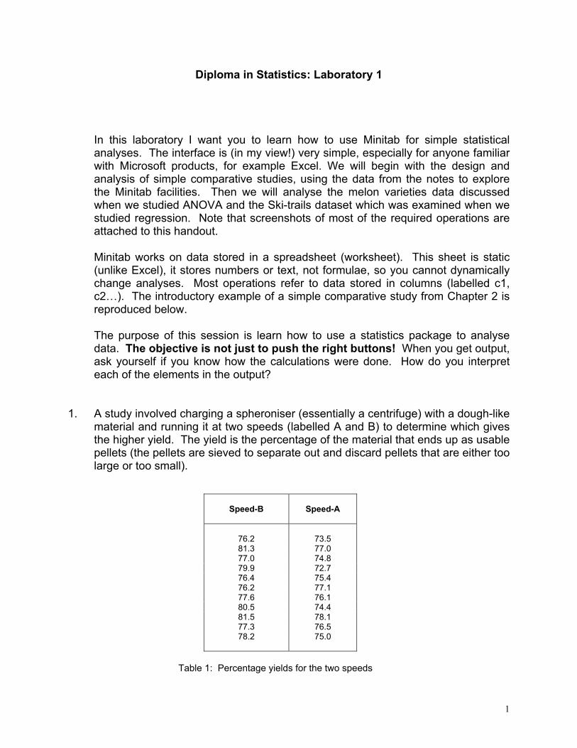
1. A study involved charging a spheroniser (essentially a centrifuge) with a dough-like material and running it at two speeds (labelled A and B) to determine which gives the higher yield. The yield is the percentage of the material that ends up as usable pellets (the pellets are sieved to separate out and discard pellets that are either too large or too small).
Speed-B
Speed-A
76.2
73.5 81.3 77.0 77.0 74.8 79.9 72.7 76.4 75.4 76.2 77.1 77.6 76.1 80.5 74.4 81.5 78.1 77.3 76.5 78.2 75.0
Table 1: Percentage yields for the two speeds

2
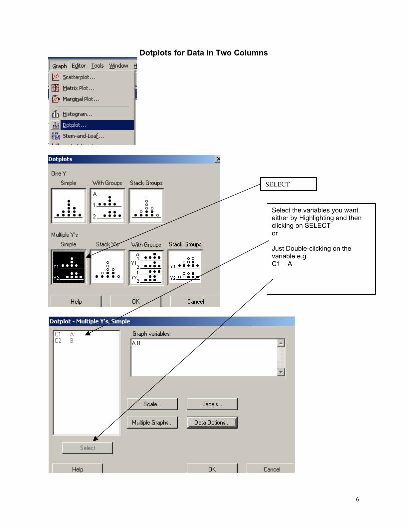
Type the data for Speed A and Speed B into two columns, say Speed B into c1 and Speed A into c2. In the header over the worksheet cells type Speed A into Column 1 and Speed B into column 2. Obtain descriptive statistics, Stat/ Basic Statistics/ Display descriptive statistics, and dotplots, Graph/ Dotplot, of the data. (See screenshots, pages 5, 6)
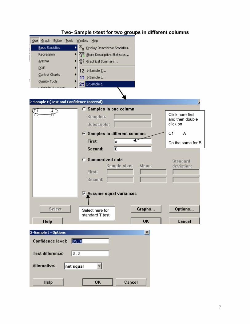
Use the Stat/ Basic Statistics/ Two-sample t menu to obtain a t-test and confidence interval for the long-run yield difference. (See screenshots, page 7)
2. To check the model assumptions we usually obtain ‘residuals’ (what is ‘left-over’ when we subtract the group mean from each of the two sets of results) and combine them into one set of values for analysis.
Use Calc/ calculator to calculate residuals (see page 8): c1-mean(c1) gives the residuals for Method A. Store these in columns c3 (Method A) and c4 (Method B). Stack the two columns in c5 either by copy and paste operations (either using the Edit menu, or control-C copies selected cells and control-V pastes the values into new cells) or by using Data/ Stack/ Columns. Obtain a Normal probability plot of the residuals using Stat/ Basic Statistics / Normality Test (see page 9). Is the Normality assumption reasonable?
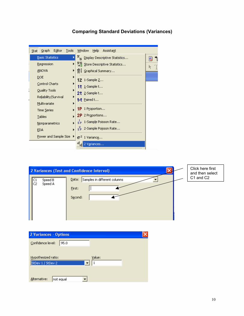
3. Use Stat/ Basic Statistics/ 2 Variances to carry out an F-test of the hypothesis
that the two long-run standard deviations are equal (see pages 10, 11). 4. Now carry out the same analyses (apart from the residual analysis) for the
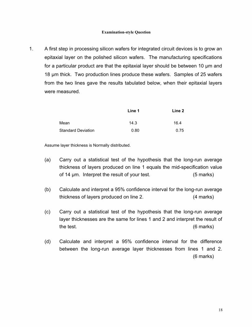
Epitaxial Layer study (attached, page 18); carry out the other analyses required in the examination question. Note that the t-tests on summarised data are carried out by selecting the “summarised data” part of the menu and filling in the data summaries given on page 18. The one-sample analyses are done using menus that are very similar to the two-sample analyses (see Stat/ Basic Statistics/ 1-sample t). Note that when comparing two variances (SD squared) the menu requires you to input the variances – not the SDs, as given in the exam question.
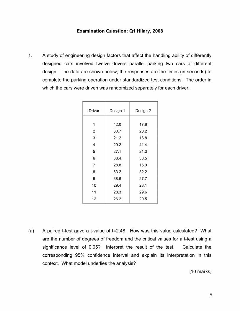
Analyse the Drivers dataset (attached, pages 19-20) using the Stat/ Basics Statistics/ paired t- menu. Obtain the means and differences for each driver on the two car designs using the Calc/ Row Statistics menu. Plot differences against means for each driver (use the Graph/ Scatterplot menu) and get a Normal plot of the differences – do the model assumptions appear valid?
3
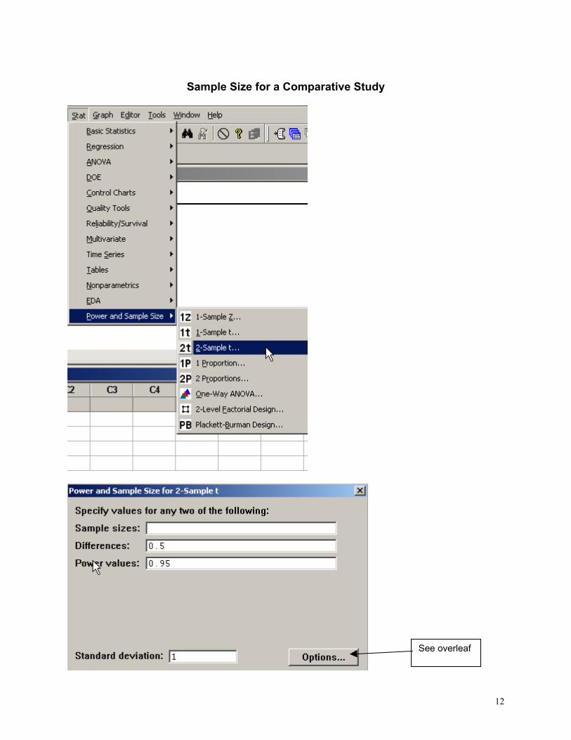
5. Use the sample size facilities within Minitab (Stat/ Power and Sample Size) to determine an appropriate sample size to detect a difference of (a) 0.5 (b) 1.0 (c) 1.5 units between two long-run means, when carrying out a two-tailed test using a significance level of 0.05, while requiring a power of 0.95 and assuming the standard deviation is either 1, 1.25, or 1.5 (see pages 12, 13).
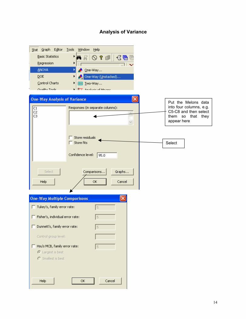
6. Mead and Curnow (1983) report an experiment to compare the yields of four
varieties of melon. Six plots of each variety were grown; the plots were allocated to varieties at random. The yields (in kg) are shown below. Enter these into four columns of the worksheet.
Variety1 Variety2 Variety3 Variety4 25.1 40.3 18.3 28.1 17.3 35.3 22.6 28.6 26.4 32.0 25.9 33.2 16.1 36.5 15.1 31.7 22.2 43.3 11.4 30.3 15.9 37.1 23.7 27.6
Page 14 gives screenshots based on the STAT/ ANOVA/ One-way (unstacked) menu. Obtain the ANOVA table, carry out multiple comparisons (note: Tukey’s = HSD, Fisher’s = LSD; Dunnett’s is another multiple comparison technique), get residuals and fitted values and use them to check the model assumptions.
7. Neter and Wasserman (1974) report the data below on a study of the relationship
between numbers of visitor days, Y, and numbers of miles, X, of intermediate level ski trails in a sample of New England ski resorts during normal snow conditions. The data are shown overleaf.
Miles-of-trails
Visitor Days
10.5
19929
2.5 5839 13.1 23696
4.0 9881 14.7 30011
3.6 7241 7.1 11634
22.5 45684 17.0 36476
6.4 12068

4
First, obtain a scatterplot of Visitor Days versus Miles-of-trails with a fitted line,
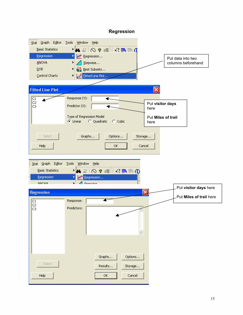
using Stat/ Regression/ Fitted Line Plot (see screenshots page 15). Next fit a regression model getting full output, including a prediction and a confidence interval when X = 10 miles of trails (type 10 into the “prediction intervals for new observations” box of the Options sub-menu). Review what is available under the various sub-menus (Graphs, Options, Storage, Results – see page 15). Store residuals and fitted values and carry out the usual residual analyses. Interpret the different elements of the output.
8. To explore some of the graphical functions within Minitab we will first generate
some random data. Use the Calc/ Random Data/ Normal menu to generate 100 data values into a column – see screenshots page 16. Name the column N-data. Just type it on the worksheet in the header row.
Use the Calc/ Random Data/ Chi-square menu to generate 100 data values from
a chi-square distribution with degrees of freedom equal to 7 into a column – see screenshots page 17. Name the column Chi-data.
Now explore the Graph menu a little – for example you could get Histograms, Dotplots and Boxplots of the two columns of data. In each case get both datasets on the same graph – this makes it easier to make comparisons. I have not given you screenshots – work it out for yourself! There is a help button on each sub-menu – see what you can learn from these (in particular look at the Boxplot Help menu).
NOTE: SOME OF THE COMMANDS AND SCREENSHOTS IN THIS HANDOUT ARE BASED ON MINITAB 15 – MINITAB 16 IS NOW INSTALLED ON THE COLLEGE SYSTEM; THERE MAY BE MINOR DIFFERENCES IN THE LATER VERSION.

5
Descriptive Statistics
Select the variables you want either by Highlighting and then clicking on SELECT or Just Double-clicking on the variable e.g. C1 A
You can change these default options by selection/de- selection
6
Dotplots for Data in Two Columns
SELECT
Select the variables you want either by Highlighting and then clicking on SELECT or Just Double-clicking on the variable e.g. C1 A
7
Two- Sample t-test for two groups in different columns
Click here first and then double click on C1 A Do the same for B
Select here for standard T test

8
Calculating Residuals
Do the same for C2 and put the resulting Residuals in C4. You can then cut and paste the numbers in C3 and C4 and put them into C5 – C5 will them contain 22 values. Name it Residuals by simply typing the name in the Minitab header. An alternative way of stacking the residuals is as follows:
This subtracts the mean of column 1 from each value in C1 and puts the resulting numbers (residuals) in C3
C1 A C2 B C3 C4
Select C3 C4 or just Type them
Deselect
Select Type
9
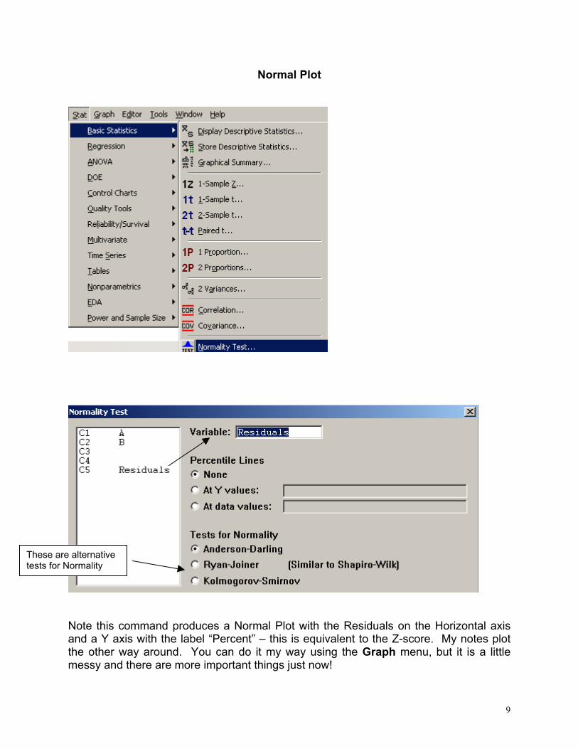
Normal Plot
Note this command produces a Normal Plot with the Residuals on the Horizontal axis and a Y axis with the label “Percent” – this is equivalent to the Z-score. My notes plot the other way around. You can do it my way using the Graph menu, but it is a little messy and there are more important things just now!
These are alternative tests for Normality
10
Comparing Standard Deviations (Variances)
Click here first and then select C1 and C2

11
(Note: This was the output from an earlier version of Minitab – compare it to that from the current version) Extract from Minitab HELP Menu: Boxplots summarize information about the shape, dispersion, and center of your data. They can also help you spot outliers. · The left edge of the box represents the first quartile (Q1), while the right edge represents the third quartile (Q3). Thus the box portion of the plot represents the interquartile range (IQR), or the middle 50% of the observations. · The line drawn through the box represents the median of the data. · The lines extending from the box are called whiskers. The whiskers extend outward to indicate the lowest and highest values in the data set (excluding outliers). · Extreme values, or outliers, are represented by dots. A value is considered an outlier if it is outside of the box (greater than Q3 or less than Q1) by more than 1.5 times the IQR. Note: Bonferroni confidence intervals mean that we are 95% confident that both intervals simultaneously cover the two population parameters, here σ1 and σ2.
The standard F-test assumes data Normality. Levene’s is an alternative test that does not make this assumption.
Boxplots of the two data columns
12
Sample Size for a Comparative Study
See overleaf

13
Power and Sample Size 2-Sample t Test Testing mean 1 = mean 2 (versus not =) Calculating power for mean 1 = mean 2 + difference Alpha = 0.05 Assumed standard deviation = 1 Sample Target Difference Size Power Actual Power 0.5 105 0.95 0.950129 Note that the actual power can be a bit different from that specified as your target value since the sample size is discrete, i.e., we can choose sample sizes of say, 104, 105 or 106 but not intermediate non-integer values.
14
Analysis of Variance
Put the Melons data into four columns, e.g. C5-C8 and then select them so that they appear here
Select
15
Regression
Put visitor days here Put Miles of trail here
Put visitor days here Put Miles of trail here
Put data into two columns beforehand

16
Generating Random Data

17
100 rows into C2 (say)
7
18
Examination-style Question 1. A first step in processing silicon wafers for integrated circuit devices is to grow an
epitaxial layer on the polished silicon wafers. The manufacturing specifications
for a particular product are that the epitaxial layer should be between 10 µm and
18 µm thick. Two production lines produce these wafers. Samples of 25 wafers
from the two lines gave the results tabulated below, when their epitaxial layers
were measured.
Line 1 Line 2
Mean 14.3 16.4
Standard Deviation 0.80 0.75
Assume layer thickness is Normally distributed.
(a) Carry out a statistical test of the hypothesis that the long-run average
thickness of layers produced on line 1 equals the mid-specification value of 14 µm. Interpret the result of your test. (5 marks)
(b) Calculate and interpret a 95% confidence interval for the long-run average
thickness of layers produced on line 2. (4 marks) (c) Carry out a statistical test of the hypothesis that the long-run average
layer thicknesses are the same for lines 1 and 2 and interpret the result of the test. (6 marks)
(d) Calculate and interpret a 95% confidence interval for the difference
between the long-run average layer thicknesses from lines 1 and 2. (6 marks)
19
Examination Question: Q1 Hilary, 2008
1. A study of engineering design factors that affect the handling ability of differently
designed cars involved twelve drivers parallel parking two cars of different
design. The data are shown below; the responses are the times (in seconds) to
complete the parking operation under standardized test conditions. The order in
which the cars were driven was randomized separately for each driver.
Driver
Design 1
Design 2
1
42.0
17.8
2 30.7 20.2
3 21.2 16.8
4 29.2 41.4
5 27.1 21.3
6 38.4 38.5
7 28.8 16.9
8 63.2 32.2
9 38.6 27.7
10 29.4 23.1
11 28.3 29.6
12 26.2 20.5
(a) A paired t-test gave a t-value of t=2.48. How was this value calculated? What
are the number of degrees of freedom and the critical values for a t-test using a
significance level of 0.05? Interpret the result of the test. Calculate the
corresponding 95% confidence interval and explain its interpretation in this
context. What model underlies the analysis?
[10 marks]
20
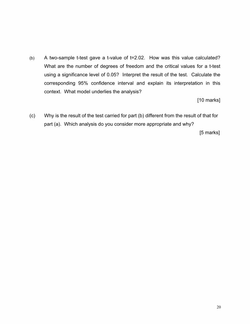
(b) A two-sample t-test gave a t-value of t=2.02. How was this value calculated?
What are the number of degrees of freedom and the critical values for a t-test
using a significance level of 0.05? Interpret the result of the test. Calculate the
corresponding 95% confidence interval and explain its interpretation in this
context. What model underlies the analysis?
[10 marks]
(c) Why is the result of the test carried for part (b) different from the result of that for
part (a). Which analysis do you consider more appropriate and why?
[5 marks]