digital graphics improving
TRANSCRIPT
Digital GraphicsHannah Mizen

File Formats

Raster Graphics
• They are made of bitmaps and they’re from pixels.
• Bitmaps separate an image into millions of little squares.
• These squares show the different colours in the image
• They have a fixed resolution (300dpi is the set resolution in photoshop), resulting in distortion when resizing.
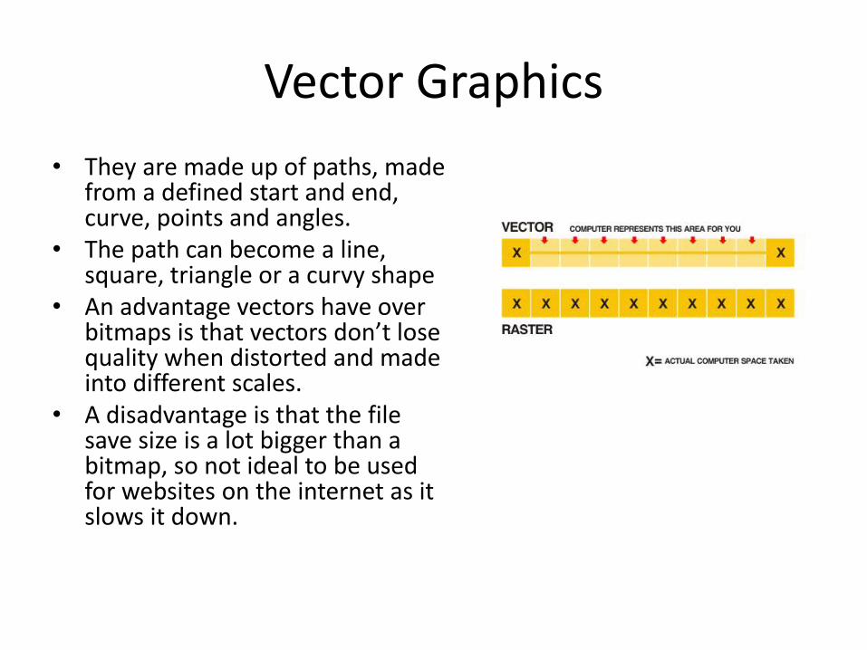
Vector Graphics
• They are made up of paths, made from a defined start and end, curve, points and angles.
• The path can become a line, square, triangle or a curvy shape
• An advantage vectors have over bitmaps is that vectors don’t lose quality when distorted and made into different scales.
• A disadvantage is that the file save size is a lot bigger than a bitmap, so not ideal to be used for websites on the internet as it slows it down.

JPEGStands For Joint Photographic Expert Group
Used For Photographs and web formats
Advantage It’s a small file which holds less data so ittakes up less space in the computers memory so you have more space to store other more important pieces of work.Ideal to use for websites and on the internet because there is less data then less internet is needed to be used when looking at a website, the website won’t take long to load and the small file means it doesn’t slow the computer down.
Disadvantage Loses quality with multiple edits due to compression and recompression every time it is opened and closed.

TIFFStands For Tagged image file format
Used For Desk top publishing, Adobe InDesign saved as TIFF
Advantage The quality of the images is much better than JPEG because of how a TIFF file doesn’t repeatedly compress the image to lessen the quality of the image because a TIFF is made from strips.
Disadvantage The amount of space and storage the TIFF takes up is considerably more than a JPEG because of the detail and lack of compression. Additionally if you were to put a TIFF on a website it would slow down the website it would time to load, it wouldn’t be instant.

PSDStands For Photoshop document
Used For Image manipulation
Advantage Saves layers and page formatting It also supports transparency, images can be manipulated and changed then go back to heir original state if saved.
Disadvantage Big files, need lots of storage space.Only useful in photoshop so it won’t open in any other format, so people who don’t own photoshop cannot access the image. The cost of buying photoshop is also expensive so some people won’t be able to afford it.

AIStands For Adobe illustrator
Used For Logo creation, graphics to represent company logo. Art illustrator.
Advantage Can be scaled big and small without the image becoming pixelated.
Disadvantage Limited software, files can only be opened in certain software. So if someone doesn’t own the correct software they cannot open the image.
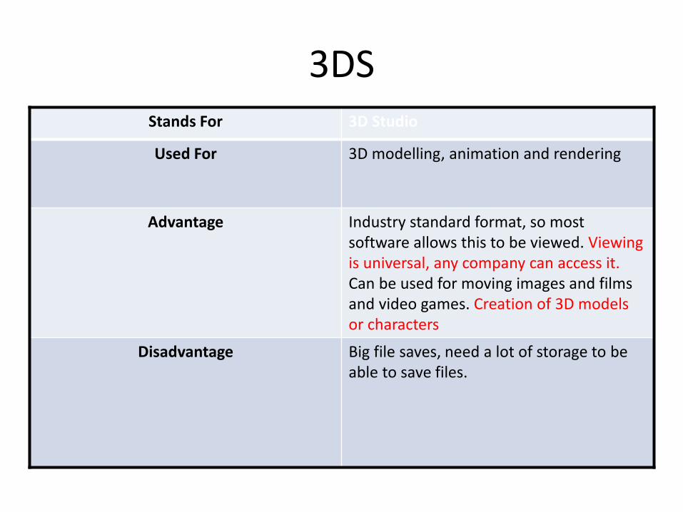
3DSStands For 3D Studio
Used For 3D modelling, animation and rendering
Advantage Industry standard format, so most software allows this to be viewed. Viewing is universal, any company can access it.Can be used for moving images and films and video games. Creation of 3D models or characters
Disadvantage Big file saves, need a lot of storage to be able to save files.

Digital Graphics Images
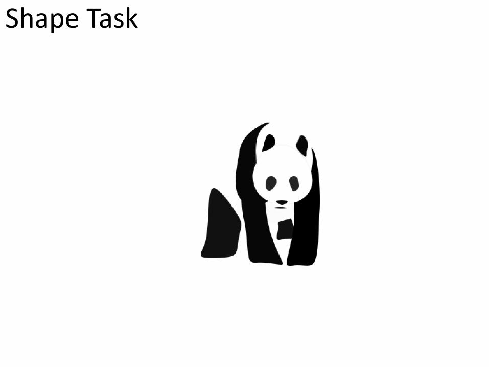
Shape Task

Evaluation
What did you like about your image?
In my image I like the overall design of the bear, I think the shape is clear and you know what animal it is straight away. I like the way it is just made from shapes put on to a white background so it just looks simple but effective.
What would you improve if you did it again?
Next time to improve this image I would include more detail. The details I could include is using different tones and shading to make the panda look more 3D. Also add little details that are not just shading but fur and eyes as well, to give more dimension.
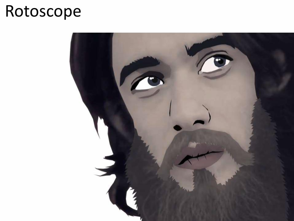
Rotoscope

Evaluation
What did you like about your image?The things I like about my image are: I like the shading around the eyes to make the rotoscope look more 3D and have some more dimension instead of just having a flat colour. I like the detail in the beard, how the spikes in the rotoscope look effective. I also like the eyes and how they don’t look out of proportion.
What would you improve if you did it again?If I were to do redo this rotoscope I would improve on a few minor details, I would probably add a little more shading where needed, maybe round the eyes and nose. I would have gone around the head hair in more detail, adding more strands of hair instead of just a big clump of colour.
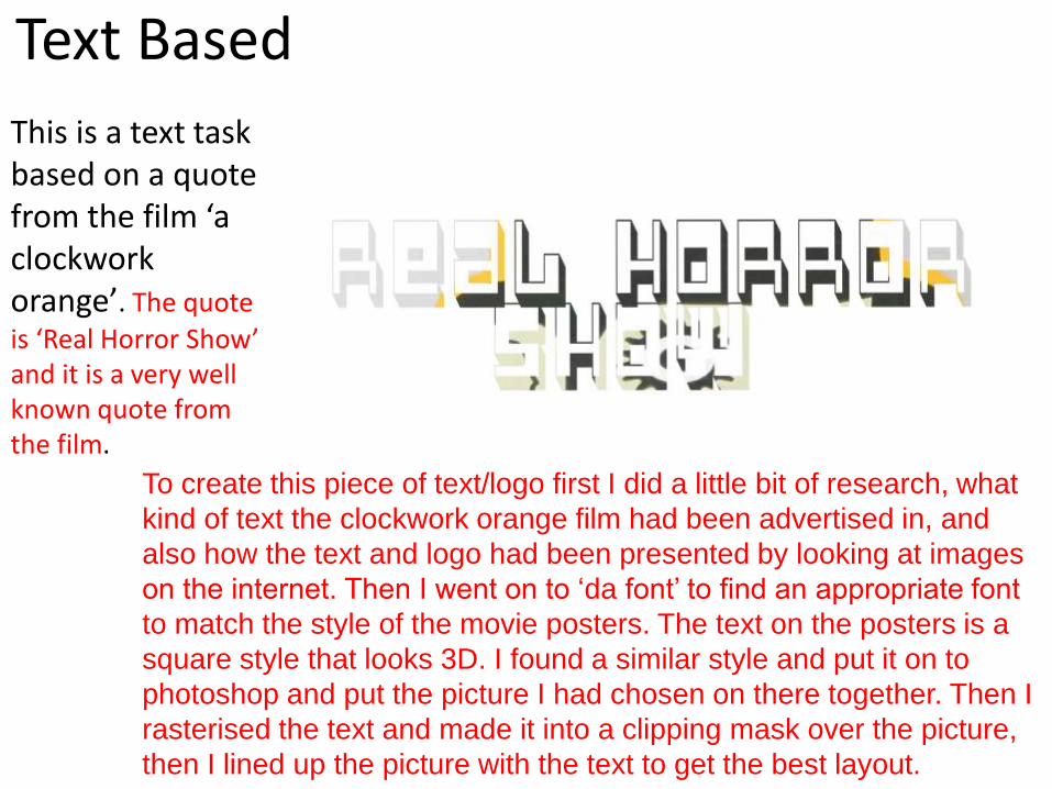
Text Based
This is a text task based on a quote from the film ‘a clockwork orange’. The quote
is ‘Real Horror Show’ and it is a very well known quote from the film.
To create this piece of text/logo first I did a little bit of research, what
kind of text the clockwork orange film had been advertised in, and
also how the text and logo had been presented by looking at images
on the internet. Then I went on to ‘da font’ to find an appropriate font
to match the style of the movie posters. The text on the posters is a
square style that looks 3D. I found a similar style and put it on to
photoshop and put the picture I had chosen on there together. Then I
rasterised the text and made it into a clipping mask over the picture,
then I lined up the picture with the text to get the best layout.
Evaluation
What did you like about your image?In this image I like the picture clipping into the text and how the eyes of the character fit perfectly in with the shape of the words. I also like the use of orange around the edges to be in keeping with the theme of the film. I also like how the text is slanted upwards, making it more interesting than if it was just straight.
What would you improve if you did it again?I would probably make the text font more interesting, or find a different font, one that is more similar to the original from the film poster.

Logo Creation
Evaluation
What did you like about your image?I like the use of colours and art that has been used to make the text stand out against the sky background. I like how the font clipped the images into the outline of the text, making it see through, instead having the text filled in. The pattern is interesting, but not too busy.
What would you improve if you did it again?The thing I would improve on is the top half of the B has quite a light pattern on it, making that part a bit hard to read.

T-Shirt Designs
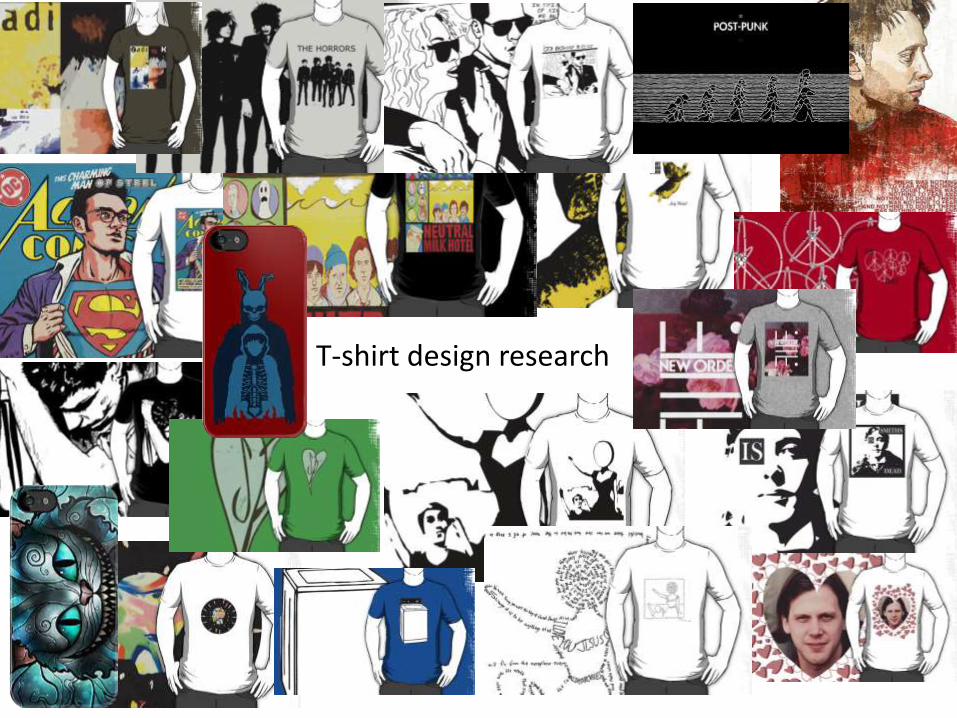
T-shirt design research
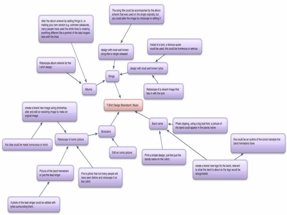
Idea Generation
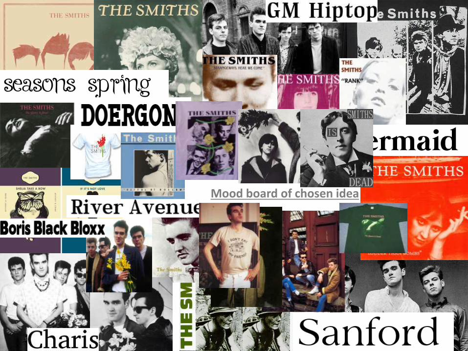
Mood board of chosen idea
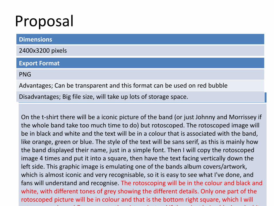
ProposalDimensions
2400x3200 pixels
Content
On the t-shirt there will be a iconic picture of the band (or just Johnny and Morrissey if the whole band take too much time to do) but rotoscoped. The rotoscoped image will be in black and white and the text will be in a colour that is associated with the band, like orange, green or blue. The style of the text will be sans serif, as this is mainly how the band displayed their name, just in a simple font. Then I will copy the rotoscoped image 4 times and put it into a square, then have the text facing vertically down the left side. This graphic image is emulating one of the bands album covers/artwork, which is almost iconic and very recognisable, so it is easy to see what I've done, and fans will understand and recognise. The rotoscoping will be in the colour and black and white, with different tones of grey showing the different details. Only one part of the rotoscoped picture will be in colour and that is the bottom right square, which I will rotoscope coloured flowers on to the picture instead if them just being black and white
Export Format
PNG
Advantages; Can be transparent and this format can be used on red bubble
Disadvantages; Big file size, will take up lots of storage space.
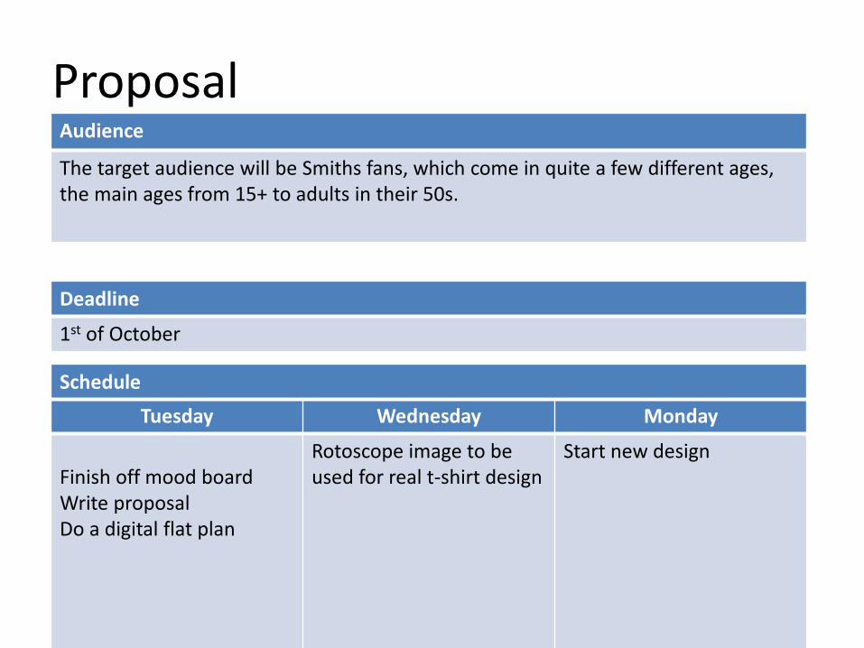
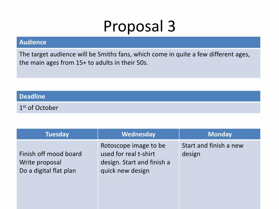
Proposal
Deadline
1st of October
Tuesday Wednesday Monday
Finish off mood boardWrite proposalDo a digital flat plan
Rotoscope image to beused for real t-shirt design
Start new design
Schedule
Audience
The target audience will be Smiths fans, which come in quite a few different ages, the main ages from 15+ to adults in their 50s.

Digital Flat PlanHere I have got 2 different pictures but duplicated them 4 times, to make it similar to the meat is murder album cover, this is a thing fans are familiar with and will understand
Meat Is Murder album artwork
I decided to go with this picture because I thought it look most effective to rotoscope
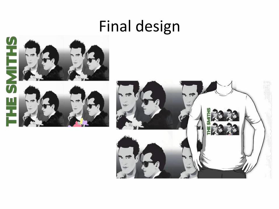
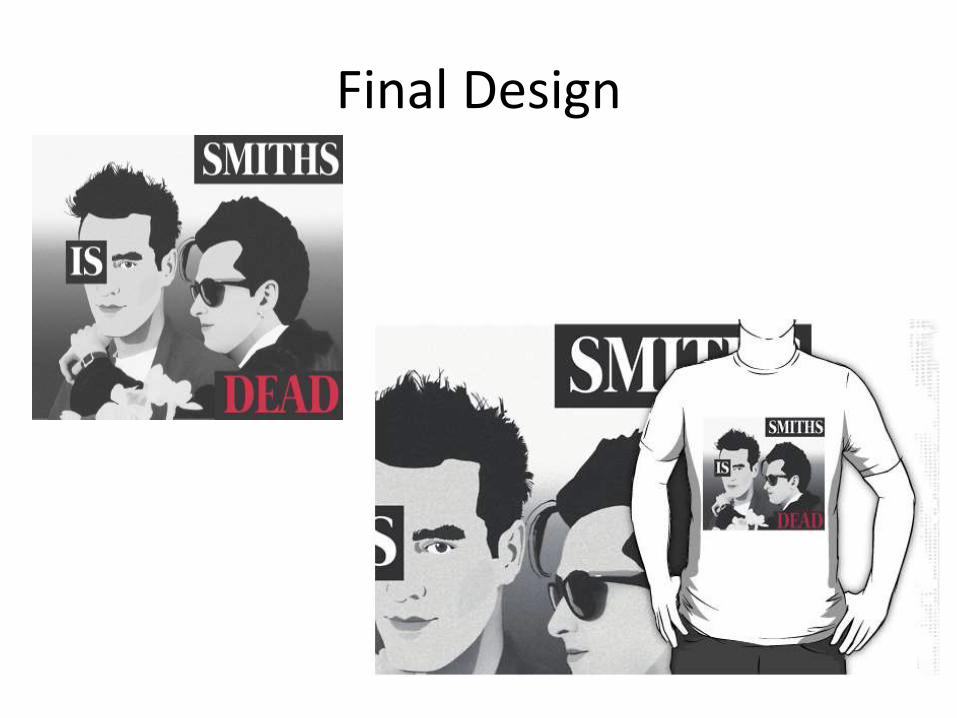
Final design
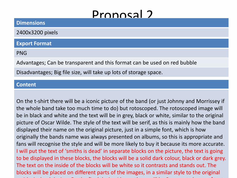
Proposal 2Dimensions
2400x3200 pixels
Content
On the t-shirt there will be a iconic picture of the band (or just Johnny and Morrissey if the whole band take too much time to do) but rotoscoped. The rotoscoped image will be in black and white and the text will be in grey, black or white, similar to the original picture of Oscar Wilde. The style of the text will be serif, as this is mainly how the band displayed their name on the original picture, just in a simple font, which is how originally the bands name was always presented on albums, so this is appropriate and fans will recognise the style and will be more likely to buy it because its more accurate. I will put the text of ‘smiths is dead’ in separate blocks on the picture, the text is going to be displayed in these blocks, the blocks will be a solid dark colour, black or dark grey. The text on the inside of the blocks will be white so it contrasts and stands out. The blocks will be placed on different parts of the images, in a similar style to the original smiths is dead design. On the final design I know there will be 3 separate boxes of text,
Export Format
PNG
Advantages; Can be transparent and this format can be used on red bubble
Disadvantages; Big file size, will take up lots of storage space.
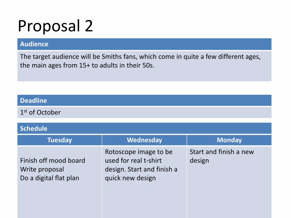
Proposal 2
Deadline
1st of October
Tuesday Wednesday Monday
Finish off mood boardWrite proposalDo a digital flat plan
Rotoscope image to beused for real t-shirt design. Start and finish a quick new design
Start and finish a new design
Schedule
Audience
The target audience will be Smiths fans, which come in quite a few different ages, the main ages from 15+ to adults in their 50s.

Digital flat planBecause the last design took a lot of time and effort I decided to do something else with it, so I got this design of Oscar Wilde which was originally official smiths merchandise and Morrissey was pictured wearing it after the band broke up.
So I decided to do a twist on this design, using pictures of the band mates, instead of Oscar Wilde. This looks simple but an effective design.
Final Design

Proposal 3Dimensions
2400x3200 pixels
Content
On this shirt and phone there will be a picture of Morrissey wearing ‘I don’t eat my friends’ shirt. I think fans will like this design because Morrissey was often seen wearing t-shirts with people wearing a statement t-shirt on it. This picture is not designed on any smiths related item before like a album or tour shirts, so it is new and interesting for fans to be able to discover and wear. This will be designed mainly for a phone case in mind, with the shape of the image, making it landscape rather than portrait, so it runs horizontally across the phone. It is also designed for a t-shirt, so it will fit on it in a neat square. This picture will be rotoscoped over the photo to make the image original and not a copy. The rotoscope will be in done in one colour, blue, but there will be different tones of blue, that are lighter and darker, to show up the details in the image, like the hair and nose. The background for this image is actually going to be a gradient of blue and white, instead of just white, like the original image, which just has a white background.
Export Format
PNG
Advantages; Can be transparent and this format can be used on red bubble
Disadvantages; Big file size, will take up lots of storage space.
Proposal 3
Deadline
1st of October
Audience
The target audience will be Smiths fans, which come in quite a few different ages, the main ages from 15+ to adults in their 50s.
Tuesday Wednesday Monday
Finish off mood boardWrite proposalDo a digital flat plan
Rotoscope image to beused for real t-shirt design. Start and finish a quick new design
Start and finish a new design

Flat digital PlanThis design is mainly for the target audience of vegetarian Smiths fans. Because Morrissey influenced a lot of people to become vegetarian and made people aware of how animals were murdered. I thought that this specific target audience would appreciate this design. I also haven’t seen this design out there, so it is a bit of a different option.
I also chose this particular design because of how Morrissey is laying down, means it would also look effective and wouldn’t distort on a phone case
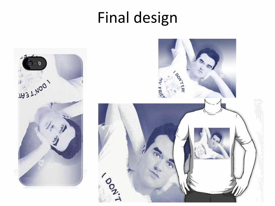
Final design

Peer Evaluation
What are the strengths of the final image?• They all have a common theme running throughout (the people in each
design).• They look very life-like (especially the blue hued one) which shows attention
to detail & it paid off!• A niche audience has been considered & produced for. It shows through the
final images.
What could be developed if the image was repeated? • The backgrounds on some the images may prevent it from being printed on certain colours of t-shirts. If developed further, there could have been a design with and without the background, to give the consumer a choice (but this would take time).• An individual design for the other member of ‘The Smiths’ would also have been good, but again, this would have taken time to do.

Peer Evaluation
What are the strengths of the final image?
You straight away know what both your images are. Your skills in rotoscope have been show really well in this, I love the top image and how realistic it looks. There is a constant theme running through both products: colours, people, text ect.
What could be developed if the image was repeated?
Although the backgrounds are well thought they could make it harder for the audience who want to buy the t-shirt to have it in some different colours.
Peer Evaluation
What are the strengths of the final image?These have both been done really well as they both look really professional and of a high quality. Also they both show a lot of skill and precision whilst working on Photoshop. I think that adding text tells the audience more about what it is from from those that aren’t fans. They both look very life like as there is a lot of detail in both the images, I also like the shadowing and gradient that has been used in the background as it makes it look more real and more of a high quality design.
What could be developed if the image was repeated? Maybe to add more colour to highlight key areas of the design and also to draw more attention to it and catch peoples eye.
T-Shirt Evaluation
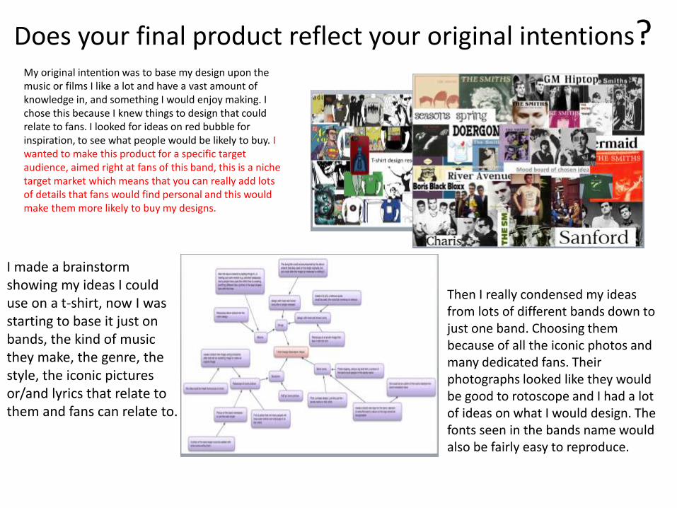
Does your final product reflect your original intentions? My original intention was to base my design upon the music or films I like a lot and have a vast amount of knowledge in, and something I would enjoy making. I chose this because I knew things to design that could relate to fans. I looked for ideas on red bubble for inspiration, to see what people would be likely to buy. I wanted to make this product for a specific target audience, aimed right at fans of this band, this is a niche target market which means that you can really add lots of details that fans would find personal and this would make them more likely to buy my designs.
I made a brainstorm showing my ideas I could use on a t-shirt, now I was starting to base it just on bands, the kind of music they make, the genre, the style, the iconic pictures or/and lyrics that relate to them and fans can relate to.
Then I really condensed my ideas from lots of different bands down to just one band. Choosing them because of all the iconic photos and many dedicated fans. Their photographs looked like they would be good to rotoscope and I had a lot of ideas on what I would design. The fonts seen in the bands name would also be fairly easy to reproduce.

Does your final product reflect your original intentions? The first design I
planned out was the ‘Meat is Murder’ album artwork with a twist. This just seemed like an obvious thing to reproduce, simple yet I have never seen
anyone do it before.
I think the final design is very successful and definitely reflects my original intentions as it looks almost identical too what my flat plan looks like.
This next flat plan has some variation to the final image, but that is due to improving and experimenting with colours and placements on Photoshop. This is also a twist on the original design, something that fans would get.
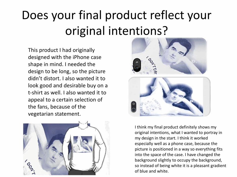
Does your final product reflect your original intentions?
This product I had originally designed with the iPhone case shape in mind. I needed the design to be long, so the picture didn’t distort. I also wanted it to look good and desirable buy on a t-shirt as well. I also wanted it to appeal to a certain selection of the fans, because of the vegetarian statement.
I think my final product definitely shows my original intentions, what I wanted to portray in my design in the start. I think it worked especially well as a phone case, because the picture is positioned in a way so everything fits into the space of the case. I have changed the background slightly to occupy the background, so instead of being white it is a pleasant gradient of blue and white.

Does your final product reflect your original intentions?
Originally in my flat plan, I set out my ideas with already existing pictures that I was going to use to trace over with my rotoscoping. With the rotoscoping I think that I did a fairly good job but may have taken on more than I could do because of how much detail the original picture had in it, for example there were two faces to rotoscoped for one design, which really slowed production time down, which meant I had to skip out on some detail in order to get my products finished in time for my deadline. Because of the time I had left I also used one design twice by changing the set out of it differently, I think that if I had more time I would create another rotoscoped design to add instead of recycling a design. I think that my audience would se this as me cheating, but on the other hand they might like the variation of the same design, but I feel that I would benefit from creating more designs. Originally I wanted to target these designs at a niche audience, for fans of the band and I feel like this intention has been fulfilled because of how the designs are aimed at this market, they are not not designed so everyone who sees them will understand, but the target audience will.
Also originally I was planning to sell my designs on t-shirts, making them appealing to wear, this has been a successful intention because people have actually bought a few of these designs on t-shirts, meaning that the audience do like them, and understand them.
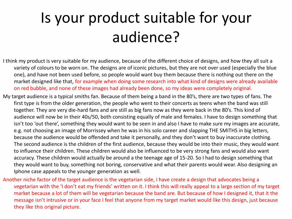
Is your product suitable for your audience?
I think my product is very suitable for my audience, because of the different choice of designs, and how they all suit a variety of colours to be worn on. The designs are of iconic pictures, but they are not over used (especially the blue one), and have not been used before, so people would want buy them because there is nothing out there on the market designed like that, for example when doing some research into what kind of designs were already available on red bubble, and none of these images had already been done, so my ideas were completely original.
My target audience is a typical smiths fan. Because of them being a band in the 80’s, there are two types of fans. The first type is from the older generation, the people who went to their concerts as teens when the band was still together. They are very die-hard fans and are still as big fans now as they were back in the 80’s. This kind of audience will now be in their 40s/50, both consisting equally of male and females. I have to design something that isn’t too ‘out there’, something they would want to be seen in and also I have to make sure my images are accurate, e.g. not choosing an image of Morrissey when he was in his solo career and slapping THE SMITHS in big letters, because the audience would be offended and take it personally, and they don’t want to buy inaccurate clothing. The second audience is the children of the first audience, because they would be into their music, they would want to influence their children. These children would also be influenced to be very strong fans and would also want accuracy. These children would actually be around a the teenage age of 15-20. So I had to design something that they would want to buy, something not boring, conservative and what their parents would wear. Also designing an Iphone case appeals to the younger generation as well.
Another niche factor of the target audience is the vegetarian side, I have create a design that advocates being a vegetarian with the ‘I don’t eat my friends’ written on it. I think this will really appeal to a large section of my target market because a lot of them will be vegetarian because the band are. But because of how I designed it, that it the message isn’t intrusive or in your face I feel that anyone from my target market would like this design, just because they like this original picture.

What do you like/dislike about the techniques you have used?
The main technique I used to create my designs was rotoscoping, creating a cartoon like version of the real picture by tracing shapes over the picture. In my rotoscoping I like that I have really gone into detail with my rotoscoping, adding shading and smaller minor details that could be missed out, like strands of hair or the shading of the cheek bones. I also like that I created my designs in black and white, I feel that this gives them a more artistic feel and the contrast of the dark on light makes it look more ‘vintage’ and old, like it has come out of the 80’s. As well as the black and white I also used a minimal colour on some flowers that stands out a lot but not too much that it takes away from the vintage feel, I used a colour block pastel colours on some flowers which made them jump out of the picture, giving my design a lot more flare and to also make it more interesting. I feel that this artistic style choice also makes my design look more professional, what also makes the rest of my designs look professional is the quality of my skills I have used. The edges of my design are sharp and the design looks like the actual picture, so all the proportions are correct, there are no flaws in my small details, like missing out a colour or the shape of a pupil Is not round enough, which I think has really has given me a professional edge.
To rotoscope I used the polygonal lasso tool, this is main tool I used for the majority of the picture. I went around the outline of the part of the picture I wanted to changed and rotoscope, then used the colour overlay and opacity tool to create my own version of the original picture. The opacity tool I used was especially helpful to assist with shading and blending, so the shadows didn’t just look like odd blocks of colour, so that they actually looked effective.
The next tool I used was the text tool, I used it to create the similar fonts used on the original album artwork.
I also used the crop tool to crop out white areas, or areas that I didn’t want to include in the picture, or that wouldn’t fit on to the template of the shirt or phone case.
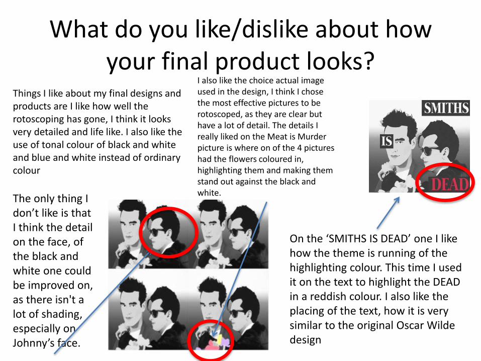
What do you like/dislike about how your final product looks?
Things I like about my final designs and products are I like how well the rotoscoping has gone, I think it looks very detailed and life like. I also like the use of tonal colour of black and white and blue and white instead of ordinary colour
I also like the choice actual image used in the design, I think I chose the most effective pictures to be rotoscoped, as they are clear but have a lot of detail. The details I really liked on the Meat is Murder picture is where on of the 4 pictures had the flowers coloured in, highlighting them and making them stand out against the black and white.
On the ‘SMITHS IS DEAD’ one I like how the theme is running of the highlighting colour. This time I used it on the text to highlight the DEAD in a reddish colour. I also like the placing of the text, how it is very similar to the original Oscar Wilde design
The only thing I don’t like is that I think the detail on the face, of the black and white one could be improved on, as there isn't a lot of shading, especially on Johnny’s face.

Why did you include the content you used?
I selected the images for my design because I felt that these would look very effective when rotoscoped. I feel my skills were good on rotoscoping and I wanted to take advantage of this skill, I also prefer the end look of rotoscoping. I also chose them because of the colours, the black and white and the blue and white, they were different and I had not ever rotoscoped in different hues of colour and I thought it would look effective, different and eye-catching.
The fonts I chose from ‘Da Font’ because they have a large selection and range of different fonts, and I was more likely to find a fitting font similar to the picture I was copying. I chose a san-serif font for the meat is murder picture, because of its similarity, I also chose the dark green so it would match the original colouring of the album artwork text. For the smiths is dead I chose a font also similar to the original, a serif font this time. I coloured it white so it would contrast and stand out against the black box background. But then I coloured the last word in red, to make it stand out and catch people’s attention. All the content I used was done for the purpose to give of that ‘smiths’ feel, the feel that the fans and target audience would see in my designs. Everything I put on my design was for this purpose, and it was to keep this theme running throughout my designs, for example the old style font and the black and white colours to keep it feeling vintage, but then adding a pop of colour for a modern twist to also cater for the younger section of my target audience.

What style have you employed in your products?
My influences are mainly the style and whole persona of the band, the kind of feel they gave with their music and the style of their album artwork. The album artwork has a very vintage feel to it, always using iconic pictures of famous movie, soap or music stars, e.g. Elvis Priestly.
The artwork was always in tonal hues, that be in black and white or pink and white. And they name would always contrast over this. The artwork would have simple colours and yet have detailed pictures, this is what made it stand out and this is the kind of feel I was trying to portray in my work
So the visual style I chose would described as a vintage feel, I wanted it to have the feel of The Smiths album artwork and I feel I succeeded with that because I twisted the original artwork and gave my separate version of it. The feel of the first 2 designs was inspired by the ‘hatful of hollow’ album art work, the side profile in the black and white colours with the different gradient in the background. Old photographs of the band has also inspired my main design motifs, because they are popular pictures and fans of this band like these pictures a lot. Some existing designs I also feel have inspired my work, like designers on red bubble’s t-shirts have helped me to realise what shapes work on a t-shirt and what colours look most effective on different colour t-shirts.
What were the strengths and weaknesses of the pre-production and planning
The strengthsThe strengths of the research was getting to see what was out
there, what kind of products people had already been designing and the kind of designs that were popular. Researching into red bubble I could see the styles and techniques people had been using to create successful t-shirts and not so successful. I found that images on shirts looked the best and the most interesting, and text and outlines didn’t looks as effective, and a bit amateur. I could also see what kind of shapes people would use for phone cases and which shape image would distort, from this cat iPhone case I could see that a longer shape with bold bright colours looks the most effective and the most desirable.
The digital flat plan helped me a lot as I could physically see the design and work out what would look best where with minimal effort and not taking up too much time.
Creating mood boards and visually being inspired really helped for me to be able to create a picture in my head what I wanted to achieve, mood boards allowed me to be able to collect existing works, seeing what was out there already and to see what had already been done. Mind maps helped in a similar way but instead of looking at different works I was inspired by this and then had a chance to write down all my ideas, getting them all out, even bad ones. This helped me to bring some structure and clarity to my ideas instead of them being all jumbled up in my head.
The weaknessesI actually found the planning to be very helpful and inspiring, and helped me create a lot more ideas than I first began with. The only thing that I found a problem was I couldn’t tell what kind of designs sold the best and for what price they were selling for, and what colours people preferred. This absence of information meant that I wasn’t able to pick a particular foundation design and be positive I know it will sell. I feel that not doing background work on my audience is something that maybe could have hindered my idea process. Having an idea of what you think your audience like to actually finding out what they like can come out very differently.

Peer feedback

Analyse each of your final print products commenting on the strengths, weaknesses and aspects you would
do differently if you were to repeat the project
The strength of this image is the quality and detail in the rotoscoping
Another strength is the vegetarian statement, really catering to a niche market
I like the blue hue and tone, relating back to the original subject of the album artwork
I like how the image and design fits on to the phone and how the shape is perfect
If I were to repeat the project, next time I would get the outline of the box on the t-shirt to be softer, and not to have such harsh edges
A strength is how it can be bought as a phone case or a t-shirt

Analyse each of your final print products commenting on the strengths, weaknesses and aspects you would
do differently if you were to repeat the project
A strength of this is the link back to the meat is murder artwork, instead of the world war 1 boy it is an iconic picture of Morrissey and Johnny
Another strength is the detail and quality of the rotoscoping, because it looks a lot like the original image.
I like the highlighting of the colours on the flowers on just on the pictures. I think this looks very effective.
A weakness is that this was my first design so it doesn’t look as good as the other two
The image on the t-shirt is a PNG so the text will be see through so the image may not look good on darker shirts

Analyse each of your final print products commenting on the strengths, weaknesses and aspects you would
do differently if you were to repeat the project
On this version I put a vintage feel effect on the image to make it look older, and I think this worked will with the black and white, and broke up the image more
I like the similar text font on this to the original. I also think the colour contrast between the black and white work well and will show up on any t-shirt
A weakness in
this design is I
thin it could
have more
detail on the
actual people.
I like the gradient
on the background
so it fades into the
white t-shirt but a
bad point is that it
wouldn’t fade into
the shirt if it was a
different colour
I like the red colour on the
‘DEAD’ as it stands out and
looks more interesting.

Peer Feedback
• Summarise peer feedback and discuss
– Responses you agree withOver-all I think the feed back I got was very positive and there was a lot of compliments
about the amount of detail and effort that I had put into it. I do agree with this as I feel I did put a very large amount of effort into the subject matter and the amount of detail that I included in the rotoscoping. I also agree that my designs are there for a niche market which cater to a certain person and a fan of this band.
– Responses you disagree withI have to say I can’t really see anything I disagree with, all that comments made
were very constructive and helpful, and there wasn’t really anything negative said.