different types of graphs tables, charts and graphs are convenient ways to clearly show your data
TRANSCRIPT

Different Types of Graphs
Tables, charts and graphs are convenient ways to clearly show your data.

Day Chocolate Strawberry White
Monday 53 78 126
Tuesday 72 97 87
Wednesday 112 73 86
Thursday 33 78 143
Friday 76 47 162
The cafeteria wanted to collect data on how much milk was sold in 1 week. The table below shows the results. We are going to take this data and display it in 3 different types of graphs.

Circle (or Pie) Graph
There are three basic graph forms.
Notice how each of the following examples are used to illustrate the data.
Choose the best graph form to express your results.
Bar Graph
Line Graph

Bar Graph• A bar graph is used to show
relationships between groups.• The two items being compared
do not need to affect each other.• It's a fast way to show big
differences. Notice how easy it is to read a bar graph. Chocolate Milk Sold
53
72
112
33
76
0
20
40
60
80
100
120
Monday Tuesday Wednesday Thursday Friday
Day
Am
ount
Sol
d
Monday TuesdayWednesday ThursdayFriday

Circle Graph or Pie Graph
• A circle graph is used to show how a part of something relates to the whole.
• This kind of graph is needed to show percentages effectively.
Chocolate Milk Sold
Monday
Tuesday
Wednesday
Thursday
Friday

Line Graph• A line graph is used to show continuing data; how
one thing is affected by another. • It's clear to see how things are going by the rises
and falls a line graph shows.
Chocolate MI lk Sold
0
20
40
60
80
100
120
Monday Tuesday Wednesday Thursday Friday
Day
Am
ount
Sol
d
Chocolate

Line Graphs continued• To display data on a line graph:
• Draw 2 axes. The horizontal axis shows time. The vertical axis shows the data that change over time.

Chocolate MI lk Sold
0
20
40
60
80
100
120
Monday Tuesday Wednesday Thursday Friday
Day
Am
ount
Sol
d
Chocolate
Chocolate Milk Sold
Monday
Tuesday
Wednesday
Thursday
Friday
Bar Graph
Line Graph
Circle (Pie) Graph
The same data displayed in 3 different
types of graphs.
Chocolate Milk Sold
53
72
112
33
76
0
20
40
60
80
100
120
Monday Tuesday Wednesday Thursday Friday
Day
Am
ount
Sol
d
Monday TuesdayWednesday ThursdayFriday

On what day did they sell the most chocolate milk?
a. Tuesday b. Friday c. Wednesday
Chocolate Milk Sold
53
72
112
33
76
0
20
40
60
80
100
120
Monday Tuesday Wednesday Thursday Friday
Day
Am
ount
Sol
d
Monday TuesdayWednesday ThursdayFriday
Chocolate
Monday
Tuesday
Wednesday
Thursday
Friday
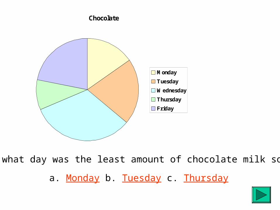
On what day was the least amount of chocolate milk sold?
a. Monday b. Tuesday c. Thursday

Chocolate
0
20
40
60
80
100
120
Monday Tuesday Wednesday Thursday Friday
Day
Am
ount
Sol
d
Chocolate
On what day did they have a drop in chocolate milk sales?
a. Thursday b. Tuesday c. Monday

You are Correct

OOPS! Wrong Answer
Try Again
Look for the tallest bar
Chocolate Milk Sold
53
72
112
33
76
0
20
40
60
80
100
120
Monday Tuesday Wednesday Thursday Friday
Day
Am
ount
Sol
d
Monday TuesdayWednesday ThursdayFriday

You are Correct

OOPS! Wrong Answer
Try Again
Chocolate
Monday
Tuesday
Wednesday
Thursday
Friday
Look for the smallest slice

You are Correct

OOPS! Wrong Answer
Try Again
Look for the drop on the line
Chocolate
0
20
40
60
80
100
120
Monday Tuesday Wednesday Thursday Friday
Day
Am
ount
Sol
d
Chocolate

Choosing the Right Graph
• Use a bar graph if you are not looking for trends (or patterns) over time; and the items (or categories) are not parts of a whole.
• Use a pie chart if you need to compare different parts of a whole, there is no time involved and there are not too many items (or categories). • Use a line graph if you need to see how a quantity has changed over time. Line graphs enable us to find trends (or patterns) over time.

Graphing on a Coordinate Grid
Learning Goals:
•Order pairs are used to plot or locate points on an coordinate grid.
•In an ordered pair, the first number tells the horizontal distance from the origin; the second number tells the vertical distance from the origin.

Rene Descartes was a French mathematician who lived from 1596 to 1650. He developed the coordinate grid system we use today. In his honour, it is called the Cartesian plane.
We use an ordered pair to describe the coordinates of a point. The coordinates of point B are (6, 2).
In an ordered pair:•The first number tells the horizontal distance from the origin.•The second number tells the vertical distance from the origin.

• We use an ordered pair to locate or plot a point. The coordinates of A are (4, 3). To draw point A on the coordinate grid: Start at the origin, move to 4 on the horizontal axis, then move up 3 units.

Homework
• Grade 6 – pgs 188-189; Q’s 1, 3-5.