diary cover design process
DESCRIPTION
diary cover design processTRANSCRIPT
Making of the diary designKenta. K
! For my diary design, I thought up of something that would be abstract and has lots of colors instead of limiting them to red, white and black, but also making it somehow analog. Also there were a lot of things I have rejected in this project, so I would also like to go over that.
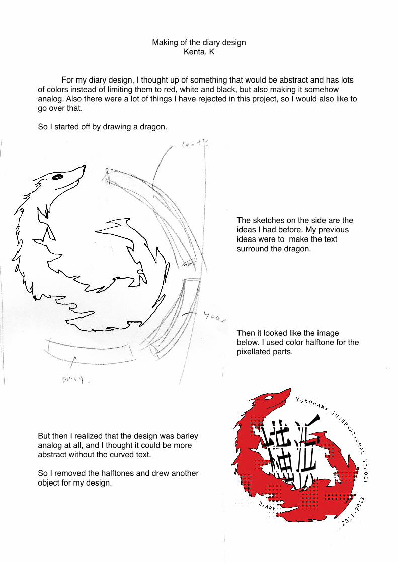
So I started off by drawing a dragon.
The sketches on the side are the ideas I had before. My previous ideas were to make the text surround the dragon.
Then it looked like the image below. I used color halftone for the pixellated parts.
But then I realized that the design was barley analog at all, and I thought it could be more abstract without the curved text.
So I removed the halftones and drew another object for my design.
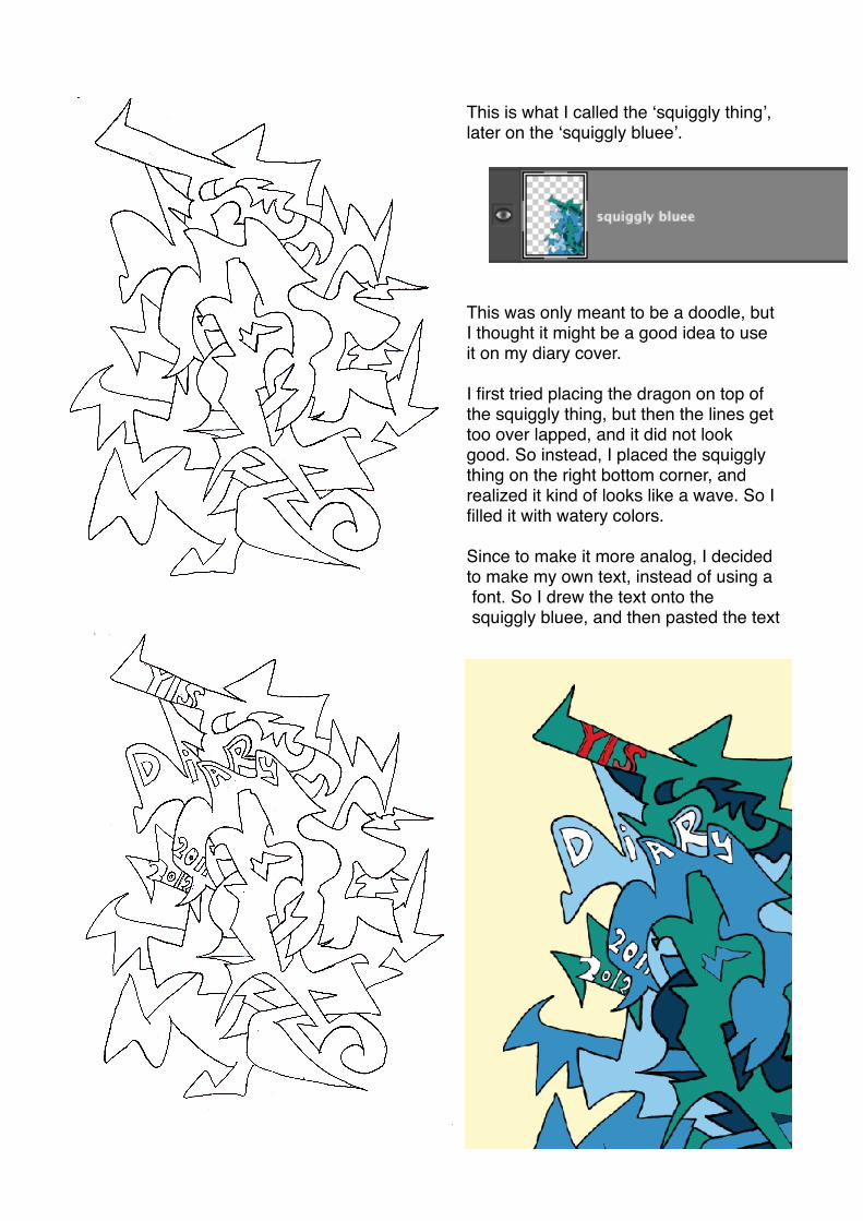
This is what I called the ʻsquiggly thingʼ, later on the ʻsquiggly blueeʼ.
This was only meant to be a doodle, but I thought it might be a good idea to use it on my diary cover.
I first tried placing the dragon on top of the squiggly thing, but then the lines get too over lapped, and it did not look good. So instead, I placed the squiggly thing on the right bottom corner, and realized it kind of looks like a wave. So I filled it with watery colors.
Since to make it more analog, I decided to make my own text, instead of using a font. So I drew the text onto the squiggly bluee, and then pasted the text

parts on to the actual part in my diary cover.
! Then there is the ʻpointy orangeʼ. The one used in the final product is called ʻpointy orange IIʼ since this was my second choice, since my first one looked weird.
! I tried many times to get my favorite pointy shape, and then I finally got it, which was the first ʻpointy orange. But then I noticed when I used it, The line thickness of the pointy orange and the squiggly bluee were different, so it did not look good. Then I made a simpler design, which was the ʻpointy orange IIʼ.
The image on the right, on the bottom is how the pointy orange first looked like. But then the the image on the left, on the the top is what the pointy orange II looks like.
And so I colored it in.

! Then I finally make my last part of my design, the ʻshady thingʼ. The lines of the shady thing was probably the only thing that was not hand-drawn, I used a select tool, fill and rotate.
Then I filled with the lines like I did below.
Then I realized that these colors are not really abstract anyways, and also it just made the whole picture boring, and it did not fit with the rest of the picture.
So I made some tweaks. I first of all made a little pattern like this.
And then I got an idea of making the shady thing into a japanese fan. So Imade the colors of the shady thing into greenish yellowish color gradient,
so it would look like gold. Then I added the pattern over it.

Then this is how it looks overall.