developing web applications for smartphones with ibm websphere
TRANSCRIPT

Developing Web Applications for
Smartphones with IBM WebSphere Portlet
Factory 7.0
WebSphere Portlet Factory Development Team 6 September 2010
© Copyright International Business Machines Corporation 2010. All rights reserved.
Introduction
Smartphone and mobile development challenges and opportunities
The recent months have seen an explosion in the market for smartphones. Smartphone sales have risen dramatically, with consumers snapping up the latest models as the smartphone vendors compete to provide the best products with the newest technology. In this market, those consumers - your customers and employees - increasingly expect to be able to do many of the same things on their mobile devices that they've traditionally done on their laptop or desktop devices. Given this trend, technology organizations are under pressure to quickly deliver smartphone and mobile access to web applications. They need tools and frameworks to help them quickly develop new mobile-enabled applications and adapt existing applications to mobile devices. Fortunately, smartphone web applications are built with the same basic technologies - HTML, CSS, and Javascript - as traditional web applications. Modern smartphones and tablets, such as iPhone, iPad, Android, and Blackberry OS 6, have very capable web browsers with excellent support for advanced features such as webkit extensions and HTML 5 features. With appropriate coding, HTML, CSS, and Javascript can be used to deliver applications that are optimized for those mobile devices and have a native-looking user interface. Since those web technologies are the ones generated by Portlet Factory applications, you can use all the power and automation of Portlet Factory to create smartphone-optimized web applications. You can even leverage new HTML 5 capabilities such as geolocation on devices where they are supported.
Benefits of using Portlet Factory for smartphone and multi-channel development
When you use Portlet Factory for mobile development, the first big benefit you get is that your mobile applications can leverage all the features of Portlet Factory, such as:
• Rapid development of portlets and web applications with rich Web 2.0 capabilities
• Comprehensive integration capabilities (SAP, Domino, relational DB, web/REST services, PeopleSoft, Siebel, and more)
• Automated support for service-oriented development
• “Dynamic profiling” capability, to create multiple variations from a single source model

• Support for multiple deployment platforms (WebSphere Portal, WebSphere Application Server, Lotus Mashup Center)
In addition to those core benefits of Portlet Factory, there are three specific Portlet Factory capabilities that are especially valuable for supporting the development of smartphone-optimized web applications. Many of these capabilities are demonstrated in the samples that accompany this article. These three capabilities are as follows.
1. Highly configurable automated generation of web user interfaces
Portlet Factory 7.0 provides a number of techniques for controlling the generation of web UI in a highly automated, centralized way:
• The Data Field Settings and Rich Data Definition builders provide centralized control over how all data fields are displayed, formatted, and validated. For example, if you want to automatically have every Integer field automatically display a smartphone numeric keypad for data input, you can do that by changing a single central entry in a Rich Data Definition base library.
• Portlet Factory's UI themes provide centralized control over the look and feel of an entire application. With a theme, you can control style sheets, Data Page HTML templates, imported base page layouts, and even the choice of builder to use for paging through large data sets.
• Data Page HTML templates and imported HTML base layouts let you control the structure and layout of generated pages. For example, in some of the attached samples, a special HTML template and stylesheet are used to generate vertical scrolling lists for data instead of a tabular display.
The following screenshot shows how the standard View & Form builder can be used with a customized HTML Template and stylesheet to generate a scrolling list interface instead of a table display.
2. Dynamic Profiling and multi-channel support

The Dynamic Profiling feature of Portlet Factory allows you to automatically generate multiple variations of an application from a single source model. This feature is often used, for example, to generate different application variations according to membership in Portal groups. For smartphone and mobile development, you can use the Dynamic Profiling feature to support "multi-channel" applications, where a single source model can generate code that's optimized for both smartphone and desktop devices. In the Designer tool you can easily switch between profiles to see what will be generated for each device type. The following diagram shows how multiple devices can be supported with a single source model through the use of Dynamic Profiling.
3. Builder automation of mobile-optimized UI patterns
At the heart of Portlet Factory is a very flexible framework for creating builders that can automate the generation of code for any design pattern. Any new builder can easily leverage all the automation of any existing builders. For smartphone support, new builders can automate the generation of UI design patterns that are optimized for mobile devices, and these new builders can draw on all the functionality of existing builders. For example, new builders can generate a native-looking scrolling list with thumbnails, or native-looking tabs at the top or bottom of a screen. The attached samples do not currently include any new builders for generating smartphone UI patterns. However, we expect mobile and smartphone builders to be a major focus for upcoming Portlet Factory product releases. We think that web application development tools going forward will need to support a wide range of devices, from traditional desktop and laptop computers, to smartphones and tablets, to other devices like TVs. We believe that the highly automated code generation and dynamic profiling features of Portlet Factory make it an ideal framework for web application development in this multi-device environment.
Note about tested devices and smartphone support for specific Portlet Factory builders
The attached samples were developed and tested with smartphones that use the webkit engine: iPhone, iPad, Android, and BlackBerry Torch. Other browsers may not render all the stylings such as rounded corners correctly. However, for the multi-channel applications (WPF Mobile Sales Orders and WPF Mobile Orders Simple), the non-mobile "desktop" profile will render correctly on any of the browsers supported by Portlet Factory, since that profile uses the default HTML/CSS generated by Portlet Factory builders.

Note that some Portlet Factory builders may generate code that is not compatible with smartphone browsers, so it's important to test the features you want to use on the smartphones you want to support. For example, some of the Dojo input widgets such as the Dojo date/time picker and Dojo drop-down lists do not work well on smartphones. The attached samples avoid the use of problematic builders; for example, the Rich Data Definition base library used in the samples does not use the Dojo date picker since it does not work well on smartphones. At this point we do not have a comprehensive list of builders or features which are problematic on smartphone devices.
Samples Technology Overview
Many of the provided samples leverage several key pieces of WebSphere Portlet Factory technology which allow you to easily create applications for smartphone devices. At a high level these technologies used are Profiling, Page Automation, and Themes, which are the same technologies used when creating traditional web and portlet applications with WebSphere Portlet Factory. The good news is if you are already using WebSphere Portlet Factory there's nothing new to learn. The following provides an overview of how these technologies are used in these smartphone device samples.
Page Automation
Page Automation is used to generate the application UI based on the schema for the data that is being presented. There are several way in which you can alter how the Page Automation UI is generated. This section describes how HTML Templates, Data Field Settings, Rich Data Definitions, HTML Data Layout, and Base Pages are used in the samples to generate smartphone style UI.
HTML Templates
- The HTML Template provided in these samples is used by the Page Automation builders (Specifically View and Form and Data Service User Interface builders) to generate a list type layout in place of the traditional table/grid layout. The list generation template uses a HTML unordered list and list items (<ul> <li>) along with a custom style sheet to get the desired list layout. There are two accompanying style sheets for the list template. The first one provides the basic list style and layouts where the list is within a contained border with rounded corners. The second style sheet changes the list style slightly so that ti consumes the full width of the display, which is typically call a edge to edge list. Associated artifacts:
• HTML List Template - WebContent\samples\mobile\html_templates\list_template.html
• List Style Sheet - WebContent\samples\mobile\html_templates\list_template_styles.css
• Edge to Edge Style Sheet - WebContent\samples\mobile\html_templates\edge2edge_list.css
Data Field Settings
- The Data Field Settings builder lets you control all the page automation fields in a model. In the samples it is used to control the field types, but is also used to hide certain fields when displaying data on a restricted smartphone device. When the same model is used to support multiple channels profiling is used to switch between different Data Field Settings builders in the model based on the current device. You can read more about the profiling aspect in the Profiling section. The Data Field Settings builder also allows you to override the project wide default Rich Data Definition file for a specific model. This technique is used in several samples.
Rich Data Definition

- A Rich Data Definition(RDD) lets you associate rich user interface descriptions with fields that are defined in a schema. A RDD typically contains a set of base types (Date, String, Email,..) that can be associated with the fields in a model. the association can be done using the Data Field Settings builder described above. In the samples a Dojo mobile RDD file is provided. This RDD file is used to set some of the new HTML 5 input "type" attribute values for number and email fields. For example this allows the device to display a numeric key pad when entering a number type field. The mobile RDD file is also used to disable the Dojo date picker, which causes issue when popping up on some smartphone devices. Associated artifacts:
• Dojo Mobile RDD - WebContent\WEB-INF\samples\mobile\data_definitions\dojo_mobile_datadef.xml
HTML Data Layout
- The HTML Data Layout builder allows you to modify the layout of items that are created by Page Automation, for example, pages, tables, groups, and fields. You typically use the Designer to first export the Page Automation generated UI to a HTML file, which then gets imported back into your model using the HTML Data Layout builder. You can use any HTML editor to alter the page to get the exact layout you desire. The Employee Icons sample uses this technique to change from a table layout to a list flow layout. Associated artifacts:
• Employee Icons Model - WebContent\samples\mobile\view\vf_ViewPage.html and WebContent\samples\mobile\view\vf_DetailsPage.html
Base Pages
- Base pages are used by the high-level Page Automation builders such as the View and Form, Data Service User Interface, and the Input Form builders. These pages are used as the basis for each of the generated pages (e.g. list, details, input, etc..) by these builder. The samples provide several base pages which are used to do the following: Button Layout - Alters the button layout so that the back button is located in the page heading section, which is typical in many mobile applications. Button Styling - New button class names are added to each of the button types to allow each to be styled differently. Meta Tag - A viewport tag is added to the page section to allow the page to be properly scaled to the mobile device. Associated artifacts:
• DSUI Base Pages - WebContent\samples\mobile\pages\dsui
• View and Form, Input Form Base Pages - WebContent\samples\mobile\pages\view_and_form
Themes
A Theme is a collection of UI related information that can be used to drive builder inputs in your model which provide the application UI. This can include but is not limited to items such as HTML Templates, Style Sheets, Base Pages, Highlighting Style, and Paging Style. The samples provided in this article includes two WebSphere Portlet Factory Theme files which are used to drive the overall mobile look and feel. In many of the Samples a Theme builder is added to the model, and points to one of the provided mobile themes. In
some of the samples the Theme builder enablement is profiled so that it can be enabled/disables based of the device type. This is part of the multi-channel support, which is described in the Profiling section. In some cases the theme builder is also used to override individual builders inputs, or even instances of of builder call inputs. This technique is used in the samples to change the default list to a edge to edge style list. For example in the Theme builder of the BankingMain model the "Additional Properties and Overrides" section includes an override of the style sheet by setting the "recentTransactions_ViewAndForm_ViewPageStyleSheetOverride" input to /samples/mobile/html_templates/edge2edge_list.css to make the list appearance be edge to edge. Associated artifacts:
• Mobile Table Theme - WebContent\WEB-INF\samples\mobile\themes\mobile_table.uitheme
• Mobile List Theme - WebContent\WEB-INF\samples\mobile\themes\mobile.uitheme (extends the mobile_table.uitheme theme)
See each theme file for a look at the individual files they each reference.
Profiling
Profiling is used to generate multiple application variations from a single source model. The profile variation can be tied to one of the many profile selection type such as a user's group or role, In order to provide multi-channel support in the smartphone samples a custom profile selection handler is provided that uses the incoming request's "user-agent" to determine the profile. This multi-channel support allows you to use a single source model to render different UI based on the device whether it be a smartphone, desktop browser, or tablet device. In the multi-channel samples you will see how the profiles in the mobile_devicetype profile set are used to enable/disable or vary builder inputs based on the device type. Associated artifacts:
• Device Profile Set - WebContent\WEB-INF\profiles\mobile_devicetype.pset
• Profile Selection Definition - WebContent\WEB-INF\config\selection_handlers\mobile_devicetype_handler.xml
• Selection Handler Class - WebContent\WEB-INF\work\source\com\ibm\wpf\samples\mobile\DeviceTypeSelectionHandler.java
• Selection Handler Properties - WebContent\WEB-INF\samples\mobile\mobiledevices.properties
Sample Descriptions
Mobile Banking Sample
This sample shows various UI techniques for building an application that will be rendered on a smartphone device. In this sample the mobile theme is used to modify the UI generation by modifying things such as HTML Template, base pages, and style sheets. See the WEB-INF\samples\mobile\themes\mjobile.uitheme Theme file and its references for more details. Other techniques show is a list style navigation, header button for previous screen navigation, and application style overrides for buttons and header.

The flow of this simple banking app is as follows:
•Main Menu - Lists banking options. Select "Bank Accounts".
•Sign in - Enter any values and hit the "Sign In" button.
•Accounts List - Shows a list of accounts. Choose any account.
•Transactions - Shows a list of transactions for the selected account. Select any transaction.
•Transaction Details - Shows details of selected transaction. Use "List" button in header to go back.
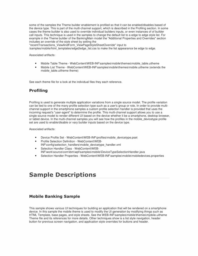
WPF Mobile Orders Simple
This sample shows how to keep the same basic UI and apply some minor modifications to enable the content to fit on a mobile device as well as change the overall color scheme. In this sample the look is changed by applying the mobile_table theme. The Theme is used to control the base pages and style sheets used by the View and Form builder as well as change the paging UI style. In order to fit the table on a restricted mobile device space the Data Field Settings builder is used to hide some of the columns when rendering on a smartphone. To enable multi-channel support the mobile_device_type Profile Set is used along with the Mobile Device Type selection handler. The Mobile Device Type handler looks at the client device type "user-agent" to determine which profile to use when generating the application. The Profile entries are used to vary the model Theme, View and Form, and Data Field Settings. A mobile Theme is used to vary the look and feel of the application. The mobile theme is used to modify the

UI generation by modifying things such as base pages, and style sheets. See the WEB-INF\samples\mobile\themes\mobile_table.uitheme Theme file and its references for more details.
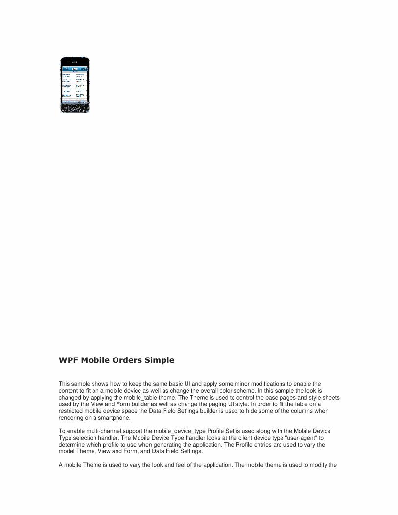
WPF Mobile Sales Orders
This model is profiled so that when you run in a desktop browser, you will see the default display which includes a table with several columns. When you run in a smartphone device, the "Smartphone" profile is selected, and the list view is a vertical list of clickable blocks.


To enable multi-channel support the mobile_device_type Profile Set is used along with the Mobile Device Type selection handler. The Mobile Device Type handler looks at the client device type "user-agent" to determine which profile to use when generating the application. The Profile entries are used to vary the model Theme, View and Form, and Data Field Settings. A mobile Theme is used to vary the look and feel of the application. The mobile theme is used to modify the UI generation by modifying things such as HTML Template, base pages, and style sheets. See the WEB-INF\samples\mobile\themes\mobile.uitheme Theme file and its references for more details.
WPF Mobile Employee Photo Icons Sample
This samples shows how to change the default table layout to a list flow layout using the HTML Data Layout builder. The HTML Data Layout allows you to modify the layout of items that are created by Page Automation. In this sample the HTML for the layout uses a unordered list markup along with style sheet settings to control the layout. See the /samples/mobile/view/vf_ViewPage.html page to see how the unordered list is constructed.

WPF Mobile Tabbed Container
This sample shows how to create a tab container with a mobile look. The technique for this uses a Variable that contains the data for each tab item such as its display name, model, and style. A Repeated Region is used to enumerate the tabs in order to display them on the page. The Model Container builder is used to pull in the content for each tab.
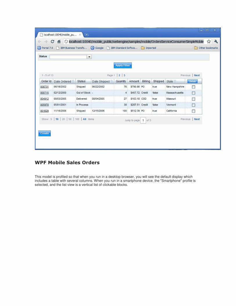
WPF Mobile GeoLocation NWS Weather Sample
This sample shows how to use the Browser's geolocation API to get the current device location, and then send that information back to the server. The geolocation API is part of the purposed HTML 5 specification and is supported by many of the leading edge browsers, such as those based on webkit. In this sample the geolocation is used as an input to a REST service call which is used to fetch the weather data. The technique for passing the geolocation data back to the server from the client in this samples uses a form on the page that contains hidden inputs for the longitude and latitude values. A link builder is added to the model in a hidden section that is used to submit the form values to a server action via AJAX request. The geolocation is obtained in a "DOMContentLoaded" event handler, which is invoked when the page is fully loaded. The "DOMContentLoaded" event handler's JavaScript fetches the geolocation using the Browser API, and then sets the longitude and latitude hidden input values. To submit the values the submit link is located, and then its onclick() function is called. The link's onclick() causes the form to be submitted to the server, and the target action to be invoked, which calls the weather REST service and redisplays the page.

WPF Mobile Orientation Change
This sample shows how to capture and process an orientation change event on the Android and Apple iPhone Smartphones and submit the orientation position back to the server. In this sample we will display fewer columns when in portrait mode, and show additional columns when in landscape. For simplicity this is visually done by using two separate pages. The technique for passing the data back to the server from JavaScript in this samples uses a form on the page that contains a single hidden input for the orientation value. A link builder is added to the model in a hidden page section that is used to submit the form orientation value to a server action. The orientation is obtained using a "onorientationchange" event handler for the iPhone and a "resize" event handler for the Android. The event handler's JavaScript fetches the window.orientation to detect portrait or landscape, and then sets the orientation hidden input value. To submit the value the submit link is located, and then its onclick() function is called. The link's onclick() causes the form to be submitted to the server, and the target action to be invoked, which chooses the page

to display.

Note
- When running many of these samples on WebSphere Portal with the Portal 6.1.5 sample IBM WebSphere Portal Mobile Theme you will notice that the styling of the portal theme has been adjusted to give the current portlet additional horizontal and vertical space. This styling change is done using the samples\mobile\html_templates\mobile_portal_override.css style sheet which is pulled in indirectly through the mobile theme.
The IBM WebSphere Portal Mobile Theme
Along with using this sample to learn how to develop portlets to run on mobile devices, you can use the IBM
WebSphere Portal Mobile Theme . Go the IBM Lotus and WebSphere Portal Business Solutions
Catalog to down load the sample code to jumpstart the development of a IBM WebSphere Portal themes for mobile devices such as the Apple iPhone, Blackberry, or Droid.