designing data platforms for action & influence: …
TRANSCRIPT

DESIGNING DATA PLATFORMS FOR ACTION & INFLUENCE: Lessons Learned From a Case Study of Five Data PlatformsSeptember 2021

TABLE OF CONTENTS
PROJECT OVERVIEW 2
FINDINGS 3Stakeholder Engagement 3
Communicating with Data Users 4Fulfilling Data Needs 5
Journalist Insights on Data Platforms 6Establishing Credibility 6Utility of Premade Graphics 7
Media Content Analysis 7News Articles 7Twitter 8Nightly News 9
Data Visualization Experiment 11
BEST PRACTICES 14
APPENDIX 16Platform Descriptions 16
City Health Dashboard 16Neighborhood Data for Social Change 16Opportunity Atlas 17Johns Hopkins Coronavirus Resource Center 17US COVID Atlas 18
Detailed Methodology 19 Interviews 19
Journalist Focus Groups and Panel 20Content Analysis of Media Coverage of Data Platforms 21 News Articles 21 Twitter 21 Nightly News 21
Experiment 21Data Collection and Sample 21
Study Design 21 Measures 22 Statistical Analysis 23 Graphics Used in the Experiments 24Graphs & Tables 27
Platform Comparison Matrix: Non-COVID Issue Areas 27Platform Comparison Matrix: Data Sources 27Platform Comparison Matrix: COVID Issue Areas 28
Local data provides policymakers, community organizers, and scholars with the tools needed to identify inequities and target resources for action. Disaggregated data allows these stakeholders to make decisions at a highly targeted level, with the ability to create precise solutions for specific audiences. Although many data platforms have emerged in recent years, the abundance of data platforms makes it increasingly difficult for users to discern which platform best meets their needs. And, data providers benefit from guidance on how to best showcase key features such as credibility, freshness of data, and the ability to stratefy and graphically depict results. In short, despite the wealth of data platforms, few guidelines exist on how to effectively communicate existing data, how to ensure that data is shared with those who can drive change, and how best to share and visualize data for the greatest impact.
This report identifies a set of best practices and features that enable data platforms to inform policy and practice and catalyze action towards health equity. By closely studying five data platforms — the John Hopkins Coronavirus Resource Center, University of Chicago COVID Atlas, City Health Dashboard, Neighborhood Data for Social Change and Opportunity Atlas — this report explores the specific needs each platform was designed to meet, and assesses their success reaching their intended audiences.
In this report, the term “data providers” will be used to describe the organizations that provide data resources for an intended set of users. Based on the data gathered and analyzed across the scope of this project, the research team identified the following recommendations for data providers seeking to share data to inform action and influence:
Clearly establish unique contributions Data providers should clearly articulate the unique contributions of their data resource compared to other platforms.
Keep data as current as possible The Covid-19 pandemic has underscored the need to make decisions based on the most recent data available. Users appreciate being able to easily access the date collected and method of sampling of a dataset.
Highlight indicators of credibility Journalists prefer relying on government data sources such as the United States Census, but also recognize university affiliation as an indicator of credibility.
Curate data for intended audiences A common request among users was to be able to easily identify data that is local to their communities or relevant to a specific geographic region. Additionally, users wanted data stratified by key demographics such as age, race, gender and income. Most platforms allow users to disaggregate the total population by one or two variables, such as age and gender, at a time. Some users were looking to run analyses showing the relationship between two or more variables. Different audiences (e.g., practitioner versus academic) require different kinds of data, communication strategies, and features. Therefore, it is critical that data managers understand the current and potential users of their platforms and are familiar with each audience’s unique data needs.
Design visualizations to meet users’ needs Based on findings from a series of experiments, simple graphics such as bar charts proved to be most effective at increasing information comprehension, whereas more complicated graphics (for example, line graphs representing change in different groups over time) may overwhelm general audiences and undermine retention. As found in the media analysis, however, simple data visualizations may be under-utilized. Testing and tweaking visual designs in response to user feedback can be a time-intensive process, but users and platform leaders agree that it is worthwhile.
DESIGNING DATA PLATFORMS FOR ACTION & INFLUENCE: LESSONS LEARNED FROM A CASE STUDY OF FIVE DATA PLATFORMS1
EXECUTIVE SUMMARY

DESIGNING DATA PLATFORMS FOR ACTION & INFLUENCE: LESSONS LEARNED FROM A CASE STUDY OF FIVE DATA PLATFORMS2
The Designing Data Platforms for Action and Influence project examined five data platforms with the goal of identifying best practices for communicating, sharing, and visualizing data platforms to drive action toward health equity. This project was a partnership between the USC Price Center for Social Innovation and the USC Annenberg School for Communication & Journalism, with support from the Robert Wood Johnson Foundation. The project aimed to understand the most successful ways to communicate often complex data about the social determinants of health. Researchers examined five data platforms, documenting and identifying successful engagement strategies used to drive action toward health equity. The platforms examined for this case study included the John Hopkins Coronavirus Resource Center, University of Chicago COVID Atlas, City Health Dashboard, Neighborhood Data for Social Change, and the Opportunity Atlas.
The John Hopkins Coronavirus Resource Center and University of Chicago COVID Atlas emerged in 2020 during the course of the pandemic and were included in the analysis to learn from this unique, fast moving, public health crisis. The four remaining platforms, launched between 2017–2018, were selected for their provision of data about the social determinants of health and equity at varying levels of geography and covering various cross-sector issue areas. All five of the platforms in this study seek to serve as data resources for users ranging from the general public to policy makers, and community groups. For a full description of each platform, please refer to the Appendix.
This research consisted of: interviews with the platform developers and data stakeholders, focus groups with journalists, a media content analysis to identify mentions of each platform (in news articles, nightly newscasts and on Twitter) and an experiment that tested the relative efficacy of different data visualizations in a COVID-related newspaper article (such as bar charts, maps, line graphs, pie charts, etc.) to ultimately influence readers’ COVID-related knowledge, attitudes, and behavior (wearing masks, socially distancing, washing hands, and getting vaccinated against COVID-19). The following section details key findings from these studies and concludes with best practices for the presentation of health and equity data.
PROJECT OVERVIEW
DESIGNING DATA PLATFORMS FOR ACTION & INFLUENCE: LESSONS LEARNED FROM A CASE STUDY OF FIVE DATA PLATFORMS3
Project findings stem from four separate but interrelated research projects:
1. STAKEHOLDER ENGAGEMENT: Researchers used in-depth interviews to determine how users experienced and engaged with each of the five data platforms.
2. JOURNALIST INSIGHTS: Researchers conducted focus groups of journalists with varying levels of data expertise in which they were asked to find specific information on each of the five da ta platforms, as well as provide insights on best practices in presenting data to the general public.
3. MEDIA CONTENT ANALYSIS: Researchers conducted a large-scale content analysis of how each of the five platforms were actually used in more traditional news channels including online and print news articles, nightly broadcast news, and on Twitter.
4. DATA VISUALIZATION EXPERIMENT: Researchers empirically tested the relative impact of different ways of presenting the same COVID-related data both visually and textually to 915 unvaccinated male participants who read a news article entitled “A Deadly Race between the Virus, Variants and Vaccination: Despite Vaccines Becoming Widely Available, COVID-19 Cases Continue to Rise, Variants Continue to Spread, and Progress Against the Virus in U.S. May Stall.”
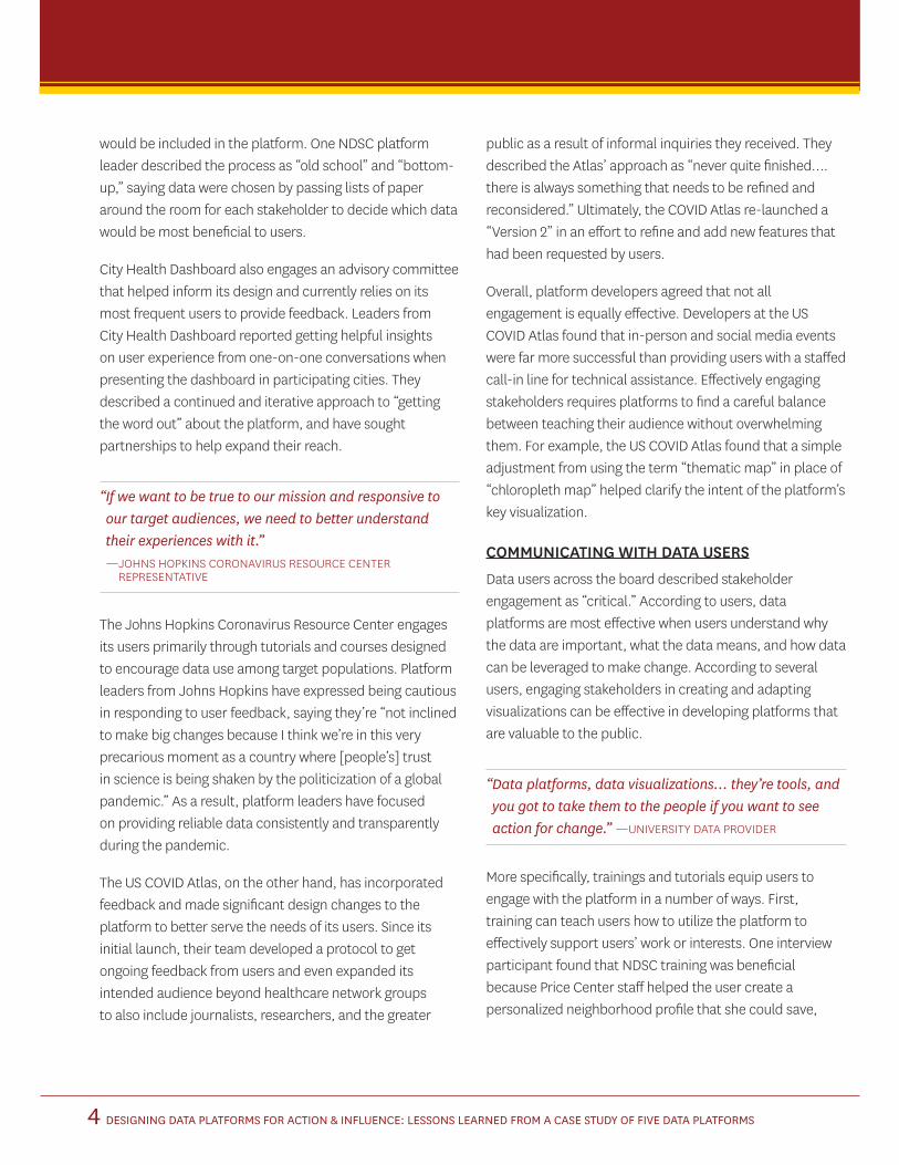
STAKEHOLDER ENGAGEMENT
Each platform in this study took a different approach to engaging stakeholders and media. Some platforms conducted their primary outreach activities in the run-up to the platform’s launch or during beta testing — what we’re calling “static engagement.” In contrast, others applied “dynamic engagement,” a more iterative strategy that continuously invites feedback to improve the platform. Platforms might adopt more static or dynamic engagement strategies depending on the audience, resources, project
needs and goals. This variety leads to a spectrum, where stakeholders are engaged based on what is most appropriate for platform. Figure 1 below shows a diagram depicting the spectrum of engagement offered by the five platforms that this project observed.
The Opportunity Atlas and Neighborhood Data for Social Change fall on opposite ends of this spectrum, with the rest of the platforms falling somewhere in between. The Atlas was designed to be a tool that should require little explanation, which lends itself to more static engagement. One representative described this nature by saying, “That’s what we envisioned the Atlas being — really intuitive. You didn’t need the Opportunity [Atlas] policy teams to guide you through it and tell you what’s in it and how to use it.” Stakeholders were invited to provide feedback in the design stage to refine the Atlas before launch. The Opportunity Atlas team then implemented an expansive engagement strategy targeted primarily to media. Since its highly publicized launch, Opportunity Atlas has positioned itself mainly on the receiving end of stakeholder engagement, fielding questions from users through email and social media.
On the other hand, the Neighborhood Data for Social Change (NDSC) has more dynamic and iterative engagement. Users are involved at multiple stages of development and kept engaged through monthly trainings and quarterly steering committee meetings. The initial NDSC development committee convened roughly 150 users and partners from across public, private, and non-profit sectors. The Price Center worked iteratively with that group in the early stages to determine what indicators
FINDINGS
OPPORTUNITYATLAS
CORONAVIRUS RESOURCE
CENTER
US COVIDATLAS
CITY HEALTHDASHBOARD
NEIGHBORHOOD DATA FOR SOCIAL CHANGE
DYNAMICENGAGEMENT
STATICENGAGEMENT
FIGURE 1: SPECTRUM OF USER ENGAGEMENT
DESIGNING DATA PLATFORMS FOR ACTION & INFLUENCE: LESSONS LEARNED FROM A CASE STUDY OF FIVE DATA PLATFORMS4
would be included in the platform. One NDSC platform leader described the process as “old school” and “bottom-up,” saying data were chosen by passing lists of paper around the room for each stakeholder to decide which data would be most beneficial to users.
City Health Dashboard also engages an advisory committee that helped inform its design and currently relies on its most frequent users to provide feedback. Leaders from City Health Dashboard reported getting helpful insights on user experience from one-on-one conversations when presenting the dashboard in participating cities. They described a continued and iterative approach to “getting the word out” about the platform, and have sought partnerships to help expand their reach.
“ If we want to be true to our mission and responsive to our target audiences, we need to better understand their experiences with it.” — JOHNS HOPKINS CORONAVIRUS RESOURCE CENTER
REPRESENTATIVE
The Johns Hopkins Coronavirus Resource Center engages its users primarily through tutorials and courses designed to encourage data use among target populations. Platform leaders from Johns Hopkins have expressed being cautious in responding to user feedback, saying they’re “not inclined to make big changes because I think we’re in this very precarious moment as a country where [people’s] trust in science is being shaken by the politicization of a global pandemic.” As a result, platform leaders have focused on providing reliable data consistently and transparently during the pandemic.
The US COVID Atlas, on the other hand, has incorporated feedback and made significant design changes to the platform to better serve the needs of its users. Since its initial launch, their team developed a protocol to get ongoing feedback from users and even expanded its intended audience beyond healthcare network groups to also include journalists, researchers, and the greater
public as a result of informal inquiries they received. They described the Atlas’ approach as “never quite finished…. there is always something that needs to be refined and reconsidered.” Ultimately, the COVID Atlas re-launched a “Version 2” in an effort to refine and add new features that had been requested by users.
Overall, platform developers agreed that not all engagement is equally effective. Developers at the US COVID Atlas found that in-person and social media events were far more successful than providing users with a staffed call-in line for technical assistance. Effectively engaging stakeholders requires platforms to find a careful balance between teaching their audience without overwhelming them. For example, the US COVID Atlas found that a simple adjustment from using the term “thematic map” in place of “chloropleth map” helped clarify the intent of the platform’s key visualization.
COMMUNICATING WITH DATA USERS
Data users across the board described stakeholder engagement as “critical.” According to users, data platforms are most effective when users understand why the data are important, what the data means, and how data can be leveraged to make change. According to several users, engaging stakeholders in creating and adapting visualizations can be effective in developing platforms that are valuable to the public.
“ Data platforms, data visualizations… they’re tools, and you got to take them to the people if you want to see action for change.” —UNIVERSITY DATA PROVIDER
More specifically, trainings and tutorials equip users to engage with the platform in a number of ways. First, training can teach users how to utilize the platform to effectively support users’ work or interests. One interview participant found that NDSC training was beneficial because Price Center staff helped the user create a personalized neighborhood profile that she could save,
DESIGNING DATA PLATFORMS FOR ACTION & INFLUENCE: LESSONS LEARNED FROM A CASE STUDY OF FIVE DATA PLATFORMS5
thereby increasing the likelihood that she would return to the platform in the future. Tutorials, on the other hand, provide instructions that users can access at any time. While tutorials may not be immediately responsive to a particular user’s needs, they are easily accessible and don’t require users to wait for the next available training.
Similarly, storytelling can demonstrate to users how the platform, or data more generally, can be leveraged to support their work. Multiple interviewees stated that data stories help make the platforms relevant to their lives and greater work. US COVID Atlas developers assert that storytelling helped validate users’ lived experiences in the absence of clear government communication.
“ We have this rule, no data without stories, no stories without data. That’s what drove me (to Opportunity Atlas). I was looking for that story piece of it.” —PRIVATE SECTOR DATA PROVIDER
Platform developers and users alike recommended engaging partners in communicating data. Partnerships can give platforms access to target communities and act as liaisons between platforms and users. When creating stories to accompany data, platforms should be careful to work with communities to align narratives. According to one user, “we tend to create the narrative for these spaces, and that’s not often how [residents] speak about their own communities.”
“ As COVID got worse over time and it became clear the policy response wasn’t improving, it seems like one of the only things that really convinced people that what they were experiencing is real [was] story mapping, being able to tell narratives…” —US COVID ATLAS REPRESENTATIVE
FULFILLING DATA NEEDS
Across all user interviews, three features emerged as highly desired in a data platform: Data available in real-time Data disaggregated by subpopulation Data available at a granular level
Users and platform developers alike stated that they would like platforms to have the ability to disaggregate data by subpopulation. This may include datasets broken down by demographic characteristics such as race, ethnicity, or gender — which can help expose inequity in health outcomes and resource allocation. According to interviewees from Johns Hopkins, disaggregated datasets can help alleviate blind spots that perpetuate inequities. When data is broken down by subpopulation, it can illuminate where disparities are happening, allowing policymakers to act to address those disparities. Otherwise, systemic aggregation of data can limit the ability to target resources efficiently.1 Visualizations can also be powerful in illustrating disparate outcomes across subpopulations. Awareness through maps can help communities better visualize the disparities across metropolitan regions.2 For example, the US COVID Atlas offers a unique map overlay highlighting health indicators and outcomes within Native American Reservations, hyper-segregated cities, and Black Belt counties.
“ We’re talking very conservatively about anti-racism and the role of health care ….looking at data by subpopulation, I feel like it’s still a little bit uncomfortable. Not uncomfortable to do it, but uncomfortable to synthesize it in a way that I hope and believe might have a greater impact than what we’ve been able to do.” —HEALTHCARE ADMINISTRATOR
1 Kauh, T. J., Read, J. N. G., & Scheitler, A. J. (2021). The Critical Role of Racial/Ethnic Data Disaggregation for Health Equity. Population Research and Policy Review, 40(1), 1-7. Ross, A. (2017, Sep.). Powering Health Equity Action with Online Data Tools: 10 Design Principles. PolicyLink and Ecotrust.
2 Finio, N., Lung-Amam, W., Knaap, G. J., Dawkins, C., & Wong, B. (2020). Equity, Opportunity, Community Engagement, and the Regional Planning Process: Data and Mapping in Five US Metropolitan Areas. Journal of Planning Education and Research.

DESIGNING DATA PLATFORMS FOR ACTION & INFLUENCE: LESSONS LEARNED FROM A CASE STUDY OF FIVE DATA PLATFORMS6
Like the Opportunity Atlas, some platforms are designed using annual data sets to illuminate trends over time. The emergence of COVID-19, however, revealed for users the influential impact that real-time data can have on knowledge and behavior. Multiple users cited a desire for data that is frequently updated. Platform developers acknowledged that regular updates and constant monitoring are ideal, but limited capacity and data availability inhibits their ability to provide data near real-time. This is congruent with similar studies which identified real-time data as a factor for making data more “actionable.”3
When asked what data they wanted, most data users responded that they would like data at more granular levels. Geographically, users preferred neighborhood-level and census tract-level data but acknowledged how challenging it is to obtain. City- and county-level data, said one interviewee, often fail to capture the dramatic differences between neighborhoods.
“ Everything that was available to us was either at the county level, or the city level, which even at the city level, is not helpful to us because we very well know our neighborhood in the south is completely different from our neighborhood to the north.” —LOCAL GOVERNMENT EMPLOYEE
Multiple interviewees spoke about the disconnect between how data users view their communities and the geographic level at which data is most often available. Some users also wanted more transparency in local business data specifically because the data would provide users the ability to analyze disparities for certain neighborhoods, but acknowledged the challenge in keeping it up-to-date. Platform leaders routinely face the trade-off between making data available at a local level and keeping it updated regularly.
“ If we have a local map, people can locate themselves in it like, ‘Oh, that’s my neighborhood,’ or ‘That’s where my grandmother used to live.’ They’re relating to it in personal terms, and they can see themselves or their community in what’s being depicted on the map.’ —UNIVERSITY DATA PROVIDER
JOURNALIST INSIGHTS ON DATA PLATFORMS
Journalists play a crucial role in driving awareness about specific data platforms. Indeed, journalists frequently use data to shape and enhance stories, and should be considered key stakeholders when designing data platforms. Further, their user experience with data platforms directly affects whether accurate interpretations are communicated to the general public through news stories. Through a series of focus groups, we asked journalists to discuss their data needs and to provide feedback on each of the five data platforms.
“ I quite liked that there’s the methods tab....so that you’re able to understand how they got the data that they have.” —JOURNALIST, LOCAL NEWS
ESTABLISHING CREDIBILITY
Journalists expressed the importance of establishing a platform’s credibility. Several journalists described time-consuming processes they engage in to learn more about a new source of data before being willing to trust the data. Journalists noted a number of ways that a platform could communicate credibility, including transparency around how the data collection is funded, a clear explanation of data collection methods (e.g., sampling, when and where collected), intelligible definitions of variables. The journalists particularly felt that a platform that provided the “raw” data for further analysis was more trustworthy
3 Petit, K., Howell, B. (2016). Assessing the Landscape of Online Health and Community Indicator Platforms. Urban Institute.

DESIGNING DATA PLATFORMS FOR ACTION & INFLUENCE: LESSONS LEARNED FROM A CASE STUDY OF FIVE DATA PLATFORMS7
than one that did not. Finally, a platform being associated with a university enhanced confidence that it was a credible source of data. As one journalist noted, “the Logo tells me that this is associated with a reputable university.”
UTILITY OF PREMADE GRAPHICS
All of the journalists interviewed were freelance journalists, and therefore had little control over whether and what type of graphics would be included in published stories. However, they all believed that some visualization of data would be useful for their stories. Further, the journalists who were not data experts reported that visual representations of data helped them better understand how issues differed by key demographics such as location, gender, age or race, which, in turn, better equipped them as journalists to tell important stories.
MEDIA CONTENT ANALYSIS
In addition to examining stakeholder engagement and journalist insights into the five data platforms, the research team also conducted a content analysis across various media channels, media channels (print news articles, tweets on Twitter, and television nightly news) to assess the exposure, use, and visibility of the five data platforms. A variety of computerized search engines were used to identify references to each of the five platforms mentioned between January 1, 2020 and December 31, 2020. Once an article, tweet or televised news story referencing one of the data platforms was identified, human coders assessed the content of each article on a number of dimensions including:
Media outlet (news articles, tweets, broadcast news)
Data platform (City Health Dashboard, Neighborhood Data for Social Change, Opportunity Atlas, Johns Hopkins Coronavirus Resource Center, and University of Chicago COVID Atlas),
Localization of data (local, county-level, state-level, regional, national, global)
Type of data visualization (bar graph, infographic, line graph, map, table/chart)
Topic of data (health, built environment, environmental, medical care, social, and COVID-19)
NEWS ARTICLES
Searches using both Lexis-Nexis and Critical Mentions search engines revealed a total of 506 unique online and print news articles that mentioned one of the five data platforms during 2020.
Data Visualizations. One of the primary goals of this project was to assess both the frequency and type of platform-related data visualizations currently being used by journalists. Although all 506 articles included data in the text, our search revealed a total of only 194 graphics identified across 94 separate print news articles, representing only 18.5% of the total number of articles coded (N=506). This means that articles that featured visualized data had on average two graphics per article. But not all of the 194 graphics in our sample were from the data platforms we studied. Indeed, only 54 graphics included in our sample of articles used data derived from one of the five platforms in this study.
The content analysis also revealed that journalists were likely to draw from multiple data sources. Moreover, even in this sample of articles who cited at least one the five data platforms, roughly only one in four included visualized data from the mentioned platform. In other words, journalists were more likely to either design their own data graphic or include a graphic from another source. Perhaps providing simple but photo ready graphics of key findings might attract more journalists to a platform who would, in turn, encourage other users.
DESIGNING DATA PLATFORMS FOR ACTION & INFLUENCE: LESSONS LEARNED FROM A CASE STUDY OF FIVE DATA PLATFORMS8
The most frequently used data visuals were static maps, which were found 25 times in the dataset (Table 1). Other prominent types of data visualization included line graphs, infographics, and interactive maps.
Visualization of data was found across national media, including Breitbart, Business Insider, CNBC, CNN, Daily Beast, Forbes, Fox News, NBC News, Time magazine,
USA Today, Vox, and the Washington Post. These findings point to promising areas of growth for platforms within media coverage and perhaps an opportunity to further educate journalists on the full spectrum of data contained within each platform site.
Data Topic. As noted in Table 2, the coded news articles citing the data platforms dealt mostly with COVID-19 and other health issues. It is important to note that even with COVID dominating the news, journalists were still interested in using non-health data within these platforms. This also may indicate a desire by journalists to provide deeper insights of underlying issues affecting communities.
Searches using both an advanced search query within the Twitter platform and a sampling of the top 100 tweets per month in a large COVID-19 twitter data
repository revealed a total of 1,129 tweets that mentioned one of the five data platforms.
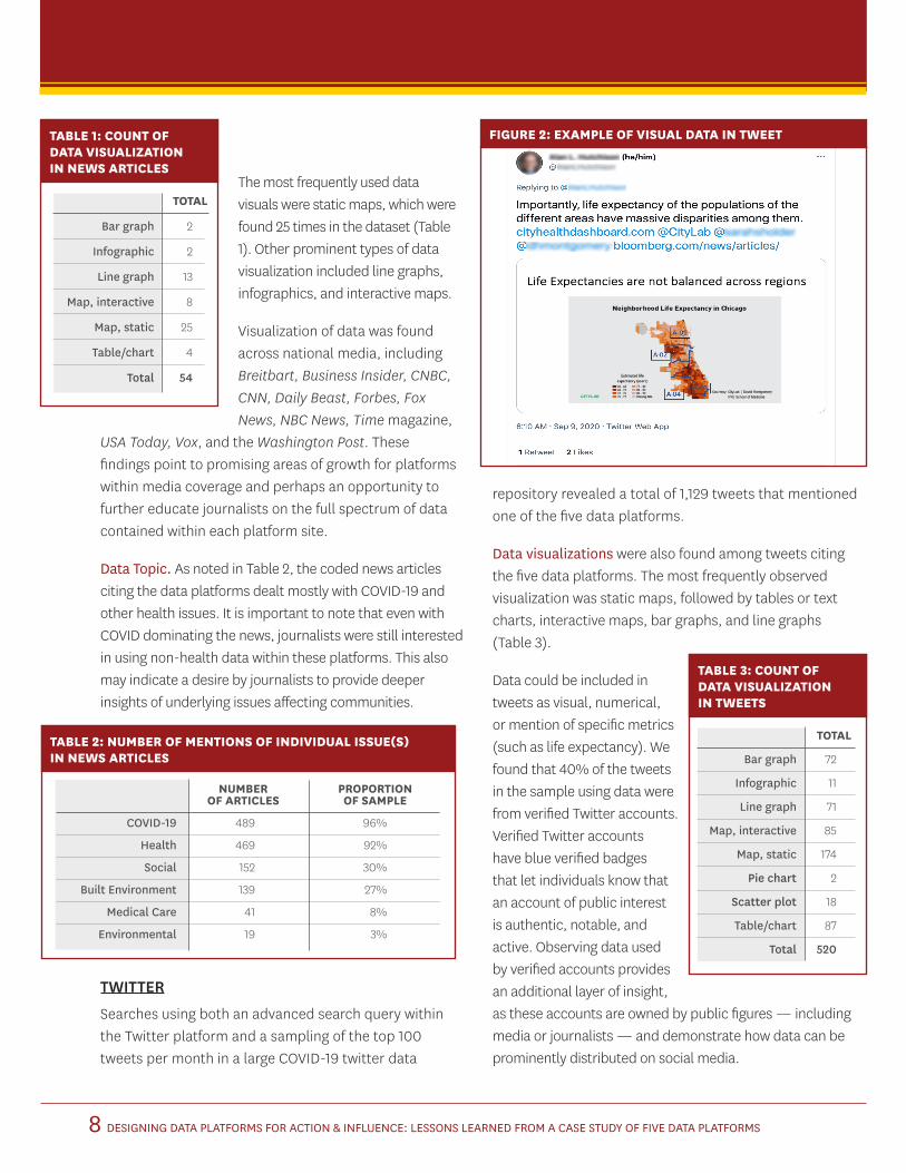
Data visualizations were also found among tweets citing the five data platforms. The most frequently observed visualization was static maps, followed by tables or text charts, interactive maps, bar graphs, and line graphs (Table 3).
Data could be included in tweets as visual, numerical, or mention of specific metrics (such as life expectancy). We found that 40% of the tweets in the sample using data were from verified Twitter accounts. Verified Twitter accounts have blue verified badges that let individuals know that an account of public interest is authentic, notable, and active. Observing data used by verified accounts provides an additional layer of insight, as these accounts are owned by public figures — including media or journalists — and demonstrate how data can be prominently distributed on social media.
FIGURE 2: EXAMPLE OF VISUAL DATA IN TWEET
TABLE 3: COUNT OF DATA VISUALIZATION IN TWEETS
TOTAL
Bar graph 72
Infographic 11
Line graph 71
Map, interactive 85
Map, static 174
Pie chart 2
Scatter plot 18
Table/chart 87
Total 520
TABLE 2: NUMBER OF MENTIONS OF INDIVIDUAL ISSUE(S) IN NEWS ARTICLES
NUMBER PROPORTION OF ARTICLES OF SAMPLE
COVID-19 489 96%
Health 469 92%
Social 152 30%
Built Environment 139 27%
Medical Care 41 8%
Environmental 19 3%
TOTAL
Bar graph 2
Infographic 2
Line graph 13
Map, interactive 8
Map, static 25
Table/chart 4
Total 54
TABLE 1: COUNT OF DATA VISUALIZATION IN NEWS ARTICLES

DESIGNING DATA PLATFORMS FOR ACTION & INFLUENCE: LESSONS LEARNED FROM A CASE STUDY OF FIVE DATA PLATFORMS9
The majority of tweets in the corpus did not include media coverage (defined as a link to a news article within the tweet), however, some media coverage was found in tweets about each of the five platforms.
Data Topic. As with the news articles, the majority of tweets in the entire dataset were about COVID-19 or other health issues. When looking at the three non-COVID platforms, tweets were also largely about social issues and built environment (Table 4). While tweets mentioning COVID-19
platforms predominantly featured conversations or discussions about a topic, tweets including non-COVID-19 platform mentions were largely focused on promotion of the platforms themselves, by both institutional accounts and people who found the platforms useful.
NIGHTLY NEWS
Searches on Critical Mention of the evening news broadcasts did not yield any findings of national nightly news coverage for four of the five platforms. Thus, a targeted exploration of how the Johns Hopkins Coronavirus Resource Center platform was utilized in U.S. national nightly news programs was conducted. Three nightly news programs were selected as representatives of left-leaning (Anderson Cooper 360, CNN), right-leaning (Special Report with Bret Baier, Fox), and center (NewsHour, PBS) news programs as defined by Pew Research Center and AllSides Media Bias Ratings.4 The resulting data set included 78 newscasts in 2020: 35 unique Anderson Cooper 360 (CNN) nightly newscasts, 23 unique Special Report with Bret Baier (Fox) nightly newscasts, and 20 unique NewsHour (PBS) nightly newscasts (Table 5).
TABLE 4: NUMBER OF MENTIONS OF INDIVIDUAL ISSUE(S) IN TWEETS
NUMBER PROPORTION OF TWEETS OF SAMPLE
COVID-19 654 58%
Health 809 71%
Social 347 30%
Built Environment 349 30%
Medical Care 121 10%
Environmental 45 4%
4 Pew Research Center: https://www.journalism.org/2014/10/21/political-polarization-media-habits/ and AllSides Media Bias Ratings: https://www.allsides.com/media-bias/media-bias-ratings
TABLE 5: NUMBER OF MENTIONS OF INDIVIDUAL ISSUE(S) IN NEWS PROGRAM
COVID-19 HEALTH SOCIAL BUILT MEDICAL ENVIRONMENTAL TOTAL NUMBER ENVIRONMENT OF NEWSCASTS
CNN 35 35 30 30 23 2 35
FOX 23 23 17 21 5 1 23
PBS 20 20 16 17 8 0 20
TOTAL 78 78 63 68 36 3 78 (Proportion of all newscasts) (100%) (100%) (80%) (87%) (47%) (4%) (100%)

DESIGNING DATA PLATFORMS FOR ACTION & INFLUENCE: LESSONS LEARNED FROM A CASE STUDY OF FIVE DATA PLATFORMS10
Data visualizations were a prominent means of sharing COVID-19 data in nightly news segments. Table 6 below details the number and types of data visuals by news program. The most prominent data graphics used were numerical charts (30.3%), followed by line graphs (22.2%), static maps (17.1%), and bar graphs (13.1%). We found that Anderson Cooper 360 (CNN) incorporated interactive maps in several nightly news segments, as did NewsHour (PBS), but Special Report with Bret Baier (Fox) did not. However, Special Report with Bret Baier (Fox) most regularly featured numerical data graphics (numbers or percentages) to present COVID-19 data within their nightly news segments (63.6%). Interestingly, across all
three news programs, we identified 65 instances where COVID-19 data was shared verbally with no source or attribution. Additionally, we identified 28 instances of data visualizations without any visual attribution. The lack of data attribution — both visually and spoken — presents an interesting challenge for any data platform looking to share accurate information while relying on media to both represent the platform as a source of data and accurately report on the data figures provided by the platform. One possible solution would be for platforms to provide graphics themselves that would include attribution that would have to be physically removed if used.
Not surprisingly, national news coverage in this dataset focused primarily on COVID-19 related health issues (24.7%) and COVID-19 medical issues (23.8%) across all three combined nightly news programs. Built environment (21.5%) and social (20%) issues were also prominently identified within all three combined nightly news programs.
FIGURE 3: EXAMPLE OF INTERACTIVE MAP USED FOR DATA VISUALIZATION ON ANDERSON COOPER 360 (CNN)
FIGURE 4: EXAMPLE OF NUMERICAL DATA VISUALIZATIONS FAVORED BY SPECIAL REPORT WITH BRET BAIER (FOX)
TABLE 6: COUNT OF DATA VISUALIZATION BY NEWS PROGRAM
CNN FOX PBS TOTAL
Bar graph 11 0 2 13
Infographic 1 0 0 1
Line graph 10 6 6 22
Map, interactive 3 0 1 4
Map, static 7 5 5 17
Numerical 0 21 9 30
Pie chart 1 0 0 1
Table/chart 0 1 6 7
DESIGNING DATA PLATFORMS FOR ACTION & INFLUENCE: LESSONS LEARNED FROM A CASE STUDY OF FIVE DATA PLATFORMS11
DATA VISUALIZATION EXPERIMENT
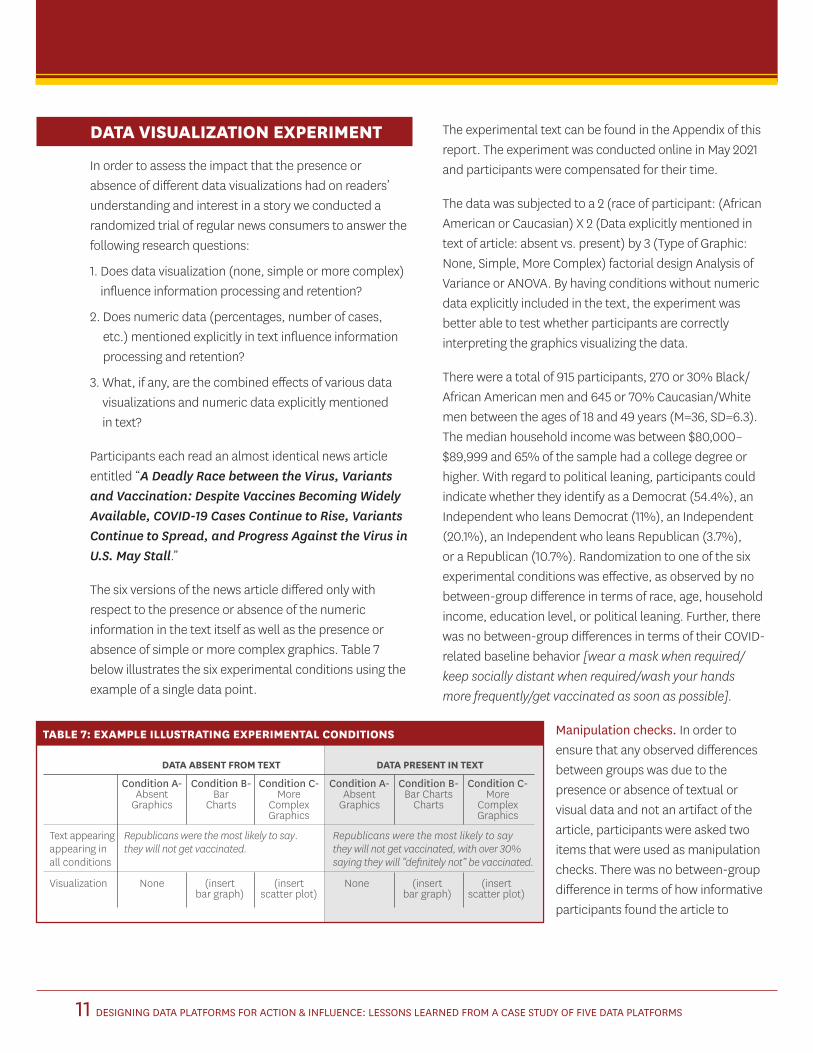
In order to assess the impact that the presence or absence of different data visualizations had on readers’ understanding and interest in a story we conducted a randomized trial of regular news consumers to answer the following research questions:
1. Does data visualization (none, simple or more complex) influence information processing and retention?
2. Does numeric data (percentages, number of cases, etc.) mentioned explicitly in text influence information processing and retention?
3. What, if any, are the combined effects of various data visualizations and numeric data explicitly mentioned in text?
Participants each read an almost identical news article entitled “A Deadly Race between the Virus, Variants and Vaccination: Despite Vaccines Becoming Widely Available, COVID-19 Cases Continue to Rise, Variants Continue to Spread, and Progress Against the Virus in U.S. May Stall.”
The six versions of the news article differed only with respect to the presence or absence of the numeric information in the text itself as well as the presence or absence of simple or more complex graphics. Table 7 below illustrates the six experimental conditions using the example of a single data point.
The experimental text can be found in the Appendix of this report. The experiment was conducted online in May 2021 and participants were compensated for their time.
The data was subjected to a 2 (race of participant: (African American or Caucasian) X 2 (Data explicitly mentioned in text of article: absent vs. present) by 3 (Type of Graphic: None, Simple, More Complex) factorial design Analysis of Variance or ANOVA. By having conditions without numeric data explicitly included in the text, the experiment was better able to test whether participants are correctly interpreting the graphics visualizing the data.
There were a total of 915 participants, 270 or 30% Black/African American men and 645 or 70% Caucasian/White men between the ages of 18 and 49 years (M=36, SD=6.3). The median household income was between $80,000–$89,999 and 65% of the sample had a college degree or higher. With regard to political leaning, participants could indicate whether they identify as a Democrat (54.4%), an Independent who leans Democrat (11%), an Independent (20.1%), an Independent who leans Republican (3.7%), or a Republican (10.7%). Randomization to one of the six experimental conditions was effective, as observed by no between-group difference in terms of race, age, household income, education level, or political leaning. Further, there was no between-group differences in terms of their COVID-related baseline behavior [wear a mask when required/keep socially distant when required/wash your hands more frequently/get vaccinated as soon as possible].
Manipulation checks. In order to ensure that any observed differences between groups was due to the presence or absence of textual or visual data and not an artifact of the article, participants were asked two items that were used as manipulation checks. There was no between-group difference in terms of how informative participants found the article to
DATA ABSENT FROM TEXT DATA PRESENT IN TEXT
Condition A- Condition B- Condition C- Condition A- Condition B- Condition C- Absent Bar More Absent Bar Charts More Graphics Charts Complex Graphics Charts Complex Graphics Graphics
Text appearing Republicans were the most likely to say. Republicans were the most likely to say appearing in they will not get vaccinated. they will not get vaccinated, with over 30% all conditions saying they will “definitely not” be vaccinated.
Visualization None (insert (insert None (insert (insert bar graph) scatter plot) bar graph) scatter plot)
TABLE 7: EXAMPLE ILLUSTRATING EXPERIMENTAL CONDITIONS

DESIGNING DATA PLATFORMS FOR ACTION & INFLUENCE: LESSONS LEARNED FROM A CASE STUDY OF FIVE DATA PLATFORMS12
be. Overall, participants found the article to be highly informative (M=8.92 out of 10, SD=1.51). Looking at how difficult participants found the article to understand, there was a main effect of data in the text, F(1, 914)=4.47, p<.05, with those who had numerical data presented in the text finding it to be less difficult to understand (M=2.66, SD=2.33) than those for whom this textual data was absent (M=3.04, SD=2.51). This finding is consistent with prior research in psychology and message construction showing that reading leads to deeper, more lasting information processing.5
As a final manipulation check, the experiment found that the article itself had an impact on behavioral intent (Table 5). Using a paired samples t-test of the entire sample, researchers found a statistically significant difference in behavioral intent t=12.02, p<.001, such that participants are more likely to get vaccinated as soon as possible after reading the article (M=7.77, SD=2.8) than before (M=7.01, SD=3.02). This finding remains when looking at participants separately by race, which is expected, given persistent disparities in vaccine acceptance, due to a combination of hesitancy and structural barriers.6 This means that there was an effect of reading the article, and there was a greater positive change in behavioral intent among African American men (mean change of 0.9 on a 10-point scale) than Caucasian/white men (mean change of 0.7 on a 10-point scale).
Findings. The first research question asked whether the inclusion of graphically visualized data influences readers’ information processing and retention. The experiment measured participants’ graphic knowledge by testing their ability to retain four facts that were visualized in different ways: bar charts, complex graphics, or not at all. There was a statistically significant main effect of the graphic condition, F(2, 914)=4.27, p<.01, such that those who saw bar graphs had a higher score (M =2.32, SD=1.08) than both no graphics (M=2.02, SD=1.11) and more complex graphics (M=2.04, SD=1.17). There was no effect of race on graphic knowledge score.
9
8
7
6
5
4
3
2
1
FIGURE 5: MEANS FOR INTENT TO GET VACCINATED BEFORE AND AFTER READING ARTICLE
African American
5.46a
6.36b
7.01c7.77d7.7d
8.4e
Caucasian Overall Sample
Baseline Post article
Note: Bars with a shared alphabetic subscript are not statistically significantly different from one another. Bars that do not share the same letter are statistically different from one another. For example, the difference between baseline and post article attitudes among African Americans is statistically significant, but the difference between baseline Caucasian attitudes and post article Overall Sample attitudes is not.
5 Petty, R. E., & Cacioppo, J. T. (1986). Elaboration likelihood model. In L. Berkowitz (Ed.), Advances in experimental social psychology (Vol. 19, pp. 123–205). Academic Press.
6 Bajaj, S. S., & Stanford, F. C. (2021). Beyond Tuskegee — Vaccine distrust and everyday racism. The New England Journal of Medicine, 2.; Quinn, S., Jamison, A., Musa, D., Hilyard, K., & Freimuth, V. (2016). Exploring the continuum of vaccine hesitancy between African American and White adults: Results of a qualitative study. PLoS Currents, 8. https://urldefense.com/v3/__https://doi.org/10.1371/currents.outbreaks.3e4a5ea39d8620494e2a2c874a3c4201__;!!LIr3w8kk_Xxm!5EMtRRq6Imh8z6G6LXxsXf1UYTl219yP5nS_oONZjuUaaQ8Jf9zWSDJYT80O3xn74Etg$ https://doi.org/10.1371/currents.outbreaks.3e4a5ea39d8620494e2a2c874a3c4201
DESIGNING DATA PLATFORMS FOR ACTION & INFLUENCE: LESSONS LEARNED FROM A CASE STUDY OF FIVE DATA PLATFORMS13
The second research question asked whether the explicit inclusion of numeric data such as percentages or specific number of cases influenced readers’ processing and retention of key facts. Indeed, there was a main effect of having data explicitly included in the text of the article, F(1,914)=27.83, p<.001, such that participants who had numerical data in the text remembered more facts (M=2.29 out of 4, SD=1.13) than those who did not have numerical data in the text (M=1.71, SD=1.03).
The third research question asked if there is a combined effect of graphics and including specific data such as percentages, case totals, etc. The answer is yes. The combination of simple graphics with specific numeric data included in text yields the highest knowledge gain and retention of key facts.
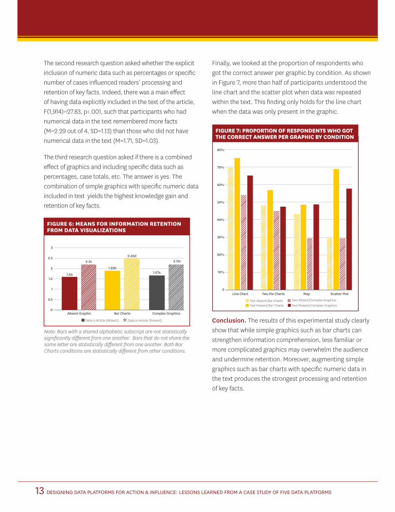
Finally, we looked at the proportion of respondents who got the correct answer per graphic by condition. As shown in Figure 7, more than half of participants understood the line chart and the scatter plot when data was repeated within the text. This finding only holds for the line chart when the data was only present in the graphic.
FIGURE 7: PROPORTION OF RESPONDENTS WHO GOT THE CORRECT ANSWER PER GRAPHIC BY CONDITION
80%
70%
60%
50%
40%
30%
20%
10%
0Line Chart Two Pie Charts Map Scatter Plot
Text Absent/Bar Charts Text Absent/Complex GraphicsText Present/Bar Charts Text Present/Complex Graphics
Conclusion. The results of this experimental study clearly show that while simple graphics such as bar charts can strengthen information comprehension, less familiar or more complicated graphics may overwhelm the audience and undermine retention. Moreover, augmenting simple graphics such as bar charts with specific numeric data in the text produces the strongest processing and retention of key facts.
FIGURE 6: MEANS FOR INFORMATION RETENTION FROM DATA VISUALIZATIONS
Absent Graphic
1.6a
2.2c
1.67a1.89b
2.49d
Bar Charts Complex Graphics
Data in Article (Absent) Data in Article (Present)
Note: Bars with a shared alphabetic subscript are not statistically significantly different from one another. Bars that do not share the same letter are statistically different from one another. Both Bar Charts conditions are statistically different from other conditions.
3
2.5
2
1.5
1
0.5
0
2.19c
DESIGNING DATA PLATFORMS FOR ACTION & INFLUENCE: LESSONS LEARNED FROM A CASE STUDY OF FIVE DATA PLATFORMS14
Based on the data gathered and analyzed, the research team has identified the following recommended data practices for data providers seeking to share data for health equity, influence, and change.
Clearly Establish Unique Contributions Data providers should begin with surveying the field to determine a specific gap that their platform can be equipped to address. These unique contributions need to be clearly communicated by the platform owners by highlighting the benefit of the platform compared to other existing data resources. As expressed by both developers and data users, each platform should provide users with a unique angle, complementing one another without overwhelming the user with too much data.
Highlight Indicators of CredibilityCredibility must also be established to gain users and trust. This includes transparency about data sources and methods of analysis. Trustworthiness can be demonstrated by clear definitions of variables communicated in a way that the end-user understands. For example, Neighborhood Data for Social Change has a “Learn More” page for users to further detail data sources and describes why certain variables are important to measure. This is particularly true when considering community groups, who may be unfamiliar with methodological and sampling terminology, as data users (Finio, Lung-Amam, & Wong, 2020). In contrast, highly data-literate users may prefer to see full “raw” datasets with detailed methodology descriptions, technical appendices, and citations to government data sources. Similarly, building relationships with diverse target audiences gives platforms conduits through which to access feedback and improve user experience. Establishing relationships with targeted audiences can help empower users — particularly those represented in the data. One data provider interviewed in this study stated that platforms that seek to advance health equity
must make intentional decisions about the communities they seek to empower and prioritize those relationships in their work.
Curate Data for Intended AudiencesNot all data, communication strategies, and features are equally effective and interesting across multiple audiences. For example, while access to raw data is important for certain users such as expert journalists or academics, access to infographics and summaries may be more useful for non-data expert journalists and lay users. A growing trend in open data is finding a way to serve both types of users; as one user put it, “both making good intuitive tools that novice users can [access] to look up the information they need, as well as making that backend data available for researchers and analysts.”
Many types of data users are looking to dig into granular and highly relevant trends through features like data disaggregation and hyper-local units of geography. Data that can be stratified by key demographics such as age, race, gender and income can identify gaps or disparities. This makes multiple cross tabulations important for analyzing data for equity purposes. Additionally, perhaps because of the COVID-19 epidemic and the inclusion of two COVID-specific platforms in our analysis, the most common request among both our general population and journalist users was to be able to easily identify data relevant to a more granular geographic region. Some platforms in the study that had this ability to search by geographic location made this more prominent in the layout of the site and intuitive by incorporating interactive maps. Platforms where such geographic specificity was either not available or was difficult to navigate resulted in user frustration.
“ People are often scared of data or intimidated by it, but data stories make it very easy to understand.” —NEIGHBORHOOD DATA FOR SOCIAL CHANGE REPRESENTATIVE
BEST PRACTICES
DESIGNING DATA PLATFORMS FOR ACTION & INFLUENCE: LESSONS LEARNED FROM A CASE STUDY OF FIVE DATA PLATFORMS15
Platforms can also provide a richer user experience by complementing visualizations with other elements, including expert interpretation and data stories. Doing so can help users interpret the data and frame data in a more nuanced way. Multiple interviewees suggested pairing visualizations with stories and analyses that humanize the communities depicted and highlight community strengths in addition to inequities. One user suggested conducting asset-based analyses to track success within communities. For example, Johns Hopkins complemented coronavirus data with map and chart visualizations, expert analysis, and online learning modules to help users understand what the data was saying about the virus.
“ That’s the recipe that we try to follow — ensuring that it’s not just data there, but there’s some partnership and communication with communities that are reflected in the data and showing some kind of path forward or examples of how to make change.” —UNIVERSITY DATA PROVIDER
Given these considerations, platforms should curate data intentionally and clearly communicate what data the platform provides and how users can find what they need. One user summarized this point, saying, “less data that is regularly updated and scrutinized to make sure it’s accurate is probably better than trying to do everything.” Sometimes this may require translating language for users to make the platform more navigable.
“ Rather than just mapping things, how you map it actually can change how you understand it.” —US COVID ATLAS REPRESENTATIVE
Design Visualizations to Meet the Needs of Users Platforms should think carefully about the best way to illustrate different data through visualizations. As noted in the experiment, bar graphs may be a simple, yet effective means of communicating trends and ensuring information retention among the general public. Similarly, journalists with less experience with data, may benefit from auto-generated visualizations on these platforms that can be easily downloaded for use.
While every platform in this study utilizes interactive maps to display data, some users stated that more simple visualizations, such as infographics, can effectively communicate essential insights as well. Engaging users in the design process can help platforms develop visualizations that effectively tell compelling data stories and share data. Testing and tweaking visual designs in response to user feedback can be a time-intensive process, but users and platform leaders agreed that it is worthwhile.
Much of the value users gain from data platforms is the ability to use data to achieve specific insights. As such, it is crucial for platforms to understand who their users are, who might be seeing the data beyond those users, and how a platform can create the most impact with data. Platforms should consider these findings while making deliberate decisions about how their data is used and viewed. As data continues to be used to drive even more specific and powerful decision-making, platforms should be particularly intentional about optimizing for users and audiences.
DESIGNING DATA PLATFORMS FOR ACTION & INFLUENCE: LESSONS LEARNED FROM A CASE STUDY OF FIVE DATA PLATFORMS16
Platform DescriptionsDuring interviews, we asked each organization for a description of their data platform, its purposes, and target audiences. This information is provided below (for a summary table see Graphs & Charts in the Appendix).
CITY HEALTH DASHBOARD
The City Health Dashboard was developed in 2018 to foster greater health by creating a resource that makes data readily available at the city or sub-city level. Its stated mission is to equip cities with a one-stop resource for comprehensive, reliable data to help them build healthier and more equitable communities. While public health data are widely available at the state and county levels, City Health developers observed that city leaders did not have access to data specific to the geographies where they worked. Platform leaders reported hearing from data users who said, “Yes, I know the smoking rate for the county, but I don’t know it for my city or the neighborhoods in my city. It’s a little hard for me to take action because I can’t manage what I can’t measure.”
City Health leaders also sought to give users a tool for assessing the health outcomes in their city relative to comparable cities throughout the country. The Dashboard was piloted publicly in just four cities and launched a year later for the 500 largest cities in the U.S. Today, users can compare metrics from more than 750, including small and mid-size cities. More than 35 metrics were chosen to serve as indicators of health, including social determinants of health. Platform leaders formed an advisory council to help determine which indicators would best serve cities and would be feasible to keep updated on the platform.
The Dashboard’s original target audience was individuals working within cities, including municipal staff, advocates, and community leaders working in nonprofit organizations. With operations based in New York City, City Health leaders have called getting the word out about the platform an enormous challenge, saying, “How do you get to the person
who’s the second in command at the health department in Wichita and have them find this (platform)?” Interviewees also acknowledged a crowded market of online data platforms as a hindrance to outreach. In response, they’ve developed informational materials, conducted webinars, and partnered with the National League of Cities and the International City and County Managers Association to help engage new users.
NEIGHBORHOOD DATA FOR SOCIAL CHANGE
Launched in 2017, the original goal of the Neighborhood Data for Social Change was to put highly curated data into the hands of both community leaders and everyday Angelenos through a one-stop-shop online resource. “It’s the nonprofits, it’s the local government, it’s students, it’s also neighborhood residents,” said platform leaders. “It could run the gamut from anybody who wants to learn about their neighborhood, to a city council member, to the head of a foundation, who wants to learn more about their grantees. That was the vision for the audience.”
In its development stage, NDSC leaders leaned heavily on stakeholders to help design what would become the only strictly neighborhood-focused platform examined in this study. Early conversations with potential users yielded doubt that such a tool could work in a sprawling city with diverse neighborhood identities and distinct governing bodies. According to interviewees, earlier versions of an LA-focused data platform had not been sustained in the long run.
NDSC staff worked closely with city leaders, community nonprofits, and the federal government to identify which data would be most valuable to users and secure access to that data. This desire to curate data to users’ needs drove strategy for the stakeholders making up the NDSC’s early steering committee. According to one interviewee, the steering committee “really put a lot of time into which data are important so that it’s not overwhelming. It’s supposed to be easy to use.” Since its original launch,
APPENDIX

DESIGNING DATA PLATFORMS FOR ACTION & INFLUENCE: LESSONS LEARNED FROM A CASE STUDY OF FIVE DATA PLATFORMS17
the Neighborhood Data for Social Change strategically partnered with KCET, a local media outlet, to help craft and share data stories more widely.
OPPORTUNITY ATLAS
The Opportunity Atlas was created to democratize a unique set of data that had previously only been accessed by the federal government and a small group of economists. When researchers Raj Chetty, John Friedman, and Nathaniel Hendron realized the data would be helpful to policymakers and other researchers, they adapted it into an interactive map-based platform illuminating disparate access to opportunity tied to geographic location. The Opportunity Atlas is distinct in this study because it examines the outcomes of a static cohort of individuals rather than providing users with data on a dynamic population that requires regular updates and maintenance.
According to platform leaders, the Opportunity Atlas highlights interesting trends at a national level by providing granular data at the local level. Interviewees believe that it has been most impactful as a conversation starter. By getting the data into the hands of the people who more intimately understand communities at the neighborhood level, Atlas leaders can get feedback to inform their understanding of why they see higher outcomes in certain places and lower outcomes in others. They also hope to provide other researchers and policymakers with data to inform more work exploring access to opportunity.
“ Our main goal was getting people to think critically around investing in policies, focusing on policies that actually impact those long-term outcomes, and having that evidence-based approach.”
Opportunity Atlas’ target audiences include academic researchers, policymakers and community-based decision-makers, and the general public. Leaders from the Opportunity Atlas conducted an extensive media outreach strategy described in interviews. Leading up to the launch, platform leaders sought to have the Atlas reported on in
all 50 states, which they accomplished after a month-long media-focused outreach campaign.
“ From the beginning, people have really loved it because it is the first time that that data has been available to a large audience and then made accessible to more than just academics.”
According to interviewees, the Opportunity Atlas was well-received and garnered a bevy of media attention after its launch but has not been utilized by target audiences as platform leaders had hoped. Interviewees believe that it may be that the tool is not as intuitive for policymakers and for their staff as developers designed it to be. As a result the team used these lessons to inform the development and launch of a new tool, the Economic Tracker, which was intended to be used more by non-academic audiences. The lead described, “I can tell that we’ve learned that lesson in the right way because the Economic Tracker is used en mass.”
JOHNS HOPKINS CORONAVIRUS RESOURCE CENTER
“ When we started this work, I don’t think that any of us anticipated that it would become quite as big as it is.”
The Coronavirus Resource Center was conceived out of a perception that building a platform around an interactive map could put data, paired with expert analysis, into the public’s hands at a time of widespread uncertainty around an emerging global crisis. The platform’s target audience was, and remains, the public at large.
“ We’re not designing this for scientists and researchers. We’re not designing this for medical professionals. We’re designing it for people like my dad who needs to know whether or not he should mask up before he goes to the grocery store or if he should just stay home and order groceries.”
DESIGNING DATA PLATFORMS FOR ACTION & INFLUENCE: LESSONS LEARNED FROM A CASE STUDY OF FIVE DATA PLATFORMS18
While the platform was not designed to be a principal source of clarity on the virus, the University recognized an opportunity to be an authoritative voice when people were receiving mixed messages from the federal government about how to keep themselves and their families safe from the virus. As more data became available, as in the vaccine rollout, JHU leaders have updated the platform. However, they have deliberately refrained from noticeably adapting the platform’s design or functionality because they want to provide a consistent and reliable source of information to users.
“ The lack of standards and the lack of a consistent way to think about the release of data has been a real problem. There’s no normal reality where Johns Hopkins University should be the standard-bearer, but we have evolved into this position.”
Johns Hopkins University leaders approached the project with a multidisciplinary perspective and were deliberate in involving various university departments in its early development. “I know from experience that you need to have a multidisciplinary approach to solve the problems that arise during a pandemic,” remarked one of the platform’s leaders who has worked in emergency preparedness and response policy for more than 15 years. Through this lens, platform developers built out a tool that would inform the public about the virus and the periphery issues around economics around the health disparities. “We’ve historically under-capitalized our health infrastructure in this country,” explained one interviewee. “It’s left communities behind. It’s created incredible health disparities, particularly for black and Latino communities.”
Johns Hopkins University described their media coverage primarily “organic.” Interviewees stated that JHU’s communications strategies were focused on making the data “equitably accessible to communities.” Leaders from the Coronavirus Resource Center attribute its significant presence, in part, to its user testing and “making sure that we’re producing content that’s resonating with our audience.”
Platform leaders believe that the Resource Center has been most effectively leveraged in policymaking. Local and state government leaders have used the data to inform policy decisions, while other governments have used the data to build their own replications of the dashboard. At the time of the interview, a JHU representative said the press also has been a critical stakeholder, according to platform leaders. “The press covers it, uses it, and it’s a mechanism for us to help shape the storytelling in a way that influences behavior and hopefully slows the spread of the disease.”
US COVID ATLAS
In 2020, researchers from the University of Chicago developed the U.S. COVID Atlas in response to the emerging threat of the COVID-19 pandemic. Platform leaders acted quickly to apply their expertise to what they saw as a gap in access to information. Specifically, the platform was developed to illuminate growing hotspots where the virus spread at the local level. It was designed to be interactive, giving users the ability to zoom in to understand what was happening in their area, then zoom out to compare it to other localities in the U.S. After working with the University of Chicago to conduct an initial media outreach effort, platform leaders worked one-on-one with journalists to help them navigate the U.S. COVID Atlas for their reporting. Outreach efforts targeted rural areas where platform leaders were concerned the virus may be spreading but not receiving any media coverage.
As more users engaged with the Atlas, leaders fielded questions to help users understand what they saw in the data.
“ We had a few people from rural towns- like one in Mississippi, one in rural Illinois- who I got the sense they didn’t believe that what we were saying. ‘You call this a hotspot? That doesn’t make sense because only 20 people have it.’ I would look into it and then write them back and say, ‘Yes, but it’s tripled over the past couple of days, and you’re the first county to have any cases at all. This is why this area got flagged as a hotspot.’ It’s a great opportunity for the local officials to contain it before it explodes further.”

DESIGNING DATA PLATFORMS FOR ACTION & INFLUENCE: LESSONS LEARNED FROM A CASE STUDY OF FIVE DATA PLATFORMS19
Since its launch, platform developers have significantly adapted the Atlas’ design and features in response to user feedback. In this regard, interviewees assert that users will never see the Atlas in its finished form, saying the Atlas is “never quite finished. There is always something that needs to be refined and reconsidered.” For example, the Atlas did not initially provide expert commentary to accompany the data. According to one platform leader interviewed early in the study, “It is meant to be an exploratory tool where you shape, define, refine your ideas. The answers are not given to you, but they’re like breadcrumbs leading you on the trail.” Since then, platform developers have modified the Atlas to tell a story. At the beginning of the pandemic, Atlas leaders focused primarily on providing access to data, asserting, “the health audience was too stressed to think about the story.”
In interviews, Atlas leaders cited capacity limits as their biggest challenge. The platform’s operations team has grown to meet demand, but developing dashboards of this nature typically take months to brainstorm and years to implement. “I don’t think we had planned to continue doing this forever,” said one Atlas leader. “I think it was meant just like a short stop-gap of information until things got better, but things headed in a different direction.”
SUMMARY OF PLATFORMS
Table 8 compares how the five platform developers articulated their platform’s original purpose and intended audience. Notably, the US COVID Atlas, Johns Hopkins Coronavirus Resource Center, and NDSC explicitly stated the general public as intended audiences for their data. Similarly, all the non-COVID dashboards named local governments as key stakeholders, presumably for trends to inform policies at the city or local level.
Detailed MethodologyINTERVIEWS
The Price Center’s research consisted of interviews with the lead platform organizations (n=8) and data users (n=16). Participants were recruited through a snowball sampling method. Interviewees were connected to the research team by way of data networks and platform developers. The map below showcases the geographic location of interviewees.
TABLE 8: ORIGINAL PURPOSE AND INTENDED AUDIENCE OF PLATFORMS
DATA USER GROUP DESCRIPTION INTERVIEWS
University Data Provider Data experts who manage partnerships between aca-demic institution and local community groups to build data capacity
5
Government Agency Individuals who work for the public sector and use data to inform their work. Included individuals from federal, regional and local agencies.
5
Non-profit/Community Group
Non-profit and community organization employees.
4
Private Sector Data Provider
Provided similar services as the University data partners, but not affiliated with any academic institution
2
Total 16
GEOGRAPHIC LOCATIONS OF INTERVIEWEES (N=24)
Los Angeles, CA (6)New York, NY (2)Chicago, IL (2)Cambridge, MA (2)Seattle, WA (2)Baltimore, MD Columbus, OHDallas, TXDetroit, MIDurham, SCIndianapolis, INMadison, WIMilwaukee, WIMinneapolis, MNMissoula, MTRancho Cucamonga, CA
Los Angeles
Seattle
Chicago
New York City
Cambridge
Baltimore
Durham
Dallas
Rancho Cucamonga
Missoula
Minneapolis
Milwaukee
Indianapolis
Columbus
DetroitMadison
DESIGNING DATA PLATFORMS FOR ACTION & INFLUENCE: LESSONS LEARNED FROM A CASE STUDY OF FIVE DATA PLATFORMS20
Interviews were conducted from October 2020 through early January 2021. Interviews were transcribed and coded for thematic analysis. The team is using a hybrid approach of inductive and deductive coding in order to develop themes. Below is an overview of the type of data user interviews conducted.
Eleven out of 16 data users interviewed were decision makers in Director or Executive level positions. Similarly, 8 out of the 9 interviews with the platform developers were Director level personnel and one interview was with a person dedicated to communications.
The Price Center developed a comparison matrix of all five platforms to compile information available based on each platform’s website. The matrix catalogues detailed information on the platform’s data sources, indicators, population focus, and features such as trainings and articles/blogs that contextualize the data. To see the information in detail please reference the appendix beginning on page 15.
Journalist Focus Groups and PanelIn October 2020, three online focus groups were conducted with professional journalists (N=10) about their experience using data in reporting and their opinions about the five dashboards of interest in this study. The journalists in these focus groups should be considered “novice” in terms of using data in their reporting, meaning that they are willing to use data to provide important context in their stories, but they are limited in their abilities to find and analyze raw data. Participants were recruited through a professional journalist organization and alumni listservs of two schools of journalism. The online focus groups were conducted on the University’s Zoom platform. Semi-structured moderator guides were used to allow for comparison across groups and probing of answers. In addition to feedback on each of the 5 platforms, participants were also asked general questions about how they use data in their journalism such as:
Are there specific topics/stories that call for the use of data more than others?
How do you vet data from an outside source to determine if it is credible?
If you were going to include data collected by others in a story would you prefer raw data that you could analyze yourself or a summary of the main findings?
On a scale from 1 to 10, where 1 means nonexistent and 10 means excellent, how would you rate your skills analyzing someone else’s data?
Of all your stories you write that include data, roughly what percentage would you say include a visual depiction of data such as a pie chart, bar graph, line graph, etc?
On a scale from 1 to 10, where 1 means nonexistent and 10 means excellent, how would you rate your skills in producing the each of following graphics for your article if you had to? (pie chart, a bar graph, a line graph)
What skills, if any, would make you more confident in making simple data graphics? For those who do not create your own visuals, what is the process of adding data graphics to your articles? Who produces the data graphics?
Using constant comparative analysis, key themes were identified across the focus groups. Summary findings were reviewed with Michelle Levander, who recommended establishing an expert data journalist panel to provide additional insight. Members of the expert data journalist panel (N=2) were recruited by Levander and are widely recognized as superb at finding data to guide their reporting. Gabe Kahn assisted in writing and organizing the prompts for the panelists. In February 2021, each expert assessed the usability and utility of the five dashboards of interest. They also provided feedback on the findings from the focus groups.
DESIGNING DATA PLATFORMS FOR ACTION & INFLUENCE: LESSONS LEARNED FROM A CASE STUDY OF FIVE DATA PLATFORMS21
Content Analysis of Media Coverage of Data Platforms
NEWS ARTICLES
News articles were collected from top news sources, an aggregation of Pew Resource Center’s Top Sources (87 sources) and top online sources by Comcast (32). Examples of news sources collected included media outlets such as The Atlantic, Breitbart, New York Times, Wall Street Journal and Washington Post. Searches were conducted within the aggregation using the platform name (e.g., Johns Hopkins Coronavirus Resource Center) and a search time frame of January 1, 2020–December 31, 2020.
Twitter samples were collected using two separate collection methods. For the Johns Hopkins Coronavirus Resource Center platform, tweets were identified from a large COVID-19 tweet repository captured by USC researchers. A representative sample of the top 100 retweets referencing the data platform by month (January 2020–December 2020) was collected. Due to limited tweets shared in January and February, a final total of 984 tweets were identified.
All other tweets were captured using an advanced search query within the Twitter platform. Tweets collected for this dataset included search terms of the platform name or platform URL. Collection of all of the tweets that fell within each platform’s creation date through December 31, 2020. The total tweets captured included 211 City Health Dashboard tweets, 200 University of Chicago COVID Atlas tweets, 154 Opportunity Atlas tweets, and 92 Neighborhood Data for Social Change tweets.
NIGHTLY NEWS
Nightly news segments were searched and collected using Critical Mention software. Searches were conducted using search terms of the platform name within three
news programs — Anderson Cooper 360 (CNN), Special Report with Bret Baier (Fox), and NewsHour (PBS). Final news program segment selection was based on the largest audience reach estimates as determined by Neilson ratings. Search results were confined to 2020 newscasts. Anderson Cooper 360 (CNN) broadcasts segments were limited to 8 p.m. and 12 p.m. ET broadcasts, Special Report with Bret Baier (Fox) segments were limited to 6 p.m. ET broadcasts, and NewsHour (PBS) were limited to 6 p.m. and 7 p.m. ET broadcasts.
Experiment
DATA COLLECTION AND SAMPLE
A series of experiments were conducted to explore the research questions about the effect of data visualization on information retention and behavioral intent. The first experiment was conducted between April 30 and May 10, 2021 on the Qualtrics platform. Sampling was limited to 10 days to avoid a history effect. Participants were recruited by SoapBox Sample. Eligible participants were African American or Black and Caucasian or White men between the ages of 18 and 49 years old who were regular news consumers (defined as consuming news — print, online or televised — at least two times per week) and had not been vaccinated for COVID-19 at the time of participation. Participants who worked in health care or news media and those who expressed conspiracy views (defined as belief that the 2020 United States elections were not fair) were excluded from the study. The second experiment was conducted between May 13 and May 18, 2021, using the same eligibility criteria and recruitment method.
STUDY DESIGN
To test the impact of data visualization on information retention, participants were randomly assigned to read a print newspaper article that had been designed for purposes of this experiments. Participants were randomly assigned to one of three conditions (a) Text

DESIGNING DATA PLATFORMS FOR ACTION & INFLUENCE: LESSONS LEARNED FROM A CASE STUDY OF FIVE DATA PLATFORMS22
Only (an article with numerical data described in the text, e.g., 25% of cases), (b) Text Plus Simple Bar Charts that included the identical article and numerical data in the text supplemented by simple bar charts that visualized the data, or (c) Text Plus More Complex Graphics, using the same article with numerical data in the text supplemented by data visualized in more complex graphics (i.e. one line chart, one heat map, one scatter plot, and two pie charts). The specific type of more complex graphics was based on feedback from focus groups with general population participants (N=10) conducted in March 2021, where we piloted news stories and graphic representations of data. In the first experiment, specific data points were included in the text and graphics. In the second experiment, data points were only included in graphics.
The news article was written by Dr. Sheila Murphy (Principle Investigator) and titled, “A Deadly Race between the Virus, Variants and Vaccination: Despite Vaccines Becoming Widely Available, COVID-19 Cases Continue to Rise, Variants Continue to Spread, and Progress Against the Virus in U.S. May Stall”. All facts and data reflected the status of the COVID-19 pandemic as of the end of April 2021, per the National Institutes of Health, the Centers for Disease Control and Prevention, Johns Hopkins Coronavirus Resource Center, and University of Chicago COVID-19 Atlas. Bar charts and pie charts were created by the research team. The line chart was created by the Centers for A Deadly Race between the Virus, Variants Disease Control and Prevention. The scatter plot was previously published in The Washington Post. The heat map was from the University of Chicago COVID-19 Atlas. The text of the article and examples of graphics can be found in Appendix page 34.
After providing consent to participate in the study and confirming eligibility, participants reported baseline intent in terms of preventive behaviors (wearing masks, socially distancing, washing hands, and getting vaccinated) and then were randomized to one of the three article conditions — text only, text with simple bar graph, or text with more
complex graphic visualization of data. After reading the article, participants reported their behavioral intent for the same four preventive behaviors and answered questions about 17 facts included in the article, five of which were specifically about the data that was either visualized or not in their condition.
MEASURES
Manipulation checks: In order to ensure that any observed effect was due to data visualization and not another artifact of the article, participants were asked two items that were used as manipulation checks: On a scale of 1 to 10 with 1 meaning “not at all” and 10 meaning “extremely,” how informative was this article for you? and Thinking about the article you read, to what extent do you think that article was difficult to understand? (1 meaning “not at all difficult to understand” and 10 meaning “very difficult to understand”).
Behavioral intent: Prior to randomization, participants were asked four items about behavioral intent: how likely are you to [wear a mask when required/keep socially distant when required/wash your hands more frequently/get vaccinated as soon as possible]? The scale was 1 to 10 with 1 meaning “not at all likely” and 10 meaning “extremely likely.” After reading the article, participants were asked the same four behavioral intent items with the addition of “Going forward, …”
Information retention: Two knowledge scores were calculated. The first was a sum of correct answers to questions about the same 17 facts that were written in the text of the article in all three conditions. Thus, general knowledge scores could range from 0 (none correct on the multiple choice questions) to 17 (all correct). The second knowledge score was a sum of correct answers to questions about the four facts that were supplemented by graphics in two of the experimental conditions. Graphic knowledge scores ranged from 0 (no correct answers) to 4 (all correct).

DESIGNING DATA PLATFORMS FOR ACTION & INFLUENCE: LESSONS LEARNED FROM A CASE STUDY OF FIVE DATA PLATFORMS23
STATISTICAL ANALYSIS
The research question about information retention was subjected to one-way analyses of variance based on the three types of graphic information present in that condition (no graphics, simple bar charts, and complex graphics). Substantial research has shown that attitudes about vaccination are influenced by systemic racism leading many in the African American community less willing to accept vaccination due to mistrust in the medical and scientific community.7 In order to account for this baseline variance in attitudes towards vaccination and better measure the persuasive effect of the visualized data, the sample was separated by race to test the research question about the persuasive impact of the information format and analyzed using one-way analysis of variance having three levels of information format, as well as, paired samples t-tests looking at pre- and post-measures of behavioral intent. All planned contrasts utilized Tukey’s method for multiple comparisons with a 0.05 alpha level for statistical significance. Analyses were conducted using IBM SPSS (version 27).
7 Hull, S., Stevens, R., & Cobb, J. (2020). Masks are the new condoms: Health communication, intersectionality and racial equity in COVID-times. Health Communication, 35(14), 1740–1742. https://doi.org/10.1080/10410236.2020.1838095 SteelFisher, G. K., Blendon, R. J., & Caporello, H. (2021). An uncertain public — Encouraging acceptance of Covid-19 vaccines. New England Journal of Medicine, NEJMp2100351. https://doi.org/10.1056/NEJMp2100351

DESIGNING DATA PLATFORMS FOR ACTION & INFLUENCE: LESSONS LEARNED FROM A CASE STUDY OF FIVE DATA PLATFORMS24
DATA ABSENT FROM TEXT DATA PRESENT IN TEXT
Condition A- Condition B- Condition C- Condition A- Condition B- Condition C- Absent Bar More Absent Bar Charts More Graphics Charts Complex Graphics Charts Complex Graphics Graphics
Text appearing While the initial surge of the pandemic last While the initial surge of the pandemic last appearing in May was driven by cases among May was driven by cases among Americans all conditions Americans ages 80 years and older, ages 80 years and older, the current case the current case count is largely driven count is largely driven by younger adults by younger adults. 18 to 24.
Visualization None (insert (insert None (insert (insert bar graph) line chart) bar graph) line chart)
DATA ABSENT FROM TEXT DATA PRESENT IN TEXT
Condition A- Condition B- Condition C- Condition A- Condition B- Condition C- Absent Bar More Absent Bar Charts More Graphics Charts Complex Graphics Charts Complex Graphics Graphics
Text appearing As a result, as of the end of April, the As a result, as of the end of April, the appearing in United States had a quarter of COVID-19 United States had 25 percent of COVID-19 all conditions cases even though the country only cases even though the country only contains a small percent of the world’s. contains about 4 percent of the world’s population. population
Visualization None (insert (insert None (insert (insert bar graph) two pie bar graph) two pie charts) charts)
DATA ABSENT FROM TEXT DATA PRESENT IN TEXT
Condition A- Condition B- Condition C- Condition A- Condition B- Condition C- Absent Bar More Absent Bar Charts More Graphics Charts Complex Graphics Charts Complex Graphics Graphics
Text appearing While most states in the US have a 7-day While most states in the US have a 7-day appearing in testing positivity rate — an important testing positivity rate—an important all conditions measure of how quickly the virus is measure of how quickly the virus is spreading spreading—of 10% or lower, many more — of 10% or lower, nearly 20% of tests came tests came back positive in Michigan back positive in Michigan over the last week. over the last week.
Visualization None (insert (insert map) None (insert (insert map) bar graph) bar graph)
GRAPHICS USED IN THE EXPERIMENTS

DESIGNING DATA PLATFORMS FOR ACTION & INFLUENCE: LESSONS LEARNED FROM A CASE STUDY OF FIVE DATA PLATFORMS25
0
20
40
60
80
100
120
140
160
180
0-5Years
6-13Years
14-17Years
18-24Years
25-34Years
35-54Years
55-64Years
65-79Years
80+Years
COVID-19 Weekly Cases per 100,000 Population by Age Group, United StatesCovid-19 Weekly Cases per 100,000
Population by Age Group, United States
GRAPHIC 1 VARIATIONS
GRAPHIC 2 VARIATIONS
AGE GROUP0–5 Years
6–13 Years
14–17 Years
18–24 Years
25–34 Years
35–54 Years
55–64 Years
65–79 Years
80+ Years
500
400
300
200
100
0
160
140
120
100
80
60
40
20
0
MAY 2020 JUL 2020 SEP 2020 NOV 2020 JAN 2021 MAR 2021CASE EARLIEST DATE BY WEEK*
INCI
DEN
T CA
SES
PER
100,
000
POPU
LATI
ON
United States
COVID INFECTIONS WORLDWIDE
WORLD POPULATION
Everywhere else in the world
United States 25%
United States 4%
PROPORTION OF COVID INFECTIONS WORLDWIDE
PROPORTION OF POPULATION WORLDWIDE
4%
25%
Everywhere else in the world 75%
Everywhere else in the world 96%
0–5 Years
6–13 Years
14–17 Years
18–24 Years
25–34 Years
55–64 Years
35–54 Years
65–79 Years
80+ Years

DESIGNING DATA PLATFORMS FOR ACTION & INFLUENCE: LESSONS LEARNED FROM A CASE STUDY OF FIVE DATA PLATFORMS26
Weekly Rate of Positive COVID-19 Tests (7-Day Positivity Rate)
GRAPHIC 3 VARIATIONS
GRAPHIC 4 VARIATIONS
REFERENCESHull, S., Stevens, R., & Cobb, J. (2020). Masks are the new condoms: Health communication, intersectionality and racial equity in COVID-times. Health Communication, 35(14), 1740–1742. https://doi.org/10.1080/10410236.2020.1838095SteelFisher, G. K., Blendon, R. J., & Caporello, H. (2021). An uncertain public — Encouraging acceptance of Covid-19 vaccines. New England Journal of Medicine, NEJMp2100351. https://doi.org/10.1056/NEJMp2100351
ARKANSAS CALIFORNIA ARIZONA MISSISSIPPI FLORIDA ILLINOIS NEVADA SOUTH MICHIGAN DAKOTA
3% 3%
10%
8%8%
5%5%
10%
20%
7 DAY TESTING POSITIVITY RATE PERCENT
NO DATA <3% 5% 10% 15% 20% >25%
A clear partisan divideQ: Have you received at least one dose of covid-19 vaccine, or not? Do you plan to get the covid-19 vaccine as soon as you are allowed, will you let other people get it first to see how it goes, or is it likely you will never get the vaccine if you can avoid it?
Democrats Independents Republicans
Already received
As soon as allowed
See how it goes
Likely will never get
Don’t know
Already got it
Will definitely get it
Will probably get it
Will probably not get it
Will definitely not get it
No opinion
0% 20 40 60
0 10 20 30 40 50
Vaccination status and plans of U.S. adultsQ: Have you personally received at least one does of a coronavirus vaccine, or not? If not: Will you definitely get a coronavirus vaccine, probably get it, probably not get it, or definitely not get it?
56%
7
11
8
16
2
BIDEN 2020 presidential vote TRUMP
30%
20%
10%
estimated hesitant
Wyo.
N.D.Miss.
IdahoMont.
Ga.
Mich.
Pa.
Ora.Va.
Minn.
N.Y.Md.
Calif.
HawaiiVt.
Mass.
Conn.
Texas
Utah
S.C.
Kan.
Ohio La. Okla.
Ky.W.Va.
Tenn.
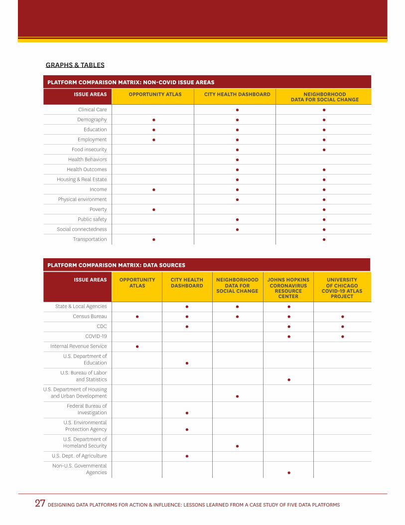
DESIGNING DATA PLATFORMS FOR ACTION & INFLUENCE: LESSONS LEARNED FROM A CASE STUDY OF FIVE DATA PLATFORMS27
ISSUE AREAS OPPORTUNITY ATLAS CITY HEALTH DASHBOARD NEIGHBORHOOD DATA FOR SOCIAL CHANGE
Clinical Care
Demography
Education
Employment
Food insecurity
Health Behaviors
Health Outcomes
Housing & Real Estate
Income
Physical environment
Poverty
Public safety
Social connectedness
Transportation
ISSUE AREAS OPPORTUNITY CITY HEALTH NEIGHBORHOOD JOHNS HOPKINS UNIVERSITY ATLAS DASHBOARD DATA FOR CORONAVIRUS OF CHICAGO SOCIAL CHANGE RESOURCE COVID-19 ATLAS CENTER PROJECT
State & Local Agencies
Census Bureau
CDC
COVID-19
Internal Revenue Service
U.S. Department of Education
U.S. Bureau of Labor and Statistics
U.S. Department of Housing and Urban Development
Federal Bureau of Investigation
U.S. Environmental Protection Agency
U.S. Department of Homeland Security
U.S. Dept. of Agriculture
Non-U.S. Governmental Agencies
PLATFORM COMPARISON MATRIX: NON-COVID ISSUE AREAS
PLATFORM COMPARISON MATRIX: DATA SOURCES
GRAPHS & TABLES

DESIGNING DATA PLATFORMS FOR ACTION & INFLUENCE: LESSONS LEARNED FROM A CASE STUDY OF FIVE DATA PLATFORMS28
INDICATORS JOHNS HOPKINS CORONAVIRUS UNIVERSITY OF CHICAGO RESOURCE CENTER COVID-19 ATLAS PROJECT (V2)
COVID casesCumulative case count
Active case count Cases per 100k population
Cases by hospital bed Cases by race/ethnicity
RecoveredU.S. counties ranked by case rate
COVID deathsConfirmed death count
Confirmed death count per 100k pop Death count/confirmed count
Case-fatality ratio Deaths by population
Deaths by race/ethnicity U.S. counties ranked by death
COVID testingTotal tested
Daily tests per 100k Testing positivity rate
COVID trends & trackingCases over time
Deaths over time Weekly trend direction
ForecastingGrowth in confirmed cases/deaths
Hospitalizations over timeRegional hotspots
Vaccine DateDoses Administered
Policy impacts Geographic level
United States (Total) State (U.S.)
County (U.S.) Neighborhood (U.S.)
WorldU.S. Congressional districts
Hypersegregated cities Black Belt Counties
Native American Reservations Community Health Factors &
SubpopulationsUninsured %
Life expectancy Hospitals & clinics
% over 65 years Race/ethnicity
PLATFORM COMPARISON MATRIX: COVID ISSUE AREAS

PLATFORM PURPOSE OF PLATFORM (WEBSITE)
PURPOSE OF PLATFORM (INTERVIEWS) ORIGINAL AUDIENCE
Opportunity Atlas To find out which neighborhoods offer children the best chance to rise out of poverty using anonymous data following 20 million Americans from childhood to their mid-30s.
To provide big data to highlight trends at a national level and local differences
Academics/Researchers
Local government
City Health Dashboard
To equip cities with a one-stop resource for comprehensive, reliable data to help them build healthier and more equitable communities.
To foster greater health and health equity by making data readily available to users at the city or sub-city level.
Community-based groups & Non-profits
Local government
Neighborhood Data for Social
Change
To learn about the trends, challenges, and opportunities facing Los Angeles County neighborhoods.
To be a highly-curated, easy-to-use “one-stop shop” for any individual who wants to engage with data at a local level.
Academics/Researchers
Banks
Community-based groups & Non-profits
General public
Local government
University of Chicago COVID
Atlas
To provide quick access to county-level COVID-19 estimates, longitudinal exploration, and statistical cluster detection.
Wanted to quickly give people very basic, interactive access to information at a county level over time.
“ I don’t think we had planned to continue doing this forever. I think it was meant just like a short stop-gap of information until things got better, but things headed in a different direction.”
Academics/Researchers
Community-based groups & Non-profits
Health care professionals
Policymakers
JHU Coronavirus Resource Center
To help advance the understanding of the virus, inform the public, and brief policymakers in order to guide a response, improve care, and save lives.
To provide knowledge for the world, data transparency, and accessibility coupled with expert analysis.
“ We wanted to make sure that our lay users would be able to actually understand what we were trying to communicate, then internalize it into their own response to the pandemic”
General public
Health care professionals
Media
Policymakers
PLATFORM COMPARISON SUMMARY TABLEBelow is a table which compares how the five platform developers articulated their platform’s original purpose and intended audience. Notably, the US COVID Atlas, Johns Hopkins Coronavirus Resource Center, and NDSC
explicitly stated the general public as intended audiences for their data. Similarly, all the non-COVID dashboards named local governments as key stakeholders, presumably for trends to inform policies at the city or local level.
DESIGNING DATA PLATFORMS FOR ACTION & INFLUENCE: LESSONS LEARNED FROM A CASE STUDY OF FIVE DATA PLATFORMS29

DESIGNING DATA PLATFORMS FOR ACTION & INFLUENCE: LESSONS LEARNED FROM A CASE STUDY OF FIVE DATA PLATFORMS34
635 Downey WayVerna & Peter Dauterive Hall (VPD), Suite 207Los Angeles, CA 90089-3331
socialinnovation.usc.edu
@USCPriceCSI
www.facebook.com/PriceSocialInnovation
3502 Watt WayLos Angeles, California 90089-0281
annenberg.usc.edu
@AnnenbergMedia
www.facebook.com/USCAnnenberg/

WE WOULD LIKE TO ACKNOWLEDGE THE FOLLOWING CONTRIBUTORS TO THIS PROJECT:
Principal Investigators
Gary Painter
Sheila Murphy
Project Team
Caroline Bhalla
Victoria Ciudad-Real
Peter Griffin
Ashley Phelps
Amber Lynn Scott
Michelle Levander
Gabriel Kahn
Research Assistants
Arielle Amit
Kyra Chan
Bryan Davis
Elizabeth Gmelich
Elizabeth Himawan
Ahhad Iqbal
Elizabeth Malanga
Lauren Mattice
Jess Maultsby
Holly Millburn-Smith
Davan Murphy
Nina Nguyen
Sabrina Ralston
Ellie Sulla
This research was made possible by generous support from the Robert Wood Johnson Foundation.
DESIGNING DATA PLATFORMS FOR ACTION & INFLUENCE: LESSONS LEARNED FROM A CASE STUDY OF FIVE DATA PLATFORMS35
ACKNOWLEDGMENTS