design guidelines ver 2017.01 - pressreaderblog.pressreader.com/docs/pr-guidelines-web.pdf · ·...
TRANSCRIPT
Design Guidelines Ver 2017.01.1

PressReader Design Guidelines 2
© PressReader, 2017
PressReader’s visual design is about more than just the logo. It’s a visual system made up of many parts that work together to elicit a feeling, and convey what PressReader is all about.
We’re youthful, modern, intelligent, forward-thinking and a little bit cheeky.
These guidelines are designed to help anyone working with the PressReader brand in a visual context. They allow everyone to work with confidence and consistency in a variety of formats, regions and circumstances. If you have any questions about our brand principles, please contact us. (See back page for details.)
IntroEvery journey starts with a great story

PressReader Design Guidelines 3
© PressReader, 2017
1. Any co-branded use of the PressReader logo and/or visual identity in combination with another company’s logo or visual identity must be evaluated and approved by the PressReader Brand Team.
2. Any PressReader marketing materials created by agents or subsidiary offices of PressReader must also be approved by the PressReader Brand Team.
3. Only the PressReader Creative Lab at Vancouver HQ is authorized to develop and/or approve co-branded marketing.
• It’s important that, in order for our partnership to be successful, a sufficient level of co-branded marketing and
communications assets must be created (by both parties) to ensure that customers have been made aware of the PressReader service, and have enough understanding of what it is and how to access it.
• We have developed a series of co-branded examples that maintain the value of PressReader’s name and brand reputation. Please be mindful of these guidelines and apply them consistently.
• It’s important to note that when visually representing PressReader, the brand logo should be treated equally to other partner logos. More so, both brands should work harmoniously in order to create the most impact.
Please send all final creative assets to [email protected] for approval before going into to production, and allow 72 hours for approval.
Rules & regsWe mean business

Inspiration
App Conversation Letter P

PressReader Design Guidelines 5
© PressReader, 2017
The PressReader P-icon is at the core of our visual identity. It’s an abstract symbol combining a speech bubble and the capital letter ‘P’. The gradient shadow effect is used to give it depth and life.
This icon can be used on its own in select circumstances only. In general, the icon without text is reserved for circumstances where the brand has already been established in the same context, either through use of the full logo, in adjacent copy, or by voiceover.
The iconP is for PressReader
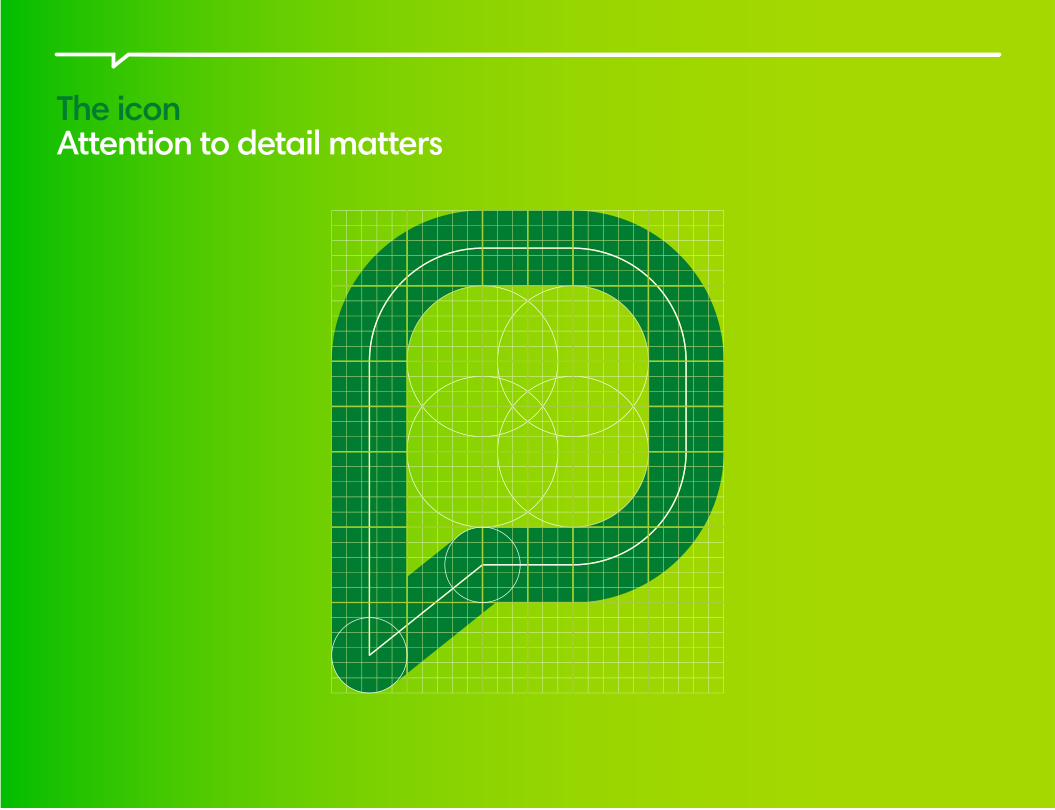
The iconAttention to detail matters
PressReader Design Guidelines 7
© PressReader, 2017
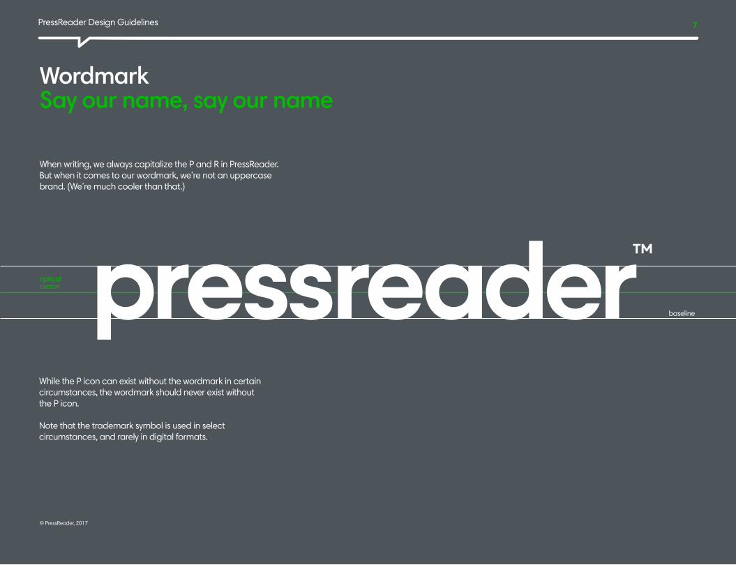
When writing, we always capitalize the P and R in PressReader. But when it comes to our wordmark, we’re not an uppercase brand. (We’re much cooler than that.)
Wordmark Say our name, say our name
baseline
optical center
While the P icon can exist without the wordmark in certain circumstances, the wordmark should never exist without the P icon.
Note that the trademark symbol is used in select circumstances, and rarely in digital formats.

PressReader Design Guidelines 8
© PressReader, 2017
The PressReader logo is at the crux of our brand identity. It’s the combination of our simple, modern wordmark and our P icon.
The logo All together now!
P Icon Wordmark
Note that the proportions of the logo cannot be changed under any circumstances.

PressReader Design Guidelines 9
© PressReader, 2017
We’re all about the green. Our primary logo consists of the green P icon and the gray wordmark on a white background. Our logo may appear in any of the formats shown here.
The logo color should be determined by what would best complement the visual of the communication, while maintaining legibility.
Visual identityColor variations
one color mono logo
grayscale logo
PressReader Design Guidelines 10
© PressReader, 2017
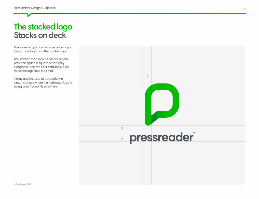
There are two primary versions of our logo: the primary logo, and the stacked logo.
The stacked logo may be used when the provided space is square or vertically elongated, and the horizontal lockup will make the logo look too small.
It may also be used to add variety in circumstances where the horizontal logo is being used frequently elsewhere.
The stacked logoStacks on deck
x
x
x

PressReader Design Guidelines 11
© PressReader, 2017
Here’s how we lay it out.
The stacked logoStacks on deck

PressReader Design Guidelines 12
© PressReader, 2017
The exclusion zoneWe love outer space
Minimum sizeBecause size matters
The PressReader logo should always be surrounded by a minimum amount of space. A margin of clear space equivalent to the width of the P icon is drawn around the logo to create an invisible boundary and an area of isolation.
The stacked logo clearance is equal to half the width of the P icon. These areas of separation are minimum standards, and should be increased whenever possible.
There are no predetermined sizes for the PressReader logo. Scale and proportion should be determined based on available space, aesthetics, function and visibility.
There’s no preset maximum size for the PressReader logo, either. Minimum sizes are shown here.
Digital: 200px width Print: 30mm width
Digital: 100px width Print: 15mm widthFor logo without trademark sign
Digital: 25px height Print: 5mm height
x
x
x
x
x
x
x
x
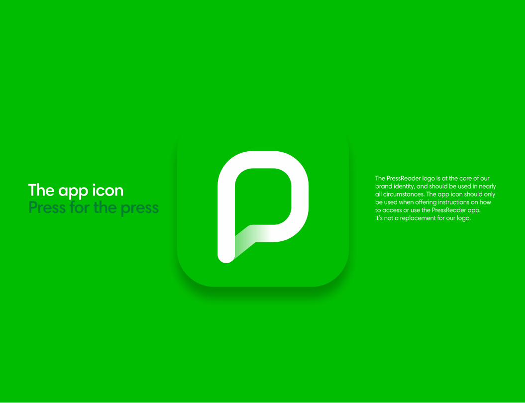
The PressReader logo is at the core of our brand identity, and should be used in nearly all circumstances. The app icon should only be used when offering instructions on how to access or use the PressReader app. It’s not a replacement for our logo.
The app iconPress for the press

PressReader Design Guidelines 14
© PressReader, 2017
TypographyOur type of font The Harmonia Sans font is at the core of our visual identity. It’s our primary typeface for titles, subtitles and primary text for all marketing communications. It’s a simple and clean typeface that complements the typeface used for our logo.
Harmonia Sans Pro®
The Harmonia Sans® typeface adds an elegant, non-geometric twist to aspects of classic geometric sans typefaces. The resulting extensive family performs well on the printed page, on screen and beyond.

PressReader Design Guidelines 15
© PressReader, 2017
The Harmonia font familyPutting it all together
Harmonia Sans Pro Regularabcefeghijklmnopqrstuvwxyz ABCEFEGHIJKLMNOPQRSTUVWXYZ1234567890
Harmonia Sans Pro Semiboldabcefeghijklmnopqrstuvwxyz ABCEFEGHIJKLMNOPQRSTUVWXYZ1234567890
We’re bold in our communications, but with Harmonia Sans we can also be quieter, more restrained and classical. Use a mix of weights that best suit the message being conveyed.

PressReader Design Guidelines 16
© PressReader, 2017
Typography Loud and clear
Offer the world’sbest contentWith thousands of premium titles from more than 100 countries, there’s something for everyone.
A branded touchpoint
Your marketing team will love how targeted, effortless and high-impact PressReader is.
Loyalty programs
Offer your customers an immersive brand experience by integrating PressReader into any part of your customer journey.
Headline
Harmonia Sans Semi BoldSize 50 pt, Leading 42 pt, Tracking -50
SubHeadling
Harmonia Sans RegularSize 26 pt, Leading 30 pt, Tracking -50
SubHeadling 2
Harmonia Sans Semi BoldSize 16 pt, Leading 18, Tracking -25
Body text
Harmonia Sans RegularSize 12 pt, Leading 14, Tracking -15

PressReader Design Guidelines 17
© PressReader, 2017
The PressReader color universe covers three shades of green, plus one accompanying color – cool gray. This palette should be adhered to across Pantone, CMYK and RGB applications.
Color references:- RGB: All PDF documents, online materials, web applications, etc.- Pantone: Solid colors for printed materials and stationery, where possible.- CMYK: 4-color process for external marketing, printed publications, etc.
To maintain consistency and brand recognition, these colors should be the lead colors in all applications. It’s essential that colors are reproduced as accurately as possible. Care must be taken in selecting the correct color reference for different applications.
Partners are asked to use the PressReader green as much as possible in co-branded communications. Sometimes it may be preferable to use knock-out variations of the PressReader logo in order to align with a brand partner.
In some circumstances, like when targeting a luxury audience, the gray color may be emphasized rather than the green.
The color matrixOur true colors
Lime Green Green
Dark Green Gray
The gradient
Lime Green
HEX #a5d900RGB 165-217-0CMYK 40-0-100-0PANTONE 375 C, 2291 U
Neon Green
HEX #a6da00RGB 0-190-0CMYK 75-0-100-0PANTONE 2271C, 2271 U
Rainforest Green
HEX #007d30CMYK 100-30-100-0PANTONE 349 C
Composite Gray
HEX #444f56CMYK 10-0-0-80PANTONE Cool Gray 11C
Color is an essential part of the PressReader brand, and helps to set the tone with a particular audience. Here’s our corporate color palette.
PressReader Design Guidelines 18
© PressReader, 2017
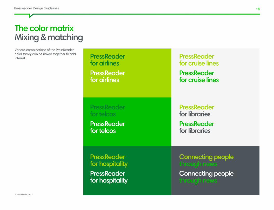
Various combinations of the PressReader color family can be mixed together to add interest.
The color matrix Mixing & matching
PressReaderfor airlinesPressReaderfor airlines
PressReaderfor telcosPressReaderfor telcos
PressReaderfor hospitalityPressReaderfor hospitality
PressReaderfor cruise linesPressReaderfor cruise lines
PressReaderfor librariesPressReaderfor libraries
Connecting peoplethrough newsConnecting peoplethrough news
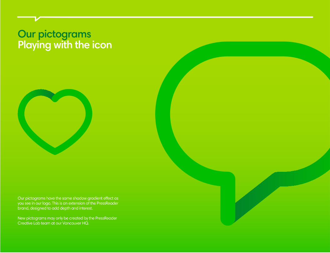
Our pictogramsPlaying with the icon
Our pictograms have the same shadow gradient effect as you see in our logo. This is an extension of the PressReader brand, designed to add depth and interest.
New pictograms may only be created by the PressReader Creative Lab team at our Vancouver HQ.
PressReader Design Guidelines 20
© PressReader, 2017
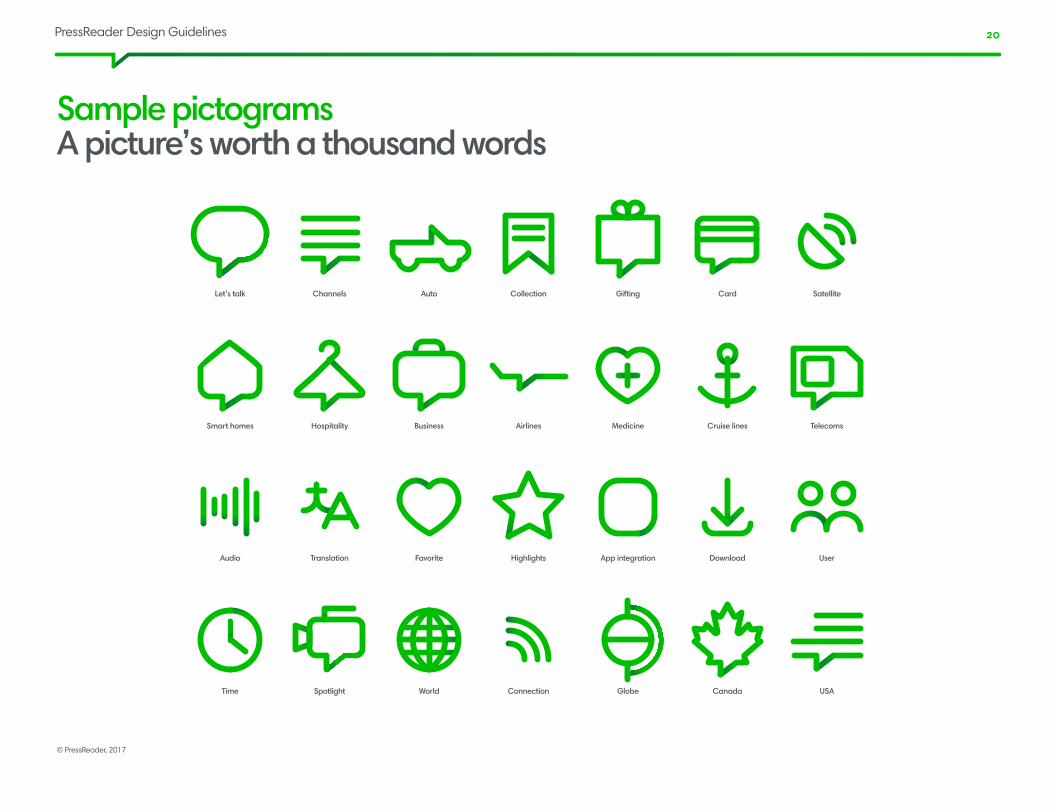
Sample pictograms A picture’s worth a thousand words
HospitalitySmart homes Business Airlines Medicine Cruise lines Telecoms
TranslationAudio Favorite Highlights App integration Download User
SpotlightTime World Connection Globe Canada USA
ChannelsLet’s talk Auto Collection Gifting Card Satellite

PressReader Design Guidelines 21
© PressReader, 2017
Visual communications
PressReader is about minimalism, rich imagery, and clear calls-to-action. We should never overcrowd or overcomplicate a layout.
PressReader Design Guidelines 22
© PressReader, 2017
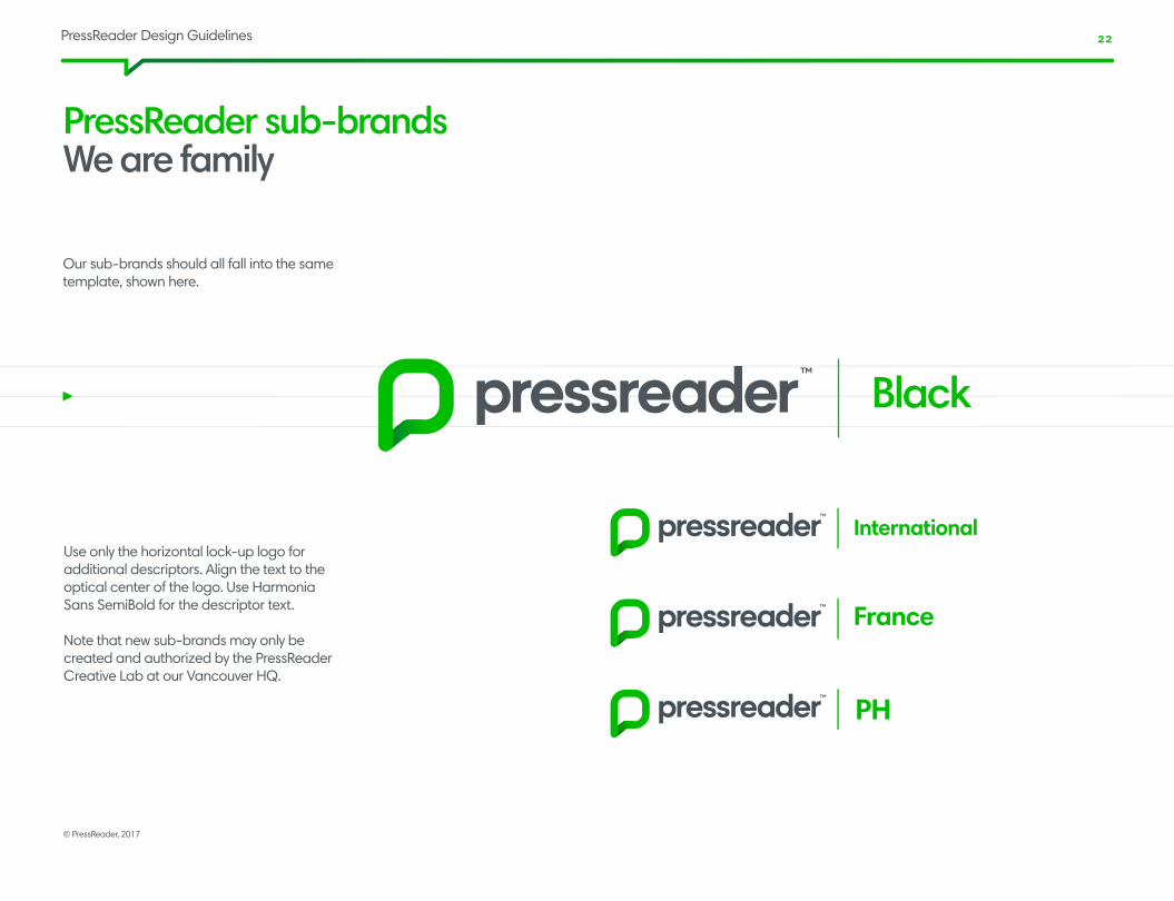
PressReader sub-brandsWe are family
Our sub-brands should all fall into the same template, shown here.
Black
Use only the horizontal lock-up logo for additional descriptors. Align the text to the optical center of the logo. Use Harmonia Sans SemiBold for the descriptor text.
Note that new sub-brands may only be created and authorized by the PressReader Creative Lab at our Vancouver HQ.
PressReader Design Guidelines 23
© PressReader, 2017
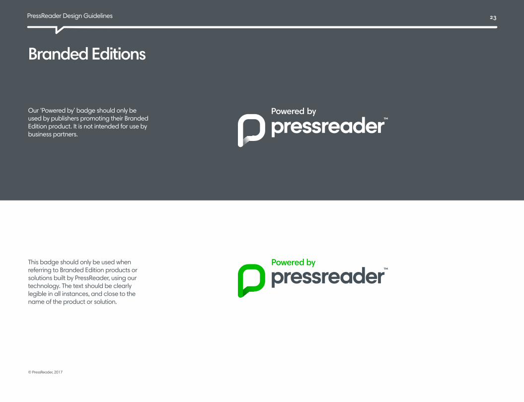
Branded EditionsPressReader ‘Powered by’ badge
Our ‘Powered by’ badge should only be used by publishers promoting their Branded Edition product. It is not intended for use by business partners.
This badge should only be used when referring to Branded Edition products or solutions built by PressReader, using our technology. The text should be clearly legible in all instances, and close to the name of the product or solution.

PressReader Design Guidelines 24
© PressReader, 2017
Linking to PressReader in app storesPushing our buttons
We use a clean, modified set of app store buttons designed to appear uniformly while still retaining the recognizable brand identities of each device manufacturer.
The app store buttons should always be used in marketing materials intended to promote or encourage people to use the product.
This is especially important for PressReader business partners. They should be used all together, and should be placed near the PressReader logo.
PressReader Design Guidelines 25
© PressReader, 2017
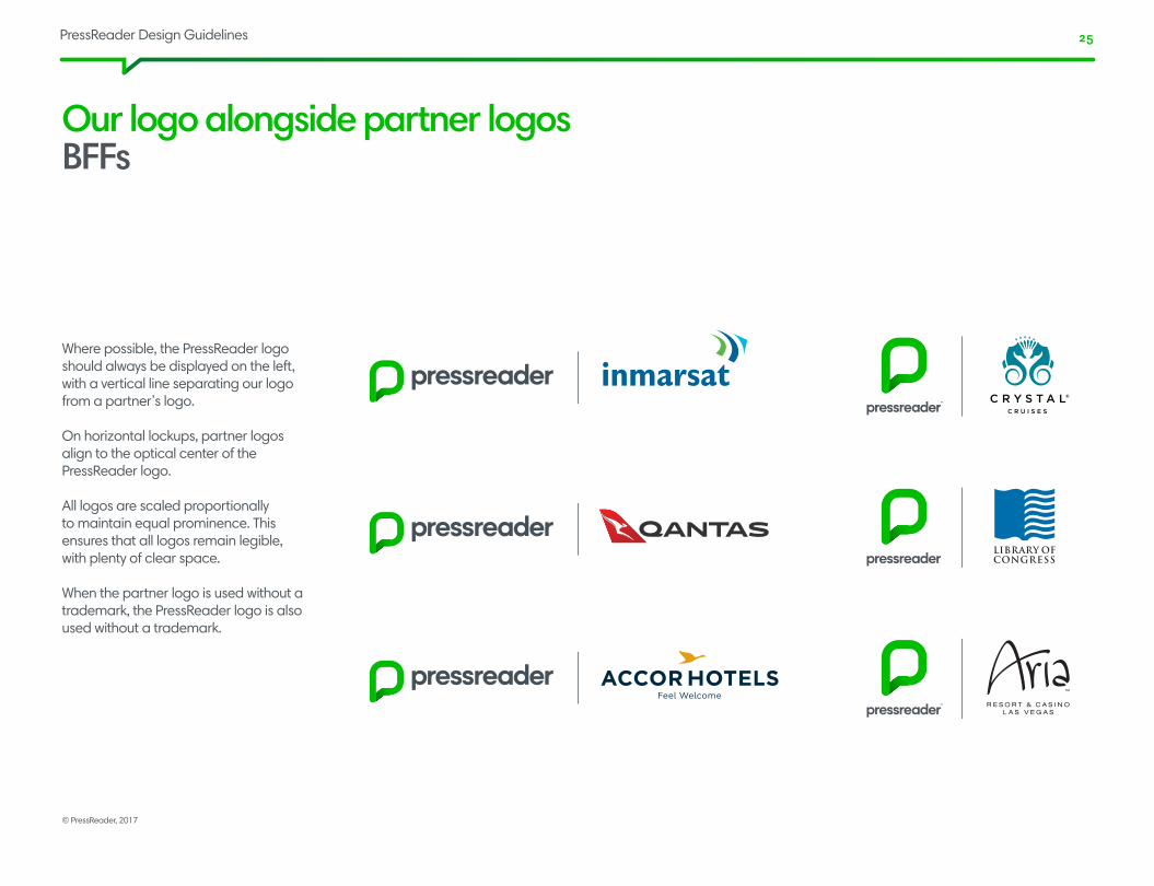
Our logo alongside partner logosBFFs
Where possible, the PressReader logo should always be displayed on the left, with a vertical line separating our logo from a partner’s logo.
On horizontal lockups, partner logos align to the optical center of the PressReader logo.
All logos are scaled proportionally to maintain equal prominence. This ensures that all logos remain legible, with plenty of clear space.
When the partner logo is used without a trademark, the PressReader logo is also used without a trademark.
PressReader Design Guidelines 26
© PressReader, 2017
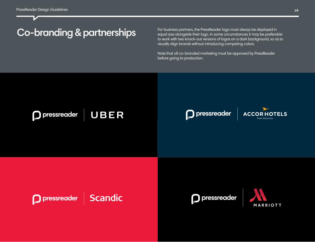
Co-branding & partnershipsWe’ve got company
For business partners, the PressReader logo must always be displayed in equal size alongside their logo. In some circumstances it may be preferable to work with two knock-out versions of logos on a dark background, so as to visually align brands without introducing competing colors.
Note that all co-branded marketing must be approved by PressReader before going to production.

PressReader Design Guidelines 27
© PressReader, 2017
Print advertising Our ad style is ruthlessly minimal and visual. We let the product lead the way, and use it to tell a story. We always incorporate a strong, clear, single call-to-action.

PressReader Design Guidelines 28
© PressReader, 2017
Print advertising
PressReader Design Guidelines 29
© PressReader, 2017
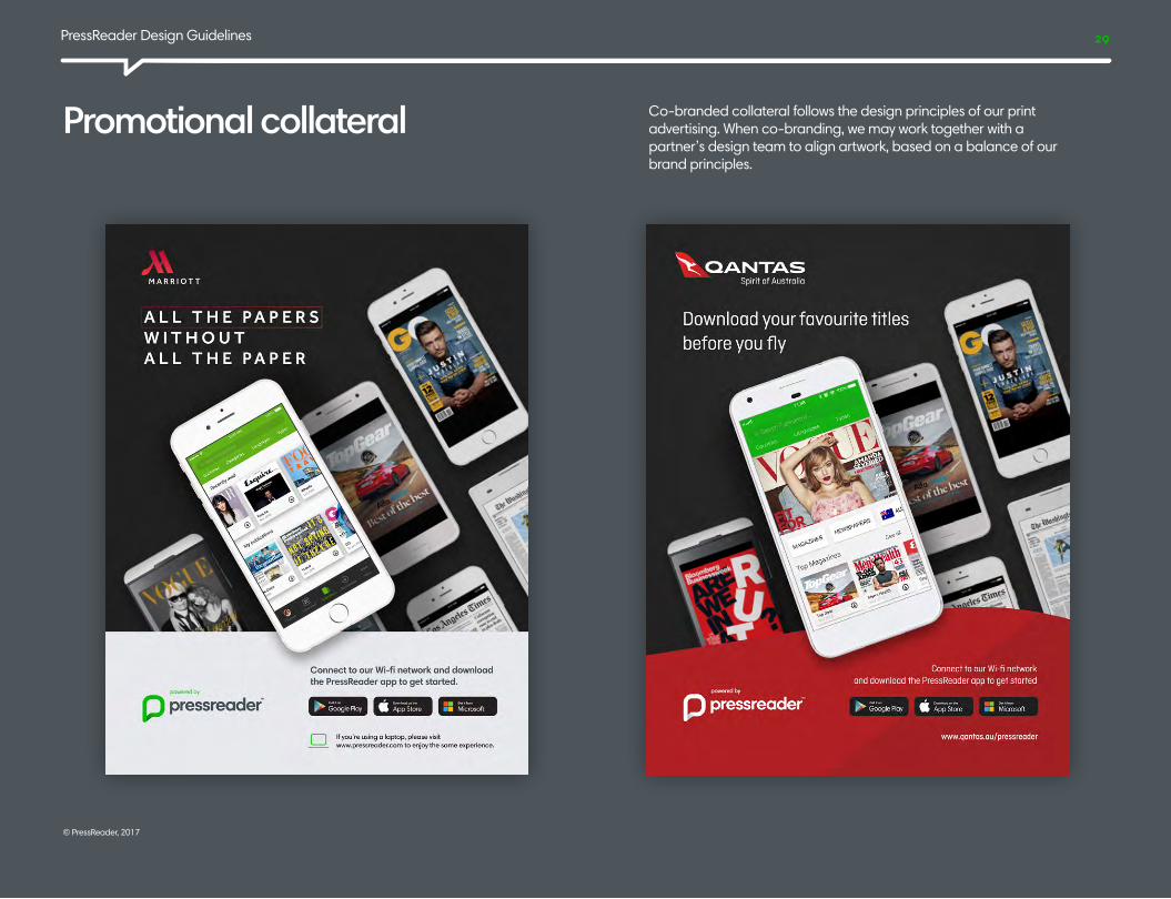
Promotional collateral Co-branded collateral follows the design principles of our print advertising. When co-branding, we may work together with a partner’s design team to align artwork, based on a balance of our brand principles.
PressReader Design Guidelines 30
© PressReader, 2017
For approval of co-branded items and externally developed materials, access to screenshots and resources, or questions about any of these guidelines, please reach out to us.
Kristin EberthDirector, Marketing & [email protected]
Kirill ZaytsevPressReader Creative [email protected]
Ver 2017.01.1Let’s talk.