demographic analyses and enrollment forecasts - · pdf filedemographic analyses and enrollment...
TRANSCRIPT

Lapkoff & Gobalet Demographic Research, Inc. www.Demographers.com
22361 Rolling Hills Road, Saratoga, CA 95070-6560 (408) 725-8164 Fax (408) 725-1479
2120 6th Street #9, Berkeley, CA 94710-2204 (510) 540-6424 Fax (510) 540-6425
Demographic Analyses and Enrollment Forecasts
for the
San Francisco Unified School District
March 18, 2010

Executive Summary
After decades of stability, enrollments in the San Francisco Unified School District
(SFUSD) began declining gradually during the 2000s. The decline stopped in Fall 2008,
and in Fall 2009, there was an increase in enrollment. The enrollment increase in Fall
2009 was the result of high grade progressions at all levels and an abnormally high
Kindergarten/Birth (K/B) ratio (the number of kindergartners was a much larger share
than normal of births five years earlier).
It seems likely that the recent increased in enrollment is due to the economic downturn.
Perhaps fewer students are enrolling in private schools, some families are returning to the
City to live in extended families, and/or families are not leaving SFUSD who might
otherwise have done so.
In any event, a key issue is whether the 2009 patterns are the start of a new trend or just a
temporary phenomenon. If it is a temporary phenomenon, how long will it last? Will an
improving economy have an effect? In our main forecast, we assume that the 2009
patterns are temporary, though we do present an alternative forecast that assumes the
2009 pattern will continue (Appendix B). This alternative forecast shows higher
enrollments (an additional 2,200—3.7 percent of K-12 students) over the main forecast.
Regardless of the short-term forecast, we know that in the long run, SFUSD should plan
for substantial enrollment growth when major redevelopment and public housing
developments are completed.
Much of the public housing being planned for San Francisco, particularly in the City’s
redevelopment areas and projects included in the HOPE SF (public housing) program,
will be targeted to families. Housing growth, therefore, is likely to result in a significant
increase in SFUSD enrollments over the long term. If most of the large redevelopment
projects are completed, SFUSD enrollments are likely to be 11,000 higher than they
otherwise would be. It appears that most of the major plans will be completed within 30
years.
Chart 1 shows the number of students to expect from major housing projects that have
been identified. This forecast is based on assumptions about the timing of future
development, much of which is uncertain at present and will probably vary from our
illustrative forecast, though the magnitude of the change is likely to be similar to what we
show. It will be important to monitor the progress of major housing developments so that
the forecasts can be adjusted as new information becomes available. But SFUSD
administrators should be prepared to accommodate a substantial increase in enrollments.
This forecast also depends on assumptions regarding ―student yields,‖ or the average
number of students per housing unit. To calibrate our assumptions about the student
yields for affordable housing in the City, we measured student yields in several of the
completed redevelopment project areas (Rincon, South of Market, Mission Bay, and

Lapkoff & Gobalet Demographic Research, Inc. 3
public housing). It turns out that yields vary widely and appear to depend on the type of
affordable housing. Student yields should be measured periodically, especially when
new housing has been completed, so that the forecasts can be adjusted accordingly.
Chart 1
Projected Enrollments from Major New Housing
Developments
0
2,000
4,000
6,000
8,000
10,000
12,000
20
09
20
11
20
13
20
15
20
17
20
19
20
21
20
23
20
25
20
27
20
29
20
31
20
33
20
35
Year
Nu
mb
er
of
Stu
de
nts
Turning to enrollments from San Francisco’s existing housing, our findings show that
birth trends have been an excellent predictor of future kindergarten and subsequent
enrollments (with the exception of Fall 2009). Specifically, kindergarten enrollments
have equaled about half of the number of births to San Francisco residents five years
earlier. Primarily because of a falling birth rate, SFUSD enrollment started to decline in
the early 2000s and continued declining through the middle of the decade, as our 2002
report predicted. Elementary enrollments declined first; later these were followed by a
decline in middle school enrollments. High school enrollments have yet to decline, but
are expected to do so shortly when the smaller birth cohorts reach high school grades.
During the last six years, the birth trend in San Francisco County has changed, and the
number of births has risen gradually. When no other factors, such as economics and
migration, are in play, our forecasts predict a progressive increase in enrollments – first in
the elementary schools, then in the middle schools, and finally in the high schools.
However, before the larger birth cohorts of recent years reach middle and high school, the
forecasts show declining enrollments at the middle and (especially) the high schools. In
other words, middle and high school enrollments are expected to first decline modestly
before they increase.

Lapkoff & Gobalet Demographic Research, Inc. 4
Other factors, however, are likely to influence SFUSD enrollments, some with short-
term, others with long-term effects. In the short run, two important factors could affect
SFUSD enrollments significantly. First, the economic recession could cause abnormal
patterns, such as lowering the (relatively high) percentage of San Francisco children
attending private schools. Though private school enrollment data for Fall 2009 are not
available at the time of writing this report, increasing enrollment in public school
kindergarten and first grade suggest that such a shift could be occurring. The recession
could also change family migration patterns, though it is hard to predict exactly how –
some families may be more reluctant to leave the City, while others may feel the
economic pressure to leave. To the extent that some families return to the City, perhaps
in order to share housing with extended family members, enrollments would rise.
The second important factor that could affect enrollments is a change in the ethnic
composition of births to District residents. White births now comprise a larger share of
the total than in the past. Since White births are less likely to result in kindergarten
enrollment than births in any other ethnic group (i.e., Whites are less likely to send their
children to public kindergarten in San Francisco than are other ethnic groups), the fact
that births have risen in recent years may not translate into increased kindergarten
enrollments.
Chart 2 shows the enrollments and enrollment forecasts at each school level. Elementary
enrollments are forecasted through 2014, middle school enrollments through 2020, and
high school enrollments through 2023. We use different forecast horizons because we
are able to reliably forecast kindergarten enrollment only through 2014.
In Chart 2, the solid heavy line is the Most Likely forecast. It represents the average of
5,000 simulations for which grade progressions and K/B ratios were randomly drawn
from SFUSD’s historical patterns. The wide range between the thinner solid lines
represents forecasts that have a 90 percent probability of occurring, and the narrower
range between the dashed lines represent forecasts that have a 67 percent probability of
occurring.
In the Most Likely forecast:
By 2014, K-12 enrollments increase by 1,800 students. More than half of this
increase is due to higher enrollments from housing in major development areas.
Elementary enrollments steadily increase through 2014 and reach about 28,400
students.
Middle school enrollments decline in 2010, but then increase progressively so
that, by 2020 (the last forecast year for this school level), middle school
enrollments reach 14,800.
High school enrollments decline for the next three years, but then increase
rapidly. By 2023 (the last forecast year for this school level), high school
enrollments reach over 24,200.

Lapkoff & Gobalet Demographic Research, Inc. 5
Chart 2
Elementary School Forecasts, 2010-2014 Includes New Housing Effects
0
5000
10000
15000
20000
25000
30000
35000
19
81
19
84
19
87
19
90
19
93
19
96
19
99
20
02
20
05
20
08
20
11
20
14
Year
Nu
mb
er
of
Stu
de
nts
Most Likely
90 Percent Interval
67 Percent Interval
Actual
Middle School Forecasts, 2010-2020 Includes New Housing Effects
0
5000
10000
15000
20000
25000
19
81
19
83
19
85
19
87
19
89
19
91
19
93
19
95
19
97
19
99
20
01
20
03
20
05
20
07
20
09
20
11
20
13
20
15
20
17
20
19
Year
Nu
mb
er
of
Stu
de
nts
Most Likely
90 Percent Interval
67 Percent Interval
Actual
High School Forecasts, 2010-2023 Includes New Housing Effects
0
5000
10000
15000
20000
25000
30000
35000
40000
19
81
19
84
19
87
19
90
19
93
19
96
19
99
20
02
20
05
20
08
20
11
20
14
20
17
20
20
20
23
Year
Nu
mb
er
of
Stu
de
nts
Most Likely
90 Percent Interval
67 Percent Interval
Actual

Lapkoff & Gobalet Demographic Research, Inc. 6
Key Findings
Regarding past enrollments:
San Francisco’s enrollment trends have differed substantially from those
of the state. California’s public school enrollments increased
dramatically during the 1980s and 1990s, while San Francisco’s
enrollments were relatively constant. Part of the difference resulted from
the City having lower housing growth rates.
San Francisco’s enrollment declines during the 2000s result from
declining numbers of births beginning in the late 1990s.
Regarding students’ race/ethnicity:
The numbers of students of Asian and Pacific Islander, Hispanic, and
multiple race ancestry have increased while the numbers of students of
African American and White ancestry have declined.
The City’s White child population has grown substantially; however, this
has not resulted in more White public school students.
Regarding private school enrollments:
In 2008, private school enrollment was relatively high in San Francisco,
with about 25,000 students. An estimated 27 percent of students living in
the City attended private schools.
Private middle and high school enrollments have risen slowly but fairly
regularly since the early 1990s, while private elementary enrollment has
been stable or perhaps declining.
Higher family income is the single most important characteristic of
children in private schools, even when controlling for race, place of birth,
and area of residence.
Race is the second most important factor after income. White children are
far more likely to attend private school than children of other races
(Hispanic, Asian, or African American). This is true even after we control
for income/wealth.
The neighborhood in which children live makes a big difference in
whether they attend private school. Children living in the northwestern
part of the City are much more likely to attend private school than
children in any other region. However, this effect disappears after we
control for income and race.

Lapkoff & Gobalet Demographic Research, Inc. 7
Regarding births and kindergarten enrollments:
The number of births to San Francisco residents increased during the
2000s, which has caused and is expected to continue to cause an increase
in public school enrollments.
The number of White births has increased more than births to other
ethnicities. Since White births are less likely than those of other
ethnicities to result in kindergarten enrollments, the relationship between
births and subsequent kindergarten enrollments may change.
Kindergarten enrollments equal about half of the number of births to San
Francisco residents five years earlier. This ratio has been very stable
over the past twenty years except in 2009, when kindergarten enrollments
were 57 percent of births five years earlier, rather than the 50 to 53
percent historical norm.
Regarding new housing:
Typically, between 1,700 and 2,000 new housing units are built annually
in San Francisco.
Market rate condominiums contain virtually no public school students.
More than 40,000 new housing units, including 10,000 affordable units,
are proposed in major development areas.
K-12 student yields are .68 for all (non-senior) public housing or .81 of all
(non-senior) occupied units. Stand-alone affordable units tend to have a
higher yield than inclusionary affordable units. Yields in stand-alone
affordable units vary substantially depending on the neighborhood
location of the housing.
We expect that more than 11,000 public school students will live in the
40,000 new housing untis, once they are completed.
Regarding enrollment forecasts:
Because of the large birth cohorts of the early 2000s, the decline in
elementary school enrollments of the past ten years has halted, and the
number of elementary school students will rise from 26,000 students in
2009 to 28,500 in 2014, representing a 10 percent increase in just five
years.
After a slight decline in 2009 and 2010, middle school enrollments will
increase, a result of the large birth cohorts of the early 2000s. In 2014
they will stand at 15,100 compared with 11,640 in 2009.
High school enrollments will experience a continuous decline over the
next three years, from 19,610 students in 2009 to 18,230 in 2012,

Lapkoff & Gobalet Demographic Research, Inc. 8
reflecting the declining birth trend of the 1990s, but they will rise again to
18,420 in 2014..
When we assume that the high grade progression and K/B ratios of 2009
will continue, the resulting forecast shows about 2,200 students more than
the main forecast in 2014.
The difference in enrollment between the alternative forecast and the main
forecast is larger for elementary school (2,160 more students in 2014),
low but still positive for middle school (610 more students in 2014) and
negative for high school (with 578 fewer students in 2014).

Lapkoff & Gobalet Demographic Research, Inc. 9
Acknowledgments
We are pleased to have been able to work for the San Francisco Unified School District
on this report, which was prepared under the direction of Nancy Waymack, Director of
Policy & Operations, and of Carlos A. Garcia, Superintendent.
We appreciate the assistance provided by Dennis Garden and Orla O’Keeffe of the San
Francisco Unified School District; Amy Neches, Thor Kaslofsky, Mike Grisso, Kelley
Kahn, Lisa Zayas-Chien, and Fred Blackwell of San Francisco’s Redevelopment Agency;
Doug Shoemaker and Amy Tharpe of the San Francisco Mayor’s Office of Housing;
Teresa Ojeda of San Francisco’s Planning Department, Cherry Hwee and Kyle Pederson
of the San Francisco Housing Authority.
Lapkoff & Gobalet Demographic Research, Inc., staff members who contributed to this
report include Shelley Lapkoff, Magali Barbieri, Jeanne Gobalet, and Robin Merrill.

Lapkoff & Gobalet Demographic Research, Inc. 10
Table of Contents
Acknowledgments ...................................................................................................... 9
Overall Enrollment Trends ........................................................................................ 12 1.1 Defining Student Enrollments ................................................................................. 12 1.2 San Francisco Historical Public School Enrollments .................................................. 13 1.3 Ethnic Trends in District Enrollment ........................................................................ 17 1.4 Private School Enrollment Trends ............................................................................ 21 1.5 Birth Trends ............................................................................................................ 24 1.6 Ethnic Birth Trends ................................................................................................. 25 1.7 Birth Forecasts ........................................................................................................ 27 1.8 Historical Trends in Population and Housing ............................................................ 28 1.9 Student Yields ........................................................................................................ 30 1.10 Forecast of Housing in Major Development Areas ................................................. 33
1.10.1 Treasure and Yerba Buena Islands ......................................................................... 34 1.10.2 Mission Bay ............................................................................................................ 36 1.10.3 Transbay Zone One Development ......................................................................... 37 1.10.4 Market and Octavia ............................................................................................... 38 1.10.5 Hunters Point Shipyard .......................................................................................... 38 1.10.6 Bayview Hunters Point ........................................................................................... 40 1.10.7 Hope SF in Bayview Hunters Point (BHP) ............................................................... 40 1.10.8 Visitacion Valley ..................................................................................................... 40 1.10.9 Other HOPE SF Projects ......................................................................................... 40
1.11 Enrollment Forecast from Major Development Areas ............................................ 41
Enrollment Forecast from Existing Housing ................................................................ 45 1.12 Forecast Method .................................................................................................. 45
1.12.1 Grade Progressions ................................................................................................ 46 1.12.2 Kindergarten Enrollment Forecasts ....................................................................... 54
1.13 Forecast Horizon ................................................................................................... 57 1.14 Grade Progression and K/B Assumptions: Modeling the Probability of Outcomes ... 58 1.15 Cohort Survival Forecast Results (Excluding the Effects of Enrollments from Large New Housing Developments) ........................................................................................... 59
Total Enrollment Forecast: Combining Forecasts from Existing and Future Housing ... 64 1.15.1 Elementary School Enrollment .............................................................................. 64 1.15.2 Middle School Enrollment ..................................................................................... 64 1.15.3 High School Enrollment.......................................................................................... 64
Appendix A: Birth Forecasts ..................................................................................... 70
Appendix B: An Alternative Forecast ......................................................................... 72
Appendix C: Analysis of Private School Enrollment Rates in San Francisco ................. 75 1.16 Summary of Findings ............................................................................................ 75 1.17 The 2007 American Community Survey (ACS) ........................................................ 76
1.17.1 Private vs. public school students by grade level .................................................. 76 1.17.1.1 Sex ................................................................................................................................ 77 1.17.1.2 Race and ethnicity ........................................................................................................ 77 1.17.1.3 Place of birth and nationality ....................................................................................... 78

Lapkoff & Gobalet Demographic Research, Inc. 11
1.17.1.4 Residential Neighborhood ........................................................................................... 78 1.17.1.5 Income and wealth ...................................................................................................... 80 1.17.1.6 Living arrangements ..................................................................................................... 81 1.17.1.7 Type of housing ............................................................................................................ 81
1.17.2 Results of the multivariate analysis ....................................................................... 82
Appendix D: Individual Grade Progressions .............................................................. 85

Lapkoff & Gobalet Demographic Research, Inc. 12
Overall Enrollment Trends
1.1 Defining Student Enrollments
Our forecast is based on student counts for all of San Francisco County public schools,
i.e., San Francisco Unified as well as San Francisco County of Education schools,
including all charter schools.
The main database used for enrollment analysis and forecasting is student enrollment data
as reported by all schools each Fall through the California Basic Educational Data
System (CBEDS). CBEDS data (now CBEDS-OPUS) are available since 1981 and are
considered the official counts of student enrollments.
To ensure a consistent data series, we combined CBEDS student counts in San Francisco
Unified School District (SFUSD) schools with those in programs administered through
the City or County of San Francisco (SFCC/SFCOE). Over the past three decades or so,
some of these programs appear to have moved back and forth between SFUSD and SFCC
for CBEDS reporting purposes.1 Charter schools are included among SFUSD schools,
including Edison Charter Academy, which in 2001 became a State-sponsored charter
school.
Private school students are excluded from our analysis unless explicitly noted.
Table A compares student counts in SFUSD non-charter schools, SFUSD charter schools,
and SFCC/SFCOE schools between 1981 and 2009. The total number of students for San
Francisco County public schools in Table A (last column) is the basis for our forecast.
1 For example, from 1981 through 1983, Andrew Jackson Shelter School enrollments were reported to
CBEDS under SFUSD, but from 1984 through 1986 they were reported under SFCC (now SFCOE).
Alternative high schools such as Bay High, Hilltop High and San Francisco Community High enrollments
were reported under SFUSD until the early 1990s but today are reported under the broad SFCC program
category of "Alternative/Opportunity." Since the early 1990s, SFCC program enrollments are reported to
CBEDS not by individual program but as totals under three broad categories: Alternative/Opportunity,
Juvenile Hall/Community, and Special Education. Edison Charter Academy is a special case: reported to
CBEDS under SFUSD until 2000, it has since 2001 been reported separately from both SFUSD and
SFCOE though it is included among SFUSD charter schools in our table.

Lapkoff & Gobalet Demographic Research, Inc. 13
Table A
San Francisco Public School enrollment
Year
In SFUSD
non-charter
schools
In SFUSD
charter schools
In
SFCC/SFCOE
schools
SF County
Total
1981 58,115 0 0 58,115
1982 60,310 0 0 60,310
1983 61,413 0 0 61,413
1984 62,957 0 394 63,351
1985 64,508 0 395 64,903
1986 64,786 0 390 65,176
1987 63,881 0 406 64,287
1988 62,528 0 785 63,313
1989 61,935 0 611 62,546
1990 61,688 0 548 62,236
1991 61,689 0 827 62,516
1992 61,882 0 633 62,515
1993 61,221 410 948 62,579
1994 60,880 460 953 62,293
1995 61,474 415 941 62,830
1996 60,754 420 975 62,149
1997 60,453 554 943 61,950
1998 60,174 868 1,059 62,101
1999 59,771 1,125 1,145 62,041
2000 58,633 1,346 1,787 61,766
2001 57,603 963 1,855 60,894
2002 57,248 968 1,305 59,991
2003 56,594 1,211 1,210 59,414
2004 55,460 1,684 1,179 58,735
2005 54,274 1,962 1,040 57,703
2006 53,136 3,047 698 57,347
2007 52,630 2,439 680 56,222
2008 52,066 3,117 816 56,451
2009 52,991 3,156 1,026 57,173
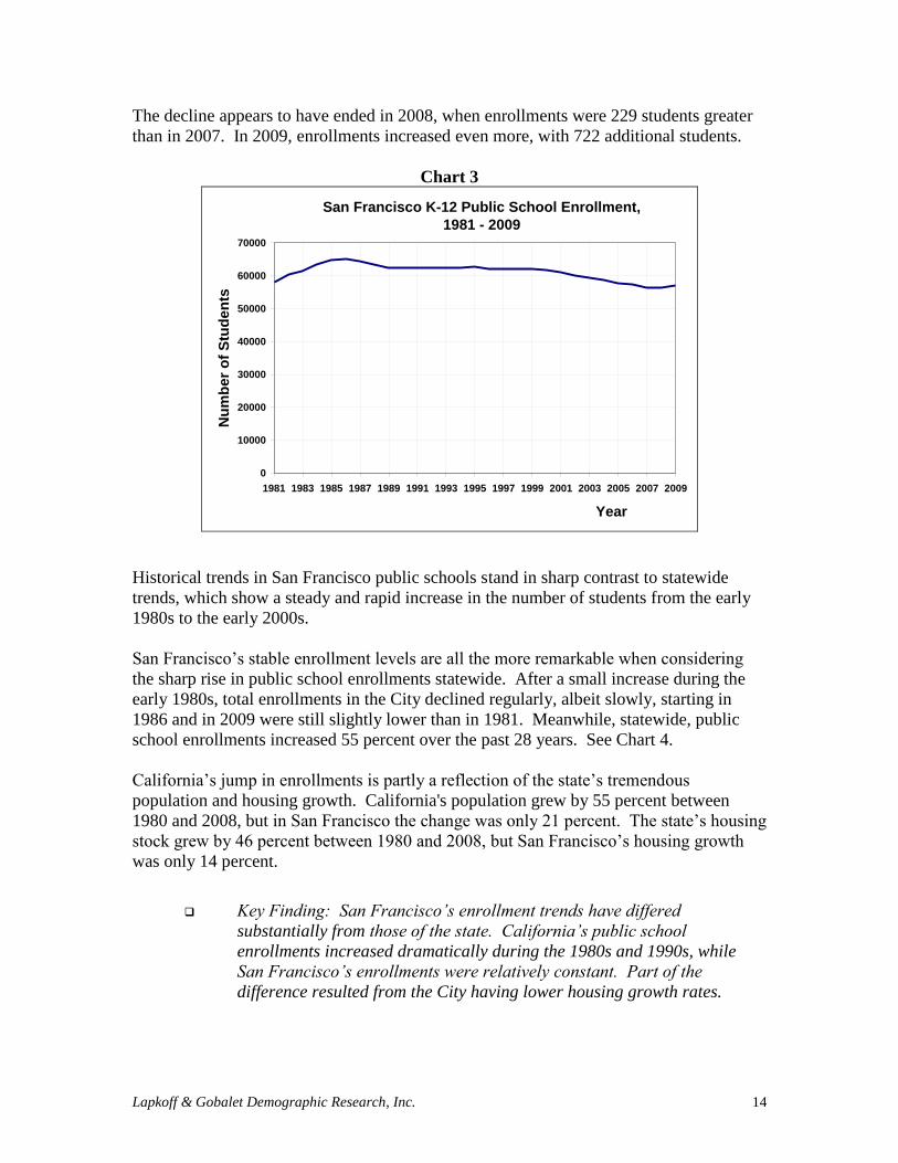
1.2 San Francisco Historical Public School Enrollments
Since at least 1981 (the earliest year for which we have data), total enrollment in San
Francisco public schools (SFUSD + SFCC + charters) has been remarkably stable,
especially compared to state trends. Enrollments averaged 61,120 students between 1981
and 2009. During this period, peak enrollment was 65,176 in 1985, while the low was
56,222 in 2007. See Chart 3.
Beginning in 2000, SFUSD and SFCOE2 schools began experiencing a gradual decline in
enrollments. From a high of 61,766 in 1999, enrollments dropped to 56,222 in 2007.
2 Unless otherwise specified, all the numbers provided in this report are based on both SFUSD and SFCOE
schools enrollments.
Lapkoff & Gobalet Demographic Research, Inc. 14
The decline appears to have ended in 2008, when enrollments were 229 students greater
than in 2007. In 2009, enrollments increased even more, with 722 additional students.
Chart 3
San Francisco K-12 Public School Enrollment,
1981 - 2009
0
10000
20000
30000
40000
50000
60000
70000
1981 1983 1985 1987 1989 1991 1993 1995 1997 1999 2001 2003 2005 2007 2009
Year
Nu
mb
er
of
Stu
de
nts
Historical trends in San Francisco public schools stand in sharp contrast to statewide
trends, which show a steady and rapid increase in the number of students from the early
1980s to the early 2000s.
San Francisco’s stable enrollment levels are all the more remarkable when considering
the sharp rise in public school enrollments statewide. After a small increase during the
early 1980s, total enrollments in the City declined regularly, albeit slowly, starting in
1986 and in 2009 were still slightly lower than in 1981. Meanwhile, statewide, public
school enrollments increased 55 percent over the past 28 years. See Chart 4.
California’s jump in enrollments is partly a reflection of the state’s tremendous
population and housing growth. California's population grew by 55 percent between
1980 and 2008, but in San Francisco the change was only 21 percent. The state’s housing
stock grew by 46 percent between 1980 and 2008, but San Francisco’s housing growth
was only 14 percent.
Key Finding: San Francisco’s enrollment trends have differed
substantially from those of the state. California’s public school
enrollments increased dramatically during the 1980s and 1990s, while
San Francisco’s enrollments were relatively constant. Part of the
difference resulted from the City having lower housing growth rates.

Lapkoff & Gobalet Demographic Research, Inc. 15
Chart 4
80
90
100
110
120
130
140
150
160
1981 1984 1987 1990 1993 1996 1999 2002 2005 2008
K-12 Public School Student Enrollment,
California and San Francisco County, 1981-2008Indexed at 100 in 1981
Nu
mb
er
of
stu
den
t (i
nd
exed
at
100 i
n 1
981)
Year
California
San Francisco
Historical enrollment patterns in the District vary by school level. The number of
elementary students increased from 25,000 in 1981 to 29,000 in 1986 and remained very
stable around this number until 1999, when it started declining and reached a low of
24,500 in 2006. Since then, enrollments have stopped declining. In 2009, elementary
enrollments reached 26,000.
The number of middle school students was very stable, at an average of 13,500,
throughout the 1980s and 1990s, though it eventually started declining in the early 2000s
to reach 11,640 in 2009. High school enrollments exhibited the same trend as the
elementary schools in the 1980s, increasing from 20,000 in 1981 to 22,000 in 1985-1986
before declining again to their previous level (20,000 in 1990) where they remained until
2005. Since then, they have been fluctuating between 19,500 and 20,500.
Over the past twenty years, trends in enrollment, especially in elementary school and, to a
smaller extent, in middle school, have closely followed prior trends in the size of birth
cohorts.
Chart 5 shows historical SFUSD elementary (kindergarten through fifth grade), middle
school (sixth, seventh, and eighth grade), and high school (ninth, tenth, eleventh, and
twelfth grade) enrollments (1981-2009). All levels experienced very stable enrollments
during the 1990s.
The recent elementary enrollment decline (1999-2007) was followed by an enrollment
decline in middle schools, and we expect it to be followed by a similar decline in high
school enrollments. As we show below, the declining size of the birth cohorts of the
1990s is moving through the school levels.
Key Finding: San Francisco’s declining enrollments during the 2000s
was the result of a decline in the number of births beginning in the late
1990s.

Lapkoff & Gobalet Demographic Research, Inc. 16
Chart 5
Enrollment in Grades K to 5, 1981 - 2009
0
5000
10000
15000
20000
25000
30000
35000
1981 1983 1985 1987 1989 1991 1993 1995 1997 1999 2001 2003 2005 2007 2009
Year
Nu
mb
er
of
Stu
de
nts
Enrollment in Grades 6 to 8, 1981 - 2009
0
2000
4000
6000
8000
10000
12000
14000
16000
1981 1983 1985 1987 1989 1991 1993 1995 1997 1999 2001 2003 2005 2007 2009
Year
Nu
mb
er
of
Stu
de
nts
Enrollment in Grades 9 to 12, 1981 - 2009
0
5000
10000
15000
20000
25000
1981 1983 1985 1987 1989 1991 1993 1995 1997 1999 2001 2003 2005 2007 2009
Year
Nu
mb
er
of
Stu
de
nts

Lapkoff & Gobalet Demographic Research, Inc. 17
1.3 Ethnic Trends in District Enrollment3
Asians and Pacific Islander students comprise the largest ethnic group in the San
Francisco public school student body, and their proportion increased from 35 percent in
1985 to 43 percent in 2008. The proportion of Hispanic4 students has also increased
relative to students of other races or ethnicities, from 18 percent in 1985 to 23 percent in
2008.
The proportion of students of all other races or origins has declined. The largest relative
drops have been experienced by African Americans (from 21 to 12 percent) and by
Whites (from 16 to 10 percent).
When we examine enrollment by ethnicity in San Francisco public schools over time, we
observe a significant change in the student body's racial and ethnic composition
independent of classification changes.5 See Chart 6.
Key Finding: The numbers of students of Asian and Pacific Islander,
Hispanic, and multiple race ancestry have increased while the numbers of
students of African American and White ancestry have declined.
3 Data by ethnicity are not yet available for the 2009-10 school year, hence, the latest data in this section are
for the 2008-09 school year. 4 We used the term ―Hispanic‖ to indicate students of Hispanic or Latino origin. The Census Bureau uses
the term Hispanic, because it is more inclusive than Latino – some Spanish-speaking people (e.g. Puerto
Ricans) may not consider themselves to be Latino. Filipinos, occasionally considered to be Hispanic, are
classified separately here.
5 The most significant change in the method of classifying students by race or ethnicity is the increasing
proportion of those in the category 'Others' (from 1 percent in 1985 to 5 percent in 2008), stemming from
the growing number of students reporting multiple races/ethnicities.

Chart 6
San Francisco Public School Students by Race and Ethnicity, 1985 and 2008 (%)
Asian and Pacific
Islanders
35%
Filipino
9%Hispanic
18%
Black
21%
White
16%
Others
1%
In 1985
Asian and Pacific
Islanders
43%
Filipino
6%
Hispanic
23%
Black
13%
White
10%
Others
5%
In 2008

Most, but not all, of the change in the racial/ethnic composition of the SFUSD student
body results from corresponding changes in the ethnic composition of the general
population. Between 1980 and 2000, changes in SFUSD’s ethnic distribution matched
changes in the City’s child population. However, since 2000, the relationship between
the number of children in the City and the number of students in SFUSD schools has
weakened, especially with respect to Whites and African Americans. The share of White
and African American students enrolled in the City’s public schools has shrunk.
Table B shows trends in the proportional distributions of SFUSD students and of the
school-aged population in San Francisco by race/ethnicity from 1980 to 2007.
The relative increase in enrollment for students of Asian and Pacific Islanders origin
corresponds to an increase in this group’s share of the 5-to-19 year old population, from
29 to 42 percent for Asian and Pacific Islanders between 1980 and 2007.
The decline in the proportion of SFUSD students who are African American (from 24
percent in 1980 to 14 percent in 2007) parallels a similar decline in the proportion of San
Francisco’s children who are African American. Of the City's 5-to-19 year olds, the
proportion that was African American fell from 19 percent to 11 percent between 1980
and 2007.
Changes in the racial/ethnic composition of the City's child population between 1980 and
2000 also appear to explain changes in the racial/ethnic composition of the SFUSD
student body for the two other largest groups, namely Hispanics and Whites. Indeed, the
increasing Hispanic enrollment share corresponds to an increase in their share of all of
the City's children (from 18 percent in 1980 to 23 percent in 2000), while the decline in
the Whites parallels their decline among all of the City's children (from 33 percent in
1980 to 23 percent in 2000).
However, the pattern was different between 2000 and 2007. While the proportion of
SFUSD students who were Hispanic increased (from 22 to 25 percent), their share in the
City's overall population of children declined (from 23 to 17 percent). For Whites, trends
are reversed: their share of SFUSD students remained fairly stable (from 10 percent in
2000 to 11 percent in 2007), even though their proportion of the population of 5-to-19
year olds increased significantly (from 23 to 29 percent).
The discrepancy between the relatively large proportion of Whites in the City’s school-
age population (nearly a third in 2007) and their small share of the public school students
(only one in ten) is explained by the strong preference of San Francisco Whites for
private schools (see Appendix B).
Key Finding: The City’s White child population has grown substantially;
however, this has not resulted in more White public school students.

Table B
Data: U.S. Census Bureau - 1980, 1990, and 2000 Decennial Censuses, American Community Survey data for 2007 and CBEDS enrollment
data for 1981, 1990, 2000, and 2007.

1.4 Private School Enrollment Trends
Statistics on private school enrollment are available from the California Basic
Educational Data System (CBEDS) database from 1983 to 2008, providing a long time
series of data with which to evaluate San Francisco private school enrollments.
Enrollment information is provided by grade, but other characteristics, such as place of
residence, are unfortunately not supplied. The data therefore include students who live
outside of San Francisco who comprise a substantial proportion of the students attending
private schools in the City. Other sources of information,6 which do not cover the whole
time period, show that the proportion of students living outside San Francisco but
attending private schools in the City reached about 14 percent in 2001, or nearly one in
six of the private school students.
As shown in Chart 7 below, private school enrollment has been relatively stable, ranging
from about 24,300 to 27,000 K-12 students each year. Private schools account for 30
percent of total enrollment in all San Francisco schools, which compares to about 10
percent in California and 11 percent nationwide. However, when we exclude non-
resident students (assuming that their proportion has remained constant since 2001), the
overall share of San Francisco-resident students who are in private school is 27 percent.
Chart 7
0
5000
10000
15000
20000
25000
30000
1983 1988 1993 1998 2003 2008
20%
25%
30%
35%
40%
San Francisco Total Private School Enrollment, 1983-2008Includes Out-of-District Students
Nu
mb
er
of
stu
de
nts
in
pri
va
te s
ch
oo
lsP
erc
en
t of to
tal s
tud
en
ts
Year
Number of private
school students
Percent of all students
in private schools
Although the percentage of San Francisco's total K-12 student population attending
private schools has been relatively stable over the past two and a half decades, there are
some significant differences among elementary, middle, and high school patterns (Chart
8).
6 San Francisco Unified Information Technology Department.

Lapkoff & Gobalet Demographic Research, Inc. 22
With an average of 13,200 students, San Francisco private elementary (K-5) enrollment
was relatively stable up to 1999, and then it dropped for the following four years (from
13,400 students in 1999 to 11,100 in 2003; Chart 8, top panel). Since 2003, the numbers
have remained stable, though the proportion has risen again to more than 30 percent; they
have fluctuated around that level since the early 1980s.
The picture is different for private middle school enrollment (Chart 8, middle panel). The
number and the proportion of these students exhibited a steady decline during most of the
1980s, from a high of 6,400 in 1983 (making up 32 percent of the total middle school
student population) to a low of 5,200 in 1987 (27 percent). Then the number (and the
proportion) started rising and peaked at nearly 6,700 in 2000 and 2001 (33 percent).
Finally, as with the elementary schools, enrollments declined for the following two to
three years so that, by 2003, the number of private middle school students was down to
6,000 (31 percent), and has since then remained relatively stable. The proportion of
students in private middle schools rose to a high of 34 percent in 2007. The drop in 2008
may have been related to the recent economic downturn.
The pattern in private high school enrollments is different from that of both elementary
and middle school enrollments (Chart 8, bottom panel). The drop in the number of
private high school students exhibited in the 1980s was much more persistent than that
found in middle school, from 8,100 in 1983 to 6,000 in 1991 (a decline of more than 25
percent compared with an 18 percent decline in private middle school enrollments). The
increase of the following period was similarly much more sustained than the increase in
middle school, with no drop in enrollments around 2000-2001.
The proportion of high school students enrolled in private San Francisco schools follows
a pattern very close to that of the enrollment numbers, with a drop from 28 percent in
1983 to 23 percent in 1991 and a perfectly compensating increase through 2007 when it
reached 28 percent. Again, the drop in 2008 may be a function of national economic
conditions.
Key Finding: In 2008, private school enrollment was relatively high in
San Francisco, with about 25,000 students. An estimated 27 percent of
students living in the City attended private schools.
Key Finding: Private middle and high school enrollments have risen
slowly but fairly regularly since the early 1990s, while private elementary
enrollment has been stable or perhaps declining.

Lapkoff & Gobalet Demographic Research, Inc. 23
Chart 8
0
2000
4000
6000
8000
10000
12000
14000
16000
1983 1988 1993 1998 2003 2008
20%
25%
30%
35%
40%
San Francisco Private Elementary School Enrollment, 1983-2008Includes Out-of-District Students
Nu
mb
er
of
stu
de
nts
in
pri
va
te s
ch
oo
lsP
erc
en
t of to
tal s
tud
en
ts
Year
Number of private
school students
Percent of all students
in private schools
0
1000
2000
3000
4000
5000
6000
7000
1983 1988 1993 1998 2003 2008
20%
25%
30%
35%
40%
San Francisco Private Middle School Enrollment, 1983-2008Includes Out-of-District Students
Nu
mb
er
of
stu
den
ts in
pri
vate
sch
oo
lsP
erc
en
t of to
tal s
tud
en
ts
Year
Number of private
school students
Percent of all students
in private schools
0
1000
2000
3000
4000
5000
6000
7000
8000
9000
1983 1988 1993 1998 2003 2008
20%
25%
30%
35%
40%
San Francisco Private High School Enrollment, 1983-2008Includes Out-of-District Students
Nu
mb
er
of
stu
den
ts in
pri
vate
sch
oo
lsP
erc
en
t of to
tal s
tud
en
ts
Year
Number of private
school students
Percent of all students
in private schools

Lapkoff & Gobalet Demographic Research, Inc. 24
1.5 Birth Trends
It is important to study birth trends because births are our best predictor of future
kindergarten enrollments, and ultimately future enrollments in all the grades. We first
discuss historical trends in the number of births to San Francisco residents, followed by a
discussion of births by mother’s ethnicity, and finally discuss birth forecasts (which allow
us to forecast enrollments beyond four years).
Chart 9 shows the number of births to San Francisco residents between 1973 and 2008.
The number increased between 1975 and 1989, declined between 1990 and 1995, and
increased modestly between 1999 and 2008.
Chart 9
0
2000
4000
6000
8000
10000
12000
1973 1978 1983 1988 1993 1998 2003 2008
San Francisco County Births: 1973 - 2008
Nu
mb
er
of
bir
ths
Year of birthCA DOF
Data: California Department of Finance
During the 1970s and 1980s, the number of births in San Francisco diverged widely from
those in California, the state’s numbers increasing far more rapidly than the City’s. State-
wide, the number of births increased from nearly 300,000 in 1973 to more than 610,000
in 1990, representing a doubling in less than twenty years, while the increase was only 30
percent in San Francisco County over the same period.
Since 1993, however, a remarkable convergence has been recorded in the birth trend in
the two areas. In both cases, the number of births declined year after year during the
1990s and rose again in the 2000s. See Chart 10, which uses 1993 as the base year for
comparison of trends.

Lapkoff & Gobalet Demographic Research, Inc. 25
Key Finding: The number of births to San Francisco residents increased
during the 2000s, which has caused and is expected to continue to cause
an increase in public school enrollments.
Chart 10
0
20
40
60
80
100
120
1973 1978 1983 1988 1993 1998 2003 2008
California Births and San Francisco County Births
1973 - 2008 (100 in 1993)
Bir
ths
(1
00
in
19
93
)
Year of birthCA DOF
California
SF County
Data: California Department of Finance
1.6 Ethnic Birth Trends
The percentage of births that were to White mothers living in San Francisco increased
substantially between 1990 and 2008 – from 29 percent in 1990 to 41 percent in 2008.
Because White births are less likely to result in kindergarten enrollments than births to
women of other ethnicities, this increasing share of births might mean a decline in the
overall share of births that result in kindergarten enrollments.
The share of San Francisco births to Asian and Pacific Islander (API) mothers has
remained stable, at around one-third of all births.
The share of births to African American mothers has declined steadily – from 15 percent
in 1990 to six percent in 2008.
The share of births to Hispanic mothers has remained stable, at around 21 percent of all
births.
Comparison of the racial/ethnic breakdown of the City’s total population with the number
of births by ethnicity leads to a few important findings (Chart 11). While Asians and
Pacific Islanders (including Filipinos) had the largest number of births from the mid-
1980s to the late 1990s, White births have become more numerous. The situation results
from two contrasting trends: a progressive decline in the number of births to Asians and

Lapkoff & Gobalet Demographic Research, Inc. 26
Pacific Islanders since their high of nearly 3,400 in 1988-1990 and a continuous increase
in the number of White births following a low of around 2,600 in 1993-1997.
In 2008 (the latest year for which birth data are available), the number of births to Asian
and Pacific Islander women was 2,817. The total for White mothers was 3,570. After
increasing regularly until the early 1990s (to 2,250 in 1991-1992), Hispanic births
declined to 1,800 in 1999 and have since fluctuated around this number. African
Americans have always had the smallest number of births, and their share of the total
dropped rapidly and continuously up to 2005, when they accounted for only six percent
of all San Francisco births. They have fluctuated slightly around this low figure since
then.
Chart 11
San Francisco County Births by Ethnicity, 1990 and 2008
Asian/Pacific
Islander
34%
Black
15%
Hispanic
22%
White
29%
In 1990
Asian/Pacific
Islander
32%
Black
6%
Hispanic
21%
White
41%
In 2008
Data: California Department of Finance
Some ethnic groups have higher birth rates than others. In 2008, birth rates (births per
100,000 people) were highest for Hispanic (18 per 100,000 people), much lower for
Asian and Pacific Islanders (11 per 100,000), and lowest for Whites and African
American (below 10 per 100,000 for each group).
The comparison of birth rates and the proportional distribution of birth by race/ethnicity
suggests that births to White and Asian women represent a large share of the total, not
because fertility is high in these two population groups, but because of their large share in
the total population of the County.
Births to Hispanic mothers represent a relatively small share of the total because a
relatively small share of the County’s total population is Hispanic. However, since the
group has a much higher birth rate than other groups, the proportion of births to
Hispanics (and subsequent SFUSD enrollments) is bound to increase significantly in the
future, because the share of women of childbearing age who are Hispanic will increase.
Comparing births by race/ethnicity to the total population, we see that, although Whites
have as many births as Asians and Pacific Islanders, they have the lowest relative birth

Lapkoff & Gobalet Demographic Research, Inc. 27
rate of any ethnic group. In 2007, Whites accounted for 51 percent of San Francisco’s
20-to-34-year-old population (prime childbearing years) and 47 percent of the total
population, but only 40 percent of all births are to White mothers. Asians and Pacific
Islanders make up 33 percent of the total population and account for one third of all
births. About seven percent of San Francisco’s population is African American, as well
as seven percent of its births. Hispanics have the highest birth rates (and this has been
true since 1980 and probably longer), comprising 21 percent of all City births but only 12
percent of the total population.
Table C
Number of Births, Total Population, and Birth Rate, 2008
San Francisco County
Race/Ethnicity Number
of births
Total
Population
Birth rate per
100,000
White 3,570 365,427 9.8
Asian and Pacific Islanders 2,754 252,257 10.9
Hispanic 1,933 109,634 17.6
African American 554 54,383 10.2
Others and multiple 293 28,377 10.3
Total 9,104 810,078 11.2
Source: California Department of Public Health.
Key Finding: The number of White births has increased more than births
from other ethnicities. Since White births are less likely than other
ethnicities to result in kindergarten enrollments, the relationship between
births and subsequent kindergarten enrollments may change.
1.7 Birth Forecasts
Birth data permit us to forecast kindergarten enrollment four years into the future.
Beyond that time horizon, we must use forecasts of births to forecast kindergarten
enrollment. California’s Department of Finance (DOF) provides County forecasts using
the most reliable demographic methods and with the richest data source possible, and
thus the DOF forecasts are the most reliable set for SFUSD. Unfortunately, past DOF
forecasts have been a very poor predictor of births. (See Appendix A.) This means that
there is greater uncertainty in forecasts that rely on these birth forecasts (five or more
years for the elementary, 10+ years for the middle school, and 14+ years for high school).
Because of the uncertainty introduced by birth forecasts, we provide a forecast for
elementary enrollments that projects only five years into the future.
The DOF demographers' most recent (2009) forecast for San Francisco County births
indicates a slight decline in 2010, but then an increase in the number of births over the
following ten years.

Lapkoff & Gobalet Demographic Research, Inc. 28
Enrollment Forecast from Future Housing
Changes in the housing stock can have a significant impact on enrollments and need to be
taken into account when forecasting school enrollments. More houses mean population
growth, including growth in the number of school-aged children. San Francisco housing
has a very low rate of public school students per unit, as we show below. However, some
types of housing in San Francisco, particularly affordable housing, have much higher
numbers of students per unit than other types. For enrollment forecasting purposes, it is
most important to consider the growth of affordable housing.
Before presenting the enrollment forecast from future housing, we describe the City’s
current housing stock, as well as past trends in housing growth.
1.8 Historical Trends in Population and Housing
In recent decades, San Francisco housing growth has been modest, especially compared
with state trends. During the 1980s, San Francisco’s housing stock increased by 3.7
percent, while the state increase was 20.5 percent. During the 1990s, San Francisco’s
housing stock increased by 3.6 percent, while that of the state increased by nine percent.
Between 2000 and 2008, San Francisco’s housing stock increased by 4.7 percent, while
California’s increased by 10 percent. Note that the City’s growth rate in the 2000s was
higher than in the 1980s or 1990s.
Housing in San Francisco grew at an average of 1,700 new units a year between 1990 and
2000 and 2,000 units a year between 2000 and 2008 (Chart 12). These numbers include
all types of housing, including public and other affordable units. Year-to-year variations
have, however, been large, the new housing stock ranging from below 1,000 per year
(877 in 1994, for instance) to close to 3,000 per year (2,837 in 2000 and 3,000 in 2003).
The level of housing growth also varies by type, with the number of single family homes
in San Francisco increasing quickly in the 1990s (by an average of more than 500 a year)
but stalling since then (with an average of only 56 new homes a year between 2000 and
2008). The number of apartment buildings with five or more units has exhibited the
opposite trend (with an average of about 850 new units a year in the 1990s compared
with over 1,500 a year in 2000-2008).

Lapkoff & Gobalet Demographic Research, Inc. 29
Chart 12
0
500
1000
1500
2000
2500
3000
3500
1991 1992 1993 1994 1995 1996 1997 1998 1999 2000 2001 2002 2003 2004 2005 2006 2007 2008
Year
Nu
mb
er
of
un
its
ga
ine
d
Number of new housing units by year, 1991-2008
San Francisco County
Table D
Total Population and Housing Stock, San Francisco, 1980-2008 1980 1990 2000 2008
Total population 678,974 723,959 773,312 824,525
Total housing units 316,608 100% 328,471 100% 345,579 100% 361,777 100%
Single family 110,476 35% 105,150 32% 111,244 32% 111,746 31%
Multi-family (2-4
units) 69,839 22% 78,889 24% 80,093 23% 82,038 23%
Multi-family (5+
units) 136,050 43% 144319 44% 153,693 44% 167,433 46%
Other 243 0% 113 0% 549 0% 560 0%
Source: California Department of Finance.
Table E
Ten-Year Population and Housing Change, San Francisco, 1980-2008 1980 to 1990 1990 to 2000 2000 to 2008*
Total population 7% 7% 8%
Total housing units 4% 5% 6%
Single family -5% 6% 1%
Multi-family (2-4 units) 13% 2% 3%
Multi-family (5+ units) 6% 6% 11%
Other -53% 386% 3%
* Adjusted for the shorter period length
Source: California Department of Finance.
One crucial element to consider for the enrollment forecasts is whether future changes in
the City’s housing stock will be very different from those that occurred in the past. If we
were to assume that the future will resemble the past, with a growth rate of about half a
percent per year, with roughly the same levels of replacement and of new affordable or

Lapkoff & Gobalet Demographic Research, Inc. 30
inclusionary housing, then it would be reasonable to assume that past enrollment trends
(grade progressions, specifically) are very indicative of future enrollment trends, and we
would not need to make an adjustment for housing growth. However, as we will explain
shortly, this is not the case, and we will need to account explicitly for the enrollment
impact from future major housing developments.
Key Finding: Typically, between 1,700 and 2,000 new housing units are
built annually in San Francisco.
1.9 Student Yields
To determine the potential impact of future new housing on the enrollment forecast, we
measured the number of students per San Francisco housing unit, with an emphasis on
affordable or Below Market Rate units. The number of students per housing unit is called
a ―student yield.‖ In San Francisco, the overall student yield per housing unit is 0.16,
meaning that each 100 residential units contain an average of 16 SFUSD K-12 public
school students. This yield is lower than yields in most other Northern California public
school districts, and clearly reflects the City’s demographic and migration patterns. In
addition, the suburbs traditionally tend to attract young families, and new suburban
developments typically show much higher student yields than urban areas.7
We measured student yields in three ways:
by analyzing data from the latest (2007) American Community Survey8 (ACS),
by using administrative records of public housing, and
by measuring student yields in recently constructed housing in redevelopment areas.
The 2007 ACS indicates an overall (public school) student yield for San Francisco
County of 0.16. As elsewhere in the Bay Area, the highest yield is found for San
Francisco’s single-family homes (0.29) and the lowest for apartment buildings of five-
plus units (0.07). The ACS does not identify below-market rate units, so we were unable
to measure yields in market and below market rate multiple family units separately.
From administrative records of public housing developments, Table F presents data that
show the number of children living in specific public housing developments, as well as
the number of occupied units. There are 2,002 housing units in six public housing
developments. There is an 18 percent vacancy rate. The child yield (children aged five
to 17) for all housing units is .66; the child yield for the occupied units is .81. The
occupancy rate in Hunters View is especially low because redevelopment is imminent.
7 In the Bay Area, urban school districts such as Oakland and Alameda have K-12 student yields of 0.35
and 0.33, respectively. In contrast, more suburban districts like Pleasanton and Piedmont show much
higher yields of 0.56 and 0.69 respectively. (Based on Census 2000 enrollment and housing data.)
8 The American Community Survey (ACS) is executed every year on a very large sample of the United
States population (about 1 percent of the total) by the U.S. Census Bureau to estimate population and other
changes between decennial censuses.

Lapkoff & Gobalet Demographic Research, Inc. 31
To the extent that the completion of HOPE SF will increase both the number and
occupancy rate of public housing units, SFUSD enrollments will increase.
Table F. Number of Children and Student Yield in Selected Housing Developments
5-10 11-13 14-17
Total
units
Occupied
Units
Hunters View 267 154 64 41 66 171 0.64 1.11
Potrero Terrace 469 377 145 39 64 248 0.53 0.66
Potrero Annex 137 97 44 29 37 110 0.80 1.13
Sunnydale 767 712 292 107 148 547 0.71 0.77
Westbrook Apartments 226 175 94 46 63 203 0.90 1.16
Westside Courts 136 126 16 9 19 44 0.32 0.35
All 2002 1641 655 271 397 1323 0.66 0.81
Student yieldChildren aged
Site Total unitsUnits
occupied
Total
Children
Source: San Francisco Mayor’s Office of Housing
It was possible to measure the number of students living in public housing by analyzing
the District’s student address database. San Francisco contains approximately 4,200 units
of non-senior public housing, and 2,844 students lived in those units in Fall 2008, for a
K-12 yield of .68. Note that .68 is very similar to the .66 yield resulting from the analysis
of administration records in public housing (that is, from a different data source).
We also used the District’s student address database to measure student yields in specific
San Francisco developments by matching the student address records with addresses of
recently built housing developments. We measured student yields in five areas: public
housing projects, Treasure Island/Yerba Buena Island, Rincon, South of Market, and
Mission Bay. Student yields from each area are discussed below.
Treasure/Yerba Buena Islands (TI/YBI) housing held 295 SFUSD students in Fall
2008. TI/YBI currently has 600 market rate rental units and 250 affordable units.9 Much
of the existing housing on the former naval base is geared towards families.
Table G shows the number of housing units and students living in each development in
the Rincon redevelopment area. In Fall 2008, only 59 SFUSD students lived in the
area’s 3,091 housing units. For our yield calculations, we assume that students live only
in the affordable units, and, even so, yields are pretty low for affordable housing.
Brannan Square has the highest yield, with .37 K-12 students per unit. All Steamboat
Point Apartments are below market rate, and average yields are only .18. South Beach
Marina, Bayside Village, and Rincon Center are all inclusionary housing, with yields
below .10. The market rate condominiums contained no SFUSD students
9 We are unable to determine which of the 295 students live in the affordable units.

Lapkoff & Gobalet Demographic Research, Inc. 32
Table G: Rincon Developments
Total Units
Affordable
Units
Type of
Housing
Affordability
status # Students
Affordable
Yield
Brannan Square 240 51 condos inclusionary 19 0.37
Steamboat Point 108 108 apts stand-alone 19 0.18
South Beach Marina 414 86 apts inclusionary 8 0.09
Bayside Village 868 173 apts inclusionary 12 0.07
Rincon Center 320 64 apts inclusionary 1 0.02
301 Bryant 38 7 condos inclusionary 0 0.00
Cape Horn Warehouse 16 0 condos all market 0 na
Oriental Warehouse 66 0 condos all market 0 na
Brannan Towers 338 0 condos all market 0 na
One Embarcadero South 233 0 condos all market 0 na
Delancey Foundation 450 na not for families not for families na na
Total 3091 489 59
Table H shows housing units and SFUSD students10
living in each development in the
Mission Bay redevelopment area. A total of 121 students live in the 3,150 new housing
units. Rich Sorro Commons is the only development with a sizable student yield. This
development is a stand-alone building with 100 affordable units, with an average yield of
.66 K-12 SFUSD students per unit. In contrast, only two SFUSD students live in the
more than 1,000 Mission Bay market rate condominium units.
Table H
Completion Unit Type Total Units Affordable Units # Students
Yield in Affordable
Units
Rich-Sorro Commons 2002 rental 100 100 66 0.66
Beacon 2004 condos 595 27 6 0.22
Mission Bay Apts - Crescent Cove 2007 rental 236 236 40 0.17
Avalon II 2006 rental 313 19 3 0.16
Glassworks 2003 condos 39 0 1 0.03
Channel Park (Signature I) - 255 Berry St 2004 condos 100 0 1 0.01
Campus Housing 2005 rental 430 430 4 0.01
Avalon I 2003 rental 260 21 0 0.00
Signature III-235 Berry Street 2006 condos 99 0 0 0.00
Park Terrace 2007 condos 100 0 0 0.00
355 Berry Street-Edgewater Apts 2007 rental 194 193 0 0.00
Arterra 2008 condos 267 0 0 0.00
Radiance 2008 condos 417 0 0 0.00
Mission Creek Senior 2006 not applicable 139 139 not applicable not applicable
Subtotal 3150 1026 121
Mission Bay Projects
Table I shows housing units and students living in each development in the South of
Market redevelopment area. Student yields in these developments are much higher than
in the Rincon or Mission Bay areas. Six of the developments have K-12 yields greater
than the .70 yield assumed in the forecasts for stand-alone affordable housing. Low
yields are found in Leland Apartments, which is perhaps related to the focus on providing
housing for disabled families. The low yield in Dudley Apartments is explained by a
10
Note that there could be children living in thèse units, but not attending SFUSD schools. We have no
data on such children attending private schools or public schools outside the county.

Lapkoff & Gobalet Demographic Research, Inc. 33
large number of studio apartments. These yields are more in line with what we would
expect from affordable housing.
Table I South of Market Existing Affordable Housing Developments
Name of development housing description # units # students Yield
Canon Barcus Community
House
very low income rentals for formerly
homeless families; mainly 2-3,4BR
units 48 50 1.04
Goodwill Housing family units 30 26 0.87
Columbia Park Apts family units 50 41 0.82
Minna Park Family Housing affordable family housing 26 20 0.77
Gabreila Apts family units 29 22 0.76
518 Minna family units 24 17 0.71
SOMA Studios
studio and family housing; 88 studios,
74 1-3BR units 74 50 0.68
1028 Howard family units 30 14 0.47
SOMA Residences
inclusionary-278 units total; 55
affordable 55 9 0.16
Dudley Apts mix studio, 1, 2 BR 74 10 0.14
Leland Apts disabled families 24 3 0.13
464 262 0.56
Student yields in affordable units vary by location. Affordable housing in South of
Market housing developments had much higher yields than affordable housing in Mission
Bay and Rincon. Student yields in public housing are more in line with yields in the
South of Market area.
Key Finding: K-12 student yields are .68 for all (non-senior) public
housing or .81 of all (non-senior) occupied units. Stand-alone affordable
units tend to have a higher yield than inclusionary affordable units. Yields
in stand-alone affordable units vary substantially depending on the
neighborhood location of the housing.
Key Finding: Market rate condominiums contain virtually no public
school students.
1.10 Forecast of Housing in Major Development Areas
This section identifies major development areas that will eventually impact San Francisco
public school enrollments. Only the large housing projects are discussed here; smaller
developments that are more typical of San Francisco’s past (1,700 to 2,000 units per year)
are accounted for elsewhere.
Table J shows the number of affordable and market rate housing units expected to be
built in the City’s major development areas over the next 20 to 30 years. Almost 11,000
affordable housing units are planned, as well as more than 30,000 market rate units.

Lapkoff & Gobalet Demographic Research, Inc. 34
While this housing is being built, SFUSD administrators should expect a major increase
in enrollments at all grade levels. Most of the new housing is concentrated in the
southeast and eastern parts of the District.
Table J. Units Planned in Major Development Areas
of San Francisco
Development AreaTotal Number of
New Units% Affordable
# Affordable
Units
Mission Bay 2,648 30% 794
Hunters Point Shipyard 11,500 30% 3,450
Bayview Hunters Point 6,500 30% 1,950
Transbay 2,638 35% 923
Market and Octavia 6,000 18% 1,050
Treasure and Yerba Buena Islands 8,000 30% 2,400
Visitacion Valley 1,600 25% 400
HOPE SF 3,500 mixed income
Total 42,386 10,968
Public housing is particularly important to SFUSD because there are large numbers of
students living in such housing. After a first public housing boom in the 1940s (with
nearly 1,500 new public housing units made available between 1940 and 1943) through
the end of the 1970s (with about 1,350 new public housing units available each decade),
the construction of new public housing stalled considerably during the 1980s (only 150
new units) and 1990s (400 units). However, the launch of important new federal funding
programs enabled the growth to resume and more than 950 new public housing units
were constructed during the first half of the 2000s. HOPE SF will replace many of the
existing public housing units, which should ultimately increase occupancy rates and
thereby increase enrollments from public housing. Also, HOPE SF will be providing
additional market rate housing tailored to middle-income households, which should bring
additional students into San Francisco as well.
Discussed below are the major development areas and our knowledge about the timing,
magnitude, and type of housing that is planned. The exact timeline and final count of
new housing (and new affordable units in particular) is very difficult to foresee, since
most of these projects are only in their initial phases and construction has started in very
few of them. Information about major development areas should be updated annually
and the likely (and actual) effects on SFUSD enrollments reviewed.
1.10.1 Treasure and Yerba Buena Islands
In 1997, the Naval Base on Treasure and Yerba Buena Islands closed, though housing
remained on the Islands. Around 2000, San Francisco County leased the housing from
the Navy and low-income housing was provided on the Islands. Currently, there are

Lapkoff & Gobalet Demographic Research, Inc. 35
approximately 550 market rate rental units and 250 subsidized units on the islands11
in
the former naval housing. In Fall 2008, 295 SFUSD students lived in these units.
The County is currently negotiating the transfer of land from the Navy to the County.
When the transfer is completed, the County will begin redevelopment of the Islands. The
redevelopment plan includes 8,000 housing units, with 30 percent to be offered at below
market rate. The forecast assumes that first occupancy occurs in 2015, which may be
optimistic. The forecast assumes it will take 20 years to complete development.
Some of the affordable housing will be inclusionary, meaning that there will be some
affordable units mixed with market rate units in a development. Other affordable units
will be in all-affordable buildings or developments. Still other affordable housing will be
for seniors. Table K shows the estimated number of students from the planned housing,
based on assumptions about number of affordable units, by type, and student yields, by
type. A total of 1,694 K-12 SFUSD students are projected. If only the affordable
housing yielded students, by the end of construction, the District would have an
additional 1,134 K-12 students.
The existing housing on Treasure Island will be the last to be demolished. At that time,
households living in the old Navy housing will be offered new housing on the Island.
The Redevelopment Plan includes a K-8 school on Treasure Island. The District should
expect between 1,100 and 1,400 K-8 SFUSD students to live on the Islands once
development is completed.12
11
There are 80 market rate units on Yerba Buena Island, the rest are on Treasure Island.
12 The 1,100 figure is based on an even distribution of students across the grades; the 1,400 figure assumes
disproportionately more students in the earlier grades (with only 20 percent of students in the high school
grades).

Lapkoff & Gobalet Demographic Research, Inc. 36
Table K
1.10.2 Mission Bay
In 1998, the Mission Bay North and South Redevelopment Project areas were
established. These eventually will provide nearly 6,000 housing units, of which 28
percent would be affordable to moderate, low, and very low-income households. More
than half of the residential projects have already been completed (see Table L). As of
2009, there were about 3,150 housing units, of which 457 were non-senior affordable
units, and another 430 units were Campus Housing.
In Fall 2008, 122 students lived in the Mission Bay area. The K-12 yield for Rich Sorro
Commons – the housing development that is completely affordable – was .66, very close
to the .70 yield we assume for affordable housing. Yields were much lower in
developments that are a mix of market-rate and affordable units. Currently, the
affordable units that are in market rate buildings (inclusionary units) are averaging yields
of about .20. (See Table L.)
All or nearly all of the residential development in Mission Bay is either under
construction or approved with construction expected to begin quite soon. All the
residential development should be completed around 2012. At that time, we expect there
to have been a doubling of the number of SFUSD students living in Mission Bay.

Lapkoff & Gobalet Demographic Research, Inc. 37
Table L
1.10.3 Transbay Zone One Development
Redevelopment of the Transbay Terminal will bring 2,638 new housing units to San
Francisco, of which 35 percent will be affordable. Of these, 691 units will be in all-
affordable buildings, while 292 affordable units will be inclusionary (mixed with market
rate units). Construction is expected to occur between 2012 and 2019. The forecast
assumes occupancy will begin in 2015 and continue through 2025. A .70 yield is
assumed for the units in all-affordable buildings, a .25 yield is assumed for the
inclusionary units, and a .05 yield is assumed for the market rate units. These
assumptions result in a forecast of 722 K-12 students for Transbay Zone One. (See Table
M.)

Lapkoff & Gobalet Demographic Research, Inc. 38
Table M
# Units Assumed Yield
Forecast of
Students
Stand-alone 691 0.70 484
Inclusionary 292 0.25 73
Market rate 1,655 0.10 166
Total 2,638 722
Transbay Zone One Development
1.10.4 Market and Octavia
The City has a 20-year plan to add 6,000 housing units in the Market/Octavia
neighborhood. Between 15 and 20 percent of units will be affordable, and 40 percent of
the units must contain at least two bedrooms. The timing of the project is uncertain and
dependent on market conditions. The forecast assumes a slow construction schedule,
with 100 units per year starting in 2014.
1.10.5 Hunters Point Shipyard
The former Naval shipyard is a redevelopment area that previously had no housing. The
30-year plan includes 11,500 housing units. The five-year plan, which is much more
defined and more certain, includes 1,500 units that will be occupied beginning around
2013 and another 2,500 units that will be occupied around 2016. The 1,500 units will
include about 1,150 for-sale units (townhomes and condominiums) from private
development, of which 15 percent will be inclusionary affordable housing. The
remaining 350 units are agency-funded development of rental housing, all of which will
be affordable. The rental housing is geared to families, with some two-bedroom units,
but mainly three-and-four-bedroom units. Characteristics of the 2,500 units expected to
be occupied beginning in 2016 are less defined, but 30 percent will be affordable. Table
N summarizes our information about the Hunters Point Shipyard Redevelopment Area
Plan.

Lapkoff & Gobalet Demographic Research, Inc. 39
Table N
Agency Rental
Units - 350
Total Units
Annually
Total Units
Cumulatively
Market Inclusionary Total 100% Affordable Market Affordable Market Affordable
2012 75 13 88 88 88
2013 130 23 153 50 203 291
2014 127 23 150 50 200 491
2015 127 23 150 50 200 691
2016 127 23 150 50 350 150 700 1391
2017 127 23 150 50 350 150 700 2091
2018 127 23 150 50 350 150 700 2791
2019 135 24 159 50 350 150 709 3500
2020 350 150 500 4000
2021 350 150 500 4500
2022 350 150 500 5000
2023 350 150 500 5500
2024 350 150 500 6000
2025 350 150 500 6500
2026 350 150 500 7000
2027 350 150 500 7500
2028 350 150 500 8000
2029 350 150 500 8500
2030 350 150 500 9000
2031 350 150 500 9500
2032 350 150 500 10000
2033 350 150 500 10500
2034 350 150 500 11000
2035 350 150 500 11500
For-sale housing - initial 1,150 units 2,500 units Future Plan
Hunters Point Shipyard Redevelopment Area

1.10.6 Bayview Hunters Point
The March 2006 Final Environmental Impact Review for Bayview Hunters Point (BHP)
projected 3,700 dwelling units over the next 30 years. Various types of units are planned,
including:
1,075 condominiums (one-to-three-bedroom units);
1,000 non-family apartments (studio and one-bedroom units);
925 single-family rentals (three-to-four-bedroom units); and
700 family apartment units (two-to-four-bedroom units).
The overall project is considered to be a 30-year program.
1.10.7 Hope SF in Bayview Hunters Point (BHP)
The Mayor’s Office of Housing is coordinating efforts for public housing expansion in
BHP. Currently, 800 new units are planned, of which 267 will be public housing, 83 will
have tax credit incentives (geared toward working families), and the rest will be market
rate. The housing plan has been approved and construction is expected to start in 2010
and to end by 2014.
The BHP public housing now has many unoccupied units; tenants have been moving out
over the last four or five years. Of the current 415 units, 267 are vacant. These units will
be demolished, and current tenants will have priority to move into the renovated units.
1.10.8 Visitacion Valley
Redevelopment of the Schlage Lock site and additional infill along Bayshore Boulevard
and Leland Avenue are expected to add 1,600 housing units, of which at least 25 percent
will be below-market-rate units. The Redevelopment Plan was approved in May 2009,
and the timing of construction is still uncertain. Environmental cleanup of the site is
required before construction can occur. The forecast assumes first occupancy in 2015,
with 100 units built per year.13
1.10.9 Other HOPE SF Projects
HOPE SF is a plan to renovate 2,500 public housing units and develop mixed-income
communities. As public housing units are replaced and renovated, up to 3,500 additional
housing units will be built, which will help offset the costs of the program. The
additional units will be targeted to moderate-income households and many will be
available for purchase. We expect the 3,500 additional units to have substantial student
yields because many will be priced for first-time home buyers who would tend to be
young people with families or are planning to have children soon.
Over the next decade, HOPE SF plans to create 1,000 affordable rental apartments and
homeownership units in addition to the Bayview Hunters Point project. Our forecasts
13
The only information we have on the timing of the project is that environmental cleanup is planned
between 2010 and 2012.

Lapkoff & Gobalet Demographic Research, Inc. 41
assume 100 new units per year until all 3,500 units are completed. With the renovation
of the public housing units, vacancy rates are likely to decline, and this would also add
students. However, this secondary effect is not taken into account in the forecasts.
1.11 Enrollment Forecast from Major Development Areas
To forecast enrollments from new housing, we multiply the number of housing units by
the expected student yield. Because student yields vary by the characteristics of a
dwelling unit, it is important to define the characteristics of planned housing as precisely
as possible. In particular, factors that affect San Francisco student yields include whether
units are affordable or market rate, where units are located, the cost of housing, the size
of the units, and the type of housing (condominiums, apartments, townhouses, or houses).
Table O shows the housing we expect to see built in each project area, along with the
student yield we expect from that housing type, and the resulting forecast of students.
The student forecasts are shaded. The number of students from each development in
each year is obtained by multiplying the number of housing units built in that year by the
appropriate student yield. We have cumulated the number of students in a running total
so that the reader can see the total number of students projected to live in the
development each year. The annual housing counts represent units assumed to be newly-
occupied that year.
The student yields we assume are based on our measurements of yields in existing San
Francisco housing. We found that housing yields were highest in public housing,
especially after accounting for the vacancy rate in this housing. Occupied public housing
(for non-seniors) averages about .80 students per unit. We also measured yields in
Rincon, Mission Bay, and South of Market. Yields in affordable units South of Market
were much higher than in Mission Bay and Rincon. Unit prices are higher in Mission
Bay and Rincon than unit prices in South of Market, and this difference could account for
the higher yields. Also, it appears that stand-alone affordable units yield more students
than inclusionary units.
After reviewing the student yields and considering other factors that we know typically
influence student yields in other districts, we assigned student yields in the following
way. Most inclusionary affordable units were assigned a .25 yield and most stand-alone
affordable units were assigned a .70 yield. Occupied public housing units were assigned
a .80 yield. Market rate condominiums were assigned a yield of zero, while most market
rate rental units were assigned a yield of .10. Market rate units in Bayview/Hunters Point
and Visitacion Valley, which are targeted to middle income households, are expected to
yield more students than other areas, and this is reflected in the forecast. As housing
developments are built and student yields measured, our forecasts should be adjusted.
More than 40,000 housing units are planned in these large developments. Many of the
units will be affordable and more likely to contain children than the average existing San
Francisco units. The timing of the projects is quite uncertain. We have indicated
particular years in which units would be built and occupied (for a total of more than

Lapkoff & Gobalet Demographic Research, Inc. 42
33,000 units by 2035), but the actual dates will depend on both market conditions and
when proposals are approved. For illustrative purposes, we have constructed this housing
forecast so that the District will have some idea of when to expect additional students
from the large developments. These housing forecasts should be adjusted as new
information becomes available from City planners.
Other housing will be built and occupied in addition to these large developments. Some
housing growth is implicit in our cohort survival forecast described later; in particular,
the forecasts assume that historical rates of housing growth will continue. This separate
forecast of students from new housing is intended only to specify the enrollment effects
of very large developments that supplement ongoing housing growth.
A total of 11,328 additional K-12 students are forecasted once all the housing
developments detailed here are completed. Chart 13 shows the forecast of total students
from the large housing developments.

Table O
Type Yield
Total
Units 2010 2011 2012 2013 2014 2015 2016 2017 2018 2019 2020 2021 2022 2023 2024 2025 2026 2027 2028 2029 2030 2031 2032 2033 2034 2035
Mission BayBMR inclusionary 0.25 211 131 80
Market apts 0.05 260 260
Market condos 0.00 627 49 578
Cumulative Students 33 46 66 66 66 66 66 66 66 66 66 66 66 66 66 66 66 66 66 66 66 66 66 66 66 66
Hunters Pt ShipyardBMR 0.70 3525 13 73 73 73 223 223 223 224 150 150 150 150 150 150 150 150 150 150 150 150 150 150 150 150
Market 0.35 7975 75 130 127 127 477 477 477 485 350 350 350 350 350 350 350 350 350 350 350 350 350 350 350 350
Cumulative Students 0 0 35 132 228 323 646 969 1292 1619 1846 2074 2301 2529 2756 2984 3211 3439 3666 3894 4121 4349 4576 4804 5031 5259
Bayview Hunters Pointapts-lg 0.70 700 70 70 70 70 70 70 70 70 70 70
sfu 0.70 925 92 92 92 92 92 93 93 93 93 93
apts-sm 0.05 1000 100 100 100 100 100 100 100 100 100 100
condos 0.00 1075 107 107 107 107 107 108 108 108 108 108
Cumulative Students 0 0 0 0 0 118 237 355 474 592 711 830 949 1068 1188 1188 1188 1188 1188 1188 1188 1188 1188 1188 1188 1188
TransbayBMR inclusionary 0.25 292 29 29 29 29 29 29 29 29 29 29
BMR stand-alone 0.70 691 69 69 69 69 69 69 69 69 69 69
Market 0.05 1655 166 166 166 166 166 166 166 166 166 166
Cumulative Students 0 0 0 0 0 64 128 192 256 320 384 448 512 576 639 639 639 639 639 639 639 639 639 639 639 639
Market and OctaviaBMR inclusionary 0.25 220 10 10 10 10 10 10 10 10 10 10 10 10 10 10 10 10 10 10 10 10 10 10
BMR stand-alone 0.70 220 10 10 10 10 10 10 10 10 10 10 10 10 10 10 10 10 10 10 10 10 10 10
Market 0.05 1760 80 80 80 80 80 80 80 80 80 80 80 80 80 80 80 80 80 80 80 80 80 80
Cumulative Students 0 0 0 0 14 27 41 54 68 81 95 108 122 135 149 162 176 189 203 216 230 243 257 270 284 297
Treasure Island and Yerba Buena IslandBMR inclusionary 0.25 840 42 42 42 42 42 42 42 42 42 42 42 42 42 42 42 42 42 42 42 42
BMR stand-alone 0.70 1320 66 66 66 66 66 66 66 66 66 66 66 66 66 66 66 66 66 66 66 66
Market 0.05 5600 280 280 280 280 280 280 280 280 280 280 280 280 280 280 280 280 280 280 280 280
Cumulative Students 0 0 0 0 0 71 141 212 283 354 424 495 566 636 707 778 848 919 990 1061 1131 1202 1273 1343 1414 1414
Visitacion ValleyBMR 0.70 400 25 25 25 25 25 25 25 25 25 25 25 25 25 25 25 25
Market 0.50 1200 75 75 75 75 75 75 75 75 75 75 75 75 75 75 75 75
Cumulative Students 0 0 0 0 0 55 110 165 220 275 330 385 440 495 550 605 660 715 770 825 880 880 880 880 880 880
Bayview Hope SFpublic housing 0.80 267 50 50 50 50 50 17
tax incentives 0.70 83 40 40 3
Market 0.50 450 100 100 100 100 50
newly occupied
(pre-existing) 0.80 48 48
Cumulative Students 40 196 314 407 497 535 535 535 535 535 535 535 535 535 535 535 535 535 535 535 535 535 535 535 535 535
Other HOPE SF Projectsmixed income 0.50 2100 100 100 100 100 100 100 100 100 100 100 100 100 100 100 100 100 100 100 100 100 100
Cumulative Students 0 0 0 0 0 50 100 150 200 250 300 350 400 450 500 550 600 650 700 750 800 850 900 950 1000 1050
Total Annual Units 33444 181 498 407 934 450 1588 2021 2021 2021 2030 1823 1823 1823 1823 1823 1188 1188 1188 1188 1188 1188 1088 1088 1088 1088 700
Total Cumulative Units 181 679 1086 2020 2470 4058 6079 8099 10120 12150 13973 15796 17618 19441 21264 22452 23640 24828 26016 27204 28392 29480 30568 31656 32744 33444
Total cumulative students 73 242 416 604 803 1309 2004 2698 3393 4091 4691 5290 5890 6490 7090 7506 7923 8340 8756 9173 9590 9951 10313 10675 11037 11328
Forecast of Housing In Large Developments

Chart 13
Projected Enrollments from Major New Housing
Developments
0
2,000
4,000
6,000
8,000
10,000
12,0002
00
9
20
11
20
13
20
15
20
17
20
19
20
21
20
23
20
25
20
27
20
29
20
31
20
33
20
35
Year
Nu
mb
er
of
Stu
de
nts
In general, we expect mostly younger (elementary-aged) students to live in new housing.
After 10 years, the distribution of students across the grades tends to be more even.
However, because San Francisco’s housing developments are relatively undefined, the
forecasts assume an even distribution of students across the grades.
Key Finding: More than 40,000 new housing units, including 10,000
affordable units, are proposed in major development areas.
Key Finding: Expect more than 11,000 K-12 public school students once
this housing is completed.

Lapkoff & Gobalet Demographic Research, Inc. 45
Enrollment Forecast from Existing Housing
1.12 Forecast Method
The cohort survival technique, a standard demographic forecasting method, is used to
model future enrollment from existing housing.14
The forecast method starts with the
number of students currently in the District, by grade. Student cohorts are advanced to
the next grade for each forecast year. This year’s first graders become next year’s second
graders, and the following year’s third graders, and so on. However, as a cohort moves
through the grades, its numbers can change. Figure 1 illustrates this process. When
forecasting, it is very important to account for students entering and leaving the District.
This change in cohort size as the groups of students move to the next grade is called a
grade progression, and is one of two major assumptions used in the forecast.
Figure 1: Cohort Survival/Grade Progression
Start with today’s students by
grade, then age them one grade
K
1
2
3
4
etc.
1
2
3
4
5
etc.
some students
leave, others
enter
The second major consideration in the forecast model regards kindergarten enrollments.
We use a cohort survival method here as well, but we start with births five years earlier in
order to forecast each year’s future kindergarten enrollments. The other major assumption
in the cohort survival method concerns the kindergarten-to-birth ratio, which for San
Francisco has historically been about 50 percent. In other words, SFUSD kindergarten
enrollments equal about half of the number of the births five years earlier.
14
As well as enrollments by residents of existing (older) housing, the grade progressions upon which
cohort survival forecasts are based include enrollments from unidentified new housing built during the
period for which grade progressions were measured. This method implicitly assumes that there will be
some unidentified housing growth during the forecast period. The amount of this housing growth is usually
quite modest, as are enrollments from the units.

Lapkoff & Gobalet Demographic Research, Inc. 46
Both historical grade progression ratios and K/B ratios are discussed at length below. In
addition to being useful in the forecast model, the historical rates are interesting in and of
themselves because they give insights into reasons for past enrollment levels and
variations.
It is important to note that the cohort survival forecast implicitly accounts for some
housing growth. Historical grade progression ratios and K/B ratios already include the
effects of housing growth that occurred during the period for which the ratios were
measured. That is, the ratios are higher than they would have been without housing
growth during the period. Generally, during the last 20 years, 200 to 300 new affordable
family housing units were built annually in San Francisco; this means that the historical
ratios include this level of housing growth. Thus, the cohort survival method assumes
this level of development when the historical ratios are used in the forecast model. We
must make a special adjustment to the forecast model to reflect the fact that future San
Francisco housing growth is expected to exceed historical levels.
1.12.1 Grade Progressions
Grade progressions are an important assumption in the forecast model. We start with the
most recent year’s student body, by grade, and then advance students one grade for each
forecast year. The grade progressions are used to adjust the sizes of the cohorts as they
progress to the next grade.
Forecast models typically use historical grade progressions to ―age‖ (advance) students
to the next grade. The historical grade progressions therefore are very important, and we
spend a significant amount of time discussing them in this section. The grade
progressions between Fall 2008 and Fall 2009 were slightly higher than in other years. If
the 2008>2009 grade progressions were used to forecast enrollments (as in the alternative
forecast presented in Appendix B), the projection would be higher than if an historical
average or a stochastic process were used.
Changes in cohort size usually result from families migrating into and out of the District,
but can also be caused by private-to-public (or public-to-private) school transfers and
students repeating or skipping grades or dropping out altogether. Migration typically
influences grade progressions at all school levels, while transfers between public and
private schools usually occur between school levels (between kindergarten and first
grade, fifth and sixth grades, and eighth and ninth grades). District policies regarding the
retention of students within a specific grade often influence grade progression within high
school as the students are required to accumulate a specific number of credits before
progressing to the next grade.
There are several ways to quantify grade progressions. One way to measure cohort
change is to follow a single cohort over time. Chart 14 tracks the kindergarten class of
1997 as it progressed through the grades. This cohort will graduate from high school in
June 2010. By the time this group reached the eighth grade, its number had shrunk to 86
percent of its original size. In ninth grade, enrollment increased by a remarkable 43
percent as some private school students switched to public schools and some students

Lapkoff & Gobalet Demographic Research, Inc. 47
repeated the ninth grade. Enrollment declined after ninth grade as students dropped out,
transferred to private or other non-SFUSD schools, repeated grades, or graduated early.
Chart 14
0
1000
2000
3000
4000
5000
6000
7000
1997-K 1998-1 1999-2 2000-3 2001-4 2002-5 2003-6 2004-7 2005-8 2006-9 2007-10 2008-11 2009-12
Year-Grade
Nu
mb
er
of
Stu
de
nts
Kindergarten cohort of 1997 as it progressed through the grades
86 percent of its original size
Another way to measure cohort size changes is to examine how each cohort fared
between Fall of one school year and Fall of the next. Demographers call such a size
change a grade progression. Chart 15 shows cohort size changes between Fall 2008 and
Fall 2009 (bars) as well as the average of the past ten years (line). The first bar on the
chart compares the number of Fall 2008 kindergartners with the number of Fall 2009 first
graders. For example, 75 students were gained (net) as these kindergartners progressed
to first grade. Generally, such a gain is mainly the result of transfers from private day
care or preschool to public elementary schools.
Most of our school district clients experience a large net gain of students between eighth
and ninth grade. In San Francisco, the progression from eighth to ninth grade is
particularly large compared with California in general and other school districts in the
area. As suggested above, the gain is due partly to transfers from private elementary/
middle schools to public high schools and partly to the District policy of progressing
ninth grade students to tenth grade only after they have completed the required number of
credits. We lack the data required to distinguish between these two categories of
students.
In San Francisco public schools, high school cohorts beyond ninth grade tend to shrink
by an average of 1,600 students per year (although between 2008 and 2009, the number
was only 970). Other urban school districts in the area, including San Jose Unified and
Oakland Unified, show similar grade progression patterns.

Lapkoff & Gobalet Demographic Research, Inc. 48
Chart 15
-1000
-500
0
500
1000
1500
K>1 1>2 2>3 3>4 4>5 5>6 6>7 7>8 8>9 9>10 10>11 11>12
Grade Progression Differences from Fall 2008 to Fall 2009
Grades from>to
Nu
mb
er
of
stu
de
nts
ga
ine
d o
r lo
st
Previous 10 year average
Chart 16 compares grade progression ratios averaged over the last ten years (1998>1999
to 2007>2008) in San Francisco with those for California as a whole. It indicates how
much larger the City’s eighth-to-ninth grade progression ratio is than in the state. 15
In
California, the ninth grade class is 12 percent larger than the eighth grade class, but in
San Francisco, the ninth grade class is 31 percent larger than the eighth. Almost all the
other grade progressions are lower in the City than in the state.
Chart 16 also shows that the negative progression between fifth and sixth grades in
SFUSD is unusual by California standards. The loss could result from families with
young school-age children leaving the City or from transfers to private schools after
students complete elementary school.
15
When we drafted this report, Fall 2009 public school enrollment data for California as a whole were not
yet available. Updated data for SFUSD suggest, however, that the difference between County and state
grade progressions was less in 2009 than in the previous year, though it remained large. The progression
ratio from Fall 2008 to Fall 2009 in SFUSD for the fifth to sixth grade transition was -4 percent compared
with -6 percent the year before and the progression ratio for the eighth to ninth grade transition was +21
percent compared with +36 percent. California’s 2008 ratios were close to 0 percent and 12 percent,
respectively.

Lapkoff & Gobalet Demographic Research, Inc. 49
Chart 16
-20%
-10%
0%
10%
20%
30%
40%
K>1 1>2 2>3 3>4 4>5 5>6 6>7 7>8 8>9 9>10 10>11 11>12
San Francisco
California
Grade Progression Ratios (averaged over the past 10 years)
Comparing San Francisco and CaliforniaP
erc
en
t c
ha
ng
e i
n n
um
be
r o
f s
tud
en
ts
Grades from>to
A final way to compare recent grade progressions with historical trends is by
summarizing elementary, middle, and high school grade progressions for each pair of
years for which we have data. For example, for elementary trends, we compare the sum
of kindergarten through fourth grade enrollment in one year with first through fifth grader
enrollment the following year. These aggregate grade progressions are useful for
comparing trends over time. They provide a long-term perspective on how migration
rates have changed over time. These charts are particularly useful for showing that the
2008>2009 grade progressions are higher than the historical norm.
Chart 17 shows the absolute change in cohort size (grade progression differences) by
school level during each of the last 28 years, while Chart 18 shows the relative change
from one grade to the next (grade progression ratios), also by school level, over the same
time period.
During the first half of the 1980s, SFUSD’s elementary and middle schools experienced
significant enrollment increases. From 1981 to 1984, elementary school cohorts gained
430 students (or two percent of the total elementary student body) and middle school
cohorts nearly 500 students (representing four percent of the total middle school student
body) each year as they progressed into the next set of grades (from kindergarten to
fourth grade into first to fifth grade).
By the mid-1980s, this trend reversed, and between 1985 and 2008 steady numbers of
students had migrated out of public schools each year. Grade progressions were
consistently negative over this period. Elementary schools lost an average of one percent
of their total student body each year (or 300 students) after 1985 and the loss was
proportionately even greater in middle school, where it was about four percent of the total
middle school student body (or 260 students). In 2009, for the first time in more than

Lapkoff & Gobalet Demographic Research, Inc. 50
twenty years, the grade progression difference for elementary schools was positive,
though it remained negative for middle school.
High school enrollments, in contrast, have been highly variable. As indicated by the high
school graph in Charts 17 and 18, the shrinkage of the aggregate cohort progressing from
eighth-to-eleventh-grade into ninth-to-twelfth-grade was particularly acute between Fall
2006 and Fall 2007, reaching a total of 1,300 students (representing more than six percent
of the total high school student body).
The 2006>2007 grade progression ratios were particularly high. Chart 19 compares
detailed 2006>2007 grade progression ratios with the average ratios over the 1999 to
2008 period (excluding 2006>2007). There were more than 40 percent more public
school students in ninth grade in 2007 than in eighth grade the previous year, compared
with less than 30 percent during the immediately previous and subsequent years. The
particularly large gain from eighth to ninth grade recorded during that year was more than
offset by the loss of students in the higher grades. Eighteen percent (net) of ninth-
through-eleventh-graders in 2006 were lost by the time they were tenth-through-twelfth-
graders in 2007. This loss more than offset the 10-percentage point gain between eighth
and ninth grades.
We believe that the wide variations in high school grade progressions have resulted
mainly from changes in the District’s policy regarding the retention of high school
students who do not have enough credits to officially advance to the next grade. Based
on viewing individual high school grade progressions, it appears that District policies
changed around the 2004-05 school year. When ninth graders are held back a year, this
will inflate the size of the following year’s ninth grade class, but reduce the following
year’s tenth grade enrollments. Holding students back a grade may also discourage
students, causing drop outs. Additionally, starting in 2006, seniors could graduate only if
they passed the California High School Exit Exam. This coincides with the large drop in
students between Fall 2006 and Fall 2007. Perhaps many students got discouraged (the
test is first administered in the tenth grade) and dropped out of school.
In summary, more elementary and middle school students leave the District than enter its
schools. An eighth grade cohort will be about 86 percent of its size in kindergarten nine
years earlier. Some students enter the District, but more exit than enter in the elementary
and middle school grades. In ninth grade, the pattern changes. The ninth grade cohort is
typically 30 percent larger than the eighth grade cohort of the previous year. However,
the pattern reverses again, with fewer students in tenth, eleventh, and twelfth grades than
in the lower grade in the previous year. The most recent set of grade progressions (Fall
2008 to Fall 2009) are particularly high in the elementary and middle school grades, and
in the upper range for high school.

Lapkoff & Gobalet Demographic Research, Inc. 51
Chart 17
-1 000
-800
-600
-400
-200
0
200
400
600
800
1981>
82
1982>
83
1983>
84
1984>
85
1985>
86
1986>
87
1987>
88
1988>
89
1989>
90
1990>
91
1991>
92
1992>
93
1993>
94
1994>
95
1995>
96
1996>
97
1997>
98
1998>
99
1999>
00
2000>
01
2001>
02
2002>
03
2003>
04
2004>
05
2005>
06
2006>
07
2007>
08
2008>
09
Nu
mb
er
of
stu
den
ts g
ain
ed
or
lost
Elementary grade progression differencesGrades K to 4 into 1 to 5
Year
-600
-400
-200
0
200
400
600
800
19
81
>8
2
19
82
>8
3
19
83
>8
4
19
84
>8
5
19
85
>8
6
19
86
>8
7
19
87
>8
8
19
88
>8
9
19
89
>9
0
19
90
>9
1
19
91
>9
2
19
92
>9
3
19
93
>9
4
19
94
>9
5
19
95
>9
6
19
96
>9
7
19
97
>9
8
19
98
>9
9
19
99
>0
0
20
00
>0
1
20
01
>0
2
20
02
>0
3
20
03
>0
4
20
04
>0
5
20
05
>0
6
20
06
>0
7
20
07
>0
8
20
08
>0
9
Middle school grade progression differencesGrades 5-7 into 6-8
Year
Nu
mb
er
of
stu
den
ts g
ain
ed
or
lost
-1 400
-1 200
-1 000
-800
-600
-400
-200
0
200
400
19
81
>8
2
19
82
>8
3
19
83
>8
4
19
84
>8
5
19
85
>8
6
19
86
>8
7
19
87
>8
8
19
88
>8
9
19
89
>9
0
19
90
>9
1
19
91
>9
2
19
92
>9
3
19
93
>9
4
19
94
>9
5
19
95
>9
6
19
96
>9
7
19
97
>9
8
19
98
>9
9
19
99
>0
0
20
00
>0
1
20
01
>0
2
20
02
>0
3
20
03
>0
4
20
04
>0
5
20
05
>0
6
20
06
>0
7
20
07
>0
8
20
08
>0
9
High school grade progression differencesGrades 8-11 into 9-12
Year
Nu
mb
er
of
stu
den
ts g
ain
ed
or
lost

Lapkoff & Gobalet Demographic Research, Inc. 52
Chart 18
-4%
-3%
-2%
-1%
0%
1%
2%
3%
4%
198
1>
82
198
2>
83
198
3>
84
198
4>
85
198
5>
86
198
6>
87
198
7>
88
198
8>
89
198
9>
90
199
0>
91
199
1>
92
199
2>
93
199
3>
94
199
4>
95
199
5>
96
199
6>
97
199
7>
98
199
8>
99
199
9>
00
200
0>
01
200
1>
02
200
2>
03
200
3>
04
200
4>
05
200
5>
06
200
6>
07
200
7>
08
200
8>
09
Perc
en
t ch
an
ge in
nu
mb
er
of
stu
den
ts
Elementary grade progression ratiosGrades K to 4 into 1 to 5
Year
-5%
-4%
-3%
-2%
-1%
0%
1%
2%
3%
4%
5%
6%
1981>
82
1982>
83
1983>
84
1984>
85
1985>
86
1986>
87
1987>
88
1988>
89
1989>
90
1990>
91
1991>
92
1992>
93
1993>
94
1994>
95
1995>
96
1996>
97
1997>
98
1998>
99
1999>
00
2000>
01
2001>
02
2002>
03
2003>
04
2004>
05
2005>
06
2006>
07
2007>
08
2008>
09
Middle school grade progression ratiosGrades 5-7 into 6-8
Year
Perc
en
t ch
an
ge in
nu
mb
er
of
stu
den
ts
-7%
-6%
-5%
-4%
-3%
-2%
-1%
0%
1%
2%
19
81
>8
2
19
82
>8
3
19
83
>8
4
19
84
>8
5
19
85
>8
6
19
86
>8
7
19
87
>8
8
19
88
>8
9
19
89
>9
0
19
90
>9
1
19
91
>9
2
19
92
>9
3
19
93
>9
4
19
94
>9
5
19
95
>9
6
19
96
>9
7
19
97
>9
8
19
98
>9
9
19
99
>0
0
20
00
>0
1
20
01
>0
2
20
02
>0
3
20
03
>0
4
20
04
>0
5
20
05
>0
6
20
06
>0
7
20
07
>0
8
20
08
>0
9
High school grade progression ratiosGrades 8-11 into 9-12
Year
Perc
en
t ch
an
ge in
nu
mb
er
of
stu
den
ts

Lapkoff & Gobalet Demographic Research, Inc. 53
Chart 19
-30%
-20%
-10%
0%
10%
20%
30%
40%
50%
K>1 1>2 2>3 3>4 4>5 5>6 6>7 7>8 8>9 9>10 10>11 11>12
Grade Progression Ratios from Fall 2006 to Fall 2007
Grades from>to
Pe
rce
nt
ch
an
ge
in
nu
mb
er
of
stu
de
nts
Previous 10 year average (excl. 2006>2007)
Grade progression patterns are the basis for the key assumptions used in our forecast
model. The main forecast uses a stochastic process that is similar to using an historical
average. However, Appendix B presents the results of a forecast that shows what would
happen if the most recent set of grade progression and kindergarten-to-birth ratios were to
continue. The difference between the two forecasts is substantial: by 2014, total
enrollments in the alternative forecast are 3.7 percent larger than in the main forecast.

Lapkoff & Gobalet Demographic Research, Inc. 54
1.12.2 Kindergarten Enrollment Forecasts
The number of births five years earlier is a major determinant of kindergarten enrollment,
but it is not the only one. Indeed, there is never a one-to-one correspondence between the
number of births one year and kindergarten enrollment five years later because some
preschool-age children move out of San Francisco County and because many children
born in San Francisco attend private schools.
When using birth data to forecast subsequent kindergarten enrollment, it is important to
clarify the typical relationship between births and subsequent enrollment. In the case of
San Francisco, there have usually been about half as many kindergartners as births five
years earlier, a result of high out-migration rates and high levels of private school
enrollment.
Chart 20 compares the number of births (the line in the chart) with kindergarten
enrollment five years later (the bars). In every single year of the 28-year span covered by
the kindergarten data, enrollment has been well below the number of births five years
earlier. However, the patterns are very similar, especially starting in the mid 1990s when
both births and enrollments began dropping, before rising again after 2004. These
matching trends suggest that birth trends have a significant impact on kindergarten (and
consequently on overall elementary school) enrollment in San Francisco.
Chart 20
0
1000
2000
3000
4000
5000
6000
7000
8000
9000
10000
11000
1981 1983 1985 1987 1989 1991 1993 1995 1997 1999 2001 2003 2005 2007 2009
0
1000
2000
3000
4000
5000
6000
7000
8000
9000
10000
11000
Kindgergartners
Births 5 years before
Births and Subsequent Kindergarten Enrollment 1981-2009
Year of enrollment
Nu
mb
er
of
kin
derg
art
ners
Nu
mb
er o
f birth
s
We investigated this issue more systematically by examining the ratio of the number of
kindergartners to the number of births five years earlier (see Chart 21). Compared with
ratios found in other California school districts, the San Francisco kindergarten-to-birth

Lapkoff & Gobalet Demographic Research, Inc. 55
ratio is very small (ranging from a high of 0.62 to a low of 0.49). For instance, this ratio
can reach up to 1.50 in suburban districts where families leaving San Francisco are likely
to settle, due in part to less expensive housing and lower costs of raising children.
The K/B ratio for San Francisco public schools has been remarkably stable since 1990.
After a severe decline between 1985 and 1990, ratios fluctuated around 0.51, meaning
that kindergarten enrollments have consistently been about 51 percent of births to San
Francisco residents five years earlier. However, in 2009, kindergarten enrollments
equaled 57 percent of births five years earlier. This was much higher than the historical
norm, and is quite remarkable, given that for the last twenty years, the K/B ratio has been
between 50 and 53 percent. This rise in the K/B ratio is consistent with Fall 2009’s high
grade progressions.
Chart 21
Ratio of Kindergarten Enrollment
to Birth Five Years Earlier, 1990 - 2009
0.45
0.50
0.55
0.60
0.65
1990 1992 1994 1996 1998 2000 2002 2004 2006 2008
Year of Enrollment in Kindergarten
Kin
derg
art
ners
Over
Bir
ths 5
Years
Ea
rlie
r
Key Finding: Kindergarten enrollments equal about half of the number of
births to San Francisco residents five years earlier. This ratio has been
very stable over the past twenty years except in 2009, when kindergarten
enrollments were 57 percent of births five years earlier, rather than the 50
to 53 percent historical norm

Lapkoff & Gobalet Demographic Research, Inc. 56
Overall, SFUSD kindergarten enrollments between 1981 and 2009 exhibited the same
general pattern as overall enrollments. There was an increase until the mid-1980s, then
relative stability around 5,000 until 1998, followed by a sharp decline until 2002 (20
percent in five years; Chart 22). Since then, kindergarten enrollments have increased,
and this increase has been especially marked recently (2006-2009). The rise in
kindergarten enrollments has halted the previous decline in elementary school
enrollments. It matches perfectly the increase in the number of births five years earlier.
The Fall 2009 increase in kindergarten enrollments also resulted partly from the higher
K/B ratio, as mentioned previously. Regardless of whether these ratios remain at their
higher-than-usual 2009 level or whether they follow historical trends, the increasing
number of births will almost certainly result in future increases in elementary
enrollments, and eventually in middle and high school enrollments.
Chart 22
Kindergarten Enrollment, 1981 - 2009
0
1000
2000
3000
4000
5000
6000
1981 1983 1985 1987 1989 1991 1993 1995 1997 1999 2001 2003 2005 2007 2009
Year
Nu
mb
er
of
Stu
den
ts
If historical trends continue, kindergarten enrollment is likely to decline by a bit less than
10 percent in Fall 2010, but will rise again starting in Fall 2011.
The dotted line in Chart 23 shows how the number of kindergarten students will change
over the next few years if the 20-year average K/B ratio applies to births over the next
four years. Since 2008 is the last year for which data on the number of births are
available for San Francisco County, we can use this method to forecast kindergarten
enrollment only through Fall 2013.

Lapkoff & Gobalet Demographic Research, Inc. 57
Chart 23
Kindergarden Enrollment,
Actual and Forecasted for 2010-2013
using the average K/B ratio for the last 20 years
0
1000
2000
3000
4000
5000
6000
1981 1983 1985 1987 1989 1991 1993 1995 1997 1999 2001 2003 2005 2007 2009 2011
Year
Nu
mb
er
of
Stu
de
nts
Chart 23 indicates that the number of kindergartners is expected to decline from 4,900 in
Fall 2009 to 4,300 in 2010 before rising again to 4,400 in 2011. The sharp decline
between 2009 and 2010 results from the fact that the average K/B ratio for the past
twenty years (0.51) is much lower than the actual ratio for 2009 (0.57). Because the
number of births in 2004 (corresponding to the cohort entering kindergarten in 2009) was
hardly different from that in 2005 (the 2010 kindergarten cohort), applying a ratio of 51
percent to the births in 2005 rather than 57 percent to the births in 2004 produces quite a
significant difference in the number of kindergartners between 2009 and 2010.
Appendix B provides an alternative forecast that shows what would happen if Fall 2009
K/B (and grade progressions) were to continue in the future.
Beyond 2013, uncertainty about the size of future kindergarten classes results partly from
fluctuations in the number of births and partly from future changes in the kindergarten to
birth ratios.
1.13 Forecast Horizon
We can forecast kindergarten enrollment five years later by using birth data. Birth data
through 2009 allow us to forecast kindergarten enrollments through 2014. Kindergarten
forecasts beyond that point are highly uncertain because there are no birth data upon
which to base an enrollment forecast. We could use birth forecasts, but as we explained
above and in Appendix A, such forecasts have been highly inaccurate in the past. If we
were to supply forecasts only to the point when we had birth data, we could forecast
elementary enrollments to 2014, middle school enrollments to 2020, and high school
enrollments to 2023. Beyond those dates, there are no birth data upon which to base
enrollment forecasts.

Lapkoff & Gobalet Demographic Research, Inc. 58
1.14 Grade Progression and K/B Assumptions: Modeling the
Probability of Outcomes
The key assumptions in the cohort survival forecast model are grade progressions and
kindergarten-to-birth ratios. Though relatively stable over the past twenty years (1990-
2009), kindergarten-to-birth (K/B) ratios and grade progression ratios (GPRs) have
experienced year-to-year fluctuations. These shifts appear to reflect random variations
rather than structural changes in the underlying rates, except for 2009 when the increase
in the K/B ratio is likely the result of the economic downturn with a decline in the
proportion of children sent to private schools and/or an increase in the number of
kindergarten age children in the County.
Whether the sudden increase in the K/B ratio recorded in 2009 (to .57 compared with a
range of 0.50 to 0.53 over the previous twenty years) represents the beginning of a new
trend will make a significant difference in future public school enrollments. Because of
the uncertainty regarding the economy over the next few years, our main forecast
assumes that the exceptional increase in the number of kindergartners in Fall 2009 is
temporary and may thus be dealt with as part of 'normal' random fluctuations. However,
Appendix B presents an alternative forecast based on the assumption that the K/B ratio as
well as the grade progression ratios of 2009 will continue over the next five years.
To model the inherent uncertainty of forecasting, we use a statistical technique that shows
the effect of random variation on forecast outcomes. The technique is called
―bootstrapping.‖ The basic idea is that the year-to-year change in the K/B ratios and
grade progression ratios of any of the past 20 years is as likely to occur in any of the
forecast years. Using the R statistical freeware, we ran five thousand forecast
simulations. Each simulation randomly picked a different historical year for the year-to-
year changes in both the K/B and the whole series of grade progression ratios16
for each
of the five years covered by the forecast (2010-2014). The outcome of the simulations
shows the likelihood of obtaining various results.
The simulations take account of the possible variations due to random factors only. At
this point, given the lack of information, it is not possible to include the effects of the
current economic crisis. If the recession turns out to have had a major impact on San
Francisco public school enrollment, for instance, by increasing or decreasing the number
of families moving out of the City or the number of private-to-public school transfers,
these will not be reflected in our main forecast.17
Similarly, the forecast would be altered
in the event of an unprecedented man-made or natural catastrophe. Essentially, only
recent fluctuations experienced in San Francisco are reflected in the simulations.
The specific inputs for our main model are:
16
With replacement (i.e., any of the past twenty years could be picked more than once).
17 Note, however, that even though the crisis might have a large impact on each of these factors, its ultimate
effect on enrollment could be nil. We could imagine for instance that a crisis-lead increase in the number
of families leaving the City within the next few years (which would have a depressing effect on enrollment)
would be offset by an increase in the number of private-to-public school transfers (which would increase
enrollment) such as that recorded in 2009.

Lapkoff & Gobalet Demographic Research, Inc. 59
1. 2009 student enrollment of SFUSD and SFCC combined (including Edison) as its
forecast base;
2. The average K/B ratio and GPRs over the past five years (from 2004>2005 to
2008>2009) as the initial set;
3. Randomized sets of actual changes in the K/B ratio and GPRs as they occurred
between 1990 and 2009 for SFUSD/SFCC; and
4. Number of births to San Francisco residents (actual for 2005-2008 and resulting
from the latest DOF forecast for 2009).
1.15 Cohort Survival Forecast Results (Excluding the Effects of
Enrollments from Large New Housing Developments)
We ran 5,000 simulations in which grade progressions and K/B ratios were randomly
drawn from the historical series. We present the Most Likely outcome (the forecast
average over the 5,000 runs of the simulation), as well as the forecasts that have a 90
percent and a 67 percent chance of occurring.18
Table P shows the enrollment forecasts, by grade, for years in which we have enrollments
or births as a basis for forecasting enrollments. Chart 24 summarizes the enrollment
forecasts by school level. Table Q shows the forecasts that have a 67 and 90 percent
probability of occurring. Enrollments include all public school students in San Francisco
(charter schools, County schools, and SFUSD schools).
These forecasts do not include the effects of housing growth from major project areas.
Students whom we project to live in these areas need be added for a complete forecast. A
combined forecast – using the results from the cohort survival model and the enrollment
forecast from major development areas – will be presented in the next section. However,
usual levels of housing growth are included in these forecasts. That is because the
historical grade progression ratios and K/B ratios already include the effects of housing
development during the time period for which the ratios were measured.
In the absence of major housing developments, SFUSD is likely to experience the
following changes:
Elementary enrollments increase steadily for at least the next four years,
exceeding 28,000 students by 2014;
Middle school enrollments first decline in Fall 2010, then increase to
14,000 in 2020 as the larger birth cohorts reach middle school age; and
18
Everything within the five to 95 percent range has a 90 percent probability of occurring. Everything
within the 16.5 percent to 83.5 percent probability range has a 66 percent (two-thirds) probability of
occurring.

Lapkoff & Gobalet Demographic Research, Inc. 60
High School enrollments decline through 2012, then rise thereafter,
reaching around 3,000 more students in 2023 than in Fall 2009.
The broad outline of these enrollment trends results from changing birth patterns. The
initial decline in middle and high school is a result of small birth cohorts reaching middle
and high school. The large recent birth cohorts produce higher elementary, middle
school, and eventually high school enrollments.

Table P
Average Forecast - Excludes the Effects of Housing Growth from Major Development Areas
2009 2010 2011 2012 2013 2014 2015 2016 2017 2018 2019 2020 2021 2022 2023
K 4,858 4,396 4,529 4,824 4,841 4,720
1 4,591 4,865 4,405 4,541 4,840 4,858 4,738
2 4,271 4,532 4,817 4,372 4,520 4,829 4,860 4,754
3 4,138 4,234 4,501 4,792 4,356 4,510 4,827 4,865 4,767
4 4,140 4,087 4,191 4,463 4,761 4,335 4,499 4,825 4,875 4,787
5 3,925 4,160 4,117 4,232 4,518 4,833 4,412 4,591 4,937 5,000 4,924
6 3,805 3,686 3,902 3,855 3,957 4,218 4,506 4,109 4,270 4,587 4,641 4,564
7 3,864 3,780 3,668 3,887 3,846 3,953 4,219 4,514 4,122 4,289 4,615 4,675 4,605
8 3,971 3,856 3,784 3,682 3,915 3,887 4,009 4,293 4,608 4,223 4,411 4,763 4,841 4,781
9 4,943 5,449 5,281 5,165 5,009 5,311 5,259 5,409 5,786 6,196 5,660 5,892 6,338 6,414 6,305
10 5,143 4,554 5,009 4,844 4,724 4,571 4,834 4,773 4,894 5,226 5,578 5,085 5,288 5,674 5,733
11 5,036 4,546 4,075 4,542 4,445 4,387 4,279 4,579 4,569 4,726 5,083 5,476 5,037 5,290 5,737
12 4,489 4,335 3,932 3,551 3,973 3,900 3,872 3,788 4,074 4,085 4,249 4,596 4,989 4,607 4,863
K to 5 25,923 26,274 26,560 27,224 27,836 28,085
6 to 8 11,640 11,322 11,354 11,424 11,718 12,058 12,734 12,916 13,000 13,099 13,667 14,002
9 to 12 19,611 18,884 18,297 18,102 18,151 18,169 18,244 18,549 19,323 20,233 20,570 21,049 21,652 21,985 22,638
Total 57,174 56,480 56,211 56,750 57,705 58,312

Lapkoff & Gobalet Demographic Research, Inc. 62
Table Q
Forecasts, Excluding the Effects of Housing Growth in Major Development Areas
2009 2010 2011 2012 2013 2014 2015 2016 2017 2018 2019 2020 2021 2022 2023
Total enrollment
Lower bound of the 90 percent interval 57,174 54,533 53,071 52,014 51,451 50,521
Lower bound of the 67 percent interval 57,174 55,813 54,565 54,080 53,976 53,604
Average 57,174 56,479 56,212 56,750 57,704 58,312
Upper bound of the 67 percent interval 57,174 57,241 57,923 59,444 61,421 62,994
Upper bound of the 90 percent interval 57,174 58,310 59,433 61,520 64,188 66,492
Elementary school enrollment
Lower bound of the 90 percent interval 25,923 25,397 25,256 25,239 25,183 24,748
Lower bound of the 67 percent interval 25,923 26,000 25,966 26,166 26,304 26,106
Average 25,923 26,273 26,560 27,224 27,836 28,085
Upper bound of the 67 percent interval 25,923 26,583 27,289 28,338 29,400 30,077
Upper bound of the 90 percent interval 25,923 26,802 27,693 29,112 30,575 31,662
Middle school enrollment
Lower bound of the 90 percent interval 11,640 10,973 10,802 10,437 10,330 10,221 10,325 10,043 9,650 9,234 9,301 9,193
Lower bound of the 67 percent interval 11,640 11,205 11,046 10,885 10,934 10,973 11,333 11,198 10,939 10,738 10,953 10,945
Average 11,640 11,322 11,354 11,424 11,718 12,058 12,734 12,916 13,000 13,099 13,668 14,002
Upper bound of the 67 percent interval 11,640 11,490 11,676 11,963 12,501 13,142 14,174 14,665 15,063 15,495 16,422 17,075
Upper bound of the 90 percent interval 11,640 11,585 11,870 12,260 12,946 13,749 15,015 15,812 16,587 17,308 18,666 19,604
High school enrollment
Lower bound of the 90 percent interval 19,611 18,163 17,013 16,338 15,938 15,552 15,135 14,876 14,993 15,212 14,818 14,622 14,485 14,134 14,052
Lower bound of the 67 percent interval 19,611 18,608 17,553 17,029 16,738 16,525 16,359 16,368 16,797 17,231 17,053 17,024 17,137 16,998 17,213
Average 19,611 18,884 18,298 18,102 18,150 18,169 18,245 18,549 19,322 20,234 20,570 21,050 21,651 21,985 22,638
Upper bound of the 67 percent interval 19,611 19,168 18,958 19,143 19,520 19,775 20,061 20,778 21,922 23,316 24,146 25,041 26,101 26,907 28,069
Upper bound of the 90 percent interval 19,611 19,923 19,870 20,148 20,667 21,081 21,517 22,345 23,797 25,534 26,696 28,162 29,803 31,210 33,082

Chart 24
Elementary School Forecast, 2010-2014Excluding Housing in Major Development Areas
0
5000
10000
15000
20000
25000
30000
35000
19
81
19
84
19
87
19
90
19
93
19
96
19
99
20
02
20
05
20
08
20
11
20
14
Year
Nu
mb
er
of S
tud
en
ts
90%
67%
50% (median)
Middle School Forecast, 2010-2020Excluding Housing in Major Development Areas
0
5000
10000
15000
20000
25000
19
81
19
84
19
87
19
90
19
93
19
96
19
99
20
02
20
05
20
08
20
11
20
14
20
17
20
20
Year
Nu
mb
er
of
Stu
de
nts
90%
67%
50% (median)
High School Forecast, 2010-2023Excluding Housing in Major Development Areas
0
5000
10000
15000
20000
25000
30000
35000
19
81
19
84
19
87
19
90
19
93
19
96
19
99
20
02
20
05
20
08
20
11
20
14
20
17
20
20
20
23
Year
Num
ber
of S
tude
nts
90%
67%
50% (median)

Lapkoff & Gobalet Demographic Research, Inc. 64
Total Enrollment Forecast: Combining Forecasts from
Existing and Future Housing
Future public school enrollments for San Francisco will be the combination of students
from existing and new housing. Table R shows the Most Likely (average) forecast, by
grade, for each year for which we have a basis for forecasting enrollments. Table S and
Chart 25 show the enrollment forecasts with the associated 67 and 90 percent confidence
interval bounds.
1.15.1 Elementary School Enrollment
Elementary enrollments begin to increase immediately. Starting in 2009 and especially
in 2010, the majority of children in elementary school belong to increasingly larger birth
cohorts (those of 1999 and thereafter). Housing growth in major development areas also
contributes some students (an estimated 371 by 2014). The forecast shows elementary
enrollment increasing from 25,923 students in 2009 to about 28,456 in 2014.
The range of uncertainty due to random variations in the K/B ratios and in the grade
progression ratios is shown in Table S. The 67 percent probability range in 2014 is from
26,477 to 30,448.
1.15.2 Middle School Enrollment
After a slight decline in 2009, the Most Likely forecast shows middle school enrollment
increasing. We show increasing enrollments through 2020, the last year of the middle
school forecast. By 2020, the Most Likely forecast shows enrollments at 15,084, a
remarkable 30 percent increase over 2009 levels.
The initial decline results from smaller birth cohorts reaching the middle school grades.
The steady increase from 2011 and onward is a result of both housing growth in the
major development areas and larger birth cohorts becoming middle school students. By
2020, housing growth is responsible for 1,082 students, or a nine percent increase over
2009 levels.
The range of uncertainty is quite large because of the smaller number of students in
middle school compared with elementary school (less than half as many). By 2020, the
two-thirds confidence interval ranges from 12,027 to 18,157.
1.15.3 High School Enrollment
In the Most Likely forecast, high school enrollments decline through 2012, reaching a
low of 18,230 students. Thereafter, enrollments increase steadily. By 2023, the last year
of the forecast, there are about 24,635 students, an increase of 26 percent over 2009
levels.

Lapkoff & Gobalet Demographic Research, Inc. 65
The initial decline results from smaller birth cohorts aging into the high school grades.
The steady increase from 2012 onward is a result of both housing growth in the major
development areas and larger birth cohorts becoming middle school students. By 2023,
housing growth is responsible for nearly 2,000 students, or a ten percent increase over
2009 levels.
The range of uncertainty is quite large. This results from the recent variability of grade
progressions at the high school level, much of which may have been driven by policy
decisions about retaining students until they have enough credits to enter tenth grade. By
2023, the two-thirds confidence interval ranges from 19,210 to 30,066.
The City’s large numbers of private school students are a potential source of additional
public school students. Though private school enrollment data for Fall 2009 are not yet
available, the increasing K/B and grade progression ratios of 2009 probably indicate that
a higher proportion of children enrolled in public schools. In addition, new District
policies could change the public's experience with and perception of public schools.
Changing the school assignment system could cause many students who would otherwise
attend private schools to enroll in public schools. Hypothetically speaking, if SFUSD
residents attended private schools at the same rate as the State average, public school
enrollment could be about 15 percent higher than forecasted.19
However, even if the
economic downturn persisted, it is unlikely that the proportion of children in San
Francisco private schools will decline by such a large extent.
Key Finding: Because of the large birth cohorts of the early 2000s, the
decline in elementary school enrollments of the past ten years has halted,
and the number of elementary school students will rise from 26,000
students in 2009 to 28,500 in 2014, representing a 10 percent increase in
just five years.
Key Finding: After a slight decline in 2009 and 2010, middle school
enrollments will increase, a result of the large birth cohorts of the early
2000s. In 2014 they will stand at 15,100 compared with 11,640 in 2009.
Key Finding: High school enrollments will experience a continuous
decline over the next three years, from 19,610 students in 2009 to 18,230
in 2012, reflecting the declining birth trend of the 1990s, but they will rise
again to 18,420 in 2014.
19
Note that the State average is for suburban, rural, and urban areas combined.

Table R
Average Forecast - Includes the Effects of Housing Growth from Major Development Areas
2009 2010 2011 2012 2013 2014 2015 2016 2017 2018 2019 2020 2021 2022 2023
K 4,858 4,402 4,548 4,856 4,887 4,782
1 4,591 4,871 4,424 4,573 4,886 4,920 4,839
2 4,271 4,538 4,836 4,404 4,566 4,891 4,961 4,908
3 4,138 4,240 4,520 4,824 4,402 4,572 4,928 5,019 4,975
4 4,140 4,093 4,210 4,495 4,807 4,397 4,600 4,979 5,083 5,048
5 3,925 4,166 4,136 4,264 4,564 4,895 4,513 4,745 5,145 5,261 5,239
6 3,805 3,692 3,921 3,887 4,003 4,280 4,607 4,263 4,478 4,848 4,956 4,925
7 3,864 3,786 3,687 3,919 3,892 4,015 4,320 4,668 4,330 4,550 4,930 5,036 5,012
8 3,971 3,862 3,803 3,714 3,961 3,949 4,110 4,447 4,816 4,484 4,726 5,124 5,248 5,234
9 4,943 5,455 5,300 5,197 5,055 5,373 5,360 5,563 5,994 6,457 5,975 6,253 6,745 6,867 6,804
10 5,143 4,560 5,028 4,876 4,770 4,633 4,935 4,927 5,102 5,487 5,893 5,446 5,695 6,127 6,232
11 5,036 4,552 4,094 4,574 4,491 4,449 4,380 4,733 4,777 4,987 5,398 5,837 5,444 5,743 6,236
12 4,489 4,341 3,951 3,583 4,019 3,962 3,973 3,942 4,282 4,346 4,564 4,957 5,396 5,060 5,362
K to 5 25,923 26,308 26,672 27,416 28,115 28,456
6 to 8 11,640 11,339 11,410 11,520 11,857 12,243 13,036 13,378 13,623 13,882 14,611 15,084
9 to 12 19,611 18,906 18,372 18,230 18,337 18,416 18,647 19,165 20,153 21,277 21,829 22,492 23,280 23,797 24,635
Total 57,174 56,553 56,453 57,166 58,309 59,115

Lapkoff & Gobalet Demographic Research, Inc. 67
Table
S
2009 2010 2011 2012 2013 2014 2015 2016 2017 2018 2019 2020 2021 2022 2023
Total enrollment
Lower bound of the 90 percent interval 57,174 54,606 53,313 52,430 52,055 51,324
Lower bound of the 67 percent interval 57,174 55,886 54,807 54,496 54,580 54,407
Average 57,174 56,552 56,454 57,166 58,308 59,115
Upper bound of the 67 percent interval 57,174 57,314 58,165 59,860 62,025 63,797
Upper bound of the 90 percent interval 57,174 58,383 59,675 61,936 64,792 67,295
Elementary school enrollment
Lower bound of the 90 percent interval 25,923 25,431 25,368 25,431 25,462 25,119
Lower bound of the 67 percent interval 25,923 26,034 26,078 26,358 26,583 26,477
Average 25,923 26,307 26,672 27,416 28,115 28,456
Upper bound of the 67 percent interval 25,923 26,617 27,401 28,530 29,679 30,448
Upper bound of the 90 percent interval 25,923 26,836 27,805 29,304 30,854 32,033
Middle school enrollment
Lower bound of the 90 percent interval 11,640 10,990 10,858 10,533 10,469 10,406 10,627 10,505 10,273 10,017 10,245 10,275
Lower bound of the 67 percent interval 11,640 11,222 11,102 10,981 11,073 11,158 11,635 11,660 11,562 11,521 11,897 12,027
Average 11,640 11,339 11,410 11,520 11,857 12,243 13,036 13,378 13,623 13,882 14,612 15,084
Upper bound of the 67 percent interval 11,640 11,507 11,732 12,059 12,640 13,327 14,476 15,127 15,686 16,278 17,366 18,157
Upper bound of the 90 percent interval 11,640 11,602 11,926 12,356 13,085 13,934 15,317 16,274 17,210 18,091 19,610 20,686
High school enrollment
Lower bound of the 90 percent interval 19,611 18,185 17,088 16,466 16,124 15,799 15,538 15,492 15,823 16,256 16,077 16,065 16,113 15,946 16,049
Lower bound of the 67 percent interval 19,611 18,630 17,628 17,157 16,924 16,772 16,762 16,984 17,627 18,275 18,312 18,467 18,765 18,810 19,210
Average 19,611 18,906 18,373 18,230 18,336 18,416 18,648 19,165 20,152 21,278 21,829 22,493 23,279 23,797 24,635
Upper bound of the 67 percent interval 19,611 19,190 19,033 19,271 19,706 20,022 20,464 21,394 22,752 24,360 25,405 26,484 27,729 28,719 30,066
Upper bound of the 90 percent interval 19,611 19,945 19,945 20,276 20,853 21,328 21,920 22,961 24,627 26,578 27,955 29,605 31,431 33,022 35,079
Forecasts, Including the Effects of Housing Growth in Major Development Areas
Lapkoff & Gobalet Demographic Research, Inc. 68

Chart 25
Elementary School Forecasts, 2010-2014 Includes New Housing Effects
0
5000
10000
15000
20000
25000
30000
35000
19
81
19
84
19
87
19
90
19
93
19
96
19
99
20
02
20
05
20
08
20
11
20
14
Year
Nu
mb
er
of
Stu
de
nts
Most Likely
90 Percent Interval
67 Percent Interval
Actual
Middle School Forecasts, 2010-2020 Includes New Housing Effects
0
5000
10000
15000
20000
25000
19
81
19
83
19
85
19
87
19
89
19
91
19
93
19
95
19
97
19
99
20
01
20
03
20
05
20
07
20
09
20
11
20
13
20
15
20
17
20
19
Year
Nu
mb
er
of
Stu
de
nts
Most Likely
90 Percent Interval
67 Percent Interval
Actual
High School Forecasts, 2010-2023 Includes New Housing Effects
0
5000
10000
15000
20000
25000
30000
35000
40000
19
81
19
84
19
87
19
90
19
93
19
96
19
99
20
02
20
05
20
08
20
11
20
14
20
17
20
20
20
23
Year
Nu
mb
er
of
Stu
de
nts
Most Likely
90 Percent Interval
67 Percent Interval
Actual

Lapkoff & Gobalet Demographic Research, Inc.
70
70
Appendix A: Birth Forecasts
The number of births to San Francisco residents in 2008 (the most recent year for which we have
data) is used to forecast kindergarten enrollment in 2013. To forecast kindergarten enrollment
beyond 2013 requires a birth forecast. As we explain below, California’s Department of Finance
(DOF) provides birth forecasts by County, but these forecasts have been highly unreliable. Thus,
forecasts for kindergarten enrollment for 2014 and later would be speculative and increase the
uncertainty in the forecasts.
State demographers in California’s Department of Finance forecast a 6.7 percent increase in the
number of births for San Francisco County residents between 2008 and 2018.
Unfortunately, birth forecasts by California State demographers have not been very accurate.
Chart A-1 shows official state projections of San Francisco births over the past 20 years and
compares these forecasts with actual births. Over time, changes in base forecast year,
methodology, and assumptions have led to significant changes in forecasted numbers. Despite
these changes, all of the State forecasts up to the most recent one have indicated a continuous
decline in the number of births, either immediately at the start of the forecast or a couple of years
later, independent of the actual trends. Consequently, the forecasts have been least accurate when
births have actually increased, which was the case in the 1980s and which has again been the case
in the most recent period. The latest (2009) birth forecast produced by State demographers does,
however, represent a major deviation from past practices: it is the only one to show an increase in
the number of births.
Considering the difficulty and uncertainty in carrying out birth forecasts for small areas, we do
not fault the State demographers but simply stress the limited use of projected births in
forecasting medium- and long-term school enrollment.
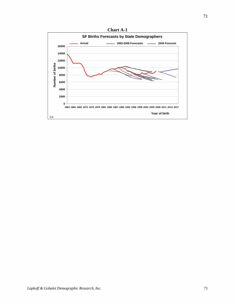
Lapkoff & Gobalet Demographic Research, Inc.
71
71
Chart A-1
SF Births Forecasts by State Demographers
0
2000
4000
6000
8000
10000
12000
14000
16000
1963 1966 1969 1972 1975 1978 1981 1984 1987 1990 1993 1996 1999 2002 2005 2008 2011 2014 2017
Year of birth
Nu
mb
er
of
bir
ths
CA
Actual
births
1983-2008 Forecasts 2009 Forecast

Lapkoff & Gobalet Demographic Research, Inc.
72
72
Appendix B: An Alternative Forecast
We produced an alternative forecast using the kindergarten-to-birth ratio for 2009 and the grade
progression ratios from Fall 2008 to Fall 2009 for each of the next four years. The alternative
forecast ends with Fall 2014. Tables B-1 and B-2 present the result of this alternative forecast
excluding (B.1) and including (B.2) the effects of housing growth in major development areas of
San Francisco. Table B-3 shows how much of the difference in enrollment numbers results from
the alternative forecast compared with the main (most likely) forecast presented earlier.
Table B-1
Alternative forecast, Excluding the Effects of Housing Growth in Major Development Areas
2009 2010 2011 2012 2013 2014
K 4,858 4,759 4,875 5,168 5,156 5,004
1 4,591 4,939 4,838 4,957 5,254 5,242
2 4,271 4,571 4,917 4,817 4,935 5,230
3 4,138 4,302 4,604 4,953 4,852 4,971
4 4,140 4,110 4,273 4,573 4,920 4,819
5 3,925 4,190 4,160 4,325 4,628 4,979
6 3,805 3,753 4,007 3,978 4,136 4,426
7 3,864 3,838 3,786 4,041 4,012 4,171
8 3,971 3,920 3,893 3,840 4,100 4,070
9 4,943 4,822 4,760 4,728 4,663 4,978
10 5,143 4,529 4,417 4,361 4,332 4,272
11 5,036 5,244 4,619 4,505 4,447 4,417
12 4,489 4,442 4,627 4,074 3,974 3,923
K to 5 25,923 26,871 27,668 28,792 29,744 30,245
6 to 8 11,640 11,511 11,686 11,859 12,247 12,668
9 to 12 19,610 19,037 18,422 17,668 17,416 17,591
Total 57,173 57,419 57,776 58,319 59,407 60,503

Lapkoff & Gobalet Demographic Research, Inc.
73
73
Table B-2
Alternative forecast, Including the Effects of Housing Growth in Major Development Areas
2009 2010 2011 2012 2013 2014
K 4,858 4,764 4,894 5,200 5,202 5,066
1 4,591 4,945 4,857 4,989 5,300 5,303
2 4,271 4,577 4,936 4,849 4,981 5,292
3 4,138 4,308 4,623 4,985 4,898 5,032
4 4,140 4,116 4,292 4,605 4,966 4,881
5 3,925 4,195 4,178 4,356 4,675 5,041
6 3,805 3,759 4,025 4,010 4,182 4,488
7 3,864 3,844 3,804 4,073 4,059 4,233
8 3,971 3,925 3,912 3,872 4,146 4,132
9 4,943 4,827 4,778 4,760 4,710 5,040
10 5,143 4,535 4,436 4,393 4,378 4,334
11 5,036 5,250 4,637 4,537 4,493 4,479
12 4,489 4,448 4,645 4,106 4,020 3,985
K to 5 25,923 26,905 27,780 28,984 30,023 30,615
6 to 8 11,640 11,528 11,742 11,955 12,387 12,853
9 to 12 19,610 19,060 18,497 17,796 17,602 17,838
Total 57,173 57,492 58,018 58,735 60,011 61,306

Lapkoff & Gobalet Demographic Research, Inc.
74
74
Table B-3
Difference in enrollment (alternative forecast minus main most likely forecast)
2009 2010 2011 2012 2013 2014
K 0 363 346 344 315 284
1 0 74 433 416 414 384
2 0 39 100 445 415 401
3 0 68 103 161 496 461
4 0 23 82 110 159 484
5 0 30 43 93 110 146
6 0 67 105 123 179 208
7 0 58 118 154 166 218
8 0 64 109 158 185 183
9 0 -627 -521 -437 -346 -333
10 0 -25 -592 -483 -392 -299
11 0 698 544 -37 2 30
12 0 107 695 523 1 23
K to 5 0 597 1,108 1,568 1,908 2,160
6 to 8 0 189 332 435 529 610
9 to 12 0 153 125 -434 -735 -578
Total 0 939 1,565 1,569 1,702 2,191
The overall difference in enrollments between this alternative forecast and the main (most likely)
forecast progressively increases from 939 more in 2010 to 2,191 more in 2014. The difference is
particularly large for elementary school enrollments, which results from the unusually high K/B
ratio in 2009. The difference reaches 2,160 in 2014 because of the birth increases from 2005 to
2008. For middle school enrollments, the alternative forecast also produces a number of students
larger than the main forecast: from 189 more in 2010 to 610 more in 2014. For high school,
however, after two years of enrollments that are higher than in the alternative forecast, the
numbers become lower, reaching -578 in 2013.
Key Finding: when we assume that the high grade progression and K/B ratios of
2009 will continue in the future, the resulting forecast produces nearly 2,200
students (3.7 percent) more than the main forecast in 2014.
Key Finding: The difference in enrollment between the alternative forecast and the
main forecast is larger for elementary school (2,160 more students in 2014), low
but still positive for middle school (610 more students in 2014) and negative for
high school (with 578 fewer students in 2014).

Lapkoff & Gobalet Demographic Research, Inc.
75
75
Appendix C: Analysis of Private School Enrollment Rates in San
Francisco
We carried out a statistical investigation of private school enrollments based on the analysis of
the 2007 American Community Survey (ACS) data. The ACS is a survey administered by the
U.S. Census Bureau and is intended to replace the decennial Census long form. These data allow
us to compare the characteristics of students attending public and private schools.
We first discuss simple analyses showing the percentage of students attending private school by
various characteristics, namely:
family income/wealth,
race/ethnicity,
living arrangements,
type of housing,
(broad) location within the City, and
sex of the student.
Many of these characteristics are correlated with private school enrollment rates. However, the
final section of the report provides results form a multiple regression analysis that allows us to
control for each variable and determine which variables are actually influencing private school
rates. For example, boys are more likely to attend private school than girls, which is statistically
significant in a simple correlation, but once we control for other variables, we find that the sex of
the student does not have a statistically significant effect.
1.16 Summary of Findings
The ACS shows that one in every four children (25 percent) living in San Francisco attends
private school, a number that closely agrees with data from the CBEDS (which was closer to
27 percent after excluding students residing outside of the District).20
Family income is the single most important characteristic of children in private school, even
when controlling for race, place of birth, and area of residence. The wealthier the child’s
family, the more likely he is to attend private school, whatever his race or ethnicity, the San
Francisco neighborhood in which he lives, and whether he is born in the United States or
abroad.
Race is the second most important factor after income. White children are far more likely to
attend private school than children of other races, i.e., Hispanic, Asian, or African American.
This is true even after we control for income/wealth.
20
Note that ACS provides information on children living in San Francisco County. CBEDS provides information on
children attending schools in the County’s schools, including some who live outside San Francisco’s boundaries.
The two sources indicate that about one sixth of all children in San Francisco County private schools live outside of
the County.

Lapkoff & Gobalet Demographic Research, Inc.
76
76
The neighborhood in which children live makes a big difference in whether they attend
private school. Children living in the northwestern part of the City (including the Presidio,
Richmond, and Western Addition) are much more likely to attend private school than children
in any of the other neighborhoods. However, this effect disappears after we control for
income and race.
1.17 The 2007 American Community Survey (ACS)
The American Community Survey (ACS) for 2007 included a sample of 3,434 households and
6,687 individuals (including 659 K-12 students) from San Francisco County. The sample is
representative to the extent that it provides an accurate picture of the overall population of San
Francisco County. In other words, the distribution of the survey populations of housing and
individuals over the available variables is identical to the distribution that would be found in the
overall population of San Francisco County if it could be calculated exhaustively. Statistical
weights21
are provided in the ACS to extrapolate from the sample to the overall population.
Questions were asked in the survey about whether a child attends public or private school and at
which grade level (but not the exact grade). It is therefore possible to compare the characteristics
of public and private school students. Some of these characteristics can be measured at the
individual level (age, sex, and race/ethnicity for instance) and some can be measured at the
household level (type of housing unit, economic activity of the parents, family income, etc.).
Results of bivariate and multivariate analyses on the characteristics of private school students are
presented below.
1.17.1 Private vs. public school students by grade level
Of the kindergarten-through-twelfth grade students in the survey, 25 percent were enrolled in
private schools. As indicated by Figure 1, the highest proportion is found in elementary schools
(28 percent), followed by kindergarten (26 percent), middle school (23 percent) and high school
(22 percent).
21
Statistical weights were used throughout the analyses presented in this report.

Lapkoff & Gobalet Demographic Research, Inc.
77
77
0
5
10
15
20
25
30
Kindergarten Grade 1 to grade 4 Grade 5 to grade 8 Grade 9 to grade 12
Figure 1. Proportion of K-12 Students in Private Schools by Grade Level,
San Francisco County
Pe
rce
nt
stu
de
nts
in
pri
va
te s
ch
oo
ls
Source: Author's calculations from the 2007 American Community Survey.
1.17.1.1 Sex
Boys are more likely than girls to attend private school. Though the difference is small
(52 percent of boys and 48 percent of girls are private school students), it is statistically
significant, i.e., the difference is systematic and is unlikely to be due to random variations. This
result could stem from the higher frequency of disciplinary referrals for boys, and parents are
more likely to transfer children from public to private schools if they are having trouble in their
school.
1.17.1.2 Race and ethnicity
The ACS gathers information on self-declared race/ethnicity, and several answers were possible
on each of the race/ethnicity questions. We constructed a variable to identify students declared as
"White only," "African American only," "Asian or Pacific Islander only," and "Hispanic" (we
arbitrary decided to group into this latter category everyone declared as "Hispanic," regardless of
whether additional ethnicities were declared, "other race only,"22
and "multiple races." Large
variations in the proportion of students in private schools were exhibited on this variable (Figure
2).
22
Because there were only two students declared as "other race only", this category was left out from the analysis.

Lapkoff & Gobalet Demographic Research, Inc.
78
78
0
10
20
30
40
50
60
White only African-American only Asian/PI only Hispanic Multiple races/ethn.
Figure 2. Proportion of K-12 Students in Private Schools by Race/Ethnic group,
San Francisco County
Pe
rce
nt
stu
de
nts
in
pri
va
te s
ch
oo
ls
Source: Author's calculations from the 2007 American Community Survey.
The highest proportion of students in private school is for children declared as "White only" (57
percent), followed by "Multiple races/ethnicities" (29 percent), "Asian or Pacific Islander only"
(18 percent), then "Hispanic" (10 percent) and last "African-American only" (eight percent).
1.17.1.3 Place of birth and nationality
Place of birth makes a big difference, with U.S.-born students more than two and a half times
more likely to attend private school than foreign-born students (28 percent versus 11 percent).
Among foreign-born students, those who are naturalized U.S. citizens are more likely than those
who remain non-U.S. citizens to attend private school (14 percent versus nine percent). We
suspect that it is not naturalization per se which increases the odds of attending private school but
some underlying characteristics more commonly found among both naturalized U.S. citizens and
students in private schools. For instance, immigrants with a high level of education might be
more likely to be naturalized and to send their children to private school. Another factor that
could explain this finding is the ability to speak English well: we found that students who do not
speak English fluently are much less likely to attend private school than others (two percent
versus 27 percent). The fact that non-U.S. citizens are less likely to speak English fluently than
those who are U.S. citizens by naturalization or by birth would explain this.
1.17.1.4 Residential Neighborhood
The survey provides general information on the respondent's area of residence within the County.
Though we do not know the exact location (for the sake of confidentiality), we know in which of
the seven residential neighborhoods defined in the ACS each household is located. These seven
residential areas are called "Public Use Microdata Areas," or "PUMAs" for short. These areas
are the same as those defined for the decennial census. Figure 3 shows the area covered by each
of the seven PUMAs and reflects private school enrollment data from the 2005-2007 ACS
surveys.

Figure 3

1.17.1.5 Income and wealth
The ACS provides information on a number of variables that reflect a household's standard of
living. Among those are family income, household poverty status,23
and allocation of food
stamps. All these variables unsurprisingly point to the same fact, namely that children living in
wealthy or relatively wealthy households are more likely to attend private school than children
living in poor households. When dividing children according to family income quartiles (Figure
4), private school attendance in the poorest quartile is exactly five times lower than in the
wealthiest quartile (11 percent versus 55 percent). It is interesting to note that there is very little
difference between the first and second income quartiles (with 11 percent and 12 percent of
children in private schools, respectively). The proportion of children in private school in the third
quartile is about halfway between that of the two surrounding quartiles (30 percent).
0
10
20
30
40
50
60
1 2 3 4
Figure 4. Proportion of K-12 Students in Private Schools by Family Income Quartile,
San Francisco County
Pe
rce
nt
stu
de
nts
in
pri
va
te s
ch
oo
ls
Source: Author's calculations from the 2007 American Community Survey.
The household income variable is more informative than poverty status as we defined it, since
only children in the highest category of the later (with a household income more than 2.5 times
23
The ACS documentation explains the way in which a person's poverty status is measured: "To determine whether
someone is in poverty, their total family income is compared with the poverty threshold appropriate for that person’s
family size and composition. If the total income of the family is less than the threshold, then the person and every
member of the family are considered to be in poverty". We summarized the original variable to construct four
categories corresponding to (1) a household income less than 50 percent below the poverty line defined in the 2007
ACS, (2) a household income between 50 and 150 percent of the poverty line, (3) a household income 150 to 250
percent of the poverty line, and (4) all remaining households (with higher incomes).
Lapkoff & Gobalet Demographic Research, Inc.
81
81
higher than the poverty level) exhibit a significantly higher probability of attending private school
(with a proportion reaching nearly 40 percent versus 10 percent or slightly less in the other
categories). Similarly, children living in households receiving food stamps are nearly six times
less likely to attend private school than others (five percent and 28 percent, respectively).
1.17.1.6 Living arrangements
Most K-12 students in San Francisco (nearly 70 percent) live with both their parents. The others
are more likely to live with their mothers only (24 percent of the total) than with their fathers
only (eight percent). The rate of children enrolled in private school is found for those living with
both parents (33 percent). Children living with both parents are more than twice as likely to
attend private school as children living with their mothers only (14 percent), who are themselves
over twice as likely to attend private school as children living with their fathers only (six
percent).
1.17.1.7 Type of housing
The ACS does not provide information about whether respondents live in public or other
subsidized housing. Housing types reported in the ACS are: single family units (detached or
attached), two-unit buildings (duplexes), three to four unit buildings (three- and fourplexes), five
to nine-unit buildings, 10 to 19-unit buildings, 20 to 49-unit buildings, and 50 or more-unit
buildings. Most housing units in San Francisco County are single family units (31 percent are
detached single family houses and 37 percent are attached single family houses). Among the
remainder, about a third of the units are duplexes; another third are triplexes, fourplexes, and five
to nine-unit buildings; and the rest have 10 units or more.
Figure 5 shows the proportion of students in private school according to the type of housing in
which they live. Children in single detached family homes and, to a lesser extent, children in
two-unit buildings are much more likely to attend private school (with, respectively, 47 percent
and 29 percent of their students in private school) than children in other housing types. The
lowest proportion of children in private school is found among those living in five to nine, 10-19,
and 20-49-apartment buildings (seven percent, six percent, and eight percent, respectively), while
the proportion of children in private school among those living in three to four-unit buildings is
the same as those living in 50 or more-unit buildings (12 percent).

Lapkoff & Gobalet Demographic Research, Inc.
82
82
0
5
10
15
20
25
30
35
40
45
50
Single family
house detached
Single family
house attached
2 Apartment
building
3-4 Apartment
building
5-9 Apartment
building
10-19 Apartment
building
20-49 Apartment
building
50 or more
apartment building
Figure 5. Proportion of K-12 Students in Private Schools by Type of Housing Unit,
San Francisco County
Pe
rce
nt
stu
de
nts
in
pri
va
te s
ch
oo
ls
Source: Author's calculations from the 2007 American Community Survey.
Though very informative, the type of bivariate analysis presented above is not entirely satisfying,
due to obvious correlations between the variables examined. One would want to know, for
instance, whether the differences in the proportion of children in private school found among
racial and ethnic groups are due to differences in family income among these varied groups.
Perhaps the smaller proportion of African American children compared with Whites in private
schools results from the higher prevalence of poverty among the former compared with the latter.
Multivariate analysis is one of the most useful statistical tools that can be implemented to
disentangle the effects of inter-related explanatory variables (race/ethnicity, area of residence,
family income, etc.) on the outcome variable (attending private school).
1.17.2 Results of the multivariate analysis
We carried out a logistic regression analysis on the odds of attending private school including the
following explanatory variables: race/ethnicity (with "White" as the reference category), place of
birth (the United States), sex (male), living arrangements (living with both parents), geographic
location (PUMA 2201 as a reference point), housing type (single family detached home), and
family income (poorest quartile). To avoid multi-collinearity and redundancy we did not use all
of the available variables, and we regrouped the categories for some variables in order to increase
statistical power. Results are presented in Table 1.
The impact of some factors, which were significant in the bivariate analyses, disappears once all
the other variables are taken into account. This is the case, surprisingly, for sex, which tends to
rule out our first hypothesis (that boys are more likely to be sent to private school because they
are not doing as well in public schools as girls), and for place of birth (not so surprising
considering that foreign-born are more often economically disadvantaged than U.S. born

Lapkoff & Gobalet Demographic Research, Inc.
83
83
children). The other variables in the model exhibit some very strong effect on the odds of
attending private school.
The strongest impacts are that of race/ethnicity and income. The odds of attending private school
for White children are more than four times higher than those of African American, Asian and
Pacific Islander, and Hispanic students. The impact of family income is of the same magnitude:
The odds of attending private school for children living in a family in the highest of the four
income brackets are also nearly four times higher (3.8) than those for children in the lowest
income bracket. Living with just a father considerably reduces the odds of attending private
school but, once all the other variables are hold constant, children living only with a mother are
not significantly less likely to attend private school than children living with both parents. These
findings suggest that the results of the bivariate analysis are due to economic factors (children
living with just a mother were less likely to attend private school because single parent
households are generally more economically disadvantaged than two-parent households). The
area of residence also has a significant effect: children living in PUMA 2201 (Presidio,
Richmond, and Western Addition) are much more likely to attend private school than children in
other neighborhoods (with odds about three times higher). Last, among children in single family
detached homes, the odds of attending private school are about two times higher than those of
children in either single family attached homes or two-unit buildings and three to four times
higher than those of children in larger apartment buildings. To summarize the statistical findings,
very wealthy white people living in single family detached housing units in the northwest
portion of San Francisco are much more likely to send their children to private school than
others.
It would have been very interesting to analyze the reasons for sending children to private schools
as declared by individual and family characteristics. Unfortunately, the ACS does not include
any question on this topic.

Lapkoff & Gobalet Demographic Research, Inc.
84
84
Table C.1. Logistic regression on the odds of attending private school in San Francisco County
Explanatory variable Odds ratio P > |z|
Race and ethnicity
White Reference
African American 0.242 **
Asian/Pacific Islander 0.228 ***
Hispanic 0.285 ***
Multiple race 0.524 --
Place of birth
The United States Reference
Foreign born 0.979 --
Sex
Male Reference
Female 0.767 --
Living arrangements
With both parents Reference
With father only 0.225 ***
With mother only 0.632 --
Neighborhood (PUMA)
PUMA 2201 Reference
PUMA 2002, 2005, 2006 0.347 ***
PUMA 2203, 2204, 2207 0.346 ***
Housing type
Single family home, detached Reference
Single family home, attached 0.456 ***
2-appartment building 0.571 --
3 or more-apartment building 0.285 ***
Family income
First quartile Reference
Second quartile 1.190 --
Third quartile 2.332 **
Fourth quartile 3.796 ***
Number of observations 576
Log-likelihood Chi2 191.18
Pseudo R2 0.2617
Significant at the following thresholds: *** 1 %; ** 5 %; *10 %.
Source: Author's analysis of 2007 ACS data.

Lapkoff & Gobalet Demographic Research, Inc.
85
85
Appendix D: Individual Grade Progressions
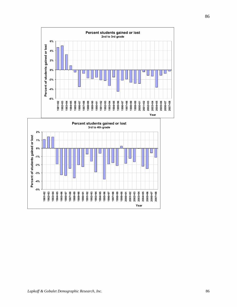
Lapkoff & Gobalet Demographic Research, Inc.
86
86

Lapkoff & Gobalet Demographic Research, Inc.
87
87

Lapkoff & Gobalet Demographic Research, Inc.
88
88

Lapkoff & Gobalet Demographic Research, Inc.
89
89

Lapkoff & Gobalet Demographic Research, Inc.
90
90