deliver perfect images at any size
TRANSCRIPT


I love images.
● BA in Art History● Worked at a stock image company
(RIP Veer)● Front End Developer for 7 years and
now work on Shopify themes
*Source

GOAL.Excellent visual experience across all devices.
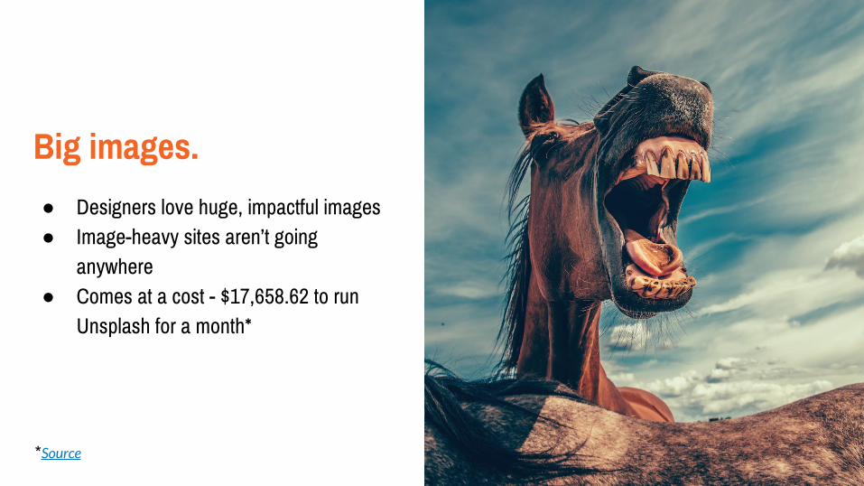
Big images.
● Designers love huge, impactful images● Image-heavy sites aren’t going
anywhere● Comes at a cost - $17,658.62 to run
Unsplash for a month*
*Source
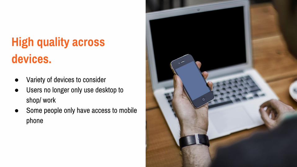
High quality across devices.
● Variety of devices to consider● Users no longer only use desktop to
shop/ work● Some people only have access to mobile
phone

Reduced load times. ● Images are not render-blocking but still
impact user experience● Non-resized images will drain data plans● Is it necessary to load that massive
image?
HOW? 3 things to keep in mind.

FAST.Let’s get things moving.

Your go-to image types.
● JPG● PNG● SVG● GIF● Test out various image types and see
what works best - the smaller the image size, the faster it will download to the browser

The future is cool.
● Hundreds of image file types? What?● BPG will work (but only with some JS)● WEBP works in Chrome and Opera● Keep an eye on these, but they aren’t
there quite yet (sadly)
Get some help.
● CDN is your global team● Deploy your images as fast as possible● Optimize your images before adding to
server (not always possible with content management systems)
● MaxCDN, CloudFlare, Rackspace Cloud Files, CacheFly, AWS and so on

Save it for later.
● Cache your images● Change the request headers of your
resources to use caching*● Edit your .htaccess file (depending on
your set-up)● Be aggressive, be, be aggressive!
*Source
Do you really need that many images?
● Yes. (or maybe not)

GOOD.Couture-quality.

Resize our images.
● Need to have different sizes of our images
● CMS will often provide options for different image dimensions

Image sizes.
● kitten-large.jpg (1024 x 768)● kitten-medium.jpg (640 x 480)● kitten-small.jpg (320 x 240)

Some new friends.
● srcset (new attribute for img)● sizes (new attribute for img)● picture (new element)
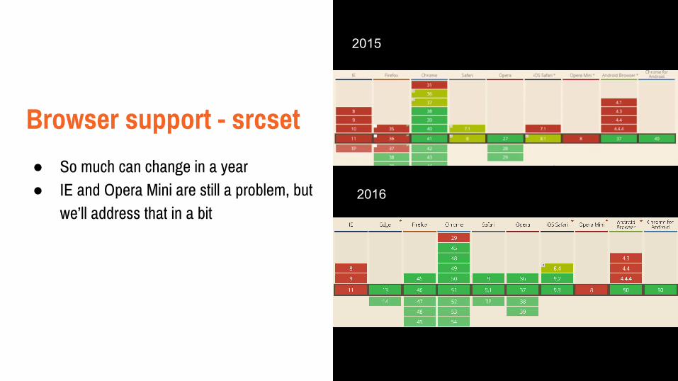
Browser support - srcset
● So much can change in a year● IE and Opera Mini are still a problem, but
we’ll address that in a bit
2015
2016
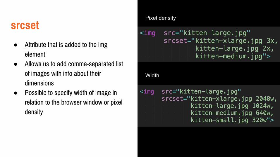
srcset
● Attribute that is added to the img element
● Allows us to add comma-separated list of images with info about their dimensions
● Possible to specify width of image in relation to the browser window or pixel density
Pixel density
Width
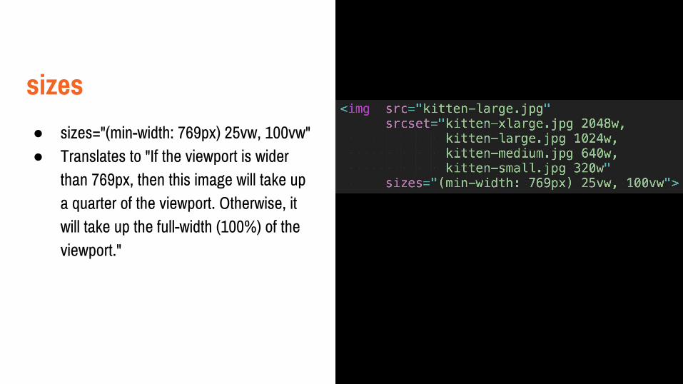
sizes
● sizes="(min-width: 769px) 25vw, 100vw"● Translates to "If the viewport is wider
than 769px, then this image will take up a quarter of the viewport. Otherwise, it will take up the full-width (100%) of the viewport."
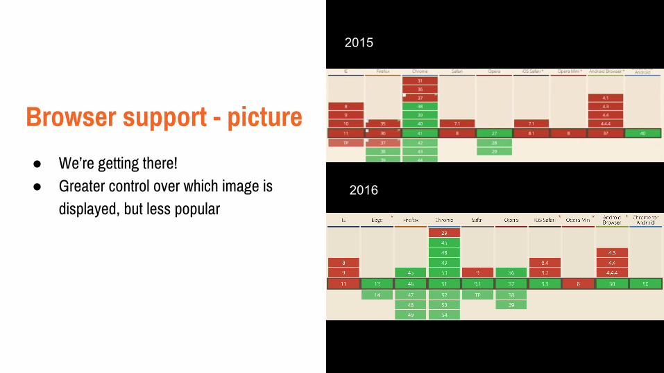
Browser support - picture
● We’re getting there!● Greater control over which image is
displayed, but less popular
2015
2016

picture
● Wraps around the img element● Append classes to img element (or
figure)● Allows for progressive enhancement -
eg. if webp is supported, use it instead
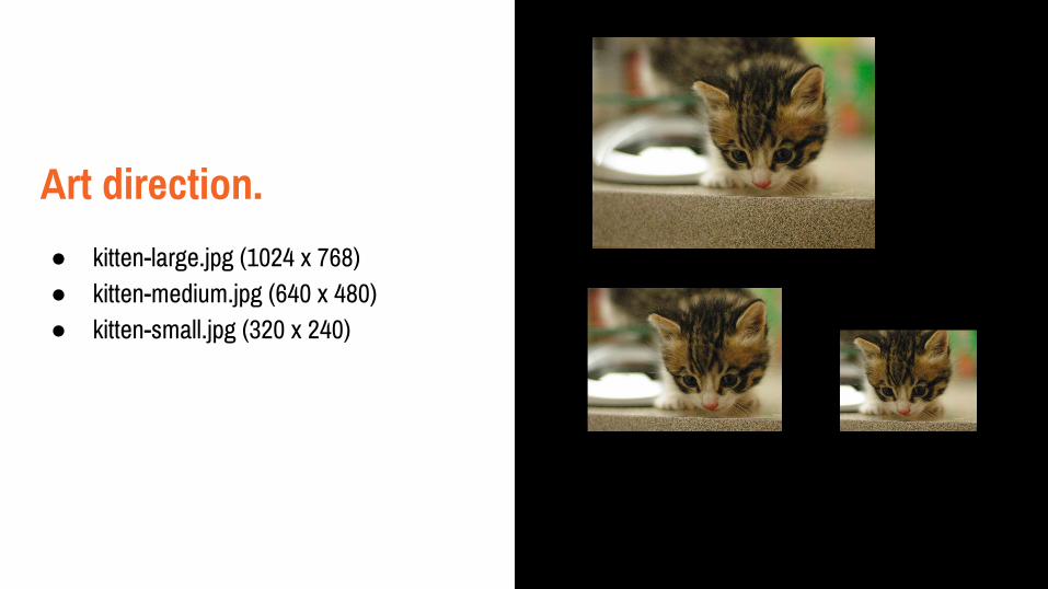
Art direction.
● kitten-large.jpg (1024 x 768)● kitten-medium.jpg (640 x 480)● kitten-small.jpg (320 x 240)

CHEAP.(results may vary)
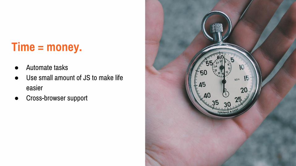
Time = money.
● Automate tasks● Use small amount of JS to make life
easier● Cross-browser support
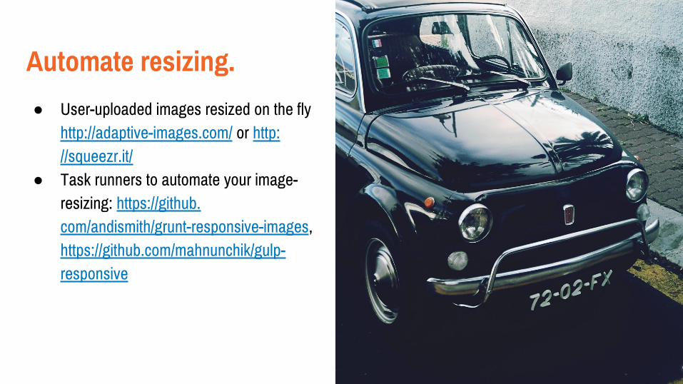
Automate resizing.
● User-uploaded images resized on the fly http://adaptive-images.com/ or http://squeezr.it/
● Task runners to automate your image-resizing: https://github.com/andismith/grunt-responsive-images, https://github.com/mahnunchik/gulp-responsive

IE/ Opera Mini
● First… huzzah for Edge!! Totally supports srcset, sizes and picture
● Alas, IE11 and below/ Opera mini● Picturefill to the rescue!● https://github.com/scottjehl/picturefill● We’ll get there eventually.

Responsive images with a little help from JavaScript.
● https://github.com/kvendrik/responsive-images.js
● https://github.com/wentin/ResponsifyJS/● http://www.imgix.com/imgix-js ($$$)● https://github.com/scottjehl/picturefill
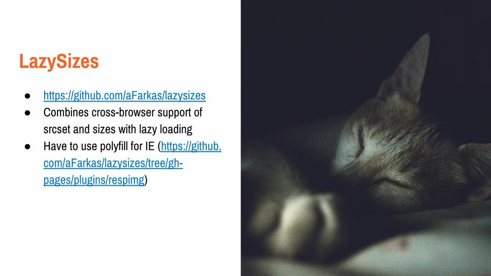
LazySizes
● https://github.com/aFarkas/lazysizes● Combines cross-browser support of
srcset and sizes with lazy loading● Have to use polyfill for IE (https://github.
com/aFarkas/lazysizes/tree/gh-pages/plugins/respimg)

Final thoughts.
● Educate client on side-effects of large images
● Don’t let yourself be constrained to text only!
● Start using srcset, sizes and picture today - the more they are used, the quicker browsers will implement the desired functionality
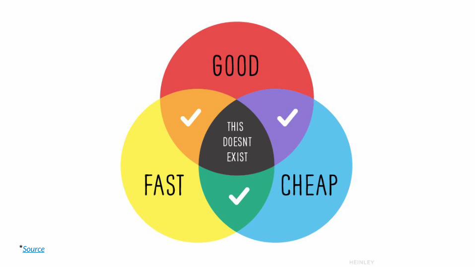
● Fast, good and cheap.

More Rescources.
● Lynda.com Responsive Images● Responsive images 101● Picture Element● Responsive Images overview● Importance of page speed
Thanks for listening!
Anne Thomas@AlfalfaAnneOut of the Sandbox