dbmotion notes
TRANSCRIPT

Background
I’ve been using dbMotion for a few weeks, both
at Magee and at Mercy (using myapps.upmc.
edu). Overall, I’m very impressed with it, in
terms of performance, design, and functionality.
I can only this were a RHIO (Regional Health In-
formation Organization) project that would cross
corporate boundaries.
I have a few minor suggestions for improve-
ment. First, I’ll lay out the specific literature on
user interaction design that leads to these sug-
gestions.
Information Design
Information Design is still defining itself;
Wikipedia says it’s: the art and science of preparing
information so that it can be used by human beings
with efficiency and effectiveness. Wikipedia goes on
to say: the term has come to be used specifically for
graphic design that has the purpose of displaying infor-
mation effectively, rather than just attractively, or for
the purpose of self expression by the designer as artist.
Action-Oriented Information Design is, even more
specifically, information design that is designed
to drive actions, such as the care of a stroke pa-
tient or MI patient in the ED. It aims to decrease
error, to remind practitioners to do those things
that they know to do but might forget, and to
improve compliance with established guide-
lines, while not forcing practitioners into rigid
protocols. Action-oriented information design
also tries to educate practitioners about optimal
ways to perform as they move through their daily
tasks.
If this sounds like the goal of standing orders
for common medical conditions, there is a strong
correlation. Those who are writing standing
orders are, know it or not, practicing
action-oriented information design. More
on that later.
This seems mostly related to com-
puters, but many information design
principles evolved long before the World
Wide Web. A few examples follow. These
have been used in this analysis and con-
stitute a basic reading-list for informa-
tion design practitioners (or critics).
the layout of type on a printed page •
or a computer screen, discussed in Bringhurst’s
seminal Elements of Typographic Style.1
1. Bringhurst R. The elements of typographic style. 3rd ed. Point Roberts, WA: Hartley & Marks; 2004.
dbMotion Notes6/27/08
Keith Conover, M.D., [email protected]

2/10
the layout used in • graphic
design; a computer-oriented
presentation may be found in the
Sun textbook, Designing Visual
Interfaces2
the science and art of color, •
found most accessibly in Itten’s
recent publications.3,4
the science and art of present-•
ing scientific and other
data in comprehensible
form, which finds its most
profound expression in the
published works of Yale’s
Edward Tufte5,6,7,8
forms design• ; those with
deep pockets and much
money at risk (national
tax agencies, large insur-
ance companies) have funded
research into forms design
that has saved them billions of
dollars in improved usability,
and these bits of knowledge are
found in Barnett’s focused and
knowledgeable Forms for People9
more specifically, dbMotion •
can be classed as an information
dashboard; though dbMotion dif-
fers from a typical business dashboard, still much
2. Mullet K, Sano D. Designing Visual Interfaces: Commu-nication Oriented Techniques. Englewood Cliffs, NJ: Sunsoft; 1995.3. Itten J, Birren F. The elements of color; a treatise on the color system of Johanne s Itten, based on his book The art of color. New York,: Van Nostrand Reinhold Co.; 1970.4. Itten J. The art of color : the subjective experience and objective rationale of color. New 1973 ed. New York: Van Nostrand Reinhold; 1973.5. Tufte ER. The visual display of quantitative informa-tion. 2nd ed ed. Cheshire, Conn. (Box 430, Cheshire 06410): Graphics Press; 2001.6. Tufte ER. Envisioning Information. Cheshire, CT: Graphics Press; 1990.7. Tufte ER. Visual explanations : images and quantities, evidence and narrative. Cheshire, Conn.: Graphics Press; 1997.8. Tufte ER. Beautiful evidence. Cheshire, Conn.: Graphics Press; 2006.9. Barnett R. Forms for people: Designing forms that people can use. Canberra, Australia: Robert Barnett and Associates Pty Ltd; 2005.
can be learned from works such as the outstand-
ing Information Dashboard Design.10
Usability and Performance
In his college textbook, Usability Engineering11,
guru Jakob Nielsen (useit.com) lays out a branch-
ing diagram for software suitability analysis (see
below). The right side lists the components of
usability. In the clini-
cal setting – when
users are sleep-
deprived, interrupted
with urgent con-
cerns, particularly
in the emergency
department12,13 –
usability becomes a
much bigger con-
cern, (see below) not
10. Few S. Information dashboard design : the effective vi-sual communication of data. 1st ed. Beijing ; Cambride [MA]: O’Reilly; 2006.11. Nielsen J. Usability Engineering. Boston: Academic Press,; 1993.12. Chisholm, C. D., E. K. Collison, et al. (2000). “Emer-gency department workplace interruptions: are emergency physicians “interrupt-driven” and “multitasking”?” Acad Emerg Med 7(11): 1239-43.13. Chisholm, C. D., A. M. Dornfeld, et al. (2001). “Work interrupted: a comparison of workplace interruptions in emer-gency departments and primary care offices.” Ann Emerg Med 38(2): 146-51.

3/10
only from the viewpoint of user acceptance, but
as a means to preventing medical error.
Another thing we learn from Nielsen is about
the importance of performance. Once one clicks
on the screen, an ordinary user will wait for one
(1) second before turning to something else. In a
busy clinical setting, one can reasonably suspect
that users won’t wait nearly so long.
Analysis Techniques
Much of design is art and intuition. Nonetheless,
there are a few engineering principles and heuris-
tics that can analyze and improve a page.
Using a phrase and concept originated by
Edward Tufte, one can analyze the ink on a piece
of paper – or the pixels on a computer screen – in
terms of data ink and data pixels. How many drops
of ink – or pixels – actually convey needed data?
How many don’t convey data? What is the ratio?
In Nielsen and Tahir’s Homepage Usability14,
they analyze 50 representative home pages,
including some of the most well-known, in terms
including data pixel ratios. While they break
down the screen real estate into multiple catego-
ries, for our use here – which is primarily a us-
ability assessment – the main division is Tufte’s
classic data pixels vs. non-data pixels, related
specifically to the clinician’s task at hand.
A classic example is the display of lab values.
14. Nielsen J, Tahir M. Homepage usability : 50 websites deconstructed. [Indianapolis, IN]: New Riders; 2002.
I’ve found that I can use
the Photoshop rubylith
overlay as a quick-and-
dirty way to mask out
non-data pixels with a
red-tinted overlay. Clini-
cians – and I focus now on
emergency physicians as
the most narrowly task-fo-
cused people around
– want to have the
essential data in
front of them right
away. For example,
when taking a quick
look at a CBC, they
aren’t interested in
the MCV, MCHC,
or a variety of other
information beyond
the basic WBC, Hg,
Hct, and platelet
counts. If they want
more information,
for example the dif-
ferential, they are
happy to click on
something to find
this out. And, as a general medical design princi-
ple, I strongly espouse designing for the ED. It’s
sort of a worst-case scenario. If the system works

4/10
there, it will likely work anywhere. Quoting from
a recent presentation I gave for HIMSS:
Emergency physicians are majorly stressed and
working at max capacity already. Darwinian selec-
tion means that ED staff (from the Critical Incident
Stress Management literature):
have obsessive/compulsive personality traits•
like to be in control•
are risk oriented•
are action-oriented•
“need to be needed”•
are dedicated•
Thus, those in the ED are intolerant
of systems that waste their time. (Look
at the picture on the previous page again;
note the number of users of the handwrit-
ten greaseboard vs. the computer-based
one.) This is why IT traditionally hates the ED,
and why IT projects tend to fail in the ED more
frequently than in other units. Nonetheless,
striving to make things work in the ED is a path
to success throughout the hospital.
Above is a laboratory data display from Well-
soft, which is the leading niche ED IS system
(KLAS overall rating of 8.24, compared with a
market average of 7.30 and a score of 7.09 for
Cerner Firstnet).
If we mask those pixels that are not directly
related to the user’s needs – seeing the basic
CBC results – we see the following.
Compare this with the dashboard design by
Larry Nathanson of Harvard’s Beth Israel-Dea-
coness Medical Center on the next page.
In this example, the lab values are grouped
together, so that users don’t have to scan through
haystacks of data to find the few elements they
really need. The remainder of the screen also
shows information that is more relevant to
the acute-care clinician, compared to the more
detailed laboratory report from Wellsoft, which
nonetheless has fewer data pixels related to the
user’s needs.
Another heuristic to analyze a screen is to
consider position. Realtors speak of “location,
location, location” and this is true of the comput-
er screen as well. Western viewers tend to read
the screen in a predictable fashion, giving pride
of place to things displayed in the upper left or
the center of the screen. The next diagram, from
the previously-mentioned Information Dashboard
Design, illustrates this. Inspect to see if critical
information gets pride of place on the screen.
Finally – and we are getting a bit theoretical
here – we can delve into cognitive psychology to

5/10
see what we can learn about our screen design. If
you are interested, there’s no better place to start
than Colin Ware’s scholarly yet practical text,
Information Visualization.15
A briefer and more accessible source of the
relevant information is found in Few’s previous-
ly-mentioned Information Dashboard Design, where
he presents a precis of the most relevant points
of Ware’s text. The following excerpt gives the
flavor of Few’s presentation:
Preattentive processing, the early stage of visual perception that rapidly occurs below the level of consciousness, is tuned to detect a specific set of visual attributes. Attentive processing is sequen-tial, and therefore much slower. The difference is easy to demonstrate. Take a moment to examine
15. Ware C. Information visualization : perception for design. San Francisco: Morgan Kaufman; 2004.
the four rows of numbers in Figure 4-1, and try to determine as quickly as you can the number of times the number 5 appears in the list.
How many did you find? The correct answer is six. Whether you got the answer right or not, the process took you a while because it involved attentive processing. The list of numbers did not exhibit any preattentive attributes that you could use to distinguish the fives from the other num-bers. Now try it again, this time using the list of numbers in Figure 4-2.
Much easier this time, wasn’t it? In this figure the fives could easily be distinguished from the other numbers, due to their differing color

6/10

7/10
intensity (one of the preattentive attributes we’ll discuss below): the fives are black while all the other numbers are gray, which causes them to stand out in clear contrast. Why couldn’t we eas-ily distinguish the fives in the first set of numbers (Figure 4-1) based purely on their unique shape? Because the complex shapes of the numbers are not attributes that we perceive preattentively. Simple shapes such as circles and squares are pre-attentively perceived, but the shapes of numbers are too elaborate.
In Information Dashboard Design, Few notes
several attributes that can be processed preatten-
tively, as shown on the previous page. A clever
designer could, for example, highlight out-of-
bounds and panic levels using one or more of
these preattentive signals.
Forms Design
The previously-mentioned Forms for People is
chock-full of useful information. Some applies to
paper forms, and some to computer-based input
forms, but there are sections relevant to the dis-
play of tabular data, too.
For instance, when presenting tabular data, Bar-
nett recommends the use of dotted lines; Tufte
also argues for de-emphasizing lines (which, after
all, are not data pixels) by making them gray (as
in dbMotion) or dotted or both.
Another of Barnett’s suggestions – de-emphasize
everything except for what is directly relevant
to the task at hand. For example, there may be
requirements for certain logos or boilerplate text
on a page, but, by decreasing contrast and color
saturation, allowing users to focus on critical
data on the screen. The examples of the UPMC
Mercy MI floor orders and ED orders in the “new
format” based on information design principles
– such as having checkboxes and text right-justi-
fied (decreases error) also show the de-emphasis
of non-critical elements to avoid “sign pollution.”
dbMotion Suggestions
First, let me comment on accessing data. While

8/10
dbMotion is primarily a display medium, one
must provide enough information to access a par-
ticular patient’s records. To find a patient from
Cerner Millenium FirstNet, one must simply type
in either “Lastname, Firstname” or “Firstname
Lastname.” Then, one is presented with a list
of matches, with information such as SSN and
birthdate, that one can use to identify the cor-
rect patient. Simple. Elegant. (One of the better
features of FirstNet.)
But, if one is trying to access dbMotion di-
rectly, say from Mercy, one has to type in the pa-
tient’s last name. And first name. And birthdate,
or SSN, or some other ID information.
As we’ve learned from Google, it’s more ef-
ficient to simply let users (especially those who
are two-finger typists) type the information
into a single field and then let them choose the
best search result. If dbMotion could emulate
the Cerner lookup method, it would make users
much happier.
Next, consider page design in light of the
forgoing. Look first at the lab display. Given what
we know about “pride of place” and preattentive
attributes, what grabs our attention? Based on
contrast, color saturation, and distinctive shapes
– and, just as much, what grabs the eye (which is
one and the same thing), I have circled in yellow
the five things that catch my eye, in this order
1. First, my eye goes to the UPMC which has a
bit of pride of place, in the right upper corner,
and has high color saturation, and high contrast
with the white space around it.
2. Next, my eye is drawn to the tubes full of red
blood, with contrasting white surrounding them,
and a big blue block with a contrasting red line
in it.
3. Next the eyes move to a cluster of pushable
buttons in the most important place at the top
left; this is also the only green on the page except
for the browser’s back arrow which we can
(mostly) ignore as it’s part of the frame.
4. The big, bold, blue block with RESULTS
prominently displayed in it is the next eye-target.
5. Finally, my eyes move to the list of blue, un-

9/10
derlined links.
Note that nowhere in this list are the actual lab
results, not even the ones that are highlighted
in red. Now others’ eyes may move differently.
Nonetheless, from Ware’s work, and the art/
engineering principles espoused by Few, Tufte,
Barnett and others, one can suppose that most
people’s eyes would move the same way.
Suggestion: make the DATA stand out, and
use unsaturated colors with low contrast with
their surrounding for all other, ancillary data.
Another suggestion, from both Barnett and
Tufte: if one uses lines in a table, one should use
gray lines (as are used in dbMotion now). Better
would be gray dotted lines. Or, as shown above
on Page 3 of the UPMC Mercy ED MI orders, no
lines at all, just a tint behind every other row.
(This is for gray-scale printing, but on-screen, a
pale pastel tint is more common.)
While most of these changes are hard to
show with just a screen shot rather than the
actual code, one can play with Photoshop a bit.
I trimmed off the browser frame, masked the
column of actual lab results, and then de-empha-
sized everything else by decreasing saturation,
contrast, and brightness by 50%. I then went
through Photoshop’s filter gallery to find some-
thing that stood out but was still more or less
legible. The result, while quite crude and ugly,
and not all that legible, does bring your attention
to the right spot.
Also, to avoid duplication of data elements on
the screen, I “merged cells” where the date and
the source were the same for multiple items.
Using data-hiding, or encapsulation (think
object-oriented programming) it would be even
10/10
better to provide an overview of the CBC results,
as provided by Larry Nathanson’s dashboard at
BIDMC – even if the capsule summary is in text
rather than the standard tree-graphic format he
uses. If one presents that four essential elements
of the CBC together: WBC, Hgb/Hct, Plats, and
then offers these in a blue underlined link to get
more information, it would allow more useful
information on the screen.
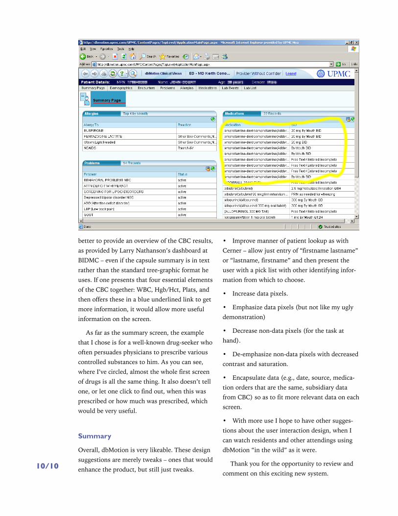
As far as the summary screen, the example
that I chose is for a well-known drug-seeker who
often persuades physicians to prescribe various
controlled substances to him. As you can see,
where I’ve circled, almost the whole first screen
of drugs is all the same thing. It also doesn’t tell
one, or let one click to find out, when this was
prescribed or how much was prescribed, which
would be very useful.
Summary
Overall, dbMotion is very likeable. These design
suggestions are merely tweaks – ones that would
enhance the product, but still just tweaks.
Improve manner of patient lookup as with •
Cerner – allow just entry of “firstname lastname”
or “lastname, firstname” and then present the
user with a pick list with other identifying infor-
mation from which to choose.
Increase data pixels.•
Emphasize data pixels (but not like my ugly •
demonstration)
Decrease non-data pixels (for the task at •
hand).
De-emphasize non-data pixels with decreased •
contrast and saturation.
Encapsulate data (e.g., date, source, medica-•
tion orders that are the same, subsidiary data
from CBC) so as to fit more relevant data on each
screen.
With more use I hope to have other sugges-•
tions about the user interaction design, when I
can watch residents and other attendings using
dbMotion “in the wild” as it were.
Thank you for the opportunity to review and
comment on this exciting new system.