david macaulay: selected drawings and sketches...david macaulay: selected drawings and sketches this...
TRANSCRIPT

David Macaulay: selected
drawings and sketches
The exhibition is made possible with support from the Vermont Arts Council. vermontartscouncil.org
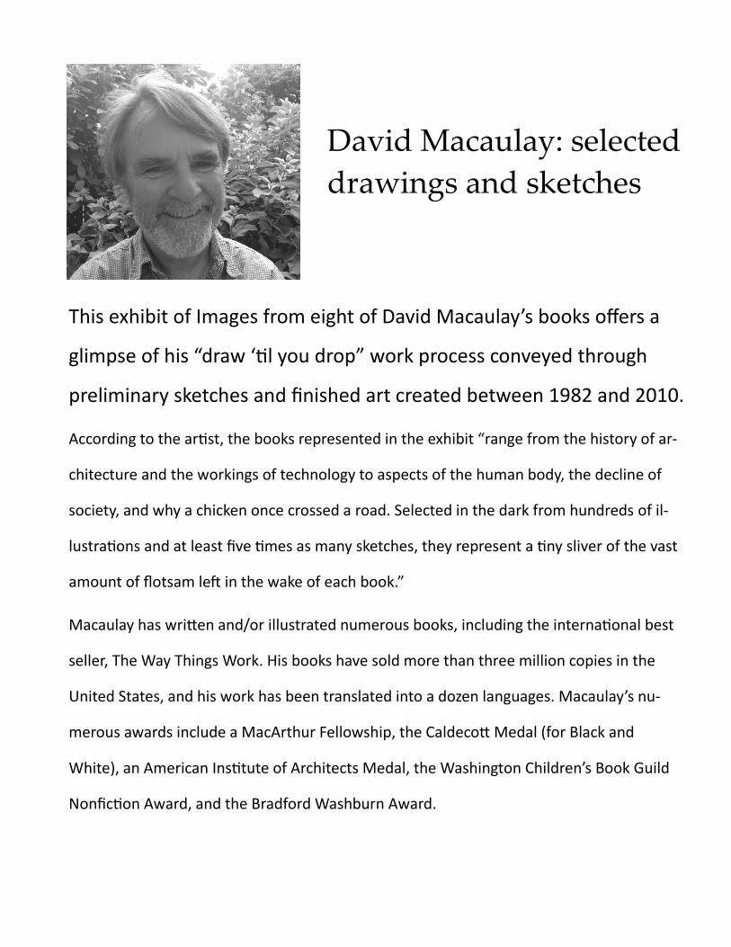
David Macaulay: selected
drawings and sketches
This exhibit of Images from eight of David Macaulay’s books offers a
glimpse of his “draw ‘til you drop” work process conveyed through
preliminary sketches and finished art created between 1982 and 2010.
According to the artist, the books represented in the exhibit “range from the history of ar-
chitecture and the workings of technology to aspects of the human body, the decline of
society, and why a chicken once crossed a road. Selected in the dark from hundreds of il-
lustrations and at least five times as many sketches, they represent a tiny sliver of the vast
amount of flotsam left in the wake of each book.”
Macaulay has written and/or illustrated numerous books, including the international best
seller, The Way Things Work. His books have sold more than three million copies in the
United States, and his work has been translated into a dozen languages. Macaulay’s nu-
merous awards include a MacArthur Fellowship, the Caldecott Medal (for Black and
White), an American Institute of Architects Medal, the Washington Children’s Book Guild
Nonfiction Award, and the Bradford Washburn Award.
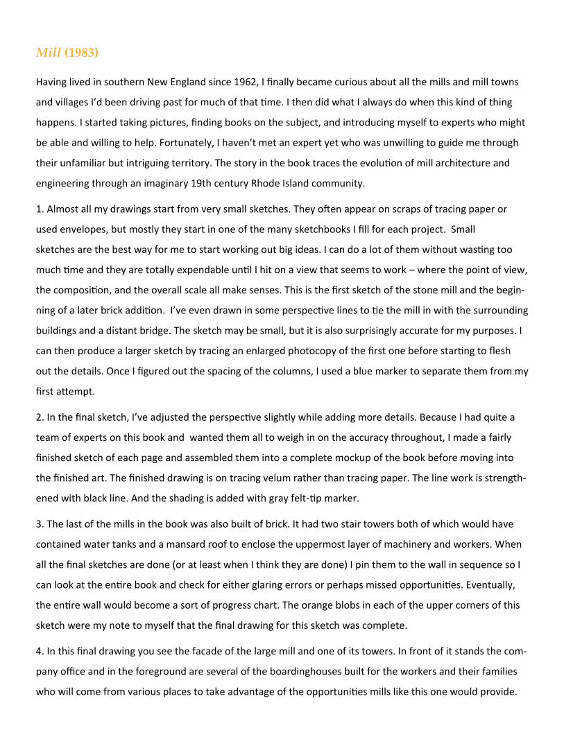
Mill (1983)
Having lived in southern New England since 1962, I finally became curious about all the mills and mill towns
and villages I’d been driving past for much of that time. I then did what I always do when this kind of thing
happens. I started taking pictures, finding books on the subject, and introducing myself to experts who might
be able and willing to help. Fortunately, I haven’t met an expert yet who was unwilling to guide me through
their unfamiliar but intriguing territory. The story in the book traces the evolution of mill architecture and
engineering through an imaginary 19th century Rhode Island community.
1. Almost all my drawings start from very small sketches. They often appear on scraps of tracing paper or
used envelopes, but mostly they start in one of the many sketchbooks I fill for each project. Small
sketches are the best way for me to start working out big ideas. I can do a lot of them without wasting too
much time and they are totally expendable until I hit on a view that seems to work – where the point of view,
the composition, and the overall scale all make senses. This is the first sketch of the stone mill and the begin-
ning of a later brick addition. I’ve even drawn in some perspective lines to tie the mill in with the surrounding
buildings and a distant bridge. The sketch may be small, but it is also surprisingly accurate for my purposes. I
can then produce a larger sketch by tracing an enlarged photocopy of the first one before starting to flesh
out the details. Once I figured out the spacing of the columns, I used a blue marker to separate them from my
first attempt.
2. In the final sketch, I’ve adjusted the perspective slightly while adding more details. Because I had quite a
team of experts on this book and wanted them all to weigh in on the accuracy throughout, I made a fairly
finished sketch of each page and assembled them into a complete mockup of the book before moving into
the finished art. The finished drawing is on tracing velum rather than tracing paper. The line work is strength-
ened with black line. And the shading is added with gray felt-tip marker.
3. The last of the mills in the book was also built of brick. It had two stair towers both of which would have
contained water tanks and a mansard roof to enclose the uppermost layer of machinery and workers. When
all the final sketches are done (or at least when I think they are done) I pin them to the wall in sequence so I
can look at the entire book and check for either glaring errors or perhaps missed opportunities. Eventually,
the entire wall would become a sort of progress chart. The orange blobs in each of the upper corners of this
sketch were my note to myself that the final drawing for this sketch was complete.
4. In this final drawing you see the facade of the large mill and one of its towers. In front of it stands the com-
pany office and in the foreground are several of the boardinghouses built for the workers and their families
who will come from various places to take advantage of the opportunities mills like this one would provide.
The Amazing Brain (1984)
Written by Robert Ornstein and Richard Thompson, The Amazing Brain was my first opportunity to develop
some understanding of how the human body works. The project began as an article for a magazine called
Human Nature of which Ornstein was the editor. The idea, proposed by a neurosurgeon named Joseph
Bogen, was to build a gigantic human brain through which neurosurgeons-in-training could wander to get a
better overall understand of the complex structure and anatomy. My job was to make a few drawings to help
the average educated reader understand what they were looking at while also marveling at the imposing
scale. It was one of the most challenging tasks I’ve ever taken on and even had me in the morgue of a local
teaching hospital cutting up a brain. As well as making three self-contained portfolios that would break up
the sizeable text. I wrote my own text for each restorative interlopers.
1. The first portfolio was set in an imaginary landscape and each drawing was accompanied by a labeled line
drawing that served as a key to the various bits of anatomy. This is the final drawing of the portfolio. I was
inspired in two ways by the works of artist and illustrator Jan Wandelaar, which appeared in Albinus’s
stunning 1774 book on anatomy. First of all, any illustrator willing to add a rhinoceros to a highly technical
drawing of a human skeleton gets my vote. And secondly, the complex line work of the engravings
themselves encouraged me to use a crowquill nib and a bottle of ink to make my own humble contribution to
the field. It’s a tedious process not only for all the lines required, but also for the ever-present danger of a
mischievous blob of ink suddenly releasing itself onto your half finished work.
2. With the third portfolio the challenge once again was to present the internal anatomy of the brain, but this
time as the giant structure first proposed for Human Nature. This one was much less threatening than the
first one, at least technically since it was all drawn with pencil and eraser. However, what I was spared in ink-
angst, I more than paid for in trying to create reasonably accurate pictures of spaces and places I couldn’t ac-
tually get inside.
Imagine a massive construction project in the middle of Central Park. Starting with a reinforced concrete
foundation based loosely on the human skull, I then added from left to right, the two cerebella (auditoriums),
the two thalami just being framed in, and the tops of the eyes, one already covered by “bone.”
3. The giant brain completed. Offices or perhaps a library occupy the nasal cavity while a pair of understanda-
bly nervous eyes stare out at the fleet of school buses simultaneously disgorging their excited and unpredict-
able passengers who swarm the elevators inside the brain stem.
4. My “rhino” was the conversion of the inferior horn of one of the two lateral ventricles (the main entrance
into the Grand Ventricular Tour) into something of a playground. This space would normally be filled with
cerebrospinal fluid which for the benefit of our visitors has been removed. The fluid would have been
produced by the choroid plexus (worms and rice) that climb the shiny white surface of the hippocampus
along with the visitors some of whom are sliding back down.
On the right, we are standing in the space between the two lateral ventricles (not shown) called the third
ventricle. The choroid plexus rises overhead on its way to the fourth ventricle and the cerebral aqueduct and
below it is the great arch forming the all-important connection between the two thalami. I remember
staggering home from my studio at Brown after each day of working on these drawings. I was struggling to
imagine how my brain inside my head was turning itself in knots trying to figure out how to explain this stuff
and make it believable.
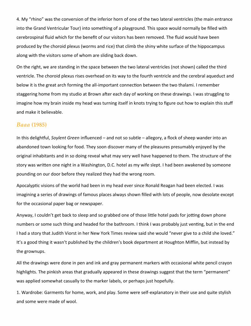
Baaa (1985)
In this delightful, Soylent Green influenced – and not so subtle – allegory, a flock of sheep wander into an
abandoned town looking for food. They soon discover many of the pleasures presumably enjoyed by the
original inhabitants and in so doing reveal what may very well have happened to them. The structure of the
story was written one night in a Washington, D.C. hotel as my wife slept. I had been awakened by someone
pounding on our door before they realized they had the wrong room.
Apocalyptic visions of the world had been in my head ever since Ronald Reagan had been elected. I was
imagining a series of drawings of famous places always shown filled with lots of people, now desolate except
for the occasional paper bag or newspaper.
Anyway, I couldn’t get back to sleep and so grabbed one of those little hotel pads for jotting down phone
numbers or some such thing and headed for the bathroom. I think I was probably just venting, but in the end
I had a story that Judith Viorst in her New York Times review said she would “never give to a child she loved.”
It’s a good thing it wasn’t published by the children’s book department at Houghton Mifflin, but instead by
the grownups.
All the drawings were done in pen and ink and gray permanent markers with occasional white pencil crayon
highlights. The pinkish areas that gradually appeared in these drawings suggest that the term “permanent”
was applied somewhat casually to the marker labels, or perhaps just hopefully.
1. Wardrobe: Garments for home, work, and play. Some were self-explanatory in their use and quite stylish
and some were made of wool.
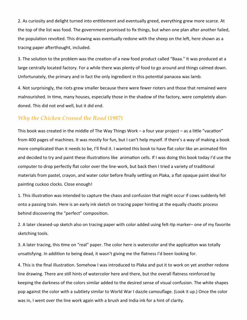
2. As curiosity and delight turned into entitlement and eventually greed, everything grew more scarce. At
the top of the list was food. The government promised to fix things, but when one plan after another failed,
the population revolted. This drawing was eventually redone with the sheep on the left, here shown as a
tracing paper afterthought, included.
3. The solution to the problem was the creation of a new food product called “Baaa.” It was produced at a
large centrally located factory. For a while there was plenty of food to go around and things calmed down.
Unfortunately, the primary and in fact the only ingredient in this potential panacea was lamb.
4. Not surprisingly, the riots grew smaller because there were fewer rioters and those that remained were
malnourished. In time, many houses, especially those in the shadow of the factory, were completely aban-
doned. This did not end well, but it did end.
Why the Chicken Crossed the Road (1987)
This book was created in the middle of The Way Things Work – a four year project – as a little “vacation”
from 400 pages of machines. It was mostly for fun, but I can’t help myself. If there’s a way of making a book
more complicated than it needs to be, I’ll find it. I wanted this book to have flat color like an animated film
and decided to try and paint these illustrations like animation cells. If I was doing this book today I’d use the
computer to drop perfectly flat color over the line-work, but back then I tried a variety of traditional
materials from pastel, crayon, and water color before finally settling on Plaka, a flat opaque paint ideal for
painting cuckoo clocks. Close enough!
1. This illustration was intended to capture the chaos and confusion that might occur if cows suddenly fell
onto a passing train. Here is an early ink sketch on tracing paper hinting at the equally chaotic process
behind discovering the “perfect” composition.
2. A later cleaned-up sketch also on tracing paper with color added using felt-tip marker– one of my favorite
sketching tools.
3. A later tracing, this time on “real” paper. The color here is watercolor and the application was totally
unsatisfying. In addition to being dead, it wasn’t giving me the flatness I’d been looking for.
4. This is the final illustration. Somehow I was introduced to Plaka and put it to work on yet another redone
line drawing. There are still hints of watercolor here and there, but the overall flatness reinforced by
keeping the darkness of the colors similar added to the desired sense of visual confusion. The white shapes
pop against the color with a subtlety similar to World War I dazzle camouflage. (Look it up.) Once the color
was in, I went over the line work again with a brush and India ink for a hint of clarity.
The Way Things Work (1988)
I began working on this book in 1984. The Way Things Work was my first real group project and on an un-
precedented scale. It remains the largest book I have ever worked on and by far the most successful. The iro-
ny is that when first invited to join the team I declined. It just sounded overwhelming and potentially dull. I
also felt I should probably be developing my own words as well as pictures instead. Thankfully, a year or so
later I was asked once again and this time I agreed. I was soon trying to figure out how to make the task less
onerous and if possible, playful.
The art was all done on real (expensive) paper after making countless detailed sketches each of which was
checked and double-checked by the book’s brilliant writer, Neil Ardley. I drew with a dip pen and a bottle of
India ink for maximum authenticity – whatever that is – and then added either sepia ink or paint. Because of
the cost of printing a 400-page book in 1988, only every other spread could be in four colors. The ones in be-
tween were limited to two. One of the many challenges was taking advantage of the full-color option while
trying to avoid a jarring contrast with each turn of the page.
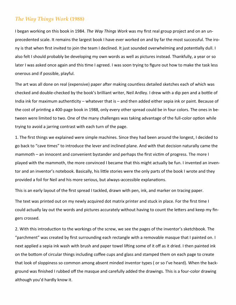
1. The first things we explained were simple machines. Since they had been around the longest, I decided to
go back to “cave times” to introduce the lever and inclined plane. And with that decision naturally came the
mammoth – an innocent and convenient bystander and perhaps the first victim of progress. The more I
played with the mammoth, the more convinced I became that this might actually be fun. I invented an inven-
tor and an inventor’s notebook. Basically, his little stories were the only parts of the book I wrote and they
provided a foil for Neil and his more serious, but always-accessible explanations.
This is an early layout of the first spread I tackled, drawn with pen, ink, and marker on tracing paper.
The text was printed out on my newly acquired dot matrix printer and stuck in place. For the first time I
could actually lay out the words and pictures accurately without having to count the letters and keep my fin-
gers crossed.
2. With this introduction to the workings of the screw, we see the pages of the inventor’s sketchbook. The
“parchment” was created by first surrounding each rectangle with a removable masque that I painted on. I
next applied a sepia ink wash with brush and paper towel lifting some of it off as it dried. I then painted ink
on the bottom of circular things including coffee cups and glass and stamped them on each page to create
that look of sloppiness so common among absent minded inventor types ( or so I’ve heard). When the back-
ground was finished I rubbed off the masque and carefully added the drawings. This is a four-color drawing
although you’d hardly know it.
3. Here’s a two-color spread of the screw at work. My favorite drawings are the one’s that show familiar
things in a way we’re not used to seeing them. The “hand of god” is always useful for adjusting one’s per-
spective on such a mundane device.
4. In this four-color spread, the heating elements inside the kettle, hair dryer, and toaster get the full red-
paint treatment. Because these elements are comparatively thin, the color doesn’t overwhelm the page.
Playing with the scale of two of these devices creates visual variety and breaks up the pages into self-
contained areas for blocks of type. And who knew that making toast of just the right darkness was such a
complex and demanding process?
Mosque (2003)
A few days after 9/11 and still in shock, I called my publisher and suggested postponing what I was working
on (The Way We Work) and replace it with a book about the building of a mosque to join Cathedral on the
Macaulay architecture shelf. He agreed and I was off.
Two years earlier I’d spent time in Istanbul and Cairo filming the PBS series Building Big and was still enjoying
fond memories of the people and places we’d visited. I felt compelled to tell a story about human achieve-
ment that would perhaps balance at least a little the story of horrendous destruction we were all slowly re-
covering from.
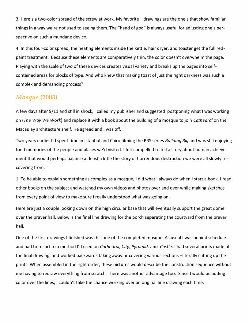
1. To be able to explain something as complex as a mosque, I did what I always do when I start a book. I read
other books on the subject and watched my own videos and photos over and over while making sketches
from every point of view to make sure I really understood what was going on.
Here are just a couple looking down on the high circular base that will eventually support the great dome
over the prayer hall. Below is the final line drawing for the porch separating the courtyard from the prayer
hall.
One of the first drawings I finished was this one of the completed mosque. As usual I was behind schedule
and had to resort to a method I’d used on Cathedral, City, Pyramid, and Castle. I had several prints made of
the final drawing, and worked backwards taking away or covering various sections –literally cutting up the
prints. When assembled in the right order, these pictures would describe the construction sequence without
me having to redraw everything from scratch. There was another advantage too. Since I would be adding
color over the lines, I couldn’t take the chance working over an original line drawing each time.
3. The line work in this drawing is an enlarged print of the previous drawing after the necessary “editing.”
The color is all Prismacolor (pencil crayons). I never learned how to paint, so I usually avoid the process.
There are exceptions for example; The Way Things Work and Black and White, but rather than take the time
to really develop the skills, I prefer to “draw” the color knowing I will have greater control over the results.
4. I wanted to show what it might feel like to see the prayer hall from above, from the base of the dome we
saw in the first sketches (1). The line work and the color here are both Prismacolor. The chandelier was
drawn on a separate piece of tracing paper and laid over the main drawing before the print was made.
Working from this angle not only allowed me to capture a sense of the space, but also include structural
details such as the iron reinforcing that helps stabilized the arches rising from the main piers. And check out
those shoes and the hint of wardrobe – both based on my research.
The Way We Work (2008)
This was the most difficult book I have ever worked on and I plan to keep it that way. Following one’s own
curiosity is risky, ask any cat, but when I set out to learn everything I could about how I actually work, I had
no idea what I was getting myself into. Even with the help of experts and eventually a co-writer, the
adventure gobbled up almost seven years and a huge amount of creative energy. Although it’s well behind
me, I still have mixed feelings about the decision in the first place. I probably should just have rented
Fantastic Voyage, binge watched it for a week, and moved on.
Still. there is no use crying over spilt milk, ask any cat, and I do carry a certain pride in having learned a lot
and surviving the process. Making these drawings was intimidating to say the least.
There is so much rich material out there (and I feel like I looked at almost all of it), and so many exquisite
illustrations, I couldn’t imagine how I could add to it in a meaningful way never mind improve on it. But after
the first few years there was no turning back. I was in too deep to abandon my quest. The only solution was
to take the information I was slowly learning and try to have a little fun with it, initially for my own sanity, but
also for a future reader’s pleasure. Here are just few examples of that approach.
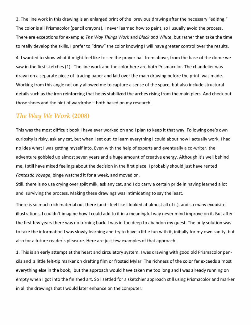
1. This is an early attempt at the heart and circulatory system. I was drawing with good old Prismacolor pen-
cils and a little felt-tip marker on drafting film or frosted Mylar. The richness of the color far exceeds almost
everything else in the book, but the approach would have taken me too long and I was already running on
empty when I got into the finished art. So I settled for a sketchier approach still using Prismacolor and marker
in all the drawings that I would later enhance on the computer.
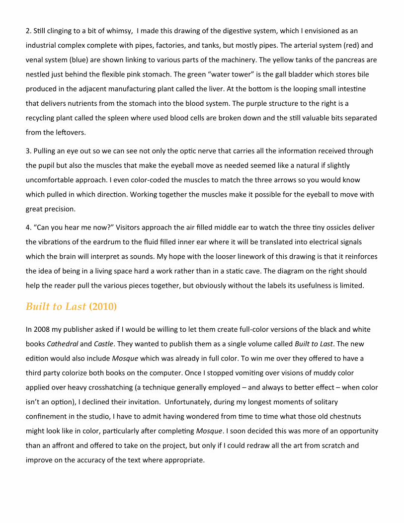
2. Still clinging to a bit of whimsy, I made this drawing of the digestive system, which I envisioned as an
industrial complex complete with pipes, factories, and tanks, but mostly pipes. The arterial system (red) and
venal system (blue) are shown linking to various parts of the machinery. The yellow tanks of the pancreas are
nestled just behind the flexible pink stomach. The green “water tower” is the gall bladder which stores bile
produced in the adjacent manufacturing plant called the liver. At the bottom is the looping small intestine
that delivers nutrients from the stomach into the blood system. The purple structure to the right is a
recycling plant called the spleen where used blood cells are broken down and the still valuable bits separated
from the leftovers.
3. Pulling an eye out so we can see not only the optic nerve that carries all the information received through
the pupil but also the muscles that make the eyeball move as needed seemed like a natural if slightly
uncomfortable approach. I even color-coded the muscles to match the three arrows so you would know
which pulled in which direction. Working together the muscles make it possible for the eyeball to move with
great precision.
4. “Can you hear me now?” Visitors approach the air filled middle ear to watch the three tiny ossicles deliver
the vibrations of the eardrum to the fluid filled inner ear where it will be translated into electrical signals
which the brain will interpret as sounds. My hope with the looser linework of this drawing is that it reinforces
the idea of being in a living space hard a work rather than in a static cave. The diagram on the right should
help the reader pull the various pieces together, but obviously without the labels its usefulness is limited.
Built to Last (2010)
In 2008 my publisher asked if I would be willing to let them create full-color versions of the black and white
books Cathedral and Castle. They wanted to publish them as a single volume called Built to Last. The new
edition would also include Mosque which was already in full color. To win me over they offered to have a
third party colorize both books on the computer. Once I stopped vomiting over visions of muddy color
applied over heavy crosshatching (a technique generally employed – and always to better effect – when color
isn’t an option), I declined their invitation. Unfortunately, during my longest moments of solitary
confinement in the studio, I have to admit having wondered from time to time what those old chestnuts
might look like in color, particularly after completing Mosque. I soon decided this was more of an opportunity
than an affront and offered to take on the project, but only if I could redraw all the art from scratch and
improve on the accuracy of the text where appropriate.
Cathedral (Built to Last version)
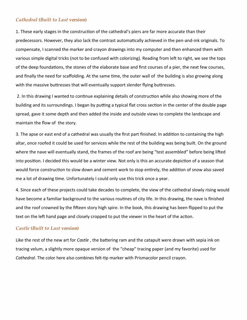
1. These early stages in the construction of the cathedral’s piers are far more accurate than their
predecessors. However, they also lack the contrast automatically achieved in the pen-and-ink originals. To
compensate, I scanned the marker and crayon drawings into my computer and then enhanced them with
various simple digital tricks (not to be confused with colorizing). Reading from left to right, we see the tops
of the deep foundations, the stones of the elaborate base and first courses of a pier, the next few courses,
and finally the need for scaffolding. At the same time, the outer wall of the building is also growing along
with the massive buttresses that will eventually support slender flying buttresses.
2. In this drawing I wanted to continue explaining details of construction while also showing more of the
building and its surroundings. I began by putting a typical flat cross section in the center of the double page
spread, gave it some depth and then added the inside and outside views to complete the landscape and
maintain the flow of the story.
3. The apse or east end of a cathedral was usually the first part finished. In addition to containing the high
altar, once roofed it could be used for services while the rest of the building was being built. On the ground
where the nave will eventually stand, the frames of the roof are being “test assembled” before being lifted
into position. I decided this would be a winter view. Not only is this an accurate depiction of a season that
would force construction to slow down and cement work to stop entirely, the addition of snow also saved
me a lot of drawing time. Unfortunately I could only use this trick once a year.
4. Since each of these projects could take decades to complete, the view of the cathedral slowly rising would
have become a familiar background to the various routines of city life. In this drawing, the nave is finished
and the roof crowned by the fifteen story high spire. In the book, this drawing has been flipped to put the
text on the left hand page and closely cropped to put the viewer in the heart of the action.
Castle (Built to Last version)
Like the rest of the new art for Castle , the battering ram and the catapult were drawn with sepia ink on
tracing velum, a slightly more opaque version of the “cheap” tracing paper (and my favorite) used for
Cathedral. The color here also combines felt-tip marker with Prismacolor pencil crayon.
