data.library.virginia.edu€¦ · web viewgis for policy: a beginner’s workbook for spatial...
TRANSCRIPT

GIS for Policy:A Beginner’s Workbook for Spatial Analysis of Things that Matter
Version 1.3, Tailored to QGIS, v 3.4.x, “Madeira”
Spencer Phillips, Ph.D. Goucher College & University of Virginia
Erich PurpurUniversity of Virginia

ContentsUsing this Guide 3
Abbreviations and Terms 3
Conventions Used in This Guide 3
Why GIS for Policy? 5
Tool Time 1: Loading data; navigating the Canvas; creating and calculating attributes; symbolizing your map; and using the Print Composer 6
Install QGIS 6
Create Folders for storing your GIS data and QGIS projects 6
Download and Extract data for Class 1 6
Open (or Start) QGIS 7
Explore Panels and Toolbars 7
Adding Data to the map (Two methods) 7
Explore the Table of Contents 8
Navigating the Map 8
Identify features 9
Saving the Project 9
Exploring Attribute Tables 9
Create Field & Using the Field Calculator 10
Selecting Features and Creating a New Layer from the Selection 10
Selecting Features 11
Create a New Layer from Selected Features (Reprise/Practice) 12
Changing How Layers are Displayed (Labels and Symbols) 12
Working with Print Layouts 13
A word about coordinate reference systems 15
Tool Time 2: More querying/selecting data; geoprocessing; joining tabular and spatial data 16
More Geoprocessing tools:See also “QGIS_VectorDataProcessing.PDF”, posted in the workshop resources. 20
1

Tool Time 3: Creating spatial data; creating features from coordinates; georeferencing earth imagery; creating features from nothing 24
Tool Time 4: Introduction to raster data 29
Additional Exercises – These are your homework assignments!
HOMEWORK 1: Getting data, basic mapping, spreadsheets for data development 33
HOMEWORK 2: Joining tabular and spatial data; and using the print composer 37
HOMEWORK 3: Editing and creating spatial data. 39
Resources 44
GIS Data Sources 44
Loading Data from an ESRI File Geodatabase (Windows only) 44
Locator maps: 44
Adding a map service from the U.S. National Map (USGS): 44
Symbolize a point layer by the size of the point: 44
Should I merge or should I union? 47
Favorite Plugins 50
Cartography Examples 50
A note on Raster processing for Mac Users [DRAFT] 50
2

Using this Guide This guide includes detailed step-by-step instruction for the in-workshop “GIS Tool Time” sessions, the practice exercises, and resources for further learning and practice. Workshop participants can also find these and other resources in the workshop Wiki pages. I recommend that participants repeat the in-workshop exercises on their own, then tackle the practice exercises to hone their skill in using the tools.
Data for the in-workshop and practice exercises will be posted in the appropriate course management system, or on shared space on the cloud.
Abbreviations and Terms
CRS: Coordinate Reference System, also “projection”, is the set of rules that determine how the three-dimensional world is represented on a two-dimensional map. See https://docs.qgis.org/3.4/en/docs/gentle_gis_introduction/coordinate_reference_systems.html
GIS: Geographic Information System
QGIS: Quantum GIS, the open source GIS software used for this course
Layer: A set of spatial data to be displayed on the map, including instructions for how it will be displayed.
Print Composer: A representation of a particular view of your QGIS project where you do your cartography, or turn your view of the spatial data into a map.
Project: A QGIS file that provides a set of commands for how map data will be displayed. It is within the Project workspace (the canvas) that you will do your GIS analysis.
Spatial Data: The actual data that are displayed as a Layer in your map Project and your Print Composer. These data are not part of your Project, but they reside on your hard drive or on a server accessed via the internet or other network.
Raster Data: Spatial data in which an area is covered by a grid (like a checkerboard or matrix) with each square taking a numeric value representing something about the corresponding spot on the surface of the earth, like population density, land cover, elevation, etc.
Vector Data: Spatial data for depicting and analyzing Points, Lines, and Polygons
Conventions Used in This Guide
Navigating menus: Each step or selection is separated by a forward slash, so “Project/Project Properties/CRS” means click the “Project” menu, then click the “Project Properties” option, then click the “CRS” option, and so on.
3
(Back slashes are used to show file structure, as in “Save your project to C:\_GIS\GISWorkshop\ToolTime1\MYPROJECTNAME.qgs”)
Open: Double click the thing to be opened (a project, a layer, etc.) so you can work with it.
Right click: This usually gives you a range of options for what to do with/about/to the thing right clicked (project, layer, etc.). The default option is usually to “open” it, but not always. If you are running QGIS on Mac OS, you “right click” by holding the Control key and clicking your one mouse button. (Note: it is HIGHLY preferable to have a two-button mouse with a scroll wheel for working in QGIS, even if you use a Mac.)
Select: means single-click the indicated item, tool, layer, map feature, etc. This usually results in the item being highlighted in some way, indicating that it has been selected, and you can now do something with it.
4

Why GIS for Policy? Whether you want to boost a company's market share, win an election, reach people most in need with vital human services, fight for environmental justice, or protect wild places for people and for non-human creatures, being able to put information about key economic, political, social, and ecological relationships on the map is an increasingly critical skill. Geographic Information Systems (GIS) technology helps us better understand those relationships and design solutions for society's most pressing problems. This hands-on workshop (or short course) introduces underlying spatial reasoning from various fields (economics, politics, environmental justice, epidemiology, conservation biology) and prepares students to apply GIS tools and techniques to a real-life issue of their choosing.
Workshop sessions include examples, hands-on group instruction, and practice exercises to be completed on one’s own or in class. Workshop participants also conduct a spatial analysis related to a topic of their choosing, with a final meeting reserved for presentations and discussion of these projects.
5

Tool Time 1: Installation, Loading data; navigating the Canvas; creating and calculating attributes; symbolizing your map; and using the Print ComposerNote: Instructions will be fairly complete for the first time we do something. When we do the same thing again, only the key points or the intended outcome are included in the instructions.
Install QGIS1. In your browser, navigate to the QGIS main download page:
https://qgis.org/en/site/forusers/download.html2. Expand the section for your operating System1
2.1. For Windows:2.1.1. Click the “QGIS Standalone Installer Version 3.4” either 32- or 64-bit version, depending
on which version of Windows you are running2
2.1.2. When the download is complete, double click the executable (e.g. “QGIS-OSGeo4W-3.4.8-1-Setup-x86_64.exe”) to install the software.
After installation you will have a QGIS 3.4 folder, most likely in your “Programs” folder.2.2. For Mac
2.2.1. Click the “Download for Mac OsX” link, then choose “Long Term Release (most stable)”. This will be QGIS 3_4_x
2.2.2. Run the installation. The wizard should walk you through the steps to do so.
*Note* - QGIS 3.x requires Python 3.6 in order to run. We will not be using it in the workbook, but it is still required to run QGIS. If you do not have Python 3.6 currently installed, you can get it here: https://www.python.org/downloads/release/python-369/
Create Folders for storing your GIS data and QGIS projectsIn whatever file management system you have:1. Make a folder called “GIS Workshops” on your hard drive, such as “C:\GIS\GISWorkshop”.2. If you have been provided a data USB drive or via download, copy (or extract) the contents the
GISWorkshop folder (or the GISWorkshopDATA.zip file) on that source to the folder you just created.3. If not, create a subfolder in GISWorkshop called “ToolTime1”, then a folder within that called
“VectorData1”
1 There are some differences in how things appear or work on a Mac versus a Windows machine. In this workbook green text indicates Windows-specific instructions or information.
2 If you are not sure which you have, open File Explorer, find “This PC”, right click it, and select “Properties” from the menu. The “System Type” field will tell you whether your Windows OS is 32- or 64-bit.
6

Download and Extract data for Class 11. Go to www.census.gov and navigate to Browse by Topic / Geography2. Scroll down and select TIGER/Line Shapefiles.3. Click the 2018 tab.4. Pick “Web Interface at the bottom of the page.5. From the drop down menu, pick “Counties (and equivalent)”, “Submit", and "Download national
file"6. Now pick “States (and equivalent)”, “Submit”, and “Download national file”.7. Extract both .zip files to [c:\...\]GISWorkshop\ToolTime1\VectorData1
(or wherever you save your data)Note: A Nice feature of QGIS is that you preview GIS data w/in a .zip file. However, you will not be able to edit data w/in a .zip.
8. The rest of your data will be available on the course Collab page under the Resources tab.
Open (or Start) QGIS1. Start the program:
Windows: Click the Start button at the bottom left of your screen and start typing “QGIS….”, then click on the “QGIS Desktop…” shortcut that pops up.
Mac: Use search to find QGIS and click the icon for QGIS2. Read the tips that pop up. There is always something new to learn.3. Close the tips.4. Start a new project by clicking the “New” (blank page) icon at the left hand side of the tool bar.
You can also select “Project / New” from the menu.
Explore Panels and Toolbars1. The Browser Panel: Explore your hard drive and any connected cloud storage here. The browser
panel will probably be on the left side of your screen and looks like a series of folders, web services, etc.
If you don’t see the Browser panel, see the next instruction.
2. Panels and Toolbars2.1. Practice turning toolbars on and off.
2.1.1. If you do not see the browser panel, at the top of your screen go to Menu: View / Panels / Browser.
2.1.2. Make sure the basics are turned on, which are called “Browser” and “Layers” to get started. We will turn more on/off as we go.
7

2.2. You can also right click an empty space in any ribbon or menu bar to see which panels and toolbars are turned on.
Adding Data to the map (Two methods)1. Using the Layer Tool
1.1. Menu: Layer / Add layer / Add vector layer1.1.1. Navigate to and add your US states layer. If you haven’t yet you should move this to the
“Tool Time 1” folder. Do the same for the US counties layer. 2. Using drag and drop from the Browser Panel
2.1. In the Browser Panel, navigate to where you save your data and drag the layer into the main part of the map with your states layer.
Note: With both of these methods you are likely to see a bunch of files with the same name and different extensions. The reason is that the map data are usually stored in several files with different purposes. These files need to be kept together in one place for the GIS to properly use them.What you need to know at this point is that you want to drag and drop the file that ends with the “.shp” extension.
Adding BasemapsA basemap is basically a background image you can use as a nice backdrop or reference map for your projects. In your Browser panel, you are given one basemap by default under ‘XYZ Tiles’. But many more exist. To add a bunch more, first go here: https://raw.githubusercontent.com/epurpur/PyQGIS-Scripts/master/qgis_basemaps.py
This is a python script which will add basemap connections to your map interface. You do not need to know how to code or even know what python is to be able to use it. This is just the code as raw text. Highlight and copy the entire text from this site (CTRL + A for PC, CMD + A for Mac).
Now, back in QGIS, at the top of the screen go to Plugins > Python Console. The python console will appear, probably across the bottom of your screen. Copy the text from the previous link into the python console and press enter (maybe twice?). Now look back in your Browser tab under ‘XYZ Tiles’ and you should have quite a few more.
FYI, python and QGIS are integrated. There is a lot of power in being able to write some python scripts to automate repetitive tasks, build your own plugins, and so on. Just know that all the steps you will do throughout this course via various widgets and buttons can all be duplicated in python. This is outside the scope of this course but if you have an interest in learning more, this is a good place to start: https://docs.qgis.org/testing/en/docs/pyqgis_developer_cookbook/
Explore the Table of Contents1. Open the Layers Panel if it is not already open.2. Turn Layers on and off3. Move Layers (drawing order)
3.1. Move counties on top of states or vice- versa by clicking and dragging them in the layers panel.
8

4. Rename layers.
Often (as in the case of these US Census data files) the data files may have names that are not easy to understand. Fortunately, you can name a data layer anything you like without having to change any file names. Let’s practice4.1. Choose one of your layers, right click it, and select “Rename Layer” from the menu.4.2. Type any name you like but remember, layer names should be descriptive.
Remember, this does not change the name of the file itself, only how it is represented on the map.
4.3. Now rename your other layer.
Navigating the MapTo move around and view the map, we’ll use a Tools found in the Navigation Toolbar, which looks like this:
If you hover over these (or any tool on any toolbar), you’ll get a short description to remind you of the tool name.
Let’s practice using a couple of them, from left to right..
1. Pan (the hand icon) is for moving the map around without zooming in or out. Select the tool, then click, hold, and drag the map in any direction.
2. Pan to Selection moves the map so that it is centered on any selected features. are in the center of 3. Zoom in/out
3.1. Incremental in/out (magnifying glasses with the “+” and “-”). Select the tool, then click the map to zoom in/out by a fixed amount.
3.2. Bounding box in/out. 3.2.1. For IN, select the “+” magnifying glass, then click and drag a rectangle. When you
release the mouse button, the map will zoom to that extent. (You might not see the same rectangle you traced, depending on the dimensions of the map canvas.)
3.2.2. For OUT, select the “-” magnifying glass, then click and drag to draw a big rectangle to zoom out a little and a small rectangle to zoom out a lot.
3.3. Zoom Full (magnifying glass with three arrows). Click this icon to zoom to the largest extent of any layer in your project.
3.4. Zoom to Selection (magnifying glass over yellow rectangle). Click to zoom to selected features.3.5. Zoom to Layer (magnifying glass over grey rectangle). Click to zoom to the active layer, which is
the one highlighted in your Layers panel.3.6. Zoom Last and Zoom Next (magnifying glass with “<” or “>”). These are like the back and
forward buttons in your browser. Click them to go to the previous zoomed extent or the next zoomed extent.
9

Identify features
1. First, note Note that you will “identify” whatever layer is active (selected) in your Layers panel.2. Choose identify from drop-down box3. Clicking on Map4. Clicking on the feature in the identify box5. Look at attributes in “identify results” box6. The identify tool can be really helpful. When clicking on a map object you will see the attributes of
this object displayed on the right side of the screen in the “Identify Results” panel. This shows attribute information for vector objects and raster values for raster objects. Basically, this tool gives you a look at all the attributes of the object you clicked on. We have not covered the attribute table yet, but you are seeing the row(s) in the attribute table for the items you clicked on with the identify tool.
Saving the Project1. Project/Save as "Class1.QGS".
Make sure you save in your Exercise1 folder with your other data.
2. You can also click this icon:
Exploring Attribute Tables3. Explore the attribute table
3.1. Right click one of your layers and select "open attribute table"4. The attribute table is a tabular view of the information for all objects in that layer. We used the
identify tool earlier which shows the attributes for only the object(s) you clicked on. The attribute table contains all underlying information and can be used to manipulate your objects.
4.1. Click the abacus and select “Create New Field” -When hovering over icon it reads “Open Field Calculator”
Create Field & Using the Field Calculator4.2. Choose “Create a New Field”4.3. Make Output Field name “AreaL”4.4. Select Decimal Number from Output Field type4.5. Click the arrow next to “Fields and Values” (below in middle column), since we are going to
calculate the value based on the value of other field.4.6. Double click “ALAND” (which is the area that is land). Don’t just type “ALAND” as the dialog box
on the left is very sensitive to syntax errors. These become easier to make the more complex your statement is.
10

4.7. Click OK4.8. Repeat the above steps for the AWATER field and create a new “AreaW” field. You’ll now have
2 new fields in your attribute table. AreaL and AreaW which will be identical to the information in AreaL and AreaW, except with a different data type (decimal vs whole number)
4.9. Now create a new field, “PctWater”4.9.1. Choose “Decimal number” as output field type or your output won’t look right. 4.9.2. Create the following expression in the dialog box: “AreaW”/(“AreaW”+”AreaL”)4.9.3. Double click AreaW from Fields and Values4.9.4. Click divided by sign “/”4.9.5. Click the open parentheses “(”4.9.6. Double click AreaW4.9.7. Click “+” (or type a plus sign)4.9.8. Double click AreaL4.9.9. Click “)”4.9.10. Click OK.You have now created a new field (“PctWater”) which shows the ratio of water area in each county.Do not worry about the nulls, or blanks, in the PctWater field we created. I am fairly certain that it is problem with bad data. I don’t know why that would have happened, but we don’t need to worry about it. As long as you see the process of creating new columns in your attribute table by using existing columns to create new ones.
Selecting Features and Creating a New Layer from the SelectionSelecting is a simple but incredibly powerful tool to parse your dataset. Often, you will want to slice and dice different parts of your data which are meaningful to you. There are several ways to select objects on your map.
1. Select by attribute1.1. Open the attribute table for the County layer
1.2. Click this for “Select Features using Expression”1.3. Open Fields and values1.4. Double click STATEFP1.5. Type or click “=”1.6. Type “50” without the quotes1.7. Click “select features” at the bottom right.1.8. You should now see the state of Vermont highlighted in yellow.
2. Save the selected features as a new layer-Just a note, we will be saving features as a geopackage. Formerly we used the ‘ESRI Shapefile’ format. You can still use Shapefiles, but as you have already seen when downloading the US States and Counties from the census bureau, a shapefile is actually many files, all of which are required to be kept together. This can be messy and confusing. The ‘geopackage’ format is a newer, open source, format which packages all these messy files together and you only have to manage one
11

geopackage with all the others inside it. 2.1. Right-click the county layer2.2. Select ‘Save Selected Features As’2.3. Specify output format as ‘Geopackage’2.4. In the “File Name” column click the button on the far right and browse to where you want to
save the file 2.5. Give your layer a file name, Like VermontCounties (NO Spaces)2.6. Select “Save only selected features”2.7. Click “OK” at the bottom.
Selecting FeaturesSelecting features by attribute is covered in the previous section. We’ll practice other methods here.1. Selecting features by clicking them on the map.
Keep in mind you will be selecting features from the active Layer, which is the one selected in the Layers panel. Select your new ‘Vermont Counties’ layer to do the following steps.
1.1. Select Feature(s) The default “Select Feature(s)” can be used to select one feature or multiple features that intersect a rectangle you draw by right clicking and dragging (like when you zoomed in and out).
1.2. Click on a Vermont county and see what happens. 1.2.1. Click and drag a rectangle to select multiple features that intersect that rectangle.1.2.2. To fine tune your selection — in case your rectangle took in too few or too many
features — hold down the <CTRL> (Command on Mac) key and click the feature you want to add/remove to/from the selection.
1.3. Select Features by Polygon 1.3.1. Select this tool, then left click on the map canvas. The points you click will be vertices of
the polygon.1.3.2. Right click to make the selection.
1.4. Select Features by Freehand 1.4.1. Click once on the map canvas1.4.2. Move the cursor to trace any shape 1.4.3. Click again to make the selection.
1.5. Select Features by Radius 1.5.1. Click once on the map canvas.1.5.2. Move the cursor to create a circle.1.5.3. Click again to make the selection.
12

1.6. Clear all selected features by clicking the icon.
2. Select Features by their Location2.1. From the menu, select Vector/Research Tools/Select by location
2.1.1. Select Vermont Counties from the 1st dropdown list2.1.2. Select “Where the features”… and Check the “Touch” Box2.1.3. Select US States from the second dropdown list2.1.4. Click “Run” then close
If you re-open the “Select by Location” box and look in the middle section under “Where the features…”, these are all the ways objects on the map can be related to each other by location. Right now we don’t have many layers and they cover the same space but these options become more interesting later.
Create a New Layer from Selected Features (Reprise/Practice)1. Use one or more of the selection methods above to select the New England States (Maine, New
Hampshire, Vermont, Massachusetts, Rhode Island, and Connecticut).2. Right click the states layer and click “Save As” (Remember to choose “Save only selected features”)3. Name it "NewEnglandStates.gpkg" (no spaces or other taboo characters)4. Use Vector (top of screen) > Research Tools > Select by location and to select all of the counties from
the “US Counties” layer that “are within” “New England States”. 5. “Save [the selected features] As” "NewEnglandCounties". (Remember, you have to do this by right
clicking on the “US Counties”)
Changing How Layers are Displayed (Labels and Symbols)1. Labels
1.1. For the New England states layer, double click the layer, go to “Symbology” and pick a different color (something other than its current color).
1.2. In the Labels tab, choose “Single Labels” and label with “NAME”2. Symbolizing
We are going to “symbolize” the New England counties layer so that the map shows the percent of each county’s total area is in water.
3. Select the New England Counties layer, right-click the layer name and select Properties3.1. Click the Symbology tab3.2. Pick Graduated from the drop down at the top. 3.3. In the Column dropdown, pick PctWater
Note- if your values are whole numbers, you didn’t choose “Decimal” when you created the PctWater field. You will have to redo that step for the values to display correctly.
3.4. Change to a blue color ramp and note the “color ramp” options3.5. In Classes, select Mode/Natural Breaks3.6. Click Classify
13

3.7. Click ApplyNote that you can change the values in the classification
Working with Print Layouts
The Print Layout tools are where we do cartography — making maps. (The rest of using QGIS is spatial analysis.) Using these tools, we make a map suitable for publishing, and that includes a title, legend, distance scale, and other graphic elements. Working with Layouts can be confusing, but it is worth learning how to use, so that you can effectively communicate the results of your analysis to stakeholders and decision makers after your project is finished so it is important to make a nice-looking map.1. Get your layers ready:
1.1. Zoom to New England Counties1.2. Turn on US States and New England States1.3. Turn off all other layers
2. Click Project / New print layout. Give it a name3. Right click on the blank page and choose Page Properties. Then change “orientation” to portrait
4. Click the add a new map tool: (on left side of screen)5. Drag a big box onto the composer page
6. Click the Move Item Content tool and center and zoom as needed (Zooming requires a scroll wheel. If you don’t have one, pop over to the map view and zoom into the layer and possibly re-add your map to the composer. (If you find this process maddening, don’t worry, you aren’t alone!)
7. Add a Legend7.1. At the top of your screen find “Add Item” > “Add Legend”7.2. Again, click and drag the legend somewhere in your screen.7.3. Select your legend, right click, and go to “item properties”.7.4. Under Legend Items, deselect “Auto Update”7.5. Click the entry, in turn, for the layers you don’t want to display a legend entry for, and then
click the red minus sign below the list to remove the layer from the legend. In our example, we only want to see US States and New England States, so the other layers don’t need to be in the legend.
8. Add a scale bar8.1. At the top go to “Add Item” and “Add Scale Bar”8.2. Drag the scale bar onto your map and right click and go to “item properties”8.3. Reduce left segments to zero8.4. Notice you can also change the units and other variables. Change them if you like. For example
you might change the scale to miles instead of Kilometers9. Now we add a locator map.
The main trick is that you first create your detail map, then lock the display in the Composer window. Then you go back to your map interface, set up the locator (or overview) map you want,
14

Finally go to the Composer and add a new map, which will be your overview/locator map.
The following video will be very helpful:https://vimeo.com/291550192 - Fast forward to the 8 minute point to see the print composer.
9.1. Switch to the the map canvas, zoom to the US states layer and then re-zoom to the lower 489.1.1.Turn off New England Counties9.1.2.Turn on New England states (make sure they are visible on top of the other states)
9.2. Go Back to the Composer
9.3. Add a new map (this tool: to the upper left-hand corner and position the Locator map as needed.
9.4. Add an Arrow from the big New England map to the little New England States layer on the little map.
10. Add a text box with a title. (Add Label). 11. Add a text box with data sources.12. Export your map
12.1.Click Layout/Export as .PDF12.2.Browse to and select a file location and type a file name.12.3.OR ClickLayout/Export as image, which is handy if you plan to later bring the map into another
document.12.4.Browse to and select a location, pick an image type, and when the dialog opens in QGIS, select
options for resolution, and cropping.
15

12.5.Your image should look something like this:
16

A word about coordinate reference systems
First, this is a confusing topic even for experienced GIS users. In order for QGIS (or any geographic information system software) to properly align and perform analysis with spatial data in different layers, it has to know HOW the each data layer is related to the real world. That “know how” is embodied in the Coordinate Reference System, or CRS. This is also known as the “map projection”.
I have found that QGIS does a pretty good job of displaying layers with different CRSs, it is terrible about performing analyses (geoprocessing) layers that have different CRSs. Therefore, it is good practice to simply run through all of your layers and use “Save As” to make a copy of the layer in the CRS in which you want to work.
For example, if you are doing a project centered on Charlottesville, you might want to work in UTM zone 17N, for “Universe Transverse Mercator, zone 17 (east-west), Latitude Ban N (north- south)”. You might get data from the city that is already in that CRS, but you then might want to combine with county data from the US Census that is in Albers Equal Area CONUS (for “CONtinental United States”). Before combining the data for any analysis, you’ll want to save your county layer as a new layer in UTM Zone 17N.
For more on map projections, See the QGIS documentation page: https://docs.qgis.org/3.4/en/docs/gentle_gis_introduction/coordinate_reference_systems.html
At the very bottom of this page is a section titled “Now you try!”. Please try. This allows you to play with some layers and change their projections to see what the effects are.
17

Tool Time 2: More querying/selecting data; geoprocessing; joining tabular and spatial data
1. Create a new Project1.1. Open QGIS and select Project / New from the menu1.2. Select Project / Project Properties from the main menu1.3. Click on “General” and
1.3.1. Give your project a TITLE in the third box (e.g. “Tool Time 2”)1.3.2. Select “relative” from the “Save paths” dropdown.
1.4. Click on the “CRS” tab on the left1.4.1. In the Filter box type “NAD83 / UTM zone 18N” (note the space before and after the
backslash)1.4.2. Click that CRS (EPSG: 6347) when it shows up
1.5. Click “Apply” then “OK”
2. Load your data. Your data will be found in the Collab site under the Resources tab2.1. Click on the Browser Panel2.2. Navigate to ToolTime2\VectorData2.3. Drag and drop all of the following layers to your map canvas
2.3.1. AppalachianTrail_UTM182.3.2. GMNF_MAs_2014_UTM182.3.3. GMNF_Proclamation_North_ UTM182.3.4. GMNF_Proclamation_South_ UTM182.3.5. NEK_DeerWinteringAreas_UT M182.3.6. NEK_Wetlands_UTM182.3.7. Roads_Major_UTM182.3.8. VermontCounties_UTM182.3.9. VermontTowns_UTM18
2.4. Arrange your layers2.4.1. Turn off all layers other than the counties, and the two GMNF Proclamation layers2.4.2. Arrange your drawing order so that the proclamation boundaries show on top of the
counties
3. Bookmarks (an interlude). This is a handy tool if you are zooming between a large and small extent in your map. This tool is not required to use but can be used to save time.
3.1. If not already the case, turn on Counties and the two Proclamation Boundary layers
18

3.2. Right click on the Southern proclamation portion and select “Zoom to layer”3.3. From the main menu, Select View / New Bookmark. Enter a descriptive name for the bookmark
like “GMNF South”. Press enter to add the bookmark or click elsewhere
3.4. Zoom to full extent using this button: 3.5. In the Bookmarks Panel, double click “GMNF South”.
4. Review: Querying/selecting data by attribute4.1. Zoom to the full Extent of the state of Vermont4.2. Turn off the GMNF Proclamation boundary layers4.3. Turn on roads_major_utm184.4. Right click roads_major_utm18 and “Open attribute table”4.5. Sort the table by AOTCLASS (AOT stands for Agency of Transportation). Do this by clicking on
the column heading that says “AOTCLASS”. By doing so, the values will be sorted in ascending order. Another click reorders them to descending order.
4.6. Scroll down and notice that US highways are class 40 and above, and interstate highways are 50 and above
4.7. Use the Select by expression tool and build an expression that ends up looking like this:
"AOTCLASS" >=40
Note: DO include the quotes, and use the Fields and Values list to make it easier.
4.8. Click Select4.9. Close the attribute table and notice that some roads are selected (turn on your roads layer)
4.10. Right click Roads_Major_UTM18, then select Export / Save Selected Features As...4.10.1. Save as geopackage4.10.2. Click browse and navigate to your Class 2 folder (or wherever you are saving these things)4.10.3. Type “USandInterstateHWYS_VT” in the File name box and click “Save”4.10.4. Check the “Save only selected features” option4.10.5. Check to see that your data will be saved in the same CRS (NAD83 / UTM zone 18N)4.10.6. Click “OK”
4.11. Turn off the two roads layers
5. Review: Selecting data from the Attribute table5.1. Turn on the "GMNF_MAs_2014_UTM18" layer, then right click the layer name, open the
attribute table and sort by the "MA" field in reverse order (click the column heading a second time. ‘Wilderness’ should be at the top of the column.)
5.2. Highlight the rows with "Wilderness" in the MA field. Do this by clicking on the left side of the attribute table on the row number. This will highlight each row. To ensure you are doing it correctly, highlight the “wilderness” rows and look in your map to see those polygons
19

highlighted in yellow.5.3. Go to the map canvas.5.4. Right click "GMNF_MAs_2014_UTM18" then select Export / Save Selected Features As.... Then
follow the steps we followed for the highways and create a shapefile called "GMNF_Wilderness"
6. Review: Select by Location6.1. Turn off all layers besides VermontTowns_UTM18 and GMNF_Proclamation_North_UTM186.2. Main menu Vector > Research Tools > Select by Location from the main menu6.3. Select features from: [pick the VermontTowns UTM18]6.4. That intersect features in: [pick the GMNF_Proclamation_North_UTM18 layer]6.5. Click Run, then Close
6.6. Clear the selected features with this button:
7. Joining Data from a table: (This is an inner join if you are familiar with databases)7.1. For when you need to connect additional data to places on the map.7.2. Turn off all layers besides VermontTowns_UTM187.3. Drag and drop GeoCode.xls and SkiTowns.xls to the map. You’ll now see the two spreadsheets
in your Layers panel, but they don’t represent anything on the map yet. They are just tables with data at this point.
7.4. Open the Attribute table for VermontTowns_UTM18 and for the two spreadsheet tables just added.
7.5. Note that SkiTowns has a code called "FIPS10" as does Geocode, but that VermontTowns_UTM18 does not. We need to make a connection from VermontTowns_UTM18 through Geocode to SkiTowns in order to identify the towns with alpine ski areas.
7.6. First we’ll join VermontTowns_UTM18 and Geocode via the common column FIPS6. 7.6.1. Right click VermontTowns_UTM18 layer and select properties (or double click the layer)
We’ll call this “Open the properties for [the layer]” from here on out.7.6.2. Click the “Joins” tab/option7.6.3. Click the green + sign at the bottom7.6.4. Select GeoCode as the join layer7.6.5. Select Fips6 as the Join field7.6.6. Select FIPS6 as the Target field (this is the one in your polygon layer)7.6.7. Click OK
7.7. Now we can join SkiTowns to our VermontTowns_UTM18 (now joined by FIPS6)Click the green + again.
7.7.1. Join layer = SkiTowns7.7.2. Join field = FIPS107.7.3. Target field = GeoCode_FIPS10 (This is a field in GeoCode that, by virtue of the first join is
now also a part of Towns)
20

7.7.4. Click OK7.7.5. Click Apply
7.8. Use the identify tool, and click on a town to see that you now have data from both tables connected to the VermontTowns_UTM18.
How do you know if this worked? Once you clicked on a town (or are looking in the attribute table for VermontTowns) you should see attributes from the GeoCode and SkiTown tables. You should see “GeoCode_cnty”, “SkiTowns_TownName”, etc.
8. Now symbolize your map of Vermont Towns to show those with an Alpine Ski Area.8.1. We’ll first have to create a new field in the attribute table of the Vermont Towns layer. Call it
“SkiTown2”8.1.1. Here is the expression you need when creating the field. Type it manually, and exactly as
is. Or you can copy and paste if viewing this document in Microsoft word.
CASE WHEN "SkiTowns_ALP_SKI" is null THEN 0WHEN "SkiTowns_ALP_SKI" = 1 THEN 1 END
In short, you are translating SkiTowns_ALP_Ski to this new field in your attribute table.8.1.2. Click OK
8.2. Right click the Vermont Towns layer and save your edits then toggle editing off8.3. Open the properties for Vermont Towns8.4. Click Symbology then Categorized
8.4.1. Column = SkiTown28.4.2. Click Classify8.4.3. Change the colors if you like8.4.4. Click Apply, then OK
Note- We could have symbolized Vermont Ski towns without creating the SkiTowns2 layer and writing its corresponding expression. We could have gone into symbology and used the SkiTowns_ALP_SKI field to do so. The difference is this field has a value of 1 for “ski towns” and a null value for everything else.
9. Joining data from a layer using Spatial Join (After creating points from polygons)When there is no common field in the attributes of two layers, we can create a relationship between the layers based on their location.
In this example, we want to know the county within which each town lies, and we will have to start by creating a different representation of our towns. Namely, we will create a point layer that shows the geographic center of each town.
9.1. Turn on VermontCounties_UTM189.2. Using the Identify tool (or attribute table), verify that the town layer does not include the
county identifiers.
21

9.3. From the Main Menu, select Vector > Geometry Tools > Centroids9.3.1. Select VermontTowns_UTM18 as the input’9.3.2. Browse to your data folder and type “Towns_Centroids” as your Centroids output shapefile
(save this inside one of your geopackages). PC version doesn’t allow you to specify this directly, you can do so later by right clicking layer and “save as…”)
9.3.3. Click Run9.3.4. Why did we do that? Because if we used the Town polygons we could get weird results for
some towns in the next step.9.3.5. Close the tool
9.4. From the Main Menu, select Vector > Data Management > Join Attributes by Location9.4.1. Input Layer = “Towns_Centroids”9.4.2. Join vector = VermontCounties_UTM189.4.3. Geometric predicate: Intersects9.4.4. Browse and give a name to your Joined layer: “TownCentroidWithCounty”9.4.5. Run, then “Yes,” add the layer to the map.
9.5. Symbolize the map of town Points according to their county (The field name for County is "NAME").
9.6. Zoom to the County layer
Can you spot a town or two that might have gotten mis-joined if we had not made the centroids first? If you want to, for fun, run the same tool (“Join attributes by location”) on the Vermont Towns layer and see what the results are. Hint: Some don’t compute correctly.
More Geoprocessing tools:See also “QGIS_VectorDataProcessing.PDF”, posted in the workshop resources.
10. Clip: use one layer as a cookie cutter to cut out a portion of another layer.10.1. Turn on the Appalachian Trail and Vermont Counties layers10.2. Select Vector > Geoprocessing tools > Clip
10.2.1. Input layer = AppalachianTrail_UTM1810.2.2. Overlay layer = VermontCounties_UTM1810.2.3. Output shapefile [you know the drill, browse and name it “ATinVermont_Clip”10.2.4. Select “Add result to canvas”10.2.5. Click "Run"
10.3. Turn off Appalachian Trail layer. The result should be only the Appalachian Trail within Vermont state boundaries.
11. Buffer: create a layer that is one layer (or a selection) plus a little bit more(This can also be used to identify other features within a certain distance of the buffered features.)We’ll work with the Clipped Appalachian Trail layer just created.
12. Select Vector > Geoprocessing tools > Buffer(s)12.1. Input vector layer = ATinVermont_Clip
22

12.2. Distance = 500 (this is 500 meters)12.3. Select “Dissolve results”12.4. Output Feature Class = ATinVermont_Buffer12.5. Click “Run”, wait a bit, then close
12.6. Zoom into your buffered layer and use the measure tool (at top of screen) and verify that you have a buffer 1km wide.
13. Union: putting TWO layers of the same geometry type together into a single, third layerWe’ll work with two types of area that might be of interest to wildlife managers.
13.1. Turn on NEK_DeerWinteringAreas_UTM18 and NEK_Wetlands_UTM1813.2. Select Vector > Geoprocessing Tools > Union
13.2.1. Input layer = NEK_DeerWinteringAreas_UTM1813.2.2. Overlay Layer = NEK_Wetlands_UTM1813.2.3. Output Feature Class = "NEK_DeerWinteringAndWetlands”13.2.4. Click “Run”...wait...close.
13.3. Check out the attributes of the new layer. It will have all the fields of the input and the union layers, but not all fields will have values
14. Merge: combining TWO OR MORE layers of the same geometry type (polygon, point, line) into a single layerWe’ll merge the North & South Proclamation Green Mountain National Forest Boundaries
14.1. Turn on GMNF_Proclamation_North_UTM18 and GMNF_Proclamation_South_UTM1814.2. Select Vector > Data Management Tools > Merge Vector Layer14.3. Check the box next to “Input Layers”14.4. From the list select GMNF_Proclamation_North_UTM18 and
GMNF_Proclamation_South_UTM1814.5. Give your file a name: “GMNF_Merged”14.6. Click Run.The difference between Merge and Union is that IF the input data layers have the same attributes (fields), Merge will put each layer’s attribute data into ONE set of field names. By contrast, a Union of layers will retain ALL of the various fields from ALL of the input layers.
15. Dissolve: lumping similar features of one layer together to form a layer of larger featuresSince we don't have a State layer, we can make one out of Counties (or Towns)
15.1. Turn on the Vermont Counties layer15.2. Select Vector > Geoprocessing Tools > Dissolve15.3. Input Features = VermontCounties_UTM1815.4. Output shapefile = State_VT15.5. Click Run...Close
23

16. Intersect: creating a new layer with just the portions of two (or more) layers that overlap, and retaining the attributes from each overlapping layer
16.1. Turn on GMNF_Wilderness and Vermont Towns16.2. Select Vector > Geoprocessing tools > Intersection16.3. Input layer = GMNF_Wilderness 16.4. Overlay layer = VermontTowns_UTM1816.5. Output Feature Class (Intersection) = TownXWilderness16.6. Click OK
16.7. Zoom in on Bristol Cliffs (the wilderness area farthest to the northwest in the group, and use the identify tool to explore the features. What do you notice about the various Area measurements? [Hint: compare the areas in the two input layers with the areas in the intersected (result) layer.]
We could now use the resulting "Shape Area" to compute the percentage of each town that is in Wilderness. The way to do it is to open the attribute table for this new layer, (“TownsXWilderness”), create a new field and write an expression for that new field. The new expression will divide the wilderness area (field = Shape_Area) by the total area of the town (Shape_Ar_1) to get Percent Wilderness.
17. Calculating Distances:
When you want to show a uniform distance from a feature or set of features, use buffering, as in the AT example above. You can then "select by location" those members of another feature class that intersect the buffer.
When you want to know the distance from each member of one feature class to the nearest point in another feature class, use the "Near" tool.
17.1. Install the “NNJoin” plugin. 17.1.1. From the main menu, use “Plugins/Manage and Install Plugins”. 17.1.2. Type “NNJoin” in the search box. (Make sure you have the “All” tab selected on the left.17.1.3. If NNJoin is not yet installed, add it.
You will see this icon in your toolbars.
17.2. Turn off all layers but Towns_Centroids and GMNF_Wilderness17.3. Open the NNJOIN plugin
17.3.1. Input vector layer = Towns_Centroids17.3.2. Join vector layer = GMNF_Wilderness17.3.3. Output layer = TownsToWilderness17.3.4. Click OK then Close.
24

17.4. Zoom in on the area between Bristol Cliffs and Breadloaf and explore your results. (These are the two northernmost wilderness areas.)
The NNJoin plugin can be used to join (and calculate the nearest distance between) any two vector layers. You can use this between point, line, and polygon vector objects. To learn more, open up the NNJoin tool again and click “help” at the bottom of the dialog box.
25

Tool Time 3: Creating spatial data; creating features from coordinates; georeferencing earth imagery; creating features from nothing
NOTE: There will be slightly less detail about exactly which buttons to press as you should start becoming more self sufficient.
1. Further help from the Web if you get stuck along the way: https://mangomap.com/industries/web-mapping/tutorials/make-webmap-from-list-of-addresses-in-spreadsheet.html
2. Load “Tool Time 3” data from Collab > Resources3. Go to the plugins menu and make sure the following plugins are installed.
3.1. Georeferencer GDAL3.2. MMQGIS3.3. Digitizing Tools3.4. AutoTrace (I am almost positive this is automatically available now as it is no longer found in
the plugins search feature)4. Digitizing 1: Creating Features from coordinates (lon/lat; easting/northing)5. Start a new project called “Tool Time 3” and set the PROJECT CRS to “WGS 84”6. Load the States layer from Exercise 1 (it is called “tl_2016_us_state.shp).7. Click Layer > Add Layer > Add Delimited Text Layer8. Browse to “Tool Time 3” folder and insert “WoodPelletMills.csv”9. Select the following options in the dialog:
9.1. File format: CSV9.2. Records and field options: First record has field names9.3. Geometry definition:
9.3.1.Point Coordinates9.3.2.X field = Lon9.3.3.Y field = Lat9.3.4.Select “WGS 84” (EPSG:4326) as your CRS.
9.4. Click “Add”10. Just for kicks, buffer these points by 75 miles (120,700.8 m), which is the sourcing radius for these
mills. This will give you a picture of how much of the region’s forests could be used to feed biomass generation in Europe.
11. There is a handy tool in the MMQGIS menu (should be at the top of your screen). Go to: MMQGIS > Create > Create Buffers. Remember, your radius distance should be 37.5 miles in order to produce a 75-mile buffer around each point.
12. Digitizing 2: Creating Features from Addresses
26

13. These steps don’t seem to work anymore, skip ahead until text is no longer gray. Instead, just watch this video so you get the idea of what geocoding does: https://www.youtube.com/watch?time_continue=152&v=9S-tPQ2lXocNote: In QGIS 3 the following may not work, unfortunately. I have had mixed success. If you do not get the desired result from the Geocode tool, don’t worry. My best guess as to why is that this tool has not been ported correctly from QGIS 2.x to the newest version of the software. The point of the tool is this: take a list of points (in a .csv file) and “geocode” them on the map. This means there will be a dot on the map for all the entries in your .csv file. This seems to work much better on a PC.
14. Turn off all layers besides the states, and pan/zoom to Texas.15. From the main menu, select MMQGIS / Geocode / Geocode CSV with Google / OpenStreetMap
15.1.Browse to ToolTime3 and select Agencies_Sample.csv15.2.Don’t worry if the Address Field, City Field, etc. seem odd...it doesn’t seem to matter15.3.Web Service = OpenStreetMaps (Doesn’t work with Google)15.4.Click OK and watch the progress at the lower left of your QGIS window. Note that progress will
seem to cease after 8 addresses have been found.
16. [This is a good time to take a break.]17. Zoom to the new layer and notice that some of the addresses have been found in NY. Zoom to the
ones in Texas instead.17.1.You could deal w/ the mismatches by deleting them, or by looking up the addressess manually,
creating a lat/lon table and then importing those lat/lon coordinates and unioning the two sets of features.
18. Georeferencing (an interlude): Putting pictures on your map19. For Georeferencing, it is really nice, but not necessary, to have 2 screens. 20. Start a new project and call it “Tool Time 3 Georeferencing”21. Set the project CRS to “WGS 84 / Pseudo Mercator” If you see two of these, select “EPSG: 3857”. 22. Load the OpenStreetMap web service as your basemap from your “XYZ tiles”.23. Look under Raster > Georeferencer and click on the Georeferencer tool.24. Maximize the Georeferencer window25. Click the open raster icon (or click
26. File\Open Raster), navigate to ToolTime3\RasterData3 and select27. “OHill_Topo_Map_24000.pdf” (Windows) or “OHill_Topo_Map_24000.jpg”.28. In the Georeferencer dialog box, zoom in to the area that contains UVa with the magnifying glass
icon. UVA is right in the middle of the image, the image is grainy if you zoom in too far.29. We will now add several points on the topo map (which as far as QGIS knows at this point is not
even a map, only an image) that correspond to known points on the OpenStreetMap layer (which QGIS does know is a map).
30.
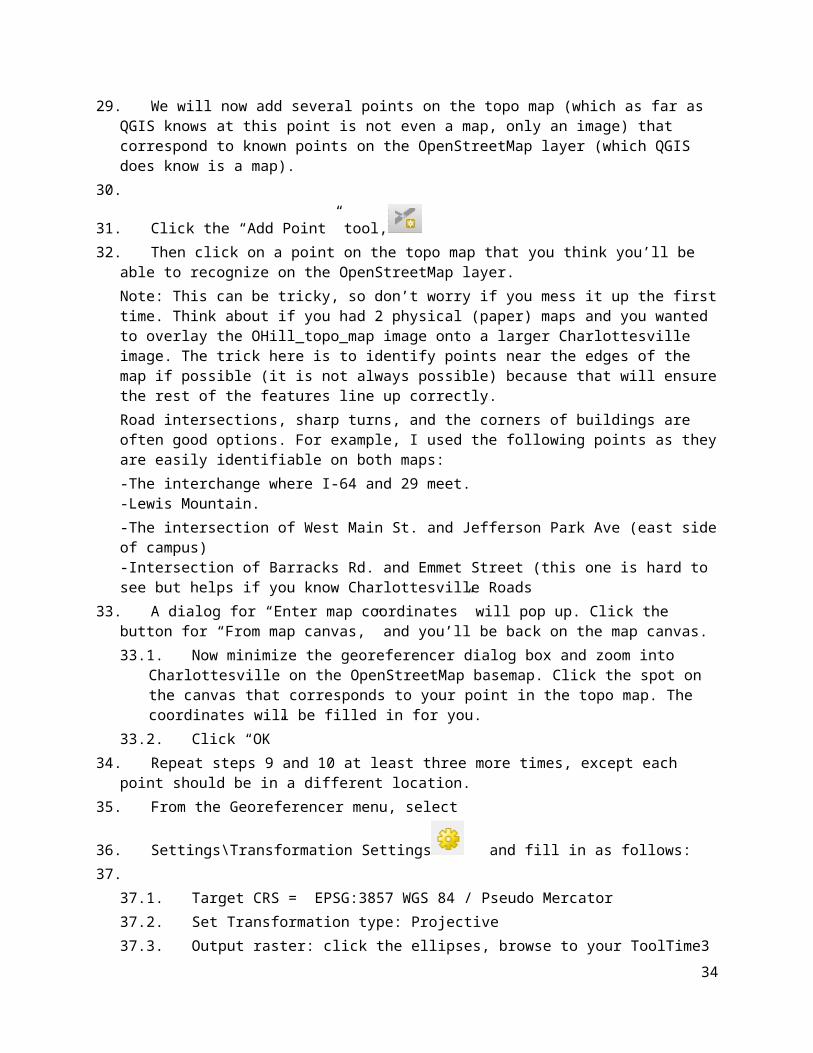
31. Click the “Add Point” tool,
27

32. Then click on a point on the topo map that you think you’ll be able to recognize on the OpenStreetMap layer.Note: This can be tricky, so don’t worry if you mess it up the first time. Think about if you had 2 physical (paper) maps and you wanted to overlay the OHill_topo_map image onto a larger Charlottesville image. The trick here is to identify points near the edges of the map if possible (it is not always possible) because that will ensure the rest of the features line up correctly. Road intersections, sharp turns, and the corners of buildings are often good options. For example, I used the following points as they are easily identifiable on both maps:-The interchange where I-64 and 29 meet.-Lewis Mountain.-The intersection of West Main St. and Jefferson Park Ave (east side of campus)-Intersection of Barracks Rd. and Emmet Street (this one is hard to see but helps if you know Charlottesville Roads
33. A dialog for “Enter map coordinates” will pop up. Click the button for “From map canvas,” and you’ll be back on the map canvas.33.1.Now minimize the georeferencer dialog box and zoom into Charlottesville on the
OpenStreetMap basemap. Click the spot on the canvas that corresponds to your point in the topo map. The coordinates will be filled in for you.
33.2.Click “OK”34. Repeat steps 9 and 10 at least three more times, except each point should be in a different location.35. From the Georeferencer menu, select
36. Settings\Transformation Settings and fill in as follows:37.
37.1.Target CRS = EPSG:3857 WGS 84 / Pseudo Mercator37.2.Set Transformation type: Projective37.3.Output raster: click the ellipses, browse to your ToolTime3 folder and type a file name (no
spaces) like “OHillTopo”.37.4.This will generate a .TIF file.37.5.Check the box next to “Load in QGIS when done”.37.6.Click OK
38. Start Georeferencing by clicking the button or selecting File\Start39. Georeferencing.40. Your topo map will now appear in the Map Canvas41. Open the properties for the new layer and make it 50% transparent. It should line up pretty well. I
use the roads in the OpenStreetMap base layer as my guide to make sure things line up correctly.42. Digitizing 4: Creating new features from nothing 43. Layer > Create layer > New geopackage layer. Choose an existing geopackage to save your layer in.
43.1.Give your new layer a table name, like “NewBuildings”.43.2.Pick Geometry type > Polygon43.3.set the CRS to WGS 84 / Pseudo Mercator (again, choose EPSG: 3857, if you have multiple
28

options)43.4.“BuildName” in the Name box under “New Field”43.5.Type = Text Data43.6.Click “Add to fields list”43.7.Click OK.
44. Make sure your “Digitizing Toolbar” and “Digitizing Tools” toolbars are showing. (Right click the toolbar area or use “View \ Toolbars”
45. from the menu.46. Select the “NewBuildings” in the Layers Panel and toggle editing on by right
clicking and selecting “Toggle editing” or clicking the pencil icon in the Digitizing Toolbar . To turn on the digitizing toolbarThe digitizing toolbar, go to View > Toolbars > Digitizing. This is what it looks like:
47. Zoom into the area around John Paul Jones Arena (At the corner of Massie and Copeley Road). I find this easier to identify with the OHillTopo layer turned off.
48. Click the Add Feature tool.49. Add JPJ Arena
49.1.Click the corners (vertices) visible in the OpenStreetMap layer. Notice the vertex of this tool is at the top left corner.
49.2.Right click, give an ID (just leave the input as ‘Autogenerate’) and a building name, Click OK50. Add another building (Scott Stadium perhaps?).
51. Save your edits by clicking the disk/pencil icon.52. Save your project. (similar icon on the main toolbar, or File > Save)53. Symbolizing a Map with dot density54. Start a new Project. Call the project something like “Tool Time 3 Dot Density”55. Load Counties_Pa from Tooltime3\VectorData3
56. Save as a new file but in the GeoJSON format (pick from the dropdown menu)6
.
57. Create new field called “PopIn000s” (whole number (integer) is fine), defined as POP_2010 divided by 1,000.
58. To create a new layer that is a dot-densisty map:58.1.Vector > research tools > ”random points inside polygons”58.2.Select your GeoJSON layer with the new field. Windows- GeoJSON layer as input layer.58.3.Pick “Use value from input field” and select POPIn000s from the dropdown list. Expression field
– choose drop down Menu and select “PopIn000s” field.58.4.Browse and save this in with the rest of your Tool Time 3 data.58.5.Click Save, then OK.
29

58.6.Wait…wait…wait…59. Turn dot density into a heatmap by manipulating the layer’s symbology60. There is/was an existing “Heatmap” tool in QGIS which no longer seems to be working in version 3.0.
But we can manipulate an existing layer’s symbology to express density.61. In your Counties_PA layer (or any points layer such as WoodPelletMills, etc) go to Properties >
Symbology and instead of Single Symbol, change this to Heatmap. Change the color ramp if you like. Set radius = 20000 map units. Rendering quality = Best.
62. Under “Layer Rendering” at the bottom of the dialog box, you can change the opacity to view this on top of other layers.
30

Tool Time 4: Introduction to raster data1. Learning Basics of working with Raster files2. We have only worked a little bit with Raster objects so far, but just like vector objects there are a
suite of commonly used tools and we will work with some common raster objects. Vector objects represent discrete objects on the map (points, lines or polygons). Raster objects are basically a grid of cells, each cell containing one value. That value can be color, elevation, etc. Raster objects do not have an attribute table, since each pixel represents only one value. If you zoom in close enough you can see each pixel. Think about a picture taken with a camera. High resolution photos have more pixels, capturing more detail. The same concept applies here. However, in this case, high resolution is not always best. The scale and scope of your project determines what resolution you should use. If your project area is all of North America, using a very high resolution DEM (digital elevation model), for example, is not only unnecessary but will be a massive file and probably crash your computer or at least be very slow to render. If your study area is one neighborhood in Charlottesville, you will probably want very high resolution satellite imagery, or other data, because your scale is small. If the pixel size of the raster data is too large for a small study area, you might lose necessary details.
3. First we need some raster data to work with. Let’s use some publicly available data. 4. Open a web browser and search for “Virginia Digital Elevation Model”. You should see a link (within
the first few results) for Radford University’s GIS Center website. Full url: https://www.radford.edu/content/csat/home/gis-center/dem.html
5. Choose “1:24,000 County DEM’s (UTM Projection) for some counties in Virginia”6. Choose “Counties in UTM Zone 17 (Western Virginia)”7. Click on “Albemarle”8. You should get a file called “Albemarle_dem.dem”. Move this to your ToolTime4 folder. Start a new
project (“Tool Time 4”), Open this layer in your map and take a look.9. If it is not obvious to you, this shows elevation change in Albemarle County, and includes the city of
Charlottesville. (There is also a Charlottesville_City DEM available at the same site if you want to take a look, but Albemarle County has greater elevation change so it is more interesting to use in my opinion). You will see high elevation areas in white and lower elevation areas in black. Elevation is represented in meters. Under your Albemarle_dem layer in the toolbar you’ll see 68-1033. 68m is the lowest elevation in Albemarle County and 1033m is the highest elevation. Also, the resolution of this layer is 30 meters, meaning each pixel is 30m x 30m.
10. Use the Identify tool.11. To show you there is no attribute table for this data, first right click the Albemarle_DEM layer and
you’ll see there is no “open attribute table” option. 12. Now, Choose the identify tool and click somewhere on the DEM. You’ll see a pop-up menu and next
to Band-1, the corresponding elevation of the pixel you clicked on. Click in some white and black areas of the map to emphasize the point that currently, white shows high elevation and black is low elevation.
13. Turn on GDAL tools. You can find these under Processing > Toolbox. ‘GDAL’ should be towards the bottom of the list. If you expand this, you can see there are many tools available here.
14. If you do not see the GDAL library or your GDAL tools don’t work…
31

14.1.Go to QGIS > Preferences > System > Environment. Click the green ‘+’ and add the following:
15. Hopefully, now your GDAL tools work correctly!16. At the top of your screen find Raster > Raster Calculator. The raster calculator is a handy tool that
allows you to change raster pixel values.17. We’ve already seen that each pixel contains an elevation value. We can do math with these using
the Raster Calculator.18. Write the following Expression: “Albemarle_dem@1” > 500.
a. Name the layer “Albemarle_High_Elevation.tif” under output_layer19. In your layers toolbar you should now see “Albemarle_High_Elevation”.20. Look at the results. You see 0 (black) and 1(white). 1 are all pixels with an elevation > 500m. Here
you can see the high elevation areas in Albemarle County. You can compare this to your original Albemarle County DEM. If you know anything about the geography of Albemarle County, you know the mountains to the west are high elevation, and there are some small ridges in the middle.
21. Using GDAL Raster tools22. I’ll be using GDAL tools, also located in the Processing toolbox, for the next few steps.23. Open GDAL > Raster Analysis > Slope24. Input layer – Albemarle DEM, leave other variables as default values and output name –
“AlbemarleSlope.tif”25. Look at the results. Your AlbemarleSlope layer will have values between 0 and 46.34. This is a slope
value. In this raster object, each pixel represents a slope value. High slope is represented in white, low slope in black. This roughly correlates with elevation. You can toggle between the two layers to compare them.
26. Now we’ll use the aspect tool. This shows you which direction a given pixel is facing.27. Open GDAL > Raster Analysis > Aspect28. Input Layer – Albemarle DEM. Save layer as “AlbemarleAspect.tif”29. The results are hard to look at and are not really meant to be human readable, but they are still
useful. It may help to change this layer’s color pattern to something more colorful. The results of the AlbemarleAspect layer show values between 0-360. Use the identify tool and click on various points to see for yourself. This makes a circle. If you think about Aspect, land can face north, south, east, south east, south south east, etc. Basically the number each pixel value has says which way it faces. 90 = east, 180 = south, 270 = west, etc.
30. If you’d like, repeat these last few steps with the Charlottesville_dem for extra practice. There should be very little difference in the results of aspect, while the slope results are stark. This shows you some of these tools depend on the relative values of a raster object, while some (like aspect), do not.
31. For fun, let’s make contour lines in Albemarle County. If you have ever read a topographic map, contour lines demarcate change in elevation. How much change depends on the elevation change in that area.
32

32. Open GDAL > Raster Extraction> Contour33. Input Layer – Albemarle DEM, Interval = 25 (this is meters). Save as “AlbemarleContours.gpkg”.
Make sure to change the output file type to .shp if it isn’t already that by default. 34. Wait…Wait…Wait… while the tool is running.35. You should see contour lines spaced at 25m throughout the county. See how they are closely spaced
in steep areas, and widely spaced in flat areas. 36. Let’s use the Raster calculator one more time with a more complicated expression.37. At the top of the screen open Raster > Raster Calculator. Write the following expression:
“AlbemarleAspect@1”>90 AND “AlbemarleAspect@1” < 270. Save this as “AlbemarleSouthFacing”. 38. The results might be a little confusing, but 1 represents South facing (and south east, south west,
etc.) and 0 represents not south facing. 39. You can write an expression in the raster calculator using more than one layer. You could write one
statement to select south facing aspect, steep slopes, and high elevation. It would look like this: "AlbemarleAspect@1" > 90 AND "AlbemarleAspect@1" < 270 AND "albemarle_dem@1" > 500 AND "AlbemarleSlope@1" > 30
40. Now we will combine two layers (AlbemarleHigh and AlbemarleSouthFacing) to create a new vector object. You can convert between vector and raster objects when it suits you need.
41. Convert raster to vector:42. Open GDAL > Raster Conversion > Polygonize (raster to vector)43. Input – AlbemarleSouthFacing. Save as AlbemarleSouthFacingVector.gpkg. This may take a
minute…44. The output is confusing. Don’t worry about that yet. 45. Right click your new vector layer and go to properties > symbology. At top choose categorized
instead of single symbol.- Column = DN- Click “Classify” -this now gives you 0 and 1 values, which are the values from the raster object now contained in a vector object. Basically, every polygon now contains a field with 1 or 0. 1 is South Facing, 0 is not. You are given two random colors. Change them if you like. Turn off 0 so only 1 is showing to see only south facing polygons.-Click “Apply” and “OK”
46. Right click the AlbemarleSouthFacingVector layer and Open Attribute Table.
47. Write an expression using the expression tool. Write the following: “DN” = 1 and “select features”. Your “1” polygons should now be selected (probably in yellow).
48. Create a new object from this selection. 49. Right click on your layer and “Save As”50. Format – ESRI shapefile. File Name – “OnlySouthFacing.shp”. Check “Save only selected features”51. Create your new layer. Turn off other layers below to emphasize what you’ve just created.
52. Now let’s do the same for our “AlbemarleHigh” layer. Go through the same process. Convert it to a
33
vector, select the 1 values in the attribute table and save that as another layer. Call it something like “OnlyAlbemarleHigh”.
53. Lastly, if you want, you could now use the “Intersect” tool on “OnlySouthFacing” and “OnlyAlbemarleHigh” to get those areas that are only high elevation and south facing. Because these are now vector objects, we can use vector tools on them.
34

Additional Exercises – These are your homework assignments!
HOMEWORK 1: Getting data, basic mapping, and using spreadsheets for data development
1. Open QGIS and start a new map.2. Add the ‘US States’ layer from the Tool Time 1 exercise to your map.3. Get Census Data for Places for a US state. Choose any state you like.
You can find the FIPA code for your state: https://www.mcc.co.mercer.pa.us/dps/state_fips_code_listing.htmA FIPS code is a US Census Bureau number assigned to each state as a unique identifier.
a. Go to www.census.gov and click the link to “Browse by topic”b. Next choose “Geography”c. Scroll down and find “TIGER/Line Geodatabasesd. Scroll down to find “State Level Geodatabases”e. Make sure you’ve chosen 2018 as the year and choose a state and the
download should start automaticallyf. Pick your state from the dropdown list and click download.g. Extract the files from the .zip to your GISforPolicy folder (or a subfolder
named with your state’s name)4. Load the ‘Census_Designated_Place’ and ‘County’ layers from the state’s geodatabase
to your map and zoom to it.5. Save your map as “Homework 1” or something similar.6. Symbolize your map as you like, but please use some combination of the following:
a. Labels for your countiesb. Places in a different / contrasting color than your countiesc. Surrounding states in a different color.
7. Save your map8. Use the snipping tool(windows) or do a screen grab (Cmd+shift+4 for Mac) to copy an
image of your map to the clipboard.9. Create a new Word or Google word processing document and paste your screen
grab into the document.10.Above your map, add a heading / title along the lines of “Places and
Counties, [my state]. On the next line, put “[My name], GIS for Public Policy, Homework 1”
Make sure your map and title fit on one page and then save/download as .PDF with a file name as follows. MYNAME_GIS4Policy_Assignment1.pdf
35

The result should look something like this:
That’s it for the mapping part of the assignment. You can close QGIS for now.
11.Go factfinder.census.gov. We’re going to need some more demographic data.a.b. Click Advanced Search and “show me all”c. Select Geographies, Select a geographic type “County - 050”, [Your State], All
Counties within [Your State]d. Click “Add to your selections”e. Click “close” at the top right.f. You now have to search for your data.g. In the search bar under “topic or table name”, Type “DP-1: Profile of
General Population and Housing Characteristics: 2010” in your state, then click “Go”
h. Check the box by the first option (2010 SF1 100% Data)i. Then click “Download” which will create a zip file.j. Click download agin to download said zip file.k. Do the usual w/ the zip file. (unzip it to your GISforPolicy folder.
12. Import the data into excel.
36

It is VERY important that you do this in the following way (do not just double click the file and let Excel open it).
a. Start Excel with a blank workbookb. Use Data > Get External Data > Import Text Filec. Navigate to your data and select the file called
something like “DEC_10_SF1_SF1DP1_with_ann.csv”d. Select “Delimited” and then click nexte. Uncheck tab and check comma, click next.f. For the second column, with GEO.id2 at the top, click Text, then click finish.
13.Clean up the spreadsheet as follows:a. Delete all columns from E (HD002_S001 / Percent: Sex and Age…)
through AY (HD02_S024 / Percent; Sex and Age - Total population - 65 years and over) Column E will now be HD01_S025 / Number; SEX AND AGE - Total population - 65 years and over
b. Delete Columns G (HD02_S026 / Number; SEX AND AGE - Male Population) through LP (all remaining columns)
c. Delete ROW 2d. Delete column A (GEO.id)e. Rename the column headings as follows
i. FIPS5ii. CountyName (NO SPACES)iii. Populationiv. SeniorPopv. PctSeniors
f. Delete the State name from each cell in the CountyName Column, using the search and replace feature.
g. Go to “Edit” > “Find” > “Replace…” and write the following expression:
37

For example, if your state is Delaware, change “Kent County, Delaware” to “Kent”
38

h. Change the name of your worksheet tab to “AGE”i. Save your worksheet as an Excel file named
MYNAME_AGE_Homework1.xls.
39

HOMEWORK 2: Joining tabular and spatial data; and using the print composer
1. Open QGIS and open your map from the first assignment.2. Load your spreadsheet from the first assignment. It should have these fields:
a. FIPS5b. CountyName (NO SPACES)c. Populationd. Seniorse. PctSeniors
3. Join your spreadsheet to your county polygon layer. (Think about which columns from each attribute table are alike)a. See GISToolTime_Week2 and pages 54ff in Learning QGIS.
4. Use “Save As” to create a new shapefile called [my state]_CountiesWithAge[my state]age.shp
5. Change the name of your County layer to “CountiesWithAge” or something similar
6. Symbolize the counties according to the percent of the population who are seniors.a. Edit the legend so that the legend labels are percentages. In the image
below, this is in process. [You can double click into the “Legend” area to edit the legend labels.]
40

41

7. Add a field to your State’s attribute table for Pct_Srs2a. Use the Expression builder to create the field as a decimal type, with a
precision of 3.b. Calculate the field based on the total population and the population of
seniors, NOT the existing percentage field.
8. Review the Class 1 tool time notes (see the last section) and the excerpt from QGIS by Example about the print composer, then compose a map with the following elements:a. A main map zoomed into your stateb. A title (add a text box) that includes “Homework 1,” your name, and a
short description of the map. For example: “Homework 1, Spencer Phillips: Population aged 65 and older, by County, Vermont, 2015”
c. A legend with with the counties symbolized for PctSeniors field. Choose colors, number of classes, etc. as you see fit.
d. A distance scalee. A text box at the bottom with sources. [Type “Source: U.S. Bureau
of the Census….” and include URL for American Fact Finder and Tiger line files.
9. Export your map as a .PDF with a filename like MYNAME_GIS4Policy_Assignment2a.pdf
10.Lastly, I want to see the attribute table with all your fields (columns), including the new PctSeniors2 field.a. Right click on your “CountiesWithAge” layer and Export > Save Feature Asb. Change “Format” to ‘MS Office Open XML spreadsheet [XLSX]’c. Export your tabular report to. Please call it
MYNAME_GIS4Policy_Homework2b.xlsxd. You could also save this as a .csv if you prefer
42

HOMEWORK 3: Editing and creating spatial data.
Please read through all of this before you begin. You will need to form a strategy for getting/ retaining all of the information you'll need, so be careful and methodical.
This assignment will test your mastery of and creativity in using the tools / skills covered so far. I recommend that you review the Tool Time notes 2 and 3, especially, then tackle the following scenario.
It is 2021, and Delaware, Maryland, Virginia and West Virginia, having finally gotten over MOST of their ages-old disagreements, have decided to re-configure their borders along the lines of the scenario that follows. Your job is to create the new map of the MidAtlantic region.
1.Determined to leave a lasting legacy for the nation, President Bernie Sanders (remember, this is hypothetical) urges the creation of "Greater Delmarnia" which is to include all of the current state of Delaware, plus the Eastern Shore of the Chesapeake Bay, stretching from Cecil County, Maryland down through Northampton County, Virginia.
2.Governor Hogan, meanwhile, is experiencing regret over his decision to ban fracking in Maryland, and has made a successful play to annex the eastern panhandle of West Virginia. (In exchange, West Virginia will continue to operate the casino and racetrack at Charlestown for a period of 25 years.) You can use county boundaries to do this.
3.West Virginia will stay mostly as-is, except minus the eastern panhandle (which is now part of “Greater Delmarnia”.
4.Finally bowing to the obvious demographic and political divisions within its remaining borders, Virginia will be split in two states: “Democroatia” and “Bratland”. While these names may seem odd for STATES, stakeholders in both areas, for different reasons, hold out hope for eventual secession from the union and they figure they may as well just do the whole "pick a name thing" once.
Seeing as the idea of using natural features to guide the location of political boundaries is now thoroughly passe', it was decided to define “Bratland” as that area of the state formerly known as "Virginia" lying north of Interstate-64 and EAST of Interstate-81. [For this change, please DO use existing county boundaries [Hint: It is probably easiest to use a basemap (from ‘XYZ tiles’ in your Browser panel), to see the road boundaries]. This will mean a less than perfect use of the interstates as the boundaries, but Virginians being Virginians can only take so much change, and could not bear, for example, to have Monticello and UVA in different nations, er, I mean STATES.]
43

Finally, as you may be wondering what is to become of the District of Columbia, here's the answer. It will also be a part of “Bratland”. The former Washington, DC is now fully devoted to monuments, parades and conferences extolling the wonder that is America -- "Pyongyang on the Potomac," as many now call it. The seat of government, meanwhile, is now a man-made island floating off the coast of New Jersey, making it even harder to get to than via Dulles Airport, but putting it within easy helicopter or yachting distance of the Hamptons. This greatly reduces the time lawmakers' must spend fundraising while increasing the time they can devote to debate over how to not really repeal and replace the Affordable Care Act and hearings on Benghazi (it never ends) and the Hoax That is Climate Change. [You may make the island any shape you wish.]
Once you have your new state boundaries created, please select a city to be each state's capital. [Hint: There are several ways to do this but I recommend to create a new point layer and add the capital cities.]
BUT BEFORE YOU BEGIN, I want to be sure you are comfortable with re-projecting data, so do the following:
1. Download and unzip the Exercise 3 data from the course site. Your four shapefiles should be in a folder called something like C:\...\GISWorkshop\Excercise3\
2. Create a new folder called "Assignment3_NAD83” or C:\...\GISWorkshop\Exercise3_NAD83
3. OPEN QGIS and load in the four original layers (Cities, Counties, Interstates, States). These are the versions in C:\...\GISWorkshop\Excercise3\ in the original projection (CRS)
4. Use “Save As” for each of those four layers in turn. For each layer, set the CRS = NAD83 / UTM zone 18N, and save the new layer to C:\...\GISWorkshopy\Exercise3_NAD83
5. NOW open a blank map file, add the new (NAD83 / UTM) layers and do the editing, etc. required above.
Please create, export to .PDF and upload TWO maps, as follows:
1) MYNAME_GIS4Policy_Assignment3a.pdf will show your editing skills: I am primarily interested in seeing that you were able to create new features out of whole cloth
44

(DC) and from existing features.
For this map, please be sure to include the following elements:a) A map showing the location of the re-configured Southern MidAtlantic.b) Distance Scale in units of your choicec) A legend showing the new states, capital cities, and any other layers you would
like to add for visual interest.d) The usual text box with the course, assignment number and your name.
MYNAME_GIS4Policy_Assignment3a.pdfe) A title.
f) A North Arrow if you really want it.
2) MYNAME_GIS4Policy_Assignment3b.pdf will show off some of your analytical skills: I want to see that you are able to create and calculate new attributes and display those on your map.
Accordingly, your map layout should show:
a) A thematic map showing the percentage of people in each county that is non-white.b) Distance scalec) Legendd) the text box with your name, etc.e) A Titlef) A North Arrow if you like.
All of the data you need is contained in the "Exercise3”
folder Enjoy!
45

Resources
GIS Data Sources
See Wiki in the course management site.
Loading Data from an ESRI File Geodatabase (Windows only)
1. From the main menu, select Layer / Add Layer / Add Vector Layer2. Select Directory as the Source type.3. Pick ESRI FileGDB from the “Type” dropdown4. Click Browse and navigate to the folder with your data.5. SINGLE Click the folder containing your Geodatabase. It will appear to be a file
with the extension “.gdb”.6. Click the “Select Folder” button at the bottom.7. Click “Open”8. Hold down the Ctrl key or Command key and click the layers you need
from your geodatabase.
Locator maps:
https://www.youtube.com/watch?
v=0uRds8DOwQc
https://www.youtube.com/watch?
v=cBbcNf1ERgM
Adding a map service from the U.S. National Map (USGS):
See this site: http://www.northrivergeographic.com/qgiswms
Symbolize a point layer by the size of the point:
Suppose you want to symbolize a point layer with the points being different SIZES according to the level of some numeric field in the layer's attribute table. Here's how you do that in Windows and on a Mac:
1. Open properties for your point layer.2. Click the Style tab.3. Pick “Graduated” from the dropdown menu at the top.4. As “Column” pick whatever attribute (field) has the data you want to use5. Change the “Method” to “Size” (from color)
46

6. Click “Classify” The default is 5 classes. You can change that, change the range of sizes, the color of the dots, etc.
7. Click Apply and OK
For MAC, it is similar, but they have hidden the key settings behind an "advanced" button:
[Note: I'm reporting this second hand, and it seems to me that one of the steps highlighted in yellow might be incorrect. If you test this and can clarify, please reply to this this conversation with the information.]
1. Open properties for your point layer.2. Click the Style tab.3. Pick “Graduated” from the dropdown menu at the top.4. As “Column” pick whatever attribute (field) has the data you want to use
[This is the one I think is not part of the Mac process.]5. Click "advanced" next to the "Classify" buttons6. Select "Size Scale Field" Select the field that has data you want to use7. Select "Scale area"8. Click “Classify”9. Change the “Method” to “Size” (from color)10. Click “Classify”11. make other changes, then click Apply and OK12. Click Apply
and OK Happy
Symbolizing!
47

Should I merge or should I union?
In the workshop exercise (Tool Time 2), we used Union to combine the two halves of the Green Mountain National Forest proclamation boundary. But we can also Merge them using the steps
described in for the example of wetlands and deer wintering areas in the Northeast Kingdom. However, the Merge and Union tools do give you slightly different results in their attribute tables.
So long as the two input data sets have the same fields in their attribute table, MERGE takes the data from both input data sets and records them in the same fields in the attribute table of the output data set.
UNION, by contrast, treats each data set as having its own unique set of attributes and it retains puts a copy of all of the input layers' fields in the output data set. So, even if the data themselves mean the same thing and the field names are the same in both input data sets, UNION will give you two sets of fields in the output data set.
Test this out by running both Union and Merge on the proclamation boundaries (North and South) and then compare what you see in the resulting attribute tables.
Both Union and Merge produce a layer that looks the same. The MERGED layer is cross-hatched, the UNIONed layer is solid green.
The difference is in the Attribute tables. Using the info tool, the lower image below shows you get when you click on the northern feature of the MERGEd layer. Note that there is but one set of attributes. If we ID’d the southern portion, the NORTHSOUTH field would be “South”.
A couple other features of these two tools:
● With MERGE, you can combine two OR MORE
48

layers of the same type (points, lines or polygons). So, for example, we could combine the buffered Appalachian Trail layer we created (a polygon) with the two separate proclamation boundary layers, the deer wintering area or any other polygon layer.
● UNION, by contrast, operates on just two layers at a time .You can, however, union a third layer to the result of the union of your first and second layer. You do end up with a lot of extra attributes.
49

● For MERGE, you select layers to merge from folders on your hard drive , not from the layers already in the map. You can also select a whole folder full of compatible layers to merge.
● UNION, by contrast, operates only on layers already in your map canvas/project .
Favorite Plugins
Time Manager, for making animated maps: https://plugins.qgis.org/plugins/timemanager/
NNJoin for finding the distance to the “nearest neighbor” of features in a dataset: https://plugins.qgis.org/plugins/NNJoin/
Cartography Examples
[See the Wiki for this too, for now.]
The CIA has released its declassified maps collection. It is well worth a look. This article has an overview and some samples, including a nice illustration of how various projections can distort our perception of the size of countries/land masses. The article has the links to the CIA Flickr page w/ the maps themselves. http://geoawesomeness.com/cia-declassified-map-collection- flickr-totally-awesome/.
Counterexamples: “Cartastrophe: mistakes were made”: https://cartastrophe.wordpress.com/page/2/
A note on Raster processing for Mac Users [DRAFT]
Our Mac-using colleagues (i.e. most of you) may be unable to find the raster reclassification and raster calculation tools in QGIS. The reason is that while they are part of the GRASS (for Geographic Resources Analysis Support System that has been around for more than 30 years) is automatically installed with QGIS on the Windows machines to which we lesser humans still cling, it is also installed automatically for the Mac. You can download it from this page: https://grass.osgeo.org/download/software/mac-osx/
Once downloaded and installed, I assume you will be able to access the GRASS-based tools via the Processing plug-in from QGIS. I do NOT recommend trying to run GRASS directly. That is possible, but it uses different file formats, has its own separate interface, etc. and is not necessary for our work here.
Another free and open source library integrated with QGIS is GDAL (pronounced “goo dal”). GDAL is a translator library for raster and vector geospatial data formats. Here is the documentation page: https://gdal.org/
50

There is also SAGA (for “System for Automated Geoscientific Analyses”), which is another GIS software package, like QGIS and GRASS that you can download from here: https://sourceforge.net/projects/saga-gis/files/ There are not separate Windows and Mac versions, as the code is designed to run on any system.
Here's what you need to know, however: QGIS while a GIS package in its own right is designed to access and use algorithms (procedures, tools, etc.) written in/for GRASS and SAGA (and some other packages, including R). Your Processing Plug-in and the Processing Toolbox give you easy access to those tools from the QGIS interface. You can activate GRASS and SAGA algorithm access by clicking the "enable additional providers" link at the bottom of the Processing Toolbox. Expand the "providers" list, and you'll see the various providers. Make sure that GDAL, GRASS GIS 7 (and/or GRASS commands) and SAGA are activated. (See the screen shot below.)
I think that should give us what you need for the Tool Time exercises.
51