data visualization design best practices workshop
TRANSCRIPT


Amanda MakulecProgram Manager & RME AssociateJohn Snow, Inc.
Passionate about how visualizing data effectively can empower people to make decisions.

This Summit has been all about collecting, sharing, quality-checking, streamlining, improving, visualizing
data.

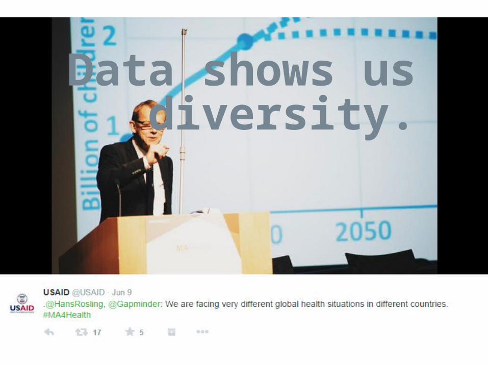
Data shows us diversity.


Effective visualizations help stakeholders use that information for decisionmaking.


Designing visualizations that communicate clearly doesn’t have to be complicated.

A basic understanding of design best practices are all you need to get started.

Disseminate &
share
Build your chart
Find the story in
your data
Identify your
audience & context
START

1Who is your audience?

On the most common visualization
mistakes
“Time isn’t adequately spent on is just what is the question that you’re trying to answer and what does your audience need to know?”
Cole NaussbaumerStorytellingwithData.com
From: http://cxcafe.maritzcx.com/storytelling-with-data-dashboarding-with-cole-nussbaumer/
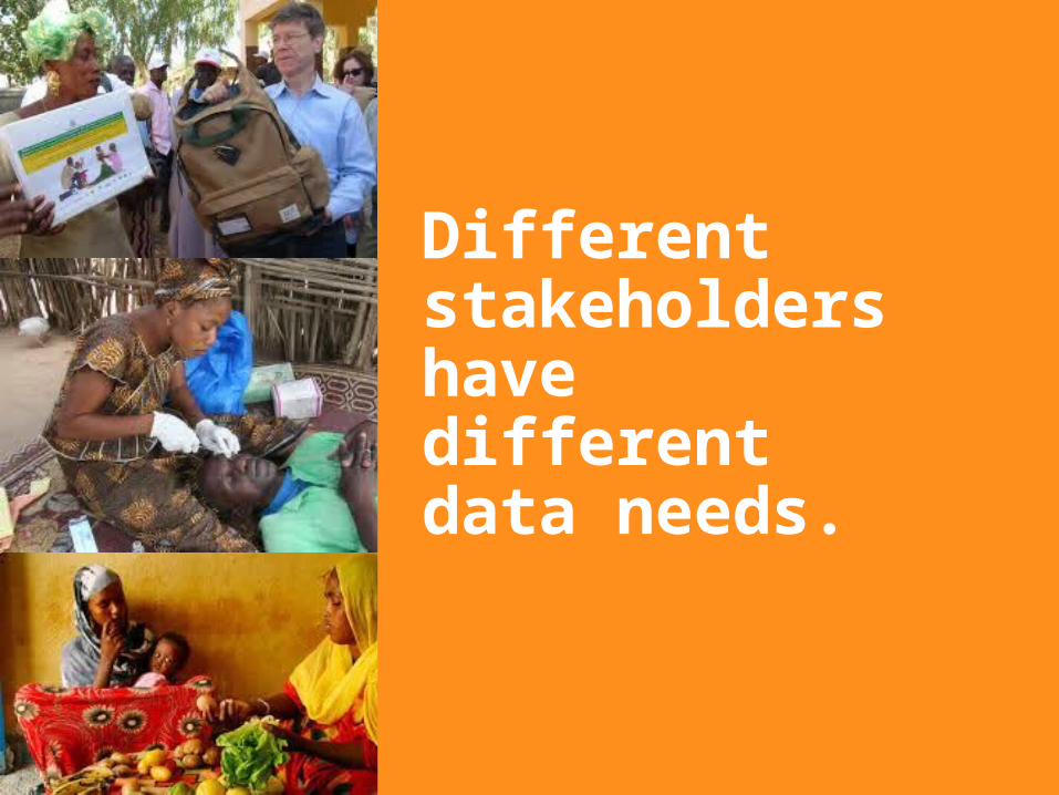
Different stakeholders have different data needs.

Consider your stakeholders’ literacy, numeric literacy, and what data they need to make decisions.

For more complex data analysis tools like dashboards, it is especially important to engage your end user to understand their needs.
Image credit: Beth Kanter

2Identify the story you want to tell & consider additional available data.

The most important question in visualization:
Read more at: http://stephanieevergreen.com/most-important-question/
Stephanie EvergreenEvergreen Data
What’s your point?

Start with the data you’ve collected.

Then, identify additional data available that would help you tell your story better visually.

Edit your data as necessary to tell your story.
e.g. create
percentages from raw
numbers,
check quality, etc.

3Design your chart or graph

Consider the kind of data story you have.
Distribution Part to Whole Correlation
Time Series Compare Categories
Ranking
Image credit: Column Five Media’s Visage Data Visualization 101

Consult with great resources for choosing the right chart type.
The Graphic ContinuumJon Schwabish & Severino Rebecca policyviz.com/presentations/graphic-continuum-video
Chart ChooserJuice Analyticslabs.juiceanalytics.com/chartchooser/index.html
Data Visualization 101Visage | visage.co/data-visualization-101-design-charts-graphs/l

And consider consulting your colleagues
M&E Advisor
Graphic Designer
Technical Expert
Communications Expert

4Plan for how you’ll share your visualization when it’s complete.

In “about five to eight seconds, someone’s going to make the decision of do they devote any more time to looking at what you’ve got in front of them or do they move on to the next thing.” Cole Naussbaumer
StorytellingwithData.com
From: http://cxcafe.maritzcx.com/storytelling-with-data-dashboarding-with-cole-nussbaumer/

Simple design principlesor “leveraging our lizard brain”

“What really makes a chart effective are font, color, and design, and the depth of critical analysis displayed.”
Dona M. WongThe Wall Street Journal Guide to
Information Graphics

Decluttering
Consider removing:• Border• Grid lines• Background shading• Axis (if you plan on
labeling the data points)
Does it enhance or distract from your data story?

Title & labelsAre you clear and succinct (6-12 words), telling your reader the key takeaway & including labels that are essential?
Recommendation of 6-12 words from the Data Visualization Checklist http://stephanieevergreen.com/dataviz-checklist/

Color
To add emphasis Or to create the confusing effect of Skittles on a page.

Practice with existing graphs and chartsHow could these charts communicate more effectively?


Year 1 Year 2 Year 3 Year 4 Year 5
District 1
District 2
District 3
32%
District 4 24%
District 5District 4 was the only district where coverage de-clined during the five year project.
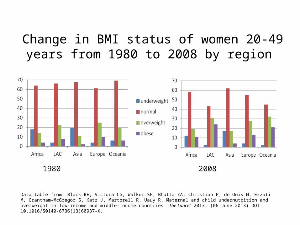
Change in BMI status of women 20-49 years from 1980 to 2008 by region
1980 2008
Data table from: Black RE, Victora CG, Walker SP, Bhutta ZA, Christian P, de Onis M, Ezzati M, Grantham-McGregor S, Katz J, Martorell R, Uauy R. Maternal and child undernutrition and overweight in low-income and middle-income countries” The Lancet 2013; (06 June 2013) DOI: 10.1016/S0140-6736(13)60937-X.

The proportion of women who are overweight has increased in low and middle income countries.

Graph from https://www.urbanreproductivehealth.org/sites/mle/files/issu_mid-term_research_brief_english.pdf


Graph from https://www.urbanreproductivehealth.org/sites/mle/files/issu_mid-term_research_brief_english.pdf

Use of implants and injectables has increased among women using family planning.

The proportion of family planning users choosing implants & injectables has increased.

About our activity today
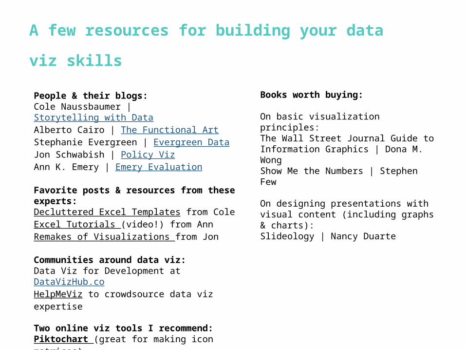
A few resources for building your data viz
skills
People & their blogs:Cole Naussbaumer | Storytelling with DataAlberto Cairo | The Functional ArtStephanie Evergreen | Evergreen DataJon Schwabish | Policy VizAnn K. Emery | Emery Evaluation
Favorite posts & resources from these experts:Decluttered Excel Templates from ColeExcel Tutorials (video!) from AnnRemakes of Visualizations from Jon
Communities around data viz:Data Viz for Development at DataVizHub.coHelpMeViz to crowdsource data viz expertise
Two online viz tools I recommend:Piktochart (great for making icon matrices)Visage
Books worth buying:
On basic visualization principles:The Wall Street Journal Guide to Information Graphics | Dona M. WongShow Me the Numbers | Stephen Few
On designing presentations with visual content (including graphs & charts):Slideology | Nancy Duarte

For the simple graph icons from the Visage Data Visualization 101 eBook and allowing us to share their eBook during our activity today.Visage was born out of Column Five, an industry-leading infographics and visual content agency with offices in Irvine, CA and Brooklyn, NY. Visage is a simple design platform that enables content marketers to create beautiful, on-brand data visualizations and visual content. Our leadership team has been working together for more than 5 years, and our focus is to help companies use visualization and great design to communicate more effectively.
Thanks to…
For providing the space & time to host this workshop.The Measurement and Accountability for Results in Health (#MA4Helath) Summit brought together world leaders to construct a common agenda to improve and sustain country measurement and accountability systems for health results in the post-2015 era. Our thanks to USAID, WHO, and the World Bank who lead the organization and coordination of the event.
