data sketches - uploads-ssl.webflow.com
TRANSCRIPT

NADIEH BREMERSHIRLEY WU
Data Sketches

“Shirley and Nadieh are honest, entertaining, and insightful in their retrospectives, and their openness and humility make the practice less intimidating, inviting
newcomers to get started.”
– Mike Bostock, Creator of D3.js and Founder of Observable
“Written in an approachable, !rst-person angle, this book is a delightful behind-the-scenes look at the process for creating any sophisticated data visualization. They make
it seem so easy you will want to start on your own project right away.”
– Manuel Lima, Author, RSA Fellow and Founder of VisualComplexity.com
“The work of Nadieh Bremer and Shirley Wu is some of the most beautiful and exciting data visualization work being done today.”
– Elijah Meeks, Author and Executive Director, Data Visualization Society
“The Data Sketches collaboration is a glorious tour de force: two people spur each other along a remarkable spiral of visualization creativity, and let the rest of us come
along for the ride!”
– Tamara Munzner, Author and Professor, University of British Columbia
“Lay-chart readers cannot appreciate the expertise and thousands of decisions that go into a single visualization, but this wonderful behind-the-scenes peek reveals how
there is never just one ‘right’ answer, but many possible answers — each of them beautiful, provocative, and shaped by the unique lens of its creator.”
– Scott Murray, Author and Designer, O'Reilly media
8 9
CONT
ENTS Intro
Foreword 12About Data Sketches 14How to Read This Book 18Technologies & Tools 20
Projects 26
Outro
Lessons 422Interview with Series Editor: Tamara Munzner 424Acknowledgments 426
Travel My Life in Vacations
90
Four Years of Vacations in 20,000 Colors
100
Presidents & Royals
Royal Constellations116
Putting Emojis on the President’s Face
132
Movies The Words of the Lord
of the Rings28
Film Flowers44
Olympics Olympic Feathers
60
Dive Fractals76
1987
1990
1993
1996
1999
2002
2005
2008
2011
2014
Born on January 19th, 1987
Parents split up
Together with RalphStarted studying Astronomy
Living in the Bay Area
Started working
Finished this visual!
My life in vacationsFor this month's datasketches' topic of Travel I wanted to dive intosomething very personal to me, my vacations. Seeing the wonders of theworld is one of my greatest hobbies (besides visualizing data), so I wasinterested to unearth & understand patterns and trends in the 30 yearssince my birth that I was not yet aware of. Scroll down if you'd like to getto know me through my travels ^_^
Squeezed months
I want this visual to focus on my vacations. However, I'm onlyon vacation for about 5 weeks, thus about 10%, of the year.Giving all the months an equal width would then result in avisual that's too wide. Therefore, I've squeezed down all monthsin which I wasn't on vacation for a single day. This does make itmore di�cult to compare dates across years, but my main focusis on the vacations themselves and less on the exact months.
Data collection
The focus was on the (very manual) collection ofthe data. Since the digital camera has becomea�ordable at the start of the 2000's it's becomemuch easier to look back and reconstruct whenand where you went on vacation. However, forthe vacations before the 2000's I asked the help ofmy parents and went through all of my oldchildhood photos to try and reconstruct thevacations that I went on during the �rst 10 yearsof my life. That was a nice trip down memorylane. The location per year was easy to �nd, butgetting the exact dates proved impossible
A�er my parents split up, me and my dad started to goon culture and nature oriented vacations, starting withParis in 2001. It's here that I learned how much I lovegoing out and seeing what the world has to o�er
Tried out snowboarding during 2 separateweeks this year. Never again...
During the 6 months that Ralph & I lived in the Bay Area (forinternship & study) we went out to explore the regionpractically every weekend. However, there were only 4 tripswhere we stayed overnight in a hotel
I've always loved the Olympics, so with the 2012 games sonear to Amsterdam I went for a few days with my dad.Fantastic experience
Celebrating 10 years together we went on a 'NorthernLights' themed week to the North of Finland. Facing farbelow freezing temperatures, dog sledding, ice climbing& even some aurora's. One of our best vacations ever
January
February
March
April
May
June
July
August
September
October
November
December
January
February
March
April
May
June
July
August
September
October
November
December
Netherlands
Netherlands
France Netherlands
Netherlands
Netherlands
France
France
France
France
Curacao
FranceDisneyland
Netherlands
Netherlands
Paris & FranceTurkey
FranceLondon
Venice - Florence - Rome
Paris & FranceNetherlands Netherlands Rome
SwitzerlandAustria Netherlands
CaliforniaFrance Tunesia
Berlin - Prague - AustriaFlorida
FranceCaliforniaOxford
Beijing - AustraliaTurkey France
Turkey Lassen NPLake Tahoe Yosemite & Sequoia NP
Los AngelesNorway
Portugal
TurkeyLondon New England (US) & Toronto (CA)
TurkeyKenya & Tanzania
TurkeyFinland
Japan
Alaska (US) & Yukon (CA)
SpainIceland
Myanmar London
Decoding the visual
Destination
France
Netherlands
Europe
Asia
Oceania
Turkey
Africa
Canada
Carribean
USA
Purpose
I leave it up to you to �gure out thesymbols for a safari, Disneylandvisits & the going to the Olympics
Travel companions
Ralph father mother inlaws others
Duration
Dates known exactly Dates vaguely known
Enjoyment
Not much funDon't know
Freakin' amazing
Created by Nadieh Bremer | VisualCinnamon.com
Go back to datasketch|es' September month

10 11
NostalgiaAll the Fights in Dragon Ball Z
216
The Most Popular of Them All232
NatureMarble Butter!ies
248
Send Me Love260
Books Magic Is Everywhere
150
Every Line in Hamilton168
MusicThe Top 2000 the 70s & 80s
190
Data Driven Revolutions 204
Myths & LegendsFigures in the Sky
346
Legends368
FearlessAn Ode to Cardcaptor Sakura
384
One Amongst Many404
Culture Beautiful in English
278
Explore Adventure296
CommunityBreathing Earth
318
655 Frustrations Doing Data Visualization
332

12 13
Orthodoxy and eccentricity are opposing but complementary forces in any "eld, and data visualization isn’t an exception. Periods when the former prevails over the latter discourage whim, passion, and experimentation, and favor stability and continuity. When the opposite happens—when eccentrics take over—chaos and turmoil ensue, but progress becomes more rapid and invention more likely. This is a book where eccentricity abounds. That’s a good thing.
The formalization and systematization of data visualization took decades and books by authors such as Jaques Bertin, John Tukey, William Cleveland, Naomi Robbins, Stephen Kosslyn, Leland Wilkinson, Tamara Munzner, and many others. It is thanks to them that we possess a common language to discuss what constitutes a well-designed chart or graph and principles that aid us when creating them. They deserve our gratitude.
What most of those authors have in common, though, is a background in statistics or the sciences, and I suspect that this has had an e#ect on the visual style favored for many years. Since the 1970s at least, data visualization has been governed by a vague consensus—an orthodoxy—that favors bare clarity over playfulness, simplicity over allegedly gratuitous adornments, supposed objectivity over individual expression.
ORTHODOXY
ECCENTRICITYAlberto Cairo
Knight Chair at the University of Miami and author of How Charts Lie
As a consequence, generations of visualization designers grew up in an era of stern and pious sobriety that sadly degenerated sometimes into dismissive self-righteousness exempli"ed by popular slurs such as ‘chart junk.’
It’s time maybe not to abandon that orthodoxy outright—when the goal of a visualization is to conduct exploratory analysis, reveal insights, or inform decisions, prioritizing clarity and sticking to standard graphic forms, conventions, and practices is still good advice— but to acknowledge that other orthodoxies are possible and necessary. Visualization can be designed and experienced in various ways, by people of various backgrounds, and in various circumstances. That’s why re!ecting on the purpose of a visualization is paramount before we design it—or before we critique it.
Nadieh Bremer and Shirley Wu are wondrous eccentrics. Their splendid book is the product of a collaborative experimental project, Data Sketches, that might be one of the "rst exponents of an emerging visualization orthodoxy in which uniqueness is paramount and templates and conventions are seen with skepticism.I discovered Data Sketches right after it was launched, back in 2016, and I was immediately enthralled, even if I couldn’t understand many of its graphics. They are insanely complex and ornate, I thought, colorful, mysteriously organic in some cases, a departure from the strictures of classic graphs, charts, and maps. I felt that Nadieh and Shirley were not only pushing what was possible through technologies such as D3.js, but also wished to defy what was acceptable.
The book that you have in your hands reveals how Nadieh and Shirley think. This is useful. Visualization is, like written language, based on a body of symbols and a syntax that aids us in arranging those symbols to convey information. However, this system of symbols and syntax isn’t rigid—again like written language—but !exible and in constant !ux. That’s why I’ve come to believe that visualization can’t be taught as a set of rigid rules, but as a principled process of reasoning about how to make good decisions when it comes to what to show and how to show it.
This process ought to be informed by what we know about vision and cognitive science, rhetoric, graphic and interaction design, UX, visual arts, and many other "elds. However, this knowledge shouldn’t be a straitjacket. Rather, it’s a foundation that opens up multiple possibilities, some more appropriate, some less, always depending on the purpose of each visualization and on its intended audience.
The education of visualization designers, whether it’s formal or not, can’t be based on memorizing rules, but on learning how to justify our own decisions based on ethics, aesthetics, and the incomplete but ever-expanding body of empirical evidence coming from academia. There are plenty of lengthy and detailed discussions in Data Sketches about how to balance out these considerations, and it’s always useful to peek into the minds of great designers, if only to borrow ideas from them. Some of you will be persuaded by those discussions, and others will disagree and argue against them. That’s "ne. Conversation is what may help us determine whether certain novelties fail and should be discarded, or succeed and become convention. Today’s eccentricity is tomorrow’s orthodoxy.
Now go ahead: read, think, and discuss. And consider becoming a bit more of an eccentric.
&
14 15
OUR JOURNEYS INTO DATA VISUALIZATION
In the last decade, the amount of data collected has exploded, and many "elds—including data visualization—have gained momentum to make sense of all this data. These data visualizations can take a wide variety of forms, such as dashboards, infographic posters, data art, and data-driven journalism. But what we enjoy the most is wielding data as a tool to explore our curiosities about the world around us. We love collecting a fun dataset, "nding the insights and stories buried within it, and sharing that story in a beautiful, visual way that excites people. Our most successful projects have turned spreadsheets full of numbers into visualizations that entice people to dive in, explore, and learn all that it has to reveal.
To do this, we honed a wide variety of skills: data analysis, information design, coding, and storytelling. And because of this wide spectrum of skills (and the relative youth of the "eld as a whole), most data visualizers start from a variety of di#erent backgrounds. We are no exceptions.
Nadieh's StartIn 2011, I graduated as an astronomer. I loved the topic and its gorgeous imagery, but knew that writing academic papers wasn’t for me. Instead, I joined the new Analytics department of Deloitte Consulting as a data scientist. Apart from data analyses, I was creating tons of simple charts in PowerPoint, QlikView, and (mostly) R. In 2013, at a data science conference, I randomly joined an “Introduction to D3.js” workshop and my mind was blown by the possibilities! I didn’t care that I had to learn JavaScript, CSS, and HTML; I was going to add D3.js to my repertoire! I still saw myself as a data scientist, though.
At another conference at the end of 2014, while waiting for Mike Freeman’s talk, my eyes fell on his "rst slide. He called himself a Data Visualization Specialist. “Wait? What? That’s a separate thing!?” It was like I was struck by lightning. I immediately knew that was where my true passion was, not the data analysis part. And from then on, I spent every moment of free time I had to become better in the visualization of data.
In December 2015, I joined Adyen as a full-time data visualization designer. However, after designing and creating dashboards for months, even in D3.js, I felt that I was still missing something; my creative side wasn’t feeling ful"lled.
Shirley's StartI loved math and art growing up. When I went to college, I studied business, but found much more enjoyment in the computer science classes I took. When I graduated in 2012, I started as a software engineer on a front-end team at Splunk, a big data company. There, I was introduced to D3.js, a JavaScript library for creating data visualizations on the web, and I immediately fell in love with being able to draw in the browser.
In 2013, I started frequenting the Bay Area D3 User Group, where I learned that D3.js was only a subset of a larger "eld called data visualization that people could specialize in. I loved that it was such a beautiful blend of art, math, and code—all of my favorite things.
For my second job, I joined an enterprise security start-up, speci"cally because they were looking for someone to specialize in creating data visualizations for their product. I grew a lot technically and loved all the data visualization aspects of my work, but not the industry I was in.
In 2016, I decided to take the leap into freelancing. I wanted to see the data-related challenges that companies faced and the problems they were trying to solve with data visualization; I wanted to "nd the industries I’d be the most excited to work in.
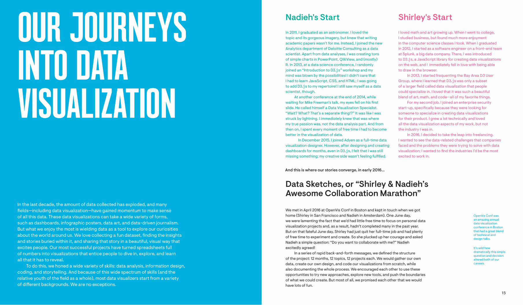
And this is where our stories converge, in early 2016...
We met in April 2016 at OpenVis Conf in Boston and kept in touch when we got home (Shirley in San Francisco and Nadieh in Amsterdam). One June day, we were lamenting the fact that we'd had little free time to focus on personal data visualization projects and, as a result, hadn’t completed many in the past year. But on that fateful June day, Shirley had just quit her full-time job and had plenty of free time to experiment and create. So she plucked up her courage and asked Nadieh a simple question: “Do you want to collaborate with me?” Nadieh excitedly agreed!
In a series of rapid back-and-forth messages, we de"ned the structure of the project: 12 months, 12 topics, 12 projects each. We would gather our own data, create our own design, and code our visualizations from scratch, while also documenting the whole process. We encouraged each other to use these opportunities to try new approaches, explore new tools, and push the boundaries of what we could create. But most of all, we promised each other that we would have lots of fun.
Data Sketches, or “Shirley & Nadieh’s Awesome Collaboration Marathon”
OpenVis Conf was an amazing annual data visualization conference in Boston that had a great blend of technical and design talks.
It’s wild how dramatically this simple question and decision altered both of our careers.

16 17
We decided to call our project “Data Sketches,” and went live on September 21st, 2016 with our "rst four visualizations on datasketch.es. We didn’t think anyone beyond our friend group would care, and we certainly didn’t expect the overwhelming response we got. But as it turned out, people really liked getting a behind-the-scenes look at our process, and we kept hearing how helpful and educational our write-ups were.
We "rst mused about a “Data Sketches” book not long after our launch, when we heard Alberto Cairo mention our project on a livestream. We were giddy with delight when we heard him say that if we ever created a book, he’d display it on his co#ee table. We were enamored with the idea, but it felt like a far-away dream.
Nonetheless, we tried to talk to a few publishers. None of them seemed keen on the book we wanted to make: a beautiful co#ee table book with large, indulgent images of our projects, side-by-side with our very technical process write-ups. We wanted it to be both aesthetically pleasing and educational, yet the publishers we talked to all seemed only to want one and not the other.
We were close to giving up when one summer day in 2017, Shirley reached out to Tamara Munzner for dinner during her visit to Vancouver. At the end of a long and delicious meal, Tamara asked if we had ever considered turning “Data Sketches” into a book. She wanted us to be part of her series of data visualization books, and we were more than thrilled! We had "nally found an editor (and enthusiastic champion of our work) and a publisher willing to work with us to create our dream book.
Tamara gave us a renewed purpose in creating a “Data Sketches” book. She convinced us that because everything on the Internet eventually bit-rots, we needed to do it for archival purposes. We also knew that because we wanted to keep many of our online write-ups freely available, we therefore needed to make this book worth splurging on. We’ve tightened up our tangents, "lled in gaps in explanation, and packed the book full of lessons we’ve learned along the way. This book is just as much about the 24 individual data visualizations we created as it is a celebration of the technical and personal growth we’ve gone through in this three-year journey. It is a snapshot in time to commemorate the immense impact “Data Sketches” has had on our lives, allowing us to quit our full-time jobs, launch thriving freelance careers, travel the world to talk about our work, and develop beautiful friendships.
Writing a book is hard. We knew this going in, and our original one-year project has since turned into three years. It’s been a monumental three (four by the time of publishing) years, and we’re so excited to hold Data Sketches in our hands, to !ip through the pages, and see our work immortalized on paper. We want to thank you for all of your excitement and support, whether you’ve been with us from the very beginning, or have just picked up this book. Thank you for helping us get here.
We hope you enjoy this dream book of ours and that you have just as much fun reading it as we did working on our Data Sketches.
We’ve added the time frame of each data visualization at the beginning of each chapter to give context.
Shirley and Nadieh, on the left and right respectively, together in real life for a week in San Francisco during September 2017.
Nadieh Bremer is a graduated astronomer, turned data scientist, turned freelancing data visualization designer. She’s worked for companies such as Google, UNESCO, Scienti!c American, and the New York Times. As 2017’s “Best Individual” in the “Information Is Beautiful” Awards, she focuses on uniquely-crafted data visualizations that are both e"ective and visually appealing for print and online.
VisualCinnamon.com
Shirley Wu is an award-winning creative focused on data-driven art and visualizations. She has worked with clients such as Google, The Guardian, SFMOMA, and NBC Universal to develop custom, highly interactive data visualizations. She combines her love for art, math, and code into colorful, compelling narratives that push the boundaries of the web.
shirleywu.studio
Our very "rst brainstorming document was titled “Shirley & Nadieh’s Awesome Collaboration Marathon” before we eventually landed on “Data Sketches.” Other names that we seriously considered included “Pencils&Code” and “Visual Wanderlust.”

18 19
32
NA
DIE
H
33
MO
VIES
After !nding the dataset, my !rst thought was: “How many words did each member of the Fellowship speak at each place/scene/location?” Focusing on the nine members of the Fellowship seemed like a nice and structured way to !lter the total dataset.
Although the original dataset was structured around scenes, it didn’t contain information about the scenes’ locations. I found the scenes to be a bit arbitrary; scenes, unlike locations, are more connected to the making of the movie versus the actual universe where the movie takes place. Therefore, I decided to manually add the location to each of the ±700 rows of data. (ò_ó̌ )
To do this, I looked at the scripts of the extended and non-extended editions and a map of Middle-earth, all found online. These scripts sometimes mention the location where the scene takes place, but for other scenes, I relied on memory from having watched these !lms way too many times.
I added two columns: one with a broad location (like a kingdom) such as “Gondor,” and the other consisting of a more detailed (or more precise) location, such as “Minas Tirith” (a city within Gondor). While I wasn’t always able to !nd location information for every scene, I still managed to add detailed location information to approximately 90% of the rows in this column.
Eventually this was a labor of love and I tried my very best to add the right data to each scene.
For my sketches, I used an iPad Pro 9.7” with an Apple Pencil that I had recently bought and was eager to try out. After having tried out a handful of apps that were recommended for drawing, I used the one that charmed me most: Tayasui Sketches. I found it to have the right level of options—not too little, as I felt with the app Paper, and not too many, such as the multitude of features in Procreate.
About a month before I started on this project I got an email from a potential client with a rough sketch of a chart that is known as a “chord diagram,” but with extra circles in the center. A chord diagram is a type of chart that reveals "ows or connections between a group of entities and can be used to show many di#erent types of datasets, such as import/export "ows between countries or how people switch between phone brands. It seemed very intriguing, and I have a fond memory of “hacking” the chord diagram for other purposes (such as turning it into a circular version of a more general "ow chart to reveal how students went from their educational degree to the type of job they end up doing a year and a half after graduating). During a dataviz design brainstorm for this project, I remembered that sketch and thought something along those lines, with data also present in the center, would be a perfect way to visualize my LotR data.
I decided to place the Fellowship characters in the center with the locations spread around them in a circle. Each character would be connected to the location where they spoke and the thickness of the chord/string represented the number of words spoken by that character at that location.
Sketch
Manually Add New Variables to Your Data
As will become apparent in the chapters to come, we often had to do a lot of manual digging to get the dataset that we needed. For this LotR data one of the most important variables—location—wasn’t in the base data, or in any other dataset for that matter. The location had to be gathered from unstructured sources, such as the movie scripts and from memory. Although this can take some time, don’t be afraid to invest a little e#ort to build up exactly the dataset that you need. If you only stick with data that is already in a comma-separated values (CSV) format or other straightforward structured !le type, you’ll be missing out on a lot of interesting topics and variables to visualize!
Fig.1.1Fig.1.1
The original LotR dataset with the number of words spoken by each character in each scene of the three movies.
All of this took place during about three hours on a lovely summer Sunday. A little dedication can go a long way!
I’m still a bit sad that meant that I had to ignore a few other wonderful characters such as Galadriel and Saruman.
Fig.1.2Fig.1.2
The LotR sketch with the Fellowship members in the center and locations around them in a circle.
Data
HOW TO READ
THIS BOOK2
19JA
NU
AR
Y 20
17N
OS
TALG
IA
I had several choices for the topic of this project’s “Nostalgia” theme—including video games, manga, and anime—and I didn’t know which one would provide the most interesting dataset. I therefore scoured the web for all the topics I had in mind. I loved playing The Legend of Zelda on the Game Boy, especially “Minish Cap” and the “Oracle of Ages/Seasons” combo. There was something about the 2D bird’s eye view of Game Boy’s Zelda games that worked exceptionally well for me, whereas in 3D games I just kept falling o! bridges and running into corners… Unfortunately I couldn’t "nd any interesting data. I looked at the original Cardcaptor Sakura (CCS) manga but also didn’t "nd enough data that I could use to create something elaborate. Neopets is where I "rst encountered HTML & CSS at 14, even though I didn’t continue using any web languages until I saw the magic of D3.js some 12 years later. However, I found out my account was hacked, my pet stolen, and I wasn’t in the mood to investigate that further at the time.
Eventually I turned my focus to the last subject I had in mind: Dragon Ball Z (DBZ). This anime was my very "rst introduction to the Japanese animation scene, airing on Cartoon Network in the Netherlands when I was about 13 or 14. Although I quickly turned solely to manga in general, I stayed loyal to the DBZ anime and loved watching it all the way to the Fusion Saga. (I eventually stopped watching DBZ because I was too annoyed by the characters Majin Buu and Gotenks 눈_눈)
All the Fights in Dragon Ball Z
NADIEH
54
SH
IRLE
Y
Scales in D3.js
Scales are one of the most important parts of the D3.js library; I use them in every project. At its base, we need two things for a scale: an input that we pass into domain and an output that we specify with range. I like to think of scales as mapping from the raw data (domain) to the web page (range).
Take, for example, a line chart of average temperatures throughout one year. We would want to map the dates to the x-axis and the temperatures to the y-axis. So we would create two scales:
∙ A d3.scaleTime(), passing in the "rst and last date as domain and mapping those to the left-most and right-most x-position, respectively, passing those into range.
∙ A d3.scaleLinear(), passing in the minimum and maximum temperatures seen that year as domain and mapping those to the bottom and top y-positions of the visualization, respectively.
In the “Sketch” section, I talked about marks and channels, and about assigning data attributes to visual channels. I think of D3.js scales as the natural next step; it is the code that will turn data attributes into visual channels.
The most fun part was adding the colors. I used D3.js’s d3.scaleOrdinal() (discrete input, discrete output) to map a movie’s genre to the corresponding color and created an SVG for each color. I liked the e#ect, but felt that the circle’s edges were too harsh, and that’s when I remembered Nadieh’s set of (brilliant) “SVGs beyond mere shapes”1 tutorials where she covered di#erent gradients, "lter e#ects, and blend modes. I went through her tutorials on CSS blend modes (multiply) and SVG "lters (feGaussianBlur) to make the colored circles look blended together and the edges feathered.
Finally, I used two SVG transform attributes—translate and rotate— to o#set the colors just enough to overlap each other and angle correctly depending on the number of genres for that movie (Figure 1.9). That calculation took me longer than I expected; I went through a lot of back and forth on how I wanted to deal with movies with only one or two genres (for one genre, the colored circle is centered, and for two, they are stacked vertically on top of each other) and spent quite some time nudging the circles together and apart so that they’d "t inside the overall shape of the $owers.
Fig.1.9Fig.1.9
The $owers with color assigned and positioned.
I was incredibly happy with the end result; I gushed about it to anyone who would listen for a good few days. One of my favorite "nds is de"nitely Batman & Robin from 1997, which had an unfortunate 3.7/10 rating on IMDb and is the most adorably tiny speck of a $ower. Others, like Inception, were marvelously large and complex. But of all the $owers, my favorite is de"nitely Harry Potter and the Deathly Hallows: Part 2, for all the sentimental memories the movie holds for me.
This project is still one of my favorites. I think it’s really beautiful in its simplicity, but because there is a clear mapping of the data, I can still "nd interesting patterns in the data. It gave me a "rm grasp on custom SVG paths, which I was previously intimidated by, and started me on $owers, a theme I have revisited many more times since.
1 Nadieh Bremer, “SVGs beyond mere shapes”: https://www.visualcinnamon.com/2016/04/svg-beyond-mere-shapes.html
Reflections
Each write-up has an introduction, data, sketch, code, and re$ections (textual) section and ends with several pages showing the "nal visual. The data, sketch, and code titles refer to what we were doing at that point in the project, not literally what is shared in that section (i.e., we've avoided sharing actual code snippets in the code section).
Period during which we worked on this project
TopicThe write-ups can be distinguished between Shirley and Nadieh through the base color. (Shirley’s color is pink and Nadieh’s color is green.)
Each chapter represents one of the 12 topics that we’ve visualized with Data Sketches, and each chapter consists of both of our individual write-ups.
General lessons are written in blue. Multiple chapters may refer to the same lesson, so all lessons are collected at the end of the book for quick reference.
Technical lessons have a blue background
Technology, referring to any kind of package or library, is displayed in this monotype font
Code is displayed with a light pink or green highlight

344 345
MYTHS &LEGENDS

347
This project took a long time to "gure out topic-wise and to create; I even "nished the next scheduled project (about “Fearless”) before this one. There were several avenues that Shirley and I investigated (Cinderella, Disney), but they didn’t pan out. And so, many months after my previous project, while at OpenVisConf in Paris, I decided to look for completely di#erent ideas. The talks de"nitely inspired me, especially one about Google’s Quickdraw dataset. I thought, maybe I’d make something about the “mythical” creatures from the Quickdraw word list and how they’re drawn, like dragons and mermaids? Something about dragons in general? Or about myths from many di#erent cultures and their timelines and similarities? Unfortunately, that would probably mean a lot of manual data gathering. But myths across cultures … that suddenly reminded me of constellations! Many constellations have been named after characters from certain myths and legends. My favorite constellations are Orion and the Swan (o%cially known as Cygnus). But what did other cultures make of those same stars? What shapes and "gures did they see in the same sky?
That idea sparked a feeling of enthusiasm and wonder in me in such a way that I knew it felt right.
As an astronomer, it also felt kind of appropriate to have my "nal Data Sketches project to be connected to actual stars.
MA
Y – JULY 2
018
MY
THS
& LEG
END
S
NADIEH
Figures in the Sky
34
8N
AD
IEH
34
9M
YTH
S &
LEGEN
DS
Data
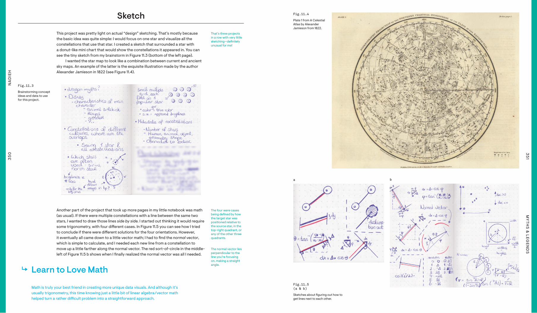
Of course, that idea still hinged on data availability. I thought that the subject I had chosen would be speci"c enough for Google. But alas, trying to search for constellation data was heavily intermixed with astrology. (ー_ー*; )
I found some promising information about the “modern” 88 constellations, but nothing about constellations from multiple cultures. That is, until I came across Stellarium, an amazing open source 3D planetarium software and all its data can be accessed on GitHub. The giant cherry on the cake is a folder1 called “skycultures” which contains information on constellations from ±25 di#erent cultures from across the world, including Aztec, Hawaiian, Japanese, Navajo, and many more. This data was exactly what I needed, but it wasn’t available in a simple CSV format, nor in the shape that I wanted for my visualization. Luckily, Stellarium has a very extensive user guide2 that explains exactly how to interpret the data.
For example, Figure 11.1 shows the data to create “stick "gures,” or the lines between stars. Each row is one constellation, with the constellation’s ID listed in the beginning, followed by the number of connections (lines) in the constellation. After that come the so-called Hipparcos (HIP) star IDs. Each pair of HIP IDs de"nes a line between those two stars.
I converted these "les into something very similar to the typical links "le of a network, with a source_id and target_id per row, having one row for each line to draw in the stick "gure/constellation.
I pulled the full names of the constellations from a di#erent Stellarium dataset and created another "le that contains all the constellation IDs that a speci"c star is connected to. However, there was still one important “subject” that I was missing in terms of data: the stars.
Thankfully, that’s a dataset I’m already familiar with and have used in a few other astronomer themed visualizations. The HYG database3 contains lots of information about many, many stars. From that database I took the right ascension and declination so I could place the stars on a map (you can think of these as the latitude and longitude of the sky). But I needed more information, such as the HIP ID, to connect them to the constellation data from Stellarium. I also found the apparent magnitude, which represents how bright the star looks, to use as a star’s size, and "nally the star’s color index to get an e#ective temperature, which could then be mapped to a color for the stars. It would be a shame not to color the stars the way they actually appear to us.
To stay true to how we see the night sky, I "ltered the stars to only include those that are bright enough to be seen by the naked eye, which is an apparent magnitude smaller than 6.5.
In addition to sky maps with constellations, I also wanted to display something more “statistical” using a bigger set of data. What sparked my interest was seeing how the data looked when I plotted a star’s brightness versus the number of constellations that each star is used in. Was there a trend? If so, which stars deviated and why? I made a quick plot in R using ggplot2 (Figure 11.2) that revealed some interesting insights, speci"cally, insights around which stars deviated from the general trend of “the brighter a star, the more constellations that use it.”
1 Stellarium skycultures folder: https://github.com/Stellarium/stellarium/tree/master/skycultures2 Stellarium user guide: https://github.com/Stellarium/stellarium/releases/download/v0.19.1/stellarium_user_guide-0.19.1-1.pdf3 HYG database: https://github.com/astronexus/HYG-Database
4 List of proper names of stars: https://en.wikipedia.org/wiki/List_of_proper_names_of_stars5 Universe Guide website: https://www.universeguide.com/star/atlas
Fig.11.1Fig.11.1
Stellarium’s data to create “stick "gures” between the stars.
Fig.11.2Fig.11.2
A scatter plot made in R showing apparent magnitude versus the number of constellations a star is part of, for approximately 2,200 stars.
The HIP ID was the unique key that made it possible to link the constellation data from Stellarium to the star data from the HYG database.
In astronomy the smaller the apparent magnitude, the brighter the star appears to us.
By proper names of stars I mean their popular/common names instead of their catalogue IDs, such as the star names Betelgeuse and Sirius.
I copied the Wikipedia list of 350 star names into Excel using its “data from web” import option.
However, while investigating this scatter plot more closely, I noticed that my star data was missing many proper star names. Almost all nine stars of the Pleiades were not named! I searched for a bigger list of named stars and found a sort-of o%cial list of ±350 stars on Wikipedia.4
However, these only contained the names themselves, not the HIP IDs needed to connect them to my data. Thankfully, there is a website called the Universe Guide5 where the URLs are based on the star’s name, while the page itself contains the HIP ID in the HTML’s h1 header (title) of the page. I therefore used the rvest package in R to download the Universe Guide page of all of the stars on the wiki list, grabbed the h1 from the HTML, and only kept the HIP id . I only had to do a few manual lookups for names that didn’t return results from the Universe Guide through my script. Finally, I merged this “proper star names” dataset into the original HYG dataset for a much more complete set of star names.
A "nal note about the data: there are no o%cially declared constellation "gures. There are indeed 88 o%cial constellations, but the only thing that is recorded is what area of the sky that constellation takes up (kind of like how the US states divide up the land). There is no o%cial consensus on how the stick "gure part of the constellation should be drawn. I’ve therefore decided to use the data from Stellarium as my “single source of truth.”
35
0N
AD
IEH
35
1M
YTH
S &
LEGEN
DS
Sketch
This project was pretty light on actual “design” sketching. That’s mostly because the basic idea was quite simple: I would focus on one star and visualize all the constellations that use that star. I created a sketch that surrounded a star with a donut-like mini chart that would show the constellations it appeared in. You can see the tiny sketch from my brainstorm in Figure 11.3 (bottom of the left page).
I wanted the star map to look like a combination between current and ancient sky maps. An example of the latter is the exquisite illustration made by the author Alexander Jamieson in 1822 (see Figure 11.4).
(a) (b)
Learn to Love Math
Math is truly your best friend in creating more unique data visuals. And although it’s usually trigonometry, this time knowing just a little bit of linear algebra/vector math helped turn a rather di%cult problem into a straightforward approach.
Another part of the project that took up more pages in my little notebook was math (as usual). If there were multiple constellations with a line between the same two stars, I wanted to draw those lines side by side. I started out thinking it would require some trigonometry, with four di#erent cases. In Figure 11.5 you can see how I tried to conclude if there were di#erent solutions for the four orientations. However, it eventually all came down to a little vector math; I had to "nd the normal vector, which is simple to calculate, and I needed each new line from a constellation to move up a little farther along the normal vector. The red sort-of-circle in the middle-left of Figure 11.5 b shows when I "nally realized the normal vector was all I needed.
Fig.11.3Fig.11.3
Brainstorming concept ideas and data to use for this project.
Fig.11.4Fig.11.4
Plate 1 from A Celestial Atlas by Alexander Jamieson from 1822.
Fig.11.5 Fig.11.5 (a & b)(a & b)
Sketches about "guring out how to get lines next to each other.
aa bb(a) (b)
That’s three projects in a row with very little sketching—de"nitely unusual for me!
The four were cases being de"ned by how the target star was positioned relative to the source star, in the top-right quadrant, or any of the other three quadrants.
The normal vector lies perpendicular to the line you’re focusing on, making a straight angle.
35
2N
AD
IEH
35
3M
YTH
S &
LEGEN
DS
Finally, I made some sketches of the general page layout. The title would stand out nicely against a background of the night sky. With the sky maps themselves already providing more than enough aesthetically, I wanted to simplify the other elements of the text and layout.
(a) (b) (c)
(b)
Fig.11.6 Fig.11.6 (a,b,c)(a,b,c)
Sketching out the layout of the page in later stages of the project.
aa bb cc
Code
My "rst goal, before focusing on the actual data visualization side of things, was to create a “base map” of the sky. I’ve never created one, so I did a little research on what kind of map projection is typically used for sky maps. (I decided to go with a stereographic one.)
Given this map would include 9,000 stars for the full sky, mini donut charts, and many constellation lines, I set out to create this project with canvas due to its better performance. I loaded my star data and set up my code following several D3.js based examples of sky maps.6 But all my code produced was a thin stripe of stars. ಥ﹏ಥ (see Figure 11.7 a).
(a) (b)(a) (b)aa bbFig.11.7 Fig.11.7 (a & b)(a & b)
The very "rst results on screen, failing "rst, but getting it right the second time.
I never truly worked with projections before outside of the default Mercator projection.
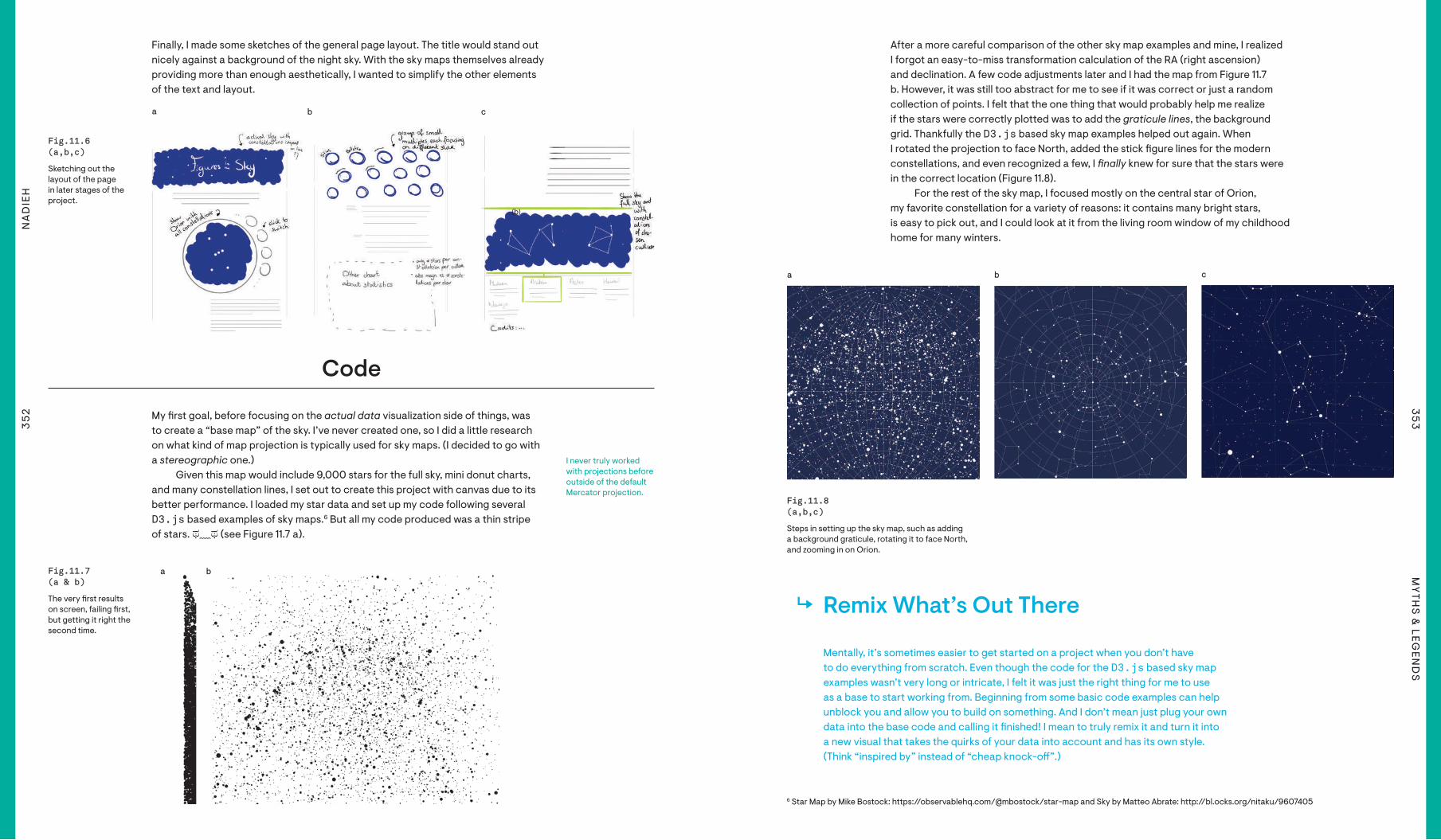
After a more careful comparison of the other sky map examples and mine, I realized I forgot an easy-to-miss transformation calculation of the RA (right ascension) and declination. A few code adjustments later and I had the map from Figure 11.7 b. However, it was still too abstract for me to see if it was correct or just a random collection of points. I felt that the one thing that would probably help me realize if the stars were correctly plotted was to add the graticule lines, the background grid. Thankfully the D3.js based sky map examples helped out again. When I rotated the projection to face North, added the stick "gure lines for the modern constellations, and even recognized a few, I !nally knew for sure that the stars were in the correct location (Figure 11.8).
For the rest of the sky map, I focused mostly on the central star of Orion, my favorite constellation for a variety of reasons: it contains many bright stars, is easy to pick out, and I could look at it from the living room window of my childhood home for many winters.
(a) (b) (c)aa bb cc
Fig.11.8 Fig.11.8 (a,b,c)(a,b,c)
Steps in setting up the sky map, such as adding a background graticule, rotating it to face North, and zooming in on Orion.
Remix What’s Out There
Mentally, it’s sometimes easier to get started on a project when you don’t have to do everything from scratch. Even though the code for the D3.js based sky map examples wasn’t very long or intricate, I felt it was just the right thing for me to use as a base to start working from. Beginning from some basic code examples can help unblock you and allow you to build on something. And I don’t mean just plug your own data into the base code and calling it "nished! I mean to truly remix it and turn it into a new visual that takes the quirks of your data into account and has its own style. (Think “inspired by” instead of “cheap knock-o#”.)
6 Star Map by Mike Bostock: https://observablehq.com/@mbostock/star-map and Sky by Matteo Abrate: http://bl.ocks.org/nitaku/9607405
(a) (b) (c)(a) (b) (c)
35
4N
AD
IEH
35
5M
YTH
S &
LEGEN
DS
Fig.11.9Fig.11.9
A much too saturated colorful sky.
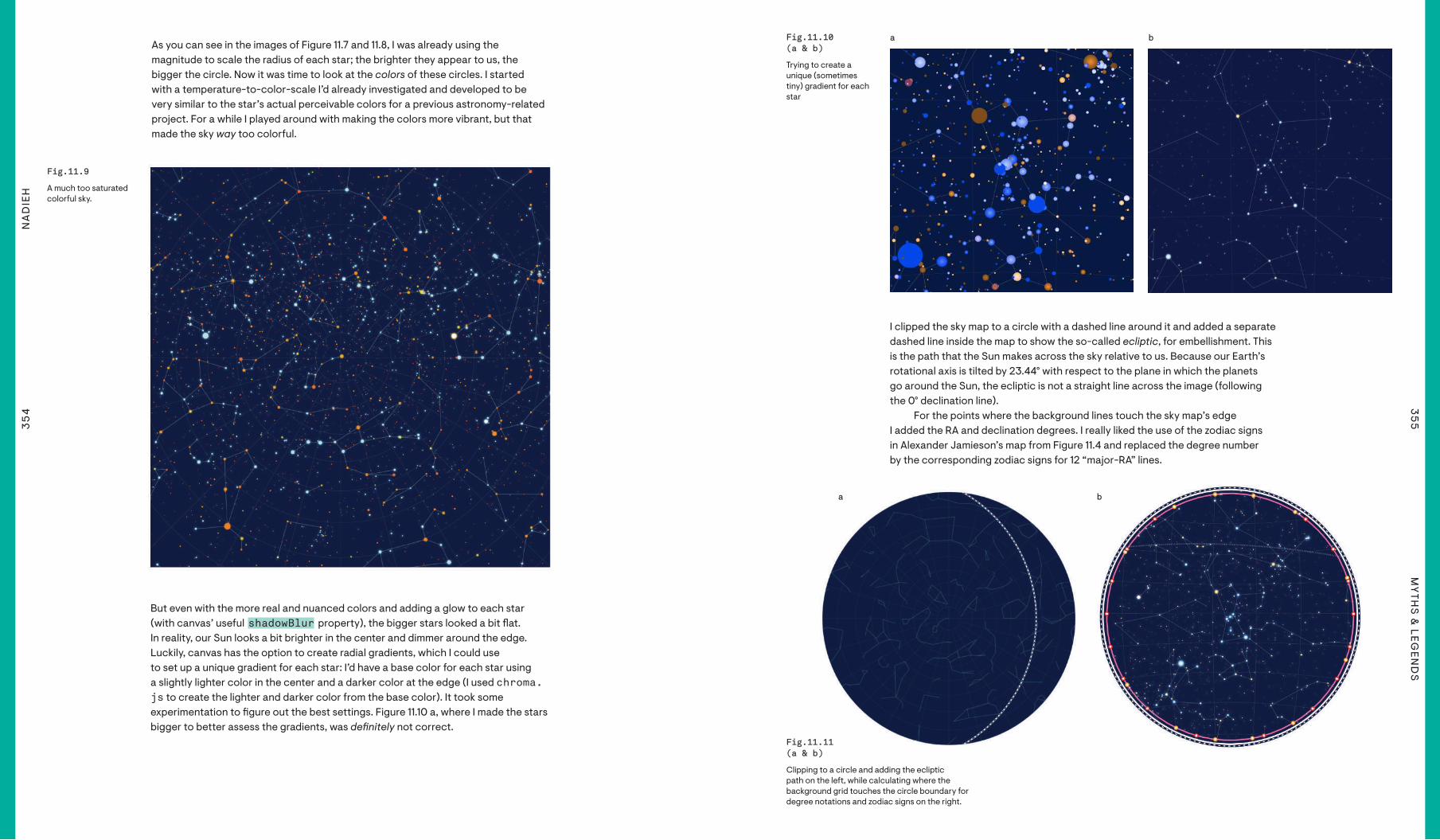
As you can see in the images of Figure 11.7 and 11.8, I was already using the magnitude to scale the radius of each star; the brighter they appear to us, the bigger the circle. Now it was time to look at the colors of these circles. I started with a temperature-to-color-scale I’d already investigated and developed to be very similar to the star’s actual perceivable colors for a previous astronomy-related project. For a while I played around with making the colors more vibrant, but that made the sky way too colorful.
But even with the more real and nuanced colors and adding a glow to each star (with canvas’ useful shadowBlur property), the bigger stars looked a bit !at. In reality, our Sun looks a bit brighter in the center and dimmer around the edge. Luckily, canvas has the option to create radial gradients, which I could use to set up a unique gradient for each star: I’d have a base color for each star using a slightly lighter color in the center and a darker color at the edge (I used chroma.js to create the lighter and darker color from the base color). It took some experimentation to "gure out the best settings. Figure 11.10 a, where I made the stars bigger to better assess the gradients, was de!nitely not correct.
aa bb(a) (b)Fig.11.10 Fig.11.10 (a & b)(a & b)
Trying to create a unique (sometimes tiny) gradient for each star
I clipped the sky map to a circle with a dashed line around it and added a separate dashed line inside the map to show the so-called ecliptic, for embellishment. This is the path that the Sun makes across the sky relative to us. Because our Earth’s rotational axis is tilted by 23.44° with respect to the plane in which the planets go around the Sun, the ecliptic is not a straight line across the image (following the 0° declination line).
For the points where the background lines touch the sky map’s edge I added the RA and declination degrees. I really liked the use of the zodiac signs in Alexander Jamieson’s map from Figure 11.4 and replaced the degree number by the corresponding zodiac signs for 12 “major-RA” lines.
Fig.11.11 Fig.11.11 (a & b)(a & b)
Clipping to a circle and adding the ecliptic path on the left, while calculating where the background grid touches the circle boundary for degree notations and zodiac signs on the right.
aa bb
35
6N
AD
IEH
35
7M
YTH
S &
LEGEN
DS
(a) (c)(b)
(a) (c)(b)
(a) (c)(b)aa bb
cc
Fig.11.12 Fig.11.12 (a,b,c,d)(a,b,c,d)
Slowly building up a “swirly background” using the contour function of D3.js.
Fig.11.13Fig.11.13
The "nal result of the base sky map. Now the data visualization would still need to be overlayed.
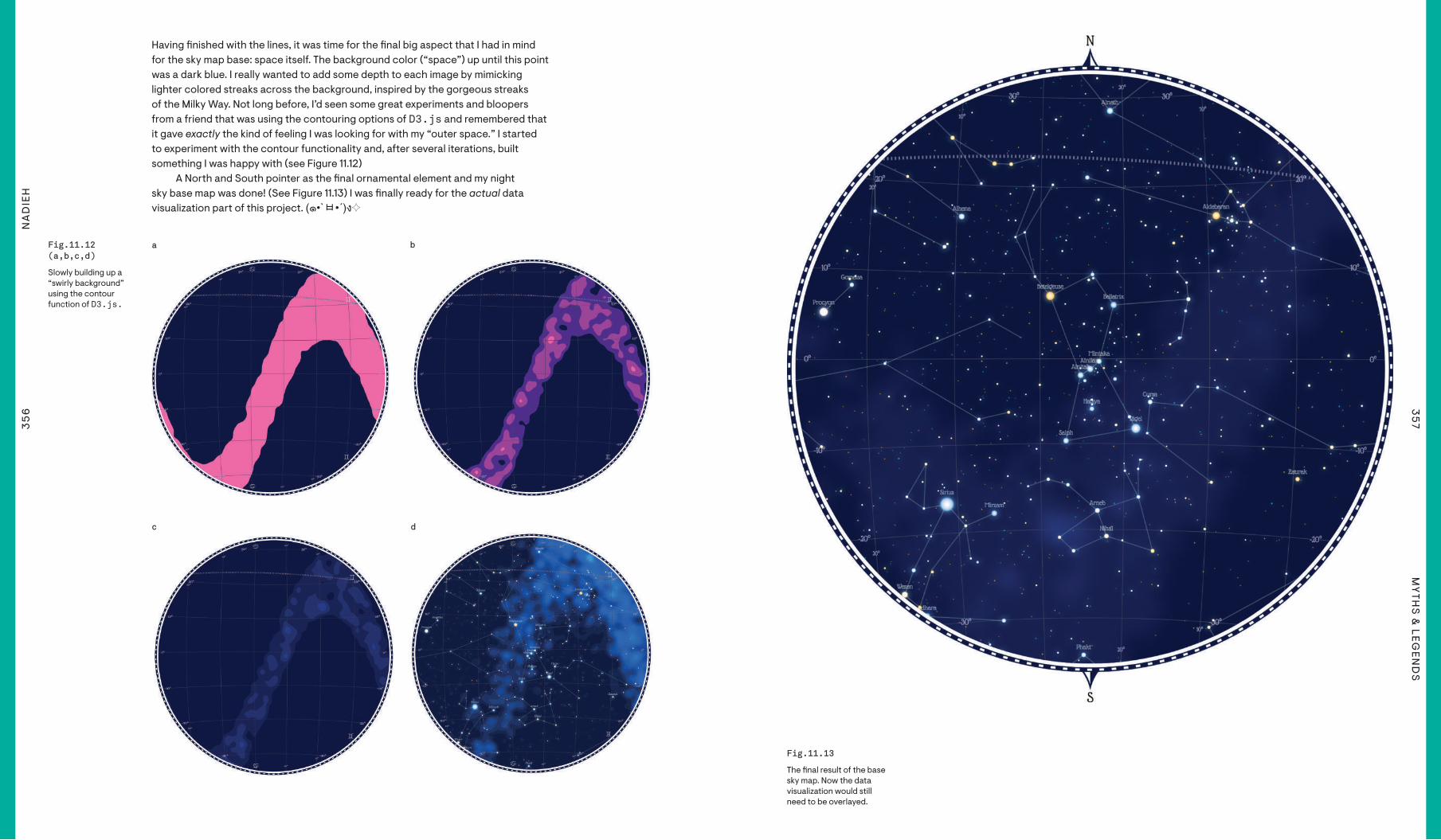
Having "nished with the lines, it was time for the "nal big aspect that I had in mind for the sky map base: space itself. The background color (“space”) up until this point was a dark blue. I really wanted to add some depth to each image by mimicking lighter colored streaks across the background, inspired by the gorgeous streaks of the Milky Way. Not long before, I’d seen some great experiments and bloopers from a friend that was using the contouring options of D3.js and remembered that it gave exactly the kind of feeling I was looking for with my “outer space.” I started to experiment with the contour functionality and, after several iterations, built something I was happy with (see Figure 11.12)
A North and South pointer as the "nal ornamental element and my night sky base map was done! (See Figure 11.13) I was "nally ready for the actual data visualization part of this project. (๑•`ㅂ•´)ง✧
dd

35
8N
AD
IEH
35
9M
YTH
S &
LEGEN
DS
(a) (b)
(a) (b)
(a) (b)
Fig.11.14 Fig.11.14 (a & b)(a & b)
Creating a mini donut chart around each constellation star.
Fig.11.15 Fig.11.15 (a & b)(a & b)
Positioning the lines to run parallel between the stars—doing it wrong at "rst and corrected eventually.
Fig.11.16 Fig.11.16 (a & b)(a & b)
Focusing on (the white circle) Betelgeuse (in the modern constellation of Orion) and on Sirius in a star-line from Hawaiian culture.
aa
aa
aa
bb
bb
bb
I chose to switch and focus on the brightest star in the night sky, Sirius.
You could already see my (mostly useless) math in the “Sketch” section earlier.
The end goal was to visualize how many constellations used each star. I started with creating a small donut chart around each star that was part of a constellation. Even though one star would be chosen to focus the visualization on, many neighboring stars would also be included in the di#erent constellations. I "rst created simple donut charts featuring only white slices. When that was working and looked good I turned it into a colored version with rounded edges and a bit of padding.
The lines in between the stars were a bit of a di#erent story. I wanted these lines to be placed alongside each other, but I only had the exact center location of each star, so calculating the o#set in the x- and y-direction that each extra line would need wasn’t trivial, I thought. Until I "nally remembered not to think in trigonometry, which created the wrong image of Figure 11.15 a, but in vectors and the normal vector (resulting in Figure 11.15 b).
Working with the di#erent constellations showed me that using one particular zoom level and center would de"nitely not work to properly reveal each of the separate constellations. It took me a while to "nally "gure out the logic and to automatically calculate the optimum zoom level, rotation, and center that would nicely "t any constellation that I would give the program (see Figure 11.16).
To make it easier to select and see the full shape of each separate constellation (using the same star), I added all of the separate constellations in a ring around the version that showed all of the constellations at once.
Fig.11.17Fig.11.17
The separate constellations in a ring around the main sky map.

36
0N
AD
IEH
36
1M
YTH
S &
LEGEN
DS
Fig.11.18Fig.11.18
The "nal look of the circular sky map with the mini circles around it.
Fig.11.19Fig.11.19
The full sky, now with the background fuzzy patches sort-of following the shape of the Milky Way.
Fig.11.20Fig.11.20
An early look of several smaller sky maps, each focusing on a di#erent star.
I was quite happy with the result, so I decided to use it for the header of the full article as well.
That immediately showed me two things. For one, this was excruciatingly slow! But also, the complete sky map on the mini circles wasn’t needed at all. They were too small to really have any visual e#ect, and they were too distracting from the central map. Luckily, removing elements from the mini maps would also make them faster to load. The main thing to see were the constellation shapes anyway, which was the most performant part of the sky map’s three layers: the glowing stars, the constellation lines and donut charts, and the entire background. After some "ddling around, I got it all working and ended up with the version from Figure 11.18. Finally, I added an interaction that allowed visitors to click any of the outside mini circles to see it drawn properly, and bigger, in the center (see Figure 11.30 for an example of selecting an outside mini circle).
I could’ve stopped there. The sky map was a complete visualization in its own right. But just showing the star Betelgeuse felt so incomplete! I had so much more data that I could use to tell a fuller and more interesting story. So even though I had already racked up way too many hours to get to this point, I decided that this project would become a complete article; with beginning, middle, and end. (In other words, even more visuals. (◍•﹏•))
An (almost) full sky map that would show all of the constellations of one chosen culture was the "rst on my list. It would allow users to select a culture and view its constellations separately. Given how complete my circular sky map function was, setting up the base for this was quite easy. In essence, the only change I had to make was to adjust the projection from stereographic to an equirectangular one (while also using a di#erent width/height and not clipping the visual to a circle). For this full sky map I made sure to have the background fuzzy patches follow the actual rough location of the Milky Way.
Betelgeuse might be a fascinating star, but I wanted to reveal many more interesting stars and constellations! The function to create the full sky map with all of its constellations could be used for any star, thankfully. What did end up taking several hours was the exact design of these extra sky maps on the page and manually going through about a hundred stars and selecting the ±15 I thought looked the most interesting and diverse.

36
2N
AD
IEH
36
3M
YTH
S &
LEGEN
DS
(a) (c)(b)
Annotations Are of Vital Importance
Often overlooked, annotations are one of the best ways to make a chart understandable to an audience. Underutilized in many data visualizations, annotations are the ideal way to highlight exactly those things that you, as the creator, want the audience to pay attention to. My current go-to is the wonderful d3-annotations library. And I think the scatter plot from this project has the most intricate placement of annotations that I’ve ever applied (see Figure 11.26 later in this chapter for the fully annotated version).
ReflectionsFig.11.21 (a,b,c)Fig.11.21 (a,b,c)
First using the same star colors and gradients as I did for the sky maps, but later going for darker colors and no gradient, and "nally even more vibrant and glowing stars.
aa bb cc
Fig.11.22Fig.11.22
All the sky cultures in their own overview.
“Beautiful in English” isn’t far behind in terms of hours spent.
I ain’t ever doing it again though. Damn, such work!! [¬°-°]¬
The "nal visual pieces to add to the page were the statistical charts, starting with the scatter plot that displayed a star’s brightness versus the number of constellations it was a part of. As ±2,200 stars were included in at least one constellation, I went for canvas as the base. However, I used a separate SVG on top for all the axes, text, interactivity, and annotations. Using canvas made it easy to reuse the same coloring of the stars as I had in the sky maps. However, with the white background those colors looked much too soft, and the gradient e#ect was too distracting (Figure 11.21 a). Removing the gradient and adding a multiply e#ect to darken any overlapping stars helped to make it visually more appealing (see Figure 11.21 b). However, I felt that the colors were still too soft. So I made them more vibrant, added a bit of “glow” around the edges, cleaned up the axes a bit, and the visual style of the scatterplot was done (see Figure 11.21 c). Eventually, I also added a mouse hover and textual annotations.
At the bottom of the article I added a section that tells more about each culture. Selecting a culture results in the full sky map updating to show all of the constellations from that culture. And a bar chart that I had in mind with the average number of stars per culture eventually ended up as a small mini bar in each of the culture “boxes” (Figure 11.22).
And then! Then I replaced as many of the visuals as I could with images. (●__●) Images are much easier to load than doing the heavy sky map calculation, and the sky maps wouldn’t change anyway.
Adding in text between all the di#erent visuals, and my second (and thankfully last) full article style data visualization was "nally done!
This was my longest project in terms of hourly investment. I clocked about 110 hours, but estimate I spent more than that, due to not always timing myself whenever I thought something would take "ve minutes to do, and suddenly, I was an hour in. Some parts took an unexpected amount of time to work on, such as setting up the functionality to create a base sky map that could handle any star and constellation combination. I am generally less enthusiastic about working on overall page layouts, but I spent extra time trying to perfect this layout since it was a vital part of the story.
Even though it took so long, I’m super happy to have created a project that combines my love of astronomy with my passion for dataviz! Especially since this was, for me, my farewell to the creation of new visualizations as a part of Data Sketches. I’m amazed at all the things that I’ve learned about making data visual across the 12 topics. And it’s fascinating to look back at my skills for the very "rst project and comparing that to the full-length article that my "nal project became. I’m exceptionally happy to have been a part of Data Sketches. It has opened doors to opportunities that I didn’t even know I was looking for!
(a) (c)(b)

36
5M
YTH
S &
LEGEN
DS
FiguresInTheSky.VisualCinnamon.comFigures in the Sky
Fig.11.23Fig.11.23
The start of the “Figures in the Sky” article.
Fig.11.26Fig.11.26
The full sky map showing all 88 “modern” (Western) constellations.
Fig.11.25Fig.11.25
All constellations that are connected to the star Deneb. In Western cultures its constellation is known as Cygnus (the Swan), but it is also part of the “Summer Triangle,” a very easy-to-make-out group of three stars in the high of a Summer night on the Northern hemisphere.
Fig.11.24Fig.11.24
The many constellations that use the star Dubhe, part of the well-known Big Dipper.

36
6N
AD
IEH
36
7M
YTH
S &
LEGEN
DS
Fig.11.27Fig.11.27
This beauty of a constellation comes from several tribes in South America and is called Veado (which Google tells me is similar to “deer”). I would say that it seems a bit too speci"c for a constellation that can “easily” be found in the sky, but that’s perhaps my own bias of having lived in very light-polluted areas all my life.
Fig.11.28Fig.11.28
After highlighting the constellations of Betelgeuse, Sirius and Deneb, the article lets the viewer inspect 15 more stars by clicking on any of the mini images.
Fig.11.29Fig.11.29
A scatter plot showing all ±2,200 stars that are included in at least one constellation.
Fig.11.30Fig.11.30
The full sky map of the 318 di#erent Chinese constellations.

36
9M
YTH
S &
LEGEN
DS
DEC
EMB
ER 2
018
Just like Nadieh, it took me forever to decide on a good dataset and angle for this project. We chose “Myths & Legends” because it sounded like a great topic with a lot of potential, but the ideas I came up with either didn’t excite me much or were di%cult from a data gathering perspective. I wanted to do something related to my Chinese background and bounced from Chinese and Asian mythology to classic Chinese literature to Mythbusters episodes.
Then, the idea came to me after watching Crazy Rich Asians. I loved Michelle Yeoh in the movie, but it wasn’t until I read more about her that I learned how accomplished and legendary she was. It made me wonder about all of the legendary women across history that I’ve never heard of, and the idea took shape from there.
SHIRLEY
Legends
370
SH
IRLE
Y3
71M
YTH
S &
LEGEN
DS
Data
Once I had the idea about doing something with legendary women, the next step was "guring out how to get the data. I decided early on that Wikipedia, with its user-generated content, would be a great resource. I wanted to "gure out a way to get the “top” women on the platform, but ran into a tricky problem: I didn’t have any idea how to de"ne “top.” Would it be page views? Page length? Inbound links? And even though I had seen something similar on The Pudding—they were even awesome enough to write about their methodology1—I still wasn’t sure how to go about adopting their approach for my own project.
Then, it hit me: instead of trying to de"ne “top” myself, I should just look for a de"nitive list. After a few Google searches, I ended up on a Wikipedia page with a list of the 51 female Nobel Laureates. They were all incredible women, yet I hadn’t heard of most of them. It was the perfect dataset.
I copy-pasted the table—with information about the category (Peace, Literature, Physiology or Medicine, Chemistry, Physics, Economic Sciences) and year of their awards, as well as the achievements that led to the award— into a spreadsheet and did some light formatting and cleaning. I exported the spreadsheet as a CSV and used an online converter to get the data into JSON format.
Because I also wanted to get data from the laureates’ individual Wikipedia pages, I researched for ways to access the Wikipedia API. It was a little hard to navigate (I wasn’t sure if I should use Wikidata or MediaWiki, which are the two options that came up when I searched “Wikipedia API”), but thankfully The Pudding had me covered. A quick dig through their repo led me to their code that used wiki.js, and I could interface with that Node.js package instead of the actual Wikipedia API.
After that, I wrote a script using wiki.js to programmatically get additional data from each woman’s Wikipedia page, including basic biographical information, the number of links into their page (“backlinks”), and the number of sources at the bottom of their page.
Sketch
In early 2018, my friend and I pitched a design to a potential client. We didn’t get the contract, but the core idea—to represent the individual data points as multifaceted crystals—really stuck with me. I pinned some gorgeous photos and paintings of crystals and mused how I could programmatically recreate them.
Fast-forward to fall 2018 and I had the idea of legendary women but wasn’t sure how I wanted to visualize them. Then, one day as I was going through the “Information Is Beautiful Awards” shortlist and pinning my favorite entries, I came across the crystals again in one of my Pinterest boards. As soon as I saw artist Rebecca Chaperon’s gorgeous paintings of crystals,2 I knew I wanted to represent each of the legendary women as one of those bright, colorful crystals—because how beautiful would that be?
It wasn’t long before I had come up with the other details. The size of the crystal would represent the number of articles linking back to a laureate’s Wikipedia page (her “in!uence”). The number of faces on the crystal would map to the number of sources at the bottom of her page (because she’s “multi-faceted”; get it? (*≧艸≦), and the colors would represent the award category.
The only thing that evaded me was how to position the crystals. For the longest time, I could only think to lay them out in a two-dimensional grid and have the reader scroll through them. But then I took Matt DesLauriers’s “Creative Coding” workshop on Frontend Masters3, where he taught (among other things) Three.js and WebGL. The workshop inspired me to try out a 3D layout, and I knew immediately that I would use the z-axis for the date they received their award: the closer to the foreground, the more recent her award.
All of this came to me so quickly and naturally, that I didn’t draw a single sketch of the idea.
Code
For years I wanted to make something physical, and in 2018, I made it a goal to create a physical installation. But every time I thought about it, I got stuck thinking about 2D projections (or TVs) on walls; I didn’t know how to take advantage of all that "oor space.
And then one day, it hit me: of course I didn’t know how to think in physical spaces, I worked digitally in 2D all day long. So if I could teach myself to work in 3D digitally, then it should (hopefully) follow that I could think in physical spaces also. I put Three.js and WebGL at the top of my list of technologies to learn.
I took Matt’s Frontend Masters workshop and learned the basics of Three.js, fragment shaders, and vertex shaders. I learned the “right-hand rule” to orient myself in WebGL’s coordinate system: with my right palm facing me, use the thumb for the x-axis (increases going right), index "nger for the y-axis (increases going up, which is the opposite of SVG and canvas), and the middle "nger for the z-axis (increases coming out of the screen and towards us). I learned that WebGL’s coordinate system doesn’t operate in pixels, but rather in “units” of measurement that we can think of as feet or meters or whatever we like, as long as we’re consistent.
In mid-November, David Ronai asked me if I was interested in participating in Christmas Experiments, an annual WebGL advent calendar. I was hesitant to accept, since I had never worked with WebGL before, but David encouraged me to give it a try and promised to put me later in the month to give me more time. I agreed, knowing that the deadline would give me the motivation I needed to complete the project. I made it a goal to do a little bit each weekday starting December 1st, until I could get to something presentable on the 23rd—the slotted date for my Christmas Experiment.
I started by reading the "rst two chapters of WebGL Programming Guide,4 which taught me how WebGL was set up. I then rewatched the Three.js section of Matt’s workshop so that I could see what heavy lifting it was doing for me. After the workshop, I created an Observable notebook to "gure out the minimum amount of setup required to draw with Three.js.
1 The Pudding, “What Does the Path to Fame Look Like?”: https://pudding.cool/2018/10/wiki- breakout/2 Rebecca Chaperon, “Crystals”: https://www.thechaperon.ca/gallery/crystals 3 Matt DesLauriers on Frontend Masters: https://frontendmasters.com/teachers/matt-deslauriers/
The Pudding is the same awesome visual essay collective I published my “Hamilton” project on!
This is one of the most important data gathering lessons I learned from Nadieh: spreadsheets are great for cleaning data. The extended lesson is to use the right tool for the job, instead of trying to use the same hammer (code) every time.
For more explanation of Three.js and WebGL, see “Technologies & Tools” at the beginning of the book.
I always like understanding the most fundamental building blocks required to make something work—the core foundation of a technology or library.
372
SH
IRLE
Y3
73M
YTH
S &
LEGEN
DS
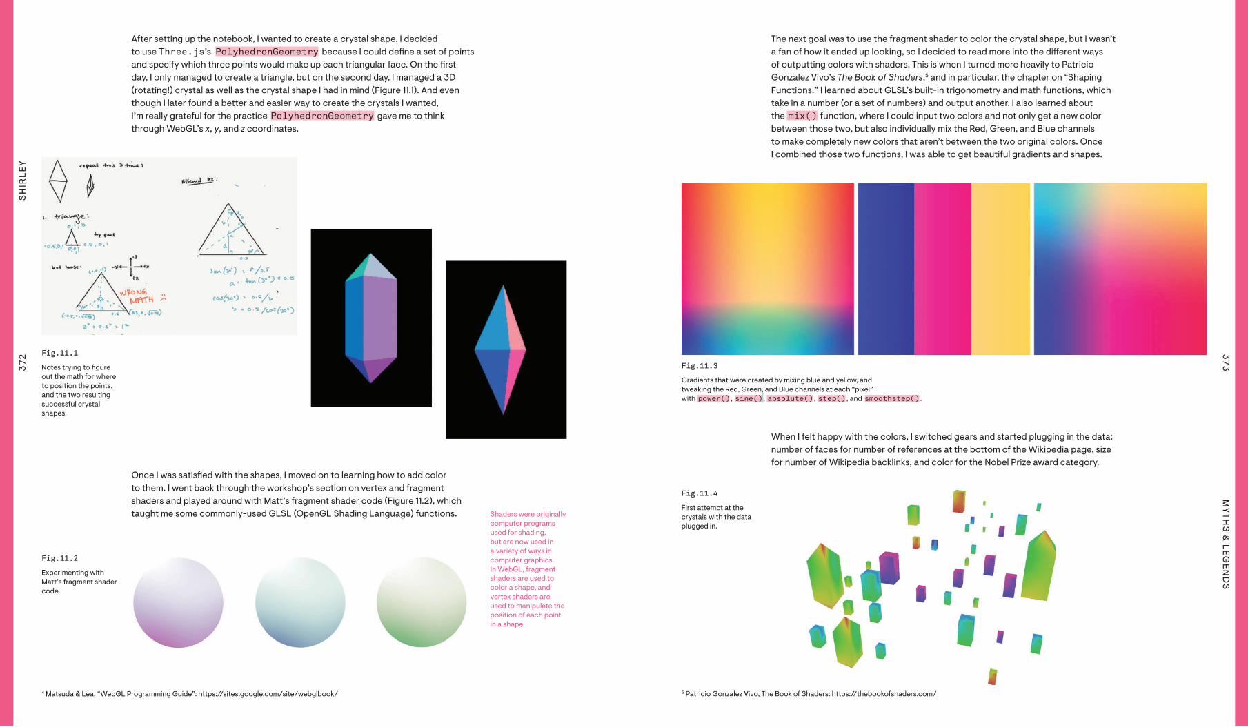
After setting up the notebook, I wanted to create a crystal shape. I decided to use Three.js’s PolyhedronGeometry because I could de"ne a set of points and specify which three points would make up each triangular face. On the "rst day, I only managed to create a triangle, but on the second day, I managed a 3D (rotating!) crystal as well as the crystal shape I had in mind (Figure 11.1). And even though I later found a better and easier way to create the crystals I wanted, I’m really grateful for the practice PolyhedronGeometry gave me to think through WebGL’s x, y, and z coordinates.
Once I was satis"ed with the shapes, I moved on to learning how to add color to them. I went back through the workshop’s section on vertex and fragment shaders and played around with Matt’s fragment shader code (Figure 11.2), which taught me some commonly-used GLSL (OpenGL Shading Language) functions.
The next goal was to use the fragment shader to color the crystal shape, but I wasn’t a fan of how it ended up looking, so I decided to read more into the di#erent ways of outputting colors with shaders. This is when I turned more heavily to Patricio Gonzalez Vivo’s The Book of Shaders,5 and in particular, the chapter on “Shaping Functions.” I learned about GLSL’s built-in trigonometry and math functions, which take in a number (or a set of numbers) and output another. I also learned about the mix() function, where I could input two colors and not only get a new color between those two, but also individually mix the Red, Green, and Blue channels to make completely new colors that aren’t between the two original colors. Once I combined those two functions, I was able to get beautiful gradients and shapes.
5 Patricio Gonzalez Vivo, The Book of Shaders: https://thebookofshaders.com/
Fig.11.1 Fig.11.1
Notes trying to "gure out the math for where to position the points, and the two resulting successful crystal shapes.
(a)
(b) (c)
(a)
(b) (c)(a)
(b) (c)
Fig.11.2Fig.11.2
Experimenting with Matt’s fragment shader code.
Fig.11.3Fig.11.3
Gradients that were created by mixing blue and yellow, and tweaking the Red, Green, and Blue channels at each “pixel” with power() , sine() , absolute() , step() , and smoothstep() .
Shaders were originally computer programs used for shading, but are now used in a variety of ways in computer graphics. In WebGL, fragment shaders are used to color a shape, and vertex shaders are used to manipulate the position of each point in a shape.
4 Matsuda & Lea, “WebGL Programming Guide”: https://sites.google.com/site/webglbook/
When I felt happy with the colors, I switched gears and started plugging in the data: number of faces for number of references at the bottom of the Wikipedia page, size for number of Wikipedia backlinks, and color for the Nobel Prize award category.
Fig.11.4Fig.11.4
First attempt at the crystals with the data plugged in.
374
SH
IRLE
Y3
75M
YTH
S &
LEGEN
DS
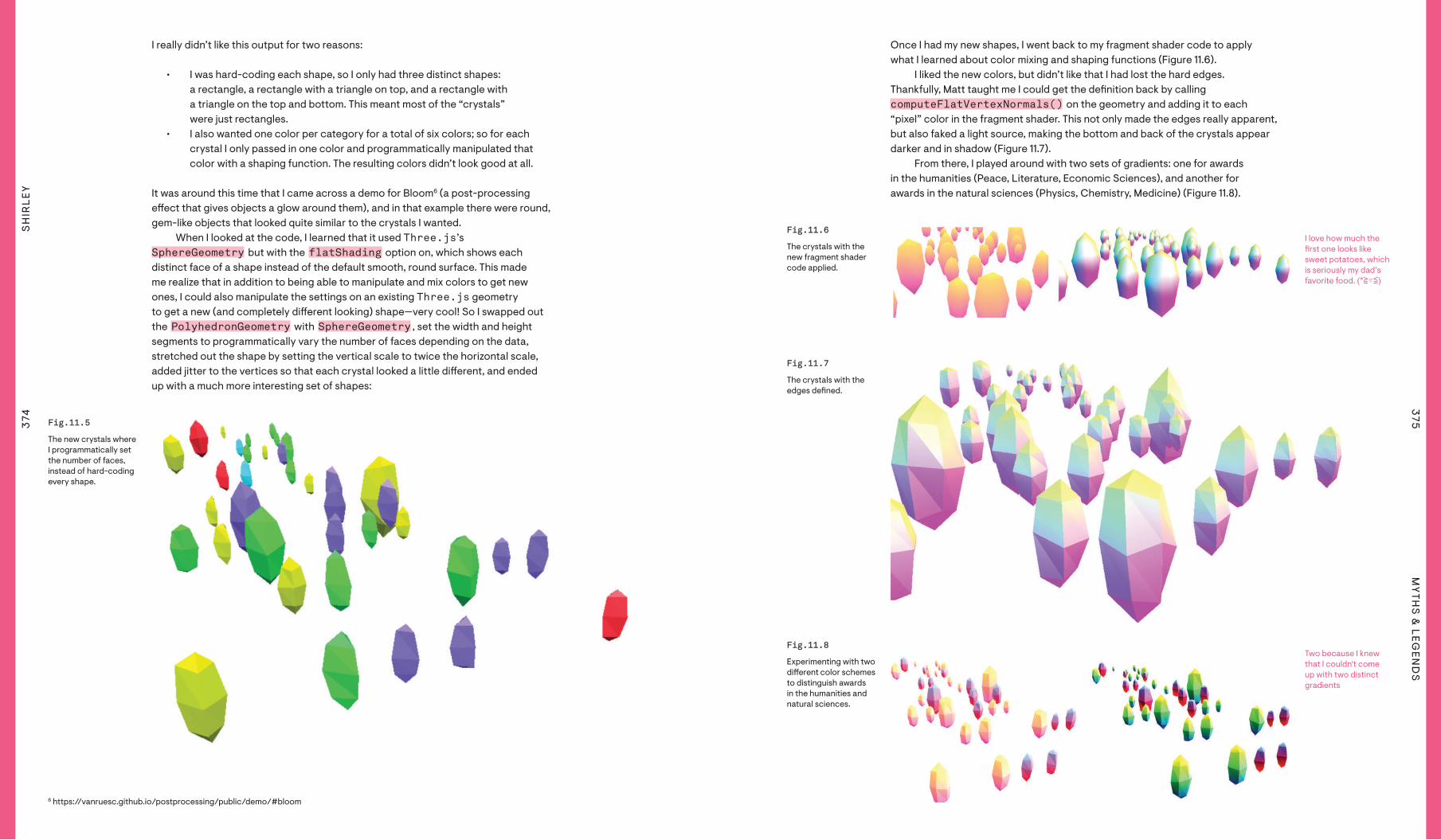
I really didn’t like this output for two reasons:
• I was hard-coding each shape, so I only had three distinct shapes: a rectangle, a rectangle with a triangle on top, and a rectangle with a triangle on the top and bottom. This meant most of the “crystals” were just rectangles.
• I also wanted one color per category for a total of six colors; so for each crystal I only passed in one color and programmatically manipulated that color with a shaping function. The resulting colors didn’t look good at all.
It was around this time that I came across a demo for Bloom6 (a post-processing e#ect that gives objects a glow around them), and in that example there were round, gem-like objects that looked quite similar to the crystals I wanted.
When I looked at the code, I learned that it used Three.js’s SphereGeometry but with the flatShading option on, which shows each distinct face of a shape instead of the default smooth, round surface. This made me realize that in addition to being able to manipulate and mix colors to get new ones, I could also manipulate the settings on an existing Three.js geometry to get a new (and completely di#erent looking) shape—very cool! So I swapped out the PolyhedronGeometry with SphereGeometry , set the width and height segments to programmatically vary the number of faces depending on the data, stretched out the shape by setting the vertical scale to twice the horizontal scale, added jitter to the vertices so that each crystal looked a little di#erent, and ended up with a much more interesting set of shapes:
6 https://vanruesc.github.io/postprocessing/public/demo/#bloom
Fig.11.5Fig.11.5
The new crystals where I programmatically set the number of faces, instead of hard-coding every shape.
Once I had my new shapes, I went back to my fragment shader code to apply what I learned about color mixing and shaping functions (Figure 11.6).
I liked the new colors, but didn’t like that I had lost the hard edges. Thankfully, Matt taught me I could get the de"nition back by calling computeFlat Vertex Normals() on the geometry and adding it to each “pixel” color in the fragment shader. This not only made the edges really apparent, but also faked a light source, making the bottom and back of the crystals appear darker and in shadow (Figure 11.7).
From there, I played around with two sets of gradients: one for awards in the humanities (Peace, Literature, Economic Sciences), and another for awards in the natural sciences (Physics, Chemistry, Medicine) (Figure 11.8).
Fig.11.6 Fig.11.6
The crystals with the new fragment shader code applied.
Fig.11.7Fig.11.7
The crystals with the edges de"ned.
Fig.11.8Fig.11.8
Experimenting with two di#erent color schemes to distinguish awards in the humanities and natural sciences.
(a) (b)
I love how much the "rst one looks like sweet potatoes, which is seriously my dad’s favorite food. (*≧▽≦)
Two because I knew that I couldn't come up with two distinct gradients

376
SH
IRLE
Y3
77M
YTH
S &
LEGEN
DS
Next came the background. I created the “!oor” by using a PlaneGeometry placed below the crystals, dividing it up into a constant number of segments and jittering the y-position of those segments to create a sense of uneven ground. I created the “sky” by placing a huge sphere around the scene with the viewer inside of it. I experimented with three di#erent kinds of lights: hemisphere lights and ambient lights to give the “sky” a nice sunrise glow, and directional lights to cast shadows from the crystals to the “!oor” (Figure 11.9).
To "nish the piece, I added “stars” to represent all the men who won Nobel Prizes in the same time period, as well as annotations for each crystal. It was a fun challenge trying to add text for the annotations: I tried to create the text using Three.js’s TextGeometry at "rst, but the page became completely unresponsive because Three.js was rendering each letter as a 3D object. After some Google searches, I found a solution to render the text within canvas, create a PlaneGeometry , and use that canvas as an image texture to "ll the PlaneGeometry —a much more performant solution!
My favorite part of the visualization is how I decided to use the third dimension to represent time. The crystals are placed according to the decade the laureate received her award, so the closer to the front (and the viewer), the more recent the award. But the decades are only revealed when a user “!ies up” to view the crystals from above; if they “walk through” the crystals at ground level, they will only see information about each woman. I did this because I really wanted the user to learn more about each laureate "rst, before they “!ew up” for a holistic view.
To "nish, I created a landing page with a legend for my legends (hehe), and managed the componentization and interaction with Vue.js.
Fig.11.9Fig.11.9
Background with a !oor and sky added.
I was quite upset when I learned that there have been 866 male Nobel Laureates but only 53 women Nobel Laureates. There’s always a gasp of disbelief when I reveal to an audience that the stars are male Nobel Laureates, because there are so many of them compared to the crystals.
Unfortunately, because the text is rendered in canvas, it is treated as an image and thus isn’t a11y (accessibility) compliant—something I only realized later on.
This project was super fun, and I’m so proud that I was able to "nish it in three weeks—something I hadn’t been able to do since the “Travel” project. I was also able to teach myself Three.js and a little bit of GLSL, which I wanted to do for a very long time. This project was a great opportunity to use the third dimension and also gave me the con"dence to experiment with more 3D and physical installation projects in the future. But most importantly, I’m so glad I chose this dataset of women Nobel Laureates; it has since motivated me to work with and highlight datasets featuring underrepresented groups.
Reflections

shirleywu.studio/projects/legendsLegends

38
0S
HIR
LEY
381
MY
THS
& LEG
END
S
Fig.11.11Fig.11.11
Recent women Nobel Laureates I "nd incredibly inspiring.
Fig.11.12Fig.11.12
I also turned this project into washi tape! But because each crystal wasn’t distinct enough, I turned them into !owers instead.
Fig.11.13Fig.11.13
My main goal with this project was to create a physical installation, and I got the opportunity when I collaborated with my studio-mate and illustrator-muralist-extraordinaire Alice Lee! It was a fun learning experience as I had to pay attention to details I never had to when working digitally, like physically organizing the pieces by prize category so we painted them the correct colors (top left), and then again by decade so that we hung them up in the right order (middle left).