data-driven asset management
TRANSCRIPT
Data-Driven Asset Management
An Example for Making Any Operation Data Driven
Richard G. Lamb
Chapter 6 Layered Charting to Know Thy Data

ii
This work is licensed by Richard G. Lamb under a Creative Commons
Attribution 4.0 International License (CC BY). Users are free to copy and redistribute
the material in any medium or format and to remix, transform, and build upon the ma-
terial for any purpose, even commercially. However, with the freedoms, users must
give appropriate credit in a reasonable manner and there may not be legal terms or
technological measures applied that legally restrict others from doing anything with the
materials that the license permits.
Information contained in this work has been obtained from sources believed to be reli-
able. Neither the author nor publisher guarantee the accuracy or completeness of any
information published herein and neither the author nor publisher shall be responsible
for any errors, omissions, or damages arising out of the use of this information. The
work is published with the understanding the author and publisher are supplying infor-
mation, but not attempting to render professional legal, accounting, engineering or any
other professional services. If such services are required, the assistance of an appropri-
ate professional should be sought.
Trademarks: Microsoft, Microsoft Office, Excel Access, Oracle, SAP, Tableau,
Power BI, Maximo and Track are registered trademarks in the United States and other
countries.

iii
Contents
Chapter 6 Layered Charting to Know Thy Data ....................................... 1
6.1. Inspect for Missing Data .............................................................. 3
6.1.1. From Super Table to R .......................................................... 4
6.1.2. Find the Missing Data ....................................................... 7
6.2. Visual and Statistical Inspection ................................................ 12
6.2.1. Load and Survey the Data .......................................... 14
6.2.2. Test for Normal Distribution ...................................... 18
6.2.3. Inspect Correlation Between Variables ...................... 28
6.2.4. Inspect Centrality and Spread .................................... 40
6.2.5. Inspect Categorical Variables .................................... 49
6.2.6. Inspect Variables Over Time ..................................... 53
6.3. Save and Disseminate ....................................................... 61
Bibliography ............................................................................ 62


Chapter 6 Layered Charting to Know Thy Data
Chapter 5 identified and framed five objectives for data-driven asset
management. The first, and foundational to the remaining four, can
be characterized as to “become at one” with our operational data.
Becoming at one with our data has two stages. First is to “know
thy data.” Thence, second is to gain and maintain the truthfulness,
entirety and accessibly of our data.
This chapter will speak to know-thy-data. The next, Chapter 7,
will speak to truthfulness, bad data, and Chapter 9 will speak to the
entirety and accessibly of data. Chapter 8 will introduce, explain and
demonstrate the data analytics we would most likely use to test and
cleanse data for truthfulness.
Chapter 3 introduced layered charting as far beyond what has
been our standard of the past; Excel charts. Layered charting is done
with the ggplot2 package in the R software.
Because of what it makes possible in the exploration of our
data, the chapter is as much about layered charting as it is about
know thy data. The explanations and demonstrations to know thy
data will likewise be explanations and demonstrations for layered
charting and, thus, ggplot2.
With the examples and demonstrations of the chapter, the
reader will be able to substitute in the variables of their maintenance
and reliability operations. Once converted to actual cases, any script
can be pulled up and run with our periodically refreshed operational
data. Consequently, once our exploratory scripts are written initially,
we can routinely call up a huge amount of insight in a matter of mo-
ments.

Chapter 6
2
As it is throughout the book, the software R will be used to
demonstrate and provide templates to the methodologies to know our
data. Accordingly, the chapter is written with the expectation that its
readers have read Chapter 3 and, thus, know how to run around in R
as instructed in this chapter.
The data that was formed to demonstrate the methods of the
chapter are available in the Excel file titled, Chap6_AssetMgt.xlsx.
The data file is available for download at https://analytics4strat-
egy.com/ddassetmgt.
The R script titled, Chap6KnowThyData.R.txt, with which the
methods and templates throughout the chapter are accomplished is
also available from the same webpage. The extension .txt has been
added to allow placement on the webpage as a notepad file. The ex-
tension must be removed from the file name to make it directly
loadable into an R session as explained in section 3.2.
Occasionally, a block of code specifies a path to source data
and saved outputs. The cases are flagged as <path> in the code. The
reader must replace the code with their own path.
Section 3.2 explained that packages typically need to be loaded
to an R session. They are loaded with the library function if previ-
ously installed with the install.packages function.
It is good practice to list the packages at the beginning of an R
script rather than load them at the point of necessity. We can load
them collectively at the beginning of the session by running the fol-
lowing block of code:
#LIBRARIES TO LOAD
library(xlsx); library(mice); library(ggplot2)
library(qqplotr); library(ggm); library(Hmisc)
library(polycor); library(rlm); library(MASS)
library(ggpubr); library(psych); library(nlme)

Layered Charting to Know Thy Data
3
6.1. Inspect for Missing Data
A super table often entails many variables and thousands of records.
Possibly salted throughout are missing data—empty cells. However,
manually searching for them through many of thousands of cells can
be laborious and without assurance of spotting all cases.
Instead, we can engage the triad of grassroot software—Ac-
cess, Excel and R—to determine which variables have missing data
and which records across the variables include missing data. The
triad, as an integration of software, was explained in section 2.2.2.
The steps to search out missing data with the triad are as fol-
lows:
1. Import the super table into Excel from Access.
2. Inspect the table for flags to missing data.
3. Import the super table into R from Excel.
4. Generate a plot and table summarizing the cases of
missing variables.
5. Generate a table of records with missing data in Ac-
cess.
6. Omit records with missing data from the super table—
optional.
Ultimately, there will be decisions for omitting or retaining the
found cases. It is possible that a missing case will prevent or under-
mine a computation to a sought insight. However, we must
remember that omitting records leaves us with less data for envi-
sioned modeled insights. Accordingly, we may choose to omit
missing data at the level of generating the insight deliverable for
which inclusion prevents or distorts a computation or model.
However, we should also be aware that the R functions typi-
cally include the argument na.rm =. If coded as TRUE, all cases of
missing data will be omitted from the analytics of the function.
In between omit and retain, we may choose to replace (impute)
the missing data with an estimate. This is done by analytically de-
veloping an estimate of the missing cases from the good data in our
super table. This is a good example of machine learning (ML) and

Chapter 6
4
artificial intelligence (AI) in action and will be explained later in the
next chapter.
6.1.1. From Super Table to R
The first three steps lead to loading our super table into our R
session.
Step 1: Import the super table into Excel from Access. It is
possible to import the super table into R directly from Access. The
reader is encouraged to research the how of it. This chapter will stick
to the familiar path to most of us, although a bit longer.
For the demonstration we will use the fabricated table shown
in Figure 6-1. The imported super table is tblSuperTable from Ac-
cess. The table is imported into a file titled Chap6_AssetMgt.xlsx and
as the worksheet titled tblSuperTable.
Figure 6-1: Table imported from Access to Excel.
Step 2: Inspect the table for flags to missing data. The KTD-
issue is to determine how missing data is flagged by its source sys-
tem. In Figure 6-1 taken from Access, we can see that missing data
comes as empty (null) cells.
Layered Charting to Know Thy Data
5
However, not all data will come from Access or follow the for-
mat. Other than to know our data, we are additionally concerned if
our imported file is a csv. We may find upon inspection that missing
data may be flagged as "*", ".", "" and others. Rather than singular,
there may be multiple flags in a table. For the read.csv function to
flag them as NA in an R data frame, we must insert the argument
na.strings=c("*", ".", "").
Step 3: Import the super table into R from Excel. As just
mentioned, section 3.3.4 introduced the code to import data tables
into R that are stored in a csv file. This time we will demonstrate
how to import a worksheet from an xlsx file.
Before this is possible, we will need to install the xlsx package
with the install.packages function and then load it to our current
session with the library function as demonstrated in section 3.2.
The code to import the worksheet tblSuperTable is as follows:
#Load table from EXcel and assign to object
sprTbl<- read.xlsx(
"C:\\<path>\\DataBookAssetMgtXlsx.xlsx",
sheetName="tblSuperTable", header=TRUE)
#
#View data frame, notice <NA> as missing data
sprTbl
Note: The code <path> in the code depicts that the reader will
insert the full path to any directory in which they have chosen to save
the files to the demonstrations of the chapter.
There are several points to introduce in the code. Notice that a
path to the file is an argument just as it is for read.csv. However, a
csv is akin to an Excel file with a single worksheet.
Therefore, notice that the shown path in the xlsx function has
two arguments. One is the file and the other, sheetName=, is the work-
sheet. When we run the final line, the data frame—sprTbl—appears
in the R console as shown in Figure 6-2.
Notice in the figure that the cases of empty cells have been
replaced with <NA>. This is necessary to conduct the diagnostic for
Chapter 6
6
missing data. Otherwise, any empty cells without the flag would not
be counted as missing.
Figure 6-2: Data table as imported from Excel and as-
signed to a data frame object.
Notice the variable “ID” in the returned data frame. Although
not necessary, let’s assume we want to remove it. The code to do so
is as follows:
#Removes ID column from data frame
#Returns data frame with only 2nd through 6th variables
sprTbl<- sprTbl[,2:6]
#Returns data frame with ID variable omitted
head(sprTbl)
Another coding to note are the use of subsetting square brack-
ets as explained in section 3.3.4. The code, [,2:6], instructs R to
return a table with only columns 2 through 6. Figure 6-3 shows the
head function view. It confirms for us that only the five columns we
want have remained in the data frame. The head and tail functions
were explained in section 3.3.3.

Layered Charting to Know Thy Data
7
Figure 6-3: sprTbl with ID column removed.
6.1.2. Find the Missing Data
The next three steps are the analytics to locate missing data
along two dimensions. First, we seek empty cells and, second, we
seek records with empty cells.
Step 4: Generate a plot and table to summarize the cases of
missing variables. R allows us to identify the variables and count of
records in the sprTable with missing data. We do it with the md.pat-
tern function. The following code returns what is shown in
Figure 6-4:
#Generate table and plots of counts and composition of
NA
#NOTE: If plot already run, close the Graphic panel
before rerun
md.pattern(sprTbl)
We see in the plot and table that 12 (60 percent) of the 20 rec-
ords have full data. Four have missing data in the CraftLead variable.
Three have missing data in the Hours variable. One has missing data
in both variables.
This is a good place to explain the R output device for the
graphic. However, the simple modern alternative is to use the Win-
dows snipping tool. With it, we would box the plot and save to a file
and directory as we are accustomed to.

Chapter 6
8
Figure 6-4: Summary of missing data (diagonal
lines added).
With the output device, png, we can send the plot of missing
data to a server or our own directory as a *.png file. The code is as
follows:
#Device png() outputs plot as a *.png file
png("C:\\<path>\\varablePlot.png")
md.pattern(sprTbl)
dev.off()
The idea is that the png function is an output device. Its argu-
ment is the destination for the output file. Thence, we run the graphic
and it is delivered per the location argument. Finally, the dev.off
turns the device off.
Step 5: Generate a table of records with missing data in Ac-
cess. The next insight we may want is which records contain missing
data. The easiest method is to use the insight of the graphic or table
to set up a query in Access with the source super table as its input.
We have created a query named qryRecordTable. In it, we use both
the Criteria and OR rows of the design grid as shown in Table 6-1.

Layered Charting to Know Thy Data
9
Table 6-1: qryRecordTable. Join None Field Order WorkType Priority Table tblSuperTable tblSuperTable tblSuperTable Sort Show Y Y Y Crite-ria
Or Or Field CraftLead Hours Table tblSuperTable tblSuperTable Sort Ascending Ascending Show Y Y Crite-ria
Is Null Is Not Null
Or Is Not Null Is Null Or Is Null Is Null
The Access code will return the table shown in Figure 6-5. No-
tice that the use of the OR rows has created three groups. The first is
created by the AND condition between variables from the criteria
row. Each OR row creates an additional group with the AND condi-
tions between variables to each. By coding Ascending in the Sort
row, we distinguish the groups.
Figure 6-5: List of orders missing data by query in
Access.
Step 5 ALTERNATIVE: Generate a table of records with
missing data in R. Rather than return to Access to generate a table
of records with missing data to some of their variables. The follow-
ing code generates a table and assigns it to an R data frame object
shown in Figure 6-6.
Chapter 6
10
#Generate a data frame of records with missing data
records<- sprTbl[!complete.cases(sprTbl),]
records
Let’s see what there is to see what is new to us in the code. We
understand the concept of subsetting within square brackets. The
method was explained in section 3.3.4.
The expression of interest is within the brackets—!com-
plete.cases(sprTbl). The complete.cases function would return all
records for which data is not missing. The ! before the function in-
dicates that we want the opposite of what the function would return.
Figure 6-6: Data frame subset to records with
missing data.
With the write.xlsx function, we can export the data frame
object of the figure to the Chap6_AssetMgt.xlsx file as the work-
sheet ListOrdersNA. The code is as follows:
#Write the data frame records to Excel file as
ListOrdersNA sheet
write.xlsx(
records, file="C:\\<path>\\Chap6_AssetMgt.xlsx",
sheetName="ListOrdersNA", row.names=FALSE,
append=TRUE )
Note the argument row.names=FALSE. If TRUE, each row of our
Excel worksheet would have been given a number. There is an
equivalent argument for columns. It is not shown because the default
for col.names= is TRUE.
Layered Charting to Know Thy Data
11
Next note the argument append=TRUE. The argument causes the
object to be added to the xlsx file. With FALSE, all other worksheets
to the file would be deleted when the current table is imported.
An actual story comes to mind for the importance of identify
the records with missing data. For one plant, the table of records with
missing data immediately revealed a dark long-standing secret. Al-
most half of the order task records had empty cells in CMMS hours
variable. It was unknown to all but the people at front line who had
the daily chore to prepare and submit the craft time sheets.
However, further investigation subsequent to the simple dis-
covery while coming to know thy data revealed the problem. The
plants the mind numbing, intricate, laborious methods to fill out
timesheets drove supervisors to record hours only to the largest work
orders.
This discovery emerged at a time when a big investigation was
being launched to figure out how to reduce the cost of a particular
type of big job for which there were some costly workorders. Fur-
thermore, the costs for equivalent work orders were not roughly
equal. The excessive, erratic cost was not the reality. Missing data
created the perception and it became reality.
Step 6: Omit records with missing cases from the super ta-
ble--Optional. We could return to the source tables and delete the
records with missing data. However, some records in the super table
occur as the result of joining subtables. An example is the use of
translation tables to cleanse data as explained in section 4.3.2. An
empty cell in the super table flagged bad data in a source table.
Removing records from the tables we have extracted from our
operating systems is normally not an advised practice. We always
want to know that the subtables to the super table are as found in
their home operating systems.
We can surgically omit records from the super table in Access.
Figure 6-5 showed the result of using the plot or table shown in Fig-
ure 6-4 to filter from the super table all records with missing data.
That was the purpose of the Access code of Table 6-1.

Chapter 6
12
Now we can omit records from the super table by changing the
Is Null to Is Not Null for each group. Each group will then return
only records with full data. If we wanted to omit all records with
missing data, we can delete the OR rows in the design grid and insert
Is Not Null in the Criteria row for each variable we know to have
missing data.
We have inspected for missing data. With the inspection we
have decided how to treat it. At this point we should know that to
deal with missing data we can simply include the argument
na.rm = TRUE in our R functions and missing data will be ignored
in the conduct of a model or calculation of the function.
6.2. Visual and Statistical Inspection
Now that we know of any missing data in our super table, we need
to ask other questions of our single- and multiple-dimensional vari-
ables. What are the variables types? What are the distributions of the
variables with respect to center and spread? Are there distorting het-
erogenous subsets within the variables? How correlated are the
variables to each other? There will also be questions that will only
occur to us as we through our data.
Modern-day analytics allow us to visualize our data rather than
be limited to numerically presented statistical reports. As the old saw
goes, “a picture is worth a thousand words.” Section 2.2.2. intro-
duced layered charting. The package, ggplot2, within R was
introduced as the graphic software with which to build layered in-
sight.
Section 3.3.3. demonstrated some of the base graphic capabil-
ity of R. This chapter and future chapters will largely present
graphics with the ggplot2 package.
This chapter will explain and demonstrate ggplot2 as templates
to methods to inspect and know our data. However, readers are en-
couraged to at least read Chapter 2 of the book, “ggplot2; Elegant
Graphics for Data Analysis,” second edition by Hadley Wickham.

Layered Charting to Know Thy Data
13
Analysts who aspire to be new age, thus, top drawer in their work
should read the first eight chapters.
This chapter will resist the urge to put glamor and polish on the
graphs it introduces as methods. The possibilities are immense. It is
left to the reader to apply the full scope of the Wickham book.
Accordingly, the templates of this chapter will stick to the core
code to each. In this way, the meat of the graphic methods to know
our data will remain highly visible to the demonstrated explanations.
A philosophy of R is that every package must be fully ex-
plained and that explanations must be available on the internet.
Furthermore, all explanations must be demonstrated with go-by ex-
amples from which we can steal code and each example must be
accompanied with a dataset with which we can try the code our-
selves. This section will use an R-provided data set (mpg) to explore
the miles per gallon data with respect to models, drive, transmission
and six other characteristics.
The data set is relevant and interesting to all of us as car own-
ers. It is commonly used in posted examples to ggplot2. More
importantly, it has characteristics which are like maintenance and
reliability data. The data of our CMMS and other sources, like the
mpg data set, contain numeric variables such as hours, dollars, quan-
tities and dates. However, like the example set, many more of the
variables are categorical such as cost center, priority, maintenance
type, order by craft type, crafts and failure codes.
The steps we will take for the visual and statistical assessment
of our data set are as follows:
1. Load and survey the data.
2. Test numeric variables for normal distribution.
3. View correlations between variables.
4. View centrality and spread of numeric variables.
5. View characteristics of categorical variables,
6. View variables over time.
Chapter 6
14
6.2.1. Load and Survey the Data
Of course, we must first load the data set into our R session.
We will use the R-provided mpg data set. It can be pulled into the
session by entering and running the code data(mpg).
However, the reality is that our maintenance and reliability
data will never come from within an R package. It will be data we
have built in Access as a super table and placed in an Excel file for
dissemination. Therefore, in line with our reality, the R-provided
data set has been stored in our Excel file as the mpgDataSet.
However, note that we can also load data directly from Access.
It is left to the reader to seek the method from the internet.
Accordingly, just as for any maintenance and reliability super
table, we would pull the mpgDataSet data set into the session from
its Excel file with the following code:
#Load table from Excel and assign to object
mpgKtd<- read.xlsx(
"C:\\<path>\\DataBookAssetMgtXlsx.xlsx",
sheetName="MpgDataSet", header=TRUE)
In the code we can see that the data set is located as the work-
sheet MpgDataSet in the Excel file Chap6_AssetMgt.xlsx. We are
using the read.xlsx function because our data is in an xlsx file. We
would use other similar functions for other file types such as csv and
dat. The code assigns the data set to the data frame object named
mpgKtd.
Now that the data set has been loaded, we should survey it in
various tabular formats. Chapter 3 introduced them. In their coded
form, they are as follows:
##Survey views of data
head(mpgKtd)
str(mpgKtd)
summary(mpgKtd)
md.pattern(mpgKtd)
describe(mpgKtd)

Layered Charting to Know Thy Data
15
If we wish to see what the data looks like in its table form, the
head function will return the first six rows of the mpgKtd data set. If
more or less rows are desired, we would code the function as
head(data, n = ) where n is the number of rows.
If we want to view the entire table, we would merely highlight
and run mpgKtd. If we want to view rows at the end of the data set,
we would use the function tail.
The function, str, returns basic information on the makeup of
the data set and its variables. Figure 6-7 shows what is returned.
Figure 6-7: The data set viewed through the str function.
We are informed that the mpgKtd data set is data frame and of
the counts for records and variables. Below that we can inspect the
names of the variables, their types and their first some records.
The definitions of the variables are obvious. However, the var-
iable, fl, is not. It is fuel type.
We can see, upon loading, that the character variables (e.g.,
model) of the data set have been appropriately interpreted by R as
factor variables. For them, we are informed of the categories or lev-
els to each.
There are of course other types of variables that do not occur
in the data frame. Furthermore, the type of any one variable can be
converted to another. Functions are available for all conversions that
make sense.
For example, what if we wanted to convert the cylinder varia-
ble to a factor from numeric. We would use the as.factor function.
If already a factor, we could use the as.numeric function to convert

Chapter 6
16
to a numeric variable. If we wanted to change the factor variables to
character, we would use the as.character function.
The function, summary, provides information of which some
overlap the str function and some are additional to str function. The
output is shown in Figure 6-8.
Figure 6-8: The data set viewed with the function,
summary.
For the numeric variables, the summary function provides sta-
tistics for centrality and spread. The statistics of centrality are mean
and median. The statistics of spread are the second and third quar-
tiles and min-max.
For the factor variables, the function returns lists and counts
for each category. However, if the categories exceed six, we only get
summary information on the six with the greatest counts. All else is
lumped as “other.”

Layered Charting to Know Thy Data
17
The md.pattern function was demonstrated in the previous
section. It would show no missing data in the data set if we ran it
here.
The describe function provides additional insight and, of
course, some that overlap with the previous functions. Rather than
inspect the entire output, Figures 6-9 and 6-10 demonstrate what the
function will return for numeric and factor variables respectively.
Figure 6-9: Example of insight to the numeric variable, hwy,
with the describe function.
In addition to what we already know, notice that there are 27
distinctive quantities to the hwy variable. At times it is important for
us to know that the numeric variable is discrete rather than continu-
ous.
We can inspect the spread as seven quantiles rather than only
quartiles. Finally, we can see the lowest and highest five mileages.
The esoteric elements, Info and Gmd, are beyond our need to know.
Figure 6-10: Example of insight to the factor variable, trans, with
the describe function.
Figure 6-10 provides the full detail of categories to the variable
trans. Recall that previous functions were truncated with respect to

Chapter 6
18
all categories to the variable. In the figure we can see that there are
ten factors. Now we can inspect the lowest and highest occurrences,
and the frequency and proportion of each category.
Now that we have seen the survey functions in action, it is easy
to imagine ourselves inspecting our maintenance and reliability su-
per tables. Many of the insights of the R survey functions are not so
readily apparent by scroll and filter inspection of an Excel table with
thousands of rows and several tens of columns.
As an exercise, the reader is invited to pull the super table of
Chapter 4 into an R session and subject it to the survey functions.
6.2.2. Test for Normal Distribution
We should test the numeric variables in our data set for normal
distribution. This is especially so if the variables are to be used in
measures and models. Furthermore, a tested variable can lead us to
recognize the levels to our categorical variables with respect to the
numeric variable that are individually homogenous but heterogenous
across the distribution. As said in measurement and analytics, “sub-
set, subset and subset.”
An example to a maintenance and reliability operation is a non-
normal distribution of a numeric variable such as hours per order.
Our inspection may find that we should search out the levels to our
categorical variables that have disparate relationships to hours. In-
sights may be hidden in the variables such as maintenance type,
priority and craft type.
This section will demonstrate how to test a numeric variable
for normal distribution. It will then demonstrate methods for inspect-
ing the categorical levels as subsets to the numeric variables for
normality.
The R script to the section includes the visual and statistical
test of normal distribution for the hwy, cty, displ and cyl variables.
However, we will only follow the case for the hwy variable because
the process is the same for all variables.

Layered Charting to Know Thy Data
19
The code below returns Figure 6-11. The figure compares the
variable, hwy, against a template of normal distribution.
#Figure 6-11
#Hwy variable
qqhwy<- ggplot(data = mpgKtd,
mapping = aes(sample = hwy)) +
stat_qq_band() +
stat_qq_line() +
stat_qq_point(aes(color=class)) +
labs(x = "Theoretical Quantiles",
y = "Sample Quantiles") +
ggtitle("Q-Q Test of the Hiqhway Variable")
qqhwy
Let’s explore the code for the basics of coding ggplot2. The
graphic is assigned to the ggplot2 object, qqhwy. We call the figure
up with the final line to the code.
As was introduced in section 2.2.2, the code creates a layered
chart. Notice the “+” code inserted between the base plot, qqplot,
stat_qq_band and so on. At each occurrence a layer is stacked on the
base plot or override its defaults.
The first element, ggplot, creates the base plot. It established
the data and axes of the graph. Within it are the what are called the
aesthetics. In this case a single variable, hwy. However, we will step
past an esoteric explanation of “aesthetic.”
The remaining elements place layers over the base plot. The
first three stack individual graphs as layers upon the base plot. The
fourth, labs, overrides the default axes titles—x and y. The fifth,
qqtitle, stacks a plot title on the base plot.
Let’s dig deeper into the ggplot element. We assign the data
with the argument data =. We set the variables and aesthetics of the
graph with the argument mapping =.
However, the point to note is that we can code the data and
aesthetic without explicitly identifying the arguments. Instead, our
code could be ggplot(mpgKtd, aes(sample = hwy)). That is the style
we will take from here on.

Chapter 6
20
At this point the reader is advised to the read Chapter 2 of the
Wickham text. What is explained and demonstrated in the sections
to come do not require reading the Wickham chapter but will greatly
enhance and enrich one’s appreciation of what is being explained in
this chapter.
Here is a tip for understanding the code in the pages to follow.
Highlight and run each element of code from the left side of the +
that follows it. Since ggplot2 is layered, you will see instantly what
each element causes in the graph. If an argument is of interest, re-
move and repeat the layered run.
If we did that with the code of Figure 6-11, the first output
would be a blank plot of the graph with its axes labels x and y. Add-
ing the second would generate the gray standard error zone. The third
would add the straight line. The fourth would add the plotted points
of the variable and gives them color according to the class variable.
The legend is also returned. The remaining two elements would have
dealt with the axis and chart titles.
The figure is a visual test if the hwy variable has a normal dis-
tribution. If it did, all but a few of the points would reside within the
zone of standard error. If we seek a 95 percent confidence, only ap-
proximately 5 percent of the 234 points would be outside the zone.
This is obviously not the reality.
The principle of the test is that the line and error zone are rep-
resentative of a variable with the mean and standard deviation of the
hwy variable. If normal, at each point along the straight line, a per-
centile of the data points would have previously occurred. If
perfectly normal, the points of the subject variable would fall exactly
on the theoretical line.

Layered Charting to Know Thy Data
21
Figure 6-11: Q-Q plot of the highway mileage variable.
However, we should confirm the visual test with a statistical
test. We can do that with the function shapiro.test. Coded as fol-
lows, its output is shown in Figure 6-12:
#Figure 6-12
#Test hwy variable for normal distribution
##Small p-value indicates is not normal.
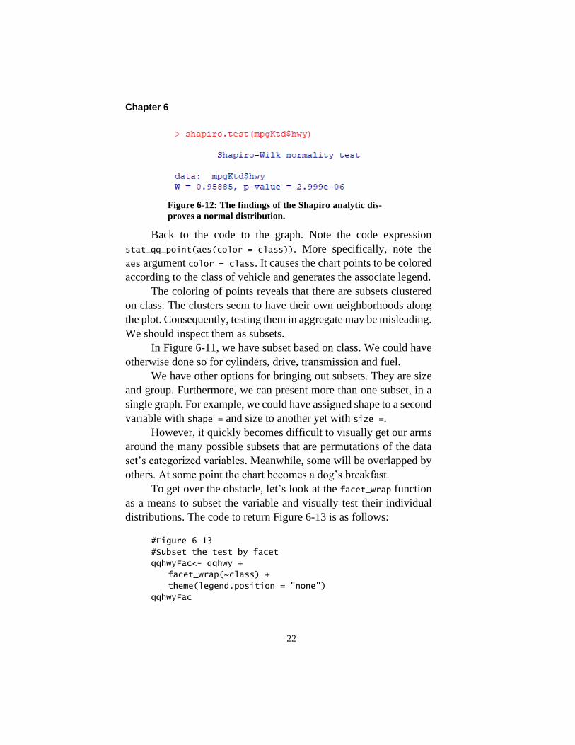
shapiro.test(mpgKtd$hwy)
The outcome of the test verifies the findings of the visualiza-
tion. The test is based on a null hypotheses. It is that the tested data
is not significantly different than the theoretical normal distribution
of data with the same mean and standard deviation. The small
p-value tells us that the data is significantly different.
Chapter 6
22
Figure 6-12: The findings of the Shapiro analytic dis-
proves a normal distribution.
Back to the code to the graph. Note the code expression
stat_qq_point(aes(color = class)). More specifically, note the
aes argument color = class. It causes the chart points to be colored
according to the class of vehicle and generates the associate legend.
The coloring of points reveals that there are subsets clustered
on class. The clusters seem to have their own neighborhoods along
the plot. Consequently, testing them in aggregate may be misleading.
We should inspect them as subsets.
In Figure 6-11, we have subset based on class. We could have
otherwise done so for cylinders, drive, transmission and fuel.
We have other options for bringing out subsets. They are size
and group. Furthermore, we can present more than one subset, in a
single graph. For example, we could have assigned shape to a second
variable with shape = and size to another yet with size =.
However, it quickly becomes difficult to visually get our arms
around the many possible subsets that are permutations of the data
set’s categorized variables. Meanwhile, some will be overlapped by
others. At some point the chart becomes a dog’s breakfast.
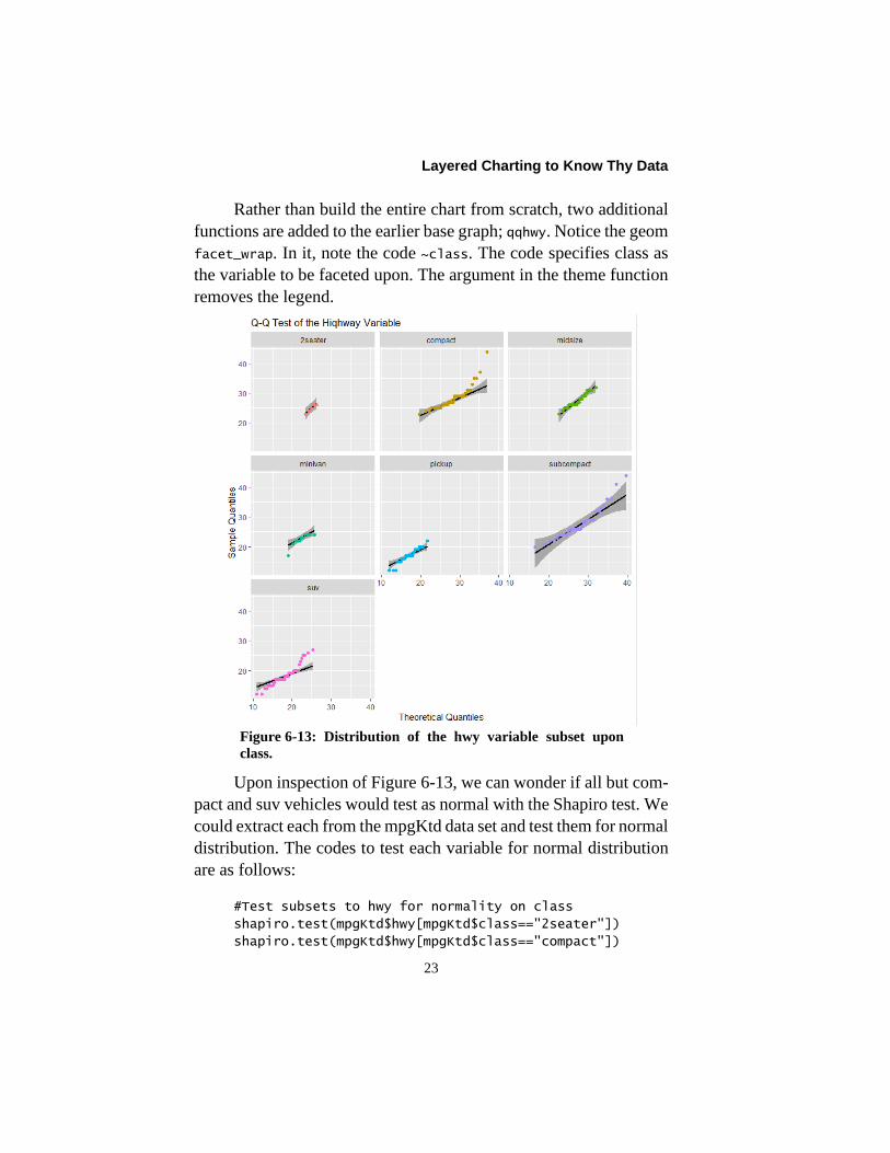
To get over the obstacle, let’s look at the facet_wrap function
as a means to subset the variable and visually test their individual
distributions. The code to return Figure 6-13 is as follows:
#Figure 6-13
#Subset the test by facet
qqhwyFac<- qqhwy +
facet_wrap(~class) +
theme(legend.position = "none")
qqhwyFac
Layered Charting to Know Thy Data
23
Rather than build the entire chart from scratch, two additional
functions are added to the earlier base graph; qqhwy. Notice the geom
facet_wrap. In it, note the code ~class. The code specifies class as
the variable to be faceted upon. The argument in the theme function
removes the legend.
Figure 6-13: Distribution of the hwy variable subset upon
class.
Upon inspection of Figure 6-13, we can wonder if all but com-
pact and suv vehicles would test as normal with the Shapiro test. We
could extract each from the mpgKtd data set and test them for normal
distribution. The codes to test each variable for normal distribution
are as follows:
#Test subsets to hwy for normality on class
shapiro.test(mpgKtd$hwy[mpgKtd$class=="2seater"])
shapiro.test(mpgKtd$hwy[mpgKtd$class=="compact"])
Chapter 6
24
shapiro.test(mpgKtd$hwy[mpgKtd$class=="midsize"])
shapiro.test(mpgKtd$hwy[mpgKtd$class=="minivan"])
shapiro.test(mpgKtd$hwy[mpgKtd$class=="pickup"])
shapiro.test(mpgKtd$hwy[mpgKtd$class=="subcompact"])
shapiro.test(mpgKtd$hwy[mpgKtd$class=="suv"])
The code would return the same statistical analyis as shown in
Figure 6-12 for the hwy variable. The outputs will not be shown here
and are left to the reader to execute. However, only the 2seater class
shows a normal distribution (p-value = 0.42) and pickup trucks are
on the fence (p-value = 0.049). Typically, analyst require that a
tested variable must return a p-value of 5 percent or greater to be
accepted as normal.
Let’s take the opportunitiy to review subsetting with R. We
will subset on a single class. The first step is to subset the table on
our chosen classs—midsize—with the following code:
#Create a table of midsize records
mpgKtdMid<- mpgKtd[mpgKtd$class=="midsize",]
To review, the code to understand are the square-brackets.
Within the brackets we are subsetting the mpgKtd table. The expres-
sion mpgKtd$class identifies the source table and variable. From
what is within the square brackets and to the left of the comma, a
TRUE/FALSE vector occurs behind the curtains. The TRUEs in the
vector will cause only the records in the mpgKtd table parallel to the
TRUE cases to be returned to the mpgKtdMid object.
The empty space within the brackets to the right of the comma
causes all variables to the mpgKtd table to be included in the returned
object. Thus, we have a table of only records to midsize cars.
This is a simple subset. We can code any filter in the spaces to
either side of the comma within the brackets
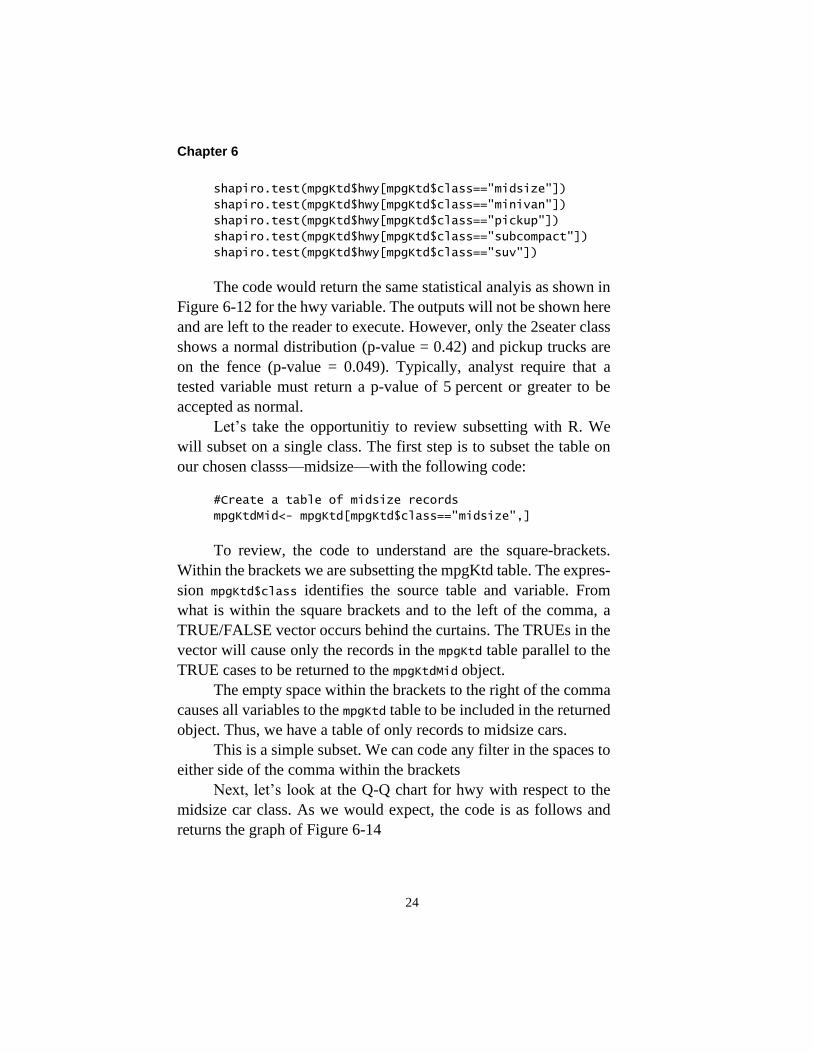
Next, let’s look at the Q-Q chart for hwy with respect to the
midsize car class. As we would expect, the code is as follows and
returns the graph of Figure 6-14
Layered Charting to Know Thy Data
25
#Figure 6-14
#Q-Q Test of midsize class
qqhwyMid<- ggplot(data = mpgKtdMid,
aes(sample = hwy)) +
stat_qq_band() +
stat_qq_line() +
stat_qq_point() +
labs(x = "Theoretical Quantiles",
y = "Sample Quantiles") +
ggtitle("Q-Q Test of the Hiqhway
Variable - Midsize") +
theme(legend.position = "none")
qqhwyMid
Figure 6-14: The midsize class does not show normal dis-
tribution.
Once again, the visualization infers a non-normal distribution.
Although not shown, we should confirm that with the Shapiro test.
However, we obviously need to more fully introduce ourselves to
the nuances of our data.
Chapter 6
26
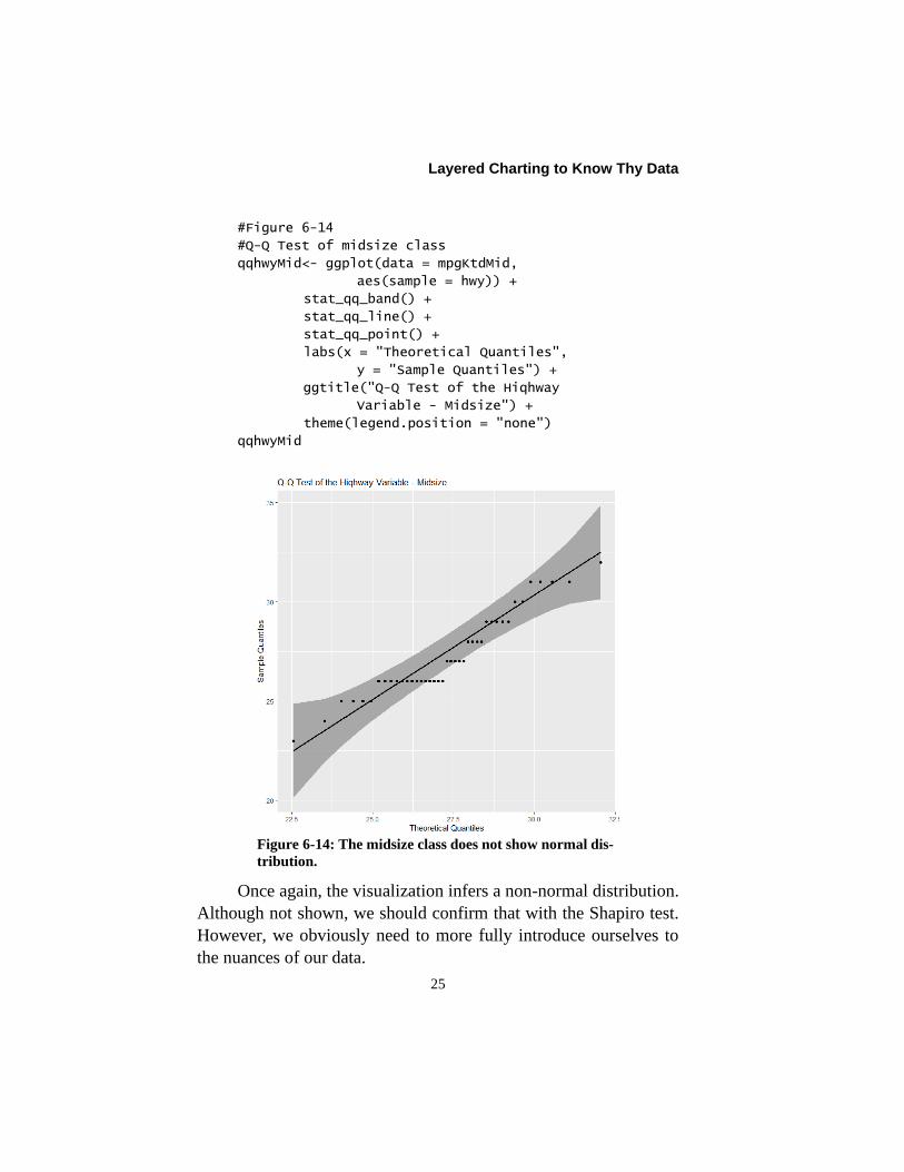
We earlier saw, in Figure 6-13, faceting in practice. The code
below to facet on models introduces an additional twist. It is appar-
ent in Figure 6-15.
#Figure 6-15
#Wrap subset midsize on model and fl
qqhwyMidFac<- qqhwyMid +
facet_wrap(~model + fl) +
theme(legend.position = "none")
qqhwyMidFac
Notice the geom, facet_wrap(~model + fl). It will create new
subsets as can be seen in Figure 6-15. Rather than only subset on
model, the faceted subsets are permutations of model and fuel type.
Figure 6-15: Subsetted facets on model and fl to the Q-Q test
of the highway variable.
As they exclaim in late night low-budget commercials for
gadgets, “But wait, there is more!” We are not limited to single a
dimension. We can view the Q-Q plots at the intersection of categor-
ical variables.

Layered Charting to Know Thy Data
27
To demonstrate, let’s contrast model and year. The following
code will return Figure 6-16.
#Figure 6-16
#Grid subset midsize on model and year
qqhwyMidGrd<- qqhwyMid +
facet_grid(model~year) +
stat_qq_point() +
theme(legend.position = "none")
qqhwyMidGrd
Notice that facet_wrap is replaced with facet_grid. Within
facet_grid, the code model~year returns a grid with year as columns
and model as rows with the expression.
Figure 6-16: Q-Q test by model and year.

Chapter 6
28
There are many rich possibilities for wrap and grid facets. Too
many to attempt to explore here. Section 7.2 of Wickham introduces
and demonstrates the many variations.
Returning to Figure 6-16, let’s make an important observation.
Notice that the x and y scales are the same for all facets. This allows
us to more easily inspect for differences in location and spread
among subsets. Of course, ggplot2 offers options to allow one or
both scales to float freely.
In the returned graph we are inspecting the Q-Q plot with re-
spect to model and year. It is notable that there seems to be fit to the
normal distribution lines when we introduce year as a facet. As al-
ways, we should test what we see with the Shapiro test.
However, as we get to know our data what we have discovered
in the facets may cause us to loop back to explore the hwy variable
for normal distribution while distinguishing between year. The lack
of normal distribution without the distinction may indicate eras of
performance characteristics.
The R script to the chapter contains the code for the Q-Q anal-
ysis of the city mileage, displacement and cylinder variables. The
reader may want to explore the variables after subsetting on year.
Let’s imagine what has been demonstrated with respect to the
data of our CMMS and other source systems. Are our costs per order,
hours per order, crafts hours per order, count of orders by lead craft
normally distributed? What do the distributions look like if we sub-
set them by craft, maintenance types, priority and cost center? How
should we subset to get a true sense of what is hidden in our data?
Are we embedding misinformation in our standard reports by not
subsetting?
6.2.3. Inspect Correlation Between Variables
We should also inspect the correlations between the variables
in our data sets. We can do that between numeric variables and be-
tween categorical and numeric variables. The explanation of the

Layered Charting to Know Thy Data
29
code and interpretation of correlation was the topic of section 3.3.4.
Partial correlation was the topic of section 3.3.5.
Rather than recook the beans, the reader is referred to the sec-
tions for review. This section will largely demonstrate methods to
visually inspect the correlation between the variables of a data set.
In addition to section 3.3.4, this section will introduce the technique
to measure correlation between categorical and numeric variables.
The data of the chapter can be substituted into the code that
was explained in sections 3.3.4 and 3.3.5 The R script to this chapter
utilizes the same code but with the substitution of the variables to the
mpgKtd data set.
We can get a visual summary of correlation with the function
pairs.panel of the psych package. The code below demonstrates the
function with 7 of the 11 variables to the mpgKtd data set. The output
is shown in Figure 6-17:
#Figure 6-17
pairs.panels(mpgKtd[c("hwy", "cty", "cyl", "displ",
"drv", "model", "trans")])
We see in the code that we are subsetting the data set upon the
seven variables it indentifies. The c() function within the square
brackets caused their return. If we had written the code as
pairs.panels(mpgKtd), we would have returned an inclusive table.
The figure provides a great deal of visual information. How-
ever, there is one caution. It is that only the correlation values
between numeric variables—hwy, cty, displ and cyl—have cre-
dence. Three categorical variables have been included—drv, model
and trans—but their correlation coefficients should be ignored.
Other than to demonstrate how to be selective with respect to
data sets of many variables, there is no technical reason for showing
only seven variables. The reason here is that showing the full set
would create a figure of proportions that are impractical to the pages
of a book.
Chapter 6
30
Figure 6-17: Grid of correlations and more to mpg variables.
Although the correlations for categorical data are not useful, it
is still useful to include the variables in the pairs graphic. This is
because so much information in the pairs panel is relevant to any
type of variable.
We can see the shape or distribution of each variable in the data
set. We can inspect the cross-plot relationship of each variable with
all other variables. The oval shape is called the correlation ellipse;
the more elongated the greater correlation. The fitted smooth line
gives a sense of pattern to the cross plots. The large dot indicates the
mean value of plot points.
Although not legitimately presented by the pairs grid, we can
calculate a correlation between categorical and numeric variables.
However, it is done with respect to levels to the categorical variable.

Layered Charting to Know Thy Data
31
The code below shows how to obtain the correlation of front-
wheel drive to highway mileage. The correlation sets rear drive as
the base level—zero so to speak—and front-end and highway as the
measured correlation. The returned output is presented in Fig-
ure 6-18.
#Figure 6-18
#Correlation of front drv and hwy with rear as base
mpgfr<- mpgKtd[(mpgKtd$drv=="f" | mpgKtd$drv=="r"),]
mpgfr$numdr<- ifelse(mpgfr$drv=="r", 0, 1)
cor.test(mpgfr$hwy, mpgfr$numdr)
Let’s inspect the code. The code, mpgKtd[(mpgKtd$drv=="f" |
mpgKtd$drv=="r"),], subsets the mpgKtd data set to one with only
two categories for drive; front and rear. The “|” syntax is an OR
relationship.
The code, ifelse(mpgfr$drv=="r", 0, 1), creates a variable
in which “0” is assigned to rear drive and “1” to front drive. This is
a new numeric variable with which correlation with another numeric
variable can be computed.
The third line applies the cor.test function to compute the
correlation, significance and confidence interval. Figure 6-18 returns
the analysis which is interpreted as explained in section 3.3.4. The
output shows that, compared to rear-wheel drive, there is a strong
correlation of front-wheel drive to highway mileage.
Figure 6-18: Correlation to front drive to highway mileage.

Chapter 6
32
The visualization of correlation is the most common purpose
of a scatter or cross plot chart. Such plots are provided for the pairs
in Figure 6-17. Of course, we can replicate them as individual charts.
However, as shown they are traditional simplistic perspectives.
We will use the capability of ggplt2 to reach much deeper per-
spectives. The difference is our heightened ability to understand our
data when we can recognize subsets within the scatter plot.
There are two ways to subset cross-plot visualizations with
ggplot2. We can show discrete and categorical variables as subsets
to the basic plot—e.g., scatter points. Alternatively, we can use fac-
ets. Better yet, we can simultaneously apply both methods.
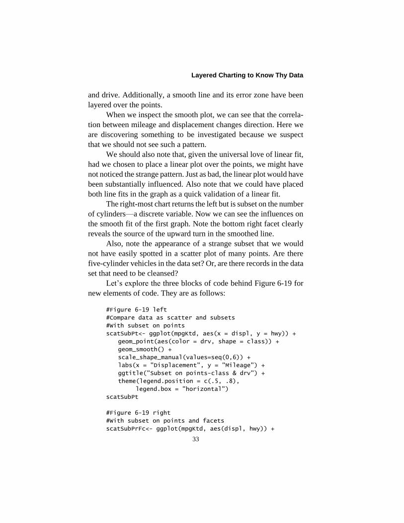
Figure 6-19 shows the two possibilities in action. The left-most
chart shows a scatter plot being subset upon its points. The right-
most chart adds a facet perspective.
Figure 6-19: Scatter plots subset on points and facets.
The left-most chart begins with the scatter points. Thence, it
subsets the points with respect to two categorical variables—class
Layered Charting to Know Thy Data
33
and drive. Additionally, a smooth line and its error zone have been
layered over the points.
When we inspect the smooth plot, we can see that the correla-
tion between mileage and displacement changes direction. Here we
are discovering something to be investigated because we suspect
that we should not see such a pattern.
We should also note that, given the universal love of linear fit,
had we chosen to place a linear plot over the points, we might have
not noticed the strange pattern. Just as bad, the linear plot would have
been substantially influenced. Also note that we could have placed
both line fits in the graph as a quick validation of a linear fit.
The right-most chart returns the left but is subset on the number
of cylinders—a discrete variable. Now we can see the influences on
the smooth fit of the first graph. Note the bottom right facet clearly
reveals the source of the upward turn in the smoothed line.
Also, note the appearance of a strange subset that we would
not have easily spotted in a scatter plot of many points. Are there
five-cylinder vehicles in the data set? Or, are there records in the data
set that need to be cleansed?
Let’s explore the three blocks of code behind Figure 6-19 for
new elements of code. They are as follows:
#Figure 6-19 left
#Compare data as scatter and subsets
#With subset on points
scatSubPt<- ggplot(mpgKtd, aes(x = displ, y = hwy)) +
geom_point(aes(color = drv, shape = class)) +
geom_smooth() +
scale_shape_manual(values=seq(0,6)) +
labs(x = "Displacement", y = "Mileage") +
ggtitle("Subset on points-class & drv") +
theme(legend.position = c(.5, .8),
legend.box = "horizontal")
scatSubPt
#Figure 6-19 right
#With subset on points and facets
scatSubPrFc<- ggplot(mpgKtd, aes(displ, hwy)) +

Chapter 6
34
geom_point(aes(color = drv, shape = class)) +
geom_smooth(aes(displ, hwy)) +
scale_shape_manual(values=seq(0,6)) +
facet_wrap(~cyl) +
labs(x = "Displacement", y = "Mileage") +
ggtitle("Wrap added to subset on points") +
theme(legend.position = "none")
scatSubPrFc
##Alernate code to the chart
scatSubPrFcAlt<- scatSubPrFc +
facet_wrap(~cyl)
scatSubPrFcAlt
#Figure 6-19 side-by-side
#Plot scat and scatFac
scat1x2<- ggarrange(scatSubPt, scatSubPrFc, ncol = 2,
nrow = 1)
scat1x2
In the first block of code we can see the base plot as the ggplot
component. However, notice how the x and y variables are coded in
the aes expression as x = and y =. However, because all other argu-
ments are explicitly named, we can implicitly code the x and y
variables. This more typical practice will be seen in the next block
of code and for the remainder of the examples.
The point geom causes the scatter plot. The mapping code,
aes(color = drv, shape = class), subsets the points on color for
drive and shape for class. The smooth geom places a statistically fit
line over the scatter plot to visualize the pattern of the correlation.
The default to the smooth geom is loess. For it we have options
for the degree of smoothness. The argument span = allows a range
of 0.0 to 1.0.
There are alternatives to the loess fit. They are lm for a linear
fit, gam for greater than 1,000 observations and rlm for reducing the
sensitivity of the fit to outliers. Enacting the choice is made with the
method = argument.

Layered Charting to Know Thy Data
35
Let’s speak to the shape legend. We have based shape on class.
If we ran the chart, we would get one for which only six of the seven
classes have been given a shape.
To get over that, we must call for shapes with the
scale_shape_manual geom. The argument values=seq(0,6) assigns a
shape to each category. If we wanted to select other than the 7 shapes
from the 24 available choices, we would replace the seq() function
with a c() function coded to list our choices. The readers are left to
find the choices on the internet; an easy task and good experience.
Next, notice the expression theme(legend.position = c(.5,
.8), legend.box = "horizontal"). The legend.position = c(.5,
.8) code sets the placement of the legend with respect to the x and y
axes. For each axis there is a range of 0 to 1. For example, the com-
bination of c(1,1) would position the legend at the upper right of the
chart. Meanwhile, the argument legend.box = "horizontal" places
the legends side-by-side in the figure rather than stacked by default.
The second block of code returns the right-most chart to Fig-
ure 6-19. Its primary distinction is to break the left-most chart into
facets.
However, there is one other difference in its code. The leg-
end.position = “none” in the theme function. To create space, the
legend has been removed.
The third block demonstrates an important trick for efficient
coding and the lazy amongst of us. We could have created the same
graphic that was returned by the second block of code. The style ap-
pends the facet_wrap function to the first graph and returns the
second.
We are seeing the fourth block of code for the first time. It
causes the charts of the first and second blocks of code to be returned
side-by-side as a single output.
Notice that we have assigned the output to an object; scat1x2.
We are using the ggarrange function of the ggpubr package. The
charts are designated by their assigned name as objects. Thence, we
have specified a single row and two columns.

Chapter 6
36
The ggarrange function allows any number of charts by virtue
of specifying the charts and number of rows and columns. They will
be returned in the order called for by the ggarrange function.
We could easily create a dashboard with the function. In one
sweep, we could run code to load the updated input tables to the
graphs, the code to each graph and finally the ggarange function to
generate the dashboard.
Better yet, we can create a function to include all code such
that we only need to call the function and all else updates and appears
on our monitors for inspection. Building such a function will not be
demonstrated here.
Another powerful way to subset is to place multiple base plots
in a single graph. We can do this because they have axes in common.
Figure 6-20 shows two pairs of scatter plots and smooth charts as a
seemingly single chart.
Figure 6-20: Two scatter graphs presented as a single graph.

Layered Charting to Know Thy Data
37
Let’s look at the code to the returned the graph. Some im-
portant techniques are hidden below the surface. The code is as
follows:
#Figure 6-20
#Multiple base plots
scat2Chts<- ggplot(mpgKtd, aes(displ, hwy)) +
geom_point(aes(color = "hwy")) +
geom_smooth(aes(color = "hwy"), se=TRUE ) +
geom_point(aes(displ, cty, color = "cty")) +
geom_smooth(aes(displ, cty, color = "cty"),
se=TRUE) +
labs(x = "Displacement", y = "Mileage") +
ggtitle("Mileage vs Displacement") +
theme(legend.position = c(.95, .9),
legend.title = element_blank())
scat2Chts
The ggplot function sets up the base graph in association with
the subsequent pair of point and smooth geoms. The second graph to
display city mileage is returned by the second pair of geoms.
Notice in the second pair that the x-y variables do not match
the pair in the ggplot function. The x variable is the same, but the y
variables has become cty. This is the same for the smooth geom. The
x-y of the second chart overrides the x-y to the ggplot function that
supports the first charted plot.
The code also allows the combined plots to return a legend.
The argument, color = in each of the geoms makes the legend hap-
pen for the case of multiple base plots.
Know that the two geoms for the displ-hwy visual are taking
their specified variables from the ggplot function. Thus, they need
not include x-y variables in their aes functions.
However, the geoms for the displ-cty visual must include them.
This causes the geoms to override the base plot variables and instead
generate on the displ and cty variables.
Chapter 6
38
Also notice that we have coded to omit a title to the legend. It
is left to the reader to search the internet for the code to name the
legend other than the default title—color.
There is a final point to make. The base graph supported two
graphs. We mentioned different x-y variables to create them—displ-
hwy and displ-cty.
We should also note that a graph need not be limited to a single
data set. In this case, the highway and city mileage were recorded in
the same data set. But what if they were not.
For the respective geoms, we would have simply identified the
associated data sets. The only requirement is that the respective
charts have the same axes scales.
Finally let’s deal with a natural problem to point charts; over
plotting. In the graphs to this point, the reality is that not all of the
234 observations of the full mpgKtd data set will be visible to us.
Some will overlap or hide others.
One method to overcome the problem is the jitter geom. It
will be presented in the next section. It works for continuous or dis-
crete data grouped in a graph by categorical or discrete levels.
However, a jittered perspective can be misinformation for continu-
ous variables. This is because each point is moved slightly on the
chart.
There are other ways to deal with over plotting. Figure 6-21
shows two. They use the geoms count and hex. Others, not shown,
are three-dimensional such as geom_contour and geom_raster.

Layered Charting to Know Thy Data
39
Figure 6-21: Area count and hex methods to deal with over plotting points.
In both cases, the charts are expressing the number of points
falling in a plotted area. The legends are given as a reference of com-
parative magnitude. The code to the respective charts are as follows:
#Figure 6-21 left
#Methods for Over lapping and plotting
##Count in area
scatAreaCnt<- ggplot(mpgKtd, aes(displ, hwy,
color = drv)) +
geom_point() +
geom_count() +
theme(legend.position = c(.95, .8))
scatAreaCnt
#Figure 6-21 right
#Hex chart
scatHex<- ggplot(mpgKtd, aes(displ, hwy,
color = drv)) +
geom_hex() +
theme(legend.position = c(.95, .8))
scatHex
#Figure 6-21 side-by-side
#Plot count and hex charts
overPlot1x2<- ggarrange(scatAreaCnt, scatHex,
Chapter 6
40
ncol = 2, nrow = 1)
overPlot1x2
The first block of code adds the count geom to the scatter plot.
The second block replaces the point geom with the hex geom. The
third block is the boiler plate code to return the graphics of both
methods as a side-by-side chart.
6.2.4. Inspect Centrality and Spread
The next perspective of our data is to inspect the numeric var-
iables with respect to central tendency and spread. The initial
summary perspectives (section 6.2.1) have given us quantitative per-
spective but visualizations are much more revealing.
Two types of partner graphic visualizations remind us of the
old saw, “a picture is worth a thousand words.” The first type is the
partnership of boxplot and violin charts. The second is histograms
and polygons.
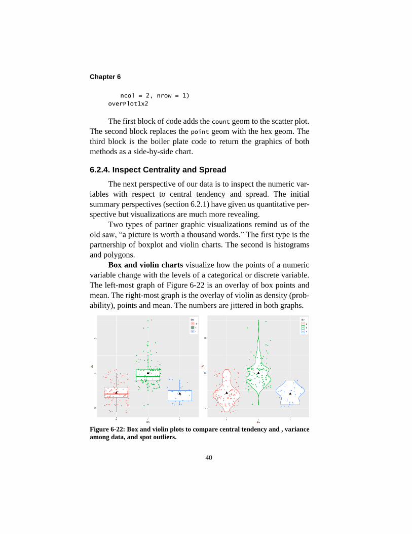
Box and violin charts visualize how the points of a numeric
variable change with the levels of a categorical or discrete variable.
The left-most graph of Figure 6-22 is an overlay of box points and
mean. The right-most graph is the overlay of violin as density (prob-
ability), points and mean. The numbers are jittered in both graphs.
Figure 6-22: Box and violin plots to compare central tendency and , variance
among data, and spot outliers.

Layered Charting to Know Thy Data
41
Let’s first examine the box chart—also known as box and
whisker plots. The box plot simultaneously visualizes the centering
of the data and spread. The dark heavy line is the median or middle
quartile of the points. The second and third quartiles are the upper
and lower edge of the box. Combined they are called the interquar-
tile.
The whiskers to the box extend to the lowest and highest ob-
servations. An observation beyond the distance of 1.5 times the
interquartile is typically regarded as an outlier. If the most extreme
points fall within the 1.5 times the interquartile, the whisker is lim-
ited to the point. The points falling beyond the whisker are
candidates for our investigation.
Also note the solid triangle-shaped point in each box. It is the
mean to each group. We can compare it to the median bar to see the
degree of skew in the data; an important insight.
We can imagine all sorts of perspectives to seek with our
maintenance and reliability data. For example, what are the central-
ity, spread, skew and any outliers of dollars or hours per order with
respect to categorical variables such as cost center, maintenance
types, priorities and craft lead?
In fact, the elements of the box and mean would constitute a
high grade KPI report with respect to cost, productivity and other
measures. Rather than a single factor, we can also see the centrality,
spread and skew of the subject KPI.
Let’s look at the code to the boxplot chart to explain any new
expressions to what we would already recognize. The code is as fol-
lows:
#Figure 6-22 left
#Boxplot, mean and points
boxPlt<- ggplot(mpgKtd, aes(drv, cty, color = drv)) +
geom_point() +
geom_boxplot(size = 1) +
geom_jitter() +
geom_point(stat="summary", fun="mean",
color = "black", size = 4, shape = 17) +

Chapter 6
42
theme(legend.position = c(.95, .9))
boxPlt
As before, the ggplot function establishes the data and varia-
bles. With drv as the categorical x axis, the points and box plots will
be subset by drv. The color = argument creates a legend to the drv
levels based on color.
Next, we can see the four graphs layered as one. The point and
boxplot geoms are as we would expect. However, the boxplot code
heavies the box edges with the argument size =.
We can spot the jitter geom as a method to step around the
over plotting of many data points. The geom moves the points
slightly from what would have been plotted. Without the geom, the
points in the graph would all fall on a straight line.
The default of the geom is to jitter both horizontally and verti-
cally. The jitter can be adjusted horizontally with width = and
vertically with height =. We will leave them at their default.
Next notice the second of the point geoms in the code. The first
plotted the points. The second, as a second graph, computes and plots
the solid triangle to the chart to locate the mean to each group of
points. It is done by inserting the arguments stat = "summary" and
fun = "mean" in the geom. The marker is also sized and shaped in
the geom.
The violin chart of Figure 6-22 right is another method to
show centrality and spread. It is a rotated density plot. In contrast to
box plots, they show the probability of observing values along the
spread.
The violin geom offers an additional value. The violin shapes
are visually comparable across groups because the standardization
of density makes them comparable. Otherwise, our ability to com-
pare would be affected by the number and position of the points to
each group.
When we place the box and violin charts side by side, we get a
tremendous amount of information. We could have taken our insight

Layered Charting to Know Thy Data
43
even farther by simultaneously subsetting the points upon other cat-
egorical variables in the data set.
The code to the violin chart is as follows:
#Figure 6-22 right
#Violin, mean and points
vioPlt<- ggplot(mpgKtd, aes(drv, cty,
color = drv)) +
geom_point() +
geom_violin(size = 1) +
geom_jitter() +
geom_point(stat="summary", fun="mean",
color = "black", size = 4, shape = 17) +
theme(legend.position = c(.95, .9))
vioPlt
On inspection there are no fundamental differences with the
code to the box plot chart. The only difference is that the violin
geom replaces the boxplot geom.
As we have already seen in action, the following code will re-
turn the box plot and violin charts side-by-side.
#Figure 6-22 side-by-side
#Plot Boxplot and Violin
boxVio1x2<- ggarrange(boxPlt, vioPlt,
ncol = 2, nrow = 1)
boxVio1x2
Although the boxplot and violin charts entail an x axis variable
that is either categorical or discrete, it is possible to build them with
a continuous variable. To do so the continuous variable must be cut
into bins with the result of Figure 6-23.

Chapter 6
44
Figure 6-23: Boxplot with a continuous variable as its group-
ing.
Notice in the code to Figure 6-23 that there is a group argument
in the boxplot geom. It is creating groups upon a cut width for bins.
Although not demonstrated, we can do the same thing with the violin
geom.
#Figure 6-23
#Boxplot with continuous variable as group variable
boxContin<- ggplot(mpgKtd, aes(displ, cty,
color = drv)) +
geom_point() +
geom_boxplot(aes(group = cut_width(displ, .1))) +
theme(legend.position = c(.95, .9))
boxContin
Histogram and polygon charts provide perspective of central-
ity and spread for continuous or discrete variables. A polygon chart
is a line version of a histogram. As such, and as it will be seen,

Layered Charting to Know Thy Data
45
polygon charts allow us to gain perspectives that are otherwise dif-
ficult with a histogram. Figure 6-24 shows both types of charts.
Figure 6-24: The overlay of histogram and polygon for
count.
The code to return the chart of the figure is as follows:
#Figure 6-24
##Histogram and polygon Without subsetting
hstPly<- ggplot(mpg, aes(hwy)) +
geom_histogram(bins=10, alpha = .4) +
geom_freqpoly(bins=10, size = 1)
hstPly
In the code we can see the respective geoms. For both, the de-
fault number of bins is 30. With the argument bins = 10, we create
charts with ten bins. We could also use a width = argument to set
bins relative to scale units. With the alpha = .4 argument we are
making the histogram bars less intense so that the polygon line is
discernible.
Chapter 6
46
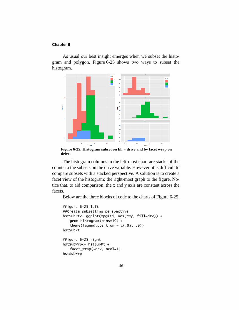
As usual our best insight emerges when we subset the histo-
gram and polygon. Figure 6-25 shows two ways to subset the
histogram.
Figure 6-25: Histogram subset on fill = drive and by facet wrap on
drive.
The histogram columns to the left-most chart are stacks of the
counts to the subsets on the drive variable. However, it is difficult to
compare subsets with a stacked perspective. A solution is to create a
facet view of the histogram; the right-most graph to the figure. No-
tice that, to aid comparison, the x and y axis are constant across the
facets.
Below are the three blocks of code to the charts of Figure 6-25.
#Figure 6-25 left
##Create subsetting perspective
hstSubPt<- ggplot(mpgKtd, aes(hwy, fill=drv)) +
geom_histogram(bins=10) +
theme(legend.position = c(.95, .9))
hstSubPt
#Figure 6-25 right
hstSubWrp<- hstSubPt +
facet_wrap(~drv, ncol=1)
hstSubWrp

Layered Charting to Know Thy Data
47
#Figure 6-25 side-by-side
hstSubPtWrp<- ggarrange(hstSubPt, hstSubWrp,
ncol = 2, nrow = 1)
hstSubPtWrp
In the first block of code we see the expression that subsets the
histogram; the argument fill = drv in the ggplot function. In the
second block we are appending the facet_wrap geom to the first
graph. In this case, we want to view the facets in column. The third
block returns the graphs in a single output.
Another method to subset the histogram is with a polygon chart
subset on the levels of a categorical variable. In contrast to Fig-
ure 6-25, the advantage is that we can directly contrast the count
profiles.
Figure 6-26: Polygon alternative of a histogram to compare sub-
sets.

Chapter 6
48
The code to the polygon figure is as follows and, by now, is as
we would expect it to be.
#Figure 6-26
plySub<- ggplot(mpg, aes(hwy, color=drv)) +
geom_freqpoly(bins=10, size = 1.25)
plySub
Figure 6-27 shows the density alternative to histogram and pol-
ygon charts. Density allows us to compare subsets on an equal
footing because they are standardized by virtue of all area under the
curve totaling unity. Therefore, we would take the perspective if we
want to compare the shape of distributions rather than size and posi-
tion.
Figure 6-27: Density perspective to the histogram and polygon charts of the
hwy variable.
The three blocks of the code to return the graphs are as follows:
#Figure 6-27 left
hstDen<- ggplot(mpgKtd, aes(hwy, fill=drv)) +
geom_histogram(aes(y = ..density..),
bins = 10, alpha = .4) +
theme(legend.position = c(.95, .9))
hstDen

Layered Charting to Know Thy Data
49
#Figure 6-27 right
plyDen<- ggplot(mpgKtd, aes(hwy, fill=drv),
bins = 10) +
geom_density( alpha = 0.2) +
xlim(0, 50) +
theme(legend.position = c(.95, .9))
plyDen
#Figure 6-27 side-by-side
denHstPly<- ggarrange(hstDen, plyDen,
ncol = 2, nrow = 1)
denHstPly
Notice the function x_lim(0,50) in the second block. Without
the code, the chart would have set limits at 5 and 45; cutting off the
extremes to the charted curves.
The notable difference in the code is how density is called up
instead of count. In the first block the argument y = ..density.. to
the histogram geom makes it happen. For the second block the out-
come is returned by the density geom as the alternative to a polygon
geom.
However, the densities are different. This is because histo-
grams are computed on data as bins and polygons are computed on
data as continuous.
We need to comment further on the y = ..density.. argument
to geom_hist. Count, density and x-center are variables created
within the geom. The prefixed and suffixed double dot code tells the
underlying algorithm that a variable is internal to the graph object
rather than external from the mpgKtd data frame. Accordingly,
..density.. as a variable, is made to be a variable to the returned
graph.
6.2.5. Inspect Categorical Variables
Bar charts, by whatever name or rotation, are a fundamental
perspective of data. They are for categorical variables what histo-
grams and polygons are for numeric variables.

Chapter 6
50
There are five standard perspectives. They are count, average,
sums, min-max and identity. Count is the default.
The graphs of Figure 6-28 are examples of the count presented
in two ways. The left-most chart is a stacked count, whereas, the
right-most is dodged count. What is stacked in the left figure is
shown side by side in the right chart.
Figure 6-28: Bar charts of counts and a functions (average).
Let’s inspect the three blocks of code to Figure 6-28 for yet
unfamiliar expressions. The code is as follows:
#Figure 6-28 left
##Barchart upon counts
barCnt<- ggplot(mpgKtd, aes(manufacturer,
fill = drv)) +
geom_bar() +
theme(axis.text.x = element_text(face = "bold",
color = "black", size = 10, angle = 90),
axis.text.y = element_text(face = "bold",
color = "black", size = 10, angle = 90)) +
theme(legend.position = c(.5, .8)) +
ggtitle("Count stacked")

Layered Charting to Know Thy Data
51
barCnt
#Figure 6-28 right
#Barchart with dodge
barCntDod<- ggplot(mpgKtd, aes(manufacturer,
fill = drv)) +
geom_bar(position = "dodge", width = .7) +
theme(axis.text.x = element_text(face = "bold",
color = "black", size = 10, angle = 90),
axis.text.y = element_text(face = "bold",
color = "black", size = 10, angle = 0)) +
theme(legend.position = c(.5, .8)) +
ggtitle("Dodged Count")
barCntDod
#Figure 6-28 side-by-side
#Plot 1x2 charts
barCntDod1x2<- ggarrange(barCnt, barCntDod,
ncol = 2, nrow = 1)
barCntDod1x2
In the first and second blocks, notice the argument in the theme
function angle = 90. The angle argument is helpful when tick titles
are long.
Also, in the code are the expressions axis.text.x and
axis.text.y. They format the scale text in the graphs. Until now we
have left the axes texts in their default state to keep the code sparse
and focused on the meat in the burger.
The first two blocks are the same except for the bar geom.
When subsetting is the case, the bar geom by default returns a
stacked perspective. Adding, the argument position = “dodge” to
the geom causes the bars to be placed side by side rather than
stacked. Additionally, we have placed spacing between the dodged
sets with the width = argument.
Count is the standard to the bar geom. However, we can expect
that we would want other statistical perspectives. The foreseeable
needs are mean, median, sum, min-max and identity.
Chapter 6
52
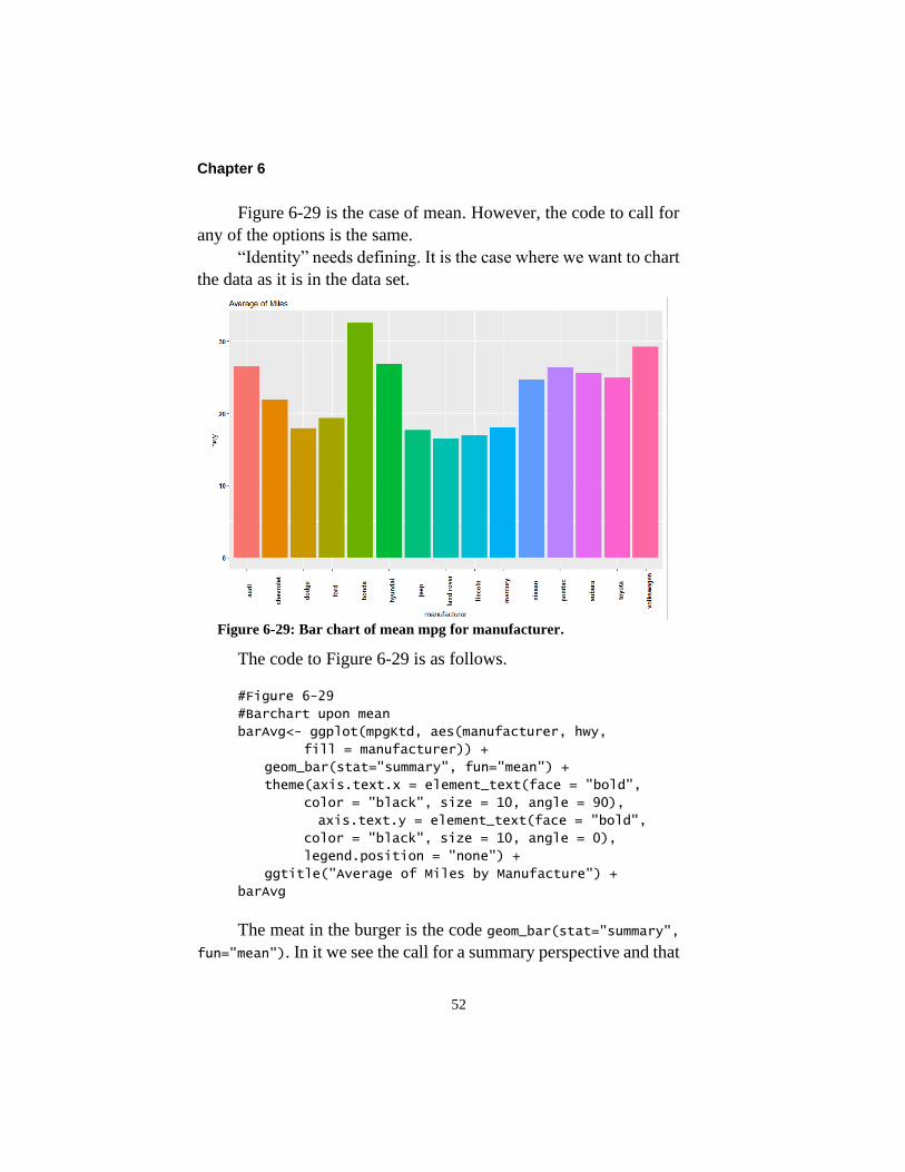
Figure 6-29 is the case of mean. However, the code to call for
any of the options is the same.
“Identity” needs defining. It is the case where we want to chart
the data as it is in the data set.
Figure 6-29: Bar chart of mean mpg for manufacturer.
The code to Figure 6-29 is as follows.
#Figure 6-29
#Barchart upon mean
barAvg<- ggplot(mpgKtd, aes(manufacturer, hwy,
fill = manufacturer)) +
geom_bar(stat="summary", fun="mean") +
theme(axis.text.x = element_text(face = "bold",
color = "black", size = 10, angle = 90),
axis.text.y = element_text(face = "bold",
color = "black", size = 10, angle = 0),
legend.position = "none") +
ggtitle("Average of Miles by Manufacture") +
barAvg
The meat in the burger is the code geom_bar(stat="summary",
fun="mean"). In it we see the call for a summary perspective and that
Layered Charting to Know Thy Data
53
the summary is to be a mean of the data to each level of the categor-
ical variable; manufacturer. As mentioned above, if we wanted
otherwise, for example median, we replace mean with median.
An enhancement to the figure would be to place labels above each
bar to the chart. Rather than do so here, the reader is left and encour-
aged to search out the method from the internet. A search phrase
mentioning geom_bar and labels for columns would take us to a start-
ing point. It is good to get accustomed to looking for methods.
6.2.6. Inspect Variables Over Time
Most operational data come with date or timestamp variables.
Consequently, we can inspect our data with respect to how they
change with time.
Line charts are what we typically think of when we seek to
inspect the pattern of variables over time. However, there are what
is called a path chart that give us an alternative perspective of time-
based patterns.
A line chart presents one variable over time. In contrast, a path
chart is cross or scatter plot of two of variables for which the line is
a path upon the dated order of the cross points. Path depicts the order
of occurrence rather than occurrence along the timeline.
First let’s look at line charts. Because our mpgKtd data set
does not contain a date variable, we will download the data set; eco-
nomics. As we would expect, the download is accomplished with the
following code:
##Download data set
economics<- read.xlsx(
"C:\\<path>\\DataBookAssetMgtXlsx.xlsx",
sheetName="EconDataSet", header=TRUE)
A review with the summary functions of section 6.2.1 would
reveal seven variables. Of the seven, we will work with the following
four:

Chapter 6
54
• date = Date to which measures applies, formatted as
date.
• DateYr = Date converted to integer form.
• pop = Population.
• uempmed = Median duration of unemployment in
weeks
• unemploy = Number of unemployed
Figure 6-30 shows two single-variable time series charts from
the data set. The left chart plots unemployment over time. The right
chart plots the concurrent median duration people remained unem-
ployed.
Figure 6-30: Line charts of unemployment rate and median length of time
unemployed.
Upon inspection, the respective patterns are not what we would
expect. Intuitively, we would expect that as unemployment in-
creases, so would the median length of unemployment. Accordingly,
we would expect the respective plots to be more similarly shaped.
Let’s explore the first and second blocks of code for new nug-
gets. We are familiar with the third. The code to the left-most chart
in Figure 6-30 is as follows:

Layered Charting to Know Thy Data
55
#Figure 6-30 left
#Time series of unemployement
serUE<- ggplot(economics, aes(date, unemploy/pop)) +
geom_line() +
ggtitle("Unemployement")
serUE
#Figure 6-30 right
#Time series median time unemployed
serTimeUE<- ggplot(economics, aes(date, uempmed)) +
geom_line() +
ggtitle("Median Time Unemployed")
serTimeUE
#Figure 6-30 side-by-side
#Plot 2 charts
series1x2<- ggarrange(serUE, serTimeUE,
ncol = 2, nrow = 1)
series1x2
The only difference from our experience is the appearance of
the line geometric in the first and second blocks of code. We should
note a small difference in the first block of code. The x and y of our
chart need not only be a variable value. Notice that the y axis of the
chart is a computation of the unemployment rate; unemploy/pop.
As mentioned, our real-life experience has been to think of line
charts rather than path charts. With the scatter chart as its base per-
spective, let’s look at path charts as a means to relate by time two
variables in a cross plot—unemployment rate and median time un-
employed—and they, in turn, to the date variable.
The best way to explain a path chart it is to demonstrate it.
What it looks like is the right-most chart in Figure 6-31.
The purely scatter plot of the left figure graphically shows a
strong positive correlation between unemployment and length of
time unemployed. It is as we would intuitively expect. However,
there are some interesting cluster-like patterns in the cross points that
suggest that we should further probe our data.

Chapter 6
56
Figure 6-31: Scatter plot graph of unemployment and length of unemploy-
ment with path line added to show time sequence.
The second chart introduces a path geometric in place of a line
geometric. With path, the geometric is plotting a path of cross point
with respect to their date—much like the child’s connect-the-dots
puzzle.
Now a different story emerges. The relationship of length of
time employed relative to unemployment rate has shifted. With path
we can see the appearance of three eras in the overall pattern. Rather
than the x axis as era, the color highlights the passage of time; darker
longer ago, lighter more recently.
Let’s make a timely observation somewhat off the trail. A path
chart is a great visual tool for connecting our maintenance and relia-
bility KPIs to outcome variables we expect that they should be
related to such as production, uptime, productivity, etc.
Let’s review the code for nuggets of coding we are not yet fa-
miliar with. The code is as follows:
#Figure 6-31 left
#As scatter plot of two charts.

Layered Charting to Know Thy Data
57
crossUeTm<- ggplot(economics,
aes(unemploy/pop, uempmed)) +
geom_point() +
ggtitle("Cross Plot of Unemployment & Time
Unemployed")
crossUeTm
#Figure 6-31 right
pthPlt<- ggplot(economics,
aes(unemploy/pop, uempmed)) +
geom_path(color="grey50") +
geom_point(aes(color = DateYr)) +
theme(legend.position = c(.1, .8)) +
ggtitle("Cross Plot with Path")
pthPlt
#Figure 6-31 side-by-side
#Plot 2 charts
crosPath1x2<- ggarrange(crossUeTm, pthPlt,
ncol = 2, nrow = 1)
crosPath1x2
The first block of code is a cross plot chart just as we have seen
before. The second block creates the path chart.
The second block of code returns the path chart. There are two
points to notice. First, of course, is the appearance of the path geo-
metric. Second, the color argument is causing the legend and line
plotted as path and points to vary color with year as the driving inte-
ger.
This is a good place to comment on dates as integers. Some-
times in charting, date formats create problems because they allow
date data to show out of order or somehow require esoteric recoding.
A down-dirty counter strategy is to convert dates to integers as a
variable to the data set. That is the case for the DateYr variable to
Figure 6-31 right. The graphic sees a number rather than date.
The data set has converted the date to an integer year. Another
example is to convert 7/2/2020 to the integer 20200702. Conversion
can take place in Excel or Access using functions that convert dates
to text, text to numeric and finally special paste as value.

Chapter 6
58
We can construct another perspective of change over time with
groups as subsets. In maintenance operations we often want to in-
spect our data longitudinally as line charts upon groups. Possible
groups are cost center, craft type, maintenance type, priority, etc. We
could also want to inspect them with respect to costs and productiv-
ity and other vantages.
To demonstrate the perspective, we will use a data set available
to us within the R software. This is also an opportunity to demon-
strate how to capitalize on the R software’s philosophy to make data
sets available to all explanations of R functions. Until now, the data
sets have been placed in an Excel file for import to the R session;
our reality.
The Oxboy data set is longitudinal with respect to continuous
and discrete variables. The code below shows how to pull the data
frame into the session and inspect its first six rows.
#Load the data set
data(Oxboys)
head(Oxboys)
Figure 6-32 shows that we can visually inspect the data as lines
for individual groups—boys as subjects in this case—for clusters,
outliers and disparate patterns. At the same time, we can display a
linear fit line to the collective groups to inspect where the individual
groups fall with respect to the overall centrality and slope of all ob-
servations.

Layered Charting to Know Thy Data
59
Figure 6-32: Lines for groups and linear fit line of the overall data.
Let’s look for new lessons in the code to return the figure. The
code is as follows:
#Figure 6-32
#Lines per group with overall linear fit line
grpLines<- ggplot(Oxboys, aes(age, height)) +
geom_line(aes(group = Subject,
color = Subject), size = 1) +
geom_smooth(method = "lm", size = 3,
se = FALSE, color = "black",
linetype = "dashed")
grpLines
First, the code calls for a line geometric for each group and
subsets on color as the legend for the subject boy. Second, the code
calls a smooth geometric for the data as a whole.
Notice that the group code appears only in the line geom but
not the smooth geom. It’s a good example of layers engaging the
same variables but presenting them with different purposes.
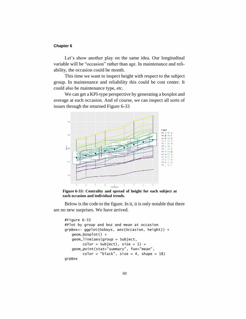
Chapter 6
60
Let’s show another play on the same idea. Our longitudinal
variable will be “occasion” rather than age. In maintenance and reli-
ability, the occasion could be month.
This time we want to inspect height with respect to the subject
group. In maintenance and reliability this could be cost center. It
could also be maintenance type, etc.
We can get a KPI-type perspective by generating a boxplot and
average at each occasion. And of course, we can inspect all sorts of
issues through the returned Figure 6-33
Figure 6-33: Centrality and spread of height for each subject at
each occasion and individual trends.
Below is the code to the figure. In it, it is only notable that there
are no new surprises. We have arrived.
#Figure 6-33
#Plot by group and boz and mean at occasion
grpBox<- ggplot(Oxboys, aes(Occasion, height)) +
geom_boxplot() +
geom_line(aes(group = Subject,
color = Subject), size = 1) +
geom_point(stat="summary", fun="mean",
color = "black", size = 4, shape = 18)
grpBox

Layered Charting to Know Thy Data
61
There is another perspective of time dated variables called
times series analysis. It will be fully explained and demonstrated in
Chapter 11 in the context of forecasting workload in the mainte-
nance budgeting process. It was briefly explained in section 2.3.3
and shown in Figure 2-16.
The function ts converts our data into a time series object.
With a time series object, we can separate seasonal and longer cycles
from the trend of the data using other functions. Once cycle is re-
moved, we can assess if the trend in our data is deterministic, random
walk or random.
We would also test for autocorrelation between data points.
That is when a variable in one period is somewhat influenced by
outcomes in one or more previous periods.
In the world of maintenance and reliability, we love to speak
of lead-lag indicators but offer no methodology other than assump-
tions. Time series analytics allow us to inspect our data for such
relationships for highly correlated patterns between both variables at
one or more reporting intervals. The relationship is called cross cor-
relation in contrast to auto correlation to a single variable. It will be
explained in later chapter about sustaining effective availability.
6.3. Save and Disseminate
The output to an R session is saved in the form of its R script. In
turn, we call the saved script into an R session and run it.
It is likely that we will want to disseminate the tables and vis-
ual perspectives that we have formulated for our needs or in service
of others. If so, we can distribute the R script.
With the code, recipients have the liberty to modify and refine
the outputs to inspect their own data. Or they may use the output as
templates to explore for perspective to other issues and KPIs.
This assumes the recipient has a threshold level of skills in R.
Teaching to the threshold was the purpose of Chapter 3. However,

Chapter 6
62
we may want to send the know-thy-data deliverables to others with-
out the threshold skills in R.
The simplest approach is to use the snipping tool to prepare a
Power Point or Word deliverable. The alternative is to export the
charts to a pdf file and, in turn, distribute the file. This can be done
with the following code:
#Save to a pdf file
#Turn dev on, export to pdf file
pdf("<path>\\Dissim.pdf", paper="USr")
print(list(serUE, serTimeUE, pthPlt))
#Turn device off
dev.off()
The function pdf() is called an output device to send the out-
put to a pdf file. As said in R, the function turns the device on. Within
the function, we code the path to where the output is to land, the
name of the created file and the paper type. We are using the US
dimensions and have rotated the path to be landscape. The print()
function and its argument, list(), specify the graphs by their name
as an object. Finally, the code dev.off() closes the pdf() device.
It is important to stress the importance of closing the device;
run the code line. If we do not, when we subsequently call for an
individual graphic, as we have all along, the R graphic window will
remain empty.
Bibliography
Wickham, Hadley. gplot2, Elegant Graphics for Data Analysis. Sec-
ond Edition. Springer 2016.