cutter · show and forecast (in a timely manner) only what the manager needs in our next article,...
TRANSCRIPT

The Journal of Information Technology Management
Cutter IT Journal
Vol. 26, No. 1January 2013
Making ManagerialDashboards Meaningful
Opening Statementby Ilenia Fronza . . . . . . . . . . . . . . . . . . . . . . . . . . . . . . . . . . . . . . . . . . . . . . . . . . . . . . . . 3
Dashboards Are Great, But We Still Must Watch the Road!by Paul Clermont . . . . . . . . . . . . . . . . . . . . . . . . . . . . . . . . . . . . . . . . . . . . . . . . . . . . . . . 6
A Case for Decision-Focused Dashboardsby Robert N. Charette . . . . . . . . . . . . . . . . . . . . . . . . . . . . . . . . . . . . . . . . . . . . . . . . . . . 13
Effective Dashboard Design by Andrea Janes, Alberto Sillitti, and Giancarlo Succi . . . . . . . . . . . . . . . . . . . . . . . . . . . . 17
Should We Abandon Performance Measures?by David Parmenter . . . . . . . . . . . . . . . . . . . . . . . . . . . . . . . . . . . . . . . . . . . . . . . . . . . . 25
Creating Dashboards That Think Globally, Act Locallyby Ravi Tej Kanteti . . . . . . . . . . . . . . . . . . . . . . . . . . . . . . . . . . . . . . . . . . . . . . . . . . . . . 33
Building Project Management Skill: How the Right DashboardDrives Organizational Performanceby Lawrence Fitzpatrick . . . . . . . . . . . . . . . . . . . . . . . . . . . . . . . . . . . . . . . . . . . . . . . . . 39
“Dashboards have not beeninvented to be mere datadisplays; their mission shouldbe to help users make betterdecisions and achieve theirgoals.”
— Ilenia Fronza,Guest Editor
NOT FOR DISTRIBUTIONFor authorized use, contact Cutter Consortium:+1 781 648 [email protected]

Cutter IT Journal®
Cutter Business Technology Council:Rob Austin, Ron Blitstein, Tom DeMarco,Lynne Ellyn, Israel Gat, Vince Kellen,Tim Lister, Lou Mazzucchelli,Ken Orr, and Robert D. Scott
Editor Emeritus: Ed YourdonPublisher: Karen Fine CoburnGroup Publisher: Chris GeneraliManaging Editor: Karen PasleyProduction Editor: Linda M. DiasClient Services: [email protected]
Cutter IT Journal® is published 12 timesa year by Cutter Information LLC,37 Broadway, Suite 1, Arlington, MA02474-5552, USA (Tel: +1 781 6488700; Fax: +1 781 648 8707; Email: [email protected]; Website:www.cutter.com; Twitter: @cuttertweets;Facebook: Cutter Consortium). PrintISSN: 1522-7383; online/electronic ISSN: 1554-5946.
©2013 by Cutter Information LLC. All rights reserved. Cutter IT Journal®is a trademark of Cutter Information LLC.No material in this publication may bereproduced, eaten, or distributed withoutwritten permission from the publisher.Unauthorized reproduction in any form,including photocopying, downloadingelectronic copies, posting on the Internet,image scanning, and faxing is against thelaw. Reprints make an excellent trainingtool. For information about reprints and/or back issues of Cutter Consortiumpublications, call +1 781 648 8700or email [email protected].
Subscription rates are US $485 a yearin North America, US $585 elsewhere,payable to Cutter Information LLC.Reprints, bulk purchases, past issues,and multiple subscription and site licenserates are available on request.
Part of Cutter Consortium’s mission is tofoster debate and dialogue on the businesstechnology issues challenging enterprisestoday, helping organizations leverage IT forcompetitive advantage and business success.Cutter’s philosophy is that most of the issuesthat managers face are complex enough tomerit examination that goes beyond simplepronouncements. Founded in 1987 asAmerican Programmer by Ed Yourdon,Cutter IT Journal is one of Cutter’s keyvenues for debate.
The monthly Cutter IT Journal and its com-panion Cutter IT Advisor offer a variety ofperspectives on the issues you’re dealing withtoday. Armed with opinion, data, and advice,you’ll be able to make the best decisions,employ the best practices, and choose theright strategies for your organization.
Unlike academic journals, Cutter IT Journaldoesn’t water down or delay its coverage oftimely issues with lengthy peer reviews. Eachmonth, our expert Guest Editor delivers arti-cles by internationally known IT practitionersthat include case studies, research findings,and experience-based opinion on the IT topicsenterprises face today — not issues you weredealing with six months ago, or those thatare so esoteric you might not ever need tolearn from others’ experiences. No otherjournal brings together so many cutting-edge thinkers or lets them speak so bluntly.
Cutter IT Journal subscribers consider theJournal a “consultancy in print” and likeneach month’s issue to the impassioneddebates they participate in at the end ofa day at a conference.
Every facet of IT — application integration,security, portfolio management, and testing,to name a few — plays a role in the successor failure of your organization’s IT efforts.Only Cutter IT Journal and Cutter IT Advisordeliver a comprehensive treatment of thesecritical issues and help you make informeddecisions about the strategies that canimprove IT’s performance.
Cutter IT Journal is unique in that it is writtenby IT professionals — people like you whoface the same challenges and are under thesame pressures to get the job done. Cutter IT Journal brings you frank, honest accountsof what works, what doesn’t, and why.
Put your IT concerns in a business context.Discover the best ways to pitch new ideasto executive management. Ensure the successof your IT organization in an economy thatencourages outsourcing and intense inter-national competition. Avoid the commonpitfalls and work smarter while under tighterconstraints. You’ll learn how to do all this andmore when you subscribe to Cutter IT Journal.
About Cutter IT Journal
Cutter IT Journal
Name Title
Company Address
City State/Province ZIP/Postal Code
Email (Be sure to include for weekly Cutter IT Advisor)
Fax to +1 781 648 8707, call +1 781 648 8700, or send email to [email protected]. Mail to Cutter Consortium, 37 Broadway,Suite 1, Arlington, MA 02474-5552, USA.
SUBSCRIBE TODAY
Request Online LicenseSubscription Rates
For subscription rates for online licenses,contact us at [email protected] or+1 781 648 8700.
Start my print subscription to Cutter IT Journal ($485/year; US $585 outside North America)

Opening Statement
3Vol. 26, No. 1 CUTTER IT JOURNAL
IT organizations worldwide use dashboards to providemanagers with the key information they need to steertheir organizations in the right direction and makeimportant strategic business decisions. Managers mustbe able to understand at a glance the information pre-sented in the dashboard and to take effective correctiveactions if needed. The success of this process stronglydepends on providing managers with properly designeddashboards. Indeed, a poorly designed dashboard canbe confusing and may even convey misinformation.
While there are guidelines for designing dashboards,the available dashboard examples demonstrate thatpractitioners do not always agree on a specific design,which naturally leads to different results. This meansthat we do not yet have a clear definition of “properlydesigned” in this context.
To design an effective dashboard, there are many chal-lenges we have to address. First, the data we measuremust be meaningful if the dashboard is to have anyvalue. We can waste considerable effort and resourcestracking the wrong information. Second, all the infor-mation has to be organized to fit one screen. Thus, wemust select the most effective visualizations for the datain question. Third, we need to regularly review dash-boards to ensure they incorporate data from all relevantsources and show useful and up-to-date information.
In this edition of Cutter IT Journal, we will focus onthe selection of the metrics that organizations shouldinclude in their dashboards to indicate how the busi-ness is performing. Moreover, we will learn best prac-tices and guidelines for showing the information onthe screen and the main requirements to keep in mindwhen designing dashboards. We will consider differentcontexts for dashboards, such as development teamsand global enterprises, and we will see how differentthe requirements for a dashboard can be depending ontheir context of application.
In this issue, our authors explore a number of approachesand solutions. They come from a variety of areas andexperiences — including academia, consulting, and
corporate environments — but they share some commonthemes. All of them agree on the need to choose carefullyboth the data to be displayed and the type of visualiza-tion to be used. However, they acknowledge that thereis no magic formula for doing that. We need trainingand experience, guidelines and examples. That’s whyeach article offers practical applications, examples, andguidelines — not merely theoretical discussion. By theend, you will take away some action steps you can usein your own organization.
NO DASHBOARD WILL REPLACE PROJECT MANAGEMENT SKILLS
A dashboard is a supplement and helps managers tofocus their attention. It is not a substitute for managers’intuition and skills. In our first article, IT managementconsultant Paul Clermont states the mandatory condi-tion for a good dashboard to succeed: a good manager.Assuming this condition to be satisfied in our organi-zations, how we can avoid designing dashboards thatmislead good managers? Clermont suggests startingfrom the following three key questions: what are youmeasuring, why, and for whom? While finding youranswers, keep in mind that dashboards must measure“what counts,” and they must measure it well enoughthat managers can trust them to focus their questionsand guide their actions. If you can answer these ques-tions, then your dashboard will have a strong founda-tion. Clermont provides typical dashboard examplesfrom IT and a list of problems inherent in measurement,along with possible solutions to those problems.
by Ilenia Fronza, Guest Editor
Get The Cutter Edge free: www.cutter.com
Managers must be able to understand ata glance the information presented in thedashboard and to take effective correctiveactions if needed.
NOT FOR DISTRIBUTION • For authorized use, contact Cutter Consortium: +1 781 648 8700 • [email protected]

©2013 Cutter Information LLCCUTTER IT JOURNAL January 20134
SHOW AND FORECAST (IN A TIMELY MANNER) ONLY WHAT THE MANAGER NEEDS
In our next article, Cutter Fellow Robert N. Charetteasks “why a reasonably planned IT project using adashboard would fail.” He finds only one reasonableanswer: the IT project dashboard doesn’t providemeaningful information to the manager responsiblefor the project.
In his article, Charette provides a definition of “meaning-ful IT dashboard information” using three characteristics:
1. Dashboards should be as timely as possible and pro-vide meaningful insights into future project deviationpossibilities.
2. Dashboards should provide predictions about whatinformation is expected at the end of the next reviewperiod, so the manager can compare expected andactual results. Making discrepancies between projectperception and project reality visible enables the proj-ect manager to take more timely corrective action.
3. The information being displayed should representthe decision-driven information needs of the projectmanager.
If project managers are provided this meaningful infor-mation, Charette notes, “maybe, just maybe, there willbe a few more IT project successes than there mighthave been otherwise.”
DESIGNING EFFECTIVE DASHBOARDS
Dashboards have not been invented to be mere datadisplays; their mission should be to help users makebetter decisions and achieve their goals. In our nextarticle, Andrea Janes, Alberto Sillitti, and GiancarloSucci of the Free University of Bozen–Bolzano describethe results of their experience designing a dashboard fora software development team. The proposed dashboardwas developed with a focus on two main aspects: select-ing the “right” data and choosing the “right” visualiza-tion techniques. The authors discuss their approachesto these challenges so that the reader can apply themas practical solutions to the biggest issues related todashboard design. Janes and his coauthors have devel-oped their own model for choosing the “right” data:a GQM+Strategies model that documents measurestogether with the reasons why the data is being col-lected. To choose the most effective visualizations, theauthors provide some guidelines for obtaining visual-izations that minimize the time needed to understandthe information that has to be communicated.
ABANDONING PERFORMANCE MEASURES: A RADICAL TREATMENT
OK, now we get it. Measures cannot be a randomcollection. We need rigor and expertise. For many years,our next author, David Parmenter, has been advocatingthe proper use of performance measures. Now he isconvinced that, in many cases, a radical treatment isnecessary: abandoning performance measures (anddashboards). Why? Because, he argues, “the greatestdanger of performance management is dysfunctionalbehavior,” and an organization with dysfunctionalperformance measures would function much betterwithout them. Does your organization need thisradical treatment? You can find out by simply usingParmenter’s checklist for assessing the damage poorlydesigned performance measures may be causing inyour organization.
If you need the radical treatment, well, this is what youshould do: stop monitoring or reporting performancemeasures for, say, three months. During this time frame,management should find out which measures they havemissed. At that point, Parmenter says the organizationcan gradually begin reintroducing measures — only thenecessary ones! — to the dashboard. He concludes withfurther action steps you can take to instill “some intel-lectual rigor into your performance measurementprocess.”
UPCOMING TOPICS IN CUTTER IT JOURNAL
FEBRUARYVince Kellen
SMAC: Social, Mobile, Analytics, and Cloud
MARCHSan Murugesan
The Emerging Cloud Ecosystem: InnovativeNew Services and Business Models
Measures cannot be a random collection.We need rigor and expertise.
NOT FOR DISTRIBUTION • For authorized use, contact Cutter Consortium: +1 781 648 8700 • [email protected]

5Get The Cutter Edge free: www.cutter.com Vol. 26, No. 1 CUTTER IT JOURNAL
GLOBAL INFORMATION SQUEEZED ONTO A SCREEN
In today’s global economy, global enterprises operateacross more than one geography. As our next author,TCS’s Ravi Tej Kanteti, notes, this means that they mustbe able to “handle different cultures, laws, languages,and timelines.” Moreover, these enterprises have a dis-tinctive structure in their IT departments: besides theglobal CIO, multiple local CIOs are needed. What arethe challenges in designing dashboards for such globalenterprises? In his article, Kanteti presents the parame-ters that global and local CIOs typically need to moni-tor. Finally, the author suggests a framework andprocesses for building — and maintaining — thesedashboards over the long run.
A DASHBOARD IS NOT THE HOLY GRAIL
In our final article, Lawrence Fitzpatrick of Computechargues that “traditional PPM dashboards produce unre-liable information, at high cost, frustrating CIOs andproject managers alike.” The solution Fitzpatrick pro-poses is to build an innovative PPM dashboard thatconsiders people, process, and tools and creates a proto-col for developing project management skill. Threeelements are required to implement this new protocol:
1. A minimalist project management framework
2. A dashboard that automatically provides reliable, up-to-date information about the project manager’s— and the project’s — performance
3. A group of experts who evaluate project managementskill through the PPM dashboard and mentor fledg-ling project managers
In this context, the dashboard must be designed to showdata useful for both assessing the skill with which thework is performed and for communicating the workthat is being done.
CLOSING REMARKS
The wide range of topics covered by our authors helpsus understand when we should think about adoptinga dashboard and how we should design it so it can beused effectively. Each author, in one way or another,has highlighted the importance of showing “useful”data and has proposed some strategies for achievingthis goal. Another theme that has emerged is the impor-tance of adopting effective visualizations, because thegoal must be to show relevant information clearly, notmerely to obtain a fancy dashboard. Other challengesinclude adapting dashboards to different contexts andmaintaining them continuously.
To sum up, much work has been done and much moreis yet to come in order to accomplish the ultimate goalof dashboards: to make the numbers talk.
Ilenia Fronza holds a PhD in computer science from the FreeUniversity of Bozen–Bolzano (Italy) and is currently a nontenuredresearcher in its Faculty of Computer Science, where she teachesthe Software Engineering and Software Project course. Her researchinterests focus on empirical software engineering, machine learningand data mining, software process visualization and improvement,and agile methodologies. Dr. Fronza has been a program committeemember of the International Workshop on Emerging Trends inSoftware Metrics (WETSoM) and has organized the CASEInternational Summer School on Practical Experimentation inSoftware Engineering. She can be reached at [email protected].
Much work has been done and much moreis yet to come in order to accomplish theultimate goal of dashboards: to make thenumbers talk.
NOT FOR DISTRIBUTION • For authorized use, contact Cutter Consortium: +1 781 648 8700 • [email protected]

WHAT IS A DASHBOARD?
If you’ve driven a car, you know about dashboards.They concentrate a lot of constantly updated, usefulinformation in our line of sight: how fast we’re going,how much fuel remains in the tank and how far itwill take us, what radio station is coming through,the outdoor temperature and where we are on a map,and warnings about overheating, insufficient oil, fail-ing brakes, failed light bulbs, low tire pressure, andunlatched doors. (When I was reversing in a rental carrecently, its navigation system turned into a TV pictureof what was behind me.) Quite simply, a dashboardis a cognitive aid to safe, convenient, and trouble-freedriving whose functionality keeps growing as the priceof the requisite technology keeps falling. Yet if the cir-cuits connecting the dashboard were suddenly to fail,we could keep on driving safely for some time basedon what we see on the road. And even if our dashboardworked perfectly, a tarp suddenly thrown over thewindshield would bring us to a screeching halt.
Dashboards for managers are similar. Retrospectively,they help us notice and quantify problems that havedeveloped. Prospectively, they provide early visibilityinto problems before they fester and metastasize. Theyhelp us focus our attention and probing.
For an enterprise, they’re even more. They can enhancethe productivity and effectiveness of managers by pro-viding a structured, easy-to-use set of information thatfacilitates rigorous comparison across entities, overtime, and against goals. The information is primarilyquantitative, displayed as gauges that show the actualmetrics, or warning or “traffic” lights based on metrics.
That said, the managerial equivalent of the windshieldmust be kept clear. No dashboard can replace it.
MEASUREMENT: NECESSARY BUT NOT SUFFICIENT
Lord Kelvin, the consummate engineer, told us, “If youcannot measure it, you cannot improve it.” It’s hard todispute that at an operational level, but Einstein, the
wise scientist, told us something subtler that’s criticalto management — and that should temper our expecta-tions of dashboards — when he said, “Not everythingthat counts can be counted and not everything that canbe counted counts.”1 Peter Drucker, the student ofhuman nature, suggested that even counting whatcounts can be problematic when he observed that“what gets measured gets managed.” If the dashboardmeasure can be made to look good by doing somethingone knows isn’t quite right but will not be noticedbecause it’s not captured on the dashboard, well …that could happen.
AUDIENCES FOR THE IT DASHBOARD
Within IT, dashboards are for people who have respon-sibility for something — applications, operations, fieldsupport, contracts, whatever — or for the whole shebang.Substantively, dashboards help these individuals main-tain or improve performance. Politically, the earlier theycan see problems before their bosses or customers tellthem, the better for all concerned.
Outside IT, IT dashboards primarily serve a politicalfunction, helping the CIO “manage” up and out. Whenthe inevitable issues arise, it’s important that the con-versation be about factual data on performance ratherthan vague impressions. This requires that the datapresented be meaningful to the user, not just internallyto IT. (More on this later.) Also, a well-designed dash-board demonstrates both IT’s managerial and (we hope)technical competence, or at least it puts any hiccups inperspective.
CHOOSING THE “INSTRUMENTS”
The value of a dashboard is no greater than the valueof its instruments. First, they must measure phenomenawe care about — what “counts,” as Einstein would say.Second, they must measure it well enough that we cantrust them to focus questions and guide, though notusually prescribe, actions.
©2013 Cutter Information LLCCUTTER IT JOURNAL January 20136
Dashboards Are Great, But We Still Must Watch the Road!by Paul Clermont
LET (NOT) THE GAMES BEGIN
NOT FOR DISTRIBUTION • For authorized use, contact Cutter Consortium: +1 781 648 8700 • [email protected]

7Get The Cutter Edge free: www.cutter.com Vol. 26, No. 1 CUTTER IT JOURNAL
What Makes a Measure Good
The first three of the following criteria apply to measuresof anything; the others are more particular to measuresdesigned for managers:
The measure is valid. It either measures directly or ishighly correlated with whatever phenomenon we’reinterested in.
It is reliable. Similar behavior of the phenomenonresults in similar measurements (i.e., readings arecomparable over time and across entities).
The signal-to-noise ratio — a term borrowed fromcommunications engineering — is high enough todispel most ambiguity. (Dispelling it all may beimpractical.)
What it measures and why it’s important, valid, andreliable are easy to explain in business terms.
It reflects the audience’s view of the phenomenon.For example, uptime at the desktop means somethingto the end user. Uptime at the server or data centerdoes not.
It is difficult to fudge and game. If it’s easy, that willinevitably happen. We are human; not being calledon the carpet is best, but being called tomorrow isbetter than being called today. Who knows, some-thing good could happen by then!
It can be crosschecked if it can be made to lookgood by means we wouldn’t like, as Druckerimplicitly warned us. (The sidebar “CountingWhat Counts” shows how client G’s materialsmanagement system proved its value through well-thought-out measurement.)
The cost of collecting the data is reasonable givenits value. Ideally it’s a byproduct of what is doneanyway. If it requires something new that is onlydone to create data for the measure, it will be easyfor the required discipline to slack off.
A Taxonomy of Measures
Not everything we could want to measure can bemeasured as precisely as we might like, so we haveto deal with different flavors:
Direct vs. surrogate. While direct measures are natu-rally more desirable, they are not always possible.Uptime, for example, can be measured directly.Progress on a system implementation cannot be,so we have to rely on surrogates like the on-timecompletion rate of milestones. When milestones arenot chosen well, games can be played. When their
completion is “subject to interpretation,” fudgeswill happen. (Client G’s shortages and inventory,described in sidebar, were directly measured butwere indirect measures of shop-floor efficiency in thatsome shortages are of trivial consequence while otherscreate disruptions that ripple far and wide for days.)
Objective vs. subjective. This distinction may seemsimilar to the previous dichotomy, but it’s not. In theprevious, there is an objective and at least theoreticallyquantifiable thing happening, but we may not be ableto measure it directly. In this dichotomy, the distinc-tion is between fact and opinion. The familiar Likertscales (five or seven points ranging from “strongly
COUNTING WHAT COUNTS
Client G, a defense contractor, had come under pressure fromits military customers about the rapidly growing IT costs beingfactored into their approved overhead rate. It wasn’t that thebrass objected to the spending per se, they simply wantedsomething to demonstrate that reasonable business benefitswere being obtained. My colleagues and I were asked to lookat, among other things, a materials management system thathad been in place for about a year. (Materials managementwas an overhead function.) The CFO had grumped that he“hadn’t seen any heads walking out the door.”
In a factory, the basic job of materials management is toensure that the right amount of the right stuff shows up in theright place at the right time. Without IT, there are two ways toaccomplish this. You can maintain high levels of raw materialsand work-in-process inventory “just in case.” Alternatively (oralso), you can employ a number of expeditors who interruptnormal workflows to get rush parts specially made to hand-carry wherever they’re needed. These are both costly andinefficient approaches, which is why production managementwas one of Client G’s early targets for automation.
Client G’s head of materials management maintained adashboard that showed the materials management functionhad gotten much better at their basic job: parts shortages onthe shop floor were down by 60%. Better yet, this improve-ment had not come from more inventory; that was downtoo. And while “no heads had walked out the door,” nonew heads had walked in, despite the fact that the volumeof end product shipped had grown significantly. The dash-board proved that the investment in IT had enabled materialsmanagement to support more shop-floor work much moreeffectively with no more people and less inventory. Themilitary was convinced. (And so was the CFO!)
NOT FOR DISTRIBUTION • For authorized use, contact Cutter Consortium: +1 781 648 8700 • [email protected]

©2013 Cutter Information LLCCUTTER IT JOURNAL January 20138
agree” to “strongly disagree”) or five-point poor-to-excellent ratings allow us to quantify subjectiveperceptions, such as a system’s ease of use or thehelpfulness of support people. A sizable sample isrequired for validity, especially if we want to compareacross populations. By definition, these are periodic orepisodic samplings rather than continuous measures.
Retrospective vs. predictive. The former tell us howwell we’ve done, while the latter tell us where to beconcerned about the future. For example, the lastmonth’s uptime may look good in total, but if therewas an uptrend in outages toward the end, someinvestigation may be merited. On the other hand,if such a monthly profile is typical, its occurrencewould not be predictive. Of course, investigation ofwhy it happens could still be appropriate from theviewpoint of quality management. (Client G’s meas-ures were all retrospective but were maintained in atimely enough manner to focus management atten-tion if inventories and shortages started edging up.)
Figure 1 shows the efficacy of measures as a functionof their objectivity in terms of managerial value, action-driving, predictive accuracy, and proneness to gamingand fudging.
Measures can also be presented in different ways. Asimple dial, like a speedometer, assumes we know howto interpret the reading we see. If that’s not a goodassumption, the dial can be enhanced with colored zones,like the red and yellow lines of a tachometer. For ease ofoverall comprehension, traffic light displays can be used.
Finally, dashboards can include graphics and tables thatenable comparisons over time and across entities.
Measures to Avoid
Measures that could be interpreted as self-serving (e.g.,subjective and qualitative assessments by the managerin charge of the activities assessed) are inherently prob-lematic unless they can be backed up by objective meas-ures. Even if it’s made with total candor, a positiveassessment that turns out to be wrong creates a problemgratuitously.
Politically charged measures whose validity is arguableare also a problem. Every CIO’s dream is to be ableto show facts and figures that conclusively prove IT’scontribution to the bottom line. This will, for the fore-seeable future, remain a dream. To suggest that thiscontribution can be measured accurately enough for adashboard is to invite not just skepticism but derision.2
TYPICAL DASHBOARD EXAMPLES FROM IT
Dashboards for IT managers fall into several categories,as described in this section.
Infrastructure-Oriented
Infrastructure-oriented dashboard measures are primar-ily objective and retrospective and are most effectivewhen direct. Examples include:
System availability and uptime
Outage frequency and repair times
Hardware and system response times
Web-related response times
User support response times
Trouble ticket volume and resolution times
Subjective measures can also be used; for example,to capture perceived performance and address moresubjective matters such as user support courtesy andhelpfulness.
Applications-Oriented
Predictability of applications work — that is, deliveringthe promised functionality and technical performanceon schedule and within budget — has been the bugbearof IT management since the earliest days. This has beentrue whether we’re talking about custom developmentor installation of purchased software, or whether thework is done primarily by employees or contractors.
ObjectivityLow High
Low
High
Proneness to Gaming
Proneness to Fudging
Managerial ValueAction-Driving
Predictive Accuracy
Figure 1 — The value of objective measures.
NOT FOR DISTRIBUTION • For authorized use, contact Cutter Consortium: +1 781 648 8700 • [email protected]

9Get The Cutter Edge free: www.cutter.com Vol. 26, No. 1 CUTTER IT JOURNAL
That’s why applications work is an ideal candidatefor a dashboard approach — it’s where things go thefurthest wrong the fastest. The problem, of course, isthat progress is very hard to gauge until completion isalmost at hand. Much progress has been made in soft-ware engineering disciplines, but the desired valid andreliable measure of percent complete (or earned value,as it’s called in contracting) remains elusive.
Showing actual milestone completion versus scheduledcompletion tries to address this, but it’s only useful ifcertain conditions are met:
To minimize late-breaking surprises, milestones mustrepresent meaningful, tangible accomplishments andstill be granular enough to provide sufficient visibil-ity over progress.
They must reflect well-thought-through scheduleswhere critical paths are clearly recognized.
Their completion must be able to be assessedunambiguously — it’s done or it isn’t, no fudges!
They must be comparable in terms of effort or diffi-culty, or measures like “percent of milestones onor ahead of schedule” can be too easily gamed byincluding lots of easy marks to hit.
Measures should be as objective as possible. Theyare retrospective, but they’re intended to be usedprospectively to focus attention on potential problems.
Customer-Oriented
With ever more business being transacted over theInternet, and with Facebook and Twitter presencebecoming de rigeur, statistics reflecting the quantity,quality, and depth of direct interactions with customersare vital not just to IT. Counting hits or visits — thecrude measure used in the early days — is no longerenough. It’s also important to track, for example,completed transactions and their value, abortedtransactions, purely browsing visits, repeat visits,and evidence of customers’ confusion in navigating.
Financially Oriented
The more attention the culture pays to budgeting,reporting, forecasting, and chargeback, the more impor-tant these are to stay on top of. Measures should trackto the chart of accounts used in budgeting, thoughmeasures that might be meaningful to IT management(e.g., differentiating staff costs among various applica-tions and infrastructure activities3) should be trackedas well, even if not for “public” consumption. By defini-tion, measures are direct and objective.
HOW DASHBOARDS CAN MISLEAD
Poor Selection of Measures
The most obvious problem is when the chosen measuresaren’t very good; that is, they’re not sufficiently validand reliable to be credible indicators. Such measuresmust not drive action without significant additionalcorroboration from other means. (Corroboration isnever a bad idea, but it’s a matter of degree.) Mostpeople would not deliberately choose inferior measures(unless they want to discredit the whole dashboardconcept), yet they are often backed into doing so. Thiscan happen for a number of reasons:
Measures we’d like to have either cannot be madeor cannot be made cost-effectively, so we acceptpoor substitutes without putting enough intellectualenergy into finding better or at least cross-checkablesurrogates. One example, as suggested above, ismilestones met as a measure of progress whenmilestone quality is not ensured.
We cannot come up with measures that seem good,but we feel pressure to measure something ratherthan “admit defeat.”
We overdelegate the selection of measures to thosebeing measured, without requiring sufficient defenseof why the proposed measures are valid, reliable, andall the rest of the criteria. Most people will naturallytend to select measures more likely to make themlook good than to invite scrutiny and intervention,and it helps if the measures are easy to fudge, “justin case.”
Bad measures are usually worse than no measures atall. They mislead us into investigating things that aregoing well and overlooking things that aren’t, and asthese flaws become apparent, the whole idea of meas-urement and dashboards gets discredited. But evena well-done measure selection can have unexpectedproblems. If there seem to be too many false positivesand/or negatives, fix — don’t just start ignoring —the dashboard.
Problems Inherent in Measurement
Few measures are pure signal (i.e., noise-free), espe-cially if we try to use them prospectively. The biggestdanger of false positives and negatives comes fromtraffic signal displays. There have to be boundariesbetween what is green and yellow and red, but thoseboundaries are necessarily arbitrary. Green lights don’talways mean there’s no need to pay attention. Theunderlying indicator may be clearly trending toward
NOT FOR DISTRIBUTION • For authorized use, contact Cutter Consortium: +1 781 648 8700 • [email protected]

©2013 Cutter Information LLCCUTTER IT JOURNAL January 201310
yellow but hasn’t gotten there yet. By the same token,red lights can, if we’re not careful, lead to overly hastyand ill-thought-out interventions.
If a measure is worth making, it should be made onschedule and with rigor. Spotty collection of data hap-pens easily, especially when the data is only collectedfor dashboard purposes. It’s best to use data alreadyproduced.
Fudges and games can be minimized by careful selec-tion of measures, but they cannot be eliminated for anymeasure that’s not purely objective. Where things goreally wrong is when people are allowed to get awaywith fudging and gaming. Worse yet is when fudgingis tacitly encouraged from above — fudge and nudge!
Insufficient follow-through on what measures saybreeds cynicism about the program, leading to spottiercollection, more blatant fudges, and ultimate abandon-ment. For example, when a caution is raised due to adependency on something outside the manager’s con-trol that is not going well, yet those who could investi-gate or take action do nothing, what message doesthat send?
Failing to properly match the measures and level ofdetail with the audience can undercut the purpose,invite cynicism, and create a temptation to microman-age (see sidebar “Who’s Managing the Refinery?”).
What gets measured gets done. Measures lacking cross-checks can lead to undesired effects not reported on thedashboard as people make sure dashboard measureslook good. (This notably did not happen with Client G.)
It’s easy to get the balance wrong between delegationand intervention. Lower-level managers don’t learn anddevelop when they’re not given enough space to recog-nize and solve their own problems. But letting thingsslide until the problem gets serious and spreads isn’tgood either. A deft hand and knowledge of people arecritical.
Misuse
Dashboards are all about visibility and transparency.For that to become a reality — “how we do things here”— openness must be rewarded. Dashboard-driven inter-ventions by managers need to come across as positiveproblem-solving and learning experiences rather thannegative, punitive encounters. Not doing this invitesever more fudges and games, beclouding the visibility.It’s important to get the full story before assuming thata dashboard reading is unambiguous evidence of ascrew-up.
Finally, we must not forget what we know about thespecific people whose activities are measured on thedashboard when choosing when and how to intervene.
WHO’S MANAGING THE REFINERY?
Client P installed a state-of-the-art control system in oneof its refineries. It featured real-time displays showingmeasures of the process at every stage. When the refinerymanager showed it off to the VP of refining, the VP was soenthusiastic he said he wanted the display in his office aswell. The manager replied, “Fine. I’ll resign, since you’ll beable to run the refinery yourself and won’t need me.” TheVP did not accept this offer.
A VIEW FROM THE EXECUTIVE SUITE
Dashboards are valuable but have their limits. The big limitsstem from the culture in which the dashboard is applied.For example:
When those who want control of information resistputting real data in the dashboard, the result is“garbage in, garbage out.”
The dashboard becomes a place where people candisclose information and use that disclosure to passthe risk up the chain of command: “I told you back inthe last dashboard report that X was a problem; youdid nothing about it.”
Participants work to manipulate the measures themselvesby adjusting definitions or by choosing vague definitionsthat can subsequently be changed to meet the needs ofthe reporting entity. My favorite: “The item is green aslong as there is at least a 1% chance that we will makethe deadline; we’ll change it when we miss it.” I actuallygot that definition from a high-level manager talkingabout a major IT initiative!
The biggest risk in using a dashboard is the mental error wecommit when, as managers, we think that because we havea good dashboard in place, we can depend on it to identifyrisks with enough time to act. It’s the dashboard and theusers that deliver results. These are great tools to drivechange and accountability, but “buyer beware.”
NOT FOR DISTRIBUTION • For authorized use, contact Cutter Consortium: +1 781 648 8700 • [email protected]

11Get The Cutter Edge free: www.cutter.com Vol. 26, No. 1 CUTTER IT JOURNAL
That applies also to things that appear to be going well,not just those with apparent problems.
Inappropriate Expectations
Good dashboards can make a good manager better butare unlikely to bring a sub-par manager up to par. Wemust recognize the limitations; a dashboard is a supple-ment, not a substitute for “old-fashioned” management.They are not an autopilot, and they don’t guaranteeanything. A manager needs to know not just what ishappening in her purview but why, and that’s a lotharder to measure. We could say that a dashboard isa digital approach to managing an analog world.
The sidebar “A View from the Executive Suite” givesa COO-level government executive’s perspective ondashboards.
Creating a dashboard is also a journey. It can always getbetter, and it should. Learning will be necessary as wecalibrate and tune — and occasionally replace — theinstruments.
GETTING STARTED
What Measures, Why, and for Whom?
The first step is to identify the audiences. Next, we needto think through the questions the dashboard shouldanswer, always putting ourselves in the shoes of theaudience. While this is a great learning opportunity forhigh-potential junior people, it is not a job to delegate tothem without a fair bit of supervision. We need to ask:
What does the audience need and want to knowand at what level of detail?
How close to real time do they need or want toknow it?
Is this information amenable to dashboard presenta-tion, or will we raise more questions than we answer?
While audience members obviously need to participatein this process, just asking them what they want is alazy approach that rarely fails to backfire. And oncethey’ve told you, it’s hard to back away when whatthey’ve asked for proves difficult or infeasible todeliver. Audiences should be approached with potentialmeasures formulated to be as meaningful as possible tothem yet still practical to deliver. This requires a seriouseffort to visualize walking in their shoes.
Obtaining the Information
Quality matters. We must be able to ensure validity andreliability of measures with crosschecks and make them
as fudge- and game-proof as possible. To repeat, if wecan’t come up with a good measure, we should not ginup something questionable just to tick a box.
Presentation
Dynamic instrumentation is most appropriate for directmeasures of operational performance. The choicebetween traffic light indicators and actual data is tiedto the question of whether the dashboard is intendedto convey specifics or to create an overall impression.In a car, we surely need to know our speed, but we donot need to know the temperature of the coolant, justwhether it rises above an acceptable range. In general,impressionistic data is better for external consumption.
Presenting specific information — snapshots and timeseries — is a mix of science and art, and books andcourses have been devoted to it.4 The role of the manygraphic choices a spreadsheet offers is to help us sepa-rate signal from noise. Figures 2 and 3 track a phenome-non with an acceptable average frequency of 100 a day,where fluctuations within ±5% are not of concern. Datafrom two different weeks is shown. Figures 2a and 3aobfuscate what’s going on, while Figures 2b and 3bmake it clear. These admittedly trivial examples pointup the editorial power, for good or ill, of graphic details.
94
96
98
100
102
104
106
Day
Fre
qu
en
cy
Figure 2a — Noise disguised as signal.
75
85
95
105
115
125
Day
Fre
qu
en
cy
Figure 2b — Noise as noise.
NOT FOR DISTRIBUTION • For authorized use, contact Cutter Consortium: +1 781 648 8700 • [email protected]

©2013 Cutter Information LLCCUTTER IT JOURNAL January 201312
Dashboard Building Sequence
Building dashboards doesn’t have to be done all at onceand should not be. There’s too much to learn, and it’stoo easy to make mistakes that cast a shadow over thewhole program. Therefore, it’s best to start internallyand build the discipline needed for data collection anduse before making a big public splash. It is also best tostart with the most objective measures.
DASHBOARDS IN CONTEXT
A dashboard is a supplement, not a substitute for “man-agement by walking around.” It may suggest priorities
of where to walk, but it is not a sat nav–generated route.The role of gut feel and intuition and the importance ofa “nose for news” should not be minimized. Finally, asUS President Ronald Reagan said about disarmamentagreements, “Trust but verify.”
As with any management tool, the word “management”is much more important than the word “tool”!
ENDNOTES1Einstein’s original authorship of this is not certain; he has beencredited with writing it on a blackboard. The first confirmedprinted citation is: Cameron, William Bruce. Informal Sociology:A Casual Introduction to Sociological Thinking. Random House,1963.
2Clermont, Paul. “Cost-Benefit Analysis: It’s Back in Fashion,Now Let’s Make It Work.” Information Strategy: The Executive’sJournal, Vol. 18, No. 2, 2002, pp. 6-11.
3Infrastructure activities might distinguish among suchcategories as server operation, network management, andhelp desk. Applications activity might differentiate amongmaintenance, enhancement, replacement, and implementationof totally new capabilities.
4Professor Emeritus Edward Tufte of Yale has published exten-sively on this topic; see Tufte, Edward R. The Visual Display ofQuantitative Information. 2nd edition. Graphics Press, 2001.
Paul Clermont has been a consultant in IT strategy, governance, andmanagement for 30 years. Before going into individual practice, hewas a Principal with Nolan, Norton & Co., a boutique consultancythat became part of KPMG. His clients have been primarily in thefinancial and manufacturing industries, as well as the US govern-ment. Mr. Clermont has spoken and written and taught executiveMBA courses on the challenges of getting significant and predictablevalue from IT investments. Before joining Nolan, Norton & Co.,he directed IT strategy at a major Boston bank and launched its ITexecutive steering committee. His undergraduate and graduate edu-cation at MIT’s Sloan School of Management was heavily orientedtoward operations research. Mr. Clermont can be reached at [email protected].
0
25
50
75
100
125
150
175
200
Day
Fre
qu
en
cy
Figure 3a — Signal disguised as noise.
75
85
95
105
115
125
Day
Fre
qu
en
cy
Figure 3b — Signal as signal.
NOT FOR DISTRIBUTION • For authorized use, contact Cutter Consortium: +1 781 648 8700 • [email protected]
In November 2012, the US Air Force finally decidedto cancel its Expeditionary Combat Support System(ECSS) modernization project after spending US $1 bil-lion on it. ECSS was intended to replace more than 240outdated Air Force logistics computer systems, someover 40 years old, with a single, integrated system. TheAir Force deemed the effort critical to the successfulmodernization of its antiquated and operationallycostly logistics infrastructure. However, in April 2012the Air Force’s comptroller told the US Senate ArmedServices Committee, “We’re now approaching sevenyears since funds were first expended on this system….I’m personally appalled at the limited capabilities thatproject has produced relative to that amount of invest-ment.”1 The Air Force’s ECSS project leadership offeredvarious excuses for the project’s failure, but the reasonsall boiled down to the claim that they did not haveadequate insight into the project’s implementation.
The Air Force’s claim of ignorance is curious given thatthere was a government mandate to provide detailedproject status information to the US Department ofDefense’s CIO, who in turn was required to review itand then post said information on a government-wide,publicly available IT dashboard along with her personalassessment of the ECSS project’s risk status on a quar-terly basis. A quick look at the dashboard shows thatthe project was rated as only a moderate risk at itsdemise and had been “closely monitored” by theCIO for the past two years.2
A better example of an ineffective IT dashboard formaking project decisions would be hard to find.
IT DASHBOARDS: PART OF THE SOLUTION OR PART OF THE PROBLEM?
The ECCS debacle leads to the interesting question ofwhy a reasonably planned IT project using a dashboardwould fail.3
Setting aside project suicides as a possible explanation,there really seem to be only three possibilities. The firstis that project management doesn’t want to hear badnews; therefore, bad news doesn’t show up on thedashboard, or if it does, it is ignored.4
The second is that project managers don’t understandwhat the information on the dashboard is telling them.This is always a possibility, especially if the dashboardprovides too much information or presents it in a waythat is confusing. Still, that’s unlikely for anyone witha minimal amount of professional project managementtraining and a bit of project management experience.
The third is that the IT project dashboard doesn’t pro-vide meaningful information to the manager respon-sible for the project.5 I will discuss what I mean by“meaningful information” shortly, but we shouldremember that a project manager’s sine qua non is tomonitor project status and, when required, to makedecisions regarding changes or deviations to the projectplan. If a project plan were perfect, you wouldn’t needa project manager.
But what is a project plan? A plan is merely a proposedsequence of activities to be carried out over a periodof time to achieve some set of feasible objectives, givenspecific constraints and assumptions (which we call theproject’s context). When the project’s activities or con-text deviate from what is expected — say, the activitieswere harder to complete than expected, the contextchanged, or what have you — then it is management’sjob to intervene and try to adjust the project plan toachieve the original (or recalibrated) objectives giventhe changed set of circumstances.6
WHAT IS MEANINGFUL IT DASHBOARD INFORMATION?
It Is Timely
In an ideal world, a project manager would be able toknow in advance that a deviation from the project planis likely to occur so that he can be prepared to interveneif the deviation does in fact occur or to take action toreduce its likelihood. The reality in most projects, how-ever, is that the project manager only finds out actionis necessary after a deviation has already occurred. Thisis because the project status measures the dashboardis tracking are typically backward-looking. Like a car’srearview mirror, they describe events that have alreadyhappened.
13Get The Cutter Edge free: www.cutter.com Vol. 26, No. 1 CUTTER IT JOURNAL
A Case for Decision-Focused Dashboardsby Robert N. Charette
THE RIGHT STUFF
NOT FOR DISTRIBUTION • For authorized use, contact Cutter Consortium: +1 781 648 8700 • [email protected]

©2013 Cutter Information LLCCUTTER IT JOURNAL January 201314
For example, take a project’s cost, which comes in twoflavors: planned and actual. While planned cost infor-mation is useful, actual cost data is critical. Typically,there is a time delay between when actual costs arebeing incurred and when they are displayed on thedashboard. If this lag time is long, the project may beoverrunning its planned budget significantly beforethe project manager has any knowledge of the fact.
Once informed, the project manager is now in a similarposition to that of a NASA controller on Earth trying todeal with a Mars rover that has run into trouble. By thetime the controller sees indications on her display thatthere is trouble with the rover, 14 minutes will havepassed on Mars. Even if the controller takes immediateaction, it won’t take effect until almost 30 minutes later.
For the project manager, any lag time in informationcan produce similar kinds of effects. If it takes twoweeks for cost overrun data to show up, then the activi-ties causing the overrun have been running for at leasttwo weeks before the manager knows about it. He nowhas to assume that the reasons for the overrun are stilloccurring (which means the cost overruns have actuallybeen occurring for a month), and that every day it takesto track down the reasons and stop them will result inmore cost overruns. Not only that, but the cost overrunswill likely have impacts on other project activities (i.e.,their resources will likely be reduced to make up forthe shortfall), which will increase the likelihood of theirdeviating from their activity plans as well. The otheroption is to seek additional funds to cover the shortfall,ideally from a management reserve or not so ideallyfrom an external source, assuming one is available.
Long information lag times can easily cause a projectto spin out of control quickly. Unfortunately, few if anydashboards highlight the age of the information beingdisplayed. Of course, the provision of actual projectinformation in real time would be extremely helpful to aproject manager to avoid issues related to lag time, butthat requires an investment in infrastructure support(e.g., for cost data, a direct tie-in to the organization’sfinancial reporting system along with the definition ofcorporate procedures to capture information from, say,timesheets every day) that is beyond most organiza-tions’ capabilities.
In general, we can say that for dashboard information tobe meaningful, it must above all be as timely as possi-ble. That said, while real-time information is extremelyuseful, it doesn’t necessarily guarantee that the projectmanager can diagnose and rectify any project deviationsthat may occur before they go from being a problemto becoming a crisis. For that to happen, a dashboard
needs to provide meaningful insights into future projectdeviation possibilities as well.
It Provides Active Management Control
As we noted above, IT dashboard information shouldlet a project manager know when the prospect of aproject deviation is increasingly apparent. Nearly alldashboards provide trend information that is used toindicate when the project is starting to deviate fromthe plan, but trending information is subject to lag-timeissues as well.
Furthermore, trending data usually depicts activity oroutcome measures and rarely performance measures.For instance, let’s say the project plan requires softwaremodule–level testing. The dashboard may depict thatthe testing activity has started. It may also show that theoutcome of the testing has found 10 defects per thousandlines of code. However, for the information to be verymeaningful, a project manager has to know whether the10 defects per thousand represent good or bad softwareprogramming performance. That is, what is the criterionagainst which the outcome is measured, and how doesproject performance change over time? If the projectmanager is shown only activity or outcome measure-ment information, she may think she is in control of theproject when in fact all she has is an illusion of control.
Even having performance measures displayed over timeis usually not enough to provide the requisite insightsinto a project’s status that would enable the project man-ager to proactively keep the project out of trouble. What isreally needed is a way for the project manager to activelyanticipate where potential problems — aka risks — lie.Risk assessments are a means to help a project manager,but most risk assessments provide only a limited snap-shot of the project state at a particular point in time. Tobe useful, project risks have to be continually updated.
One way to help spot risks early is for the project man-ager to predict what she thinks will happen next on aproject and then compare this forecast against whatactually happened. By comparing the forecast againstthe actual outcome, meaningful insights into the stateof the project are possible.
A useful analytical and graphical technique that haslong been used in gauging the accuracy of economicforecasting, but has been overlooked by designers ofIT dashboards, is the prediction-realization diagramdeveloped in 1964 by the pioneering Dutch econometri-cian Henri Theil (see Figure 1).7 What makes Theil’stechnique useful is that it accounts for something thatis usually missed in forecasts — the accuracy both inthe size and direction of the forecast.
NOT FOR DISTRIBUTION • For authorized use, contact Cutter Consortium: +1 781 648 8700 • [email protected]

15Get The Cutter Edge free: www.cutter.com Vol. 26, No. 1 CUTTER IT JOURNAL
We can illustrate Theil’s concept with a simple example.Suppose the project management team predicts thatproject personnel turnover will be 10% below the proj-ect’s average for the next measurement period, but infact it is 15% above average. This situation, as depictedby the star in quadrant II of Figure 1, is called a turningpoint error, or a prediction that is opposite to what wasrealized. Turning point errors graphically highlight thefact that something is happening in the project that isnot expected or is misunderstood. How unexpected willdepend on the magnitude of the difference between theproject team’s prediction and its realization. Turningpoint errors indicate that there may be a fundamentalmisalignment between a manager’s perception of proj-ect reality and reality itself, signaling that activities maybe occurring that put the project in jeopardy and are notreadily apparent. At the very least, turning point errorsindicate that the project is in danger of getting out ofcontrol and the reasons should be investigated.
If, on the other hand, the prediction and realizationalign, it indicates that the prediction is correct, althoughthe percentage change may be off. A perfect alignmentof prediction and realization results in being on thediagonal.
If the project manager makes several forecasts on keymeasures using a prediction-realization approach, theresulting plot can quickly identify whether she gener-ally understands what is happening on the project (i.e.,prediction and realization are in alignment), is over-optimistic or overpessimistic (i.e., in alignment but havingeither overestimated or underestimated the percentagechange), or possibly is completely out of touch with real-ity (i.e., turning point errors). Using prediction-realizationtechniques is similar to what NASA Mars rover con-trollers do to keep from losing control of a rover.
Therefore, a second rule of thumb for making dashboardinformation more meaningful is to ensure that predictionsare made about what information is expected to be dis-played at the end of the next review period. If the ECSSproject had been required to use prediction-realizationdiagrams, it is likely the project would have been can-celled earlier at lower cost, as the difference between proj-ect perception and reality would have been visible to all.
It Is the Right Information
In his book Psychology: The Science of Mental Life, psy-chologist George Miller writes:
In truth, a good case could be made that if your knowl-edge is meager and unsatisfactory, the last thing in theworld you should do is make measurements. The chanceis negligible that you will measure the right thingsaccidentally.8
Miller’s comment highlights that the most important con-sideration with regard to information being captured anddisplayed on IT dashboards is that it in fact be the rightinformation. What people often forget when designing ITdashboards is that the information displayed is supposedto help project managers make better decisions. If deci-sion-focused information isn’t being displayed, the effortof collecting and displaying dashboard information iswasted.
What this tells us is that before a dashboard is evercreated, the dashboard designer needs to develop athorough inventory of the types of decisions the projectmanager and other relevant stakeholders are likely toface over the course of the project (e.g., recurring, orknown critical decisions) — along with when the projectmanager or stakeholders will need to make those deci-sions. Once the “decision inventory” has been devel-oped, the kinds of information the manager will needto make the various decisions will have to be identifiedand captured.
The types of decisions a project manager is requiredto make naturally change over time, which means theinformation displayed on the dashboard will also haveto change over time. This is especially true as an ITproject gets closer to becoming operational. The infor-mation needed to make the business decision to “golive” is much different than what is needed for makingtechnical decisions regarding the project’s direction on aday-to-day basis. For instance, a “go live” decision pointfor a major project will require the dashboard to sup-port the information needs of the CIO, the CFO, andpossibly the CEO and board members, not just those ofthe project manager.
Line ofPerfect Prediction
Percentage
Change
Actual
Percentage
Change
I. Underestimate ofPositive Change
II. Turning Point Error(predicted negative change,
actual positive change)
III. Overestimate ofNegative Change
IV. Underestimate ofNegative Change
V. Turning Point Error(predicted positive change,
actual negative change)
VI. Overestimate ofPositive Change
�
50
40
30
20
10
-50
-40
-30
-20
-10
10 20 30 40 50-10 -20 -30 -40 -50
Figure 1 — Prediction-realization diagram. (Source: Theil.)
NOT FOR DISTRIBUTION • For authorized use, contact Cutter Consortium: +1 781 648 8700 • [email protected]

©2013 Cutter Information LLCCUTTER IT JOURNAL January 201316
Recall that the project manager’s purpose in life is tomonitor a project’s status and to intervene if the projectdeviates (or is about to deviate) unacceptably fromthe plan. Recall also that a project exists in a particularcontext defined by its objectives, assumptions, andconstraints. My experience is that the project contextis rarely reviewed, yet this is where projects are mostvulnerable. A change in a critical project constraint orassumption can obviously undermine the likelihood ofa project’s success, just as a crack in a foundation canbring down a house. Project context information shouldbe on every project dashboard, for it is, in my opinion,the most meaningful project information of all.
Next to project context information, the other informa-tion that dashboards usually don’t display but reallymust is the project’s status as perceived by the projectparticipants themselves. A project’s morale is a criticalmeasure of likely future success. Typically, only indirectand heavily time-lagged measures are used to measuremorale, such as project turnover rate. If a project man-ager’s only insight into poor project morale is a highturnover rate, then the project is as good as cancelled.
There are now appearing dashboards, such as ITBuzzfrom CAI, that incorporate ongoing surveys to solicitteam member feedback as a means to provide qualita-tive as well as quantitative program status informationto project managers.9 These surveys also extend tocustomers and other project stakeholders to offer evenmore insight into the project’s status from different per-spectives. Combining these types of surveys along withthe use of prediction-realization diagrams could be apowerful way to create meaningful information andconversation about a project’s true progress.
ANSWERING THE RIGHT QUESTIONS
French sociologist Jean Baudrillard once wrote,“Information can tell us everything. It has all theanswers. But they are answers to questions we havenot asked, and which doubtless don’t even arise.”10
You could be forgiven if you thought Baudrillard waswriting about the ECSS project dashboard. And thepoint he makes could be applied to today’s IT dash-boards in general: too often they provide informationthat is not meaningful to the questions that a projectmanager needs to ask — or knows need to be asked — and to answer concerning an IT project’s status.
What we require is a dashboard focused on providingthe information to support the myriad different types ofdecisions a project manager has to make over the courseof a project’s life. When that information is provided ina timely fashion and is combined with forecasting tech-niques such as prediction-realization diagramming,dashboards will begin to provide information that istruly meaningful. And maybe, just maybe, there will bea few more IT project successes than there might havebeen otherwise.
ENDNOTES1Serbu, Jared. “Air Force ‘Appalled’ by $1B IT System ThatProduced Few Capabilities.” Federal News Radio, 20 April2012 (www.federalnewsradio.com/412/2834438/Air-Force-appalled-by-1B-IT-system-that-produced-few-capabilities).
2“Expeditionary Combat Support System IT Dashboard.”US Office of Management and Budget (www.itdashboard.gov/investment?buscid=22) (archived copy).
3A “reasonably planned IT project” is defined as one that istechnically feasible and has adequate resources of time, money,and people.
4Ketrick, Paul K. et al. Assessment of DoD Enterprise ResourcePlanning Business Systems. Institute for Defense Analyses,February 2011 (www.dtic.mil/cgi-bin/GetTRDoc?Location=U2&doc=GetTRDoc.pdf&AD=ADA563798).
5Note that when I say “project manager,” I am including anyoneon the project who has decision authority.
6Deviations may also be caused by opportunities to gainincreased benefits from the project in less time and/or withless cost.
7Theil, Henri. Optimal Decision Rules for Government and Industry.North Holland Publishing Company, 1964.
8Miller, George. Psychology: The Science of Mental Life. Harper &Rowe, 1962.
9“ITBuzz: Enterprise Management Solution.” Computer Aid,Inc. (www.caibuzz.com).
10Baudrillard, Jean. Cool Memories. Translated by Chris Turner.Verso, 1990.
Robert N. Charette is a Fellow with Cutter’s Business TechnologyStrategies practice. He is also President of ITABHI Corporation andManaging Director of the Decision Empowerment Institute. With 35years’ experience in a wide variety of international technology andmanagement positions, Dr. Charette is recognized as an internationalauthority and pioneer regarding IS, IT, and telecommunications riskmanagement. He is long-time member of the IEEE and ACM and aLean Systems Society Fellow. Dr. Charette is also contributing editorto IEEE Spectrum and writes its popular Risk Factor blog. He can bereached at [email protected].
NOT FOR DISTRIBUTION • For authorized use, contact Cutter Consortium: +1 781 648 8700 • [email protected]

In the 19th century, the term “dashboard” was alreadybeing used to refer to a board in front of a carriage thatstopped mud from being splashed (dashed) into thevehicle by the horse’s hooves. Later, cars began usingdashboards to inform the driver about the status of thecar’s various systems. When a problem arises, the colorsof the dashboard indicators show how urgent the mat-ter is (see Figure 1):
Red indicators typically mean that the problem isserious and that some action is needed immediately.Red indicators such as “Check Engine” or “Low Oil”require the driver to halt the car right away to pre-vent further damage. Safety issues, such as a non-working air bag, are also shown using red lamps.
Yellow indicators show that some action is requiredsoon, such as the yellow “Low Fuel” light.
Green indicators inform the driver that some systemis turned on, such as the “Low Beam Lights.”
The dashboard is designed to ensure the correct func-tioning of the car. It is, so to speak, aligned to the busi-ness goal of the driver. It helps the driver achieve thegoal, which is to drive from point A to point B.
In an organization, the term “dashboard” is used todescribe a system that visualizes data useful for deci-sion making.1 Dashboards, as in a car, have the goal ofinforming while not distracting users from their actualtask. Therefore, data in dashboards is summarizedusing charts, tables, gauges, and so on (see Figure 2).To allow users to interpret an element on the dashboardcorrectly, dashboards typically allow them to see theoriginal data on which the summarization was based.
Some authors distinguish between dashboards andscorecards,2 depending on whether the data measuresperformance (dashboard) or charts progress (scorecard).
We treat the terms “dashboard” and “scorecard” assynonyms.
THE IDEAL DASHBOARD
Dashboards visualize data. Ideally, dashboards are use-ful. They are useful if they support their users in fulfill-ing their goals. Unfortunately, many dashboards arenot designed to be useful.3 Instead, they are designedto visualize as much data as possible, to demonstratethe graphical abilities of the dashboard, to impresspotential customers, and so on.
To obtain a useful dashboard, our approach focuses ontwo aspects: selecting the “right” data and choosing the“right” visualization technique:
1. To choose the right data, we develop a measurementmodel (see next section) that defines which data wecollect, together with the reasons why we collectit. For example, we could define that we collectMcCabe’s cyclomatic complexity of every method(what) because by using that measurement, wecan decide to what extent we have to test that code(why). Once the collected data is linked to the reasonwhy we need it, it is possible to correctly interpret thedata and reuse it for future projects, since we are ableto put it into the correct context.4
17Get The Cutter Edge free: www.cutter.com Vol. 26, No. 1 CUTTER IT JOURNAL
Effective Dashboard Designby Andrea Janes, Alberto Sillitti, and Giancarlo Succi
A GQM+STRATEGIES APPROACH
STOP
Check Engine(red light)
Low Oil(red light)
Low Fuel(yellow light)
Low Beam Lights(green light)
Figure 1 — Typical indicators in a car dashboard.
200020012002200320042005
A
10 21 21 55 23 16
B
72 11 55 15 68 93
C
72 86
D
72 41 11 28 09 32
E
12 51 69 33 41 96
Area 1 Area 3
Area 2 Area 4
Figure 2 — A typical dashboard. (Source: Adapted from Few.)
NOT FOR DISTRIBUTION • For authorized use, contact Cutter Consortium: +1 781 648 8700 • [email protected]

©2013 Cutter Information LLCCUTTER IT JOURNAL January 201318
2. The next step is to choose the right visualizationtechniques. We focus on visualizations that minimizethe time needed to understand what has to becommunicated.
HOW TO CHOOSE THE “RIGHT” DATA
Generally speaking, we can measure everything thatwe can observe. Some things can be observed with oursenses, while some things — such as the Higgs boson —require the use of expensive equipment such as theLarge Hadron Collider in Geneva. Not everything thatcan be measured should be measured. Measurementcosts, so the decision of what to measure has to bebased on the expected benefit of the measurement.
By creating a measurement model, we document —starting from the measurement goal — which questionswe want to answer and which data we have to collectto answer them. To achieve this, we have adopted theGQM+Strategies approach,5 which is based on GQM(Goal-Question-Measurement) models.6 We will explainthe latter first.
A GQM model is defined on three levels:
1. The goal — the conceptual level — defines what wewant to study and why. What is studied is the “objectof study,” the specific products, processes, andresources. Why something is studied identifies thereason, the different aspects taken into consideration,the considered points of view, and the environment.
2. The questions — the operational level — define (a)what parts of the object of study are relevant, and (b)what properties of such parts are used to characterizethe assessment or achievement of a related goal. Theseproperties are often called the “focus” of the study.
Altogether, the questions specify which specific aspectsof the object of study are observed to understandwhether the goal is achieved or not. Questions aremeasurable entities that establish a link between theobject of study and the focus. For example, if the objectof study is a car and the focus is its environmental
impact, a question could be: “How high are the car’scarbon dioxide emissions?”
3. The measures — the quantitative level — definewhich data has to be collected to answer the ques-tions in an objective (quantitative) way.
These three levels are complemented by an interpreta-tion model that defines how to interpret the collecteddata to evaluate the measurement goal.
It is important not to confuse the focus with the point ofview. The focus is the part of the object of study that isstudied. It is an objective view of the object of study.The point of view describes who is measuring and rep-resents the subjective view of the measurement goal.
The GQM model is a hierarchy of goals, questions, andmeasurements (see Figure 3). This hierarchy details whatis measured and how the results have to be interpreted.
Showing How It’s Done with the King of Wines
To explain how a GQM model defines the collectionand interpretation of data, in the following example weuse the model to evaluate the taste of a glass of Barolo,an Italian red wine.
The model is depicted in Figure 4. A precise definitionof the goal — evaluating a glass of Barolo wine — helpsus to obtain data (answers to the defined questions) thathas an impact on the goal.
In this example, we evaluate the taste using three crite-ria: the sweetness, the aroma, and the flavor of the wine.To objectively measure the sweetness of the wine, weuse an electronic oscillating U-tube meter. To measure
Goal 1 Goal 2
Question Question Question Question
Measurement Measurement Measurement Measurement
Interpretation Model for Goal 1
Conceptual Level
Operational Level
Quantitative Level
Figure 3 — A GQM model.
Goal
Analyze
a glass of Barolo wine (object)
for the purpose of evaluation (why)
with respect to the taste (focus)
from the point of view of the rare wine drinker (who)
in the context of a dinner eating red meat (where).
How sweet
is the wine?
What is
the aroma
of the wine?
What is
the flavor
of the wine?
Degrees Brix (°Bx)
measured using
an electronic
oscillating
U-tube meter
Personal
evaluation
Personal
evaluation
Question Question Question
Measurement Measurement Measurement
Figure 4 — A GQM model for evaluating the tasteof a glass of Barolo wine.
NOT FOR DISTRIBUTION • For authorized use, contact Cutter Consortium: +1 781 648 8700 • [email protected]
19Get The Cutter Edge free: www.cutter.com Vol. 26, No. 1 CUTTER IT JOURNAL
aroma and flavor, we use the personal evaluation of oursommelier, who is an expert in the field. The somme-lier’s opinion is not that objective, but it is also not assubjective as asking a beginner.
The interpretation model for the example in Figure 4has to state how the collected data answers the ques-tions and how the answers to the questions influencethe measurement result. The model has to specify howto combine the results to evaluate how well Barolo winetastes to a rare wine drinker who is eating red meat.
As we said above, the definition of measurement goalsis critical to the successful application of the GQMapproach. To facilitate the definition of precise meas-urement goals, the authors of the GQM approach devel-oped a goal template (see Figure 5). The goal templaterequires the dashboard’s designer to state the purposeof the measurement (what it is measuring and why),the perspective (what specifically is observed, the focus,and from which point of view the observation is made),and the environment (in which context the measurementtakes place).
The explicit formulation of the purpose, the perspective,and the environment helps us to understand which datais needed to fulfill the measurement goal and to under-stand how to interpret the collected data.
Once we have defined one or more goals, we definequestions that characterize the goal in a quantifiableway and the measurements to describe the data thatwill be used to answer the questions. GQM questionscan be classified into three groups:7
1. Questions that characterize the object of study withrespect to the overall goal (e.g., “Is Barolo considereda superb, good, or miserable wine?”)
2. Questions that characterize relevant attributes of theobject of study with respect to the focus (e.g., “What isthe aroma of the wine: spicy, smoky, oaky, etc.?” or
“What is the sensation of the wine: sparkling, acidic,crisp, etc.?”)
3. Questions that evaluate relevant characteristics ofthe object of study with respect to the focus (e.g.,“Is the taste satisfactory from the viewpoint of a rarewine drinker?” or “Does the taste match well withthe meat?”)
After defining the questions, we have to define whichmeasurements we are going to collect to answer them,as multiple measurements might be used to answer thesame question. As we have seen before, the sweetnessof wine can be measured using an electronic oscillatingU-tube meter, but it could be also evaluated using apersonal evaluation.
The selection of measurements to answer the developedquestions depends on different factors, such as theamount and quality of data that is already available,the cost-benefit ratio of performing a specific measure-ment, the level of precision needed, and so forth.
A Hierarchy of Goals
So far we have not mentioned that measurement goalscan occur on different levels in the organization. In fact,every activity within an organization is a means to anend, a part of the organizational strategy to achieve anorganizational goal. In any organization we can observea goal hierarchy: beginning from the main organiza-tional goal, all subsequent goals are derived from theprevious goal.
In the example in Figure 6, the organization decidesto obtain a given financial goal through an increase in
Purpose
Analyze: a glass of Barolo wine (objects: process, products, resources)
for the purpose of:(why: to characterize, evaluate, predict, motivate, improve)
evaluation
Perspective
with respect to: the taste
(focus: cost, correctness, changes, reliability, …)
from the point of view of: (who: user, customer, manager, developer, corporation, …)
a rare wine drinker
Environment
in the following context: a dinner eating meat
(where: environmental factors influencing the measurement)
Figure 5 — A GQM goal template.
.....
...
.....
...
...
Obtain
revenue x
Increase
sales
Increase
reputation
Increase
software quality
Increase
reliability
Decrease
failure rate
Figure 6 — A goal hierarchy.
NOT FOR DISTRIBUTION • For authorized use, contact Cutter Consortium: +1 781 648 8700 • [email protected]

©2013 Cutter Information LLCCUTTER IT JOURNAL January 201320
sales, which should be achieved through an increasein the reputation of the company. (Alternative optionsat each step in the hierarchy would be shown in thedashed boxes.) The organization believes it can attainthis increase in reputation by increasing its softwarequality. Moreover, in this example, the software depart-ment decides that it should achieve this through anincrease in the reliability of the software, which impliesa decrease in the failure rate.
Such a goal hierarchy fulfills two functions. First, itdescribes abstract goals in more detail; for example,“increase reliability” better describes what is meant by“increase software quality.” Second, it describes means-end relationships, such as to increase the reputation ofthe company being the means to increase sales.8
Deciding how a given goal is to be achieved — whatmeans will be used to achieve it — is defined by thestrategy. The organization accepts the strategy as theright approach to achieve its goals, given its context andassumptions.9 The strategy explicitly states what stepsthe organization has to take to obtain the desired goal.
At this point, we see how the GQM+Strategies approachextends the GQM model. It considers the goal hierarchymotivated by the organizational strategy and creates ameasurement model that links business goals to meas-urement goals. Figure 7 illustrates the concept: everyelement of the goal hierarchy is linked to a GQM modelthat measures the achievement of the business goal atthat level.
The GQM+Strategies measurement model describeswhat we call the “ideal dashboard.” It measures theachievement of the organizational strategy (i.e., the
business goals). To measurements it adds the context,meaning the reasons for collecting them, and the busi-ness strategy that justifies this.
It is not always feasible to elaborate a detailedGQM+Strategies measurement model; for example,if the strategy is frequently changing as a reaction toa volatile market. As we said earlier, measurementcosts. Therefore it is up to the organization to decidewhich level of monitoring and what kind of informationare worth collecting and visualizing.
Authors typically distinguish between strategic, tactical,and operational dashboards. Seen from the perspectiveof the GQM+Strategies measurement model, a strategicdashboard visualizes the achievement of the uppergoals of the goal hierarchy, a tactical dashboard dealswith the goals in the middle, and an operational dash-board handles the most detailed goals at the bottom.
It is out of the scope of this article to discuss how thedata required to evaluate the measurement models isobtained. We recommend automating this step as muchas possible using noninvasive measurement.10, 11
HOW TO CHOOSE THE “RIGHT” VISUALIZATION
Dashboards can be designed in a variety of ways.There is no one right or wrong way — it depends onthe requirements the dashboard has to fulfill. In thissection we want to discuss two usage scenarios for adashboard: “pull” and “push.”12
In the pull scenario, the user wants to get a specificpiece of information and uses the dashboard to obtainit. In such a case, aspects of technology acceptancebecome important, such as the dashboard’s perceivedusefulness and perceived ease of use.13 Importantconsiderations include:14
The dashboard should help the user to understandthe context of the data: why it was collected, how itshould it be interpreted, how it can be used in futureprojects, etc.
The dashboard should help the user understand themeaning of the data. Visualizations should requireminimal effort to get the conveyed message, be coher-ent, allow the user to choose the level of detail of thedata, etc.
In the push scenario, the dashboard has to be designedso that important information is pushed to the user. Thatis, it must capture the user’s attention and inform him.
Whether a dashboard is more suited to the push orpull scenario depends on how much effort a user has to
Goal
…
…
Goal
Question Question
Question Question
Measurement Measurement
Measurement Measurement
GQM Measurement Models
Goal Hierarchy
Inte
rpre
tati
on
Mo
del
Inte
rpre
tati
on
Mo
del
Increase
reputation
Increase
software quality
Measures the
achievement
of the business goal
Figure 7 — A GQM+Strategies measurement model.
NOT FOR DISTRIBUTION • For authorized use, contact Cutter Consortium: +1 781 648 8700 • [email protected]

21Get The Cutter Edge free: www.cutter.com Vol. 26, No. 1 CUTTER IT JOURNAL
invest to see the dashboard. A dashboard that pushesthe information to the user has the advantage of infor-ming him in unexpected, unforeseen situations aboutproblems, anomalies, and the like. A dashboard that isdesigned to support the pull scenario should offer morepossibilities to explore the data, to filter and to search,to investigate the reasons that caused the data, andso on.
To set up a dashboard that is used in a push scenario,we found the following considerations important:15, 16
The user should be able to see the dashboard withoutany effort. For example, in a car, the dashboard isbuilt in such a way that it is in the range of visionof the driver. An organizational dashboard shouldbe displayed on a monitor in the corridor or some-where in the office where many are passing by. Theinformation will be pushed to the users without theiractive participation. An example of such a dashboardis the Andon board, used in lean manufacturing,which is placed so that everybody can see if thereis a problem on the assembly line (see Figure 8).
The user should not need to interact with visualiza-tions to understand the data. The charts have to bedesigned so that an interaction is only necessarywhen the user switches into “pull” mode (i.e., thedashboard got the attention of the user and shewants to investigate further).
Arrange the data to minimize the time needed toconsult the dashboard. Always place the same infor-mation in the same spot. Allow the user to develophabits; for example, every morning as he passes bywith his coffee in hand, he can check the current sizeof the error log displayed in the upper-right corner ofthe dashboard.
Guide the attention of the user to important infor-mation. There are different mechanisms you can useto draw the attention of the user, but make sure notto overuse them. If everything on the dashboard isblinking, the user will ignore it.
Since we want users to look at the dashboards bychoice, there are also aesthetic factors to consider.Displaying dashboard elements in a visually appeal-ing way can increase the user’s interest in looking atthe dashboard.
To highlight important data, we use a technique called“pre-attentive processing.” Researchers have identifieddifferent graphical properties (grouped into form,color, motion, and spatial position) that cause people toprocess information before they are even paying con-scious attention to it.17 Pre-attentive processing elements
have the advantage of being processed (i.e., understood)faster than elements that are not pre-attentive.18
In Figure 9, both boxes a and b contain numbers. If welook at box on the top (Figure 9a) and try to count thenumber of 3s, we have to process the numbers sequen-tially. That is, we have to look at each number separatelyand decide if it resembles the form of the number 3.
It is much easier to count the number of 3s in the bottombox (Figure 9b). This is because we identify color/shading differences faster than the meaning of a symbol.
How strongly something is noticed pre-attentivelydepends on how different the highlighted elementis from the others and how different the other ele-ments are from each other. Moreover, combining two
Time
1 3 4
Workstation 1
Andon
Andon cord
2
Workstation 2
Figure 8 — An Andon board in lean manufacturing.
1 0 4 2 1 3 7 8 6 7 6 4 3 2
1 3 6 8 7 5 4 3 5 6 7 8 0 0
9 7 5 2 0 9 5 3 7 8 0 1 2 7
9 8 2 3 8 6 1 9 0 5 8 4 1 6
4 7 9 4 7 2 2 2 3 7 4 9 0 1
1 0 4 2 1 3 7 8 6 7 6 4 3 2
1 3 6 8 7 5 4 3 5 6 7 8 0 0
9 7 5 2 0 9 5 3 7 8 0 1 2 7
9 8 2 3 8 6 1 9 0 5 8 4 1 6
4 7 9 4 7 2 2 2 3 7 4 9 0 1
(a)
(b)
Figure 9 — How many 3s are present in the box?
NOT FOR DISTRIBUTION • For authorized use, contact Cutter Consortium: +1 781 648 8700 • [email protected]

©2013 Cutter Information LLCCUTTER IT JOURNAL January 201322
pre-attentively processed properties (such as color andshape in Figure 10) doesn’t work. The information can-not be processed pre-attentively but will again requiresequential processing.
COMBINING THE “RIGHT” DATA WITH THE “RIGHT” VISUALIZATION TECHNIQUES
In this section, we present a dashboard we designed fora software development team, combining the conceptsdiscussed above. The starting point for the dashboard’sdevelopment was the development of the goal hierar-chy. The top business goal for the team was to increasedevelopment productivity. Starting from that, we devel-oped subgoals such as “Improve component reuse” and“Reduce average development effort.”
For each business goal, the development team togetherwith the project manager developed measurement goalsand modeled them as GQM models (see Figure 11 foran example).
To display the measurements, we then used coloredtiles that visualize the outcome of the measurement, thetrend (if the value is decreasing, stable, or increasingover time), and the classification of the measurement as“good” (green), “warning” (amber), or “critical” (red).
It is also possible to use shades of gray, patterns, or adifferent line thickness if the dashboard has to be acces-sible to color-blind people. For example, in the US, theSection 508 Amendment to the Rehabilitation Act of1973 states that “Color coding shall not be used as theonly means of conveying information, indicating anaction, prompting a response, or distinguishing a visualelement.” While this legal requirement applies only toUS federal agencies, it is a good idea to add a seconddistinctive element, such as line thickness, or to choosecolors that are different enough that they becomedistinctive shades of gray for a color-blind person.
The tile in Figure 12 is red (or dark gray if depicted inshades of gray), meaning that the measurement is classi-fied as “critical” and requires the attention of the team.The name of the measurement is “A,” and the currentvalue is 10. The arrow shows that since the last timethe measure was evaluated, the value has increased.
Figure 13 depicts a dashboard based on such tiles. Eachtile represents the outcome of a measurement. Themeasurements are grouped with their questions andgoals. We use colors to depict the status of a measure-ment to allow users to look at the dashboard using pre-attentive processing. The idea is that green (or lightgray) tiles do not need to be read; they can be ignored.Amber (or medium gray) and red (or dark gray) tilesrequire attention; developers and managers should havea look at them.
The dashboard represents the measurement goalsconnected to one business goal. In our dashboardimplementation, the values displayed within a meas-urement tile can either originate from actual data orbe the result of another measurement goal.
Figure 14 illustrates how the dashboard described hereallows users to navigate through the GQM+Strategiesmeasurement model. In Step 1, the user clicked on thered tile related to the business goal “Increase reputa-tion.” That tile is not calculated using actual data butrather is the result of a measurement goal that belongsto the business goal “Increase software quality.”Therefore, after clicking on the tile, the user obtains theGQM model for the business goal “Increase software
1 0 4 2 1 3 7 8 6 7 6 4 3 2
1 3 6 8 7 5 4 3 5 6 7 8 0 0
9 7 5 2 0 9 5 3 7 8 0 1 2 7
9 8 2 3 8 6 1 9 0 5 8 4 1 6
4 7 9 4 7 2 2 2 3 7 4 9 0 1
Figure 10 — How many 3s and 4s are present in the box?
Question
Metric
x 100
Analyze
change request processing (object)
for the purpose of improvement (why)
with respect to the timeliness (focus)
from the point of view of the project
manager (who)
in the context of the software
development department (where).
What is the current
change request
processing speed?
Is the performance
of the process
improving?
Subjective
rating
of manager’s
satisfaction
Average
cycle time
Standard
deviation
Percentage
of cases
outside
of the
upper limit
Current average cycle time
Baseline average cycle time
Goal
Question
MetricMetric Metric Metric
Figure 11 — GQM model to evaluate the timeliness of change request processing.
NOT FOR DISTRIBUTION • For authorized use, contact Cutter Consortium: +1 781 648 8700 • [email protected]

23Get The Cutter Edge free: www.cutter.com Vol. 26, No. 1 CUTTER IT JOURNAL
quality.” Moreover, the user sees why the tile ofthe business goal “Increase reputation” was marked“critical”: one of the tiles of the business goal “Increasesoftware quality” is critical.
Tiles do not necessarily need to be connected to otherGQM models. In Figure 14, Step 2, the user clicks on thered tile that is the result of an analysis performed overthe source code repository. This analysis identified aproblem with a module stored in the repository andreports a quality issue using a bar chart.
CONCLUSIONS
The dashboard we have described here illustrates howto use a GQM+Strategies measurement model as a basisfor developing a dashboard that supports its users toachieve their business goals. In our case study, thisimplementation led to the following conclusions:
A dashboard is successful to the extent that it followsthe findings of the Technology Acceptance Model —that is, according to its perceived usefulness andperceived ease of use.
Dashboards that follow a “push” approach getmore attention than dashboards following a “pull”approach, but they allow less freedom in their design.
For a dashboard to be useful, it has to contain datarelated to the business goals. The development ofsuch a dashboard requires the involvement of man-agement and experienced collaborators.19
The development of a dashboard is a continuousprocess, since the organization is always learning.It is important to constantly ask whether it is timeto update the current business goals, assumptions,strategy, and measurement goals.
The visualization style you adopt is crucial — it hasa huge impact on the acceptance of the dashboard.
ENDNOTES1Few, Stephen. Information Dashboard Design. O’Reilly Media,2006.
2Eckerson, Wayne W. Performance Dashboards: Measuring,Monitoring, and Managing Your Business. 2nd edition. JohnWiley & Sons, 2011.
3Few. See 1.4Rombach, H. Dieter, and Bradford T. Ulery. “ImprovingSoftware Maintenance Through Measurement.” Proceedingsof the IEEE, Vol. 77, No. 4, April 1989.
5Basili, Victor, Jens Heidrich, Mikael Lindvall, Jürgen Münch,Myrna Regardie, Dieter Rombach, Carolyn Seaman, and AdamTrendowicz. “Linking Software Development and BusinessStrategy Through Measurement.” Computer, Vol. 43, No. 4,April 2010.
6Basili, Victor R., and H. Dieter Rombach. “Goal QuestionMetric Paradigm.” Encyclopedia of Software Engineering. 1st edition. John Wiley & Sons, 1994.
7Basili, Victor R., Gianluigi Caldiera, and H. Dieter Rombach.“The Goal Question Metric Approach.” Encyclopedia of SoftwareEngineering. 1st edition. John Wiley & Sons, 1994.
A
10 �
Figure 12 — A tile that represents a measurement outcome.
Goal 1
Goal 2
Goal 3
A
10
Question 1
B
33
C
7%
D
3
E
18
F
0.98
G
22
I
33
J
7%
H
7
K L
20
Question 1
Question 1
Question 2
Question 2
Question 3
� � � �
�
�
� �
�
�
�
Figure 13 — A dashboard showing the measurement outcomes as tiles.
Increasereputation
Increasesoftware quality
Goal Hierarchy
Step 1
Step 2
Visualizes theachievement
of the business goal
Figure 14 — Possible drill-down path in the dashboard.
NOT FOR DISTRIBUTION • For authorized use, contact Cutter Consortium: +1 781 648 8700 • [email protected]

©2013 Cutter Information LLCCUTTER IT JOURNAL January 201324
8Schwarz, Rainer. Controlling-Systeme: Eine Einführung inGrundlagen, Komponenten und Methoden des Controlling. GablerVerlag, 2002.
9Basili et al. See 5.10Danovaro, Emanuele, Andrea Janes, and Giancarlo Succi.
“Jidoka in Software Development.” Proceedings of OOPSLA2008. ACM, 2008.
11Janes, Andrea, Alberto Sillitti, and Giancarlo Succi. “Non-Invasive Software Process Data Collection for ExpertIdentification.” Proceedings of the International Conference onSoftware Engineering & Knowledge Engineering. KnowledgeSystems Institute, 2008.
12Janes, Andrea, and Giancarlo Succi. “To Pull or Not to Pull.”Proceedings of OOPSLA 2009. ACM, 2009.
13Venkatesh, Viswanath, and Hillol Bala. “TechnologyAcceptance Model 3 and a Research Agenda on Interventions.”Decision Sciences, Vol. 39, No. 2, May 2008.
14Few. See 1.15Few. See 1.16Ware, Colin. Information Visualization: Perception for Design.
3rd edition. Morgan Kaufmann, 2012.17Ware. See 16.18Ware. See 16.19For an example of tool support for collecting experience, see:
Danovaro, Emanuele, Tadas Remencius, Alberto Sillitti, andGiancarlo Succi. “PKM: Knowledge Management Tool forEnvironments Centered on the Concept of the ExperienceFactory.” Proceedings of the 30th International Conference onSoftware Engineering. IEEE, 2008.
Andrea Janes is Assistant Professor of Software Engineering at theFree University of Bozen–Bolzano (Italy). His research interestsinclude lean software development, value-based software engineer-ing, and empirical software engineering. Mr. Janes holds a master ofscience degree in business informatics from the Technical Universityof Vienna and is pursuing a PhD in informatics at the University ofKlagenfurt (Austria). He can be reached at [email protected].
Alberto Sillitti is Associate Professor of Computer Science at the FreeUniversity of Bozen–Bolzano. He has been involved in several EU-funded projects related to open source software, services architectures,and agile methods in which he applies noninvasive measurementapproaches. Additional research areas include mobile and Web ser-vices. Dr. Sillitti has served as a program committee member of severalinternational conferences and as program chair of OSS 2007, XP2010,and XP2011. He is the author of more than 80 papers for internationalconferences and journals. Dr. Sillitti holds a PhD in electrical andcomputer engineering from the University of Genoa. He can bereached at [email protected].
Giancarlo Succi is a Senior Consultant with Cutter Consortium’sAgile Product & Project Management practice. He is Professor ofSoftware Engineering and Director of the Center for Applied SoftwareEngineering at the Free University of Bozen–Bolzano. Dr. Succi’sresearch areas include agile methodologies, open source development,empirical software engineering, software product lines, software reuse,and software engineering over the Internet. He is the author of onebook and more than 100 papers published in international conferenceproceedings and journals. He can be reached at [email protected].
NOT FOR DISTRIBUTION • For authorized use, contact Cutter Consortium: +1 781 648 8700 • [email protected]

I have worked with performance measures for over20 years, and in that time I have witnessed minimalprogress in the right direction. Deriving measures isoften viewed as an afterthought. Measures are regardedas something we fill into a box to say we have achieveda goal.
I firmly believe that performance measures exist for ahigher purpose — helping align the staff’s daily actionsto the organization’s critical success factors (CSFs). Yetall too often the measures in an organization amount toa random collection prepared with little expertise signi-fying nothing. To make matters worse, these measurescost the organization dearly:
Measures are gamed to the detriment of the organi-zation so that executives can increase their pay.
Teams are encouraged to perform tasks that arecontrary to the organization’s strategic direction.
Costly “measurement and reporting” regimes lockup valuable staff and management time.
Measures are often derived from six-figure consul-tancy assignments that yield little more for theorganization than another “doorstop” report.
A RADICAL TREATMENT FOR AN ACUTE PROBLEM
Why would an author who has preached about imple-menting winning KPIs now have a change of heart?Because I have witnessed the failure of too many perfor-mance measurement initiatives. I am now convinced that,in many cases, a more radical approach is necessary.
For centuries the medical profession has realized thatacute cases demand extreme action. Some treatmentsfor critically ill patients involve the eradication of theimmune system and then slowly, step by step, reintro-ducing it. An abandonment of all performance meas-ures, albeit on a short-term basis, may well be theradical treatment required before we can cure thepatient (the organization). We need to cut the rot out;otherwise it will eventually destroy all new perfor-mance measurement initiatives. Starting anew will
enable the organization to rebuild the way performancemeasures are used from the ground up.
PERFORMANCE MEASUREMENT SYSTEMS ARE BROKEN
Performance measurement systems are broken, and thereason for this is very simple. Organizations, in both theprivate and public sectors, are being run by managerswho have not yet received any formal education in per-formance measurement. Unlike accounting and infor-mation systems, where rigorous processes have beenformulated, discussed, and taught, performance meas-urement has been left as an orphan of business theoryand practice.
Whilst writers such as Edwards Deming,1 MargaretWheatley and Myron Kellner-Rogers,2 Gary Hamel,3
Michael Hammer,4 and Dean Spitzer5 have for sometime illustrated the dysfunctional nature of performancemeasurement, their valuable arguments have not yetbeen reflected in business practice. There is a long jour-ney ahead in order to get performance measurementfunctioning properly. We will be well on our way tothis goal when students are attending lectures on meas-urement and professionals are being examined on theirunderstanding of performance measurement in order toobtain their desired professional qualifications.
In order to get performance measures to work, we needto challenge the myths they have been built on. To illus-trate my point, I would like to draw your attention tosix of the performance measurement myths6 that needto be challenged:
1. Most measures lead to better performance.
2. All measures can work successfully in anyorganization, at any time.
3. All performance measures are KPIs.
4. By tying KPIs to pay, you will increase performance.
5. There is a need to set annual targets.
6. You need performance measures in order to driveperformance.
25Get The Cutter Edge free: www.cutter.com Vol. 26, No. 1 CUTTER IT JOURNAL
Should We Abandon Performance Measures?by David Parmenter
THROWING IN THE TOWEL — TEMPORARILY
NOT FOR DISTRIBUTION • For authorized use, contact Cutter Consortium: +1 781 648 8700 • [email protected]

©2013 Cutter Information LLCCUTTER IT JOURNAL January 201326
MYTH #1: MOST MEASURES LEAD TO BETTER PERFORMANCE
Measurement initiatives are often cobbled togetherwithout the knowledge of the organization’s CSFs andwithout an understanding of a measure’s behavioralconsequences. It is a myth of performance measurementthat most measures lead to better performance. Everyperformance measure can have a dark side, a negativeconsequence, an unintended action that leads to inferiorperformance.
In order to make a performance measure work, oneneeds to anticipate likely human behavior and minimizethe potential dark side of the measure. The key is to findthe dark side and then tweak how the measure is usedso that the behaviors it will promote are appropriate.
I suspect well over half the measures in an organizationmay be encouraging unintended negative behavior. DeanSpitzer’s book Transforming Performance Measurementprovides a vast array of examples of dysfunctional per-formance due to poor measurement. Below are someexamples of dysfunctional activities promoted by theinappropriate use of performance measures:7
Public-Sector Examples
Experienced caseworkers in a government agencywill work on the easiest cases and leave the difficultones to the inexperienced staff because they aremeasured on the number of cases closed.
An Australian city rail service penalized train driversfor late trains, resulting in drivers skipping stationsin order to achieve on-time schedules.
A UK accident and emergency department was meas-uring timely treatment of patients. The nurses thendelayed the ambulances from offloading patientsuntil the doctors could see them, thus achieving azero time difference. Within hours of this measurebeing implemented, ambulances were circling thehospital, as the ambulance bay was full. The follow-on result was obvious: ambulances arriving late atemergency calls.
Private-Sector Examples
A fast-food restaurant manager was striving toachieve an award for zero wastage of chicken. Themanager won the chicken efficiency award by wait-ing until the chicken was ordered before cooking it.The long wait times that resulted meant a huge lossof customers in the following weeks.
A company that was measuring product that left thefactory on time had a 100% record, yet 50% of cus-tomers complained about late delivery. The reasonwas that nobody cared about what happened nextafter the product left the factory.
Sales staff met their targets at the expense of thecompany, offering discounts and extended paymentterms and selling to customers who would never pay.You name it, they did it to get the bonus!
Purchasing departments awarded for receivinglarge discounts started to buy in too large a quantity,creating an inventory overload.
A stores department maintained a low inventoryto get a bonus, which resulted in a productionshutdown because of stock outs.
Spitzer’s statement that “people will do what man-agement inspects, not necessarily what managementexpects” is very apt. The greatest danger of perfor-mance management is dysfunctional behavior. AsSpitzer notes, “the ultimate goal is not the customer —it’s often the scorecard.” He has heard executives, whenbeing candid, say, “We don’t worry about strategy; wejust move our numbers and get rewarded.”8 The check-list in Table 1 will help you assess the potential damagein your organization.
MYTH #2: ALL MEASURES CAN WORK SUCCESSFULLYIN ANY ORGANIZATION, AT ANY TIME
Contrary to common belief, all measures will not worksuccessfully in any organization, at any time. The realityis that there needs to be, as Spitzer argues, a positive“context of measurement”9 for measures to delivertheir potential.
In order to have an environment where measurementwill thrive, the following seven foundation stonesneed to be in place:10
1. Partner with the staff, unions, and third parties.
2. Transfer power to the front line.
3. Measure and report only what matters.
4. Source KPIs from the CSFs.
5. Abandon processes that do not deliver.
6. Understand human behavior.
7. Ensure organization-wide understanding ofwinning KPIs.
NOT FOR DISTRIBUTION • For authorized use, contact Cutter Consortium: +1 781 648 8700 • [email protected]

27Get The Cutter Edge free: www.cutter.com Vol. 26, No. 1 CUTTER IT JOURNAL
These seven foundation stones are explained atlength in my recent book Key Performance Indicatorsfor Government and Non Profit Agencies.11
MYTH #3: ALL PERFORMANCE MEASURES ARE KPIs
Throughout the world, from Iran to the US and back toAsia, organizations have been using the term “KPIs” tomean all performance measures. No one seems to worrythat the KPIs have not been defined by anyone. Thus,measures that are truly key to the enterprise are beingmixed with measures that are completely flawed.
Let’s break the term down. “Key” means key to theorganization, while “performance,” naturally, meansthat the measure will assist in improving performance.I have come to the conclusion that there are four typesof performance measures.12 They have different func-tions and frequency of measurement (see Table 2).
The common characteristic of key result indicators(KRIs), which are often mistaken for KPIs, is that they arethe result of many actions. They give a clear picture ofwhether you are traveling in the right direction and ofthe progress made toward achieving desired outcomesand strategies. They are ideal for governance reporting,as KRIs show overall performance and help the Boardfocus on strategic rather than management issues.
KRIs do not tell management and staff what they needto do to achieve desired outcomes. Only performanceindicators (PIs) and KPIs can do this. Examples of KRIsinclude:
Customer satisfaction
Employee satisfaction
Return on capital employed
Separating out KRIs from other measures has a pro-found impact on the way performance is reported.
1. Is the reward structure tied to the key performance indicators?
2. Are measures constructed by teams or individuals who have not received
training or guidance on what makes measures work or fail?
3. Are annual targets set that will trigger bonuses if met?
4. Does management believe that performance can only be achieved if there
is a financial reward attached to that performance?
5. Are measures typically adopted without testing and assessing their
potential negative behavioral impact?
6. Is it common for staff to be asked to “force” compliance to a measure
just to achieve a target, even though the action may damage the
organization’s reputation?
7. Does your organization have some measures that are leading to
dysfunctional behavior?
8. Has your organization had to remove measures due to the damage they
have created?
9. Does your organization have measures that are solely used to make
departments look good rather than focusing on actions that will benefit
the overall organization?
11. Does your organization have a history of “gaming” performance
measures?
12. Do you have over 100 measures in your organization?
13. Are measures introduced without any estimation of the likely
cost/benefit?
14. Is there a high degree of cynicism about the effectiveness of
performance measures in your organization?
Yes/No
Yes/No
Yes/No
Yes/No
Yes/No
Yes/No
Yes/No
Yes/No
Yes/No
Yes/No
Yes/No
Yes/No
Yes/No
Your score: Every “yes” indicates a problem. If you have over five affirmative responses,
it may be best to put a stop to all new performance measures and start rebuilding
your measures from scratch.
Table 1 — Dysfunctional Performance Measures Checklist
NOT FOR DISTRIBUTION • For authorized use, contact Cutter Consortium: +1 781 648 8700 • [email protected]

©2013 Cutter Information LLCCUTTER IT JOURNAL January 201328
There is now a separation of performance measures intothose impacting governance (up to 10 KRIs in a Boarddashboard) and those result indicators (RIs), PIs, andKPIs that impact management.
Probably the most controversial statement in my workhas been that every KPI on this planet is nonfinancial. Iargue that when you have a dollar amount, you havesimply quantified an activity. Whilst financial measuresare useful, they are RIs, not KPIs. The seven characteris-tics of a KPI are:13
1. It is a nonfinancial measure (not expressed in dollars,yen, pounds, Euros, etc.).
2. It is measured frequently (e.g., 24/7, daily, orweekly).
3. It is acted upon by the CEO and senior managementteam.
4. All staff understand the measure and what correctiveaction is required.
5. Responsibility for the measure can be tied down toa team.
6. It has a significant impact (e.g., it impacts on morethan one of the CSFs and more than one balancedscorecard perspective).
7. It encourages appropriate action (i.e., it has beentested to ensure it has a positive impact on perfor-mance, whereas ill-thought-through measures canlead to dysfunctional behavior).
Examples of KPIs include:
Planes late by more than x hours or x minutes. Thiswould be measured 24/7 and would focus staff onthe important issue of getting a plane back on timeeven if it was not a problem of their own making.
Late deliveries to key customers. By focusing onlyon timeliness of deliveries to key customers, we aretelling staff to focus on these shipments first. If youmeasure all deliveries, staff will pick the easiest andsmallest deliveries in order to achieve a high score,thereby sacrificing the large, complex orders to keycustomers, which is where companies typically makemost of their profit.
Number of CEO recognitions of staff achievementsplanned for next week, next fortnight. Recognition isa major motivator, and great CEOs are good at givingit frequently. As Jack Welch says, “Work is too mucha part of life not to recognize moments of achieve-ment.”14 This KPI could be reported each Fridaymorning so that the CEO has the opportunity to say,“There must be more teams we can celebrate nextweek. Please find them and organize it.” In non-performing organizations, everybody is invariablytoo busy chasing their tails to stop and celebrate suc-cess. Not so in high-performing ones. That is why thismeasure deserves to be called a KPI.
The winning KPIs methodology clearly indicates thatKPIs are a rare beast. KPIs are reported immediatelyand thus will never find their way into a balancedscorecard that is reported to the senior managementteam two or three weeks after month end.
MYTH #4: BY TYING KPIs TO PAY, YOU WILL INCREASE PERFORMANCE
It is a common belief that the primary driver for staffis money, and thus one needs incentives in order toget great performance. Although this is the case withemployees who are sitting on the first two rungs ofMaslow’s hierarchy of needs,15 it does not apply to
Type of Performance Measure Number of
Measures in Use
Frequency
of Measurement
1. Key result indicators (KRIs) give an overview of the organiza-
tion’s past performance and are ideal for the Board (e.g., return
on capital employed).
2. Result indicators (RIs) summarize activities of a number of teams
and thus have a shared responsibility (e.g., yesterday’s sales).
3. Performance indicators (PIs) are measures that can be tied back
to a team but are not “key” to the business (e.g., number of sales
visits organized with key customers next week/fortnight).
4. Key performance indicators (KPIs) are measures focusing on
those aspects of organizational performance that are the most
critical for the current and future success of the organization
(e.g., planes that are currently over two hours late).
Up to 10 Monthly, quarterly
80 or so
(If it gets over 150,
you will begin
to have serious
problems.)
24/7, daily,
weekly, fortnightly,
monthly, quarterly
Up to 10
(You may have
considerably fewer.)
24/7, daily, weekly
Table 2 — The Four Types of Performance Measures
NOT FOR DISTRIBUTION • For authorized use, contact Cutter Consortium: +1 781 648 8700 • [email protected]

29Get The Cutter Edge free: www.cutter.com Vol. 26, No. 1 CUTTER IT JOURNAL
many managers or staff. Recognition, respect, and self-actualization are more important drivers. This factorhas a big impact on how we treat KPIs.
In all types of organizations, there is a tendency tobelieve the way to make KPIs work is to tie them to anindividual’s pay. I believe KPIs are so important to anorganization that performance in this area should betreated as a given, or as Jack Welch says, “a ticket tothe game.”16 When KPIs are linked to pay, they createkey political indicators, which will be manipulated toenhance the probability of a larger bonus.
Because KPIs are special performance tools, it is imper-ative that they not be included in any performance-related pay discussions. KPIs are too important to bemanipulated by individuals and teams to maximizebonuses. Although KPIs will show — 24/7, daily, orweekly — how teams are performing, it is essential toleave the KPIs uncorrupted by performance-related pay.
Performance bonus schemes, using a balanced score-card, are often flawed on a number of counts:
The balanced scorecard is often based on only fourperspectives, ignoring the important environment,community, and staff-satisfaction perspectives.
The measures chosen are open to debate andmanipulation.
There is seldom a linkage to progress within theorganization’s CSFs.
Weighting of measures leads to crazy performanceagreements such as the one in Table 3, in which themessage is “Find a way to manipulate these numbers,
and you will get your bonus.” The damage done tothe business by such schemes is only discovered insubsequent years.
MYTH #5: THERE IS A NEED TO SET ANNUAL TARGETS
We’d like to think that we know what good perfor-mance will look like before the year starts and, thus,can set relevant year-end targets. In reality, as JackWelch observes, it leads to constraining initiative,stifling creative thought processes, and promotingmediocrity rather than giant leaps in performance.17
All forms of annual targets are doomed to failure. Fartoo often management spends months arguing aboutwhat is a realistic target, when the only sure thing isthat it will be wrong. It will be either too soft or toohard. I am a follower of Jeremy Hope’s work. He andhis coauthor Robin Fraser were the first writers toclearly articulate that a fixed annual performancecontract was doomed to fail.18
Far too often, organizations end up paying incentives tomanagement when in fact you have lost market share.In other words, your rising sales did not keep up withthe growth rate in the marketplace.
As Hope and Fraser point out, not setting an annualtarget beforehand is not a problem as long as staffmembers are given regular updates about how theyare progressing against their peers and the rest of themarket. They argue that if you do not know how hardyou have to work to get a maximum bonus, you willwork as hard as you can.
Category Perspective
Weighting
Measure Measure
Weighting
Financial
Customer
Internal
Innovation
and learning
60% Economic value added
Unit’s profitability
Market growth
20%
10%
10%
Customer satisfaction survey
Dealer satisfaction survey
Above-average rank in
industry-based quality survey
Decrease in dealer delivery
cycle time
Employee suggestions
raised vs. implemented
Satisfaction from employee
survey (re: coaching,
empowerment, etc.)
25%
20%
15%
10%
10%
5%
5%
5%
5%
Table 3 — A Performance-Related Pay System That Will Never Work
NOT FOR DISTRIBUTION • For authorized use, contact Cutter Consortium: +1 781 648 8700 • [email protected]

©2013 Cutter Information LLCCUTTER IT JOURNAL January 201330
MYTH #6: YOU NEED PERFORMANCE MEASURESIN ORDER TO DRIVE PERFORMANCE
If the organization has recruited the right staff, there isa clear understanding of what the organization’s CSFsare, and if staff work in a supportive environment withgreat managers and leaders, the organization will suc-ceed. Performance measures don’t drive performance —they support and enforce the positive environment thatalready exists.
I am now convinced that an organization with dysfunc-tional performance measures would function muchbetter without them, for the following reasons:
Staff Management
Managers would spend time discussing goals with staff.Having one-to-one meetings on a regular basis wouldensure that progress against goals was monitored,feedback was given, and celebrations were held.
Performance-Related Pay
Bonuses would no longer be based on very dubious for-mulae matrices. Instead, the organization would rewardstaff based on a retrospective look at their performance,including a comparison against the performance ofpeers and that achieved by third parties. Taking thisapproach would dispel one of the greatest myths ofperformance measurement, which is that linking payto performance measures increases performance.19
Balanced Scorecard Initiatives
All those balanced scorecards that are not deliveringwould be frozen, giving the organization a chance toevaluate how it is using this important methodology.
Measurement of Team Progress
The organization would monitor progress againstmilestones achieved and output from the team.Comparisons could be drawn from prior periods ofoutstanding performance, and agreements could bereached relatively painlessly between the managerand staff concerned.
Ascertaining the Organization’s CSFs
With no measures, the CEO could take a step sidewaysand realize that the organization does not in fact knowwhat its CSFs are. This is a vital realization. Whilst mostorganizations know their success factors, few organiza-tions have:
Worded their success factors appropriately
Segregated out success factors from their strategicobjectives
Sifted through their success factors to find theircritical ones
Communicated the CSFs to staff
Monitoring the Organization’s Performance
The CEO would be analyzing actual performance andwould be notified of exceptions that warranted his orher attention. There would be daily and weekly report-ing, as well as some instantaneous exception reportsbeamed to his or her smartphone in cases where aphone call was needed to chase something up. The CEOwould be encouraged to “go out and see” — a Toyotaprinciple — rather than hide behind a bank of data.
The CEO would now need to promote leadership andinnovation within the organization and adopt more ofthe management practices preached by great paradigmshifters such as Jim Collins, Gary Hamel, Jack Welch,and Peter Drucker.
Consultancies Rethinking Their Product Range
The abandonment of performance measures wouldhave a profound impact on the bottom line of consul-tancy firms. Large assignments performed on balancedscorecard implementations would cease, for the timebeing, and clients’ staff would no doubt breathe a sighof relief.
Gaming of the Performance Management System
The manipulation of performance reporting for thesole benefit of one’s pay packet would no longer bea worthwhile activity. Senior management wouldnow spend more time improving the bottom line. Theannual target-setting travesty would be replaced bythe setting of “big hairy audacious goals” that motivateand energize staff.
SUGGESTED ACTION STEPS
To address the issues discussed above, I propose thefollowing action steps:
Do some background reading on the topic. Thesources listed in the endnotes to this article would bea good place to start. Everybody, no matter how busythey are, can find the time to read a chapter or two,three times a week.
If you think you are working with dysfunctionalmeasures, negotiate a three-month moratorium on
NOT FOR DISTRIBUTION • For authorized use, contact Cutter Consortium: +1 781 648 8700 • [email protected]

31Get The Cutter Edge free: www.cutter.com Vol. 26, No. 1 CUTTER IT JOURNAL
using performance measures within your organiza-tion. In this window of opportunity, perform thetasks set out below.
Complete a thorough exercise to ascertain yourorganizations’ CSFs and then ensure that all meas-ures used by the organization relate back to theCSFs.20 It is the CSFs, and the performance measureswithin them, that link daily activities to the organi-zation’s strategy. This, I believe, is the El Dorado ofmanagement.
Commence the grooming of an inhouse expert inperformance measurement. Dean Spitzer suggestsusing the title “Chief Measurement Officer” (seebelow).
A Three-Month Moratorium on Using Performance Measures
After three months with no performance measuresbeing monitored or reported, management wouldhave a good idea of the measures it has missed and theones that should be permanently abandoned. The CEOwould be invigorated from the closer contact with theoperation and be in a better position to lead an initiativeto revitalize performance, more effectively linking staffto the CSFs of the enterprise. As part of the gradualreintroduction of measures, I would recommend:
Establishing a measurement project team withfour to five representatives from the finance, HR, IT,and operations teams. Their role would be to explorehow to embed wining KPIs in their organization,approve all measures, and start a process of educa-tion within the organization. This project team wouldbe disbanded once the organization established theChief Measurement Officer position and appointedsomeone to fill it.
Consulting with staff so that you have some idea ofthe possible unintended consequences of a measure.Ask, “If we measure x, what action will you take?”
Piloting each performance measure you intend touse. This simple step will enhance the measure’schance of success. Implementing measures withoutdoing this testing is at best naive and at worstincompetent.
Appointment of a Chief Measurement Officer
Performance measurement is worthy of more intellec-tual rigor in every organization that is on the journeyfrom average to good and finally to great. The chiefmeasurement officer would be part psychologist, part
teacher, part salesperson, and part project manager. Heor she would be responsible for:
Testing each new measure to ensure the dark sideis minimal
Vetting and approving all measures in theorganization
Leading all balanced scorecard initiatives
Promoting the abandonment of measures thatdo not work
Developing and improving the use of performancemeasures in the organization
Learning about the latest thinking in performancemeasurement
Being the resident expert on the behavioralimplications of performance measures
Replacing annual planning with quarterly rollingplanning
I envision this position having a status equivalent tothe senior IT, accounting, and HR officials. The positionwould report directly to the CEO, as befits the knowl-edge and diverse blend of skills required for this posi-tion. Only when we have this level of expertise withinthe organization can we hope to move away frommeasurement confusion to measurement clarity.
IN CONCLUSION
I hope this article will trigger some actions in yourorganization. Perhaps it will encourage you to abandonsome broken measures, reexamine the way measuresare introduced, or launch a KPI project to put someintellectual rigor into your performance measurementprocess. If nothing else, I hope it has sparked a commit-ment to ensuring that performance measures exist tobetter align your staff to the organization’s CSFs.
ENDNOTES1Deming, W. Edwards. Out of the Crisis. MIT Press, 2000.2Wheatley, Margaret, and Myron Kellner-Rogers. “What DoWe Measure and Why?” Journal for Strategic PerformanceMeasurement, June 1999.
3Hamel, Gary, with Bill Breen. The Future of Management.Harvard Business Press, 2007.
4Hammer, Michael et al. “The Seven Deadly Sins ofPerformance Measurement (and How to Avoid Them).”MIT Sloan Management Review, Vol. 7, No. 1, Spring 2007.
NOT FOR DISTRIBUTION • For authorized use, contact Cutter Consortium: +1 781 648 8700 • [email protected]

©2013 Cutter Information LLCCUTTER IT JOURNAL January 201332
5Spitzer, Dean R. Transforming Performance Measurement:Rethinking the Way We Measure and Drive Organizational Success.AMACOM, 2007.
6Parmenter, David. “The Myths and Flaws of PerformanceMeasurement.” White paper, DavidParmenter.com, 2013.
7Spitzer. See 5.8Spitzer. See 5.9Spitzer. See 5.10These seven foundation stones are explained at length in:
Parmenter, David. Key Performance Indicators for Governmentand Non Profit Agencies. John Wiley & Sons, 2012.
11Parmenter, David. Key Performance Indicators: Developing,Implementing, and Using Winning KPIs. 2nd edition. John Wiley& Sons, 2010.
12Parmenter. See 11.13Parmenter. See 11.14Welch, Jack, with Suzy Welch. Winning. HarperBusiness, 2005.15Maslow, Abraham H. Motivation and Personality. Harper, 1954.16Welch. See 14.
17Welch. See 14.18Hope, Jeremy, and Robin Fraser. Beyond Budgeting: How
Managers Can Break Free from the Annual Performance Trap.Harvard Business School Press, 2003.
19I have written about how to fix performance-related pay in:Parmenter, David. The Leading Edge Manager’s Guide to Success.John Wiley & Sons, 2011.
20This process is outlined in: Parmenter, David. “Finding YourOrganization’s Critical Success Factors.” White paper,DavidParmenter.com, 2012.
David Parmenter is an international presenter who is known for histhought-provoking and lively keynote addresses and workshops, whichhave led to substantial change in many organizations. Mr. Parmenterhas worked for Ernst & Young, BP Oil Ltd, Arthur Andersen, andPrice Waterhouse. He is a fellow of the Institute of CharteredAccountants in England and Wales. He is the author of four bookspublished by John Wiley & Sons Inc. and has written over 50 articlesfor accounting and management journals. Mr. Parmenter has wontwo “article of merit” awards from the International Federationof Accountants. He can be reached at [email protected]; website: www.DavidParmenter.Com.
NOT FOR DISTRIBUTION • For authorized use, contact Cutter Consortium: +1 781 648 8700 • [email protected]
Today’s global economy has spawned global enter-prises that traverse boundaries and operate acrossmore than one geography — effectively meaningthey encounter and handle different cultures, laws,languages, and timelines.
Many of these enterprises embrace “glocalization,”wherein they localize their operations and adapt theirproducts and services to suit the local environs andneeds. While glocalization isn’t a new phenomenon, fewenterprises have been able to perfectly balance the levelof globalization and localization and harmonize thebenefits that both these models have to offer. Increasedglobalization/centralization offers better control overthe geographically disparate IT operations. It also helpsdrive standardization across IT operations and presentsopportunities for economies of scale. On the contrary,improved localization enables the local IT departmentsto respond faster (and in a more efficient manner) to thelocal business needs. It also helps the enterprise conformto local regulatory and legal compliance requirements.
It’s not surprising, then, that global enterprises grapplewith balancing how much autonomy to delegate to thelocal IT departments and how much control to retaincentrally/globally. These enterprises typically operatewith a global CIO at the helm of overall IT operationssupported by multiple local CIOs managing theirrespective IT operations. Building dashboards for globaland local CIOs requires us to clearly understand howtheir priorities and focus areas differ:
A Fortune 30 insurance firm recently replicated itsproducts and services and core business processesacross its Asian operations (spanning eight countries)in a bid to improve standardization and leverageeconomies of scale. The Asian CIO was tasked withfostering application reuse across each of the eightcountries for the standardized business processes,consolidating all the IT partners and centralizingthe procurement process, streamlining data centerdeployments, and replicating the IT operating model.The local CIOs were responsible for effectivelyresponding to the local business needs, ensuringcompliance to the regulatory requirements, and
ensuring effective implementation of the varioustransformation programs initiated by the global ITdepartment.
The Australian entity of one of the world’s oldestcredit bureaus was transforming its IT operationsto improve alignment with its business strategy.The Australian CIO was given the responsibility ofimproving the level of business process automation,reducing the risk posed by employee attrition, andreining in the overall IT costs — while adheringto globally mandated technology frameworks andarchitecture standards.
This article presents the typical parameters that globaland local CIOs seek to monitor when managing their IToperations, showcases illustrative dashboards from myconsulting experiences, and explores the various chal-lenges that an enterprise faces when building CIO dash-boards. Finally, it introduces a framework for buildingthe dashboards, including a governance mechanism forsustaining these dashboards over the long run.
PRIORITIES OF GLOBAL AND LOCAL CIOS
Traditionally within enterprises, the priorities of CIOscentered around how best to support the businessrequirements, optimize IT costs, improve delivery qual-ity and response times to the business, and so on. Formanaging daily operations, typical parameters to trackincluded:
Level of business process automation
Split across application technology platforms
Infrastructure capacity utilization
Personnel allocation across technologies
Functional and technical adequacy of applications
Status of transformation programs
Figure 1 shows the illustrative dashboards used by theCIO of an Australian credit bureau for managing the IToperations.
33Get The Cutter Edge free: www.cutter.com Vol. 26, No. 1 CUTTER IT JOURNAL
Creating Dashboards That Think Globally, Act Locallyby Ravi Tej Kanteti
GOING “GLOCAL”
NOT FOR DISTRIBUTION • For authorized use, contact Cutter Consortium: +1 781 648 8700 • [email protected]

©2013 Cutter Information LLCCUTTER IT JOURNAL January 201334
As enterprises have embraced globalization, the resul-tant CIO priorities as well as the organization structuresof the IT departments have changed to make room for aglobal CIO and multiple local CIOs. Depending on thecomplexity of the operations and the enterprise’s oper-ating model, there could be regional CIOs for specificgeographies (as we saw above) in order to improvefocus and leverage synergies across local operations.
While the objectives of these global and local CIOs aresimilar in terms of enabling IT to effectively support theenterprise, improving process automation, optimizingcosts, improving resource and capacity utilization, andthe like, their individual priorities and focus areas varyvastly.
The priorities of global (and regional) CIOs are morestrategic, dealing with how to streamline and standard-ize operations, improve economies of scale, benchmarkIT performance of various local operations, and iden-tify rationalization opportunities for applications,infrastructure, and vendors/partners. The prioritiesof local CIOs are more operational and similar to thoseof CIOs who manage traditional enterprises.
Some of the key illustrative parameters that global CIOsseek to track include:
Level of application portfolio reuse across operations
Vendor consolidation opportunities
Applications versus cost across operations
Compliance to enterprise technology standards
Applications technology platform split acrossoperations
Comparison of IT spending per employee acrossoperations
Figure 2 shows the illustrative dashboards of a regionalCIO who manages the Asian operations of a Fortune 10insurance firm.
CHALLENGES WITH BUILDING EFFECTIVE DASHBOARDS
The primary difficulty in building dashboards in a globalenterprise involves stakeholder management. Given thediffering priorities/focus areas of the various CIOs, it is
- 0 -
All applications complying to enterprise technology standards.
Compare deviance from industry-wide
staffing benchmarks.
Significant number of servers
approaching end of support.
Breadth represents the span of IT support across the business. Depth represents the level
of automation within each business area.
Identify business capabilities with
high/low levels of automation.
Scope for improving integration between
applications.
Figure 1 — Illustrative dashboards used by a CIO managing a traditional enterprise.
NOT FOR DISTRIBUTION • For authorized use, contact Cutter Consortium: +1 781 648 8700 • [email protected]

35Get The Cutter Edge free: www.cutter.com Vol. 26, No. 1 CUTTER IT JOURNAL
tough to build a consensus on what dashboards to buildand maintain, who should build and maintain them, andhow this should be done. Exacerbating the situation isthe geographically disparate nature of the IT operationsand key IT personnel in a global enterprise.
Detailed below are some of the key challenges an enter-prise faces in building effective dashboards:
Defining and agreeing on a set of dashboards thatcater to the requirements of both the global and thelocal CIOs and “templatizing” them
Identifying the relevant information parameters (datapoints) that are critical to realizing these dashboardsas well as their primary data sources and subject mat-ter expert stakeholders from across the enterprise
Establishing a governance framework to addressthe following:
Identifying the roles (globally and locally) andresponsibilities essential for building and main-taining the dashboards, as well as the reportingstructure
Developing a “dashboard template building/updating process” for creating the dashboard
template and continually keeping it up to dateto reflect changing enterprise and CIO priorities
Establishing a “dashboard maintenance/refreshprocess” for ensuring that dashboards are accurateand reflect the current state of IT at any givenpoint in time
FRAMEWORK FOR BUILDING CIO DASHBOARDS
While dashboards are a great resource for CIOs —they aid in strategic analysis as well as operationalmonitoring, in decision making as well as performancereporting — the overall dashboard building and mainte-nance processes needn’t necessarily be effort- and cost-intensive. Many of the ingredients for building effectivedashboards are already available within the enterprise.The framework for building effective dashboards com-prises the following three components:
1. Tools
2. People
3. Process
Compare number of applications vs. cost. Number of interfaces represent level of
integration.
Compare technology footprints, especially noncore platforms, which represent
complexity.
Many functionally or technically
inadequate applications represent risk.
Many functionally or technically extensive applications represent underutilization of investments.
Many internal applications require internal IT staff for maintenance and support.
Many COTS products indicate commoditizing of IT solutions
(this is a good thing).
Many local applications represent sourcing inefficiency.
Many “keep as is” applications indicate a low level of
application transformation.
Figure 2 — Illustrative dashboards used by a global/regional CIO managing a global enterprise.
NOT FOR DISTRIBUTION • For authorized use, contact Cutter Consortium: +1 781 648 8700 • [email protected]

©2013 Cutter Information LLCCUTTER IT JOURNAL January 201336
Tools
It is not necessary to use an expensive, specialized toolfor capturing the information parameters required forbuilding a dashboard. Many enterprises already capturedetails about their application portfolio and infrastruc-ture in a comprehensive manner in an application port-folio manager, an enterprise architecture modeling tool,or, more commonly, an Excel-based repository. Enter-prises can readily leverage (or extend) these tools forbuilding dashboards as long as they cover the followingcategories of information about their IT department:
Information about existing applications and trans-formation programs, including linkage to businessprocesses, technology platform, application conver-gence levels, interfaces and integration patterns,application sourcing details, etc.
Information about infrastructure (the primary datacenter as well as the disaster recovery [DR] site),including linkages to applications, type and classof hardware, current utilization levels, etc.
Information about IT personnel, including staffingsplit across technology platforms, the staffing splitacross operations support, ratio of employees tocontractors, etc.
Information on costs, including ratio of CAPEX toOPEX, application licensing and maintenance costs,infrastructure costs (storage, server, network, cooling,
etc.), IT spending on employees, projected TCO oftransformation programs, etc.
People
The enterprise will need people to build the dashboardsas well as keep them current. To ensure long-term util-ity of dashboards, the enterprise must apportion someeffort (~15 FTE per year per geography) toward keepingthe dashboards relevant and updated. While havingdedicated resources would be overkill, the enterprisearchitecture team can be given the responsibility ofmaintaining the dashboards. This responsibility mayalso be shouldered by the project management officeor a similar IT function that reports to the CIO.
In the global insurance firm referenced earlier, the officeof enterprise architecture was entrusted with developingand maintaining the global and local dashboards. Each ofthe geographies already had dedicated enterprise archi-tects operating locally and reporting to the local CIOs.
In case enterprises do not have a mature enterprisearchitecture practice (i.e., one that spans across geogra-phies), each local CIO can nominate a dashboard singlepoint of contact (SPOC) to coordinate with the globalEA team and maintain the local dashboards.
Figure 3 illustrates an example of the roles, responsi-bilities, and reporting structure for maintaining CIOdashboards.
Owners of the Dashboards
• Dashboard consumers
• Dashboard template validation
and sign-off
Custodians of the Dashboards
• Dashboard maintenance
• Liaison with stakeholders
• Dashboard awareness
Other Stakeholders
(G/L – Global and/or Local)
• Information providers/consumers
Figure 3 — Maintaining CIO dashboards: roles, responsibilities, and reporting structure.
NOT FOR DISTRIBUTION • For authorized use, contact Cutter Consortium: +1 781 648 8700 • [email protected]

37Get The Cutter Edge free: www.cutter.com Vol. 26, No. 1 CUTTER IT JOURNAL
The Dashboard Review Board (DRB) consists of the globaland local CIOs as well as the head of enterprise archi-tecture. The DRB would be responsible for defining theset of dashboards to be “finalized and templatized.”DRB members are the owners and also the consumersof the various dashboards.
The Dashboard Working Committee (DWC) would becomposed of the global and local dashboard SPOCs,who are the custodians of the various dashboards. Theyare responsible for building the dashboards as well asmaintaining them. Reporting to the global CIO and thehead of enterprise architecture, the global dashboardSPOC identifies the information parameters/data pointsrequired for building the dashboards, in additionto their primary data sources. Once finalized, theseparameters are disseminated to all the local dashboardSPOCs for information gathering from the primary
data sources/stakeholders. Some of these parameterscould already be captured and available within theenterprise’s application portfolio manager or enterprisearchitecture modeling tool.
It’s important to note that an enterprise embarking ona dashboard exercise can nominate existing key IT per-sonnel for the various roles that make up the DWC andshould avoid hiring dedicated staff for this exercise.
Process
The process component of the dashboards frameworkcomprises two key processes:
1. Building/updating the dashboards template (seeFigure 4)
2. Dashboard maintenance/refresh (see Figure 5)
Why
Periodicity
Benefits
To ensure that all dashboards that are part of the template cater to the requirements of the majority of the
stakeholders (CIOs), a best practice is to agree on a standardized dashboard template and establish a process
for governing changes to it.
Dashboards template building process — once
Dashboards template updating process — annually
• This approach achieves better ROI for the effort invested in building and maintaining the dashboards.
• The method for building the dashboard (defining data points, identifying data sources and stakeholders,
etc.) can be defined once and replicated across all the geographies, optimizing the FTEs invested by
the DWC.
Glo
bal/
Lo
cal C
IOs
Glo
bal D
ash
bo
ard
SPO
C
Dash
bo
ard
Revie
wB
oard
Dash
bo
ard
Wo
rkin
gC
om
mit
tee
Not feasible
Presentdashboardrequests
Hand off to DRBfor validationand sign-off
Identifyinformation
parameters andtheir data sources
Disseminatethe updateddashboard
template to DWC
Review the newdashboard
template andsign off
Gather therequired
informationparameters and
build dashboards
Assessfeasibility of
updatingdashboardtemplate
Feasible
Figure 4 — Dashboard template building/updating process.
NOT FOR DISTRIBUTION • For authorized use, contact Cutter Consortium: +1 781 648 8700 • [email protected]
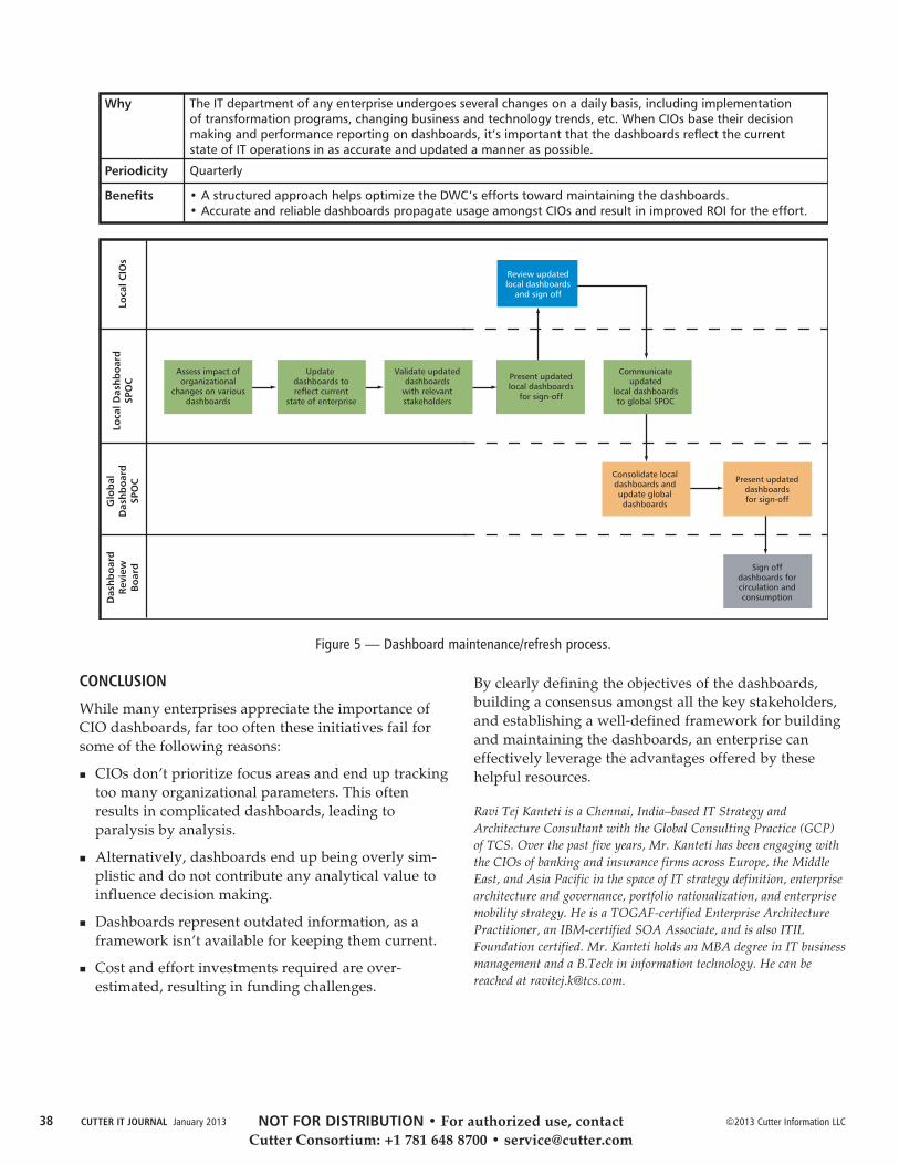
©2013 Cutter Information LLCCUTTER IT JOURNAL January 201338
CONCLUSION
While many enterprises appreciate the importance ofCIO dashboards, far too often these initiatives fail forsome of the following reasons:
CIOs don’t prioritize focus areas and end up trackingtoo many organizational parameters. This oftenresults in complicated dashboards, leading toparalysis by analysis.
Alternatively, dashboards end up being overly sim-plistic and do not contribute any analytical value toinfluence decision making.
Dashboards represent outdated information, as aframework isn’t available for keeping them current.
Cost and effort investments required are over-estimated, resulting in funding challenges.
By clearly defining the objectives of the dashboards,building a consensus amongst all the key stakeholders,and establishing a well-defined framework for buildingand maintaining the dashboards, an enterprise caneffectively leverage the advantages offered by thesehelpful resources.
Ravi Tej Kanteti is a Chennai, India–based IT Strategy andArchitecture Consultant with the Global Consulting Practice (GCP)of TCS. Over the past five years, Mr. Kanteti has been engaging withthe CIOs of banking and insurance firms across Europe, the MiddleEast, and Asia Pacific in the space of IT strategy definition, enterprisearchitecture and governance, portfolio rationalization, and enterprisemobility strategy. He is a TOGAF-certified Enterprise ArchitecturePractitioner, an IBM-certified SOA Associate, and is also ITILFoundation certified. Mr. Kanteti holds an MBA degree in IT businessmanagement and a B.Tech in information technology. He can bereached at [email protected].
Why
Periodicity
Benefits
The IT department of any enterprise undergoes several changes on a daily basis, including implementation
of transformation programs, changing business and technology trends, etc. When CIOs base their decision
making and performance reporting on dashboards, it’s important that the dashboards reflect the current
state of IT operations in as accurate and updated a manner as possible.
Quarterly
• A structured approach helps optimize the DWC’s efforts toward maintaining the dashboards.
• Accurate and reliable dashboards propagate usage amongst CIOs and result in improved ROI for the effort.
Lo
cal C
IOs
Lo
cal D
ash
bo
ard
SPO
C
Glo
bal
Dash
bo
ard
SPO
C
Dash
bo
ard
Revie
wB
oard
Review updatedlocal dashboards
and sign off
Assess impact oforganizational
changes on variousdashboards
Update dashboards toreflect current
state of enterprise
Validate updateddashboards
with relevantstakeholders
Present updatedlocal dashboards
for sign-off
Communicateupdated
local dashboardsto global SPOC
Consolidate localdashboards andupdate globaldashboards
Present updateddashboardsfor sign-off
Sign offdashboards forcirculation andconsumption
Figure 5 — Dashboard maintenance/refresh process.
NOT FOR DISTRIBUTION • For authorized use, contact Cutter Consortium: +1 781 648 8700 • [email protected]

The holy trinity of information technology is people,process, and tools. Yet in practice, IT fixates on toolsfirst, process second, and then largely ignores people.Nowhere is this more evident than in project portfoliomanagement (PPM) — the process of managing andcommunicating the project activities within an organi-zation. Despite their widespread use, traditional PPMdashboards produce unreliable information, at highcost,1 frustrating CIOs and project managers alike. Thealternative is to focus — not on project managementreporting, but on project management skill and the resultsthat follow. Building effective project management skill,through simplified processes and an innovative PPMdashboard, will deliver the results CIOs have beenseeking.
TRADITIONAL PROJECT PORTFOLIO MANAGEMENT
Project management is an activity that depends inher-ently on human performance; project management can-not be reduced to following checklists, and it cannot beautomated. Measuring project management effectivenessrequires techniques that center on human performance.Sadly, the dominant PPM approaches ignore humanperformance and focus instead on specifying detailedprocesses and collecting more and more detailed infor-mation in the hope of avoiding risk. Ironically, moreinformation has not led to better project management.2
The problem? Flaws in the way PPM dashboards areimplemented and managed, usually by a programmanagement organization (PMO). The traditional PMOtakes an outside-in approach, beginning with the dash-board. They design dashboard displays and reportsdriven by metrics that are easy to calculate but irrelevantas predictors of outcomes. To collect the data needed bythe dashboard, they then specify numerous, complexartifacts to be provided by project managers throughburdensome, duplicative reporting tools. Then, proforma review processes attempt to enforce compliance.
The result? Inconsistent and unreliable reporting, amarked decrease in efficiency, and — arguably —increased project risk. Over time, project managersare turned into “template zombies”3 who push paperto satisfy checkboxes. All this is due to an emphasis onreporting as enforced by processes and tools that areso cumbersome they leave little time to invest in whatreally matters — how project managers are managing.
FOCUS ON PROJECT MANAGEMENT SKILL
While the need to monitor and communicate programinformation remains as pressing as ever, an alternativeto traditional PPM that avoids the relentless pursuit ofever more information can deliver results. This alterna-tive approach recognizes that the fundamental driver ofproject performance and transparency is skill — projectmanagement skill. It works from the inside out, and byfocusing on skill, project success and reliable reportingfollow.
There can be no denying that some project managershave a better track record of success. Whether attend-ing to staffing, clarifying objectives, mitigating risk, orcommunicating effectively, successful project managersdo the things necessary for delivering positive outcomes.While many managers believe that success is due toinnate talent, in reality success is due to skill. The good
39©2013 Lawrence Fitzpatrick. All rights reserved. Vol. 26, No. 1 CUTTER IT JOURNAL
Building Project Management Skill: How the RightDashboard Drives Organizational Performance by Lawrence Fitzpatrick
PEOPLE-ORIENTED PPM
BAD PPM IS EXPENSIVE
While most IT organizations have PPM dashboards,few executives have faith that the dashboards accuratelyreflect program performance or project status. Moreover,project managers are frustrated by the effort they investin producing unreliable information. A true accounting ofthe costs in dollars, time, and risk to maintain traditionaldashboards might be a cause of alarm.
NOT FOR DISTRIBUTION • For authorized use, contact Cutter Consortium: +1 781 648 8700 • [email protected]
©2013 Lawrence Fitzpatrick. All rights reserved.CUTTER IT JOURNAL January 201340
news is that skill can be learned, and less experiencedproject managers can improve by learning those skillsemployed by their better-performing peers.
Taken in this light, the project portfolio dashboardshould be viewed as a window into the skill of the
project manager, rather than as a window into projectperformance. The dashboard should show whether theproject manager is doing the things that a skilled projectmanager should be doing and reveal how well he or sheis doing them. When the dashboard is viewed this way,it also serves remarkably well as a window into projectperformance.
A skill-focused dashboard is one of three componentsto drive project management performance. Anothercomponent is a simplified framework for guiding theessential activities of a project manager. The frameworkestablishes the consistency necessary for both buildingthe dashboard and communicating effectively aboutprojects. The third component is a small cadre of expertsupport people to assess performance and remediatedeficits. Note their emphasis is on developing skill,not on overseeing projects.
Each of these three elements — framework, dashboard,and mentors — reinforces the others. The combinationunlocks the potential of the organization to perform.
HOW DOES IT WORK?
This alternative to traditional PPM takes a new lookat people, process, and tools and creates a protocolfor developing project management skill that offersimmediate, meaningful results. With increasinglyskilled project managers producing meaningful projectinformation, risks can be identified early enough tomake a difference. Project visibility afforded to all stake-holders shifts the perception of the project organizationfrom expensive and unpredictable to valued partners.Finally, as the portfolio grows and changes, the newPPM approach and dashboard build capacity on thefly, enabling smooth on-boarding and development ofskilled project managers.
Three elements are required to implement this new pro-tocol. Each corner of the holy trinity of IT — process,tools, and people — is represented (see Figure 1):
A minimalist project management framework focuseson the bare essentials (managing scope, schedule,budget, staff, risk, and communication). Implementedthrough guidelines and simple, extensible templates,these essentials are designed for actual project man-agement but also facilitate reporting.
A dashboard automatically reads and organizes infor-mation from project management artifacts, providingreliable, up-to-date visibility into project manager —and project — performance.
CASE STUDY: DATA-DRIVEN DASHBOARDFOR PROJECT PORTFOLIO MANAGEMENT
A well-known regulator merged with another regulator,launched several new business initiatives, and faced direperformance concerns with aging, mission-critical systems.All of these factors spurred significant growth in the ITorganization. A maintenance portfolio had mushroomedinto a hundred new projects, and IT faced two challenges:(1) on-boarding hundreds of new employees to meet proj-ect needs, and (2) communicating a large volume of fast-changing, complex information reliably and simply tonervous stakeholders.
The management team seized the initiative to create aproject portfolio dashboard to meet the PPM challenge.The approach was driven by practices that overturnedconvention:
Hide nothing. Visible to the whole company, thedashboard provided summary views of the portfolio, drill-downs to detailed project views, and access to realproject artifacts.
Capture data once, from living management artifacts.Managers used standard project reporting tools, and thedashboard aggregated, parsed, and displayed this dataregularly and automatically.
Emphasize sound project management, and reportingwill follow. Project managers were provided training,documentation, coaching, and mentoring on an ongoingbasis to reinforce discipline.
Innovate incrementally. Dashboard capability increasedgradually over time as the organization matured.
The dashboard contributed to a near-perfect record of on-budget, on-time project delivery of valued projectsover many years. Adoption was painless: within six months, 50-plus projects were operating consistently. The total costof building, running, and sustaining the organization wasless than 1% of the project budget — 1/10 the cost of aconventional PMO!
NOT FOR DISTRIBUTION • For authorized use, contact Cutter Consortium: +1 781 648 8700 • [email protected]
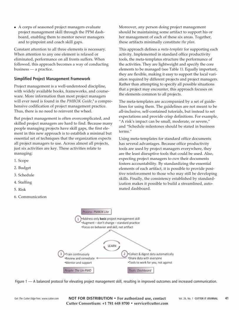
41Get The Cutter Edge free: www.cutter.com Vol. 26, No. 1 CUTTER IT JOURNAL
A corps of seasoned project managers evaluateproject management skill through the PPM dash-board, enabling them to mentor newer managersand to pinpoint and coach skill gaps.
Constant attention to all three elements is necessary.When attention to any one element is relaxed oreliminated, performance on all fronts suffers. Whenfollowed, this approach becomes a way of conductingbusiness — a practice.
Simplified Project Management Framework
Project management is a well-understood discipline,with widely available books, frameworks, and course-ware. More information than most project managerswill ever need is found in the PMBOK Guide,4 a compre-hensive codification of project management practice.Thus, there is no need to reinvent the wheel.
But project management is often overcomplicated, andskilled project managers are hard to find. Because manypeople managing projects have skill gaps, the first ele-ment in this new approach is to establish a minimal butessential set of techniques that the organization expectsall project managers to use. Across almost all projects,just six activities are key. These activities relate tomanaging:
1. Scope
2. Budget
3. Schedule
4. Staffing
5. Risk
6. Communication
Moreover, any person doing project managementshould be maintaining some artifact to support his orher management of each of these six areas. Together,these artifacts minimally constitute the plan.
This approach defines a meta-template for supporting eachactivity. Implemented in standard office productivitytools, the meta-templates structure the performance ofthe activities. They are lightweight and specify the coreelements to be managed (see Table 1). Equally important,they are flexible, making it easy to support the local vari-ation required by different projects and project managers.Rather than attempting to specify all possible situationsthat a project may encounter, this approach focuses onthe elements common to all projects.
The meta-templates are accompanied by a set of guide-lines for using them. The guidelines are not meant to beall-inclusive, self-contained tutorials, but instead to setexpectations and provide crisp definitions. For example,“A risk’s impact can be small, moderate, or severe,”and “Schedule milestones should be stated in businessterms.”
Using meta-templates for standard office documentshas several advantages. Because office productivitytools are used by project managers everywhere, theyare the least disruptive tools that could be used. Also,expecting project managers to own their documentsfosters accountability. By standardizing the essentialelements of each artifact, it is possible to provide posi-tive reinforcement to those who may still be developingskills. Finally, the consistency established by standard-ization makes it possible to build a streamlined, auto-mated dashboard.
Figure 1 — A balanced protocol for elevating project management skill, resulting in improved outcomes and increased communication.
NOT FOR DISTRIBUTION • For authorized use, contact Cutter Consortium: +1 781 648 8700 • [email protected]

©2013 Lawrence Fitzpatrick. All rights reserved.CUTTER IT JOURNAL January 201342
A Meaningful Dashboard
Transparency of information breeds self-correctingbehavior.
— Admiral Thad Allen, US Coast Guard
The principle behind the new project portfolio dash-board is that actual work should throw off data usefulfor both assessing the skill with which the work isperformed and communicating the work that is beingdone. By taking advantage of the consistency and disci-pline established by the meta-template approach, statusreporting becomes an outgrowth of doing the work.
At designated intervals, the dashboard software readsand parses the project management artifacts all projectmanagers use. By design, the parsing engine paysattention only to the core elements established by themeta-templates and ignores any extensions created forlocalized needs. In the interest of evaluating skill devel-opment, the dashboard does not enforce compliance ordata quality but accepts whatever the project managerprovides — the good, the bad, and the ugly — andmakes it visible to all.
The data extracted from the project artifacts is loadedinto a database, and a user interface provides a naviga-ble view over all projects. A summary page provides asuccinct overview of all projects, and each project has alink to a detailed status page (see Figure 2). The sourceartifacts are stored in the database and can be down-loaded and viewed for complete details.
Supporting the varied needs of different stakeholders,the project portfolio dashboard is available to everyperson in the organization. Customers and executiveshave 24/7 access to their own — and others’ — projects.
Peers can monitor interdependencies. Most importantly,senior managers can assess the performance skill oftheir project managers. Everyone sees the same data,thus avoiding the confusion created by the word-of-mouth relays that too often dominate internal businesscommunication.
Developing and Sustaining Skill
A small cadre of project management experts is thefinal ingredient in achieving high-performance projectmanagement across an organization. These experts actas trainers and coaches and are able to leverage thedashboard as they mentor less-skilled project managers.While project performance is obviously the subject ofmentoring, unlike in traditional PMO-driven PPM, thementors leave project performance oversight to thesenior managers and other project stakeholders —possibly even a PMO.
Initially, the experts provide project managers withfundamentals training on how to use the frameworkand the dashboard. Skilled project managers can beup and running in less than an hour, and even inexperi-enced project managers can come up to speed in a fewhours. The real growth begins as project managers usethe framework for their daily activities and those activi-ties are displayed through the dashboard.
The language project managers use in their projectplans — to describe scope, budget, schedule, staffing,risk, and so on — is a window into the thoughts andskill of the project manager. Skill gaps are revealedquickly in the dashboard as experts look for signs thatindicate such deficits (see sidebar “Mind the Skill
Activity Template Guidelines
Scope
Budget
Schedule
Staffing
Risk
Communication
Text document
Spreadsheet
Project planning
tool
Spreadsheet
Spreadsheet
Text document
Succinctly state capabilities and business benefits to be realized.
Track the available budget, actual expenditures to date, and
forecast to complete.
Specify project deliverables and high-level intermediate milestones
that demonstrate progress. Short-duration milestones must be
understandable and measurable by the customer.
Capture the team composition over time. This may include, role,
name if known, start date, end date, and utilization rate.
Record risks, issues, and dependencies. Focus on brief description,
mitigation strategy, progress against, impact, severity, owner,
and target close date.
Explain variations from plan and highlight any positive
accomplishments, such as meeting a milestone, on-boarding
staff, and/or closing a risk.
Table 1 — Basic Project Management Meta-Templates Define the Plan
NOT FOR DISTRIBUTION • For authorized use, contact Cutter Consortium: +1 781 648 8700 • [email protected]

43Get The Cutter Edge free: www.cutter.com Vol. 26, No. 1 CUTTER IT JOURNAL
Gap”). Informed by this information, mentors can workwith the project manager, either to advance a baselineproject management skill or hone a skill required tohandle a particular project’s challenges. In most cases,skill gaps can be overcome with short-term, targetedcoaching. Rarely but importantly, the gaps exposeindividuals who are not suited to project management.
The use of experts as mentors and coaches to facilitateskill development is essential. There is no way toencode all the knowledge required to manage the vari-ety of projects an organization encounters — problem-solving in the trenches is the most efficient way to learnand to teach. By reinforcing a consistent set of practicesembedded in the project management framework, andby using the dashboard as a skill diagnostic, mentorsspend coaching time only where and when needed.By keeping the overhead low — as little as one men-tor for up to 30 project managers — the organizationexpends more of its resources delivering value forthe business.
LESSONS FROM THE FIELD
The gravitational pull of tradition can be strong, andtraditional project portfolio management is ubiquitous.But this new project portfolio dashboard approachholds real promise both to build organizational capacityand to deliver projects successfully.
Successful implementations of the project portfoliodashboard approach offer these guiding principles:
Accountability for project management shouldremain with project managers. Don’t let well-intentioned policies, people, or processes undermineaccountability for results. Consider adopting themindset of the US Federal Aviation Administration’sPilot in Command authority5 (see sidebar “Pilotin Command”).
Successful project delivery begins and ends withskilled project managers, so develop skill through
Figure 2 — Project summary and detail screen.
MIND THE SKILL GAP
Examples of the types of skill deficits demonstrated throughthe dashboard:
Work not described in business terms (aka, using “geekspeak”) may indicate that the project manager cannot seethe forest for the trees, potentially presaging a disconnectwith customers.
Overly broad risks (“If we don’t get resources in time, theschedule will slip”), or risks not described as events thatcan be mitigated, may reflect poor risk management skill.
Project milestones that can’t demonstrate progress mayreflect poor work planning.
A resource plan that doesn’t match the level of effort ortype of activity can reflect poor accountability for orunderstanding of the problem.
NOT FOR DISTRIBUTION • For authorized use, contact Cutter Consortium: +1 781 648 8700 • [email protected]

©2013 Lawrence Fitzpatrick. All rights reserved.CUTTER IT JOURNAL January 201344
coaching and mentoring. If success is the goal, noamount of process, procedures, or metrics can obviatethe need for skill.
Populate the dashboard by mining the data naturallyfound in the project artifacts that skilled projectmanagers naturally use. Don’t change the way theywork — if you can’t find the data in well-structuredmanagement artifacts, you probably don’t need it.
Standardize only the bare essentials and allow varia-tion. Don’t try to codify the infinite complexity possi-ble from all projects; focus instead on what’s commonto all projects.
Give everyone visibility, but make sure it is safe tobe transparent. Don’t punish lack of skill; punishobfuscation.
Since 2005, several implementations of this alternativePPM dashboard have reliably achieved project portfoliotransparency within three months and consistency andpredictability within six months. By developing consis-tency and competency in project management, projectrisks have been exposed earlier — when they can beremediated — thus leading to far fewer project failures.In addition, several organizations have streamlinedtheir PMOs because they no longer need to compensatefor poor performance and poorer communication.Perhaps best of all, due to the availability of accurate,salient, and timely project information organization-wide, suspicion and mistrust of IT have been replacedby confidence and respect.
ACKNOWLEDGMENTS
Special thanks go to Rita Hadden: your knowledge,dogged determination, and positive attitude werecritical in the initial implementations of this alternativePPM dashboard. Thanks also go to Tigran Khrimian,Eric Layne, Bill Dunn, Ivy Ho, Scott Jones, and KathyVoorhees. Your efforts in this novel approach to projectportfolio management have helped many.
ENDNOTES1Common estimates for a PMO exceed 10% of the total ITbudget, of which a significant component is project oversightand reporting. In our experience with dozens of organizations,the PPM dashboard “project” is frequently one of the mostexpensive and endless in the IT portfolio. In a survey of 291organizations, PM Solutions found that the median size ofa PMO is 6.25% of project budgets; see: “The State of thePMO 2010: A PM Solutions Research Report.” PM SolutionsResearch, 2010 (www.pmsolutions.com/collateral/research/State%20of%20the%20PMO%202010%20Research%20Report.pdf).
2“PMO Effectiveness, Part 1: Why Traditional PMOs Are Failingand Being Abandoned.” The Hackett Group, September 2012.
3Demarco, Tom et al. Adrenaline Junkies and Template Zombies:Understanding Patterns of Project Behavior. Dorset House, 2008.
4A Guide to the Project Management Body of Knowledge (PMBOKGuide). Project Management Institute (PMI), 2009.
5US Office of the Federal Register. Code of Federal Regulations(CFR) Title 14, Part 91.3.
Lawrence Fitzpatrick has a record of software delivery and transfor-mational software management that spans commercial software prod-uct development, corporate IT, academia, and government for over 30years. Currently, Mr. Fitzpatrick is President of Computech, Inc., aninnovative application development firm headquartered in Bethesda,Maryland, USA. Until mid-2009, Mr. Fitzpatrick served as SeniorVP of the Financial Industry Regulatory Authority (FINRA). Duringa time of significant change in the financial sector, he grew and ranan application development team of over 500 individuals and wasaccountable for the delivery of numerous key systems. Prior to joiningFINRA in 2002, Mr. Fitzpatrick led delivery of commercial softwareproducts as VP at Open Text Software (OTEX) and as CTO atPersonal Library Software. Mr. Fitzpatrick has degrees from theUniversity of Virginia and Georgetown University and holdsa private pilot license. Mr. Fitzpatrick can be reached [email protected] or [email protected].
PILOT IN COMMAND
The FAA has issued the following guidelines for a pilot incommand of an aircraft:
Responsibility and authority of the pilot in command:
(a) The pilot in command of an aircraft is directly responsiblefor, and is the final authority as to, the operation of thataircraft.
(b) In an in-flight emergency requiring immediate action, thepilot in command may deviate from any rule of this part tothe extent required to meet that emergency.
(c) Each pilot in command who deviates from a rule underparagraph (b) of this section shall, upon the request of theAdministrator, send a written report of that deviation to theAdministrator.
NOT FOR DISTRIBUTION • For authorized use, contact Cutter Consortium: +1 781 648 8700 • [email protected]