css3 and responsive web design - web technologies (1019888bnr)
TRANSCRIPT

2 December 2005
Web TechnologiesCSS3 and Responsive Web Design
Prof. Beat Signer
Department of Computer Science
Vrije Universiteit Brussel
http://www.beatsigner.com

Beat Signer - Department of Computer Science - [email protected] 2October 28, 2016
Cascading Style Sheets (CSS)
Separation of presentation and content visualisation of HTML elements defined by styles
enables multiple presentations of the same content
media-specific style sheets via the media attribute
<html><head>...<link ref="stylesheet" type="text/css" href="default.css"media="screen, tv" />
<link rel="stylesheet" type="text/css" href="alternative.css"media="print, handheld" />
</head><body>...</body></html>

Beat Signer - Department of Computer Science - [email protected] 3October 28, 2016
CSS Versions
CSS1 specification published in 1996 remember that HTML 3.2 introduced some elements and
attributes (e.g. color) for the visual appearance in 1997
CSS2 specification published in 1998 superset of CSS1
functionality for relative, absolute and fixed positoning of elements
media types
CSS3 divided into separate modules (documents) 2D & 3D transforms
transitions
Flexbox
media queries
...

Beat Signer - Department of Computer Science - [email protected] 4October 28, 2016
CSS Versions
Sergey Mavrody, 2014

Beat Signer - Department of Computer Science - [email protected] 5October 28, 2016
CSS Syntax
CSS rule consists of two parts a selector
- HTML element
a declaration block (at least one property and value)
- surrounded by curly braces
- multiple properties are separated with a semicolon
Example
selector {property1: value1;property2: value2;}
h1 {color: red;font-size: 10px;}

Beat Signer - Department of Computer Science - [email protected] 6October 28, 2016
Selectors
Selectors are used to target rules to specific elements in
an HTML document (case sensitive)
Universal selector all elements in the document
Element/Type selector specific element names
ID selector element with a specific value for the id attribute
* { ... }
p { ... }h1, h2, h3 { ... } /* also called grouping selector */
#intro { ... } /* always more weight than class selector */

Beat Signer - Department of Computer Science - [email protected] 7October 28, 2016
Selectors …
Class selector elements with the given class attribute value (elements can have
more than one class)
Child selector elements that are direct children of other elements
Descendant selector elements that are descendants of other elements
.main { ... } /* any element with a 'main' class value' */h1.main { ... }
p>a { ... }
p a { ... }
Beat Signer - Department of Computer Science - [email protected] 8October 28, 2016
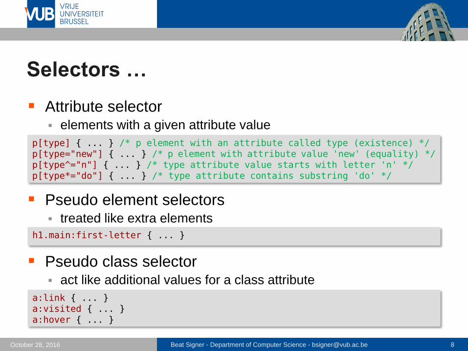
Selectors …
Attribute selector elements with a given attribute value
Pseudo element selectors treated like extra elements
Pseudo class selector act like additional values for a class attribute
p[type] { ... } /* p element with an attribute called type (existence) */p[type="new"] { ... } /* p element with attribute value 'new' (equality) */p[type^="n"] { ... } /* type attribute value starts with letter 'n' */ p[type*="do"] { ... } /* type attribute contains substring 'do' */
h1.main:first-letter { ... }
a:link { ... }a:visited { ... }a:hover { ... }

Beat Signer - Department of Computer Science - [email protected] 9October 28, 2016
Rule Order
For identical selectors, the last rule will be applied
Furthermore, we have the following internal priorities(1) rules containing IDs
(2) rules containing classes (or pseudo classes) and attributes
(3) rules containing elements (or pseudo elements)
Rules for selectors that are more specific than the others
have preference
* { color: red; }
p b { color: pink; } /* more specific than p selector */
p { color: blue; }
p { color: green; } /* last rule for p selector */

Beat Signer - Department of Computer Science - [email protected] 10October 28, 2016
Inheritance
Some properties such a color or font-family are
inherited by most child elements leads to simpler style sheets
The inheritance of properties can be enforced via the
inherit keyword
body {color: red; /* inherited by child elements */padding: 10px; /* normally not inherited */}
p {padding: inherit; /* explicitly inherited from parent element */}

Beat Signer - Department of Computer Science - [email protected] 11October 28, 2016
CSS Inclusion
There are three ways how CSS can be included in HTML inline style
internal style sheet
external style sheet
Inline style defined via the style attribute of the corresponding
HTML element
still mixes content and presentation and should therefore be avoided whenever possible
<h1 style="color:red; font-size:10px">Urgent Tasks</h1>

Beat Signer - Department of Computer Science - [email protected] 12October 28, 2016
CSS Inclusion ...
Internal style sheet used when a single document has a unique style
defined in the <head> section
e.g. used in HTML-encoded emails
<html><head>...<style>h1 {color: red; font-size: 10px;}p {color: blue;}...</style> </head><body>...</body></html>

Beat Signer - Department of Computer Science - [email protected] 13October 28, 2016
CSS Inclusion ...
External style sheet (in *.css file) changes to the overall appearance of an entire website can be
managed in a single file
- removes a lot of potential redundancy
- saves a lot of time
- leads to more consistent websites
<html><head>...<link rel="stylesheet" type="text/css" href="default.css" /></head><body>...</body></html>

Beat Signer - Department of Computer Science - [email protected] 14October 28, 2016
Multiple Style Sheets (Cascading)
Multiple styles will cascade into a single one properties/values are inherited from more specific style sheets
Overriding priorities(1) inline style (highest priority)
(2) internal style sheet
(3) external style sheet
(4) default browser style
Note that if the link to the external style sheet in the<head> section is placed after the internal style sheet, then the external style sheet will override the internal one
A stylesheet can import other stylesheets via @import

Beat Signer - Department of Computer Science - [email protected] 15October 28, 2016
Box Model
Box that wraps every single HTML element (content) by default the box is just big enough to keep its content
padding
- transparent area around the content
border
- around the padding
margin
- transparent area around the border
margin
paddingborder
content
div {width: 300px; /* only content area */padding: 10px;border: 10px red;margin: 5px;}

Beat Signer - Department of Computer Science - [email protected] 16October 28, 2016
Box Model …
By default the width of a box only defines the width of
the content padding and border are added to that width
Behaviour can be changed via the box-sizingproperty content-box (default) or border-box
width in border-box "mode" includes padding and border width
* {box-sizing: border-box; /* use border-box for the whole page */}

Beat Signer - Department of Computer Science - [email protected] 17October 28, 2016
Box Model …
Boxes can be either block-level boxes or inline boxes block-level boxes start on a new line
- main building blocks of any layout
- e.g. <p>, <h1>, <ul>, or <li>
inline boxes flow between sourrounding text
- e.g. <b>, <i> or <img>
Block-level boxes (elements) can be grouped e.g. number of elements grouped via <div> in a containing or
parent element
Behaviour can be changed via display property li {display: inline; /* no longer treated as block-level element */margin-right: 5px; /* list items shown next to each other with space */}

Beat Signer - Department of Computer Science - [email protected] 18October 28, 2016
Box Model …
CSS3 further introduces a new Flexbox layout mode new flex and inline-flex values for the display property

Beat Signer - Department of Computer Science - [email protected] 19October 28, 2016
Measurements
Absolute or relative units of measurements can be used
Absolute units px: pixels are not necessary consistent across devices
cm, mm and in: one centimeter is 37.8 pixels, a milimeter 3.78 pixels and an inch 96 pixels (also not consistent across devices)
pt: a point is equal to 1/72 of an inch (common in print design)
Relative units %: percentage measured against the content
em: ems are relative to the font size of the element
rem: rems are relative to the font size of the document
Beat Signer - Department of Computer Science - [email protected] 20October 28, 2016
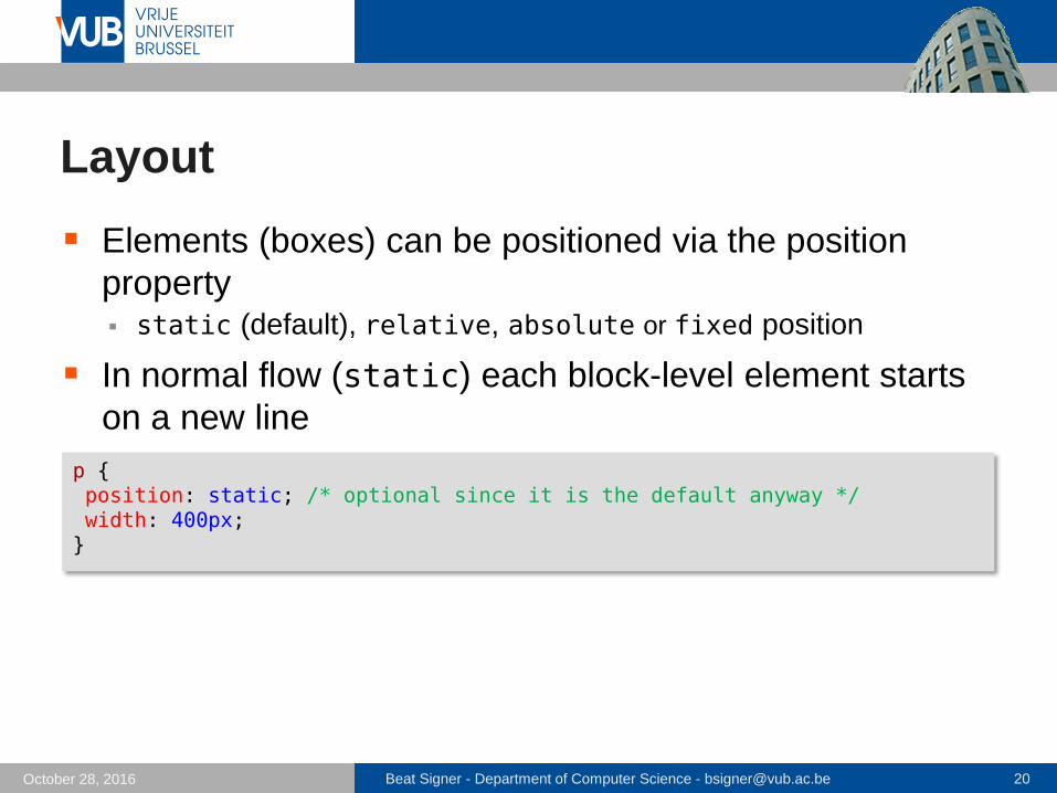
Layout
Elements (boxes) can be positioned via the position
property static (default), relative, absolute or fixed position
In normal flow (static) each block-level element starts
on a new line
p {position: static; /* optional since it is the default anyway */width: 400px;}

Beat Signer - Department of Computer Science - [email protected] 21October 28, 2016
Layout …
Relative positioning moves the element in relation to
where it would have been shown
Absolute position takes box out of the normal flow
p.test {position: relative; width: 400px;left: 100px; /* move 100 pixels to the right */top: 20px; /* move 20 pixels down */}
p.test {position: absolute; width: 200px;left: 300px; /* position the element 300 pixels from the left */top: 0px; /* position element at the top (of the containing element) */}

Beat Signer - Department of Computer Science - [email protected] 22October 28, 2016
Layout …
Fixed positioning renders an element relative to the
browser window scrolling no longer changes the position
Boxes with a relative, absolute or fixed position might
overlap z-index property can be used to control the ordering (higher
values are closer to the front)
p.test {position: fixed; width: 400px;right: 0px;top: 0px; /* positions the paragraph at the top right corner */}

Beat Signer - Department of Computer Science - [email protected] 23October 28, 2016
Floats
Elements can also be positioned via the float property succeeding elements will flow around the element
floating can be stopped via the clear property
<p>...</p><img class="floatLeft" src="logo.jpg" alt="logo"><p>...</p><h2 class="clearLeft">History</h2>
floatLeft { float: left; }clearLeft { clear: left; }

Beat Signer - Department of Computer Science - [email protected] 24October 28, 2016
Responsive Web Design (RWD)
Websites originally
designed with a fixed size
to fit common desktop and
laptop screen sizes
e.g. 960-pixel-wide layout
Around 2007 mobile
phones able to render
standard HTML pages
dedicated mobile version of
website (e.g. 320-pixel-wide)
- redirection to m-dot websites

Beat Signer - Department of Computer Science - [email protected] 25October 28, 2016
Responsive Web Design (RWD) …
Problem of maintainability as more versions added different phone display sizes and new devices (e.g. iPad)
Design websites that can easily be viewed on devices
with various screen sizes
Only one version of the website (one HTML structure) design rearranges itself to perfectly fit the screen size
- e.g. single column on mobile device and multiple columns on wider desktop
screens
use different CSS styles based on media queries
only since CSS3 it is possible to query features such as the screen width and height or the colour capabilities
flexibility via relative horizontal measurements (e.g. percentage)
should automatically look decent on future devices
Beat Signer - Department of Computer Science - [email protected] 26October 28, 2016
Content Strategy
Think about the content before thinking about the design
of a website address user needs
Most important information should be at the top of a
page
Divide content into chunks that can be rearranged on a
page
All users (regardless of the device) should have access
to all the content of a website
Beat Signer - Department of Computer Science - [email protected] 27October 28, 2016
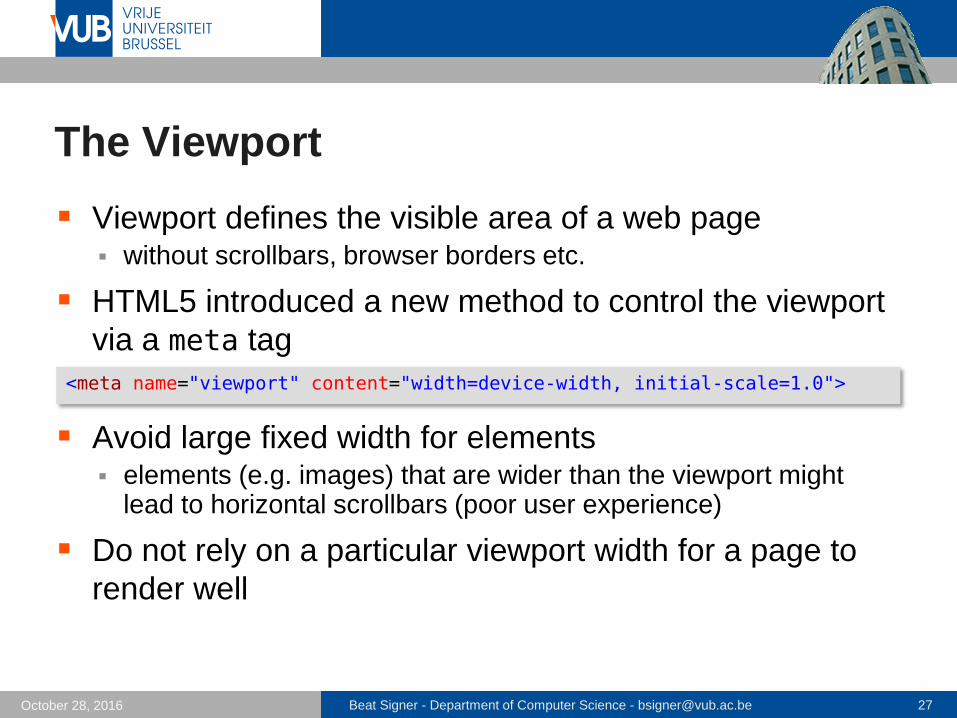
The Viewport
Viewport defines the visible area of a web page without scrollbars, browser borders etc.
HTML5 introduced a new method to control the viewport
via a meta tag
Avoid large fixed width for elements elements (e.g. images) that are wider than the viewport might
lead to horizontal scrollbars (poor user experience)
Do not rely on a particular viewport width for a page to
render well
<meta name="viewport" content="width=device-width, initial-scale=1.0">

Beat Signer - Department of Computer Science - [email protected] 28October 28, 2016
Media Queries
CSS2 allowed media queries for media types e.g. screen or print
CSS3 allows media queries to apply different declaration
blocks based on device properties (e.g. viewport width) e.g. typically change the number of columns, navigation, font size
or image size
body {font-size: 12px;background-color: red;}
@media only screen and (min-width: 40em) {body { background-color: green; }}

Beat Signer - Department of Computer Science - [email protected] 29October 28, 2016
Media Queries
Device properties that can be queried via CSS3 viewport width (width) and height (height)
screen width (device-width) and height (device-height)
orientation (orientation) which can be landscape or portrait
aspect ratio (aspect-ratio or device-aspect-ratio)
- e.g. 16:9 or 4:3
resolution (resolution) of the device screen
- e.g. 300 dpi
does the device support colour (color)
…

Beat Signer - Department of Computer Science - [email protected] 30October 28, 2016
Breakpoints
Breakpoint is the point
where we use a media
query to change the
design
e.g. change the number of
columns or font size
Design range is the range
between two breakpoints
design should look good
anywhere within a design
range

Beat Signer - Department of Computer Science - [email protected] 31October 28, 2016
Designing Responsive Solutions
Mobile-first approach start with the basic design (default design) for the narrowest
design range and devices that might not support media queries
Progressive enhancement via different layers ensures
that page is also accessible without CSS and JavaScript1. HTML
2. CSS (with potential media queries)
3. JavaScript
Responsive design is often based on grids 12-column grid is very common
columns can be grouped

Beat Signer - Department of Computer Science - [email protected] 32October 28, 2016
Multi-Column Layout
Compute the percentage for each column and the space
between the columns e.g. 4-column layout with 21% for each column, 2% between the
columns and 5% for the left and right border
5% 5%21% 21% 21% 21%2% 2% 2%
<article> <aside>
<footer>
Beat Signer - Department of Computer Science - [email protected] 33October 28, 2016
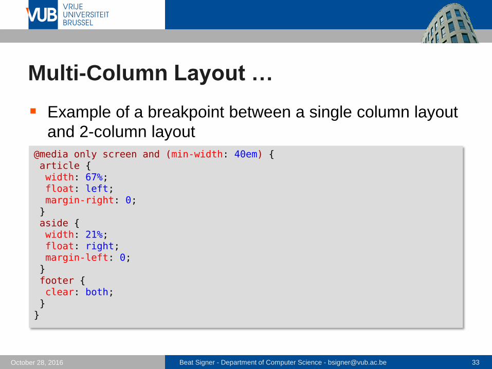
Multi-Column Layout …
Example of a breakpoint between a single column layout
and 2-column layout
@media only screen and (min-width: 40em) {article {width: 67%;float: left;margin-right: 0;}aside {width: 21%;float: right;margin-left: 0;}footer {clear: both;}}

Beat Signer - Department of Computer Science - [email protected] 34October 28, 2016
Images
Scaling of images can be controlled e.g. via max-width property
Offer different sizes of an image e.g. via the HTML5 picture element
img {max-width: 100%; /* do not scale up images */ height: auto;}
<picture><source srcset="smallfBird.jpg" media="(max-width: 300px)"><source srcset="bird.jpg"><img src="bird.jpg" alt="Bird"> /* fallback */ </picture>

Beat Signer - Department of Computer Science - [email protected] 35October 28, 2016
RWD Frameworks
Bootstrap mobile-first design philosophy
provides a set of CSS style sheets for the formatting of key HTML components
additional reusable components (e.g. advanced buttons)
JavaScript components (e.g. UI elements)
Skeleton
…

Beat Signer - Department of Computer Science - [email protected] 36October 28, 2016
Use Case: MindXpres
MindXpres presentations
are currently represented
in an XML document
format
Compiler (node.js
application) translates
XML to HTML
Presentation engine
based on HTML5 and
related APIs
e.g. WebSockets for
connectivity

Beat Signer - Department of Computer Science - [email protected] 37October 28, 2016
Exercise 6
No Exercise use time to prepare interim project presentation

Beat Signer - Department of Computer Science - [email protected] 38October 28, 2016
References
Learning Responsive Web Design:
A Beginner's Guide, Clarissa Peterson,
O'Reilly Media (1st edition), June 2014
ISBN-13: 978-1449362942
HTML and CSS: Design and Build Websites,
Jon Duckett, Wiley (1st edition),
November 2011
ISBN-13: 978-1118008188

Beat Signer - Department of Computer Science - [email protected] 39October 28, 2016
References …
Cascading Style Sheets (CSS) Snapshot 2010,
W3C Working Group Note http://www.w3.org/TR/CSS/
Molly E. Holzschlag, Core CSS (Part I, II & III)
(refcardz #19, #25 and #34) http://refcardz.dzone.com/refcardz/corecss-part1
http://refcardz.dzone.com/refcardz/corecss2
http://refcardz.dzone.com/refcardz/corecss3
CSS Tutorial http://www.w3schools.com/css/

Beat Signer - Department of Computer Science - [email protected] 40October 28, 2016
References ...
MDN CSS Reference https://developer.mozilla.org/en-US/docs/Web/CSS/Reference
Webplatform.orgl http://docs.webplatform.org/wiki/css
Bootstrap http://getbootstrap.com
R. Roels and B. Signer, MindXpres: An Extensible
Content-driven Cross-Media Presentation Platform,
Proceedings of WISE 2014, 15th International
Conference on Web Information System Engineering,
Thessaloniki, Greece, October, 2014 http://beatsigner.com/publications/roels_WISE2014.pdf

2 December 2005
Next LectureJavaScript and jQuery