css - mit student information processing board & html elements are rendered from l-to-r until a...
TRANSCRIPT

CSSMaking Layouts with CSS
1

Where does it go?
CSS can be included in
The style attribute of an element
The <head> tag of a HTML document
An external file specified in the <head> tag
➡ This order indicates the dominance scheme
Dominance absolutely applies only in certain cases
2In the past lecture, we discussed CSS and its syntax, but we did not actually discuss where the CSS could be located. The CSS can be contained within the style attribute of an element (properties and values for that element only, no selectors), a <style> tag located inside <head> tag of the current HTML document, or an external file containing only CSS linked to the current document via a <link> tag located in the <head> tag of the current document.
This order of locations defines the CSS dominance scheme--for the same selector and property, the value specified in the element’s style attribute will override the definition in the <style> tag which will have overridden the definition in the external file. However, the differences in dominance between the CSS in the <style> tag and the external file depend on the specificity of selector.

Things to know
CSS rules applied by specificity
Selectors are not overridden simply by order
Most specific selector for an element’s property wins
Comments /* */
Not every browser renders content the same
3CSS rules are applied by specificity. Because of this, the style attribute on an element is always most specific (and always “wins”). In the other cases, a selector’s specificity is increased by specifying, for example, a parent element, a class for the element, or an id for the element.
To make comments in CSS, use /* comment */ anywhere in the code. This comment can span multiple lines, meaning you can “open” the comment on one line and everything between /* and */ however many lines away will be ignored.
With CSS it is important to remember that not all browsers render content the same. From browser to browser, certain properties and values may or may not be supported or rendered correctly. You should always test your webpages in multiple browsers to ensure that the desired visual effects are being rendered.

CSSBasic Layout Properties
4
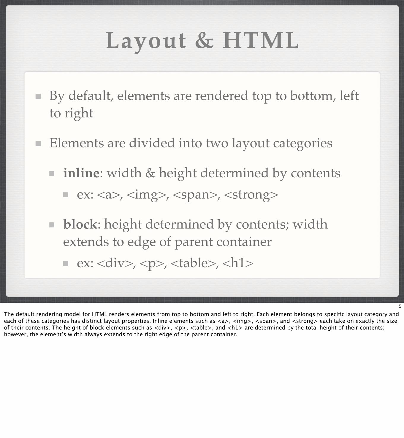
Layout & HTML
By default, elements are rendered top to bottom, left to right
Elements are divided into two layout categories
inline: width & height determined by contentsex: <a>, <img>, <span>, <strong>
block: height determined by contents; width extends to edge of parent container
ex: <div>, <p>, <table>, <h1>
5The default rendering model for HTML renders elements from top to bottom and left to right. Each element belongs to specific layout category and each of these categories has distinct layout properties. Inline elements such as <a>, <img>, <span>, and <strong> each take on exactly the size of their contents. The height of block elements such as <div>, <p>, <table>, and <h1> are determined by the total height of their contents; however, the element’s width always extends to the right edge of the parent container.

Layout & HTML
Elements are rendered from L-to-R until a block is encountered
Blocks break flow of inline elements
ex: <br/>
CSS Box Model explains spacing between objects rendered according to this scheme
6Because block elements take up the entire width of their parent container, it follows that block elements cannot exist on the same “line” as inline elements. HTML elements will be laid out by the browser from left-to-right until a block element is encountered. When the block element is encountered, the block will move to the next line, occupy the entire width of that line, and inline elements will continue on the line after that. With such behavior, block elements are said to break the flow of inline elements. This is, for example, the definition of a line break <br/> which indicates that subsequent items should occur on the next line.
In summary, inline elements can sit side-by-side on a line, block elements sit by themselves on their own line (and they occupy this entire line).
These are the only layout changes that can be indicated by HTML-- we can use CSS to alter the spacing between elements in their locations. The CSS Box model defines the properties used to alter this spacing.

Layout: The Box Model
Describes how layout properties alter rendering
Well-illustrated in real-time with Firebug
Padding
Element
MarginBorder
7The Box Model is a visualization of layout properties defined by CSS for each element. The contents of each element is surrounded immediately by its padding, then by its border, and finally by its margin. By default, for most elements, these values are all zero. Notable exceptions are <h1> and <p> which both define a margin.
In Firebug, inspecting an element will indicate each of these properties for that element. The dimensions of each property can also be changed directly within Firebug.

How to change attributes
Elementwidth, height
Paddingpadding macro
Borderborder macros
Marginmargin macro
Padding
Element
Margin
Border
8Again, the CSS Box Model defines properties that can be used to alter the size of each of these quantities. The dimensions of the element can be changed predictably with the width and height properties and the padding, border, and margin macro properties are used to alter their respective quantities.

How it’s seen
Background color extends to border
Margin is invisiblePadding
Element
Margin
Border
9In most cases each of the differences between the element, border, and margin are difficult to distinguish. This is due to the fact that the background color of an element extends to the element’s border and the margin is invisible.
Because of this be sure to consider both the size of the element, its padding, and its border when attempting to calculate its width or height on screen. The width and height set in the CSS for the element will set only the dimensions of the element without respect to the additional padding or border.

About Macro Properties
Macro properties take multiple values, separated by spaces
border: <border-width> <border-style> <border-color>
ex: border: 1px solid #000000;
Each constituent value corresponds to a property that can be set itself
10Macro properties are those that simultaneously set values for several related properties by taking more than one value each separated by a space. For example, the padding and margin can be defined on the top, right, bottom, and left edges of the element. Because of this, the padding and margin properties can take up to four values corresponding to the value of the property on each side. The padding and margin can be set individually for each side of the element using properties such as margin-left, margin-top, padding-right, padding-bottom, each of which will accept only one value.
The border property, as shown, is a macro property for the three items expected to define a border: the border width, style, and color. Since the border can be defined for each side, there are also other macro properties, border-top, border-right, border-bottom, and border-left which each take three values. Since three properties are required to define each border, there are at least (3*4) 12 additional subvalues to define each aspect of all four borders.

CSSAdvanced Layout Properties
11
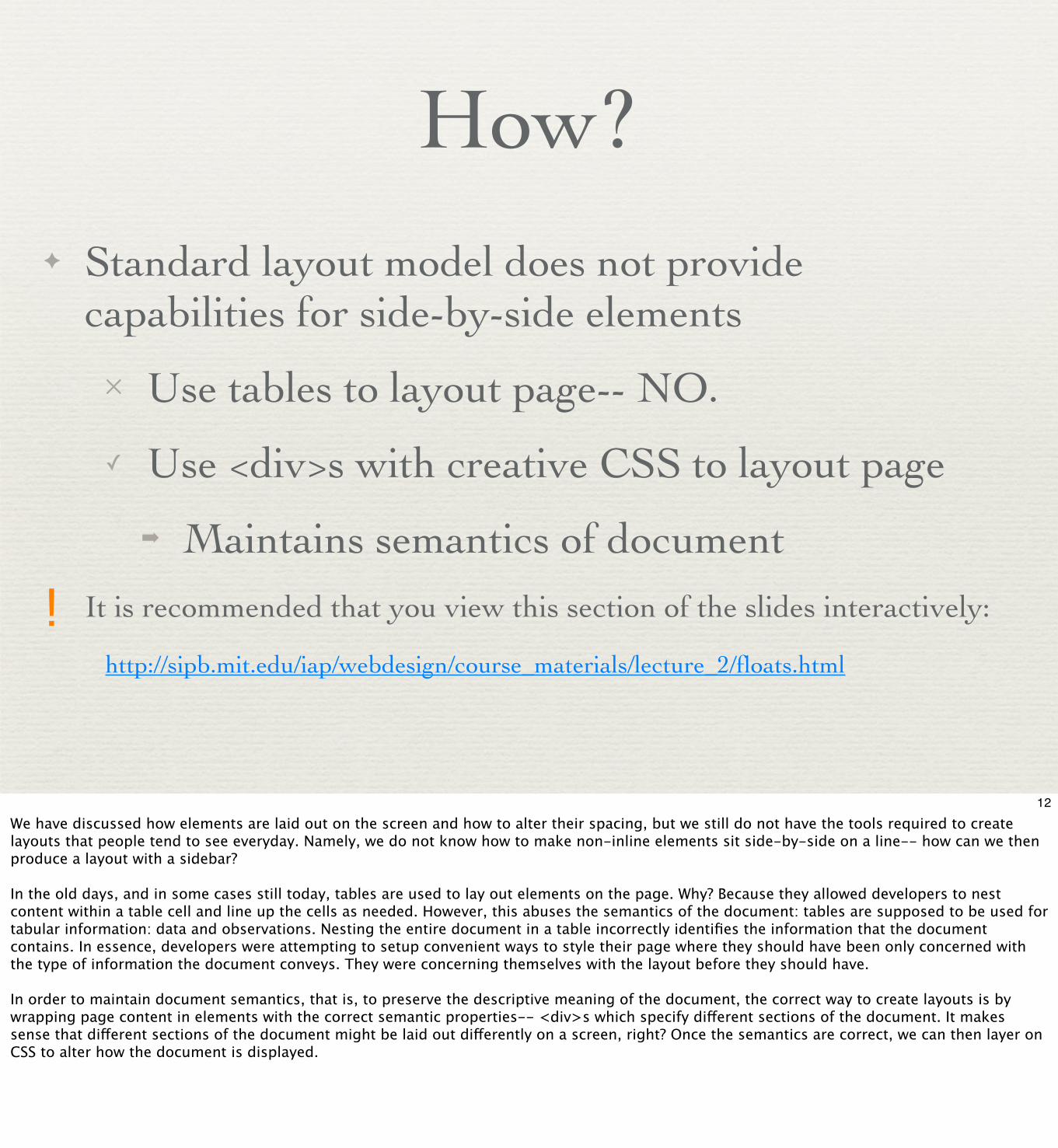
How?✦ Standard layout model does not provide
capabilities for side-by-side elements
✕ Use tables to layout page-- NO.
✓ Use <div>s with creative CSS to layout page
➡ Maintains semantics of document
! It is recommended that you view this section of the slides interactively:
http://sipb.mit.edu/iap/webdesign/course_materials/lecture_2/floats.html
12We have discussed how elements are laid out on the screen and how to alter their spacing, but we still do not have the tools required to create layouts that people tend to see everyday. Namely, we do not know how to make non-inline elements sit side-by-side on a line-- how can we then produce a layout with a sidebar?
In the old days, and in some cases still today, tables are used to lay out elements on the page. Why? Because they allowed developers to nest content within a table cell and line up the cells as needed. However, this abuses the semantics of the document: tables are supposed to be used for tabular information: data and observations. Nesting the entire document in a table incorrectly identifies the information that the document contains. In essence, developers were attempting to setup convenient ways to style their page where they should have been only concerned with the type of information the document conveys. They were concerning themselves with the layout before they should have.
In order to maintain document semantics, that is, to preserve the descriptive meaning of the document, the correct way to create layouts is by wrapping page content in elements with the correct semantic properties-- <div>s which specify different sections of the document. It makes sense that different sections of the document might be laid out differently on a screen, right? Once the semantics are correct, we can then layer on CSS to alter how the document is displayed.

Using Floats✦ What is it?
✦ Any block element given
✦ float: left; or float: right;
✦ Floats break from the normal layout flow
✦ Rendered to either side of parent
✦ Objects around them flow around it
✦ ex: an inset figure in a paper
13In order to have the desired visual layout, we use a CSS technique called “floating”. In order to make an element “float” we simply specify that its float property be set to “left” or “right” depending on our needs. Note that this property only applies for block elements.
Floating elements break from the normal layout flow, being “attracted” to either the left or right edge of the parent container. In the process, the block element no longer extends to fill the entire width of the parent container, and because of this unfloated elements, both block and inline elements near to the element (or below it) can “flow” around it, including on the same line. This is not an abstract concept-- in research papers, for example, text flows along side the outside of an inset figure.

Using Floats✦ Floated <div>s can be used to place block
content side-by-side
➡ Enables traditional layout schemes
✦ Elements floated to the same side are rendered in order
✦ To interrupt aligned layout (next “row”), use✦ clear: (left | right | both);
14When designing layouts, we can leverage this functionality to sit block elements side-by-side one another. An additional aspect of floating elements is that, if a floating element occurs after another floating element, and both are floated to the same side, the second element will sit alongside the first. The non-floated elements will then flow around the outside of the second element. If the first floating element is floated to the side opposite the second, then the nonfloated elements will flow between the two floating elements.
In many cases, it will be necessary to escape from the altered flow setup by floating elements. By setting an element’s “clear” property to “left”, “right”, or “both”, the element will be rendered on the next line instead of beside the previous floating element. If the “clearing” element itself is floated, then then the same layout scheme will develop for this line, otherwise the standard layout scheme will develop (the “clearing” element will be a standard block or inline element).
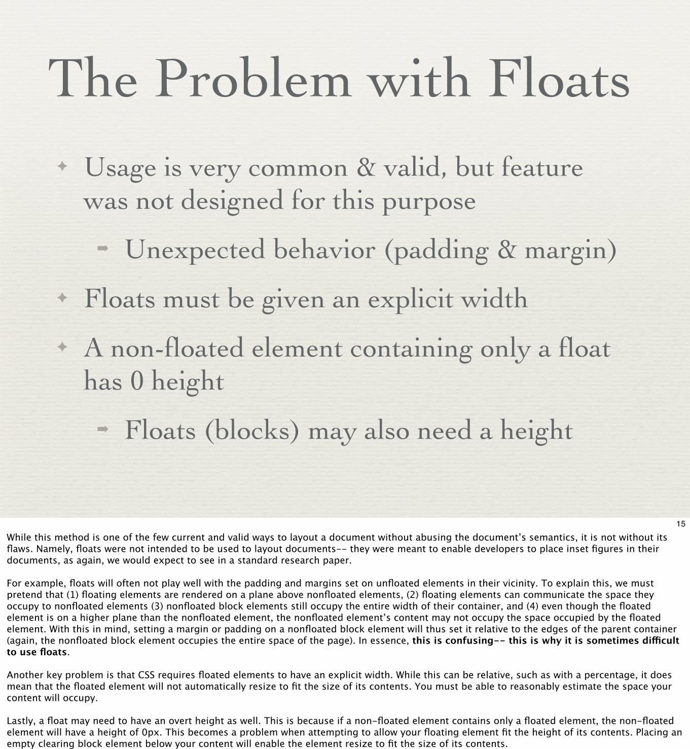
The Problem with Floats✦ Usage is very common & valid, but feature
was not designed for this purpose
➡ Unexpected behavior (padding & margin)
✦ Floats must be given an explicit width
✦ A non-floated element containing only a float has 0 height
➡ Floats (blocks) may also need a height
15While this method is one of the few current and valid ways to layout a document without abusing the document’s semantics, it is not without its flaws. Namely, floats were not intended to be used to layout documents-- they were meant to enable developers to place inset figures in their documents, as again, we would expect to see in a standard research paper.
For example, floats will often not play well with the padding and margins set on unfloated elements in their vicinity. To explain this, we must pretend that (1) floating elements are rendered on a plane above nonfloated elements, (2) floating elements can communicate the space they occupy to nonfloated elements (3) nonfloated block elements still occupy the entire width of their container, and (4) even though the floated element is on a higher plane than the nonfloated element, the nonfloated element’s content may not occupy the space occupied by the floated element. With this in mind, setting a margin or padding on a nonfloated block element will thus set it relative to the edges of the parent container (again, the nonfloated block element occupies the entire space of the page). In essence, this is confusing-- this is why it is sometimes difficult to use floats.
Another key problem is that CSS requires floated elements to have an explicit width. While this can be relative, such as with a percentage, it does mean that the floated element will not automatically resize to fit the size of its contents. You must be able to reasonably estimate the space your content will occupy.
Lastly, a float may need to have an overt height as well. This is because if a non-floated element contains only a floated element, the non-floated element will have a height of 0px. This becomes a problem when attempting to allow your floating element fit the height of its contents. Placing an empty clearing block element below your content will enable the element resize to fit the size of its contents.