creating great presentations basic steps to remember!
TRANSCRIPT
Creating Great
Presentations
Basic Steps to Remember!
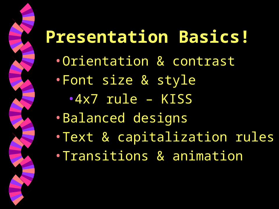
Presentation Basics!• Orientation & contrast
• Font size & style
• 4x7 rule – KISS
• Balanced designs
• Text & capitalization rules
• Transitions & animation
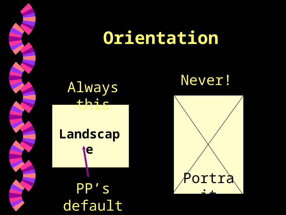
Orientation
Always this Never!
Portrait
Landscape
PP’s default
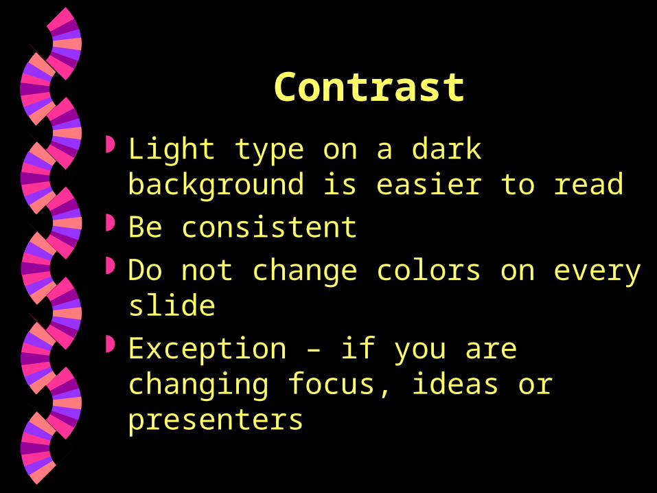
Contrast Light type on a dark background is
easier to read Be consistent Do not change colors on every
slide Exception – if you are changing
focus, ideas or presenters
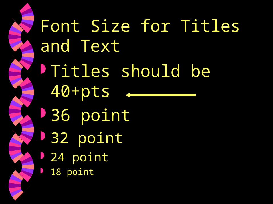
Font Size for Titles and Text
Titles should be 40+pts 36 point 32 point 24 point 18 point
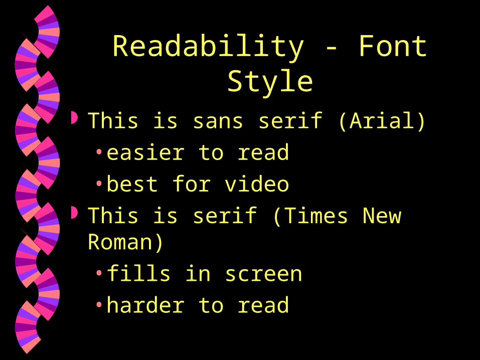
Readability - Font Style
This is sans serif (Arial)
• easier to read
• best for video This is serif (Times New Roman)
• fills in screen
• harder to read
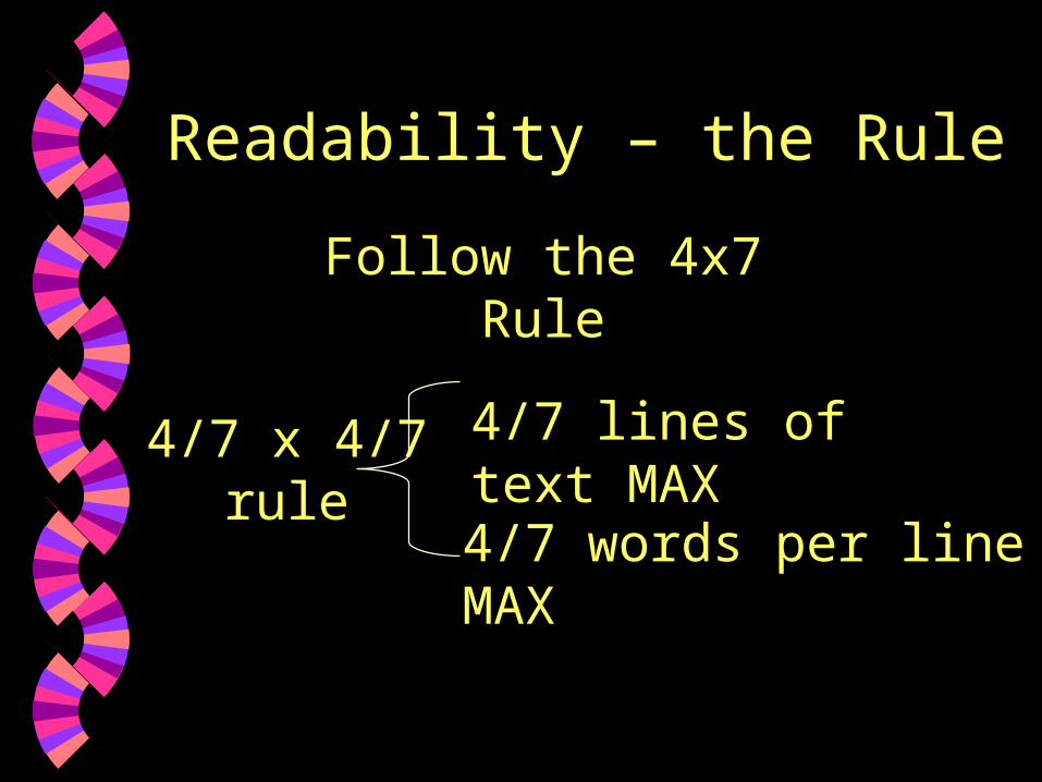
Readability – the Rule
4/7 x 4/7 rule
4/7 lines of text MAX
4/7 words per line MAX
Follow the 4x7 Rule
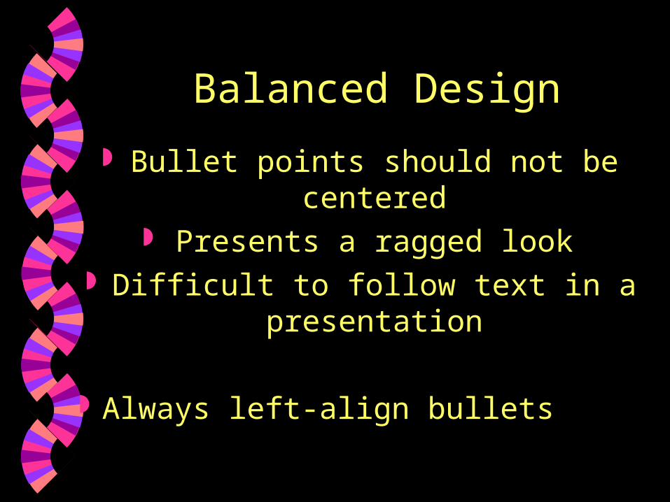
Balanced Design
Bullet points should not be centered Presents a ragged look
Difficult to follow text in a presentation
Always left-align bullets
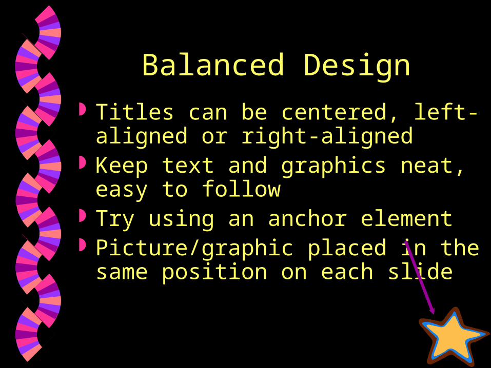
Balanced Design Titles can be centered, left-aligned
or right-aligned Keep text and graphics neat, easy
to follow Try using an anchor element Picture/graphic placed in the same
position on each slide
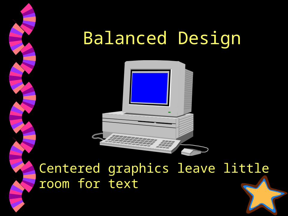
Balanced Design
Centered graphics leave little room for text
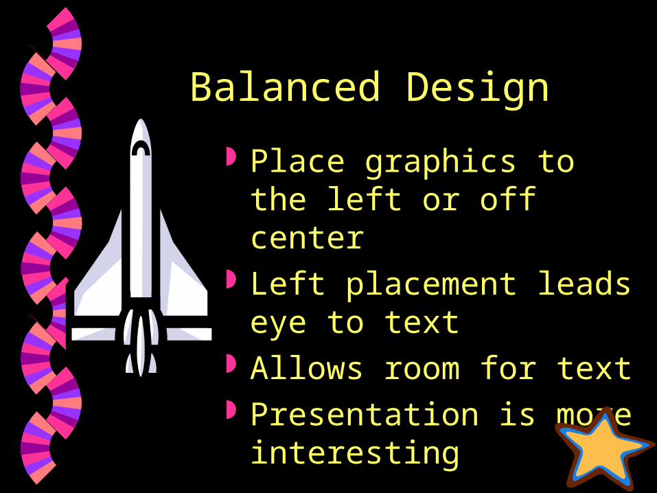
Balanced Design
Place graphics to the left or off center
Left placement leads eye to text
Allows room for text Presentation is more
interesting
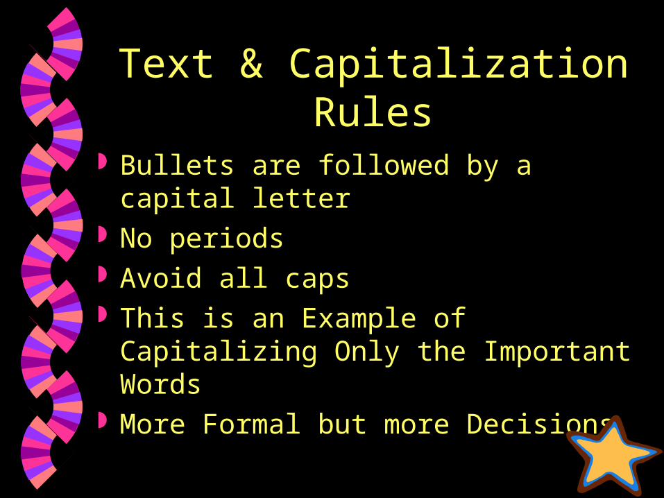
Text & Capitalization Rules
Bullets are followed by a capital letter No periods Avoid all caps This is an Example of Capitalizing
Only the Important Words More Formal but more Decisions
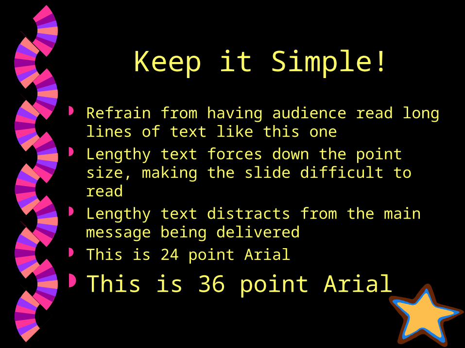
Keep it Simple!
Refrain from having audience read long lines of text like this one
Lengthy text forces down the point size, making the slide difficult to read
Lengthy text distracts from the main message being delivered
This is 24 point Arial
This is 36 point Arial
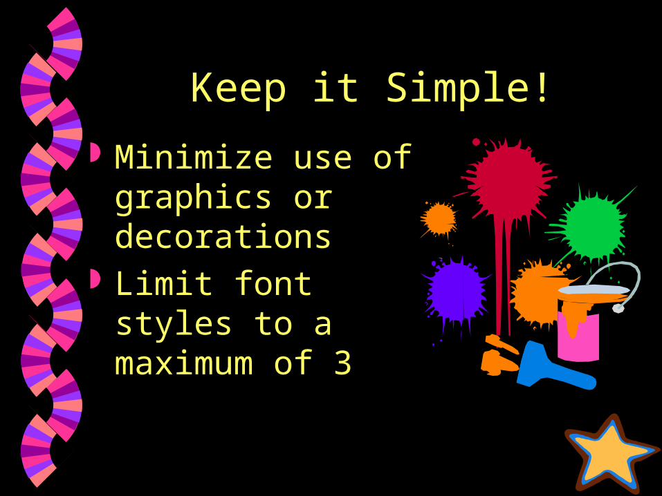
Keep it Simple!
Minimize use of graphics or decorations
Limit font styles to a maximum of 3
Transitions
Avoid distracting transitions and review
The way in which the presentation moves from one slide to the next
Animations
How text or graphics come on the slide
Use consistency with animations Too much movement reduces
readability Always review animations
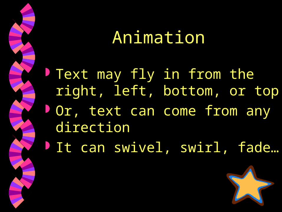
Animation
Text may fly in from the right, left, bottom, or top
Or, text can come from any direction
It can swivel, swirl, fade…
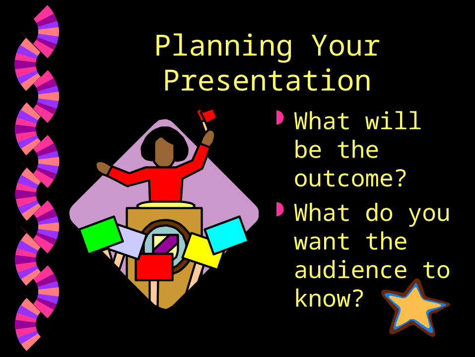
Planning Your Presentation
What will be the outcome?
What do you want the audience to know?
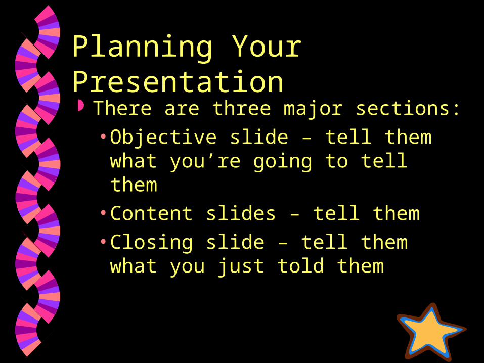
Planning Your Presentation There are three major sections:
• Objective slide – tell them what you’re going to tell them
• Content slides – tell them
• Closing slide – tell them what you just told them
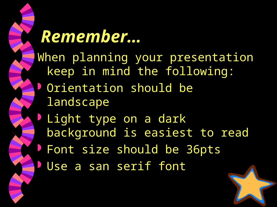
Remember…When planning your presentation
keep in mind the following: Orientation should be landscape Light type on a dark background is
easiest to read Font size should be 36pts Use a san serif font
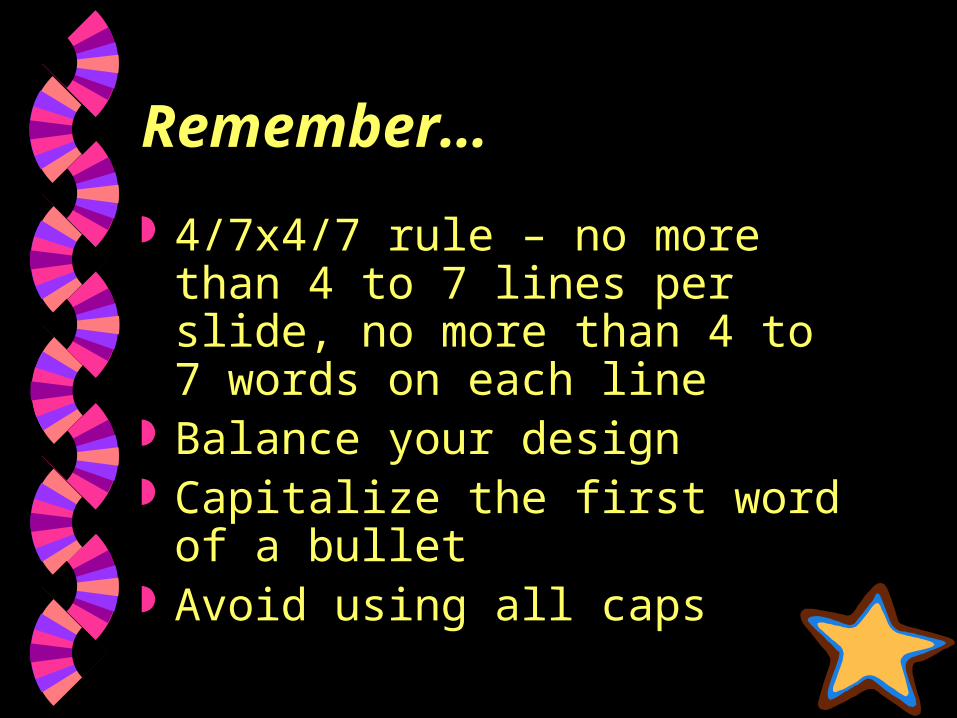
Remember…
4/7x4/7 rule – no more than 4 to 7 lines per slide, no more than 4 to 7 words on each line
Balance your design Capitalize the first word of a
bullet Avoid using all caps
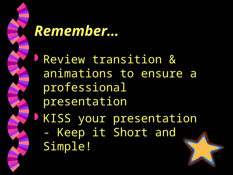
Remember…
Review transition & animations to ensure a professional presentation
KISS your presentation - Keep it Short and Simple!