costco locations and map with...
TRANSCRIPT

COSTCO LOCATIONS AND MAP WITH LINES
Dots on a map and dots connected by lines
This is part of the exercises described in Chapter 8: Visualizing Spatial Relationships (pp. 276-282) of the book Visualize This. It covers putting dots for Costco location on a US, world, and Western Region maps. In addition, it shows how to put dots on a map and connect the dots with lines.
Note: In this exercise, all dots are the same size. For placing circles of different sizes, see the world map with bubbles exercise (Facebook data set – J. Chu), which is partly based on the Scaled Points exercise on pp. 283-285, also in Chapter 8. In that exercise, we also showed how to create a key for the sizes of the circles by creating fake categories (adding rows) in the data set.
For this exercise you need to turn on the maps package in RStudio.
The final complete code can be found here and also at the end of this document.
Get data set of Costco locations from the flowingdata website:http://book.flowingdata.com/ch08/geocode/costcos-geocoded.csv
Or get Pino’s edited version (recommended)The above link is also on the resources page. Please note that was having trouble exporting the PDF of the “Western Region” plot. It might have been due to funny characters in the data set, which I cleaned up. If you have
the same problem, make sure to use the edited file, not the one from flowingdata.
Load the data set into RStudio: Import data set -- Workspace > Import Dataset > From text file(If you are loading from local file. If loading from web, see code in book, end of page 276.)
Shorten name of file to “costcos” when loading data set.
#turn on maps package#render usa mapmap(database="state")
This generates a simple map with black lines. Later we’ll make it out of gray lines. Note that the base maps in R may not be very detailed. Wikipedia is a great resourse for very detailed SVG maps, for example below is a link to a USA Counties map. You could use any similar map in Illustrator to swap the one that you export from R, but make sure that you are swapping “similar projection type” maps, especially for complete world maps.
http://en.wikipedia.org/wiki/File:USA_Counties_with_FIPS_and_names.svg
DAI 523 Information Design 1: Data Visualization | Trogu | Fall 2012! ! ! ! Wed. Nov. 28, 2012costco locations and map with lines – step by step! ! ! ! ! !
Page 1 of 5

#USAsymbols(costcos$Longitude, costcos$Latitude, circles=rep(1, length(costcos$Longitude)), inches=0.05, add=TRUE)
This code adds plain outlined dots to the map.
#USA gray outline map map(database="state", col="#cccccc")symbols(costcos$Longitude, costcos$Latitude, bg="#e2373f", fg="#ffffff", lwd=0.5, circles=rep(1, length(costcos$Longitude)), inches=0.05, add=TRUE)
This code makes the map gray and the dots red with a white border. Note that the dots’ color is defined by both a “fill” (bg) and a “border” (fg). This means that when the file is exported to PDF, two objects are used to
render the dot: a fill with a separate border around it. This is not efficient and can cause problems later on, so in Illustrator you might want to delete all the borders and add them back if needed so that each dot is a single object with two attributes: fill and border.
#world mapmap(database="world", col="#cccccc")symbols(costcos$Longitude, costcos$Latitude, bg="#e2373f", fg="#ffffff", lwd=0.5, circles=rep(1, length(costcos$Longitude)), inches=0.05, add=TRUE)
Loading the “world” map instead of the “state” map allows Hawaii and Alaska to be included, but you will need to edit out the rest of the world map later in Illustrator if you don’t need it.
DAI 523 Information Design 1: Data Visualization | Trogu | Fall 2012! ! ! ! Wed. Nov. 28, 2012costco locations and map with lines – step by step! ! ! ! ! !
Page 2 of 5

#western regionmap(database="state", region=c("California", "Nevada", "Oregon", "Washington"), col="#cccccc")symbols(costcos$Longitude, costcos$Latitude, bg="#e2373f", fg="#ffffff", lwd=0.2, circles=rep(1, length(costcos$Longitude)), inches=0.02, add=TRUE)text(costcos$Longitude, costcos$Latitude, costcos$City, cex=0.2)
The “region” argument used above allows to select individual states as needed. Notice that cities in states neighboring Washington and Oregon are also rendered. Edit these out later in Illustrator.Note: the width of the borders in the dots is defined by “lwd” (line width). I made the dots and the name of the cities rather small in order to differentiate each city later in Illustrator.
(cont. on next page)
DAI 523 Information Design 1: Data Visualization | Trogu | Fall 2012! ! ! ! Wed. Nov. 28, 2012costco locations and map with lines – step by step! ! ! ! ! !
Page 3 of 5

For the “map with lines” above, please get the “faketrace” data set here. It’s a slightly different version than the one from the book as I added a column named “stop”. We’ll use these names (stop 1, stop 2, etc) to label the dots.
#import data set -- Workspace > Import Dataset > From text file#find file on your computerfaketrace <- read.delim("~/Desktop/chapter 8 practice/data sets/faketrace.txt")View(faketrace)
#map with linesmap(database="world", col="#cccccc")lines(faketrace$longitude, faketrace$latitude, col="#bb4cd4", lwd=2)symbols(faketrace$longitude, faketrace$latitude, lwd=2, bg="#bb4cd4", fg="#ffffff", circles=rep(1, length(faketrace$longitude)), inches=0.08, add=TRUE)#offset location of labels#plus or minus degrees next to longitude & latitudetext(faketrace$longitude+15, faketrace$latitude-5, faketrace$stop, cex=1)
The “lines” command connects the dots with lines based on the longitude and latitude information. The “symbols” command again generates the dots. The “text” command creates the labels. Notice that it’s easy to offset the location of the labels with respect to the dots by simply adding or subtructing (in this case degrees but I assume it could be pixels) from the longitude and latitude, directly in the code (I used +15 for longitude and -5 for latitude).
DAI 523 Information Design 1: Data Visualization | Trogu | Fall 2012! ! ! ! Wed. Nov. 28, 2012costco locations and map with lines – step by step! ! ! ! ! !
Page 4 of 5
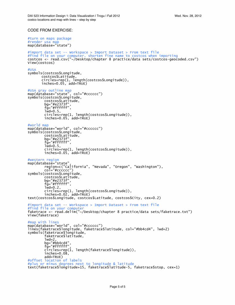
CODE FROM EXERCISE:
#turn on maps package#render usa mapmap(database="state")
#import data set -- Workspace > Import Dataset > From text file#find file on your computer, shorten fine name to costcos when importingcostcos <- read.csv("~/Desktop/chapter 8 practice/data sets/costcos-geocoded.csv")View(costcos)
#USAsymbols(costcos$Longitude, costcos$Latitude, circles=rep(1, length(costcos$Longitude)), inches=0.05, add=TRUE)
#USA gray outline map map(database="state", col="#cccccc")symbols(costcos$Longitude, costcos$Latitude, bg="#e2373f", fg="#ffffff", lwd=0.5, circles=rep(1, length(costcos$Longitude)), inches=0.05, add=TRUE)
#world mapmap(database="world", col="#cccccc")symbols(costcos$Longitude, costcos$Latitude, bg="#e2373f", fg="#ffffff", lwd=0.5, circles=rep(1, length(costcos$Longitude)), inches=0.05, add=TRUE)
#western regionmap(database="state", region=c("California", "Nevada", "Oregon", "Washington"), col="#cccccc")symbols(costcos$Longitude, costcos$Latitude, bg="#e2373f", fg="#ffffff", lwd=0.2, circles=rep(1, length(costcos$Longitude)), inches=0.02, add=TRUE)text(costcos$Longitude, costcos$Latitude, costcos$City, cex=0.2)
#import data set -- Workspace > Import Dataset > From text file#find file on your computerfaketrace <- read.delim("~/Desktop/chapter 8 practice/data sets/faketrace.txt")View(faketrace)
#map with linesmap(database="world", col="#cccccc")lines(faketrace$longitude, faketrace$latitude, col="#bb4cd4", lwd=2)symbols(faketrace$longitude, faketrace$latitude, lwd=2, bg="#bb4cd4", fg="#ffffff", circles=rep(1, length(faketrace$longitude)), inches=0.08, add=TRUE)#offset location of labels#plus or minus degrees next to longitude & latitudetext(faketrace$longitude+15, faketrace$latitude-5, faketrace$stop, cex=1)
DAI 523 Information Design 1: Data Visualization | Trogu | Fall 2012! ! ! ! Wed. Nov. 28, 2012costco locations and map with lines – step by step! ! ! ! ! !
Page 5 of 5