correlation coefficients computing distribute€¦ · so a correlation of −.70 is stronger than a...
TRANSCRIPT
76
5COMPUTING
CORRELATION COEFFICIENTSIce Cream and Crime
Difficulty Scale ☺ ☺ (moderately hard)
WHAT YOU WILL LEARN IN THIS CHAPTER
• Understanding what correlations are and how they work
• Computing a simple correlation coefficient
• Interpreting the value of the correlation coefficient
• Understanding what other types of correlations exist and when they should be used
WHAT ARE CORRELATIONS ALL ABOUT?Measures of central tendency and measures of variability are not the only descrip-tive statistics that we are interested in using to get a picture of what a set of scores
Copyright ©2020 by SAGE Publications, Inc. This work may not be reproduced or distributed in any form or by any means without express written permission of the publisher.
Do not
copy
, pos
t, or d
istrib
ute

Chapter 5 ■ Computing Correlation Coefficients 77
looks like. You have already learned that knowing the values of the one most repre-sentative score (central tendency) and a measure of spread or dispersion (variability) is critical for describing the characteristics of a distribution.
However, sometimes we are as interested in the relationship between variables—or, to be more precise, how the value of one variable changes when the value of another variable changes. The way we express this interest is through the computation of a simple correlation coefficient. For example, what’s the relationship between age and strength? Income and years of education? Memory skills and amount of drug use? Your political attitudes and the attitudes of your parents?
A correlation coefficient is a numerical index that reflects the relationship or asso-ciation between two variables. The value of this descriptive statistic ranges between −1.00 and +1.00. A correlation between two variables is sometimes referred to as a bivariate (for two variables) correlation. Even more specifically, the type of correla-tion that we will talk about in the majority of this chapter is called the Pearson product-moment correlation, named for its inventor, Karl Pearson.
The Pearson correlation coefficient examines the relationship between two variables, but both of those variables are continuous in nature. In other words, they are variables that can assume any value along some underlying continuum; examples include height (you really can be 5 feet 6.1938574673 inches tall), age, test score, and income. Remember in Chapter 2, when we talked about levels of measurement? Interval and ratio levels of measurement are continuous. But a host of other variables are not continuous. They’re called discrete or categorical variables, and examples are race (such as black and white), social class (such as high and low), and political affiliation (such as Democrat and Republican). In Chapter 2, we called these types of variables nominal level. You need to use other correlational techniques, such as the phi correlation, in these cases. These topics are for a more advanced course, but you should know they are acceptable and very useful techniques. We mention them briefly later on in this chapter.
Other types of correlation coefficients measure the relationship between more than two variables, and we’ll talk about one of these in some more advanced chapters later on (which you are looking forward to already, right?).
Types of Correlation Coefficients: Flavor 1 and Flavor 2
A correlation reflects the dynamic quality of the relationship between variables. In doing so, it allows us to understand whether variables tend to move in the same or opposite directions in relationship to each other. If variables change in the same direction, the correlation is called a direct correlation or a positive correlation. If variables change in opposite directions, the correlation is called an indirect correlation or a negative correlation. Table 5.1 shows a summary of these rela-tionships.
Copyright ©2020 by SAGE Publications, Inc. This work may not be reproduced or distributed in any form or by any means without express written permission of the publisher.
Do not
copy
, pos
t, or d
istrib
ute

78 Part II ■ Σigma Freud and Descriptive Statistics
TABLE 5.1 Types of Correlations
What Happens to Variable X
What Happens to Variable Y
Type of Correlation Value Example
X increases in value.
Y increases in value.
Direct or positive Positive, ranging from .00 to +1.00
The more time you spend studying, the higher your test score will be.
X decreases in value.
Y decreases in value.
Direct or positive Positive, ranging from .00 to +1.00
The less money you put in the bank, the less interest you will earn.
X increases in value.
Y decreases in value.
Indirect or negative
Negative, ranging from −1.00 to .00
The more you exercise, the less you will weigh.
X decreases in value.
Y increases in value.
Indirect or negative
Negative, ranging from –1.00 to .00
The less time you take to complete a test, the more items you will get wrong.
Now, keep in mind that the examples in the table reflect generalities, for example, regarding time to complete a test and the number of items correct on that test. In general, the less time that is taken on a test, the lower the score. Such a conclusion is not rocket science, because the faster one goes, the more likely one is to make care-less mistakes such as not reading instructions correctly. But, of course, some people can go very fast and do very well. And other people go very slowly and don’t do well at all. The point is that we are talking about the average performance of a group of people on two different variables. We are computing the correlation between the two variables for the group of people, not for any one particular person.
There are several easy (but important) things to remember about the correlation coefficient:
• A correlation can range in value from −1.00 to +1.00.
• The absolute value of the coefficient reflects the strength of the correlation. So a correlation of −.70 is stronger than a correlation of +.50. One frequently made mistake regarding correlation coefficients occurs when students assume that a direct or positive correlation is always stronger (i.e., “better”) than an indirect or negative correlation because of the sign and nothing else.
• To calculate a correlation, you need exactly two variables and at least two people.
Copyright ©2020 by SAGE Publications, Inc. This work may not be reproduced or distributed in any form or by any means without express written permission of the publisher.
Do not
copy
, pos
t, or d
istrib
ute

Chapter 5 ■ Computing Correlation Coefficients 79
• Another easy mistake is to assign a value judgment to the sign of the correlation. Many students assume that a negative relationship is not good and a positive one is good. But think of the example from Table 5.1 where exercise and weight have a negative correlation. That negative correlation is a positive thing! That’s why, instead of using the terms negative and positive, you might prefer to use the terms indirect and direct to communicate meaning more clearly.
• The Pearson product-moment correlation coefficient is represented by the small letter r with a subscript representing the variables that are being correlated. You’d think that P for Pearson might be used as the symbol for this correlation, but in Greek, the P letter actually is similar to the English “r” sound, so r is used. P is used for the theoretical correlation in a population, so don’t feel sorry for Pearson. (If it helps, think of r as standing for relationship.) For example,
{ rxy is the correlation between variable X and variable Y.
{ rweight-height is the correlation between weight and height.
{ rSAT.GPA is the correlation between SAT score and grade point average (GPA).
The correlation coefficient reflects the amount of variability that is shared between two variables and what they have in common. For example, you can expect an individual’s height to be correlated with an individual’s weight because these two variables share many of the same characteristics, such as the individual’s nutritional and medical history, general health, and genetics, and, of course, taller people have more mass usually. On the other hand, if one variable does not change in value and therefore has nothing to share, then the correlation between it and another variable is zero. For example, if you computed the correlation between age and number of years of school completed, and everyone was 25 years old, there would be no correlation between the two variables because there is literally no information (no variability) in age available to share.
Likewise, if you constrain or restrict the range of one variable, the correlation between that variable and another variable will be less than if the range is not con-strained. For example, if you correlate reading comprehension and grades in school for very high-achieving children, you’ll find the correlation to be lower than if you computed the same correlation for children in general. That’s because the reading comprehension score of very high-achieving students is quite high and much less variable than it would be for all children. The moral? When you are interested in the relationship between two variables, try to collect sufficiently diverse data—that way, you’ll get the truest representative result. And how do you do that? Measure a variable as precisely as possible (use higher, more informative levels of measurement) and use a sample that varies greatly on the characteristics you are interested in.
Copyright ©2020 by SAGE Publications, Inc. This work may not be reproduced or distributed in any form or by any means without express written permission of the publisher.
Do not
copy
, pos
t, or d
istrib
ute

80 Part II ■ Σigma Freud and Descriptive Statistics
COMPUTING A SIMPLE CORRELATION COEFFICIENTThe computational formula for the simple Pearson product-moment correla-tion coefficient between a variable labeled X and a variable labeled Y is shown in Formula 5.1:
rn XY X Y
n X X Yxy =
− ∑∑∑
− ∑( )∑
− ∑( )∑
2 2 2 2n Y,
(5.1)
where
• rxy is the correlation coefficient between X and Y;
• n is the size of the sample;
• X is each individual’s score on the X variable;
• Y is each individual’s score on the Y variable;
• XY is the product of each X score times its corresponding Y score;
• X 2 is each individual’s X score, squared; and
• Y 2 is each individual’s Y score, squared.
Here are the data we will use in this example:
X Y X 2 Y 2 XY
2 3 4 9 6
4 2 16 4 8
5 6 25 36 30
6 5 36 25 30
4 3 16 9 12
7 6 49 36 42
8 5 64 25 40
5 4 25 16 20
6 4 36 16 24
7 5 49 25 35
Total, Sum, or ∑ 54 43 320 201 247
Copyright ©2020 by SAGE Publications, Inc. This work may not be reproduced or distributed in any form or by any means without express written permission of the publisher.
Do not
copy
, pos
t, or d
istrib
ute

Chapter 5 ■ Computing Correlation Coefficients 81
Before we plug the numbers in, let’s make sure you understand what each one represents:
• ∑X, or the sum of all the X values, is 54.
• ∑Y, or the sum of all the Y values, is 43.
• ∑X 2, or the sum of each X value squared, is 320.
• ∑Y 2, or the sum of each Y value squared, is 201.
• ∑XY, or the sum of the products of X and Y, is 247.
It’s easy to confuse the sum of a set of values squared and the sum of the squared values. The sum of a set of values squared is taking values such as 2 and 3, summing them (to be 5), and then squaring that (which is 25). The sum of the squared values is taking values such as 2 and 3, squaring them (to get 4 and 9, respectively), and then adding those together (to get 13). Just look for the parentheses as you work.
Here are the steps in computing the correlation coefficient:
1. List the two values for each participant. You should do this in a column format so as not to get confused. Use graph paper if working manually or SPSS or some other data analysis tool if working digitally.
2. Compute the sum of all the X values and compute the sum of all the Y values.
3. Square each of the X values and square each of the Y values.
4. Find the sum of the XY products.
These values are plugged into the equation you see in Formula 5.2:
rxy =
( ) ( )
[( ) ][( ) ].10 247 54 43
320 54 10 201 432 2
× − ×
× − × −10 (5.2)
Ta-da! And you can see the answer in Formula 5.3:
rxy = =
148213 83
692.
. . (5.3)
What’s really interesting about correlations is that they measure the amount of dis-tance that one variable covaries in relation to another. So, if both variables are highly variable (have lots of wide-ranging values), the correlation between them is more likely to be high than if not. Now, that’s not to say that lots of variability guarantees
Copyright ©2020 by SAGE Publications, Inc. This work may not be reproduced or distributed in any form or by any means without express written permission of the publisher.
Do not
copy
, pos
t, or d
istrib
ute

82 Part II ■ Σigma Freud and Descriptive Statistics
a higher correlation, because the scores have to vary in a systematic way. But if the variance is constrained in one variable, then no matter how much the other variable changes, the correlation will be lower. For example, let’s say you are examining the correlation between academic achievement in high school and first-year grades in college and you look at only the top 10% of the class. Well, that top 10% is likely to have very similar grades, introducing no variability and no room for the one variable to vary as a function of the other. Guess what you get when you correlate one variable with another variable that does not change (that is, has no variability)? rxy = 0, that’s what. The lesson here? Variability works, and you should not artificially limit it.
The Scatterplot: A Visual Picture of a Correlation
There’s a very simple way to visually represent a correlation: Create what is called a scatterplot, or scattergram (in SPSS lingo it’s a scatter/dot graph). This is simply a plot of each set of scores on separate axes.
Here are the steps to complete a scattergram like the one you see in Figure 5.1, which plots the 10 sets of scores for which we computed the sample correlation earlier.
FIGURE 5.1 A simple scattergram
9
8
7
6
5
4
3
2
1
09876543210
Y
X
Data point (2,3)
1. Draw the x-axis and the y-axis. Usually, the X variable goes on the horizontal axis and the Y variable goes on the vertical axis.
2. Mark both axes with the range of values that you know to be the case for the data. For example, the value of the X variable in our example ranges from 2 to 8, so we marked the x-axis from 0 to 9. There’s no harm in marking the axes a bit low or high—just as long as you allow room for the values to appear. The value of the Y variable ranges from 2 to 6, and we
Copyright ©2020 by SAGE Publications, Inc. This work may not be reproduced or distributed in any form or by any means without express written permission of the publisher.
Do not
copy
, pos
t, or d
istrib
ute

Chapter 5 ■ Computing Correlation Coefficients 83
marked that axis from 0 to 9. Having similarly labeled (and scaled) axes can sometimes make the finished scatterplot easier to understand.
3. Finally, for each pair of scores (such as 2 and 3, as shown in Figure 5.1), we entered a dot on the chart by marking the place where 2 falls on the x-axis and 3 falls on the y-axis. The dot represents a data point, which is the intersection of the two values.
When all the data points are plotted, what does such an illustration tell us about the relationship between the variables? To begin with, the general shape of the collection of data points indicates whether the correlation is direct (positive) or indirect (negative).
A positive slope occurs when the data points group themselves in a cluster from the lower left-hand corner on the x- and y-axes through the upper right-hand corner. A negative slope occurs when the data points group themselves in a cluster from the upper left-hand corner on the x- and y-axes through the lower right-hand corner.
Here are some scatterplots showing very different correlations where you can see how the grouping of the data points reflects the sign and strength of the correlation coefficient.
Figure 5.2 shows a perfect direct correlation, where rxy = 1.00 and all the data points are aligned along a straight line with a positive slope.
FIGURE 5.2 A perfect direct, or positive, correlation
0
1
2
3
4
5
6
7
8
9
10
0 1 2 3 4 5 6 7 8 9 10
X
Y
Copyright ©2020 by SAGE Publications, Inc. This work may not be reproduced or distributed in any form or by any means without express written permission of the publisher.
Do not
copy
, pos
t, or d
istrib
ute

84 Part II ■ Σigma Freud and Descriptive Statistics
If the correlation were perfectly indirect, the value of the correlation coefficient would be −1.00, and the data points would align themselves in a straight line as well but from the upper left-hand corner of the chart to the lower right. In other words, the line that connects the data points would have a negative slope. And, remember, in both examples, the strength of the association is the same; it is only the direction that is different.
Don’t ever expect to find a perfect correlation between any two variables in the behavioral or social sciences. Such a correlation would say that two variables are so perfectly related, they share everything in common. In other words, knowing one is exactly like knowing the other. Just think about your classmates. Do you think they all share any one thing in common that is perfectly related to another of their characteristics across all those different people? Probably not. In fact, r values approaching .7 and .8 are just about the highest you’ll see.
In Figure 5.3, you can see the scatterplot for a strong (but not perfect) direct relationship where rxy = .70. Notice that the data points align themselves along a positive slope, although not perfectly.
Now, we’ll show you a strong indirect, or negative, relationship in Figure 5.4, where rxy = −.82. Notice that the data points align themselves on a negative slope from the upper left-hand corner of the chart to the lower right-hand corner.
That’s what different types of correlations look like, and you can really tell the gen-eral strength and direction by examining the way the points are grouped.
FIGURE 5.3 A strong, but not perfect, direct relationship
0
1
2
3
4
5
6
7
8
9
10
X
Y
0 1 2 3 4 5 6 7 8 9 10
Copyright ©2020 by SAGE Publications, Inc. This work may not be reproduced or distributed in any form or by any means without express written permission of the publisher.
Do not
copy
, pos
t, or d
istrib
ute

Chapter 5 ■ Computing Correlation Coefficients 85
FIGURE 5.4 A strong, but not perfect, indirect relationship
10
9
8
7
6
5
4
3
2
1
0
Y
X
0 1 2 3 4 5 6 7 8 9 10
Not all correlations are reflected by a straight line showing the X and the Y values in a relationship called a linear correlation (see Chapter 16 for tons of fun stuff about this). The relationship may not be linear and may not be reflected by a straight line. Let’s take the correlation between age and memory. For the early years, the correlation is probably highly positive—the older children get, the bet-ter their memory. Then, into young and middle adulthood, there isn’t much of a change or much of a correlation, because most young and middle adults maintain a good (but not necessarily increasingly better) memory. But with old age, memory begins to suffer, and there is an indirect relationship between memory and aging in the later years. If you take these together and look at the relationship over the life span, you find that the correlation between memory and age tends to look something like a curve where age continues to grow at the same rate but memory increases at first, levels off, and then decreases. It’s a curvilinear relationship, and sometimes, the best description of a relationship is that it is curvilinear.
The Correlation Matrix: Bunches of Correlations
What happens if you have more than two variables and you want to see correlations among all pairs of variables? How are the correlations illustrated? Use a correla-tion matrix like the one shown in Table 5.2—a simple and elegant solution.
As you can see in these made-up data, there are four variables in the matrix: level of income (Income), level of education (Education), attitude toward voting (Attitude), and how sure they are that they will vote (Vote).
Copyright ©2020 by SAGE Publications, Inc. This work may not be reproduced or distributed in any form or by any means without express written permission of the publisher.
Do not
copy
, pos
t, or d
istrib
ute

86 Part II ■ Σigma Freud and Descriptive Statistics
TABLE 5.2 Correlation Matrix
Income Education Attitude Vote
Income 1.00 .574 −.08 −.291
Education .574 1.00 −.149 −.199
Attitude −.08 −.149 1.00 −.169
Vote −.291 −.199 −.169 1.00
For each pair of variables, there is a correlation coefficient. For example, the correla-tion between income level and education is .574. Similarly, the correlation between income level and how sure people are that they will vote in the next election is −.291 (meaning that the higher the level of income, the less confident people were that they would vote).
In such a matrix with four variables, there are really only six correlation coefficients. Because variables correlate perfectly with themselves (those are the 1.00s down the diagonal), and because the correlation between Income and Vote is the same as the correlation between Vote and Income, the matrix creates a mirror image of itself.
You can use SPSS—or almost any other statistical analysis package, such as Excel—to easily create a matrix like the one you saw earlier. In applications like Excel, you can use the Data Analysis ToolPak.
You will see such matrices (the plural of matrix) when you read journal articles that use correlations to describe the relationships among several variables.
Understanding What the Correlation Coefficient Means
Well, we have this numerical index of the relationship between two variables, and we know that the higher the value of the correlation (regardless of its sign), the stronger the relationship is. But how can we interpret it and make it a more mean-ingful indicator of a relationship?
Here are different ways to look at the interpretation of that simple rxy.
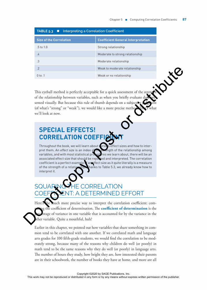
Using-Your-Thumb (or Eyeball) Method
Perhaps the easiest (but not the most informative) way to interpret the value of a correlation coefficient is by eyeballing it and using the information in Table 5.3. This is based on customary interpretations of the size of a correlation in the behav-ioral sciences.
So, if the correlation between two variables is .3, you could safely conclude that the relationship is a moderate one—not strong but certainly not weak enough to say that the variables in question don’t share anything in common.
Copyright ©2020 by SAGE Publications, Inc. This work may not be reproduced or distributed in any form or by any means without express written permission of the publisher.
Do not
copy
, pos
t, or d
istrib
ute
Chapter 5 ■ Computing Correlation Coefficients 87
This eyeball method is perfectly acceptable for a quick assessment of the strength of the relationship between variables, such as when you briefly evaluate data pre-sented visually. But because this rule of thumb depends on a subjective judgment (of what’s “strong” or “weak”), we would like a more precise method. That’s what we’ll look at now.
SPECIAL EFFECTS! CORRELATION COEFFICIENTThroughout the book, we will learn about various effect sizes and how to inter-pret them. An effect size is an index of the strength of the relationship among variables, and with most statistical procedures we learn about, there will be an associated effect size that should be reported and interpreted. The correlation coefficient is a perfect example of an effect size as it quite literally is a measure of the strength of a relationship. Thanks to Table 5.3, we already know how to interpret it.
SQUARING THE CORRELATION COEFFICIENT: A DETERMINED EFFORTHere’s the much more precise way to interpret the correlation coefficient: com-puting the coefficient of determination. The coefficient of determination is the percentage of variance in one variable that is accounted for by the variance in the other variable. Quite a mouthful, huh?
Earlier in this chapter, we pointed out how variables that share something in com-mon tend to be correlated with one another. If we correlated math and language arts grades for 100 fifth-grade students, we would find the correlation to be mod-erately strong, because many of the reasons why children do well (or poorly) in math tend to be the same reasons why they do well (or poorly) in language arts. The number of hours they study, how bright they are, how interested their parents are in their schoolwork, the number of books they have at home, and more are all
TABLE 5.3 Interpreting a Correlation Coefficient
Size of the Correlation Coefficient General Interpretation
.5 to 1.0 Strong relationship
.4 Moderate to strong relationship
.3 Moderate relationship
.2 Weak to moderate relationship
0 to .1 Weak or no relationship
Copyright ©2020 by SAGE Publications, Inc. This work may not be reproduced or distributed in any form or by any means without express written permission of the publisher.
Do not
copy
, pos
t, or d
istrib
ute

88 Part II ■ Σigma Freud and Descriptive Statistics
related to both math and language arts performance and account for differences between children (and that’s where the variability comes in).
The more these two variables share in common, the more they will be related. These two variables share variability—or the reason why children differ from one another. And on the whole, the brighter child who studies more will do better.
To determine exactly how much of the variance in one variable can be accounted for by the variance in another variable, the coefficient of determination is com-puted by squaring the correlation coefficient.
For example, if the correlation between GPA and number of hours of study time is .70 (or rGPA.time = .70), then the coefficient of determination, represented by rGPA.time
2 , is .702, or .49. This means that 49% of the variance in GPA “can be explained by” or “is shared by” the variance in studying time. And the stronger the correlation, the more variance can be explained (which only makes good sense). The more two variables share in common (such as good study habits, knowledge of what’s expected in class, and lack of fatigue), the more information about performance on one score can be explained by the other score.
However, if 49% of the variance can be explained, this means that 51% cannot—so even for a very strong correlation of .70, many of the reasons why scores on these variables tend to be different from one another go unexplained. This amount of unexplained variance is called the coefficient of alienation (also called the coef-ficient of nondetermination). Don’t worry. No aliens here. This isn’t X-Files or Walking Dead stuff—it’s just the amount of variance in Y not explained by X (and, of course, vice versa since the relationship goes both ways).
How about a visual presentation of this sharing variance idea? Okay. In Figure 5.5, you’ll find a correlation coefficient, the corresponding coefficient of determination, and a diagram that represents how much variance is shared between the two vari-ables. The larger the shaded area in each diagram (and the more variance the two variables share), the more highly the variables are correlated.
• The first diagram in Figure 5.5 shows two circles that do not touch. They don’t touch because they do not share anything in common. The correlation is zero.
• The second diagram shows two circles that overlap. With a correlation of .5 (and rxy
2 .25= ), they share about 25% of the variance between them.
• Finally, the third diagram shows two circles placed almost on top of each other. With an almost perfect correlation of rxy = .90 (rxy
2 .81= ), they share about 81% of the variance between them.
Copyright ©2020 by SAGE Publications, Inc. This work may not be reproduced or distributed in any form or by any means without express written permission of the publisher.
Do not
copy
, pos
t, or d
istrib
ute

Chapter 5 ■ Computing Correlation Coefficients 89
FIGURE 5.5 How variables share variance and the resulting correlation
Variable X Variable Y
0% shared
25% shared
81% shared
Correlation
rxy = .5
rxy = .9
rxy = 0
Coefficient ofDetermination
r 2 = 0
r 2 = .25 or 25%
r 2 = .81 or 81%xy
xy
xy
As More Ice Cream Is Eaten . . . the Crime Rate Goes Up (or Association vs. Causality)
Now here’s the really important thing to be careful about when computing, read-ing about, or interpreting correlation coefficients.
Imagine this. In a small midwestern town, a phenomenon occurred that defied any logic. The local police chief observed that as ice cream consumption increased, crime rates tended to increase as well. Quite simply, if you measured both, you would find the relationship was direct, meaning that as people eat more ice cream, the crime rate increases. And as you might expect, as they eat less ice cream, the crime rate goes down. The police chief was baffled until he recalled the Stats 1 class he took in college and still fondly remembered. (He probably also pulled out his copy of this book that he still owned. In fact, it was likely one of three copies he had purchased to make sure he always had one handy.)
He wondered how this could be turned into an aha! “Very easily,” he thought. The two variables must share something or have something in common with one another. Remember that it must be something that relates to both level of ice cream consumption and level of crime rate. Can you guess what that is?
The outside temperature is what they both have in common. When it gets warm outside, such as in the summertime, more crimes are committed (it stays light longer, people leave the windows open, bad guys and girls are out more, etc.). And because it is warmer, people enjoy the ancient treat and art of eating ice cream. Conversely, during the long and dark winter months, less ice cream is consumed and fewer crimes are committed as well.
Copyright ©2020 by SAGE Publications, Inc. This work may not be reproduced or distributed in any form or by any means without express written permission of the publisher.
Do not
copy
, pos
t, or d
istrib
ute

90 Part II ■ Σigma Freud and Descriptive Statistics
Joe, though, recently elected as a city commissioner, learns about these findings and has a great idea, or at least one that he thinks his constituents will love. (Keep in mind, he skipped the statistics offering in college.) Why not just limit the con-sumption of ice cream in the summer months to reduce the crime rate? Sounds good, right? Well, on closer inspection, it really makes no sense at all.
That’s because of the simple principle that correlations express the association that exists between two or more variables; they have nothing to do with causality. In other words, just because level of ice cream consumption and crime rate increase together (and decrease together as well) does not mean that a change in one results in a change in the other.
For example, if we took all the ice cream out of all the stores in town and no more was available, do you think the crime rate would decrease? Of course not, and it’s preposterous to think so. But strangely enough, that’s often how associations are interpreted—as being causal in nature—and complex issues in the social and behavioral sciences are reduced to trivialities because of this misunderstanding. Did long hair and hippiedom have anything to do with the Vietnam conflict? Of course not. Does the rise in the number of crimes committed have anything to do with more efficient and safer cars? Of course not. But they all happen at the same time, creating the illusion of being associated.
PEOPLE WHO LOVED STATISTICS
Katharine Coman (1857–1915) was such a kind and caring researcher that a famous book of poetry and prose was written about her after her death from cancer at the age of 57. Her love for statistics was demonstrated in her belief that the study of economics could solve social problems and urged her college, Wellesley, to let her teach economics and statistics. She may have been the first woman statis-tics professor. Coman was a prominent social activist in her life and in her writings, and she frequently cited industrial and economic sta-tistics to support her positions, especially as they related to the labor movement and the role of African American workers. The artis-tic biography written about Professor Coman was Yellow Clover (1922), a tribute to her by her longtime companion (and coauthor of the song “America the Beautiful”), Katherine Lee Bates.
Copyright ©2020 by SAGE Publications, Inc. This work may not be reproduced or distributed in any form or by any means without express written permission of the publisher.
Do not
copy
, pos
t, or d
istrib
ute

Chapter 5 ■ Computing Correlation Coefficients 91
Using SPSS to Compute a Correlation Coefficient
Let’s use SPSS to compute a correlation coefficient. The data set we are using is an SPSS data file named Chapter 5 Data Set 1.
There are two variables in this data set:
Variable Definition
Income Annual income in dollars
Education Level of education measured in years
To compute the Pearson correlation coefficient, follow these steps:
1. Open the file named Chapter 5 Data Set 1.
2. Click Analyze → Correlate → Bivariate, and you will see the Bivariate Correlations dialog box, as shown in Figure 5.6.
3. Double-click on the variable named Income to move it to the Variables: box.
4. Double-click on the variable named Education to move it to the Variables: box. You can also hold down the Ctrl key to select more than one variable at a time and then use the “move” arrow in the center of the dialog box to move them both.
5. Click OK.
FIGURE 5.6 The Bivariate Correlations dialog box
Copyright ©2020 by SAGE Publications, Inc. This work may not be reproduced or distributed in any form or by any means without express written permission of the publisher.
Do not
copy
, pos
t, or d
istrib
ute

92 Part II ■ Σigma Freud and Descriptive Statistics
Understanding the SPSS Output
The output in Figure 5.7 shows the correlation coefficient to be equal to .574. Also shown are the sample size, 20, and a measure of the statistical significance of the correlation coefficient (we’ll cover the topic of statistical significance in Chapter 9).
FIGURE 5.7 SPSS output for the computation of the correlation coefficient
The SPSS output shows that the two variables are related to one another and that as level of income increases, so does level of education. Similarly, as level of income decreases, so does level of education. The fact that the correlation is significant means that this relationship is not due to chance.
As for the meaningfulness of the relationship, the coefficient of determination is .5742 or .329 or .33, meaning that 33% of the variance in one variable is accounted for by the other. According to our eyeball strategy, this is a relatively weak relation-ship. Once again, remember that low levels of income do not cause low levels of education, nor does not finishing high school mean that someone is destined to a life of low income. That’s causality, not association, and correlations speak only to association.
Creating a Scatterplot (or Scattergram or Whatever)
You can draw a scatterplot by hand, but it’s good to know how to have SPSS do it for you as well. Let’s take the same data that we just used to produce the correlation matrix in Figure 5.7 and use it to create a scatterplot. Be sure that the data set named Chapter 5 Data Set 1 is on your screen.
1. Click Graphs → Chart Builder → Scatter/Dot, and you will see the Chart Builder dialog box shown in Figure 5.8.
2. Double-click on the first Scatter/Dot example.
3. Highlight and drag the variable named Income to the y-axis.
Copyright ©2020 by SAGE Publications, Inc. This work may not be reproduced or distributed in any form or by any means without express written permission of the publisher.
Do not
copy
, pos
t, or d
istrib
ute

Chapter 5 ■ Computing Correlation Coefficients 93
4. Highlight and drag the variable named Education to the x-axis.
5. Click OK, and you’ll have a very nice, simple, and easy-to-understand scatterplot like the one you see in Figure 5.9.
FIGURE 5.8 The Chart Builder dialog box
FIGURE 5.9 A simple scatterplot
Copyright ©2020 by SAGE Publications, Inc. This work may not be reproduced or distributed in any form or by any means without express written permission of the publisher.
Do not
copy
, pos
t, or d
istrib
ute
94 Part II ■ Σigma Freud and Descriptive Statistics
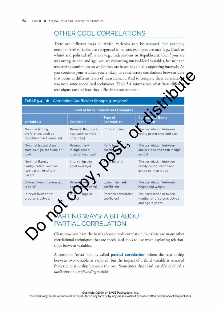
OTHER COOL CORRELATIONSThere are different ways in which variables can be assessed. For example, nominal-level variables are categorical in nature; examples are race (e.g., black or white) and political affiliation (e.g., Independent or Republican). Or, if you are measuring income and age, you are measuring interval-level variables, because the underlying continuum on which they are based has equally appearing intervals. As you continue your studies, you’re likely to come across correlations between data that occur at different levels of measurement. And to compute these correlations, you need some specialized techniques. Table 5.4 summarizes what these different techniques are and how they differ from one another.
TABLE 5.4 Correlation Coefficient Shopping, Anyone?
Level of Measurement and Examples
Variable X Variable YType of Correlation
Correlation Being Computed
Nominal (voting preference, such as Republican or Democrat)
Nominal (biological sex, such as male or female)
Phi coefficient The correlation between voting preference and sex
Nominal (social class, such as high, medium, or low)
Ordinal (rank in high school graduating class)
Rank biserial coefficient
The correlation between social class and rank in high school
Nominal (family configuration, such as two-parent or single-parent)
Interval (grade point average)
Point biserial The correlation between family configuration and grade point average
Ordinal (height converted to rank)
Ordinal (weight converted to rank)
Spearman rank coefficient
The correlation between height and weight
Interval (number of problems solved)
Interval (age in years)
Pearson correlation coefficient
The correlation between number of problems solved and age in years
PARTING WAYS: A BIT ABOUT PARTIAL CORRELATIONOkay, now you have the basics about simple correlation, but there are many other correlational techniques that are specialized tools to use when exploring relation-ships between variables.
A common “extra” tool is called partial correlation, where the relationship between two variables is explored, but the impact of a third variable is removed from the relationship between the two. Sometimes that third variable is called a mediating or a confounding variable.
Copyright ©2020 by SAGE Publications, Inc. This work may not be reproduced or distributed in any form or by any means without express written permission of the publisher.
Do not
copy
, pos
t, or d
istrib
ute

Chapter 5 ■ Computing Correlation Coefficients 95
For example, let’s say that we are exploring the relationship between level of depres-sion and incidence of chronic disease and we find that, on the whole, the relationship is positive. In other words, the more chronic disease is evident, the higher the like-lihood that depression is present as well (and of course vice versa). Now remember, the relationship might not be causal, one variable might not “cause” the other, and the presence of one does not mean that the other will be present as well. The posi-tive correlation is just an assessment of an association between these two variables, the key idea being that they share some variance in common.
And that’s exactly the point—it’s the other variables they share in common that we want to control and, in some cases, remove from the relationship so we can focus on the key relationship we are interested in.
For example, how about level of family support? Nutritional habits? Severity or length of illness? These and many more variables can all explain the relationship between these two variables, or they may at least account for some of the variance.
And think back a bit. That’s exactly the same argument we made when focusing on the relationship between the consumption of ice cream and the level of crime. Once outside temperature (the mediating or confounding variable) is removed from the equation . . . boom! The relationship between the consumption of ice cream and the crime level plummets. Let’s take a look.
Here are some data on the consumption of ice cream and the crime rate for 10 cities.
Consumption of Ice Cream Crime Rate
Consumption of ice cream
1.00 .743
Crime rate 1.00
So, the correlation between these two variables, consumption of ice cream and crime rate, is .743. This is a pretty healthy relationship, accounting for about 50% of the variance between the two variables (.7432 = .55 or 55%).
Now, we’ll add a third variable, average outside temperature. Here are the Pearson correlation coefficients for the set of three variables.
Consumption of Ice Cream Crime Rate
Average Outside Temperature
Consumption of ice cream
1.00 .743 .704
Crime rate 1.00 .655
Average outside temperature
1.00
Copyright ©2020 by SAGE Publications, Inc. This work may not be reproduced or distributed in any form or by any means without express written permission of the publisher.
Do not
copy
, pos
t, or d
istrib
ute

96 Part II ■ Σigma Freud and Descriptive Statistics
As you can see by these values, there’s a fairly strong relationship between ice cream consumption and outside temperature and between crime rate and outside tem-perature. We’re interested in the question, “What’s the correlation between ice cream consumption and crime rate with the effects of outside temperature removed or partialed out?”
That’s what partial correlation does. It looks at the relationship between two vari-ables (in this case, consumption of ice cream and crime rate) as it removes the influence of a third (in this case, outside temperature).
A third variable that explains the relationship between two variables can be a mediating variable or a confounding variable. Those are different types of variables with different definitions, though, and are easy to confuse. In our example with correlations, a confounding variable is something like tempera-ture that affects both our variables of interest and explains the correlation between them. A mediating variable is a variable that comes between our two variables of interest and explains the apparent relationship. For example, if A is correlated with B and B is correlated with C, A and C would seem to be related but only because they are both related to B. B is a mediating variable. Perhaps A affects B and B affects C, so A and C are correlated.
Using SPSS to Compute Partial Correlations
Let’s use some data and SPSS to illustrate the computation of a partial correlation. Here are the raw data.
CityIce Cream
Consumption Crime RateAverage Outside
Temperature
1 3.4 62 88
2 5.4 98 89
3 6.7 76 65
4 2.3 45 44
5 5.3 94 89
6 4.4 88 62
7 5.1 90 91
8 2.1 68 33
9 3.2 76 46
10 2.2 35 41
1. Enter the data we are using into SPSS.
2. Click Analyze → Correlate → Partial and you will see the Partial Correlations dialog box, as shown in Figure 5.10.
Copyright ©2020 by SAGE Publications, Inc. This work may not be reproduced or distributed in any form or by any means without express written permission of the publisher.
Do not
copy
, pos
t, or d
istrib
ute

Chapter 5 ■ Computing Correlation Coefficients 97
3. Move Ice_Cream and Crime_Rate to the Variables: box by dragging them or double-clicking on each one.
4. Move the variable named Outside_Temp to the Controlling for: box.
5. Click OK and you will see the SPSS output as shown in Figure 5.11.
FIGURE 5.10 The Partial Correlations dialog box
FIGURE 5.11 The completed partial correlation analysis
Understanding the SPSS Output
As you can see in Figure 5.11, the correlation between ice cream consumption (Ice_Cream) and crime rate (Crime_Rate) with the influence or moderation of outside temperature (Outside_Temp) removed is .525. This is less than the simple Pearson correlation between ice cream consumption and crime rate (which is .743), which does not consider the influence of outside temperature. What seemed to explain 55% of the variance (and was what we call “significant at the .05 level”), with the removal of Outside_Temp as a moderating variable, now explains .5252 = 0.28 = 28% of the variance (and the relationship is no longer significant).
Copyright ©2020 by SAGE Publications, Inc. This work may not be reproduced or distributed in any form or by any means without express written permission of the publisher.
Do not
copy
, pos
t, or d
istrib
ute

98 Part II ■ Σigma Freud and Descriptive Statistics
Our conclusion? Outside temperature accounted for enough of the shared variance between the consumption of ice cream and the crime rate for us to conclude that the two-variable relationship was significant. But, with the removal of the moder-ating or confounding variable outside temperature, the relationship was no longer significant. And we don’t need to stop selling ice cream to try to reduce crime.
REAL-WORLD STATS
This is a fun one and consistent with the increasing interest in using statistics in various sports in various ways, a discipline informally named sabermetrics. The term was coined by Bill James (and his approach is represented in the movie and book Moneyball).
Stephen Hall and his colleagues examined the link between teams’ payrolls and the compet-itiveness of those teams (for both professional baseball and soccer), and he was one of the first to look at this from an empirical perspective. In other words, until these data were published, most people made decisions based on anec-dotal evidence rather than quantitative assess-ments. Hall looked at data on team payrolls in American Major League Baseball and English soccer between 1980 and 2000, and he used a model that allows for the establishment of cau-sality (and not just association) by looking at the time sequence of events to examine the link.
In baseball, payroll and performance both increased significantly in the 1990s, but there was no evidence that causality runs in the direction from payroll to performance. In com-parison, for English soccer, the researchers did show that higher payrolls actually were at least one cause of better performance. Pretty cool, isn’t it, how association can be explored to make real-world decisions?
Want to know more? Go online or to the library and find . . .
Hall, S., Szymanski, S., & Zimbalist, A. S. (2002). Testing causality between team performance and payroll: The cases of Major League Baseball and English soccer. Journal of Sports Economics, 3, 149–168.
Summary
The idea of showing how things are related to one another and what they have in common is a very powerful one, and the correlation coefficient is a very useful descriptive statistic (one used in infer-ence as well, as we will show you later). Keep in mind that correlations express a relationship that is associative but not necessarily causal, and you’ll be able to understand how this statistic gives us valuable information about relationships between variables and how variables change or remain the same in concert with others. Now it’s time to change speeds just a bit and wrap up Part II with a focus on reliability and validity. You need to know about these ideas because you’ll be learning how to determine what differences in outcomes, such as scores and other variables, represent.
Copyright ©2020 by SAGE Publications, Inc. This work may not be reproduced or distributed in any form or by any means without express written permission of the publisher.
Do not
copy
, pos
t, or d
istrib
ute

Chapter 5 ■ Computing Correlation Coefficients 99
Time to Practice
1. Use these data to answer Questions 1a and 1b. These data are saved as Chapter 5 Data Set 2.
a. Compute the Pearson product-moment correlation coefficient by hand and show all your work.
b. Construct a scatterplot for these 10 pairs of values by hand. Based on the scatterplot, would you predict the correlation to be direct or indirect? Why?
Number Correct (out of a possible 20)
Attitude (out of a possible 100)
17 94
13 73
12 59
15 80
16 93
14 85
16 66
16 79
18 77
19 91
2. Use these data to answer Questions 2a and 2b. These data are saved as Chapter 5 Data Set 3.
Speed (to complete a 50-yard swim)
Strength (number of pounds bench-
pressed)
21.6 135
23.4 213
26.5 243
25.5 167
20.8 120
19.5 134
20.9 209
18.7 176
29.8 156
28.7 177
a. Using either a calculator or a computer, compute the Pearson correlation coefficient.
b. Interpret these data using the general range of very weak to very strong. Also compute the coefficient of determination. How does the subjective analysis compare with the value of r2?
(Continued)
Copyright ©2020 by SAGE Publications, Inc. This work may not be reproduced or distributed in any form or by any means without express written permission of the publisher.
Do not
copy
, pos
t, or d
istrib
ute

100 Part II ■ Σigma Freud and Descriptive Statistics
3. Rank the following correlation coefficients on strength of their relationship (list the weakest first).
.71
+.36
−.45
.47
−.62
4. For the following set of scores, calculate the Pearson correlation coefficient and interpret the outcome. These data are saved as Chapter 5 Data Set 4.
Achievement Increase Over 12 Months
Classroom Budget Increase Over 12
Months
0.07 0.11
0.03 0.14
0.05 0.13
0.07 0.26
0.02 0.08
0.01 0.03
0.05 0.06
0.04 0.12
0.04 0.11
5. For the following set of data, by hand, correlate minutes of exercise with grade point average (GPA). What do you conclude given your analysis? These data are saved as Chapter 5 Data Set 5.
Exercise GPA
25 3.6
30 4.0
20 3.8
60 3.0
45 3.7
90 3.9
60 3.5
0 2.8
15 3.0
10 2.5
(Continued)
Copyright ©2020 by SAGE Publications, Inc. This work may not be reproduced or distributed in any form or by any means without express written permission of the publisher.
Do not
copy
, pos
t, or d
istrib
ute
Chapter 5 ■ Computing Correlation Coefficients 101
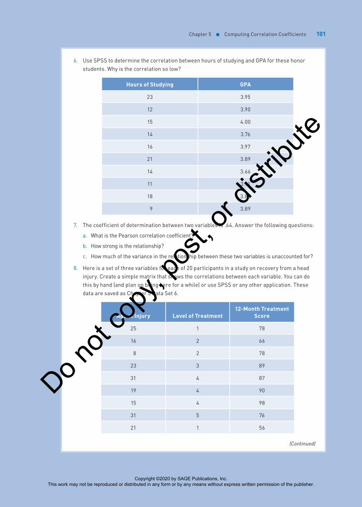
6. Use SPSS to determine the correlation between hours of studying and GPA for these honor students. Why is the correlation so low?
Hours of Studying GPA
23 3.95
12 3.90
15 4.00
14 3.76
16 3.97
21 3.89
14 3.66
11 3.91
18 3.80
9 3.89
7. The coefficient of determination between two variables is .64. Answer the following questions:
a. What is the Pearson correlation coefficient?
b. How strong is the relationship?
c. How much of the variance in the relationship between these two variables is unaccounted for?
8. Here is a set of three variables for each of 20 participants in a study on recovery from a head injury. Create a simple matrix that shows the correlations between each variable. You can do this by hand (and plan on being here for a while) or use SPSS or any other application. These data are saved as Chapter 5 Data Set 6.
Age at Injury Level of Treatment12-Month Treatment
Score
25 1 78
16 2 66
8 2 78
23 3 89
31 4 87
19 4 90
15 4 98
31 5 76
21 1 56
(Continued)
Copyright ©2020 by SAGE Publications, Inc. This work may not be reproduced or distributed in any form or by any means without express written permission of the publisher.
Do not
copy
, pos
t, or d
istrib
ute

102 Part II ■ Σigma Freud and Descriptive Statistics
Age at Injury Level of Treatment12-Month Treatment
Score
26 1 72
24 5 84
25 5 87
36 4 69
45 4 87
16 4 88
23 1 92
31 2 97
53 2 69
11 3 79
33 2 69
9. Look at Table 5.4. What type of correlation coefficient would you use to examine the relationship between biological sex (defined in this study as having only two categories: male or female) and political affiliation? How about family configuration (two-parent or single-parent) and high school GPA? Explain why you selected the answers you did.
10. When two variables are correlated (such as strength and running speed), they are associated with one another. Explain how, even if there is a correlation between the two, one might not cause the other.
11. Provide three examples of an association between two variables where a causal relationship makes perfect sense conceptually.
12. Why can’t correlations be used as a tool to prove a causal relationship between variables rather than just an association?
13. When would you use partial correlation?
Student Study Site
Get the tools you need to sharpen your study skills! Visit edge.sagepub.com/salkindfrey7e to access practice quizzes, eFlashcards, original and curated videos, data sets, and more!
(Continued)
Copyright ©2020 by SAGE Publications, Inc. This work may not be reproduced or distributed in any form or by any means without express written permission of the publisher.
Do not
copy
, pos
t, or d
istrib
ute