cop-21 hyperwall science stories
TRANSCRIPT

PARIS52 1Hyperwall Science Stories

Hyperwall Stories are Available for Download at:
svs.gsfc.nasa.gov/hw
Cover Image:
Europe at night; Visible Infrared Imaging Radiometer Suite, Suomi National Polar-orbiting Partnership satellite
Table of Contents
Observing Earth from Space ...................................................................... 3
Changes at Earth’s Poles ............................................................................ 12
Earth’s Ocean and Water Resources ........................................................... 16
Atmospheric Composition and Aerosols...................................................... 31
Forests and Biodiversity ............................................................................. 37
Human Footprints ...................................................................................... 42

3
Observing Earth from Space
Current Earth Science Satellite Missions
In order to study the Earth as a whole system and understand how it is changing, NASA develops and supports a large number of Earth observing missions. These missions provide Earth science researchers the necessary data to address key questions about global climate change.
Missions begin with a study phase during which the key science objectives of the mission are identified, and designs for spacecraft and instruments are analyzed. Following a successful study phase, missions enter a development phase whereby all aspects of the mission are developed and tested to insure it meets the mission objectives. Operating missions are those missions that are currently active and providing science data to researchers. Operating missions may be in their primary operational phase or in an extended operational phase. This graphic shows NASA’s current fleet of Earth-observing satellite missions.
svs.gsfc.nasa.gov/goto?30065
International Satellites Under One Umbrella
As the old adage goes: “when it rains, it pours.” Unfortunately, scientists can’t rely on a single satellite to provide global precipitation data. That’s why NASA has teamed with the Japan Aerospace Exploration Agency and other international agencies to support the Global Precipitation Measurement (GPM) mission. GPM is an international satellite constellation with contributions from several international and domestic partners. Each satellite has its own purpose and mission, but the instruments aboard each satellite provide coverage of precipitation across the globe. The GPM Core Observatory satellite is equipped with two very important instruments that will provide three-dimensional images of rainfall and also extend our ability to measure light rain and snowfall. Ultimately, the GPM Core Observatory will unify measurements being taken by other instruments aboard other satellites and combine them into one global precipitation product.
svs.gsfc.nasa.gov/goto?3891
Future Earth Science Instruments on the International Space Station
The space station offers a unique vantage for observing the Earth’s ecosystems with hands-on and automated equipment. These options enable astronauts to observe and explain what they witness in real time. Station crews can observe and collect camera images of events as they unfold and may also provide input to ground personnel programming the station’s automated Earth-sensing systems. This flexibility is an advantage over sensors on unmanned spacecraft, especially when unexpected natural events, such as volcanic eruptions and earthquakes, occur.
A wide variety of Earth-observation payloads can be attached to the exposed facilities on the station’s exterior; already, several instruments have been proposed by researchers from the partner countries. The station contributes to humanity by collecting data on the global climate, environmental change and natural hazards using its unique complement of crew-operated and automated Earth-observation payloads.
www.nasa.gov/mission_pages/station/research

4
Observing Earth from Space
Future Earth Science Satellite Missions
To study the Earth as a whole system and understand how it is changing, NASA develops and supports a large number of Earth-observing missions. These missions provide Earth science researchers the necessary data to address key questions about global climate change.
This graphic shows NASA’s Earth-observing missions planned to launch in the future. Missions begin with a study phase during which the key science objectives of the mission are identified, and designs for spacecraft and instruments are analyzed. Following a successful study phase, missions enter a development phase whereby all aspects of the mission are developed and tested to insure it meets the mission objectives.
svs.gsfc.nasa.gov/goto?30065
Long-Term Global Warming Trend
The world is getting warmer. This map shows global, annual temperature anomalies from 1880 to 2014 based on analysis conducted by NASA’s Goddard Institute for Space Studies (GISS). Red and blue shades show how much warmer or cooler a given area was compared to an averaged base period from 1951 to 1980. The graph shows yearly, global GISS temperature anomaly data from 1880 to 2014. Though there are minor variations from year to year, the general trend shows rapid warming in the past few decades, with the last decade being the warmest. To conduct its analysis, GISS uses publicly available data from approximately 6300 meteorological stations around the world; ship-based and satellite observations of sea surface temperature; and Antarctic research station measurements. These three datasets are loaded into a computer analysis program that calculates trends in temperature anomalies relative to the annual average temperature from 1951 to 1980. Generally, warming is greater over land than over the oceans because water is slower to absorb and release heat. Warming may also differ substantially within specific landmasses and ocean basins.
svs.gsfc.nasa.gov/goto?30477
Hurricane Katrina Hot Towers
The Tropical Rainfall Measuring Mission (TRMM) spacecraft allowed us to look under Hurricane Katrina’s clouds to see the rain structure on August 28, 2005. Just before Katrina strengthened into a Category 5 hurricane, TRMM observed tall cumulonimbus clouds, seen as red spikes, emerging from the storm’s eyewall and rain bands. The spikes, named hot towers, are associated with tropical cyclone intensification because they emit tremendous amounts of heat that fuels the storm. The eyewall hot tower was approximately 10 miles (16 kilometers) tall.
Before TRMM, no dataset existed that could show globally and definitively the presence of these hot towers in cyclone systems. Now, scientists are combining observations from TRMM with supercomputing modeling power to shed light on the internal workings of hurricanes and how they intensify.
svs.gsfc.nasa.gov/goto?3253

5
Observing Earth from Space
The Rainmaker
Each year hurricanes cause billions of dollars in damage across the United States. In August of 2011, Hurricane Irene roared up the densely populated East Coast dumping large amounts of rain on major cities. Floodwaters inundated roadways, communities, beaches, homes, and more from North Carolina to New England until the storm finally fizzled out over the Northern Atlantic. This visualization shows the spiraling storm as it trekked up the U.S. East Coast. Rainfall amounts were measured by the Microwave Imager onboard the Tropical Rainfall Measuring Mission (TRMM) satellite from August 17-29, 2011.
svs.gsfc.nasa.gov/goto?3852
Blackout in New Jersey and New York
In the days following landfall of Hurricane Sandy, millions remained without power. This pair of images shows the difference in city lighting across New Jersey and New York before (August 31, 2012), when conditions were normal, and after (November 1, 2012) the storm. Both images were captured by the Visible Infrared Imaging Radiometer Suite (VIIRS) “day-night band” onboard the Suomi National Polar-orbiting Partnership satellite, which detects light in a range of wavelengths and uses filtering techniques to observe signals such as gas flares, city lights, and reflected moonlight. In Manhattan, the lower third of the island is dark on November 1, while Rockaway Beach, much of Long Island, and nearly all of central New Jersey are significantly dimmer. The barrier islands along the New Jersey coast, which are heavily developed with tourist businesses and year-round residents, are just barely visible in moonlight after the blackout.
svs.gsfc.nasa.gov/cgi-bin/details.cgi?aid=30220
A Changed Coastline in New Jersey
On October 29, 2012, Superstorm Sandy changed the lives of many living along the U.S. East Coast—especially along the shorelines of New Jersey, New York, and Connecticut. At landfall, heavy rains pelted states as far inland as Wisconsin and surging seawater washed away beaches and flooded streets, businesses, and homes.
These two images show a portion of the New Jersey coastal town of Mantoloking, just north of where the storm made landfall, before (March 18, 2007) and after (October 31, 2012) the storm. On the barrier island, entire blocks of houses along Route 35 (also called Ocean Boulevard) were damaged or completely washed away by the storm surge and wind. Fires raged in the town from natural gas lines that had ruptured and ignited. A new inlet was cut across the island, connected the Atlantic Ocean and the Jones Tide Pond.
svs.gsfc.nasa.gov/cgi-bin/details.cgi?aid=30178

6
Observing Earth from Space
NASA’s Current Earth-Observing Fleet
Like orbiting sentinels, NASA’s Earth-observing satellites vigilantly monitor our planet’s ever-changing pulse from their unique vantage points in orbit. This animation shows the orbits of all of the current satellite missions. The flight paths are based on actual orbital elements. These missions—many joint with other nations and/or agencies—are able to collect global measurements of rainfall, solar irradiance, clouds, sea surface height, ocean salinity, and other aspects of the environment. Together, these measurements help scientists better diagnose the “health” of the Earth system.
svs.gsfc.nasa.gov/cgi-bin/details.cgi?aid=30496
Earth from Orbit 2014
NASA satellites provide useful data about our home planet each day. They also provide beautiful images! This video includes satellite images of Earth in 2014 from NASA and its partners as well as astronaut photography, a time-lapse video from the International Space Station, among other interesting visuals.
Satellite images range from the San Quintín Glacier—the largest outflow glacier of the Northern Patagonian Ice Field in southern Chile—to Scorpion Reef—a reef surrounding a small group of islands in the Gulf of Mexico off the northern coast of the state of Yucatan, Mexico. While watching, you’ll also witness how different parts of our world are changing over time, including the Aral Sea, Mount Shasta in California, the Aleutian Island in Alaska, Bermuda, and the Amazon River, and Nepal. The video also includes images of natural hazards (Sangeang Api volcano in Indonesia and Super Typhoon Vongfong), a flight across the Earth at night, and intriguing model results.
svs.gsfc.nasa.gov/cgi-bin/details.cgi?aid=11858
Five-Year Global Temperature Anomalies from 1880 to 2014
The year 2014 ranks as Earth’s warmest since 1880—continuing the planet’s long-term warming trend—according to an analysis of surface temperature measurements by scientists at NASA’s Goddard Institute of Space Studies (GISS) in New York. The 10 warmest years in the instrumental record, with the exception of 1998, have now occurred since 2000.
This color-coded map in Robinson projection displays a progression of five-year global surface temperature anomalies from 1880 through 2014. Higher than normal temperatures are shown in red and lower then normal temperatures are shown in blue. Since 1880, the average surface temperature of Earth has warmed by about 1.4 degrees Fahrenheit (0.8 degrees Celsius), a trend that is largely driven by the increase in carbon dioxide and other human emissions into the planet’s atmosphere. The majority of that warming has occurred in the past three decades.
svs.gsfc.nasa.gov/goto?4252
7
Observing Earth from Space
From Observations to Models
NASA’s Global Modeling and Assimilation Office (GMAO) uses the Goddard Earth Observing System Model, Version 5 Data Assimilation System (GEOS-5 DAS) to produce global numerical weather forecasts four times a day.
For each forecast, it is necessary to combine the latest observations from satellites, aircraft, and ground stations with a short-term, 6-hour forecast—a process known as data assimilation. The GEOS- 5 DAS assimilates more than 5 million observations during each 6-hour assimilation period.
These observations are assembled from a number of sources from around the globe, including NASA, NOAA, EUMETSAT, commercial airlines, the U.S. Department of Defense, and many others. This visualization shows how different observation types have different strategies. One of the main challenges of data assimilation is to understand how all these observations are alike, how they differ, and how they interact with each other.
svs.gsfc.nasa.gov/cgi-bin/details.cgi?aid=30590
How Global Warming Stacks Up
Skeptics of manmade climate change offer various natural causes to explain why the Earth has warmed 1.4 degrees Fahrenheit since 1880. But can these account for the planet’s rising temperature? Watch to see how much different factors, both natural and industrial, contribute to global warming, based on findings from NASA’s Goddard Institute for Space Studies.
svs.gsfc.nasa.gov/cgi-bin/details.cgi?aid=30615
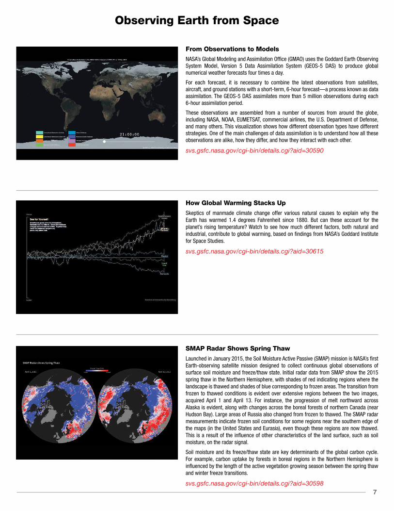
SMAP Radar Shows Spring Thaw
Launched in January 2015, the Soil Moisture Active Passive (SMAP) mission is NASA’s first Earth-observing satellite mission designed to collect continuous global observations of surface soil moisture and freeze/thaw state. Initial radar data from SMAP show the 2015 spring thaw in the Northern Hemisphere, with shades of red indicating regions where the landscape is thawed and shades of blue corresponding to frozen areas. The transition from frozen to thawed conditions is evident over extensive regions between the two images, acquired April 1 and April 13. For instance, the progression of melt northward across Alaska is evident, along with changes across the boreal forests of northern Canada (near Hudson Bay). Large areas of Russia also changed from frozen to thawed. The SMAP radar measurements indicate frozen soil conditions for some regions near the southern edge of the maps (in the United States and Eurasia), even though these regions are now thawed. This is a result of the influence of other characteristics of the land surface, such as soil moisture, on the radar signal.
Soil moisture and its freeze/thaw state are key determinants of the global carbon cycle. For example, carbon uptake by forests in boreal regions in the Northern Hemisphere is influenced by the length of the active vegetation growing season between the spring thaw and winter freeze transitions.
svs.gsfc.nasa.gov/cgi-bin/details.cgi?aid=30598

8
Observing Earth from Space
Painting the World with Water
The Global Precipitation Measurement (GPM) mission—a network of international satellites including the GPM Core Observatory—provides unprecedented observations of Earth’s precipitation. This visualization shows the GPM constellation in action, revealing precipitation measurements underneath each satellite orbit. As time progresses and the precipitation measurements begin to cover the Earth’s surface, global precipitation patterns become clear. For example, constant rainfall is visible along the Equator and scattered storms continuously pop up across the mid-latitudes. The dynamic nature of precipitation is revealed as time speeds up and the satellite data swaths merge into a continuous animation of changing rain and snowfall. Finally, the video fades into an animation created using the Integrated Multi-satellite Retrievals for GPM (IMERG) product, the newly available dataset of global precipitation every 30 minutes that is derived from GPM constellation data.
svs.gsfc.nasa.gov/cgi-bin/details.cgi?aid=4283
Near-Real-Time Global Precipitation
In February 2015, NASA released the agency’s most comprehensive global rain and snowfall product to date from the Global Precipitation Measurement (GPM) mission. The product, called the Integrated Multi-satellite Retrievals for GPM (IMERG), is derived using data from the GPM constellation of satellites—a network of international satellites including the GPM Core Observatory. The global IMERG precipitation dataset provides rainfall rates for the entire world every 30 minutes.
Although the process to create the combined dataset is intensive, the GPM team creates a preliminary, near-real-time dataset of precipitation within about a day of data acquisition. This visualization shows the most currently available precipitation data from IMERG—combining measurements from the GPM Core Observatory, GCOM-W1, NOAA-18, NOAA-19, DMSP F-16, DMSP F-17, DMSP F-18, Metop-A, and Metop-B. This dataset allows scientists to see how rain and snowstorms move around the planet. As scientists work to understand all the elements of Earth’s climate and weather systems, and how they could change in the future, GPM provides a major step forward in providing the scientific community comprehensive and consistent measurements of precipitation.
svs.gsfc.nasa.gov/cgi-bin/details.cgi?aid=4285
Soil Moisture Maps and Australian RainfallWater is one of the most important components of soil, but the volume of water contained within a given volume of soil—or soil moisture—can fluctuate annually, seasonally, daily, and even hourly, due to changes in water availability from precipitation, irrigation, and evaporation from the soil and plants.
Launched in January 2015, NASA’s Soil Moisture Active-Passive (SMAP) satellite measures global soil moisture from space. These images compare three-day composites of uncalibrated soil moisture data from SMAP [top row] with rain gauge precipitation data from the Australian Bureau of Meteorology [bottom row] in April 2015. In the southeastern Australian state New South Wales, the April 14-16 images [left] show little precipitation and relatively dry soil moisture conditions. Later in the month, widespread rain and flooding gave way to saturated soil on April 17-19 [middle] and April 21-23 [right] as an intense low-pressure system brought heavy rainfall to the region. The soil moisture data were acquired by SMAP’s radiometer instrument and show the volumetric water content in the top 2 inches (5 cm) of soil at ~25-mile (40-km) spatial resolution.
Data from SMAP allow scientists to better understand the processes that link the Earth’s water, energy, and carbon cycles, as well as enhance the predictive skills of weather and climate models. In addition, scientists can use these data to develop improved flood prediction and drought monitoring capabilities. Societal benefits include improved water-resource management, agricultural productivity, and wildfire and landslide predictions.svs.gsfc.nasa.gov/cgi-bin/details.cgi?aid=30599

9
Observing Earth from Space
Accumulated Precipitation from IMERG
The global Integrated Multi-satellite Retrievals for GPM (IMERG) precipitation dataset provides global rain and snowfall rates for the entire world every 30 minutes. IMERG is derived using data from the Global Precipitation Measurement (GPM) mission—a network of international satellites including the GPM Core Observatory. Using this dataset, it is possible to calculate the amount of accumulated rainfall for any region over a given period of time.
This animation shows the accumulation of rainfall across the globe for a week in August 2014. In addition to the dramatic accumulation near Japan due to Typhoon Halong and the track of Hurricane Bertha off the eastern coast of the United States, it is also possible to see a rare August storm over the North Sea near Europe, the origins of Hurricane Gonzalo on the western coast of Africa, and a deep tropical depression that produced floods across northern India. As scientists work to understand all the elements of Earth’s climate and weather systems, and how they could change in the future, GPM provides a major step forward in providing the scientific community comprehensive and consistent measurements of precipitation.
svs.gsfc.nasa.gov/cgi-bin/details.cgi?aid=4284
GPM Sees 2015 Nor’easter Dump Snow on New England
The January 2015 North American blizzard, also unofficially named Winter Storm Juno was a powerful nor’easter that affected Canada and the Central and Eastern United States, and eventually, parts of Southern Greenland and Western Europe.
At 5:06 PM EST Monday, January 26, 2015, the Global Precipitation Measurement (GPM) Core Observatory flew over the nor’easter as it began dumping snow on New England. This visualization shows liquid precipitation rainfall rates (green to red) as well as frozen precipitation, or snowfall rates (purple to blue). The center of the storm, shown in 3-D, was offshore with far-reaching bands of snowfall. More intense snowfall rates (blue), can be seen on the northern edge of the storm and also over land up the coast from New York to Maine and into Canada, as well in the upper atmosphere before turning to heavy rainfall over the ocean.
svs.gsfc.nasa.gov/goto?4266
Tropical Storm Bill Over Texas
Tropical Storm Bill made landfall over Texas at approximately 11:45 AM CST on June 16, 2015. Shortly after midnight, the Global Precipitation Measurement (GPM) Core Observatory passed over the storm as it slowly worked its way northward across the already drenched state of Texas.
This animation shows the structure of the storm as well as rain intensity measured by the Core Observatory’s GPM Microwave Imager (GMI) and Dual-frequency Precipitation Radar (DPR) at 12:11 AM CST on June 17, 2015. Shades of green represent low amounts of liquid precipitation, while shades of red represent high amounts of precipitation. Blue shades indicate frozen precipitation. As the camera moves in on the storm, DPR’s volumetric view of the storm’s precipitation structure is revealed. A slicing plane moves across the volume to display precipitation rates throughout the storm.
svs.gsfc.nasa.gov/cgi-bin/details.cgi?aid=4316

10
Observing Earth from Space
Global Rainfall-Triggered Landslides and Global Precipitation from IMERG
This visualization shows rainfall-triggered landslides and precipitation from August and September of 2014. Landslides occur when an environmental trigger like an extreme rain event, often a severe storm or hurricane, and gravity’s downward pull sets soil and rock in motion. Conditions beneath the surface are often unstable already, so the heavy rains act as the last straw that causes mud, rocks, or debris—or all combined—to move rapidly down mountains and hillsides.
Here the NASA Global Landslide Catalog (GLC) is shown with precipitation data detected b y NASA’s Integrated Multi-satellite Retrieval for the Global Precipitation Measurement Mission (IMERG). The GLC was developed with the goal of identifying rainfall-triggered landslide events around the world, regardless of size, impact, or location. The GLC considers all types of mass movements triggered by rainfall, which have been reported in the media, disaster databases, scientific reports, or other sources. The GLC has been compiled since 2007 at NASA’s Goddard Space Flight Center. This is a valuable database for characterizing global patterns of landslide occurrence and evaluating relationships with extreme precipitation at regional and global scales.
svs.gsfc.nasa.gov/cgi-bin/details.cgi?aid=4304
Ultra-High-Definitino Video form the International Space Station
A 4K Ultra-High-Definition video camera (actually 3840x1920) on the International Space Station provides a stunning view of our planet from above. This view provides an unprecedented look at what it’s like to live and work aboard the International Space Station. This important new capability will allow researchers to acquire high resolution - high frame rate video to provide new insight into the vast array of experiments taking place every day. It will also bestow the most breathtaking views of planet Earth and space station activities ever acquired for consumption by those still dreaming of making the trip to outer space.
svs.gsfc.nasa.gov/cgi-bin/details.cgi?aid=30623
EPIC View of Earth
On July 6, 2015, a NASA camera onboard the Deep Space Climate Observatory (DSCOVR) satellite returned its first view of the entire sunlit side of Earth from its orbit at the first Lagrange point (L1), about one million miles from Earth. This initial image, taken by DSCOVR’s Earth Polychromatic Imaging Camera (EPIC), shows the effects of sunlight scattered by air molecules, giving the image a characteristic bluish tint. Once the instrument begins regular data acquisition, images will be available every day, 12 to 36 hours after they are acquired by EPIC. Data from EPIC will be used to measure ozone and aerosol levels in Earth’s atmosphere, cloud height, vegetation properties, and the ultraviolet reflectivity of Earth. NASA will use these data for a number of Earth science applications, including dust and volcanic ash maps of the entire planet.
The primary objective of DSCOVR, a partnership between NASA, the National Oceanic and Atmospheric Administration (NOAA), and the U.S. Air Force, is to maintain the nation’s real-time solar wind monitoring capabilities, which are critical to the accuracy and lead time of space weather alerts and forecasts from NOAA.
svs.gsfc.nasa.gov/cgi-bin/details.cgi?aid=30610

11
Observing Earth from Space
One-Year Crew Docking to the International Space Station
This video was taken by the crewmembers aboard the Soyuz TMA-16M spacecraft which docked to the International Space Station at 9:33 PM EDT March 27, 2015. NASA astronaut Scott Kelly and Russian cosmonauts Mikhail Kornienko and Gennady Padalka arrived just six hours after launching from Baikonur, Kazakhstan, completing four orbits around the Earth before catching up with the orbiting laboratory.
The vehicle docked to the Poisk module (also known as the Mini-Research Module 2) on the space-facing side of the Russian Service Module. The spinning object in view is an antenna that is part of the automatic rendezvous and docking system known as KURS.
Kelly and Kornienko will spend about a year living and working aboard the space station to help scientists better understand how the human body reacts and adapts to the harsh environment of space. Most expeditions to the space station last four to six months. By doubling the length of this mission, researchers hope to better understand how the human body reacts and adapts to long-duration spaceflight. This knowledge is critical as NASA looks toward human journeys deeper into the solar system, including to and from Mars, which could last 500 days or longer. It also carries potential benefits for humans here on Earth, from helping patients recover from long periods of bed rest to improving monitoring for people whose bodies are unable to fight infections.
svs.gsfc.nasa.gov/cgi-bin/details.cgi?aid=30624
From a Million Miles Away, NASA Camera Shows Moon Crossing Face of Earth
On July 16, 2015, a NASA camera onboard the Deep Space Climate Observatory (DSCOVR) satellite returned a series of images of the entire sunlit side of Earth and the moon from its orbit at the first Lagrange point (L1), about 1,000,000 miles (1,609,344 kilometers) from Earth. This image series, taken by the Earth Polychromatic Imaging Camera (EPIC), shows the far side of the moon, illuminated by the sun, as it crossed between DSCOVR and Earth. The effects of sunlight scattered by air molecules gives Earth a characteristic bluish tint.
The images were generated by combining red, blue, and green exposures taken by EPIC in quick succession (about 30 seconds apart). Because the moon moved in relation to Earth between exposures, a thin green offset appears on the right side of the moon. This natural lunar movement also produces a slight red and blue offset on the left side of the moon. At the time of this writing, regular data acquisition is scheduled to begin in September 2015 with images available every day, 12 to 36 hours after they are acquired by EPIC. Data from EPIC will be used to measure ozone and aerosol levels in Earth’s atmosphere, cloud height, vegetation properties, and the ultraviolet reflectivity of Earth. NASA will use these data for a number of Earth science applications, including dust and volcanic ash maps of the entire planet. The primary objective of DSCOVR, a partnership between NASA, the National Oceanic and Atmospheric Administration (NOAA), and the U.S. Air Force, is to maintain the nation’s real-time solar wind monitoring capabilities, which are critical to the accuracy and lead time of space weather alerts and forecasts from NOAA.
svs.gsfc.nasa.gov/cgi-bin/details.cgi?aid=11971
12
Changes at Earth’s Poles
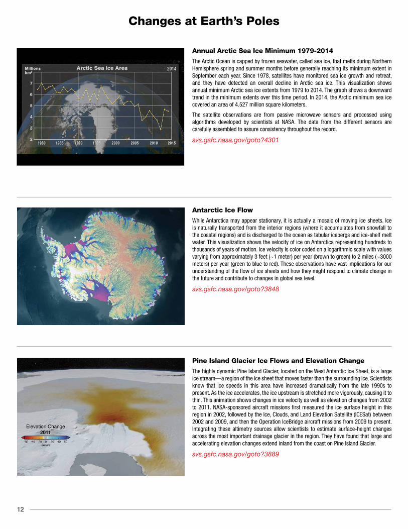
Annual Arctic Sea Ice Minimum 1979-2014
The Arctic Ocean is capped by frozen seawater, called sea ice, that melts during Northern Hemisphere spring and summer months before generally reaching its minimum extent in September each year. Since 1978, satellites have monitored sea ice growth and retreat, and they have detected an overall decline in Arctic sea ice. This visualization shows annual minimum Arctic sea ice extents from 1979 to 2014. The graph shows a downward trend in the minimum extents over this time period. In 2014, the Arctic minimum sea ice covered an area of 4.527 million square kilometers.
The satellite observations are from passive microwave sensors and processed using algorithms developed by scientists at NASA. The data from the different sensors are carefully assembled to assure consistency throughout the record.
svs.gsfc.nasa.gov/goto?4301
Antarctic Ice Flow
While Antarctica may appear stationary, it is actually a mosaic of moving ice sheets. Ice is naturally transported from the interior regions (where it accumulates from snowfall to the coastal regions) and is discharged to the ocean as tabular icebergs and ice-shelf melt water. This visualization shows the velocity of ice on Antarctica representing hundreds to thousands of years of motion. Ice velocity is color coded on a logarithmic scale with values varying from approximately 3 feet (~1 meter) per year (brown to green) to 2 miles (~3000 meters) per year (green to blue to red). These observations have vast implications for our understanding of the flow of ice sheets and how they might respond to climate change in the future and contribute to changes in global sea level.
svs.gsfc.nasa.gov/goto?3848
Pine Island Glacier Ice Flows and Elevation Change
The highly dynamic Pine Island Glacier, located on the West Antarctic Ice Sheet, is a large ice stream—a region of the ice sheet that moves faster than the surrounding ice. Scientists know that ice speeds in this area have increased dramatically from the late 1990s to present. As the ice accelerates, the ice upstream is stretched more vigorously, causing it to thin. This animation shows changes in ice velocity as well as elevation changes from 2002 to 2011. NASA-sponsored aircraft missions first measured the ice surface height in this region in 2002, followed by the Ice, Clouds, and Land Elevation Satellite (ICESat) between 2002 and 2009, and then the Operation IceBridge aircraft missions from 2009 to present. Integrating these altimetry sources allow scientists to estimate surface-height changes across the most important drainage glacier in the region. They have found that large and accelerating elevation changes extend inland from the coast on Pine Island Glacier.
svs.gsfc.nasa.gov/goto?3889
13
Changes at Earth’s Poles
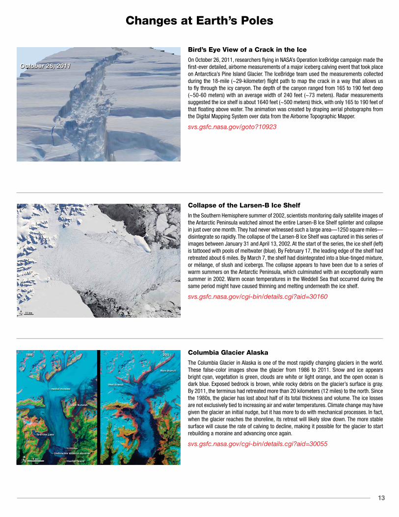
Bird’s Eye View of a Crack in the Ice
On October 26, 2011, researchers flying in NASA’s Operation IceBridge campaign made the first-ever detailed, airborne measurements of a major iceberg calving event that took place on Antarctica’s Pine Island Glacier. The IceBridge team used the measurements collected during the 18-mile (~29-kilometer) flight path to map the crack in a way that allows us to fly through the icy canyon. The depth of the canyon ranged from 165 to 190 feet deep (~50-60 meters) with an average width of 240 feet (~73 meters). Radar measurements suggested the ice shelf is about 1640 feet (~500 meters) thick, with only 165 to 190 feet of that floating above water. The animation was created by draping aerial photographs from the Digital Mapping System over data from the Airborne Topographic Mapper.
svs.gsfc.nasa.gov/goto?10923
Collapse of the Larsen-B Ice Shelf
In the Southern Hemisphere summer of 2002, scientists monitoring daily satellite images of the Antarctic Peninsula watched almost the entire Larsen-B Ice Shelf splinter and collapse in just over one month. They had never witnessed such a large area—1250 square miles—disintegrate so rapidly. The collapse of the Larsen-B Ice Shelf was captured in this series of images between January 31 and April 13, 2002. At the start of the series, the ice shelf (left) is tattooed with pools of meltwater (blue). By February 17, the leading edge of the shelf had retreated about 6 miles. By March 7, the shelf had disintegrated into a blue-tinged mixture, or mélange, of slush and icebergs. The collapse appears to have been due to a series of warm summers on the Antarctic Peninsula, which culminated with an exceptionally warm summer in 2002. Warm ocean temperatures in the Weddell Sea that occurred during the same period might have caused thinning and melting underneath the ice shelf.
svs.gsfc.nasa.gov/cgi-bin/details.cgi?aid=30160
Columbia Glacier Alaska
The Columbia Glacier in Alaska is one of the most rapidly changing glaciers in the world. These false-color images show the glacier from 1986 to 2011. Snow and ice appears bright cyan, vegetation is green, clouds are white or light orange, and the open ocean is dark blue. Exposed bedrock is brown, while rocky debris on the glacier’s surface is gray. By 2011, the terminus had retreated more than 20 kilometers (12 miles) to the north. Since the 1980s, the glacier has lost about half of its total thickness and volume. The ice losses are not exclusively tied to increasing air and water temperatures. Climate change may have given the glacier an initial nudge, but it has more to do with mechanical processes. In fact, when the glacier reaches the shoreline, its retreat will likely slow down. The more stable surface will cause the rate of calving to decline, making it possible for the glacier to start rebuilding a moraine and advancing once again.
svs.gsfc.nasa.gov/cgi-bin/details.cgi?aid=30055

14
Changes at Earth’s Poles
Permafrost Extent in the Northern HemispherePermafrost is defined as soil, rock, and any other subsurface Earth material that exists at or below 0° C for two or more consecutive years. Current maps of permafrost in the Northern Hemisphere (20° N to 90° N) are based on a map compiled in 1997 by the International Permafrost Association (see original 1997 permafrost map below). This map contributes to a unified international dataset that depicts the distribution and properties of permafrost and ground ice. Colors indicate permafrost extent, estimated in percent area. A second map, updated on February 21, 2012, has been digitized and simplified to show continuous permafrost, discontinuous/sporadic permafrost, isolated patches of permafrost, as well as ice sheets and glaciers. Here the original map and a later digitized version have been adapted for display on the hyperwall. While ground-based instruments can be used to obtain reliable measurements of permafrost at specific locations, it is difficult to make continuous measurements of permafrost because of its remoteness and vast distribution. Satellite observations from space, however, can cover broad areas and provide frequent measurements. The Soil Moisture Active Passive, or SMAP, mission is NASA’s first Earth-observing satellite mission designed to collect continuous global observations of surface soil moisture conditions as well as whether or not the water contained within the soil is frozen or thawed—called its freeze/thaw state—every 2-3 days at 3-40 km (~2-25 mi) spatial resolution. These data will help quantify the nature, extent, timing, and duration of landscape seasonal freeze/thaw state transitions as well as help detect permafrost thaw.
svs.gsfc.nasa.gov/goto?30578
Upsala Glacier Retreat in Argentina
Many glaciers around the world are in retreat due to rising global temperatures. These Landsat images of Upsala Glacier in Los Glaciares National Park, located in the Andean Mountains in Argentina, show how the glacier has retreated 7.2 kilometers (~4.5 miles) between 1986 and 2014—a rate of approximately 260 meters (~853 feet) per year. A smaller, side glacier joins Upsala at the present-day ice front—the wall from which masses of ice periodically collapse into Lago (Lake) Argentino. A mixture of sea ice, icebergs, and snow, called an ice mélange, is visible at the edge of the ice wall (blue) in both the 1986 and 2014 images due to ice calving events. Larger icebergs appear as white dots on the lake surface in all three images. Glacier retreat in this part of South America is believed to be caused by local climatic warming. The warming not only causes the ice front to retreat but more importantly, causes overall thinning of the glacier ice mass.
svs.gsfc.nasa.gov/goto?30549
Greenland Ice Loss, 2004 to 2014
The mass of the Greenland ice sheet has rapidly been declining over the last several years due to surface melting and iceberg calving. This visualization shows changes in Greenland ice mass from January 2004 to June 2014, using Gravity Recovery and Climate Experiment (GRACE) mass concentration (mascon) solutions.
The surface of Greenland shows the change in equivalent water height. A color scale was applied in the range of +250 to -250 centimeters of equivalent water height, where blue values indicate an increase in the ice sheet mass while pink shades indicate a decrease. White indicates areas where there has been very little or no change in ice mass since 2004. In addition, the running sum total of the accumulated mass change over the Greenland Ice Sheet is shown on a graph overlay in gigatons. In general, higher-elevation areas near the center of Greenland experienced little to no change, while lower-elevation and coastal areas experienced significant ice mass loss.
svs.gsfc.nasa.gov/cgi-bin/details.cgi?aid=4325

15
Changes at Earth’s Poles
Antarctica Ice Loss, 2004 to 2014
The mass of the Antarctic ice sheet has changed over the last several years. In particular, the West Antarctic Ice Sheet is losing ice mass faster than it is gaining ice mass. This visualization shows changes in Antarctic ice mass from January 2004 to June 2014, using Gravity Recovery and Climate Experiment (GRACE) mass concentration (mascon) solutions.
The surface of Antarctica shows the change in equivalent water height. A color scale was applied in the range of +250 to -250 centimeters of equivalent water height, where blue values indicate an increase in the ice sheet mass while pink shades indicate a decrease. White indicates areas where there has been very little or no change in ice mass since 2004. The camera zooms to focus on the West Antarctic Ice Sheet, the region to the West of the Trans-Antarctic mountains, where much of the loss has taken place. The animation is shown again over this region while the graph of ice loss presents the change over West Antarctica alone. Regions composed of the floating ice shelves, and thus not a part of the Antarctic Ice Sheet, are shown in a pale shade of green.
svs.gsfc.nasa.gov/cgi-bin/details.cgi?aid=4347
A Cold, Snowy, and Icy Winter in North America
Ice cover on North America’s Great Lakes formed early during the 2013-2014 winter, and persisted until the official ice-off date in Lake Superior on June 6, 2014. Ice cover plays an important role in the regional climate, and also affects lake water levels, water temperature, and the development of spring algal blooms on the Great Lakes.
This visualization shows snow cover as well as the daily percentage of the lake area covered by ice as derived using data from NASA’s Moderate Resolution Imaging Spectroradiometer (MODIS) from September 15, 2013 to May 310, 2014. The maximum ice extent occurred on March 6 when 92.5% of the surface of the Great Lakes was covered with ice. This is the second most extensive ice cover observed over the lakes since the satellite record began in 1973. The greatest extent occurred in 1979 when 94.7% of the surface was covered, according to the National Oceanic and Atmospheric Administration’s Great Lakes Environmental Research Laboratory (GLERL). Four of the Great Lakes (Superior, Michigan, Huron, and Erie) became 90% or more ice covered for the first time since 1994. The extensive and thick ice cover caused significant difficulties and shipping delays throughout the ice season. The route of the United States Coast Guard icebreaker Mackinaw, from Sault Ste. Marie, Michigan to Duluth, Minnesota, is shown for selected dates in March 2014 while the Mackinaw was operating under heavy ice conditions in Lake Superior during the opening of the navigation season.
svs.gsfc.nasa.gov/cgi-bin/details.cgi?aid=4256

16
Earth’s Ocean and Water Resources
Earth’s Circulatory System
In certain areas near the polar oceans, cooler surface water becomes saltier due to evaporation or sea ice formation and becomes dense enough to sink to the ocean depths. This “pumping” of surface water into the deep ocean forces water near the ocean floor to move horizontally (i.e., it circulates the water). The ocean’s thermohaline circulation is driven by global density gradients such as these, caused by differences in ocean temperature—thermo—and salinity—haline. This animation shows one of the major regions of the thermohaline circulation—the North Atlantic Ocean around Greenland, Iceland, and the North Sea. It also shows the Antarctic Circumpolar Current, circling Antarctica. This circumpolar motion links the world’s oceans and allows the deep water circulation from the Atlantic to rise in the Indian and Pacific Oceans, thereby closing the surface circulation loop.
svs.gsfc.nasa.gov/goto?3884
Sea-Surface Temperatures in Ultra-High Resolution
This animation from January 1, 2010 to December 31, 2011, shows global sea surface temperatures (SST) at 1-kilometer (~0.6 mile) resolution. Watch how Western Boundary Currents—fast-flowing currents that flow on the west side of ocean basins—such as the Gulf Stream and Kuroshio Current (near Japan) carry warm water from the tropics poleward. Additionally one can see the major upwelling areas (cooler temperatures) of the world’s oceans associated with the California, Peruvian/Chilean, and Namibian/South African coasts. The Multi-scale Ultra-high Resolution (MUR) SST dataset combines data from the Advanced Very High Resolution Radiometer (AVHRR), Moderate Resolution Imaging Spectroradiometer (MODIS), and Advanced Microwave Scanning Radiometer for EOS (AMSR-E) instruments.
svs.gsfc.nasa.gov/goto?30008
The Motions of the Ocean
The sun continually heats our planet, but the heating is unevenly distributed over Earth’s surface. The tropics receive more energy than they emit and the polar regions emit more energy than they receive. Ocean water near the equator gets hotter and hotter while ocean water near the poles gets colder and colder. Nature won’t stand for that kind of imbalance for very long. Its solution: the wind. Surface winds blow from areas of high pressure to low pressure, and help to steer ocean currents that transport heat in the ocean from the tropics to the poles. Scientists use model simulations like this one—produced by the Estimating the Circulation and Climate of the Ocean, Phase II (ECCO2)—to help resolve ocean eddies and other narrow-current systems that transport heat (and carbon) in Earth’s ocean. In this animation, from March 25, 2007 to March 3, 2008, colors represent sea surface temperatures while the flow lines represent sea surface currents.
svs.gsfc.nasa.gov/goto?3912

17
Earth’s Ocean and Water Resources
22-Year Sea Level Rise
Sea level rise is caused primarily by two factors related to global warming: the added water from melting land ice and the expansion of seawater as it warms. Seas around the world have risen an average of nearly 3 inches since 1992, with some locations rising more than 9 inches due to natural variation, according to the latest satellite measurements from NASA and its partners.
This visualization shows total sea level change between 1992 and 2014, based on data collected from the TOPEX/Poisedon, Jason-1, and Jason-2 satellites. Blue regions are where sea level has gone down, and orange/red regions are where sea level has gone up. The color range for this visualization is -7 centimeters to +7 centimeters (-2.76 inches to +2.76 inches), though measured data extends above and below 7 centimeters. This particular range was chosen to highlight variations in sea level change.
svs.gsfc.nasa.gov/cgi-bin/details.cgi?aid=4345
The Powerful Gulf Stream
The Gulf Stream is a powerful ocean current found in the Atlantic Ocean that transports warm water from the Gulf of Mexico along the South Atlantic Seaboard, subsequently influencing local weather patterns and climate. The current then turns northeastward crossing the Atlantic, where it exerts a warming influence on the climate of Western and Northern Europe, making these areas warmer then they would otherwise be. This visualization shows the warm-water Gulf Stream and its associated temperatures as it stretches across the Atlantic generating smaller currents and ocean eddies along the way. Model output from the Estimating the Circulation and Climate of the Ocean, Phase II (ECCO2) project were used to create this visualization. The project used a general circulation model to synthesize satellite and in situ data of the global ocean at resolutions that resolve ocean eddies and other narrow current systems that transport heat in the oceans.
svs.gsfc.nasa.gov/goto?3913
Speedy Ocean Currents
Ocean surface currents, mainly driven by prevailing winds, help transport heat and ocean nutrients around the world. This visualization shows surface ocean currents colored by velocities from January 1, 2008 to July 27, 2012. Blue shades indicate slow surface currents, while green and yellow shades indicate faster moving currents. Orange and red shades (the fastest currents) indicate velocities up to 1 meter (~3 feet) per second. Notice how fast-flowing currents such as those that flow on the west side of ocean basins— e.g., the Gulf Stream along the Eastern United States and Kuroshio Current near Japan—eventually disperse into slower, swirling eddies. This dataset—called the Ocean Surface Current Analysis Real-Time (OSCAR)—was derived from observed satellite altimetry and wind vector data. OSCAR data are produced by Earth & Space Research and distributed through the National Oceanic and Atmospheric Administration and NASA.
svs.gsfc.nasa.gov/goto?3958

18
Earth’s Ocean and Water Resources
Sea Surface Height Anomalies, 1992-2011
Using data from several satellite radar altimeters, a finer picture of the ever-changing height of the ocean is revealed. In this visualization, sea surface height anomalies derived from satellite altimeter data show differences above and below normally observed sea surface heights from 1992 to 2011. Blue shades indicate areas where sea surface height is lower than normal, while red shades indicate areas where sea surface height is higher than normal. Swirling currents called eddies pepper the scene and can be found in every major ocean basin. Near the Equator, ocean eddies give way to fast moving features called Kelvin waves. When they build up in the Pacific, these waves can usher in a phenomenon known as El Niño, which happens when warm water and high sea levels move into the Eastern Pacific along the Equator. Occurring roughly every 3-4 years, El Niño events can have a big impact on weather across the globe, bringing extra rainfall to the American Southwest and even affecting hurricanes in the Atlantic Oceans. Sea surface height data also have many other applications, such as in fisheries management, navigation, and offshore operations.
svs.gsfc.nasa.gov/goto?30502
Wind-Blown Marine Debris from Japanese Tsunami
On Friday, March 11, 2011, a magnitude 9.0 undersea megathrust earthquake struck off the Pacific coast of Japan that generated tsunami waves that reached 40.5 meters (~133 feet) high, traveling up to 10 kilometers (6 miles) inland in some areas (e.g., Sendai). The earthquake and resulting tsunami generated an estimated 24-25 million tons of rubble and debris in Japan. This simulation shows how winds near the ocean surface impacted the movement of marine debris as they moved across the Pacific from March 2011 to July 2012. The colors show the percentage of windage, or the amount of force (i.e., wind) created on an object by friction. Objects that float mostly above water are more impacted by the speed of the wind than the speed of the water; therefore, they have high windage values (orange and red shades). These objects move more quickly than objects that float mostly below water that are impacted more by the speed of the water and thus have low windage values (purple and blue shades). The results were used to assess the location of the tsunami debris in the ocean and the timeline of its arrival on the west coast of the United States. The International Pacific Research Center, Surface Currents Diagnostic model was used to run the simulation.
svs.gsfc.nasa.gov/goto?30504
ENSO Sea Surface Temperature Anomalies: 2015
The El Niño-Southern Oscillation (ENSO) is a quasi-periodic fluctuation of ocean temperatures in the equatorial Pacific. The temperatures generally fluctuate between two states: warmer than normal central and eastern equatorial Pacific (El Niño) and cooler than normal central and eastern equatorial Pacific (La Niña).
This animation illustrates the evolution of sea surface temperature (SST) anomalies (relative to the respective normal state) in the Pacific Ocean associated with the 2015 El Niño, the warm phase ENSO. SST anomalies reflect the heat content in the mixed layer (upper 50 meters).
svs.gsfc.nasa.gov/goto?30645

19
Earth’s Ocean and Water Resources
ENSO Sea Surface Temperature Anomalies: 1997-1998
This animation illustrates the evolution of sea surface temperature (SST) anomalies (relative to the respective normal state) in the Pacific Ocean associated with the 1997-98 El Niño, the warm phase of an interannual mode of climate variability called El Niño-Southern Oscillation, or ENSO. SST anomalies reflect the heat content in the mixed layer (upper 50 meters of the ocean). This product uses optimal interpolation (OI) using data from the 4 km Advanced Very High Resolution Radiometer (AVHRR) Pathfinder Version 5 time series (when available, otherwise operational NOAA AVHRR data are used) and in situ ship and buoy observations.
Initial warming appeared in the eastern equatorial Pacific around May 1997 and grew into a strong El Niño event by the end of the year. In fact, the 1997-98 El Niño was the strongest on record, and it developed more rapidly than any El Niño of the past 40 years. The event impacted weather, marine ecosystems, and fisheries.
svs.gsfc.nasa.gov/goto?30551
La Niña: Sea Surface Temperature and Height
This visualization from June 1, 2006 to December 31, 2011, illustrates the evolution of sea surface temperature (SST) and sea surface height (SSH) anomalies (relative to the respective normal state) associated with the 2010-2011 La Niña in the Pacific Ocean. SST and SSH anomalies reflect the heat content in the mixed layer (top 50 meters) and the upper ocean (top 150 meters), respectively. Typically, warm SST anomalies are often associated with high SSH anomalies, while cold SST anomalies are associated with low SSH anomalies. Therefore, they provide complimentary views of the oceanic signature of climate variability such as El Niño and La Niña. La Niña is the cooling phase of an interannual mode of climate variability called El Nino-Southern Oscillation. Initial cooling appeared in the eastern to central equatorial Pacific around June 2010 and grew into a relatively strong La Niña event in late 2010. The event persists beyond February 2011.
svs.gsfc.nasa.gov/goto?30489
El Niño Watch 2015
Interest in the developing 2015 El Niño is high, as the strength of this year’s event will influence how much rain and snowfall states like California receive this winter. Strong El Niño conditions typically result in wetter weather patterns along the United States west coast, which could help to ameliorate the ongoing drought. A statement issued by the National Oceanic and Atmospheric Administration (NOAA) Climate Prediction Center on August 13, 2015, reports that “there is a greater than 90% chance that El Niño will continue through Northern Hemisphere winter 2015-16, and around an 85% chance it will last into early spring 2016.” El Niño is characterized by unusually warm ocean temperatures in the Equatorial Pacific. Conditions in 2015 bear some similarities to those of 1997, a year that brought one of the most potent El Niño events of the twentieth century. This visualization provides side-by-side comparisons of Pacific Ocean sea surface height anomalies (SSHA) in 2015 [right] with SSHA during the famous 1997 El Niño [left]. Red shades indicate where the ocean stood above normal sea level because warmer water expands to fill more volume (thermal expansion). Blue shades indicate where sea level and temperatures were lower than average (thermal contraction). Normal sea-level conditions appear yellow. The maps—based on altimetry data collected by the TOPEX/Poseidon (1997) and OSTM/Jason-2 (2015) satellites—have been processed to highlight the interannual signal of SSH, i.e., the mean signal, seasonal signal, and the trend have been removed.
svs.gsfc.nasa.gov/cgi-bin/details.cgi?aid=30629

20
Earth’s Ocean and Water Resources
Ocean Bottom Pressure from GRACE
The twin Gravity Recovery and Climate Experiment (GRACE) satellites, launched on March 17, 2002, have been making detailed measurements of Earth’s gravity field from space and revolutionizing investigations about Earth’s ocean, water reservoirs, large-scale solid Earth changes, and ice cover.
To aid in the interpretation of gravity change over the oceans, the GRACE Tellus project provides ocean bottom pressure maps derived from the GRACE satellite data. Ocean bottom pressure is the sum of the mass of the atmosphere and ocean in a “cylinder” above the seafloor. This visualization shows monthly changes in ocean bottom pressure data obtained by the GRACE satellites from November 2002 to January 2012. Purple and blue shades indicate regions with relatively low ocean bottom pressure, while red and white shades indicate regions with relatively high ocean bottom pressure. Scientists use these data to observe and monitor changes in deep ocean currents, which transport water and energy around the globe.
svs.gsfc.nasa.gov/goto?30503
Monitoring Coral Reefs
NOAA Coral Reef Watch’s (CRW) next generation high resolution bleaching thermal stress monitoring product suite comprises 5 products. Beginning with Sea Surface Temperature from NOAA NESDIS, several processing steps lead to the final Bleaching Alert Areas product.
CRW Coral Bleaching Alert Area product outlines the areas where bleaching thermal stress currently reaches various bleaching stress levels, based on satellite sea surface temperature monitoring. There are five stress levels in the product ranging from 1: “No Stress” up through 5: “Mortality Likely”. The timing of the peak bleaching season varies among ocean basin and hemispheres but it is generally during the summertime.
svs.gsfc.nasa.gov/goto?30490
Modeled Phytoplankton Communities in the Global Ocean
Phytoplankton are the base of the marine food web and are crucial players in the Earth’s carbon cycle. They are also incredibly diverse. This visualization shows dominant phytoplankton types from 1994-1998 generated by the Darwin Project using a high-resolution ocean and ecosystem model. The model contains flow fields from 1994-1998 (generated by the ECCO2 model), inorganic nutrients, 78 species of phytoplankton, zooplankton, as well as particulate and dissolved organic matter. Colors represent the most dominant type of phytoplankton at a given location based on their size and ability to uptake nutrients. Red represents diatoms (big phytoplankton, which need silica), yellow represents flagellates (other big phytoplankton), green represents prochlorococcus (small phytoplankton that cannot use nitrate), and cyan represents synechococcus (other small phytoplankton). Opacity indicates concentration of the carbon biomass. A key part of the Darwin Project is developing theoretical and numerical models of the marine ecosystems. The data shown here are from a simulation of the Darwin model in a physical run of the Massachusetts Institute of Technology general circulation model by the Estimating the Circulation and Climate of the Ocean (ECCO) group. The model provides a laboratory to explore the controls on biodiversity and the biogeography of different phytoplankton species. In particular, the role of the swirls and filaments (mesoscale features) appear important in maintaining high biodiversity in the ocean.
svs.gsfc.nasa.gov/goto?30669

21
Earth’s Ocean and Water Resources
Modeling Hurricanes
The 2005 Atlantic Basin hurricane season was extremely active, producing a remarkable 27 storms in a six-month period. This visualization shows a Goddard Earth Observing System Model, Version 5 (GEOS-5) simulation of the very active hurricane season. Seeded only at the beginning of the run, the model shows 23 out of 27 storms—including Katrina. Considering this was an anomalous year, the model did a good job of simulating the large number of storms for that season. An innovative aspect of this global model is the ability to represent realistic hurricane intensities, including the six major hurricanes (i.e., Category 3 or higher on the Saffir-Simpson scale) that formed. Ocean colors ranging from blue to orange depict air temperature 2 meters (~6.6 feet) above sea level.
svs.gsfc.nasa.gov/goto?3887
Hurricane Sandy Surface Winds
A rare combination of environmental conditions present during Hurricane Sandy’s lifecycle gave rise to a storm of unforgettable magnitude—hence the nickname, Superstorm Sandy. This animation shows surface wind speeds from the GEOS-5 beginning September 1, 2012 with a 25-kilometer (~15.5-mile) model, preceding a higher-resolution 7-kilometer (~4.3-mile) global simulation with the GEOS-5 initialized on October 26, 2012. Surface wind speeds range from blue (10 miles per hour) to purple (80 miles per hour). The higher-resolution simulation depicts the strong onshore winds that continued to pummel New York and New Jersey even after landfall and the dramatic influence of the land surface slowing down Sandy’s inland surface winds. Scientists can analyze the structure and lifecycle of severe storms like Sandy using the GEOS-5. What they learn can be incorporated into newer models, and result in even more accurate hurricane forecasts in the future.
svs.gsfc.nasa.gov/goto?30019
Sediment in the Gulf of Mexico
Clouds of sediment colored the Gulf of Mexico on November 10, 2009. Much of the color likely comes from re-suspended sediment dredged up from the sea floor in shallow waters. The sediment-colored water transitions to clearer dark blue near the edge of the continental shelf, where the water becomes deeper. The ocean turbulence that brought the sediment to the surface is readily evident in the textured waves and eddies within the tan and green waters. Tropical Storm Ida had come ashore over Alabama and Florida, immediately east of the area shown here, a few hours before the image was acquired. The storm’s wind and waves may have churned up waters farther west. A second source of sediment is visible along the shore. Many rivers, including the Mississippi River, drain into the Gulf of Mexico in this region. The river plumes are dark brown that fade to tan and green as the sediment dissipates.
svs.gsfc.nasa.gov/goto?30287

22
Earth’s Ocean and Water Resources
Drought Cycles in Australia
Drought is a frequent visitor in Australia. The Australian Bureau of Meteorology describes the typical rainfall over much of the continent as “not only low, but highly erratic.” These satellite-based vegetation images document what farmers and ranchers have had to contend with over the past decade.
The images are centered on the agricultural areas near the Murray River—Australia’s largest river—between Hume Reservoir and Lake Tyrrell. The series shows vegetation growing conditions for a 16-day period in the middle of September each year from 2000 through 2010 compared to the average mid-September conditions over the decade. Places where the amount and/or health of vegetation was above the decadal average are green, average areas are off-white, and places where vegetation growth was below average are brown.
svs.gsfc.nasa.gov/cgi-bin/details.cgi?aid=30158
Thirst for Water: Crop Circles in the Desert
Over the past three decades, Saudi Arabia has been drilling for a resource more precious than oil. Engineers and farmers have tapped ancient reserves of water, dating back to the last Ice Age, to grow crops in the desert. This series of four false-color satellite images show the evolution of agricultural operations in the Wadi As-Sirhan Basin from 1987 to 2012. New vegetation appears bright green while dry vegetation or fallow fields appear rust colored. Dry, barren surfaces (mostly desert) are pink and yellow.
Saudi Arabians have reached this underground water source by drilling wells through sedimentary rock, as much as a kilometer beneath the desert sands. Rainfall averages just 100 to 200 millimeters per year and usually does not recharge the underground aquifers, making the groundwater a non-renewable source. Although no one knows how much water lies beneath the desert—estimates range from 252 to 870 cubic kilometers—hydrologists believe it will only be economical to pump it for about 50 years.
svs.gsfc.nasa.gov/cgi-bin/details.cgi?aid=30054
India Groundwater Depletion
Scientists using data from NASA’s twin Gravity Recovery and Climate Experiment (GRACE) satellites have found that the groundwater beneath Northern India has been receding by as much as one foot per year over the past decade. After examining many environmental and climate factors, the team of hydrologists concluded that the loss is almost entirely due to human consumption. Groundwater comes from the natural percolation of precipitation and other surface waters down through Earth’s soil and rock, accumulating in aquifers. When groundwater is pumped for irrigation or other uses, recharge to the original levels can take months or years.
More than 109 cubic km (26 cubic miles) of groundwater disappeared from the region’s aquifers between 2002 and 2008--double the capacity of India’s largest surface water reservoir, the Upper Wainganga, and triple that of Lake Mead, the largest manmade reservoir in the U.S. The animation shown here depicts the change in groundwater levels as measured each November between 2002 and 2008.
svs.gsfc.nasa.gov/goto?3623

23
Earth’s Ocean and Water Resources
Looking for Water Amidst the Heat
In Southern California irrigated farmland stretches north- and southward from the Salton Sea—an artificial inland sea in the desert. Blocks of square farmland appear in shades of green and tan in the natural-color image acquired on March 24, 2013 by the Operational Land Imager onboard the Landsat Data Continuity Mission—now renamed Landsat-8. On that same day, thermal measurements from the Thermal Infrared Sensor (grayscale image) show that the crops had different temperatures—specifically, cooler areas appear as dark shades, while warmer areas appear as bright shades. Dark pixels—representing cooler areas—in thermal images from TIRS help water managers determine where water is being used for irrigation. Plants cool down when they transpire, so the combination of water evaporating from the plants and the ground (i.e., evapotranspiration) lowers the temperature of the irrigated land. Scientists use these thermal measurements to calculate how much water agricultural fields are using.
svs.gsfc.nasa.gov/cgi-bin/details.cgi?aid=30045
A Decade of Ocean Color
A decade of observations from the SeaWiFS satellite are represented in this image, which shows average chlorophyll concentrations in Earth’s oceans from mid-September 1997 through the end of August 2007. Areas where plants thrive are light blue and yellow, while less productive regions are dark blue. In general, high chlorophyll corresponds with a high number of healthy plants. The global relationship between temperature and productivity was one that scientists first observed in SeaWiFS data. The places with the lowest chlorophyll concentrations are in the tropics, while the cold waters in the Arctic and Antarctic have high chlorophyll concentrations. What the image does not show is that the growth at the poles is seasonal. The plants only flourish during the spring and summer when there is sufficient light to fuel photosynthesis.
svs.gsfc.nasa.gov/goto?30289
Water Level in Lake Powell
Among the dams on the Colorado River is the Glen Canyon Dam, which creates Lake Powell. This series of natural-color Landsat images shows the dramatic drop in Lake Powell’s water level between 1999 and 2015 caused by prolonged drought and water withdrawals. At the beginning of the series, water levels were relatively high, and the water was a clear, dark blue. The sediment-filled river appeared green-brown. Dry conditions and falling water levels were unmistakable in the image from April 13, 2003, and again in early 2005 when water levels plummeted and the northwestern side branch of Lake Powell remained cut off from the rest of the reservoir.
In the latter half of the decade the lake level began to rebound. Significant amounts of snowfall over the winter of 2010–2011 meant more water for the lake. Regional snowfall in the spring of 2012, on the other hand, was abnormally low, and inflow to Lake Powell did not begin to increase in May 2012 as it had in previous years. Since 2012, snow- and rainfall totals have been abnormally low as the region suffered through persistent drought. Inflow to Lake Powell has been minimal, and by April 2015, the reservoir stood at 42 percent of capacity. Droughts in this region are not unusual; however, global warming is expected to make droughts more severe in the future.
svs.gsfc.nasa.gov/cgi-bin/details.cgi?aid=30073

24
Earth’s Ocean and Water Resources
GPM Dissects Typhoon Hagupit
On December 5, 2014, at 1032 UTC, the Global Precipitation Measurement (GPM) Core Observatory flew over Typhoon Hagupit as it headed towards the Philippines. A few hours later at 1500 UTC (10 AM EST), Super Typhoon Hagupit’s maximum sustained winds were near 130 knots (150 mph/241 kph), down from 150 knots (172 mph/278 kph). Typhoon-force winds extended 46 miles (74 km) outward from the center, while tropical-storm-force winds extended 138 miles (222 km) out.
This animation reveals a swath of data from the GPM Microwave Imager (wide swath) and Dual-frequency Precipitation Radar (narrow 3-D swath) over Typhoon Hagupit. As the camera moves, a 3-D view of the storm is revealed. A slicing plane moves across the volume to display precipitation rates throughout the storm. Green to red shades represent liquid precipitation extending down to the ground. Blue shades represent frozen precipitation at the top of the storm.
svs.gsfc.nasa.gov/goto?4248
Altimetry: Past, Present, and Future
Launched in 1978, Seasat was the first NASA mission designed to observe the world’s ocean. Seasat carried five major instruments, including a radar altimeter, indicating global sea surface height and the topography of the ocean surface. This visualization shows the progression of improved data resolution from satellite altimeters in the past, present, and future, beginning with 1.5-degree resolution data from Seasat and ending with 0.05-degree resolution data from NASA’s SWOT mission, planned to launch in 2020. A single satellite (Geosat) provided 0.5-degree resolution data from 1986 to 1990, while numerous international satellite missions (ERS-1, TOPEX/Poseidon, ERS-2, Jason-1, Envisat, and Jason-2) have provided 0.25-degree resolution data from 1992 until now. SWOT (with 0.05-degree-resolution) will offer an unprecedented combination of spatial and temporal resolution while continuing and extending the ocean altimeter data record for years to come.
svs.gsfc.nasa.gov/goto?30500
Bright Waters of the Southern Ocean
Phytoplankton are microscopic organisms that live in watery environments, forming the foundation of the aquatic and marine food webs. Phytoplankton populations can grow explosively creating bright green and blue marble swirls, or blooms, near the surface. This visualization shows global daily averages of suspended particulate inorganic carbon (PIC, known as calcium carbonate or limestone) from July 4, 2002 to May 26, 2014, made with data from Aqua/MODIS. One can see shades of bright turquoise circling the Southern Ocean, a unique and consistent feature characterized by the presence of elevated PIC concentrations near the Sub-Tropical, Sub-Antarctic, and Polar Fronts. Referred to as the “Great Calcite Belt,” high PIC concentrations result from large numbers of highly reflective microscopic PIC plates called “coccoliths,” released from calcifying coccolithophores. Such regions of elevated reflectance have been observed each year during austral summer with minor variations from year to year. Many sectors of the Southern Ocean are generally characterized by low concentrations of potentially growth limiting iron (Fe) concentrations. Studies suggest, however, that coccolithophores are well adapted to growth under low ambient iron conditions.
svs.gsfc.nasa.gov/goto?30512

25
Earth’s Ocean and Water Resources
GPM Explores Typhoon Vongfong
Typhoon Vongfong was the most intense tropical cyclone worldwide in 2014, and struck Japan as a large tropical system. It also indirectly affected the Philippines and Taiwan. Estimates assess damage from Typhoon Vongfong to have been over $48 million. The name Vongfong means wasp in Cantonese.
On October 9, 2014, the Global Precipitation Measurement (GPM) Core Observatory flew over Typhoon Vongfong as it headed towards Japan. At this point, the storm had weakened to a category 4 typhoon with maximum sustained winds at 150 mph, down form a category 5 typhoon on October 8.
This animation shows the structure of the storm as well as rain intensity measured by the Core Observatory’s GPM Microwave Imager (GMI) and Dual-frequency Precipitation Radar (DPR). As the camera moves in on the storm, DPR’s volumetric view of the storm’s precipitation structure is revealed. A slicing plane moves across the volume to display precipitation rates throughout the storm. Shades of green represent low amounts of liquid precipitation, while shades of red represent high amounts of precipitation.
svs.gsfc.nasa.gov/goto?4229
Galápagos Blooms After El Niño
The 1997-98 El Niño was the strongest on record. The surface water in the Pacific off the coast of South America was significantly warmer than normal. This warm water trapped the ocean nutrients and led to a drastic decrease in phytoplankton and other ocean life in the region. The unique Galápagos ecosystem was severely affected and many species, including sea lions, seabirds, and barracudas, suffered a very high mortality level. During the start of a La Niña (in May 1998), ocean temperatures dropped dramatically and the ocean productivity exploded with large phytoplankton blooms. Many species recovered very rapidly and the land species started to reproduce immediately. These images, created with data from NASA’s Sea-viewing Wide Field-of-view Sensor (SeaWiFS) instrument, show phytoplankton concentrations in the Galápagos Marine Reserve (surrounding the Galápagos Islands) on May 9, May 18, and May 24, 1998. Blue shades represent little or no phytoplankton, while shades of teal, green, and tan indicate increasing ocean productivity. Dark blue denotes missing data while the islands are shown in gray. SeaWiFS monitors global chlorophyll pigments in phytoplankton that allow scientists to monitor the blooms from space.
svs.gsfc.nasa.gov/goto?30543
GPM Examines East Coast Snow Storm
The Global Precipitation Measurement (GPM) Core Observatory spacecraft observed a rare late-season snowstorm over the Eastern United States in mid-March 2014, when the jet stream dropped south across a cold high pressure along the Mid-Atlantic coast. The storm that formed deposited more than 7 inches (~18 cm) of snow on the nation’s capital, with even greater amounts in a swath from the Blue Ridge Mountains to southern New Jersey.
This animation, from March 17, 2014 (just 18 days after GPM’s launch), combines data from GPM’s Dual-frequency Precipitation Radar (DPR) and GPM Microwave Imager (GMI) and shows the southern extent of the storm off the coast of South Carolina. Together the DPR and GMI collect observations that allow scientists to dissect clouds. Like a diagnostic CAT scan, the DPR returns the three-dimensional profile that shows the intensities of liquid and solid precipitation. Blue shades indicate frozen precipitation, while red to green shades indicate liquid precipitation. Inside the storm over the Atlantic Ocean, precipitation was frozen at high altitudes in the cloud before melting into rain near the surface. Inland, the temperatures were below freezing all the way down to the surface, allowing the formation of shallow, low-level (i.e., nimbostratus) clouds capable of producing snow. The GMI, which senses the total precipitation within all cloud layers including light rain and falling snow, provides the two-dimensional view of the storm’s precipitation at the surface—like an X-ray. GMI views an area nearly four times as wide as DPR.
svs.gsfc.nasa.gov/goto?4173
26
Earth’s Ocean and Water Resources
Aquarius Sea Surface Salinity 2011-2014
The Aquarius spacecraft is designed to measure global sea surface salinity. It is important to understand salinity, the amount of dissolved salts in water, because it will lead us to a better understanding of the water cycle and can lead to improved climate models. Aquarius is a collaboration between NASA and the Space Agency of Argentina.
This visualization celebrates over three years of successful Aquarius observations. Sea surface salinity is shown on a flat map using simple cartesian and extended Molleide projections. Versions are included with and without grid lines, and in both Altantic-centered and Pacific-centered projections.
The range of time shown is September 2011 through September 2014. This visualization was generated based on version 3.0 of the Aquarius data products.
svs.gsfc.nasa.gov/goto?4233
Simulated Sea Surface Speeds
The speed of the ocean water near the surface, or sea surface speed, is influenced by many factors including surface winds, tides, diurnal cycles, atmospheric pressure forcings, as well as other dynamic and thermodynamic forces. Scientists use model simulations like this one—carried out by the Estimating the Circulation and Climate of the Ocean (ECCO2) group using the Massachusetts Institute of Technology general circulation model—to help resolve sea surface speeds in ultra-high resolution. Light blue shades represent relatively fast sea surface speeds and darker shades of blue represent slower speeds. While winds near the surface of the ocean are the largest source of momentum for the ocean surface speed, the effects of several other oceanic characteristics are also visible, including the influence of tides, internal waves, and diurnal cycles. Several well known ocean features such as the Agulhas Current near the southwest Indian Ocean; the Gulf Steam along the Eastern United States; the north-flowing Kuroshio Current on the west side of the North Pacific Ocean near Japan; and water flowing out from the mouth of the Amazon River are also visible.
The period of the visualization covers September 2011 through January 2012. The numerical formulation includes ocean circulation and tidal forcing and uses atmospheric state from reanalysis at a global resolution of about 1/4 degree.
svs.gsfc.nasa.gov/cgi-bin/details.cgi?aid=30552
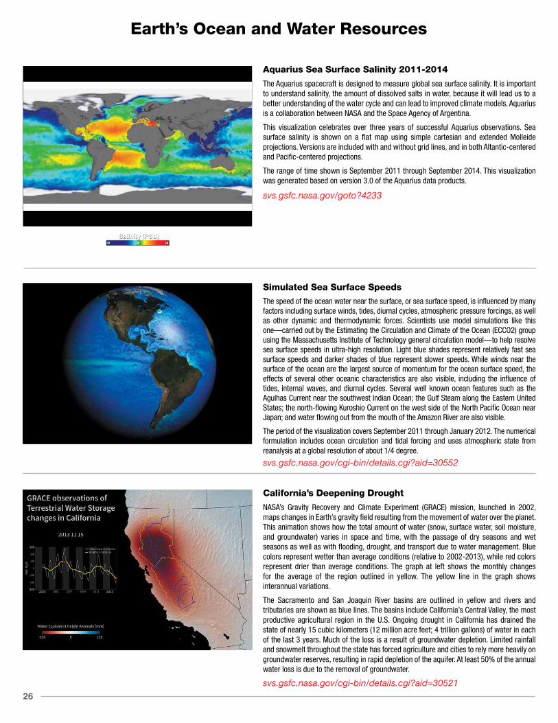
California’s Deepening Drought
NASA’s Gravity Recovery and Climate Experiment (GRACE) mission, launched in 2002, maps changes in Earth’s gravity field resulting from the movement of water over the planet. This animation shows how the total amount of water (snow, surface water, soil moisture, and groundwater) varies in space and time, with the passage of dry seasons and wet seasons as well as with flooding, drought, and transport due to water management. Blue colors represent wetter than average conditions (relative to 2002-2013), while red colors represent drier than average conditions. The graph at left shows the monthly changes for the average of the region outlined in yellow. The yellow line in the graph shows interannual variations.
The Sacramento and San Joaquin River basins are outlined in yellow and rivers and tributaries are shown as blue lines. The basins include California’s Central Valley, the most productive agricultural region in the U.S. Ongoing drought in California has drained the state of nearly 15 cubic kilometers (12 million acre feet; 4 trillion gallons) of water in each of the last 3 years. Much of the loss is a result of groundwater depletion. Limited rainfall and snowmelt throughout the state has forced agriculture and cities to rely more heavily on groundwater reserves, resulting in rapid depletion of the aquifer. At least 50% of the annual water loss is due to the removal of groundwater.
svs.gsfc.nasa.gov/cgi-bin/details.cgi?aid=30521

27
Earth’s Ocean and Water Resources
Sea Surface Temperature, Ice Thickness and Precipitable Water
This animation shows sea surface temperature (SST), sea ice thickness (where the fractional ice coverage is greater than 15%), and the vertical integral of atmospheric precipitable water (transparent overlay) sampled every 6 hours from January 1, 2013 to November 1, 2014 from a reanalysis completed with the AXIOM-1 (eXperimental Analysis of sea Ice and Ocean Mesoscale version 1) system. Most tropical cyclones are identifiable by the SST cooling they induce.
AXIOM-1 is a coupled analysis of the global ocean and sea ice obtained by assimilating Aquarius sea surface salinity (SSS) and MODIS chlorophyll data together with sea surface temperature (SST) and sea ice concentrations from the Operational Sea Surface Temperature and Sea Ice Analysis (OSTIA) objective analysis into a global high-resolution coupled ocean/atmosphere/sea-ice model. The ocean and sea ice model horizontal resolutions vary from 11 km to less than 3 km in the Arctic and the atmospheric model resolution is 25 km.
svs.gsfc.nasa.gov/goto?30524
Ocean Salinity, Sea Ice Thickness and Atmospheric Precipitable Water
This animation shows ocean sea surface salinity (SSS), sea ice thickness (where the fractional ice coverage is greater than 15%), and the vertical integral of atmospheric precipitable water (transparent overlay) sampled every 6 hours from June 1, 2012 to November 1, 2014 from a reanalysis completed with the AXIOM-1 (eXperimental Analysis of sea Ice and Ocean Mesoscale version 1) system. The precipitations associated with tropical cyclones and other major storm systems induce localized surface freshenings, which makes the corresponding storm tracks visible in the SSS field.
AXIOM-1 is a coupled analysis of the global ocean and sea ice obtained by assimilating Aquarius SSS and Moderate Resolution Imaging Spectroradiometer (MODIS) chlorophyll data together with sea surface temperature (SST) and sea ice concentrations from the Operational Sea Surface Temperature and Sea Ice Analysis (OSTIA) objective analysis into a global high-resolution coupled ocean/atmosphere/sea-ice model. The ocean and sea ice model horizontal resolutions vary from 11 km to less than 3 km in the Arctic and the atmospheric model resolution is 25 km.
svs.gsfc.nasa.gov/cgi-bin/details.cgi?aid=30583
Chlorophyll, Sea Ice Thickness and Atmospheric Precipitable Water
This animation shows ocean surface chlorophyll concentrations, sea ice thickness (where the fractional ice coverage is greater than 15%), and the vertical integral of atmospheric precipitable water (transparent overlay) sampled every 6 hours from January 1, 2013 to November 1, 2014 from a reanalysis completed with the AXIOM-1 (eXperimental Analysis of sea Ice and Ocean Mesoscale version 1) system. The chlorophyll concentration is proportional to the ocean biomass and primary production and influences how deep solar radiation can heat the ocean sub-surface, which needs to be accounted for in numerical ocean models.
AXIOM-1 is a coupled analysis of the global ocean and sea ice obtained by assimilating Aquarius sea surface salinity (SSS) and MODIS chlorophyll data together with sea surface temperature (SST) and sea ice concentrations from the Operational Sea Surface Temperature and Sea Ice Analysis (OSTIA) objective analysis into a global high-resolution coupled ocean/ atmosphere/sea ice model. The ocean and sea ice model horizontal resolutions vary from 11 km to less than 3 km in the Arctic and the atmospheric model resolution is 25 km.
svs.gsfc.nasa.gov/cgi-bin/details.cgi?aid=30584

28
Earth’s Ocean and Water Resources
Garbage Patch Experiment
An ocean gyre is a large system of circular ocean currents formed by global wind patterns and forces created by Earth’s rotation. Floating ocean debris tends to accumulate at the center of gyres where the water moves more slowly, similar to a whirlpool. The five main ocean gyres are located in the Indian Ocean, North Atlantic, North Pacific, South Atlantic, and South Pacific.
This visualization shows how modeled ocean currents carry modeled particles around the ocean. The modeled particles (dots) are released evenly around the world at the start of the visualization. The color of the dots denotes relative speed ranging from white (fastest moving particles) to dark blue (slowest moving particles). While there are likely seasonal variations in how the particles move, the general pattern shows that they migrate to the five known gyres also called ocean garbage patches. Scientists use ocean visualizations such as this one, created using data from the Estimating the Circulation and Climate of the Ocean (ECCO-2) model, to better understand ocean eddies and other narrow current systems, which transport heat, carbon, and other properties within the ocean.
svs.gsfc.nasa.gov/cgi-bin/details.cgi?aid=4174
Global Sea Surface Temperature and Winds
This visualization shows the directional flow and magnitude of surface wind-vector data (calibrated to a 10 meter reference height) from June 1, 2011 to October 31, 2011. In addition to surface winds, global sea surface temperature (SST) data are shown.
Notice how the SST cools in the wake of large storms such as hurricanes. Warm surface water powers these storms and as they absorb energy (heat), the water they pass over tends to cool. A great example is Hurricane Irene, which became a hurricane as it crossed the island of Puerto Rico and skirted the eastern and northern coastlines of Hispaniola on August 22, 2011. As Hurricane Irene enters the open Atlantic Ocean, the storm intensifies and the SST cooling effect is clearly visible in the wake of the storm. This cooling effect takes place due to latent and sensible heat fluxes as well as wind-induced upwelling. The wind-induced upwelling is most pronounced to the right of the storm track.
The wind data are from the Cross-Calibrated Multi-Platform project, while SST data are from the Multi-scale Ultra-high Resolution (MUR) Sea Surface Temperature (SST) analysis. Both CCMP and MUR data were funded by the NASA MEaSUREs program.
svs.gsfc.nasa.gov/cgi-bin/details.cgi?aid=4240
North Atlantic Sea Surface Temperature and Winds
This visualization provides a regional perspective of the directional flow and magnitude of surface winds (calibrated to a 10 meter reference height) and sea surface temperature in the North Atlantic region to highlight tropical cyclone activity from June 1, 2011 to October 31, 2011. The wind data are from the Cross-Calibrated Multi-Platform project, while SST data are from the Multi-scale Ultra-high Resolution (MUR) Sea Surface Temperature (SST) analysis—both funded by the NASA MEaSUREs program.
Notice how the SST cools in the wake of large storms such as hurricanes. Warm surface water powers these storms and as they absorb energy (heat), the water they pass over tends to cool. A great example is Hurricane Irene, which became a Category 1 hurricane as it crossed the island of Puerto Rico on August 22, 2011. As Irene enters the open Atlantic, the storm intensifies and the SST cooling effect is clearly visible in the wake of the storm. This cooling effect takes place due to latent and sensible heat fluxes as well as wind-induced upwelling. The wind-induced upwelling is most pronounced to the right of the storm track. On August 24 the NHC reported that Irene was a Category 3 hurricane. The storm eventually lost energy from southwesterly wind shear and moved into cooler northern waters. Continuing to weaken, Irene was downgraded to a Category 1 hurricane before making landfall on the Outer Banks of North Carolina on August 27.
svs.gsfc.nasa.gov/cgi-bin/details.cgi?aid=4240

29
Earth’s Ocean and Water Resources
Surface Winds Colored by Velocity
Atmospheric winds steer the clouds in our atmosphere just as they steer the surface currents in our oceans. This visualization shows global surface wind-vector flow lines colored to show the clear distinctions in wind speed from June 1, 2011 to October 31, 2011. The wind data are from the Cross-Calibrated Multi-Platform project, funded by the NASA MEaSUREs program.
Several weather systems such as mid-latitude cyclones and tropical storms can be seen swirling across Earth’s surface. In general, higher surface wind speeds are found over the ocean while weaker winds are found over land. Winds over the ocean are a critical factor in determining regional weather and climate patterns. Studying changes in ocean winds helps scientists better predict small-scale weather phenomena as well as large-scale patterns connected with Earth’s climate, such as El Niño and La Niña. In severe storms such as hurricanes, ocean winds can inflict major damage to coastal populations. A great example is Hurricane Irene, which became a Category 1 hurricane as it crossed the island of Puerto Rico on August 22, 2011. On August 24 the NHC reported that Irene was a Category 3 hurricane with maximum sustained winds of 120 miles (195 kilometers) per hour. Hurricane Irene was downgraded to a Category 1 hurricane before making landfall on the Outer Banks of North Carolina on August 27.
svs.gsfc.nasa.gov/cgi-bin/details.cgi?aid=4240
Global Surface Winds
Atmospheric winds steer the clouds in our atmosphere just as they steer the surface currents in our oceans. This visualization shows the directional flow and magnitude of surface wind-vector data (calibrated to a 10 meter reference height) from June 1, 2011 to October 31, 2011.The wind data are from the Cross-Calibrated Multi-Platform project, funded by the NASA MEaSUREs program.
Several weather systems such as mid-latitude cyclones and tropical storms can be seen swirling across Earth’s surface. In general, higher surface wind speeds are found over the ocean while weaker winds are found over land. Winds over the ocean are a critical factor in determining regional weather and climate patterns. Studying changes in ocean winds helps scientists better predict small-scale weather phenomena as well as large-scale patterns connected with Earth’s climate, such as El Niño and La Niña. In severe storms such as hurricanes, ocean winds can inflict major damage to coastal populations. A great example is Hurricane Irene, which became a Category 1 hurricane as it crossed the island of Puerto Rico on August 22, 2011. On August 24 the NHC reported that Irene was a Category 3 hurricane with maximum sustained winds of 120 miles (195 kilometers) per hour. Hurricane Irene was downgraded to a Category 1 hurricane before making landfall on the Outer Banks of North Carolina on August 27.
svs.gsfc.nasa.gov/cgi-bin/details.cgi?aid=4240
A Satellite View of River Width
Hydrologists from the University of North Carolina have come up with an innovative way to estimate the size of rivers via satellite images. Combing through data acquired by Landsat satellites, George Allen and Tamlin Pavelsky have compiled a new database of river widths for North America. The result is this continental scale map of river widths. Width is depicted with shades of blue, with wider rivers appearing darker and thinner rivers appearing lighter. According to this dataset, some of the widest stretches of river in North America are found along the Yukon in Alaska, the Mackenzie in Canada’s Northwest Territories, the Hudson in New York, the St. Lawrence along the border of New England and Quebec, and the Mississippi. Note that having a wide width does not necessarily correspond to having a large flow volume.
Accurate river widths are useful for analyses of flood hazards, studies of ecological diversity, and estimates of the volume of greenhouse gases released by rivers and reservoirs due to bacterial activity. Most significantly, the river width database is part of a broader scientific effort to prepare for the upcoming Surface Water and Ocean Topography (SWOT) mission. Scheduled to launch in 2020, SWOT will map water elevation and areal extent with unprecedented detail.
svs.gsfc.nasa.gov/cgi-bin/details.cgi?aid=30626

30
Earth’s Ocean and Water Resources
Projected Megadroughts in the United States: RCP 4.5
Droughts in the Southwest and Central Plains of the United States in the second half of the twenty-first century could be drier and longer than anything humans have seen in those regions in the last 1,000 years, according to a new NASA study published in February 2015. The research found continued increases in human-produced greenhouse gas emissions drives up the risk of severe droughts in these regions.
This visualization shows soil moisture conditions for the top 30 centimeters of soil from 1950 to 2095 based on a 10-year moving average of 17 climate models (CMIP5) that assume greenhouse gas emissions stop increasing in the mid-twenty-first century—a climate scenario called RCP 4.5. The results suggest that there is a 60% likelihood of a decades-long megadrought in the Southwest and Central Plains between the years 2050 and 2099. In the Southwest, climate change would likely cause reduced rainfall and increased temperatures that will evaporate more water from the soil. In the Central Plains, drying would largely be caused by temperature-driven increases in evaporation. This moderate-emissions scenario projects atmospheric carbon dioxide concentrations to reach 650 parts per million (ppm) by 2100. As of October 2015, the atmosphere contains 400 ppm of carbon dioxide.
svs.gsfc.nasa.gov/cgi-bin/details.cgi?aid=4270
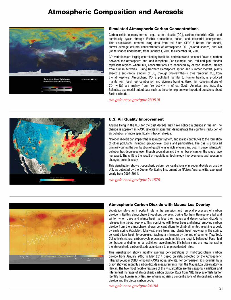
31
Atmospheric Composition and Aerosols
Simulated Atmospheric Carbon Concentrations
Carbon exists in many forms—e.g., carbon dioxide (CO2), carbon monoxide (CO)—and continually cycles through Earth’s atmosphere, ocean, and terrestrial ecosystems. This visualization, created using data from the 7-km GEOS-5 Nature Run model, shows average column concentrations of atmospheric CO2 (colored shades) and CO (white shades underneath) from January 1, 2006 to December 31, 2006.
CO2 variations are largely controlled by fossil fuel emissions and seasonal fluxes of carbon between the atmosphere and land biosphere. For example, dark red and pink shades represent regions where CO2 concentrations are enhanced by carbon sources, mainly from human activities. During Northern Hemisphere spring and summer months, plants absorb a substantial amount of CO2 through photosynthesis, thus removing CO2 from the atmosphere. Atmospheric CO, a pollutant harmful to human health, is produced mainly from fossil fuel combustion and biomass burning. Here, high concentrations of CO (white) are mainly from fire activity in Africa, South America, and Australia. Scientists use model output data such as these to help answer important questions about Earth’s climate.
svs.gsfc.nasa.gov/goto?30515
U.S. Air Quality Improvement
Anyone living in the U.S. for the past decade may have noticed a change in the air. The change is apparent in NASA satellite images that demonstrate the country’s reduction of air pollution, or more specifically, nitrogen dioxide.
Nitrogen dioxide can impact the respiratory system, and it also contributes to the formation of other pollutants including ground-level ozone and particulates. The gas is produced primarily during the combustion of gasoline in vehicle engines and coal in power plants. Air pollution has decreased even though population and the number of cars on the roads have increased. The shift is the result of regulations, technology improvements and economic changes, scientists say.
This visualization shows tropospheric column concentrations of nitrogen dioxide across the U.S. as detected by the Ozone Monitoring Instrument on NASA’s Aura satellite, averaged yearly from 2005-2011.
svs.gsfc.nasa.gov/goto?11579
Atmospheric Carbon Dioxide with Mauna Loa Overlay
Vegetation plays an important role in the emission and removal processes of carbon dioxide in Earth’s atmosphere throughout the year. During Northern Hemisphere fall and winter, when trees and plants begin to lose their leaves and decay, carbon dioxide is released into the atmosphere. This, combined with fewer trees and plants removing carbon dioxide from the atmosphere, allows concentrations to climb all winter, reaching a peak by early spring (Apr/May). Likewise, once trees and plants begin growing in the spring, concentrations begin to decrease, reaching a minimum by the end of summer (Aug/Sep). Collectively, natural carbon-cycle processes such as this are roughly balanced. Fossil fuel combustion and other human activities have disrupted this balance and are now increasing the atmospheric carbon dioxide abundance to unprecedented rates.
This visualization shows monthly average concentrations of mid-tropospheric carbon dioxide from January 2000 to May 2014 based on data collected by the Atmospheric Infrared Sounder (AIRS) onboard NASA’s Aqua satellite. For comparison, it is overlain by a graph showing monthly carbon dioxide measurements from the Mauna Loa Observatory in Hawaii. The two most notable features of this visualization are the seasonal variations and interannual increase of atmospheric carbon dioxide. Data from AIRS help scientists better identify how human activities are influencing rising concentrations of atmospheric carbon dioxide and the global carbon cycle.
svs.gsfc.nasa.gov/goto?4184

32
Atmospheric Composition and Aerosols
Around the World with Aerosols
Tiny solid and liquid particles suspended in the atmosphere are called aerosols. Windblown dust, sea salts, volcanic ash, smoke from wildfires, and pollution from factories are all examples of aerosols. Depending upon their size, type, and location, aerosols can either cool the surface, or warm it. They can help clouds to form, or they can inhibit cloud formation. And if inhaled, some aerosols can be harmful to people’s health. To study aerosols, researchers from NASA’s Global Modeling and Assimilation Office ran a simulation of the atmosphere that captured how winds transport aerosols around the world. The simulation shows sea salt and dust swirl inside cyclones, sulfates stream from volcanoes, and carbon burst from fires from May 2005 to May 2007, produced by the Goddard Earth Observing System Model Version 5, or GEOS-5. In general, dust appears in shades of orange, sea salt appears in shades of blue, sulfates appear white, and carbon appears in shades of green. Such simulations allow scientists to better understand how these tiny particulates travel in the atmosphere and influence weather and climate.
svs.gsfc.nasa.gov/goto?30017
Beyond the Flames of Fire
Forest fires produce carbon monoxide (CO) along with copious amounts of other gases and particulate matter that subsequently change Earth’s atmospheric composition. In the atmosphere, CO is short lived and therefore is detected close to its source. The CO seen here primarily comes from fires burning in the Amazon basin, with some additional contribution from fires in Southern Africa from August to September 2005. Red, orange, and yellow shades across South America, Africa, and the Atlantic Ocean points to high levels of CO. Notice the CO has transported from South America over the Atlantic Ocean to Africa and over the Indian Ocean to Australia. Instruments like the Atmospheric Infrared Sounder (AIRS)—aboard NASA’s Aqua satellite—measure global atmospheric CO on a daily basis and help scientist better understand the impacts of CO on the atmosphere.
svs.gsfc.nasa.gov/goto?3882
Watching the Earth Breathe
Trees and plants participate in the carbon cycle by “inhaling” carbon dioxide and converting it into organic plant matter as part of the process of photosynthesis, thus removing carbon dioxide from the middle part of Earth’s lowest atmospheric layer—the troposphere. During Northern Hemisphere spring and summer for example, carbon dioxide in the troposphere decreases due to the large volume of new and growing vegetation, reaching a peak in late summer.
This animation shows daily average concentrations of mid-tropospheric carbon dioxide from January to December, shown in orange-yellow. The blooming effect of carbon dioxide follows a decrease in vegetation (green), as a result of seasonal changes (i.e., fall, winter). Data such as these give scientists an opportunity to better understand the relationship between carbon dioxide and the seasonal cycle of vegetation. The carbon dioxide values were made by averaging Atmospheric Infrared Sounder data from NASA’s Aqua satellite, collected between 2003 and 2010 (e.g., the data used for January 1 is actually an average of eight years of AIRS carbon dioxide data taken each year on January 1). The vegetation values were made using data from the Moderate Resolution Imaging Spectroradiometer (MODIS) averaged from 2003 to 2006.
svs.gsfc.nasa.gov/goto?3947
33
Atmospheric Composition and Aerosols
The Air We Breathe
Nitrogen Dioxide is a key component of urban air pollution. Most nitrogen dioxide is emitted by combustion (e.g., fossil fuels, wildfires). Major sources include industrial emissions, automobile traffic, forest and brush fires, microbiological soil emissions, lightning, and aircraft. More than half of the total nitrogen dioxide emissions are estimated to be anthropogenic, mainly from the burning of fossil fuels for energy production, transportation, and industrial activities. Nitrogen dioxide has a relatively short lifetime (about a day) and is therefore concentrated near its sources. This sequence of daily images from September 1, 2009 to August 31, 2010, shows the global perspective of tropospheric nitrogen dioxide as measured by the Ozone Measuring Instrument (OMI) flying aboard NASA’s Aura spacecraft.
svs.gsfc.nasa.gov/goto?30014
Iceland’s Eyjafjallajökull Volcanic Ash Plume
A silica-rich plume composed of ash, smoke, and steam rose into the atmosphere over southern Iceland during the series of eruptions by Eyjafjallajökull volcano in spring 2010. Weary travelers were stranded at airports as air traffic across the Atlantic and over parts of Europe came to a halt. A European geostationary satellite, which orbits Earth above a single point, tracked the movement of the ash clouds as westerly winds carried them high above the ocean and toward northern Europe. Meanwhile, NASA’s Cloud-Aerosol Lidar and Infrared Pathfinder Satellite Observation (CALIPSO) satellite measured the height and thickness of the material ejected into the atmosphere using its lidar instrument and infrared sensors. Together, the satellites created an unprecedented view of the eruption’s aftermath. This visualization shows the movement and three-dimensional structure of the ash clouds released by Eyjafjallajökull volcano from May 6-8, 2010.
svs.gsfc.nasa.gov/goto?3783
A Sea of Clouds
Earth’s atmosphere is a fluid system not unlike our oceans, and both continuously work together to transport water around our planet. This visualization shows clouds from a simulation using the Goddard Earth Observing System Model, Version 5 (GEOS-5) for January 2, 2009. The sea of white appears to flow effortlessly above Earth’s surface. Atmospheric winds steer the clouds in our atmosphere just as they steer the surface currents in our oceans, all the while exchanging water. Since there is only one day of simulation data, the sequence of clouds repeats several times. The white flash indicates the sequence is about to repeat. The simulation ran at 3.5 kilometers (~2 miles) per grid cell. The results were written out at 10-minute intervals.
svs.gsfc.nasa.gov/goto?3722

34
Atmospheric Composition and Aerosols
What’s Up with Clouds?
From space, streaks of white clouds can be seen swirling across Earth’s surface. If you stare long enough, you’ll notice distinct patterns in the direction clouds move at certain latitudes. These patterns are a result of tropical regions receiving more energy than they emit and the polar regions emitting more energy than they receive. This latitudinal heat imbalance drives atmospheric circulation and subsequently causes weather. In this visualization, the intertropical convergence zone (ITCZ) is visible as a narrow band of clouds along the equator. Above and below the ITCZ, open cell cumulous clouds propagate westward. Most striking are the large swirls moving eastward located between 30–60º latitude, often referred to as mid-latitude cyclones.
The visualization shows a simulation of clouds from February 2-22, 2010, using the Goddard Earth Observing System Model, Version 5 (GEOS-5).
svs.gsfc.nasa.gov/goto?3723
OCO-2 Early Glint Retrievals Over Water
Launched on July 2, 2014, the second Orbiting Carbon Observatory (OCO-2) is the first NASA Earth-observing satellite designed to study atmospheric carbon dioxide (CO2) from space. Measurements from OCO-2 will be used to find the human and natural sources that are emitting CO2 into the atmosphere and the natural sinks that are absorbing this gas at the Earth’s surface.
This pair of images compares preliminary estimates of column-averaged volume mixing ratios of carbon dioxide, or XCO2, from OCO-2 glint observations over the ocean to those generated by the NASA Goddard Earth Observing System Model, Version 5 (GEOS-5). The large scale features are quite similar, but there are subtle differences that are being studied to determine whether they indicate biases in these early OCO-2 XCO2 estimates or limitations of the model. Over time, these comparisons are expected to substantially improve the accuracy and reliability of both the measurements and the models.
svs.gsfc.nasa.gov/goto?30600
The Antarctic Ozone Hole Will Recover
Ozone is Earth’s natural sunscreen, shielding life from dangerous solar ultraviolet radiation. Human-produced chemicals in our atmosphere—such as chlorofluorocarbons (CFCs), used for many years as refrigerants and in aerosol spray cans—have depleted the Earth’s ozone layer. Scientists first recognized the potential for harmful effects of CFCs on ozone in the early 1970s. In the 1980s, governments around the world woke up to the destruction of the ozone layer and in 1987 negotiated the Montreal Protocol— an international treaty designed to protect the ozone layer by banning CFCs and similar ozone-depleting chemicals.
Since the mid-1990s, global ozone levels have become relatively stable. In fact, because of the Montreal Protocol, model simulations suggest the size of the hole should return to its pre-1980 levels by about 2075. Here, the four globes show monthly-averaged total ozone over Antarctica in October. The 1971 and 2006 globes were created with data from NASA’s Nimbus-4 Backscatter Ultraviolet instrument and Aura’s Ozone Monitoring Instrument, respectively. The 2041 and 2076 globes were made using output from the NASA Goddard Earth Observing System Chemistry-Climate Model, or GEOS-CCM. The graph shows each year’s October average minimum (white dots) over Antarctica. The red curve represents a smoothed version of the white dots.
svs.gsfc.nasa.gov/goto?30602
35
Atmospheric Composition and Aerosols
World Avoided
Human-produced chemicals in our atmosphere—such as chlorofluorocarbons (CFCs), used for many years as refrigerants and in aerosol spray cans—are now known to have played a role in depleting the Earth’s ozone layer. In 1987 governments around the world negotiated the Montreal Protocol—an international treaty designed to protect the ozone layer by banning CFCs and similar ozone-depleting chemicals. Since the mid-1990s, global ozone levels have become relatively stable. In fact, because of the Montreal Protocol, model simulations suggest that the ozone layer should recover to its pre-1970s levels by around the middle of the century (2040-2080).
Shown here, a team of atmospheric chemists simulated ‘what might have been’ if CFCs and similar ozone-depleting chemicals were not banned through the Montreal Protocol. The comprehensive model used for the study—including atmospheric chemical effects, wind changes, and solar radiation changes—presents two cases: the ‘world avoided’ case, where the rate of CFC emission into the atmosphere is assumed to be that of the period before regulation, and the ‘projected’ case, which assumes the current rate of emission, post-regulation. Both cases extrapolate to the year 2065. With continued production of CFCs, ozone levels worldwide would have dropped to dangerously low levels.
svs.gsfc.nasa.gov/goto?4272
Satellite Tracks Saharan Dust in Amazon
For the first time, a NASA satellite has quantified in three dimensions how much dust makes the trans-Atlantic journey from the Sahara Desert to the Amazon rainforest. Among this dust is phosphorus, an essential nutrient that acts like a fertilizer, which the Amazon depends on in order to flourish.
The new dust transport estimates were derived from data collected by a lidar instrument on NASA’s Cloud-Aerosol Lidar and Infrared Pathfinder Satellite Observation (CALIPSO) satellite from 2007 through 2013.
An average of 27.7 million tons of dust per year—enough to fill 104,908 semi trucks—fall to the surface over the Amazon basin. The phosphorus portion, an estimated 22,000 tons per year, is about the same amount as that lost from rain and flooding. The finding is part of a bigger research effort to understand the role of dust and aerosols in the environment and on local and global climate.
svs.gsfc.nasa.gov/cgi-bin/details.cgi?aid=11775
Atmospheric CO2 Trends
Fossil fuel combustion and other human activities are now increasing the atmospheric carbon dioxide (CO2) abundance to unprecedented rates. It is estimated that approximately 36 billion tons of CO2 are added to the atmosphere each year. The large graph shown here is an animated version of the standard Keeling curve from 1980 to September 2014. The red line denotes ground-based measurements from the Mauna Loa Observatory in Hawaii, while yellow denotes observations from the South Pole Observatory. Purple denotes the global trend. The smaller graph in the upper left shows satellite measurements of tropospheric CO2 concentrations (white dots) at different latitudes from September 2002 to September 2014, obtained by the Atmospheric Infrared Sounder (AIRS) and Advanced Microwave Sounding Unit (AMSU) instruments. Note how the Northern Hemisphere has greater variably and generally higher levels of CO2 than the Southern Hemisphere. In May of 2013, these emissions pushed the monthly average CO2 concentrations above 400 parts per million (ppm)—a level that has not been reached during the past 800,000 years. These ever-increasing levels are raising concerns about greenhouse-gas-induced climate change. Data from NASA’s Orbiting Carbon Observatory-2 (OCO-2), launched in July 2014, are helping scientists better identify how human activities, as well as the natural processes on Earth are influencing rising concentrations of atmospheric CO2 and the global carbon cycle.
svs.gsfc.nasa.gov/goto?30556
36
Atmospheric Composition and Aerosols
Mount Etna
Twin volcanic plumes—one of ash, one of gas—rose from Sicily’s Mount Etna on the morning of October 26, 2013. L’Istituto Nazionale di Geofisica e Vulcanologia (INGV) Osservatorio Etneo (National Institute of Geophysics and Volcanology Etna Observatory) reported that Etna was experiencing its first paroxysm in six months. Multiple eruption columns are common at Etna, a result of complex plumbing within the volcano. The Northeast Crater, one of several on Etna’s summit, was emitting the ash column, while the New Southeast Crater was simultaneously venting mostly gas.
This natural-color image collected by Landsat 8 shows the view from space at 11:38 a.m. local time. The towering, gas-rich plume cast a dark shadow over the lower, ash-rich plume and Etna’s northwestern flank. Relatively fresh lava flows (less than a century or so old) are dark gray; vegetation is green; and the tile-roofed buildings of Bronte and Biancavilla lend the towns an ochre hue.
svs.gsfc.nasa.gov/cgi-bin/details.cgi?aid=30476
CERES Cloud Radiative Effect
Clouds exert a big influence on the Earth’s climate. Two of the main reasons are that they increase the amount of solar radiation reflected back to space (a cooling effect) and decrease the amount of thermal infrared radiation escaping to space (a warming effect). From a surface observer’s perspective the opposite occurs: clouds decrease the amount of sunlight and increase the amount of thermal radiation reaching the surface. We can measure these two cloud radiative influences using satellite instruments such as CERES (Clouds and the Earth’s Radiant Energy System).
A simple way to describe clouds’ effect on the Earth’s energy budget is the cloud radiative effect, which is the amount of radiative energy that would return to space if there were no clouds, minus the amount that actually escapes with clouds present. For solar radiation this quantity is usually negative (clear skies reflect less sunlight back to space than cloudy ones) while for thermal radiation it is positive (clear skies allow more radiation escape than cloudy ones). The net effect of clouds is the sum of these opposing effects. Current satellite observations indicate that the sum is negative overall, i.e., clouds cool the climate. It is still uncertain whether clouds will cool more or less in a changed climate.
svs.gsfc.nasa.gov/cgi-bin/details.cgi?aid=30603

37
Forests and Biodiversity
Global Biosphere, Yearly Cycle
Satellite instruments reveal the yearly cycle of plant life on the land and in the water. On land, the images represent the density of plant growth, while in the oceans they show the chlorophyll concentration from tiny, plant-like organisms called phytoplankton. From December to February, during the Northern Hemisphere winter, plant life in the higher latitudes is minimal. The region shaded dark gray shows areas receiving no sunlight, and snow and ice cover much of those areas. However even in the mid latitudes plants are dormant, shown here with browns and yellows on the land and dark to mid blues in the ocean. By contrast the southern ocean and land masses are at the height of the summer season and plant life is revealed with dark green colors on the land and bright teal in the ocean. As the year progresses, the situations reverses, with plant life following the increased sunlight northward, while the Southern Hemisphere experiences decreased plant actvity during its’ winter.
svs.gsfc.nasa.gov/goto?30595
Global Fire Map
Fires can take place just about anywhere on the planet, but some locales seem more prone to fires than others. Observations from space have shown that approximately 70% of the world’s fires occur in Africa alone.
This visualization shows fires across the globe between July 2002 and July 2011, and includes vegetation and snow cover data to show how fires respond to seasonal change. Fires can result from either natural processes, such as ignition by lighting strikes; or human activity, such as burning vegetation for agricultural purposes. As an example, almost all of the fires in the Amazon are the direct result of human activity, including slash-and-burn agricultural techniques. Instruments such as the Moderate Resolution Imaging Spectroradiometer (MODIS) onboard NASA’s Aqua and Terra satellites detect fires from space.
svs.gsfc.nasa.gov/goto?3868
Burn Recovery in Yellowstone
In the summer of 1988, lightning- and human-ignited fires consumed vast stretches of Yellowstone National Park. By the time the first snowfall extinguished the last flames in September, 793,000 of the park’s 2,221,800 acres had burned.
This series of images from 1987 to 2011, shows the burn scars left in the wake of the western Yellowstone fires and the slow recovery in the years that followed. Taken by Landsat-5, the images were made with a combination of visible and infrared light (green, short-wave infrared, and near infrared) to highlight the burned area and changes in vegetation. In the years that follow, the burn scar fades progressively. On the ground, grasses and wildflowers sprung up from the ashes and tiny pine trees took root and began to grow. Though changes did occur between 1988 and 2010, recovery has been slow. In 2010, the burned area is still clearly discernible.
svs.gsfc.nasa.gov/cgi-bin/details.cgi?aid=30194

38
Forests and Biodiversity
Devastation and Recovery at Mt. St. Helens
In the three decades since the eruption (1980), Mt. St. Helens has given scientists an unprecedented opportunity to witness the steps through which life reclaims a devastated landscape. The scale of the eruption and the beginning of reclamation in the Mt. St. Helens blast zone are documented in this series of images between 1979 and 2014. The older images are false-color (vegetation is red).
Not surprisingly, the first noticeable recovery (late 1980s) takes place in the northwestern quadrant of the blast zone, farthest from the volcano. It is another decade (late 1990s) before the terrain east of Spirit Lake is considerably greener. By the end of the series, the only area (beyond the slopes of the mountain itself) that remains conspicuously bare at the scale of these images is the Pumice Plain.
svs.gsfc.nasa.gov/cgi-bin/details.cgi?aid=30162
Amazon Deforestation
The state of Rondônia in western Brazil has become one of the most deforested parts of the Amazon. This image series, created with data from the Moderate Resolution Imaging Spectroradiometer (MODIS) onboard NASA’s Terra satellite, shows the region from 2000 to 2010. By the year 2000, the frontier had reached the remote northwest corner of Rondônia. Intact forest is deep green, while cleared areas are tan (bare ground) or light green (crops, pastures). Deforestation follows a predictable pattern in these images. The first clearings appear in a fishbone pattern, arrayed along the edges of roads. Over time, the fishbones collapse into a mixture of forest remnants, cleared areas, and settlements. This pattern is common in the Amazon. Legal and illegal roads penetrate a remote part of the forest, and small farmers migrate to the area. They claim land along the road and clear some of it for crops. Within a few years, heavy rains and erosion deplete the soil, and crop yields fall. Farmers then convert the degraded land to cattle pasture, and clear more forest for crops.
svs.gsfc.nasa.gov/cgi-bin/details.cgi?aid=30166
Mountaintop Mining, West Virginia
These images illustrate the growth of the Hobet mine in Boone County, WV as it moves from ridge to ridge between 1984 and 2015. The natural forested landscape appears dark green, creased by steams and indented by hollows. Active mining areas, however, appear off-white and areas being reclaimed with vegetation appear light green. The law requires coal operators to restore the land to its approximate original shape, but the rock debris generally can’t be securely piled as high or graded as steeply as the original mountaintop. There is always too much rock left over, and coal companies dispose of it by building valley fills in hollows, gullies, and streams. While the image from 2015 shows apparent green-up of restored lands, it also shows expanded operations in the west. The resulting impacts to stream biodiversity, forest health, and ground-water quality are high, and may be irreversible.
svs.gsfc.nasa.gov/cgi-bin/details.cgi?aid=30059

39
Forests and Biodiversity
Athabasca Oil Sands
Buried under Canada’s boreal forest is one of the world’s largest reserves of oil. Bitumen—a very thick and heavy form of oil (also called asphalt)—coats grains of sand and other minerals in a deposit that covers about 142,200 square kilometers of northwest Alberta.
Only 20 percent of the oil sands lie near the surface where they can easily be mined. The rest of the oil sands are buried more than 75 meters below ground and are extracted by injecting hot water into a well that liquefies the oil for pumping. This series of images from the Landsat satellite shows the growth of surface mines over the Athabasca oil sands between 1984 and 2015.
These images show slow growth between 1984 and 2000, followed by a decade of more rapid development. The first mine (from 1967, now part of the Millennium Mine) is visible near the Athabasca River in the 1984 image. The only new development visible between 1984 and 2000 is the Mildred Lake Mine (west of the river), which began production in 1996. By 2015 operations have expanded to the north and east.
svs.gsfc.nasa.gov/cgi-bin/details.cgi?aid=30056
SMAP’s New High-Resolution Global Soil Moisture Map
Launched in January 2015, the Soil Moisture Active Passive (SMAP) mission is NASA’s first Earth-observing satellite mission designed to collect continuous global observations of surface soil moisture and freeze/thaw state. This map combines radar and radiometer data from the SMAP satellite to show soil moisture estimates in the top 5 centimeters (~2 inches) of soil at 9-kilometer (~6 mile) resolution. The data were acquired May 4-11, 2015, during SMAP’s commissioning phase. Orange and yellow shades represent dry soil moisture conditions, while green and blue shades indicate wet soil moisture conditions. Gray areas over land indicate no data, due to the instruments turning on and off during testing.
The ability to measure global soil moisture from space with unprecedented accuracy and spatial resolution allows scientists to better understand the processes that link the Earth’s water, energy, and carbon cycles, as well as enhance the predictive skills of weather and climate models. In addition, scientists can use these data to develop improved flood prediction and drought monitoring capabilities. Societal benefits include improved water-resource management, agricultural productivity, and wildfire and landslide predictions.
svs.gsfc.nasa.gov/goto?30601
Climate Change in Yellowstone
Yellowstone National Park is globally recognized for preserving the majority of the world’s geysers and is home to perhaps the most intact ecosystems in the lower United States. Coniferous forests dominate much of the park’s 900,000 hectares, providing habitats for many species including grizzly bears, black bears, wolves, mountain lions, wolverines, coyotes, bison, and elk. This visualization shows projected changes in late spring (May) temperatures for the U.S. from 1950-2100 using the NASA Earth Exchange Downscaled Climate Projections (NEX-DCP30) model. The results show how Yellowstone’s average May temperatures are expected to increase from below freezing to above freezing by 2100. These temperatures will impact the timing of snowmelt and summer soil moisture, which will subsequently influence the length of the fire season. The U.S. National Park Service is collaborating with scientists from NASA, Montana State University, Woods Hole Research Center, and Colorado State University to project the effect of climate change on dominant trees species and ecosystem functioning. Average temperatures in Yellowstone have already increased by at least 1.1 degrees Celsius over the past century. In fact, many trees in Yellowstone are already exhibiting signs of stress— e.g., browning and dying from infestations of forest insect pests and diseases.
svs.gsfc.nasa.gov/goto?30554

40
Forests and Biodiversity
Tesso Nilo National Park
Tesso Nilo National Park in Sumatra encompasses an area of rich plant and animal diversity, providing habitats for the critically endangered Sumatran elephants and tigers. This series of Landsat images begins in 1990, where it shows the relatively undisturbed natural lush forest (dark green) in the area that would become the national park in 2004 (outlined in yellow). The park was later expanded in 2009 (outlined in white).
Over the years, Landsat imagery shows a loss of natural forest in the park area and surrounding forest-logging concessions. The biggest driver of deforestation in Indonesia is agriculture. The logged areas initially appear brown or red, but take on a green color as palm plantations mature, replacing the original forest. Though the replanted areas appear similar to the natural forest in Landsat imagery, they no longer support the original diversity of plant and animal species.
svs.gsfc.nasa.gov/goto?30545
Forest Cover Loss 2000-2012 in Colorado, Oklahoma, and Saskatechewan
Twelve years of global deforestation, wildfires, insect infestations, and more are captured in a set of forest-disturbance maps created from billions of pixels acquired by Landsat 7. Matt Hansen [University of Maryland] and colleagues analyzed 143 billion pixels in 654,000 Landsat images to compile maps of forest loss and gain between 2000 and 2012. During that period, 888,000 square miles (2.3 million square kilometers) of forest was lost, and 308,900 square miles (0.8 million square kilometers) regrew.
This visualization shows the cumulative forest cover loss from 2000-2012 for Colorado, Oklahoma, and Saskatechewan. Starting with a view of the U.S., the visualization zooms into Colorado where forest loss due to forest fires is highlighted. The sequence shows the total cumulative loss with the latest loss in bright red and the earlier loss in yellows and greys. Next the camera zooms into Oklahoma showing cumulative forest cover loss due to logging. Finally the camera goes to Saskatchewan, Canada where forest loss comes from many causes including, harvest, fires, and insect damage.
svs.gsfc.nasa.gov/goto?4209
Plant Fluorescence in High-Resolution
Plants grow and thrive through photosynthesis, a process that converts sunlight into energy. During photosynthesis, plants emit what is called fluorescence—light invisible to the naked eye but detectable by satellites orbiting hundreds of miles above Earth.
This visualization compares land plant fluorescence data with Normalized Difference Vegetation Index (NDVI) data—a vegetation index that describes the relative density and health (or greenness) of vegetation—from 2007 to 2011, combined to depict a single average year. Dark green shades indicate regions with little or no fluorescence [top row] and low NDVI [bottom row]. Light green shades and white indicate regions of high fluorescence [top row] and high NDVI [bottom row]. Fluorescence measurements complement NDVI data by providing direct information about plant productivity. For example, fewer hours of sunlight in Northern Hemisphere fall slows photosynthesis and fluorescence wanes. Once this happens, leaves begin to change color and NDVI goes down. The fluorescence data are derived using measurements from the second Global Ozone Monitoring Experiment (GOME-2) satellite.
svs.gsfc.nasa.gov/cgi-bin/details.cgi?aid=4100

41
Forests and Biodiversity
Projected Suitable Habitats for Whitebark Pine
Whitebark pine (Pinus albicaulis) is an important tree species in Yellowstone National Park and the surrounding forests. The pines inhabit cold and harsh high-elevation ecosystems, and produce energy- and protein-rich nuts that are considered to be an important source of food for grizzly bears, birds, and other species in the region. This visualization shows projected changes in suitable habitats in the Beartooth Mountain range (northeast of Yellowstone) for whitebark pine from 2010-2099 using the NASA Earth Exchange Downscaled Climate Projections (NEX-DCP30) model. The results show how the suitable bioclimate habitat area (blue shades) for the important species is expected to shrink by 2099. Average temperatures in the region have already increased by approximately 1 degree Celsius over the past century. In fact, many whitebark pine in the Beartooth range are already exhibiting browning and dying from infestations of mountain pine beetles and blister rust disease. To deal with these issues, the Whitebark Pine Subcommittee of the Greater Yellowstone Coordinating Committee is guiding management efforts across the Greater Yellowstone Ecosystem. The U.S. National Park Service is collaborating with scientists from NASA, Montana State University, Woods Hole Research Center, and Colorado State University to inform and support the Subcommittee by conducting analyses based on NASA models.
svs.gsfc.nasa.gov/cgi-bin/details.cgi?aid=30555
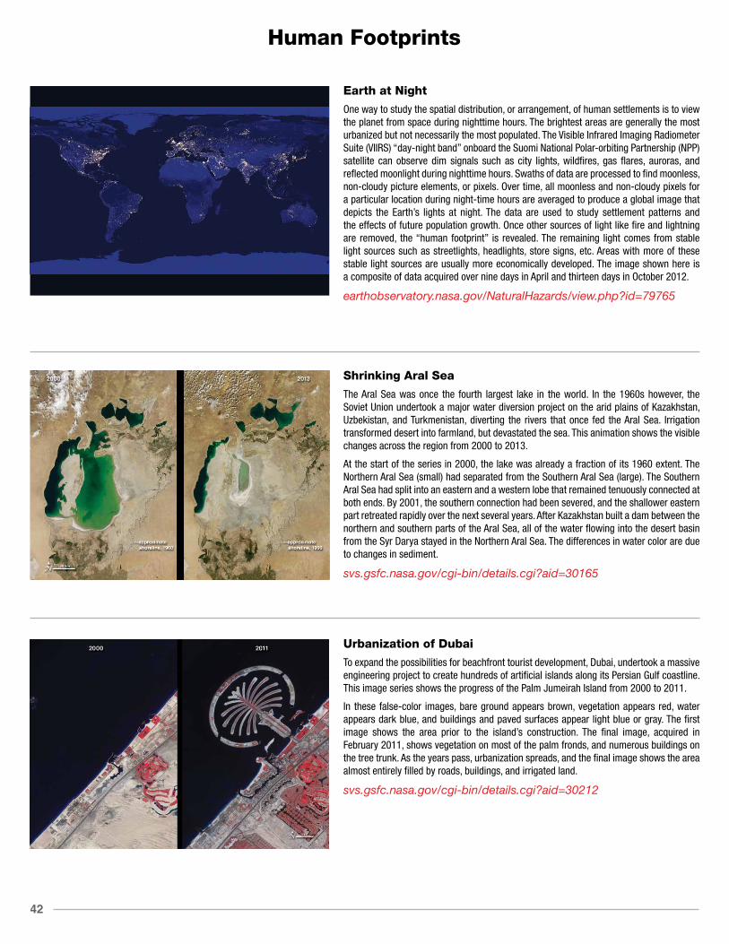
42
Human Footprints
Earth at Night
One way to study the spatial distribution, or arrangement, of human settlements is to view the planet from space during nighttime hours. The brightest areas are generally the most urbanized but not necessarily the most populated. The Visible Infrared Imaging Radiometer Suite (VIIRS) “day-night band” onboard the Suomi National Polar-orbiting Partnership (NPP) satellite can observe dim signals such as city lights, wildfires, gas flares, auroras, and reflected moonlight during nighttime hours. Swaths of data are processed to find moonless, non-cloudy picture elements, or pixels. Over time, all moonless and non-cloudy pixels for a particular location during night-time hours are averaged to produce a global image that depicts the Earth’s lights at night. The data are used to study settlement patterns and the effects of future population growth. Once other sources of light like fire and lightning are removed, the “human footprint” is revealed. The remaining light comes from stable light sources such as streetlights, headlights, store signs, etc. Areas with more of these stable light sources are usually more economically developed. The image shown here is a composite of data acquired over nine days in April and thirteen days in October 2012.
earthobservatory.nasa.gov/NaturalHazards/view.php?id=79765
Shrinking Aral Sea
The Aral Sea was once the fourth largest lake in the world. In the 1960s however, the Soviet Union undertook a major water diversion project on the arid plains of Kazakhstan, Uzbekistan, and Turkmenistan, diverting the rivers that once fed the Aral Sea. Irrigation transformed desert into farmland, but devastated the sea. This animation shows the visible changes across the region from 2000 to 2013.
At the start of the series in 2000, the lake was already a fraction of its 1960 extent. The Northern Aral Sea (small) had separated from the Southern Aral Sea (large). The Southern Aral Sea had split into an eastern and a western lobe that remained tenuously connected at both ends. By 2001, the southern connection had been severed, and the shallower eastern part retreated rapidly over the next several years. After Kazakhstan built a dam between the northern and southern parts of the Aral Sea, all of the water flowing into the desert basin from the Syr Darya stayed in the Northern Aral Sea. The differences in water color are due to changes in sediment.
svs.gsfc.nasa.gov/cgi-bin/details.cgi?aid=30165
Urbanization of Dubai
To expand the possibilities for beachfront tourist development, Dubai, undertook a massive engineering project to create hundreds of artificial islands along its Persian Gulf coastline. This image series shows the progress of the Palm Jumeirah Island from 2000 to 2011.
In these false-color images, bare ground appears brown, vegetation appears red, water appears dark blue, and buildings and paved surfaces appear light blue or gray. The first image shows the area prior to the island’s construction. The final image, acquired in February 2011, shows vegetation on most of the palm fronds, and numerous buildings on the tree trunk. As the years pass, urbanization spreads, and the final image shows the area almost entirely filled by roads, buildings, and irrigated land.
svs.gsfc.nasa.gov/cgi-bin/details.cgi?aid=30212

43
Human Footprints
Yellow River Delta
China’s Yellow River is the most sediment-filled river on Earth. The river crosses a plateau blanketed with up to 300 meters (980 feet) of fine, wind-blown soil. The soil is easily eroded, and millions of tons of it are carried away by the river every year. Some of it reaches the river’s mouth, where it builds and rebuilds the delta.
The Yellow River Delta has wandered up and down several hundred kilometers of coastline over the past two thousand years. Since the mid-nineteenth century, however, the lower reaches of the river and the delta have been extensively engineered to control flooding and to protect coastal development. This sequence of natural-color images shows the delta near the present river mouth at five-year intervals from 1989 to 2009. In 1996, engineers blocked the main channel and forced the river to veer northeast. By 1999, a new peninsula had formed to the north. The new peninsula thickened in the next five-years, and what appears to be aquaculture (dark-colored rectangles) expanded significantly in areas south of the river as of 2004. By 2009, the shoreline northwest of the new river mouth had filled in considerably. The land northwest of the newly fortified shoreline is home to an extensive field of oil and gas wells.
svs.gsfc.nasa.gov/cgi-bin/details.cgi?aid=30207
Dead Sea Salt Farming
The Dead Sea is so named because its high salinity discourages the growth of fish, plants, and other wildlife. It is the lowest surface feature on Earth, sitting roughly 1300 feet (396 meters) below sea level. On a hot, dry summer day, the water level can drop as much as one inch because of evaporation.
These three false-color images were captured in 1972, 1989, and 2011 by Landsat satellites. Deep waters are blue or dark blue, while brighter blues indicate shallow waters or salt ponds. Green indicates sparsely vegetated lands. Denser vegetation appears bright red.
The ancient Egyptians used salts from the Dead Sea for mummification, fertilizers, and potash (a potassium-based salt). In the modern age, sodium chloride and potassium salts culled from the sea are used for water conditioning, road de-icing, and the manufacturing of polyvinyl chloride (PVC) plastics. The expansions of massive salt evaporation projects are clearly visible over the span of 39 years.
svs.gsfc.nasa.gov/cgi-bin/details.cgi?aid=30053
Urban Growth in Las Vegas
The city of Las Vegas—meaning the meadows—was established in 1905. Its grassy meadows and artesian springs attracted settlers traveling across the arid Desert Southwest in the early 1800s. In the 1930s, gambling became legalized and construction of the Hoover Dam began, resulting in the city’s first growth spurt. Since then, Las Vegas has not stopped growing. Population has reached nearly two million over the past decade, becoming one of the fastest growing metropolitan areas in the world. These false-color images show the rapid urbanization of Las Vegas between 1984 and 2014. The city streets and other impervious surfaces appear gray, while irrigated vegetation appears red. Over the years, the expansion of irrigated vegetation (e.g., lawns and golf courses) has stretched the city’s desert bounds.
svs.gsfc.nasa.gov/goto?30215

44
Human Footprints
Urban Growth in Tucson, Arizona
The astronauts who snapped photos of Earth during the Mercury and Gemini missions produced more than just pretty pictures. They planted seeds at the USGS and NASA. In the mid-1960s, the director of USGS proposed a satellite program to observe our planet from above, and later described Landsat as “a direct result of the demonstrated utility of the Mercury and Gemini orbital photography to Earth resource studies.”
On a flight in late August 1965, Gemini V astronauts Gordon Cooper and Pete Conrad took photos of the Earth, including a shot showing Tucson, Arizona. A lot changed in the 46 years between that photo and the satellite image acquired in 2011 by the Thematic Mapper on Landsat 5.
A comparison of the images shows more city and less green. The expansion of urbanized areas is readily identifiable by the grid pattern of city streets. Between 1965 and 2011, Tucson’s population grew rapidly. In 1970, the population was 262,933; in 2010, it was 520,116.
svs.gsfc.nasa.gov/cgi-bin/details.cgi?aid=30183
NASA Satellite Data Reveal Impact of Olympic Pollution Controls in Beijing, China
Chinese government regulators had clearer skies and easier breathing in mind in the summer of 2008 when they temporarily shuttered some factories and banished many cars in a pre-Olympic sprint to clean up Beijing’s air. And that’s what they got.
They were not necessarily planning for something else: an unprecedented experiment using satellites to measure the impact of air pollution controls. Taking advantage of the opportunity, NASA researchers have since analyzed data from NASA’s Aura and Terra satellites that show how key pollutants responded to the Olympic restrictions.
The image on the left, an average of August 2005-07 nitrogen dioxide (NO2) levels, shows high levels of pollution in Beijing and other areas of eastern China. In contrast, levels of nitrogen dioxide (NO2) plunged nearly 50 percent in and around Beijing in August 2008 (right image) after officials instituted strict traffic restrictions in preparation for the Olympic Games.
svs.gsfc.nasa.gov/cgi-bin/details.cgi?aid=30403

NOTES

NOTES

NOTES

PARIS52 1Hyperwall Stories
svs.gsfc.nasa.gov/hw
National Aeronautics and Space Administration
www.nasa.gov
9/2015