compensation metrics cheat sheet
TRANSCRIPT

Compensation MetricsCheat SheetLeverage data to overcome your most pressing C&B challenges
2
Why compensation metrics matter
Offering the right compensation is one of the keys to attract
and retain the best talent. This is especially important as
organizations face the great resignation and a future of
shrinking talent pools.
Even now, 69% of employers globally are struggling to find
skilled workers. And in 2019, compensation was the number
one factor in voluntary turnover.
As finding a fitting compensation strategy becomes more
important than ever, so does tracking compensation metrics.
Why? There are three key reasons.
Introduction1: Increased strategic importance
Provide compensation packages that support your
organization's objectives and business strategies, and align pay
to market realities, granting you a strategic advantage.
2. Improved talent acquisition and management
Determine which compensation package will let you remain
competitive in the war for talent, and see the impact of your
policies on employee retention.
3. Better equity and fairness
See how equitable and fair the pay is within teams and across
the entire organization, and ensure pay is fair, preventing legal
issues related to pay discrimination.
3
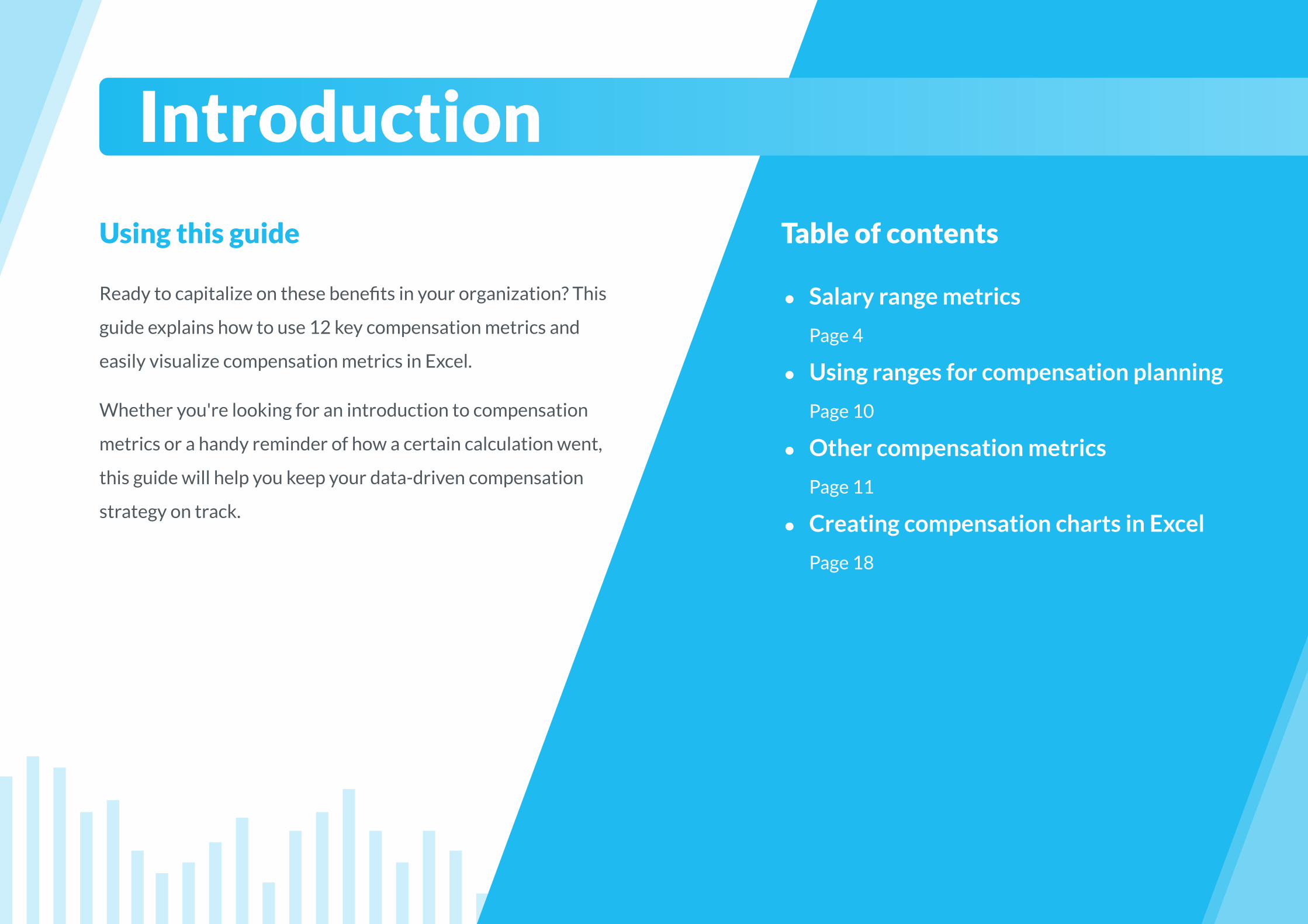
Using this guide
Ready to capitalize on these benefits in your organization? This
guide explains how to use 12 key compensation metrics and
easily visualize compensation metrics in Excel.
Whether you're looking for an introduction to compensation
metrics or a handy reminder of how a certain calculation went,
this guide will help you keep your data-driven compensation
strategy on track.
Table of contents
● Salary range metrics
Page 4
● Using ranges for compensation planning
Page 10
● Other compensation metrics
Page 11
● Creating compensation charts in Excel
Page 18
Introduction
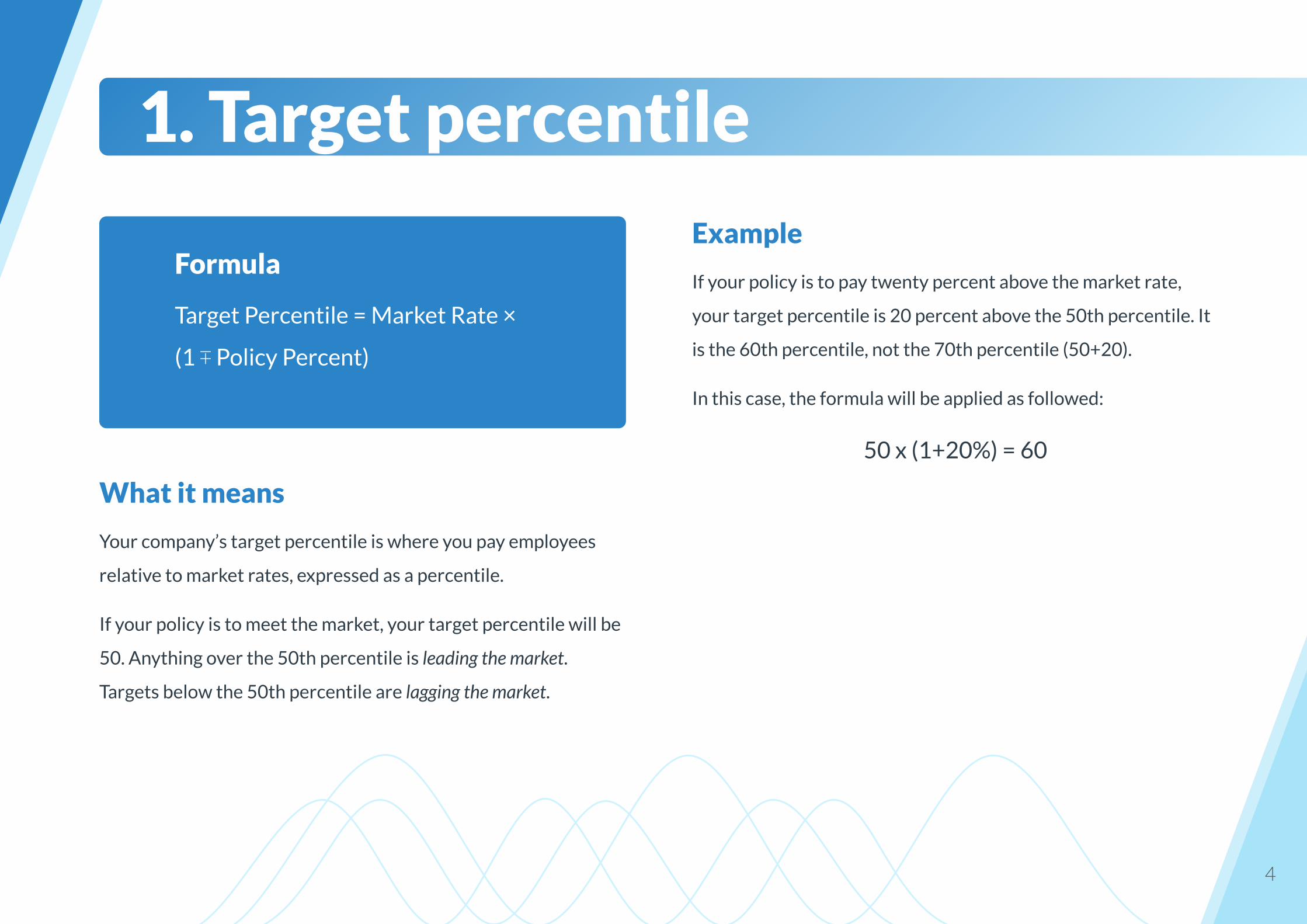
Example
If your policy is to pay twenty percent above the market rate,
your target percentile is 20 percent above the 50th percentile. It
is the 60th percentile, not the 70th percentile (50+20).
In this case, the formula will be applied as followed:
50 x (1+20%) = 60
4
What it means
Your company’s target percentile is where you pay employees
relative to market rates, expressed as a percentile.
If your policy is to meet the market, your target percentile will be
50. Anything over the 50th percentile is leading the market.
Targets below the 50th percentile are lagging the market.
1. Target percentile
Formula
Target Percentile = Market Rate ×
(1 ∓ Policy Percent)

Example
If your goal is to lead the market by 30% when the market rate is
$46,000, your range midpoint would be:
$46,000 × (1 + 30%) = $59,800
If your goal is to lag the market by 10% when the market rate for
a job group is $46,000, your range midpoint would be:
$46,000 × (1 – 10%) = $41,400
5
What it means
This is the exact middle of your range, equally distanced from the
range minimum and range maximum, and aligned to the market
value of the job.
2. Range midpoint
Formula
Midpoint = Market Rate ×
(1 + Policy Percentage)
6
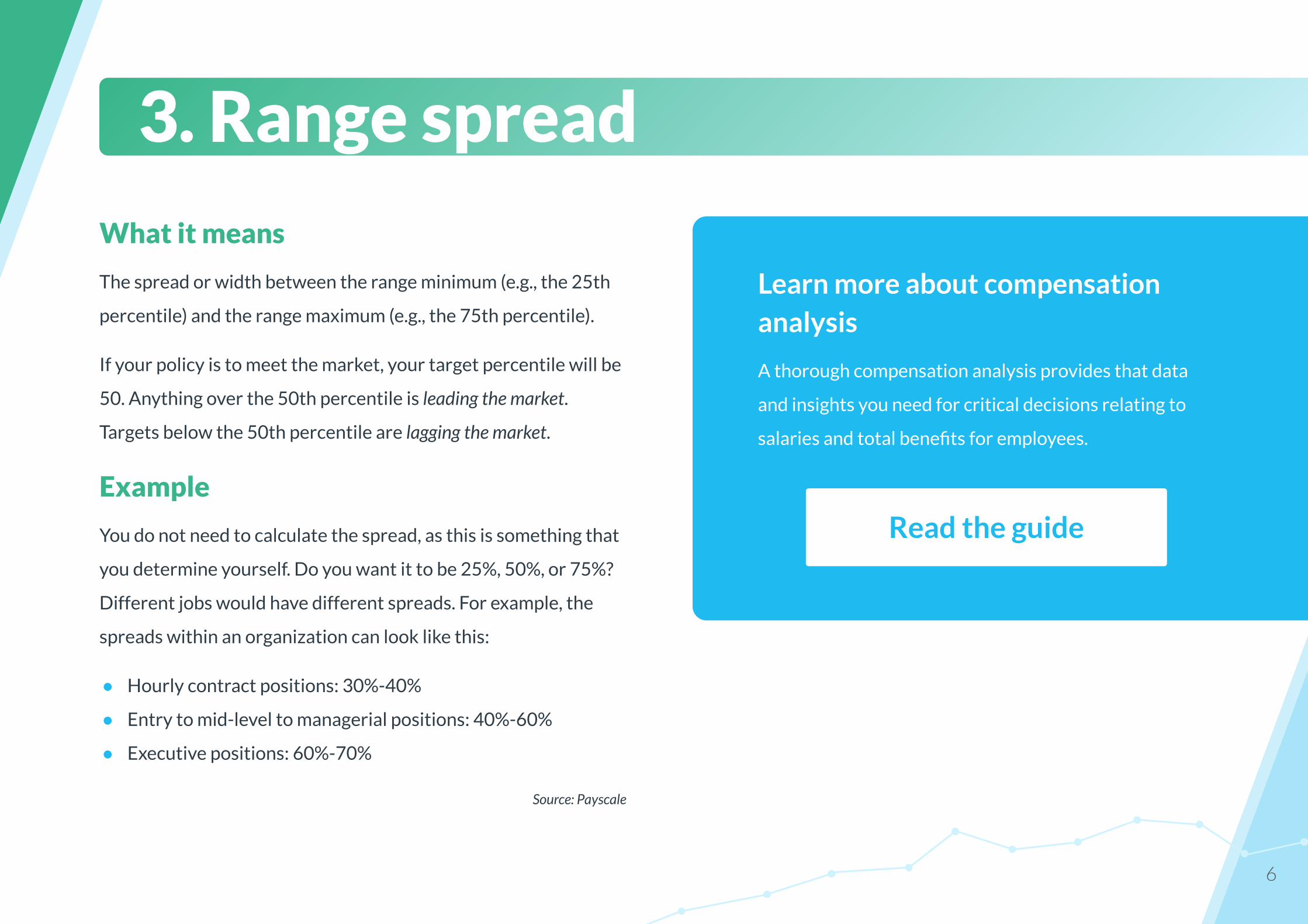
What it means
The spread or width between the range minimum (e.g., the 25th
percentile) and the range maximum (e.g., the 75th percentile).
If your policy is to meet the market, your target percentile will be
50. Anything over the 50th percentile is leading the market.
Targets below the 50th percentile are lagging the market.
Example
You do not need to calculate the spread, as this is something that
you determine yourself. Do you want it to be 25%, 50%, or 75%?
Different jobs would have different spreads. For example, the
spreads within an organization can look like this:
● Hourly contract positions: 30%-40%
● Entry to mid-level to managerial positions: 40%-60%
● Executive positions: 60%-70%
Source: Payscale
3. Range spread
Learn more about compensation analysis
A thorough compensation analysis provides that data
and insights you need for critical decisions relating to
salaries and total benefits for employees.
Read the guide
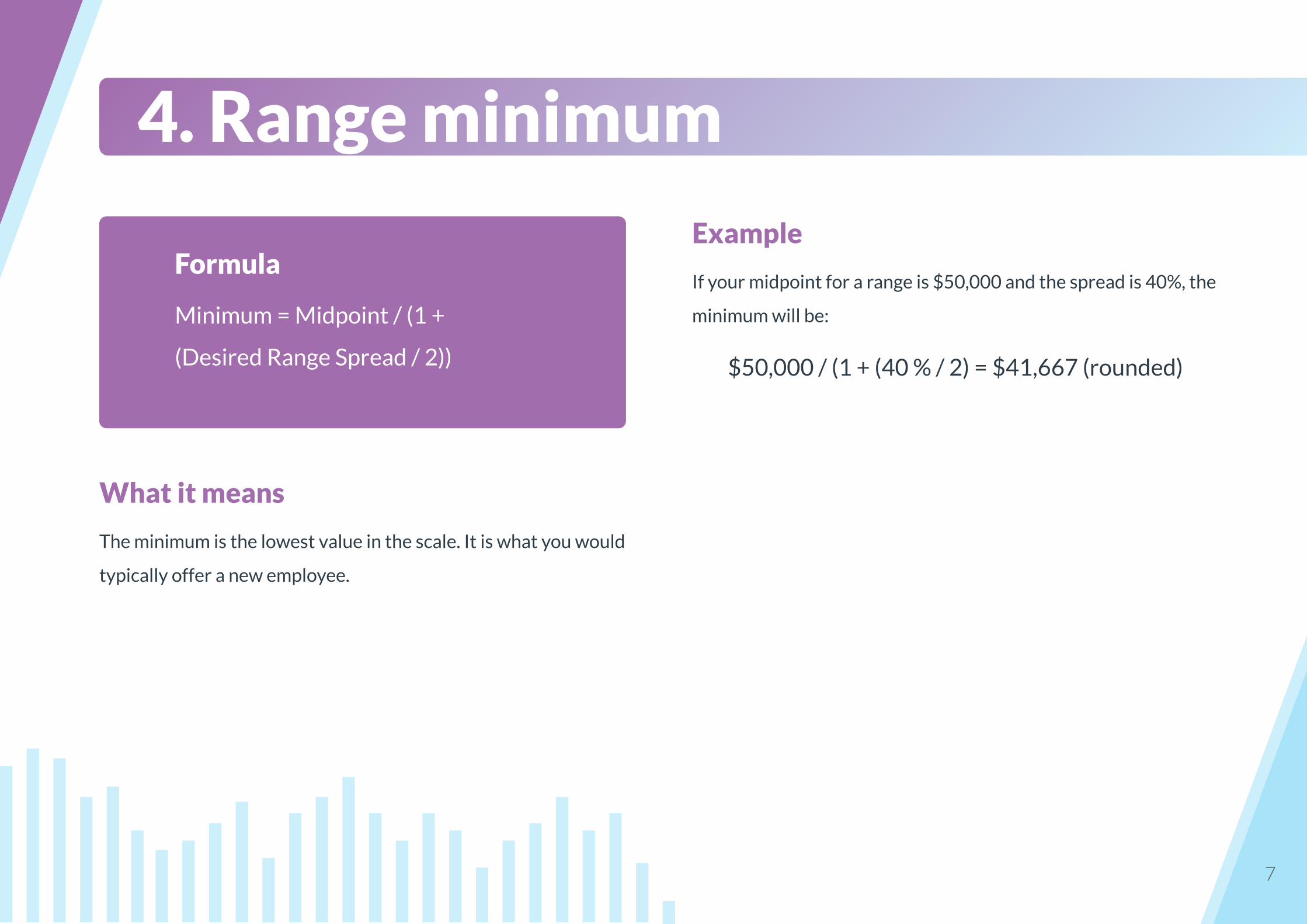
Example
If your midpoint for a range is $50,000 and the spread is 40%, the
minimum will be:
$50,000 / (1 + (40 % / 2) = $41,667 (rounded)
7
What it means
The minimum is the lowest value in the scale. It is what you would
typically offer a new employee.
4. Range minimum
Formula
Minimum = Midpoint / (1 +
(Desired Range Spread / 2))
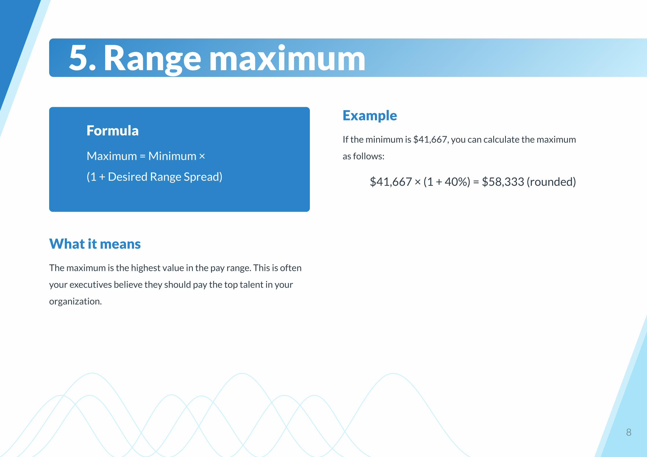
Example
If the minimum is $41,667, you can calculate the maximum
as follows:
$41,667 × (1 + 40%) = $58,333 (rounded)
8
What it means
The maximum is the highest value in the pay range. This is often
your executives believe they should pay the top talent in your
organization.
5. Range maximum
Formula
Maximum = Minimum ×
(1 + Desired Range Spread)
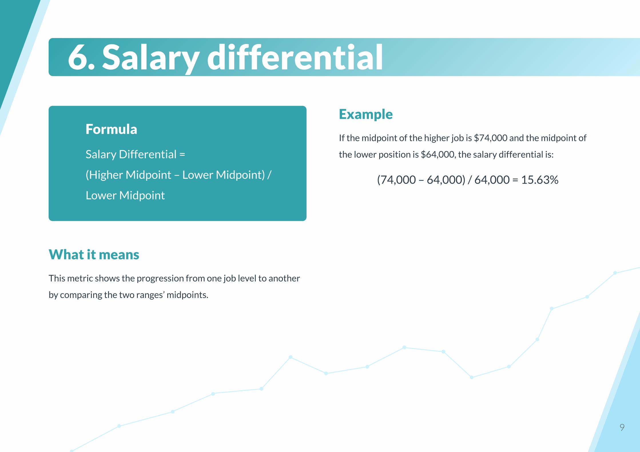
Example
If the midpoint of the higher job is $74,000 and the midpoint of
the lower position is $64,000, the salary differential is:
(74,000 – 64,000) / 64,000 = 15.63%
9
What it means
This metric shows the progression from one job level to another
by comparing the two ranges’ midpoints.
6. Salary differential
Formula
Salary Differential =
(Higher Midpoint – Lower Midpoint) /
Lower Midpoint
10
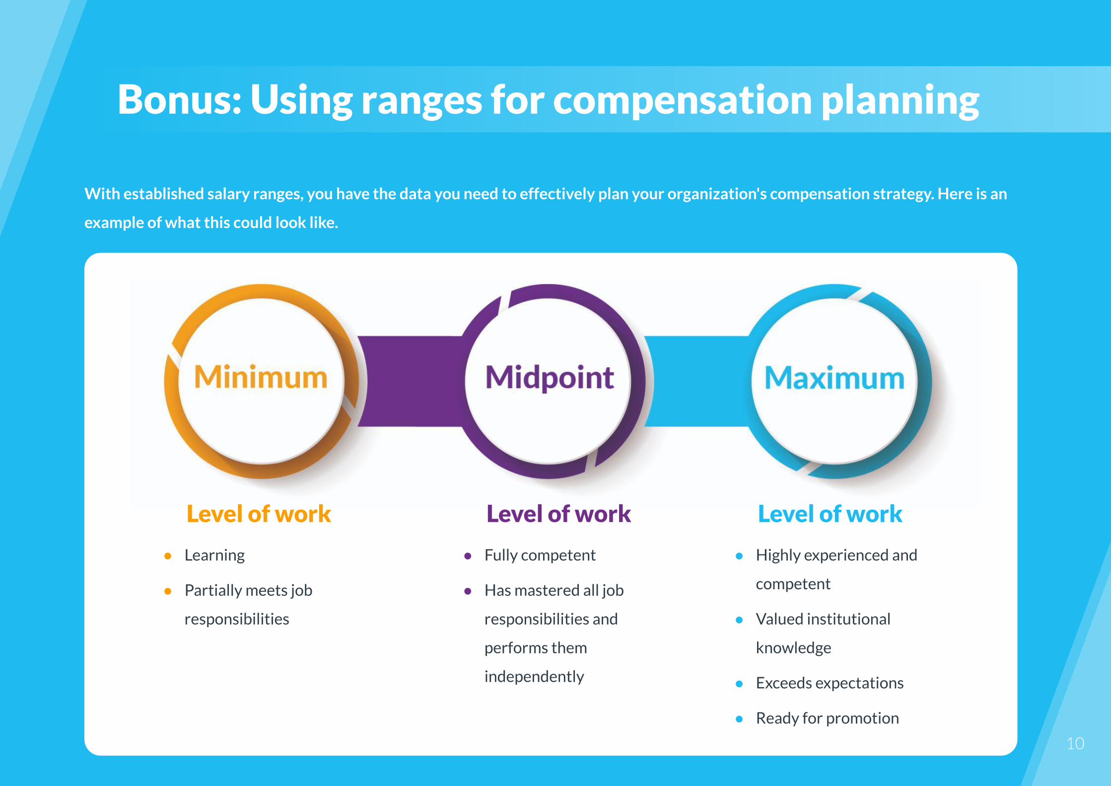
With established salary ranges, you have the data you need to effectively plan your organization's compensation strategy. Here is an
example of what this could look like.
Bonus: Using ranges for compensation planning
Level of work
● Learning
● Partially meets job
responsibilities
Level of work
● Fully competent
● Has mastered all job
responsibilities and
performs them
independently
Level of work
● Highly experienced and
competent
● Valued institutional
knowledge
● Exceeds expectations
● Ready for promotion
Example
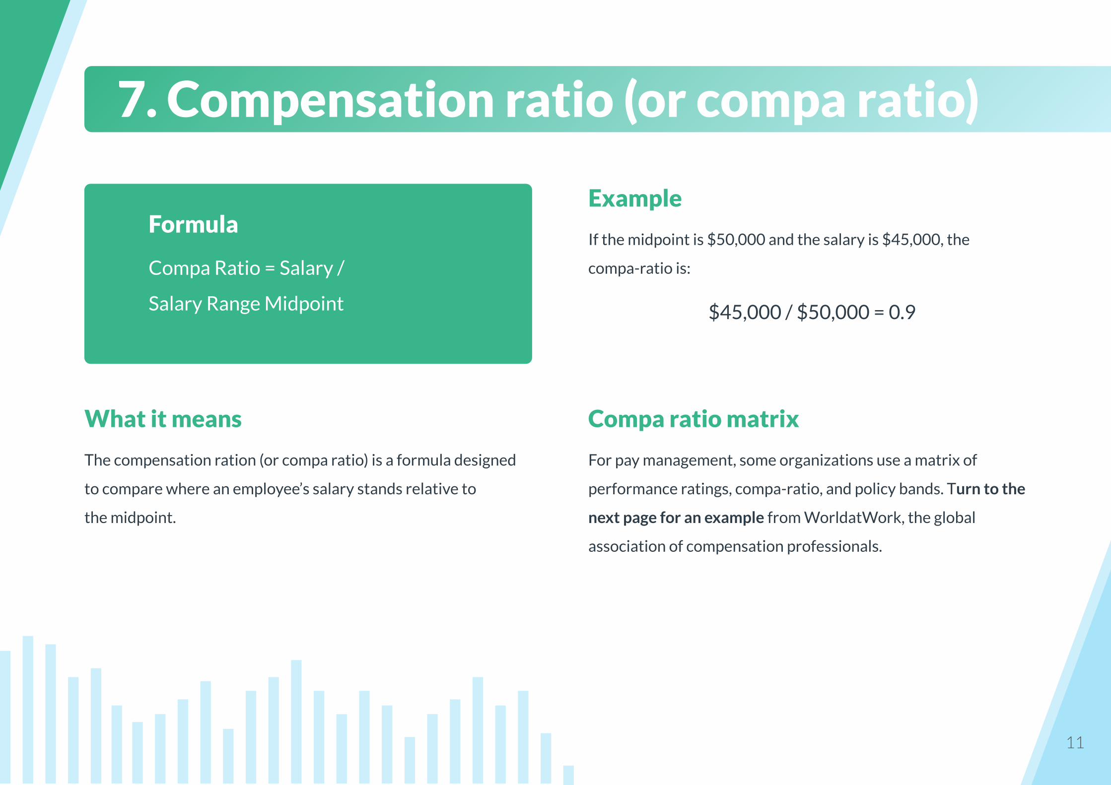
If the midpoint is $50,000 and the salary is $45,000, the
compa-ratio is:
$45,000 / $50,000 = 0.9
11
What it means
The compensation ration (or compa ratio) is a formula designed
to compare where an employee’s salary stands relative to
the midpoint.
7. Compensation ratio (or compa ratio)
Formula
Compa Ratio = Salary /
Salary Range Midpoint
Compa ratio matrix
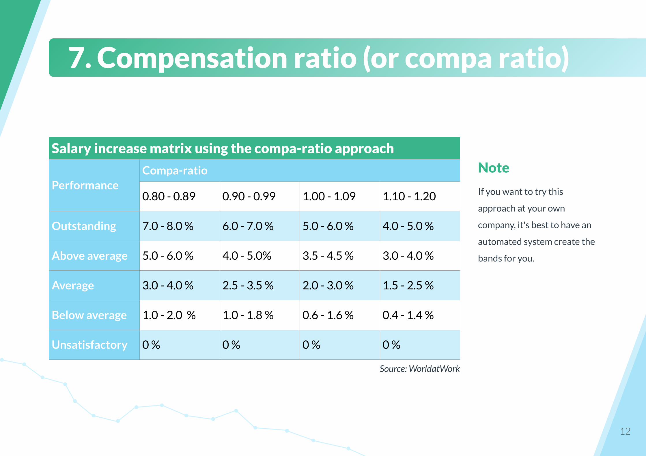
For pay management, some organizations use a matrix of
performance ratings, compa-ratio, and policy bands. Turn to the
next page for an example from WorldatWork, the global
association of compensation professionals.
12
Note
If you want to try this
approach at your own
company, it's best to have an
automated system create the
bands for you.
7. Compensation ratio (or compa ratio)
Salary increase matrix using the compa-ratio approach
PerformanceCompa-ratio
0.80 - 0.89 0.90 - 0.99 1.00 - 1.09 1.10 - 1.20
Outstanding 7.0 - 8.0 % 6.0 - 7.0 % 5.0 - 6.0 % 4.0 - 5.0 %
Above average 5.0 - 6.0 % 4.0 - 5.0% 3.5 - 4.5 % 3.0 - 4.0 %
Average 3.0 - 4.0 % 2.5 - 3.5 % 2.0 - 3.0 % 1.5 - 2.5 %
Below average 1.0 - 2.0 % 1.0 - 1.8 % 0.6 - 1.6 % 0.4 - 1.4 %
Unsatisfactory 0 % 0 % 0 % 0 %
Source: WorldatWork
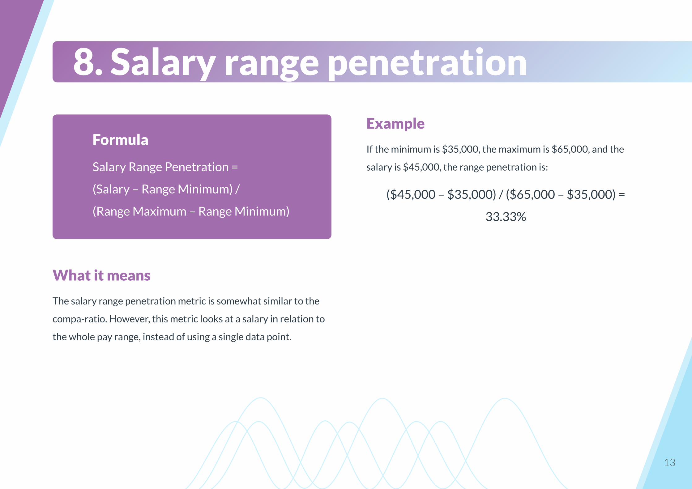
Example
If the minimum is $35,000, the maximum is $65,000, and the
salary is $45,000, the range penetration is:
($45,000 – $35,000) / ($65,000 – $35,000) =
33.33%
13
What it means
The salary range penetration metric is somewhat similar to the
compa-ratio. However, this metric looks at a salary in relation to
the whole pay range, instead of using a single data point.
8. Salary range penetration
Formula
Salary Range Penetration =
(Salary – Range Minimum) /
(Range Maximum – Range Minimum)
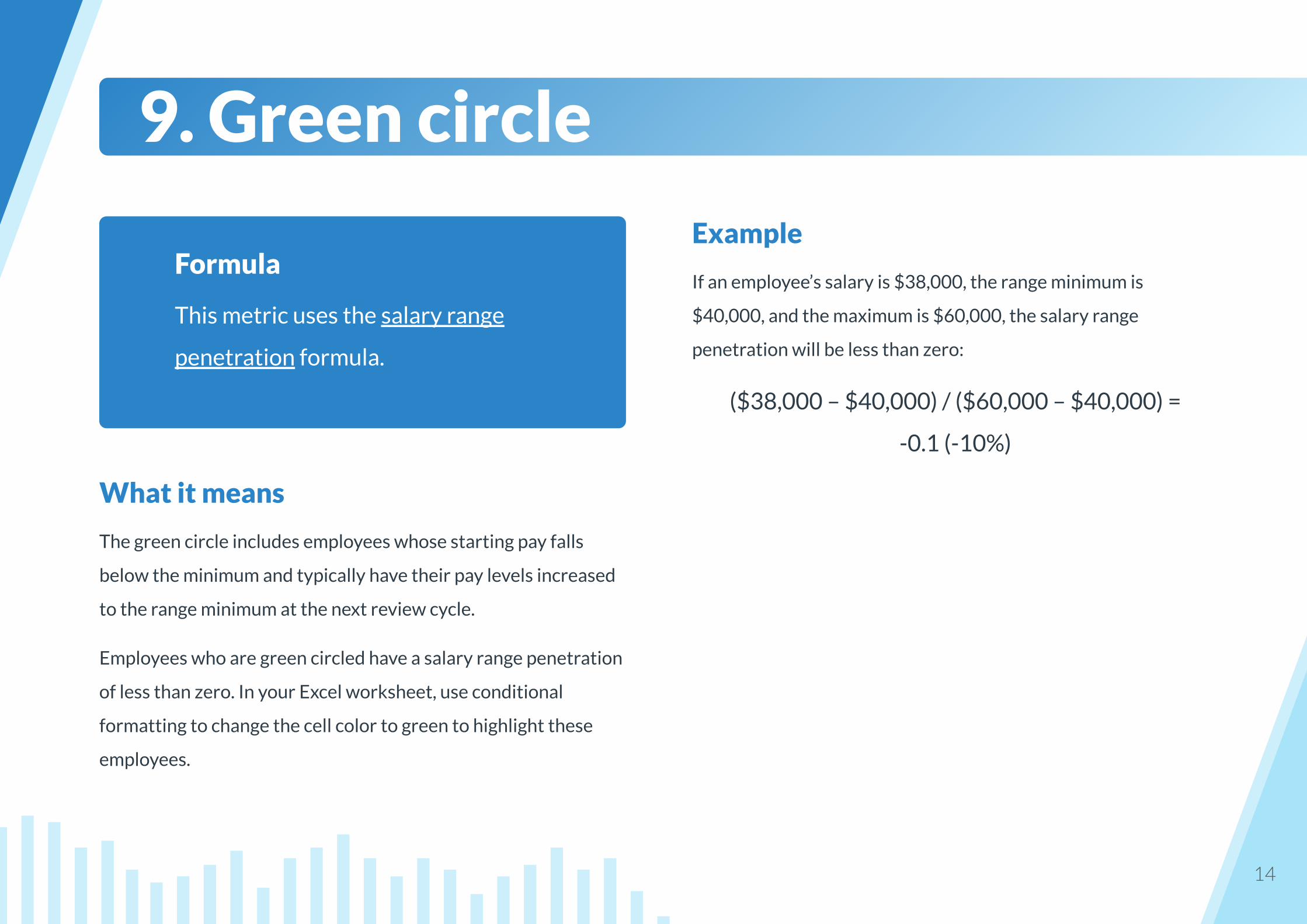
Example
If an employee’s salary is $38,000, the range minimum is
$40,000, and the maximum is $60,000, the salary range
penetration will be less than zero:
($38,000 – $40,000) / ($60,000 – $40,000) =
-0.1 (-10%)
14
What it means
The green circle includes employees whose starting pay falls
below the minimum and typically have their pay levels increased
to the range minimum at the next review cycle.
Employees who are green circled have a salary range penetration
of less than zero. In your Excel worksheet, use conditional
formatting to change the cell color to green to highlight these
employees.
9. Green circle
Formula
This metric uses the salary range
penetration formula.

Example
If an employee’s salary is $65,000, the minimum is $40,000, and
the maximum is $60,000, the range penetration will be greater
than 100%:
($65,000 – $40,000) / ($60,000 – $40,000) =
1.3 (130%)
15
What it means
The red circle includes employees whose pay falls above the
salary range maximum. They will probably have their pay frozen
until their salary once again falls within the range.
Employees who are red circled have a salary range penetration of
more than 100%. In your Excel worksheet, use conditional
formatting to change the cell color to red to highlight these
employees.
10. Red circle
Formula
This metric uses the salary range
penetration formula.
Example
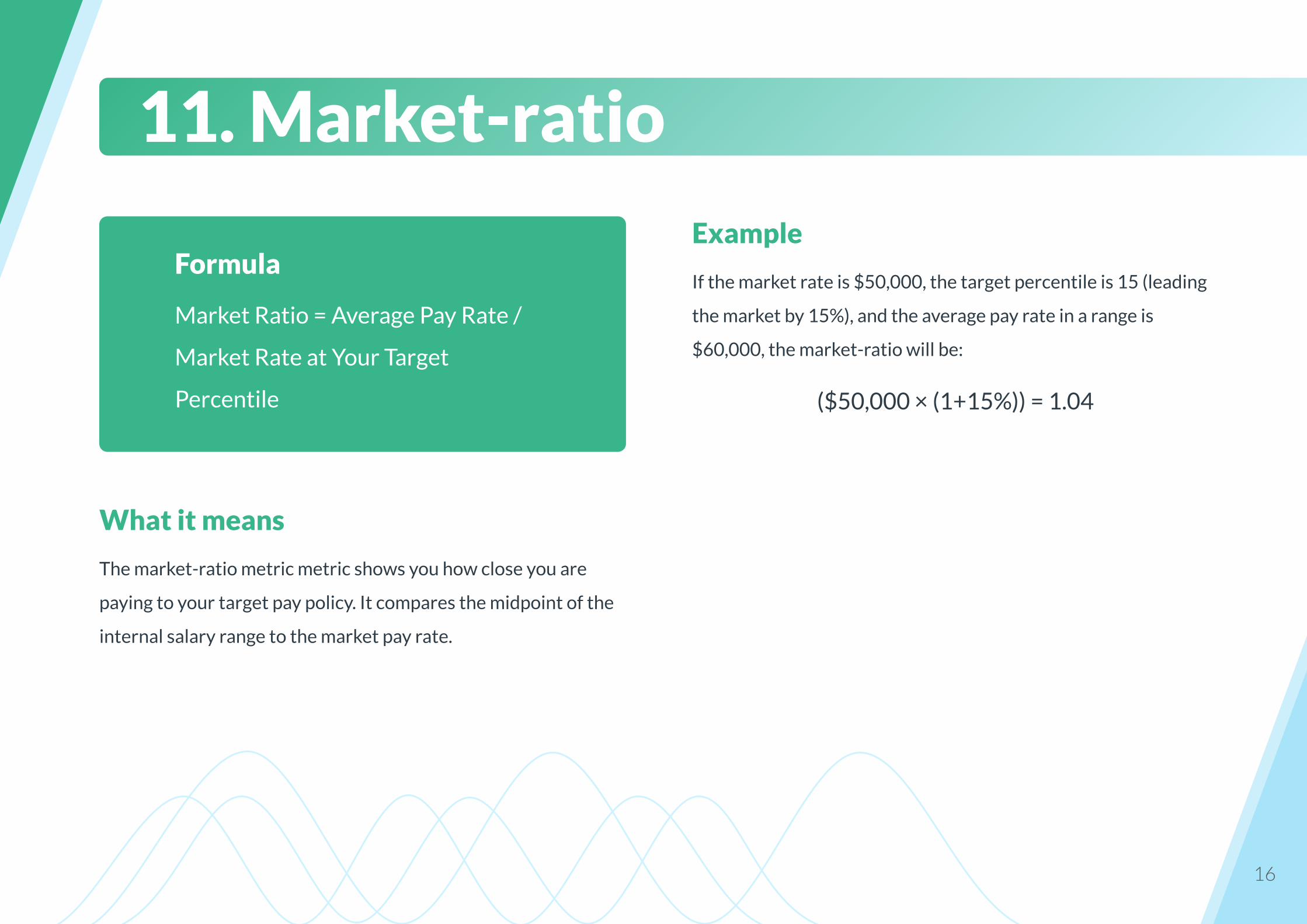
If the market rate is $50,000, the target percentile is 15 (leading
the market by 15%), and the average pay rate in a range is
$60,000, the market-ratio will be:
($50,000 × (1+15%)) = 1.04
16
What it means
The market-ratio metric metric shows you how close you are
paying to your target pay policy. It compares the midpoint of the
internal salary range to the market pay rate.
11. Market-ratio
Formula
Market Ratio = Average Pay Rate /
Market Rate at Your Target
Percentile
17
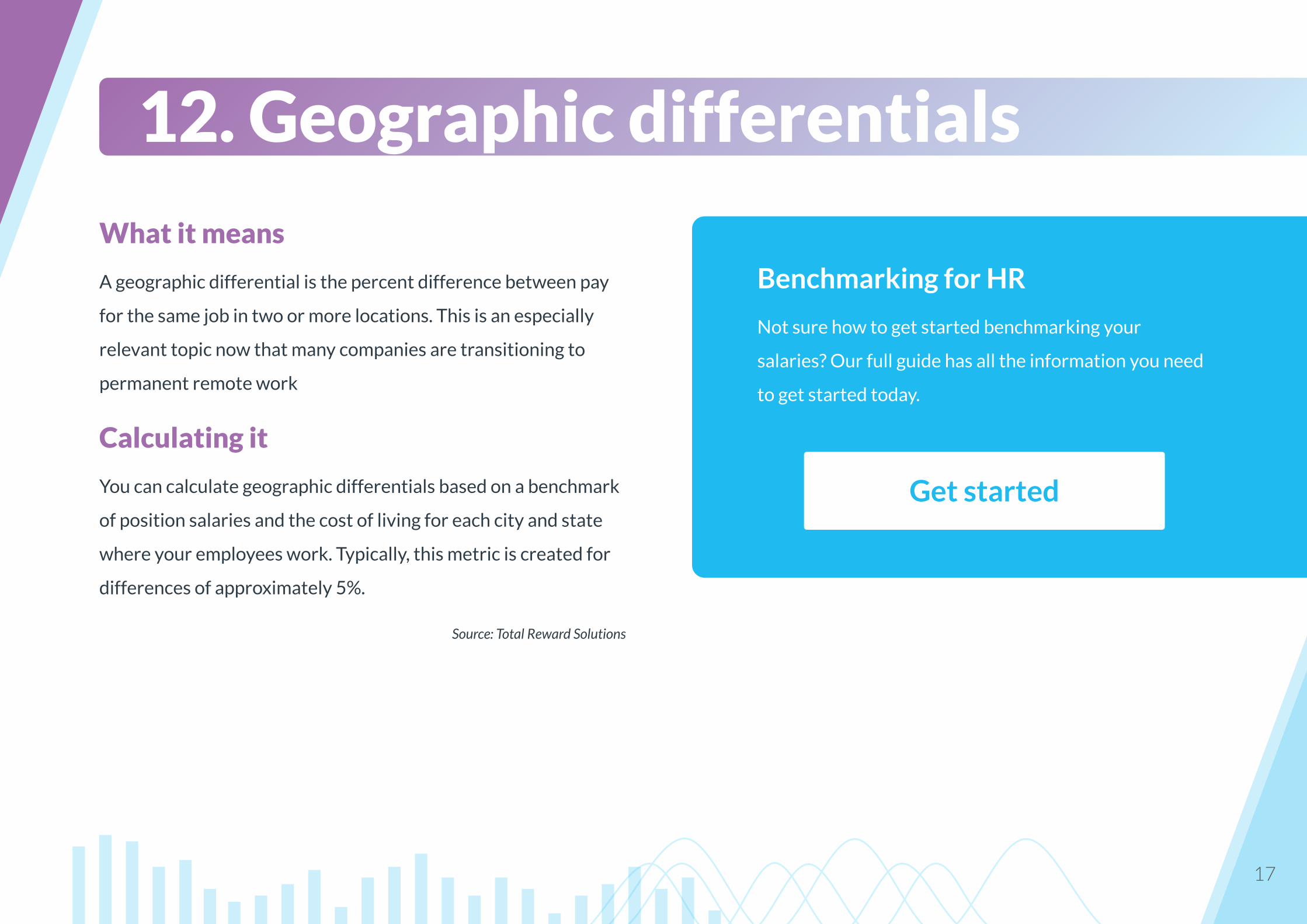
12. Geographic differentials
What it means
A geographic differential is the percent difference between pay
for the same job in two or more locations. This is an especially
relevant topic now that many companies are transitioning to
permanent remote work
Calculating it
You can calculate geographic differentials based on a benchmark
of position salaries and the cost of living for each city and state
where your employees work. Typically, this metric is created for
differences of approximately 5%.
Source: Total Reward Solutions
Benchmarking for HR
Not sure how to get started benchmarking your
salaries? Our full guide has all the information you need
to get started today.
Get started
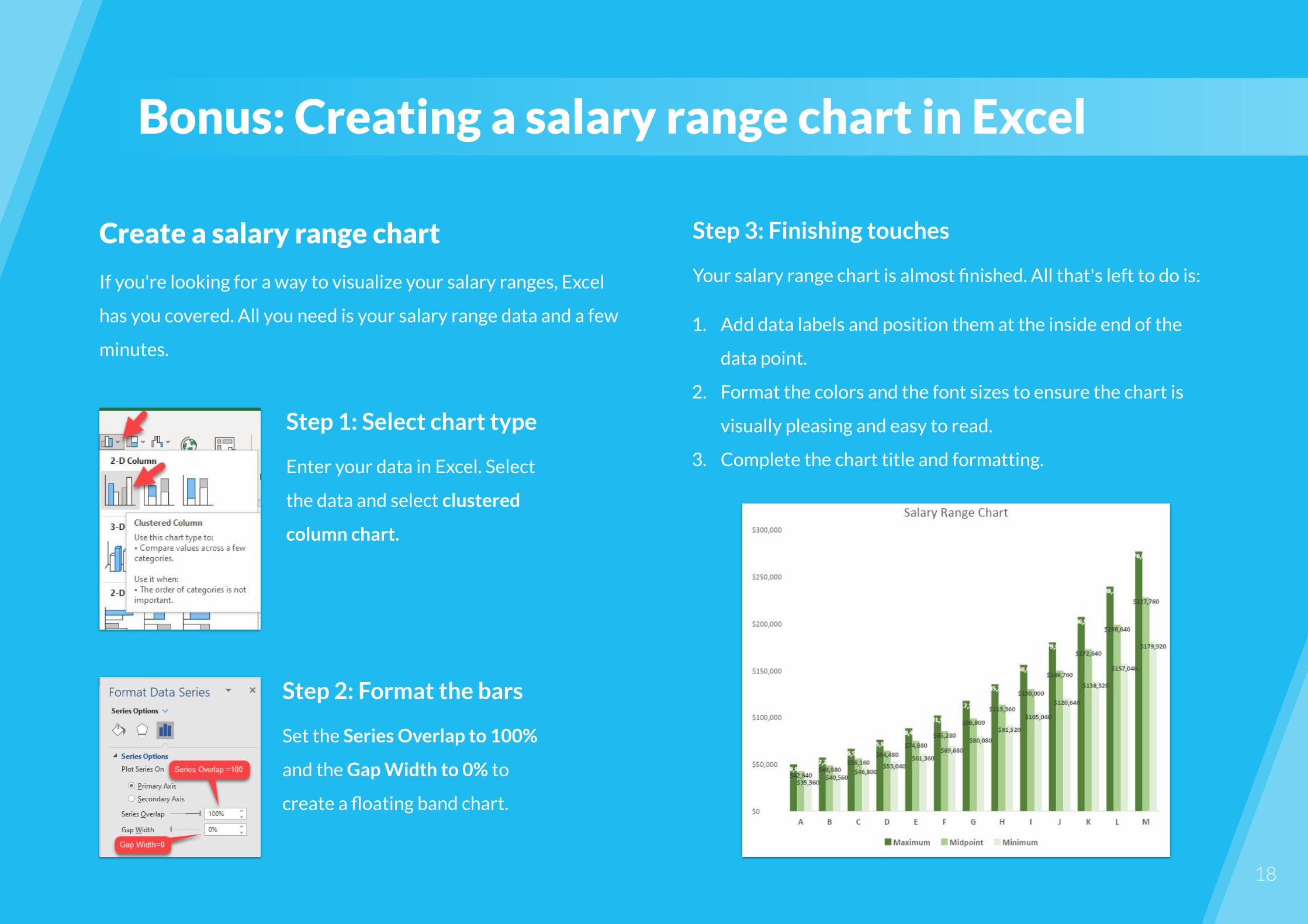
Step 3: Finishing touches
Your salary range chart is almost finished. All that's left to do is:
1. Add data labels and position them at the inside end of the
data point.
2. Format the colors and the font sizes to ensure the chart is
visually pleasing and easy to read.
3. Complete the chart title and formatting.
Create a salary range chart
If you're looking for a way to visualize your salary ranges, Excel
has you covered. All you need is your salary range data and a few
minutes.
Bonus: Creating a salary range chart in Excel
Step 1: Select chart type
Enter your data in Excel. Select
the data and select clustered
column chart.
Step 2: Format the bars
Set the Series Overlap to 100%
and the Gap Width to 0% to
create a floating band chart.
18
Step 3: Adjust the chart
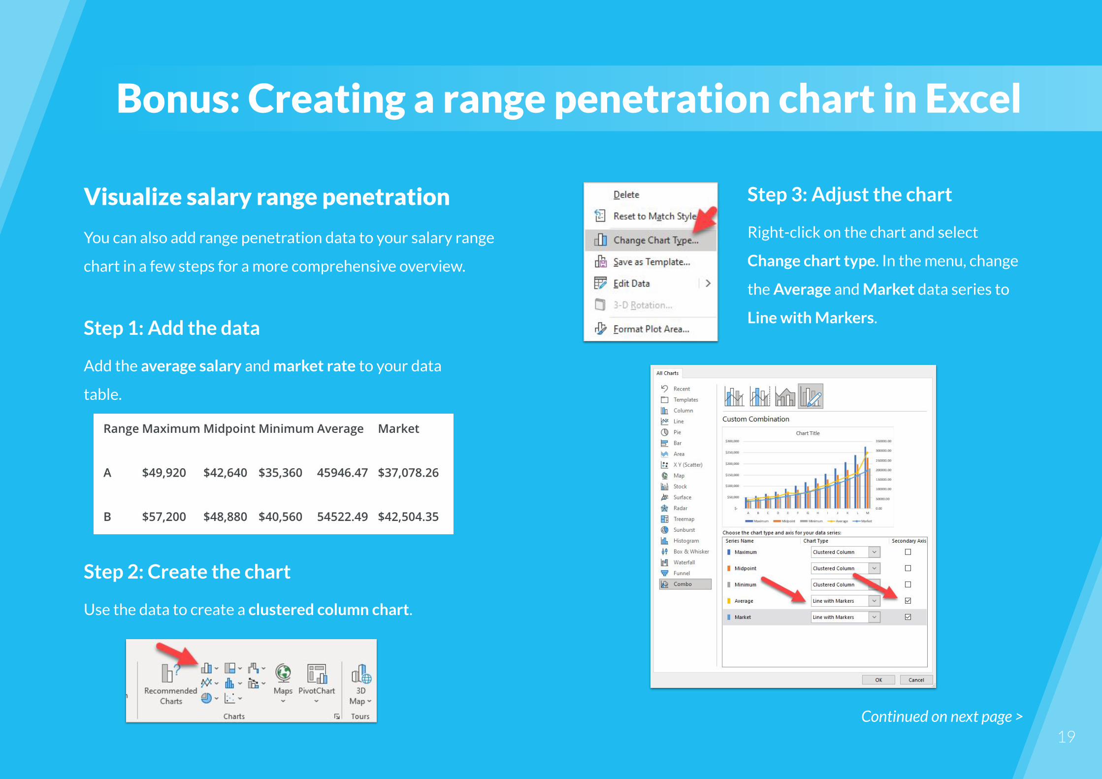
Right-click on the chart and select
Change chart type. In the menu, change
the Average and Market data series to
Line with Markers.
19
Visualize salary range penetration
You can also add range penetration data to your salary range
chart in a few steps for a more comprehensive overview.
Bonus: Creating a range penetration chart in Excel
Step 1: Add the data
Add the average salary and market rate to your data
table.
Step 2: Create the chart
Use the data to create a clustered column chart.
Continued on next page >
20
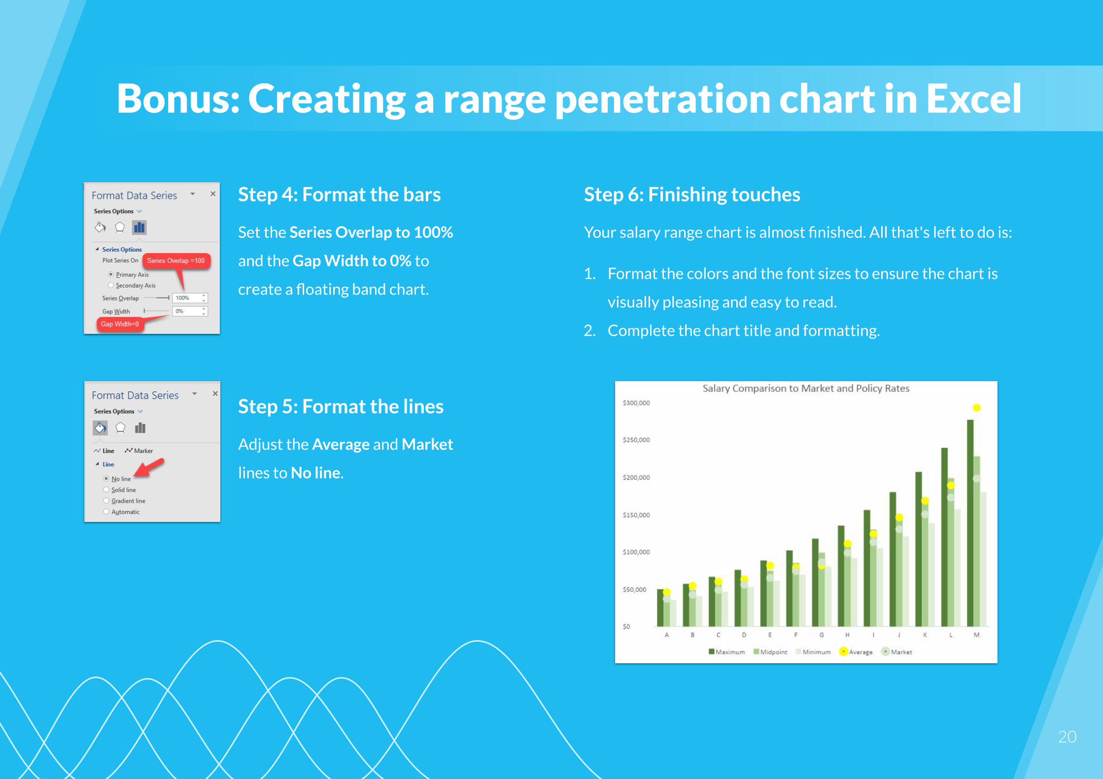
Bonus: Creating a range penetration chart in Excel
Step 5: Format the lines
Adjust the Average and Market
lines to No line.
Step 4: Format the bars
Set the Series Overlap to 100%
and the Gap Width to 0% to
create a floating band chart.
Step 6: Finishing touches
Your salary range chart is almost finished. All that's left to do is:
1. Format the colors and the font sizes to ensure the chart is
visually pleasing and easy to read.
2. Complete the chart title and formatting.

COMPENSATION & BENEFITS CERTIFICATE
Become a Total Rewards specialist
The Compensation & Benefits Certificate Program helps you
gain the skills to create an effective Total Rewards strategy and
drive business impact with your C&B initiatives.
Type Online self-paced learning
Duration 30 hours
Structure 5 courses + capstone project
Digital certificate upon completion (including LI token)
Eligible for HRCI, SHRM & HRPA credits
Create a future-proof C&B strategy
Learn more

At the Academy to Innovate HR (AIHR), it is our mission to make HR
future-proof by offering world-class, online education programs available
anywhere, anytime.
Any HR professional who is committed to lifelong learning can expand their skill
set with relevant and in-demand skills. AIHR is the place to learn the skills you
need to advance your career and secure a job at the forefront of HR.
Browse our programs at AIHR.com
AIHR | Academy to Innovate HR
COPYRIGHT © 2021 AIHR. All rights reserved. This
publication may not be reproduced or transmitted in any
form by any means, electronic, mechanical, photocopying,
recording, or otherwise, without the prior written permission
of AIHR.
22
Sources
Compensation Metrics HR and Managers Need to Know
A Guide to Compensation Analysis
This Month In HR: From Great Reopening To Great Resignation Of Employees
Pay range
Global Talent Shortages Reach 15-Year-High As Workforce Transformation Reshapes In-Demand Skills
Is Compensation to Blame for Your High Employee Turnover Rate?
A Crash Course in Key Compensation Metrics
Illustrations by Storyset