colour, vision & perception - school of computing · physiology (vision) • psychology...
TRANSCRIPT

Colour, Vision & Perception
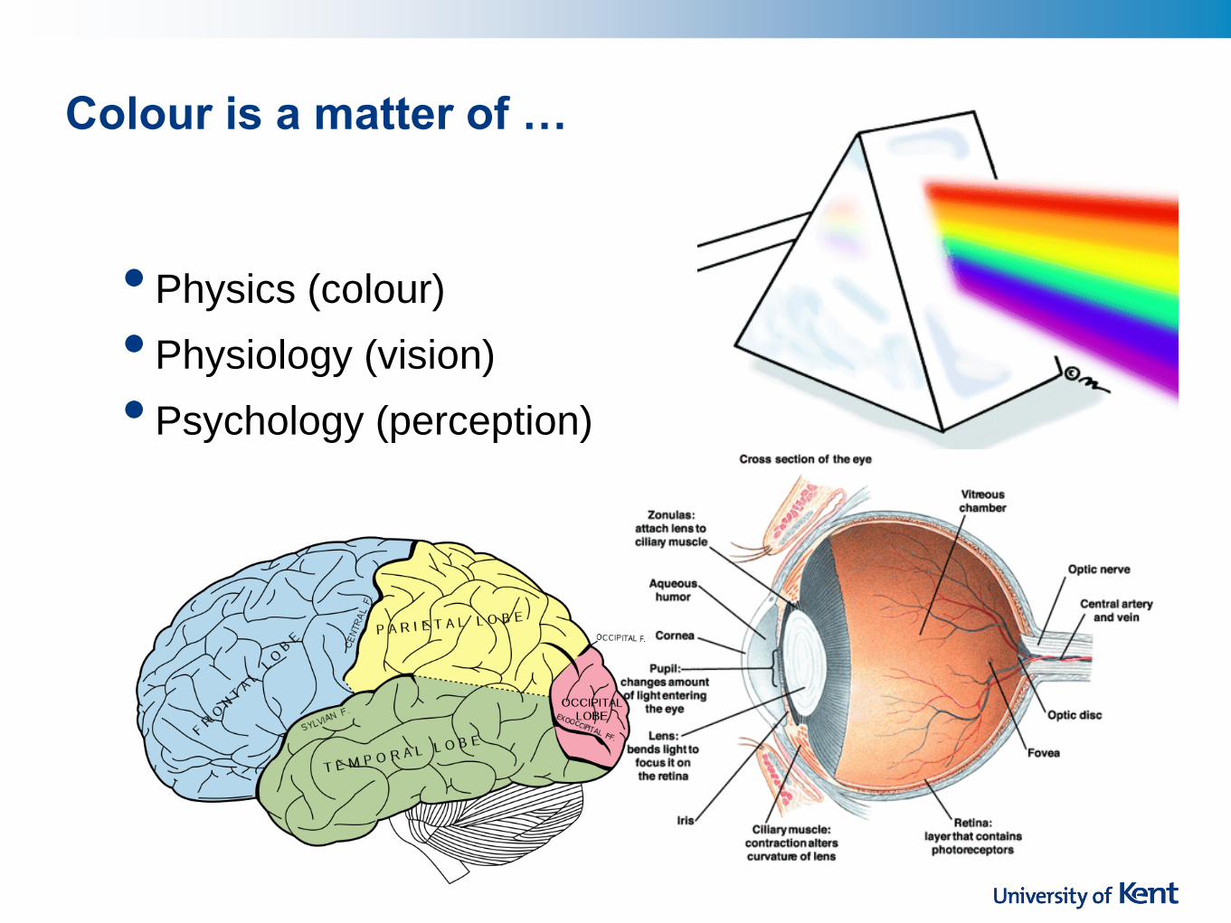
Colour is a matter of …
• Physics (colour)
• Physiology (vision)
• Psychology (perception)

Colour is a matter of …
• Physics (colour)
• Physiology (vision)
• Psychology (perception)

Isaac Newton

Light
• Light from the sun is composed of an almost
continuous spectrum of electromagnetic radiation.
• A majority of the light waves above 2,000
nanometers (infrared wavelengths) are absorbed by
carbon dioxide, water vapor, and ozone
• The shorter ultraviolet waves are also absorbed by
the ozone layer. This filtering effect of the
atmosphere limits the spectrum of light waves
reaching the ground to those having wavelengths
between 320 and 2,000 nanometres.

Physics - Electromagnetic Spectrum

Simple colour models
Receptors in the eye are sensitive to RGB
(biologically) Printers CYM model

Additive vs subtractive colour
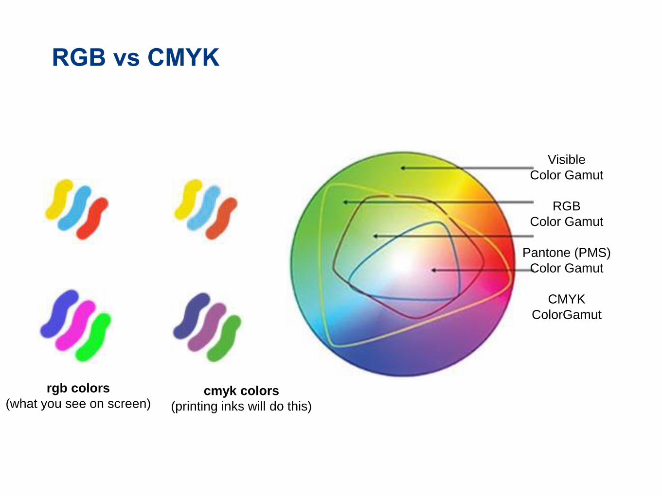
RGB vs CMYK
Visible
Color Gamut
RGB
Color Gamut
Pantone (PMS)
Color Gamut
CMYK
ColorGamut
cmyk colors
(printing inks will do this)
rgb colors
(what you see on screen)

•Hue
a property of the wavelengths of light (i.e., “colour”)
Colour Dimensions: Hue

•Saturation
purity of the hue
for example, red is more saturated than pink
the portion of pure hue in any given colour is the
degree of saturation
•Saturation is the degree of colour intensity
associated with a colour's perceptual difference
from a white, black or gray of equal lightness.
Colour Dimensions: Saturation
Same Hue, different Saturation

•Lightness/Brightness
(“Value”)
how much light appears to be
reflected from a surface
some hues are inherently
lighter or darker
for example, you can’t really
imagine “dark yellow” in the
same way as you can “dark
blue”
Colour Dimensions: Value


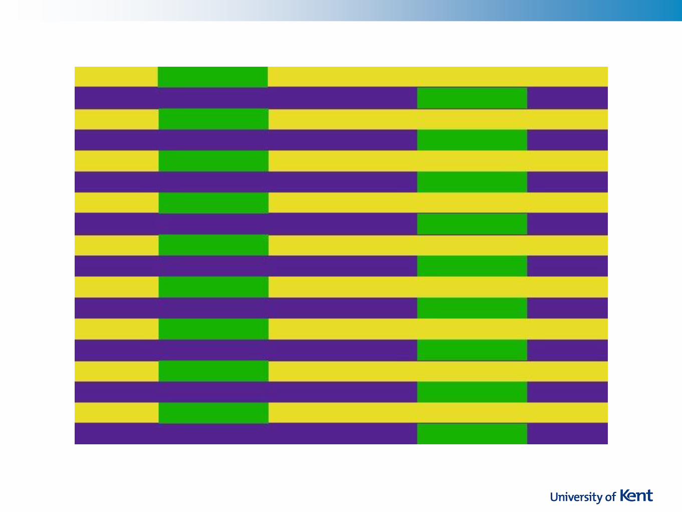
Value is also affected by background

Value is also affected by background

Value is also affected by background


Adelson’s
Checkerboard


Saturation vs. Value

Saturation vs. Value

Don't be fooled by models
•Colour perception is
not uniform

Live Demonstration
Colour is a matter of …
•Physics (colour)
•Physiology (vision)
•Psychology (perception)

Colour is a matter of …
•Physics (colour)
•Physiology (vision)
•Psychology (perception)

Physiology of the eye (i)
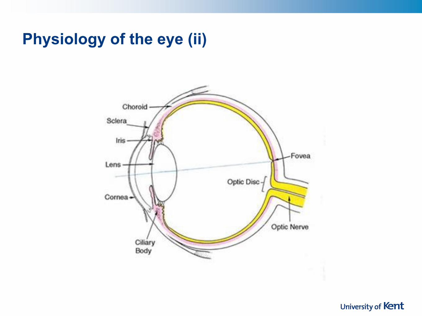
Physiology of the eye (ii)

Physiology of the eye (iii)
Receptors: Rods & Cones

Retina (i)
• Retina covered with light-sensitive receptors
• Rods (circa 120 million) scotopic vision: (poor acuity)
good for low luminance, mostly peripheral; very sensitive to
light
primarily for night vision & perceiving movement (we’re all
colour-blind at night)
• Cones (circa 6 million) - color photopic vision: (good acuity)
require substantial luminance; not very sensitive to light
primarily used to sense colour

Retina (ii)

Retina (iii)
• The centre of retina has most of the cones, the fovea has only cones. high acuity of objects
focussed at centre (reading, threading needles etc.)
• Edge of retina is dominated by rods. detecting motion of threats in
periphery (leopards, assassins etc.)
http://www.olympusmicro.com/primer/lightandcolor/humanvisionint
ro.html
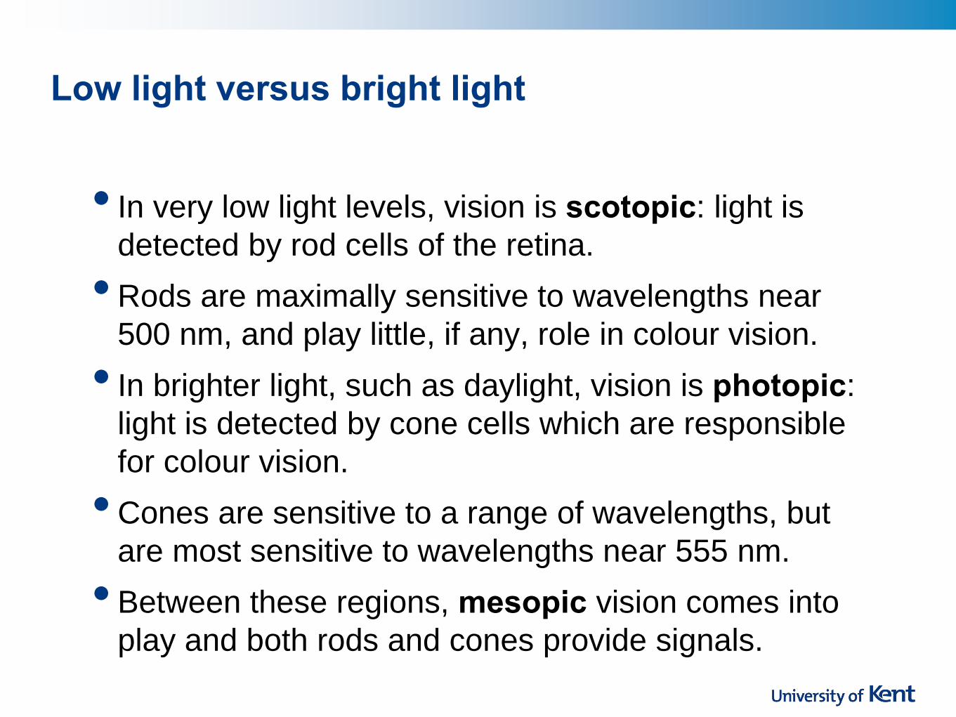
Low light versus bright light
• In very low light levels, vision is scotopic: light is
detected by rod cells of the retina.
• Rods are maximally sensitive to wavelengths near
500 nm, and play little, if any, role in colour vision.
• In brighter light, such as daylight, vision is photopic:
light is detected by cone cells which are responsible
for colour vision.
• Cones are sensitive to a range of wavelengths, but
are most sensitive to wavelengths near 555 nm.
• Between these regions, mesopic vision comes into
play and both rods and cones provide signals.

Three different of cones

Colour Perception via Cones
• Three types of cone: blue,
green and “red”
• Each sensitive to different band
of spectrum
• Light is perceived as white when all three cone cell
types are simultaneously stimulated by equal amounts
of red, green, and blue light
• Other colours are perceived by combining stimulation
– a cone “fires”, which indicates its “colour” (blue,
green or red). The strength of the firing is combined
with that of other receptors to create the infinitely
subtle spectrum we see.

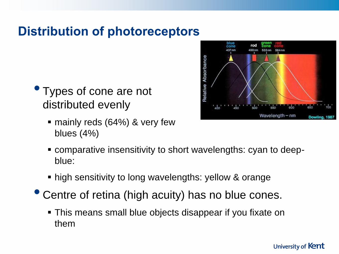
Distribution of photoreceptors
• Red grabs your attention, why?
• Why not blue?
Distribution of photoreceptors
• Types of cone are not
distributed evenly
mainly reds (64%) & very few
blues (4%)
comparative insensitivity to short wavelengths: cyan to deep-
blue:
high sensitivity to long wavelengths: yellow & orange
• Centre of retina (high acuity) has no blue cones.
This means small blue objects disappear if you fixate on
them

Colour sensitivity (i)
Relative brightness sensitivity of the human visual system as a function of wavelength
(in daylight)

Colour sensitivity (ii)
• Visual acuity peaks at about 22, and from there
begins a steady decline
• As we age … we all develop a condition called presbyopia that makes it
harder to shift the distance of our focus (from paper to
screen, for example)
lenses become less and less transparent (i.e. cloudy)
macular degeneration yellows the area around the fovea
fluid between lens and retina absorbs more light
with yellowing, shorter wavelengths of visible light are
absorbed, so blue hues appear darker
• … we perceive a lower level of brightness and
require more contrast to see fine details and read
text

Focus
• Different wavelengths of light focused at different
distances behind eye’s lens
need for constant refocusing causes fatigue
be careful about colour combinations
• Pure (saturated) colours require more focusing then
less pure (desaturated)
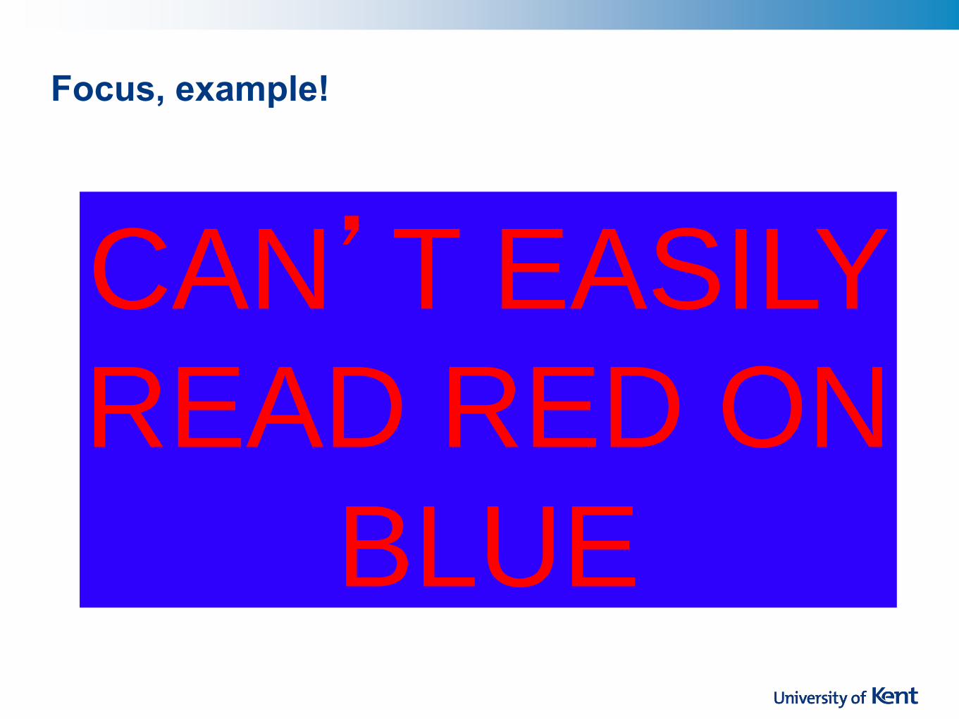
Focus, example!
CAN’T EASILY
READ RED ON
BLUE


• Trouble discriminating colours besets about 9% of population (male), about 0.4% (female)
• Different photoreceptor response reduces capability to discern small colour differences
particularly those of low brightness
• Dichromacy a more severe form of colour blindness
occurs when one of the receptors is seriously deviant in its
absorption characteristics
red-green deficiency is best known: can’t discriminate
colours dependent on red and green
Colour deficiency

Colour deficiency explored
Normal colour
vision Green-insensitive
dichromate
Available light
without green
Red perceived as
both red & green
Red-insensitive
dichromate
Available light
without red
Green perceived as
both red & green
http://www.firelily.com/opinio
ns/color.html

Colour is a matter of …
•Physics (colour)
•Physiology (vision)
•Psychology (perception)

Colour is a matter of …
•Physics (colour)
•Physiology (vision)
•Psychology (perception)

Perception: Colour meanings?
• What colours are associated with: Health?
Fun?
Death?
• Depends on culture Blue – “authority” or “calm” in European culture,
“villainy” in Japanese, “virtue” and “truth” in Arabic
Black for mourning death in Europe, white in Asia


Internationalisation is difficult!

Colour: top five
beginner's mistakes Too many bright
colours
Saturated
complementary
colours
Giving priority to
hue instead of
value
Visual
inconsistency
Deep blue text

Colour: top five
beginner's mistakes
Saturated
complementary
colours
Giving priority to
hue instead of
value
Visual
inconsistency
Deep blue text
Too many bright
colours

Too many bright colours

Colour Guidelines
• Avoid simultaneous display of highly saturated,
spectrally extreme colours
e.g., no blues at the same time as reds.
few natural saturated colours – no saturated blue in nature
• Opponent colours can go well together

Saturated
complementary
colours
Giving priority to
hue instead of
value
Visual
inconsistency
Deep blue text
Too many bright
colours

Too many bright
colours
Giving priority to
hue instead of
value
Visual
inconsistency
Deep blue text
Saturated
complementary
colours

Saturated complementary colours

Colour Guidelines (cont.)
• Users may be working with an application 8 hours a
day – give them a break!
• Pink for MS Word?

Too many bright
colours
Giving priority to
hue instead of
value
Visual
inconsistency
Deep blue text
Saturated
complementary
colours

Too many bright
colours
Saturated
complementary
colours
Visual
inconsistency
Deep blue text
Giving priority to
hue instead of
value

Colour Guidelines (cont.)
•At age 60, when compared to the visual efficiency of a 20-
year old, only 33 percent of the light incident on the
cornea reaches the photoreceptors in the retina. This
value drops to around 12.5 percent by the mid-70s.
•Older users need higher brightness levels to distinguish
colours
•Older users often experience difficulty discriminating
between colours that differ primarily in their blue content,
such as blue and gray or red and purple.
•Use value as well as colour differences: design with value
first

http://www.lighthouse.org/color_contrast.htm
Choose dark colours with
hues from the bottom half
of the hue circle against
light colours from the top
half of the circle. Avoid
contrasting light colours
from the bottom half
against dark colours from
the top half.

http://www.lighthouse.org/color_contrast.htm
For most people with partial
sight and/or congenital
colour deficiencies, the
lightness values of colours
in the bottom half of the
hue circle tend to be
reduced.

Too many bright
colours
Saturated
complementary
colours
Visual
inconsistency
Deep blue text
Giving priority to
hue instead of
value

Too many bright
colours
Saturated
complementary
colours
Giving priority to
hue instead of
value
Deep blue text
Visual
inconsistency

Colour Guidelines (cont.)
• Don't forget perception interworks with memory –
associate objects with hue across screens
(recognition over recall)

Using colour consistently: Canon Exilim EX-250
Zero bars to three bars
Also “traffic light” indication:
•low:
•normal: yellow
•fine:
Question: What colour is “fine”?
Thanks to Tom Castle for this example
Battery life indicator
Also “traffic light” indication:
•one bar: red
•two bars: yellow
•three bars: green
Picture quality indicator
Word labels “low, normal and fine”

Using colour consistently: Canon Exilim EX-250
• If “fine” is green, then we can imagine a sort
of quantity metaphor in operation: “more is
better” – more power, more pixels.
•However, in this interface, “fine” was red.
•Why?
•Our best guess is that the designer intended a
resources metaphor: beware, you’re using
resources, you won’t be able to carry on doing
this for much longer.
Thanks to Tom Castle for this example
What colour is “fine”?

Too many bright
colours
Saturated
complementary
colours
Giving priority to
hue instead of
value
Deep blue text
Visual
inconsistency

Too many bright
colours
Saturated
complementary
colours
Giving priority to
hue instead of
value
Visual
inconsistency
Deep blue text

Colour Guidelines (cont.)
• Avoid pure blue for text, lines, and small shapes
• Never distinguish between two states purely on basis
of colour. colour should supplement the major information channel
• Avoid single-colour distinctions mixtures of colours should differ in more than one dimension
e.g., two colours shouldn’t differ only by amount of red
helps colour-deficient observers

If you remember nothing else …
•Colour can be helpful, but easily misused
•Design in black & white first
•Add colour for emphasis, when your design is
complete
•Colour should never be the only visual cue for
anything

Interface Hall of Fame or Shame?

Interface Hall of Fame or Shame?
• A dialogue box which asks if you
want to delete records: two choices
yes (green), no (red)

Hall of Shame!
• A dialogue box which asks if you
want to delete records: two choices
yes (green), no (red)
• What are the problems here? Yes =“good”: Green=“good” Red/Green colour deficiency
Potential cultural mismatch

Interface Hall of Fame or Shame?

Interface Hall of Fame or Shame?
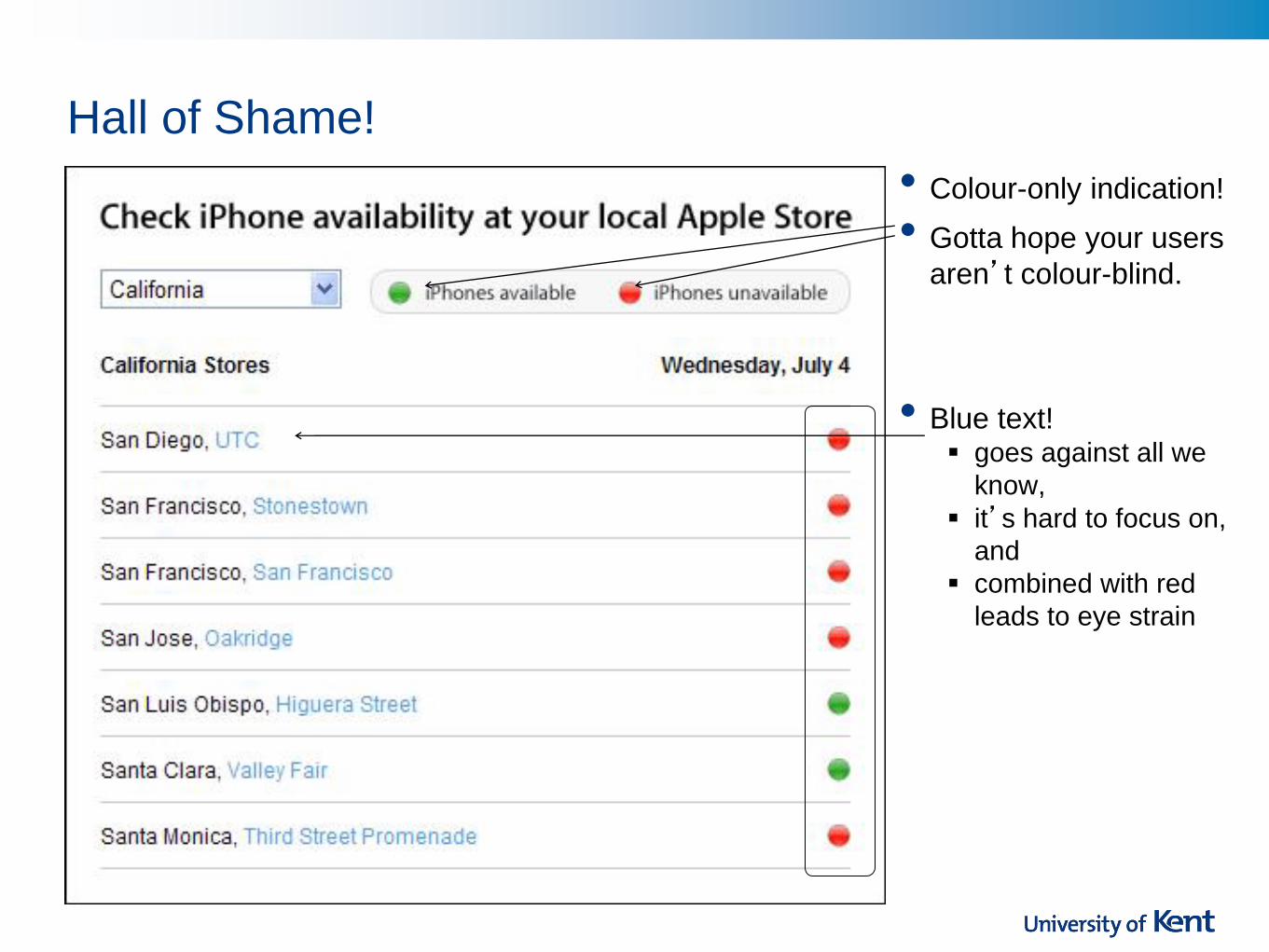
Hall of Shame!
• Blue text! goes against all we
know,
it’s hard to focus on,
and
combined with red
leads to eye strain
• Colour-only indication!
• Gotta hope your users
aren’t colour-blind.

Interface Hall of Fame or Shame?
•Woolf College was officially
opened on the 13th of March
2009
• I started lecturing in it that
September
•Here’s what I found …

This is the “visualiser control screen” in the Woolf Lecture Theatre. The Woolf Lecture Theatre has three display screens, and this panel allows the lecturer to determine what is displayed on each screen. You can allocate a resource to each screen
DVD video PC laptop Visualiser (a high-tech version of an ohp)
At this time, I have the visualiser displaying on each screen

For each screen, you can also:
Make the screen blank (this doesn’t work)
Turn off the projector (“do not turn off the projector”)
Lock the current image to the screen. Useful if you are producing a series of hand-written slides on the visualiser, for instance, and want to keep the first page visible (on screen one, say) whilst you continue to write and display (on screen two, say)

When the resource is active – that is, when I have “locked” a device to a screen – the outer border changes from green to red. That’s all. Bit of a problem if I’m red/green colour blind, really. Here a red border means “locked”.
And that’s not all …

You’ll notice that every other aspect of the interface also has the same, colour-only, indication of activity …
The speaker and microphone levels The “lecture in progress” sign The lighting levels in the body of the lecture theatre The “freezing” of an image to a screen
You’ll notice that every other aspect of the interface also has the same, colour-only, indication of activity …
So, tell me. What is the status of the middle screen?
Bizarrely – truly bizarrely – the status of the middle screen is that the projector is on and it is not blank. The screen is “locked” to the visualiser, but the picture is not “frozen” to the screen. The picture IS “frozen” to the left- and right- hand screens.
Please, please promise me you’ll never design anything as terrible as this
Every control indicator is red-green, but whether red or green indicates “active” varies from control to control

Bad

Refs & Acks
•Most slides written by Sally Fincher, University of
Kent
•The first two “Hall of Fame/Shame” examples
today were first used by James Landay.
•The hue/saturation/value images were taken from:
http://www.ncsu.edu/scivis/lessons/colormodels/color
_models2.html
•There are very good guidelines at:
http://www.olympusmicro.com/primer/lightandcolor/h
umanvisionintro.html, much of the material on aging
was taken from this

This work is licensed under an Attribution-NonCommercial-ShareAlike 2.0 UK:
England & Wales Creative Commons License