colour connection - resene.com.au
TRANSCRIPT

plus
Colour your home with
colourconnection

Contributing photographers: Daniel Allen, Emily Andrews, Jeff Bass, Tony Brownjohn, Tim Cuff, Nicola Edmonds, Rossi Gannon, Mark Heaslip, Juliet Nicholas, Toaki Okano, Frances Oliver, Sally Tagg, Nick Tressider, Tim Whittaker.Cover: Resene Whizz Bang walls, Resene April Sun table, Resene Outrageous floor. Photograph by Nick Tressider.
Resene April Sun
Some products or services may not be offered in your area or country. Please check with your local Resene ColorShop or reseller for availability. Most Resene products can be ordered in on request though lead times and minimum order quantities may apply.
Colours are as close as the printing process allows. Always try a Resene testpot or view a physical colour sample before making your final choice.
The contents of habitat plus are copyright and may not be reproduced in any form without the written permission of Resene. Opinions expressed in habitat plus are not necessarily those of Resene or the publisher Tangible Media. No responsibility is accepted for the authors’ suggestions or conclusions, or for any errors or omissions. Copyright 2013 Resene Paints Ltd. ISSN: 1176-8010
Resene Hive
Resene Whizz Bang

welcomeAt Resene, our first love may be paint but our second has to be colour. Glorious colour. For decades we have focused on helping you discover and use colour for your decorating projects. We regularly collate and launch fashion colour fandecks and palettes as well as update the ever-popular Resene The Range Whites & Neutrals collection. We publish habitat magazine and the habitat of the week email newsletters to inspire you, and we have many resources to help you choose exactly the right colours for your home.
At our Resene ColorShops you’ll find colour and technical consultants, colour cards and testpots for you to try. And we round it all out with exclusive collections of wallpapers and curtain fabrics.
Our latest offering to help you in your colour quest is this, our habitat plus book devoted to colour – from the most vibrant reds and yellows, to soothing neutrals and moody black. We have plenty of examples as well as great advice. So turn the page, be inspired and have fun with colour. Enjoy!
The Resene and habitat teams
Resene Nero
Resene Hive

Resene Geneva
contents4 i see red
6 think pink
8 optimistic energetic orange
10 hello yellow
12 green branches out
14 shades of the sea
16 why be blue?
26
62 |

18 the power of purple
20 the right white
22 middle earth
24 meet the super neutrals
26 just call it chocolate
28 how great is grey?
30 black magic
22 12
10

It’s not just a fashion thing – the colour red seems to be a perennial favourite at this end of the world. Maybe it’s the saturated, strong quality of our light, or the brightly flowering pohutukawa and wattle trees to which we’ve grown so attached.
We happily wear, paint our walls, drive in and accessorise our houses with red. In fact, Resene Pohutukawa is a hugely popular paint, blazing off front doors, kitchen cabinets and walls throughout the land.
For such a strong colour, red comes in many, many varieties – from magenta with its pink undertones, through to deep ox-blood. It’s a hue associated with passion, energy and a healthy appetite. Pale bright red, like Resene Candy Floss, is all about romantic love, but switch to a saturated true red, like Resene Havoc, and it becomes more, well, erotic.
Beware! Although it’s a passionate colour, beware of using too much red in the bedroom – it could increase your pulse rate and stop you getting a good night’s sleep. The
i see redbest option might be to have it as a statement wall behind the bed, so you’ll see and enjoy the colour when you’re in the room but it won’t be overpowering.
Red also represents the passion of anger and war, and is often seen in uniforms and national flags. It’s a highly visible colour, used in stop signs, on fire engines and also in advertising to attract attention and stimulate your senses.
Add more black to red, like Resene Dynamite, and it becomes sophisticated and mellow, reminiscent of red wine, velvet curtains and Oriental rugs. Add white and, of course, it becomes pink.
In interiors, red has often been used as a feature wall, a backdrop of strong colour at one end of a room. It’s a good solution for those who find red too overpowering on all their walls.
Red is traditionally used in areas where food is eaten. It stimulates appetite, so restaurants love it – and at home, we can do the same in our dining rooms.
Clockwise from top: Resene Flame Red feature wall with other walls in Resene Gallery; designed by architect Daniel Marshall. Resene Sensual Red kitchen with walls in Resene Half Perfect Taupe and trims in Resene Eighth Thorndon Cream; designed by kitchen architect Toni Roberts. Resene Raspberry dining room. Resene Pohutukawa library nook with Resene Quarter Lemon Grass walls in the foreground; designed by Eddie Van Uden.
Resene Bright Red
Resene Dynamite
Resene Candy FlossResene
Havoc
4 |

did you know… That a red wall around a fireplace or on a chimney breast gives a feeling of warmth, even if the fire’s not lit, and a red front door or entrance lends a feeling of luxury and opulence?
Resene Flame Red
Resene Pohutukawa
Resene Raspberry
Resene Sensual Red
| 5

Pink is a fairly polarising colour; you tend to either love it or hate it. It’s also considered extremely girly. But it’s a colour that is sneaking its way out of the baby’s nursery. Subtle use of pink can bring warmth and rosiness to a room. Used in moderation, pink is an uplifting colour. But used too much, and it can become sickly.
Painting a feature wall or a piece of furniture is a great way to embrace the colour and suits the current fashion for vintage interiors. Cushions, wallpaper and rugs are devices to weave in pink tones without going overboard. If you’re still wary of committing to pink, start with flowers – an arrangement is less likely to appear too girly or gaudy, and gives you a chance to decide if you like the colour in your home.
From bubble gum to magenta
Pink is a hugely varied colour, from palest rose and nude blush through bubble gum and crimson to screaming hot
think pinkpink. It also carries a wide spectrum of connotations: pale pink, like Resene Cupid, denotes purest girly prettiness, while hot pink, like Resene Disco, shouts out gaudy and passionate. The in-between pinks, like Resene Viola, are youthful and fun. In the Western world, this colour suggests feminine energy, romance and love.
If you team pink with lighter neutrals, you will achieve a softer, more romantic vibe, while darker combinations can make pink appear more dramatic. Pale pinks, like Resene Cornflower, are calming (some prison interiors are painted pink for this very reason), while deeper shades are more like red because they get the heart racing.
When light reflects off pink walls, it makes you look rosy and healthy – cheaper than a high-tech face cream! In fact, early-20th-century designers used to line lamp shades in pink silk to cast a pink glow and warm up a woman’s face, making her look younger.
Clockwise from top left: Resene Lipstick walls. Resene Pot Pourri bedroom. Resene Geraldine walls with Resene Paua bath. Resene Smitten study; designed by Debra Yearsley.
Resene Disco
Resene Pale Rose
Resene Lipstick
Resene Pot Pourri
Resene Smitten
Resene Geraldine
6 |

pink partners If you want to use pink but don’t want to overdo it, here are some good colour combos:
• Pink and green go particularly well together. Try pale eggshell pink with pale apple green
• Candy pink and black or charcoal, or mid-pink and white
• Pink and gold for a luscious look
• Pink and turquoise for a Moroccan twist
• Pink and other warm shades like yellow and tangerine for summery appeal
Resene Viola
Resene Cupid
Resene Cornflower
| 7

try these colour combos• Burnt orange and teal for a sophisticated
take on a retro scheme
• Orange and charcoal for urban edginess
• Pale pumpkin and icy blue
• Bright orange and hot pink for something racy and fun
• A two-tone orange scheme of soft golden orange and deep gingery orange
• Terracotta and rust tones for rustic, Italian-style interiors
Resene Outrageous
Resene Porsche
8 |

Happy, fun, sassy, playful, optimistic and energetic. Orange is such an irrepressibly cheerful colour that it makes most of us smile. Some people are not so keen on its in-your-face exuberance, but orange as an interior colour has been in the good books for a while now – particularly in its clear, true form like Resene Hyperactive or the slightly burnt versions like Resene Vesuvius.
Because orange is such a strong colour, it has often been reserved for use as an accent for feature walls and splashbacks. But there are many ways to include its brightness in your home.
From peach to pumpkin
Orange is a hugely adaptable colour: it starts at soft peach, then ranges through coral, melon to carrot, then goes on to deeper shades of terracotta and rust. It transcends the seasons, too. In its pale bright form, like Resene Koromiko, it’s a peppy spring and summer shade, but turn it pumpkin, like Resene Porsche, or rust, like Resene Fire, and it becomes quite autumnal and wintry.
Orange looks great with all forms of blue – turquoise, teal, ice-blue, true blue, slate blue – as blue sits opposite
optimistic,
orangeenergetic
orange on the colour wheel. As with any scheme based on the use of complementary colours, make sure you get the saturation and balance of colours right.
Orange has a cool retro appeal that goes with mid-century-style interiors. It’s also a good colour to use in children’s rooms if you don’t want to fall into the unisex stereotypes of pink or blue. Make sure you tone it down a little though, or orange’s stimulating power will keep the kiddies awake.
You can go all out in the kitchen though, where orange’s warmth can be channelled to create a inviting social space.
Clockwise from top left: Resene Flashback chair with Resene Afficionado weatherboards. Resene Kamikaze door with Resene Half Bison Hide walls; designed by Lizzie K & Co. Resene Whizz Bang walls, Resene April Sun table, Resene Outrageous floor. Resene Cumin feature wall with other walls in Resene Joanna; house designed by Irving Smith Jack Architects.
Resene Kamikaze
Resene Cumin
Resene Whizz Bang
Resene Flashback
Resene April SunResene
Koromiko
Resene Vesuvius
Resene FireResene
Hyperactive | 9

Happy, sunshiny yellow – it’s the colour of spring and summer, of warmth and cheeriness. It brings a bit of brightness into your life and makes you smile.
So why don’t we see more of it in interiors? Yellow is one of the most vivid colours in the spectrum, so it can be a scary colour to use. But while intense daffodil yellows may be a bit much on all four walls of a room, there are many yellow-based colours that look amazing.
Deep dusky yellow: These yellows are a bit muddied and stretch from soft straw tones like Resene Putty to deeper mustard hues like Resene Hacienda. Such saturated colours lend sophisticated warmth to a room, and look fantastic in older homes with a heritage bent. You can give these colours an acidic edge by adding a touch of green for sharp urban interiors and team them with charcoal or black. Or add some red for a spicy saffron yellow that looks great in ethnic-inspired interiors.
Soft lemon yellow: Another easier shade to live with, pale lemony yellows, like Resene Witch Haze, impart a
helloyellow
Resene Witch Haze
Resene Hacienda
Resene Energy Yellow
Resene Putty
10 |

Resene La Luna
Resene Double Raffia
Resene Moonbeam
bright, welcoming look to any room. They look great with clear whites and fresh greens, and suit country-style or French-style interiors.
Custard yellow: Creamier yellows, like Resene Energy Yellow, haven’t been seen much in interiors; our paler neutrals have tended more towards stone tones. If you deepen custard yellow a little for a warm, tropical-banana yellow, it becomes a lovely colour for a child’s room. Or if you’re feeling really brave, go ’70s retro and use it with brown!
Yellow metals: We’re set to see more gold tones in metal accessories and fittings, as they move from silver and chrome to yellow metals like gold, bronze and brass. Check out the Resene Metallics and special effects range for colours like Resene Bullion or Resene Gold Dust.
top tip When used on the walls of a room, yellow is a colour that reflects off itself so the look of it intensifies even more. If in doubt, choose a softer, creamier yellow. Yellow can also become acidic quite quickly so unless that’s the look you’re after, veer towards creamier, more wheaten tones.
Opposite: Resene Moonbeam walls with Resene Half Dutch White trims. Clockwise from top left: Resene Turbo door with Resene Crowshead weatherboards; designed by Hunter Design/Red Shed. Resene Double Raffia walls. Resene La Luna walls, drawers in Resene Rapture (bottom), Resene Renew (middle) and Resene Sentimental (top) with top in Resene Double Bianca, Resene Bambina chair, Resene Hemisphere floor.
Resene Half Dutch White
Resene Turbo
| 11

This colour has had the most profound change in status in decades, if not centuries. Green. This word now carries the weight of all matters eco-friendly on its shoulders. But those shoulders are broad enough, and this colour – so harmonious and restful, symbolic of new life and hope – is the perfect signature shade for the eco trend. Can’t imagine red or orange doing the job, can you?
Green also has obvious botanic alliances and allusions, whether they are realised in a bright floral fabric or elegantly stylised bamboo-motif wallpaper.
Every which way
Green is a versatile colour, too. Apart from the crossover sea shades hues (see overleaf) greens comes in...
• Cleaner, truer greens like Resene Conifer. Use these bold tones as a feature wall or when colour-blocking. Nice and strong, they suit boys’ bedrooms and Asian-inspired schemes. Truer greens go well with the primary colours of red and yellow, as well as crisp whites.
• Dollop in some more yellow and you come up with acid greens like Resene Karma. Tangy and edgy, they go well with charcoal and green-based creams, and perhaps even palest icy blue.
• Pale and interesting greens, soft sages and apples, like Resene Pale Leaf. These restful colours are perfect in bedrooms and look amazing with a natural scheme of pale timbers: there’s no finer way to exude eco-chic.
• Emeralds and jades, like Resene Deep Sea. These strong, rich colours have an edge of decadence and eastern mysticism.
• Forest greens like Resene Homegrown. These deeper colours and other dark sludgy greens suit heritage decors that feature dark antiques, brocades and leather.
Green is often seen as a cool colour and in theory, if you added yellow to the green, it should warm it up. But yellow-greens are quite sharp and acidic. The best way to warm up a green is, perversely, to add either black to form a soft and smoky green, or blue to make it more of a sea-foam tone.
branches outgreen
Clockwise from top left: Resene Poprock walls. Resene Camarone bedroom. Resene Karma walls. Resene Spirulina kitchen with walls in Resene Half Tea; designed by Heather Thorley of Colour Options.
Resene Poprock
Resene Spirulina
Resene Camarone
12 |

green-based neutralsThe future of green is growing, so to speak. When it comes to pale neutral colours, we’re moving away from those with yellow or brown undertones to those with a green base, like Resene Thorndon Cream and Resene Ash. These colours have a cool sophistication and are quite complex so go with many styles of interiors.
Resene Celery
Resene Conifer
Resene Deep Sea
Resene Homegrown
Resene Ash
Resene Pale Leaf
Resene Thorndon Cream
Resene Karma
| 13

shades of the seaMutable, magical washed shades of blue and green – the colours of the sea. These crossover greens and blues are a strong and continuing trend which is not surprising in a country with such a lot of coastline. They are colours that create a soothing scheme where you can almost smell the salty tang of the sea.
Such colours are great companions to many styles, not just those with coastal influences, and can be as modern or traditional as you like. Give your interiors a retro twist by sharpening up an aqua to turn it into turquoise. Or create a classic Victorian look by softening a seafoam shade into a pale eggshell shade, like Resene Periglacial Blue.
How to use these colours
Whether you’re using a sea-foam green like Resene Gulf Stream, soft aqua blue like Resene Foam, or one of those mysterious colours in between, keep the palette pale,
Clockwise from left: Resene Kumutoto walls, Resene Carefree tongue-and-groove panelling, Resene Kandinsky Lusty Lloyd Loom furniture. Resene Metamorphis wall in background, Resene Neutral Green in front; designed by architect Fleur Ford. Resene Patriot wall.
washed or muddy so the tones don’t tip over into bright turquoise or limey green – these colours can look too aggressive.
Don’t be afraid of using more than one of these crossover colours in the same space – they look sensational together as you can see from the photographs here, and act in the same way that the many tones of the sea give it depth, life and energy.
Don’t forget to include deep teal sea colours like Resene Pelorous for contrast against the paler tones.
While these sea tones look sensational on the walls, if you’re nervous, just use them as accents or on accessories against pale sand-coloured walls in Resene Half Wheatfield. Use soft milky whites like Resene Rice Cake for your trims and ceilings.
Resene CarefreeResene
Gulf Stream
Resene Foam
Resene Pelorous
Resene Riptide
Resene Periglacial Blue
14 |
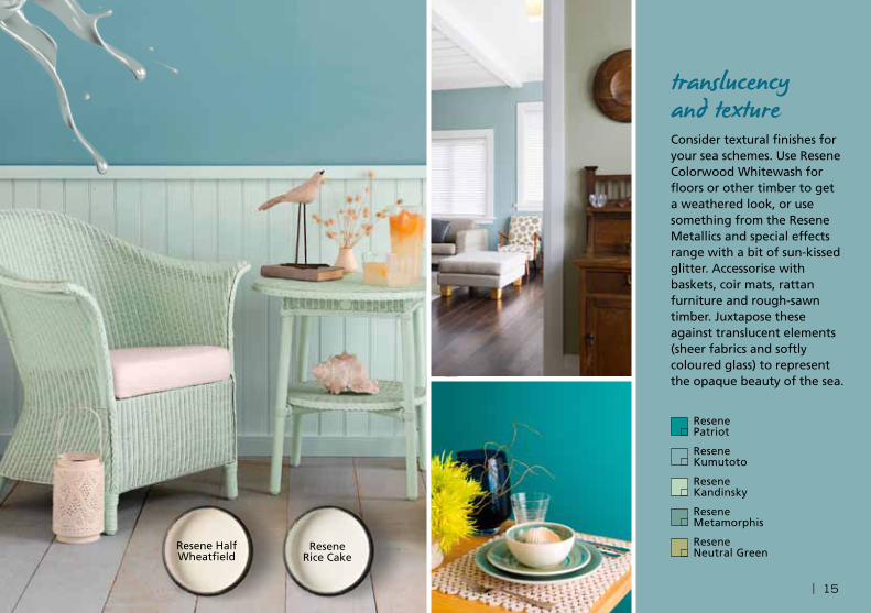
translucency and textureConsider textural finishes for your sea schemes. Use Resene Colorwood Whitewash for floors or other timber to get a weathered look, or use something from the Resene Metallics and special effects range with a bit of sun-kissed glitter. Accessorise with baskets, coir mats, rattan furniture and rough-sawn timber. Juxtapose these against translucent elements (sheer fabrics and softly coloured glass) to represent the opaque beauty of the sea.
Resene Patriot
Resene Kumutoto
Resene Kandinsky
Resene Metamorphis
Resene Neutral Green
Resene Half Wheatfield
Resene Rice Cake
| 15

So you thought blue was just for the boys? Think again. Apparently it’s the least gender-specific colour around. It’s also one that inspires a feeling of trustworthiness, sincerity and peacefulness. It stands proudly for moderation and dependability (no excesses here, please), which is why many uniforms are blue and why more conservative institutions often choose it as their branding colour.
Too cool?
Blue’s not the most common colour seen in interiors, unless you’re talking bathrooms or boys’ bedrooms, although it has been popping up in deep inky tones in living rooms of late. It often gets a bad rap as a cold colour but depending on the shade, blue can be very welcoming and soothing – try Resene Takaka, a mid-tone blue, or Resene Waikawa Grey with its touch of grey-violet. The deep, jewel-like blues that border on navy can be very cocooning and warm, such as Resene True Blue.
That aside, blue is predominantly a cool colour so it can stand being used in sunny, north-facing rooms. It’s a classic choice for bathrooms because of its feeling of cleanliness (there’s a reason most packaging for cleaning products is blue).
why beblue?
16 |

blue?Combinations to try:
• Pale blue and white for a classic Cape Cod look, or for a crisp, clean kitchen.
• Blue-greens such as Resene Escape used with palest sand tones for a bachy, seaside feel.
• Retro teals such as Resene Blumine with other zingy brights against a background of cleanest white or deepest black. Unapologetic and fun.
• Deep blue for a rich and sophisticated living room, teamed with soft metallic golds or pewter, or even pops of pink and yellow.
• Pretty vintage blues, like Resene Time Out, tied with antique white and pretty sorbet shades.
Clockwise from top left: Resene Smalt Blue; renovation designed by architect John Mills. Resene Wavelength wall. Resene Jordy Blue bathroom with Resene Alabaster trims; by interior designer Anna Cuthbert. Right: Resene True Blue walls, Resene Zephyr lamp base, Resene El Nino side table.
Resene Waikawa Grey
Resene Takaka
Resene Blumine
Resene Time Out Resene
Escape
Resene Jordy Blue
Resene Zephyr
Resene True Blue
Resene Wavelength
Resene Smalt Blue
Resene El Nino
| 17

growing upPurple has become a go-to colour for older girls who don’t want to be surrounded by pink. Purple bedrooms are popping up everywhere and will take girls safely from toddler-hood through their teen years.
Resene Covert
Resene Wicked
Resene Bona Fide
Resene Kookaburra
Resene I Do
Resene Finn
18 |

Purple is a fearless colour, the colour of royalty, luxury and glamour. Unlike its close cousins, red and blue, purple can inspire nervousness in home decorators. It’s a powerful colour, even in its softer forms of mauve and lilac, so many of us are wary of using it.
Purple gives a level of richness few other colours can achieve. A true violet purple is certainly strong but if you add some deep red, you get eggplant and mulberry colours, which are easier to deal with. If you add grey to mauve-purple, you end up with soft lavender tones. The key to using purple is to get just the right tone and amount. Try these combinations:
Purple with aged gold tones: Rich purples, like Resene Vortex, look great with any metallic tones. If you use glass and silver or chrome, you’ll end up with a blingy lusciousness that exudes an air of nightclub glamour. If you pair purple with tarnished golds and bronzes, a room will take on an aged, regal feel, reminiscent of Renaissance
the power of
purpleItaly. (Think ornate mirrors and crushed velvets as key accessories.) Timber has similar amber tonings to gold so it also looks good alongside purple, whether you use it on the floor or through furniture.
Deep purple and charcoal: This combination gives a room a lush, witty, urban look. Charcoal can be quite masculine and serious, but purple gives the scheme a playful, sensuous twist.
Spicy shades and purple: Clear purples and aubergines, like Resene Daisy Bush and Resene Fandango, are seen in Moroccan and Indian-inspired décor schemes. To follow their lead, put a few rich, spicy tones – like orange, pink or turquoise – alongside purple for a playful, vibrant scheme that’s not too eye-jangling.
Provençe pairings: Team soft greyed lavenders, like Resene Amethyst Smoke, with eggshell blues and dusky creams for a dreamy, French-inspired interior.
Clockwise from top left: Resene Wicked kitchen; designed by Sian Gillanders. Resene Finn wall; designed by Designworx. Resene Sugar And Spice girls bedroom. Striped wall from top, Resene Covert, Resene I Do, Resene Bona Fide, Resene Kookaburra and Resene Poet.
Resene Amethyst
Smoke
Resene Fandango
Resene Daisy Bush
Resene VortexResene
Poet
Resene Sugar And Spice
| 19

the right
whiteWhite is white is white – right? Wrong. When you’re decorating, there’s white (which you can buy as Resene White), and there are a slew of other ‘whites’ or off-whites, with touches of yellow, green, brown or grey turning them to alabaster, chalk, ivory, cream.
Our search for just the right white is what makes the Resene The Range Whites & Neutrals palette so popular. With their yellow base, Resene Spanish White and Resene Pearl Lusta have the ability to lift a room and warm it visually. They and their varying strengths still take out many of the top places in the Resene Top 20 most popular paint colours each year. Conversely, colours like Resene Sea Fog have a cooling effect.
The whites of today
Times are a-changing and fashion is swaying towards whites with a touch of green. There’s a true sophistication to colours like Resene Thorndon Cream, Resene Ecru White and Resene Quarter Ash. These colours tend to change
Clockwise from top left: Resene Ecru White with Resene Black White trims. Resene Rice Cake walls. Resene Ecru White walls with Resene Alabaster trims. Opposite: Resene Quarter Ash walls and louvres.
20 |

white with the light quality, appearing warmer one minute and cooler the next.
Whites and off-whites pick up on other elements in the room. If you have lots of greenery out the window, expect your walls to take on a green look. Use a strong blue rug or furniture, and your walls will pick up on that.
Different parts of the room also reflect light differently. An off-white used under a window will look darker than the same colour used on the opposite wall. An off-white used on the ceiling will look much darker than the same colour on a wall because there is less light reflected. Use a half strength of your wall colour on your ceiling for balance.
The paint sheen level can also affect the way the colour looks. A flat paint will make the colour look muddier and denser, while a gloss finish will make it look cleaner and brighter.
Deciphering whites
On the Resene Whites & Neutrals fandeck, beneath each paint swatch is the name and a code. Codes that start with Y for yellow or B for brown describe warmer whites, good for cool, south-facing rooms. Cool whites have G for green and N for neutral (which means black, or rather grey once you put it with white). Use cooler whites to take the visual heat out of north-facing rooms.
Resene Black White
Resene Quarter Ash
Resene Rice Cake
Resene Ecru White
Resene Alabaster
Resene Spanish White
Resene Thorndon
Cream
Resene Pearl Lusta
Resene Sea Fog
| 21

It’s probably the most appealing, easiest-to-live-with part of the colour spectrum – mid-toned neutrals. Whether it’s a washed sand tone, a pebble grey or stony taupe, these colours are calming, subtle and hugely versatile. You can dress them up or down, and change their look and style according to the accent colours or accessories you put with them.
These mid-range colours are so popular that Resene Tea – a complex, grown-up beige with hints of grey and green – has been in Resene’s top five most popular paint colours list since it started. It has many cosy neighbours in the Resene Whites & Neutrals range: Resene Napa, Resene Akaroa, Resene Ash and Resene Truffle, just for starters.
Easy harmony
A great use of these mid-toned neutrals is to form what’s called a monochromatic scheme, where one colour is used in varying strengths for a harmonious look. This is an almost-foolproof way of developing a scheme.
Here, the Resene Whites & Neutrals collection really comes into its own, as up to six strengths of the one colour are shown on the same card. So you could, for example, use Resene Half Drought for the main living area, Resene
middle
Above: Resene Double Biscotti walls, vases from left Resene Quarter Lignite, Resene Double Drought, Resene Barely There, Resene Triple Truffle, Resene Desperado. Opposite clockwise from left: Resene Foggy Grey walls; designed by Trinity Design. Resene Napa walls. Resene Lodestar metallic; designed by architect Fleur Ford.
earth
Resene Foggy Grey
Resene Ash
Resene Lodestar
Resene Canterbury
Clay
Resene Tana
Resene Napa
Resene Concrete
Resene Double Biscotti
Resene Quarter Lignite
Resene Double Drought
Resene Barely There
Resene Triple Truffle
Resene Desperado
22 |

Double Drought for bedrooms or a second living room,
and Resene Eighth Drought for the ceiling and trims. Then
you could add cream or rich timber accents, furniture and
accessories, or a bolder colour (red, orange, acid green) to
make the colour scheme more interesting.
As you flick through the Resene Whites & Neutrals
collection, you’ll notice how the neutrals, especially those
in the mid range, vary:
Buttery hues: from creamy gold through to duskier
wheaten tones, these colours include colours like Resene
Canterbury Clay.
Biscuit brown: these have been hugely popular in the
past decade for their warmth and earthiness, and include
colours like Resene Napa and Resene Double Drought.
A hint of green: these colours are currently coming to the
fore because they’re cool, yet not cold. Try Resene Triple
Ash and Resene Tana.
Shades of grey: crisp and urban, clean and cool – Resene
Double Concrete and Resene Foggy Grey.
Resene Tea
| 23

Many of us think of off-white as the only neutral paint colour, but neutrals also encompass dark tones. These examples, mostly from the Resene Whites & Neutrals collection, describe the different types of dark neutrals and their effects:
Toasty neutrals, like Resene Triple Pravda and Resene Triple Mondo. These colours are dark and dense but retain the lovely, soothing warmth of coffee bean or chocolate tones.
Going greenish, with Resene Tapa or Resene Masala. These moody colours give a more earthy twist to darker neutrals, and can look quite different from room to room depending on the light.
Truer charcoals, such as Resene Gravel, Resene Double Stack and Resene Quarter Fuscous Grey. Flinty and sophisticated, these colours are cool and urbane.
Ideal on their own or to anchor a scheme, dark neutrals provide a soulful backdrop for brighter, more intense feature colours. Add drama by using a sharp accent colour, like chartreuse green, yellow or teal. Team dark neutrals with cream or crisp white trims. This works especially well
meet the
super neutralswith older homes, where skirtings, architraves and cornices will be highlighted by the contrast with smoky dark walls.
Dark colours make a room feel more intimate and cosy – great for bedrooms, media rooms or large living spaces. A far wall can appear closer when painted in a dark colour, or use a dark wall colour to offset a beautiful sideboard, mantelpiece, free-standing bath or upholstered chair.
If a full colour scheme of dark neutrals is too much, use varying shades of the same neutral in different rooms. The Resene Whites & Neutrals collection is particularly useful, as varying strengths of the same colour are displayed on the same card.
Resene Talisman
Resene Masala
Clockwise from left: Resene Masala; interior colour selection by Wendy Campbell, architect Ian Cumberpatch. Resene Triple Mondo bathroom walls; designed by Lloyd Macomber of Salmond Reed Architects. Resene Curtain Collection Unison in colour Naturalle with Resene Talisman walls.
24 |

the right lightMake sure your lighting is up to the task. Dark walls absorb light, so you may need to beef up your lighting to compensate. Spreading the light around the room, rather than having one central ceiling fixture, achieves a more even effect and gives you flexibility.
Resene Gravel
Resene Triple Pravda
Resene Double Stack
Resene Quarter
Fuscous Grey
Resene Tapa
Resene Triple Mondo
| 25

Resene Masala
some combinations to try• Mid or dark brown and grey –
an on-trend colour scheme
• Brown and ice-blue or dusky teal
• Tonal colour schemes based on varying strengths of the same brown
• Tawny brown and green, two of the most prevalent colours in nature
• Brown and mustard or orange for a retro feel
• Mid brown with creamy vanilla white Resene
Oilskin
26 |

Before you hurry to turn the page, wait – give brown another chance. The word may conjure up images of dowdy old-fashioned rooms decked out in shades of mustard and dingy brown. But given a pinch of grey or a twist of gold, brown can be a wonderful colour with which to paint your walls.
In fact, let’s not call it brown. Try these descriptive tags and brown turns from yuck to yum: cocoa, chocolate, coffee, cinnamon, sepia, nut, russet, rust and mahogany.
Nutty and warm
In fact, brown-based colours have been hugely popular in recent years: albeit dubbed as toasty neutrals and nutty greys like Resene Drought and Resene Oilskin.
Many an interior scheme has been built on tonal colour schemes, using varying strengths of one of the gorgeous pale neutral browns off the Resene Whites & Neutrals
collection. Resene Tea (described as a complex river-boulder beige) always ranks high on the Resene Top 20 list of most popular colours. This type of ‘greige’ (grey beige) colour is hugely versatile and useful in interiors. And of course, one of our most-loved decorating materials – timber – is brown. So we’re actually quite used to seeing this colour not only in our homes, but also in nature.
Brown is generally thought of as a masculine colour that promotes feelings of strength and stability. It’s comfortable, warm, approachable and reassuring.
Add yellow for amber tones and tawny browns, like Resene Korma, or add black for dense rustic browns, like Resene Sidewinder. Tobacco browns or paper-bag browns, like Resene Sandal, work well with traditional interiors, especially for more intimate spaces like bedrooms and studies. Or add a squeeze of orange for rust-browns that have more warmth and zing.
Clockwise from far left: Resene Oilskin fireplace; designed by Yellowfox. Resene Curtain Collection Haven in colour Naturalle with Resene Stonehenge walls. Resene Mondo bedroom.
chocolate
Resene Stonehenge
Resene Mondo
Resene Drought
Resene Korma
Resene Tea
Resene Sidewinder
Resene Sandal
just call it
| 27

Like any other part of the colour spectrum, when it comes to neutrals, there is a fashion. For years, warm biscuit tones and dark smoky browns have been popular, but now it’s time for grey. Along with green-toned creams, it’s now an ‘in’ neutral and synonymous with style, glamour and a certain urbane sophistication – whether it’s a silvery off-white or a deep, grunty charcoal.
Silvery grey: Tones such as Resene Half Surrender appear luminous in a well-lit space. They are serene and whimsical. If you want to heighten the effect, look at the various silvers available in the Resene Metallics and special effects range. Have a look at the pewter shades too, like Resene Pure Pewter, as softer bronzes and pewters become more popular.
Mid grey: This hue has a calming effect. True grey can be too cool for many people’s liking, so adding a smidge of another colour will change its character. You can go ‘greige’ (grey-beige), by adding a bit of brown to achieve a colour like Resene Quarter Taupe Grey. This still has the appearance of grey but with an added touch of warmth.
how great is
grey?Resene
Half Surrender
Resene Quarter Taupe Grey
Resene Lynch
Resene Mine Shaft
28 |

Blue grey: There’s a big move towards greys with a touch of blue or teal, like Resene Lynch. While blue is also a ‘cool’ colour, these slatey tones in their darker forms are smoky and moody. In paler forms, they are beachy and casual. A warmer twist to this palette is the purple-greys which are rich and warm.
Charcoal grey: Elegant and restful, charcoals like Resene Mine Shaft look superb with creamy whites and shots of vivid colors.
Grey combos to try:
• The latest trend is pairing grey with brown. The brown might come in the form of timber or hemp-coloured upholstery, so make sure you keep it textural.
• Silver-grey and white with touches of deep charcoal or black.
• Turn the above combination on its head: go for charcoal walls with white accessories.
• Grey with any form of yellow – acid, bright or mustard.
• Grey with orange, either deep, burnt forms or tangerine.
• Grey with pinky purples.
Left from top: Resene Gravel garden walls. Resene Shady Lady bedroom; designed by Yellowfox. This page, from top: Resene Half Rakaia kitchen. Resene Curtain Collection Ripple in colour Stone with Resene Tuna walls. Resene
Gravel
top tipGive grey a bit of fun and life by using it in metallic form.Check out the options on the Resene Metallics and special effects chart.
Resene Tuna
Resene Half Rakaia
Resene Shady Lady
| 29

top tipAn extreme colour such as black often calls for an extreme finish – choose an absolute matt finish to appear velvety and luscious. A high-gloss finish gives a feeling of glamour and helps reflect light.
Resene Half White Pointer
30 |

We may be known for our love of black clothing, but it seems we also love this colour in our homes. It’s a brave person who paints their interiors in black, but the colour – or at least its many subtle shades from the Resene paint palette – is increasingly popping up in living rooms, bedrooms and even bathrooms. Black is smart, sophisticated, dramatic, masculine, moody and urbane.
As with any dark colour, black will make a room appear smaller and more enclosed. It’s superb for a room that’s more likely to be used in the evening, such as a media or TV room, or a bedroom. Well-planned lighting can heighten the effect of black, by casting a wash of soft light over a wall or even diffusing sunlight through sheer curtains.
Not all blacks are created equal. Some have a touch of brown, some a touch of green (Resene Swamp), blue (Resene Bastille) or white (Resene Shark). Ask a staff member at your local Resene ColorShop to decipher the numbered code underneath the colour swatch.
Chalk it up with blackboard paint
The ultimate practical black finish is Resene Blackboard Paint. Paint an entire wall in a child’s room, the back of a
magic black
kitchen island bench, or frame up part of a wall as a more traditional-style blackboard. Add another dimension by painting Resene Magnetic Magic underneath so you can use it as a magnetic noticeboard as well.
Black started showing up on exteriors a while ago. Resene Bokara Grey is particularly popular for this, as it’s not absolute black and has a delicious touch of coffee-bean brown in it. Black lends a crisp contemporary edge to modern architecture, or a romantic cast to bungalows and cottages, especially when teamed with white architraves and joinery.
Beware! If you’re using dark colours on the exterior of a house, consider using a Resene CoolColour version of your colour, which reflects more of the sun’s heat to keep the paint, surface and building cooler.
Clockwise from top left: Resene Nero kitchen walls with Resene Alabaster cabinets. Resene Blackboard Paint walls. Resene Gravel weatherboards, Resene Double Gravel guttering, Resene Half White Pointer trims. Resene Nero living room; designed by Suzie Fraser for Simonds Homes.
Resene Shark
Resene Bokara Grey
Resene Bastille
Resene Swamp
Resene Nero
Resene Gravel
Resene Double Gravel
Resene Blackboard Paint
Resene Alabaster
| 31

Try out your favourite colours
Testpots are the best way to try out your colour choices. Available at your Resene ColorShop, or order online at www.resene.com.
Thousands of Resene colours are also available as A4 screenprinted swatches, known as drawdowns. You can order these from the Resene website or browse through the in-store library of swatches at Resene ColorShops and resellers.
Enjoy Resene cardholder discounts
Sign up for a Resene ColorShop Card or DIY Card and enjoy discounts on a wide range of products. You can sign up free in-store or online at www.resene.com/colorshopcard.
Find your nearest Resene ColorShop or reseller
Simply visit www.resene.com/colorshops or call 0800 737 363 (NZ) or 1800 738 383 (Australia).
get decoratingResene Nero
32 |

Resene Quarter Fossil
Need more colour advice?
Try out the Resene Ask a Colour Expert service at www.resene.com/colourexpert
Need technical advice?
Try out the Resene Ask a Technical Expert service at www.resene.com/technicalexpert
Get more inspiration
For gorgeous home projects, themes and more colour ideas, go to www.habitatoftheweek.com.
Resene Whizz Bang
For more paint and decorating ideas, how to projects and videos, visit the Resene website www.resene.com.
Remember you only get authentic Resene colours when you use Resene tinters in Resene paint bases. Resene Non VOC tinters and the true Resene colour formulations are unique and only available from Resene. So make sure you insist on genuine Resene products and tinters for your project.
Resene White Thunder

In Australia: www.resene.com.au
1800 738 383
In New Zealand: www.resene.co.nz 0800 RESENE (737 363)
www.facebook.com/resene www.pinterest.com/resene
Find us on
Printed on environmentally responsible paper produced in an ISO14001 (Environmental Management System) accredited mill, from Elemental Chlorine Free (ECF) pulp,
with FSC Mixed Pulp certification, sourced from sustainable forests and plantations. Printed using vegetable-based inks. Please recycle.