color/huecolor/hue. the basic color wheel primary colorssecondary colors intermediate color
TRANSCRIPT
Color/Hue
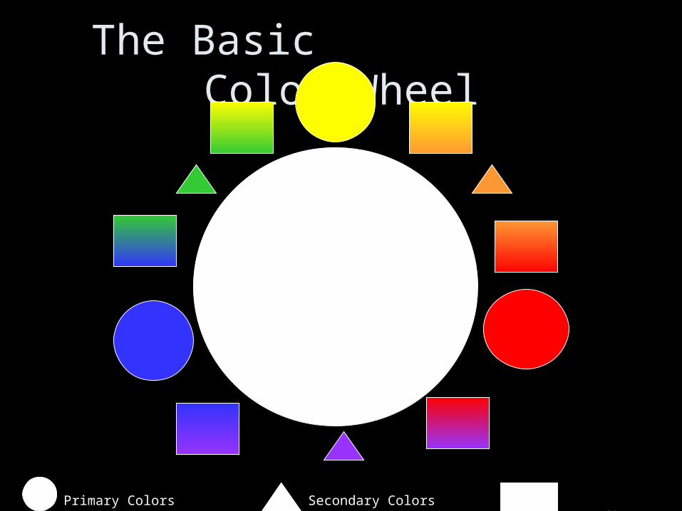
The Basic Color Wheel
Primary Colors Secondary Colors Intermediate Color
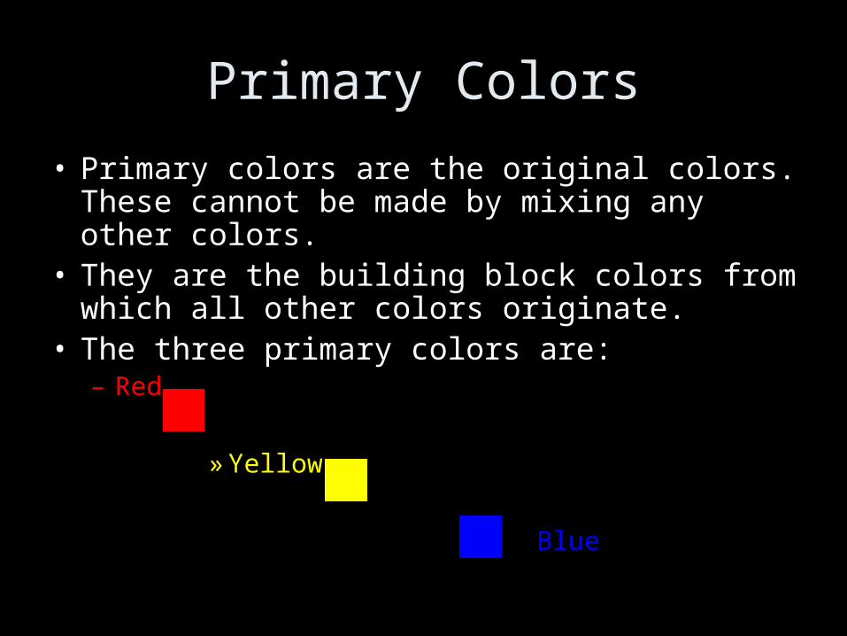
Primary Colors
• Primary colors are the original colors. These cannot be made by mixing any other colors.
• They are the building block colors from which all other colors originate.
• The three primary colors are: – Red
» Yellow
Blue
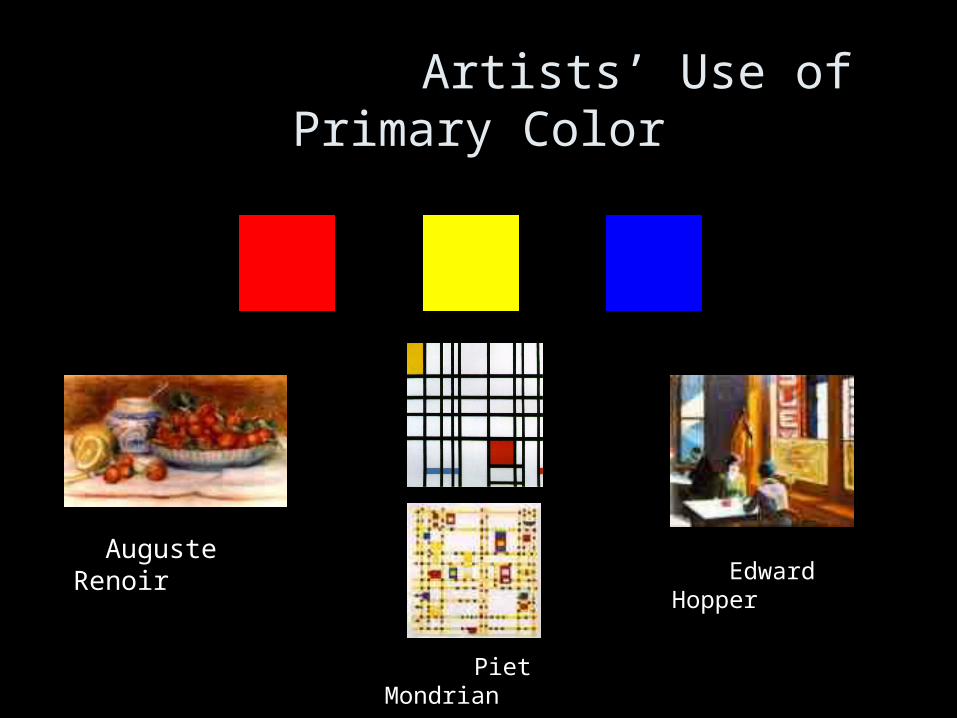
Artists’ Use of Primary Color
Piet Mondrian
Edward Hopper Auguste Renoir
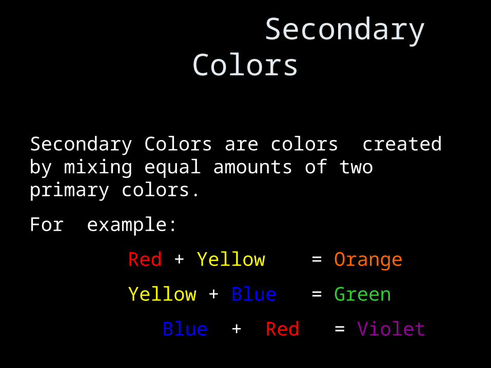
Secondary Colors
Secondary Colors are colors created by mixing equal amounts of two primary colors.
For example:
Red + Yellow = Orange
Yellow + Blue = Green
Blue + Red = Violet
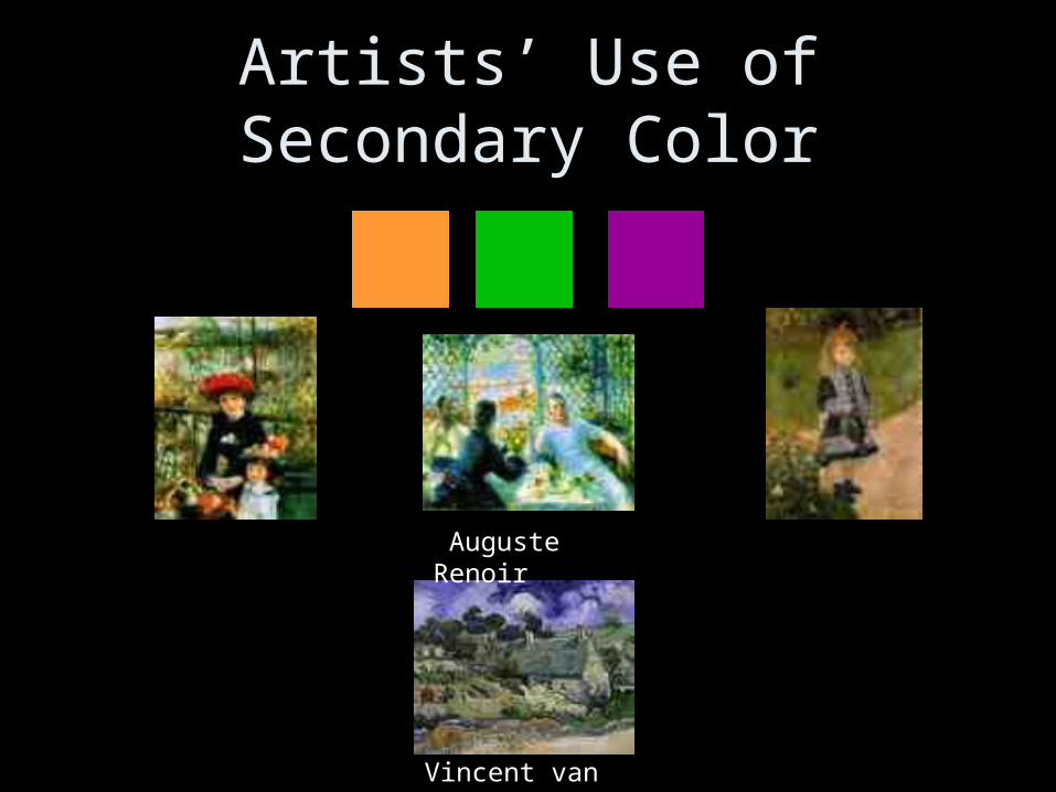
Artists’ Use of Secondary Color
Auguste Renoir
Vincent van Gogh
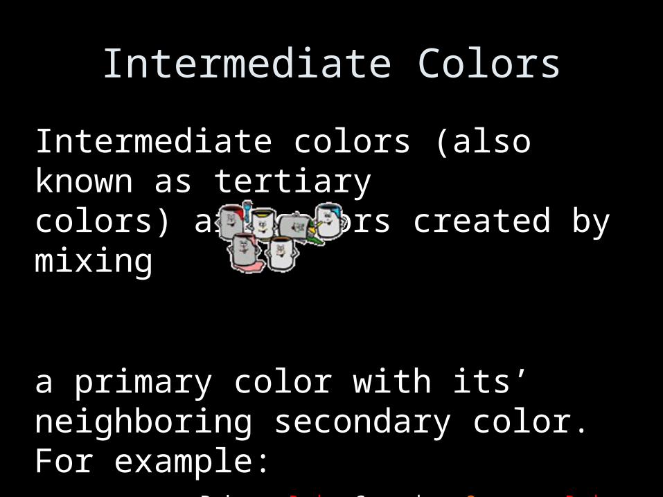
Intermediate Colors
Intermediate colors (also known as tertiary colors) are colors created by mixing
a primary color with its’ neighboring secondary color. For example: Primary Red + Secondary Orange = Red Orange / Orange Red
Primary Blue + Secondary Violet = Blue Violet / Violet Blue
Primary Yellow + Secondary Green = Green Yellow / Yellow Green
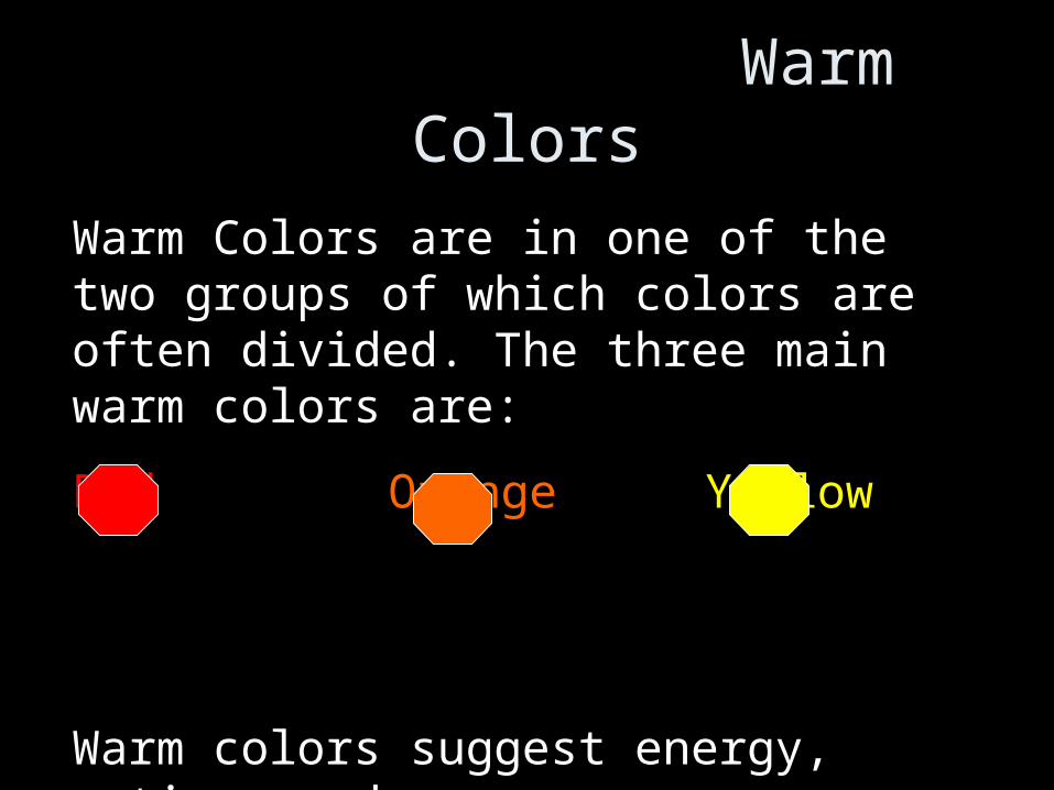
Warm Colors
Warm Colors are in one of the two groups of which colors are often divided. The three main warm colors are:
Red Orange Yellow
Warm colors suggest energy, action, and normally optically advance!
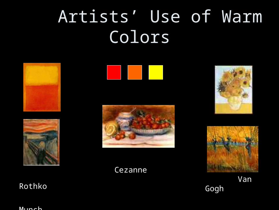
Artists’ Use of Warm Colors
Rothko
Munch
Cezanne
Van Gogh
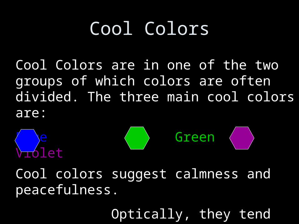
Cool Colors
Cool Colors are in one of the two groups of which colors are often divided. The three main cool colors are:
Blue Green Violet
Cool colors suggest calmness and peacefulness.
Optically, they tend to recede.
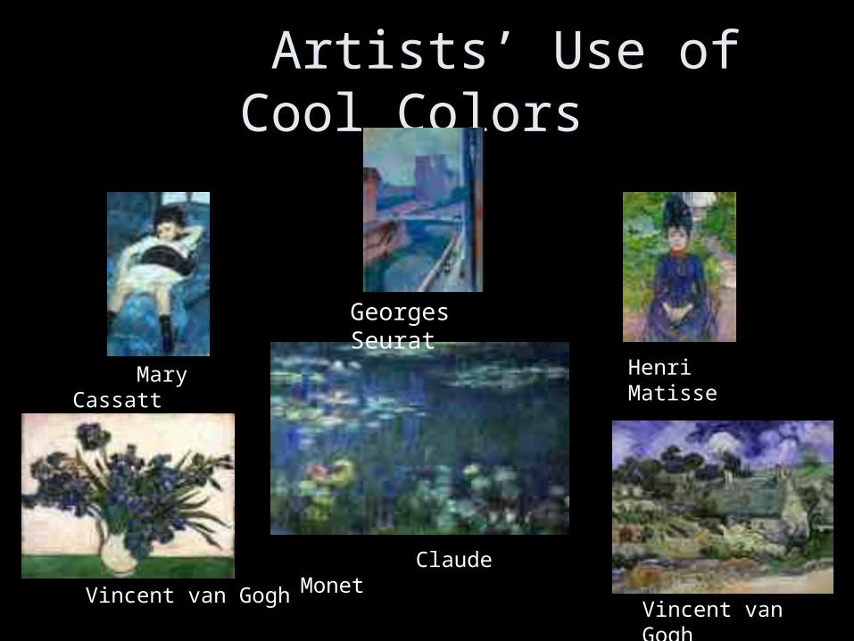
Artists’ Use of Cool Colors
Mary Cassatt
Vincent van Gogh
Henri Matisse
Vincent van Gogh
Claude Monet
Georges Seurat
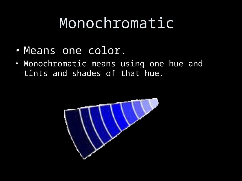
Monochromatic
• Means one color.• Monochromatic means using one hue and tints and
shades of that hue.
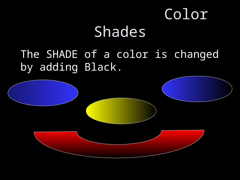
Color Shades
The SHADE of a color is changed by adding Black.
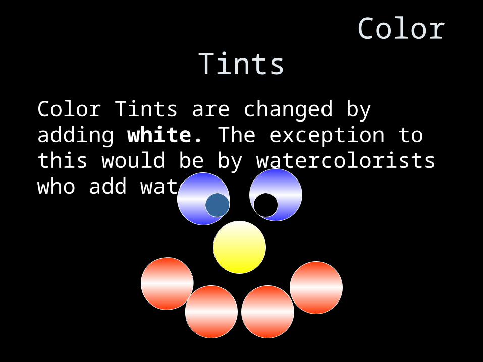
Color Tints
Color Tints are changed by adding white. The exception to this would be by watercolorists who add water!
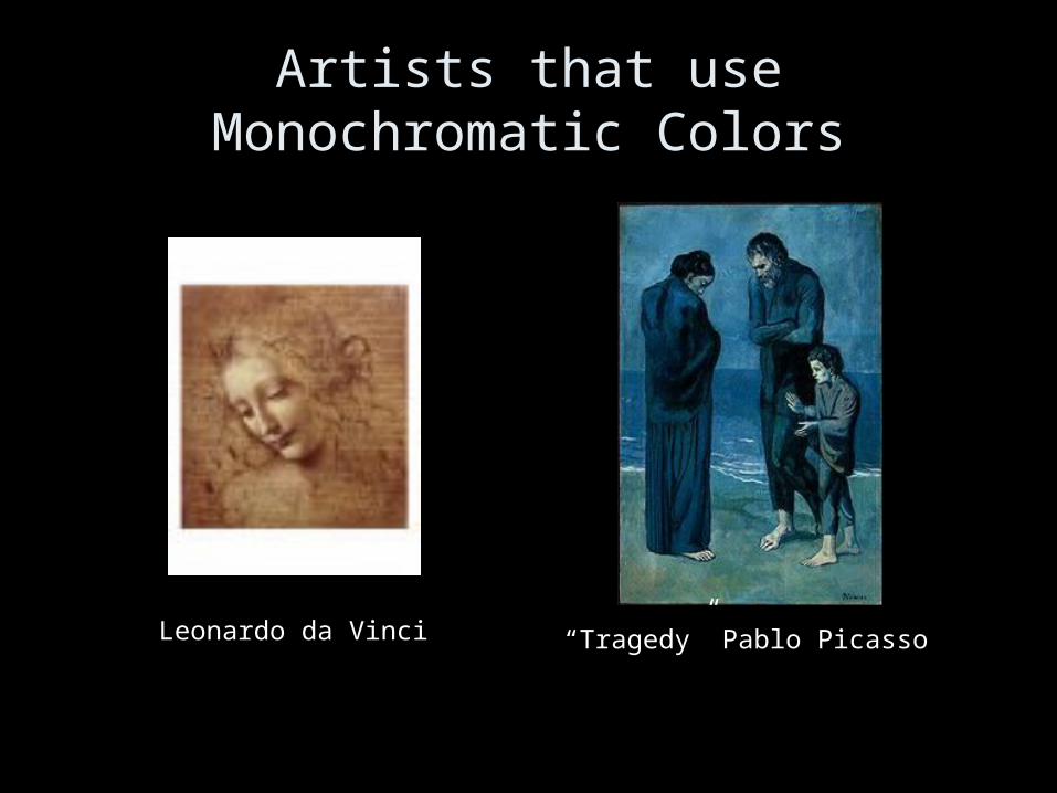
Artists that use Monochromatic Colors
“Tragedy” Pablo PicassoLeonardo da Vinci
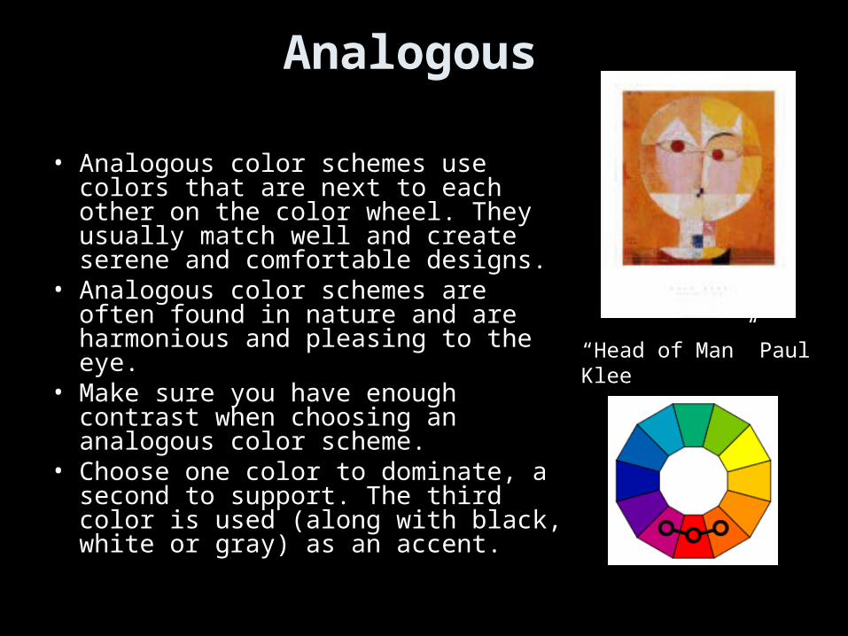
Analogous
• Analogous color schemes use colors that are next to each other on the color wheel. They usually match well and create serene and comfortable designs.
• Analogous color schemes are often found in nature and are harmonious and pleasing to the eye.
• Make sure you have enough contrast when choosing an analogous color scheme.
• Choose one color to dominate, a second to support. The third color is used (along with black, white or gray) as an accent.
“Head of Man” Paul Klee
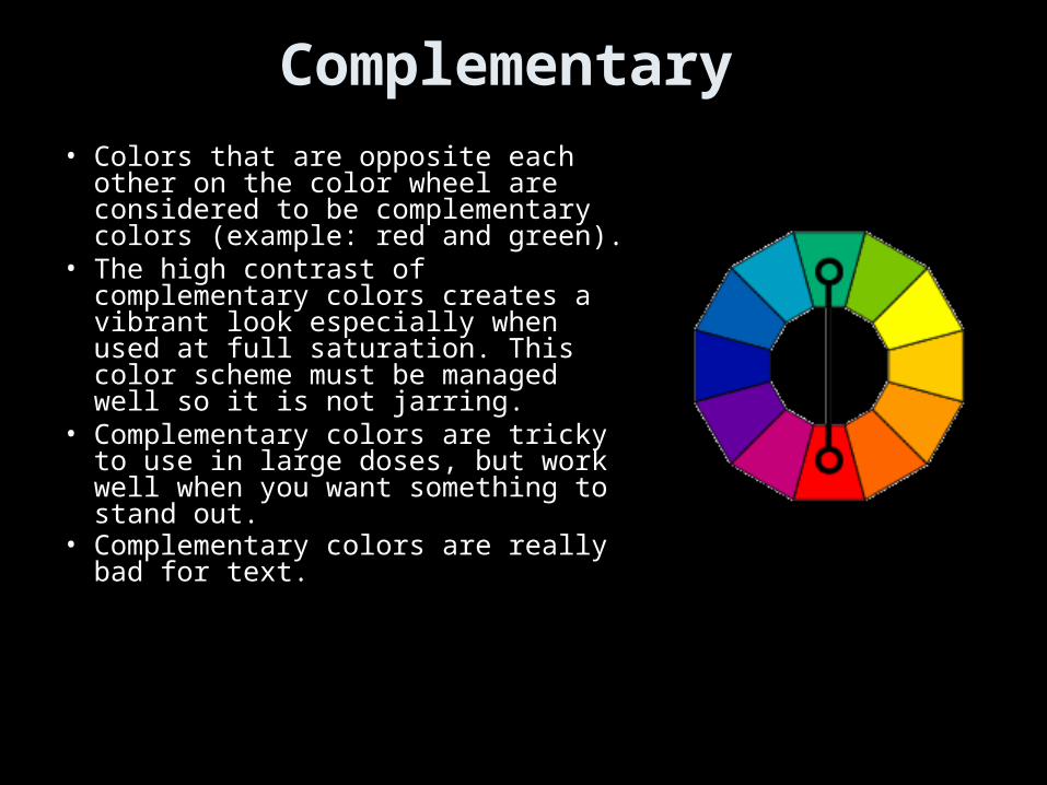
Complementary
• Colors that are opposite each other on the color wheel are considered to be complementary colors (example: red and green).
• The high contrast of complementary colors creates a vibrant look especially when used at full saturation. This color scheme must be managed well so it is not jarring.
• Complementary colors are tricky to use in large doses, but work well when you want something to stand out.
• Complementary colors are really bad for text.
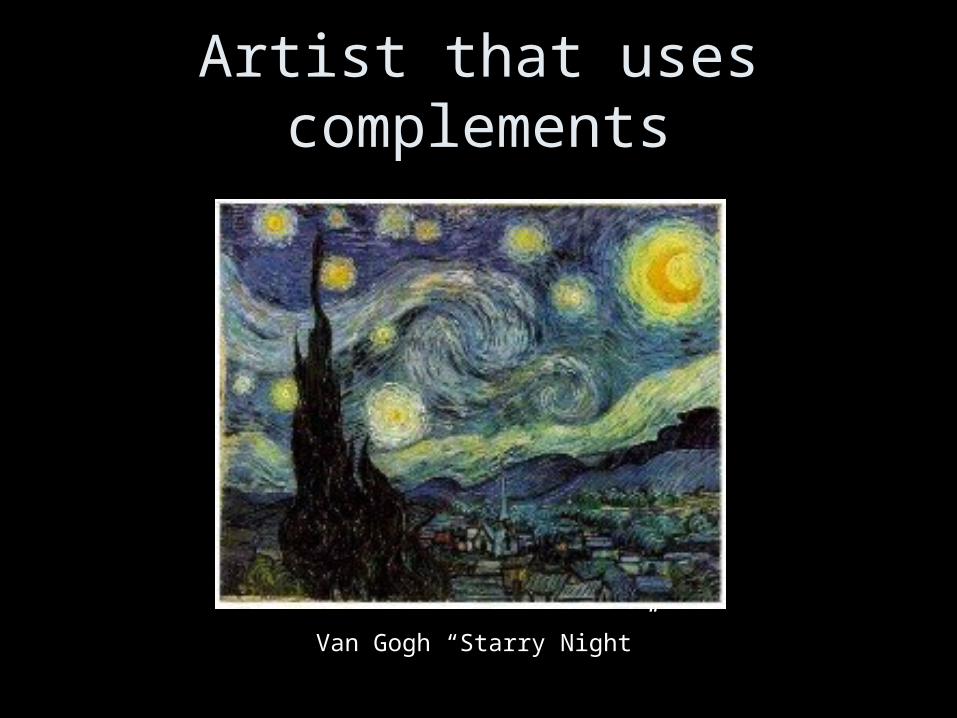
Artist that uses complements
Van Gogh “Starry Night”
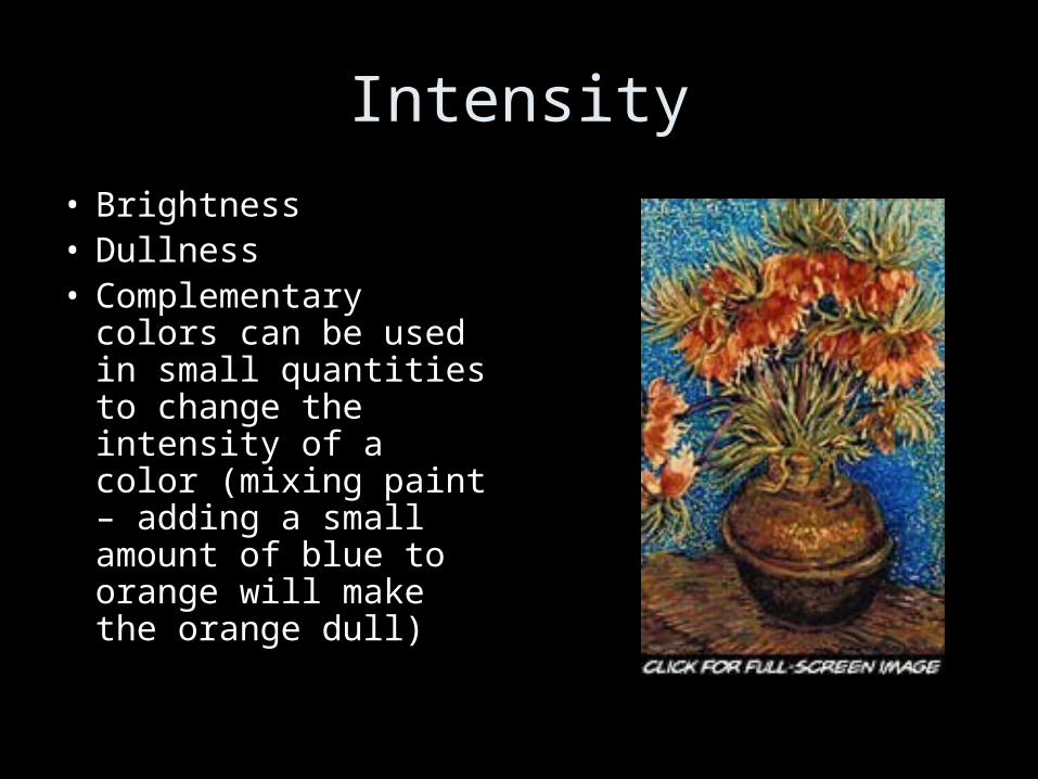
Intensity
• Brightness• Dullness• Complementary
colors can be used in small quantities to change the intensity of a color (mixing paint – adding a small amount of blue to orange will make the orange dull)
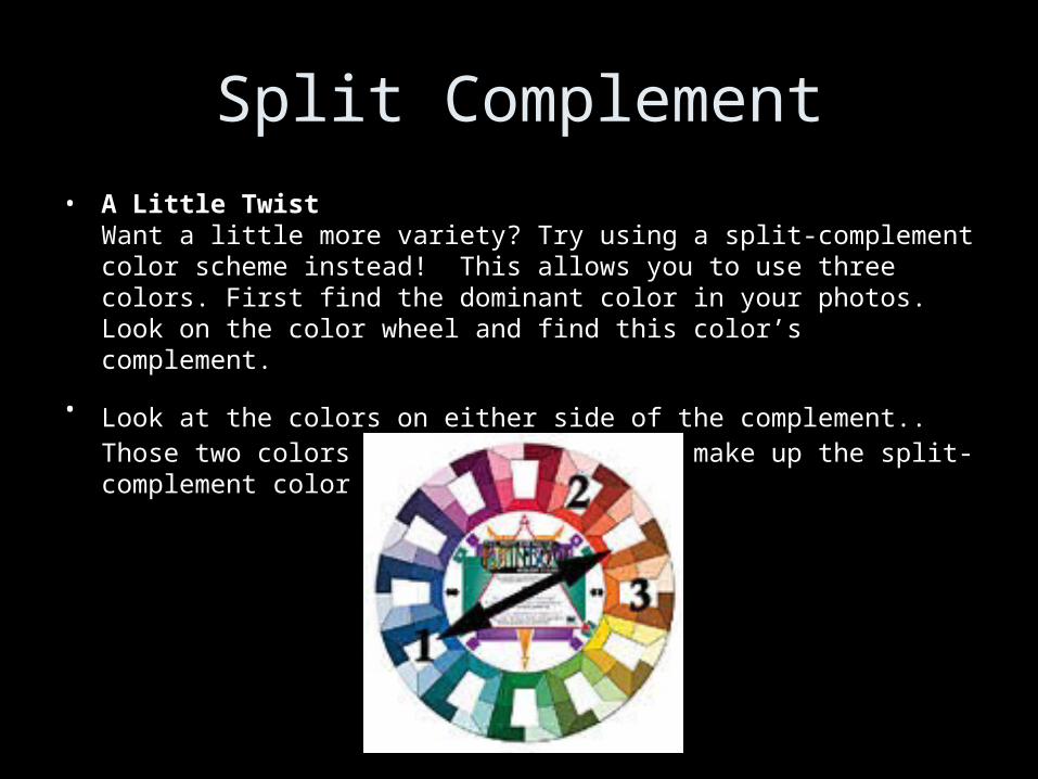
Split Complement
• A Little TwistWant a little more variety? Try using a split-complement color scheme instead! This allows you to use three colors. First find the dominant color in your photos. Look on the color wheel and find this color’s complement.
• Look at the colors on either side of the complement.. Those two colors plus your main color make up the split-complement color scheme.
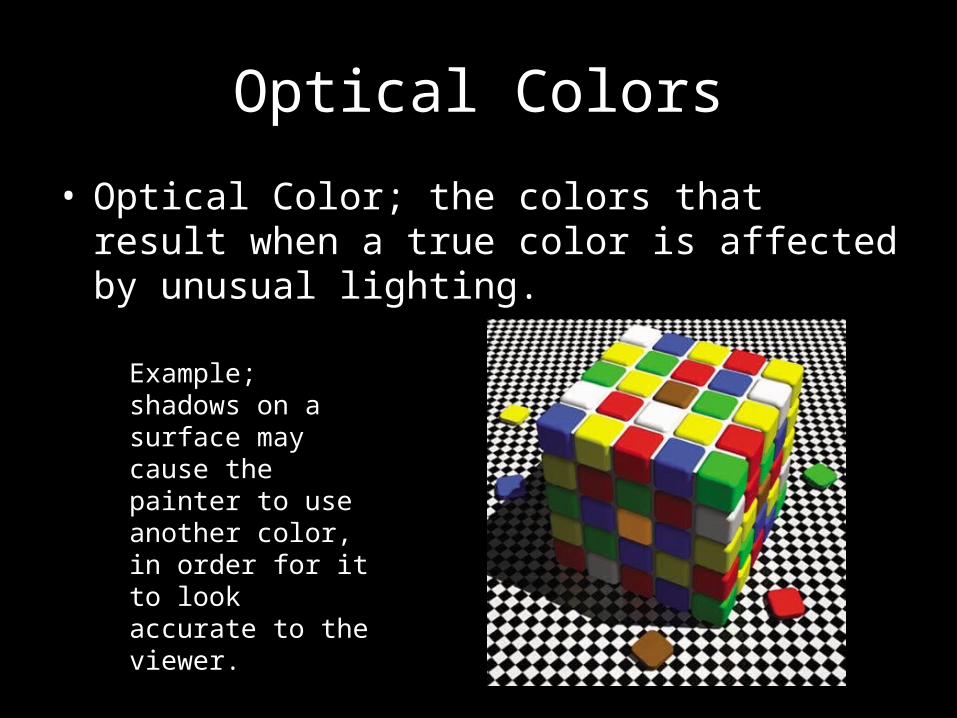
Optical Colors
• Optical Color; the colors that result when a true color is affected by unusual lighting.
Example; shadows on a surface may cause the painter to use another color, in order for it to look accurate to the viewer.
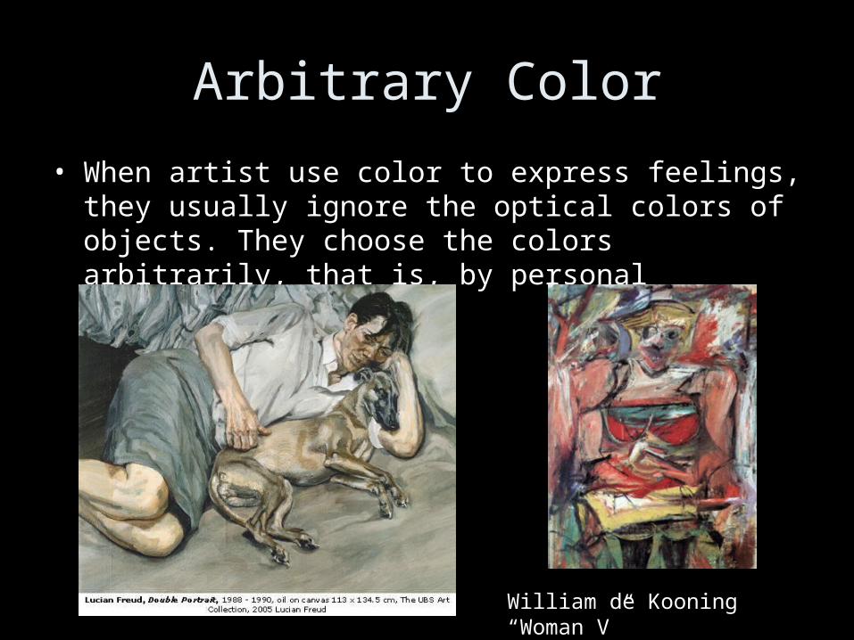
Arbitrary Color
• When artist use color to express feelings, they usually ignore the optical colors of objects. They choose the colors arbitrarily, that is, by personal preference.
William de Kooning “Woman V”