colorblindness and design
TRANSCRIPT

Designing for the User
The importance of User-Centric Design
Rebecca Torvik, Yiwei Li, Craig Wang, Devon Walker

What is User-Based Design?
● A user interface design process that focuses on usability goals, user characteristics, environment, tasks, and workflow in the design of an interface.
● Follows a series of well-defined methods and techniques for analysis, design, and evaluation of mainstream hardware, software, and web interfaces.

Color blindness testThe first step of user-based design to to distinguish the user’s limitations
Can your read the numbers inside the circles?

What is Colorblindness?
● Colorblindness is a decreased ability to see color, or a decreased ability to tell colours apart from one another.
● The two most common types of color blindness, deuteranopia and protanopia, are sex-linked traits and are much more common in men than in women.
● Deuteranopia, the most common, occurs in 7% of males, but only 0.5% of females. That’s nearly 8% of the population.
5 ways to Improve Your Ecommerce Design for Colorblind UsersOnline shopping if often difficult for colorblind people. Web Designers should implement the following techniques:
1. Use clear color names2. Use effective Color Search Filters3. Avoid Color Specific Instructions4. Avoid Low Contrast Design5. Test Your Work

Tip 1: Use Clear Color Names
Using ambiguous color names makes it difficult to understand the true color of the item that the individual is about to purchase.

Tip 2: Use effective Color Search Filters
Combining color swatch samples with clearly defined labels allows for a quick and easy selection.

Tip 3: Avoid Color Specific Instructions
When designing forms, labeling required fields with colored text can look identical to a person that is colorblind.

Tip 3: Avoid Color Specific Instructions
Label buttons clearly and reference them by function, not color.
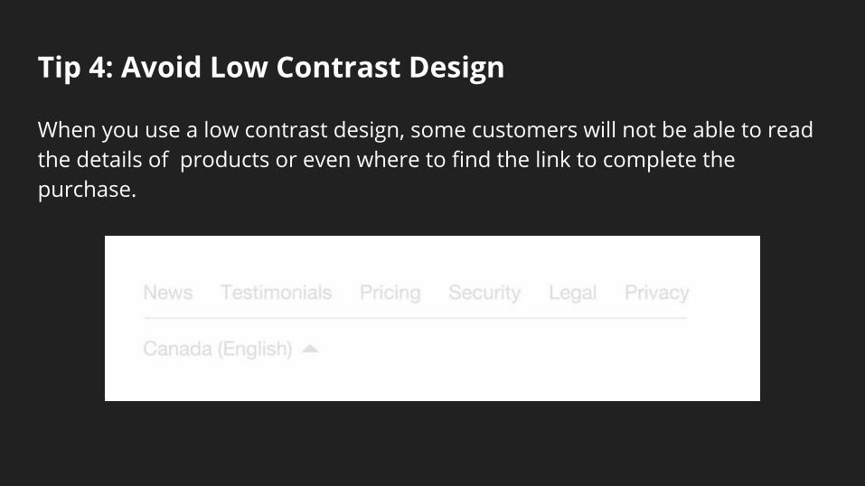
Tip 4: Avoid Low Contrast Design
When you use a low contrast design, some customers will not be able to read the details of products or even where to find the link to complete the purchase.

Tip 5: Test your work
For example, The Color Oracle, an app that simulates the most severe forms of colorblindness.

Tools to Help Designers Understand Color Blindness
Alternative Color Palettes for Photoshop and Illustrator that simulate the different types of color blindness
● Christine Rigden’s Software
● Colorfield’s INSIGHT software

Tools that Help Designers Understand Color Blindness
● An Independent designer has created alternative color palettes that allow designers to preview Web pages as they would be seen by people with complete red or green color blindness.
● Insight, a photoshop plug-in made by Colorfield, allows designers to check the colorblind compatibility of their work by using standard pull-down menus. It can also simulate total blue color blindness.
● Both these tools help Designers understand what their webpage looks like to those with varying degrees/ types of color blindness

Color Palettes for the Color Blind

Tools that Help Designers Understand Color Blindness
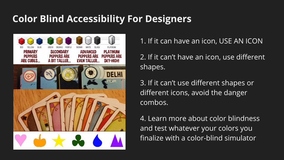
Color Blind Accessibility For Designers
1. If it can have an icon, USE AN ICON
2. If it can’t have an icon, use different shapes.
3. If it can’t use different shapes or different icons, avoid the danger combos.
4. Learn more about color blindness and test whatever your colors you finalize with a color-blind simulator

Integrating Accessibility Throughout Design
Accessibility in User-Centered Design:
“The goal of incorporating accessibility into User-Centered Design is to follow a process of creating products (devices, environments, systems, and processes) which are usable by people with the widest possible range of abilities, operating within the widest possible range of situations (environments, conditions, and circumstances), as is commercially practical."
http://uiaccess.com/accessucd/background.html

What is Accessibility?
● Accessibility means that people with disabilities can use a product.
● Accessibility is making user interfaces perceivable, operable, and understandable for people with a wide range of abilities.
● It encompasses all disabilities, or functional limitations, including visual, auditory, physical, speech, cognitive, and neurological disabilities.

Designing Clothing For People With Disabilities
https://www.youtube.com/watch?v=riZPN8WAcEM#action=share

Designing for Disability
When designing for disabilities, each one is different so more time is needed to create the clothing. Fabrics and design techniques have to be of quality to ensure the clothing is practical and achieves its purpose.

ABL Denim and IZ Adaptive Clothing create stylish, yet practical clothing for those in wheelchairs.
Designing Clothing For People With Disabilities

Tilting Sink by gwenolé gasnier
The un lavabos sink that can adapt to everyone.
It is cut so that it can be tilted to accommodate different people

Braille Electric Plug Tags
Braille Electric Plug Tags have Braille letters, device icons and abbreviations to help people that are blind distinguish cords.
It has Velcro for easy application and removal.

Overarching Theme
Implementing User-Based Design
How design can and should be implemented to fill every consumer’s specific needs

Sources
● Adjusting Web Colors for the Color Blind● 5 Ways to Improve Your Ecommerce Design for Colourblind Users-● How to Design for Color Blindness-● Why Color Blindness is No Longer a Problem for Web Design
http://technabob.com/blog/2012/01/18/braille-electric-plug-tags/● http://www.konbini.com/us/lifestyle/adaptive-clothing-for-people-with-disabilities/