color management and adobe photoshop cs2/cs3 management in pscs2.pdfcolor management and adobe...
TRANSCRIPT

Color Management and Adobe Photoshop CS2/CS3
Andrew Rodney
aka
The Digital Dog
www.digitaldog.net
Email me ([email protected]) if you need this presentation in PDF form.
Most of the definitions found throughout this presentation are taken from my book “Color Management for Photographers, Hands on Techniques for Photoshop Users” published by Focal Press. A table of content and sample chapter can be downloaded from the web site above. Or go to:http://www.amazon.com/exec/obidos/ASIN/0240806492/digitaldog-20/104-1213564-0901541?creative=327641&camp=14573&link_code=as1
©2007 Andrew Rodney
1

What is Color Management ?
! The ability to accurately and predictably control the reproduction of color from beginning to end of the imaging pipeline
! There are many kinds of “color management” such as altering your display to match a print. This is ineffective and dangerous! For the following presentation ICC Color Management will be covered
ICC color management is cross platform and common in many desktop applications like Photoshop, InDesign, Illustrator, and many scanner and capture applications. Applications that do not support ICC color management will not produce accurate on-screen previews (soft proof.) An example is most web browsers which simply send the numbers in a document directly to the screen. This is why many users find images on a web site don!t match the image previews seen in Photoshop.
2

Color Management Does Not...
! Fix bad color, especially bad originals! Color management will ensure that ugly color is
faithfully reproduced. Color management ensures that you know that what you’re viewing is ugly or not
! GIGO - Garbage In - Garbage Out.! Color management is only as effective as it’s weakest
link. Color management isn’t “push button” color or color correction!
3

! Digital Images are simply a mosaic of square pixels of solid colors, each having a specific numeric value.
! Problem is, numbers alone do not provide enough information to reproduce color. The solution to this is color management!
! Color management gives all the numbers a definition. The result is color we expect to see on any output device!
4

Why Color Management ? Device Dependent Color
! Device dependent color is a partial recipe for color. If we define a color numerically such as 233R/45G/89B, what does it look like?
! Since each device treats the same color numbers differently, how can we ensure this color appearance reproduces on all our devices?
! You need ICC device profiles to define the right numbers to send to your printer to produce the expected color! ICC color management simply gives the numbers a definition. It also creates new numbers from existing files, allowing us to reproduce the color appearance on different devices.
Device Dependent: Used to define a color space that is tied to a specific device behavior such as a printer, scanner, camera or display. Each device produces it!s own unique behavior and the color space that describes this behavior is device dependent. The device itself influences the color produced since the colorants (inks, dyes etc) or other means of producing color (Phosphors in a CRT display or Fluorescent light in an LCD) are all different.
Color Model: Color Model - A method of mapping color using a set of defined dimensions. Some scientific color models such as x,y,Y or L*a*b* encompass all of human vision and have a defined scale such that a particular color will always have the same set of values. Other color models such as RGB or CMYK have no standard defined reference or scale. In order to understand a color in these models you must have a color space definition that provides a scale and reference.
Color Space: A color space is a scientifically defined portion of human vision. A color space may be defined with any color model. The RGB values R10,G100,B10 have no meaning by themselves other than the color is mostly some kind of green. By using a color space definition the same set of values can be translated into one of the scientific color models, giving the values exact meaning. Having a set of RGB values associated with a color space allow for the exact reproduction of the color.
5

R255 Green has a di!erent scale in Adobe RGB (1998) than sRGB but share the same numeric value!
Color spaces and color numbers.
The gamut (range of colors visible) of human vision
Plotted 2 dimensionally produces this
horseshoe shaped plot.
Here!s a metaphor for a color space: suppose I supply a recipe for chocolate chip cookies but do not provide the unit for each ingredient in the recipe. The recipe provides each ingredient followed by a number. Without units you can!t make the cookies. The numbers alone are not enough information to describe how the cookies will be produced. Likewise, R78/G103/B23 or C23/M98/M123/K6 is not enough information to reproduce that color. Using a chocolate chip cookie recipe analogy, suppose a color model is a cookie recipe with only three ingredients. I give you this recipe, which simply calls for 1-flour, 8-butter and 2-chocolate chips. You don!t have enough information to make the cookies. However if I provide you the recipe with a specific scale—1 cup of flour, 8 tablespoons of butter, and 2 cups of chocolate chips—I!ve provided the necessary information, the scale, to make a dozen chocolate chip cookies. I can give you the cookie recipe in the metric scale such as liters and grams and you can still makes the same cookies even though the numbers are different. A color space is a color model that has a known reference and scale, in this case primaries (the ingredients, in this case RG and B) and scale (specific quantities of these ingredients). Suppose I specify a color as R10/G130/B50 and specify a color reference by saying the color space is Adobe RGB (1998), which defines the scale of the RGB primaries; the color coordinates of this color space. The R10/G130/B50 set of numbers can now reproduce a color by anyone with the proper tools since the reference and scale have been defined. Different RGB color spaces use a different scale of red, green, and blue primaries. Adobe RGB (1998) and sRGB are different color spaces, however both are based on the RGB color model using RGB primaries. Although each color space uses the same three primary ingredients (R, G, and B), the specific colorimetric scale of each color space is different. The maximum of red, green, and blue are more saturated in the Adobe RGB (1998) color space than the sRGB color space. Even though R0/G255/B0 is the greenest green ingredient in both Adobe RGB (1998) and sRGB, knowing that the scale is different in both color spaces explains why this green value is more saturated in Adobe RGB (1998). This also illustrates how R0/G255/B0 alone can!t tell us what green.An ICC profile simply defines this scale and gives the numbers a meaning allowing us to reproduce the color using something far more concrete than using the English word "Green" or a set of numbers which alone is far too ambiguous to produce a specific color appearance. So R255 in Adobe RGB (1998) and R255 in sRGB share the same numbers but have a different scale. When you assign a color space to either number, you!re telling Photoshop the scale, it!s updating it!s preview and showing you this (correct or not, you!ve defined the scale so Photoshop believes you). The number hasn!t changed the color appearance has. Now you know why.
6

Numbers and color: Color appearance is the same but numbers are NOT
You can demo this effect yourself in Photoshop. Open a tagged file in a color working space such as ColorMatch RGB as seen above. Use the Convert to Profile command and convert to a different working space. Using the Info palette, examine the same area in both documents to see that indeed, while both preview the same color appearance, they both have different color numbers.
7

Numbers and color: Color appearance is different but numbers are the same! Identical numbers without color
management will preview incorrectly!
Demo this for yourself in Photoshop by using the Proof setup menu shown here. When you pick Macintosh (or Windows) RGB option, the numbers are sent directly to the screen (your display profile is being used however). Try this with a file that has a quite different color space from sRGB such as ProPhoto RGB seen here. It looks very desaturated when displayed this way since the documents embedded profile is not being used for preview purposes. Same color numbers, different color appearance. This is also the effect most users see in their web browsers. Few are ICC aware; they simply send the numbers to the screen as seen in the example to the right.
8

Each display receives the same signal. Yet the color of each is different. The
device affects the color!
TV screens all getting same signal but showing different colors. Therefore, each device affects the colors, even when the numbers going to the devices are all identical.
9

Color Gamut
! Gamut is the range of color that a device or process can reproduce
! Devices vary widely on gamut they can reproduce
! We want to capture and reproduce as many colors as possible now and in the future
! There is scene gamut, working space gamut and output gamut
Geek Alert
The CIE chromaticity chart seen here represents the visible colors humans can perceive (the entire horseshoe shape). This is based on a mathematically constructed color model (CIE XYZ) which defines human vision (the “Standard Observer”.) Using a simple mathematical derivative of CIE XYZ, any color can be plotted using x and y values. Like CIE XYZ, the third component is Luminance (Y). This color space allows us to plot hue and saturation, independent of luminance, two dimensionally on this graph. This allows us to define the color gamut.Inside this plot are the color gamut of a monitor, a slide and a print. The largest gamut seen here is the red plot of the color slide. The green plot of the print is much smaller. Colors outside that green plot are not reproducible on that device but are on the larger red plot. Chromaticity: The hue or color of light or a reflected color described using x.y values. These x,y colorant values specify the color itself although not the actual brightness, of a perceived color. Also known as Chromaticity Coordinates
10

Problems can arise due to gamut mismatch
! We can define 16.7 million color (24-bit color)! We can see approximately 12 million colors! Typical 4 color press can produce 70,000 colors! ICC Color Management has powerful options for
gamut compression and gamut clipping:
ICC profiles have 4 Rendering Intents:Perceptual Relative Colorimetric Absolute Colorimetric (proofing) Saturation
Geek Alert
16.7 million due to 3 to the 8th power (three color channels in 8-bit) or 3x3x3x3x3x3x3x3.Rendering Intent: The ICC specifies three rendering intents for mapping out of gamut colors of a source color space into the gamut of a destination color space; Perceptual, Saturation, and Colorimetric (Absolute/ Relative) . Two basic techniques are utilized; gamut compression where all colors are compressed and affected and gamut clipping, where only out of gamut colors are affected. Perceptual uses gamut compression while Colorimetric rendering intents use gamut clipping.
11

Calibration vs. Profiling
! Calibration places devices into a known and repeatable state
! Profiling “fingerprints” the behavior of the device! ALL devices should be calibrated or at least
consistent! We can’t work with un-calibrated devices either with, or without ICC Color Management! Some devices are consistent in their behavior so calibration isn’t necessary or even possible. However we may be profiling a behavior that isn’t ideal (Epson print driver)
Calibration is like running replenishment or control strips on a processor. Process control is critical in all aspects of imaging both conventional and digital. The Epson driver in it!s “No color adjustment” mode is very non-linear meaning it!s ink delivery is less than ideal. It is not possible to calibrate (or linearize) this behavior although we can profile this behavior. The good news is that the driver and printer behavior are consistent so while we can!t improve upon the ink delivery, at least we can profile the behavior and it will remain consistent .
12

How does a CMS work?ICC profiles describe the conditions
of ALL our devices! Device profiles use device independent color (usually
L*a*b*) to translate color from device to device! Profiles are generated using empirical data from
Spectrophotometers and Colorimeters after reading color data from our devices
The two instruments used in color management are Colorimeters and SpectrophotometersColorimeter: An instrument used to measure color. Some colorimeters use special stacked filters to simulate the X,Y,Z color matching functions. Others simply use R,G,B filters limiting their effective gamut. Colorimeters can be the best device for a specific job. Spectrophotometers are used to measure the amount of light a color sample reflects or transmits at each wavelength and can break the colored measurements down into the visual light spectrum.When a Spectrophotometers is used to calibrate a display, no light source is used so technically it is called a Spectroradiometer. We are measuring the energy radiating from the source (hence the term radiometer.)The instrument on the left is the Optix XR from X-Rite and is a Colorimeter. The instrument on the right is the Eye-One Pro from GretagMacbeth which is a Spectrophotometer.
13

! Profile camera/scanner! Calibrate and profile monitor! Profile proofing device! Profile output device! Use profiles in production (Photoshop CS2-CS3)
Profiling Overview
14

IT-8 TargetHCT Target
Profiling Scanners
For more information on the fine HCT Target, go to:http://www.hutchcolor.com/HCT_software.htm
15

! Using IT8 or HCT targets. Transparencies and Reflective only. No profiling of color negs at this time
! Scanner must be able to be placed into a consistent state! Auto corrections invalidate process unless scanner is ICC “aware”
! Scanner should support high bit file saving for applying profile after the scan or should support ICC profiles at the scan stage. Ideally, scanner driver should be ICC aware (use profiles at the scan stage)
Profiling Scanners
High bit refers to any capture device that can record more than 8-bits per color channel. Many can produce 10-bit, 12-bit, 14-bit a few even 16-bit. Photoshop lumps all such “high bit” files as 16-bit even though the original data may have been less then 16 true bits. Note that Photoshop actually works in 15-bits in such cases but that!s another story.
16

! Current solutions work best in studio situations (Maybe not)...
! May need different profiles for different subjects (Maybe not)…
! Extremely dependent on consistency! Difficult to include target in all shots! Works best if capturing at high bit depth! Most use Macbeth ColorChecker as target! Raw converters can play a profound role!! Often a royal PITA. Consider Adobe Camera Raw or
Lightroom
Profiling Digital Cameras
An excellent article by Bruce Fraser to read on the subject of Adobe Camera Raw and how to calibrate it for your specific camera can be found at:http://www.creativepro.com:80/story/feature/21351-1.html
17

Macbeth ColorChecker DC
Targets for digital cameras
Seen above are the three targets used to build digital camera profiles. The newest (and best) is the ColorChecker SG (far right). The original 24 patch ColorChecker is still very useful as a reference image, especially when calibrating Adobe Camera Raw.
Problem! These targets attempt to define the color gamut of the capture device yet this is a serious stretch. Real world images (scenes) can contain far more saturated colors and those colors can have much higher gloss levels than can be produced with such man made targets.
18

! Scene referred is the measured color (colorimetry) of a scene photographed (this is accurate color)
! Scene referred is not pleasing when viewed (due to dynamic range, gamut etc)
! Output referred is the rendering of scene referred to a device such as a display
! When you photograph the scene, you are not reproducing it as it is but as you wish it to appear on some device!
Scene and Output Referred What is accurate color?
Scene colorimetry is related to a term called Input or Scene-Referred. Since we need to view this image on something like a display or a print which has a far more limited range than the scene, it!s necessary to make the image appear more pleasing on the output device and to produce the desired color appearance the image creator wishes to express and reproduce. This is known as Output-Referred. The need to fit the color gamut and dynamic range of the scene-referred data to output referred data is called rendering. The camera usually performs this rendering when you select a color matrix setting such as sRGB or Adobe RGB (1998). If the camera is set to capture just Raw data, the rendering becomes the job of the image creator; you the photographer. When you produce an sRGB image file you aren't producing a colorimetric copy of the scene you took the picture of, you are producing an image as it would look rendered to an sRGB display or correctly previewed in an ICC aware application like Photoshop. What is being seen, and ultimately output, isn!t a colorimetric representation of the actual scene (scene-referred). This is one reason why producing “accurate” color from a digital camera can be difficult.
See: www.color.org/ICC_white_paper_20_Digital_photography_color_management_basics.pdf
19

! In order to properly view the numbers in your images, you must calibrate and profile your display. This profile provides the necessary information to properly preview those numbers
! Eyeball calibration doesn’t cut it! You expect the same numbers in your images to produce the same color appearance every time you view them
! The human visual system is great for some tasks but poor at others. Placing a device in a consistent and repeatable condition is the job of instruments
! We rely in instrumentation in our daily lives.
Calibrate and Profile your display
20

Eyeball calibration doesn’t cut it!
Square A and B are the same!
Square A and B are the same color! They don!t look the same but an instrument would correctly read the values as the same. Don!t believe me?
21

An instrument would measure A and B the same color.
When the lines are drawn as seen here, the optical illusion is broken. So much for eyeball calibration.
22

! Allow CRT monitor to warm up at least 45 minutes before calibrating. Even LCDs should be given 15 minutes for stability
! Shield from extraneous light (use a hood)! After calibrating do not make adjustments to monitor
(keepa your hands off)! Advantage of CRT monitors is electronic controls
over the RGB Guns. CRTs are all but gone! LCDs allow for greater luminance however, only
adjustments possible are backlight intensity
Monitor Calibration considerations
CRTs and Bias/Gain: Bias controls the brightness of the three guns in a CRT. As such this can affect gray tracking. Think of the Bias controls as independent brightness control for each of the three guns. Gain controls adjust the contrast (Although they are not the actual brightness and contrast controls of the monitor). Bias/Brightness will add a small amount of voltage to the gun output and gain/contrast works by amplifying the signal voltage. Gain (contrast) usually has minimal impact on the black since the voltage is very low and there isn!t much to amplify. Likewise, Bias will have a minimal effect on the white point.
23

! Densitometer ($500 to $2,000)! measures the amount of light absorption. Not useful
for building profiles! Colorimeter ($89 to $400)! measures light by breaking it into its RGB
components. Ideal for building display profiles! Spectrophotometer ($900 to $5,000)! measures spectral data–the amount of light energy
reflected from an object. Necessary for building output (paper) profiles
Measuring Instruments
Spectral data: Data that is usually produced from a device like a Spectrophotometer that defines the colors measured broken down in the spectrum of light the measured sample reflects or emits. Based on each wavelength of light is reflected, spectral data records the amount of reflected light in 10-nanometer or 20-nanometer bands.
24

ICC profile transforms require we specify a Source and Destination profile.
Each device “speaks” it’s own language. Profiles are translators for describing each device
Scanner RGB Working Space RGB
Working Space RGB Printer RGB
Working Space RGB Printer CMYK
In an ICC workflow, there has to be a
Source and Destination profile!
Where profiles live on your system:Windows98: C:\Windows\System\ColorWindows XP: C:\Windows\System32\Spool\Drivers\ColorWindows 2000, XP:C:WinNT\ System32\Spool\Drivers\Color OSX: System->Library->ColorSync->Profiles
25

ColorMatch RGB SWOP Coated
SWOP Coated Epson Proofer
ProPhoto RGB Epson 3800 Glossy
One file may make many color space transformations!
Scanner to Working Space, Working Space to multiple
output devices with different gamuts and color spaces
(RGB and/or CMYK) known as retargeting
Color space conversions are necessary!Files are then optimized for specific output
needs
26

Photoshop 5.0 to CS3 uncouples the monitor from the editing process
! Editing is NOT based on the idiosyncrasies of a monitor
! All images perceptually identical thanks to RGB Working Spaces & display profile
Monitor RGB (Device Dependent)
RGB Working Space (Adobe 1998)
Quasi-Device Independent
Device Independent: A color space that is not influenced by a device nor behaves like any specific real world device. Device independent color spaces are based on synthetic color models or constructions since all real world devices being device dependent have their own unique ways of producing color. These imagery color spaces are mathematically based upon how humans perceive color not based on any physical device like a printer or scanner. LAB is a device independent color space. Since technically RGB is a color model that isn!t device independent, the term Quasi-device independent is used here.
27

! Since the Working Spaces are identical among all users, what about the display?
! The ICC profile that describes your display produces a unique compensation that ensures proper color previews. All users see the same numbers the same way despite differences in display conditions.
! Photoshop does an on-the-fly conversion from Working Space to monitor color space for all previews
! Display Using Monitor Compensation is always on in Photoshop 6 through CS3. Color Management cannot be turned off!
Display Using Monitor Compensation
28

7 units too blue 7 units too Yellow
Display Using Monitor Compensation
Goldielocks and the three displays. One is too blue, one is too yellow but one is just right. Thanks to ICC profiles that describe the bias, Photoshop can compensate on the fly as seen on the lower displays.
29

Forget the default settings. Instead, use North America Prepress (US Prepress Defaults) then set RGB working space to ProPhoto RGB.
Conversions
Advanced Controls (stay away)
Polices and Warning check boxes
Select preferred working space
Presets toggle entire dialog
Conversions only used when you select Mode:
Photoshop’s Color Settings
30

! Ideally the working space can contain all captured colors and colors you wish to output. The “big 3” are:
! sRGB: Smallest Gamut. Good for the web. Gamut of most displays.
! Adobe RGB (1998): Useful gamut for many output needs but larger than the gamut of most displays which could produce unexpected results.
! ProPhoto RGB: Excellent in Raw workflow's. Not appropriate for 8-bit editing. Many colors outside display gamut!
! While two of these working spaces can contain colors you cannot see on your display, you will be working with devices that can reproduce these colors
RGB Working SpacesWhich One
ProPhoto RGB is supported in Adobe Camera Raw and Lightroom and I!ve been using more and more as often I find I have images that exceed the gamut of Adobe RGB (1998). I encode the data into ProPhoto RGB in 16-bit.
The Role of Working Spaces in Adobe Applicationshttp://www.adobe.com/digitalimag/pdfs/phscs2ip_colspace.pdf
31

• At this point, we should put to bed the tired myth that digital cameras capture sRGB: the truth is, we’ve never seen a camera that was limited to capturing a gamut as small as sRGB!
• Very often, camera sensors capture saturated colors that fall outside the gamut of even Adobe RGB.
• For some images, if the goal is to maintain the maximum gamut, the only RGB color space that can do so may be ProPhoto RGB.
Urban Legends
32

sRGB (full color) vs. Epson 2400 (Red)
33

The tired myth that digital cameras capture sRGB
Photoshop’s Color Settings
Take this image into ColorThink...
34

The tired myth that digital cameras capture sRGB
Photoshop’s Color Settings
Image plotted as color samples
35

The tired myth that digital cameras capture sRGB
Image plotted as color samples compared to sRGBsubstantial color plots of the image outside of sRGB results in
color gamut clipping...
Photoshop’s Color Settings
36

The tired myth that digital cameras capture sRGB
Photoshop’s Color Settings
Image plotted as color samples compared to Pro Photo RGBAll color is contained in Pro Photo RGB–no clipping.
37
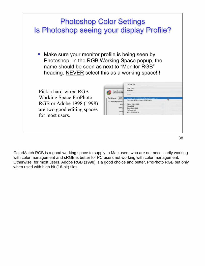
! Make sure your monitor profile is being seen by Photoshop. In the RGB Working Space popup, the name should be seen as next to “Monitor RGB” heading. NEVER select this as a working space!!!
Pick a hard-wired RGB Working Space ProPhoto RGB or Adobe 1998 (1998) are two good editing spaces for most users.
Photoshop Color SettingsIs Photoshop seeing your display Profile?
ColorMatch RGB is a good working space to supply to Mac users who are not necessarily working with color management and sRGB is better for PC users not working with color management. Otherwise, for most users, Adobe RGB (1998) is a good choice and better, ProPhoto RGB but only when used with high bit (16-bit) files.
38

! Load the ICC profile for the CMYK output device you use for conversions in the CMYK popup menu or...
! Instead use the “Convert to Profile” command and select any CMYK (or RGB/Grayscale) profile you wish to use for the output device. Advantage to Convert to Profile is rendering intents can be previewed prior to conversion
! Avoid the Photoshop “Classic” engine which was around prior to PS5. It’s flaky!
Photoshop Color SettingsWorking Space-CMYK
The benefits of Convert to Profile is the ability to soft proof on-screen as you try different rendering intents. Also Black Point Compensation and other conversion options are available.Black Point Compensation: A software switch in Adobe's ACE CMM. Turning this switch on causes ACE to ignore the actual luminance of black in the source color space. With this switch on the darkest black in the source space is mapped to the darkest black in the destination. It is recommended that you use Black Point Compensation in most situations.
39

! Controls the default behavior for documents that don’t match the “Preferred” (current) RGB/CMYK/Gray Working Spaces set in Color Settings.
! Preserve Policy provides the most flexibility for users working with many color spaces. If documents don’t match, you can open in existing color space then decide what to do next (convert or preserve).
! Convert Policy attempts to “force” the Working Space upon files that don’t match current settings. Good if you want files to end up in the color space set in color settings.
! Off Policy is not recommended!!! *See the “Assign versus Convert” tutorial on www.digitaldog.net
Photoshop Color SettingsPolicies
Convert and Preserve are the same when warnings are on. When warnings are off, there is a much bigger difference due to automatic conversions with Convert policy!Preserve colors changes the data to keep colors looking “correct.”
40

Have the Ask When... checkboxes on to warn about: Missing Profiles
Profile Mismatches
Paste Mismatches
This is your safety net! However, turning off warnings can speed up automated production. This will allow automatic conversions depending on policy settings.
For more details on the settings refer to the Photoshop tutorial PDF’s on www.digitaldog.net
Photoshop Color SettingsWarning Check Boxes
See the tutorials available on my web site which walk users through the policies and their exact behavior on different documents.
41

*See the “Assign versus Convert” tutorial on www.digitaldog.net
! Assign Profile command controls what profiles are used for each document if necessary. Used for untagged documents to redefine the color space
! Untagged documents are assumed to be in whatever RGB, CMYK or Gray color space you selected in the Color Settings. If this is the incorrect assumption, Assign Profile is the fix
! Don’t accept untagged documents!
Assign Profile Command
Convert versus Assign. Convert changes the numbers in a document. Assign changes the definition of the numbers but those numbers remain the same values. The color appearance of these unchanged numbers appear differently due to a different definition.
42

Once you select the proper printer profile that defines the printer and paper, toggle the rendering intent popup from Relative Colorimetric to Perceptual. Select the intent based on the soft proof you see and prefer visually.
The same functionality is seen in Print with Preview however, there is NO soft proof provided in that dialog so you need to predetermine this first (Customize Proof Setup).
Do NOT apply a profile in both Convert to Profile and Print with Preview. This results in double profiling. Pick one or the other method to apply the profile.
Convert to Profile
Document color space
Profile for printer/paper
Use ACEToggle different intents
Keep check boxes on
43

! Use Photoshop’s Custom Proof setup and load your output profile
! Edit in your RGB Working Space WHILE viewing the output simulation(s)
! Once you edit for a specific output device, edit on a copy or Layer! The original file in the RGB working space is your “master” which you will go back to each time you wish to print it
! Always show client images on screen with the soft proof! If you show them the RGB preview, that’s what they will expect you to provide and that’s not possible!
Soft Proofing in Photoshop
Soft Proof: A term that describes the process of using ICC color management to produce a preview of an image on screen that simulates (proofs) how that image will output to a specific printer.
For those working with untagged files or files that are in an print/output space (CMYK specifically), it is useful to see what the document would look like if the current set of numbers were simply sent to the printer “as is.” For example, I’m provided a document in U.S. Web Uncoated (SWOP) v2 but the document will be output to a device where Eurocoated v2 is the behavior of the device. By un-checking Preserve Color(CMYK in CS2) Numbers, a soft proof is produced showing what the output would look like if those numbers from SWOP were sent directly to the output device that prints Eurocoated. I can then decide if it’s appropriate to send the U.S. Web Coated (SWOP) v2 document to the Eurocoated printer or if some conversion or editing is necessary, based upon what I see displayed.
NEVER allow the client to see the image without a soft proof or they will expect this on output (which is impossible).
Also see:http://www.ppmag.com/reviews/200409_rodneycm.pdf
http://www.ppmag.com/reviews/200411_rodneycm.pdf
44

! Presets can be selected after you configure and save them to disk. Quick way to toggle different settings and view soft proof. Notice that Rendering Intent was saved in name.
! Device to Simulate: Pick your printer here.
! Preserve RGB Numbers: What does output look like without the use of a profile?
! Rendering Intent: Select the best based on soft proof.
! Simulate check box affect dynamic range of soft proof by taking paper and ink into account. Use in Full screen mode only!
*See the “Soft Proof” tutorial on www.digitaldog.net
Saved Presets
Output device to Soft Proof
Conversion Options
Control Dynamic Range
Custom Proof Setup
When you use the Simulate check boxes, only the black and white within your image undergo the simulation. Problem is, the user interface (menus, palettes) do not change their appearance and your eye always adapts to the whitest white in a scene. For this reason, you should be in Full Screen Mode with NO palettes showing when using this simulation. Setup the soft proof as you wish. Type the F key twice, then the Tab key once and you will have the image in Full Screen Mode.
45

Preparing files for print in Photoshop*
Print using ICC profiles
! Output profiles provide the recipe for new RGB or CMYK numbers necessary to reproduce original color as you expect.
! You can use either Convert to Profile or Print with Preview command in Photoshop to apply your output profile. Never use both to apply the profile.
! Select a rendering intent based on the preview (soft proof). Profiles know nothing about images, only devices. Here is where you make the decisions that instruments cannot.
46

Document is in ColorMatch RGB and will be converted to an Epson 2200 because the color handling is set to Let Photoshop Determine Colors.
The functionality is the same as Convert to Profile command.
Do not allow print driver to apply color management!
Use the No Color Management setting if you used Convert to Profile!
Print with Preview CS2
Not Color Managed
47
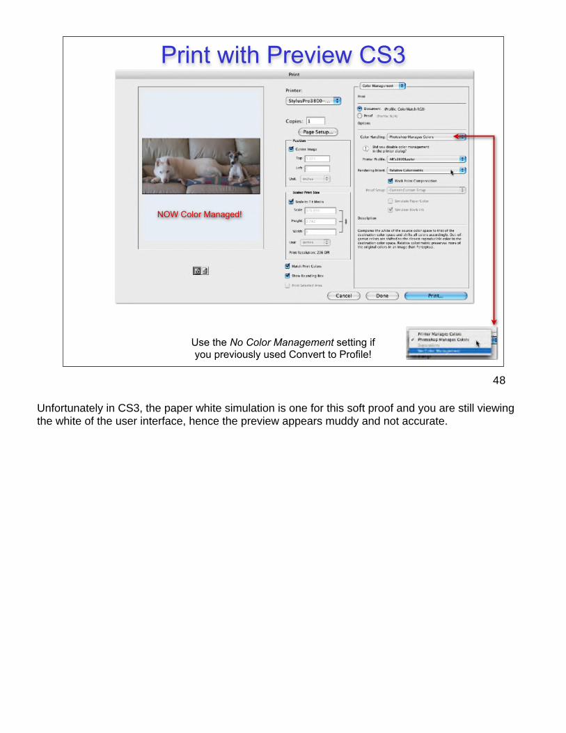
Use the No Color Management setting if you previously used Convert to Profile!
NOW Color Managed!
Print with Preview CS3
Unfortunately in CS3, the paper white simulation is one for this soft proof and you are still viewing the white of the user interface, hence the preview appears muddy and not accurate.
48
! Predictable, Repeatable & Accurate Color based upon empirical data (measured data)
! Color numbers are defined within a color space, Non ambiguous data due to the use of ICC profiles and profile embedding. No RGB or CMYK “mystery meat”
! Soft Proofing on-screen for image editing based upon any output device defined by an ICC profile*
! Ability to make multiple devices match (Know as Cross Rendering)
! Robust Gamut Mapping
*See the “Soft Proof” tutorial on www.digitaldog.net
Benefits of a CMS
Cross Rendering: A term that describes the process where one printer is used to simulate the color of another printer. Using color management to make an Epson printer produce a proof that matches what will ultimately be output on a contract proof is an example of cross rendering. Also known as cross simulation.
49

! You don’t have to deal with all items at once. Start by calibrating and profiling the monitor using an instrument (not eye-ball calibration!)
! Get your service provider to profile their devices and give you the profiles! This allows you to control conversions based upon the output soft proof
Setting up a CMS
Try to use instrument based display calibration. Products now start at under $90.If you run into a service provider that asks you to match your display to a reference print they supply using on display controls, run away from them as fast as you can! This is an exercise in failure using ICC aware applications like Photoshop.
50

Question & Answers
Thank you for coming. If you were provided with evaluation forms, please fill them out.
51