color accessibility greg kraus university it accessibility coordinator north carolina state...
TRANSCRIPT

Color Accessibility
Greg KrausUniversity IT Accessibility Coordinator
North Carolina State [email protected]
@gdkraus
Concepts
Two Questions We Ask With Color Accessibility
1. Given moderate visual acuity loss, can a person read this content without the aid of assistive technologies?
2. If a person needs an assistive technology, does our content prevent them from modifying the content to meet their needs?

Planning for Color and Visual Deficiencies
• There are a wide range of color deficiencies and visual impairments
• How do we plan for them all?
Visual Impairment Simulator
• NoCoffee• Chrome Extension

Standards: Taking the Guessing Out of Conformance
• WCAG 2– Color is not the sole means of conveying
information– Provide sufficient contrast based on the size of the
text and the conformance level desired

WCAG 2 (1.4.1): Use of Color
• Level A• Examples of violations– “Required fields are in red”– “Complete the blue section first”

WCAG 2 (1.4.3 and 1.4.6): Contrast
• Level AA and Level AAA Conformance• Ratios– 3:1 minimum acceptable contrast for standard text and
vision– 4.5:1 accounts for moderately low visual acuity (vision
loss equivalent to approximately 20/40)• typical visual acuity of people at roughly age 80
– 7:1 accounts for users who typically do not depend on assistive technologies for visual impairments (vision loss equivalent to approximately 20/80)
What Is Covered in WCAG Contrast Requirements?
• Text• Does NOT apply to– Logos– Inactive form elements– Purely decorative text– Incidental text in photos– Other UI elements
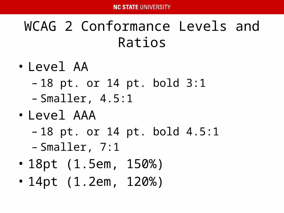
WCAG 2 Conformance Levels and Ratios
• Level AA– 18 pt. or 14 pt. bold 3:1– Smaller, 4.5:1
• Level AAA– 18 pt. or 14 pt. bold 4.5:1– Smaller, 7:1
• 18pt (1.5em, 150%)• 14pt (1.2em, 120%)

Beyond WCAG 2
• (Acknowledge Wayne Dick from CSU Long Beach for information)
• There is no average person with low vision• 35+ critical structures in the human visual
system– Multiple ways these structures can break
• Bright light is painful to many people with low vision
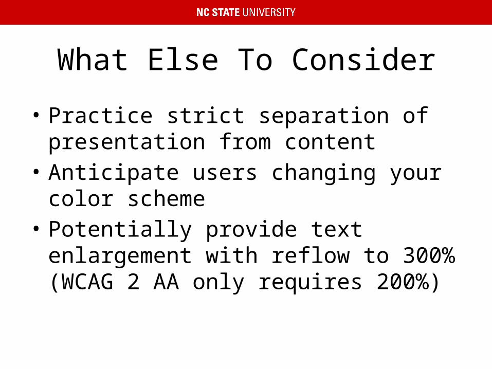
What Else To Consider
• Practice strict separation of presentation from content
• Anticipate users changing your color scheme• Potentially provide text enlargement with
reflow to 300% (WCAG 2 AA only requires 200%)

Tools
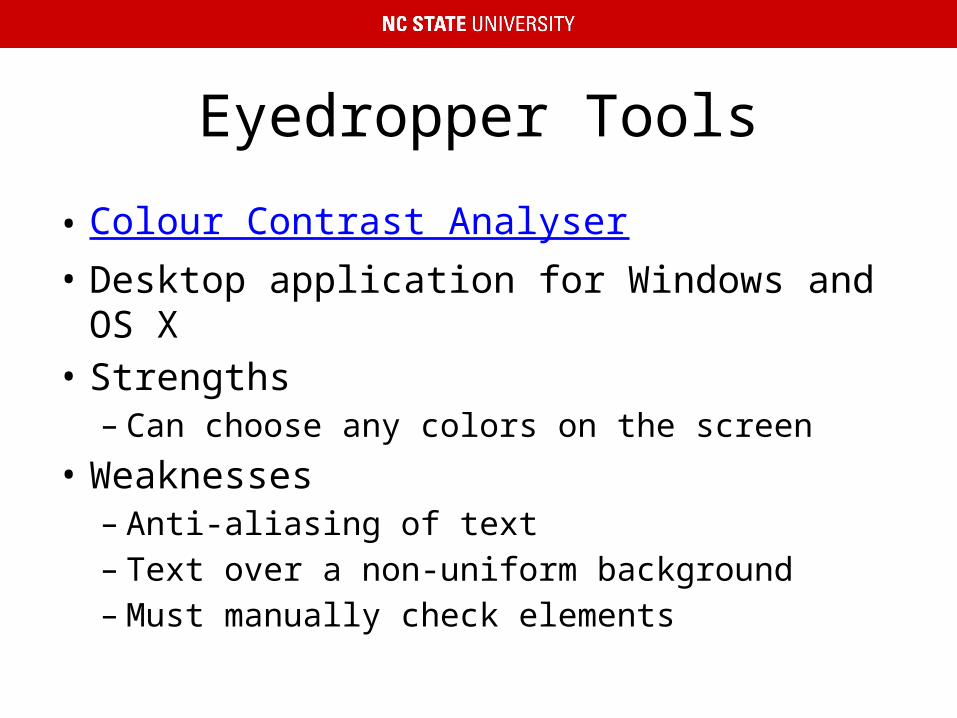
Eyedropper Tools
• Colour Contrast Analyser• Desktop application for Windows and OS X• Strengths– Can choose any colors on the screen
• Weaknesses– Anti-aliasing of text– Text over a non-uniform background– Must manually check elements
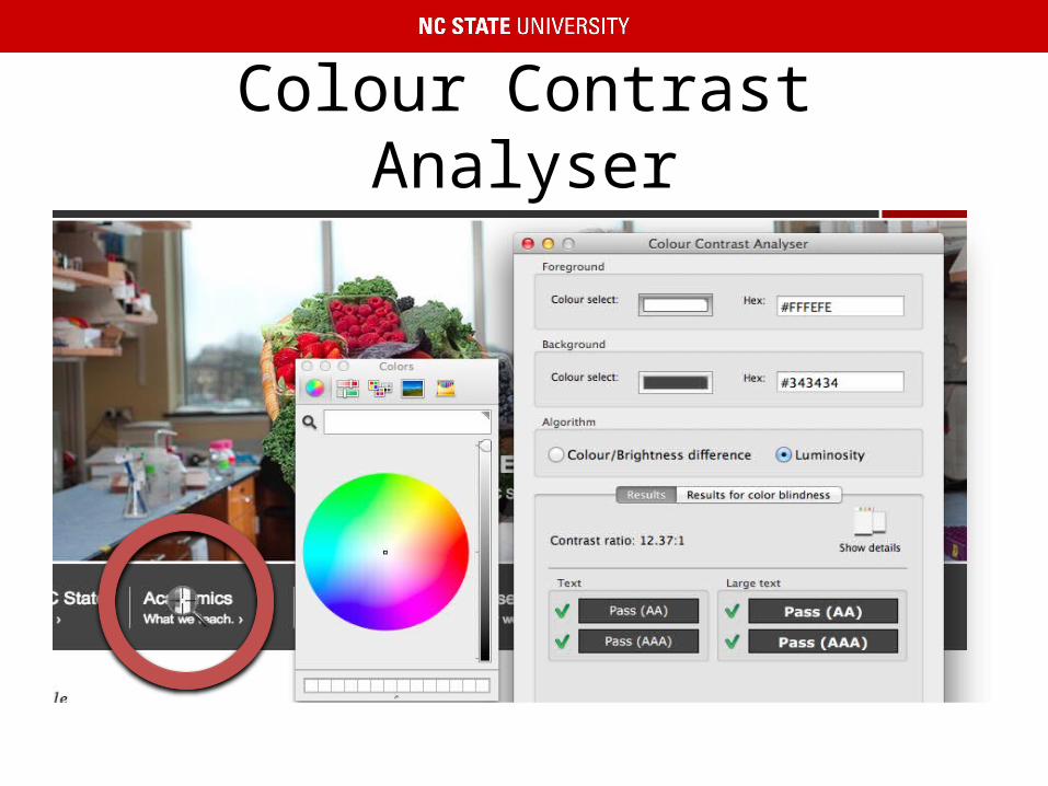
Colour Contrast Analyser

Automated Tools
• WAVE• Juicy Studio Accessibility Toolbar• Strengths– Automatically checks all color combinations– Can account for text size
• Weaknesses– Text over images– Text in images– Text over CSS3 gradients

Text Over Images
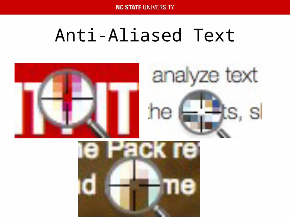
Anti-Aliased Text

Image Analysis
• Color Contrast Analyzer for Chrome• Chrome extension• Strengths– Checks the page as it is rendered
• Weaknesses– Cannot differentiate between text and other user
interface elements

Color Contrast Analyzer: Original Image

Color Contrast Analyzer: Mask

Color Contrast Analyzer: Text Over Images

Color Contrast Analyzer: Text in Images

Testing Color Palettes
• NC State Accessible Color Palette Evaluator• Web-based application• Build a color palette• Compare all of the color combinations to see
which have enough contrast• Sample Accessible Palette Evaluator
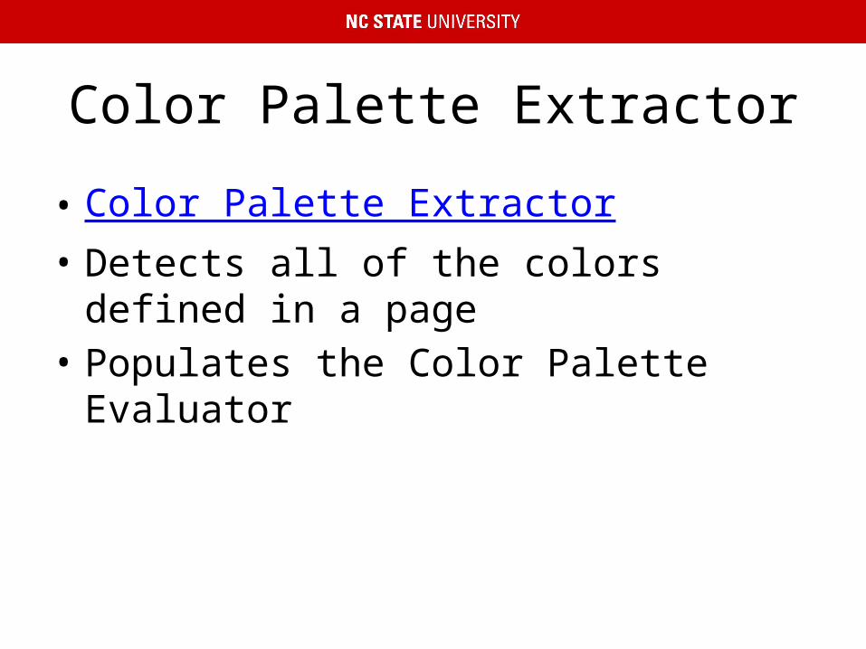
Color Palette Extractor
• Color Palette Extractor• Detects all of the colors defined in a page• Populates the Color Palette Evaluator

Color Palette Tweaker
• Tanaguru• Web-based application• Pick two colors and adjust one of them to
make the contrast great enough to meet WCAG

Substituting Style Sheets
• Web Evaluation Tools

Questions