codes and conventions
TRANSCRIPT
CODES AND CONVENTIONS
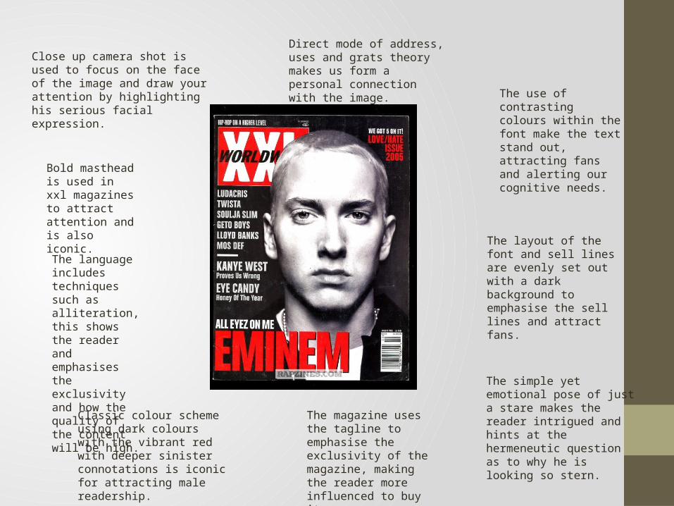
Direct mode of address, uses and grats theory makes us form a personal connection with the image.
Close up camera shot is used to focus on the face of the image and draw your attention by highlighting his serious facial expression.
Bold masthead is used in xxl magazines to attract attention and is also iconic.
Classic colour scheme using dark colours with the vibrant red with deeper sinister connotations is iconic for attracting male readership.
The magazine uses the tagline to emphasise the exclusivity of the magazine, making the reader more influenced to buy it.
The language includes techniques such as alliteration, this shows the reader and emphasises the exclusivity and how the quality of the content will be high.
The use of contrasting colours within the font make the text stand out, attracting fans and alerting our cognitive needs.
The layout of the font and sell lines are evenly set out with a dark background to emphasise the sell lines and attract fans.
The simple yet emotional pose of just a stare makes the reader intrigued and hints at the hermeneutic question as to why he is looking so stern.
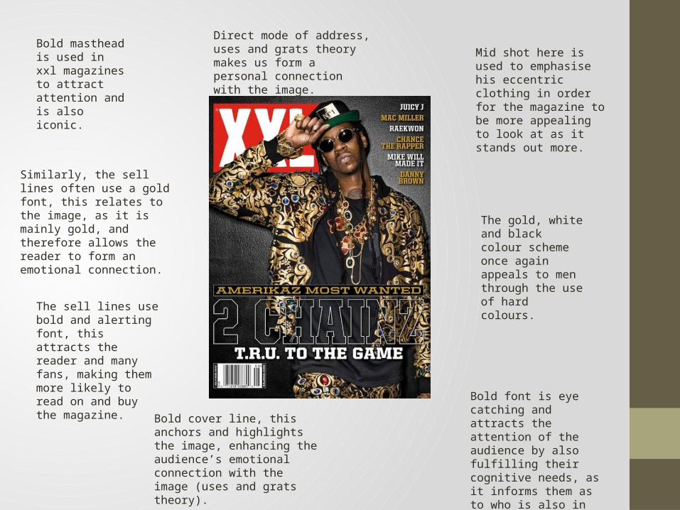
Direct mode of address, uses and grats theory makes us form a personal connection with the image.
Mid shot here is used to emphasise his eccentric clothing in order for the magazine to be more appealing to look at as it stands out more.
Bold font is eye catching and attracts the attention of the audience by also fulfilling their cognitive needs, as it informs them as to who is also in the magazine.
The gold, white and black colour scheme once again appeals to men through the use of hard colours.
Bold cover line, this anchors and highlights the image, enhancing the audience’s emotional connection with the image (uses and grats theory).
The sell lines use bold and alerting font, this attracts the reader and many fans, making them more likely to read on and buy the magazine.
Similarly, the sell lines often use a gold font, this relates to the image, as it is mainly gold, and therefore allows the reader to form an emotional connection.
Bold masthead is used in xxl magazines to attract attention and is also iconic.
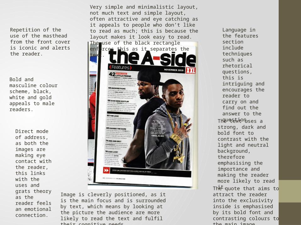
Repetition of the use of the masthead from the front cover is iconic and alerts the reader.
Bold and masculine colour scheme, black, white and gold appeals to male readers.
Direct mode of address, as both the images are making eye contact with the reader, this links with the uses and grats theory as the reader feels an emotional connection.
Image is cleverly positioned, as it is the main focus and is surrounded by text, which means by looking at the picture the audience are more likely to read the text and fulfil their cognitive needs.
The quote that aims to attract the reader into the exclusivity inside is emphasised by its bold font and contrasting colours to the main image.
The text uses a strong, dark and bold font to contrast with the light and neutral background, therefore emphasising the importance and making the reader more likely to read it.
Language in the features section include techniques such as rhetorical questions, this is intriguing and encourages the reader to carry on and find out the answer to the question.
Very simple and minimalistic layout, not much text and simple layout, often attractive and eye catching as it appeals to people who don’t like to read as much; this is because the layout makes it look easy to read. The use of the black rectangle enforces this as it separates the text.

Headline labelled “contents” uses a bold black font to attract attention, similarly, the letters are positioned on top of each other which as a result intrigues the reader.
Simple yet bland colour scheme is used in order to draw attention to the vibrant colour (red) which is used in the main image. This makes us wonder why the magazine is emphasising Kanye’s heart, so we therefore want to read on (to fulfil our cognitive needs).
Sell lines similarly use bold and black font to stand out from the bland background, as well as a more sophisticated and italic font, making it more eye catching and attractive to read.
Direct mode of address in the image allows the audience to feel a personal connection and therefore want to read the rest of the magazine.
The strong and stern looking facial expression within the image (of Kanye West) makes us want to find out why he is feeling this way, thus teasing our cognitive needs.
Simple and minimalistic layout makes it more attractive for a reader as it doesn’t flood the page with information and the text seems limited as it is evenly spread and positioned.
Alliteration within the text is used in order to grab the attention of the reader, and make them think they are reading a sophisticatedly written piece and it will perhaps fulfil their cognitive needs.
The contents of the image are purposely aimed to be intriguing and aim to want the audience to pose questions, e.g. Kanye’s hands are in his pockets, perhaps suggesting secrecy or something to be unveiled.
The text is layed out in a simple and narrow manner, this aims to make it seem as if there is less text to read, this therefore appeals to people who aren't keen readers, and males who tend to be lazy.

Masthead/headline uses strong and bold font, with contrasting colours so that it catches the eye and people are attracted to read it.
Text layout is narrow and tall, thus appealing to people who don’t like to read mass amounts of writing, meaning a wider range of audiences are likely to read it.
Main text uses a contrasting and dark colour to the background, this makes it stand out and therefore emphasises the information in the text.
Image has been purposely made to be large, as it takes up ¾ of the page. This emphasises the contents of the image, and attracts fans of the A$AP mob.
The picture is positioned cleverly in this double page spread, as it is placed directly in the middle of both pages and takes up the majority of the page, this therefore draws your attention to the small text and it also attracts fans.
The camera has captured them in a slightly high angled, mid shot, the lighting is high key portraying a natural environment.
They (“the mob” are all wearing noticeably common hip-hop esque outfits, including jackets and caps, this will attract hip-hop lovers who haven’t heard of the ASAP mob.
All members of the mob are doing something different (some use direct mode of address, some even swear on the far left), this shows us that they are all different and individual from another.
Similarly, the natural background and poses, with clothes that aren't expensive looking show us that they are just “normal people” and that they aren’t fake.
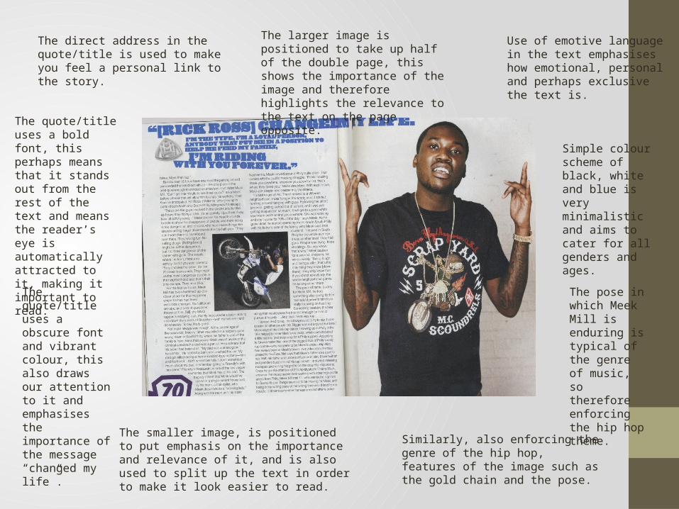
The direct address in the quote/title is used to make you feel a personal link to the story.
The quote/title uses a bold font, this perhaps means that it stands out from the rest of the text and means the reader’s eye is automatically attracted to it, making it important to read.
The quote/title uses a obscure font and vibrant colour, this also draws our attention to it and emphasises the importance of the message “changed my life”.
The smaller image, is positioned to put emphasis on the importance and relevance of it, and is also used to split up the text in order to make it look easier to read.
The larger image is positioned to take up half of the double page, this shows the importance of the image and therefore highlights the relevance to the text on the page opposite.
Use of emotive language in the text emphasises how emotional, personal and perhaps exclusive the text is.
Simple colour scheme of black, white and blue is very minimalistic and aims to cater for all genders and ages.
The pose in which Meek Mill is enduring is typical of the genre of music, so therefore enforcing the hip hop theme.
Similarly, also enforcing the genre of the hip hop, features of the image such as the gold chain and the pose.