climate benefits slideshow 2015
TRANSCRIPT

Stuart Cohen
Executive Director
Climate Investments
Benefit Campaign

Keep cap-and-trade intact
Extend AB 32 to 2030
Illustrate benefits of transportation
and sustainable communities
benefits
Shape narrative to support
replication outside California
Higher Level Goals

Research and Reports
Education and Outreach
Communications Support for
Regional Organizations
Benefits Campaign Components

{ As an example of
combining strong
data and metrics
with outreach and
advocacy, this
report quantified
how locating
affordable homes
near transit is an
effective strategy
for reducing GHGs.

Funded by the
Ford
Foundation, the
report showed
the specific
benefits
currently
achieved, then
projected the
cumulative
benefits for
three years of
cap-and-trade
investments.

This evidence built
the case for traffic
reduction benefits
as well as GHG
reduction. It
helped unlock the
final cap-and-trade
budget package
(the poster
summarizes report
results)

We need the power of data,
combined with outreach and
education, to amplify and celebrate
cap-and-trade benefits.

The Climate
Investments
Benefits Map will
be a powerful GIS
database-driven
tool. It will
illustrate the
benefits of cap-
and-trade
investments to
diverse audiences
in the way that is
most meaningful
to them.

Users could filter
investments by:
program area,
geography, and year.
Here, we use the
program area filter
for "Waste
Diversion" to find
the first set of
investments,
announced in
November 2014.

Users would get a
map of waste
diversion projects,
and a list of their
benefits in
aggregate. Below
that will be the
individual projects.
Clicking on a
project brings up a
full page
description.
(Note: these are
the actual 2014/15
investments)

These full page
project reports will
provide a more
detailed overview,
and provide
relevant links. In
this example, we
link to the
upcoming UpliftCA
website, which will
provide more
detailed stories of
benefits for
disadvantaged
communities.

Filtering by
geography will be
one of the most
useful features for
community
members, the media
and decisionmakers.
Checkboxes will
show that map layer.
While boxes to
right are used for
filtering. Users
could also filter for
disadvantaged
community benefits.

Here, we use the
geography filter for
“Assembly District
31” to find all the
investments in that
district. A map
would come up,
just showing those
investments.

With additional
resources, these
maps can include
more than just pin
drops (dots), but
can show the transit
lines funded,
boundaries of
conservation areas
funded, etc. Project
reports, either brief
or detailed ones,
could be exported
and printed for
distribution.

The program
reports can be
short one- to four-
page summaries,
depending on the
number of projects
selected via filters.

We can also create
longer documents.
Here, we show the
table of contents of
a hypothetical
report that could be
generated for
Assembly District
31. The one-page
project reports are
compiled and
framed by critical
context. These
could be generated
in real time for use
at events, by
reporters, etc.
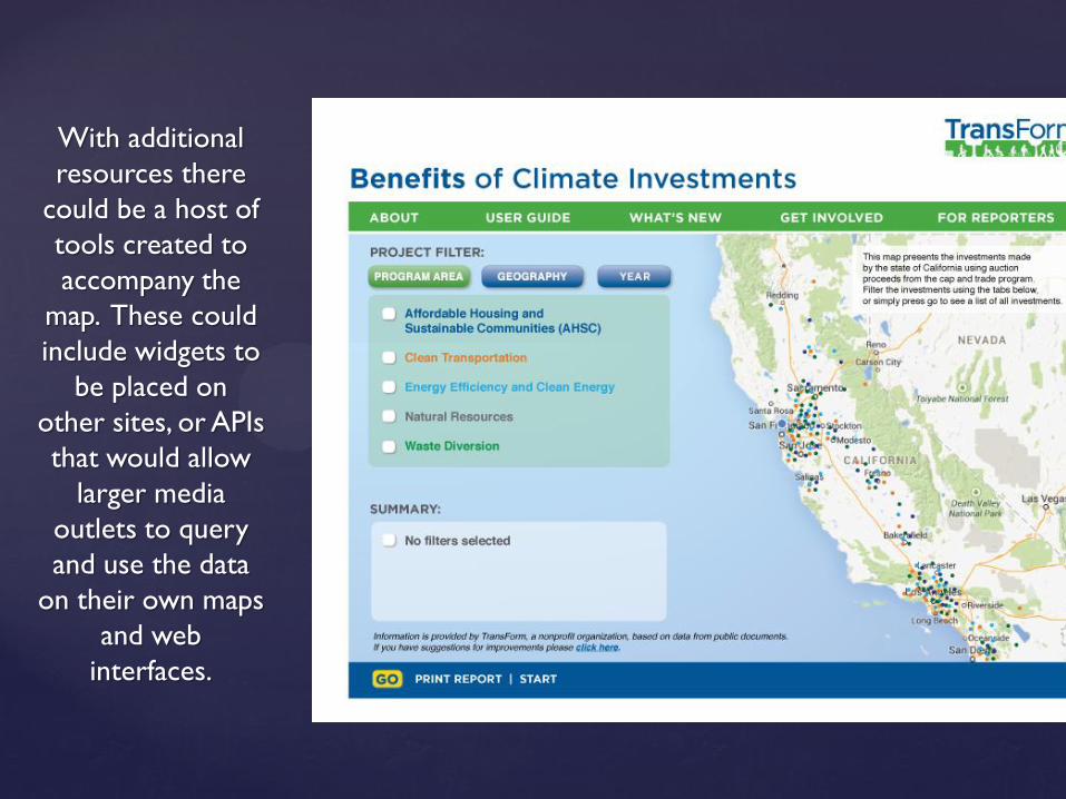
With additional
resources there
could be a host of
tools created to
accompany the
map. These could
include widgets to
be placed on
other sites, or APIs
that would allow
larger media
outlets to query
and use the data
on their own maps
and web
interfaces.
