charts n charts are used to help people understand numerical data through visualization
TRANSCRIPT

Charts
Charts are used to help people understand numerical data through visualization.

Appropriate charts can provide different perspectives, details, overviews, generalizations, and trends in data.
These visual language devices filter knowledge and provide appropriate chunking, structuring, and pacing in the presentation of data.

Scientists often distinguish charts from graphs.
Charts present numerical relations on a comparative basis.
Graphs present a functional relation between dependent and independent variables.

Examples of scientific charts
Bar chart, pie chart, various pictorial charts

Examples of scientific graphs
Continuous line plots on linear-linear coordinate scales,
on semi-logarithmic coordinate scales, on log-log coordinate scales

Electronic spreadsheets usually do not make that distinction.
They take a more business orientation and refer to them both as charts. That’s what we do here, matching Excel’s terminology.

Basic issues in designing and implementing graphic presentations:
Simplicity, clarity, and consistency are essential for good chart design.
Keep extraneous text to a minimum.

Both legibility and readability can be significantly improved through the selection of graphic elements and the layout of the material.

Legibility
Legibility deals with the reader’s ability to successfully find, identify, and absorb what a chart denotes.

Readability
Readability concerns the chart’s interpretation and appeal.

Spreadsheet packages offer a variety of chart types for accomplishing this.

Excel supplies:
Column Bar Line Pie XY (scatter) Area
Doughnut Radar Surface Bubble Stock Cone, cylinder, and
pyramid

You can create any one of these in Excel by first selecting the cells whose values are to be displayed in the chart.
Then click the Chart Wizard button on the standard toolbar and choose from among the options presented on the resulting series of dialog boxes.
Column charts
A column chart shows the data as vertical bars.
A column chart shows data changes over a period of time or illustrates comparisons among items.
Categories are organized horizontally, values vertically, to emphasize variation over time.
Stacked column charts show the relationship of individual items to the whole.
Step charts are column charts without space between the columns.

The 3-D perspective column chart compares data points along two axes.
In this 3-D chart, you can compare four quarters of sales performance in one division with the performance of two other divisions.

0
10
20
30
40
50
60
70
80
90
1st Qtr 2nd Qtr 3rd Qtr 4th Qtr
EastWestNorth
Bar chart
A bar chart displays the data as horizontal bars. It is used to illustrate comparisons among
individual items. Categories are organized vertically, values
horizontally, to focus on comparing values and to place less emphasis on time.
Stacked bar charts show the relationship of individual items to the whole.


Line chart
A line chart shows data plotted with or without markers at the data point locations and with or without line segments connecting the points.
A line chart shows trends in data at equal intervals, discretely or continuously.


Pie chart
A pie chart displays the data in a circle divided into sectors.
It shows the proportional size of items(out of 100%) that make up a data series to the sum of the items.
NB: It always shows only one data series and is useful when you want to emphasize a significant element.

To make small sectors/slices easier to see, you can group them together as one item in a pie chart and then break down that item in a smaller pie or bar chart next to the main chart.


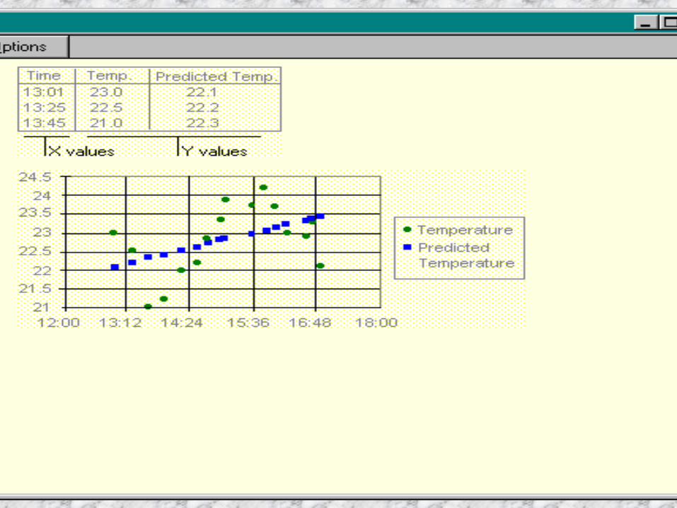
XY (scatter) chart
A scatter chart is like a line chart but with a greater variety of built-in axes for proportional calibrations.
An xy (scatter) chart either shows the relationships among the numeric values in several data series or plots two groups of numbers as one series of xy coordinates.
It shows uneven intervals or clusters of data and is commonly used for scientific data.

When you arrange your data, place x values in one row or column, and then enter corresponding y values in the adjacent rows or columns.

Area chart
An area chart shows the area under a curve. It is usually used to emphasize the magnitude of
change over time. By displaying the sum of the plotted values, an
area chart also shows the relationship of parts to a whole.– For example, an area chart might emphasize
increased sales in Washington and illustrate the contribution of each state to total sales.


Doughnut chart
Like a pie chart, a doughnut chart shows the relationship of parts to a whole, but it can contain more than one data series. Each ring of the doughnut chart represents a data series.


Radar chart
In a radar chart, each category has its own value axis radiating from the center point. Lines connect all the values in the same series.

Surface chart A surface chart is useful when you want to
find optimum combinations between two sets of data.
As in a topographic map, colors and patterns indicate areas that are in the same range of values.


Bubble chart
A bubble chart is a type of xy (scatter) chart. The size of the data marker indicates the value of a third variable.
To arrange your data, place the x values in one row or column, and enter corresponding y values and bubble sizes in the adjacent rows or columns.– For example, a chart might show that Company A has
the most products and the greatest market share, but not the highest sales.

Stock chart
The high-low-close chart is often used to illustrate stock prices.
This chart can also be used for scientific data, for example, to indicate temperature changes.
You must organize your data in the correct order to create this and other stock charts.


A stock chart that measures volume has two value axes: one for the columns that measure volume, the other for the stock prices.
You can include volume in a high-low-close or open-high-low-close chart.


Cone, cylinder, and pyramid
The cone, cylinder, and pyramid data markers are variations of columns and bars. They can add a special effect to 3-D column and bar charts.
So instead of having bars and columns you use cones, cylinders, and pyramids.


Some general guidelines in designing any chart

The ones most used in the business environment are:– Line– Bar and column– Pie
Line charts
These use a line to connect data points on a measurable area, e.g. a Cartesian grid, to show one dependent variable plotted against an independent variable, such as time.
With a line chart you can show long series of data, interpolate between points, extrapolate beyond known data values, and compare several data lines.

Line charts (cont.)
The purpose of a line chart is to emphasize a trend rather than actual amounts.

Guidelines in designing a line chart Since there are the data point lines and grid
and axis lines, make the data lines the thickest.
Make the grid lines thin or leave them out. Axes should be medium weight ; they
should be part of the rectangle that defines the entire data area.

Line chart (cont.)
If there’s enough room around the data area, place the tick marks and scale values outside the area.
If there is more than one line, distinguish them by color or texture.
Avoid presenting more than 5 data lines. Be careful that when lines overlap, they are in an
order where textures or colors won’t be mixed.

Line chart (cont.)
For legibility keep all typography horizontal, if possible.
Sans serif fonts in a single font design are often the most legible (Marcus 1992:101).
The title can be centered but a stronger structure is flush left aligned with the left side of the data area rectangle.

Line charts (cont.)
Keep the number of digits in the scales on the axes at a minimum.
Avoid labeling boxes or leader lines since the chart might get too cluttered.

Bar (horizontal) and column (vertical) charts Bar charts can be interchanged with line
charts in terms of purpose. But they are better for emphasizing actual
values or differences, especially between positive and negative values.

Bar and column charts (cont.)
Bar charts use thick lines, bars, or columns to emphasize the magnitude or size of the data value.
They can stand separately, be grouped, or stood end to end.
Most of the issues relating to line charts also apply to bar charts.
Bar and column charts (cont.)
If you need to put data values near the end of the bars or columns, make them small.
The space between bars should be half the width of the bars or less.(Or leave it out altogether.)
Bar and column charts (cont.)
Select colors and textures that do not cause optical illusions or emphasize one segment in comparison to others.
Avoid putting more than three bars in a group since the values they represent may become confusing.
One way to do this in Excel is to limit the variables you will be charting to three or so.

Pie charts
A pie chart shows the interrelation of components to a whole.
Its use is discouraged when you want a reader to compare areas accurately either within a chart or across several charts.
It usually charts the values of a single variable.
Pie charts (cont.)
Place the title centered over or under the pie if there aren’t any other constraints.
But flush left or further left is OK if the title were to obstruct a label.
Place sector labels outside the sector. Arrange groups of labels simply. Use leader lines to identify small sectors but
don’t use many different angles.

Pie charts (cont.)
Avoid using more than 7 sectors. Avoid having sectors that take up less 5%
of the pie/circle. Use textures and colors uniformly.

Where does Excel get the information it needs to create a chart?
Labels of axes and legends come from column and row headings
Data points come from worksheet cell values


Some pointers for creating bar and column charts 1 To get the proper labels on legends and on
axes, you have to tell the system by including in your selected region not only the data points you want plotted but also the labels from the label column and the label row.


Qtr 1 Qtr 2 Qtr 3
IncomeLocal funds $250,000 $260,000 $270,400State funds $130,000 $135,200 $140,608National funds $50,000 $52,000 $54,080Gifts $15,000 $15,600 $16,224


2 For a bar or column chart, make sure your selection delimits/describes a rectangle:


3 Make sure the upper left-most cell is blank. If it isn’t, Excel may have trouble interpreting what you want as labels on your legend, etc.

Upper left-most cell is empty

4. Select your labels and data points systematically: e.g. top-to-bottom and left-to-right.

Top-to-bottom and
left-to-right

Types of things you can format on a chart


Number formats, axis scale, and tick marks: You can specify the range of values
displayed on the value axis and change the interval between values along the axis.
For example, instead of starting at 0 (zero), the chart in our example displays the range of values $25 to $275.
You can also specify whether an axis has tick marks.

You can format numbers in a chart as you would numbers on a worksheet.
To apply the most common number formats, click the axis or data label that has the number you want to format, and then apply currency, percent, or comma style formatting by clicking the buttons on the Formatting toolbar.

Formatting with colors, textures, and gradient fills You can apply colors, borders, and fill effects to
data markers, the chart area, the plot area, and other chart items.
To apply a fill effect, such as a texture or a picture, click a chart item, click the arrow next to Fill Color, and then click Fill Effects.
Next, select the options you want on the Gradient, Texture, Pattern, and Picture tabs.

To format texts, including rotating text You can format text in a chart as you would
any other text: Click the text or item, and then change the
font, size, and color by clicking the buttons on the Formatting toolbar.
To rotate text 45 degrees up or down, click the Angle Text Upward or Angle Text Downward icons on the Chart toolbar.
Special formatting options for each chart type Special lines, bars, data markers, and other options
are available for different chart types. For example, you can get a layered effect for
column and bar charts by changing the overlap property for data series.
A line chart can have a shadow behind each diamond-shaped marker and use a smoothed line.

Lines can connect the data series in a stacked bar chart.
To set special formatting for a data series, click the data series, click Data Series on the Format menu, and then select the options you want on the Patterns and Options tabs.

You can choose to display or hide titles, gridlines, axes, data labels, legends, or a data table in your chart.
Some of these items are available only in certain types of charts.
You can also display or hide some of these items by using the buttons on the Chart toolbar.

To add labels to data points or series: The chart type associated with the selected data
series or data point determines the type of label you can add.
1 To add data labels to a data series, click the data series.
To add a data label to a single data point, click the data series that contains the data marker you want to label, and then click the data marker for the data point you want to label.

2 On the Format menu, click Data Series or Data Point.
3 On the Data Labels tab, select the options you want.
Note: You can quickly label all data points. Click the chart, click Chart Options on the Chart menu, and then select the options you want on the Data Labels tab.
To add a title to a chart
1 Click the chart to which you want to add a title.
2 On the Chart menu, click Chart Options, and then click the Titles tab.
3 To add a chart title, click in the Chart title box, and then type the text you want.
To add one or more axis titles, click in the appropriate box for each title, and then type the text you want.

Note: To insert a line break in a chart title or axis title, click the text on the chart, click where you want to insert the line break, and then press ENTER.

Change the size, color, or shape of line, xy (scatter), or radar chart markers
1 Click the line with the data markers you want to change.
2 On the Format menu, click Data Series, and then click the Patterns tab.
3 Under Marker, select the options you want.

To overlap or space data markers in bar and column charts
You need to select only a single data series to change the overlap or spacing of all data series of the same chart type.
1 Click a data series in the chart you want to change.
2 On the Format menu, click Data Series, and then click the Options tab.

3 To change the overlap of the data markers in each category, enter a value between -100 and 100 in the Overlap box. The higher the value, the greater the overlap within the category.
4 To change the spacing between categories of data markers, enter a value between 0 (zero) and 500 in the Gap width box. The higher the value, the greater the distance between each category.

To vary colors in the same data series In a single-series chart, you can vary the colors of
data markers within the same data series. The colors of slices in pie charts, which contain only one series, are varied by default.
1 Click the data series you want to change the colors for.
2 On the Format menu, click Data Series or Data Point, and then click the Options tab.
3 Select the Vary colors by point check box or the Vary colors by slice check box.