charts mpr 3/17 - norges bank · 1) mpr 2/17 was based on information through 16 june 2017,...
TRANSCRIPT

2010 2011 2012 2013 2014 2015 2016 2017 2018 2019 2020
–3
–2
–1
0
1
2
3
4
5
–3
–2
–1
0
1
2
3
4
5
30% 50% 70% 90%
Chart 1.1a Key policy rate with fan chart.1)
Percent.
2010 Q1 – 2020 Q4 2)
1) The fan charts are based on historical experience and stochastic simulations in Norges Banks’s mainmacroeconomic model, NEMO. The fan chart for the key policy rate does not take into account that a lower bound for the interest rate exists. 2) Projections for 2017 Q3 – 2020 Q4 (broken line). Source: Norges Bank
Projections MPR 3/17
Projections MPR 2/17

2010 2011 2012 2013 2014 2015 2016 2017 2018 2019 2020
–5
–4
–3
–2
–1
0
1
2
3
4
5
–5
–4
–3
–2
–1
0
1
2
3
4
5
30% 50% 70% 90%
Chart 1.1b Projected output gap1)
with fan chart. Percent. 2010 Q1 – 2020 Q4
1) The output gap measures the percentage deviation between mainland GDP and projectedpotential mainland GDP. Source: Norges Bank
Projections MPR 3/17
Projections MPR 2/17

2010 2011 2012 2013 2014 2015 2016 2017 2018 2019 2020
–2
–1
0
1
2
3
4
5
–2
–1
0
1
2
3
4
530% 50% 70% 90%
Chart 1.1c Consumer price index (CPI) with fan chart. Four-quarter
percentage change. 2010 Q1 – 2020 Q4 1)
1) Projections for 2017 Q3 – 2020 Q4 (broken lines).Sources: Statistics Norway and Norges Bank
Projections MPR 3/17
Projections MPR 2/17

2010 2011 2012 2013 2014 2015 2016 2017 2018 2019 2020
–2
–1
0
1
2
3
4
5
–2
–1
0
1
2
3
4
5
30% 50% 70% 90%
Chart 1.1d CPI-ATE1)
with fan chart. Four-quarter percentage change.
2010 Q1 – 2020 Q4 2)
1) CPI adjusted for tax changes and excluding energy products.2) Projections for 2017 Q3 – 2020 Q4 (broken lines). Sources: Statistics Norway and Norges Bank
Projections MPR 3/17
Projections MPR 2/17

2010 2011 2012 2013 2014 2015 2016 2017 2018 2019 2020
0
1
2
3
4
5
0
1
2
3
4
5
Chart 1.2 GDP for Norway’s trading partners.1)
Annual percentage change.
2010 – 2020 2)
1) Export weights, 25 main trading partners. 2) Projections for 2017 – 2020 (broken lines). Sources: IMF, Statistics Norway, Thomson Reuters and Norges Bank
Projections MPR 3/17
Projections MPR 2/17

2010 2011 2012 2013 2014 2015 2016 2017 2018 2019 2020
0
0.5
1
1.5
2
0
0.5
1
1.5
2
Chart 1.3 Three-month money market rates for Norway’s trading partners.1)
Percent. 2010 Q1 – 2020 Q4 2)
1) Based on money market rates and interest rate swaps. For information about the aggregate for trading partner interest rates, see Norges Bank Papers 2/2015. 2) Orange and blue broken lines show forward rates at 16 June 2017 and 15 September 2017 respectively.Sources: Thomson Reuters and Norges Bank
Forward rates MPR 3/17
Forward rates MPR 2/17

2010 2011 2012 2013 2014 2015 2016 2017 2018 2019 2020
0
20
40
60
80
100
120
140
0
20
40
60
80
100
120
140
Chart 1.4 Oil price.1)
USD/barrel. January 2010 – December 2020 2)
1) Brent Blend. USD/barrel. 2) Futures prices (broken lines) are the averages of futures prices for the period 11 September – 15 September 2017 for MPR 3/17 and 12 June – 16 June 2017 for MPR 2/17.Sources: Thomson Reuters and Norges Bank
Spot price
Futures prices MPR 3/17
Futures prices MPR 2/17

2010 2011 2012 2013 2014 2015 2016 2017 2018 2019 2020
110
105
100
95
90
85
80
–1
0
1
2
3
Chart 1.5 Three-month money market rate differential between Norway1)
and
trading partners2)
and import-weighted exchange rate index (I-44)3)
.
2010 Q1 – 2020 Q4 4)
1) Key policy rate plus Norwegian money market premium. The calculations are based on the assumption that the key policy rate forecast is priced into the money market. 2) Forward rates for trading partners at 15 September 2017 and 16 June 2017. The aggregatefor trading partner interest rates is described in Staff Memo 2/2015, Norges Bank. 3) A positive slope denotes a stronger krone exchange rate. 4) Projections for 2017 Q3 – 2020 Q4 (broken lines). Sources: Thomson Reuters and Norges Bank
I-44 (left-hand scale)
Three-month rate differential (right-hand scale)
Projections MPR 3/17
Projections MPR 2/17

2005 2007 2009 2011 2013 2015 2017
–4
–2
0
2
4
6
8
–4
–2
0
2
4
6
8
Chart 1.6 GDP for mainland Norway1)
and regional network’s indicator of output
growth2)
. Four-quarter percentage change. 2005 Q1 – 2017 Q4 3)
1) Seasonally adjusted. 2) Reported output growth past three months converted to quarterly figures (solid line). The quarterlyfigures are calculated by weighting together three-monthly figures based on when the survey was carried out. For 2017 Q3 expected output growth is estimated by weighting together reported growth over the past three months and expected growth in the next six months and 2017 Q4 is expected growth in the next six months (broken orange line). 3) Projections for 2017 Q3 – 2017 Q4 (broken lines). Sources: Statistics Norway and Norges Bank
GDP mainland Norway
Regional network

2005 2007 2009 2011 2013 2015 2017
–2
–1
0
1
2
3
4
5
–2
–1
0
1
2
3
4
5
Chart 1.7 Growth in employment in the quarterly national accounts and
regional network1)
. Four-quarter percentage change. 2005 Q1 – 2017 Q4 2)
1) Reported output growth past three months (solid line). Quarterly figures are calculated by weightingtogether three-monthly figures based on when the survey was carried out. For 2017 Q3, expected output growth is estimated by weighting together reported growth over the past three months and expected growth in the next three months and 2017 Q4 is expected growth in the next three months (broken orange line). 2) Projections for 2017 Q3 – 2017 Q4 (broken lines). Sources: Statistics Norway and Norges Bank
Quarterly national accounts
Regional network
Projections MPR 3/17
Projections MPR 2/17

2010 2011 2012 2013 2014 2015 2016 2017
–2
0
2
4
6
8
10
12
14
190
195
200
205
210
215
220
225
Chart 1.8 House prices. Twelve-month percentage change. January 2010 – August 2017. Household debt ratio. Debt as a percentage of
disposable income1)
. 2010 Q1 – 2017 Q2 2)
1) Disposable income is adjusted for estimated reinvested dividend income for 2000 Q1 – 2005 Q4 and reduction of equity capital for 2006 Q1 – 2012 Q3. For 2015 Q1 – 2017 Q2 growth in disposable incomeexcluding dividends is used. 2) Projections for 2017 Q2. Sources: Eiendomsverdi, Finn.no, Real Estate Norway, Statistics Norway and Norges Bank
House prices (left-hand scale)
Debt ratio (right-hand scale)
Projections MPR 3/17

2010 2011 2012 2013 2014 2015 2016 2017 2018 2019 2020
0
1
2
3
4
0
1
2
3
4
Chart 1.9 GDP for mainland Norway. Annual percentage change. 2010 – 2020 1)
1) Projections for 2017 – 2020. Sources: Statistics Norway and Norges Bank
Projections MPR 3/17
Projections MPR 2/17

2010 2011 2012 2013 2014 2015 2016 2017 2018 2019 2020
–20
–10
0
10
20
–20
–10
0
10
20
Chart 1.10 Petroleum investment. Annual percentage change. 2010 – 2020 1)
1) Projections for 2017 – 2020. Sources: Statistics Norway and Norges Bank
Projections MPR 3/17
Projections MPR 2/17

2002 2004 2006 2008 2010 2012 2014 2016 2018 2020
–1
–0.5
0
0.5
1
1.5
2
2.5
–1
–0.5
0
0.5
1
1.5
2
2.5
Chart 1.11 Change in structural non-oil deficit as a share of
trend GDP for mainland Norway. Percentage points. 2002 – 2020 1)
1) Projections for 2017 – 2020 (broken blue line).Sources: Ministry of Finance and Norges Bank
Average 2002 – 2016

2010 2011 2012 2013 2014 2015 2016 2017 2018 2019 2020
2
2.5
3
3.5
4
4.5
5
2
2.5
3
3.5
4
4.5
5
Chart 1.12 Unemployed as a share of the labour force. LFS 1)
and NAV 2)
.
Seasonally adjusted. Percent. 2010 Q1 – 2020 Q4 3)
1) Labour Force Survey. 2) Registered unemployment. 3) Projections for 2017 Q3 – 2020 Q4 (broken lines). Sources: Norwegian Labour and Welfare Administration (NAV), Statistics Norway and Norges Bank
LFS
NAV
Projections MPR 3/17
Projections MPR 2/17

2010 2012 2014 2016 2018 2020
0
1
2
3
4
5
6
7
8
9
0
1
2
3
4
5
6
7
8
9
Chart 2.1 GDP for Norway’s trading partners.1)
Annual percentage change. 2010 – 2020 2)
1) Export weights. 25 main trading partners.
2) Projections for 2017 – 2020 (broken lines).
Sources: Thomson Reuters and Norges Bank
Advanced economies
Emerging economies

2012 2013 2014 2015 2016 2017
–2
–1
0
1
2
47
48
49
50
51
52
53
Chart 2.2 Global confidence indicators. PMI1)
and consumer confidence index 2)
.Seasonally adjusted. January 2012 – August 2017
1) Manufacturing PMI. GDP-weighted index for Norway’s trading partners.
2) GDP-weighted index of standardised consumer confidence indexes for the US, UK, euro area and Sweden.
Sources: Thomson Reuters and Norges Bank
Consumer confidence (left-hand scale)
PMI (right-hand scale)

2012 2013 2014 2015 2016 2017
0
1
2
3
0
1
2
3
Chart 2.3 Core CPI1)
in selected countries. Twelve-month percentage change.
Three-month moving average. January 2012 – August 2017 2)
1) CPI excluding the most volatile components (mainly food and energy products).
2) The latest observation for the US is July 2017.
Source: Thomson Reuters
US
UK
Euro area
Sweden

Jan−15 Jul−15 Jan−16 Jul−16 Jan−17 Jul−17
–1
0
1
2
3
–1
0
1
2
3
Chart 2.4 Yields on tenyear government bonds in selected countries.
Percent. 1 January 2015 – 15 September 2017 1)
1) MPR 2/17 was based on information through 16 June 2017, indicated by the vertical line.
Source: Bloomberg
US UK
Germany Sweden
Norway

2010 2012 2014 2016 2018 2020
–1
0
1
2
3
–1
0
1
2
3
Chart 2.5 Policy rates and estimated forward rates1)
in selected countries.
Percent. 1 January 2010 – 31 December 2020 2)
1) Forward rates at 16 June 2017 (broken lines) and 15 September 2017 (solid lines).
Forward rates are based on Overnight Index Swap (OIS) rates.
2) Daily data through 15 September 2017. Quarterly data from 2017 Q4.
3) ECB’s deposit rate. Eonia from 2017 Q4.
Sources: Bloomberg, Thomson Reuters and Norges Bank
US
UK
Euro area3)
Sweden

Jan−15 Jul−15 Jan−16 Jul−16 Jan−17 Jul−17
80
90
100
110
120
130
140
80
90
100
110
120
130
140
Chart 2.6 Equity price indexes in selected countries. 2 January 2015 = 100.
2 January 2015 – 15 September 20171)
1) MPR 2/17 was based on information through 16 June 2017, indicated by the vertical line.
2) Standard and Poor’s 500 Index.
3) Financial Times Stock Exchange 100 Index.
4) Stoxx Europe 600 Index.
5) OSE Benchmark Index.
Source: Bloomberg
US2)
UK3)
Europe4)
Norway5)

2012 2013 2014 2015 2016 2017
–20
0
20
40
60
–2
0
2
4
6
Chart 2.7 Investment in the US. Quarterly percentage change. Seasonally adjusted. 2012 Q1 – 2017 Q2
Source: Thomson Reuters
Resource extraction (left-hand scale)
Housing (right-hand scale)
Business (right-hand scale)
Business, excluding resource extraction (right-hand scale)

2012 2013 2014 2015 2016 2017
–6
–4
–2
0
2
4
–6
–4
–2
0
2
4
Chart 2.8 GDP for selected countries in the euro area.Four-quarter percentage change. 2012 Q1 – 2017 Q2
Soruce: Thomson Reuters
Germany
France
Italy
Spain
Portugal

2004 2007 2010 2013 2016
–4
–2
0
2
4
6
–4
–2
0
2
4
6
Chart 2.9 Wage growth in the UK. Twelve-month percentage change.Three-month moving average. January 2004 – July 2017
1) Nominal wage growth deflated by the consumer price inflation.
Source: Thomson Reuters
Nominal wages
Real wages1)

2004 2006 2008 2010 2012 2014 2016
–30
–20
–10
0
10
20
30
–30
–20
–10
0
10
20
30
Chart 2.10 Investment in Sweden. Four-quarter percentage change.Three-quarter moving average. 2004 Q1 – 2017 Q2
Source: Statistics Sweden
Machinery and equipment
Housing
Other buildings and structures
Total

2010 2012 2014 2016 2018 2020
–5
0
5
10
15
–5
0
5
10
15
Chart 2.11 GDP in China. Annual percentage change.
Contributions from demand components. Percentage points. 2010 – 2020 1)
1) Projections for 2017 – 2020 (broken line and shaded bars).
Sources: Thomson Reuters and Norges Bank
Consumption Investment
Net exports GDP

2012 2013 2014 2015 2016 2017
–1
0
1
2
3
88
90
92
94
96
98
100
Chart 2.12 Balance in the global oil market. In millions of barrels per day.2012 Q1 – 2017 Q2
Source: IEA
Changes in inventories (left-hand scale)
Global consumption (right-hand scale)
Global production (right-hand scale)

2012 2013 2014 2015 2016 2017
200
400
600
800
1000
1200
1400
1600
1800
5
6
7
8
9
10
Chart 2.13 Active rigs and crude oil production in the US.1)
Production. In millions of barrels per day. Week 1 2012 – week 37 2017
1) The main reason for the abrupt change in crude oil production over the last two weeks is Hurricane Harvey.
Source: Thomson Reuters
Active rigs (lefthand scale)
Crude oil production (righthand scale)

2014 2015 2016 2017 2018 2019 2020
0
0.25
0.5
0.75
1
0
0.25
0.5
0.75
1
Chart 3.1 Three−month money market premium. Percentage points.
Five−day moving average. 1 January 2014 – 31 December 2020 1)
1) Projections for 2017 Q3 – 2020 Q4 (broken lines). 2) Norges Bank estimates of the difference between the threemonth money market rate and the expectedkey policy rate. 3) The Kliem premium is intended to reflect European banks’ cost of USD interbank borrowing. In practice, the Kliem rate is the European money market rate, Euribor, swapped into USD. Sources: Bloomberg, Thomson Reuters and Norges Bank
Projections MPR 3/17
Projections MPR 2/17
Norwegian three−month money market premium 2)
Kliem premium 3)

2010 2011 2012 2013 2014 2015 2016 2017 2018 2019 2020
0
1
2
3
4
5
6
0
1
2
3
4
5
6
Chart 3.2 Interest rates. Percent. 2010 Q1 – 2020 Q4 1)
1) Projections for 2017 Q3 – 2020 Q4 (broken lines). 2) Average interest rate on all loans to households from banks and mortgage companies. 3) Key policy rate plus Norwegian money market premium. The calculations are based on the assumption that the key policy rate forecast is priced into the money market. 4) Based on money market rates and and interest rate swaps. The aggregate for trading partnerthree-month interest rates is described in Norges Bank Memo 2/2015. Sources: Statistics Norway, Thomson Reuters and Norges Bank
Lending rate, households2)
Three-month money market rate3)
Key policy rate Money market rates for trading partners4)
Projections MPR 3/17 Projections MPR 2/17

2014 2015 2016 2017
0
1
2
3
4
5
0
1
2
3
4
5
Chart 3.3 Money market rates and lending rates for households and
non-financial enterprises.1)
Percent. January 2014 – July 2017
1) Average interest rate on all loans to households and non-financial enterprisesfrom banks and mortgage companies. Fifty largest banks and mortgage companies. Sources: Statistics Norway and Norges Bank
Lending rate, households
Lending rate, non-financial enterprises
Three-month money market rate

2014 2015 2016 2017
20
40
60
80
100
120
115
110
105
100
95
90
85
Chart 3.4 Oil price1)
and import-weighted exchange rate index (I-44)2)
.1 January 2014 – 15 September 2017
1) Brent Blend. USD/barrel. 2) A positive slope denotes a stronger krone exchange rate. 3) MPR 2/17 was based on information through 16 June 2017, indicated by the vertical line.Sources: Thomson Reuters and Norges Bank
Oil price (left-hand scale)
I-44 (right-hand scale)
Projections I-44 MPR 2/17 3)

Total Manuf. Oil serv. Construc-tion
Retailtrade
Services
–6
–4
–2
0
2
4
6
–6
–4
–2
0
2
4
6
Chart 3.5 Output percentage change as reported by regional network. Annualised
Source: Norges Bank
May 2017, growth past three months
August 2017, growth past three months
August 2017, expected growth next six months

2014 2015 2016 2017
–0.2
0
0.2
0.4
0.6
0.8
1
–0.2
0
0.2
0.4
0.6
0.8
1
Chart 3.6 GDP for mainland Norway and regional network’s indicator of
output growth1)
. Quarterly percentage change. 2014 Q1 – 2017 Q4 2)
1) Reported output growth past three months converted to quarterly figures (solid line). The quarterlyfigures are calculated by weighting together three-monthly figures based on when the survey was carried out. For 2017 Q3 expected output growth is estimated by weighting together reported growth over the past three months and expected growth in the next six months. 2017 Q4 is expected growth in the next six months as reported in August (broken orange line). 2) Projections for 2017 Q3 – 2017 Q4 (broken lines). 3) System for Averaging short-term Models. Sources: Statistics Norway and Norges Bank
GDP mainland Norway
GDP forecasts from SAM3)
Regional network

2010 2011 2012 2013 2014 2015 2016 2017
–2
0
2
4
6
8
10
–2
0
2
4
6
8
10
Chart 3.7 Household consumption of goods and services. Four-quarter percentage change. Seasonally adjusted. 2010 Q1 – 2017 Q2
Source: Statistics Norway
Goods
Services

2005 2007 2009 2011 2013 2015 2017
–30
–20
–10
0
10
20
30
40
50
–15
–10
–5
0
5
10
15
20
25
Chart 3.8 Consumer confidence. Net values. Kantar TNS trend indicator for households. 2005 Q1 – 2017 Q3. Opinion consumer confidence index (CCI).May 2005 – August 2017
Sources: Kantar TNS and Opinion
Kantar TNS trend indicator (left-hand scale)
Consumer confidence index (right-hand scale)

2005 2010 2015 2020
0
1
2
3
4
5
6
0
1
2
3
4
5
6
Chart 3.9 Household consumption1)
and real disposable income2)
.
Annual percentage change. 2005 – 2020 3)
1) Includes consumption for non-profit organisations. 2) Excluding dividend income. Including income for non-profit organisations. Deflated by the CPI.3) Projections for 2017 – 2020 (broken line and shaded bars). Sources: Statistics Norway and Norges Bank
Consumption
Real disposable income

1995 1998 2001 2004 2007 2010 2013 2016 2019
–15
–10
–5
0
5
10
15
–15
–10
–5
0
5
10
15
Chart 3.10 Household saving and net lending as a share of disposable income.
Percent. 1995 – 20201)
1) Projections for 2017 – 2020 (broken lines).Sources: Statistics Norway and Norges Bank
Saving ratio
Saving ratio excl. dividend income
Net lending ratio excl. dividend income

2010 2011 2012 2013 2014 2015 2016 2017
–1
0
1
2
3
4
–5
0
5
10
15
20
Chart 3.11 House prices. Twelve-month percentage change and seasonally
adjusted monthly percentage change. January 2010 – December 2017 1)
1) Projections for September 2017 – December 2017. Sources: Eiendomsverdi, Finn.no, Real Estate Norway and Norges Bank
Seasonally adjusted monthly change (left-hand scale)
Projections MPR 3/17 (left-hand scale)
Twelve-month change (right-hand scale)

2010 2011 2012 2013 2014 2015 2016 2017 2018 2019 2020
–10
–5
0
5
10
15
20
–10
–5
0
5
10
15
20
Chart 3.12 Housing investment and house prices. Annual percentage change.
2010 – 2020 1)
1) Projections for 2017 – 2020 (broken lines and shaded bars). Sources: Eiendomsverdi, Finn.no, Real Estate Norway, Statistics Norway and Norges Bank
House prices Projections MPR 3/17 Projections MPR 2/17
Housing investment Projections MPR 3/17 Projections MPR 2/17

2005 2007 2009 2011 2013 2015 2017
–50
–40
–30
–20
–10
0
10
20
30
40
50
–16
–12
–8
–4
0
4
8
12
16
Chart 3.13 Expected profitability1)
and investment 2)
next 12 months.2005 Q1 – 2017 Q3
1) Norges Bank’s expectations survey. Difference between the share expecting "improved profitability"and the share expecting "reduced profitablility". 2) Norges Bank’s regional network. Percentage change. Weighted average of manufacturing, oil service,retail trade and services. Sources: Epinion and Norges Bank
Profitability (left-hand scale)
Expected change in investment (right-hand scale)

2000 2004 2008 2012 2016 2020
–25
–20
–15
–10
–5
0
5
10
15
20
25
–6
–4
–2
0
2
4
6
Chart 3.14 Business investment and GDP. Annual percentage change.
2000 – 20201)
1) Projections for 2017 – 2020. Sources: Statistics Norway and Norges Bank
Business investment (left-hand scale)
Projections MPR 3/17 (left-hand scale)
Projections MPR 2/17 (left-hand scale)
GDP mainland Norway (right-hand scale)

2000 2004 2008 2012 2016 2020
4
6
8
10
12
14
4
6
8
10
12
14
Chart 3.15 Housing, petroleum and business investment as a share of GDP
for mainland Norway. Seasonally adjusted. Percent. 2000 Q1 – 2020 Q4 1)
1) Projections for 2017 Q3 – 2020 Q4 (broken lines).Sources: Statistics Norway and Norges Bank
Housing investment
Petroleum investment
Business investment

2010 2011 2012 2013 2014 2015 2016 2017 2018 2019 2020
–15
–10
–5
0
5
10
15
–15
–10
–5
0
5
10
15
Chart 3.16 Exports from mainland Norway and imports among Norway’s
trading partners. Annual percentage change. 2010 – 20201)
1) Projections for 2017 – 2020 (broken lines and shaded bars). 2) Groups of goods and services in the national accounts where the oil service industry accounts fora considerable share of exports. Sources: Statistics Norway, Thomson Reuters and Norges Bank
Imports among Norway’s trading partners
Exports from mainland Norway
Exports from oil service industry etc.2)
Other exports from mainland Norway

2014 2015 2016 2017
2600
2700
2800
2900
2600
2700
2800
2900
Chart 3.17 Employment in the QNA and the LFS.1)
Seasonally adjusted. In thousands. 2014 Q1 – 2017 Q4 2)
1) The QNA (quarterly national accounts) and the LFS (Labour Force Survey) normally show different levelsof employment. This is because the LFS only counts permanent residents, while the national accounts also include temporary residents. 2) Projections from 2017 Q3 – 2017 Q4 Sources: Statistics Norway and Norges Bank
Quarterly national accounts at MPR 3/17
Quarterly national accounts at MPR 2/17
LFS
Projections MPR 3/17
Projections MPR 2/17

2010 2011 2012 2013 2014 2015 2016 2017
–0.2
0
0.2
0.4
0.6
0.8
45
50
55
60
65
70
Chart 3.18 Expected change in employment. Regional network.1)
Quarterly
percentage change. Norges Bank’s expectations survey. Diffusion index.2)
2010 Q1 – 2017 Q3
1) Expected change in employment next three months. 2) Share of business leaders expecting "more employees" in their own firm in the following 12 months+ (1/2 * share expecting "unchanged number of employees"). Sources: Epinion and Norges Bank
Regional network (left-hand scale)
Expectations survey (right-hand scale)

2012 2013 2014 2015 2016 2017
2
3
4
5
6
2
3
4
5
6
Chart 3.19 Unemployed as a share of the labour force. LFS1)
and NAV 2)
.
Seasonally adjusted. Percent. January 2012 – December 2017 3)
1) Labour Force Survey. 2) Registered unemployment. 3) Projections for September 2017 – December 2017 (registered unemployment) and July 2017 – October 2017 (LFS) Sources: Norwegian Labour and Welfare Administration (NAV), Statistics Norway and Norges Bank
Registered unemployment
Registered unemployment including labour market programmes
LFS unemployment
Projections MPR 3/17
Projections MPR 2/17

2010 2011 2012 2013 2014 2015 2016 2017
0
1
2
3
4
5
0
1
2
3
4
5
Chart 3.20 Registered unemployment by county. Share of labour force.Seasonally adjusted. Percent. January 2010 – August 2017
Sources: Norwegian Labour and Welfare Administration (NAV) and Norges Bank
Hordaland, Møre og Romsdal, Rogaland and Vest-Agder
Rest of Norway

2010 2011 2012 2013 2014 2015 2016 2017
50
55
60
65
70
75
50
55
60
65
70
75
Chart 3.21 Job vacancies. Seasonally adjusted. In thousands. 2010 Q1 – 2017 Q2
Source: Statistics Norway

2010 2012 2014 2016 2018 2020
69
70
71
72
73
69
70
71
72
73
Chart 3.22 Labour force participation rates. Labour force as a shareof the population (aged 15 – 74). Seasonally adjusted. Percent.
2010 Q1 – 2020 Q4 1)
1) Projections 2017 Q3 – 2020 Q4. 2) Developments in the labour force participation rate for the population (aged 15 – 74) at constant2013 rates for each age cohort. The line slopes downward because a growing number of persons are entering age groups with lower labour force participation rates, owing to population ageing. 2013 is chosen because capacity utilisation is deemed to be close to a normal level that year. Sources: Statistics Norway and Norges Bank
Labour force participation rate
Projections MPR 3/17
2013 rate2)

2014 2015 2016 2017 2018 2019 2020
–0.2
0
0.2
0.4
0.6
0.8
1
1.2
1.4
1.6
–0.2
0
0.2
0.4
0.6
0.8
1
1.2
1.4
1.6
Chart 3.23 Employment in LFS1)
and QNA2)
. Annual percentage change.
2014 – 2020 3)
1) Labour Force Survey. 2) Quarterly national accounts. 3) Projections for 2017 – 2020 (shaded). Sources: Statistics Norway and Norges Bank
LFS
QNA

2005 2007 2009 2011 2013 2015 2017
0
20
40
60
80
0
20
40
60
80
Chart 3.24 Capacity constraints and labour supply as reported by
regional network.1)
Percent. January 2005 – August 2017
1) Share of contacts that will have some or considerable problems accommodating an increase in demand and the share of contacts reporting that output is being constrained by labour supply.Source: Norges Bank
Capacity constraints
Labour supply
Average 2005 – 2017

Jan−14 Jul−14 Jan−15 Jul−15 Jan−16 Jul−16 Jan−17 Jul−17
–1
0
1
2
3
4
5
–1
0
1
2
3
4
5
Chart 3.25 CPIATE1)
by supplier sector.
Twelvemonth percentage change. January 2014 – December 2017 2)
1) CPI adjusted for tax changes and excluding energy products. 2) Projections for September 2017 – December 2017 (broken lines).3) Norges Bank’s estimates. Sources: Statistics Norway and Norges Bank
Domestically produced goods and services3)
Imported consumer goods
Projections MPR 3/17
Projections MPR 2/17

1990 1994 1998 2002 2006 2010 2014
1
2
3
4
5
6
7
8
1
2
3
4
5
6
7
8
Chart 3.26 Wages and goods and services produced in Norway
in the CPI-ATE1)
. Annual percentage change. 1990 – 2016
1) CPI adjusted for tax changes and excluding energy products. 2) Norges Bank’s estimates. Sources: Norwegian Technical Calculation Committee for Wage Settlements, Statistics Norway and Norges Bank
Wages
CPI-ATE goods and services produced in Norway 2)

1990 1994 1998 2002 2006 2010 2014
0
1
2
3
4
5
6
7
8
0
1
2
3
4
5
6
7
8
Chart 3.27 Wages, prices for services where wages
dominate and domestically produced goods.1)
Annual percentage change.1990 – 2016
1) The price series have been spliced with price series from previous supplier sectors in 2003.Sources: Statistics Norway and Norges Bank
Services where wages dominate
Domestically produced goods
Wages

2016Q1 2016Q3 2017Q1 2017Q3
0
1
2
3
4
5
0
1
2
3
4
530% 50% 70% 90%
Chart 3.28 CPI-ATE1)
in MPR 3/17 with fan chart given by SAM 2)
.
Four-quarter percentage change. 2016 Q1 – 2017 Q4 3)
1) CPI adjusted for tax changes and excluding energy products.2) System for Averaging short-term Models. 3) Projections for 2017 Q3 – 2017 Q4 (broken lines). Sources: Statistics Norway and Norges Bank
Forecasts of CPI-ATE from SAM
Projections MPR 3/17

2005 2007 2009 2011 2013 2015 2017
0
1
2
3
4
5
6
7
0
1
2
3
4
5
6
7
Chart 3.29 Wages, wage norm and wage expectations.Annual percentage change. 2005 – 2017
1) Historical annual wage growth from Statistics Norway. Norges Banks’ projections for 2017 (shaded bar). 2) Social partners’ wage growth expectations for the current year as measured in Q3 each year. 3) Expected wage growth for the current year as reported by regional network in August/Septembereach year. Sources: Epinion, Statistics Norway and Norges Bank.
Wages1)
Expectations survey2)
Regional network3)
Wage norm

2010 2011 2012 2013 2014 2015 2016 2017 2018 2019 2020
–2
–1
0
1
2
3
4
5
6
–2
–1
0
1
2
3
4
5
6
Chart 3.30 Wages. Annual percentage change. 2010 – 2020 1)
1) Projections for 2017 – 2020 (broken lines). 2) Nominal wage growth deflated by the CPI. Sources: Norwegian Technical Calculation Committee for Wage Settlements, Statistics Norwayand Norges Bank
Nominal wages
Real wages2)
Projections MPR 3/17
Projections MPR 2/17

1980 1985 1990 1995 2000 2005 2010 2015 2020
69
70
71
72
73
74
75
76
77
69
70
71
72
73
74
75
76
77
Chart 3.31 Labour share for mainland Norway.1)
Percent. 1980 – 2020 2)
1) Labour costs as a share of the sum of labour costs and operating profit.2) Projections 2017 – 2020 (broken blue line). Sources: Statistics Norway and Norges Bank
Average 1980 – 2016

1980 1985 1990 1995 2000 2005 2010 2015 2020
50
100
150
200
250
50
100
150
200
250
Chart 3.32 Productivity, real wages for producers1)
and consumers2)
.
Index. 1980 = 100. 1980 – 2020 3)
1) Labour costs deflated by producer prices.2) Labour costs deflated by consumer prices.3) Projections 2017 – 2020 (broken lines). Sources: Statistics Norway and Norges Bank
Productivity
Real wages producers
Real wages consumers

2010 2011 2012 2013 2014 2015 2016 2017 2018 2019 2020
0
1
2
3
4
5
0
1
2
3
4
5
Chart 3.33 CPI-ATE1)
. Four-quarter percentage change. 2010 Q1 – 2020 Q4 2)
1) CPI adjusted for tax changes and excluding energy products.2) Projections for 2017 Q3 – 2020 Q4 (broken lines). Sources: Statistics Norway and Norges Bank
Projections MPR 3/17
Projections MPR 2/17

2005 2007 2009 2011 2013 2015 2017
0
1
2
3
4
5
0
1
2
3
4
5
Chart 3.34 Indicators of underlying inflation1)
. Twelve-month percentagechange. January 2005 – August 2017
1) For a review of the indicators, see Husabø, E. (2017) "Indicators of underlying inflation in Norway".Staff Memo, Norges Bank (forthcoming). 2) Due to a reorganisation of the statistics at the detailed level, there is a break in the series in January 2016 and January 2017 Sources: Statistics Norway and Norges Bank
CPIM
CPIXE
20 % trimmed mean2)
CPI-XV
CPI common
CPI-ATE

2002 2005 2008 2011 2014 2017
0
1
2
3
4
0
1
2
3
4
Chart 3.35 Expected consumer price inflation five years ahead.Twelve-month percentage change. 2002 Q1 – 2017 Q3
Source: Epinion
Employee organisations
Employer organisations
Economists, academia
Economists, financial industry

2002 2004 2006 2008 2010 2012 2014 2016 2018 2020
0
1
2
3
4
5
6
7
8
9
0
1
2
3
4
5
6
7
8
9
Chart 3.36 Structural non-oil deficit and 3% of the GPFG1)
.
Share of trend GDP for mainland Norway. 2002 – 2020 2)
1) Government Pension Fund Global. 2) Projections for 2017 – 2020 (broken line and shaded bars).Sources: Ministry of Finance and Norges Bank
3% of the GPFG
Structural non-oil deficit

2010 2011 2012 2013 2014 2015 2016 2017 2018 2019 2020
0
1
2
3
4
0
1
2
3
4
Chart 3.37 Public sector demand and GDP for mainland Norway.
Annual percentage change. 2010 – 20201)
1) Projections for 2017 – 2020 (broken lines).Sources: Statistics Norway and Norges Bank
GDP mainland Norway
Public demand
Projections MPR 3/17
Projections MPR 2/17

2010 2011 2012 2013 2014 2015 2016 2017 2018 2019 2020
0
50
100
150
200
250
300
0
50
100
150
200
250
300
Chart 3.38 Petroleum investment.
Constant 2017 prices. In billions of NOK. 2010 – 2020 1)
1) Projections for 2017 – 2020. Figures for 2010 − 2016 are from Statistics Norway’s investment intentions survey and deflated by the price index for petroleum investment in the national accounts. The index is projected to fall by 3.5% between 2016 and 2017 and to be unchanged between 2017 and 2018.Sources: Statistics Norway and Norges Bank
Fields in production Field development
Exploration Pipelines and onshore activities
Shutdown and removal

2010 2011 2012 2013 2014 2015 2016 2017 2018 2019 2020
0
25
50
75
100
125
0
25
50
75
100
125
Chart 3.39 Field development.
Constant 2017 prices. In billions of NOK. 2010 – 2020 1)
1) Projections for 2017 – 2020 and for the breakdown of investment in 2015 and 2016. Figures for total development investment for 2010 – 2016 are from Statistics Norway’s investment intentions survey and deflated by the price index for petroleum investment in the national accounts. The projections are based on reports to the Storting, impact analyses, forecasts from the Norwegian Petroleum Directorate, StatisticsNorway’s investment intentions survey and current information about development investments. Sources: Statistics Norway and Norges Bank
Projects initiated before 2015
Johan Sverdrup (phase 1 and 2)
Other projects initiated between 2015 Q1 and 2017 Q3
Yme, Snadd, Fenja, Storklakken and Skarfjell
Johan Castberg and Snorre Expansion
Other new development projects

1985 1989 1993 1997 2001 2005 2009 2013 2017
–2
0
2
4
6
8
10
–2
0
2
4
6
8
10
Chart 4.1 CPI. Four-quarter percentage change. 1985 Q1 – 2017 Q2
Sources: Statistics Norway and Norges Bank
CPI
CPI, 10-year moving average
Inflation target

1985 1989 1993 1997 2001 2005 2009 2013 2017
–2
0
2
4
6
8
10
12
–2
0
2
4
6
8
10
12
Chart 4.2 Yields on 10-year government bonds. 14 OECD countries.1)
Percent. 1985 Q1 – 2017 Q2
1) Austria, Belgium, Canada, Denmark, France, Germany, Italy, Japan, Netherlands, Sweden, Switzerland, UK, US and Norway. Unweighted average. 2) The real interest rate is calculated using the nominal government bond yield less average inflationby the consumer price index over the past year. Sources: OECD and Norges Bank
Nominal interest rate
Real interest rate2)

2010 2011 2012 2013 2014 2015 2016 2017 2018 2019 2020
0
1
2
3
4
5
0
1
2
3
4
5
Chart 4.3a Key policy rate. Projections in MPR 2/17. Percent.
2010 Q1 – 2020 Q41)
1) Projections for 2017 Q2 – 2020 Q4 (broken line).Source: Norges Bank

2010 2011 2012 2013 2014 2015 2016 2017 2018 2019 2020
–2
–1
0
1
2
3
4
5
–2
–1
0
1
2
3
4
5
Chart 4.3b CPI-ATE1)
. Projection conditional on new information and key policy
forecast in MPR 2/17. Four-quarter percentage change. 2010 Q1 – 2020 Q4 2)
1) CPI adjusted for tax changes and excluding energy products.2) Projections for 2017 Q2 – 2020 Q4 (broken lines). Sources: Statistics Norway and Norges Bank
Projections MPR 2/17
New information

2010 2011 2012 2013 2014 2015 2016 2017 2018 2019 2020
–5
–4
–3
–2
–1
0
1
2
3
4
5
–5
–4
–3
–2
–1
0
1
2
3
4
5
Chart 4.3c Projected output gap. Projection conditional on new information andkey policy rate forecast in MPR 2/17. Percent. 2010 Q1 – 2020 Q4
Source: Norges Bank
Projections MPR 2/17
New information

2010 2011 2012 2013 2014 2015 2016 2017 2018 2019 2020
–3
–2
–1
0
1
2
3
4
5
–3
–2
–1
0
1
2
3
4
530% 50% 70% 90%
Chart 4.4a Key policy rate with fan chart.1)
Percent. 2010 Q1 – 2020 Q4 2)
1) The fan charts are based on historical experience and stochastic simulations in Norges Bank’s mainmacroeconomic model, NEMO. The fan chart for the key policy rate does not take into account that a lower bound for the interest rate exists. 2) Projections for 2017 Q3 – 2020 Q4 (broken line). Source: Norges Bank

2010 2011 2012 2013 2014 2015 2016 2017 2018 2019 2020
–5
–4
–3
–2
–1
0
1
2
3
4
5
–5
–4
–3
–2
–1
0
1
2
3
4
530% 50% 70% 90%
Chart 4.4b Projected output gap1)
with fan chart.Percent. 2010 Q1 – 2020 Q4
1) The output gap measures the percentage deviation between mainland GDP and projectedpotential mainland GDP. Source: Norges Bank

2010 2011 2012 2013 2014 2015 2016 2017 2018 2019 2020
–2
–1
0
1
2
3
4
5
–2
–1
0
1
2
3
4
530% 50% 70% 90%
Chart 4.4c CPI with fan chart.
Four-quarter percentage change. 2010 Q1 – 2020 Q4 1)
1) Projections for 2017 Q3 – 2020 Q4 (broken line).Sources: Statistics Norway and Norges Bank

2010 2011 2012 2013 2014 2015 2016 2017 2018 2019 2020
–2
–1
0
1
2
3
4
5
–2
–1
0
1
2
3
4
530% 50% 70% 90%
Chart 4.4d CPI-ATE1)
with fan chart.
Four-quarter percentage change. 2010 Q1 – 2020 Q4 2)
1) CPI adjusted for tax changes and excluding energy products.2) Projections for 2017 Q3 – 2020 Q4 (broken line). Sources: Statistics Norway and Norges Bank

2010 2011 2012 2013 2014 2015 2016 2017 2018 2019 2020
0
1
2
3
4
5
0
1
2
3
4
5
Chart 4.5 Key policy rate. Percent. 2010 Q1 – 2020 Q4 1)
1) Projections for 2017 Q3 – 2020 Q4 (broken lines).Source: Norges Bank
Projections MPR 3/17
Projections MPR 2/17

2017Q4 2018Q2 2018Q4 2019Q2 2019Q4 2020Q2 2020Q4
–2
–1
0
1
2
–2
–1
0
1
2
Chart 4.6 Factors behind changes in key policy rate forecast since MPR 2/17.Cumulative contribution. Percentage points. 2017 Q4 – 2020 Q4
Source: Norges Bank
Change in the key policy rate forecast Domestic demand
Exchange rate Foreign factors
Oil price Money market premium
Prices and wages Financial imbalances and uncertainty

2010 2011 2012 2013 2014 2015 2016 2017 2018 2019 2020
0
1
2
3
4
5
0
1
2
3
4
5
Chart 4.7 Three-month money market rate in the baseline scenario1)
and
estimated forward rates2)
. Percent. 2010 Q1 – 2020 Q4 3)
1) Key policy rate in the baseline scenario plus Norwegian money market premiums. The calculations are based on the assumption that the key policy rate forecast is priced into the money market.2) Forward rates are based on money market rates and interest rate swaps. The orange and blue bands show the highest and lowest rates in the period 5 June – 16 June and 4 September – 15 September, respectively. 3) Projections for 2017 Q3 – 2020 Q4 (broken lines). Sources: Thomson Reuters and Norges Bank
Money market rate in the baseline scenario, MPR 3/17
Money market rate in the baseline scenario, MPR 2/17
Estimated forward rates, MPR 3/17
Estimated forward rates, MPR 2/17

2005 2007 2009 2011 2013 2015 2017
–1
0
1
2
3
4
5
6
7
8
–1
0
1
2
3
4
5
6
7
8
Chart 4.8 Key policy rate and interest rate path that follows from
Norges Bank’s average pattern of interest rate setting.1)
Percent. 2005 Q1 – 2017 Q4 2)
1) Interest rate movements are explained by developments in inflation, mainland GDP growth, wage growth and threemonth money market rates among trading partners, as well as the key policy rate in the preceding period. The equation is estimated over the period 1999 Q1 – 2017 Q2.For further discussion, see Staff Memo 3/2008, Norges Bank. 2) Projections for 2017 Q3 – 2017 Q4 (broken line). Source: Norges Bank
Key policy rate
90% confidence interval

2015 2016 2017
–5
0
5
10
–5
0
5
10
Chart 1 Shock decomposition of the key policy rate.1)
In percentage units.2014 Q4 – 2017 Q2
1) In NEMO, 26 observable variables are used for identifying 26 different types of shock.In the chart, shocks are sorted into categories to simplify the presentation. Source: Norges Bank
Neutral key policy rate Domestic demand Exchange rate
Foreign factors Money market premium Oil price
Prices and wages Monetary policy Oil investment
Key policy rate

2014Q4 2015Q2 2015Q4 2016Q2 2016Q4
10
12
14
16
18
20
10
12
14
16
18
20
Chart 5.1 Common Equity Tier 1 (CET1) capital ratios for the largest EU banks.1)
Percent. 2014 Q4 – 2017 Q1
1) Based on 189 banks. Source: European Banking Authority (EBA) Risk Dashboard
25th − 75th percentile
Weighted average

1983 1987 1991 1995 1999 2003 2007 2011 2015
0
20
40
60
80
100
120
140
160
180
200
220
0
20
40
60
80
100
120
140
160
180
200
220
Chart 5.2 Credit mainland Norway as a share of mainland GDP.Percent. 1983 Q1 – 2017 Q2
Sources: IMF, Statistics Norway and Norges Bank
Total credit
Domestic debt, households (C2)
Domestic debt, non-financial enterprises (C2)
Foreign debt, non-financial enterprises
Crises

1983 1987 1991 1995 1999 2003 2007 2011 2015
–20
–15
–10
–5
0
5
10
15
20
–20
–15
–10
–5
0
5
10
15
20
Chart 5.3 Decomposed credit gap. Credit mainland Norway as a share of
mainland GDP. Deviation from trend with augmented HP filter.1)
Percentage points. 1983 Q1 – 2017 Q2
1) One-sided Hodrick-Prescott filter estimated on data augmented with a simple projection. Lambda = 400 000.Sources: IMF, Statistics Norway and Norges Bank
Total credit
Domestic debt, households (C2)
Domestic debt, non-financial enterprises (C2)
Foreign debt, non-financial enterprises
Crises

1983 1987 1991 1995 1999 2003 2007 2011 2015
0
5
10
15
20
25
0
5
10
15
20
25
Chart 5.4 Household interest burden and debt service ratio.1)
Percent. 1983 Q1 – 2017 Q1
1) The interest burden is calculated as interest expenses as a percentage of disposable income plus interestexpenses. The debt service ratio also includes estimated principal payments on an 18year mortgage. Disposable income is adjusted for estimated reinvested dividend income for 2003 − 2005 and reduction of equity capital for 2006 Q1 − 2012 Q3. Growth in disposable income excluding dividend income is used for the period 2015 Q1 − 2017 Q1. Sources: Statistics Norway and Norges Bank
Interest burden
Interest burden with a 5 percentage point interest rate increase
Debt service ratio
Debt service ratio with a 5 percentage point interest rate increase

2008 2009 2010 2011 2012 2013 2014 2015 2016 2017
–2
–1
0
1
2
–2
–1
0
1
2
Chart 5.5 Credit demand and banks’ credit standards.1)
Change from previous quarter. Households. 2008 Q1 − 2017 Q2
1) The banks respond on a scale of +/−2. In the aggregated figures, banks are weighted by the sizeof their balance sheets. Negative values denote lower demand or tighter credit standards. Source: Norges Bank’s Survey of Bank Lending
Demand
Credit standards
Next quarter

< 85 85 − 100 > 100
0
10
20
30
40
50
60
0
10
20
30
40
50
60
Chart 5.6 Distribution of debt by loantovalue ratio.1)
Share of loan volume.2)
Percent. 2010 − 2015
1) Total debt exluding student loans. 2) Nonhomeowning households with debt are not included. Hence, the bars do not sum up to 100 for eachyear. Sources: Norwegian Tax Administration and Norges Bank
2010
2011
2012
2013
2014
2015

2014 2015 2016 2017
0
2
4
6
8
0
2
4
6
8
Chart 5.7 Credit to households and non-financial enterprises in mainland Norway. Twelve-month change. Percent. January 2014 – July 2017
Sources: Statistics Norway and Norges Bank
C2 Households
C2 Non-financial enterprises
C2 Gross domestic debt

2014 2015 2016 2017
–1
0
1
2
3
4
5
6
7
8
–1
0
1
2
3
4
5
6
7
8
Chart 5.8 Credit to non-financial enterprises, by source. Stock. Twelve-month change. Percent. January 2014 – July 2017
Source: Statistics Norway
Banks and mortgage companies
Bonds and short-term paper
Life insurance companies
Other
Total

2014 2015 2016 2017
–4
–2
0
2
4
6
8
10
–4
–2
0
2
4
6
8
10
Chart 5.9 Credit from banks and mortage companies, by sector.Stock. Twelve-month change. Percent. January 2014 – July 2017
Soruces: Statistics Norway and Norges Bank
Commercial property
Construction
Manufacturing
Services
Public enterprises
Other
Total

2003 2005 2007 2009 2011 2013 2015 2017
0
20
40
60
80
0
20
40
60
80
Chart 5.10 Debt-servicing capacity1)
and historical averages.
Listed companies.2)
Percent. 2003 Q1 – 2017 Q2
1) Earnings before interest, tax, depreciation and amortisation (EBITDA) for the previous four quarters as a percentage of net-interest bearing debt. 2) Norwegian non-financial companies listed on Oslo Børs, excluding oil and gas extraction. Norsk Hydro is excluded to end-2007 Q3. Sources: Bloomberg and Norges Bank
All sectors Oil service sector
Non-oil sectors Period average

1983 1987 1991 1995 1999 2003 2007 2011 2015
50
100
150
200
50
100
150
200
Chart 5.11 House prices relative to disposable income.1)
Index. 1998 Q4 = 100. 1983 Q1 – 2017 Q2
1) Disposable income adjusted for estimated reinvested dividend income for 2003 – 2005 and reduction of equity capital for 2006 Q1 – 2012 Q3. Growth in disposable income excluding dividend income is used for 2015 Q1 – 2017 Q2. Sources: Eiendomsverdi, Finn.no, Norwegian Association of Real Estate Agents (NEF), Real Estate Norway,Statistics Norway and Norges Bank
House prices/disposable income
House prices/disposable income per capita (aged 15−74)
Crises

2012 2013 2014 2015 2016 2017
–1
–0.5
0
0.5
1
1.5
2
–10
–5
0
5
10
15
20
Chart 5.12 House prices. Twelve-month change and seasonally adjusted monthlychange. Percent. January 2012 – August 2017
Sources: Eiendomsverdi, Finn.no and Real Estate Norway
Twelve-month change (right-hand scale)
Monthly change (left-hand scale)

2012 2013 2014 2015 2016 2017
–10
–5
0
5
10
15
20
25
–10
–5
0
5
10
15
20
25
Chart 5.13 House prices. Twelve-month change.Percent. January 2012 – August 2017
Sources: Eiendomsverdi, Finn.no and Real Estate Norway
Oslo Bergen Trondheim
Tromsø Stavanger Kristiansand

2003 2005 2007 2009 2011 2013 2015 2017
1
1.2
1.4
1.6
1.8
2
1
1.2
1.4
1.6
1.8
2
Chart 5.14 Estimated price per square metre in Oslo relative to other cities.1)
January 2003 – August 2017
1) Prices per sq.m. by end−August are based on observations from the past six months. Prices per sq.m.are extended by using past growth in the house price index of the relevant city. Sources: Eiendomsverdi, Finn.no and Real Estate Norway
Oslo/Stavanger
Oslo/Bergen
Oslo/Trondheim
Oslo/Tromsø

2012 2013 2014 2015 2016 2017
0
2
4
6
8
10
0
2
4
6
8
10
Chart 5.15 New home sales. In thousands. Sum past twelve months.January 2012 – August 2017
Sources: Norwegian Home Builders’ Association, Prognosesenteret and Norges Bank
Eastern Norway Western Norway Mid-Norway
Northern Norway Southern Norway

2000 2002 2004 2006 2008 2010 2012 2014 2016
0
5
10
15
20
25
0
5
10
15
20
25
Chart 5.16 Housing starts and completions. In thousands.Sum past twelve months. January 2000 – July 2017
1) Akershus, Buskerud, Hedmark, Oppland, Oslo, Telemark, Vestfold and Østfold.Sources: Statistics Norway and Norges Bank
Housing starts, eastern Norway1)
Completions, eastern Norway1)
Housing starts, rest of Norway Completions, rest of Norway

2008 2010 2012 2014 2016 2018
0
2
4
6
8
10
0
2
4
6
8
10
5.4
7.67.9
7.1 7.27.4
7.8
8.4
7.8
7.0
6.56.3
Chart 5.17 Office vacancy rates in Oslo and Bærum at yearend.1)
Percent. 2008 − 2019 2)
1) Calculated as the average of projections from different analysts at 30 June 2017.2) Projections for 2017 − 2019. Source: Entra
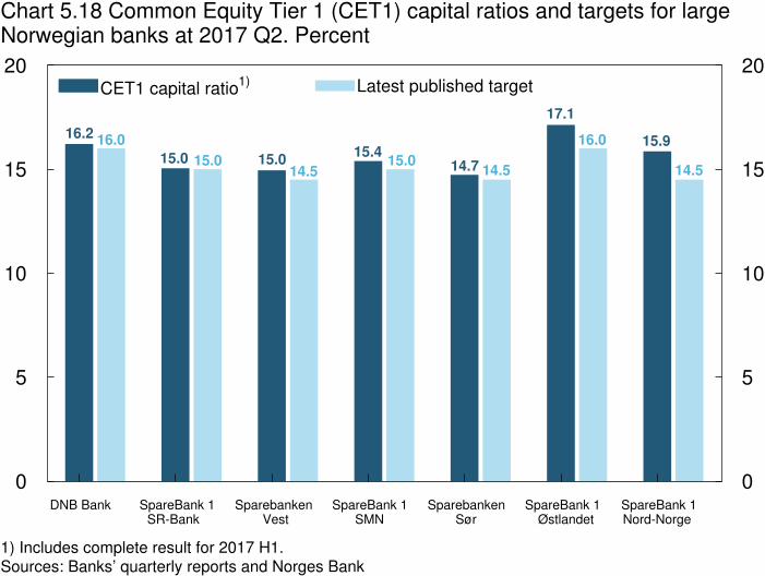
DNB Bank SpareBank 1 SR-Bank
Sparebanken Vest
SpareBank 1 SMN
Sparebanken Sør
SpareBank 1 Østlandet
SpareBank 1Nord-Norge
0
5
10
15
20
0
5
10
15
20
14.5
15.916.0
17.1
14.515.0
14.7
15.4
14.515.015.015.0
16.016.2
Chart 5.18 Common Equity Tier 1 (CET1) capital ratios and targets for largeNorwegian banks at 2017 Q2. Percent
1) Includes complete result for 2017 H1. Sources: Banks’ quarterly reports and Norges Bank
CET1 capital ratio1) Latest published target

2014 2015 2016 2017
–2
0
2
4
6
8
–2
0
2
4
6
8
Chart 5.19 Corporate lending by banks and mortgage companies.Stock. Twelve-month change. Percent. January 2014 – July 2017
Source: Norges Bank
DNB
Other Norwegian banks
Nordea
Other branches
All

2010Q4 2011Q4 2012Q4 2013Q4 2014Q4 2015Q4 2016Q4
–10
–5
0
5
10
15
20
25
–10
–5
0
5
10
15
20
25
Chart 5.20 House prices in selected countries and capitals.Fourquarter change. Percent. 2010 Q4 − 2017 Q2
1) Flats only. 2) The latest observation is 2017 Q1. Sources: Eiendomsverdi, Finn.no, Real Estate Norway, Statistics Denmark and Valueguard
Norway Oslo
Sweden Stockholm1)
Denmark2)
Copenhagen1)
2)

1983 1987 1991 1995 1999 2003 2007 2011 2015
–30
–20
–10
0
10
20
30
40
–30
–20
–10
0
10
20
30
40
Chart 5.21 Credit gap. Total credit mainland Norway 1)
as a share of mainland
GDP. Deviation from estimated trends.2)
Percentage points. 1983 Q1 – 2017 Q2
1) The sum of C2 households and C3 non-financial enterprises for mainland Norway (all non-financial enterprises pre-1995). C3 non-financial enterprises comprises C2 non-financial enterprises and foreign debt for mainland Norway. 2) The trends are estimated based on data from 1975 Q4 onwards. 3) One-sided Hodrick-Prescott filter estimated on data augmented with a simple projection. Lambda = 400 000.4) One-sided Hodrick-Prescott filter. Lambda = 400 000. Sources: IMF, Statistics Norway and Norges Bank
Augmented HP filter3)
One-sided HP filter4)
10-year rolling average
Crises

1983 1987 1991 1995 1999 2003 2007 2011 2015
0
1
2
3
4
0
1
2
3
4
Chart 5.22 Reference rates for the countercyclical capital buffer underalternative trend estimates. Percent. 1983 Q1 – 2017 Q2
1) One-sided Hodrick-Prescott filter estimated on data augmented with a simple projection.Lambda = 400 000. 2) One-sided Hodrick-Prescott filter. Lambda = 400 000. Sources: IMF, Statistics Norway and Norges Bank
Buffer based on deviation from trend using augmented HP filter1)
Buffer based on deviation from trend using one-sided HP filter2)

1983 1987 1991 1995 1999 2003 2007 2011 2015
–40
–20
0
20
40
–40
–20
0
20
40
Chart 5.23 House price gap. House prices relative to disposable income1)
as
deviation from estimated trends.2)
Percent. 1983 Q1 – 2017 Q2
1) Disposable income adjusted for estimated reinvested dividend income for 2003 – 2005 and reduction of equity capital for 2006 Q1 – 2012 Q3. Growth in disposable income excluding dividend income is used for 2015 Q1 – 2017 Q2. 2) The trends are estimated based on data from 1978 Q4 onwards. 3) One-sided Hodrick-Prescott filter estimated on data augmented with a simple projection. Lambda = 400 000.4) One-sided Hodrick-Prescott filter. Lambda = 400 000. Sources: Eiendomsverdi, Finn.no, Norwegian Association of Real Estate Agents (NEF), Real Estate Norway, Statistics Norway and Norges Bank
Augmented HP filter3)
One-sided HP filter4)
Recursive average
Crises

1983 1987 1991 1995 1999 2003 2007 2011 2015
50
100
150
200
250
50
100
150
200
250
Chart 5.24 Real commercial property prices.1)
Index. 1998 = 100. 1983 Q1 – 2016 Q4
1) Estimated selling prices for centrally located high-standard office space in Oslo. Deflated by the GDPdeflator for mainland Norway. 2) Based on data from 1981 Q2 onwards. Sources: Dagens Næringsliv, OPAK, Statistics Norway and Norges Bank
Real commercial property prices
Average2)
Crises

1983 1987 1991 1995 1999 2003 2007 2011 2015
–40
–20
0
20
40
60
80
100
–40
–20
0
20
40
60
80
100
Chart 5.25 Commercial property price gap. Real commercial property prices1)
as deviation from estimated trends.2)
Percent. 1983 Q1 – 2016 Q4
1) Estimated selling prices for high-standard office space in Oslo deflated by the GDP deflator for mainland Norway. 2) The trends are estimated based on data from 1981 Q2 onwards. 3) One-sided Hodrick-Prescott filter estimated on data augmented with a simple projection. Lambda = 400 000.4) One-sided Hodrick-Prescott filter. Lambda = 400 000. Sources: Dagens Næringsliv, OPAK, Statistics Norway and Norges Bank
Augmented HP filter3)
One-sided HP filter4)
Recursive average
Crises

1983 1987 1991 1995 1999 2003 2007 2011 2015
0
10
20
30
40
50
60
0
10
20
30
40
50
60
Chart 5.26 Banks’1)
wholesale funding ratio.Percent. 1983 Q1 – 2017 Q2
1) All banks and covered bond mortgage companies in Norway except branches and subsidiariesof foreign banks. 2) Based on data from 1975 Q4 onwards. Source: Norges Bank
Wholesale funding ratio
Average2)
Crises

1983 1987 1991 1995 1999 2003 2007 2011 2015
–20
–10
0
10
20
30
–20
–10
0
10
20
30
Chart 5.27 Wholesale funding gap. Banks’1)
wholesale funding ratio
as deviation from estimated trends.2)
Percentage points. 1983 Q1 – 2017 Q2
1) All banks and covered bond mortgage companies in Norway except branches and subsidiaries of foreign banks. 2) The trends are estimated based on data from 1975 Q4 onwards. 3) One-sided Hodrick-Prescott filter estimated on data augmented with a simple projection. Lambda = 400 000.4) One-sided Hodrick-Prescott filter. Lambda = 400 000. Source: Norges Bank
Augmented HP filter3)
One-sided HP filter4)
10-year rolling average
Crises

1983 1987 1991 1995 1999 2003 2007 2011 2015
0
0.1
0.2
0.3
0.4
0.5
0.6
0.7
0.8
0.9
1
0
0.1
0.2
0.3
0.4
0.5
0.6
0.7
0.8
0.9
1
Chart 5.28 Estimated crisis probabilities based on various model specifications.1983 Q1 – 2017 Q2
Source: Norges Bank
Model variation
Crises