chart types - business intelligence software | exagoexagoinc.com/uploads/chart types.pdfchart types...
TRANSCRIPT

Chart Types
The Charts Wizard supports a variety of single- and multi-series charts.
Pie
Pie Charts are used to compare numerical data fields as portions of a whole. The area of each “slice” of the pie is proportional to the quantity it represents. Doughnut, Pyramid, and Funnel charts are variations of Pie Charts and are created in the same manner.
In the following example, the pie represents the total number of Orders and each slice represents the number of Orders per Customer.
Note: This report is making use of a Group Footer section to get a count of orders per customer. A Group Header may also be used. See Sections for more information.
Note: The following instructions also apply to Doughnut, Pyramid, and Funnel charts.
Add a Report Footer section to the report. Select all the cells in the Report Footer and
click the Merge Cells button ( ).
Select the merged cell and click the Insert Chart button ( ).
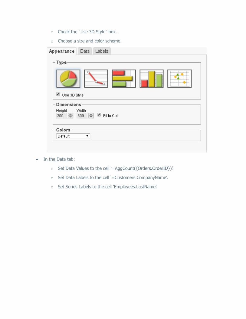
In the Appearance tab:
o Click on the Pie Chart menu and select the Pie Chart option.
o Check the “Use 3D Style” box.
o Choose a size and color scheme.

In the Data tab:
o Set Data Values to the cell ‘=AggCount({Orders.OrderID})’.
o Set Data Labels to the cell ‘Customers.CompanyName’.
In the Labels tab:
o Enter the text ‘Orders by Customer’ in the Chart Title.
o Set Point Labels to ‘Data Values’ and the Legend Position to ‘Right’.

Click Finish and execute the report as HTML.
This is how the chart will appear in the report designer:
Note: The chart will appear as a template in the report designer. It will not populate the field data.
This is how the chart will appear in the final report:
Note: This example has a filter on Customers for brevity.

Doughnut
Doughnut Charts are Pie Charts with a hollowed out center. They are created in a similar fashion.
See Pie Charts for instructions on creating a Doughnut Chart. The example will result in the following:

Pyramid
A Pyramid Chart is a variation of a Pie Chart in which the data sections are represented as “slices” on a Pyramid. The area of each slice is proportional to the quantity it represents.
Note: The width of each slice is not representative of the data.
See Pie Charts for instructions on creating a Pyramid Chart. The example will result in the following:

Funnel
A Funnel Chart is a variation of a Pie Chart in which the data sections are represented as “slices” on a Funnel. The area of each slice is proportional to the quantity it represents. It can be thought of as a “reverse” Pyramid Chart.
Note: The width of each slice is not representative of the data.
See Pie Charts for instructions on creating a Funnel Chart. The example will result in the following:

Line
Line Charts display a series of data points connected by straight lines. They are often used to display a trend in data over intervals of time. The vertical axis shows the categories being compared. The horizontal axis shows the numerical value for each category.
In the following example, each line represents the total number of Orders per Year per Company.
Note: This report is making use of a Group Footer section to get a count of orders per year. A Group Header may also be used. See Sections for more information.
Note: The following instructions also apply to Spline, Area, and Spline Area charts.

Add a Report Footer section to the report. Select all the cells in the Report Footer and
click the Merge Cells button ( ).
Select the merged cell and click the Insert Chart button ( ).
In the Appearance tab:
o Click on the Line Chart menu and select the Line Chart option.
o Choose a size and color scheme.
In the Data tab:
o Set Data Values to the cell ‘=AggCount({Orders.OrderID})’.
o Set Data Labels to the cell ‘=Year({Orders.OrderDate})’.
o Set Series Labels to the cell ‘Customers.CompanyName’.

In the Labels tab:
o Enter the text ‘Yearly Orders’ in the Chart Title.
o Enter the text ‘Year’ in the X-Axis Title.
o Enter the text ‘Orders’ in the Y-Axis Title.
Click Finish and execute the report as HTML.

This is how the chart will appear in the report designer:
Note: The chart will appear as a template in the report designer. It will not populate the field data.
This is how the chart will appear in the final report:
Note: This example has a filter on Customers for brevity.
Spline
Spline Charts display a series of data points connected by a fitted curve. They can be thought of as a variation of a Line Chart and are created in a similar fashion.

Note: The curve between data points is an estimation; it does not represent actual data values.
See Line Charts for instructions on creating a Spline Chart. The example will result in the following:
Area
Area Charts are line charts in which the area below each line is filled in. They are generally used to compare the cumulative totals of different Data Fields over time. They can be thought of as a variation of a Line Chart and are created in a similar fashion.
See Line Charts for instructions on creating an Area Chart. The example will result in the following:

Spline Area
Spline Area Charts are spline charts in which the area below each spline is filled in. They are generally used to compare the cumulative totals of different Data Fields over time. They can be thought of as a variation of a Line Chart and are created in a similar fashion.
See Line Charts for instructions on creating a Spline Area Chart. The example will result in the following:

Bar
Bar Charts use bars to compare data between different categories. The X-Axis shows the categories being compared. The Y-Axis shows the numerical value for each category.
In the following example, each bar represents the total number of Orders per Employee per Company.
Note: The report designer here is making use of a Group Footer section and two sorts to get a count of orders by customer per employee. See Sections for more information.
Note: The following instructions also apply to Stacked Bar, 100% Stacked Bar, Column, Stacked Column, and 100% Stacked Column charts.
Add a Report Footer section to the report. Select all the cells in the Report Footer and
click the Merge Cells button ( ).
Select the merged cell and click the Insert Chart button ( ).
In the Appearance tab:
o Click on the Bar Chart menu and select the Bar Chart option.
o Check the “Use 3D Style” box.
o Choose a size and color scheme.
In the Data tab:
o Set Data Values to the cell ‘=AggCount({Orders.OrderID})’.
o Set Data Labels to the cell ‘=Customers.CompanyName’.
o Set Series Labels to the cell ‘Employees.LastName’.

In the Labels tab:
o Enter the text ‘Orders by Customer’ in the Chart Title.
o Enter the text ‘Customer’ in the X-Axis Title.
o Enter the text ‘Orders’ in the Y-Axis Title.
Click Finish and execute the report as HTML.

This is how the chart will appear in the report designer:
Note: The chart will appear as a template in the report designer. It will not populate the field data.
This is how the chart will appear in the final report:
Note: This example has a filter on Customers for brevity.

Stacked Bar
Stacked Bar Charts are Bar Charts which stack each data field in a group together on a single horizontal bar. Each bar represents a grouped Data Field, and each slice of the bar represents a data value in the group. They can be thought of as a variation of a Bar Chart and are created in a similar fashion.
See Bar Charts for instructions on creating a Stacked Bar Chart. The example will result in the following:

100% Stacked Bar
100% Stacked Bar Charts are Bar Charts which calculate the relative proportion for each data field in a group, and stack them together on a single horizontal bar so that they add up to 100%. Each bar represents a grouped Data Field, and each slice of the bar represents the proportion of a data value. 100% Stacked Bar Charts can be thought of as a variation of a Bar Chart and are created in a similar fashion.
See Bar Charts for instructions on creating a 100% Stacked Bar Chart. The example will result in the following:

Column
Column Charts use vertical bars to compare data between different categories. The X-Axis shows the categories being compared. The Y-Axis shows the numerical value for each category. They can be thought of as a variation of a Bar Chart and are created in a similar fashion.
See Bar Charts for instructions on creating a Column Chart. The example will result in the following:

Stacked Column
Stacked Column Charts are Bar Charts which stack each data field in a group together on a single vertical bar. Each bar represents a grouped Data Field, and each slice of the bar represents a data value in the group. They can be thought of as a variation of a Bar Chart and are created in a similar fashion.
See Bar Charts for instructions on creating a Stacked Column Chart. The example will result in the following:

100% Stacked Column
100% Stacked Column Charts are Bar Charts which calculate the relative proportion for each data field in a group, and stack them together on a single vertical bar so that they add up to 100%. Each bar represents a grouped Data Field, and each slice of the bar represents the proportion of a data value. 100% Stacked Column Charts can be thought of as a variation of a Bar Chart and are created in a similar fashion.
See Bar Charts for instructions on creating a 100% Stacked Column Chart. The example will result in the following:

Pareto
Pareto Charts are a special type of single series chart generally used to highlight the most important element amongst a group. The bars of a Pareto chart display in descending order while a line shows the cumulative percentage of the total. You can read more about Pareto Charts here.
In the following example, each bar represents the number of Orders per Customer, and the line represents the cumulative percentage of the total Orders.
Note: This report is making use of a Group Footer section to get a count of orders per customer. A Group Header may also be used. See Sections for more information.

Add a Report Footer section to the report. Select all the cells in the Report Footer and
click the Merge Cells button ( ).
Select the merged cell and click the Insert Chart button ( ).
In the Appearance tab:
o Click on the Bar Chart menu and select the Pareto Chart option.
o Check the “Use 3D Style” box.
o Choose a size and color scheme.
In the Data tab:
o Set Data Values to the cell ‘=AggCount({Orders.OrderID})’.
o Set Data Labels to the cell ‘Customers.CompanyName’.

In the Labels tab:
o Enter the text ‘Orders by Customer’ in the Chart Title.
o Enter the text ‘Customer’ in the X-Axis Title.
o Enter the text ‘Orders’ in the Y-Axis Title.
Click Finish and execute the report as HTML.
This is how the chart will appear in the report designer:
Note: The chart will appear as a template in the report designer. It will not populate the field data.

This is how the chart will appear in the final report:
Note: This example has a filter on Customers for brevity.

Scatter
A Scatter Chart uses coordinates to display values for two variables in a set of data. One variable is represented on the X-Axis, and another is represented on the Y-Axis. They are typically used to show correlations between variables for large sets of data.

In the following example, the data points on the chart are coordinate pairs of the total number of Orders per Customer, and the average Order price per Customer.
Note: This report is making use of a Group Footer section to get a count of orders per customer and an average order price per customer. A Group Header may also be used. See Sections for more information.
Add a Report Footer section to the report. Select all the cells in the Report Footer and
click the Merge Cells button ( ).
Select the merged cell and click the Insert Chart button ( ).
In the Appearance tab:
o Click on the Scatter Chart menu and select the Scatter Chart option.
o Choose a size and color scheme.
In the Data tab:
o Set Y Values to the cell ‘=Average({OrderDetails.UnitPrice})’.
o Set X Values to the cell ‘=AggCount({Orders.OrderID})’.
o Set Series Labels to ‘None’.

In the Labels tab:
o Enter the text ‘Price vs Num. Orders’ in the Chart Title.
o Enter the text ‘Number of Orders’ in the X-Axis Title.
o Enter the text ‘Average Price’ in the Y-Axis Title.
o Set the Legend Position to ‘None’
Click Finish and execute the report as HTML.
This is how the chart will appear in the report designer:
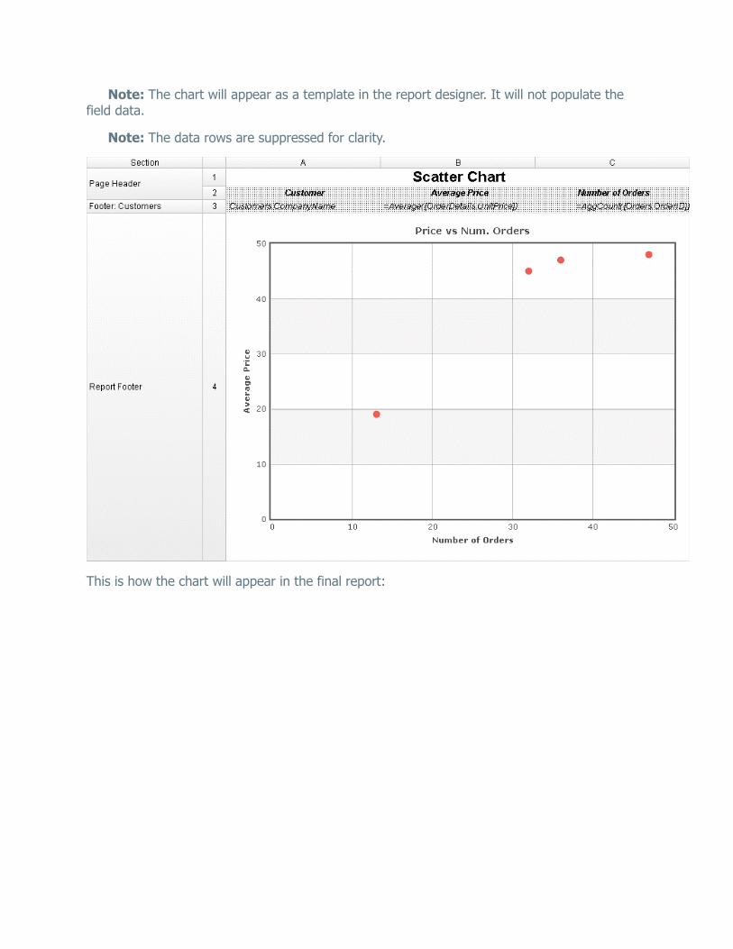
Note: The chart will appear as a template in the report designer. It will not populate the field data.
Note: The data rows are suppressed for clarity.
This is how the chart will appear in the final report:

Bubble
A Bubble Chart uses bubbles of variable size as coordinates to display values for three variables in a set of data. One variable is represented on the X-Axis, another is represented on the Y-Axis, and a third is represented by the size of the bubble.
In the following example, the data bubbles are coordinate pairs of the total number of Orders per Customer, and the average Order price per Customer. The size of the bubbles is the average Discount per Customer.
Note: This report is making use of a Group Footer section to get a count of orders per customer, average order price per customer, and average discount per customer. A Group Header may also be used. See Sections for more information.

Add a Report Footer section to the report. Select all the cells in the Report Footer and
click the Merge Cells button ( ).
Select the merged cell and click the Insert Chart button ( ).
In the Appearance tab:
o Click on the Scatter Chart menu and select the Bubble Chart option.
o Choose a size and color scheme.
In the Data tab:
o Set Y Values to the cell ‘=Average({OrderDetails.UnitPrice})’.
o Set X Values to the cell ‘=AggCount({Orders.OrderID})’.
o Set Series Labels to ‘Customers.CompanyName’.
o Set Bubble Sizes to ‘=Average({OrderDetails.Discount})’
o Set Bubble Labels to ‘None’.

In the Labels tab:
o Enter the text ‘Price vs Num. Orders’ in the Chart Title.
o Enter the text ‘Number of Orders’ in the X-Axis Title.
o Enter the text ‘Average Price’ in the Y-Axis Title.
o Set the Legend Position to ‘None’
Click Finish and execute the report as HTML.
This is how the chart will appear in the report designer:
Note: The chart will appear as a template in the report designer. It will not populate the field data.

Note: The data rows are suppressed for clarity.
This is how the chart will appear in the final report:
Note: This example has a filter on Customers for brevity.

Maps
A Map can be displayed in a report to give a visual representation of geographic data. To insert
a Map, select a cell and click the Insert Map button ( ). The Map Wizard will appear. The Map Wizard has three tabs: Type, Locations and Data.
Note: Maps should only be placed into a Group Header, Group Footer, Report Header or Report Footer section.
Type
In the Type tab select the initial view, size, colors and where to display the legend.

Use the Initial View drop-down to select the location that initially displays on the Map. You may either select the world, a continent, or a country.
There are three ways to set the size of the Map.
o Enter the height and width in the dimension boxes.
o Resize the chart by dragging the lower right corner in the preview.
o Check the box ‘Fit to Cell’.
In the Color drop-down either select a color theme or specify a linear range of colors.
Check the ‘Show Legend’ box to display the legend.
Locations
In the Locations tab specify which geographic locations should display on the Map.
Use the Location Values drop-downs to select the cells that contain the geographic information for the Map. To utilize Region information, such as states/provinces, Country information must be provided. Similarly, City information requires Region and Country information.
The ‘Show last Location type as’ drop-down specifies how to display the lowest level of information. You can either select circular markers (see image in Data tab) or shaded geographic regions (see image below).

Data
In the Data tab specify which data determines the color of each country/region/city and the size of each marker.
For each Data Value:
Use the Data Values drop-down to specify which cells on the report should be used to determine the color and the size of each marker. Setting a cell for the size of marker is optional.
Enter a label in the Data Labels column. Labels will appear in the hover effects of Dynamic Maps.
Use the Aggregation drop-down to select a method to perform on the data.
o Sum: Totals the Data Value for each location.
o Count: Counts all instances of the Data Value for each location.
o Distinct Count: Counts all unique instances of the Data Value for each location.
o Average: Takes the arithmetic mean of the Data Value for each location.
o Minimum: Displays the lowest value in the Data Value for each location.
o Maximum: Displays the highest value in the Data Value for each location.
Use the Display Format drop-down to specify how to display the data.
o Default: Displays the values without any formatting.
o Currency: Prepends the currency symbol on the values.
o Percent: Multiplies the Data Value by 100 and appends a percent symbol (%) to the values.
o Scientific Notation: Displays the values in scientific notation.
Ex. If Decimal Places is set to 2 then 123.45 would appear as 1.23 E2.
For each Data Decimal Places: the number of decimal places to display.

Example
Take the following report as an example.
The subsequent steps show how to create a Map in this report. The Map will be colored based on the number of customers in each location and the markers will be sized based on how many orders have been placed in each location:
Add a Report Footer section to the report, select all the cells in the Report Footer and
click the merge cell button ( ).
Select the merged cell and click the Insert Map icon ( ).
In the Type tab:
o Set the initial view, size and color.

In the Locations tab, set the field Customers.Country for Country information, Customers.State for Region, and Customers.City for City information. Set the ‘Show last location type as’ drop-down to Markers.
In the Data tab:
o Set the field Customers.CompanyName for Color of Locations. Provide a label such as ‘Num. of Customers’ and set the Aggregate Type to Distinct Count.
o Set the field Orders.OrderId for the Size of Markers. Provide a label such as ‘Num. of Orders’ and set the Aggregate Type to Count.
Click Finish and execute the report as HTML.
Report Designer:
Note: In the report designer the map is always represented by the same image regardless of the size, color or world view of the map that will be generated on the report.
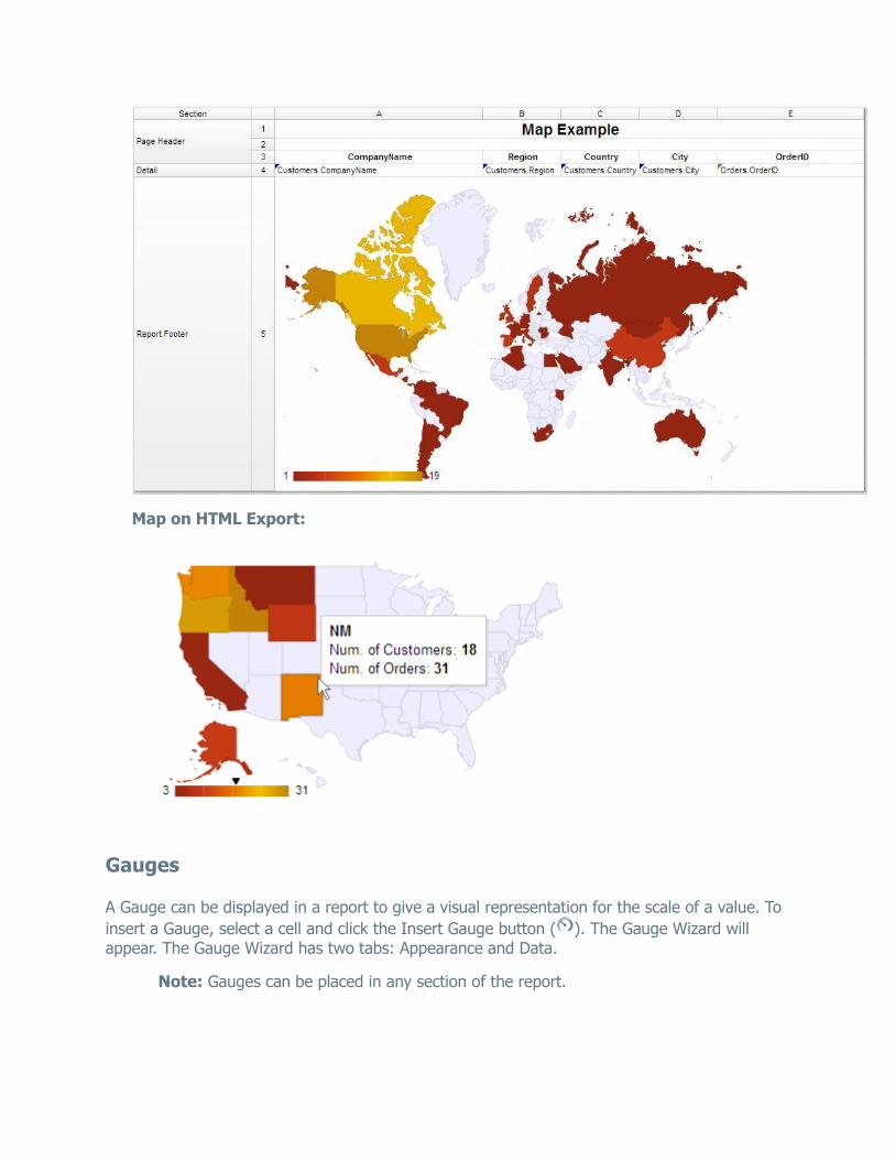
Map on HTML Export:
Gauges
A Gauge can be displayed in a report to give a visual representation for the scale of a value. To
insert a Gauge, select a cell and click the Insert Gauge button ( ). The Gauge Wizard will appear. The Gauge Wizard has two tabs: Appearance and Data.
Note: Gauges can be placed in any section of the report.

Appearance
In the Appearance tab select the Type and Dimension of the Gauge.
Type – Select the icon representing the type of gauge. Available types include: Angular, Linear, Bulb and Thermometer.
There are three ways to set the size of the Gauge. o Enter the height and width in the dimension boxes.
o Resize the gauge by dragging the lower right corner in the preview.
o Check the box ‘Fit to Cell’.
Data
In the Data tab select the Data Values and Color Ranges for the Gauge.
Use the Data Values drop-down to select the cell that contains the numeric value for the Gauge.

Use the ‘Provide range as’ buttons to specify if the Min and Max values for the Gauge should be static numbers or come from cells on the report.
In the Color Ranges, use the ‘Color By’ buttons to specify if color ranges should be percentages of the Max value, static numbers, or come from cells on the report.
Note: Percent Color Ranges must be in ascending numeric order.
Use the Add ( ) and Remove ( ) buttons to create additional colors.
Note: Thermometer Gauges can only have one color.
To change a color either use the drop-down ( ) or enter a Hex value.