chapter 8 - huntington beach, california · chapter 8: signs city of ... elements. color contrast...
TRANSCRIPT
Chapter 8: Signs
City of Huntington Beach Design Guidelines 8-1
Chapter 8
Signs
A. Introduction
Signage can have a dramatic impact on the visual
character of a city. Restrained and tasteful signage
conveys an orderly and quality appearance which
complements project design and enhances the City’s
image. Excessive signage or illegible signage degrades
the visual quality of the environment.
The sign design guidelines in this chapter encourage the
highest level of sign design quality while allowing
maximum flexibility.
Site specific standards and guidelines shall take
precedence when in conflict with the following
guidelines. Where such standards or guidelines are
silent, these guidelines will serve as a supplement.
B. General Design Objectives
The sign design for projects in Huntington Beach
should:
Provide creative, high quality signage that
positively contributes in the improvement of the
visual environment, expression of local character,
and development of a distinctive City image
Enhance the building’s architectural design
Consider the scale proportions and character of
signage in the immediate vicinity
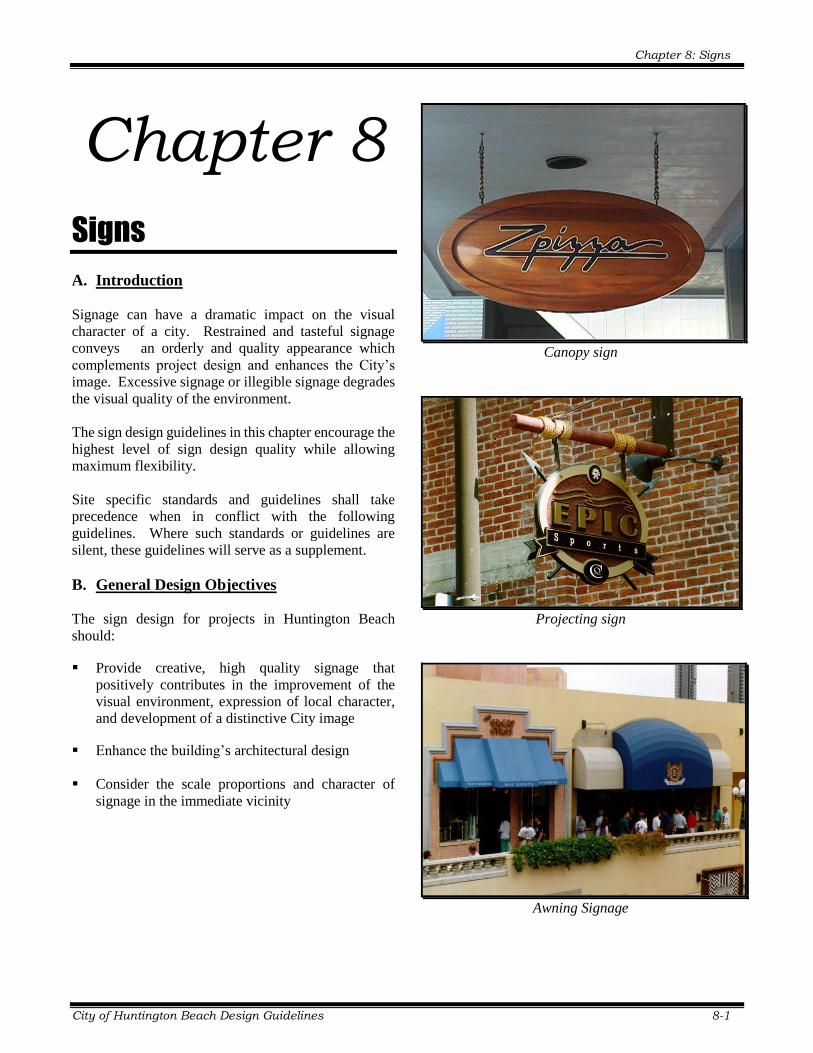
Canopy sign
Projecting sign
Awning Signage

Chapter 8: Signs
8-2 City of Huntington Beach Design Guidelines
C. General Sign Design Guidelines a. Building and freestanding signs should be
compatible with the predominant visual elements
of the project architecture.
b. Sign size should be complementary to the
proportion and scale of the building and its
elements.
c. Creative wall and freestanding signage which
identifies and accentuate building entries is
encouraged.
d. Use of figurative signage is encouraged.
Figurative signs are encouraged
e. Overly intricate typefaces should be avoided.
f. Sign colors and materials should be selected to
contribute to the signs legibility. Excessive use of
colors is not acceptable.
g. Freestanding signs should be placed within
landscaped area(s), perpendicular to approaching
traffic and positioned to provide clear lines of sight
at intersections and driveway approaches.
1. Color
a. Use of colors is one of the primary means of visual
communication. Excessive or uncoordinated use
of colors in sign design can confuse and/ or negate
the message of a sign. Restrained use of colors is
encouraged.
b. Sign design should consider the visual impacts of
color contrast in achieving legible and aesthetically
pleasing signage.
Use of contrasting colors can enhance sign legibility
c. Color accents should be used to create unique and
attractive signage and enhance sign legibility.
Large sign areas with multiple colors are
discouraged.
Use of many colors can be confusing
d. Colors or color combinations that interfere with the
legibility of the sign copy should be avoided.
Chapter 8: Signs
City of Huntington Beach Design Guidelines 8-3
e. Multi-tenant freestanding signs should utilize one
uniform sign background color for all tenant
signage.
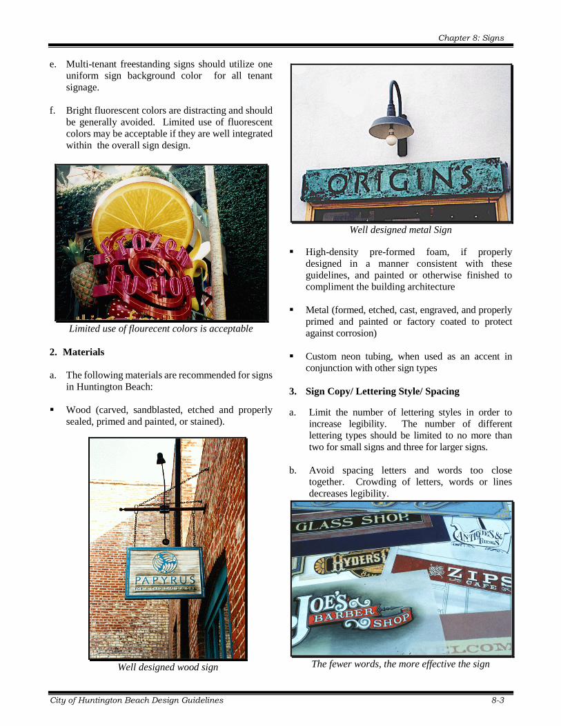
f. Bright fluorescent colors are distracting and should
be generally avoided. Limited use of fluorescent
colors may be acceptable if they are well integrated
within the overall sign design.
Limited use of flourecent colors is acceptable
2. Materials
a. The following materials are recommended for signs
in Huntington Beach:
Wood (carved, sandblasted, etched and properly
sealed, primed and painted, or stained).
Well designed wood sign
Well designed metal Sign
High-density pre-formed foam, if properly
designed in a manner consistent with these
guidelines, and painted or otherwise finished to
compliment the building architecture
Metal (formed, etched, cast, engraved, and properly
primed and painted or factory coated to protect
against corrosion)
Custom neon tubing, when used as an accent in
conjunction with other sign types
3. Sign Copy/ Lettering Style/ Spacing
a. Limit the number of lettering styles in order to
increase legibility. The number of different
lettering types should be limited to no more than
two for small signs and three for larger signs.
b. Avoid spacing letters and words too close
together. Crowding of letters, words or lines
decreases legibility.
The fewer words, the more effective the sign
Chapter 8: Signs
8-4 City of Huntington Beach Design Guidelines
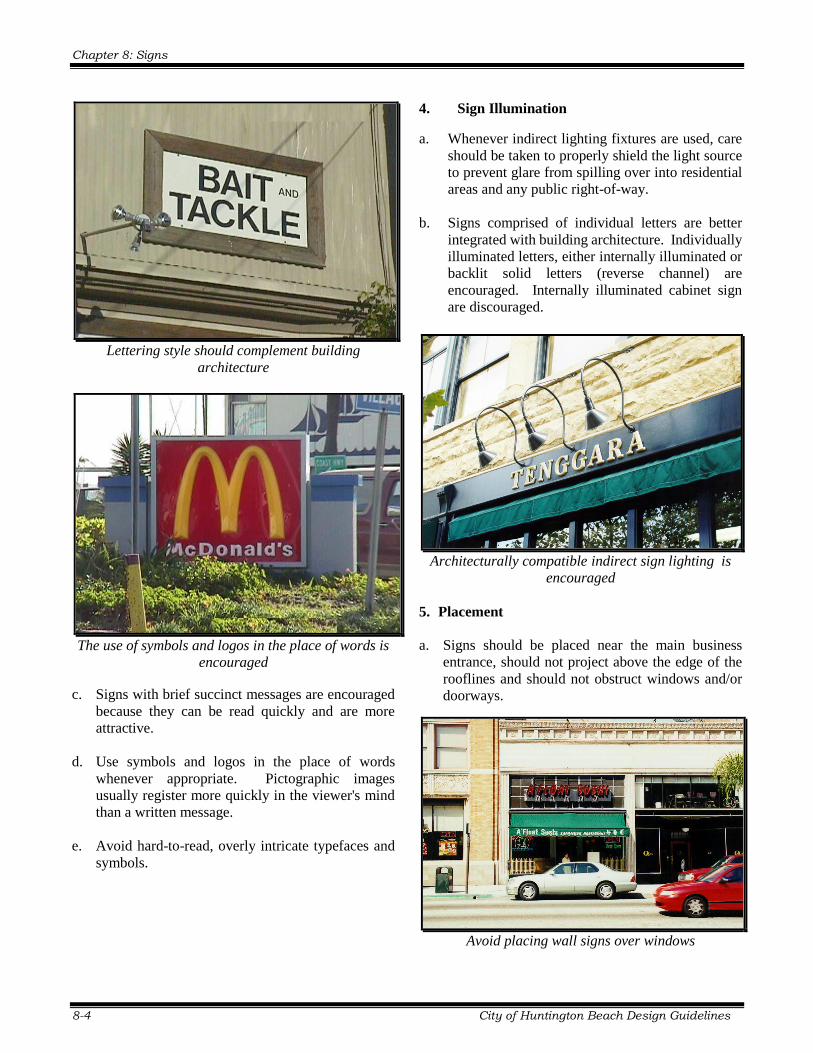
Lettering style should complement building
architecture
The use of symbols and logos in the place of words is
encouraged
c. Signs with brief succinct messages are encouraged
because they can be read quickly and are more
attractive.
d. Use symbols and logos in the place of words
whenever appropriate. Pictographic images
usually register more quickly in the viewer's mind
than a written message.
e. Avoid hard-to-read, overly intricate typefaces and
symbols.
4. Sign Illumination
a. Whenever indirect lighting fixtures are used, care
should be taken to properly shield the light source
to prevent glare from spilling over into residential
areas and any public right-of-way.
b. Signs comprised of individual letters are better
integrated with building architecture. Individually
illuminated letters, either internally illuminated or
backlit solid letters (reverse channel) are
encouraged. Internally illuminated cabinet sign
are discouraged.
Architecturally compatible indirect sign lighting is
encouraged
5. Placement
a. Signs should be placed near the main business
entrance, should not project above the edge of the
rooflines and should not obstruct windows and/or
doorways.
Avoid placing wall signs over windows
Chapter 8: Signs
City of Huntington Beach Design Guidelines 8-5
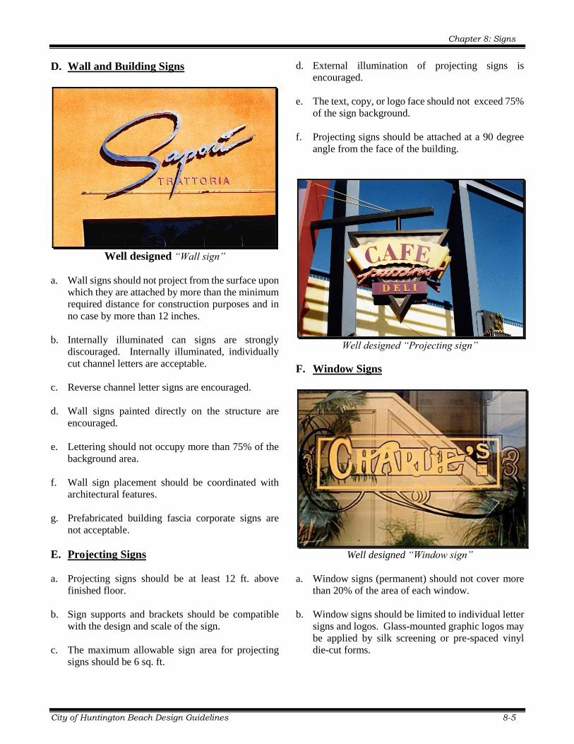
D. Wall and Building Signs
Well designed “Wall sign”
a. Wall signs should not project from the surface upon
which they are attached by more than the minimum
required distance for construction purposes and in
no case by more than 12 inches.
b. Internally illuminated can signs are strongly
discouraged. Internally illuminated, individually
cut channel letters are acceptable.
c. Reverse channel letter signs are encouraged.
d. Wall signs painted directly on the structure are
encouraged.
e. Lettering should not occupy more than 75% of the
background area.
f. Wall sign placement should be coordinated with
architectural features.
g. Prefabricated building fascia corporate signs are
not acceptable.
E. Projecting Signs
a. Projecting signs should be at least 12 ft. above
finished floor.
b. Sign supports and brackets should be compatible
with the design and scale of the sign.
c. The maximum allowable sign area for projecting
signs should be 6 sq. ft.
d. External illumination of projecting signs is
encouraged.
e. The text, copy, or logo face should not exceed 75%
of the sign background.
f. Projecting signs should be attached at a 90 degree
angle from the face of the building.
Well designed “Projecting sign”
F. Window Signs
Well designed “Window sign”
a. Window signs (permanent) should not cover more
than 20% of the area of each window.
b. Window signs should be limited to individual letter
signs and logos. Glass-mounted graphic logos may
be applied by silk screening or pre-spaced vinyl
die-cut forms.
Chapter 8: Signs
8-6 City of Huntington Beach Design Guidelines
G. Awning Signs
a. Awnings should not be internally illuminated.
Downward directed lighting that does not
illuminate the awning is allowed.
b. Sign or logo areas should not occupy more than
30% of the awning panel.
c. Additional lettering may appear on the awning
valance (flaps).
Lettering may appear on the awning valance
H. Freestanding Monument Signs
a. All freestanding signs should be monument type.
Pole or pylon signs are strongly discouraged.
b. A minimum of 10% of the sign face area of a
freestanding monument sign should be dedicated to
“in scale” address identification. Multi-tenant
development should display the range of address
numbers on the sign.
c. Each sign should incorporate a 2 ft. high (min)
base. The base materials should match those
utilized on the development it serves.
d. Freestanding monument sign should be setback
from the public right-of-way a minimum of 1 ft.
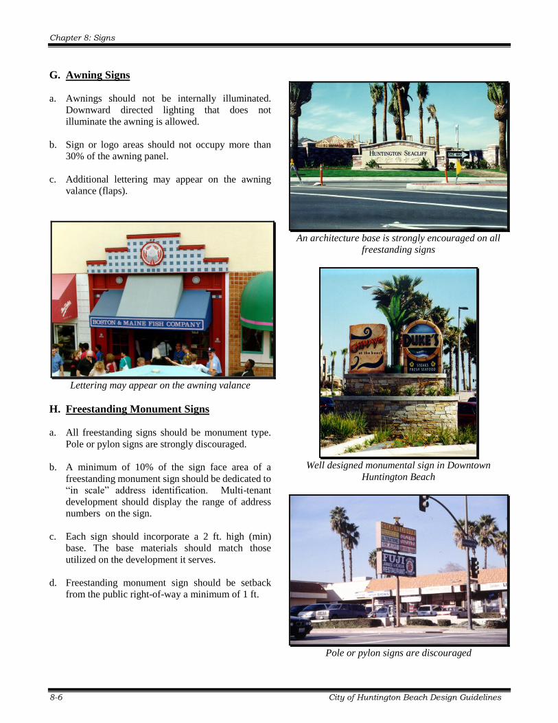
An architecture base is strongly encouraged on all
freestanding signs
Well designed monumental sign in Downtown
Huntington Beach
Pole or pylon signs are discouraged