chapter 3 quiz 1 - john marshall high...
TRANSCRIPT
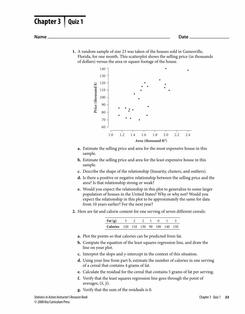
1. A random sample of size 23 was taken of the houses sold in Gainesville, Florida, for one month. This scatterplot shows the selling price (in thousands of dollars) versus the area or square footage of the house.
60
70
80
90
100
110
120
130
140
1.0 1.2 1.4 1.6 1.8 2.0 2.2 2.4
Area (thousand ft2)
Pri
ce (
thou
san
d $
)
a. Estimate the selling price and area for the most expensive house in this sample.
b. Estimate the selling price and area for the least expensive house in this sample.
c. Describe the shape of the relationship (linearity, clusters, and outliers).d. Is there a positive or negative relationship between the selling price and the
area? Is that relationship strong or weak?e. Would you expect the relationship in this plot to generalize to some larger
population of houses in the United States? Why or why not? Would you expect the relationship in this plot to be approximately the same for data from 10 years earlier? For the next year?
2. Here are fat and calorie content for one serving of seven different cereals:
Fat (g) 5 2 2 1 0 1 3Calories 120 110 130 90 100 140 150
a. Plot the points so that calories can be predicted from fat.b. Compute the equation of the least squares regression line, and draw the
line on your plot.c. Interpret the slope and y-intercept in the context of this situation.d. Using your line from part b, estimate the number of calories in one serving
of a cereal that contains 4 grams of fat.e. Calculate the residual for the cereal that contains 5 grams of fat per serving.f. Verify that the least squares regression line goes through the point of
averages, ( _
x , _ y ).
g. Verify that the sum of the residuals is 0.
Chapter 3 Quiz 1
Name Date
Statistics in Action Instructor’s Resource Book Chapter 3 Quiz 1 23© 2008 Key Curriculum Press

3. Shown here is typical computer output for a least squares regression analysis of height (in cm) versus age (in months) for a sample of children age 2 through 6.Regression AnalysisPredictor Coef Stdev t-ratio pConstant 71.508 1.308 54.65 0.000Age 0.38550 0.02132 18.08 0.000S = 0.8954 R-sq = 97.6% R-sq(adj) = 97.3%
Analysis of VarianceSource DF SS MS F pRegression 1 261.99 261.99 326.80 0.000Error 8 6.41 0.80Total 9 268.40
a. The equation of the least squares regression line is A. height � 0.3855 � 71.508 � age B. height � 71.508 � 0.3855 � age C. height � 0.3855 � 71.508 � age D. height � 71.508 � 0.3855 � age E. age � 71.508 � 0.3855 � height
b. Interpret the slope and y-intercept in the context of this situation.c. Interpret r 2 in the context of this situation.
4. The best estimate of the correlation coefficient for the following scatterplot isA. �1.0 B. �0.8 C. �0.5 D. �0.1 E. 0
1
2
3
4
5
1 2 3 4 5
x
y
0
5. Students in last year’s statistics course at a local high school took a midterm exam and then the AP Exam near the end of the course. Imagine a scatterplot in which the score on the midterm exam is graphed on the x-axis and the score on the AP Exam is graphed on the y-axis. The correlation between the two scores is 0.8. The mean for the scores on the midterm is 82, and the standard deviation is 8. The mean for the scores on the AP Exam is 3.6, and the standard deviation is 0.6.a. Find the equation of the least squares regression line for predicting a score
on the AP Exam from a score on the midterm exam. Use this equation:
b 1 � r � s y __ s x
b. Predict the score on the AP Exam from a score of 90 on the midterm.
Chapter 3 Quiz 1 (continued)
24 Chapter 3 Quiz 1 Statistics in Action Instructor’s Resource Book © 2008 Key Curriculum Press

1. Which point will have the most influence on the slope of the regression line: the point (
_ x , y), where y is an outlier among the values of y, or the point (x,
_ y ),
where x is an outlier among the values of x? 2. If your points follow the pattern of a power function, y � a � x b , what
transformation would linearize the points so that you can fit a regression line? 3. Which of these scatterplots could be a residual plot for a given least squares
regression line?
A.
1
2
3
4
5
2 4 6 8 10
x
Res
idu
al
0
B.
–4
–2
0
2
4
0 2 4 6 8 10
x
Res
idu
al
C.
–4
–2
0
2
4
0 2 4 6 8 10
x
Res
idu
al
D.
–4
–2
0
2
4
0 2 4 6 8 10
x
Res
idu
al
E. None of these plots can be a residual plot.
Chapter 3 Quiz 2
Name Date
Statistics in Action Instructor’s Resource Book Chapter 3 Quiz 2 25© 2008 Key Curriculum Press
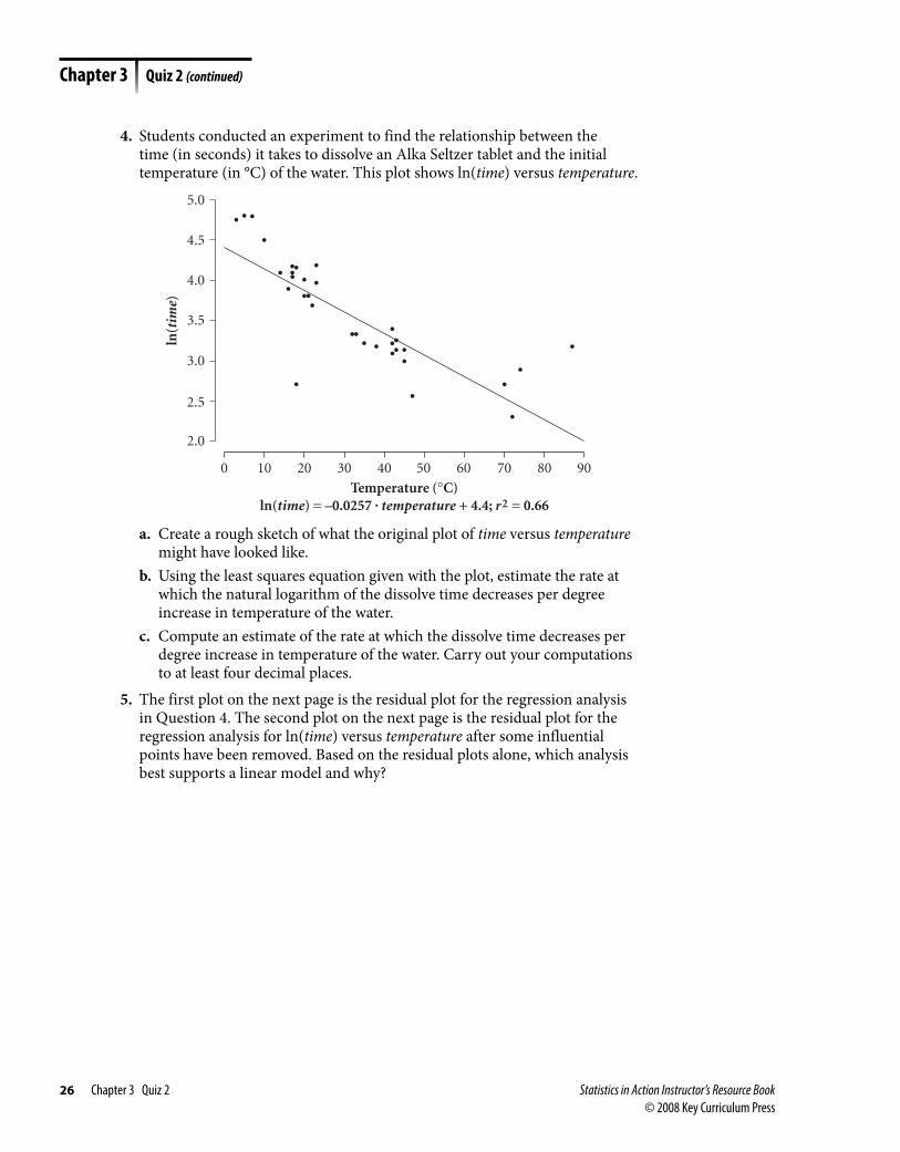
4. Students conducted an experiment to find the relationship between the time (in seconds) it takes to dissolve an Alka Seltzer tablet and the initial temperature (in °C) of the water. This plot shows ln(time) versus temperature.
ln(t
ime)
20 30100 40 50 60 70 80 90
Temperature (°C)ln(time) = –0.0257 . temperature + 4.4; r2 = 0.66
3.0
2.5
3.5
4.0
4.5
5.0
2.0
a. Create a rough sketch of what the original plot of time versus temperature might have looked like.
b. Using the least squares equation given with the plot, estimate the rate at which the natural logarithm of the dissolve time decreases per degree increase in temperature of the water.
c. Compute an estimate of the rate at which the dissolve time decreases per degree increase in temperature of the water. Carry out your computations to at least four decimal places.
5. The first plot on the next page is the residual plot for the regression analysis in Question 4. The second plot on the next page is the residual plot for the regression analysis for ln(time) versus temperature after some influential points have been removed. Based on the residual plots alone, which analysis best supports a linear model and why?
Chapter 3 Quiz 2 (continued)
26 Chapter 3 Quiz 2 Statistics in Action Instructor’s Resource Book © 2008 Key Curriculum Press

Res
idu
al
20 30100 40 50 60 70 80 90
Temperature (°C)
–0.5
–1.0
0.0
0.5
1.0
–1.5R
esid
ual
20 30100 40 50
Temperature (°C)
0.0
–0.2
0.2
0.4
–0.4
6. This scatterplot shows the data for a regression analysis of the percentage of women who have completed four years of college versus the percentage of women living in poverty for all 50 states and the District of Columbia.
Col
lege
Gra
du
ate
Rat
e (%
)
6 8 10 12 14 16 18 20 22 24 26
Poverty Rate (%)college graduate rate = –0.503 . poverty rate + 24.3; r 2 = 0.28
10
District of Columbia
14
18
22
26
30
34
a. What is the effect on the slope and correlation of removing the point for the District of Columbia? Explain.
b. Does the presence of a linear relationship here imply that a state that reduces its poverty rate among women causes its college graduation rate for women to rise? Explain your reasoning.
Chapter 3 Quiz 2 (continued)
Statistics in Action Instructor’s Resource Book Chapter 3 Quiz 2 27© 2008 Key Curriculum Press

1. This scatterplot shows the overall percentage of on-time arrivals versus overall mishandled baggage per 1000 passengers for the year 2002.
Per
cen
tage
On
-Tim
e A
rriv
als
2.6 3.0 3.4 3.8 4.2 4.6
Mishandled Baggage (per thousand passengers)
72
74
76
Alaska
US Airways
Continental
Southwest
Delta
UnitedAmerican
Northwest
America West
78
80
82
84
a. Which airline has the worst record for mishandled baggage? For being on time?
b. United has the highest percentage of on-time arrivals. Estimate that percentage and United’s mishandled baggage rate.
c. Describe the overall shape of the relationship (linearity, clusters, and influential points).
d. Is there a positive or negative relationship between the on-time percentage and the rate of mishandled baggage? What is the strength of the relationship?
2. The best estimate of the correlation coefficient for the following scatterplot isA. 0B. 0.1C. 0.5D. 0.8E. 1.0
2
4
6
8
10
0 2 4 6 8 10
x
y
Chapter 3 Test A
Name Date
28 Chapter 3 Test A Statistics in Action Instructor’s Resource Book © 2008 Key Curriculum Press

3. Which of these scatterplots has a least squares regression line with slope closest to zero?
A.
3
5
7
9
3.0 4.0 5.0 6.0 7.0x
y
B.
2
4
6
8
1 2 3 4 5 6 7x
y
0
C.
2
4
6
8
1 2 3 4 5 6 7 8 9x
y
D.
0
2
4
6
8
1 2 3 4 5 6 7 8 9x
y
E.
1
3
5
7
9
1 2 3 4 5 6 7 8 9x
y
4. Using data from a sample of 15 women, this scatterplot shows the relationship between body density (as compared to water density) and skinfold thickness (in mm). Skinfold thickness is used to predict body density. Choose the correct regression equation and correlation for these data.
1.00
1.02
1.04
1.06
1.08
60 100 140 180 220 260
Skinfold (mm)
Den
sity
A. density � 1.08 � 0.0003 � skinfold; r � � 0.90B. density � 1.08 � 0.0003 � skinfold; r � �0.90C. density � 1.08 � 0.0003 � skinfold; r � �0.90D. density � 1.08 � 0.0003 � skinfold; r � � 0.90E. none of the above
Chapter 3 Test A (continued)
Statistics in Action Instructor’s Resource Book Chapter 3 Test A 29© 2008 Key Curriculum Press

5. Data on the diameter (in inches) and the age (in years) of a sample of 25 oak trees yielded the regression equation diameter � 1.18 � 0.165 � age and the residual plot shown here.
–2.0
–1.0
0.0
1.0
2.0
0 10 20 30 40 50
Age (yr)
Res
idu
al
a. Which of these is the best explanation of the relationship between growth in diameter and age of tree?
A. The diameter grows at approximately 0.165 inch per year throughout the life of the tree.
B. The diameter grows slower than 0.165 inch per year early in the life of the tree and faster than 0.165 inch per year later in life.
C. The diameter grows faster than 0.165 inch per year early in the life of the tree and slower than 0.165 inch per year later in life.
D. The diameter grows at a rate of 1.18 inches per year throughout the life of the tree.
b. If the standard deviation of the diameters is 2.2 inches and the standard deviation of the ages is 12 years, find the correlation between diameter and age.
c. Is the correlation coefficient a good measure of association to use with the diameter versus age data? Briefly explain your answer.
6. A friend is planning to sell her used Honda so she gathers data on prices (in thousands of dollars) and year (let 79 represent 1979) for eleven cars similar to hers. A scatterplot of the data is shown. The least squares regression line through these data has the equation price � 0.735 � year � 59.5.
0
2
4
6
8
10
78 80 82 84 86 88 90 92 94
Yearprice = 0.735 . year – 59.5; r2 = 0.87
Pri
ce (
thou
san
d $
)
a. Interpret the slope of the regression line in the context of this problem.
Chapter 3 Test A (continued)
30 Chapter 3 Test A Statistics in Action Instructor’s Resource Book © 2008 Key Curriculum Press
b. The data point for the 1979 Honda is removed from the data set, and a new regression model is calculated. State whether the slope increases or decreases.
c. Your friend’s Honda is a 1988. Use the regression model to establish a selling price for her car.
d. Looking at these data, do you think the selling price established in part c is too high, too low, or about right? Explain.
7. Here is the regression analysis for calories versus fat (in grams) for some pizza data.The regression equation isCalories = 253 + 6.48 Fat
Predictor Coef Stdev t-ratio p Constant 253.08 12.10 20.92 0.000 Fat 6.4799 0.9527 6.80 0.000 s = 16.92 R-sq = ??? R-sq(adj) = ???
Analysis of VarianceSOURCE DF SS MS F pRegression 1 13241 13241 46.26 0.000Error 22 6297 286Total 23 19538
a. Compute R 2 (R-sq).b. Interpret R 2 in the context of this problem.
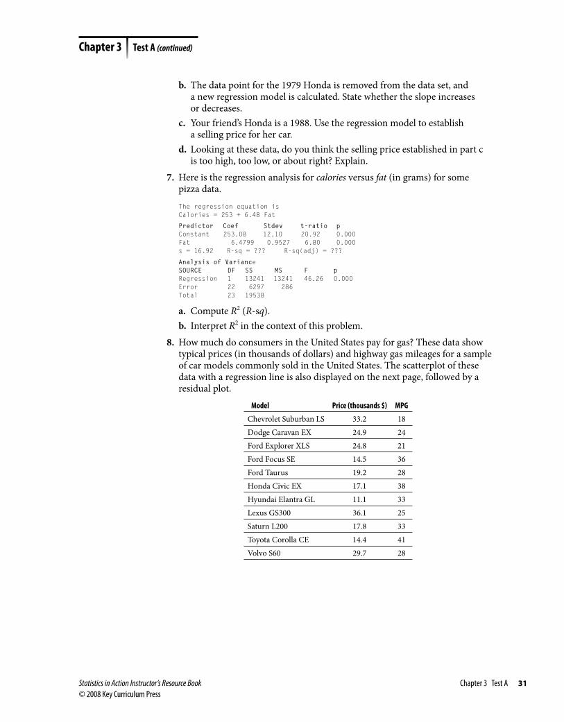
8. How much do consumers in the United States pay for gas? These data show typical prices (in thousands of dollars) and highway gas mileages for a sample of car models commonly sold in the United States. The scatterplot of these data with a regression line is also displayed on the next page, followed by a residual plot.
Model Price (thousands $) MPG
Chevrolet Suburban LS 33.2 18Dodge Caravan EX 24.9 24Ford Explorer XLS 24.8 21Ford Focus SE 14.5 36Ford Taurus 19.2 28Honda Civic EX 17.1 38Hyundai Elantra GL 11.1 33Lexus GS300 36.1 25Saturn L200 17.8 33Toyota Corolla CE 14.4 41Volvo S60 29.7 28
Chapter 3 Test A (continued)
Statistics in Action Instructor’s Resource Book Chapter 3 Test A 31© 2008 Key Curriculum Press

–8
–4
0
4
8
10 15 20 25 30 35 40
Price (thousand $)MPG = –0.689 . price + 44.8; r2 = 0.61
Res
idu
al
18
22
26
30
34
38
42
10 15 20 25 30 35 40
Mil
es p
er G
allo
n
a. Interpret the slope of the regression line in the context of this problem.b. Is fitting a regression line appropriate for the pattern displayed in the
scatterplot? Explain by inspecting the original plot as well as the residual plot.
c. What lurking variable might account for the negative association between price and gas mileage?
d. Which auto produces the largest positive residual? Compute that residual. (Do not round your answer.)
9. For a laboratory experiment, scientists induced a skin infection in a rat and recorded the growth of the discolored skin patch every three days over a six-week period. Ten of the recordings are shown here.
Days After Induction 14 17 20 23 26 29 32 35 38 41Diameter of Patch (mm) 1.9 3.1 4.6 7.4 11.3 16.4 25.4 38.0 55.9 81.9
a. Plot diameter versus days.b. Gillian thought that the growth in the diameter should be exponential.
What transformation should Gillian use on these data before she fits a linear equation?
c. Make this transformation, and find the equation of the regression line for the transformed data.
d. Show a sketch of the residuals, and comment on the observed pattern.e. Use your model from part c to estimate the rate of growth of the patch.
From examining the residuals, does it appear that this rate will be constant?
Chapter 3 Test A (continued)
32 Chapter 3 Test A Statistics in Action Instructor’s Resource Book © 2008 Key Curriculum Press
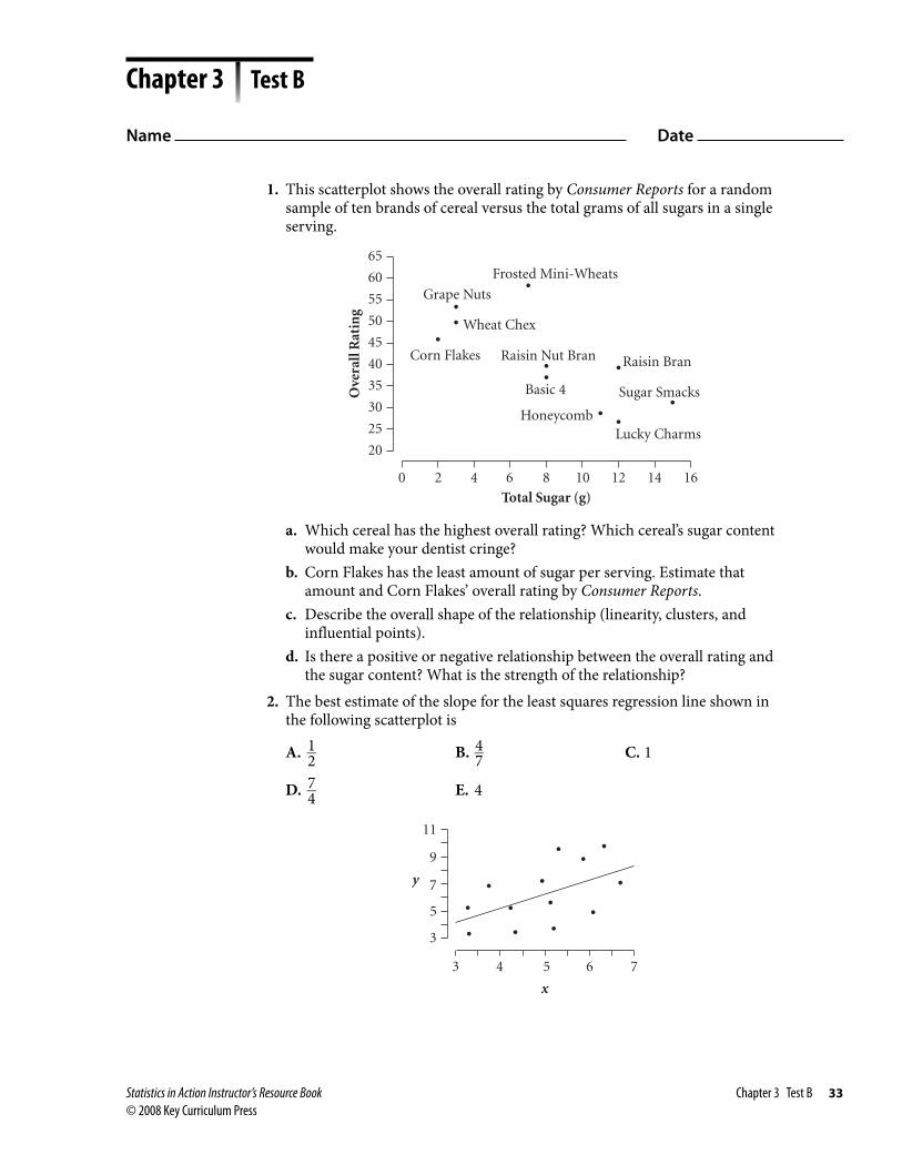
1. This scatterplot shows the overall rating by Consumer Reports for a random sample of ten brands of cereal versus the total grams of all sugars in a single serving.
Ove
rall
Rat
ing
0 2 4 6 8 10 12 14 16
Total Sugar (g)
20
25
30
35
40
45
50
55
60
65
Raisin Bran
Grape Nuts
Frosted Mini-Wheats
Wheat Chex
Corn Flakes Raisin Nut Bran
Basic 4
HoneycombLucky Charms
Sugar Smacks
a. Which cereal has the highest overall rating? Which cereal’s sugar content would make your dentist cringe?
b. Corn Flakes has the least amount of sugar per serving. Estimate that amount and Corn Flakes’ overall rating by Consumer Reports.
c. Describe the overall shape of the relationship (linearity, clusters, and influential points).
d. Is there a positive or negative relationship between the overall rating and the sugar content? What is the strength of the relationship?
2. The best estimate of the slope for the least squares regression line shown in the following scatterplot is
A. 1 __ 2 B. 4 __ 7 C. 1
D. 7 __ 4 E. 4
3
5
7
9
11
3 4 5 6 7
x
y
Chapter 3 Test B
Name Date
Statistics in Action Instructor’s Resource Book Chapter 3 Test B 33© 2008 Key Curriculum Press

3. Which of these scatterplots has a correlation coefficient closest to one?
A.
3
5
7
9
3.0 4.0 5.0 6.0 7.0x
y
B.
2
4
6
8
1 2 3 4 5 6 7x
y
0
C.
2
4
6
8
1 2 3 4 5 6 7 8 9x
y
D.
0
2
4
6
8
1 2 3 4 5 6 7 8 9x
y
E.
1
3
5
7
9
1 2 3 4 5 6 7 8 9x
y
4. Using data from a sample of 20 brands of cereal, this scatterplot shows the overall rating by Consumer Reports versus the number of calories per serving. Choose the correct regression equation and correlation for these data.
Ove
rall
Rat
ing
60 80 100 120 140 160
Calories per Serving
15202530354045505560
A. rating � 81.66 � 0.382 � calories; r � �1.54B. rating � 81.66 � 0.382 � calories; r � �0.54C. rating � 81.66 � 0.382 � calories; r � �0.54D. rating � 81.66 � 0.382 � calories; r � �0.54E. none of the above
Chapter 3 Test B (continued)
34 Chapter 3 Test B Statistics in Action Instructor’s Resource Book © 2008 Key Curriculum Press

5. Data on fuel consumption (in gallons per hour) and average speed (in miles per hour) for a sample of 27 commercial aircraft yielded the regression equation fuel consumption � �5465.5 � 15.50 � speed and this residual plot.
Res
idu
al
360 400 440 480 520 560
Speed (mi/h)
–800
–400
0
400
800
1200
a. Which of these is the best description of how fuel consumption changes with an increase in speed?
A. Fuel consumption increases at approximately 15.5 gal/h at all speeds. B. Fuel consumption increases slower than 15.5 gal/h at lesser speeds and
faster than 15.5 gal/h at higher speeds. C. Fuel consumption increases faster than 15.5 gal/h at lesser speeds and
slower than 15.5 gal/h at higher speeds. D. Fuel consumption increases at a rate of 5465.5 gal/h no matter what
the speed.b. If the standard deviation of the fuel consumption is approximately
976.7 gal/h and the standard deviation of the speed is 54.8 mi/h, find the correlation between fuel consumption and speed.
c. Is the correlation coefficient a good measure of association to use with the fuel consumption versus speed data? Briefly explain your answer.
Chapter 3 Test B (continued)
Statistics in Action Instructor’s Resource Book Chapter 3 Test B 35© 2008 Key Curriculum Press

6. The midterm and final test grades of a sample of 11 statistics students were recorded. A scatterplot of the data is on the next page, and the least squares regression line through these data has the equation final � 0.937 � midterm � 8.55.
Fin
al S
core
50 60 70 80 90 100
Midterm Scorefinal = 0.937 . midterm + 8.55; r2 = 0.73
40
50
60
70
80
90
100
105
a. Interpret the slope of the regression line in the context of this problem.b. The data point for the student who did poorly on both exams is removed
from the data set and a new regression model is calculated. Will the slope increase or decrease?
c. Your friend received an 82 on the midterm. Use the regression model to estimate his score on the final.
d. Looking at these data, do you think the estimate established in part c is too high, too low, or about right? Explain.
7. These data show the exam scores for the sample of students in Question 6.Student Number Midterm Score Final Exam Score
1 77 81 2 90 96 3 65 72 4 86 91 5 59 82 6 92 93 7 97 95 8 72 69 9 79 8910 76 7411 50 42
Chapter 3 Test B (continued)
36 Chapter 3 Test B Statistics in Action Instructor’s Resource Book © 2008 Key Curriculum Press

a. Is fitting a regression line appropriate for the pattern displayed in the scatterplot shown in Question 6? Explain by inspecting the original plot on the previous page, as well as the residual plot for this data, shown here.
Res
idu
al
50 60 70 80 90 100
Midterm Score
–15
–10
–5
0
5
10
15
20
b. Which student produces the largest positive residual? Compute that residual.
c. What lurking variable might account for the positive association (or the pattern) between the test scores?
8. Here is the regression analysis for diameter (in inches) versus age (in years) for a sample of 25 oak trees.The regression equation isDiameter = 1.18 + 0.165 Age
Predictor Coef Stdev t-ratio p Constant 1.1755 0.4142 2.84 0.009 Age 0.16476 0.01670 9.87 0.000 s = 0.9858 R-sq = ????? R-sq(adj) = ?????
Analysis of VarianceSOURCE DF SS MS F pRegression 1 94.605 94.605 97.35 0.000Error 23 22.351 0.972Total 24 116.955
a. Interpret the slope of the regression line in the context of this problem.
b. Compute R 2 (R � sq).c. Interpret R 2 in the context of this problem.
Chapter 3 Test B (continued)
Statistics in Action Instructor’s Resource Book Chapter 3 Test B 37© 2008 Key Curriculum Press

9. These data show ten values of the Consumer Price Index (CPI). The CPI compares historical prices. For example, an item that cost $1.00 (or 100 as listed in the table) in 1967 cost about $4.57 in 1995.
Year 1915 1925 1935 1945 1955 1965 1967 1975 1985 1995
CPI 30.4 52.5 41.1 53.9 80.2 94.5 100.0 161.2 322.2 456.5
a. Plot CPI versus year (for year, use 15, 25, 35, . . . , 95).b. Gillian thought that the growth in the CPI should be exponential. What
transformation should she use before she fits a linear equation?c. Make this transformation, and find the equation of the regression line for
the transformed data.d. Show a sketch of the residuals and comment on the observed pattern.e. Use your model from part c to estimate the rate of growth in the CPI. From
examining the residuals, does it appear that this rate will be constant?
Chapter 3 Test B (continued)
38 Chapter 3 Test B Statistics in Action Instructor’s Resource Book © 2008 Key Curriculum Press

1. A simple random sample of 50 families produced these statistics:number of children in family:
_ x � 2.1, s x � 1.4
annual gross income: _ y � 34,250, s y � 10,540
r � 0.75 The linear regression equation relating these
variables, based on these data, is income � 5,646(number of children) � 22,392 income � 34,250 � 0.0001(number of children)
income � 0.0001(number of children) � 1.312 number of children � 5,646(income) � 22,392 The equation cannot be determined from the given information.
2. A study using a simple random sample of 40 college students recorded their hours of part-time work per week and grade point average and found that the correlation coefficient between the variables was �0.43. If the resulting linear regression is
GPA � 3.75 � 0.05 (number of hours) which of these is not a correct statement?
The average GPA of students who don’t work is approximately 3.75.
If the correlation coefficient were �0.60, the slope of the regression equation would be approximately �0.07.
Students who work 40 hours per week have a mean GPA of approximately 1.75.
The value of the correlation coefficient and steepness of the regression lines are not related.
All of these are correct statements. 3. If the correlation coefficient of a bivariate set of
data {(x, y)} is r, which of these are true? The variables x and y are linearly related. The correlation coefficient of the set {(y, x)} is also r.
The correlation coefficient of the set {(x, ay)} is a � r.
The correlation coefficient of the set {(ax, ay)} is a � r .
None of these are true. 4. Which of these is a correct conclusion based
on the displayed residual plot produced from a least squares line that is shifted off-center?
Res
idu
al
0
If you use the line to predict y from x, the predictions will tend to be too small.
If you use the line to predict y from x, the predictions will tend to be too large.
It is not appropriate to fit a line to these data because there is clearly no correlation between the variables.
The variables y and x do not appear to be linearly related.
None of these choices is correct. 5. In this scatterplot of y versus x, the least squares
regression line is graphed. Which of points A–E has the largest residual?
x
y
5
A
B
C
D
E
10 15 20 25
0
10
20
30
40
50
60
A B C D E
Chapter 3 AP Practice Quiz
Name Date
Statistics in Action Instructor’s Resource Book Chapter 3 AP Practice Quiz 39© 2008 Key Curriculum Press

6. Students’ scores on two exams in a statistics course are given here, along with a scatterplot with regression line and a residual plot. The regression equation is Exam 2 � 51.0 � 0.430(Exam 1) and the correlation, r, is 0.756.
Exam 1 Exam 2 Exam 1 Exam 2
80 88 96 9952 83 78 9087 87 93 8895 92 92 9267 75 91 9371 78 96 9297 97 69 7396 85 76 8788 93 91 91
100 93 98 9788 86 83 8986 85 96 8381 81 95 9761 73 80 8697 92
Exam 1
Exa
m 2
50 60 70 80 90 100
70 75 80 85 90 95
100
Exam 1
Res
idu
al
50 60 70 80 90 100
–10
–5
0
5
10
a. Is there a point that is more influential than the others on the slope of the regression line? How can you tell from the scatterplot? From the residual plot?
b. How will the slope change if the scores for this one influential point are removed from the data set? How will the correlation change? Calculate the slope and correlation for the revised data to check your estimate.
c. Construct a residual plot for the revised data. Does a linear model fit the data well?
d. Refer to the scatterplot of Exam 2 versus Exam 1 scores. Does this plot illustrate regression to the mean? Explain your reasoning.
Chapter 3 AP Practice Quiz (continued)
40 Chapter 3 AP Practice Quiz Statistics in Action Instructor’s Resource Book © 2008 Key Curriculum Press

Use these data for Questions 1–3.This table lists the number of applications to a sample of ten colleges that are located in the same state. The values are in 100’s.
Colleges
Number of Applications
(100’s) Colleges
Number of Applications
(100’s)
A 72.0 F 26.9B 63.1 G 25.0C 54.7 H 23.9D 54.3 I 23.0E 29.0 J 20.0
1. What is the sample variance of the number of applications (rounded to two decimal places)?
18.54 19.54 343.75 381.94 none of these
2. Assuming that the mean and standard deviation of the numbers of applications are 40 and 19, respectively, what is the z-score for college A?
0.292 0.594 1.68 2.15 32
3. Which display would be least appropriate for these data?
stem-and-leaf dot plot histogram scatterplot All of these are appropriate.
4. For an approximately normal distribution, the 80th percentile is defined as
the z-score that cuts off an area of 0.80 to its left
the value of the variable whose z-score cuts off an area of 0.80 to its left
the z-score such that 10% of the area under the normal curve is shaded both at the upper and lower tails of the curve
the value whose z-score is such that 10% of the area under the normal curve is shaded both at the upper and lower tails of the curve
None of these is the definition of a percentile. 5. You are given the regression equation
temperature � 30.4 � 0.072(distance) where temperature is the temperature displayed
on a sensor in °C and distance is the distance in centimeters from the sensor to a heat source. Which of these is not a reasonable conclusion?
Using this regression line, the predicted value of the temperature of the heat source is 30.4°C.
The temperature decreases approximately 0.72°C for each centimeter the sensor is moved away from the heat source.
You can predict that the sensor displays a temperature of 21.76°C when the sensor is 12 centimeters away from the heat source.
The correlation coefficient between temperature and distance indicates a negative relationship.
All of these are reasonable.
Chapters 2–3 AP Practice Quiz
Name Date
Statistics in Action Instructor’s Resource Book Chapters 2–3 AP Practice Quiz 41© 2008 Key Curriculum Press

6. In 2005, the average SAT I math score across the United States was 520. North Dakota students averaged 605, Illinois students averaged 606, and students from the nearby state of Iowa did even better, averaging 608. Why do states from the Midwest do so well? It is easy to jump to a false conclusion, but the scatterplot here can help you find a reasonable explanation.
10 20 30 40 50 60 70 80 90Percentage_Taking_Exam
480
500
520
540
560
580
600
620
SAT Scores Scatter Plot
Ave
rag
e_S
AT
_Mat
h_S
core
a. Estimate the percentage of students in Iowa and in Illinois who took the SAT I. New York had the highest percentage of students who took the SAT I. Estimate that percentage and the average SAT I math scores for students in that state.
b. Describe the shape of the plot. Do you see any clusters? Are there any outliers? Is the relationship linear or curved? Is the overall trend positive or negative? What is the strength of the relationship?
c. Is the distribution of the percentage of students taking the SAT I bimodal? Explain how the scatterplot shows this. Is the distribution of SAT I math scores bimodal?
d. The cases used in this plot are the 50 U.S. states in 2005. Would you expect the pattern to generalize to some other set of cases? Why or why not?
e. Suggest an explanation for the trend. (Hint: The SAT is administered from Princeton, New Jersey. An alternative exam, the ACT, is administered from Iowa. Many colleges and universities in the Midwest either prefer the ACT or at least accept it in place of the SAT, whereas colleges in the eastern states tend to prefer the SAT.) Is there anything in the data that you can use to help decide whether your explanation is correct?
Chapters 2–3 AP Practice Quiz (continued)
42 Chapters 2–3 AP Practice Quiz Statistics in Action Instructor’s Resource Book © 2008 Key Curriculum Press