chapter 3: context - university of exeterchapter 3: context this chapter examines the context of...
TRANSCRIPT

Overview0.1Contents0.2Abstract0.3Thanks0.4Author’s declaration0.5Definitions0.6Abbreviations0.7Introduction1Information graphics1.1hta1.2Potential functions1.3Problem domain1.4Research question1.5Methodology2Discussion2.1
2.2Context3Current use3.1Information needs3.2Design4Elements4.1Specification4.2Development4.3
5Introduction5.1Methods5.2Quantitative results5.3Qualitative results5.4Conclusions5.5Prototype test 2 (soc)6Introduction6.1Methods6.2Quantitative results6.3Qualitative results6.4Conclusions6.5Discussion7Summary7.1 Conclusions7.2Future research7.3Appendices8
ABCDEFGHI
References9
Chapter 3: ContextThis chapter examines the context of interest for the thesis: hta research.
The first section of this chapter, 3.1, is a systematic study of the information graphics currently used in ‘technology assessment reports’ (TARs) that inform health policy decisions in the uk. Through counting the techniques used, the study is intended to provide an understanding of the visual communication skills and capabilities available to health technology assessment authoring groups in the uk.
The second part of the chapter, 3.2, is a second research study. This explores the information needs of those working in hta, with a focus on policy-makers. Its aim is to establish where the potential functions of information graphics discussed in Chapter 1.3 might be useful to the process of making health policy decisions.
— 87 —
Process model
Prototype test 1 (GOfER)
Methodological study
NICE interview data
GOfER graphic
GOfER test script
GOfER test transcript
GOfER test data
SOC graphic
SOC test script
SOC test transcript

This chapter shows examples of the kind of studies that might be used in the first part of the suggested design process for information graphics in hta (See Figure 3.0 - 1). The quantitative content analysis and qualitative telephone interviews formed and important part of the information needs collection that was the basis for the information graphics designed, which will be detailed in Chapter 4. However, informal conversations and consideration of visual material also contributed significantly to the development of these information graphics. Therefore, the two studies detailed here might represent the two larger circles feeding into the area of information needs, which is also informed by other elements (the smaller circles), and has a somewhat indefinable boundary. This is partly because future studies are also likely to reveal information needs, resulting in feedback loops.
— 88 —
Context33.1
Information needs3.2Current use
INFORMATIONNEEDS
needsresearchstudies
informalconversations
SPECIFICATION PROTOTYPE DEPLOY MONITOR
INDIVIDUALSTUDY
COMPARATIVESTUDY
informaladvice
pilottesting
initial design work real data incorporation
redesignmay beneeded
Figure 3.0 – 1Showing the part of the proposed design
process detailed in Chapter 3

3.1 Current useNote: the research detailed in Chapter 3.1 has been published in: Pitt, M.; Stahl-Timmins, W.; Anderson, R. and Stein, K. 2009. Using information graphics in health technology assessment: Toward a structured approach. International Journal of Technology Assessment in Health Care. 25 (04): 555–563.
3.1.1 Introduction
3.1.1.1 Information graphics in hta
Visual presentation techniques are used frequently in health technology assessment. This is not surprising, given the challenges inherent in assimilating large volumes of information and effectively presenting this to decision-making bodies and other interested parties, in light of what has been suggested about the role of information graphics in the introduction to this thesis. Almost all ‘Technology Assessment Reports’ (tars) produced in the uk to inform the decision-making process at nice (the National Institute for Health and Clinical Excellence) feature at least one graph or chart. However, the techniques used are limited to black and white, printed graphical presentations.
It has been over ten years since eur-assess detailed the available presentation methods for hta in Europe (Banta 1997). Since that time, the internet has become an increasingly media-rich platform, capable of delivering animation, sound, and interactive graphics to the majority of internet users in the uk. Computers have become faster and cheaper, and more possibilities for visual communication now exist than ever before (Thomas & Cook 2005). While the benefits of visual data presentation have been embraced in business management (Shostack & Eddy 1971) and finance (Wattenberg 2008), very little subject-specific guidance on visual presentation is currently available to those producing hta reports in the uk (Pitt et al. 2009).
3.1.1.2 Examples of information graphics used in hta
Three examples of information graphics are presented here, all taken from published hta reports. They are all typical of the kind of standard graph techiques commonly used in hta. (Brazzelli M et al. 2006; ; ).
— 89 —
Context33.1
Information needs3.2Current use

As is conventional, the bar chart in Figure 3.1 – 1, (from Brazzelli et al. 2006), uses the height of the bars to represent a numerical quantity (in this case percentage of children with dental cavities). The horizontal position of the bars is used to represent a categorical variable (age). This particular chart also uses greyscale shading and grouping to show another categorical variable (year). It would have been possible for the author to have presented this data using a table, with nine boxes in a 3x3 matrix for age and year, and the percentages displayed in numerical form. The numerical presentation would have taken less space, and would have enabled another researcher to use the values for further analysis at a later date*. However, the human eye is trained from an early age to measure different sized objects (Resnikoff 1989), and visual representations such as this can be a very quick and effective way of allowing the reader to judge the relative differences between the quantities represented (Spence 2007). Whatever the reason, the author for this part of the report must have decided that a bar chart was the best method available to them to convey the data to its intended audience.
The Flow diagram in Figure 3.1 – 2 (from Fox et al. 2007) uses titled boxes to represent different ‘health states’. This way of showing the different stages in a disease process is commonly used in health technology assessment. Directional linking (arrows) show the possible events within the system, representing the possible transition of units (in this case people) in a mathematical model of this disease and treatment. The system is evidently very complex, and
— 90 —
Context33.1
Information needs3.2Current use
Figure 3.1 – 1Bar chart showing the number of children of
different ages with tooth cavities over time (from Brazelli et al. 2006).
* Systematic reviewers are sometimes forced to
use a ruler to measure the height of bars in bar charts
in the published reports of trials, to obtain data for
evidence synthesis.
Figure 3.1 – 2Flow diagram showing the pathways for
simulated patients in a mathematical simulation of cardiac resynchronisation
(from Fox et al. 2007).

the author has chosen to give a visual overview at this point, to explain what can happen to people that undergo the procedure in question. The procedure could conceivably have been described textually instead, but the graphical presentation here probably saves space and can be more quickly understood. However, it is not without its flaws. Double-headed arrows are not explained in the key, and the large grey boxes are not labelled. Some simple typographic techniques could give more structure to the diagram – in its current form it is hard to get an overall sense of the diagram without reading each word. Despite its unsophisticated design, the visual representation affords the possibility that the viewer can choose which part of the system they look at, thus allowing them to choose their own sequence in which to understand the system. A narrative description would be more prescriptive, leading the reader through the system in one particular way. Whatever their reason, the author(s) again chose to represent the information in graphical form.
The time series graph in Figure 3.1 – 3 (from Hill et al. 2004) shows two dimensions of information using the familiar Cartesian axes. Following convention, time is shown on the x-axis (horizontal postion), with the mean waiting time of patients is shown on the y-axis (vertical). The mean waiting time against time is shown for two different health interventions, which are distinguished from each other using both greyscale shading and the shape of the points along the two lines. The data used is quite similar to that presented with a bar chart by Brazzeli et al. (shown in Figure 3.1 – 1). However, they seem to have chosen a different graphical presentation method. The author(s) of this section of the report could, again, have chosen to show this information in numerical, tabulated form. This would have the advantage that, again, the information could be further analysed in future without having to measure the points on the graph. Also, it has been suggested (Cleveland & McGill 1984) that two-line comparative line graphs which curve in the same direction at different levels are misleading. This probably affects the section of the time series between Q3
— 91 —
Context33.1
Information needs3.2Current use
Figure 3.1 – 3Time series graph showing the mean waiting time
for those recieving cardio-thoracic surgery and Cardiology over time (from Hill et al. 2004).

2001 and Q1 2002, causing the viewer to believe that the lines are closer than they actually are. The author(s) may not have been aware of this difficulty with their chosen presentation method, or they may have decided that the benefits of using this information graphic outweighed its disadvantages. It may be that it takes less cognitive effort to see the general shape of the two interventions’ waiting times gradually becoming closer together and then eventually crossing in this form than it would be in tabulated form. Whatever the reason, a choice was again made to use an information graphic rather than tabulated numerical data.
While the time and skills needed to create visual displays may be limited in hta, there is at least some use of visual techniques. This study seeks to explore the extent of the current use of information graphics in hta documentation.
3.1.1.3 Systematic tar review
In order to determine the current use of information graphics, this chapter presents the results of a systematic review of their appearance within hta reports in the uk. An information graphic is defined here as any method of presenting data that uses visual elements, rather than purely numerical (tabulated) or textual display. The review detailed in the rest of this chapter is intended to provide a clearer understanding of current practice in hta in the uk, highlighting any variability and suggesting possible reasons for this. By investigating which graphical presentation techniques are currently accepted and widely used in hta, opportunities for further development in the methods used for graphical presentation of hta outputs can be revealed.
The review focuses on the information graphics used in Technology Assessment Reports. These reports are used by the National Institute for Health and Clinical Excellence (nice) to assist the process of decision-making on the adoption of health interventions by the National Health Service in England and Wales. These are produced by research groups at seven university-based research centres throughout the uk (referred to hereafter as ‘technology assessment groups’).
3.1.2.1 Research questions
While the overall aim of reviewing hta reports is to understand the patterns of use for information graphics in the field, several research questions are used to focus the analysis.
— 92 —
Context33.1
Information needs3.2Current use

Q1) How extensively are information graphics used in hta reports?
The most simple test of how information graphics are used is how frequently they appear. Answering this question will suggest to what extent they are currently relied upon by the reports’ authors.
Q2) Are tables more or less prevalent than information graphics?
Any numerical data can be presented in graphical form. Even tables with text content can often be presented in graphical form. The answer to this question will show how much additional information in the technology assessment reports could be presented in graphical form.
Q3) Which information graphic techniques are used?
Knowing which techniques are currently used allows the design and development of new techniques to be focussed on innovative areas. A large range of techniques used might indicate that reports have very individual complexities or presentation challenges. Alternatively, it might be a reflection of a lack of guidance on the use of information graphics for hta report authors. A small selection of techniques used could indicate little innovation or development of graphical presentation techniques, or that only a few techniques are appropriate.
Q4) Which sections of the reports do these information graphics appear in?
This question, with reference to the previous one, will help to show how much of a pattern has already been established for the use of information graphics in health technology assessment.
Q5) Do different technology assessment groups use different types or quantities of information graphics?
This question is used to show the degree of variation that is found between groups. This may help to show how much guidance is available to hta authors in the uk on the graphical presentation of data.
— 93 —
Context33.1
Information needs3.2Current use

3.1.2 Methods
To assess the use of information graphics in hta reports, a systematic content analysis was performed. Content analysis is a technique which produces quantitative data through counting appearances of words or figures. It is normally applied to textual data, but can be applied to graphical techniques, although this is not usual (Carney 1972).
This kind of quantitative technique might be expected to be well understood in hta, which also focuses largely on extracting data from published materials. To count the appearance of different kinds of information graphics, categorisation is necessary. Categorisation of graphical presentation techniques is already established practice (Bertin 1981; Harris 1999).
3.1.2.1 Population Sampled: 50 most recent TARs
As of July 2008, when this review was performed, 98 Technology Assessment Reports had been published to inform the decision-making process at nice. These reports are included in the hta monograph series (nihr Health Technology Assessment programme 2010). These reports provide a substantial body of work, which might be expected to be representative of other technology assessment documentation around the world.
3.1.2.2 Sample size
The review was restricted to the 50 most recently published as monographs in the series at the time of writing. These monographs were dated between October 2003 and November 2007. This sample provides enough material to enable a discussion of comparative results, whilst being recent enough to give an overview of current practice.
The reports were produced by seven different technology assessment groups at universities in the uk. Some centres were more active than others, but care has been taken to normalise results where possible, so that they are expressed in terms of how many reports each team has produced in this period of time.
3.1.2.3 Procedures
Content analysis was used to perform a systematic review of the current use of information graphics in hta reports in the uk. Content Analysis is primarily a quantitative research method, used most often to classify and record
— 94 —
Context33.1
Information needs3.2Current use

occurrences of words or phrases through counting. This survey recorded the appearance of graphic techniques in a similar way. Since some of these can be hard to classify, the graphics were also described textually, noting which visual elements were used to present information. As in much research with a visual basis, such qualitative information is valuable, to provide a richer method of recording the use of unusual and innovative techniques ( Jensen 2002).
3.1.2.4 Outcomes: Typology of information graphics
The graphics in the reports surveyed were counted, and grouped into several categories. To develop an appropriate typology, an initial ‘scoping review’ was carried out. Ten reports, from 2006 and 2007 were surveyed. This led to the development of a typology with two dimensions: 1) The graphic’s position within the report, and 2) the type of information graphic used.
1) Position Within Report
Inroduction / Background•Systematic Review (Methods)•Systematic Review (Results)•Economic Review and Model Critique•Economic Analysis (Methods)•Economic Analysis (Results)•Conclusion•Appendices•
To describe the information graphic techniques used, the review used both types and subtypes. This gave two possible levels of information from which to draw conclusions. The more general types were useful for recording widely used techniques, such as line graphs with two axes, that did not fit into a specific subtype.
2) Information Graphic Technique UsedLine•
Time Series -Cost—Effectiveness Acceptability Curve -Threshold Diagram -Other -
Flow•State Transition -Decision Tree -
— 95 —
Context33.1
Information needs3.2Current use

Other -Area/Position•
Bar Chart/Histogram -Scatter Plot -Other -
Other•Forest Plot -Other -
The number of tables used (containing numerical or textual data) was also recorded, as a comparator, as this is the main alternative method of displaying data that might instead be used for information graphics in hta reports.
A textual description of each graphic was included, noting any graphical elements used to display the information, as suggested by Colin Ware (Ware 2004). For example:
“CEAC: Use of shaped points, greyscale shading for distinction 1x comparative, 3 line -1x comparative, 2 line” -
or :
“area/position>other: Summary of study designs. Arrow length indicates length of studies. Greyscale shading. Use of line pattern.”
This kind of textual record gives more information than numerical results alone. It was recorded to give an idea of the intentions behind the graphics, and the graphical elements that were used for constructing information graphic techniques. Also, in the case of any graphics which were somewhat hard to classify, or fell outside the typology, this space for textual description gives a more meaningful way of recording the graphic than simply marking it as belonging to the ‘other’ category. This information can be used to test the typology.
A more general notes column was included for the researcher to record qualitative observations on each report. As in other areas of visual research and evaluation, such information can be more valuable than quantitative results alone (Gray & Malins 2004) if it is obtained in a reliable and systematic manner (Robson 1993).
— 96 —
Context33.1
Information needs3.2Current use

3.1.2.5 Analysis method
All figures in the reports were categorised according to the typology. This allowed for quantitative comparisons of the numbers of graphics used in reports, against the number of tables used, between different kinds of graphics, the section of reports in which they were used, and comparisons of the number and type of graphics used between the different research centres producing the reports.
3.1.3 Results
3.1.3.1 Frequency of information graphics
Research question 1: How extensively are information graphics used in hta reports?
A total of 965 graphics were used in the fifty reports surveyed (excluding those found in appendices). In total, this is approximately one graphic for every five pages of report reviewed. This is an average of 0.20 graphics per page (calculated as the mean of each report’s frequency of graphics per page, to reduce the effect of disproportionate use of repeated graphic techniques).
Almost every report surveyed used some kind of information graphic, with the exception of Bryant, J. et al. (2005). This was also the shortest hta report included, at only 38 pages, comparing a drug-based intervention with a device. In this report, there was a small pool of identified research, which was presented in tabular form. The review included no economic model, instead reviewing existing economic evaluations and applying findings from these, presenting results in one small table.
3.1.3.2 Use of tables
Research question 2: Are tables more or less prevalent than information graphics?
Tables are used, on average, nearly three times more than graphics in the reports surveyed (mean frequency of graphics per page in each report 0.2, sd 0.160, and mean frequency of tables per page 0.58, sd 0.163). Median frequencies were similar to the means, with 0.17 for graphics (iqr 0.1–0.28; range 0–0.97.) and 0.57 for tables (iqr 0.48–0.64; range 0.28–1.03.) It should be noted that the maximum value for graphics is rather high due to a very large systematic review with many Forest plots (Bridle C et al. 2004). Discounting this review, the next value would be 0.54. Figure 3.1 – 4 summarises these
— 97 —
Context33.1
Information needs3.2Current use

results in a box-and-whisker plot, which are widely used for displaying such information.
Only one report used more graphics than tables (Bridle C et al. 2004). This
2004 review, carried out by the York technology assessment group, included 93 forest plots. Only two other graphics were used in the report. This probably reflects the large pool of existing research in the area covered by the report, which has led to the repeated use of a well established graphic technique for summarising this data.
3.1.3.3 Graphical techniques
Research question 3: Which information graphic techniques are used?
97.7% of the graphics used fitted within the defined typology of techniques, as shown in Figure 3.1 – 5. Of the 353 graphics in the ‘other’ category, 331 were forest plots, leaving only 22 graphics that could not be classified. This should probably have been a main category, but the pilot study used to inform the category building did not pick this up, and several weeks of effort had been invested before it was clear that there would be a very large number of forest plots.
— 98 —
Context33.1
Information needs3.2Current use
1.0
0.8
0.6
0.4
0.2
0GRAPHICS
PER PAGETABLESPER PAGE
Figure 3.1 – 4Number of information graphics and tables used per page in
the reports reviewed.

Of the 22 other graphics recorded as ‘other’ graphics, many (around 35%) were medical illustrations or photographs, used to expain the technology being assessed. Others were often conceptual diagrams, which were hard to classify, as they did not present numerical data in graphical form.
3.1.3.4 Distribution of graphics in reports by section (Q4)
Research question 4: Which sections of the reports do these information graphics appear in?
Graphics were distributed widely throughout the reports. Figure 3.1 – 6 shows the raw counts. The two main report sections have fairly equal graphics use, with 456 in the clinical effectiveness sections and 440 in the economic analysis sections. Graphics were used predominantly to display results rather than methods used.
Some graphics appeared in report appendices, but these can run to hundreds of pages, sometimes becoming longer than the actual report that they accompany. In the appendices, the mean
— 99 —
Context33.1
Information needs3.2Current useTI
ME
SE
RIE
S
102
CE
AC
124
THR
ES
HO
LD A
NA
LYS
IS
37
OTH
ER
38
STA
TE T
RA
NS
ITIO
N
78
DE
CIS
ON
TR
EE
41O
THE
R5
BA
R C
HA
RT
88
SC
ATTE
R P
LOT
55
OTH
ER
44
FOR
ES
T P
LOT
331
OTH
ER
22
OTHER
AREA/POSITION
FLOW
LINE
124
301
187
353
Figure 3.1 – 5Types of graphics used in reports surveyed.
Figure 3.1 – 6Types of graphics used in reports surveyed.

/POS
ITIO
N
LINE
FLOW
OTHE
R
EEEEEEEE WOOWWWWWWWWWWWWWWW EEEAAEAAAAAAAAAA OOONNONNNN HHHEEEEEEEEREERRRRRRRRRR
TIM
E S
ER
IES
CE
AC
THR
ES
HO
LD
OTH
ER
STA
TE T
RA
NS
ITIO
N
DE
CIS
ION
TR
EE
OTH
ER
BA
R C
HA
RT
SC
ATTE
R P
LOT
OTH
ER
FOR
ES
T P
LOT
OTH
ER
INTR
O/BA
CKG.
SYST
EM.
REVI
EWM
ETHO
DS
SYST
EM.
REVI
EWRE
SULT
S
MOD
ELRE
VIEW
SM
ODEL
MET
HODS
MOD
ELRE
SULT
SCO
NC.
APPEN-
DICE
S
10 10
3
3 3
5
6
6
1
1
1 5
8
5
8
8 31
11
11
1 11 1
14
4
2
20
25
2
2
22
2
2 2
2
10
30
8
10 164
4 41
1
9
2
2 2
1
1
2 14 7
5040
3020
10
ALL
CA
LCU
LATI
ON
S F
OR
CIR
CLE
SIZ
ES
AR
E A
RE
A-B
AS
ED
. SO
,
A C
IRC
LE R
EP
RE
SE
NTI
NG
50
RE
PO
RTS
HA
S A
DIA
ME
TER
OF
10m
m,
AN
D A
N A
RE
A O
F 7.
9mm
2 . A
CIR
CLE
RE
PR
ES
EN
TIN
G 2
5 R
EP
OR
TS
HA
S A
N A
RE
A O
F 3.
9mm
2 A
ND
A D
IAM
ETE
R O
F 7.
1mm
.
A TY
POLO
GY O
F IN
FORM
ATIO
N GR
APHI
CSU
SE
D IN
NIC
E-C
OM
MIS
SIO
NE
D T
EC
HN
OLO
GY
AS
SE
SS
ME
NT
RE
PO
RTS
, 200
3-20
07
CIR
CLE
S R
EP
RE
SE
NT
THE
NU
MB
ER
OF
RE
PO
RTS
TH
AT U
SE
D A
TY
PE
OF
GR
AP
HIC
AT
LEA
ST
ON
CE
, BY
RE
PO
RT
SE
CTI
ON
Figu
re 3
.1 –
7N
umbe
r of r
epor
ts u
sing
a ty
pe o
f gra
phic
a
t lea
st o
nce,
by
repo
rt se
ctio
n.

frequency is 0.065 graphics per page. Compared to a mean frequency of 0.2 graphics per page in the main section of the reports, this shows that relatively few graphics appear in the appendices.
The raw data on the use of graphics can, however, be misleading. Some reports compared as many as 16 different treatments, and would therefore tend to use similar graphics repeatedly, having significant impact on raw counts. Also, certain graphics appeared almost exclusively in only one section of the reports. Figure 3.1 – 7 therefore shows how many of the fifty reports studied used a type of graphic at least once. These are displayed by report section, to give an overview of the pattern of use. This figure uses the area of circles to show the number of reports using a technique. While these diagrams can be hard to compare (Waller, 2011), they have the advantage of being comparable both horizontally and vertically (or, indeed, from any angle), and can therefore be used to give an approximate comparison.
Certain established graphic techniques stand out clearly in the diagram. Many reports included ‘study selection’ tree diagrams in the systematic review section, as required by the quorom guidelines (Moher et al. 1999). Also, forest plots were often used in this section to display results of meta-analyses.
In the economic modelling section, there was frequently a state transition diagram, usually depicting the structure of a Markov model. The results of the modelling were often presented as a ‘cost-effectiveness acceptability curve’ (ceac), at least in cases where a probabilistic sensitivity analysis was conducted. Bar charts were sometimes used to display the results of one-way sensitivity analyses, and scatter plots to display probabilistic ones.
Overall, even the most common forms of graphic were only used in just over half of the reports (state transition in 60% of the model methods sections, and ceacs in 62% of the model results sections). However, this count data does not enable us to know whether there were missed opportunities for information graphics. However, considering the large amount of tabulated data, it seems likely that more could usefully be included.
3.1.3.5 Graphics used, by technology assessment group
Research question 5: Do different technology assessment groups use different types or quantities of information graphics?
Results are presented here for each of the seven hta report-producing research
— 101 —
Context33.1
Information needs3.2Current use

cate
gory
abbr
evia
tion
Aber
deen
Birm
ingh
amEx
eter
Live
rpoo
lSh
effiel
dSo
utha
mpt
onYo
rk
time
serie
sTS
0.8
2.0
4.4
2.5
2.6
0.7
1.4
CEA
CC
C1.
20.
44.
00.
05.
61.
33.
4
thre
shol
d an
alys
esTA
0.2
0.0
4.7
0.0
0.3
0.0
0.1
othe
r (lin
e)O
L1.
20.
30.
42.
00.
80.
00.
9
stat
e tr
ansi
tions
ST0.
80.
51.
41.
01.
31.
01.
6
deci
sion
tree
sD
T0.
01.
51.
01.
00.
90.
11.
1
othe
r (flo
w)
OF
0.2
0.1
0.1
0.0
0.0
0.0
0.2
bar c
hart
sBC
1.8
0.4
2.9
2.5
1.9
0.6
3.2
scat
ter p
lots
SP0.
50.
83.
61.
51.
10.
10.
6
othe
r (ar
ea/
posi
tion)
OA
0.2
0.1
3.0
0.0
0.1
0.4
1.9
fore
st p
lots
FP1.
55.
95.
317
.56.
43.
712
.0
othe
r (ot
her)
OO
0.3
0.5
1.0
1.0
0.1
0.6
0.1
— 102 —
Context33.1
Information needs3.2Current use
Tabl
e 3.1
– 1
Type
s of
gra
phic
s us
ed b
y ea
ch te
chno
logy
as
sess
men
t gro
up, p
er re
port
incl
uded
in th
e su
rvey

— 103 —
Context33.1
Information needs3.2Current use
Figure 3.1 – 8Types of graphic used by the technology assessment groups surveyed
TSTIMESERIES
CCCEAC
TATHRESHOLD
ANALYSIS
OLOTHER
(LINE)
STSTATE
TRANSITION
DTDECISION
TREESOFOTHER(FLOW)
BCBARCHARTS
SPSCATTER PLOTS
OAOTHER(AREA/POSITION)
FPFORESTPLOTS
OOOTHER(OTHER)
12
12
YORKSOUTHAMPTON COMPOSITE
SHEFFIELDEXETER
ABERDEEN BIRMINGHAM
TS CC
TA
OL
ST
DT
OFBC
SP
OA
FP
OO
7654321
Diagrams show the number of graphics of each
technique subtype used by each research centre, per
report submitted in the time period surveyed, on a scale
ranging from 1 to 7.
TS CC
TA
OL
ST
DT
OFBC
SP
OA
FP
OO
TS CC
TA
OL
ST
DT
OFBC
SP
OA
FP
OO
TS CC
TA
OL
ST
DT
OFBC
SP
OA
FP
OO
TS CC
TA
OL
ST
DT
OFBC
SP
OA
FP
OO
TS CC
TA
OL
ST
DT
OFBC
SP
OA
FP
OO

— 104 —
Context33.1
Information needs3.2Current use
Figure 3.1 – 9Types of graphic used by the technology assessment groups surveyed (continued)
TSTIMESERIES
CCCEAC
TATHRESHOLD
ANALYSIS
OLOTHER
(LINE)
STSTATE
TRANSITION
DTDECISION
TREESOFOTHER(FLOW)
BCBARCHARTS
SPSCATTER PLOTS
OAOTHER(AREA/POSITION)
FPFORESTPLOTS
OOOTHER(OTHER)
12
12
YORKSOUTHAMPTON COMPOSITE
SHEFFIELDEXETER
ABERDEEN BIRMINGHAM
TS CC
TA
OL
ST
DT
OFBC
SP
OA
FP
OO
7654321
Diagrams show the number of graphics of each
technique subtype used by each research centre, per
report submitted in the time period surveyed, on a scale
ranging from 1 to 7.
TS CC
TA
OL
ST
DT
OFBC
SP
OA
FP
OO
TS CC
TA
OL
ST
DT
OFBC
SP
OA
FP
OO
TS CC
TA
OL
ST
DT
OFBC
SP
OA
FP
OO
TS CC
TA
OL
ST
DT
OFBC
SP
OA
FP
OO
TS CC
TA
OL
ST
DT
OFBC
SP
OA
FP
OO

groups in the uk. Due to the variability in the number of reports submitted by each technology assessment group in the time period surveyed, results are presented as the number of graphics used per report submitted. Numerical results are presented in Table 3.1 – 1, and ‘Radar’ diagrams have been used to give a profile for each technology assessment group in Figures 3.1 – 8 and 3.1 – 9.
The small number of reports per group limits the generalisability of these findings. For this reason, they are presented in summary, rather than performing statistical tests on the results.
In general, forest plots, ceac graphs and bar charts were used frequently by most of the research centres. State transition diagrams were also used consistently at just over one per report in all cases except for Birmingham, who appear to use decision trees instead. This suggests they tend to use decision tree models instead of Markov models in their economic analyses.
The radar charts do suggest some clear overall similarities between groups. York and Sheffield, for example, seem to have similar use of flow diagrams such as Markov model structure diagrams and study selection charts. This is shared by Exeter, and to some extent by the other research centres. This may indicate that it is becoming established practice to use these techniques in similar quantities in the reports produced. Many technology assessment groups also seem to use forest plots often, with Aberdeen the only group using this technique less frequently than another.
However, there are also many differences revealed between the patterns of use of graphic techniques in the different technology assessment groups. For example, ceac graphs (Cost—Effectiveness Acceptability Curves) are used frequently by the groups based in Exeter, Sheffield and York, with three or more in every report on average. This technique is used around once or less per report by the Aberdeen, Birmingham and Southampton groups. Threshold diagrams, which show the effects of changing various input parameters on cost-effectiveness estimates, are rarely used by any technology assessment group apart from the one based in Exeter, where they are used, on average, nearly five times per report. Similarly, the use of scatter plots ranges from very high in Exeter, through medium use in Birmingham and Sheffield, to very low use in Southampton, where only one appears in the seven reports produced.
— 105 —
Context33.1
Information needs3.2Current use

3.1.4 Conclusion
3.1.4.1 Statement of findings
Summaries are presented by research question, giving a summary of findings, attempting to give them some context and offering a degree of interpretation.
Q1) Are information graphics used in all reports?
Information graphics are obviously valued by the authors of hta reports, with an average of one graphic used per five pages of report surveyed. This content analysis study cannot give us all of the reasons for this. However, there is little specific guidance for the authors of nice appraisal documents on how graphical techniques should be used (National Institute for Clinical Excellence 2004). Therefore, in every case of an information graphic being used, the researcher must have weighed the benefits of alternative presentations and decided that a graphical presentation was most appropriate.
The one report that used no graphical techniques had a very small amount of numerical data, presented in small tables. This might please Edward Tufte, who claims that visual display techniques are not always beneficial when presenting small data sets (Tufte 2001). However, Bertin claims the reverse (Bertin 1981), so it is quite hard to know for certain if this is appropriate or not.
Q2) Are tables more or less prevalent than information graphics?
Data tables were used nearly three times more frequently than information graphics, showing an overall preference for presentation of numerical or textual data. This may be due to a lack of visual communication training on the part of the researchers, and/or because it is more appropriate to present numerical data for further analysis than to explain this data in a graphical form in hta reports.
There does, however, seem to be a desire to provide visual alternatives, to aid understanding of the complex information that must be presented. There may be opportunities that have not yet been explored for presenting some of the numerical, tabulated data that does appear in the reports.
Q3) Which information graphic techniques are used?
Of the graphics used, a large number do fit within the typology, with very few
— 106 —
Context33.1
Information needs3.2Current use

appearing in the ‘other’ subtypes, and only 2.3% entirely uncategorised. This is perhaps surprising since the typology is small, containing only eight rather specific kinds of diagram. Even the graphics which fall outside these eight specific techniques are mostly other kinds of line graphs or bar charts. This suggests that the current palette of information graphics used in hta in the uk is quite limited compared to the number of different techniques that could be used: There are no area-based charts apart from bar charts – no pie charts, bubble charts, mosaic charts or radar diagrams. These could be useful for displaying the frequently multi-dimensional data in both systematic reviewing and modelling sections. In terms of flow diagrams, no Sankey diagrams or other data-rich flow techniques are used, which could be very valuable for showing patient flows. No link diagrams appear in any report, and diagrams rarely, if ever, combine techniques to enable comparisons beyond two or three dimensions of data. All diagrams were limited to black ink on white background. The printed / pdf distribution formats allow no animation or user input beyond choosing where to direct the gaze.
It could be argued from these results that a small set of specific techniques could be all that is necessary in the field. However, the variability in the other analyses and the limited guidance available on the graphic presentation of information in hta (National Institute for Health and Clinical Excellence 2008) tends to suggest that the alternative information graphic techniques available have not been fully explored.
There may be a time constraint on designing more elaborate graphical techniques, or a lack of visual communication skills available to report authoring teams. Alternatively the systematic nature of the evidence synthesis methods used in hta might mean that standard techniques are all that can be used. This might mean that innovation in terms of data presentation has been discouraged in the field. It is quite likely that a combination of such factors has led to the limited palette of techniques used in the reports surveyed.
Q4) Which sections of the reports do these information graphics appear in?
Relatively few graphics appear in the appendices, especially considering how long these sections can be. The appendices tend to contain information that would interrupt the flow of the report, especially very large amounts of technical data that may be of limited use to many readers. This suggests that graphics are used more often for key data, that must be explained concisely to a wide range of readers. This may indicate that the primary function of an information graphic as a kind of rhetorical device. While they may include raw
— 107 —
Context33.1
Information needs3.2Current use

data, they are used to set it out to show something to the reader that raw data would not display so clearly.
Information graphics were used throughout the main body of the reports. They were used to explain the intervention being considered, to show the results of systematic reviews and meta-analyses, explain the structure of simulation models, and to present the results of cost-effectiveness analyses.
This does not suggest a particular area of hta as a focus for information graphics. They are used both to display numerical data and explain structural relationships throughout the reports.
Q5) Do different technology assessment groups use different types or quantities of information graphics?
Technology assessment groups in the uk have established uses for certain information graphics within the country’s health technology process. Many of these, such as forest plots in meta-analysis and Cost-Effectiveness Acceptability Curves (ceacs) for the display of economic model outputs, have become common within technology assessment reports, but none are ubiquitous. As the volume of available trial data continues to increase, and the numbers of alternative interventions for comparison increase, researchers may be challenged to find new ways of communicating their findings.
Although nice does provide guidance on the production of technology assessment reports (National Institute for Health and Clinical Excellence 2008), they mention only ceac graphs and forest plots. However, the different kinds and quantities of graphics used by the different authoring centres seems to suggest some uncertainty as to the best methods for presenting data in health technology assessment.
3.1.4.2 Discussion
While those working within hta may be highly skilled in mathematical modelling, have a clear understanding of the clinical context of an intervention, or advanced skills in critically appraising and synthesising clinical studies, it is likely that few have received training in visual communication and graphical presentation methods. This study suggests that the tools available for presenting complex results are limited to software designed for word processing or spreadsheets in most cases (and follow precedent).
— 108 —
Context33.1
Information needs3.2Current use

There are also certain constraints inherent in the current media available for presenting research. hta reports are currently produced in black and white, in printed reports. It has been suggested that screen-based interactive display methods can have benefits in terms of understanding complex multivariate data (Spence 2007). Colour has also been shown to have a positive effect on making decisions based on multivariate data (So & Smith 2002).
hta reports are currently available to the general public on the internet, and are produced on modern computers at academic institutions that already possess the necessary technology to host files online. Howver, the use of presentation media seems to still be limited to that suggested in the eur-assess report in 1997 (Banta 1997), which discussed the possibilities offered by the internet, including email, in one short paragraph. This report also suggested that television, radio and newspapers might be good ways of disseminating hta work to the general public, but this review can not comment on how widely this has been taken up.
There may be possibilities for improved use of information graphics, especially if the media for presentation can include screen-based, or colour reproduction. Even within the limitations of static, black and white, printed graphics, it may be possible to develop effective new presentation methods, in response to the needs of the decision-maker, and the data to be presented.
3.1.4.3 Strengths and limitations of methods
This content analysis study has shown a detailed overview of the information graphics used in hta documentation used to support health policy decisions in the uk. While it is likely that this is largely replicated in other documentation around the world, more might perhaps be said about the inevitable differences between health technology assessment documentation in the different health systems of different countries.
Also, other kinds of documentation could be reviewed. Surveying television, radio and/or newspaper reports might suggest whether information graphics are used differently there, to convey hta research data to the general public. The use of hta by general practitioners might be compared to the information graphics used in medical journals, or the nice guidance that is disseminated to them.
The quantitative method of content analysis can hardly begin to suggest what the benefits of visual communication might be, compared to those of numerical or textual presentation. Each information graphic has strengths
— 109 —
Context33.1
Information needs3.2Current use
and weaknesses for displaying different kinds of information, and to different audiences. Further research might be able to show whether some degree of replication of information may also be desirable, or even necessary, which would support the use of multiple methods of displaying the same data in hta documentation.
3.1.4.4 Implications of findings
This review has defined the scope of the remainder of this thesis. It has shown that information graphics are already established as essential methods of communicating the complex numerical data found in hta reports in the uk. However, the number of different techniques used is limited, and improvements might be made.
The next stage will be to give a clear idea of who the end-users of hta reports are. Research is needed that establishes their needs, and the tasks they seek to accomplish using hta documents. This will show whether new visual communication techniques are needed.
— 110 —
Context33.1
Information needs3.2Current use

3.2 Information needs
3.2.1 Introduction
3.2.1.1 Information Needs
An understanding of user needs is very important for design. In Donald Norman’s often quoted volume The Design of Everyday Things (Norman 1998), he tells us that:
“The point of [this book] is to advocate a user-centered design, a philosophy based on the needs and interests of the user, with an emphasis on making products usable and understandable.”
This functional approach can be a useful one in the design of information graphics for a scientific field such as hta.
The introduction to information graphics in Chapter 1.1 gives us examples of the value of understanding something about the people that will be using a graphic. Otl Aicher’s pictograms for the 1972 Munich Olympic Games (see Figure 3.2 – 1) seem to demonstrate a understanding of the knowledge and abilities of an international audience. It might be assumed that, whatever verbal language this audience spoke, they might recognise the body language and positioning of the athletes in their chosen events (Aicher 1994). Likewise, Otto and Marie Neurath’s understanding of the needs and abilities of their intended audience allowed them to communicate statistical information to largely uneducated, and even illiterate, people (Neurath 1936).
To demonstrate an understanding of the needs and abilities of the audience with which we intend to communicate in health technology assessment, empirical research is necessary. hta is itself a sub-domain of evidence-based policy (Banta 2003). Empirical evidence of the needs of decision-makers may provide a strong basis for developing graphical presentation tools in health technology assessment.
There are many ways of providing empirical evidence of perceived needs - established research methods, such as questionnaires, interviews and focus
— 111 —
Context33.1
Information needs3.2Current use
Figure 3.2 – 1Ticket from 1972 Olympic Games, featuring
Otl Aicher’s symbols for the events

groups. For a given situation, the most appropriate methods depend on several factors. These might include the nature of the user or audience whose needs you are interested in, the time available to research them, the level of detail required, and the resources (human and equipment) available for the research.
In hta, a single ‘user’ is somewhat difficult to define. The assessment reports produced for nice to support their health technology appraisals process are used by policy-makers. These policy-makers – the appraisal committees that consider the evidence and decide what technologies will be provided under the nhs – are themselves a diverse group of people. They can be academics (such as statisticians or economists), doctors (such as gps or hospital consultants), nhs managers and service commissioners. Each of these groups will have different qualifications, knowledge and interests, and therefore different abilities and needs.
However, the assessment reports are also public documents, and can have great impact on many people’s lives. The material contained within them can be of interest to patients and prospective patients suffering from the licensed indication that the technology addresses. If substantial numbers of the public are interested, then the news media often have an interest as well. However, these are not considered core users for this research.
The majority of the uk’s hta output is not written with the general public in mind. One example is the technology assessment reports (tars) that inform the production of guidance by the uks National Institute for Health and Clinical Excellence (nice). These reports are highly technical in nature, and are intended to be used by decision-makers, who have a reasonable (but not exhaustive) knowledge of health economics, clinical practice, and/or statistical analysis. Nevertheless, highly specialised knowledge of the intricacies of systematic reviewing and mathematical modelling is not likely to be possessed by all policy-makers:
“The chief audience for tars – as for other hta reports – is not researchers but decision-makers. Reports therefore need to be clear, especially when presenting complex methodological issues.”
(Milne, Clegg, & Stevens 2003)
For our purposes here, of producing meaningful and useful information graphics which address user needs in health technology assessment, the policy-makers can be considered our key audience, or ‘user’, to use Norman’s
— 112 —
Context33.1
Information needs3.2Current use

terminology.
3.2.1.2 Information in the appraisal process
Before decision-makers can reach an informed decision, they need to have at least an overview-level understanding of some complex information. Policy-makers at nice in the uk need to consider comprehensive assessments of the effectiveness, cost-effectiveness and other impacts of health interventions. During the appraisal process, the information presented to the decision-makers is derived from published scientific evidence, informed by expert clinical advice, and often synthesised using statistical methods or simulation modelling methods (Gabbay et al. 2001). For more information on the appraisal process, see Chapter 1.2.2 – Focus: nice appraisals.
At nice appraisal committees, a complex and detailed set of information needs to be considered. Apart from the often lengthy and technically demanding documents produced by the technology assessment groups, the decision-makers might have to consider analyses submitted by the technology manufacturer and, for the larger ‘multiple technology appraisals’ (mtas), from relevant professional bodies, patient user groups, and selected clinical experts.
The decision-makers appointed by nice must consider all of this information, before making a decision on whether to recommend the adoption of the technology, and in what circumstances. To assist them in this process, the nice technical lead also summarises the submitted evidence, and gives a summary document to the decision-makers.
The task addressed by this chapter is how to find some of the needs of the decision-makers, which might be addressed by producing information graphics using some of this research data. This will support the design of information graphics for this thesis, and provide a description of decision-makers’ needs in health technology assessment for future research.
3.2.1.3 Research question
The aim of the research presented in this chapter is to identify non-graphical (ie, numerical or textual) information or data, in the uk hta process, that could be usefully presented in graphical form. The aim is not to assess the usefulness of current graphical techniques that could be improved, as most of these already have a literature surrounding them. Forest plots, for example, are discussed in some detail elsewhere (Lewis & Clarke 2001), as are ceac graphs (Fenwick, Claxton, & Sculpher 2001;Fenwick, O’Brien, & Briggs 2004) and
— 113 —
Context33.1
Information needs3.2Current use

Kaplan-Meier curves (Kaplan & Meier 1958). Rather, this chapter details a way of finding certain commonly used types of data, in the hta process, that could be usefully presented in a graphical form.
The research question addressed by this study can be phrased:
Is there numerical data in hta reports that might benefit from graphical presentation?
To do so, the study focuses on the five potential uses of graphical presentation of information identified in Chapter 1.3 – Potentials:
Where data is complex (Remus 1984; Remus 1987).1.
Where more data must be displayed in a smaller space (Tufte 2001).2.
For overview and comparison of multivariate data (Spence 2007).3.
To enable faster data processing by using the ‘high bandwidth’ of visual 4. perception (Resnikoff, 1989).
Where data must be simplified or organised through abstraction and 5. selective omission (Thomas, 2005).
For example, addressing potential use 1: if there is an area of hta which is perceived to involve complex numerical data, it may be beneficial to attempt to present it using a graphical technique. Likewise, in the case of potential use 5: if there is information in reports that is presented in amalgamated form, it may prove useful to decision-makers to see only small parts of it at a time.
3.2.2 Methods
3.2.2.1 Population sampled
Decision-makers at nice appraisal committees are the obvious hta report users to sample in this study. However, even if nice were able to give out their contact details, a low response rate would be expected. They are a time-pressured audience, with many commitments. They already give their time to sit on nice appraisal committees with no financial reward. They may, however, also not be the best placed to answer questions about their needs. The most
— 114 —
Context33.1
Information needs3.2Current use

specialist among them may not have a overview of the whole situation, only sitting on a few particular appraisals in their field. They may also be unwilling to discuss their difficulties with understanding the information presented in appraisals, even in an anonymous survey, for fear of undermining their authority to make potentially life-changing decisions at the committees - although there is no evidence of this. This may be true even if their difficulties stem from no inadequacies on their part, but from sub-optimal presentation of the inherently complex data involved in health technology assessment.
Following discussion with the phd supervision team, who are familiar with the nice appraisal process, a decision was taken to sample nice Technical Advisors instead. These people are employees of nice, who coordinate the appraisals. Part of their role is to first read and understand the reports submitted, and then to summarise the evidence contained within them, and to arrange its distribution and presentation it to the decision-makers involved. They therefore might be expected to have a good overview of the needs of the committee as a whole.
3.2.2.2 Sample size
As there were seven technical advisors in the technology appraisal team at nice at the time of conducting the research, this allowed a realistic attempt at a census interview survey.
3.2.2.3 Setting
A semi-structured interview format was used, to ask technical advisors from nice about where they thought that the kinds of research data mentioned in Chapter 3.2.1.3 might appear. The decision was made to use remote voice interviews rather than travelling to the nice headquarters in London and Manchester. A major disadvantage with telephone interviewing is that it is difficult to provide visual displays ( Jensen 2002). However, in this situation, they were not necessary. In fact, not showing interviewees examples of information graphics was an advantage, as it prevented them from becoming preoccupied with the current use of graphics, and allowed them to talk more about areas in which presentation of data was problematic.
3.2.2.4 Procedures
The interview questions were based on the areas in which information graphics might be used, presented in Chapter 3.2.1.3 (see Appendix B – 1: nice interview script).
— 115 —
Context33.1
Information needs3.2Current use

3.2.2.5 Outcomes
The only initial categories in the thematic framework related to the opportunities for information graphics identified from the information design / visualisation literature:
Complexity / overwhelming volume of data1.
Condensing / summarising / one page only2.
Comparison3.
Limited time4.
Selective focussing5.
The thematic framework developed greatly during the analysis, however. The resulting categories for the analysis are therefore detailed with the results, in Chapter 3.2.3.
3.2.2.6 Analysis method
The Framework Approach was used to analyse the transcripts of the audio recorded interviews (Ritchie 1994). This method was designed specifically for applied research, and offers a structured, but relatively quick, way of drawing together qualitative data to form conclusions. As in much qualitative research, it relies on constructing categories, or themes (referred to in this case as a thematic framework). This allows themes to be addressed across interviews, and similar ideas that are mentioned in different parts of the interviews can also be brought together.
A more in-depth grounded theory (Glaser & Strauss 1968) analysis would not be appropriate here as there is only a single set of results from which to draw. Also, from a practical perspective, there were constraints in using a more resource-intensive method such as multiple-researcher coding. As this is only a small part of the process of designing information graphics within health technology assessment, it would be unlikely that time and resources would be available for more in-depth analysis.
— 116 —
Context33.1
Information needs3.2Current use

3.2.3 Results
Five of the seven nice technical advisors were interviewed, between the 3rd and the 10th of July, 2009. Of the remaining two, one was away on maternity leave, and one did not respond to the invitation to participate. The 20-30 minute telephone interviews were recorded, and transcribed by the researcher. This meant that a verbatim transcript was not required, as the researcher could assess what was necessary to understand what the participant was saying. Therefore sub-lingual vocalisations such as ‘um’ and ‘er’ were not recorded. Also, false starts, where a participant rephrases due to an error, were removed where it was felt that the initial form did not provide any useful information. A sample transcript is available in Appendix B – 2.
The initial thematic framework for the analysis was developed from the questioning strategy, based on the potential uses of information graphics in hta, described in Chapter 3.2.1.3: complexity, condensing, comparison, limited time and selective focussing. The framework was allowed to develop over time as the responses of the five interviewees were being analysed. The thematic framework had three overarching categories, as well as several sub-categories within these. The three main categories were: the uk hta process; opportunities for information graphics; and data/information types mentioned (see Table 3.2 – 1).
The analysis of the interview transcripts produced a very interlinked set of results (ie double- or triple-coded based on the same section of an interview). The data and information types identified were often linked, to a greater or lesser degree, with the different potential functions of graphics from which the questioning strategy was developed. These data and information types were often referred to using technical terms. More information on the 36 technical terms identified as data and information types appearing in hta reports is provided in Appendix B – 3, which may be relevant to those unfamiliar with the methods used for nice appraisals.
The complex linkages within the interviews can be seen in Figure 3.2 – 2. Each interview is given a different colour, so that they can be distinguished. The width of the links is proportional to the number of times that a person mentions that link within their interview. The lines are slightly ‘transparent’, so a darker coloured link is likely to be something that was mentioned by more than one person.
The central aim of the study is to assess what kinds of data might be displayed
— 117 —
Context33.1
Information needs3.2Current use
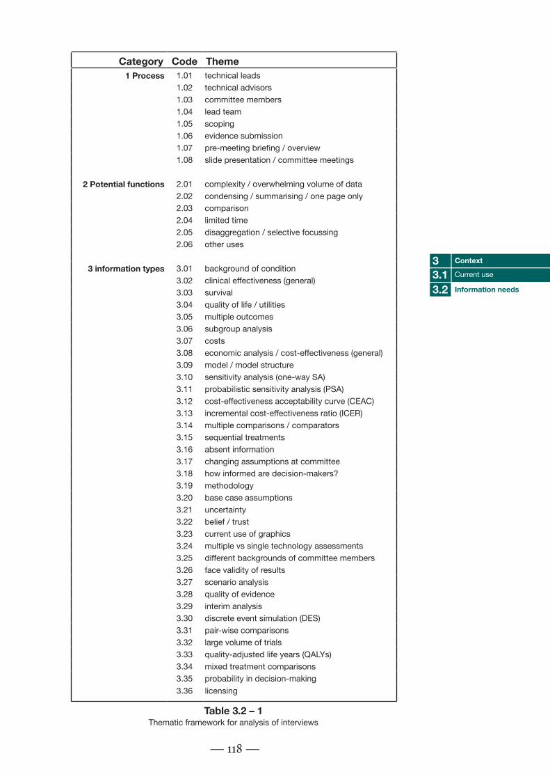
Category Code Theme1 Process 1.01 technical leads
1.02 technical advisors1.03 committee members1.04 lead team1.05 scoping1.06 evidence submission1.07 pre-meeting briefing / overview1.08 slide presentation / committee meetings
2 Potential functions 2.01 complexity / overwhelming volume of data2.02 condensing / summarising / one page only2.03 comparison2.04 limited time2.05 disaggregation / selective focussing2.06 other uses
3 information types 3.01 background of condition3.02 clinical effectiveness (general)3.03 survival3.04 quality of life / utilities3.05 multiple outcomes3.06 subgroup analysis3.07 costs3.08 economic analysis / cost-effectiveness (general)3.09 model / model structure3.10 sensitivity analysis (one-way SA)3.11 probabilistic sensitivity analysis (PSA)3.12 cost-effectiveness acceptability curve (CEAC)3.13 incremental cost-effectiveness ratio (ICER)3.14 multiple comparisons / comparators3.15 sequential treatments3.16 absent information3.17 changing assumptions at committee3.18 how informed are decision-makers?3.19 methodology3.20 base case assumptions3.21 uncertainty3.22 belief / trust3.23 current use of graphics3.24 multiple vs single technology assessments3.25 different backgrounds of committee members3.26 face validity of results3.27 scenario analysis3.28 quality of evidence3.29 interim analysis3.30 discrete event simulation (DES)3.31 pair-wise comparisons3.32 large volume of trials3.33 quality-adjusted life years (QALYs)3.34 mixed treatment comparisons3.35 probability in decision-making3.36 licensing
— 118 —
Context33.1
Information needs3.2Current use
Table 3.2 – 1Thematic framework for analysis of interviews

— 119 —
technical leads
technical advisors
committee members
lead team
scoping
evidence submission
pre-meeting briefing / overview
slide presentation / committee meetings
complexity / overwhelming volume of data
condensing / summarising / one page only
comparison
limited time
disaggregation / selective focussing
magnitude
background of condition
clinical effectiveness (general)
survival
quality of life / utilities
multiple outcomes
subgroup analysis
costs
economic analysis / cost-effectiveness (general)
model / model structure
sensitivity analysis
probabilistic sensitivity analysis (PSA)
cost-effectiveness acceptablility curves (CEACs)
incremental cost-effectiveness ratio (ICER)
multiple comparisons
sequencial treatments
absent information
changing assumptions at committee
how informed are decision-makers?
methodology
base case assumptions
uncertainty
belief/trust
current use of graphics
multiple vs single technology assessments
different backgrounds of committee members
face validity of results
scenario analyses
quality of evidence
interim analysis
discrete event simulation
pair-wise comparisons
large volume of trials
quality adjusted life years (QALYs)
mixed treatment comparisons
probability in decision-making
licensing
1.01
1.02
1.03
1.04
1.05
1.06
1.07
1.08
2.01
2.02
2.03
2.04
2.05
2.06
3.01
3.02
3.03
3.04
3.05
3.06
3.07
3.08
3.09
3.10
3.11
3.12
3.13
3.14
3.15
3.16
3.17
3.18
3.19
3.20
3.21
3.22
3.23
3.24
3.25
3.26
3.27
3.28
3.29
3.30
3.31
3.32
3.33
3.34
3.35
3.36
interview 1
interview 2
interview 3
interview 4
interview 5
Figure 3.2 – 2Link diagram showing the greatly interlinked nature of the categories from the interviews

using information graphics. Therefore, the categories representing the five identified opportunities of complexity, comparison, condensing, limited time and selective focussing are highlighted in detail in the following sections.
3.2.3.1 Complexity / overwhelming volume of data
See Figure 3.2 – 3 on the next page.
Complexity was mentioned in relation to a number of different kinds of data, from clinical effectiveness reviews, to economic analysis, model structure and sensitivity/scenario analysis. Complex numerical data is probably found throughout the reports. It was thought that the area of greatest complexity would largely depend on the qualities of the individual assessment. One participant said: “It’s difficult [to give a general area of complexity in the reports], because it depends on the individual appraisal.”
Complexity was related to clinical effectiveness by three of the five interviewees. The data presented in systematic reviews of clinical effectiveness was reported to be quite problematic to present. This is likely to be the case particularly where there are different subgroups of people that are of interest in the analysis, or where the trials reviewed used a large number of different outcome measures.
An economic analysis may be very complex if a sensitivity analysis is performed which has many different variables. Also, a simulation model which has many different disease states through which a person might progress might lead to very complex data which needs to be presented.
In general, reports which have multiple outcome measures, many subgroups, sequential treatments or mixed treatment comparisons were mentioned as having the most complex data. If any of these factors are combined, the amount of information produced is multiplied rapidly.
— 120 —
Context33.1
Information needs3.2Current use

— 121 —
technical leads
technical advisors
committee members
lead team
scoping
evidence submission
pre-meeting briefing / overview
slide presentation / committee meetings
complexity / overwhelming volume of data
condensing / summarising / one page only
comparison
limited time
disaggregation / selective focussing
magnitude
background of condition
clinical effectiveness (general)
survival
quality of life / utilities
multiple outcomes
subgroup analysis
costs
economic analysis / cost-effectiveness (general)
model / model structure
sensitivity analysis
probabilistic sensitivity analysis (PSA)
cost-effectiveness acceptablility curves (CEACs)
incremental cost-effectiveness ratio (ICER)
multiple comparisons
sequencial treatments
absent information
changing assumptions at committee
how informed are decision-makers?
methodology
base case assumptions
uncertainty
belief/trust
current use of graphics
multiple vs single technology assessments
different backgrounds of committee members
face validity of results
scenario analyses
quality of evidence
interim analysis
discrete event simulation
pair-wise comparisons
large volume of trials
quality adjusted life years (QALYs)
mixed treatment comparisons
probability in decision-making
licensing
1.01
1.02
1.03
1.04
1.05
1.06
1.07
1.08
2.01
2.02
2.03
2.04
2.05
2.06
3.01
3.02
3.03
3.04
3.05
3.06
3.07
3.08
3.09
3.10
3.11
3.12
3.13
3.14
3.15
3.16
3.17
3.18
3.19
3.20
3.21
3.22
3.23
3.24
3.25
3.26
3.27
3.28
3.29
3.30
3.31
3.32
3.33
3.34
3.35
3.36
interview 1
interview 2
interview 3
interview 4
interview 5
Figure 3.2 – 3Links to the ‘complexity’ function

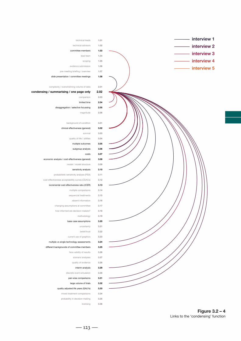
3.2.3.2 Condensing / summarising / fitting information onto a single page
See Figure 3.2 – 4 on the next page.
The interviewees most often recalled that clinical effectiveness data had been difficult to fit onto a single page or slide (four of five interviewees mentioned this as a difficulty they had had). One participant said: “In terms of quantity of information, then the problem is usually with the clincal effectiveness, and summarising that.”
The interviewees again thought that this problem could be compounded in any reviews with large numbers of trials, subgroup analyses, or large numbers of outcome measures. Normal practice was to split data over many pages or slides. This was not seen as a very great problem by at least two of the interviewees, but this may be due to the fact that graphical alternatives that could condense this data into a smaller space have not yet been fully demonstrated to them.
Problems with condensing information onto a single page or slide were also mentioned several times in relation to presenting sensitivity analysis of an economic model. Economic analyses can also generally be problematic to present in a concise way where more than two interventions are being compared.
— 122 —
Context33.1
Information needs3.2Current use
— 123 —
technical leads
technical advisors
committee members
lead team
scoping
evidence submission
pre-meeting briefing / overview
slide presentation / committee meetings
complexity / overwhelming volume of data
condensing / summarising / one page only
comparison
limited time
disaggregation / selective focussing
magnitude
background of condition
clinical effectiveness (general)
survival
quality of life / utilities
multiple outcomes
subgroup analysis
costs
economic analysis / cost-effectiveness (general)
model / model structure
sensitivity analysis
probabilistic sensitivity analysis (PSA)
cost-effectiveness acceptablility curves (CEACs)
incremental cost-effectiveness ratio (ICER)
multiple comparisons
sequencial treatments
absent information
changing assumptions at committee
how informed are decision-makers?
methodology
base case assumptions
uncertainty
belief/trust
current use of graphics
multiple vs single technology assessments
different backgrounds of committee members
face validity of results
scenario analyses
quality of evidence
interim analysis
discrete event simulation
pair-wise comparisons
large volume of trials
quality adjusted life years (QALYs)
mixed treatment comparisons
probability in decision-making
licensing
1.01
1.02
1.03
1.04
1.05
1.06
1.07
1.08
2.01
2.02
2.03
2.04
2.05
2.06
3.01
3.02
3.03
3.04
3.05
3.06
3.07
3.08
3.09
3.10
3.11
3.12
3.13
3.14
3.15
3.16
3.17
3.18
3.19
3.20
3.21
3.22
3.23
3.24
3.25
3.26
3.27
3.28
3.29
3.30
3.31
3.32
3.33
3.34
3.35
3.36
interview 1
interview 2
interview 3
interview 4
interview 5
Figure 3.2 – 4Links to the ‘condensing’ function

3.2.3.3 Comparing two or more kinds of data or information
See Figure 3.2 – 5 on the next page.
The most commonly mentioned type of data that needed to be compared to another was the icer, the overall measure of the cost-effectiveness of an intervention. Two people mentioned that changing something about the model, and seeing the magnitude of the effect on the icer would be important. This is known as one-way, or deterministic sensitivity analysis. Techniques such as ‘tornado charts’ (a kind of bar chart) and data tables are frequently used to present this information, but alternatives could perhaps be valuable.
One interviewee mentioned that they had noticed that it was frequently necessary in committee meetings to “flip backwards and forwards” through slides when questions were asked about the certainty of evidence. This information suggests that it might be beneficial to develop graphical presentations that link the quality of trials to the inputs of economic models, or relate a sensitivity analysis performed on a certain value to information on the evidence on which it is based.
Another interviewee said that comparison of data was important for model validation – comparing the results of a model to what actually happens in a real health system.
The last interviewee talked about comparing information on different models, showing the differences between manufacturers’ and review groups’ models, for example.
In general, it seems that comparing and checking the results of mathematical models was highly valued, particularly showing the reasons for changes in the icer in response to changes (sensitivity analysis), but also linking this to the results of systematic reviewing and meta-analysis.
— 124 —
Context33.1
Information needs3.2Current use

— 125 —
technical leads
technical advisors
committee members
lead team
scoping
evidence submission
pre-meeting briefing / overview
slide presentation / committee meetings
complexity / overwhelming volume of data
condensing / summarising / one page only
comparison
limited time
disaggregation / selective focussing
magnitude
background of condition
clinical effectiveness (general)
survival
quality of life / utilities
multiple outcomes
subgroup analysis
costs
economic analysis / cost-effectiveness (general)
model / model structure
sensitivity analysis
probabilistic sensitivity analysis (PSA)
cost-effectiveness acceptablility curves (CEACs)
incremental cost-effectiveness ratio (ICER)
multiple comparisons
sequencial treatments
absent information
changing assumptions at committee
how informed are decision-makers?
methodology
base case assumptions
uncertainty
belief/trust
current use of graphics
multiple vs single technology assessments
different backgrounds of committee members
face validity of results
scenario analyses
quality of evidence
interim analysis
discrete event simulation
pair-wise comparisons
large volume of trials
quality adjusted life years (QALYs)
mixed treatment comparisons
probability in decision-making
licensing
1.01
1.02
1.03
1.04
1.05
1.06
1.07
1.08
2.01
2.02
2.03
2.04
2.05
2.06
3.01
3.02
3.03
3.04
3.05
3.06
3.07
3.08
3.09
3.10
3.11
3.12
3.13
3.14
3.15
3.16
3.17
3.18
3.19
3.20
3.21
3.22
3.23
3.24
3.25
3.26
3.27
3.28
3.29
3.30
3.31
3.32
3.33
3.34
3.35
3.36
interview 1
interview 2
interview 3
interview 4
interview 5
Figure 3.2 – 5Links to the ‘comparison’ function

3.2.3.4 Time limitations
See Figure 3.2 – 6 on next page.
While this figure seems to show few linkages between time limitations and specific kinds of data and information, this is because time was thought to be universally limited throughout the appraisal process. When asked if time was limited (in any part of the appraisal process?), interviewees responded: “Time is always limited” or “Yes, is the short answer!” All five interviewees stated that time was always limited for decision-makers to familiarise themselves with the necessary information before an appraisal committee. It is apparently quite common for the committee members to be given many hundreds of pages of report to go through over the weekend before an appraisal. They are not paid for appearing on a committee beyond covering their expenses, so must fit this in around other work commitments.
Time was also said to be limited for technical leads to prepare pre-meeting briefings. Also, one interviewee mentioned that if new analyses were produced by manufacturers or review groups after an initial decision had been reached, that time for decision-makers to understand this was likely to be even more limited than normal.
If the time taken to absorb information from technology assessment reports is so limited, this may be an opportunity for information graphics. If a graphical method can transmit the same information as clearly, but more quickly, that might be enough to recommend its use. Particular emphasis might be given to ways of presenting model data that could be used when alternative models are provided at later stages of the decision process, although care would have to be taken that the time needed to produce the information graphic did not outweigh its benefits.
— 126 —
Context33.1
Information needs3.2Current use

— 127 —
technical leads
technical advisors
committee members
lead team
scoping
evidence submission
pre-meeting briefing / overview
slide presentation / committee meetings
complexity / overwhelming volume of data
condensing / summarising / one page only
comparison
limited time
disaggregation / selective focussing
magnitude
background of condition
clinical effectiveness (general)
survival
quality of life / utilities
multiple outcomes
subgroup analysis
costs
economic analysis / cost-effectiveness (general)
model / model structure
sensitivity analysis
probabilistic sensitivity analysis (PSA)
cost-effectiveness acceptablility curves (CEACs)
incremental cost-effectiveness ratio (ICER)
multiple comparisons
sequencial treatments
absent information
changing assumptions at committee
how informed are decision-makers?
methodology
base case assumptions
uncertainty
belief/trust
current use of graphics
multiple vs single technology assessments
different backgrounds of committee members
face validity of results
scenario analyses
quality of evidence
interim analysis
discrete event simulation
pair-wise comparisons
large volume of trials
quality adjusted life years (QALYs)
mixed treatment comparisons
probability in decision-making
licensing
1.01
1.02
1.03
1.04
1.05
1.06
1.07
1.08
2.01
2.02
2.03
2.04
2.05
2.06
3.01
3.02
3.03
3.04
3.05
3.06
3.07
3.08
3.09
3.10
3.11
3.12
3.13
3.14
3.15
3.16
3.17
3.18
3.19
3.20
3.21
3.22
3.23
3.24
3.25
3.26
3.27
3.28
3.29
3.30
3.31
3.32
3.33
3.34
3.35
3.36
interview 1
interview 2
interview 3
interview 4
interview 5
Figure 3.2 – 6Links to the ‘limited time’ function
3.2.3.5 Selective focussing
See Figure 3.2 – 7 on the next page.
When asked if certain information should be picked out for certain people, most interviewees were uncomfortable about the idea. They felt that all information should be presented to all decision-makers, even though several of them mentioned at other times that the committee members all had different specialisms and interests. Denying data to certain people was not the intention behind the use of selective focussing. This may indicate that the construction of this question was poor, and therefore this study may not have fully explored the potential for selective focussing in hta.
One person did mention that it might be useful to pick certain scenarios out of a set of data, such as highlighting a manufacturer’s ‘base case’*.
The only link that was made by more than one person was to complexity. It may be that selective focussing is just a powerful way of dealing with overwhelming quantities of data rather than a separate function of information graphics.
— 128 —
Context33.1
Information needs3.2Current use
* The initial evidence-based values used to
construct a model before sensitivity analysis is
performed.

— 129 —
technical leads
technical advisors
committee members
lead team
scoping
evidence submission
pre-meeting briefing / overview
slide presentation / committee meetings
complexity / overwhelming volume of data
condensing / summarising / one page only
comparison
limited time
disaggregation / selective focussing
magnitude
background of condition
clinical effectiveness (general)
survival
quality of life / utilities
multiple outcomes
subgroup analysis
costs
economic analysis / cost-effectiveness (general)
model / model structure
sensitivity analysis
probabilistic sensitivity analysis (PSA)
cost-effectiveness acceptablility curves (CEACs)
incremental cost-effectiveness ratio (ICER)
multiple comparisons
sequencial treatments
absent information
changing assumptions at committee
how informed are decision-makers?
methodology
base case assumptions
uncertainty
belief/trust
current use of graphics
multiple vs single technology assessments
different backgrounds of committee members
face validity of results
scenario analyses
quality of evidence
interim analysis
discrete event simulation
pair-wise comparisons
large volume of trials
quality adjusted life years (QALYs)
mixed treatment comparisons
probability in decision-making
licensing
1.01
1.02
1.03
1.04
1.05
1.06
1.07
1.08
2.01
2.02
2.03
2.04
2.05
2.06
3.01
3.02
3.03
3.04
3.05
3.06
3.07
3.08
3.09
3.10
3.11
3.12
3.13
3.14
3.15
3.16
3.17
3.18
3.19
3.20
3.21
3.22
3.23
3.24
3.25
3.26
3.27
3.28
3.29
3.30
3.31
3.32
3.33
3.34
3.35
3.36
interview 1
interview 2
interview 3
interview 4
interview 5
Figure 3.2 – 7Links to the ‘selective focussing’ function

3.2.3.5 Responses to ‘other difficulties’ question
There were two other difficulties highlighted by the interviewees when asked.
Firstly, it was thought that the committee members needed to see how the icer value had been calculated, giving more detail than just the numerical cost-effectiveness value that had been calculated. This could perhaps be achieved by providing an information graphic that showed detail of how quality of life or costs changed (by state or over time) for the simulated people in the model. This could then be compared visually with which model states people were in, or at what time costs were incurred.
Secondly, the interpretation of probabilistic sensitivity analysis by committee members was thought to be problematic. This method shows a number of possible situations, based on randomised sampling across all values that are used to construct the model (based on how uncertain these values were in the systematic review and discussion of costs). These are often presented using line graphs called a ‘cost-effectiveness acceptability curves’ (ceac). These show how many of the resulting samples would be considered cost-effective at different levels of ‘willingness to pay’. The interviewees thought that this was both a difficult concept for decision-makers to understand, but also difficult to know how this should affect the decision, even if it was understood. For example, if a drug was 50% likely to be cost-effective at the current willingness to pay threshold, they thought that a decision-maker would find it challenging to decide whether it should it be approved or not.
3.2.4 Conclusion
3.2.4.1 Statement of findings
The research question asked: Is there numerical data in hta reports that might benefit from graphical presentation? These telephone interviews have suggested that a number of potential functions of information graphics could be relevant to the nice appraisal process in the uk.
Participants mentioned that clinical effectiveness data can be very complex, especially in reviews that they described as including many trials. They also mentioned that reviews that had what they considered to be a large number of outcome measures could be problematic, as were those where subgroup analysis is required, or where several different comparators are being considered, possibly in combination (referred to as ‘mixed treatment
— 130 —
Context33.1
Information needs3.2Current use

comparisons). When several of these complicating factors are combined, the data can be very difficult to present in a small space, and may be difficult for decision-makers to get to grips with in the short space of time available to them.
Another problem is linking the effectiveness review data with the different economic analyses presented by manufacturers or the review group. All models are uncertain, but the decision-makers need to bear in mind the way in which the evidence from a systematic review and / or meta-analysis supports the economic models presented.
These models themselves can be complex, both methodologically and in terms of the volume of data presented. In particular, deterministic sensitivity analysis of complex models can be difficult to present concisely, as many individual changes may be possible, and each affect the model in multiple ways. Also, probabilistic sensitivity analysis can be difficult to understand and implement. The participants described decision-makers finding it difficult to know exactly what level of uncertainty was acceptable.
The interviews suggested that employees at nice and the decision-makers on appraisal committees have a very limited time to familiarise themselves with this complex and interlinked set of data before the final decision must be made. This qualitative study shows a number of opportunities for information graphics to assist in this process.
3.2.4.2 Discussion
These interviews show several different needs that might be met by producing new kinds of information graphic.
One of the most obvious applications is to show an overview of systematic review data. This can be difficult to condense into a small space, and is generally split up over several pages of reports or slides of a presentation. This information is important for decision-makers to consider at all stages of making their decision, and may frequently be referred back to. Therefore a graphical summary of the information that could be glanced at quickly might be very valuable.
An information graphic might also be used to link the results of systematic reviewing to a model’s sensitivity analysis. In this way, it would be possible to show why a modeller felt that the value might be uncertain, and therefore how
— 131 —
Context33.1
Information needs3.2Current use

realistic it might be that this alteration would more accurately represent reality. It might also be possible to use a similar graphical technique to link systematic reviewing results to model inputs, which might suggest why they were varied in a probabilistic sensitivity analysis.
A graphical way of showing more information on how an icer value is calculated might be valuable. For example, an information graphic could be used to show the quality of life gains and cost differences between model arms over time or by model state.
A graphic might be used for model validation, showing how accurately the model represents reality. It might be desirable for the graphic to show alternative scenarios, and show how much these represent the situation in observed data.
It might also be useful to use a graphical technique to compare different models, for example highlighting the differences between manufacturer’s own models and those produced by the independent review group for the nice appraisal.
However, several of the interviewees noted that the complexities in the reports tended to change from appraisal to appraisal. A large number of outcome measures used by the trials in the systematic review might make the clinical effectiveness section more complex. A large sensitivity analysis with many variables might lead to a complex economic evaluation section. If the complicating factors of reports vary so much, different information graphic techniques might be more or less appropriate in different appraisals.
There are also difficulties faced in the appraisal process that are less suited to the use of information graphics. The understanding of health economics methodologies, for example, will probably not be addressed by the use of an information graphic.
Whatever information graphics are developed in response to these needs, a key consideration seems to be the limited time available to both nice analysts and committee members to understand the data with which they are presented. It may be enough to recommend an information graphic for use if it can be shown that it can transmit the same information as clearly, but more quickly.
— 132 —
Context33.1
Information needs3.2Current use

3.2.4.3 Strengths and limitations of methods
The method of telephone interviewing was able to show information needs that could be addressed by the development of information graphics. Withholding the fact that the research was interested in graphical presentation until the very end of the interviews was effective in forcing the interviewees to focus on data that is not currently presented in graphical form. The interviews delivered by telephone were detailed enough to be of use, although the transcription and analysis process took several weeks.
There are some factors that might limit the value of the results. Very few specific reports or appraisals were mentioned by more than one interviewee, which probably indicates that the nice technical advisors remember only the reports that they’ve dealt with themselves. There may therefore be recall bias in the study. However, as the aim of the research is to find commonly occurring information needs that might be addressed, the fact that each technical advisor can only remember those reports that they have been deeply involved with themselves does not invalidate the results in any way. As different people mentioned the same difficulties, and they only recall their own appraisals, the difficulties can be said to be commonly occurring.
It was hoped that the nice technical advisors interviewed would be able to give a general view of the percieved needs of the decision-makers. In making this assumption, the research depends to some extent on how good the feedback is between decision-makers and the nice technical advisors. If poor, they would be reporting only what they find difficult, rather than what the decision-makers find difficult. This study can recommend areas that are perceived to be needs by nice technical analysts. However, the true value of any information graphics developed in response to these perceived needs must be tested to show actual benefits in practice.
3.2.4.4 Relevance to previous research
The findings of this study suggest that Thomas’ view of selective focussing as a possible function of information graphics (Thomas & Cook 2005) may be a way of dealing with complex data. Therefore, ideas of using information graphics to explain complex data (Remus 1987a) might be an overarching category, with more specific ways of doing this being techniques such as selective focussing. There may also be other ways of presenting very complex data, such as gradually increasing the amount shown, or breaking it into component parts. However, given the results of the methodological study presented in Appendix A, information graphics may not be universally suited
— 133 —
Context33.1
Information needs3.2Current use

to presenting complex data, and this should be tested on a case-by-case basis.
This also links to the question of whether information graphics should be used in hta to present primary data, or an interpretation of this. This may depend on the point in the hta process at which the information graphic is constructed. If a graphic is included in technology assessment reports presented to nice, the report would be considered objective ‘assessment’ rather than value-based judgement (‘appraisal’) (Gabbay & Walley 2006). In this case, it might have been expected that techniques which can be used to display entire data sets, with the viewer choosing what to view in most detail, might me more useful than the interviewees realised. This may be a result of their unfamiliarity with such visual display techniques.
Several of the interviewees thought that the complexities of reports are appraisal-specific. This might explain why the review of nice appraisal report graphics in Chapter 3.1 showed that graphical techniques were not used in all cases (Pitt et al. 2009). It may be that different techniques are applicable in different appraisals, depending on what specific complicating factors apply (many subgroups, large number of outcome measures, etc.)
3.2.4.5 Implications of findings
This study showed perceived needs of decision-makers, using nice technical advisors as a proxy. Several of these needs might be addressed by the design of new information graphics. After these are created, future research could be conducted on a sample of hta report authors and/or nice Appraisal Committee members to validate the findings.
Other hta commissioning bodies around the world may have similar needs, but those that do not use cost-effectiveness analysis may have more limited needs. Further research could be performed, focussing on other hta commissioning bodies.
One interviewee mentioned that giving an idea of the magnitude of numerical data was important, in this case how much altering costs affected the icer. Conveying a sense of relative magnitude is another potential function of information graphics that has been used successfully in the past (Holmes 2009). This function was not addressed by the questioning strategy used in this study. There may also be other potential functions that were not incorporated here, such as building up complexity slowly and breaking complex data into manageable parts. Future research could base their questioning strategies on a
— 134 —
Context33.1
Information needs3.2Current use
more comprehensive selection of possible functions of information graphics.
This study’s focus on user needs is widely supported in information design (Martin, Gregor, & Rice 2008), but this is debated. Some writers in the field suggest a task focus (Pettersson 2001), process focus (Frascara & Ruecker 2007) or system focus (Knoflacher 2009) may be more appropriate. Future research on these alternative (and potentially complimentary) methods of informing the design of information graphics might be usefully performed in health technology assessment.
— 135 —
Context33.1
Information needs3.2Current use