chapter 2 - polytechpanthers.enschool.org · using the ames lettering guide •it makes guidelines...
TRANSCRIPT
Chapter 2
Lettering

TECHNICAL LETTERING
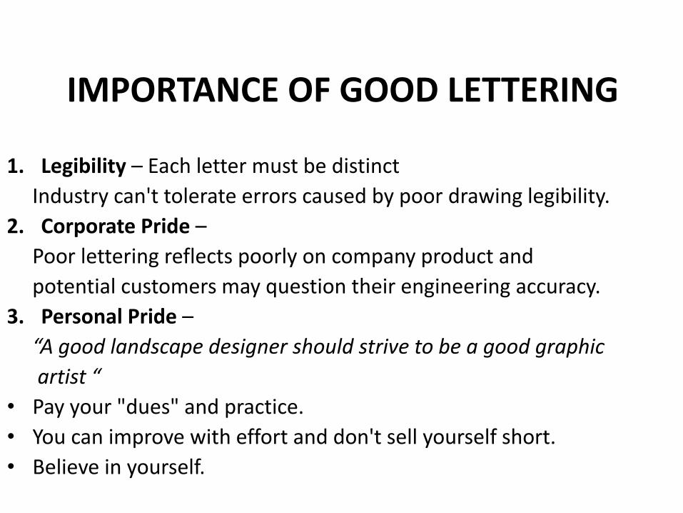
1. Legibility – Each letter must be distinct
Industry can't tolerate errors caused by poor drawing legibility.
2. Corporate Pride –
Poor lettering reflects poorly on company product and
potential customers may question their engineering accuracy.
3. Personal Pride –
“A good landscape designer should strive to be a good graphic
artist “
• Pay your "dues" and practice.
• You can improve with effort and don't sell yourself short.
• Believe in yourself.
IMPORTANCE OF GOOD LETTERING

Choice of Methods for Applying Letters
1. Importance of the drawing
2. Time schedule for its production
3. In house drawings vs. presentation drawings
4. Easy to create “Time is Money”

5 Methods for Applying Letters
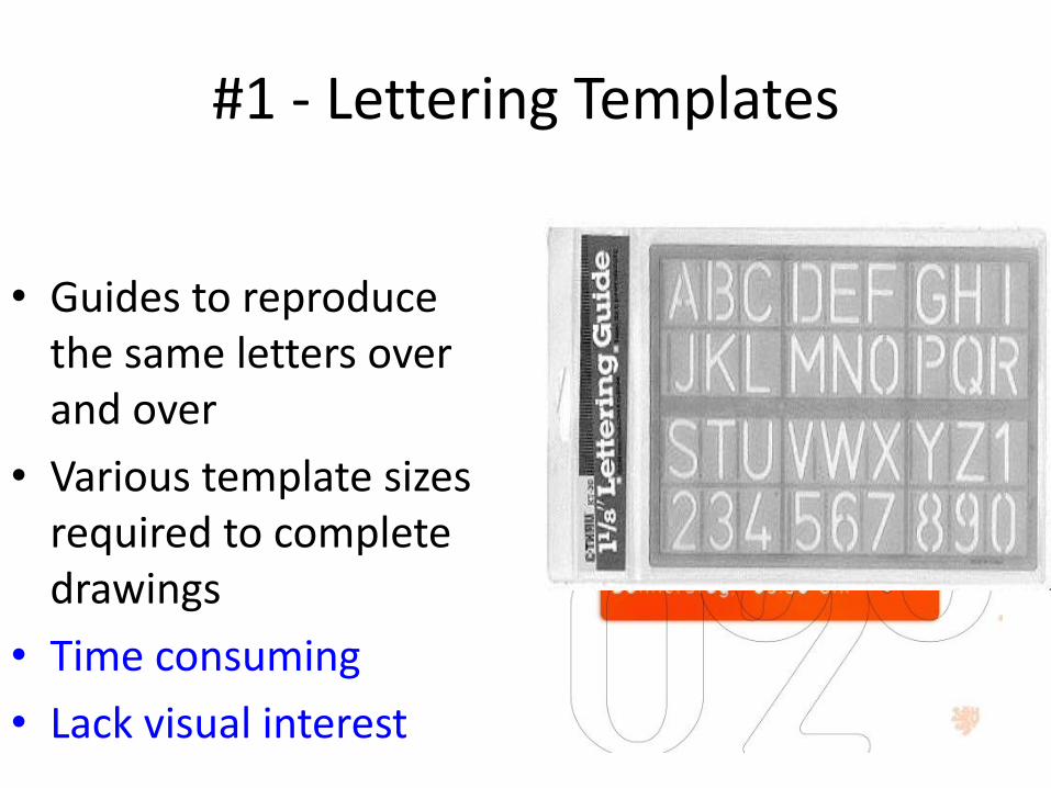
#1 - Lettering Templates
• Guides to reproduce the same letters over and over
• Various template sizes required to complete drawings
• Time consuming
• Lack visual interest

#2 - Waxed press-on letters
• Quick and easy to use
• Letters sold on sheets of plastic or waxed paper
• Transferred to drawing by pencil rubbing
• Create a professional graphic image
• Easily removed w/cellophane tape
• Expensive
• Crack w/age
• Wasteful - vowels used more than consonants
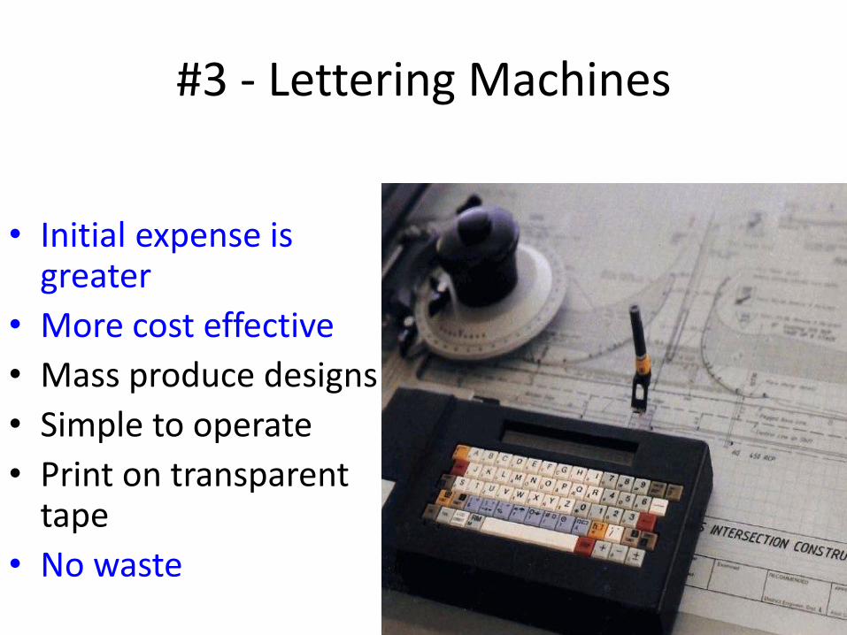
#3 - Lettering Machines
• Initial expense is greater
• More cost effective
• Mass produce designs
• Simple to operate
• Print on transparent tape
• No waste
#4 -Transfer Film- “Sticky Back”
• Plastic sheet w/adhesive back
• Used for plant lists
• Construction notations
• Client names and addresses
• Company logos
• Prepared on a word processor and photo copied onto plastic film
• Very versatile
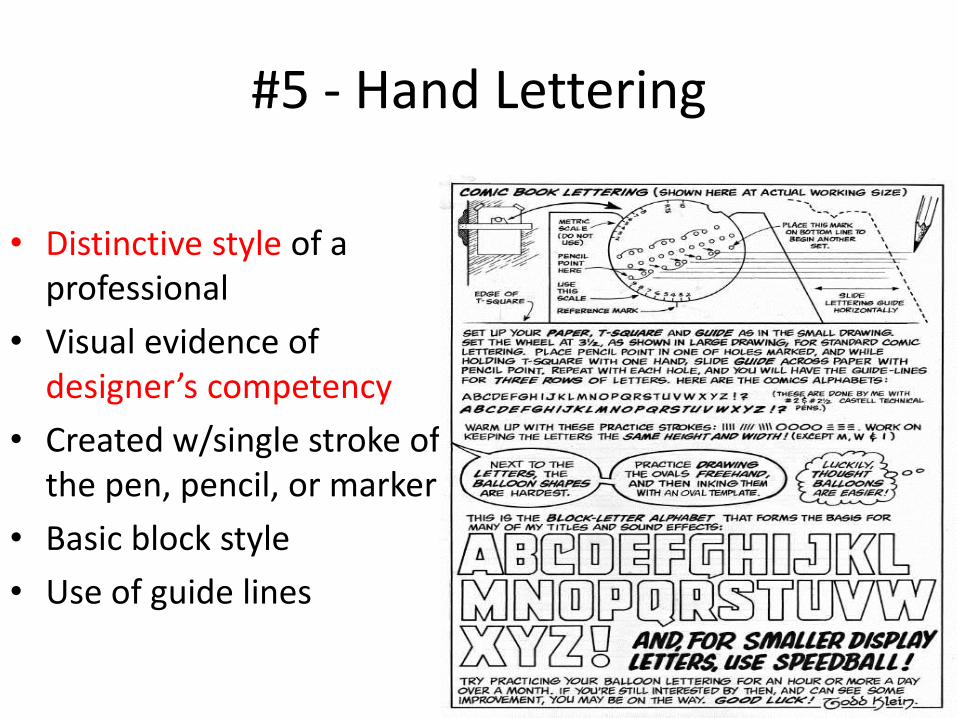
#5 - Hand Lettering
• Distinctive style of a professional
• Visual evidence of designer’s competency
• Created w/single stroke of the pen, pencil, or marker
• Basic block style
• Use of guide lines


Using the Ames Lettering Guide
• Ames Lettering Guide works like the chalk holder your elementary school teacher used
Using the Ames Lettering Guide
• It makes guidelines for you to use when doing your architectural lettering
• it will take a bit of practice to master this tool - so be patient as you get started
• hand lettering gives a personal touch
•Practice Makes Perfect!
General Lettering Tips
• Be conservative with letters and do not add to
much flair to the letters
• Keep letters consistent
• Use guidelines
• Minimum size is 1/8”
• Titles are 3/16” or 1/4”

More Lettering Tips
• Use 0.5mm automatic pencil with H, F, or HB lead
• Rest hand on clean protective sheet
• Keep vertical lines farther apart than angles or
curved lines
• Relax and be comfortable
• Slanted letters should be at about 68°

1st Practice Lesson – Graph Paper Letters
• Practice your lettering strokes
• Follow the direction of each stroke in composing your letters
• Letters are composed via the number of strokes
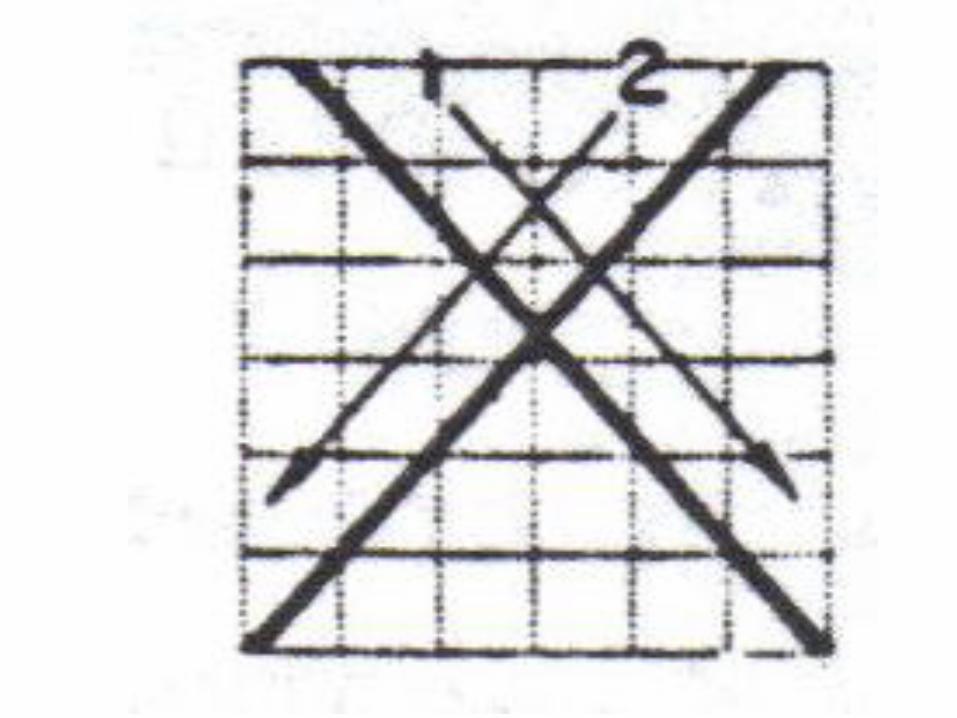
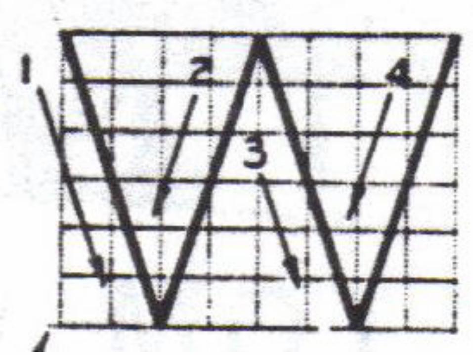
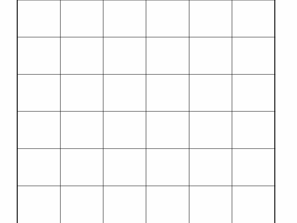
• Grid - The grid is comprised or a 6 x 6 matrix of 36 boxes to aid composition and width.
• TOM Q VAXY = 6 x 6 proportion
• All other letters = 6 x 5 proportion
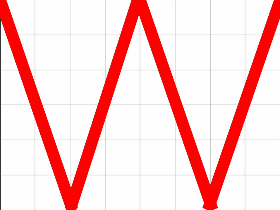
• ONLY “W” is the exception = 6 x 8
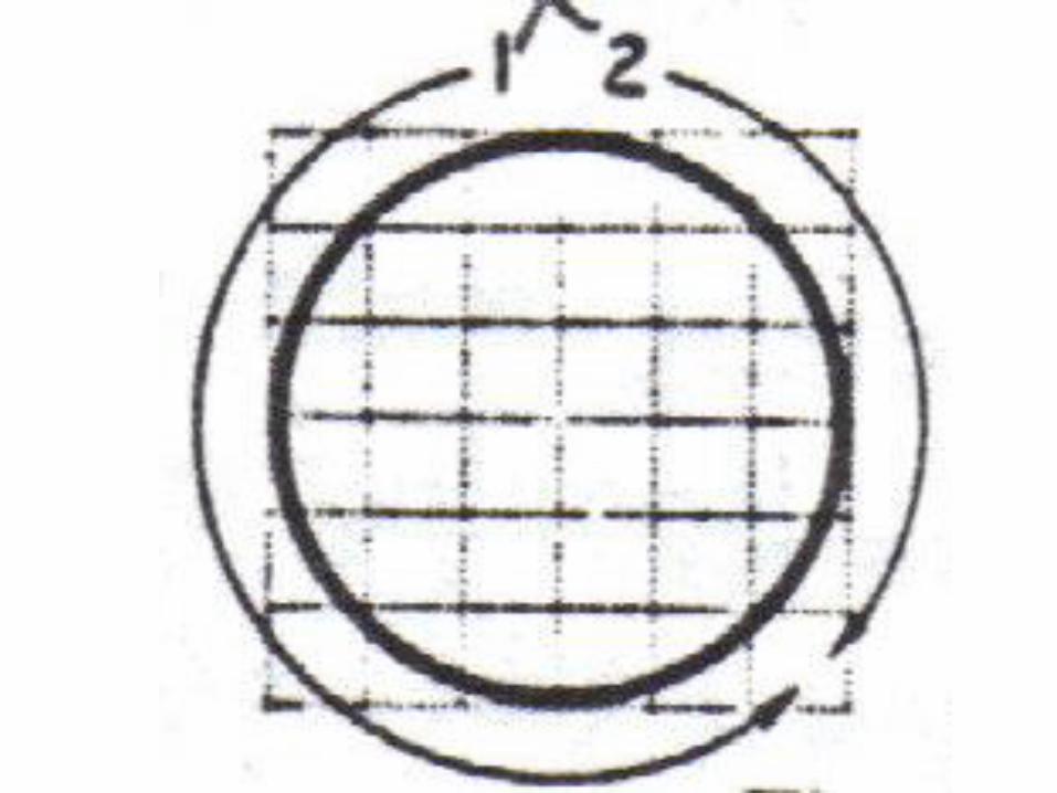
• Groups - Letters such as 0, C,, G, and Q are grouped to ease learning & to maintain common traits.
Lettering
• lettering is a skill that takes a lot of practice
• always use your straight edge to make your
verticals
• Note: straight side of the Ames lettering guide
works great for this
• don't forget that dark black letters are our goal

ELEMENTS OF QUALITY LETTERING
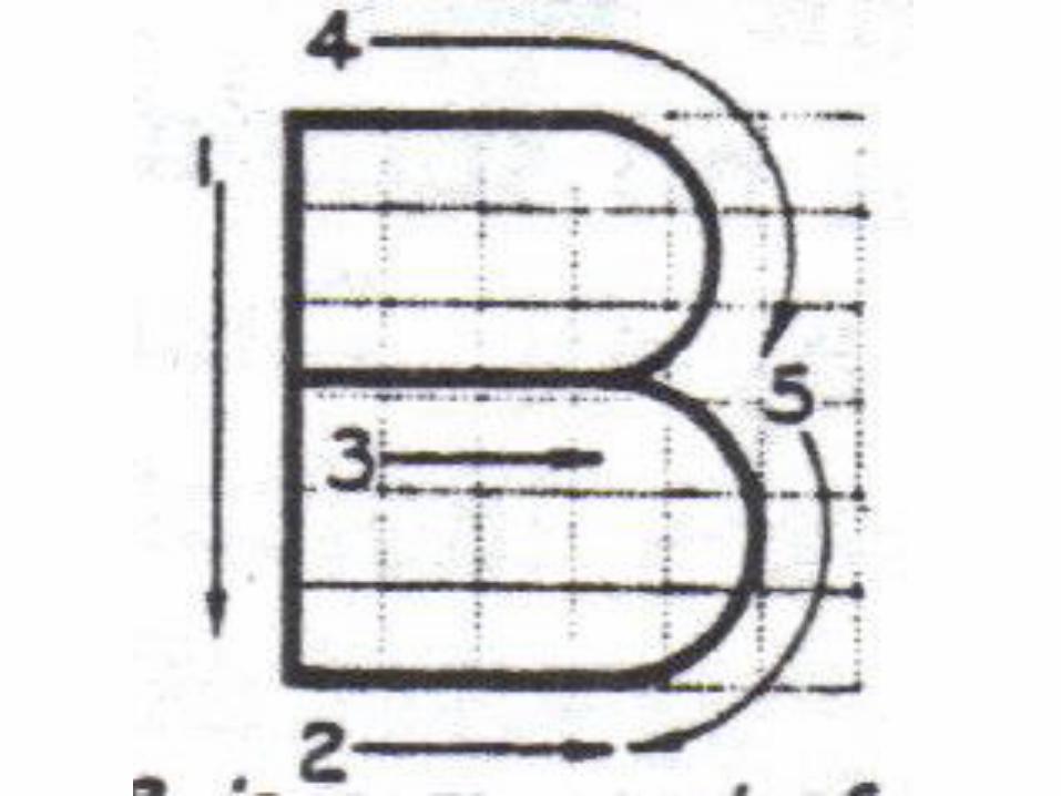
• Stability – • The bottom of letters such as B are larger than the top, not
top heavy • Composition – • Each portion of each letter is formed to an exact standard. • Uniformity – • All "A's" are alike. All B's" are alike, etc. • Alignment – • The imaginary axis of all letters are all parallel and either
vertical or inclined to the right at 68 degrees, no back slant.
Single stroke Lettering
• Each letter is made up of a series of single strokes
• Some letters as many as five
• Assignment:
• Write a row for each letter and number using the graph paper supplied (margin to margin)
• Leave one graph line row between each letter and number

Guidelines
• Must be used to establish uniform height, not crooked.
• Use the Ames Lettering Guide.
• Guidelines must be extremely light via 6H.

Lettering Size
• Height –
• 1/8” is common (1/4” for titles etc.)
• Upper & Lower Case –
• Engineering lettering is commonly upper case CAPITALS
Fractions
• Not too common except for certain materials such as wood.
• Five guidelines are required for mixed numbers.
• The numerator and denominator are 3/4 the height of the whole number.
Lettering Strokes
• Letters are composed via the number of strokes
• Grid - The grid is comprised or a 6 x 6 matrix of 36 boxes to aid composition and width.
• Groups - Letters such as 0, C,, G, and Q are grouped to ease learning & to maintain common traits.
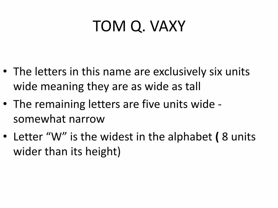
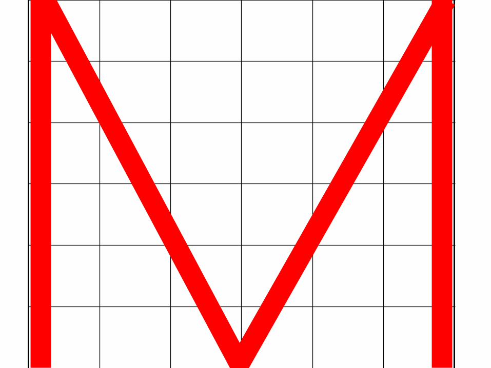
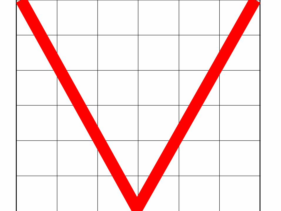
TOM Q. VAXY
• The letters in this name are exclusively six units wide meaning they are as wide as tall
• The remaining letters are five units wide - somewhat narrow
• Letter “W” is the widest in the alphabet ( 8 units wider than its height)


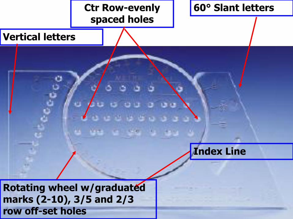
60° Slant letters Ctr Row-evenly spaced holes
Vertical letters
Index Line
Rotating wheel w/graduated marks (2-10), 3/5 and 2/3 row off-set holes
Using the Ames Lettering Guide
• Ames Lettering Guide works like the chalk holder your elementary school teacher used
• It makes guidelines for you to use when doing your architectural lettering
• it will take a bit of practice to master this tool - so be patient as you get started
• hand lettering gives a personal touch
• Practice Makes Perfect!

Lesson #1
6 x 6 letters

Instructions • Graph paper will be supplied to you for this lesson
• Mark off all your 6x6, 6x5, or 6x8 squares on your graph sheet before you start lettering
• Skip a square between each letter on the line and a row of squares between each row of letters and numbers
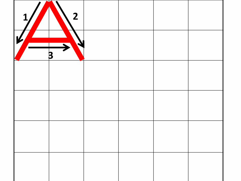
• Write a whole row of each letter and number, starting with the letter “A”
• Be sure the draw and number the directional arrows for each stroke. ONLY THE 1ST LETTER & NUMBER ON EACH LINE
• Remember letters “T O M Q V A X Y” are 6 squares by 6 squares tall and wide
• The rest of the letters and numbers are 6 squares tall by 5 squares wide
• W is the exception – it is 6 squares tall by 8 squares wide

1 2
3
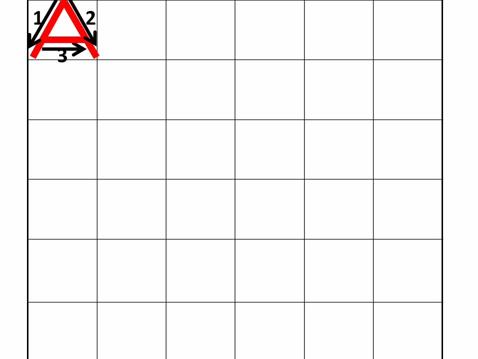
Lesson #2
2 x 2 letters

Instructions • Graph paper will be supplied to you for this lesson • Mark off all your 2x2, 2x1-2/3, or 2x2-2/3 squares on your
graph sheet before you start lettering • Skip a square between each letter on the line and a row of
squares between each row of letters and numbers • Write a whole row of each letter and number, starting with
the letter “A” • Be sure the draw and number the directional arrows for each
stroke. ONLY THE 1ST LETTER & NUMBER ON EACH LINE • Use the same proportions for your 2 x 2 letters and numbers
as you did for your 6 x 6 letters and numbers • Remember letters “T O M Q V A X Y” are 2 squares by 2
squares tall and wide • The rest of the letters and numbers are 2 squares tall by 1-2/3
squares wide • W is the exception – it is 2 squares tall by 2-2/3 squares wide
1 2
3

Lesson #3
1 x 1 letters

Instructions • Graph paper will be supplied to you for this lesson • Mark off all your 1x1, 1x2/3, or 1x1-2/3 squares on your
graph sheet before you start lettering • Skip a square between each letter on the line and a row of
squares between each row of letters and numbers • Write a whole row of each letter and number, starting with
the letter “A” • Be sure the draw and number the directional arrows for each
stroke. ONLY THE 1ST LETTER & NUMBER ON EACH LINE • Use the same proportions for your 1 x 1 letters and numbers
as you did for your 6 x 6 and 2 x 2 letters and numbers • Remember letters “T O M Q V A X Y” are 1 squares by 1
squares tall and wide • The rest of the letters and numbers are 1 squares tall by 2/3
squares wide • W is the exception – it is 1 squares tall by 1-2/3 squares wide
1 2
3
Lesson #4
Notebook Sheet Letters

Instructions • You will use your own notebook paper for this lesson • Write a whole row of each letter and number, starting on the
left margin with the letter “A” • Your letters and numbers MUST TOUCH the top and bottom
line on each row • Skip a row between each row of letters and numbers • Be sure the draw and number the directional arrows for each
stroke. ONLY THE 1ST LETTER & NUMBER ON EACH LINE • Use the same proportions for these letters as you did
previously for your 6 x 6 and 2 x 2 and 1 x 1 letters and numbers
• Remember letters “T O M Q V A X Y” are as tall as they are wide
• The rest of the letters and numbers are the same height by 2/3 the width
• W is the exception – it is as tall by 1-2/3 the width

Skip a row
Write your next letter on this entire row
Skip a row
Write your next letter on this entire row
Skip a row
1 2
3