chapter 2. mapping gis data - offices and...
TRANSCRIPT

David Tenenbaum – EEOS 281 – UMB Fall 2010
Chapter 2. Mapping GIS Data
Objectives:• Understanding map scales and GIS data scaling
issues• Knowing types of attribute data and the maps
created from each• Understanding how to classify numeric data• Displaying raster images • Understanding how map documents save and
represent data

David Tenenbaum – EEOS 281 – UMB Fall 2010
Definition of Maps:•A graphic depiction on a flat medium of all or part of a geographic realm in which real world features have been replaced with symbols in their correct spatial location at a reduced scale.•To map is to transform information from one form to another --- Mathematics
•Earth surface Paper --- Geographymap
What is a Map?

David Tenenbaum – EEOS 281 – UMB Fall 2010
Scale• Scale is a way to quantify the size relationship
between the real world and the map
• But the notion of scale goes beyond simply the issue of the size at which features are portrayed, and is one of the most important concepts in geography because of its effects on analysis– It affects nearly all aspects of geographic data and GIS– A GIS is scaleless in the sense that maps can be
enlarged and reduced and plotted at many scales other than that of the original data.
– To compare maps in a GIS, both maps MUST be at the same scale and have the same extent.

David Tenenbaum – EEOS 281 – UMB Fall 2010
USGS Topo Map Title and Scale

David Tenenbaum – EEOS 281 – UMB Fall 2010
Definition:The scale of a map is ratio between distances on the map and the corresponding distances in the real world.
Scale representation on the map:•Representative fraction (RF): 1:100,000, 1 to 100,000, or 1/100,000•Verbal: 1 inch is equal to 50 miles•Graphic: Scale bar 10 miles
Representing Scale on Maps
Purpose (or a kind of question that scale can answer):•Scale information allows us to answer questions like: 1 inch on a 1:24000 map represents what distance on the surface of the Earth? (2000 feet)

David Tenenbaum – EEOS 281 – UMB Fall 2010
• Remember that the notions of small and large are reversed from our conventional thinking when we talk about scale large scale refers to looking at a smaller area in detail, and this makes sense because the representative fractions are larger:– Large scale 1:400 to 1:50,000– Intermediate scale 1:50,000 to 1:250,000– Small scale 1:250,000 and beyond
• Even these are just guidelines … we might refer to large or small scale in a given context (the categories given above are for the full range of mapping, from local to global), or we might use these terms in a relative sense
General Classification of Scale

David Tenenbaum – EEOS 281 – UMB Fall 2010
• GIS is scaleless, in the sense that the onscreen representation of a GIS is far less limited by the considerations associated with map representations (i.e. you can resize your View to any scale you’d like, although there are resolution limitations imposed by the minimum unit of display, a pixel)
• Thus, data captured at a certain scale can be scaled (multiplied up or reduced down) freely in a GIS, potentially not respecting the limitationsassociated with the scale at which the data was created
Map Scale and GIS

David Tenenbaum – EEOS 281 – UMB Fall 2010
• When we freely scale data captured at a certain scale in a GIS, we can run into problems if we go too far in either direction:
• If we reduce a map’s scale too much, the map becomes too information-dense to be useful, because the detail can no longer be displayed
• If we enlarge a map produced at a small scale too much, we can see the lack of detail as a result of the data’s scale of production
• Representation of data at an appropriate scale is one the most important goals of cartography
Map Scale and GIS

David Tenenbaum – EEOS 281 – UMB Fall 2010
Maps and GIS - Scaling Up
•The river network shown here on a national scale was produced at a much larger scale, and it contains a great deal of detail that cannot be seen here … zooming in …

David Tenenbaum – EEOS 281 – UMB Fall 2010
Maps and GIS - Scaling Up
All the detail that is encoded in this river network data is really only visible and usefulwhen operating at more local scales
This level of detail is not necessary or useful at the national scale. GIS does not modify the level of detail in the representation of features when scaling up or down

David Tenenbaum – EEOS 281 – UMB Fall 2010
Maps and GIS - Scaling Down• Scale affects both the precision and accuracy of
geographic information’s representation of reality• The scale at which data is collected / produced at
affects the amount of generalization inherent in vector data objects’ representation
• Large-scale data contains more detail than small-scale data
• When using small-scale data at an extent or for a purpose that is larger-scale than it was intended for can reveal a different kind of problem …

David Tenenbaum – EEOS 281 – UMB Fall 2010
Maps and GIS - Scaling Down
•Here we can see a national scale coastline (shown in red) superimposed over local scale data, we can clearly see the generalization and lack of detail

David Tenenbaum – EEOS 281 – UMB Fall 2010
Choosing a Map Type• Cartographers have designed hundreds of
map types: methods of cartographic representation.
• Not all GISs allow all types.• Most have a set of basic types• Depends heavily on the dimension of the
data to be shown in the map figure.

David Tenenbaum – EEOS 281 – UMB Fall 2010
Choosing Map Types• Check the data
– Continuous vs. Discrete– Accuracy & Precision– Reliability
• Dimension (Point, Line, Area, Volume)• Scale of Measurement (Nominal etc.)• What types is your GIS capable of creating• May need to supplement GIS software

David Tenenbaum – EEOS 281 – UMB Fall 2010
Scales of Measurement
• Thematic data can be divided into four types
1. The Categorical Scale
2. The Ordinal Scale
3. The Interval Scale
4. The Ratio Scale
As we progress through these scales, the types of data they describe have increasing information content

David Tenenbaum – EEOS 281 – UMB Fall 2010
The Categorical Scale
• Categorical data - information that is simply grouped into categories on the basis of qualitative considerations– Example: Place names

David Tenenbaum – EEOS 281 – UMB Fall 2010
The Ordinal Scale
• Ordinal data - grouped by rank on the basis of some quantitative measure– Example: Small, medium and large towns

David Tenenbaum – EEOS 281 – UMB Fall 2010
The Interval Scale
• Interval data - information that can be arranged using a standard scale along which operations of addition and subtraction have meaning– Example: Temperature is an interval measure
• Interval data is one type of continuous data

David Tenenbaum – EEOS 281 – UMB Fall 2010
The Ratio Scale• Ratio data - other type of continuous data that can be
arranged along a scale but, in addition, the scale begins at a non-arbitrary zero point– At the zero point, no features are present– Multiplication and division can be employed with ratio
data to consider proportions and magnitudes– Examples: Elevation above sea level, precipitation,
population

David Tenenbaum – EEOS 281 – UMB Fall 2010
The Ratio Scale• Ratio data

David Tenenbaum – EEOS 281 – UMB Fall 2010
Data Symbolization•There are a number of characteristics of symbols that we can use of to make visual distinctions in thematic information (Jacques Bertin’s Visual Variables):
•Size•Shape•Color Hue (color)•Color Value (intensity)•(Texture)•(Orientation)•(Arrangement)

David Tenenbaum – EEOS 281 – UMB Fall 2010
Size Graduated & proportional symbol maps• difference in dimensions of symbols • useful for ordinal, interval, & ratio data; bad
for categorical• convention: larger size = greater quantity
Shape• differences in forms of symbols can be abstract and
"geometric", or iconographic • useful for categorical data; bad for for ordinal,
interval, & ratio • too many shapes = cluttered & difficult for map
reader to discriminate
Data Symbolization

David Tenenbaum – EEOS 281 – UMB Fall 2010
Graduated Symbol Maps
David Tenenbaum – EEOS 281 – UMB Fall 2010
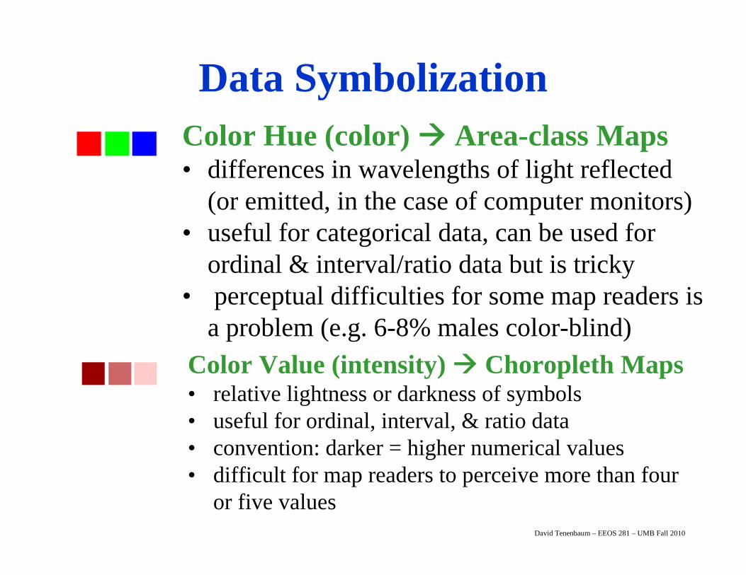
Color Hue (color) Area-class Maps• differences in wavelengths of light reflected
(or emitted, in the case of computer monitors)• useful for categorical data, can be used for
ordinal & interval/ratio data but is tricky • perceptual difficulties for some map readers is
a problem (e.g. 6-8% males color-blind)Color Value (intensity) Choropleth Maps• relative lightness or darkness of symbols• useful for ordinal, interval, & ratio data• convention: darker = higher numerical values• difficult for map readers to perceive more than four
or five values
Data Symbolization

David Tenenbaum – EEOS 281 – UMB Fall 2010
- Represent continuous areas of attribute data
Some examples of such data include:
• landuse
• vegetation
• climate zones
-Boundaries determined by variation of the attribute being mapped
Area-class Maps

David Tenenbaum – EEOS 281 – UMB Fall 2010
- Represent continuous areas of attribute data
Some examples of such data include:
• landuse
• vegetation
• climate zones
-Boundaries determined by variation of the attribute being mapped
Area-class Maps

David Tenenbaum – EEOS 281 – UMB Fall 2010
- Use of reporting zones(areal units)
- Zones are independentof data
- Types of attributes:
• population density
• mortality rates
• average income
*** Absolute counts are not suitable (i.e. total population)
Per Capita Income for Connecticut Towns, 1998
Per Capita Income13,271 - 22,69522,696 - 29,23529,236 - 38,48138,482 - 53,84853,849 - 75,714
Choropleth Maps

David Tenenbaum – EEOS 281 – UMB Fall 2010
• Greek: choros (place) + plethos (filled)• These are used to map categorical and
quantitative data over defined areas– polygonal enumeration units
e.g. census tract, counties, watersheds, etc.• Data values are generally classified into ranges
– allow map reader to readily interpret the map• Polygons can produce misleading impressions
– area/size of polygon vs. quantity of thematic data value
Choropleth Maps

David Tenenbaum – EEOS 281 – UMB Fall 2010

David Tenenbaum – EEOS 281 – UMB Fall 2010
- Data is represented as dots
- Dots usually represent a certain quantity of something (1 dot = 100 persons)
- Dots do not necessarily represent exact locations of the data being represented
Dot Density Maps

David Tenenbaum – EEOS 281 – UMB Fall 2010
Dot Density Maps

David Tenenbaum – EEOS 281 – UMB Fall 2010
• Data values are classified into ranges for many thematic maps (especially choropleth) – This aids the reader’s interpretation of map
• Trade-off:– presenting the underlying data accurately
VS.– generalizing data using classes
• Goal is to meaningfully classify the data– group features with similar values– assign them the same symbol
• But how to meaningfully classify the data?
Classifying Thematic Data

David Tenenbaum – EEOS 281 – UMB Fall 2010
• How many classes should we use?– too few - obscures patterns– too many - confuses map reader
• difficult to recognize more than seven classes• How do we create the classes?
– assign classes manually: create meaningful classes, such as population above / below poverty level
– equal intervals: This ignores the data distribution, which can be misleading too!
Creating Classes

David Tenenbaum – EEOS 281 – UMB Fall 2010
Creating Classes•How do we create the classes (cont.)
–“natural” breaks based on data distribution: minimize within-class variation and maximize between-class variation
–quartiles: top 25%, 25% above middle, 25% below middle, bottom 25% (quintiles uses 20%)
–standard deviation: mean+1s, mean-1s, mean+2s, mean-2s, …

David Tenenbaum – EEOS 281 – UMB Fall 2010
The Effect of Classification• Four common ways to display continuous data in
ArcGIS (i.e. these are options in Symbolization):
– Equal Interval– Quantiles– Natural Breaks– Standard Deviation

David Tenenbaum – EEOS 281 – UMB Fall 2010
The Effect of Classification• Equal Interval
– Splits data into user-specified number of classes of equal width
– Each class has a different number of observations

David Tenenbaum – EEOS 281 – UMB Fall 2010
The Effect of Classification
• Quantiles– Data divided so that there are an equal number of
observations are in each class– Some classes can have quite narrow intervals

David Tenenbaum – EEOS 281 – UMB Fall 2010
The Effect of Classification
• Natural Breaks– Splits data into classes based on natural breaks
represented in the data histogram

David Tenenbaum – EEOS 281 – UMB Fall 2010
The Effect of Classification
• Standard Deviation– Splits data into classes that represent values close to the
mean and increments of standard deviations above and below the mean

David Tenenbaum – EEOS 281 – UMB Fall 2010
Natural BreaksNatural Breaks
QuantilesQuantiles
Equal IntervalEqual Interval
Standard DeviationStandard Deviation

David Tenenbaum – EEOS 281 – UMB Fall 2010

David Tenenbaum – EEOS 281 – UMB Fall 2010

David Tenenbaum – EEOS 281 – UMB Fall 2010
• Two types of raster data sets:– Thematic rasters represent quantities like land
use or rainfall, can be further subdivided into:– Discrete thematic rasters coded values (cf. categorical
data, area-class maps, displayed ideally using unique values)– Continuous thematic rasters values that change
continuously (cf. interval or ratio data, choropleth maps, displayed using either classified methods or stretched)
– Image rasters from aerial photography and satellite imagery, pixels represent brightness (displayed using a stretched or RGB composite method)
Displaying Rasters

David Tenenbaum – EEOS 281 – UMB Fall 2010
Image Raster Display - Stretched
• Assume that the In and Out brightness values are equal• For a single band, the resultant color will be grayscale
• All three colors display the same value, so the colors are shades of gray
BVin
BVout
BVin
BVout
BVin
BVout
Band 1 Band 1 Band 1

David Tenenbaum – EEOS 281 – UMB Fall 2010
Band 1 - Blue
Band 3 - Red
Band 2 - Green
Band 4 - NIR
Image Raster Display - Stretched

David Tenenbaum – EEOS 281 – UMB Fall 2010
Band 5 - IR
Band 7 - FIR
Band 6 - TIR
Image Raster Display - Stretched

David Tenenbaum – EEOS 281 – UMB Fall 2010
Image Raster Display - Stretched• Contrast Enhancement - “stretching” all or part of the
input BVs from the image data to the full 0-255 screen output range for better visual performance (i.e. we maximize the contrast so we can see the differences better)

David Tenenbaum – EEOS 281 – UMB Fall 2010
Image Raster Display - Stretched• A linear stretch is one of the most common types of
contrast enhancement• The minimum BV is remapped to 0• The maximum BV is remapped to 255• E.g. given a certain band histogram:
0 255127
0 25560 108 158

David Tenenbaum – EEOS 281 – UMB Fall 2010
Image Raster Display - Stretched• Two types of linear stretches:
– The basic linear contrast stretch– A piecewise linear stretch
BVin
BVout
Output
255
255
0
Input
BVin
BVout
Stretched Output
Emphasizes middle “piece” of input range
255
255
0
Input
Linear Contrast Stretch Piecewise Linear Stretch

David Tenenbaum – EEOS 281 – UMB Fall 2010

David Tenenbaum – EEOS 281 – UMB Fall 2010
Image Raster Display – RGB Composite• For a multi-band image, the resultant color will depend on
which bands are assigned to which color guns
BVin
BVout
BVin
BVout
BVin
BVout
Red (3) Green (2) Blue (1)
BVin
BVout
BVin
BVout
BVin
BVout
Near Infrared (4) Red (3) Green (2)
True Color Composite
(321)
False Color Composite
(432)

David Tenenbaum – EEOS 281 – UMB Fall 2010
1. We put the digital numbers into the color guns of computer display so that the level of intensity for the color corresponds to the size of the number (i.e. brightness values are equal)
2. If we put the same digital numbers into all three color guns on a computer, we will get a black and whitepicture. We call this an image
3. If we put the digital number for red light in red gun, and the digital numbers for blue light in blue gun, and the digital numbers for green light in green gun, we will have a true color image. Otherwise mappings we call false color images (all are RGB composites)
Image Raster Display – RGB Composite

David Tenenbaum – EEOS 281 – UMB Fall 2010
red + green = yellowgreen + blue = cyanred + blue = magenta
Color Arithmetic
R B G

David Tenenbaum – EEOS 281 – UMB Fall 2010
321 432
543
Image Raster Display – RGB Composite

David Tenenbaum – EEOS 281 – UMB Fall 2010
True-Color 321 Image
No stretch applied
True-Color 321 Image
Linear Contrast Stretch

David Tenenbaum – EEOS 281 – UMB Fall 2010
Next Topic:Coordinate Systems