chapter 14: statistics introductory question: on the most recent chemistry test, mrs. jones’ class...
TRANSCRIPT

Chapter 14: StatisticsIntroductory Question: On the most recent Chemistry Test, Mrs. Jones’ class had the following scores: 81, 45, 67, 88, 72, 97, 59, 82, 67, 86.
How many students scored above the class average for this Test?
What are the maximum and minimum scores?
What are the mode and median?

Statistics
Statistics: The mathematics of the collection, organization, and interpretation of numerical data, especially the analysis of population characteristics by inference from sampling.

Characteristics of the Mean
The arithmetic mean is the most widely used measure of location.
It is calculated by summing the values and dividing by the number of values (the average).

Sample Mean
The sample mean is the sum of all the sample values divided by the number of sample values:
Where n is the total number of values in the sample.
n
XX

EXAMPLE
A sample of five executives received the following bonus last year ($000):
14.0, 15.0, 17.0, 16.0, 15.0What is the mean for this data?
4.155
77
5
0.15...0.14
n
XX

The MedianThe Median is the midpoint of the values
after they have been ordered from the smallest to the largest.
There are as many values above the median as below it in the data array. For an even set of values, the median will be the arithmetic average of the two middle numbers.

EXAMPLE
The ages for a sample of five college students are:
21, 25, 19, 20, 22Arranging the data in ascending order gives: 19, 20, 21, 22, 25. Thus the median is 21.

Example
The heights of four basketball players, in inches, are:
76, 73, 80, 75
Arranging the data in ascending order gives: 73, 75, 76, 80. Thus the median is 75.5, found by (75+76)/2.

The ModeThe mode is the value of the observation that
appears most frequently.
EXAMPLE 6: The exam scores for ten students are: 81, 93, 84, 75, 68, 87, 81, 75, 81, 87. Because the score of 81 occurs the most often, it is the mode.

Stem-and-leaf DisplaysStem-and-leaf display: A statistical technique for displaying a set of data. Each numerical value is divided into two parts: the leading digits become the stem and the trailing digits the leaf.

EXAMPLE Colin achieved the following scores on his twelve Accounting quizzes this semester: 86, 79, 92, 84, 69, 88,
91, 83, 96, 78, 82, 85. Construct a stem-and-leaf chart.

stem leaf
6 9
7 8 9
8 2 3 4 5 6 8
9 1 2 6
Example continued

EXAMPLE The top ten rushers in the NFL this past season had the following number of total rushes for the season: 360, 335, 330, 290, 323, 282, 307, 300, 305, 372 Construct a stem-and-leaf chart.

Percentiles and QuartilesThe Percentile gives us the location, or ranking, of a
data point in relation to the data set. Example: the 9th percentile is the value that is above
exactly 9% of all the data points.A special percentile is the Quartile. The first quartile, Q1, is the value that is above one
quarter, or 25% of the data values.The third quartile, Q3, is the value that is above three
quarters, or 75% of the data values.

Location of a Percentile
100)1(
PnLp
To find the location of the percentile, p, in a data set containing n data points, first order the data from smallest to largest. Then, to find the location in the ordered set, use the following formulas.
If the location falls between two data points, you will find a value between those data points.

EXAMPLEFind the 18th percentile for the following data set: 30, 32, 37, 39, 41, 43, 44, 46, 48, 48, 53
In this problem, n = 11. Therefore the location of the 18th percentile is
16.2100
18)111( pL
and is between the 2nd and 3rd data points. With a difference of 5, the 18th percentile is 32 + .16*5 or
p18 = 32.80

EXAMPLE (cont)Find the first quartile for the following data set: 30, 32, 37, 39, 41, 43, 44, 46, 48, 48, 53
To find the first quartile, we need to find the 25 th percentile. It’s location is
3100
25)111( pL
Which is the 3rd data point, or Q1 = 37

Quartiles The first quartile, Q1, is essentially the median for
the first half of the data.The third quartile, Q3, is essentially the median for
the second half of the data.

RangeThe range is the difference between the largest and the smallest value.
Only two values are used in its calculation. To calculate, range = maximum-minimum

Interquartile Range
The Interquartile range is the distance between the third quartile Q3 and the first quartile Q1.
This distance will include the middle 50 percent of the observations.
Interquartile range = Q3 - Q1

ExampleGiven the following set of data:
52, 26, 33, 40, 35, 29, 26, 37, 28
What is the median, Q1, and Q3?Arranging the data in ascending order gives: 26, 26, 28, 29, 33, 35, 37, 40, 52. Thus the median is 33, Q1 is 27, and Q3 is 38.5
What is the inter-quartile range?Q3 - Q1 = 38.5 – 27 = 11.5

EXAMPLE
For a set of observations the third quartile is 24 and the first quartile is 10. What is the interquartile range?
The interquartile range is 24 - 10 = 14. Fifty percent of the observations will occur between 10 and 24.

Box PlotsA box plot is a graphical display, based on quartiles, that helps to picture a set of data.Five pieces of data are needed to construct a box plot: the Minimum Value, the First Quartile, the Median, the Third Quartile, and the Maximum Value.

min Q1 median Q3 max
12 14 16 18 20 22 24 26 28 30 32
EXAMPLE

Box PlotsA box plot sometimes includes an outlier.
An outlier is an extreme value that are more than 1.5 times the interquartile range beyond the upper or lower quartiles.If an outlier exists, it is marked by a single point, and each whisker is extended to the last value of the data that is not an outlier.
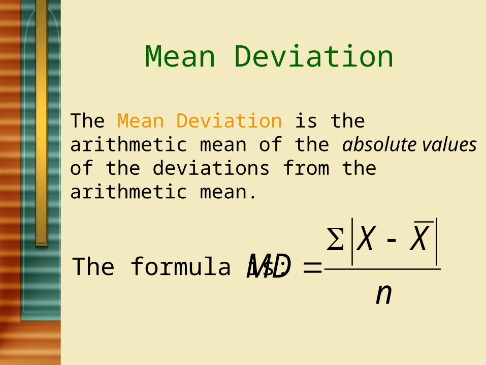
Mean Deviation
The Mean Deviation is the arithmetic mean of the absolute values of the deviations from the arithmetic mean.
The formula is:n
XXMD

EXAMPLE
The weights of a sample of crates containing books for the bookstore (in pounds ) are:
103, 97, 101, 106, 103Find the mean deviation.

Example (cont)
To find the mean deviation, first find the mean weight.
1025
510
n
XX

Example (cont)
The mean deviation is:
4.25
141515
102103...102103
n
XXMD

Variance
The variance is the arithmetic mean of the squared deviations from the mean.
The formula for the variance is:
N
XX 22 )(
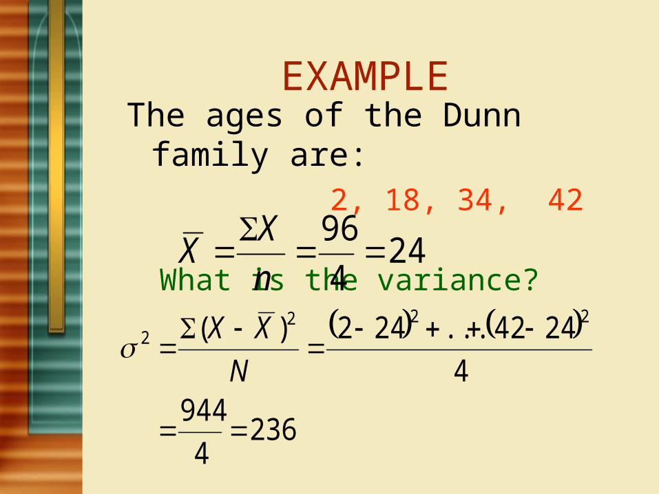
EXAMPLEThe ages of the Dunn family are:
2, 18, 34, 42 What is the variance?
244
96
n
XX
2364
9444
2442...242)( 2222
N
XX

The Standard Deviation
The standard deviation σ is the square root of the variance.
For the previous example, the standard deviation is 15.36, found by
36.152362
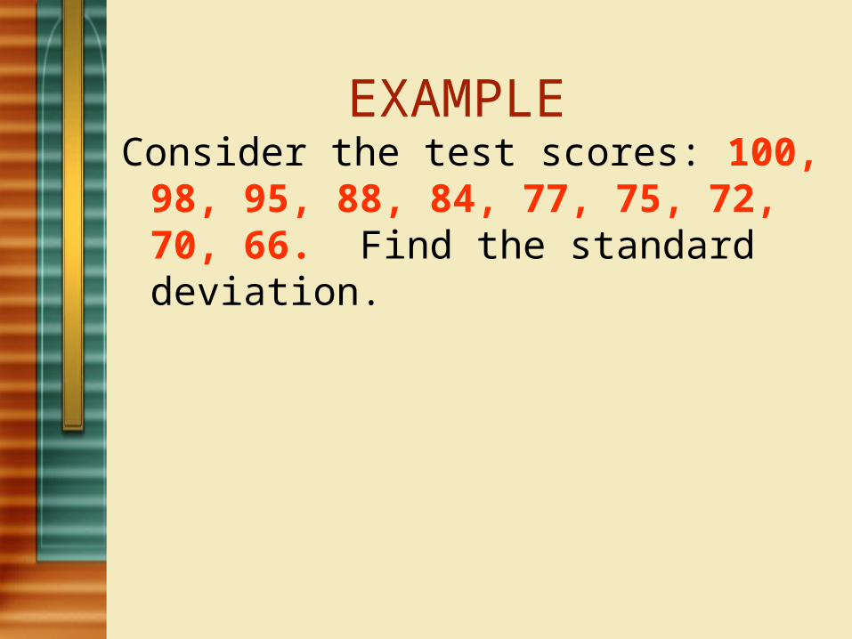
EXAMPLE Consider the test scores: 100, 98, 95, 88, 84,
77, 75, 72, 70, 66. Find the standard deviation.

EXAMPLE Consider the test scores: 100, 98, 95, 88, 84,
77, 75, 72, 70, 66. Find the standard deviation. Create a Chart (see below)
X XX 2)( XX

EXAMPLE Consider the test scores: 100, 98, 95, 88, 84, 77,
75, 72, 70, 66. How many scores were within 1 standard deviation from the mean? How many were within 2 standard deviations?
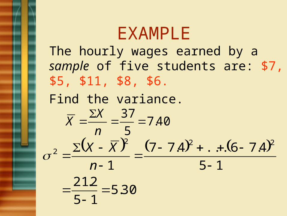
EXAMPLE The hourly wages earned by a sample of five students are: $7, $5, $11, $8, $6. Find the variance.
40.75
37
n
XX
30.515
2.2115
4.76...4.77
1
2222
n
XX

Frequency Distribution
A Frequency distribution is a grouping of data into mutually exclusive categories showing the number of observations in each class.

Frequency Distribution
Class frequency: The number of observations in each class. Class interval: The class interval is obtained by subtracting the lower limit of a class from the lower limit of the next class.
Number of Classes: Should use at least k classes, where 2k > n ( the number of data points).
(This is the 2k rule)
Class Mark: The midpoint of a class interval.

Suggestions on Constructing a Frequency Distribution
The class intervals used in the frequency distribution should be equal.
classes ofNumber
ue)Lowest val - lueHighest va(i
Determine a suggested class interval by using the formula:
Note: this is a suggested class interval; if the computed class interval is ’97’, it may be better to use ‘100’.
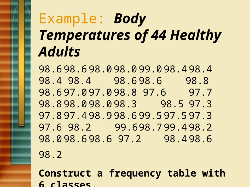
Example: Body Temperatures of 44 Healthy Adults98.6 98.6 98.0 98.0 99.0 98.4 98.4 98.4 98.4 98.6 98.6 98.8 98.6 97.0 97.0 98.8 97.6 97.7 98.8 98.0 98.0 98.3 98.5 97.3 97.8 97.4 98.9 98.6 99.5 97.5 97.3 97.6 98.2 99.6 98.7 99.4 98.2 98.0 98.6 98.6
97.2 98.4 98.6 98.2 Construct a frequency table with 6 classes.

EXAMPLE 1Dr. Tillman is Dean of the School of Business at Hampton University. He wishes to prepare a report showing the number of hours per week students spend studying. He selects a random sample of 30 students and determines the number of hours each student studied last week.
15.0, 23.7, 19.7, 15.4, 18.3, 23.0, 14.2, 20.8, 13.5, 20.7, 17.4, 18.6, 12.9, 20.3, 13.7, 21.4, 18.3, 29.8, 17.1, 18.9, 10.3, 26.1, 15.7, 14.0, 17.8, 33.8, 23.2, 12.9, 27.1, 16.6.Organize the data into a frequency distribution.

Example 1 continued
Two raised to the fifth power is 32.Therefore, we should have at least 5 classes. It turns out we will use 6 classes.
The range is 23.5 hours, (found by 33.8 hours – 10.3 hours).We choose an interval of 5 hours.
The lower limit of the first class is 7.5 hours.
There are 30 observations

Hours studying Frequency, f 7.5 up to 12.5 1 12.5 up to 17.5 12 17.5 up to 22.5 10 22.5 up to 27.5 5 27.5 up to 32.5 1
32.5 up to 37.5 1
Hours studying Frequency, f 7.5 up to 12.5 12.5 up to 17.5 17.5 up to 22.5 22.5 up to 27.5 27.5 up to 32.5
32.5 up to 37.5
EXAMPLE 1 continued

Relative Frequency Distributions
A relative frequency distribution shows the percent of observations in each class.

Example 1Hours f Relative
Frequency 7.5 up to 12.5 1 1/30=.0333
12.5 up to 17.5 12 12/30=.400
17.5 up to 22.5 10 10/30=.333
22.5 up to 27.5 5 5/30=.1667
27.5 up to 32.5 1 1/30=.0333
32.5 up to 37.5 1 1/30=.0333 TOTAL 30 30/30=1

Graphic Presentation of a Frequency Distribution
A Histogram is a graph in which the classes are marked on the horizontal axis and the class frequencies on the vertical axis. The class frequencies are represented by the heights of the bars and the bars are drawn adjacent to each other.
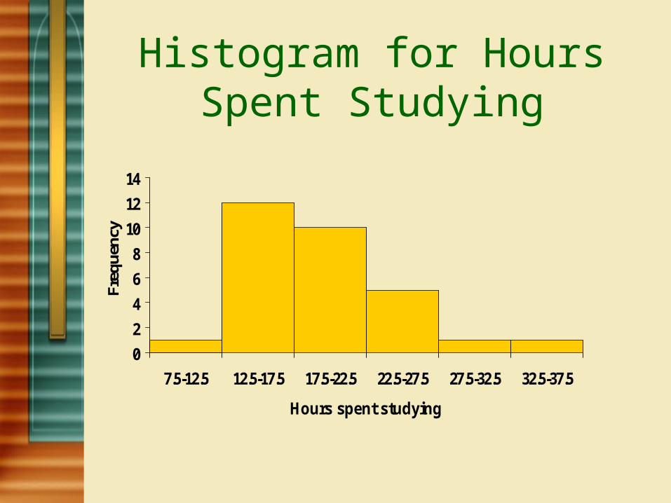
Histogram for Hours Spent Studying
0
2
4
6
8
10
12
14
7.5-12.5 12.5-17.5 17.5-22.5 22.5-27.5 27.5-32.5 32.5-37.5
Hours spent studying
Freq
uenc
y

Normal DistributionNormal Distributions are really a
family of frequency distributions that have the same general “Bell”shape when shown graphically. They are symmetric with scores more concentrated in the middle than in the tails.
A Normal Distribution often occurs when there is a large data set.

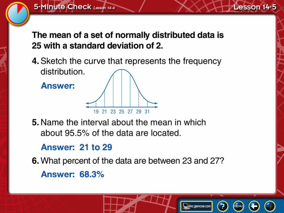
Normal DistributionNormal Distributions have the following properties:1. The maximum point of the curve is the MEAN.2. About 68.3% of the data are within 1 standard
deviation from the mean3. About 95.5% of the data are within 2 standard
deviations from the mean.4. About 99.7% of the data are within 3 standard
deviations from the mean

Lesson Overview 14-4B

Normal Distribution Example: A data set of 250 values has a normal
distribution. The mean of the data is 45 and the standard deviation is 3.
a) What percent of the data is in the range 39 to 51?
b) What is the range of data that includes 68.3% of the data?

Normal Distribution Example: A data set of 250 values has a normal
distribution. The mean of the data is 45 and the standard deviation is 3.
c) Find the probability that a value selected at random will be within the limits 36 to 54.

Normal Distribution Example: A data set of 250 values has a normal
distribution. The mean of the data is 45 and the standard deviation is 3.
d) Find the probability that a value selected at random will be less than 48.
e) Find the probability that the value selected will be greater than 48.

Normal Distribution Example: A data set of 250 values has a normal
distribution. The mean of the data is 45 and the standard deviation is 3.
f) Find the probability that the score is between 33 and 48.

Normal Distribution Example: A sample of 600 young people are
weighed at a clinic. If 100 pounds is the average weight, and the weights are normally distributed, determine how many young people are within 1 standard deviation from the mean.
How many are within 2 standard deviations?

Normal Distribution Example: A company manufactures light bulbs
that have a life expectancy that is normally distributed with a mean of 750 hours and a standard deviation of 40 hours. Find the probability that a bulb burns between 728 and 784 hours.

Normal Distribution Example: On a SAT exam, the mean math score
was 475 with a standard deviation of 130. If a scholarship is available to students with scores above the 85th percentile, what is the score needed to be eligible for the scholarship?

Normal Distribution Example: The heights of a group of students are
taken, and the mean is 52 inches with a standard deviation of 2.5 inches. Assuming the heights are normally distributed, what is the probability that a student selected at random will have a height less than 50 inches?

5-Minute Check Lesson 14-5A
5-Minute Check Lesson 14-5B

Scatter Plots Comparing two variables (like time vs distance)
involves bivariate statistics.A “picture” or graph of the data can be shown by a
scatterplot.Label the axes and plot the points, just like the
rectangular coordinate system (but do NOT connect the dots-that is why it is called a ‘scatter’ plot; it gives you an indication of the relationship that exists between the two sets of variables)

Linear RegressionSome data is related linearly; i.e. the scatterplot of
the data most closely resembles a line. Not all data is linear in nature, but we can run a linear regression on the data to see if a linear equation could be used for a given situation.
If data is linear, then the equation should be of the form:
y = mx + b (where m is the slope and b is the y-intercept)

Linear Regression We will use the graphing calculator to run the
regression. First, we must type in the data for each variable set, storing them in L1 and L2. Next, we use the ‘Stats’ button and choose ‘linreg’.
The closer the ‘r’ value (known as the correlation coefficient) is to 1, the more appropriate a linear equation would be to relate the two sets of data. Notice that the calculator actually tells what the best linear equation would be to use for the data.

Example Example: Scientists have monitored the number of
chirps per minute made by crickets and the corresponding temperature.
# of chirps/min136 165 98 110 150 210 84 158 221 178Temp in F 72 84 68 75 80 94 60 75 92 89Make a scatter plot of the data using appropriate scales
for the x and y axes.

Example (continued)-Find the "line of best fit" for the data and draw
that line.-Pick two points of your line (not necessarily of the
data points) and write the equation of the line.-What does the slope indicate? What does the y-
intercept represent?-Predict - if a cricket chirps 90 times/min, what is
the temperature?-If the temperature is 78, how many times will the
cricket chirp?

Example (continued)Now, we will run the Linear Regression on the
calculator and record the values of a, b, and r, where y = ax + b, and r represents the correlation coefficient
a: b: r: How close does your equation match the one that
the calculator came up with?

Other Regressions If your scatterplot does not suggest a linear
relationship, there are other types of regressions you can run.
Expreg (if the relationship is exponential)Powreg (if the relationship is a polynomial
function)Lnreg (if the relationship is logarithmic)

Example Example: Year vs. Cost of Postage Stamps Year 1919 1932 1958 1963 1968 1971 1974 1978 1981 1983 1988 1991 Cost of 2 3 4 5 6 8 10 15 18 22 25 29 Stamps
Make a scatter plot of the data using appropriate scales for the x and y axes. Then run the 4 regressions we mentioned to determine which type of equation would correlate most to the given data.

Example Example: Year vs. Cost of Postage Stamps Year 1919 1932 1958 1963 1968 1971 1974 1978 1981 1983 1988
1991
Cost of 2 3 4 5 6 8 10 15 18 22 25 29
Stamps
Based on the Regression equation you came up with, calculate the price of a postage stamp in the current year. Does that match up with what a postage stamp actually costs?

Bell -Shaped Curve showing the relationship between and .
Mean of the Data in a Frequency Distribution
First, find the class marks for each class in the distribution.
Next, for each class mark, multiply it by its corresponding frequency.
Then, take each of these products and add them together.
Finally, take that sum and divide by the total number of frequencies the distribution has.

Standard Deviation of the Data in a Frequency Distribution
First, find the class marks for each class in the distribution.Next, find the mean for the distribution (see previous information).Next, take each class mark and subtract the mean from it.Next, take those results and square them.Next, take those numbers and multiply them by their corresponding
frequencies.Next, take those values and add them together.Finally, take that sum and divide it by the total number of frequencies
you have, then take the square root.