chapter 1.4 introduction to color
TRANSCRIPT

PART 1
FUNDAMENTALS
Chapter 1.4 Color
Gateways to Art: Understanding the Visual Arts, Debra J. DeWitte, Ralph M. Larmann, M. Kathryn Shields
Introduction to Color
Color attracts our attention and conveys emotions
Our perceptions of color are personal and subjective-everyone
perceives color differently WITH Cultural aspects, too.
Use of color in art has “rules” yet those rules are used and
challenged, making it magical/powerful in unpredictable ways
“Artists’ color” is the name for the basic theory about color
based on the three primary colors (red, yellow, blue)

PART 1
FUNDAMENTALS
Chapter 1.4 Color
Gateways to Art: Understanding the Visual Arts, Debra J. DeWitte, Ralph M. Larmann, M. Kathryn Shields
Light and Color
The primary colors cannot be mixed from any other
two colors-red blue yellow
Secondary colors are colors that can be mixed from two primary
colors
Colors of light and colors of pigment behave differently as in
when mixing paint versus mixing light on screen
Color Theory

PART 1
FUNDAMENTALS
Chapter 1.4 Color
Gateways to Art: Understanding the Visual Arts, Debra J. DeWitte, Ralph M. Larmann, M. Kathryn Shields
Traditional color wheel (red, yellow, blue primaries)

PART 1
FUNDAMENTALS
Chapter 1.4 Color
Gateways to Art: Understanding the Visual Arts, Debra J. DeWitte, Ralph M. Larmann, M. Kathryn Shields
Dimensions of Color: Hue
Hues are the basic colors of the spectrum-pure color
Red, orange, yellow, green, blue, and violet are hues

André Derain, The Turning Road, L’Estaque, 1906. Oil on canvas, 4’3” x 6’4¾”. Museum of Fine Arts, Houston, Texas

PART 1
FUNDAMENTALS
Chapter 1.4 Color
Gateways to Art: Understanding the Visual Arts, Debra J. DeWitte, Ralph M. Larmann, M. Kathryn Shields
André Derain, The Turning Road, L’Estaque

Barnett Newman, Vir Heroicus Sublimis, 1950–1. Oil on canvas, 7’11⅜” x 17’8¼”. MOMA, New York

PART 1
FUNDAMENTALS
Chapter 1.4 Color
Gateways to Art: Understanding the Visual Arts, Debra J. DeWitte, Ralph M. Larmann, M. Kathryn Shields
Barnett Newman, Vir Heroicus Sublimis
Relies on value and saturation of color for its visual
impact
Alternating colors of the narrow vertical lines break
up a broad red plane
Subtle variations in the saturation of the red tones
create the sensation that parts of the painting are
separately lit
Newman wants viewers to stand close to the canvas,
engulfed by color-8’ x 18’
What are your thoughts on this piece?

PART 1
FUNDAMENTALS
Chapter 1.4 Color
Gateways to Art: Understanding the Visual Arts, Debra J. DeWitte, Ralph M. Larmann, M. Kathryn Shields
Each hue has a value, meaning its relative lightness or darkness
compared to another hue so pure purple has a darker value
compared to pure yellow
Different colors of the same hue vary in terms of their value
There are light reds and dark reds
Tints are colors that are lighter than their basic hue
Shades are colors that are darker
Dimensions of Color: Value

PART 1
FUNDAMENTALS
Chapter 1.4 Color
Gateways to Art: Understanding the Visual Arts, Debra J. DeWitte, Ralph M. Larmann, M. Kathryn Shields
Color–value relationships
Notice how “tonal” the colors are

Mark Tansey, Picasso and Braque, 1992. Oil on canvas, 5’4” x 7’

PART 1
FUNDAMENTALS
Chapter 1.4 Color
Gateways to Art: Understanding the Visual Arts, Debra J. DeWitte, Ralph M. Larmann, M. Kathryn Shields
Mark Tansey, Picasso and Braque
A work that uses only one hue is called monochromatic
An artist can give variety to such a work by using a range
of values
In Picasso and Braque, Tansey depicts two figures, whom
he refers to as “Orville and Wilbur” (Wright)
He is referring to Pablo Picasso and Georges Braque’s
habit of referring to each other as Orville and Wilbur
The monochromatic palette is reminiscent of the black-and-
white photos of the Wright Brothers’ experiments with flight

PART 1
FUNDAMENTALS
Chapter 1.4 Color
Gateways to Art: Understanding the Visual Arts, Debra J. DeWitte, Ralph M. Larmann, M. Kathryn Shields
Color Schemes
The color wheel displays important color relationships
Complementary colors contrast strongly with each other;
they work together and fight each other as well-
”frenemies”
Analogous colors do not contrast strongly with each other;
yet they can work easy and harmoniously together-almost
to the point of ennui - boredom

PART 1
FUNDAMENTALS
Chapter 1.4 Color
Gateways to Art: Understanding the Visual Arts, Debra J. DeWitte, Ralph M. Larmann, M. Kathryn Shields
Complementary Color
When two complementary colors are painted side by side, these
“opposite” colors create visual anomalies
They intensify one another
Each seems more saturated As they have vastly different wavelengths, an illusion (in the photoreceptors
of the eye) is created of vibrating movement along adjacent edges
of the two complementary colors

Frederic Edwin Church, Twilight in the Wilderness,1860. Oil on canvas, 40 x 64”. Cleveland Museum of Art, Ohio

PART 1
FUNDAMENTALS
Chapter 1.4 Color
Gateways to Art: Understanding the Visual Arts, Debra J. DeWitte, Ralph M. Larmann, M. Kathryn Shields
Frederic Edwin Church, Twilight in the Wilderness
Used complementary colors for dramatic effect
The intense red-orange clouds complement swathes
of the blue-green evening sky
The powerful color of the sky and its reflection in the
water below reveal Church’s awe and respect for the
American landscape

PART 1
FUNDAMENTALS
Chapter 1.4 Color
Gateways to Art: Understanding the Visual Arts, Debra J. DeWitte, Ralph M. Larmann, M. Kathryn Shields
Analogous Color
Analogous colors are similar in wavelength
Painters use analogous color to create color unity
and harmonies
By keeping the color within a similar range, artists avoid
jarring, contrasting combinations of colors and moods

Mary Cassatt, The Boating Party, 1893–4. Oil on canvas, 35⅜ x 46⅛”. National Gallery of Art, Washington, D.C.

PART 1
FUNDAMENTALS
Chapter 1.4 Color
Gateways to Art: Understanding the Visual Arts, Debra J. DeWitte, Ralph M. Larmann, M. Kathryn Shields
Mary Cassatt, The Boating Party

PART 1
FUNDAMENTALS
PowerPoints developed by CreativeMyndz Multimedia Studios
Chapter 1.4 Color
What comparisons do you see between this and the Cassatt?

PART 1
FUNDAMENTALS
Chapter 1.4 Color
Gateways to Art: Understanding the Visual Arts, Debra J. DeWitte, Ralph M. Larmann, M. Kathryn Shields
Our Perceptions of Color
Our experiences of color are sometimes evocative
or physical
Some colors are associated with emotional states
Blue is also associated with cold, and red with hot:
an association known as
Because of color saturation, our eyes cannot fully
comprehend all the colors we see, so our brain
translates (or distorts) the incoming information
This is the basis of an illusion known as optical color

Notice these colors and how they affect each other
An artist must consider this as well

PART 1
FUNDAMENTALS
Chapter 1.4 Color
Gateways to Art: Understanding the Visual Arts, Debra J. DeWitte, Ralph M. Larmann, M. Kathryn Shields
Color Temperature
We associate color with temperature because of our
previous experiences-the sun is yellow, water blue-These
stereotypes are perceived worldwide
Artists use such associations to communicate physical
and emotional states
Color temperature is relative to the other colors nearby-
meaning it is enhanced and influenced by a comparison
Our perception of the temperature of a color can be
altered if it is placed next to an analogous color


PART 1
FUNDAMENTALS
Chapter 1.4 Color
Gateways to Art: Understanding the Visual Arts, Debra J. DeWitte, Ralph M. Larmann, M. Kathryn Shields
Optical Color
Two squares, one filled with red and blue dots and the other with
red and yellow dots to create optical color mixing effect
Colors our minds create based on information we perceive

Georges Seurat,
The Circus, 1890–91.
Oil on canvas, 6’⅞” x
4’11⅞”. Musée d’Orsay,
Paris, France

—devised by
Seurat—is the use of such small
dots of color to produce optical
color mixtures
Because these dots are so
close together, the colors we
see are different from the
actual colors of the dots
Optical mixing
makes the colors more intense
because they have retained
their individual saturation

PART 1
FUNDAMENTALS
Chapter 1.4 Color
Gateways to Art: Understanding the Visual Arts, Debra J. DeWitte, Ralph M. Larmann, M. Kathryn Shields
Color in Design and Print
Artists who design images for commercial printing or to
display on video screens take a different approach to color
Most printed color images rely on four separate colors to
create the range of colors that we see
Commercial printers use the primary colors cyan,
magenta, and yellow, together with black
An image is scanned and separated into the four colors

PART 1
FUNDAMENTALS
Chapter 1.4 Color
Gateways to Art: Understanding the Visual Arts, Debra J. DeWitte, Ralph M. Larmann, M. Kathryn Shields
Color wheel for commercial printing inks

PART 1
FUNDAMENTALS
Chapter 1.4 Color
Gateways to Art: Understanding the Visual Arts, Debra J. DeWitte, Ralph M. Larmann, M. Kathryn Shields
Subtractive color
mixtures using CMY
primaries, CMYK
color separation,
and image with
exaggerated print
screen
Additive color mixtures
using RGB primaries
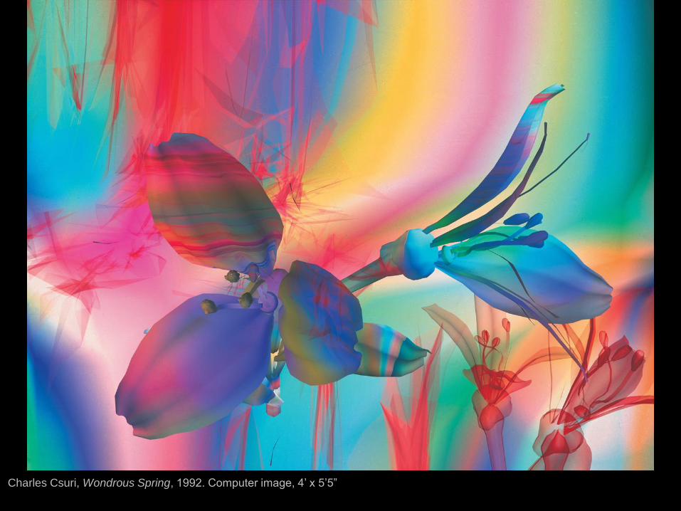
Charles Csuri, Wondrous Spring, 1992. Computer image, 4’ x 5’5”

PART 1
FUNDAMENTALS
Chapter 1.4 Color
Gateways to Art: Understanding the Visual Arts, Debra J. DeWitte, Ralph M. Larmann, M. Kathryn Shields
Charles Csuri, Wondrous Spring
The digital artist Charles Csuri has been creating imagery on
computers since 1963
In Wondrous Spring, the RGB primaries create a dazzling
illuminated array of colors, reminiscent of a modern-day
stained-glass window
Csuri has explored and helped develop the digital realm as a
viable art medium-What are your thoughts? When does the
machine begin to take over ?

PART 1
FUNDAMENTALS
Chapter 1.4 Color
Gateways to Art: Understanding the Visual Arts, Debra J. DeWitte, Ralph M. Larmann, M. Kathryn Shields
Psychological and Expressive Aspects of Color
There do appear to be some universal psychological
associations to particular colors—for example, red may
provoke feelings of passion or anger
Important element in designing living and public space
Artists sometimes want a viewer of a work to “feel” an
artwork, rather than merely to understand it
Color can express a wide range of emotions
Artists can use color to engage the viewer

Vincent van Gogh, The Night Café, 1888. Oil on canvas, 28½ x 36¼”. Yale University Art Gallery, New Haven, Connecticut

PART 1
FUNDAMENTALS
Chapter 1.4 Color
Gateways to Art: Understanding the Visual Arts, Debra J. DeWitte, Ralph M. Larmann, M. Kathryn Shields
Vincent van Gogh, The Night Café
Van Gogh was greatly affected by color, and studied its
psychological effects
The colors in the painting The Night Café were carefully chosen to
elicit emotional responses from viewers
“I have tried to express with red and green the terrible passions of
human nature.” (Van Gogh in a letter to his brother Theo)
The color intensifies the psychological implications of the scene in a
seedy nightspot in Arles, France

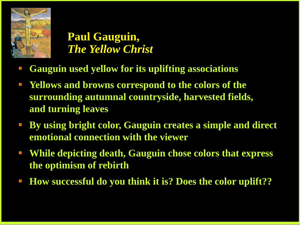
Paul Gauguin, The Yellow
Christ, 1889. Oil on canvas,
36¼ x 27⅞”. Albright-Knox Art
Gallery, Buffalo, New York
PART 1
FUNDAMENTALS
Chapter 1.4 Color
Gateways to Art: Understanding the Visual Arts, Debra J. DeWitte, Ralph M. Larmann, M. Kathryn Shields
Paul Gauguin, The Yellow Christ
Gauguin used yellow for its uplifting associations
Yellows and browns correspond to the colors of the
surrounding autumnal countryside, harvested fields,
and turning leaves
By using bright color, Gauguin creates a simple and direct
emotional connection with the viewer
While depicting death, Gauguin chose colors that express
the optimism of rebirth
How successful do you think it is? Does the color uplift??

Picasso’s La Vie, 1903
From his “Blue Period”,
this scene has the man,
his lover confronted by his
wife and child. Supposedly
based the portrait of the
man on one of his friends,
who later committed
suicide when rejected by
his lover.