chapter 13. bitmaps - xamarin.azureedge.net · chapter 13. bitmaps the visual elements of a...
TRANSCRIPT

Creating Mobile Apps with Xamarin.Forms — 2nd Preview Edition — March 13, 2015
Chapter 13.
Bitmaps
The visual elements of a graphical user interface can be roughly divided between elements used for
presentation (such as text) and those capable of interaction with the user, such as buttons, sliders, and
list boxes.
Text is essential for presentation, but pictures are often just as important to supplement text and
convey crucial information. The web, for example, would be Inconceivable without pictures. These pic-
tures are often in the form of rectangular arrays of picture elements (or pixels) known as bitmaps.
Just as a view named Label displays text, a view named Image displays bitmaps. The bitmap for-
mats supported by iOS, Android, and Windows Phone are a little different, but if you stick to JPEG,
PNG, GIF, and BMP in your Xamarin.Forms applications, you’ll probably not experience any problems.
Image defines a Source property that you set to an object of type ImageSource, which references
the bitmap displayed by Image. Bitmaps can come from a variety of sources, so the ImageSource class
defines four static creation methods that return an ImageSource object:
ImageSource.FromUri for accessing a bitmap over the web.
ImageSource.FromResource for a bitmap stored as an embedded resource in the application
PCL.
ImageSource.FromFile for a bitmap stored as content in an individual platform project.
ImageSource.FromStream for loading a bitmap using a .NET Stream object.
ImageSource also has three descendant classes named UriImageSource, FileImageSource, and
StreamImageSource that you can use instead of the first three static creation methods. Generally, the
static methods are easier to use in code, but the descendant classes are sometimes required in XAML
Generally, you’ll use the ImageSource.FromUri and ImageSource.FromResource methods to
obtain platform-independent bitmaps for presentation purposes, and ImageSource.FromFile for
platform-specific bitmaps in user-interface objects. Small bitmaps play a crucial role in MenuItem and
ToolbarItem objects, and you can also add a bitmap to a Button.
This chapter begins with the use of platform-independent bitmaps obtained from the Im-
ageSource.FromUri and ImageSource.FromResource methods, and then explores some uses of
the ImageSource.FromStream method. The chapter concludes with the use of Im-
ageSource.FromFile to obtain platform-specific bitmaps for toolbars and buttons.

Chapter 13. Bitmaps Page 266
Creating Mobile Apps with Xamarin.Forms — 2nd Preview Edition — March 13, 2015
Platform-Independent Bitmaps
Here’s a code-only program named WebBitmapCode with a page class that uses Im-
ageSource.FromUri to access a bitmap from the Xamarin website:
public class WebBitmapCodePage : ContentPage
{
public WebBitmapCodePage()
{
string uri = "http://developer.xamarin.com/demo/IMG_1415.JPG";
Content = new Image
{
Source = ImageSource.FromUri(new Uri(uri))
};
}
}
If the URI passed to ImageSource.FromUri does not point to a valid bitmap, no exception is raised.
Even this tiny program can be simplified. ImageSource defines an implicit conversion from string
or Uri to an ImageSource object, so you can set the string with the URI directly to the Source prop-
erty of Image:
public class WebBitmapCodePage : ContentPage
{
public WebBitmapCodePage()
{
Content = new Image
{
Source = "http://developer.xamarin.com/demo/IMG_1415.JPG"
};
}
}
Or, to make it more verbose, you can set the Source property of Image to a UriImageSource ob-
ject with its Uri property set to a Uri object:
public class WebBitmapCodePage : ContentPage
{
public WebBitmapCodePage()
{
Content = new Image
{
Source = new UriImageSource
{
Uri = new Uri("http://developer.xamarin.com/demo/IMG_1415.JPG")
}
};
}
}

Chapter 13. Bitmaps Page 267
Creating Mobile Apps with Xamarin.Forms — 2nd Preview Edition — March 13, 2015
The UriImageSource class might be preferred if you want to control the caching of web-based im-
ages. The class implements its own caching that uses the application’s private storage area available on
each platform. UriImageSource defines a CachingEnabled property that has a default value of
true, and a CachingValidity property of type TimeSpan that has a default value of one day. This
means that if the image is re-accessed within a day, the cached image is used. You can disable caching
entirely by setting CachingEnabled to false, or you can change the caching expiry time by setting
the CachingValidity property to another TimeSpan value.
Regardless which way you do it, by default the bitmap displayed by the Image view is stretched to
the size of its container—the ContentPage in this case—while respecting the bitmap’s aspect ratio:
This bitmap is square, so blank areas appear above and below the image. As you turn your phone or
emulator between portrait and landscape mode, a rendered bitmap can change size, and you’ll see
some blank space at the top and bottom, or the left and right, where the bitmap doesn’t reach. You
can color that area using the BackgroundColor property that Image inherits from VisualElement.
The bitmap referenced in the WebBitmapCode program is 4,096 pixels square, but a utility is in-
stalled on the Xamarin web site that lets you download a much smaller bitmap file by specifying the
URI like so:
Content = new Image
{
Source = "http://developer.xamarin.com/demo/IMG_1415.JPG?width=25"
};

Chapter 13. Bitmaps Page 268
Creating Mobile Apps with Xamarin.Forms — 2nd Preview Edition — March 13, 2015
Now the downloaded bitmap is 25 pixels square, but it is again stretched to the size of its container.
Each platform implements an interpolation algorithm in an attempt to smooth the pixels as the image
is expanded to fit the page:
However, if you now set HorizontalOptions and VerticalOptions on the Image to Cen-
ter—or put the Image element in a StackLayout—this 25-pixel bitmap collapses into a very tiny
image. This phenomenon is discussed in more detail later in this chapter.
You can also instantiate an Image element in XAML and load a bitmap from a URI by setting the
Source property directly to a web address. Here’s the XAML file from the WebBitmapXaml program:
<ContentPage xmlns="http://xamarin.com/schemas/2014/forms"
xmlns:x="http://schemas.microsoft.com/winfx/2009/xaml"
x:Class="WebBitmapXaml.WebBitmapXamlPage">
<Image Source="http://developer.xamarin.com/demo/IMG_3256.JPG" />
</ContentPage>
A more verbose approach involves explicitly instantiating a UriImageSource object and setting the
Uri property:
<Image>
<Image.Source>
<UriImageSource Uri="http://developer.xamarin.com/demo/IMG_3256.JPG" />
</Image.Source>
</Image>
Regardless, here’s how it looks on the screen:

Chapter 13. Bitmaps Page 269
Creating Mobile Apps with Xamarin.Forms — 2nd Preview Edition — March 13, 2015
Fit and Fill If you set the BackgroundColor property of Image on any of the previous code and XAML examples,
you’ll see that Image actually occupies the entire rectangular area of the page. Image defines an As-
pect property that controls how the bitmap is rendered within this rectangle. You set this property to
a member of the Aspect enumeration:
AspectFit — the default
Fill — stretches without preserving aspect ratio
AspectFill — preserves aspect ratio but crops the image
The default setting is the enumeration member Aspect.AspectFit, meaning that the bitmap fits
into its container’s boundaries while preserving the bitmap’s aspect ratio. As you’ve already seen, the
relationship between the bitmap’s dimensions and the container’s dimensions can result in background
areas at the top and bottom, or at the right and left.
Try this in the WebBitmapXaml project:
<Image Source="http://developer.xamarin.com/demo/IMG_3256.JPG"
Aspect="Fill" />
Now the bitmap is expanded to the dimensions of the page. This results in the picture being stretched
vertically so the car appears rather short and stocky:

Chapter 13. Bitmaps Page 270
Creating Mobile Apps with Xamarin.Forms — 2nd Preview Edition — March 13, 2015
If you turn the phone sideways, the image is stretched horizontally but the result isn’t quite as extreme
because the picture has a somewhat landscape aspect ratio to begin with.
The third option is AspectFill:
<Image Source="http://developer.xamarin.com/demo/IMG_3256.JPG"
Aspect="AspectFill" />
With this option the bitmap completely fills the container but at the same time maintains the bitmap’s
aspect ratio. The only way this is possible is by cropping part of the image, and you’ll see that the im-
age is indeed cropped on either the top and bottom, or the left and right, leaving only the central part
of the bitmap:

Chapter 13. Bitmaps Page 271
Creating Mobile Apps with Xamarin.Forms — 2nd Preview Edition — March 13, 2015
Embedded Resources Accessing bitmaps over the internet is convenient, but sometimes it’s not optimum. The process re-
quires an internet connection, an assurance that the bitmaps haven’t been moved, and some time for
downloading. For fast and guaranteed access to bitmaps, they can be bound right into the application.
If you need access to images that are not platform specific, you can include bitmaps as embedded
resources in the shared Portable Class Library project and access them with the Im-
ageSource.FromResource method. The ResourceBitmapCode solution demonstrates how to do it.
The ResourceBitmapCode PCL project within this solution has a folder named Images that con-
tains two bitmaps named ModernUserInterface.jpg (a very large bitmap) and ModernUserInter-
face256.jpg (the same picture but with a 256-pixel width).
When adding any type of embedded resource to a PCL project, make sure to set the Build Action
of the resource to EmbeddedResource. This is crucial.
In code, you set the Source property of an Image element to the ImageSource object returned
from the static ImageSource.FromResource method. This method requires the resource ID. The re-
source ID begins with the assembly name, followed by a period, and then the folder name, followed by
another period, and then the filename, which contains another period for the filename extension. For
this example, the resource ID for accessing the smaller of the two bitmaps in the ResourceBitmap-
Code program is:
ResourceBitmapCode.Images.ModernUserInterface256.jpg

Chapter 13. Bitmaps Page 272
Creating Mobile Apps with Xamarin.Forms — 2nd Preview Edition — March 13, 2015
The code in this program references that smaller bitmap and also sets the HorizontalOptions
and VerticalOptions on the Image element to Center:
public class ResourceBitmapCodePage : ContentPage
{
public ResourceBitmapCodePage()
{
Content = new Image
{
Source = ImageSource.FromResource(
"ResourceBitmapCode.Images.ModernUserInterface256.jpg"),
VerticalOptions = LayoutOptions.Center,
HorizontalOptions = LayoutOptions.Center
};
}
}
As you can see, the bitmap in this instance is not stretched to fill the page:
A bitmap is not stretched to fill its container if:
it is smaller than the container, and
the VerticalOptions and HorizontalOptions properties of the Image element are not set
to Fill, or if Image is a child of a StackLayout.
If you comment out the VerticalOptions and HorizontalOptions settings, or if you reference
the large bitmap (which does not have the “256” at the end of its filename), the image will again
stretch to fill the container.

Chapter 13. Bitmaps Page 273
Creating Mobile Apps with Xamarin.Forms — 2nd Preview Edition — March 13, 2015
When a bitmap is not stretched to fit its container, it must be displayed in a particular size. What is
that size?
On iOS and Android, the bitmap is displayed in its pixel size. In other words, the bitmap is rendered
with a one-to-one mapping between the pixels of the bitmap and the pixels of the video display. The
iPhone 6 used for these screenshots has a screen width of 750 pixels, and you can see that the
256-pixel width of the bitmap is about 1/3 that width. The Android phone here is a Nexus 5 which has
a pixel width of 1080, and the bitmap is about ¼ that width.
On Windows Phone, however, the bitmap is displayed in device-independent units, in this example,
256 device-independent units. The Nokia Lumia 925 used for these screenshots has a pixel width of
768, which is approximately the same as the iPhone 6. However, the screen width of this Windows
Phone in device-independent units is 480, and you can see that the rendered bitmap width is a little
more than half the screen width.
This discussion on sizing bitmaps continues in the next section.
How would you reference a bitmap stored as an embedded resource from XAML? Unfortunately,
there is no ResourceImageSource class. If there were, you would probably try instantiating that class
in XAML between Image.Source tags. But that’s not an option.
You might consider using x:FactoryMethod to call ImageSource.FromResource, but that won’t
work. As currently implemented, the ImageSource.FromResource method requires that the bitmap
resource be in the same assembly as the code that calls the method. When you use x:FactoryMethod
to call ImageSource.FromResource, the call is made from the Xamarin.Forms.Xaml assembly.
What will work is a very simple XAML markup extension. Here’s one in a project named
StackedBitmap:
namespace StackedBitmap
{
[ContentProperty ("Source")]
public class ImageResourceExtension : IMarkupExtension
{
public string Source { get; set; }
public object ProvideValue (IServiceProvider serviceProvider)
{
if (Source == null)
return null;
return ImageSource.FromResource(Source);
}
}
}
ImageResourceExtension has a single property named Source that you set to the resource ID. The
ProvideValue method simply calls ImageSource.FromResource with the Source property. As is
common for single-property markup extensions, Source is also the content property of the class. That

Chapter 13. Bitmaps Page 274
Creating Mobile Apps with Xamarin.Forms — 2nd Preview Edition — March 13, 2015
means that you don’t need to explicitly include “Source=” when you’re using the curly-braces syntax
for XAML markup extensions.
But watch out: You cannot move this ImageResourceExtension class to a toolkit library, such as
Xamarin.FormsBook.Toolkit. The class must be part of the same assembly that contains the embed-
ded resources you want to load, which is generally the application’s Portable Class Library.
Here’s the XAML file from the StackedBitmap project. An Image element shares a StackLayout
with two Label elements:
<ContentPage xmlns="http://xamarin.com/schemas/2014/forms"
xmlns:x="http://schemas.microsoft.com/winfx/2009/xaml"
xmlns:local="clr-namespace:StackedBitmap;assembly=StackedBitmap"
x:Class="StackedBitmap.StackedBitmapPage">
<StackLayout>
<Label Text="400 x 300 Pixel Bitmap"
FontSize="Large"
VerticalOptions="CenterAndExpand"
HorizontalOptions="Center" />
<Image Source="{local:ImageResource StackedBitmap.Images.Sculpture_400x300.jpg}"
BackgroundColor="Aqua"
SizeChanged="OnImageSizeChanged" />
<Label x:Name="label"
FontSize="Large"
VerticalOptions="CenterAndExpand"
HorizontalOptions="Center" />
</StackLayout>
</ContentPage>
The local prefix refers to the StackedBitmap namespace and StackedBitmap assembly. The
Source property of the Image element is set to the ImageResource markup extension, which refer-
ences a bitmap stored in the Images folder of the PCL project and flagged as an EmbeddedResource.
The bitmap is 400 pixels wide and 300 pixels high. The Image also has its BackgroundColor property
set; this will allow us to see the entire size of Image within the StackLayout.
The Image element has its SizeChanged event set to a handler in the code-behind file:
public partial class StackedBitmapPage : ContentPage
{
public StackedBitmapPage()
{
InitializeComponent();
}
void OnImageSizeChanged(object sender, EventArgs args)
{
Image image = (Image)sender;
label.Text = String.Format("Render size = {0:F0} x {1:F0}",
image.Width, image.Height);

Chapter 13. Bitmaps Page 275
Creating Mobile Apps with Xamarin.Forms — 2nd Preview Edition — March 13, 2015
}
}
The size of the Image element is constrained vertically by the StackLayout, so the bitmap is dis-
played in its pixel size (on iOS and Android) and device-independent units on Windows Phone. The
Label displays the size of the Image element in device-independent units, which differ on each plat-
form:
The width of the Image element displayed by the bottom Label includes the aqua background and
equals the width of the page in device-independent units. You can use Aspect settings of Fill or
AspectFill to make the bitmap fill that entire aqua area.
If you’d prefer that the bottom Label displays only the width of the rendered bitmap, you can set
the HorizontalOptions property of the Image to something other than the default value of Fill:
<Image Source="{local:ImageResource StackedBitmap.Images.Sculpture_400x300.jpg}"
HorizontalOptions="Center"
BackgroundColor="Aqua"
SizeChanged="OnImageSizeChanged" />
Now the size of the Image element is the same size as the rendered bitmap in device-independent
units. Settings of the Aspect property have no effect:

Chapter 13. Bitmaps Page 276
Creating Mobile Apps with Xamarin.Forms — 2nd Preview Edition — March 13, 2015
Let’s refer to this rendered Image size as its natural size because it is based on the size of the bit-
map being displayed.
The iPhone 6 has a pixel width of 750 pixels, but as you discovered when running the WhatSize
program in Chapter 5, applications perceive a screen width of 375. There are two pixels to the de-
vice-independent unit, so this 400-pixel bitmap is displayed with a width of 200 DIUs.
The Nexus 5 has a pixel width of 1080 but applications perceive a width of 360, so there are three
pixels to the device-independent unit, as the Image width of 133 DIUs confirms.
On both the iOS and Android devices, when a bitmap is displayed in its natural size, there is a
one-to-one mapping between the pixels of the bitmap and the pixels of the display. On Windows
Phone, however, that’s not the case. The Nokia Lumia 925 used for these screenshots has a pixel width
of 768 with 1.6 pixels to the device-independent unit so applications perceive a screen width of 480.
But the 400-by-300 pixel bitmap is displayed in a size of 400-by-300 device-independent units.
This inconsistency between Windows Phone and the other two platforms is actually beneficial when
you’re accessing bitmaps from the individual platform projects. As you’ll see, iOS and Android include a
feature that lets you supply different sizes of bitmaps for different device resolutions. In effect, this al-
lows you to specify bitmap size in device-independent units, which means that Windows Phone is con-
sistent with those schemes.
But when using platform-independent bitmaps, you’ll probably want to size the bitmaps consist-
ently on all three platforms, and that requires a deeper plunge into the subject.

Chapter 13. Bitmaps Page 277
Creating Mobile Apps with Xamarin.Forms — 2nd Preview Edition — March 13, 2015
More on Sizing So far, you’ve seen two ways to size Image elements:
If the Image element is not constrained in any way, it will fill its container while maintaining the
bitmap’s aspect ratio, or fill the area entirely if you set the Aspect property to Fill or AspectFill.
If the bitmap is less than the size of its container, and the Image is constrained horizontally or ver-
tically by setting HorizontalOptions or VerticalOptions to something other than Fill, or if the
Image is put in a StackLayout, the bitmap is displayed in its natural size. That’s the pixel size on iOS
and Android devices, but the size in device-independent units on Windows Phone.
You can also control size by setting WidthRequest or HeightRequest to an explicit dimension in
device-independent units. However, there are some restrictions.
The following discussion is based on experimentation with the StackedBitmap sample. It pertains
to Image elements that are vertically constrained by being a child of a vertical StackLayout or having
the VerticalOptions property set to something other than Fill. The same principles apply to an
Image element that is horizontally constrained.
If an Image element is vertically constrained, you can use WidthRequest to reduce the size of the
bitmap from its natural size, but you cannot use it to increase the size. For example, try setting
WidthRequest to 100:
<Image Source="{local:ImageResource StackedBitmap.Images.Sculpture_400x300.jpg}"
WidthRequest="100"
HorizontalOptions="Center"
BackgroundColor="Aqua"
SizeChanged="OnImageSizeChanged" />
The resultant height of the bitmap is governed by the specified width and the bitmap’s aspect ratio,
so now the Image is displayed with a size of 100-by-75 device-independent units on all three plat-
forms:

Chapter 13. Bitmaps Page 278
Creating Mobile Apps with Xamarin.Forms — 2nd Preview Edition — March 13, 2015
The HorizontalOptions setting of Center does not affect the size of the rendered bitmap. If you
remove that line, the Image element will be as wide as the screen (as the aqua background color will
demonstrate) but the bitmap will remain the same size.
You cannot use WidthRequest to increase the size of the rendered bitmap beyond its natural size.
For example, try setting WidthRequest to 1000:
<Image Source="{local:ImageResource StackedBitmap.Images.Sculpture_400x300.jpg}"
WidthRequest="1000"
HorizontalOptions="Center"
BackgroundColor="Aqua"
SizeChanged="OnImageSizeChanged" />
Even with HorizontalOptions set to Center, the resultant Image element is now wider than the
rendered bitmap, as indicated by the background color:

Chapter 13. Bitmaps Page 279
Creating Mobile Apps with Xamarin.Forms — 2nd Preview Edition — March 13, 2015
But the bitmap itself is displayed in its natural size. The vertical StackLayout is effectively preventing
the height of the rendered bitmap from exceeding its natural height.
To overcome that constraint of the vertical StackLayout, you need to set HeightRequest. How-
ever, you’ll also want to leave HorizontalOptions at its default value of Fill. Otherwise, the Hori-
zontalOptions setting will prevent the width of the rendered bitmap from exceeding its natural size.
Just as with WidthRequest, you can set HeightRequest to reduce the size of the rendered bit-
map. The following code sets HeightRequest to 50 device-independent units:
<Image Source="{local:ImageResource StackedBitmap.Images.Sculpture_400x300.jpg}"
HeightRequest="50"
BackgroundColor="Aqua"
SizeChanged="OnImageSizeChanged" />
The rendered bitmap is now 50 device-independent units high with a width governed by the aspect
ratio. The Image itself stretches to the sides of the StackLayout:

Chapter 13. Bitmaps Page 280
Creating Mobile Apps with Xamarin.Forms — 2nd Preview Edition — March 13, 2015
In this particular case, you can set HorizontalOptions to Center without changing the size of the
rendered bitmap. The Image element will then be the size of the bitmap (67 × 50) and the aqua back-
ground will disappear.
It’s important to leave HorizontalOptions at its default setting of Fill when setting the
HeightRequest to a value greater than the bitmap’s natural height, for example 250:
<Image Source="{local:ImageResource StackedBitmap.Images.Sculpture_400x300.jpg}"
HeightRequest="250"
BackgroundColor="Aqua"
SizeChanged="OnImageSizeChanged" />
Now the rendered bitmap is larger than its natural size:

Chapter 13. Bitmaps Page 281
Creating Mobile Apps with Xamarin.Forms — 2nd Preview Edition — March 13, 2015
However, this technique has a built-in danger, which is revealed when you set the HeightRequest
to 500:
<Image Source="{local:ImageResource StackedBitmap.Images.Sculpture_400x300.jpg}"
HeightRequest="500"
BackgroundColor="Aqua"
SizeChanged="OnImageSizeChanged" />
Here’s what happens: The Image element does indeed get a height of 500 device-independent units.
But the width of the rendered bitmap in that Image element is limited by the width of the screen,
which means that the height of the rendered bitmap is less than the height of the Image element:
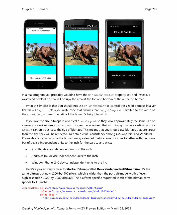
Chapter 13. Bitmaps Page 282
Creating Mobile Apps with Xamarin.Forms — 2nd Preview Edition — March 13, 2015
In a real program you probably wouldn’t have the BackgroundColor property set, and instead, a
wasteland of blank screen will occupy the area at the top and bottom of the rendered bitmap.
What this implies is that you should not use HeightRequest to control the size of bitmaps in a ver-
tical StackLayout unless you write code that ensures that HeightRequest is limited to the width of
the StackLayout times the ratio of the bitmap’s height to width.
If you want to size bitmaps in a vertical StackLayout so they look approximately the same size on
a variety of devices, use WidthRequest instead. You’ve seen that WidthRequest in a vertical Stack-
Layout can only decrease the size of bitmaps. This means that you should use bitmaps that are larger
than the size they will be rendered. To obtain visual consistency among iOS, Android, and Windows
Phone devices, you can size the bitmap using a desired metrical size in inches together with the num-
ber of device-independent units to the inch for the particular device:
iOS: 160 device-independent units to the inch
Android: 160 device-independent units to the inch
Windows Phone: 240 device-independent units to the inch
Here’s a project very similar to StackedBitmap called DeviceIndependentBitmapSize. It’s the
same bitmap but now 1200-by-900 pixels, which is wider than the portrait-mode width of even
high-resolution 1920-by-1080 displays. The platform-specific requested width of the bitmap corre-
sponds to 1.5 inches:
<ContentPage xmlns="http://xamarin.com/schemas/2014/forms"
xmlns:x="http://schemas.microsoft.com/winfx/2009/xaml"
xmlns:local=
"clr-namespace:DeviceIndependentBitmapSize;assembly=DeviceIndependentBitmapSize"

Chapter 13. Bitmaps Page 283
Creating Mobile Apps with Xamarin.Forms — 2nd Preview Edition — March 13, 2015
x:Class="DeviceIndependentBitmapSize.DeviceIndependentBitmapSizePage">
<StackLayout>
<Label Text="1200 x 900 Pixel Bitmap"
FontSize="Large"
VerticalOptions="CenterAndExpand"
HorizontalOptions="Center" />
<Image Source=
"{local:ImageResource DeviceIndependentBitmapSize.Images.Sculpture_1200x900.jpg}"
HorizontalOptions="Center"
SizeChanged="OnImageSizeChanged">
<Image.WidthRequest>
<!-- 1.5 inches -->
<OnPlatform x:TypeArguments="x:Double"
iOS="240"
Android="240"
WinPhone="360" />
</Image.WidthRequest>
</Image>
<Label x:Name="label"
FontSize="Large"
VerticalOptions="CenterAndExpand"
HorizontalOptions="Center" />
</StackLayout>
</ContentPage>
If the preceding analysis about sizing is correct and all goes well, this bitmap should look approxi-
mately the same size on all three platforms relative to the width of the screen:

Chapter 13. Bitmaps Page 284
Creating Mobile Apps with Xamarin.Forms — 2nd Preview Edition — March 13, 2015
With this knowledge about sizing bitmaps, it is now possible to make a little e-book reader with
pictures, because what is the use of a book without pictures?
This e-book reader displays a scrollable StackLayout with the complete text of Chapter 7 of Lewis
Carroll’s Alice’s Adventures in Wonderland including three of John Tenniel’s original illustrations. The
text and illustrations were downloaded from the University of Adelaide web site. The illustrations are
included as embedded resources in the MadTeaParty project. They have the same names and sizes as
those on the web site. The names refer to page numbers in the original book:
image113.jpg — 709 × 553
image122.jpg — 485 × 545
image129.jpg — 670 × 596
Recall that the use of WidthRequest for Image elements in a StackLayout can only shrink the size of
rendered bitmaps. These bitmaps are not wide enough to ensure that they will all shrink to a proper
size on all three platforms, but it’s worthwhile examining the results anyway because this is much closer
to a real-life example.
The MadTeaParty program uses an implicit style for Image to set the WidthRequest property to a
value corresponding to 1.5 inches. Just as in the previous example, this value is:
240 device-independent units for iOS
240 device-independent units for Android
360 device-independent units for Windows Phone.
For the three devices used for these screenshots, this width corresponds to:
480 pixels on the iPhone 6
720 pixels on the Android Nexus 5
570 pixels on the Windows Phone Nokia Lumia 925
This means that all three images will shrink in size on the iPhone 6, and they will all have a rendered
width of 240 device-independent units.
However, none of the three images will shrink in size on the Nexus 5 because they all have narrower
pixel widths than the number of pixels in 1.5 inches. The three images will have a rendered width of
(respectively) 236, 162, and 223 device-independent units on the Nexus 5. (That’s the pixel width di-
vided by 3.)
On the Windows Phone, the natural widths of the three images are (respectively) 709, 485, and 670
device-independent units. These widths are all wider than the Nokia Lumia 925 screen width of 480
units. Without a WidthRequest setting, these three images would all be displayed at the full width of

Chapter 13. Bitmaps Page 285
Creating Mobile Apps with Xamarin.Forms — 2nd Preview Edition — March 13, 2015
the StackLayout. With a WidthRequest setting of 360, they will all be displayed with a width of 360
device-independent units.
Let’s see if the predictions are correct. The XAML file includes a BackgroundColor setting on the
root element that colors the entire page white, as is appropriate for a book. The Style definitions are
confined to a Resources dictionary in the StackLayout. A style for the book title is based on the de-
vice TitleStyle but with black text and centered, and two implicit styles for Label and Image serve
to style most of the Label elements and all three Image elements. Only the first and last paragraphs of
the book’s text are shown in this listing of the XAML file:
<ContentPage xmlns="http://xamarin.com/schemas/2014/forms"
xmlns:x="http://schemas.microsoft.com/winfx/2009/xaml"
xmlns:sys="clr-namespace:System;assembly=mscorlib"
xmlns:local="clr-namespace:MadTeaParty;assembly=MadTeaParty"
x:Class="MadTeaParty.MadTeaPartyPage"
BackgroundColor="White">
<ContentPage.Padding>
<OnPlatform x:TypeArguments="Thickness"
iOS="5, 20, 5, 0"
Android="5, 0"
WinPhone="5, 0" />
</ContentPage.Padding>
<ScrollView>
<StackLayout Spacing="10">
<StackLayout.Resources>
<ResourceDictionary>
<Style x:Key="titleLabel"
TargetType="Label"
BaseResourceKey="TitleStyle">
<Setter Property="TextColor" Value="Black" />
<Setter Property="XAlign" Value="Center" />
</Style>
<!-- Implicit styles -->
<Style TargetType="Label"
BaseResourceKey="BodyStyle">
<Setter Property="TextColor" Value="Black" />
</Style>
<Style TargetType="Image">
<Setter Property="WidthRequest">
<Setter.Value>
<!-- 1.5 inches -->
<OnPlatform x:TypeArguments="x:Double"
iOS="240"
Android="240"
WinPhone="360" />
</Setter.Value>
</Setter>
</Style>

Chapter 13. Bitmaps Page 286
Creating Mobile Apps with Xamarin.Forms — 2nd Preview Edition — March 13, 2015
<!-- 1/4 inch indent for poetry -->
<OnPlatform x:Key="poemIndent"
x:TypeArguments="Thickness"
iOS="40, 0, 0, 0"
Android="40, 0, 0, 0"
WinPhone="60, 0, 0, 0" />
</ResourceDictionary>
</StackLayout.Resources>
<!-- Text and images from http://ebooks.adelaide.edu.au/c/carroll/lewis/alice/ -->
<StackLayout Spacing="0">
<Label Text="Alice’s Adventures in Wonderland"
Style="{DynamicResource titleLabel}"
FontAttributes="Italic" />
<Label Text="by Lewis Carroll"
Style="{DynamicResource titleLabel}" />
</StackLayout>
<Label Style="{DynamicResource SubtitleStyle}"
TextColor="Black"
XAlign="Center">
<Label.FormattedText>
<FormattedString>
<Span Text="Chapter VII" />
<Span Text="{x:Static sys:Environment.NewLine}" />
<Span Text="A Mad Tea-Party" />
</FormattedString>
</Label.FormattedText>
</Label>
<Label Text=
"There was a table set out under a tree in front of the
house, and the March Hare and the Hatter were having tea at
it: a Dormouse was sitting between them, fast asleep, and
the other two were using it as a cushion, resting their
elbows on it, and talking over its head. ‘Very uncomfortable
for the Dormouse,’ thought Alice; ‘only, as it’s asleep, I
suppose it doesn’t mind.’" />
…
<Label>
<Label.FormattedText>
<FormattedString>
<Span Text=
"Once more she found herself in the long hall, and close to
the little glass table. ‘Now, I’ll manage better this time,’
she said to herself, and began by taking the little golden
key, and unlocking the door that led into the garden. Then
she went to work nibbling at the mushroom (she had kept a
piece of it in her pocket) till she was about a foot high:
then she walked down the little passage: and " />
<Span Text="then" FontAttributes="Italic" />

Chapter 13. Bitmaps Page 287
Creating Mobile Apps with Xamarin.Forms — 2nd Preview Edition — March 13, 2015
<Span Text=
" — she found herself at last in the beautiful garden,
among the bright flower-beds and the cool fountains." />
</FormattedString>
</Label.FormattedText>
</Label>
</StackLayout>
</ScrollView>
</ContentPage>
The three Image elements simply reference the three embedded resources and are given a setting
of the WidthRequest property through the implicit style:
<Image Source="{local:ImageResource MadTeaParty.Images.image113.jpg}" />
…
<Image Source="{local:ImageResource MadTeaParty.Images.image122.jpg}" />
…
<Image Source="{local:ImageResource MadTeaParty.Images.image129.jpg}" />
Here’s the first picture:
It’s fairly consistent among the three platforms, even though it’s displayed in its natural width of 709
pixels on the Nexus 5, but that’s very close to the 720 pixels that a width of 240 device-independent
units implies.
The difference is much greater with the second image:

Chapter 13. Bitmaps Page 288
Creating Mobile Apps with Xamarin.Forms — 2nd Preview Edition — March 13, 2015
This is displayed in its pixel size on the Nexus 5, which corresponds to 162 device-independent units,
but is displayed with a width of 240 units on the iPhone 6 and 360 units on the Nokia Lumia 925.
Although the pictures don’t look bad on any of the platforms, getting them all about the same size
would require starting out with larger bitmaps.
Browsing and Waiting Another feature of Image is demonstrated in the ImageBrowser program, which lets you browse the
stock photos used for some of the samples in this book. As you can see in the XAML file below, an Im-
age element shares the screen with a Label and two Button views. Notice that a PropertyChanged
handler is set on the Image. You learned in Chapter 11, “The Bindable Infrastructure,” that the Prop-
ertyChanged handler is implemented by BindableObject and is fired whenever a bindable property
changes value.
<ContentPage xmlns="http://xamarin.com/schemas/2014/forms"
xmlns:x="http://schemas.microsoft.com/winfx/2009/xaml"
x:Class="ImageBrowser.ImageBrowserPage">
<ContentPage.Padding>
<OnPlatform x:TypeArguments="Thickness"
iOS="0, 20, 0, 0" />
</ContentPage.Padding>
<StackLayout>
<Image x:Name="image"
VerticalOptions="CenterAndExpand"
PropertyChanged="OnImagePropertyChanged" />

Chapter 13. Bitmaps Page 289
Creating Mobile Apps with Xamarin.Forms — 2nd Preview Edition — March 13, 2015
<Label x:Name="filenameLabel"
HorizontalOptions="Center" />
<ActivityIndicator x:Name="activityIndicator" />
<StackLayout Orientation="Horizontal">
<Button x:Name="prevButton"
Text="Previous"
IsEnabled="false"
HorizontalOptions="CenterAndExpand"
Clicked="OnPreviousButtonClicked" />
<Button x:Name="nextButton"
Text="Next"
IsEnabled="false"
HorizontalOptions="CenterAndExpand"
Clicked="OnNextButtonClicked" />
</StackLayout>
</StackLayout>
</ContentPage>
Also on this page is an ActivityIndicator. You generally use this view when a program is wait-
ing for a long operation to complete (such as downloading a bitmap) but can’t provide any infor-
mation about the progress of the operation. If your program knows what fraction of the operation has
completed, you can use a ProgressBar instead. (ProgressBar is demonstrated in the next chapter.)
The ActivityIndicator has a Boolean property named IsRunning. Normally, that property is
false and the ActivityIndicator is invisible. Set the property to true to make it visible. All three
platforms implement an animated visual to indicate that the program is working, but it looks a little
different on each platform. On iOS it’s a spinning wheel, and on Android it’s a spinning partial circle.
On Windows Phone, a series of dots move across the screen.
To provide browsing access to the stock images, the ImageBrowser needs to download a JSON file
with a list of all the filenames. Over the years, various versions of .NET have introduced several classes
capable of downloading objects over the web. However, not all of these are available in the version of
.NET that is available in a Portable Class Library that has the profile compatible with Xamarin.Forms. A
class that is available is WebRequest and its descendent class HttpWebRequest.
The WebRequest.Create method returns a WebRequest method based on a URI. (The return val-
ue is actually an HttpWebRequest object.) The BeginGetResponse method requires a callback func-
tion that is called when the Stream referencing the URI is available for access. The Stream is accessible
from a call to EndGetResponse and GetResponseStream.
Once the program gets access to the Stream object in the following code, it uses the DataCon-
tractJsonSerializer class together with the embedded ImageList class defined near the top of
the ImageBrowserPage class to convert the JSON file to an ImageList object:
public partial class ImageBrowserPage : ContentPage
{
[DataContract]

Chapter 13. Bitmaps Page 290
Creating Mobile Apps with Xamarin.Forms — 2nd Preview Edition — March 13, 2015
class ImageList
{
[DataMember(Name = "photos")]
public List<string> Photos = null;
}
WebRequest request;
ImageList imageList;
int imageListIndex = 0;
public ImageBrowserPage()
{
InitializeComponent();
// Get list of stock photos.
Uri uri = new Uri("http://docs.xamarin.com/demo/stock.json");
request = WebRequest.Create(uri);
request.BeginGetResponse(WebRequestCallback, null);
}
void WebRequestCallback(IAsyncResult result)
{
Device.BeginInvokeOnMainThread(() =>
{
try
{
Stream stream = request.EndGetResponse(result).GetResponseStream();
// Deserialize the JSON into imageList;
var jsonSerializer = new DataContractJsonSerializer(typeof(ImageList));
imageList = (ImageList)jsonSerializer.ReadObject(stream);
if (imageList.Photos.Count > 0)
FetchPhoto();
}
catch (Exception exc)
{
filenameLabel.Text = exc.Message;
}
});
}
void OnPreviousButtonClicked(object sender, EventArgs args)
{
imageListIndex--;
FetchPhoto();
}
void OnNextButtonClicked(object sender, EventArgs args)
{
imageListIndex++;
FetchPhoto();
}
Chapter 13. Bitmaps Page 291
Creating Mobile Apps with Xamarin.Forms — 2nd Preview Edition — March 13, 2015
void FetchPhoto()
{
// Prepare for new image.
image.Source = null;
string url = imageList.Photos[imageListIndex];
// Set the filename.
filenameLabel.Text = url.Substring(url.LastIndexOf('/') + 1);
// Create the UriImageSource.
UriImageSource imageSource = new UriImageSource
{
Uri = new Uri(url + "?Width=1080"),
CacheValidity = TimeSpan.FromDays(30)
};
// Set the Image source.
image.Source = imageSource;
// Enable or disable buttons.
prevButton.IsEnabled = imageListIndex > 0;
nextButton.IsEnabled = imageListIndex < imageList.Photos.Count - 1;
}
void OnImagePropertyChanged(object sender, PropertyChangedEventArgs args)
{
if (args.PropertyName == "IsLoading")
{
activityIndicator.IsRunning = ((Image)sender).IsLoading;
}
}
}
The entire body of the WebRequestCallback method is enclosed in a lambda function that is the
argument to the Device.BeginInvokeOnMainThread method. WebRequest downloads the file ref-
erenced by the URI in a secondary thread of execution. This ensures that the operation doesn’t block
the program’s main thread, which is handling the user interface. The callback method also executes in
this secondary thread. However, user-interface objects in a Xamarin.Forms application can only be ac-
cessed from the main thread.
The purpose of Device.BeginInvokeOnMainThread method is to get around this problem. The
argument to this method is queued to run in the program’s main thread and can safely access us-
er-interface objects.
As you click the two buttons, calls to FetchPhoto use UriImageSource to download a new bit-
map. This might take a second or so. The Image class defines a Boolean property named IsLoading
that is true when Image is in the process of loading (or downloading) a bitmap. IsLoading is backed
by the bindable property IsLoadingProperty. That also means that whenever IsLoading changes
value, a PropertyChanged event is fired. The program uses the PropertyChanged event han-

Chapter 13. Bitmaps Page 292
Creating Mobile Apps with Xamarin.Forms — 2nd Preview Edition — March 13, 2015
dler—the OnImagePropertyChanged method at the very bottom of the class—to set the IsRunning
property of the ActivityIndicator to the same value as the IsLoading property of Image.
You’ll see in Chapter 16, “Data Binding,” how your applications can link properties like IsLoading
and IsRunning so they maintain the same value without any explicit event handlers.
Here’s ImageBrowser in action:
Some of the images have an EXIF orientation flag set, and if the particular platform ignores that
flag, the image is displayed sideways.
Streaming Bitmaps
If the ImageSource class didn’t have FromUri or FromResource methods, you would still be able to
access bitmaps over the web or stored as resources in the PCL. You can do both of these jobs—as well
as several others—with ImageSource.FromStream or the StreamImageSource class
The ImageSource.FromStream method is somewhat easier to use than StreamImageSource, but
both are a little odd. The argument to ImageSource.FromStream is not a Stream object but a Func
object (a method with no arguments) that returns a Stream object. The Stream property of Stream-
ImageSource is likewise not a Stream object but a Func object that has a CancellationToken ar-
gument and returns a Task<Stream> object.
This section is restricted to ImageSource.FromStream; the use StreamImageSource is discussed
in a later chapter on asynchronous operations.
Chapter 13. Bitmaps Page 293
Creating Mobile Apps with Xamarin.Forms — 2nd Preview Edition — March 13, 2015
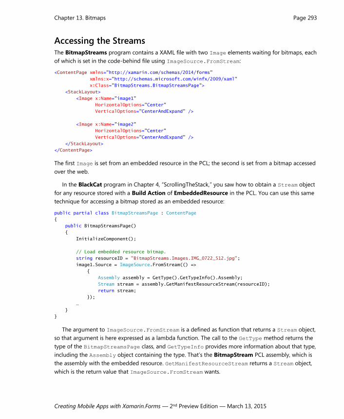
Accessing the Streams The BitmapStreams program contains a XAML file with two Image elements waiting for bitmaps, each
of which is set in the code-behind file using ImageSource.FromStream:
<ContentPage xmlns="http://xamarin.com/schemas/2014/forms"
xmlns:x="http://schemas.microsoft.com/winfx/2009/xaml"
x:Class="BitmapStreams.BitmapStreamsPage">
<StackLayout>
<Image x:Name="image1"
HorizontalOptions="Center"
VerticalOptions="CenterAndExpand" />
<Image x:Name="image2"
HorizontalOptions="Center"
VerticalOptions="CenterAndExpand" />
</StackLayout>
</ContentPage>
The first Image is set from an embedded resource in the PCL; the second is set from a bitmap accessed
over the web.
In the BlackCat program in Chapter 4, “ScrollingTheStack,” you saw how to obtain a Stream object
for any resource stored with a Build Action of EmbeddedResource in the PCL. You can use this same
technique for accessing a bitmap stored as an embedded resource:
public partial class BitmapStreamsPage : ContentPage
{
public BitmapStreamsPage()
{
InitializeComponent();
// Load embedded resource bitmap.
string resourceID = "BitmapStreams.Images.IMG_0722_512.jpg";
image1.Source = ImageSource.FromStream(() =>
{
Assembly assembly = GetType().GetTypeInfo().Assembly;
Stream stream = assembly.GetManifestResourceStream(resourceID);
return stream;
});
…
}
}
The argument to ImageSource.FromStream is a defined as function that returns a Stream object,
so that argument is here expressed as a lambda function. The call to the GetType method returns the
type of the BitmapStreamsPage class, and GetTypeInfo provides more information about that type,
including the Assembly object containing the type. That’s the BitmapStream PCL assembly, which is
the assembly with the embedded resource. GetManifestResourceStream returns a Stream object,
which is the return value that ImageSource.FromStream wants.

Chapter 13. Bitmaps Page 294
Creating Mobile Apps with Xamarin.Forms — 2nd Preview Edition — March 13, 2015
Another method of the Assembly class helps in debugging embedded resources: The GetMani-
festResourceNames returns an array of string objects with all the resource IDs in the PCL. If you can’t
figure out why your GetManifestResourceStream isn’t working, first check to make sure your re-
sources have a Build Action of EmbeddedResource, and then call GetManifestResourceNames to
get all the resource IDs.
To download a bitmap over the web, you can use the same WebRequest method demonstrated in
the ImageBrowser program. In this program the BeginGetResponse callback is a lambda function:
public partial class BitmapStreamsPage : ContentPage
{
public BitmapStreamsPage()
{
…
// Load web bitmap.
Uri uri = new Uri("http://developer.xamarin.com/demo/IMG_0925.JPG?width=512");
WebRequest request = WebRequest.Create (uri);
request.BeginGetResponse((IAsyncResult arg) =>
{
Stream stream = request.EndGetResponse(arg).GetResponseStream();
ImageSource imageSource = ImageSource.FromStream(() => stream);
Device.BeginInvokeOnMainThread(() => image2.Source = imageSource);
}, null);
}
}
This BeginGetResponse callback also contains two more embedded lambda functions! The first line
of the callback obtains the Stream object for the bitmap. The second line uses a short lambda function
as the argument to ImageSource.FromStream to define a function that returns that stream. The last
line of the BeginGetResponse callback is a call to Device.BeginInvokeOnMainThread to set the
ImageSource object to the Source property of the Image.

Chapter 13. Bitmaps Page 295
Creating Mobile Apps with Xamarin.Forms — 2nd Preview Edition — March 13, 2015
It might seem as if you have more control over the downloading of images using WebRequest and
ImageSource.FromStream than using ImageSource.FromUri, but the ImageSource.FromUri
method has a big advantage: It caches the downloaded bitmaps in a storage area private to the appli-
cation. As you’ve seen, you can turn off the caching, but if you’re using ImageSource.FromStream
instead of ImageSource.FromUri, you might find the need to cache the images, and that would be a
much bigger job.
Generating Bitmaps at Runtime All three platforms support the BMP file format, which dates back to the very beginning of Microsoft
Windows. Despite its ancient heritage, the file format is now fairly standardized with more extensive
header information.
Although there are some BMP options that allow some rudimentary compression, most BMP files
are uncompressed. This lack of compression is usually regarded as a disadvantage of the BMP file for-
mat, but in some cases it’s not a disadvantage at all. For example, if you want to generate a bitmap al-
gorithmically at runtime, it’s much easier to generate an uncompressed bitmap instead of one of the
compressed file formats. (Indeed, even if you had a library function to create a JPEG or PNG file, you’d
apply that function to the uncompressed pixel data.)
You can create a bitmap algorithmically at runtime by filling a MemoryStream with the BMP file
headers and pixel data, and then passing that MemoryStream to the ImageSource.FromStream
method. The BmpMaker class in the Xamarin.FormsBook.Toolkit library demonstrates this. It creates a
BMP in memory using a 32-bit pixel format—8 bits each for red, green, blue, and alpha (opacity)
channels. The BmpMaker class was coded with performance in mind, in hopes that it might be used for

Chapter 13. Bitmaps Page 296
Creating Mobile Apps with Xamarin.Forms — 2nd Preview Edition — March 13, 2015
animation. Maybe someday it will be, but in this chapter the only demonstration is a simple color gra-
dient.
The constructor creates a byte array named buffer that stores the entire BMP file beginning with
the header information and followed by the pixel bits. The constructor then uses a MemoryStream for
writing the header information to the beginning of this buffer:
public class BmpMaker
{
const int headerSize = 54;
readonly byte[] buffer;
public BmpMaker(int width, int height)
{
Width = width;
Height = height;
int numPixels = Width * Height;
int numPixelBytes = 4 * numPixels;
int fileSize = headerSize + numPixelBytes;
buffer = new byte[fileSize];
// Write headers in MemoryStream and hence the buffer.
using (MemoryStream memoryStream = new MemoryStream(buffer))
{
using (BinaryWriter writer = new BinaryWriter(memoryStream, Encoding.UTF8))
{
// Construct BMP header (14 bytes).
writer.Write(new char[] { 'B', 'M' }); // Signature
writer.Write(fileSize); // File size
writer.Write((short)0); // Reserved
writer.Write((short)0); // Reserved
writer.Write(headerSize); // Offset to pixels
// Construct BitmapInfoHeader (40 bytes).
writer.Write(40); // Header size
writer.Write(Width); // Pixel width
writer.Write(Height); // Pixel height
writer.Write((short)1); // Planes
writer.Write((short)32); // Bits per pixel
writer.Write(0); // Compression
writer.Write(numPixelBytes); // Image size in bytes
writer.Write(0); // X pixels per meter
writer.Write(0); // Y pixels per meter
writer.Write(0); // Number colors in color table
writer.Write(0); // Important color count
}
}
}
public int Width
{
private set;
get;

Chapter 13. Bitmaps Page 297
Creating Mobile Apps with Xamarin.Forms — 2nd Preview Edition — March 13, 2015
}
public int Height
{
private set;
get;
}
public void SetPixel(int row, int col, Color color)
{
SetPixel(row, col, (int)(255 * color.R),
(int)(255 * color.G),
(int)(255 * color.B),
(int)(255 * color.A));
}
public void SetPixel(int row, int col, int r, int g, int b, int a = 255)
{
int index = (row * Width + col) * 4 + headerSize;
buffer[index + 0] = (byte)b;
buffer[index + 1] = (byte)g;
buffer[index + 2] = (byte)r;
buffer[index + 3] = (byte)a;
}
public ImageSource Generate()
{
// Create MemoryStream from buffer with bitmap.
MemoryStream memoryStream = new MemoryStream(buffer);
// Convert to StreamImageSource.
ImageSource imageSource = ImageSource.FromStream(() =>
{
return memoryStream;
});
return imageSource;
}
}
After creating a BmpMaker object, a program can then call one of the two SetPixel methods to set
a color at a particular row and column. When making very many calls, the SetPixel call that uses a
Color value is significantly slower than the one that accepts explicit red, green, and blue values.
The last step is to call the Generate method. This method instantiates another MemoryStream ob-
ject based on the buffer array and uses it to create a FileImageSource object. You can call Gener-
ate multiple times after setting new pixel data. The method creates a new MemoryStream each time
because ImageSource.FromStream closes the Stream object when it’s finished with it.
The DiyGradientBitmap program—“DIY” stands for “Do It Yourself”—demonstrates using Bmp-
Maker to make a bitmap with a simple gradient and display it to fill the page. The XAML file includes
the Image element:
<ContentPage xmlns="http://xamarin.com/schemas/2014/forms"

Chapter 13. Bitmaps Page 298
Creating Mobile Apps with Xamarin.Forms — 2nd Preview Edition — March 13, 2015
xmlns:x="http://schemas.microsoft.com/winfx/2009/xaml"
x:Class="DiyGradientBitmap.DiyGradientBitmapPage">
<ContentPage.Padding>
<OnPlatform x:TypeArguments="Thickness"
iOS="0, 20, 0, 0" />
</ContentPage.Padding>
<Image x:Name="image"
Aspect="Fill" />
</ContentPage>
The code-behind file instantiates a BmpMaker and loops through the rows and columns of the bit-
map to create a gradient that ranges from red at the top to blue at the bottom:
public partial class DiyGradientBitmapPage : ContentPage
{
public DiyGradientBitmapPage()
{
InitializeComponent();
int rows = 128;
int cols = 64;
BmpMaker bmpMaker = new BmpMaker(cols, rows);
for (int row = 0; row < rows; row++)
for (int col = 0; col < cols; col++)
{
bmpMaker.SetPixel(row, col, 2 * row, 0, 2 * (128 - row));
}
ImageSource imageSource = bmpMaker.Generate();
image.Source = imageSource;
}
}
Here’s the result:
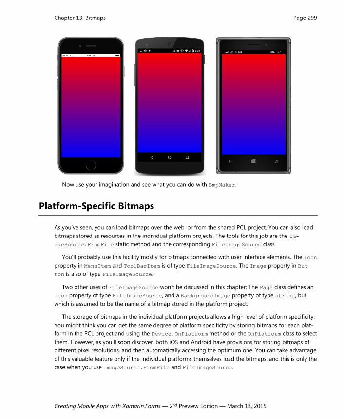
Chapter 13. Bitmaps Page 299
Creating Mobile Apps with Xamarin.Forms — 2nd Preview Edition — March 13, 2015
Now use your imagination and see what you can do with BmpMaker.
Platform-Specific Bitmaps
As you’ve seen, you can load bitmaps over the web, or from the shared PCL project. You can also load
bitmaps stored as resources in the individual platform projects. The tools for this job are the Im-
ageSource.FromFile static method and the corresponding FileImageSource class.
You’ll probably use this facility mostly for bitmaps connected with user interface elements. The Icon
property in MenuItem and ToolBarItem is of type FileImageSource. The Image property in But-
ton is also of type FileImageSource.
Two other uses of FileImageSource won’t be discussed in this chapter: The Page class defines an
Icon property of type FileImageSource, and a BackgroundImage property of type string, but
which is assumed to be the name of a bitmap stored in the platform project.
The storage of bitmaps in the individual platform projects allows a high level of platform specificity.
You might think you can get the same degree of platform specificity by storing bitmaps for each plat-
form in the PCL project and using the Device.OnPlatform method or the OnPlatform class to select
them. However, as you’ll soon discover, both iOS and Android have provisions for storing bitmaps of
different pixel resolutions, and then automatically accessing the optimum one. You can take advantage
of this valuable feature only if the individual platforms themselves load the bitmaps, and this is only the
case when you use ImageSource.FromFile and FileImageSource.

Chapter 13. Bitmaps Page 300
Creating Mobile Apps with Xamarin.Forms — 2nd Preview Edition — March 13, 2015
The platform projects already contain several bitmaps. In the iOS project you’ll find these in the
Resources folder. In the Android project, they’re in subfolders of the Resources folder. In the Windows
Phone project, they’re in the Assets folder and subfolders. These bitmaps are application icons and
splash screens, and you’ll want to replace them when you prepare to bring an application to market.
Let’s write a small project called PlatformBitmaps that accesses an application icon from each
platform project and displays the rendered size of the Image element. If you’re using FileI-
mageSource to load the bitmap (as this program does), you need to set the File property to a
string with the bitmap’s filename. Almost always, you’ll be using Device.OnPlatform in code or
OnPlatform in XAML to specify the three filenames:
public class PlatformBitmapsPage : ContentPage
{
public PlatformBitmapsPage()
{
Image image = new Image
{
Source = new FileImageSource
{
File = Device.OnPlatform(iOS: "Icon-Small-40.png",
Android: "icon.png",
WinPhone: "Assets/ApplicationIcon.png")
},
HorizontalOptions = LayoutOptions.Center,
VerticalOptions = LayoutOptions.CenterAndExpand
};
Label label = new Label
{
FontSize = Device.GetNamedSize(NamedSize.Large, typeof(Label)),
HorizontalOptions = LayoutOptions.Center,
VerticalOptions = LayoutOptions.CenterAndExpand
};
image.SizeChanged += (sender, args) =>
{
label.Text = String.Format("Rendered size = {0} x {1}",
image.Width, image.Height);
};
Content = new StackLayout
{
Children =
{
image,
label
}
};
}
}

Chapter 13. Bitmaps Page 301
Creating Mobile Apps with Xamarin.Forms — 2nd Preview Edition — March 13, 2015
When you access a bitmap stored in the Resources folder of the iOS project or the Resources
folder (or subfolders) of the Android project, do not preface the filename with a folder name. These
folders are the standard repositories for bitmaps on these platforms. But bitmaps can be anywhere in
the Windows Phone project (including the project root), so the folder name (if any) is required.
In all three cases, the default icon is the famous hexagonal Xamarin logo (fondly known as the
Xamagon), but each platform has different conventions for its icon size, so the rendered sizes are dif-
ferent:
If you begin exploring the icon bitmaps in the iOS and Android projects, you might be a little con-
fused: There seem to be multiple bitmaps with the same names (or similar names) in the iOS and An-
droid projects.
It’s time to dive deeper in the subject of bitmap resolution.
Bitmap Resolutions The iOS bitmap filename specified in PlatformBitmaps is Icon-Small-40.png, but if you look in the
Resources folder of the iOS project, you’ll see three files with variations of that name. They all have
different sizes:
Icon-Small-40.png — 40 pixels square
[email protected] — 80 pixels square
[email protected] — 120 pixels square

Chapter 13. Bitmaps Page 302
Creating Mobile Apps with Xamarin.Forms — 2nd Preview Edition — March 13, 2015
As you discovered earlier in this chapter, when an Image is a child of a StackLayout, iOS displays the
bitmap in its pixel size with a one-to-one mapping between the pixels of the bitmap and the pixels of
the screen. This is the optimum display of a bitmap.
However, on the iPhone 6 simulator used in the screenshot, the Image has a rendered size of 40
device-independent units. On the iPhone 6 there are two pixels per device-independent unit, which
means that the actual bitmap being displayed in that screenshot is not Icon-Small-40.png but
[email protected], which is two times 40 or 80 pixels square.
If you instead run the program on the iPhone 6 Plus—which has a device-independent unit equal to
three pixels—you’ll again see a rendered size of 40 pixels, which means that the [email protected]
bitmap is displayed. Now try it on the iPad 2 simulator. The iPad 2 has a screen size of just 768 × 1024,
and device-independent units are the same as pixels. Now the Icon-Small-40-png bitmap is displayed
and the rendered size is still 40 pixels.
This is what you want. You want to be able to control the rendered size of bitmaps in de-
vice-independent units because that’s how you can achieve perceptibly similar bitmap sizes on differ-
ent devices and platforms. When you specify the Icon-Small-40.png bitmap, you want that bitmap to
be rendered as 40 device-independent units—or about ¼ inch—on all iOS devices. But if the program
is running on an Apple Retina device, you don’t want a 40-pixel square bitmap stretched to be 40 de-
vice-independent units. For maximum visual detail, you want a higher resolution bitmap displayed with
a one-to-one mapping of bitmap pixels to screen pixels.
If you look in the Android Resources directory, you’ll find four different versions of a bitmap named
icon.png. These are stored in different subfolders of Resources:
drawable/icon.png — 72 pixels square
drawable-hdpi/icon.png — 72 pixels square
drawable-xdpi/icon.png — 96 pixels square
drawable-xxdpi/icon.png — 144 pixels square
Regardless of the Android device, the icon is rendered with a size of 48 device-independent units. On
the Nexus 5 used in the screenshot, there are three pixels to the device-independent unit, which means
that the bitmap actually displayed on that screen is the one in the drawable-xxdpi folder, which has a
size of 144-pixels square.
What’s nice about both iOS and Android is that you only need to supply bitmaps of various siz-
es—and give them the correct names or store them in the correct folders—and the operating system
chooses the optimum image for the particular resolution of the device.
The Silverlight platform of Windows Phone doesn’t have such a system. The ApplicationIcon.png file
is 100 pixels square, and it’s rendered as 100 device-independent units.
Although the treatment of Windows Phone seems inconsistent with the other two platforms, it is

Chapter 13. Bitmaps Page 303
Creating Mobile Apps with Xamarin.Forms — 2nd Preview Edition — March 13, 2015
not: In all three platforms you can control the size of bitmaps in device-independent units.
When creating your own platform-specific images, follow the following guidelines:
Device-Independent Bitmaps for iOS
The iOS naming scheme for bitmaps involves a suffix on the filename. The operating system fetches a
particular bitmap with the underlying filename based on the approximate pixel resolution of the de-
vice:
No suffix for 160 DPI devices (1 pixel to the device-independent unit)
@2x suffix for 320 DPI devices (2 pixels to the DIU)
@3x suffix: 480 DPI devices (3 pixels to the DIU)
For example, suppose you want a bitmap named MyImage.jpg to show up as about one-inch
square on the screen. You should supply three versions of this bitmap:
MyImage.jpg — 160 pixels square
[email protected] — 320 pixels square
[email protected] — 480 pixels square
The bitmap will render as 160 device-independent units. For rendered sizes smaller than one inch, de-
crease the pixels proportionally.
When creating these bitmaps, start with the largest one. Then you can use any bitmap-editing utility
to reduce the pixel size. For some images, you might want to fine-tune or completely redraw the
smaller versions.
As you might have noticed when examining the various icon files that the Xamarin.Forms template
includes with the iOS project, not every bitmap comes in all three resolutions. If iOS can’t find a bitmap
with the particular suffix it wants, it will fall back and use one of the others, scaling the bitmap up or
down in the process.
Device-Independent Bitmaps for Android
For Android, bitmaps are stored in various subfolders of Resources that correspond to a pixel resolu-
tion of the screen. Android defines six different directory names for six different levels of device resolu-
tion:
drawable-ldpi (low DPI) for 120 DPI devices (0.75 pixels to the DIU)
drawable-mdpi (medium) for 160 DPI devices (1 pixel to the DIU)
drawable-hdpi (high) for 240 DPI devices (1.5 pixels to the DIU))
drawable-xhdpi (extra high) for 320 DPI devices (2 pixels to the DIU)

Chapter 13. Bitmaps Page 304
Creating Mobile Apps with Xamarin.Forms — 2nd Preview Edition — March 13, 2015
drawable-xxhdpi (extra extra high) for 480 DPI devices (3 pixels to the DIU)
drawable-xxxhdpi (three extra highs) for 640 DPI devices (4 pixels to the DIU)
If you want a bitmap named MyImage.jpg to render as a one-inch square on the screen, you can
supply up to six versions of this bitmap using the same name in all these directories. The size of this
one-inch square bitmap in pixels is equal to the DPI associated with that directory:
drawable-ldpi/MyImage.jpg — 120 pixels square
drawable-mdpi/MyImage.jpg — 160 pixels square
drawable-hdpi/MyImage.jpg — 240 pixels square
drawable-xhdpi/MyImage.jpg — 320 pixels square
drawable-xxdpi/MyImage.jpg — 480 pixels square
drawable-xxxhdpi/MyImage.jpg — 640 pixels square
The bitmap will render as 160 device-independent units.
You are not required to create bitmaps for all six resolutions. The Android project created by the
Xamarin.Forms template only includes drawable-hdpi, drawable-xhdpi, and drawable-xxdpi, as well
as an unnecessary drawable folder with no suffix. These encompass the most common devices. If the
Android operating system does not find a bitmap of the desired resolution, it will fall back to a size that
is available and scale it.
Device-Independent Bitmaps for Windows Phone
For a bitmap to be rendered as one-inch square on Windows Phone, make it 240 pixels square.
Let’s look at a program that actually does supply custom bitmaps of various sizes for the three
platforms. These bitmaps are intended to be rendered about one-inch square, which is approximately
half the width of the phone’s screen in portrait mode.
This ImageTap program creates a pair of rudimentary tappable button-like objects that display not
text, but a bitmap. The two buttons that ImageTap creates might substitute for traditional OK and
Cancel buttons, but perhaps you want to use faces from famous paintings for the buttons. Perhaps you
want the OK button to display the face of Botticelli’s Venus, and you want the Cancel button to display
the distressed man in Edvard Munch’s The Scream.
Among the sample code for this chapter is a directory named Images that contains such images
named Venus_xxx.jpg and Scream_xxx.jpg, where the xxx indicates the pixel size. Each image is in eight
different sizes: 60, 80, 120, 160, 240, 320, 480, and 640 pixels square. In addition, some of the files have
names of Venus_xxx_id.jpg and Scream_xxx_id.jpg. These versions have the actual pixel size displayed in
the lower-right corner of the image so we can see on the screen exactly what bitmap the operating
system has selected.

Chapter 13. Bitmaps Page 305
Creating Mobile Apps with Xamarin.Forms — 2nd Preview Edition — March 13, 2015
To avoid confusion, the bitmaps with the original names were added to the project folders first, and
then they were renamed within Visual Studio.
In the Resources folder of the iOS project, the following files were renamed:
Venus_160_id.jpg became Venus.jpg
Venus_320_id.jpg because [email protected]
Venus_480_id.jpg became [email protected]
This was done similarly for the Scream.jpg bitmaps.
In the various subfolders of the Android project Resources folder, the following files were renamed:
Venus_160_id.jpg became drawable-mdpi/Venus.jpg
Venus_240_id.jpg became drawable-hdpi/Venus.jpg
Venus_320_id.jpg became drawable-xhdpi/Venus.jpg
Venus_480_id.jpg became drawable_xxhdpi/Venus.jpg
And similarly for the Scream.jpg bitmaps.
For the Windows Phone project, the Venus_240_id.jpg and Scream_240_id.jpg files were copied to
the Assets folder and renamed Venus.jpg and Scream.jpg.
Each of the projects requires a different Build Action for these bitmaps. This should be set auto-
matically when you add the files to the projects, but you definitely want to double check to make sure
the Build Action is set correctly:
iOS: BundleResource
Android: AndroidResource
Windows Phone: Content
You don’t have to memorize these. When in doubt just check the Build Action for the bitmaps in-
cluded by the Xamarin.Forms template in the platform projects.
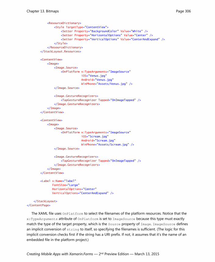
The XAML file for the ImageTap program puts each of the two Image elements on a ContentView
that is colored white from an implicit style. This white ContentView is entirely covered by the Image,
but (as you’ll see) it comes into play when the program flashes the picture to signal that it’s been
tapped.
<ContentPage xmlns="http://xamarin.com/schemas/2014/forms"
xmlns:x="http://schemas.microsoft.com/winfx/2009/xaml"
x:Class="ImageTap.ImageTapPage">
<StackLayout>
<StackLayout.Resources>
Chapter 13. Bitmaps Page 306
Creating Mobile Apps with Xamarin.Forms — 2nd Preview Edition — March 13, 2015
<ResourceDictionary>
<Style TargetType="ContentView">
<Setter Property="BackgroundColor" Value="White" />
<Setter Property="HorizontalOptions" Value="Center" />
<Setter Property="VerticalOptions" Value="CenterAndExpand" />
</Style>
</ResourceDictionary>
</StackLayout.Resources>
<ContentView>
<Image>
<Image.Source>
<OnPlatform x:TypeArguments="ImageSource"
iOS="Venus.jpg"
Android="Venus.jpg"
WinPhone="Assets/Venus.jpg" />
</Image.Source>
<Image.GestureRecognizers>
<TapGestureRecognizer Tapped="OnImageTapped" />
</Image.GestureRecognizers>
</Image>
</ContentView>
<ContentView>
<Image>
<Image.Source>
<OnPlatform x:TypeArguments="ImageSource"
iOS="Scream.jpg"
Android="Scream.jpg"
WinPhone="Assets/Scream.jpg" />
</Image.Source>
<Image.GestureRecognizers>
<TapGestureRecognizer Tapped="OnImageTapped" />
</Image.GestureRecognizers>
</Image>
</ContentView>
<Label x:Name="label"
FontSize="Large"
HorizontalOptions="Center"
VerticalOptions="CenterAndExpand" />
</StackLayout>
</ContentPage>
The XAML file uses OnPlatform to select the filenames of the platform resources. Notice that the
x:TypeArguments attribute of OnPlatform is set to ImageSource because this type must exactly
match the type of the target property, which is the Source property of Image. ImageSource defines
an implicit conversion of string to itself, so specifying the filenames is sufficient. (The logic for this
implicit conversion checks first if the string has a URI prefix. If not, it assumes that it’s the name of an
embedded file in the platform project.)

Chapter 13. Bitmaps Page 307
Creating Mobile Apps with Xamarin.Forms — 2nd Preview Edition — March 13, 2015
If you want to avoid using OnPlatform entirely in programs that use platform bitmaps, you can put
the Windows Phone bitmaps in the root directory of the project rather than the Assets folder.
Tapping one of these buttons does two things: The Tapped handler sets the Opacity property of
the Image to 0.75, which results in partially revealing the white ContentView background and simu-
lating a flash. A timer restores the Opacity to the default value of 1 a tenth of a second later. The
Tapped handler also displays the rendered size of the Image element:
public partial class ImageTapPage : ContentPage
{
public ImageTapPage()
{
InitializeComponent();
}
void OnImageTapped(object sender, EventArgs args)
{
Image image = (Image)sender;
image.Opacity = 0.75;
Device.StartTimer(TimeSpan.FromMilliseconds(100), () =>
{
image.Opacity = 1;
return false;
});
label.Text = String.Format("Rendered Image is {0} x {1}",
image.Width, image.Height);
}
}
That rendered size compared with the pixel sizes on the bitmaps confirms that iOS and Android
have indeed selected the optimum bitmap:

Chapter 13. Bitmaps Page 308
Creating Mobile Apps with Xamarin.Forms — 2nd Preview Edition — March 13, 2015
These buttons occupy roughly half the width of the screen on all three platforms. This sizing is
based entirely on the size of the bitmaps themselves, without any additional sizing information in the
code or markup.
Toolbars and their Icons One of the primary uses of bitmaps in the user interface is the Xamarin.Forms toolbar, which appears at
the top of the page on iOS and Android devices, and at the bottom of the page on Windows Phone
devices. Toolbar items are tappable and fire Clicked events much like Button.
There is no class for toolbar itself. Instead, you add objects of type ToolbarItem to the
ToolbarItems collection property defined by Page.
The ToolbarItem class does not derive from View like Label and Button. It instead derives from
Element by way of MenuItemBase and MenuItem. (MenuItem is used only in connection with the
TableView and won’t be discussed until a later chapter.) To define the characteristics of a toolbar
item, use the following properties:
Text — the text that might appear (depending on the platform and Order)
Icon — a FileImageSource object referencing a bitmap from the platform project
Order — a member of the ToolbarItemOrder enumeration: Default, Primary, or Second-ary
There is also a Name property, but it just duplicates the Text property and should be considered obso-
lete.

Chapter 13. Bitmaps Page 309
Creating Mobile Apps with Xamarin.Forms — 2nd Preview Edition — March 13, 2015
The Order property governs whether the ToolbarItem appears as an image (Primary) or text
(Secondary). The Windows Phone is limited to four Primary items, and both the iPhone and Android
start getting crowded with more than that, so that’s a reasonable limitation. Additional Secondary
items are text only. On the iPhone they appear underneath the Primary items; on Android and Win-
dows Phone they aren’t seen on the screen until the user taps a vertical or horizontal ellipsis.
The Icon property is crucial for Primary items and the Text property is crucial for Secondary
items, but Windows Phone also uses the Text to display a short text hint underneath the icons for
Primary items.
When the ToolbarItem is tapped, it fires a Clicked event. ToolbarItem also has Command and
CommandParameter properties like the Button, but these are for data binding purposes and will be
demonstrated in a later chapter.
The ToolbarItems collection defined by Page is of type IList<ToolbarItem>. Once you add a
ToolbarItem to this collection, the ToolbarItem properties cannot be changed. The property set-
tings are instead used internally to construct platform-specific objects.
You can add ToolbarItem objects to a ContentPage in Windows Phone, but iOS and Android re-
strict toolbars to a NavigationPage, or to a page navigated to from a NavigationPage. Fortunately,
this requirement doesn’t mean that the whole topic of page navigation needs to be discussed before
you can use the toolbar. Instantiating a NavigationPage instead of a ContentPage simply involves
calling the NavigationPage constructor with the newly created ContentPage object in the App class.
The ToolbarDemo program reproduces the toolbar that you saw on the screenshots in Chapter 1.
The ToolbarDemoPage derives from ContentPage, but the App class passes the ToolbarDemoPage
object to a NavigationPage constructor:
public class App : Application
{
public App()
{
MainPage = new NavigationPage(new ToolbarDemoPage());
}
…
}
That’s all that’s necessary to get the toolbar to work on iOS and Android, and it has some other im-
plications as well. A title that you can set with the Title property of Page is displayed at the top of the
iOS and Android screens, and the application icon is also displayed on the Android screen. Another
result of using NavigationPage is that you no longer need to set some padding at the top of the iOS
screen. The status bar is now out of the range of the application’s page.
Perhaps the most difficult aspect of using ToolbarItem is assembling the bitmap images for the
Icon property. Each platform has different requirements for the color composition and size of these
icons, and each platform has somewhat different conventions for the imagery. The standard icon for
Share, for example, is different on all three platforms.

Chapter 13. Bitmaps Page 310
Creating Mobile Apps with Xamarin.Forms — 2nd Preview Edition — March 13, 2015
For these reasons, it makes sense for each of the platform projects to have its own collection of
toolbar icons, and that’s why Icon is of type FileImageSource.
Let’s begin with the two platforms that provide collections of icons suitable for ToolbarItem.
Icons for Android
The Android website has a downloadable collection of toolbar icons at this URL:
http://developer.android.com/design/downloads
Download the ZIP file identified as Action Bar Icon Pack.
The unzipped contents are organized into two main directories: Core_Icons (23 images), and Ac-
tion Bar Icons (144 images). These are all PNG files, and the Action Bar Icons come in four different
sizes indicated by the directory name:
drawable-mdpi (medium DPI) — 32 pixels square
drawable-hdpi (high DPI) — 48 pixels square
drawable-xhdpi (extra high DPI) — 64 pixels square
drawable-xxhdpi (extra extra high DPI) — 96 pixels square
These directory names are the same as the Resources folders in your Android project, and imply that
the toolbar icons render at 32 device-independent units, or about 1/5 inch.
The Core_Icons folder also arranges its icons into four directories with the same four sizes, but
these directories are named mdpi, hdpi, xdpi, and unscaled.
The Action Bar Icons folder has an additional directory organization using the names holo_dark
and holo_light:
holo_dark — white foreground image on a transparent background
holo_light — black foreground image on a transparent background
The word “holo” stands for “holographic” and refers to the name Android uses for its color themes.
Although the holo_light icons are much easier to see in Finder and Windows Explorer, for most
purposes (and especially for toolbar items) you should use the holo_dark icons. (Of course, if you know
how to change your application theme in the AndroidManifest.xml file, then you probably also know to
use the other icon collection.)
The Core_Icons folder only contains icons with white foregrounds on a transparent background.
For the ToolbarDemo program, three icons were chosen from the holo_dark directory in all four
resolutions. These were copied to the appropriate subfolders of the Resources directory in the Android
project:

Chapter 13. Bitmaps Page 311
Creating Mobile Apps with Xamarin.Forms — 2nd Preview Edition — March 13, 2015
From the 01_core_edit directory, the files named ic_action_edit.png
From the 01_core_search directory, the files named ic_action_search.png
From the 01_core_refresh directory, the files named ic_action_refresh.png
Check the properties of these PNG files. They must have a Build Action of AndroidResource.
Icons for Windows Phone
If you have a version of Visual Studio installed for Windows Phone 8, you can find a collection of PNG
files suitable for ToolbarItem in the following directory on your hard drive:
C:\Program Files (x86)\Microsoft SDKs\Windows Phone\v8.0\Icons
There are two subdirectories, Dark and Light, each containing the same 37 images. As with Android,
the icons in the Dark directory have white foregrounds on transparent backgrounds, and the icons in
the Light directory have black foregrounds on transparent backgrounds. You should use the ones in
the Dark directory.
The images are a uniform 76 pixels square but have been designed to appear inside a circle. Indeed,
one of the files is named basecircle.png that can serve as a guide if you’d like to design your own, so
there are really only 36 usable icons in the collection and a couple of them are the same.
Generally, in a Windows Phone project, files such as these are stored in the Assets folder (which al-
ready exists in the Windows Phone project) or a folder named Images. For variety, an Images folder
was created in the Windows Phone project in ToolbarDemo, and the following bitmaps added to it:
edit.png
feature.search.png
refresh.png
Check the properties of these files, and make sure the Build Action is Content.
Icons for iOS devices
This is the most problematic platform for ToolbarItem. If you’re programming directly for the native
iOS API, a bunch of constants let you select an image for UIBarButtonItem, which is the underlying
iOS implementation of ToolbarItem. But for the Xamarin.Forms ToolbarItem you’ll need to obtain
icons from another source—perhaps licensing a collection such as the one at glyphish.com—or make
your own.
For best results, you should supply two or three image files for each toolbar item in the Resources
folder. An image with a filename such as image.png should be 20-pixels square, while the same image
should also be supplied in a 40-pixel square dimension with the name [email protected] and a 60-pixel
square bitmap named [email protected].

Chapter 13. Bitmaps Page 312
Creating Mobile Apps with Xamarin.Forms — 2nd Preview Edition — March 13, 2015
Here’s a collection of free unrestricted-use icons used for the program in Chapter 1 and for the
ToolbarDemo program in this chapter:
http://www.smashingmagazine.com/2010/07/14/gcons-free-all-purpose-icons-for-designers-and-d
evelopers-100-icons-psd/
However, they are uniformly 32-pixels square, and some basic ones are missing. Regardless, the fol-
lowing three bitmaps were copied to the Resources folder in the iOS project under the assumption
that they will be properly scaled:
edit.png
search.png
reload.png
Another option is to use Android icons from the holo_light directory and scale the largest image
for the various iOS sizes.
For toolbar icons in an iOS project, the Build Action must be BundleResource.
Here’s the ToolbarDemo XAML file showing the various ToolbarItem objects added to the
ToolbarItems collection of the page. The x:TypeArguments attribute for OnPlatform must be
FileImageSource in this case because that’s the type of the Icon property of ToolbarItem. The
three items flagged as Secondary have only the Text property set and not the Icon property.
The root element has a Title property set on the page. This is displayed on the iOS and Android
screens when the page is instantiated as a NavigationPage (or navigated to from a Navigation-
Page):
<ContentPage xmlns="http://xamarin.com/schemas/2014/forms"
xmlns:x="http://schemas.microsoft.com/winfx/2009/xaml"
x:Class="ToolbarDemo.ToolbarDemoPage"
Title="Toolbar Demo">
<Label x:Name="label"
FontSize="Large"
HorizontalOptions="Center"
VerticalOptions="Center" />
<ContentPage.ToolbarItems>
<ToolbarItem Text="edit"
Order="Primary"
Clicked="OnToolbarItemClicked">
<ToolbarItem.Icon>
<OnPlatform x:TypeArguments="FileImageSource"
iOS="edit.png"
Android="ic_action_edit.png"
WinPhone="Images/edit.png" />
</ToolbarItem.Icon>
</ToolbarItem>

Chapter 13. Bitmaps Page 313
Creating Mobile Apps with Xamarin.Forms — 2nd Preview Edition — March 13, 2015
<ToolbarItem Text="search"
Order="Primary"
Clicked="OnToolbarItemClicked">
<ToolbarItem.Icon>
<OnPlatform x:TypeArguments="FileImageSource"
iOS="search.png"
Android="ic_action_search.png"
WinPhone="Images/feature.search.png" />
</ToolbarItem.Icon>
</ToolbarItem>
<ToolbarItem Text="refresh"
Order="Primary"
Clicked="OnToolbarItemClicked">
<ToolbarItem.Icon>
<OnPlatform x:TypeArguments="FileImageSource"
iOS="reload.png"
Android="ic_action_refresh.png"
WinPhone="Images/refresh.png" />
</ToolbarItem.Icon>
</ToolbarItem>
<ToolbarItem Text="explore"
Order="Secondary"
Clicked="OnToolbarItemClicked" />
<ToolbarItem Text="discover"
Order="Secondary"
Clicked="OnToolbarItemClicked" />
<ToolbarItem Text="evolve"
Order="Secondary"
Clicked="OnToolbarItemClicked" />
</ContentPage.ToolbarItems>
</ContentPage>
All the Clicked events have the same handler assigned. You can use unique handlers for the items,
of course. This handler just displays the text of the ToolbarItem using the centered Label:
public partial class ToolbarDemoPage : ContentPage
{
public ToolbarDemoPage()
{
InitializeComponent();
}
void OnToolbarItemClicked(object sender, EventArgs args)
{
ToolbarItem toolbarItem = (ToolbarItem)sender;
label.Text = "ToolbarItem '" + toolbarItem.Text + "' clicked";
}
}

Chapter 13. Bitmaps Page 314
Creating Mobile Apps with Xamarin.Forms — 2nd Preview Edition — March 13, 2015
The screenshots show the icon toolbar items (and for iOS, the text items) and the centered Label
with the most recently clicked item:
If you tap the ellipsis at the top of the Android screen, or the ellipsis at the lower right corner of the
Windows Phone screen, the text items are displayed, and in addition, the text items associated with the
icons are also displayed on Windows Phone:

Chapter 13. Bitmaps Page 315
Creating Mobile Apps with Xamarin.Forms — 2nd Preview Edition — March 13, 2015
Regardless of the platform, the toolbar is the standard way to add common commands to a phone
application.
Button Images Button defines an Image property of type FileImageSource that you can use to supply a small sup-
plemental image that is displayed to the left of the button text. This feature is not intended for an im-
age-only button; if that’s what you want, the ImageTap program in this chapter is a good starting
point.
You want the images to be about one-fifth inch in size. That means you want them to render at 32
device-independent units, and to show up against the background of the Button. For iOS, that means
a black image against a white or transparent background. For Android and Windows Phone, you’ll
want a white image against a transparent background. (Unfortunately, if the Windows Phone user
switches to a light background scheme, the bitmap won’t be visible.)
All the bitmaps in the ButtonImage project are from the Action Bar directory of the Android De-
sign Icons collection, and the 03_rating_good and 03_rating_bad subdirectories. These are “thumbs
up” and “thumbs down” images.
The iOS images are from the holo_light directory (black images on transparent backgrounds) with
the following filename conversions:
drawable-mdpi/ic_action_good.png not renamed
drawable-xhdpi/ic_action_good.png renamed to [email protected]
And similarly for ic_action_bad.png.
The Android images are from the holo_dark directory (white images on transparent backgrounds),
and includes all four sizes from the subdirectories drawable-mdpi (32 pixels square), drawable-hdpi
(48 pixels), drawable-xhdpi (64 pixels), and drawable-xxhdpi (96 pixels square).
The Windows Phone images are also from the holo_dark directory but are only the 32-pixel bit-
maps from the drawable-mdpi directories. (You might think that you should use 48-pixel bitmaps for
Windows Phone, but the implementation of this feature in Xamarin.Forms limits the size, so it doesn’t
make a difference.)
Here’s the XAML file that sets the Icon property for two Button elements:
<ContentPage xmlns="http://xamarin.com/schemas/2014/forms"
xmlns:x="http://schemas.microsoft.com/winfx/2009/xaml"
x:Class="ButtonImage.ButtonImagePage">
<StackLayout VerticalOptions="Center"
Spacing="50">
<StackLayout.Resources>
<ResourceDictionary>

Chapter 13. Bitmaps Page 316
Creating Mobile Apps with Xamarin.Forms — 2nd Preview Edition — March 13, 2015
<Style TargetType="Button">
<Setter Property="HorizontalOptions">
<Setter.Value>
<OnPlatform x:TypeArguments="LayoutOptions"
iOS="Fill"
Android="Center"
WinPhone="Center" />
</Setter.Value>
</Setter>
</Style>
</ResourceDictionary>
</StackLayout.Resources>
<Button Text="Oh Yeah">
<Button.Image>
<OnPlatform x:TypeArguments="FileImageSource"
iOS="ic_action_good.png"
Android="ic_action_good.png"
WinPhone="Assets/ic_action_good.png" />
</Button.Image>
</Button>
<Button Text="No Way">
<Button.Image>
<OnPlatform x:TypeArguments="FileImageSource"
iOS="ic_action_bad.png"
Android="ic_action_bad.png"
WinPhone="Assets/ic_action_bad.png" />
</Button.Image>
</Button>
</StackLayout>
</ContentPage>
That implicit Style definition for Button requires an explanation: Originally the buttons were given
a HorizontalOptions of Center to prevent the button border from stretching to the sides of the
screen on Android and Windows Phone. However, with that setting, the iOS button wasn’t sizing itself
correctly and truncated the button text. For that reason, this implicit Style gives the iOS button a
HorizontalOptions setting of Fill. The iOS button doesn’t have a border so that setting doesn’t
change its appearance:

Chapter 13. Bitmaps Page 317
Creating Mobile Apps with Xamarin.Forms — 2nd Preview Edition — March 13, 2015
It’s not much, but the bitmap adds a little panache to the normally text-only Button.
Another significant use for small bitmaps is the context menu available for items in the TableView.
But a prerequisite for that is a deep exploration of the various views that contribute to the interactive
interface of Xamarin.Forms. That’s coming up in Chapter 15.
But first let’s look at an alternative to StackLayout that lets you position child views in a com-
pletely flexible manner.