chapter 1 statistics
DESCRIPTION
statisticTRANSCRIPT
26
Chapter 1Statistics
1.1 BASIC TERMINOLOGIES OF STATISTICS
a. Population : the collection of items under discussions/study.
b. Sample : any subset of a population. A random sample is a sample which is chosen so that every member of the population is equally likely to be chosen.
c. Variable : any quantity or characteristic whose value varies for different members of a population/sample (e.g. height, occupation)
d. Frequency : number of time a value occurs (e.g. 25 males in a class)
e. Frequency Distribution : set of the different possible values of a variable and the frequencies with which the occur. A frequency distribution may be grouped and ungrouped.
1.2 DATA PRESENTATION
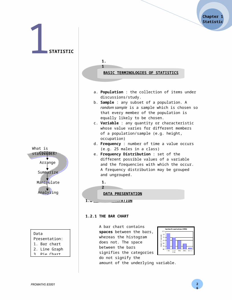
1.2.1 THE BAR CHART
A bar chart contains spaces between the bars, whereas the histogram does not. The space between the bars signifies the categories do not signify the amount of the underlying variable.
The bar-chart (or column chart) is the simplest and most versatile of statistical diagrams. It is used for comparing the frequency, count, total or average of data in different categories.
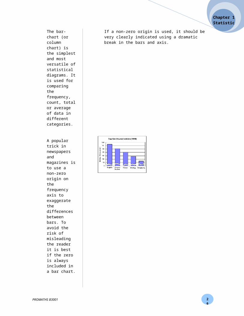
A popular trick in newspapers and magazines is to use a non-zero origin on the frequency axis to exaggerate the differences between bars. To avoid the risk of misleading the reader it is best if the zero is always included in a bar chart.
If a non-zero origin is used, it should be very clearly indicated using a dramatic break in the bars and axis.
PROMATHS B3001
Data Presentation:1. Bar chart2. Line Graph3. Pie Chart 4. Pictograph
Collect
Arrange
Summarize
Manipulate
Analyzing
What is statistics?
STATISTIC
1.1
BASIC TERMINOLOGIES OF STATISTICS
1.2
DATA PRESENTATION
26
Chapter 1Statistics
1.2.2 LINE CHART
A line chart is used for displaying time series data. A time series is a set of observations recorded at successive points in time, normally at regular intervals.
A time series is a special case of a bivariate data-set in which the independent (x) variable is time. Interestingly, although time is a continuous variable, the recorded time data will appear to be discrete (e.g. 1985, 1986, 1987, ...) or even nominal (e.g. Jan, Feb, Mar, ...).
A line chart is essentially an XY chart in which the x-variable is time.
The primary purpose of a line chart is to show changes and trends over time. Hence, unlike an XY chart, in a line chart consecutive points are connected by lines - needed the plotting symbols may be removed if preferred. A line chart is preferable to a bar chart for this type of data since a bar chart emphasises changes in the vertical direction and the gaps between the bars interrupt the passage of time.
On the time axis the tick marks are used to separate the time periods, rather than mark a particular time. As in an XY chart, it is not essential to include the zero mark on the y-axis, as this may mask the very changes that one wishes to display (see below).
PROMATHS B3001

26
Chapter 1Statistics
1.2.3 PIE CHART
A pie chart is used to display the proportion (i.e. percentage or fraction) of the data belonging to different categories. Pie charts should only be used for nominal (categorical, qualitative) data. If numerical data are used there is a risk of confusion between the data values and the percentages (or frequencies). If ordinal data are used it is important that the order of the sectors follows the natural order of the data. Each 1% of the data is represented by a sector (i.e. piece of the cake) of 3.6 degrees, making 100% or 360 degrees altogether.
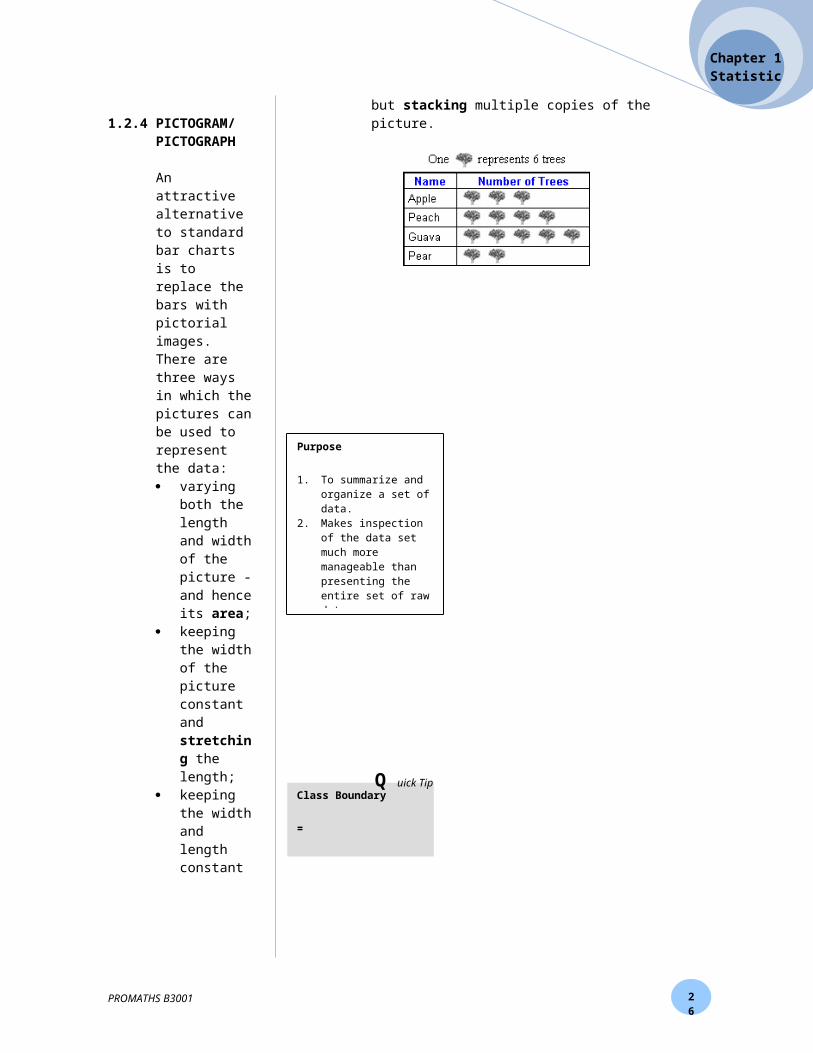
1.2.4 PICTOGRAM/PICTOGRAPH
An attractive alternative to standard bar charts is to replace the bars with pictorial images. There are three ways in which the pictures can be used to represent the data: varying both the length and width of the picture - and
hence its area; keeping the width of the picture constant and
stretching the length; keeping the width and length constant but stacking
multiple copies of the picture.
PROMATHS B3001

26
Chapter 1Statistics
1.3 FREQUENCY DISTRIBUTION TABLE
A distribution showing the number of observations associated with each score value in a set of data that is quantitative in nature. Frequency distributions make it easy to see trends in data, particularly when two different data sets are compared.
How to construct Frequency Distribution Table
1. Determine the highest and lowest value of the data.2. Determine the range of data
[range = highest value – lowest value]3. Determine the number of class [ ]
4. Determine the width/size of class [ ]
5. Build the class interval.6. Count the frequency of the data by using tally mark.
1.4 FREQUENCY DISTRIBUTION GRAPH
1.4.1 Histogram
A pictorial representation of a frequency distribution in which the scores (X) are plotted on the X-axis of a graph and the frequency (or relative frequency) of occurrences is plotted on the Y-axis. A Histogram is used when the X scores are quantitative, or continuous.
How to create a Histogram:
1. Create a Frequency Distribution of the scores of interest.
2. The X-axisa. Determine a suitable scale for the
horizontal axis & determine the number of squares needed.
b. Try not to break the X-axis, but if you do, use proper notation.
PROMATHS B3001
10 - 15Lower Class
LimitUpper Class Limit
Class Interval
9.5 – 15.5
Class Boundary
Lower Class Boundary
Upper Class Boundary
Purpose
1. To summarize and organize a set of data.
2. Makes inspection of the data set much more manageable than presenting the entire set of raw data.
3. A frequency distribution can be considered a type of descriptive
Histogram is plot of the frequencies against the class boundaries
1.3
FREQUENCY DISTRIBUTION TABLE
1.4
FREQUENCY DISTRIBUTION GRAPH
Class Boundary
=
Q uick Tip
26
Chapter 1Statistics
3. The Y-
axis
a. Displays information about frequency b. Try not to break the Y-axis, but if you do,
use proper notation. 4. Create bars for each score value (X).
a. Height = frequency/relative frequency.b. No gaps between bars (except for N = 0
intervals). Bars should touch.5. Label histogram with title. Be sure to label X and
Y-axes.
1.4.2 Frequency polygon
A frequency polygon is a pictorial representation of a frequency distribution in which the scores (X) are plotted on the X-axis of the graph and the frequency (or relative frequency) of occurrences is plotted on the Y-axis. However, the frequencies at each value of X are represented as dots connected by a line as opposed to bars (as in a Histogram).
How to create a Frequency Polygon
1. Create a Frequency Distribution of the scores of interest. 2. The X-axis - completed as a Histogram with the following
caveat - create a X value for the score above the highest and below the lowest actual X scores.
3. The Y-axis - completed as a Histogram 4. Create dots for each class interval - the height should be
equal to frequency or relative frequency. 5. Connect dots with straight lines. Connect the dots above
the highest and below the lowest score values (X) to the X-axis at the score values created in step 2. Label frequency polygon with title. Be should to label X and Y-axes.
1.4.3 Ogive
The ogive is then simply an XY plot of the cumulative frequencies (or cumulative percentage frequencies) against the class upper boundaries. A common mistake is to plot against the class midpoints, due to confusion with the simple frequency polygon.
PROMATHS B3001

26
Chapter 1Statistics
1.5 MEASURE OF CENTRAL TENDENCY
1.5.1 Mean
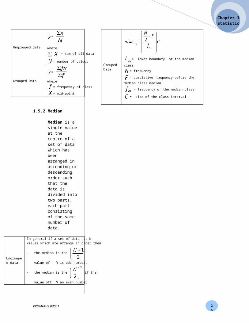
The mean (or average) of a set of data values is the sum of all of the data values divided by the number of data values.
Ungrouped data
=
where,
= sum of all data
= number of values
Grouped Data
=
where
= frequency of class
= mid-point
1.5.2 Median
Median is a single value at the centre of a set of data which has been arranged in ascending or descending order such that the data is divided into two parts, each part consisting of the same number of data.
Ungrouped data
In general if a set of data has N values which are arrange in order then
- the median is the if the value of
N is odd number.
- the median is the if the value off N an
even number
Grouped Data
= lower boundary of the median class
= frequency
= cumulative frequency before the median class
median
= frequency of the median class
= size of the class interval
PROMATHS B3001
1.5
MEASURE OF CENTRAL TENDENCY
WHAT IS GROUPED DATA ?
Data which have been arranged in groups or classes rather than showing all the original figures, for example, the data in a population
The data obtained in original form are called raw data or ungrouped data

26
Chapter 1Statistics
1.5.3 Mode
Mode is the value with the highest number of occurrence in a set of data.
Grouped Data
where, LMo= lower boundary of the mode class.d1 = Difference between frequency of class mode and frequency class before class mode d2 = Difference between frequency of class mode and frequency class after class modec = size of class interval
1.6 ANALYZE FREQUENCY DISTRIBUTION GRAPH
1.6.1 QuartileOne of the four divisions of observations which have been grouped into four equal-sized sets based on their statistical rank (Q1, Q2 and Q3.)
1.6.2 DecileA decile is any of the 9 values that divide the sorted data into 10 equal parts, so that each part represents 1/10th of the sample or population. (D1, D2, D3,……,D9.)
1.6.3 PercentileValue on a scale of one hundred that indicates the percent of a distribution that is equal to or below it. (P1, P2, P3,……,P99)
1.7 MEASURE OF DISPERSION
1.7.1 Mean deviation
The mean deviation (also called the mean absolute deviation) is the mean of the absolute deviations of a set of data about the data's mean.
Ungrouped data MD =
Grouped Data MD =
PROMATHS B3001
1.6
ANALYZE FREQUENCY DISTRIBUTION GRAPH

26
Chapter 1Statistics
1.7.2 Variance
A measure of the dispersion of a set of data points around their mean value. It is a mathematical expectation of the average squared deviations from the mean.
Ungrouped data
Grouped Data
1.7.3 Standard deviation
A measure of the dispersion or variation in a distribution, equal to the square root of the arithmetic mean of the squares of the deviations from the arithmetic mean.
Ungrouped data
Grouped Data
PROMATHS B3001
Size of the class, c = upper class boundary – lower class boundary
Q uick Tip
26
Chapter 1Statistics
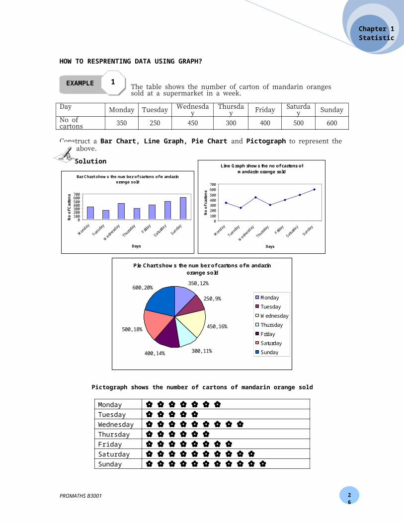
HOW TO RESPRENTING DATA USING GRAPH?
The table shows the number of carton of mandarin oranges sold at a supermarket in a week.
Day Monday Tuesday Wednesday Thursday Friday Saturday SundayNo of cartons 350 250 450 300 400 500 600
Construct a Bar Chart, Line Graph, Pie Chart and Pictograph to represent the data above.
Bar Chart shows the number of cartons of mandarin orange sold
0100200300400500600700
Mon
day
Tuesd
ay
Wedn
esday
Thurs
day
Friday
Satur
day
Sunda
y
Days
No
of
Car
ton
s
Line Graph shows the no of cartons of mandarin orange sold
0100
200300400500
600700
Mon
day
Tuesd
ay
Wedn
esday
Thurs
day
Friday
Satur
day
Sunda
y
Days
No
of
cart
on
s
Pie Chart shows the number of cartons of mandarin orange sold
350, 12%
250, 9%
450, 16%
300, 11%400, 14%
500, 18%
600, 20%
Monday
Tuesday
Wednesday
Thursday
Friday
Saturday
Sunday
Pictograph shows the number of cartons of mandarin orange sold
Monday Tuesday Wednesday Thursday Friday Saturday Sunday
represent 50 cartons
PROMATHS B3001
EXAMPLE 11
Next Exercise : Progressive Exercise 1 a , b PAGE 24
Solution
26
Chapter 1Statistics
HOW TO BUILD FREQUENCY DISTRIBUTION TABLE ?
The data below shows the marks for 50 students in a quiz.
34 75 62 26 56 72 80 63 85 59
37 51 72 20 72 75 70 48 58 40
44 70 60 51 74 75 65 56 59 59
48 67 72 51 80 70 58 83 56 56
55 70 70 73 58 68 73 71 45 52
1. Determine the highest and lowest value of the data.
2. Determine the range of data ; [range = highest value – lowest value]
3. Determine the number of class [ ]
4. Determine the width/size of class [ ]
5. Build the class interval and count the frequency of the data by using tally mark.
Class Interval Tally Marks Frequency Class Boundary
PROMATHS B3001
Next Exercise : Progressive Exercise 1 c PAGE 24
EXERCISE 1.1
Solution

An ogive of the score for 40 students in a Science Quiz
0
10
20
30
40
50
29.5 39,5 49.5 59.5 69.5 79.5 89.5
Upper Class Boundary
Cu
mm
ula
tive
Fre
qu
ency
26
Chapter 1Statistics
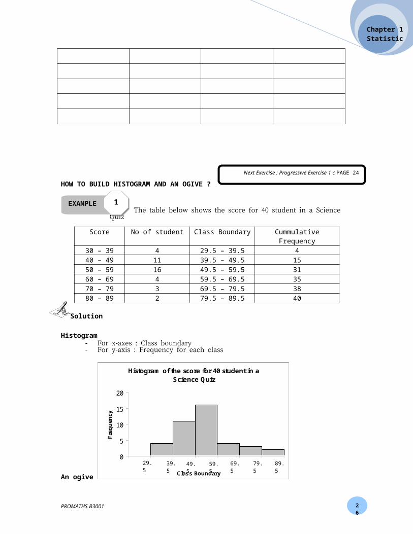
HOW TO BUILD HISTOGRAM AND AN OGIVE ?
The table below shows the score for 40 student in a Science Quiz
Score No of student Class Boundary Cummulative Frequency30 – 39 4 29.5 – 39.5 440 – 49 11 39.5 – 49.5 1550 – 59 16 49.5 – 59.5 3160 – 69 4 59.5 – 69.5 3570 – 79 3 69.5 – 79.5 3880 – 89 2 79.5 – 89.5 40
Histogram- For x-axes : Class boundary- For y-axis : Frequency for each class
An ogive- For x-axes : Upper Class boundary- For y-axis : Cummulative Frequency
PROMATHS B3001
Histogram of the score for 40 student in a Science Quiz
0
5
10
15
20
Class Boundary
Fre
qu
ency
29.5 39.5 49.5 59.5 69.5 79.5 89.5
EXAMPLE 11
Solution

26
Chapter 1Statistics
MEASURE OF CENTRAL TENDENCY
Find the mean for data below :2, 3, 8, 10, 12
= = = = 5
Find the mean for data below :
Score (x) Frequency (f)
fx
2 4 83 5 156 2 127 3 2110 3 30
Σf = 17 Σfx = 86
= = = 5.059
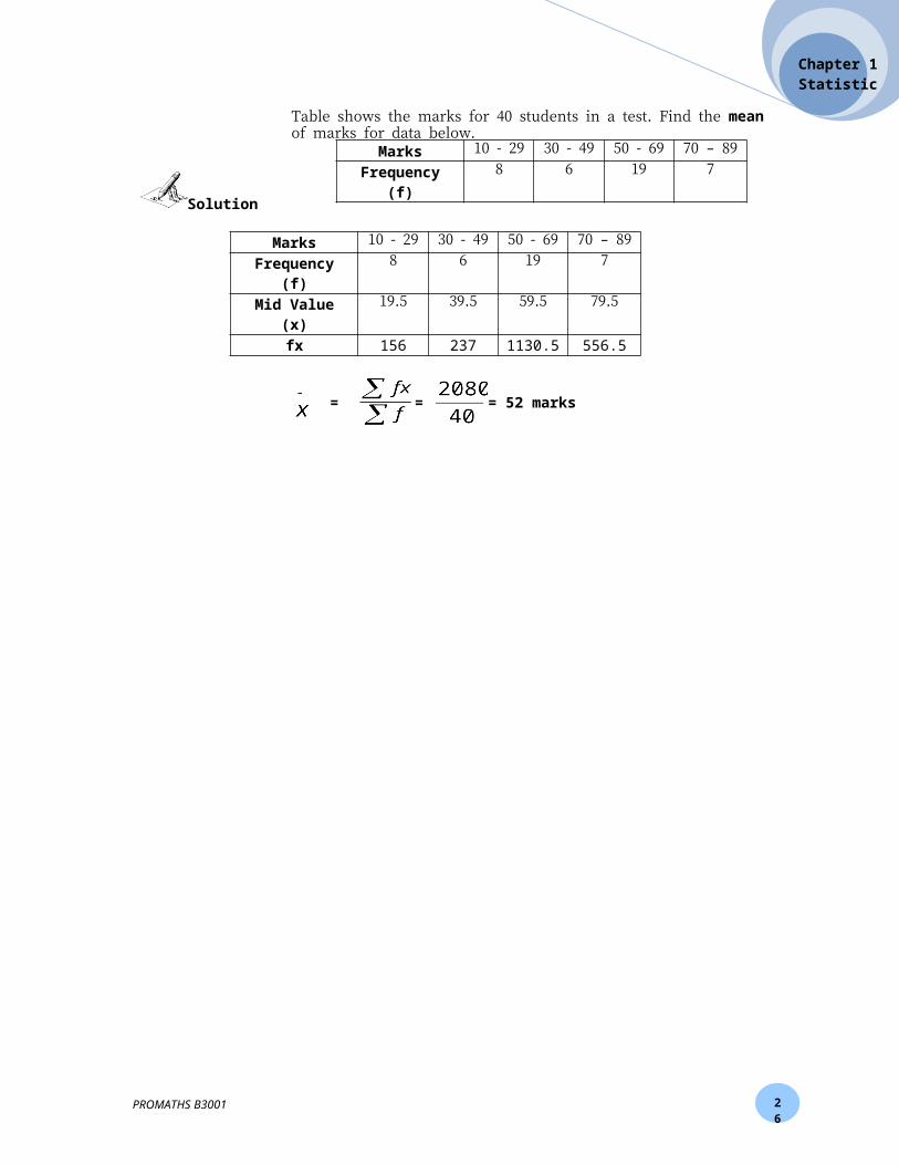
Table shows the marks for 40 students in a test. Find the mean of marks for data below.
Marks 10 - 29 30 - 49 50 - 69 70 – 89Frequency (f) 8 6 19 7
Marks 10 - 29 30 - 49 50 - 69 70 – 89Frequency (f) 8 6 19 7Mid Value (x) 19.5 39.5 59.5 79.5
fx 156 237 1130.5 556.5
PROMATHS B3001
Score Frequency2 43 56 27 3
10 3
EXAMPLE 11
EXAMPLE 22
EXAMPLE 33
Next Exercise : Progressive Exercise 1 c PAGE 24
MEAN FOR UNGROUPED DATA
MEAN FOR GROUPED DATA
Solution
Solution
Solution

26
Chapter 1Statistics
= = = 52 marks
PROMATHS B3001
26
Chapter 1Statistics
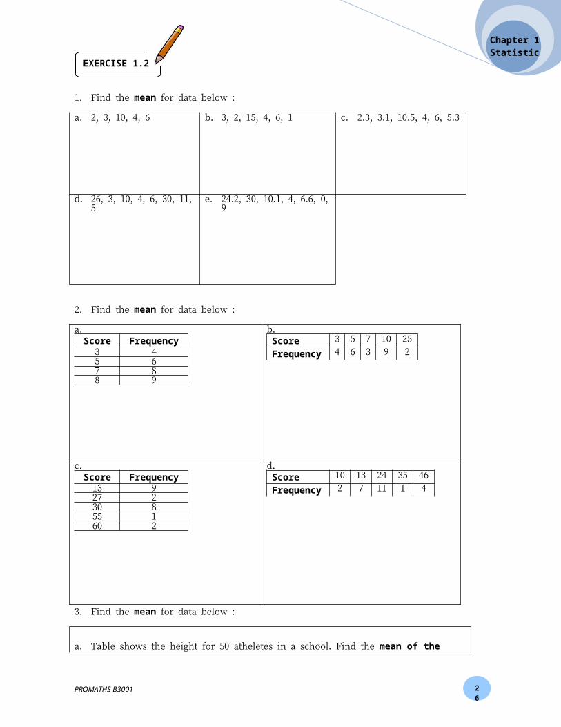
1. Find the mean for data below :
a. 2, 3, 10, 4, 6
b. 3, 2, 15, 4, 6, 1
c. 2.3, 3.1, 10.5, 4, 6, 5.3
d. 26, 3, 10, 4, 6, 30, 11, 5 e. 24.2, 30, 10.1, 4, 6.6, 0, 9
2. Find the mean for data below :
a.Score Frequency
3 45 67 88 9
b.Score 3 5 7 10 25Frequency 4 6 3 9 2
c.
Score Frequency13 927 230 855 160 2
d.Score 10 13 24 35 46Frequency 2 7 11 1 4
PROMATHS B3001
EXERCISE 1.2

26
Chapter 1Statistics
3. Find the mean for data below :
a. Table shows the height for 50 atheletes in a school. Find the mean of the height of athlete.
Height (cm) 141-145 146- 150 151-155 156-160 161-165 166-170No of
Athelete2 5 10 12 14 7
b. Table shows the ages for 100 workers in a factory for the year of 2009 and find the mean of age of the worker.
Age (year)
No of workers
20 - 24 525 - 29 1730 - 34 2335 - 39 2840 - 44 1845 - 49 750 - 54 2
c. Table shows the width of leaves that was collected by a group of students for expereiment. Find the mean of the width of the leaves.
Width (cm) 5.1 - 6.0 6.1 – 7.0 7.1 – 8.0 8.1 – 9.0 9.1 – 10.0 Frequency 13 18 24 16 9
PROMATHS B3001
Next Exercise : Progressive Exercise 1 d, e, f, g , h, i, j PAGE 24
26
Chapter 1Statistics
Find the median for data below :
2, 3, 8, 10, 12, 3
Arrange the order of data ; 2, 3, 3, 8, 10, 12
So, the median is = 5.5
Find the median for data below :
To find the median value, = = 8.5 [Refer cumulative frequency]
= score 6
Table shows the marks for 40 students in a test. Find the median of the marks.
Marks 10 - 29 30 - 49 50 - 69 70 – 89Frequency 8 6 19 7
Marks 10 - 29 30 - 49 50 - 69 70 – 89Frequency 8 6 19 7
Mid Value (x) 19.5 39.5 59.5 79.5Cumulative Frequency 8 14 33 40
Median class = = = 20 [Refer Cumulative Frequency] = 50 - 69
= lower boundary of the median class = 49.5 = frequency = 40
= cumulative frequency before the median class median = 14 = frequency of the median class = 19
= size of the class interval = 10
PROMATHS B3001
Score Frequency Cumulative Frequency2 4 43 5 96 2 117 3 14
10 3 17
EXAMPLE 11
EXAMPLE 22
EXAMPLE 33
MEDIAN FOR GROUPED DATA
MEDIAN FOR UNGROUPED DATA
Solution
Solution
Solution
Size of the class, c = upper class boundary – lower class boundary
Q uick Tip

26
Chapter 1Statistics
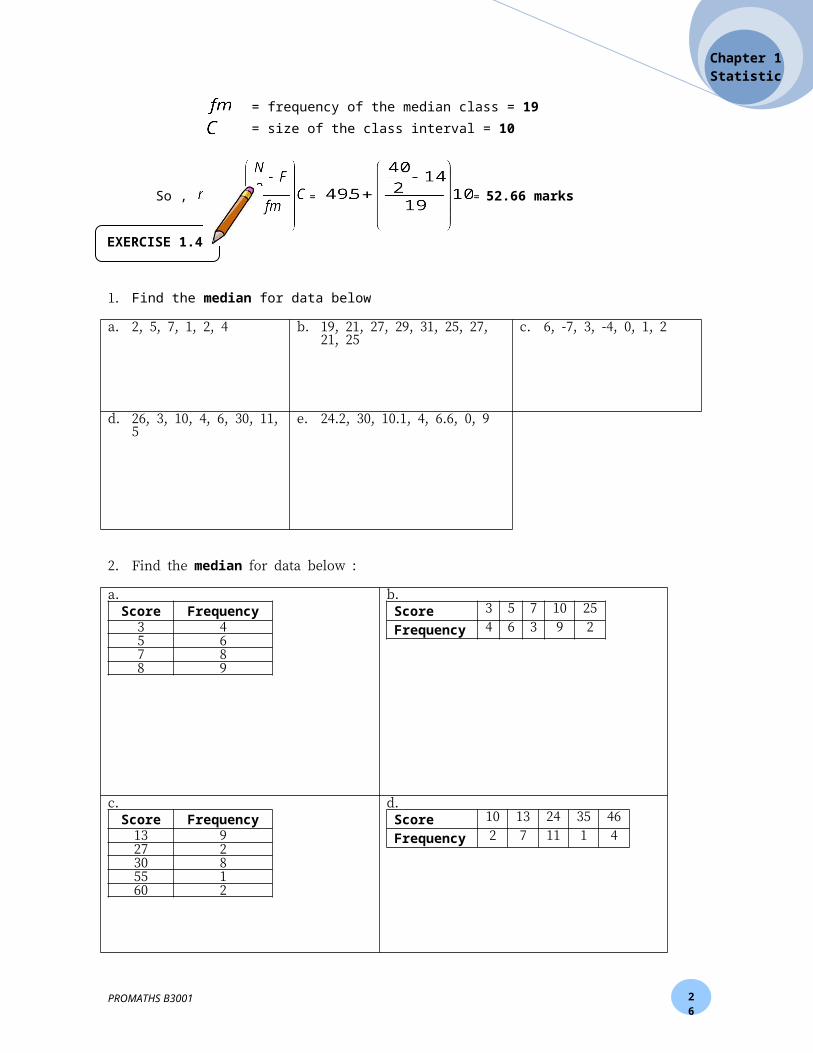
So , = = 52.66 marks
1. Find the median for data below
a. 2, 5, 7, 1, 2, 4
b. 19, 21, 27, 29, 31, 25, 27, 21, 25
c. 6, -7, 3, -4, 0, 1, 2
d. 26, 3, 10, 4, 6, 30, 11, 5 e. 24.2, 30, 10.1, 4, 6.6, 0, 9
2. Find the median for data below :
a.Score Frequency
3 45 67 88 9
b.Score 3 5 7 10 25Frequency 4 6 3 9 2
c.Score Frequency
13 927 230 855 160 2
d.Score 10 13 24 35 46Frequency 2 7 11 1 4
PROMATHS B3001
EXERCISE 1.4
26
Chapter 1Statistics
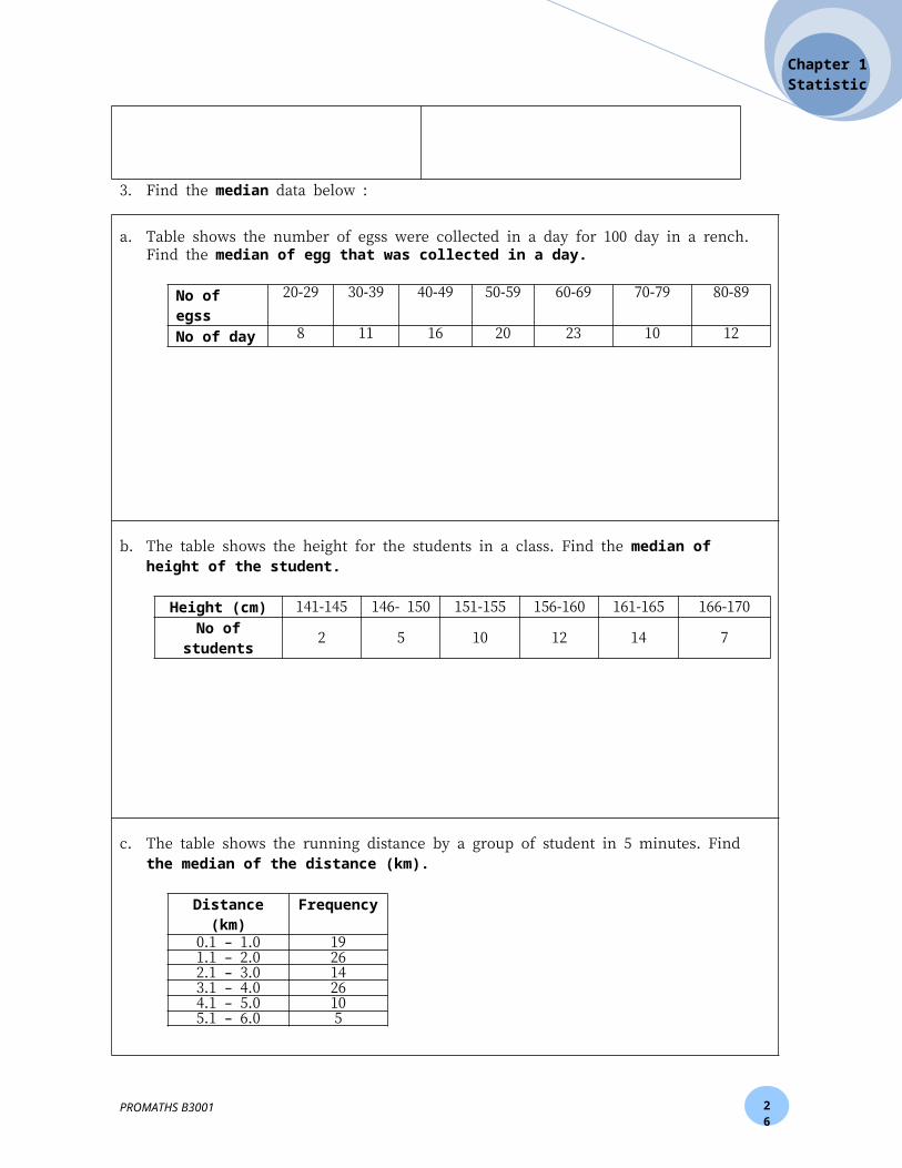
3. Find the median data below :
a. Table shows the number of egss were collected in a day for 100 day in a rench. Find the median of egg that was collected in a day.
No of egss 20-29 30-39 40-49 50-59 60-69 70-79 80-89No of day 8 11 16 20 23 10 12
b. The table shows the height for the students in a class. Find the median of height of the student.
Height (cm) 141-145 146- 150 151-155 156-160 161-165 166-170No of students 2 5 10 12 14 7
c. The table shows the running distance by a group of student in 5 minutes. Find the median of the distance (km).
Distance (km) Frequency0.1 – 1.0 191.1 – 2.0 262.1 – 3.0 143.1 – 4.0 264.1 – 5.0 105.1 – 6.0 5
PROMATHS B3001
26
Chapter 1Statistics
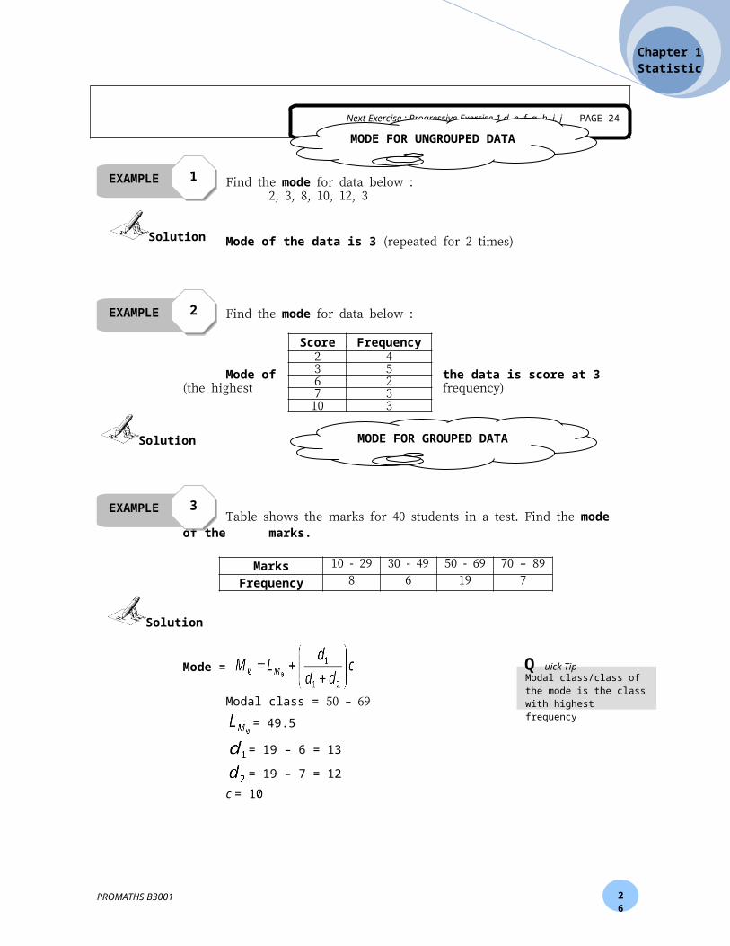
Find the mode for data below :2, 3, 8, 10, 12, 3
Mode of the data is 3 (repeated for 2 times)
Find the mode for data below :
Mode of the data is score at 3 (the highest frequency)
Table shows the marks for 40 students in a test. Find the mode of themarks.
Marks 10 - 29 30 - 49 50 - 69 70 – 89Frequency 8 6 19 7
Mode =
Modal class = 50 – 69
= 49.5
= 19 – 6 = 13
= 19 – 7 = 12c = 10
So, = 54.7 marks
PROMATHS B3001
Score Frequency2 43 56 27 3
10 3
Next Exercise : Progressive Exercise 1 d, e, f, g, h, i, j PAGE 24
EXAMPLE 11
EXAMPLE 22
EXAMPLE 33
MODE FOR GROUPED DATA
Solution
Solution
Solution
Modal class/class of the mode is the class with highest frequency
Q uick Tip
MODE FOR UNGROUPED DATA
26
Chapter 1Statistics
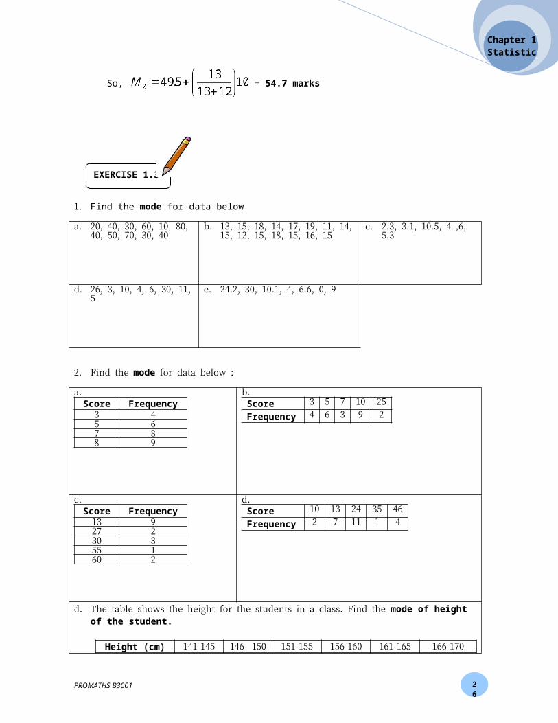
1. Find the mode for data below
a. 20, 40, 30, 60, 10, 80, 40, 50, 70, 30, 40
b. 13, 15, 18, 14, 17, 19, 11, 14, 15, 12, 15, 18, 15, 16, 15
c. 2.3, 3.1, 10.5, 4 ,6, 5.3
d. 26, 3, 10, 4, 6, 30, 11, 5 e. 24.2, 30, 10.1, 4, 6.6, 0, 9
2. Find the mode for data below :
a.Score Frequency
3 45 67 88 9
b.Score 3 5 7 10 25Frequency 4 6 3 9 2
c.Score Frequency
13 927 230 855 160 2
d.Score 10 13 24 35 46Frequency 2 7 11 1 4
d. The table shows the height for the students in a class. Find the mode of height of the student.
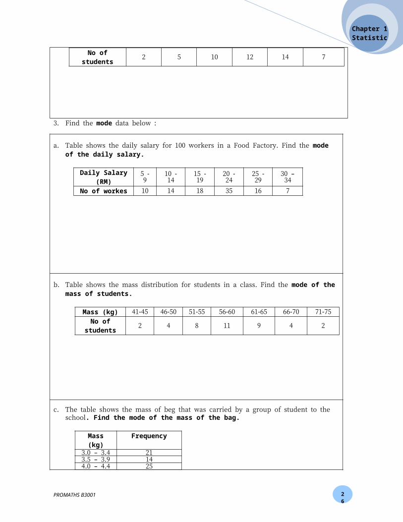
Height (cm) 141-145 146- 150 151-155 156-160 161-165 166-170No of students 2 5 10 12 14 7
PROMATHS B3001
EXERCISE 1.3

26
Chapter 1Statistics
3. Find the mode data below :
a. Table shows the daily salary for 100 workers in a Food Factory. Find the mode of the daily salary.
Daily Salary (RM)
5 - 9 10 - 14 15 - 19 20 - 24 25 - 29 30 – 34
No of workes 10 14 18 35 16 7
b. Table shows the mass distribution for students in a class. Find the mode of the mass of students.
Mass (kg) 41-45 46-50 51-55 56-60 61-65 66-70 71-75No of
students2 4 8 11 9 4 2
c. The table shows the mass of beg that was carried by a group of student to the school. Find the mode of the mass of the bag.
Mass (kg) Frequency3.0 – 3.4 213.5 – 3.9 144.0 – 4.4 254.5 – 4.9 185.0 – 5.4 16
PROMATHS B3001
26
Chapter 1Statistics
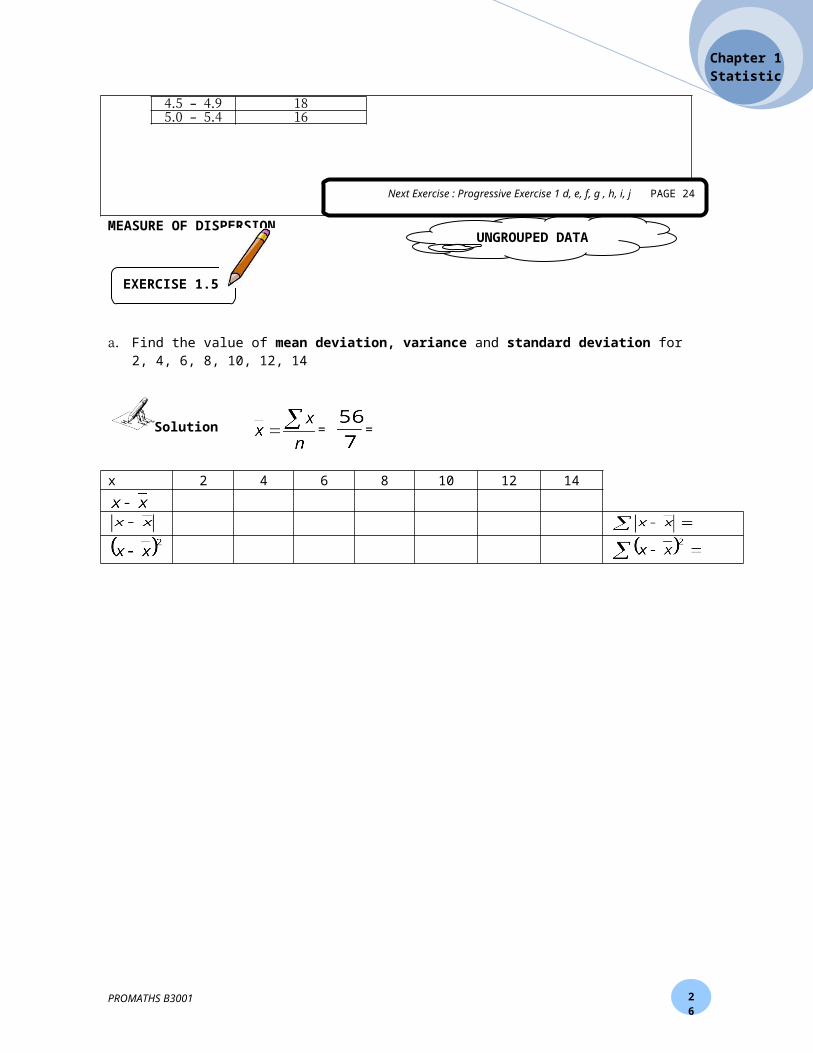
MEASURE OF DISPERSION
a. Find the value of mean deviation, variance and standard deviation for 2, 4, 6, 8, 10, 12, 14
= =
x 2 4 6 8 10 12 14
PROMATHS B3001
UNGROUPED DATA
EXERCISE 1.5
Solution
Next Exercise : Progressive Exercise 1 d, e, f, g , h, i, j PAGE 24
26
Chapter 1Statistics
b. The table shows the time was taken by 100 typist typed a document. Find the value of mean deviation, variance and standard deviation.
Time (minute) 11 12 13 14 15 16 17 18 19 20No of typist 1 2 4 6 12 28 23 11 9 4
fx
=
PROMATHS B3001
Next Exercise : Progressive Exercise 1 d, e PAGE 24
Next Exercise : Progressive Exercise 1 f , g PAGE 24
26
Chapter 1Statistics
c. Table shows the marks for 40 students in a test. Find the value of mean deviation, variance and standard deviation.
Marks 10 - 29 30 - 49 50 - 69 70 – 89
Frequency 8 6 19 7
Mid Value (x)
fx
=
a. The table shows the total credit card application within 5 years in Bank ABC
PROMATHS B3001
Next Exercise : Progressive Exercise 1 c, i, j PAGE 24
GROUPED DATA
PROGRESSIVE EXERCISE 1
26
Chapter 1Statistics
Years 2004 2005 2006 2007 2008No of application 2500 3000 4500 4000 3500
b. The table shows the number of students in four university for 2 years
UniversityYear
UM USM UMS UKM
2007 1250 2550 2050 15502008 1500 3050 2500 1850
c. The data below shows the duration of time (minute) for a group of student read a newspaper in one day. Construct a frequency distribution table for the data below.
12 34 42 34 28 49 33 37 33 30 31 23 34 29 33 4111 13 20 26 21 27 36 31 35 26 25 24 28 35 37 4750 16 11 39 22 26 44 43 32 54 37 53 37 36 31 25
d. 4, 6, 3, 2, 1, 1, 5
e. 213, 106, 311, 482, 762, 106
f. The table shows the age of students as a member in a Mathematics Club
Age (years) 13 14 15 16 17Frequency 5 19 7 10 1
g. The mean of the data below is 61.25.
Marks 50 55 60 65 70 75Frequency 2 3 x 2 1 2
i. Find the value of x.ii. Then, find the value of median and mode of the data.
h. The mode of a set of data with values of 25, 18, p, 30, 27, 40, 27, and 32 is p.i. Find the value of p.ii. Hence, calculate the mean of the set of data.
i. The table shows the distribution of marks obtained by a group of students in a Science Test..
Marks 21 - 40 41 – 60 61 – 80 81 - 100Frequency 12 k 8 9
i. Find the value of k if the mean mark is 57.5.ii. Then, find the value of mean deviation, variance and standard deviation.
j. The table shows the height of student in Kelas 1 Mawar.
PROMATHS B3001
26
Chapter 1Statistics
Height (m) 1.20 – 1.24 1.25 – 1.29 1.30 – 1.34 1.35 – 1.39 1.40 – 1.44Frequency 12 23 34 29 15
i. Find the mean, median and mode for the height of studentii. Find the mean deviation, variance and standard deviation.iii. Find the 3rd quartile, 7th decile and 60th percentile
1. The table shows the number of books published by a local publisher in five years.
Year 2000 2001 2002 2003 2004Number of books 240 300 150 210 330
Construct :i. A line graph to represent the above data.ii. A pictograph to represent the above by using the symbol to represent 30 books.iii. A pie chart to represent the above data.
2. The table shows the number of passenger, according to gender, who used the Putra LRT for a specified trip in five days a week. Construct a composite horizontal bar char to represent the data below :
Day Monday Tuesday Wednesday Thursday FridayMale Passenger 300 750 800 450 300
Female Passenger 500 400 600 650 400
3. Find the mean, median, mode, mean deviation, variance and standard deviation for data below :a. 102, 97, 78, 118, 84, 103, 95, 99b. 3.4, 6.2, 9.2, 1.3, 6.2, 5.5
4. The table shows the data of monthly wages of employees in a certain company.
Wages (RM) 840 920 1000 1080 1110Number of employees 5 4 6 8 7
From the data above, find the mean, median and mode of the monthly wages of employees in a certain company.
5. The frequency distribution table shows the masses of loaves of bread produced by a bakery
PROMATHS B3001
SUMMATIVE EVALUATION
26
Chapter 1Statistics
Mass (g) 420 – 424 425 – 429 430 – 434 435 – 439 440 - 444Frequency 16 24 25 18 17
From the table above:a. Construct an ogive then find the median of the mass of loaves.b. Construct a histogram then find the mode of the mass of loaves.c. Calculate the mean deviation, variance and standard deviation.d. From the ogive from 5(a), find the 1st quartile, 4th decile and 80th percentile.
6. The following is the distribution of the number of rainy days in Seattle in 60 months:
Number of days 5 – 7 8 – 10 11 – 13 14 – 16 17 - 19 20 - 22Frequency 5 9 12 18 13 3
From the table above:a. Construct an ogive then find the median of the number of rainy days.b. Construct a histogram then find the mode of the number of rainy days.c. Calculate the mean deviation, variance and standard deviation.d. From the ogive from 6(a), find the 3rd quartile, 8th decile and 40th percentile.
7. The following table shows the wind speed for 184 days from July to December 1995 recorded at a weather station:
Wind speed (ms-1) Frequency0.50 – 0.99 281.00 – 1.49 501.50 – 1.99 402.00 – 2.49 142.50 – 2.99 143.00 – 3.49 103.50 – 3.99 94.00 – 4.49 54.50 – 4.99 85.00 – 5.49 25.50 – 5.99 4
From the table above:a. Find the mean, median and mode of the wind speed (ms-1).b. Calculate the mean deviation, variance and standard deviation.c. Construct an ogive then find the 3rd quartile, 4th decile and 80th percentile.
8. The data below shows the percentage of sales that has been made by 56 company.
9.0 3.3 3.0 8.9 13.0 6.7 4.2 7.0 8.1 6.2 6.2 6.4 4.8 8.24.7 4.7 3.5 4.7 10.5 12.2 3.2 6.2 5.3 4.5 9.6 5.2 5.6 9.1
11.5 1.8 8.2 12.5 6.7 3.7 2.1 3.1 6.0 7.3 11.2 4.6 10.9 14.35.0 4.6 5.1 9.7 6.1 10.0 5.5 2.8 9.8 4.3 4.3 3.2 6.2 1.5
From the data above, build a frequency distribution table then construct an ogive and histogram.
PROMATHS B3001