chapman & hall/crc - wordpress.comchapman & hall/crc texts in statistical science series...
TRANSCRIPT

CHAPMAN & HALL/CRC
Texts in Statistical Science Series
Series EditorsChris Chatfield, University of Bath, UK
Martin Tanner, Northwestern University, USAJim Zidek, University of British Columbia, Canada
Analysis of Failure and Survival DataPeter J.Smith
The Analysis and Interpretation of Multivariate Data for Social ScientistsDavid J.Bartholomew, Fiona Steele, Irini Moustaki, and Jane Galbraith
The Analysis of Time Series—An Introduction, Sixth EditionChris Chatfield
Applied Bayesian Forecasting and Time Series AnalysisA.Pole, M.West and J.Harrison
Applied Nonparametric Statistical Methods, Third EditionP.Sprent and N.C.Smeeton
Applied Statistics—Handbook of GENSTAT AnalysisE.J.Snell and H.Simpson
Applied Statistics—Principles and ExamplesD.R.Cox and E.J.Snell
Bayes and Empirical Bayes Methods for Data Analysis, Second EditionBradley P.Carlin and Thomas A.Louis
Bayesian Data Analysis, Second EditionAndrew Gelman, John B.Carlin, Hal S.Stern, and Donald B.Rubin
Beyond ANOVA—Basics of Applied StatisticsR.G.Miller, Jr.
Computer-Aided Multivariate Analysis, Third EditionA.A.Afifi and V.A.Clark

A Course in Categorical Data AnalysisT.Leonard
A Course in Large Sample TheoryT.S.Ferguson
Data Driven Statistical MethodsP.Sprent
Decision Analysis—A Bayesian ApproachJ.Q.Smith
Elementary Applications of Probability Theory, Second EditionH.C.Tuckwell
Elements of SimulationB.J.T.Morgan
Epidemiology—Study Design and Data AnalysisM.Woodward
Essential Statistics, Fourth EditionD.A.G.Rees
A First Course in Linear Model TheoryNalini Ravishanker and Dipak K.Dey
Interpreting Data—A First Course in StatisticsA.J.B.Anderson
An Introduction to Generalized Linear Models, Second EditionA.J.Dobson
Introduction to Multivariate AnalysisC.Chatfield and A.J.Collins
Introduction to Optimization Methods and their Applications in StatisticsB.S.Everitt
Large Sample Methods in StatisticsP.K.Sen and J.da Motta Singer
Markov Chain Monte Carlo—Stochastic Simulation for Bayesian InferenceD.Gamerman
Mathematical StatisticsK.Knight

Modeling and Analysis of Stochastic SystemsV.Kulkarni
Modelling Binary Data, Second EditionD.Collett
Modelling Survival Data in Medical Research, Second EditionD.Collett
Multivariate Analysis of Variance andRepeated Measures—A Practical Approachfor Behavioural ScientistsD.J.Hand and C.C.Taylor
Multivariate Statistics—A Practical ApproachB.Flury and H.Riedwyl
Practical Data Analysis for Designed ExperimentsB.S.Yandell
Practical Longitudinal Data AnalysisD.J.Hand and M.Crowder
Practical Statistics for Medical ResearchD.G.Altman
Probability—Methods and MeasurementA.O’Hagan
Problem Solving—A Statistician’s Guide, Second EditionC.Chatfield
Randomization, Bootstrap and Monte Carlo Methods in Biology, Second EditionB.F.J.Manly
Readings in Decision AnalysisS.French
Sampling Methodologies with ApplicationsPoduri S.R.S.Rao
Statistical Analysis of Reliability DataM.J.Crowder, A.C.Kimber, T.J.Sweeting, and R.L.Smith
Statistical Methods for SPC and TQMD.Bissell

Statistical Process Control—Theory and Practice, Third EditionG.B.Wetherill and D.W.Brown
Statistical Theory, Fourth EditionB.W.Lindgren
Statistics for AccountantsS.Letchford
Statistics for EpidemiologyNicholas P.Jewell
Statistics for Technology—A Course in Applied Statistics, Third EditionC.Chatfield
Statistics in Engineering—A Practical ApproachA.V.Metcalfe
Statistics in Research and Development, Second EditionR.Caulcutt
Survival Analysis Using S—Analysis of Time-to-Event DataMara Tableman and Jong Sung Kim
The Theory of Linear ModelsB.Jørgensen
Linear Models with RJulian J.Faraway
Statistical Methods in Agriculture and Experimental Biology, Second EditionR.Mead, R.N.Curnow, and A.M.Hasted

Texts in Statistical Science
Linear Modelswith R
Julian J.Faraway
CHAPMAN & HALL/CRC
A CRC Press Company
Boca Raton London NewYork Washington, D.C.

This edition published in the Taylor & Francis e-Library, 2009.
To purchase your own copy of this or any ofTaylor & Francis or Routledge’s collection of thousands of eBooks
please go to www.eBookstore.tandf.co.uk.
Library of Congress Cataloging-in-Publication DataFaraway, Julian James.
Linear models with R/Julian J.Faraway.p. cm.—(Chapman & Hall/CRC texts in statistical science series; v. 63)
Includes bibliographical references and index.ISBN 1-58488-425-8 (alk. paper)
1. Analysis of variance. 2. Regression analysis. I. Title. II. Texts in statistical science;v. 63.
QA279.F37 2004 519.5'38–dc22 2004051916
This book contains information obtained from authentic and highly regarded sources. Reprinted material is quoted with permission, and sources are indicated. A wide variety of references are
listed. Reasonable efforts have been made to publish reliable data and information, but the author and the publisher cannot assume responsibility for the validity of all materials or for the
consequences of their use. Neither this book nor any part may be reproduced or transmitted in any form or by any means,
electronic or mechanical, including photocopying, microfilming, and recording, or by any information storage or retrieval system, without prior permission in writing from the publisher.
The consent of CRC Press LLC does not extend to copying for general distribution, for promotion, for creating new works, or for resale. Specific permission must be obtained in writing from CRC
Press LLC for such copying.
Direct all inquiries to CRC Press LLC, 2000 N.W. Corporate Blvd., Boca Raton, Florida 33431.
Trademark Notice: Product or corporate names may be trademarks or registered trademarks, and are used only for identification and explanation, without intent to
infringe.
Visit the CRC Press Web site at www.crcpress.com
© 2005 by Chapman & Hall/CRC
No claim to original U.S. Government works
ISBN 0-203-50727-4 Master e-book ISBN
International Standard Book Number 1-58488-425-8
Library of Congress Card Number 2004051916
ISBN 0-203-59454-1 (Adobe ebook Reader Format)

Contents
Preface xi
1 Introduction 1
1.1 Before You Start 1
1.2 Initial Data Analysis 2
1.3 When to Use Regression Analysis 7
1.4 History 7
2 Estimation 12
2.1 Linear Model 12
2.2 Matrix Representation 13
2.3 Estimating ! 13
2.4 Least Squares Estimation 14
2.5 Examples of Calculating 16
2.6 Gauss—Markov Theorem 17
2.7 Goodness of Fit 18
2.8 Example 20
2.9 Identifiability 23
3 Inference 28
3.1 Hypothesis Tests to Compare Models 28
3.2 Testing Examples 30
3.3 Permutation Tests 36
3.4 Confidence Intervals for ! 38
3.5 Confidence Intervals for Predictions 41
3.6 Designed Experiments 44
3.7 Observational Data 48
3.8 Practical Difficulties 53
4 Diagnostics 58
4.1 Checking Error Assumptions 58
4.2 Finding Unusual Observations 69
4.3 Checking the Structure of the Model 78
viii Contents
5 Problems with the Predictors 83
5.1 Errors in the Predictors 83
5.2 Changes of Scale 88
5.3 Collinearity 89
6 Problems with the Error 96
6.1 Generalized Least Squares 96
6.2 Weighted Least Squares 99
6.3 Testing for Lack of Fit 102
6.4 Robust Regression 106
7 Transformation 117
7.1 Transforming the Response 117
7.2 Transforming the Predictors 120
8 Variable Selection 130
8.1 Hierarchical Models 130
8.2 Testing-Based Procedures 131
8.3 Criterion-Based Procedures 134
8.4 Summary 139
9 Shrinkage Methods 142
9.1 Principal Components 142
9.2 Partial Least Squares 150
9.3 Ridge Regression 152
10 Statistical Strategy and Model Uncertainty 157
10.1 Strategy 157
10.2 An Experiment in Model Building 158
10.3 Discussion 159
11 Insurance Redlining—A Complete Example 161
11.1 Ecological Correlation 161
11.2 Initial Data Analysis 163
11.3 Initial Model and Diagnostics 165
11.4 Transformation and Variable Selection 168
11.5 Discussion 171
12 Missing Data 173

Contents ix
13 Analysis of Covariance 177
13.1 A Two-Level Example 178
13.2 Coding Qualitative Predictors 182
13.3 A Multilevel Factor Example 184
14 One-Way Analysis of Variance 191
14.1 The Model 191
14.2 An Example 192
14.3 Diagnostics 195
14.4 Pairwise Comparisons 196
15 Factorial Designs 199
15.1 Two-Way ANOVA 199
15.2 Two-Way ANOVA with One Observation per Cell 200
15.3 Two-Way ANOVA with More than One Observation per Cell 203
15.4 Larger Factorial Experiments 207
16 Block Designs 213
16.1 Randomized Block Design
16.2 Latin Squares 218
16.3 Balanced Incomplete Block Design 222
A R Installation, Functions and Data 227
B Quick Introduction to R 229
B.1 Reading the Data In 229
B.2 Numerical Summaries 229
B.3 Graphical Summaries 230
B.4 Selecting Subsets of the Data 231
B.5 Learning More about R 232
Bibliography 233
Index 237
213


Preface
There are many books on regression and analysis of variance. These books expect different levels of preparedness and place different emphases on the material. This book is not introductory. It presumes some knowledge of basic statistical theory and practice. Readers are expected to know the essentials of statistical inference such as estimation, hypothesis testing and confidence intervals. A basic knowledge of data analysis is presumed. Some linear algebra and calculus are also required.
The emphasis of this text is on the practice of regression and analysis of variance. The objective is to learn what methods are available and more importantly, when they should be applied. Many examples are presented to clarify the use of the techniques and to demonstrate what conclusions can be made. There is relatively less emphasis on mathematical theory, partly because some prior knowledge is assumed and partly because the issues are better tackled elsewhere. Theory is important because it guides the approach we take. I take a wider view of statistical theory. It is not just the formal theorems. Qualitative statistical concepts are just as important in statistics because these enable us to actually do it rather than just talk about it. These qualitative principles are harder to learn because they are difficult to state precisely but they guide the successful experienced statistician.
Data analysis cannot be learned without actually doing it. This means using a statistical computing package. There is a wide choice of such packages. They are designed for different audiences and have different strengths and weaknesses. I have chosen to use R (Ref. Ihaka and Gentleman (1996) and R Development Core Team (2003)). Why have I used R? There are several reasons.
1. Versatility. R is also a programming language, so I am not limited by the procedures that are preprogrammed by a package. It is relatively easy to program new methods in R.
2. Interactivity. Data analysis is inherently interactive. Some older statistical packages were designed when computing was more expensive and batch processing of computations was the norm. Despite improvements in hardware, the old batch processing paradigm lives on in their use. R does one thing at a time, allowing us to make changes on the basis of what we see during the analysis.
3. Freedom. R is based on S from which the commercial package S-plus is derived. R itself is open-source software and may be obtained free of charge to all. Linux, Macin-tosh, Windows and other UNIX versions are maintained and can be obtained from the R-project at www.r-project.org. R is mostly compatible with S-plus, meaning that S-plus could easily be used for most of the examples provided in this book.
4. Popularity. SAS is the most common statistics package in general use but R or S is most popular with researchers in statistics. A look at common statistical journals con-firms this popularity. R is also popular for quantitative applications in finance.
Getting Started with RR requires some effort to learn. Such effort will be repaid with increased productivity. You can learn how to obtain R in Appendix A along with instructions on the installation of additional software and data used in this book.

This book is not an introduction to R. Appendix B provides a brief introduction to thelanguage, but alone is insufficient. I have intentionally included in the text all thecommands used to produce the output seen in this book. This means that you canreproduce these analyses and experiment with changes and variations before fullyunderstanding R. You may choose to start working through this text before learning Rand pick it up as you go. Free introductory guides to R may be obtained from the Rproject Web site at www.r-project.org. Introductory books have been written by Dalgaard(2002) and Maindonald and Braun (2003). Venables and Ripley (2002) also have anintroduction to R along with more advanced material. Fox (2002) is intended as acompanion to a standard regression text. You may also find Becker, Chambers, and Wilks(1998) and Chambers and Hastie (1991) to be useful references to the S language. Ripleyand Venables (2000) wrote a more advanced text on programming in S or R.
The Web site for this book is at www.stat.lsa.umich.edu/˜faraway/LMR where datadescribed in this book appear. Updates and errata will appear there also.
Thanks to the builders of R without whom this book would not have been possible.
xii Preface

CHAPTER 1 Introduction
1.1 Before You Start
Statistics starts with a problem, proceeds with the collection of data, continues with the data analysis and finishes with conclusions. It is a common mistake of inexperienced statisticians to plunge into a complex analysis without paying attention to what the objectives are or even whether the data are appropriate for the proposed analysis. Look before you leap!
The formulation of a problem is often more essential than its solution which may be merely a matter of mathematical or experimental skill. Albert Einstein
To formulate the problem correctly, you must:
1. Understand the physical background. Statisticians often work in collaboration with others and need to understand something about the subject area. Regard this as an opportunity to learn something new rather than a chore.
2. Understand the objective. Again, often you will be working with a collaborator who may not be clear about what the objectives are. Beware of “fishing expeditions”—if you look hard enough, you will almost always find something, but that something may just be a coincidence.
3. Make sure you know what the client wants. You can often do quite different analyses on the same dataset. Sometimes statisticians perform an analysis far more complicated than the client really needed. You may find that simple descriptive statistics are all that are needed.
4. Put the problem into statistical terms. This is a challenging step and where irreparable errors are sometimes made. Once the problem is translated into the language of statistics, the solution is often routine. Difficulties with this step explain why artificial intelligence techniques have yet to make much impact in application to statistics. Defining the problem is hard to program.
That a statistical method can read in and process the data is not enough. The results of an inapt analysis may be meaningless.
It is also important to understand how the data were collected.
were they obtained via a designed sample survey. How the data were collected has a crucial impact on what conclusions can be made.
• Is there nonresponse? The data you do not see may be just as important as the data you do see.
• Are there missing values? This is a common problem that is troublesome and time
consuming to handle.• How are the data coded? In particular, how are the qualitative variables represented?• What are the units of measurement?
•

2 Linear Models with R
• Beware of data entry errors and other corruption of the data. This problem is all too common —
almost a certainty in any real dataset of at least moderate size. Perform some data sanity checks.
1.2 Initial Data Analysis
This is a critical step that should always be performed. It looks simple but it is vital. You
should make numerical summaries such as means, standard deviations (SDs), maximum
and minimum, correlations and whatever else is appropriate to the specific dataset.
Equally important are graphical summaries. There is a wide variety of techniques to
choose from. For one variable at a time, you can make boxplots, histograms, density plots
and more. For two variables, scatterplots are standard while for even more variables,
there are numerous good ideas for display including interactive and dynamic graphics. In
the plots, look for outliers, data-entry errors, skewed or unusual distributions
and structure. Check whether the data are distributed according to prior expectations.
Getting data into a form suitable for analysis by cleaning out mistakes and aberrations is
often time consuming. It often takes more time than the data analysis itself. In this course,
all the data will be ready to analyze, but you should realize that in practice this is rarely the case.
Let’s look at an example. The National Institute of Diabetes and Digestive and Kidney
Diseases conducted a study on 768 adult female Pima Indians living near Phoenix. The
following variables were recorded: number of times pregnant, plasma glucose
concentration at 2 hours in an oral glucose tolerance test, diastolic blood pressure
(mmHg), triceps skin fold thickness (mm), 2-hour serum insulin (mu U/ml), body mass
index (weight in kg/(height in m2)), diabetes pedigree function, age (years) and a test
whether the patient showed signs of diabetes (coded zero if negative, one if positive). The
data may be obtained from UCI Repository of machine learning databases at
www.ics.uci.edu/˜mlearn/MLRepository.html.
Of course, before doing anything else, one should find out the purpose of the study and
more about how the data were collected. However, let’s skip ahead to a look at the data:
> library(faraway)
> data (pima)
> pima
pregnant glucose diastolic triceps insulin bmi diabetes age
1 6 148 72 35 0 33.6 0.627 50
2 1 85 66 29 0 26.6 0.351 31
3 8 183 64 0 0 23.3 0.672 32
…much deleted…
768 1 93 70 31 0 30.4 0.315 23
The library (faraway) command makes the data used in this book available. You need to
install this package first as explained in Appendix A. We have explicitly written this
command here, but in all subsequent chapters, we will assume that you have already
issued this command if you plan to use data mentioned in the text. If you get an error
message about data not being found, it may be that you have forgotten to type this.

Introduction 3
The command data (pima) calls up this particular dataset. Simply typing the name of the data frame, pima, prints out the data. It is too long to show it all here. For a dataset of this size, one can just about visually skim over the data for anything out of place, but it is certainly easier to use summary methods.
We start with some numerical summaries:
The summary ( ) command is a quick way to get the usual univariate summary information. At this stage, we are looking for anything unusual or unexpected, perhaps indicating a data-entry error. For this purpose, a close look at the minimum and maximum values of each variable is worthwhile. Starting with pregnant, we see a maxi-mum value of 17. This is large, but not impossible. However, we then see that the next five variables have minimum values of zero. No blood pressure is not good for the health—something must be wrong. Let’s look at the sorted values:

4 Linear Models with R
> pima$diastolic [pima$diastolic = = 0] < - NA
> pima$glucose [pima$glucose == 0] < - NA
> pima$triceps [pima$triceps == 0] < - NA
> pima$insulin [pima$insulin == 0] < - NA
> pima$bmi [pima$bmi == 0] < - NA
The variable test is not quantitative but categorical. Such variables are also called factors.However, because of the numerical coding, this variable has been treated as if it werequantitative. It is best to designate such variables as factors so that they are treatedappropriately. Sometimes people forget this and compute stupid statistics such as the“average zip code.”
> pima$test < - factor (pima$test)
> summary (pima$test)
0 1
500 268
We now see that 500 cases were negative and 268 were positive. It is even better to usedescriptive labels:
We see that the first 35 values are zero. The description that comes with the data saysnothing about it but it seems likely that the zero has been used as a missing value code. Forone reason or another, the researchers did not obtain the blood pressures of 35 patients.In a real investigation, one would likely be able to question the researchers about whatreally happened. Nevertheless, this does illustrate the kind of misunderstanding that caneasily occur. A careless statistician might overlook these presumed missing values andcomplete an analysis assuming that these were real observed zeros. If the error was later discovered,they might then blame the researchers for using zero as a missing value code (not a good choicesince it is a valid value for some of the variables) and not mentioning it in their data description.Unfortunately such oversights are not uncommon, particularly with datasets of any sizeor complexity. The statistician bears some share of responsibility for spotting these mistakes.
We set all zero values of the five variables to NA which is the missing value codeused by R:

Introduction 5
Now that we have cleared up the missing values and coded the data appropriately, we are ready to do some plots. Perhaps the most well-known univariate plot is the histogram:
Figure 1.1 The first panel shows a histogram of the diastolic blood pres-sures, the second shows a kernel density estimate of the same, while the third shows an index plot of the sorted values.
> hist (pima$diastolic)
as seen in the first panel of Figure 1.1. We see a bell-shaped distribution for the diastolic blood pressures centered around 70. The construction of a histogram requires the specification of the number of bins and their spacing on the horizontal axis. Some choices can lead to histograms that obscure some features of the data. R specifies the number and spacing of bins given the size and distribution of the data, but this choice is not foolproof and misleading histograms are possible. For this reason, some prefer to use kernel density estimates, which are essentially a smoothed version of the histogram (see Simonoff (1996) for a discussion of the relative merits of histograms and kernel estimates):
> plot (density (pima$diastolic, na . rm=TRUE) )
The kernel estimate may be seen in the second panel of Figure 1.1. We see that this plot avoids the distracting blockiness of the histogram. Another alternative is to simply plot the sorted data against its index:

6 Linear Models with R
> plot (sort (pima$diastolic), pch=".")
The advantage of this is that we can see all the cases individually. We can see thedistribution and possible outliers. We can also see the discreteness in the measurement ofblood pressure—values are rounded to the nearest even number and hence we see the“steps” in the plot.
Now note a couple of bivariate plots, as seen in Figure 1.2:
> plot (diabetes ˜ diastolic,pima)
> plot (diabetes ˜ test, pima)
Figure 1.2 The first panel shows scatterplot of the diastolic blood pres-sures against diabetes function and the second shows box-plots of diastolic blood pressure broken down by test result.
First, we see the standard scatterplot showing two quantitative variables. Second, we seea side-by-side boxplot suitable for showing a quantitative and a qualititative variable.Also useful is a scatterplot matrix, not shown here, produced by:
> pairs (pima)
We will be seeing more advanced plots later, but the numerical andgraphical summaries presented here are sufficient for a first look at the data.

Introduction 7
1.3 When to Use Regression Analysis
Regression analysis is used for explaining or modeling the relationship between a single
variable Y, called the response, output or dependent variable; and one or more predictor,
input, independent or explanatory variables, X1,…, X
p. When p=1, it is called simple
regression but when p>1 it is called multiple regression or sometimes multivariate regression. When there is more than one Y, then it is called multivariate multiple regression which we will not be covering explicity here, although you can just do separate regressions on each Y.
The response must be a continuous variable, but the explanatory variables can be continuous, discrete or categorical, although we leave the handling of categorical explanatory variables to later in the book. Taking the example presented above, a regression with diastolic and bmi as X’s and diabetes as Y would be a multiple regression involving only quantitative variables which we shall be tackling shortly. A regression with diastolic and test as X’s and bmi as Y would have one predictor that is quantitative and one that is qualitative, which we will consider later in Chapter 13 on analysis of covariance. A regression with test as X and diastolic as Y involves just qualitative predictors—a topic called analysis of variance (ANOVA), although this would just be a simple two sample situation. A regression of test as Y on diastolic and bmi as predictors would involve a qualitative response. A logistic regression could be used, but this will not be covered in this book.
Regression analyses have several possible objectives including:
1. Prediction of future observations2. Assessment of the effect of, or relationship between, explanatory variables and the
response3. A general description of data structure
Extensions exist to handle multivariate responses, binary responses (logistic regression analysis) and count responses (Poisson regression) among others.
1.4 History
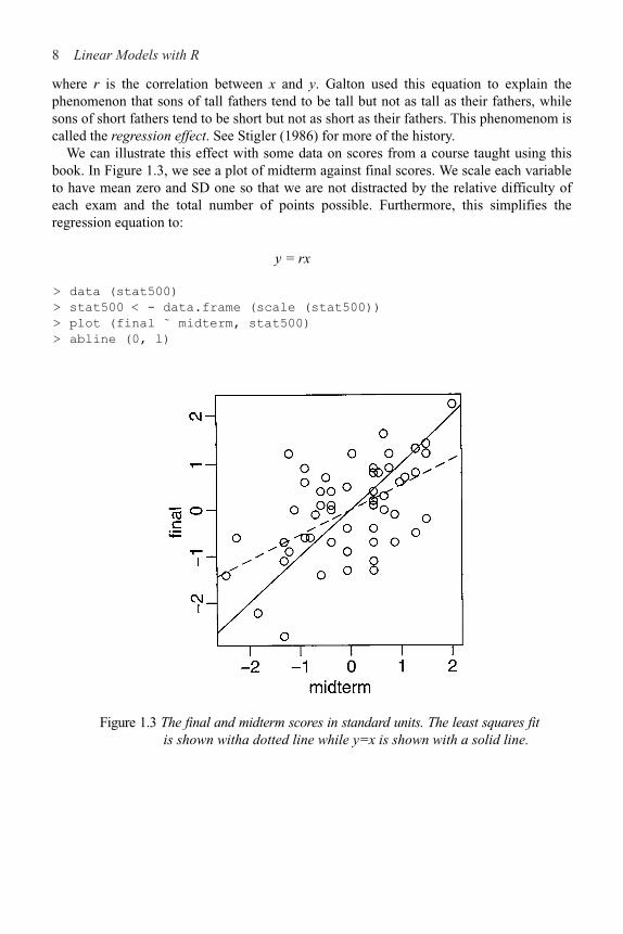
Regression-type problems were first considered in the 18th century to aid navigation with the use of astronomy. Legendre developed the method of least squares in 1805. Gauss claimed to have developed the method a few years earlier and in 1809 showed that least squares is the optimal solution when the errors are normally distributed. The methodology was used almost exclusively in the physical sciences until later in the 19th century. Francis Galton coined the term regression to mediocrity in 1875 in reference to the simple regression equation in the form:
8 Linear Models with R
where r is the correlation between x and y. Galton used this equation to explain thephenomenon that sons of tall fathers tend to be tall but not as tall as their fathers, whilesons of short fathers tend to be short but not as short as their fathers. This phenomenom iscalled the regression effect. See Stigler (1986) for more of the history.
We can illustrate this effect with some data on scores from a course taught using thisbook. In Figure 1.3, we see a plot of midterm against final scores. We scale each variableto have mean zero and SD one so that we are not distracted by the relative difficulty ofeach exam and the total number of points possible. Furthermore, this simplifies theregression equation to:
y = rx
> data (stat500)
> stat500 < - data.frame (scale (stat500))
> plot (final ˜ midterm, stat500)
> abline (0, l)
Figure 1.3 The final and midterm scores in standard units. The least squares fitis shown witha dotted line while y=x is shown with a solid line.

Introduction 9
We have added the y=x (solid) line to the plot. Now a student scoring, say 1 SD above average on the midterm might reasonably expect to do equally well on the final. We compute the least squares regression fit and plot the regression line (more on the details later). We also compute the correlations:
> g < - lm (final ˜ midterm, stat500)
> abline (coef (g), lty=5)
> cor (stat500)
midterm final hw total
midterm 1.00000 0.545228 0.272058 0.84446
final 0.54523 1.000000 0.087338 0.77886
hw 0.27206 0.087338 1.000000 0.56443
total 0.84446 0.778863 0.564429 1.00000
The regression fit is the dotted line in Figure 1.3 and is always shallower than the y=x line. We see that a student scoring 1 SD above average on the midterm is predicted to score only 0.545 SDs above average on the final
Correspondingly, a student scoring below average on the midterm might expect to do relatively better in the final, although still below average.
If exams managed to measure the ability of students perfectly, then provided that ability remained unchanged from midterm to final, we would expect to see an exact correlation. Of course, it is too much to expect such a perfect exam and some variation is inevitably present. Furthermore, individual effort is not constant. Getting a high score on the midterm can partly be attributed to skill, but also a certain amount of luck. One cannot rely on this luck to be maintained in the final. Hence we see the “regression to mediocrity.”
Of course this applies to any (x, y) situation like this—an example is the so-called sophomore jinx in sports when a new star has a so-so second season after a great first year. Although in the father-son example, it does predict that successive descendants will come closer to the mean; it does not imply the same of the population in general since random fluctuations will maintain the variation. In many other applications of regression, the regression effect is not of interest, so it is unfortunate that we are now stuck with this rather misleading name.
Regression methodology developed rapidly with the advent of high-speed computing. Just fitting a regression model used to require extensive hand calculation. As computing hardware has improved, the scope for analysis has widened.
Exercises
1. The dataset teengamb concerns a study of teenage gambling in Britain. Make a numerical and graphical summary of the data, commenting on any features that you find interesting. Limit the output you present to a quantity that a busy reader would find sufficient to get a basic understanding of the data.
2. The dataset uswages is drawn as a sample from the Current Population Survey in 1988. Make a numerical and graphical summary of the data as in the previousquestion.

10 Linear Models with R
3. The dataset prostate is from a study on 97 men with prostate cancer who were due to receivea radical prostatectomy. Make a numerical and graphical summary of the data as in the firstquestion.
4. The dataset sat comes from a study entitled “Getting What You Pay For: The DebateOver Equity in Public School Expenditures.” Make a numerical and graphicalsummary of the data as in the first question.
5. The dataset divusa contains data on divorces in the United States from 1920 to 1996.Make a numerical and graphical summary of the data as in the first question.

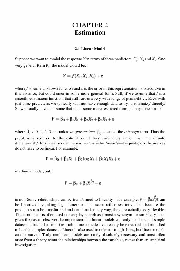
CHAPTER 2 Estimation
2.1 Linear Model
Suppose we want to model the response Y in terms of three predictors, X1, X
2 and X
3. One
very general form for the model would be:
where f is some unknown function and " is the error in this representation. " is additive in this instance, but could enter in some more general form. Still, if we assume that f is a smooth, continuous function, that still leaves a very wide range of possibilities. Even with just three predictors, we typically will not have enough data to try to estimate f directly. So we usually have to assume that it has some more restricted form, perhaps linear as in:
where !i, i=0, 1, 2, 3 are unknown parameters. !
0 is called the intercept term. Thus the
problem is reduced to the estimation of four parameters rather than the infinite dimensional f. In a linear model the parameters enter linearly—the predictors themselves do not have to be linear. For example:
is a linear model, but:
is not. Some relationships can be transformed to linearity—for example, canbe linearized by taking logs. Linear models seem rather restrictive, but because the predictors can be transformed and combined in any way, they are actually very flexible. The term linear is often used in everyday speech as almost a synonym for simplicity. This gives the casual observer the impression that linear models can only handle small simple datasets. This is far from the truth—linear models can easily be expanded and modified to handle complex datasets. Linear is also used to refer to straight lines, but linear models can be curved. Truly nonlinear models are rarely absolutely necessary and most often arise from a theory about the relationships between the variables, rather than an empirical investigation.

Estimation 13
2.2 Matrix Representation
If we have a response Y and three predictors, X1, X
2 and X
3, the data might be presented
in tabular form like this:
where n is the number of observations, or cases, in the dataset. Given the actual data values, we may write the model as:
yi=!
0+!
1x
1i+!
2x
2i+!
3x
3i+"
i i=1,…, n
but the use of subscripts becomes inconvenient and conceptually obscure. We will find it simpler both notationally and theoretically to use a matrix/vector representation. The regression equation is written as:
y=X!+"
where y=(y1,…, y
n)T, "=("
1,…, "
n)T, !=(!
0,…,!
3)T and:
The column of ones incorporates the intercept term. One simple example is the null model where there is no predictor and just a mean y=!+":
We can assume that E"=0 since if this were not so, we could simply absorb the nonzero expectation for the error into the mean ! to get a zero expectation.
2.3 Estimating !
The regression model, y=X!+", partitions the response into a systematic component X!and a random component " We would like to choose ! so that the systematic part explains
14 Linear Models with R
as much of the response as possible. Geometrically speaking, the response lies in an
n-dimensional space, that is, while where p is the number of parameters.If we include the intercept then p is the number of predictors plus one. We will use this definition of p from now on. It is easy to get confused as to whether p is the number of predictors or parameters, as different authors use different conventions, so be careful.
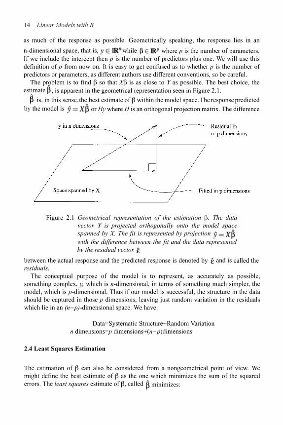
The problem is to find ! so that X! is as close to Y as possible. The best choice, theestimate , is apparent in the geometrical representation seen in Figure 2.1.
Figure 2.1 Geometrical representation of the estimation !. The datavector Y is projected orthogonally onto the model spacespanned by X. The fit is represented by projection with the difference between the fit and the data represented by the residual vector
.
between the actual response and the predicted response is denoted by and isresiduals.
The conceptual purpose of the model is to represent, as accurately as possible, something complex, y, which is n-dimensional, in terms of something much simpler, the model, which is p-dimensional. Thus if our model is successful, the structure in the data should be captured in those p dimensions, leaving just random variation in the residuals which lie in an (n#p)-dimensional space. We have:
Data=Systematic Structure+Random Variationn dimensions=p dimensions+(n#p)dimensions
2.4 Least Squares Estimation
The estimation of ! can also be considered from a nongeometrical point of view. We might define the best estimate of ! as the one which minimizes the sum of the squarederrors. The least squares estimate of !, called minimizes:
by the model is or Hy where H is an orthogonal projection matrix. The difference
called the
is, in this sense, the best estimate of ! within the model space. The response predicted

Estimation 15
Differentiating with respect to ! and setting to zero, we find that satisfies:
These are called the normal equations. We can derive the same result using the
geometrical approach. Now provided XTX is invertible:
H=X(XTX)!1XT is called the hat-matrix and is the orthogonal projection of y onto thespace spanned by X. H is useful for theoretical manipulations, but you usually do notwant to compute it explicitly, as it is an n!n matrix which could be uncomfortably largefor some datasets. The following useful quantities can now be represented using H.
The predicted or fitted values are while the residuals are
The residual sum of squares (RSS) is
Later, we will show that the least squares estimate is the best possible estimate of !
when the errors " are uncorrelated and have equal variance or more briefly put var "=#2I.
is unbiased and has variance (XTX)–1#2 provided var " = #2I. Since is a variance is a matrix.
We also need to estimate #2. We find that estimator:
as an unbiased estimate of #2. n#p is the degrees of freedom of the model. Sometimes
you need the standard error for a particular component of which can be picked out as
vector, its
which suggests the

16 Linear Models with R
In a few simple models, it is possible to derive explicit formulae for
1. When y = !+", X=1 and !=! so XTX=1T1=n so:
2. Simple linear regression (one predictor):
We can now apply the formula but a simpler approach is to rewrite the equation as:
so now:
Next work through the rest of the calculation to reconstruct the familiar estimates, that is:
In higher dimensions, it is usually not possible to find such explicit formulae for the
parameter estimates unless XTX happens to be a simple form. So typically we needcomputers to fit such models. Regression has a long history, so in the time beforecomputers became readily available, fitting even quite simple models was a tedious timeconsuming task. When computing was expensive, data analysis was limited. It wasdesigned to keep calculations to a minimum and restrict the number of plots. Thismindset remained in statistical practice for some time even after computing becamewidely and cheaply available. Now it is a simple matter to fit a multitude of models andmake more plots than one could reasonably study. The challenge for the analyst is tochoose among these intelligently to extract the crucial information in the data.
2.5 Examples of Calculating

Estimation 17
2.6 Gauss-Markov Theorem
is a plausible estimator, but there are alternatives. Nonetheless, there are threegoodreasons to use least squares:
1. It results from an orthogonal projection onto the model space. It makes sensegeometrically.
2. If the errors are independent and identically normally distributed, it is the maximumlikelihood estimator. Loosely put, the maximum likelihood estimate is the value of !that maximizes the probability of the data that was observed.
3. The Gauss-Markov theorem states that is the best linear unbiased estimate (BLUE).
To understand the Gauss-Markov theorem we first need to understand the concept of an
estimable function. A linear combination of the parameters is estimable if and
only if there exists a linear combination aTy such that:
Estimable functions include predictions of future observations, which explains why theyare well worth considering. If X is of full rank, then all linear combinations are estimable.
Suppose E"=0 and var "=#2I. Suppose also that the structural part of the model,EY=X! is correct. (Clearly these are big assumptions and so we will address the
implications of this later.) be an estimable function; then the Gauss-Markov
theorem states that in the class of all unbiased linear estimates of has theminimum variance and is unique.
We prove this theorem. Suppose aTy is some unbiased estimate of cT! so that:
which means that aTX=CT. This implies that c must be in the range space of XT which in
turn implies that c is also in the range space of XTX which means there exists a $, such
that c=XTX$ so:
Now we can show that the least squares estimator has the minimum variance—pick an
arbitrary estimate aTy and compute its variance:

18 Linear Models with R
but
so
Now since variances cannot be negative, we see that:
In other words, has minimum variance. It now remains to show that it is unique.
There will be equality in the above relationship if var (aTy#$TXTy)=0 which would
require that aT#$TXT=0 which means that So equality occurs only
if aTy=cT so the estimator is unique. This completes the proof.
The Gauss-Markov theorem shows that the least squares estimate is a good choice, but it does require that the errors are uncorrelated and have unequal variance. Even if the errors behave, but are nonnormal, then nonlinear or biased estimates may work better. So this theorem does not tell one to use least squares all the time; it just strongly suggests it unless there is some strong reason to do otherwise. Situations where estimators other than ordinary least squares should be considered are:
1. When the errors are correlated or have unequal variance, generalized least squares should be used. See Section 6.1.
2. When the error distribution is long-tailed, then robust estimates might be used. Robust estimates are typically not linear in y. See Section 6.4.
3. When the predictors are highly correlated (collinear), then biased estimators such as ridge regression might be preferable. See Chapter 9.
2.7 Goodness of Fit
It is useful to have some measure of how well the model fits the data. One commonchoice is R2, the so-called coefficient of determination or percentage of variance explained:

Estimation 19
Its range is 0"R2"1—values closer to 1 indicating better fits. For simple linear regression
R2=r2 where r is the correlation between x and y. An equivalent definition
Figure 2.2 Variation in the response y when x is known is denoted by dotted arrows while variation in y when x is unknown is shown with the solid arrows.
The graphical intuition behind R2 is seen in Figure 2.2. Suppose you want to predict y. If you do not know x, then your best prediction is but the variability in this prediction is high. If you do know x, then your prediction will be given by the regression fit. This
prediction will be less variable provided there is some relationship between x and y. R2 is one minus the ratio of the sum of squares for these two predictions. Thus for perfect
predictions the ratio will be zero and R2 will be one.
R2 as defined here does not make any sense if you do not have an intercept in your
model. This is because the denominator in the definition of R2 has a null model with an
intercept in mind when the sum of squares is calculated. Alternative definitions of R2 are possible when there is no intercept, but the same graphical intuition is not available and

20 Linear Models with R
the R2s obtained in this way should not be compared to those for models with an
intercept. Beware of high R2s reported from models without an intercept.
What is a good value of R2? It depends on the area of application. In the biological andsocial sciences, variables tend to be more weakly correlated and there is a lot of noise.
We would expect lower values for R2 in these areas—a value of 0.6 might be consideredgood. In physics and engineering, where most data come from closely controlled
experiments, we expect to get much higher R2s and a value of 0.6 would be consideredlow. Of course, I generalize excessively here so some experience with the particular area
is necessary for you to judge your R2s well.An alternative measure of fit is This quantity is directly related to the standard errors
of estimates of ! and predictions. The advantage is that is measured in the units of
the response and so may be directly interpreted in the context of the particular dataset.
This may also be a disadvantage in that one must understand whether the practical
significance of this measure whereas R2, being unitless, is easy to understand.
2.8 Example
Now let’s look at an example concerning the number of species of tortoise on the variousGalápagos Islands. There are 30 cases (Islands) and seven variables in the dataset. Westart by reading the data into R and examining it (remember you first need to load thebook data with the library (faraway) command):
> data (gala) >
gala
Species Endemics Area Elevation Nearest Scruz
Baltra 58 23 25.09 346 0.6 0.6
Bartolome 31 21 1.24 109 0.6 26.3
. . .
The variables are Species—the number of species of tortoise found on the island,
Endemics—the number of endemic species, Area—the area of the island (km2),
Elevation—the highest elevation of the island (m), Nearest—the distance from the
nearest island (km), Scruz—the distance from Santa Cruz Island (km), Adjacent—the
area of the adjacent island (km2).The data were presented by Johnson and Raven (1973) and also appear in Weisberg (1985).
I have filled in some missing values for simplicity (see Chapter 12 for how this can bedone). Fitting a linear model in R is done using the lm ( ) command. Notice the syntax forspecifying the predictors in the model. This is part of the Wilkinson-Rogers notation. Inthis case, since all the variables are in the gala data frame, we must use the data=argument:
> mdl < - lm (Species ˜ Area + Elevation + Nearest + Scruz
+ Adjacent, data=gala) >
summary (mdl)

Estimation 21
Call:
lm (formula = Species ˜ Area + Elevation + Nearest + Scruz
+ Adjacent, data = gala)
Residuals:
Min 1Q Median 3Q Max
!111.68 !34.90 !7.86 33.46 182.58
Coefficients:
Estimate Std. Error t value Pr(>|t|)
(Intercept) 7.06822 19.15420 0.37 0.7154
Area !0.02394 0.02242 !1.07 0.2963
Elevation 0.31946 0.05366 5.95 3.8e–06
Nearest 0.00914 1.05414 0.01 0.9932
Scruz !0.24052 0.21540 !1.12 0.2752
Adjacent !0.07480 0.01770 !4.23 0.0003
Residual standard error: 61 on 24 degrees of freedom
Multiple R-Squared: 0.766, Adjusted R-squared: 0.717
F-statistic: 15.7 on 5 and 24 DF, p-value: 6.84e–07
We can identify several useful quantities in this output. Other statistical packages tend to produce output quite similar to this. One useful feature of R is that it is possible to directly calcu-late quantities of interest. Of course, it is not necessary here because the lm ( ) function does the job, but it is very useful when the statistic you want is not part of the prepackaged functions.
First, we make the X-matrix:
> x < - model.matrix ( ˜ Area + Elevation + Nearest + Scruz
+ Adjacent, gala)
and here is the response y:
> y < - gala$Species
Now let’s construct . t ( ) does transpose and %*% does matrix multiplication.
solve (A) computes A!1 while solve (A, b) solves Ax=b:
> xtxi < - solve (t (x) %*% x)
We can get directly, using (XTX)!1XTy:
> xtxi %*% t (x) %*% y
[,1]
1 7.068221
Area !0.023938
Elevation 0.319465
Nearest 0.009144
Scruz !0.240524
Adjacent !0.074805

22 Linear Models with R
This is a very bad way to compute . It is inefficient and can be very inaccurate when thepredictors are strongly correlated. Such problems are exacerbated by large datasets. Abetter, but not perfect, way is:
> solve (crossprod (x, x), crossprod (x, y))
[,1]
1 7.068221
Area !0.023938
Elevation 0.319465
Nearest 0.009144
Scruz !0.240524
Adjacent !0.074805
where crossprod (x, y) computes xT y. Here we get the same result as lm ( ) because thedata are well-behaved. In the long run, you are advised to use carefully programmed codesuch as found in lm ( ). To see the full details, consult a text such as Thisted (1988).
We can extract the regression quantities we need from the model object. Commonlyused are residuals ( ), fitted ( ), deviance ( ) which gives the RSS, df . residual ( ) which
gives the degrees of freedom and coef ( ) which gives the . You can also extract otherneeded quantities by examining the model object and its summary:
> names (mdl)
[1] "coefficients" "residuals" "effects"
[4] "rank" "fitted.values" "assign"
[7] "qr" "df.residual" "xlevels"
[10] "call" "terms" "model"
> md1s < - summary (mdl)
> names (mdls)
[1] "call" "terms" "residuals"
[4] "coefficients" "aliased" "sigma"
[7] "df" "r.squared" "adj.r.squared"
[10] "fstatistic" "cov.unscaled"
We can estimate # using the formula in the text above or extract it from the summaryobject:
> sqrt (deviance (mdl) /df.residual (mdl))
[1] 60.975
> mdls$sigma
[1] 60.975
We can also extract (XTX)–1and use it to compute the standard errors for the coefficients.(diag ( ) returns the diagonal of a matrix):
> xtxi < - mdls$cov.unscaled
> sqrt (diag (xtxi)) *60.975
(Intercept) Area Elevation Nearest Scruz
19.154139 0.022422 0.053663 1.054133 0.215402

Estimation 23
Adjacent
0.017700
or get them from the summary object:
> mdls$coef [,2]
(Intercept) Area Elevation Nearest Scruz
19.154198 0.022422 0.053663 1.054136 0.215402
Adjacent
0.017700
Finally, we may compute or extract R2:
> 1-deviance (mdl) /sum ((y-mean (y))^2)
[1] 0.76585
> mdls$r.squared
[1] 0.76585
2.9 Identifiability
The least squares estimate is the solution to the normal equations:
where X is an n!p matrix. If XTX is singular and cannot be inverted, then there will be
infinitely many solutions to the normal equations and is at least partially unidentifiable.Unidentifiability will occur when X is not of full rank—when its columns are linearly dependent. With observational data, unidentifiability is usually caused by some oversight. Here are some examples:
1. A person’s weight is measured both in pounds and kilos and both variables are entered into the model.
2. For each individual we record the number of years of preuniversity education, the number of years of university education and also the total number of years of education and put all three variables into the model.
3. We have more variables than cases, that is, p>n. When p=n, we may perhaps estimate all the parameters, but with no degrees of freedom left to estimate any standard errors or do any testing. Such a model is called saturated. When p>n, then the model is called supersaturated. Oddly enough, such models are considered in large-scale screening experiments used in product design and manufacture, but there is no hope of uniquely estimating all the parameters in such a model.
Such problems can be avoided by paying attention. Identifiability is more of an issue in designed experiments. Consider a simple two-sample experiment, where the treatment observations are y
1,…, y
n and the controls are y
n+1,…, y
m+n. Suppose we try to model the
response by an overall mean ! and group effects %1 and %
2 :

24 Linear Models with R
Now although X has three columns, it has only rank 2—(!, %1, %
2) are not identifiable
and the normal equations have infinitely many solutions. We can solve this problem byimposing some constraints, !=0 or %
1+%
2=0, for example.
Statistics packages handle nonidentifiability differently. In the regression case above,some may return error messages and some may fit models because rounding error mayremove the exact identifiability. In other cases, constraints may be applied but these maybe different from what you expect. By default, R fits the largest identifiable model byremoving variables in the reverse order of appearance in the model formula.
Here is an example. Suppose we create a new variable for the Galápagos dataset—thedifference in area between the island and its nearest neighbor:
> gala$Adiff < - gala$Area -gala$Adjacent
and add that to the model:
> g < - lm (Species ˜ Area+Elevation+Nearest+Scruz+Adjacent
+Adiff, gala)
> summary (g)
Coefficients: (1 not defined because of singularities)
Estimate Std. Error t value Pr(>|t|)
(Intercept) 7.06822 19.15420 0.37 0.7154
Area !0.02394 0.02242 !1.07 0.2963
Elevation 0.31946 0.05366 5.95 3.8e–06
Nearest 0.00914 1.05414 0.01 0.9932
Scruz !0.24052 0.21540 !1.12 0.2752
Adjacent !0.07480 0.01770 !4.23 0.0003
Adiff NA NA NA NA
Residual standard error: 61 on 24 degrees of freedom
Multiple R-Squared: 0.766, Adjusted R-squared: 0.717
F-statistic: 15.7 on 5 and 24 DF, p-value: 6.84e–07
We get a message about one undefined coefficient because the rank of the design matrix X issix, which is less than its seven columns. In most cases, the cause of identifiability can be revealed with some thought about the variables, but, failing that, an eigendecom-position of XTX will reveal the linear combination(s) that gave rise to the unidentifiability.

Estimation 25
Lack of identifiability is obviously a problem, but it is usually easy to identify and work around. More problematic are cases where we are close to unidentifiability. To demonstrate this, suppose we add a small random perturbation to the third decimal place of Adiff by adding a random variate from U [&0.005, 0.005] where U denotes the uniform distribution:
> Adiffe < - gala$Adiff+0.001*(runif(30)-0.5)
and now refit the model:
> g < - lm (Species ˜ Area+Elevation+Nearest+Scruz
+Adjacent+Adiffe, gala)
> summary (g)
Coefficients:
Estimate Std. Error t value Pr(>|t|)
(Intercept) 7.14e+00 1.956+01 0.37 0.72
Area !2.38e+04 4.70e+04 !0.51 0.62
Elevation 3.12e–01 5.67e–02 5.50 1.46–05
Nearest 1.38e–01 1.10e+00 0.13 0.90
Scruz !2.50e–01 2.206–01 !1.14 0.27
Adjacent 2.386+04 4.70e+04 0.51 0.62
Adiffe 2.386+04 4.70e+04 0.51 0.62
Residual standard error: 61.9 on 23 degrees of freedom
Multiple R-Squared: 0.768, Adjusted R-squared: 0.708
F-statistic: 12.7 on 6 and 23 DF, p-value: 2.58e–06
Notice that now all parameters are estimated, but the standard errors are very large because we cannot estimate them in a stable way. We deliberately caused this problem so we know the cause but in general we need to be able to identify such situations. We do this in Section 5.3.
Exercises
1. The dataset teengamb concerns a study of teenage gambling in Britain. Fit a regression model with the expenditure on gambling as the response and the sex, status, income and verbal score as predictors. Present the output.
(a) What percentage of variation in the response is explained by these predictors?(b) Which observation has the largest (positive) residual? Give the case number.(c) Compute the mean and median of the residuals.(d) Compute the correlation of the residuals with the fitted values.(e) Compute the correlation of the residuals with the income.(f) For all other predictors held constant, what would be the difference in predicted
expenditure on gambling for a male compared to a female?
2. The dataset uswages is drawn as a sample from the Current Population Survey in 1988. Fit a model with weekly wages as the response and years of education and experience as predictors. Report and give a simple interpretation to the regression

26 Linear Models with R
coefficient for years of education. Now fit the same model but with logged weeklywages. Give an interpretation to the regression coefficient for years of education.Which interpretation is more natural?
3. In this question, we investigate the relative merits of methods for computing thecoefficients. Generate some artificial data by:
> x < - 1:20
> y < - x+rnorm(20)
Fit a polynomial in x for predicting y. Compute in two ways—by lm ( ) and byusing the direct calculation described in the chapter. At what degree of polynomialdoes the direct calculation method fail? (Note the need for the I ( ) function in fittingthe polynomial, that is, lm(y˜x+I(x^2)) .
4. The dataset prostate comes from a study on 97 men with prostate cancer who were dueto receive a radical prostatectomy. Fit a model with lpsa as the response and l cavol as
the predictor. Record the residual standard error and the R2. Now add lweight, svi,lpph, age, l cp, pgg45 and gleason to the model one at a time. For each model record
the residual standard error and the R2. Plot the trends in these two statistics.5. Using the prostate data, plot lpsa against l cavol. Fit the regressions of lpsa on lcavol
and lcavol on lpsa. Display both regression lines on the plot. At what point do the twolines intersect?

CHAPTER 3 Inference
Until now, we have not found it necessary to assume any distributional form for the errors ". However, if we want to make any confidence intervals or perform any hypothesis tests, we will need to do this. The common assumption is that the errors are normally distributed. In practice, this is often, although not always, a reasonable assumption. We have already assumed that the errors are independent and identically distributed (i.i.d.) with mean 0 and variance #2, so we have " ~ N(0, #2I). Now since y=X!+", we have y ~ N(X!, #2I). which is a compact description of the regression model. From this we find, us-ing the fact that linear combinations of normally distributed values are also normal, that:
3.1 Hypothesis Tests to Compare Models
Given several predictors for a response, we might wonder whether all are needed. Consider a larger model, #, and a smaller model, ', which consists of a subset of the predictors that are in ( If there is not much difference in the fit, we would prefer the smaller model on the principle that simpler explanations are preferred. On the other hand, if the fit of the larger model is appreciably better, we will prefer it. We will take ' to represent the null hypothesis and ( to represent the alternative. A geometrical view of the problem may be seen in Figure 3.1.
RSS"&RSS
# is small, then the fit of the smaller model is almost as good as the larger
model and so we would prefer the smaller model on the grounds of simplicity. On the other hand, if the difference is large, then the superior fit of the larger model would be preferred. This suggests that something like:
would be a potentially good test statistic where the denominator is used for scaling purposes.
As it happens, the same test statistic arises from the likelihood-ratio testing approach. We give an outline of the development: If L (!, # y) is the likelihood function, then the likelihood-ratio statistic is:

Inference 29
The test should reject if this ratio is too large. Working through the details, we find that for each model:
Figure 3.1 Geometrical view of the comparison between big model, !, and small model, ". The squared length of the residual vector for the big model is RSS
! while that for the small model is RSS!. By Pythagoras’
theorem, the squared length of the vector connecting the two fits is RSS
""RSS
!. A small value for this indicates that the small model fits
almost as well as the large model and thus might be preferred due to its simplicity.
which after some manipulation gives us a test that rejects if:
which is the same statistic suggested by the geometrical view. It remains for us to discover the null distribution of this statistic.
Now suppose that the dimension (or number of parameters) of ( is p and the dimension of ' is q, then:
Details of the derivation of this statistic may be found in more theoretically oriented texts such as Sen and Srivastava (1990).
Thus we would reject the null hypothesis if The degrees of freedom of a model are (usually) the number of observations minus the number of parameters so thistest statistic can also be written:

30 Linear Models with R
where df#
=n#p and df"
=n#q. The same test statistic applies not just to when ' is a
subset of #, but also to a subspace. This test is very widely used in regression and analysis of variance. When it is applied in different situations, the form of test statisticmay be reexpressed in various different ways. The beauty of this approach is you onlyneed to know the general form. In any particular case, you just need to figure out whichmodels represent the null and alternative hypotheses, fit them and compute the teststatistic. It is very versatile.
3.2 Testing Examples
Test of all the predictorsAre any of the predictors useful in predicting the response? Let the full model (() bey=X!+" where X is a full-rank n!p matrix and the reduced model (') be y=!". We wouldestimate ) by . We write the null hypothesis as:
H0: !
1=…!
p!1=0
Now , the residual sum of squares for the full
model, while , which is sometimes known as the sum ofsquares corrected for the mean. So in this case:
We would now refer to Fp!1,n!p
for a critical value or a p-value. Large values of F would
indicate rejection of the null. Traditionally, the information in the above test is presented in an analysis of variance table. Most computer packages produce a variant on this. SeeTable 3.1 for the layout. It is not really necessary to specifically compute all the elementsof the table. As the originator of the table, Fisher said in 1931, it is “nothing but aconvenient way of arranging the arithmetic.” Since he had to do his calculations by hand,the table served a necessary purpose, but it is not essential now.
Source Deg. of Freedom Sum of Squares Mean Square F
Regression P#1 SSreg SSreg
/(p#1) F

Inference 31
Total n#1 TSS
Table 3.1 Analysis of variance table.
A failure to reject the null hypothesis is not the end of the game—you must still investigate the possibility of nonlinear transformations of the variables and of outliers which may obscure the relationship. Even then, you may just have insufficient data to demonstrate a real effect, which is why we must be careful to say “fail to reject” the null rather than “accept” the null. It would be a mistake to conclude that no real relationship exists. This issue arises when a pharmaceutical company wishes to show that a proposed generic replacement for a brand-named drug is equivalent. It would not be enough in this instance just to fail to reject the null. A higher standard would be required.
When the null is rejected, this does not imply that the alternative model is the best model. We do not know whether all the predictors are required to predict the response or just some of them. Other predictors might also be added or existing predictors transformed or recombined. Either way, the overall F-test is just the beginning of an analysis and not the end.
Let’s illustrate this test and others using an old economic dataset on 50 different countries. These data are averages from 1960 to 1970 (to remove business cycle or other short-term fluctuations). dpi is per capita disposable income in U.S. dollars; ddpi is the percentage rate of change in per capita disposable income; sr is aggregate personal saving divided by disposable income. The percentage of population under 15 (pop15) and over 75 (pop75) is also recorded. The data come from Belsley, Kuh, and Welsch (1980). Take a look at the data:
> data(savings)
> savings
sr pop15 pop75 dpi ddpi
Australia 11.43 29.35 2.87 2329.68 2.87
Austria 12.07 23.32 4.41 1507.99 3.93
…cases deleted…
Malaysia 4.71 47.20 0.66 242.69 5.08
First, consider a model with all the predictors:
> g < - 1m (sr ˜ pop15 + pop75 + dpi + ddpi, savings)
> summary (g)
Coefficients:
Estimate Std. Error t value Pr (>|t|)
(Intercept) 28.566087 7.354516 3.88 0.00033
pop15 !0.461193 0.144642 !3.19 0.00260
pop75 !1.691498 1.083599 !1.56 0.12553
dpi !0.000337 0.000931 !0.36 0.71917
ddpi 0.409695 0.196197 2.09 0.04247
Residual standard error: 3.8 on 45 degrees of freedom
Multiple R-Squared: 0.338, Adjusted R-squared: 0.28
F-statistic: 5.76 on 4 and 45 DF, p-value: 0.00079
Residual n"p RSS RSS/(n"p)

32 Linear Models with R
We can see directly the result of the test of whether any of the predictors havesignificance in the model. In other words, whether !
1=(!
2=!
3=!
4=0. Since the p-value,
0.00079, is so small, this null hypothesis is rejected.We can also do it directly using the F-testing formula:
> g < - 1m (sr ˜ pop15 + pop75 + dpi + ddpi, savings)
> (tss < - sum((savings$sr-mean (savings$sr))^2))
[1] 983.63
> (rss < - deviance(g))
[1] 650.71
> df.residual(g)
[13 45
> (fstat < - ((tss-rss)/4)/(rss/df.residual(g)))
[1] 5.7557
> 1-pf (fstat, 4, df.residual (g))
[1] 0.00079038
Verify that the numbers match the regression summary above.
Testing just one predictorCan one particular predictor be dropped from the model? The null hypothesis would beH
0: !
i=0. Let RSS
# be the RSS for the model with all the predictors of interest which has
p parameters and let RSS"
be the RSS for the model with all the same predictors except
predictor i.The F-statistic may be computed using the standard formula. An alternative approach
is to use a t-statistic for testing the hypothesis:
and check for significance using a t-distribution with n#p degrees of freedom.
However, is exactly the F-statistic here, so the two approaches are numericallyidentical. The latter is less work and is presented in typical regression outputs.
For example, to test the null hypothesis that !1=0, (that pop15 is not significant in the
full model) we can simply observe that the p-value is 0.0026 from the table and conclude that the null should be rejected.
Let’s do the same test using the general F-testing approach: We will need the RSS anddf for the full model which are 650.71 and 45, respectively. We now fit the model thatrepresents the null:
> g2 < - 1m (sr ˜ pop75 + dpi + ddpi, savings)
and compute the RSS and the F-statistic:
> (rss2 < - deviance (g2))
[1] 797.72
> (fstat < - (deviance (g2)-deviance (g))/

Inference 33
(deviance (g)/df.residual(g)))
[1] 10.167
The p-value is then:
> l-pf (fstat, l, df.residual(g))
[1] 0.002603
We can relate this to the t-based test and p-value by:
> sqrt (fstat)
[1] 3.1885
> (tstat < - summary(g)$coef[2, 3])
[1] !3.1885
> 2 * (l-pt (sqrt (fstat), 45))
[1] 0.002603
A more convenient way to compare two nested models is:
> anova (g2, g)
Analysis of Variance Table
Model 1: sr ˜ pop75 + dpi + ddpi
Model 2: sr ˜ pop15 + pop75 + dpi + ddpi
Res.Df Res.Sum Sq Df Sum Sq F value Pr(>F)
1 46 798
2 45 651 1 147 10.2 0.0026
Understand that this test of pop15 is relative to the other predictors in the model, namely, pop75, dpi and ddpi. If these other predictors were changed, the result of the test may be different. This means that it is not possible to look at the effect of pop15 in isolation. Simply stating the null hypothesis as H
0: !
pop15=0 is insufficient—information about
what other predictors are included in the null is necessary. The result of the test may be different if the predictors change.
Testing a pair of predictorsSuppose we wish to test the significance of variables X
j and X
k. We might construct a
table as seen above and find that both variables have p-values greater than 0.05 thus indicating that individually each one is not significant. Does this mean that both X
j and X
k
can be eliminated from the model? Not necessarily.Except in special circumstances, dropping one variable from a regression model causes
the estimates of the other parameters to change so that we might find that after dropping X
j, a test of the significance of X
k shows that it should now be included in the model.
If you really want to check the joint significance of Xj and X
k you should fit a model
with and then without them and use the general F-test discussed before. Remember that even the result of this test may depend on what other predictors are in the model.
We test the hypothesis that both pop75 and ddpi may be excluded from the model:
34 Linear Models with R
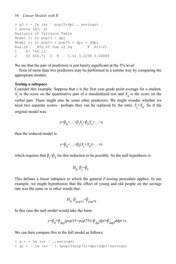
> g3 < - 1m (sr ˜ popl5+dpi , savings)
> anova (g3, g)
Analysis of Variance Table
Model 1: sr pop15 + dpi
Model 2: sr pop15 + pop75 + dpi + ddpi
Res.Df RSS Df Sum of Sq F Pr(>F)
1 47 744.12
2 45 650.71 2 9 3.41 3.2299 0.04889
We see that the pair of predictors is just barely significant at the 5% level.Tests of more than two predictors may be performed in a similar way by comparing the
appropriate models.
Testing a subspaceConsider this example. Suppose that y is the first year grade point average for a student,X
j is the score on the quantitative part of a standardized test and X
k is the score on the
verbal part. There might also be some other predictors. We might wonder whether weneed two separate scores—perhaps they can be replaced by the total, X
j+X
k. So if the
original model was:
y=!0+…+!
jX
j+!
kX
k+…+"
then the reduced model is:
y=!0+…+!
l(X
j+X
k)+…+"
which requires that !j=!
k for this reduction to be possible. So the null hypothesis is:
H0: !
j=!
k
This defines a linear subspace to which the general F-testing procedure applies. In ourexample, we might hypothesize that the effect of young and old people on the savingsrate was the same or in other words that:
H0: !
pop15=!
pop75
In this case the null model would take the form:
y=!0+!
dep(pop15+pop75)+!
dpidpi+!
ddpiddpi+"
We can then compare this to the full model as follows:
> g < - 1m (sr ˜ .,savings)
> gr < - 1m (sr ˜ I (pop15+pop75)+dpi+ddpi/savings)

Inference 35
> anova (gr, g)
Analysis of Variance Table
Model 1: sr ˜ I (pop15 + pop75) + dpi + ddpi
Model 2: sr ˜ pop15 + pop75 + dpi + ddpi
Res.Df Res.Sum Sq Df Sum Sq F value Pr(>F)
1 46 674
2 45 651 1 23 1.58 0.21
The period in the first model formula is shorthand for all the other variables in the data frame. The function I ( ) ensures that the argument is evaluated rather than interpreted as part of the model formula. The p-value of 0.21 indicates that the null cannot be rejected here, meaning that there is not evidence that young and old people need to be treated separately in the context of this particular model.
Suppose we want to test whether one of the coefficients can be set to a particular value. For example:
H0: !
ddpi=0.5
Here the null model would take the form:
y=!0+!
pop15pop15+!
pop75pop75+!
dpidpi+0.5ddpi+"
Notice that there is now a fixed coefficient on the ddpi term. Such a fixed term in the regression equation is called an offset. We fit this model and compare it to the full:
> gr < - 1m (sr ˜ pop15+pop75+dpi+offset(0.5*ddpi),savings)
> anova (gr, g)
Analysis of Variance Table
Model 1: sr pop15 + pop75 + dpi + offset(0.5 * ddpi)
Model 2: sr pop15 + pop75 + dpi + ddpi
Res.Df RSS Df Sum of Sq F Pr(>F)
1 46 654
2 45 651 1 3 0.21 0.65
We see that the p-value is large and the null hypothesis here is not rejected. A simpler way to test such point hypotheses is to use a t-statistic:
where c is the point hypothesis. So in our example the statistic and corresponding p-value is:
> (tstat < - (0.409695–0.5)/0.196197)
[1] !0.46028
> 2*pt (tstat, 45)
[1] 0.64753

36 Linear Models with R
We can see the p-value is the same as before and if we square the t-statistic
> tstatˆ 2
[1] 0.21186
we find we get the same F-value as above. This latter approach is preferred in practicesince we do not need to fit two models but it is important to understand that it isequivalent to the result obtained using the general F-testing approach.
Can we test a hypothesis such as H0: !
j!
k=1 using our general theory? No. This
hypothesis is not linear in the parameters so we cannot use our general method. We would need to fit a nonlinear model and that lies beyond the scope of this book.
3.3 Permutation Tests
We can put a different interpretation on the hypothesis tests we are making. For theGalapágos dataset, we might suppose that if the number of species had no relation to thefive geographic variables, then the observed response values would be randomlydistributed between the islands without relation to the predictors. The F-statistic is a goodmeasure of the association between the predictors and the response with larger valuesindicating stronger associations. We might then ask what the chance would be under thisassumption that an F-statistic would be observed as large, or larger than the one weactually observed. We could compute this exactly by computing the F-statistic for allpossible (30!) permutations of the response variable and see what proportion exceed theobserved F-statistic. This is a permutation test. If the observed proportion is small, thenwe must reject the contention that the response is unrelated to the predictors. Curiously,this proportion is estimated by the p-value calculated in the usual way based on theassumption of normal errors thus saving us from the massive task of actually computingthe regression on all those computations. See Freedman and Lane (1983) for a discussionof these matters.
Let’s see how we can apply the permutation test to the savings data. I chose a modelwith just pop75 and dpi so as to get a p-value for the F-statistic that is not too small (andtherefore less interesting):
> g < - 1m (sr ˜ pop75+dpi,savings)
> summary (g)
Coefficients:
Estimate Std. Error t value Pr (>|t|)
(Intercept) 7.056619 1.290435 5.47 1.7e–06
pop75 1.304965 0.777533 1.68 0.10
dpi !0.000341 0.001013 !0.34 0.74
Residual standard error: 4.33 on 47 degrees of freedom
Multiple R-Squared: 0.102, Adjusted R-squared: 0.0642
F-statistic: 2.68 on 2 and 47 DF, p-value: 0.079
We can extract the F-statistic as:
> gs < - summary (g)

Inference 37
> gs$fstat
value numdf dendf
2.6796 2.0000 47.0000
The function sample ( ) generates random permutations. We compute the F-statistic for 4000 randomly selected permutations and see what proportion exceeds the F-statistic for the original data:
> fstats < - numeric(4000)
> for (i in 1:4000){
+ ge < - lm (sample(sr) ˜ pop75+dpi,data=savings)
+ fstats [i] < - summary(ge)$fstat[1]
+ }
> length(fstats[fstats > 2.6796])/4000
[1] 0.07425
This should take less than a minute on any relatively new computer. If you repeat this, you will get a slightly different result each time because of the random selection of the permutations. So our estimated p-value using the permutation test is 0.07425, which is close to the normal theory-based value of 0.0791. We could reduce variability in the estimation of the p-value simply by computing more random permutations. Since the permutation test does not depend on the assumption of normality, we might regard it as superior to the normal theory based value. It does take longer to compute, so we might use the normal inference secure, in the knowledge that the results can also be justified with an alternative argument.
Tests involving just one predictor also fall within the permutation test framework. We permute that predictor rather than the response. Let’s test the pop75 predictor in the model. We can extract the t-statistic as:
>summary(g)$coef [2, 3]
[1] 1.6783
Now we perform 4000 permutations of pop75 and check what fraction of the t-statistics exceeds 1.6783 in absolute value:
>tstats < - numeric(4000)
>for (i in 1:4000){
+ge < - 1m (sr ˜ sample(pop75)+dpi, savings)
+tstats [i] < - summary(ge)$coef[2,3]
+}
>mean (abs (tstats) > 1.6783)
[1] 0.10475
The outcome is very similar to the observed normal-based p-value of 0.10.
38 Linear Models with R
Confidence intervals (CIs) provide an alternative way of expressing the uncertainty in ourestimates. They are linked to the tests that we have already constructed. For the CIs andregions that we will consider here, the following relationship holds. For a 100(1&%)%confidence region, any point that lies within the region represents a null hypothesis thatwould not be rejected at the 100%% level while every point outside represents a nullhypothesis that would be rejected. So, in one sense, the confidence region provides a lotmore information than a single hypothesis test in that it tells us the outcome of a wholerange of hypotheses about the parameter values. Of course, by selecting the particularlevel of confidence for the region, we can only make tests at that level and we cannotdetermine the p-value for any given test simply from the region. However, since it isdangerous to read too much into the relative size of p-values (as far as how muchevidence they provide against the null), this loss is not particularly important.
The confidence region tells us about plausible values for the parameters in a way thatthe hypothesis test cannot. This makes it more valuable. As with testing, we must decidewhether to form confidence regions for parameters individually or simultaneously.Simultaneous regions are preferable, but for more than two dimensions they are difficultto display and so there is still some value in computing the one-dimensional CIs.
We can consider each parameter individually, which leads to CIs taking the generalform of:
Estimate±Critical Value!SE of Estimate
or specifically in this case:
Alternatively, a 100(1–%)% confidence region for ! satisfies:
These regions are ellipsoidally shaped. Because these ellipsoids live in higherdimensions, they cannot easily be visualized except for the two-dimensional case.
It is better to consider the joint CIs when possible, especially when the are heavilycorrelated.
Consider the full model for the savings data:
> g < - 1m (sr ˜ . , savings)
where the output is displayed on page 28. We can construct individual 95% CIs for!
pop75:
> qt (0.975,45)
[1] 2.0141
> c (!1.69!2.01*1.08,!1.69+2.01*1.08)
[1] !3.8608 0.4808
3.4 Confidence Intervals for !

Inference 39
CIs have a duality with two-sided hypothesis tests as we mentioned above. Thus the
interval contains zero, which indicates that the null hypothesis H0: !
pop75=0 would not be
rejected at the 5% level. We can see from the summary that the p-value is 12.5%—greater than 5%—confirming this point.
The CI for !pop75
is:
> c (0.41 !2.01 * 0.196, 0.41+2.01*0.196)
[1] 0.01604 0.80396
Because zero is in this interval, the null is rejected. Nevertheless, this CI is relatively wide in the sense that the upper limit is about 50 times larger than the lower limit. This means that we are not really that confident about what the exact effect of growth on savings really is, even though it is statistically significant. A convenient way to obtain all the univariate intervals is:
> confint (g)
2.5 % 97.5 %
(Intercept) 13.7533307 43.3788424
pop15 –0.7525175 –0.1698688
pop75 –3.8739780 0.4909826
dpi –0.0022122 0.0015384
ddpi 0.0145336 0.8048562
Now we construct the joint 95% confidence region for !pop15
and !pop75
. First, we load in
a package for drawing confidence ellipses (which is not part of base R and so may need to be downloaded):
> library(ellipse)
and now the plot:
> plot(ellipse(g,c(2,3)),type="l",xlim=c(-1,0))
We add the origin and the point of the estimates:
> points(0,0)
> points (coef (g) [2], coef (g) [3], pch=18)
Since the origin lies outside the ellipse, we reject the hypothesis that !pop15
=!pop75
= 0.
We mark the one-way CI on the plot for reference:
> abline (v=confint (g) [2,], lty=2)
> abline (h=confint (g) [3,], lty=2)

40 Linear Models with R
lines were moved out so that they enclosed the ellipse exactly, the CIs would be jointlycorrect.
In some circumstances, the origin could lie within both one-way CIs, but lie outside theellipse. In this case, both one-at-a-time tests would not reject the null whereas the jointtest would. The latter test would be preferred. It is also possible for the origin to lieoutside the rectangle but inside the ellipse. In this case, the joint test would not reject thenull whereas both one-at-a-time tests would reject. Again we prefer the joint test result.
Examine the correlation of the two predictors:
> cor (savings$pop15, savings$pop75)
[1] !0.90848
However, from the plot, we see that coefficients have a positive correlation. We canconfirm this from:
Figure 3.2 Confidence ellipse and regions for !pop75. and !
pop15
>summary (g, corr=TRUE) $corr
(Intercept) pop15 pop75 dpi ddpi
(Intercept) 1.00000 !0.98416 !0.809111 !0.16588 !0.188265
pop15 !0.98416 1.00000 0.765356 0.17991 0.102466
pop75 !0.80911 0.76536 1.000000 !0.36705 !0.054722
See the plot in Figure 3.2. Notice that these lines are not tangential to the ellipse. If the

Inference 41
dpi !0.16588 0.17991 !0.367046 1.00000 0.255484
ddpi !0.18827 0.10247 !0.054722 0.25548 1.000000
where we see that the correlation is 0.765. The correlation between predictors and the correla-tion between the coefficients of those predictors are often different in sign. Loose-ly speaking, two positively correlated predictors will attempt to perform the same job of expla-nation. The more work one does, the less the other needs to do and hence a negative correlation in the coefficients. For the negatively correlated predictors, as seen here, the effect is reversed.
3.5 Confidence Intervals for Predictions
Given a new set of predictors, x0, the predicted response is However, we need
to assess the uncertainty in this prediction. Decision makers need more than just a point estimate to make rational choices. If the prediction has a wide CI, we need to allow for outcomes far from the point estimate. For example, suppose we need to predict the high water mark of a river. We may need to construct barriers high enough to withstand floods much higher than the predicted maximum.
We must also distinguish between predictions of the future mean response and predictions of future observations. To make the distinction clear, suppose we have built a regression model that predicts the selling price of homes in a given area that is based on predictors such as the number of bedrooms and closeness to a major highway.There are two kinds of predictions that can be made for a given x
0:
1. Suppose a specific house comes on the market with characteristics x0. Its selling price
will be Since E"=0, the predicted price is but in assessing the variance of this prediction, we must include the variance of ".
2. Suppose we ask the question—“What would a house with characteristics x0 sell for on
average?” This selling price is and is again predicted by but now only thevariance in needs to be taken into account.
Most times, we will want the first case, which is called “prediction of a future value,” while the second case, called “prediction of the mean response” is less commonly required.
We have var A future observation is predicted to be
(where we do not know what the future " will be and we can reasonably assumethis to be independent of ). So a 100(1–%) % CI for a single future response is:

42 Linear Models with R
If, on the other hand, you want a CI for the mean response for given x0, use:
We return to the Galápagos data for this example:
> g < - lm (Species ˜ Area+Elevation+Nearest+Scruz+Adjacent, gala)
Suppose we want to predict the number of species (of tortoise) on an island withpredictors 0.08, 93, 6.0, 12.0, 0.34 (same order as in the dataset). This might representanother island that was not included in the original data or we might wish to explore theeffects of the predictors by experimenting with new predictor values. We can directlycompute the point prediction as:
> x0 < - c (1, 0.08, 93, 6.0, 12.0, 0.34)
> (y0 < - sum (x0*coef(g)))
[1] 33.92
This is the predicted number of species. If a whole number is preferred, we could roundup to 34.
Now if we want a 95% CI for the prediction, we must decide whether we arepredicting the number of species on one new island or the mean response for all islandswith same predictors x
0. Suppose that an island was not surveyed for the original dataset.
The former interval would be the one we want. For this dataset, the latter interval would be more valuable for “what if” type of calculations. First, we need the t-critical value:
> qt (0.975,24)
[1] 2.0639
We calculate the (XTX)!1 matrix:
> x < - model.matrix (g)
> xtxi < - solve (t (x) %*% x)
The width of the bands for mean response CI is( ):
> (bm < - sqrt (x0 %*% xtxi %*% x0) *2.064 * 60.98)
[,1]
[1,] 32.89

Inference 43
> c (y0!bm, y0+bm)
[1] 1.0296 66.8097
Now we compute the prediction interval for the single future response:
> bm < - sqrt (l+x0 %*% xtxi %*% x0) *2.064 * 60.98
> c(y0–bm, y0+bm)
[1] !96.17 164.01
Of course, the number of species cannot be negative. In such instances, impossible values in the CI can be avoided by transforming the response, say taking logs (explained in a later chapter), or by using a probability model more appropriate to the response. The normal distribution is supported on the whole real line and so negative values are always possible. A better choice for this example might be the Poisson distribution which is supported on the nonnegative integers.
There is a more direct method for computing the CI. The function predict ( ) requires that its second argument be a data frame with variables named in the same way as the original dataset:
> x0 < - data. frame (Area=0.08, Elevation=93, Nearest=6.0,
Scruz=12, Adjacent=0.34)
> str (predict (g, x0, se=TRUE))
List of 4
$ fit : num 33.9
$ se.fit : num 15.9
$ df : int 24
$ residual.scale: num 61
> predict (g, x0, interval="confidence")
fit lwr upr
[1,] 33.92 1.0338 66.806
> predict (g, x0, interval="prediction")
fit lwr upr
[1,] 33.92 !96.153 163.99
Extrapolation occurs when we try to predict the response for values of the predictor which lie outside the range of the original data. There are two different types of extrapolation:
1. Quantitative extrapolation: We must check whether the new x0 is within the range of
the original data. If not, the prediction may be unrealistic. CIs for predictions get wider as we move away from the data. We can compute these bands for the Galápagos model where we vary the Nearest variable while holding the other predictors fixed:
> grid < - seq (0, 100, 1)
> p < - predict (g, data.frame (Area=0.08, Elevation=93Nearest=
grid, Scruz=12, Adjacent=0.34), se=T, interval="confidence")
> matplot (grid, p$fit, lty=c (1,2,2), type=“l”,
and the interval is:
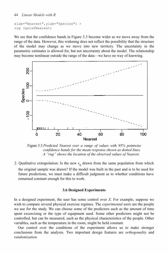
44 Linear Models with R
xlab="Nearest",ylab="Species") >
rug (gala$Nearest)
We see that the confidence bands in Figure 3.3 become wider as we move away from therange of the data. However, this widening does not reflect the possibility that the structureof the model may change as we move into new territory. The uncertainty in theparametric estimates is allowed for, but not uncertainty about the model. The relationshipmay become nonlinear outside the range of the data—we have no way of knowing.
Figure 3.3 Predicted Nearest over a range of values with 95% pointwiseconfidence bands for the mean response shown as dotted lines.A “rug” shows the location of the observed values of Nearest.
2. Qualitative extrapolation: Is the new x0 drawn from the same population from which
the original sample was drawn? If the model was built in the past and is to be used for future predictions, we must make a difficult judgment as to whether conditions haveremained constant enough for this to work.
3.6 Designed Experiments
In a designed experiment, the user has some control over X. For example, suppose wewish to compare several physical exercise regimes. The experimental units are the peoplewe use for the study. We can choose some of the predictors such as the amount of timespent excercising or the type of equipment used. Some other predictors might not becontrolled, but can be measured, such as the physical characteristics of the people. Othervariables, such as the temperature in the room, might be held constant.
Our control over the conditions of the experiment allows us to make strongerconclusions from the analysis. Two important design features are orthogonality andrandomization.
Inference 45
Orthogonality is a useful property because it allows us to more easily interpret the
effect of one predictor without regard to another. Suppose we can partition X in two, X=
[X1 X
2] such that So now:
y=X!+"=X1!+X
2!
2+"
and
which means:
Notice that will be the same regardless of whether X2 is in the model or not (and vice
versa). So we can interpret the effect of X1without a concern forX
2. Unfortunately, the
decoupling is not perfect for suppose we wish to test H0: !
1=0. We have
that will be different depending on whether X2 is included in the model or not, but the
difference in F is not liable to be as large as in nonorthogonal cases.Orthogonality is a desirable property, but will only occur when X is chosen by the
experimenter. It is a feature of a good design. In observational data, we do not have direct control over X and this is the source of many of the interpretational difficulties associated with nonexperimental data.
Here is an example of an experiment to determine the effects of column temperature, gas/liquid ratio and packing height in reducing the unpleasant odor of a chemical product that was sold for household use. Read the data in and display:
> data (odor)
> odor
odor temp gas pack
1 66 !1 !1 0
2 39 1 !1 0
3 43 !1 1 0
4 49 1 1 0
5 58 !1 0 !1
6 17 1 0 !1
7 !5 !1 0 1
8 !40 1 0 1
9 65 0 !1 !1
10 7 0 1 !1
46 Linear Models with R
11 43 0 !1 1
12 !22 0 1 1
13 !31 0 0 0
14 !35 0 0 0
15 !26 0 0 0
The three predictors have been transformed from their original scale of measurement, forexample, temp=(Fahrenheit-80)/40 so the original values of the predictor were 40, 80 and120. The data is presented in John (1971) and give an example of a central compositedesign. Here is the X-matrix:
> x < - as.matrix (cbind (1, odor[,!1]))
and XTX:
> t (x) %*% x
1 temp gas pack
1 15 0 0 0
temp 0 8 0 0
gas 0 0 8 0
pack 0 0 0 8
The matrix is diagonal. Even if temp was measured in the original Fahrenheit scale, thematrix would still be diagonal, but the entry in the matrix corresponding to temp wouldchange. Now fit a model, while asking for the correlation of the coefficients:
> g < - lm (odor ˜ temp + gas + pack, odor)
> summary (g, cor=T)
Coefficients:
Estimate Std. Error t value Pr(>|t|)
(Intercept) 15.2 9.3 1.63 0.13
temp !12.1 12.7 !0.95 0.36
gas !17.0 12.7 !1.34 0.21
pack !21.4 12.7 !1.68 0.12
Residual standard error: 36 on 11 degrees of freedom
Multiple R-Squared: 0.334, Adjusted R-squared: 0.152
F-statistic: 1.84 on 3 and 11 DF, p-value: 0.199
Correlation of Coefficients:
(Intercept) temp gas
temp 0.00
gas 0.00 0.00
pack 0.00 0.00 0.00
We see that, as expected, the pairwise correlation of all the coefficients is zero. Notice thatthe SEs for the coefficients are equal due to the balanced design. Now drop one of thevariables:
> g < - lm (odor ˜ gas + pack, odor) >
summary (g)
Coefficients:

Inference 47
Estimate Std. Error t value Pr(>|t|)
(Intercept) 15.20 9.26 1.64 0.13
gas !17.00 12.68 !1.34 0.20
pack !21.37 12.68 !1.69 0.12
Residual standard error: 35.9 on 12 degrees of freedom
Multiple R-Squared: 0.279, Adjusted R-squared: 0.159
F-statistic: 2.32 on 2 and 12 DF, p-value: 0.141
The coefficients themselves do not change, but the residual SE does change slightly, which causes small changes in the SEs of the coefficients, t-statistics and p-values, but nowhere near enough to change our qualitative conclusions.
These were data from an experiment so it was possible to control the values of the predictors to ensure orthogonality. Now consider the savings data, which are observational:
> g < - 1m (sr ˜ pop15 + pop75 + dpi + ddpi, savings)
> summary (g)
Coefficients:
Estimate Std. Error t value Pr(>|t|)
(Intercept) 28.566087 7.354516 3.88 0.00033
pop15 !0.461193 0.144642 !3.19 0.00260
pop75 !1.691498 1.083599 !1.56 0.12553
dpi !0.000337 0.000931 !0.36 0.71917
ddpi 0.409695 0.196197 2.09 0.04247
Residual standard error: 3.8 on 45 degrees of freedom
Multiple R-Squared: 0.338, Adjusted R-squared: 0.28
F-statistic: 5.76 on 4 and 45 DF, p-value: 0.00079
Drop pop15 from the model:
> g < - update (g, . ˜ . - pop15)
> summary (g)
Coefficients:
Estimate Std. Error t value Pr(>|t|)
(Intercept) 5.487494 1.427662 3.84 0.00037
pop75 0.952857 0.763746 1.25 0.21849
dpi 0.000197 0.001003 0.20 0.84499
ddpi 0.473795 0.213727 2.22 0.03162
Residual standard error: 4.16 on 46 degrees of freedom
Multiple R-Squared: 0.189, Adjusted R-squared: 0.136
F-statistic: 3.57 on 3 and 46 DF, p-value: 0.0209
Pay particular attention to pop75. The effect has now become positive whereas before it was negative. Granted, in both cases it is not significant, but it is not uncommon in other datasets for such sign changes to occur and for them to be significant.
Another important feature of designed experiments is the ability to randomly assign the experimental units to our chosen values of the predictors. For example, in our exercise regime experiment, we might choose an X with some desirable orthogonality properties and then fit a y=X!+" model. However, the subjects we use for the experiment are likely
48 Linear Models with R
to differ in ways that might affect the response, which could, for example, be resting heartrate. Some of these characteristics may be known and measurable such as age or weight.These can be included in X. Including such known important variables is typicallybeneficial, as it increases the precision of our estimates of !.
However, there will be other variables, Z that we cannot measure or may not evensuspect. The model we use is y=X!+" while the true model might be y=X!+ Z*++. + isthe measurement error in the response. We can assume that E"=0 without any loss ofgenerality, because if E"=c, we could simply redefine !
0 as !
0+c and the error would
again have expectation zero. This is another reason why it is generally unwise to remove the intercept term from the model since it acts as a sink for the mean effect of unincludedvariables. So we see that " incorporates both measurement error and the effect of othervariables. We will not observe Z so we cannot estimate *. If X were orthogonal to Z, that
is, XTZ=0, the estimate of ! would not depend on the presence of Z. Of course, we cannotachieve this exactly, but because of the random assignment of the experimental units,which each carry an unknown value of Z, to the predictors X, we will have cor (X, Z)=0.This means that the estimate of ! will not be biased by Z.
Another compelling argument in favor of the randomization is that it justifies the useof permutation tests. We really can argue that any assignment of X to the experimentalunits was one of n! possible permutations.
For observational data, no randomization can be used in assigning X to the units andorthogonality will not just happen. An unmeasured and possible unsuspected lurkingvariable Z may be the real cause of an observed relationship between y and X. Forexample, we will observe a positive correlation among the shoe sizes and reading abilitiesof elementary school students, but this relationship is driven by a lurking variable—theage of the child. In this example, the nature of Z is obvious, but in other cases, we maynot be able to identify an important Z. The possible existence of such a lurking variablecasts a shadow over any conclusions from observational data.
Simply using a designed experiment does not ensure success. We may choose a badmodel for the data or find that the variation in the unobserved Z overwhelms the effect ofthe predictors. Furthermore, results from unrealistic controlled experiments in thelaboratory may not extrapolate to the real world.
3.7 Observational Data
Sometimes it is not practical or ethical to collect data from a designed experiment. Wecannot control the assignment of X and so we can only obtain observational data. In somesituations, we can control which cases we observe from those potentially available. Asample survey is used to collect the data. A good survey design can allow stronger andwider conclusions, but the data will still be observational.
Interpreting models built on observational data is problematic. There are manyopportunities for error and any conclusions will carry substantial unquantifiableuncertainty. Nevertheless, there are many important questions for which onlyobservational data will ever be available and so we must make the attempt in spite of thedifficulties. Suppose we fit a model to obtain the regression equation:
Inference 49
What does mean? In some cases, a ! might represent a real physical constant. Forexample, we might attach weights x to a spring and measure the extension y. willestimate a physical property of the spring. Such examples are rare and so usually thestatistical model is just a convenience for representing a complex reality and the realmeaning of a particular ! is not obvious.
Let’s start with the simplest interpretation: “A unit change in x1 will produce a change
of in the response.” For example, suppose y is annual income and x1 is years of
education. We might hope that represents the predicted change in income if aparticular individual had one more year of education.
The first objection is that there may be some lurking variable Z that is the real drivingforce behind y that also happens to be associated with x
1. Once Z is accounted for, there
may be no relationship between x1 and y. Unfortunately, we can usually never be certain
that such a Z does not exist.Even so, what if all relevant variables have been measured? In other words, suppose
there are no unidentified lurking variables. Even then the naive interpretation does notwork. Consider:
but suppose we change x2→ x
1+x
2; then:
The coefficient for x1 has changed. Interpretation cannot be done separately for each
variable. This is a practical problem because it is not unusual for the predictor of interest,x
1 in this example, to be mixed up in some way with other variables like x
2. This is the
problem of collinearity which is explored in Section 5.3.
Let’s try a new interpretation: “ is the effect of x1 when all the other (specified)
predictors are held constant.”
This is better, but it too has problems. Often in practice, individual variables cannot bechanged without changing others too. For example, in economics we cannot expect tochange tax rates without other things changing too. Furthermore, this interpretationrequires the specification of the other variables—changing which other variables areincluded will change the interpretation. Unfortunately, there is no simple solution.
Just to amplify this, consider the effect of pop 75 on the savings rate in the savingsdataset. I will fit four different models, all including pop 75, but varying the inclusion ofother variables:

50 Linear Models with R
> g < - 1m (sr ˜ pop15 + pop75 + dpi + ddpi, savings)
> summary (g)
Coefficients:
Estimate Std . Error t value Pr((>|t|)
(Intercept) 28.566087 7.354516 3.88 0.00033
pop15 !0.461193 0.144642 !3.19 0.00260
pop75 !1.691498 1.083599 !1.56 0.12553
dpi !0.000337 0.000931 !0.36 0.71917
ddpi 0.409695 0.196197 2.09 0.04247
Residual standard error: 3.8 on 45 degrees of freedom
Multiple R-Squared: 0.338, Adjusted R-squared: 0.28
F-statistic: 3.57 on 3 and 46 DF, p-value: 0.0209
It is perhaps surprising that pop75 is not significant in this model. However, pop75 isnegatively correlated with pop15 5 since countries with proportionately more youngerpeople are likely to have relatively fewer older ones and vice versa. These two variablesboth measure the nature of the age distribution in a country. When two variables thatrepresent roughly the same thing are included in a regression equation, it is not unusualfor one (or even both) of them to appear insignificant even though prior knowledge aboutthe effects of these variables might lead one to expect them to be important:
> g2 < - 1m (sr ˜ pop75 + dpi + ddpi, savings)
> summary(g2)
Coefficients:
Estimate Std. Error t value Pr (>|t|)
(Intercept) 5.487494 1.427662 3.84 0.00037
pop75 0.952857 0.763746 1.25 0.21849
dpi 0.000197 0.001003 0.20 0.84499
ddpi 0.473795 0.213727 2.22 0.03162
Residual standard error: 4.16 on 46 degrees of freedom
Multiple R-Squared: 0.189, Adjusted R-squared: 0.136
F-statistic: 3.57 on 3 and 46 DF, p-value: 0.0209
We note that the income variable dpi and pop75 are both not significant in this model andyet one might expect both of them to have something to do with savings rates. Highervalues of these variables are both associated with wealthier countries.
Let’s see what happens when we drop dpi from the model:
> g3 < - 1m (sr ˜ pop75 + ddpi, savings)
> summary(g3)
Coefficients:
Estimate Std. Error t value Pr(>|t|)
(Intercept) 5.470 1.410 3.88 0.00033
pop75 1.073 0.456 2.35 0.02299
ddpi 0.464 0.205 2.26 0.02856
Residual standard error: 4.12 on 47 degrees of freedom
Multiple R-Squared: 0.188, Adjusted R-squared: 0.154
F-statistic: 5.45 on 2 and 47 DF, p-value: 0.00742
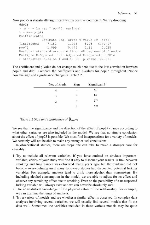
Inference 51
ddpi:
> g4 < - 1m (sr ˜ pop75, savings)
> summary(g4)
Coefficients:
Estimate Std. Error t value Pr (>|t|)
(Intercept) 7.152 1.248 5.73 6.4e–07
pop75 1.099 0.475 2.31 0.025
Residual standard error: 4.29 on 48 degrees of freedom
Multiple R-Squared: 0.1, Adjusted R-squared: 0.0814
F-statistic: 5.34 on 1 and 48 DF, p-value: 0.0251
The coefficient and p-value do not change much here due to the low correlation between pop75 and ddpi. Compare the coefficients and p-values for pop75 throughout. Notice how the sign and significance change in Table 3.2.
No. of Preds Sign Significant?
4 # no
3 + no
2 + yes
1 + yes
Table 3.2 Sign and significance of .
We see that the significance and the direction of the effect of pop75 change according to what other variables are also included in the model. We see that no simple conclusion about the effect of pop75 is possible. We must find interpretations for a variety of models. We certainly will not be able to make any strong causal conclusions.
In observational studies, there are steps one can take to make a stronger case for causality:
1. Try to include all relevant variables. If you have omitted an obvious important variable, critics of your study will find it easy to discount your results. A link between smoking and lung cancer was observed many years ago, but the evidence did not become overwhelming until many follow-up studies had discounted potential lurking variables. For example, smokers tend to drink more alcohol than nonsmokers. By including alcohol consumption in the model, we are able to adjust for its effect and observe any remaining effect due to smoking. Even so the possibility of a unsuspected lurking variable will always exist and we can never be absolutely sure.
2. Use nonstatistical knowledge of the physical nature of the relationship. For example, we can examine the lungs of smokers.
3. Try a variety of models and see whether a similar effect is observed. In complex data analyses involving several variables, we will usually find several models that fit the data well. Sometimes the variables included in these various models may be quite
Now pop75 is statistically significant with a positive coefficient. We try dropping

52 Linear Models with R
different, but if is similar, this will increase confidence in the strength of theconclusions.
4. Multiple studies under different conditions can help confirm a relationship.5. In a few cases, one can infer causality from an observational study. Dahl and Moretti
(2003) report from U.S. census records that parents of a single girl are 5% more likelyto divorce than parents of a single boy. The gap widens for larger families of girls andboys, respectively, and is even wider in several other countries. In many observationalstudies we can suggest a lurking variable that drives both the predictor and theresponse, but here, excepting recent experimental reproductive methods, the sex of achild is a purely random matter. This observational study functions like anexperimental design. So in this example, we can say that the sex of the child affectsthe chance of divorce. The exact mechanism or reason is unclear. Census data are solarge that statistical significance is assured.
It is difficult to assess the evidence in these situations and one can never be certain. Thestatistician is comfortable with the uncertainty expressed by hypothesis tests and CIs, butthe uncertainty associated with conclusions based on observational data cannot bequantified and is necessarily subjective.
An alternative approach to interpreting parameter estimates is to recognize that theparameters and their estimates are fictional quantities in most regression situations. The“true” values may never be known (if they even exist in the first place). Instead,concentrate on predicting future values—these may actually be observed and success canthen be measured in terms of how good the predictions were.
Consider a prediction made using each of the previously mentioned four models:
> x0 < - data. frame(pop15=32, pop75=3, dpi=700, ddpi=3)
> predict (g, x0)
[1] 9.7267
> predict (g2, x0)
[1] 9.9055
> predict(g3, x0)
[1] 10.078
> predict(g4, x0)
[1] 10.448
Prediction is more stable than parameter estimation. This enables a rather cautious
interpretation of . Suppose the predicted value is % for given x1
and other given
predictor values. Now suppose we observe x1+1 and the same other given predictor
values; then the predicted response is increased by Notice that we have been carefulnot to say that we have taken a specific individual and increased his or her x
1 by 1; rather
we have observed a new individual with predictor x1+1. To put it another way, people
with college educations earn more on average than people without, but giving a collegeeducation to someone without one will not necessarily increase his or her income by thesame amount.

Inference 53
3.8 Practical Difficulties
We have described a linear model y=X!+". Provided certain assumptions are satisfied,we can estimate ! test any linear hypothesis about !, construct confidence regions for !and make predictions with CIs. The theory is clear and, with a little experience, thecomputation becomes straightforward. However, the most difficult part of regression dataanalysis is ensuring that the theory is appropriate for the real application. Einstein put itwell:
So far as theories of mathematics are about reality; they are not certain; so far asthey are certain, they are not about reality.
Problems may arise in several areas:
Nonrandom Samples
How the data were collected directly affects what conclusions we can draw. The generaltheory of hypothesis testing posits a population from which a sample is drawn—thesample is our data. We want to say something about the unknown population values !, using estimated values that are obtained from the sample data. Furthermore, we requirethat the data be generated using a simple random sample of the population. This sample isfinite in size, while the population is infinite in size or at least so large that the samplesize is a negligible proportion of the whole. For more complex sampling designs, otherprocedures should be applied, but of greater concern is the case when the data are not arandom sample at all.
Sometimes, researchers may try to select a representative sample by hand. Quite apartfrom the obvious difficulties in doing this, the logic behind the statistical inferencedepends on the sample being random. This is not to say that such studies are worthless,but that it would be unreasonable to apply anything more than descriptive statisticaltechniques. Confidence in the conclusions from such data is necessarily suspect.
A sample of convenience is where the data are not collected according to a samplingdesign. In some cases, it may be reasonable to proceed as if the data were collected usinga random mechanism. For example, suppose we take the first 400 people from the phonebook whose names begin with the letter P. Provided there is no ethnic effect, it may bereasonable to consider this a random sample from the population defined by the entries inthe phone book. Here we are assuming the selection mechanism is effectively randomwith respect to the objectives of the study. The data are as good as random. Othersituations are less clear-cut and judgment will be required. Such judgments are easytargets for criticism. Suppose you are studying the behavior of alcoholics and advertise inthe media for study subjects. It seems very likely that such a sample will be biased,perhaps in unpredictable ways. In cases such as this, a sample of convenience is clearlybiased in which case conclusions must be limited to the sample itself. This situationreduces to the case where the sample is the population.
Sometimes, the sample is the complete population. In this case, one might argue thatinference is not required since the population and sample values are one and the same.For both regression datasets, gala and savings, that we have considered so far, the sampleis effectively the population or a large and biased proportion thereof. Permutation tests

54 Linear Models with R
make it possible to give some meaning to the p-value when the sample is the populationor for samples of convenience although one has to be clear that one’s conclusion appliesonly to the particular sample. Another approach that gives meaning to the p-value whenthe sample is the population involves the imaginative concept of “alternative worlds”where the sample/population at hand is supposed to have been randomly selected fromparallel universes. This argument is definitely more tenuous.
Choice and Range of PredictorsWhen important predictors are not observed, the predictions may be poor or we maymisinterpret the relationship between the predictors and the response.
The range and conditions under which the data are collected may limit effectivepredictions. It is unsafe to extrapolate too much. Carcinogen trials may apply large dosesto mice. What do the results say about small doses applied to humans? Much of theevidence for harm from substances such as asbestos and radon comes from peopleexposed to much larger amounts than that encountered in a normal life. It is clear thatworkers in old asbestos manufacturing plants and uranium miners suffered from theirrespective exposures to these substances, but what does that say about the danger to youor me?
Model Misspecification
We make assumptions about the structural and random part of the model. For the errorstructure, we may assume that " ~ N (0, #2I), but this may not be true. The structural partof linear model Ey=X! may also be incorrect. The model we use may come fromdifferent sources:
1. Physical theory may suggest a model. For example, Hooke’s law says that theextension of a spring is proportional to the weight attached. Models like these usuallyarise in the physical sciences and engineering.
2. Experience with past data. Similar data used in the past were modeled in a particularway. It is natural to see whether the same model will work with the current data.Models like these usually arise in the social sciences.
3. No prior idea exists—the model comes from an exploration of the data.
Confidence in the conclusions from a model declines as we progress through these.Models that derive directly from physical theory are relatively uncommon so that usuallythe linear model can only be regarded as an approximation to a complex reality.
The inference depends on the correctness of the model we use. We can partially checkthe assumptions about the model, but there will always be some element of doubt.Sometimes the data may suggest more than one possible model, which may lead tocontradictory results.
Most statistical theory rests on the assumption that the model is correct. In practice, thebest one can hope for is that the model is a fair representation of reality. A model can beno more than a good portrait. As George Box said,
All models are wrong but some are useful.
Publication and Experimenter Bias
Many scientific journals will not publish the results of a study whose conclusions do notreject the null hypothesis. If different researchers keep studying the same relationship,

Inference 55
sooner or later one of them will come up with a significant effect even if one really does not exist. It is not easy to find out about all the studies with negative results so it is easy to make the wrong conclusions. The news media often jump on the results of a single study, but one should be suspicious of these singleton results. Follow-up studies are often needed to confirm an effect.
Another source of bias is that researchers have a vested interest in obtaining a positive result. There is often more than one way to analyze the data and the researchers may be tempted to pick the one that gives them the results they want. This is not overtly dishonest, but it does lead to a bias towards positive results.
Practical and Statistical Significance
Statistical significance is not equivalent to practical significance. The larger the sample, the smaller your p-values will be, so do not confuse p-values with an important predictor effect. With large datasets it will be very easy to get statistically significant results, but the actual effects may be unimportant. Would we really care that test scores were 0.1% higher in one state than another or that some medication reduced pain by 2%? CIs on the parameter estimates are a better way of assessing the size of an effect. They are useful even when the null hypothesis is not rejected, because they tell us how confident we are that the true effect or value is close to the null.
It is also important to remember that a model is usually only an approximation of underlying reality which makes the exact meaning of the parameters debatable at the very least. The precision of the statement that !
1=0 exactly is at odds with the acknowledged
approximate nature of the model. Furthermore, it is highly unlikely that a predictor that one has taken the trouble to measure and analyze has exactly zero effect on the response. It may be small but it will not be zero.
This means that in many cases, we know the point null hypothesis is false without even looking at the data. Furthermore, we know that the more data we have, the greater the power of our tests. Even small differences from zero will be detected with a large sample. Now if we fail to reject the null hypothesis, we might simply conclude that we did not have enough data to get a significant result. According to this view, the hypothesis test just becomes a test of sample size. For this reason, we prefer CIs.
Exercises
1. For the prostate data, fit a model with lpsa as the response and the other variables as predictors.
(a) Compute 90 and 95% CIs for the parameter associated with age. Using just these intervals, what could we have deduced about the p-value for age in the regression summary?
(b) Compute and display a 95% joint confidence region for the parameters associated with age and Ibph. Plot the origin on this display. The location of the origin on the display tells us the outcome of a certain hypothesis test. State that test and its outcome.
(c) Suppose a new patient with the following values arrives:
lcavol lweight age Ibph svi lcp
1.44692 3.62301 65.00000 0.30010 0.00000 !0.79851

56 Linear Models with R
gleason pgg45
7.00000 15.00000
Predict the lpsa for this patient along with an appropriate 95% CI.(d) Repeat the last question for a patient with the same values except that he or she is
age 20. Explain why the CI is wider.(e) In the text, we made a permutation test corresponding to the F-test for the
significance of all the predictors. Execute the permutation test corresponding to thet-test for age in this model. (Hint: {summary (g) $coef [4,3] gets you the t-statisticyou need if the model is called g.)
2. For the model of the previous question, remove all the predictors that are notsignificant at the 5% level.
(a) Recompute the predictions of the previous question. Are the CIs wider or narrower?Which predictions would you prefer? Explain.
(b) Test this model against that of the previous question. Which model is preferred?
3. Using the teengamb data, fit a model with gamble as the response and the othervariables as predictors.
(a) Which variables are statistically significant?(b) What interpretation should be given to the coefficient for sex?(c) Predict the amount that a male with average (given these data) status, income and
verbal score would gamble along with an appropriate 95% CI. Repeat theprediction for a male with maximal values (for this data) of status, income andverbal score. Which CI is wider and why is this result expected?
(d) Fit a model with just income as a predictor and use an F-test to compare it to thefull model.
4. Using the sat data:
(a) Fit a model with total sat score as the response and expend, ratio and salary aspredictors. Test the hypothesis that !
Salary=0. Test the hypothesis that
!salary
=!ratio
=!expend
= 0. Do any of these predictors have an effect on the response?
(b) Now add takers to the model. Test the hypothesis that !salary
=0. Compare this
model to the previous one using an F-test. Demonstrate that the F-test and t-testhere are equivalent.
5. Find a formula relating R2 and the F-test for the regression.


CHAPTER 4Diagnostics
The estimation and inference from the regression model depends on several assumptions. These assumptions need to be checked using regression diagnostics. We divide the potential problems into three categories:
Error We have assumed that "~N(0, #2I) or in words, that the errors are independent, have equal variance and are normally distributed.
Model We have assumed that the structural part of the model Ey=X! is correct.Unusual observations Sometimes just a few observations do not fit the model. These few observations might change the choice and fit of the model.
Diagnostic techniques can be graphical, which are more flexible but harder to definitively interpret, or numerical, which are narrower in scope, but require no intuition. The relative strengths of these two types of diagnostics will be explored below. The first model we try may prove to be inadequate. Regression diagnostics often suggest improvements, which means model building is often an iterative and interactive process. It is quite common to repeat the diagnostics on a succession of models.
4.1 Checking Error Assumptions
We wish to check the independence, constant variance and normality of the errors, ". The errors are not observable, but we can examine the residuals, . These are not interchangeable with the error, as they have somewhat different properties. Recall that
%=X(XTX)!1XTy=H
y where H is the hat-matrix, so that
. Therefore,
assuming that var "=#2I. We see that although the errors may have equal variance and be uncorrelated, the residuals do not. Fortunately, the impact of this is usually small and diagnostics are often applied to the residuals in order to check the assumptions on the error.
4.1.1 Constant Variance
It is not possible to check the assumption of constant variance just by examining the residuals alone—some will be large and some will be small, but this proves nothing. We need to check whether the variance in the residuals is related to some other quantity.
First, plot against % If all is well, you should see constant variance in the vertical( )are heteroscedasticity (nonconstant variance) and nonlinearity (which indicates some change in the model is necessary). In Figure 4.1, these three cases are illustrated.
direction and the scatter should be symmetric vertically about zero. Things to look for
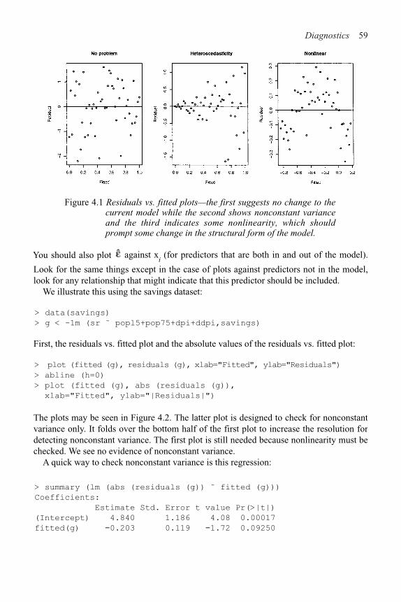
Diagnostics 59
Figure 4.1 Residuals vs. fitted plots—the first suggests no change to the current model while the second shows nonconstant variance and the third indicates some nonlinearity, which should prompt some change in the structural form of the model.
You should also plot against xi (for predictors that are both in and out of the model).
Look for the same things except in the case of plots against predictors not in the model, look for any relationship that might indicate that this predictor should be included.
We illustrate this using the savings dataset:
> data(savings)
> g < -1m (sr ˜ popl5+pop75+dpi+ddpi,savings)
First, the residuals vs. fitted plot and the absolute values of the residuals vs. fitted plot:
> plot (fitted (g), residuals (g), xlab="Fitted", ylab="Residuals")
> abline (h=0)
> plot (fitted (g), abs (residuals (g)),
xlab="Fitted", ylab="|Residuals|")
The plots may be seen in Figure 4.2. The latter plot is designed to check for nonconstant variance only. It folds over the bottom half of the first plot to increase the resolution for detecting nonconstant variance. The first plot is still needed because nonlinearity must be checked. We see no evidence of nonconstant variance.
A quick way to check nonconstant variance is this regression:
> summary (lm (abs (residuals (g)) ˜ fitted (g)))
Coefficients:
Estimate Std. Error t value Pr(>|t|)
(Intercept) 4.840 1.186 4.08 0.00017
fitted(g) !0.203 0.119 !1.72 0.09250

60 Linear Models with R
Figure 4.2 Residual vs. fitted plots for the savings data.
Residual standard error: 2.16 on 48 degrees of freedom
Multiple R-Squared: 0.0578, Adjusted R-squared: 0.0382
F-statistic: 2.95 on 1 and 48 DF, p-value: 0.0925
This test is not quite right, as some weighting should be used and the degrees of freedomshould be adjusted, but there does not seem to be a clear problem with nonconstantvariance.
It is often hard to judge residual plots without prior experience so it is helpful togenerate some artificial plots where the true relationship is known. The following four for( ) loops show:
1. Constant variance2. Strong nonconstant variance3. Mild nonconstant variance4. Nonlinearity
> par(mfrow=c (3, 3))
> for (i in 1:9) plot (1:50, rnorm (50))
> for (i in 1:9) plot (1:50, (1:50)*rnorm(50))
> for (i in 1:9) plot (1:50, sqrt ((1:50))*rnorm(50))
> for (i in 1:9) plot(1:50, cos ((1:50)*pi/25)+rnorm(50))
> par(mfrow=c (1, 1))
Repeat to get an idea of the usual amount of variation. Artificial generation of plots is agood way to “calibrate” diagnostic plots. It is often hard to judge whether an apparentfeature is real or just random variation. Repeated generation of plots under a model,where there is no violation of the assumption that the diagnostic plot is designed to check,is helpful in making this judgment.
Now look at some residuals against predictor plots:
> plot(savings$pop15, residuals(g),
xlab="Population under 15", ylab="Residuals")

Diagnostics 61
> plot(savings$pop75, residuals(g),
xlab="Population over 75", ylab="Residuals")
Figure 4.3 Residuals vs. predictor plots for the savings data.
The plots may be seen in Figure 4.3. Two groups can be seen in the first plot. Let’s compare and test the variances in these groups. Given two independent samples from normal distributions, we can test for equal variance using the test statistic of the ratio of the two variance. The null distribution is an F with degrees of freedom given by the two samples:
> var.test (residuals(g)[savings$pop15>35],
residuals(g)[savings$pop15<35])
F test to compare two variances
F=2.7851, num df=22, denom df=26, p-value=0.01358
alternative hypothesis: true ratio of variances is not equal to 1
95 percent confidence interval:
1.2410 6.4302
sample estimates:
ratio of variances
2.7851
A significant difference is seen.There are two approaches to dealing with nonconstant variance. Use of weighted least
squares (see Section 6.1) is appropriate when the form of the nonconstant variance is either known exactly or there is some known parametric form. Alternatively, one can transform the variables. Sometimes other changes to the model may fix the problem, but we consider transforming the response y to h(y) where h( ) is chosen so
that var h(y) is constant. To see how to choose h consider this:

62 Linear Models with R
We ignore the higher order terms. For var h(y) to be constant we need:
which suggests:
For example if var y=var " % (Ey)2, then h(y)=log y is suggested while if var " % (Ey),
then .In practice, you need to look at the plot of the residuals and fitted values and take a
guess at the relationship. When looking at the plot, we see the change in SDy rather thenvar y, because the SD is in the units of the response. If your initial guess is wrong, youcan always try another transformation.
Sometimes it can be difficult to find a good transformation. For example, when yi"0
for some i, square root or log transformations will fail. You can try, say, log (y+ +), forsome small + but this makes interpretation difficult.
Consider the residual vs. fitted plot for the Galapágos data:
> data (gala)
> gg < - lm (Species ˜ Area + Elevation + Scruz + Nearest
+ Adjacent, gala)
> plot (fitted (gg), residuals (gg), xlab="Fittedn,
ylab="Residuals")
We can see nonconstant variance in the first plot of Figure 4.4.

Diagnostics 63
Figure 4.4 Residual vs. fitted plots for the Galápagos data before (left) and after (right) transformation.
There are formal tests for nonconstant variance—for example, one could start by regressing on % or x
i The null hypothesis of constant variance is clear, but specifying a
good alternative hypothesis is problematic. A formal test may be good at detecting a particular kind of nonconstant variance, but have no power to detect another. Residual plots are more versatile because unanticipated problems may be spotted.
A formal diagnostic test may have a reassuring aura of exactitude about it, but one needs to understand that any such test may be powerless to detect problems of an unsuspected nature. Graphical techniques are usually more effective at revealing structure that you may not have suspected. Of course, sometimes the interpretation of the plot may be ambiguous, but at least one can be sure that nothing is seriously wrong with the assumptions. For this reason, we usually prefer a graphical approach to diagnostics with formal tests reserved for the clarification of signs discovered in the plots.
Here we guess that a square root transformation will give us a constant variance:
> gs < - lm (sqrt (Species) ˜ Area+ Elevation+ Scruz+ Nearest
+ Adjacent, gala)
> plot (fitted (gs), residuals (gs), xlab="Fitted", ylab="Residuals",
main="Square root Response")
We see in the second plot of Figure 4.4 that the variance is now constant. Our guess at a variance stabilizing transformation worked out here, but had it not, we could always have tried something else. The square root transformation is often appropriate for count response data. The Poisson distribution is a good model for counts and that distribution has the property that the mean is equal to the variance thus suggesting the square root transformation.

64 Linear Models with R
The tests and confidence intervals we use are based on the assumption of normal errors.The residuals can be assessed for normality using a Q–Q plot. This compares the
residuals to "ideal" normal observations. We plot the sorted residuals against
for i =1,…, n. Let’s try it out on the savings data:
> qqnorm (residuals (g), ylab="Residuals")
> qqline (residuals (g))
See the first plot of Figure 4.5—qqline ( ) adds a line joining the first and third quartiles.It is not influenced by outliers. Normal residuals should follow the line approximately.Here, the residuals look normal.
Histograms and boxplots are not suitable for checking normality:
> hist (residuals (g))
The histogram seen in the second plot of Figure 4.5 does not have the expected bellshape. This is because we must group the data into bins. The choice of width andplacement of these bins is problematic and the plot here is inconclusive.
We can get an idea of the variation to be expected in Q–Q plots in the following experiment.Such simulations are useful for self-calibration. I generate data from different distributions:
Figure 4.5 Normality checks for the savings data.
1. Normal2. Lognormal—an example of a skewed distribution3. Cauchy—an example of a long-tailed (platykurtic) distribution4. Uniform—an example of a short-tailed (leptokurtic) distribution
4.1.2 Normality
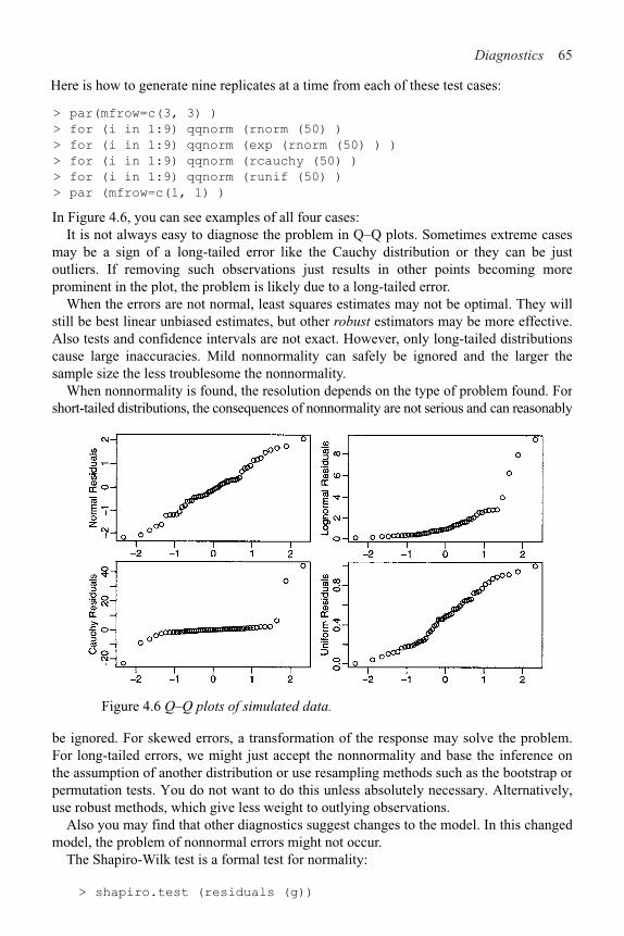
Diagnostics 65
> par(mfrow=c(3, 3) )
> for (i in 1:9) qqnorm (rnorm (50) )
> for (i in 1:9) qqnorm (exp (rnorm (50) ) )
> for (i in 1:9) qqnorm (rcauchy (50) )
> for (i in 1:9) qqnorm (runif (50) )
> par (mfrow=c(1, 1) )
In Figure 4.6, you can see examples of all four cases:It is not always easy to diagnose the problem in Q–Q plots. Sometimes extreme cases
may be a sign of a long-tailed error like the Cauchy distribution or they can be just outliers. If removing such observations just results in other points becoming more prominent in the plot, the problem is likely due to a long-tailed error.
When the errors are not normal, least squares estimates may not be optimal. They will still be best linear unbiased estimates, but other robust estimators may be more effective. Also tests and confidence intervals are not exact. However, only long-tailed distributions cause large inaccuracies. Mild nonnormality can safely be ignored and the larger the sample size the less troublesome the nonnormality.
When nonnormality is found, the resolution depends on the type of problem found. For short-tailed distributions, the consequences of nonnormality are not serious and can reasonably
Figure 4.6 Q–Q plots of simulated data.
be ignored. For skewed errors, a transformation of the response may solve the problem. For long-tailed errors, we might just accept the nonnormality and base the inference on the assumption of another distribution or use resampling methods such as the bootstrap or permutation tests. You do not want to do this unless absolutely necessary. Alternatively, use robust methods, which give less weight to outlying observations.
Also you may find that other diagnostics suggest changes to the model. In this changed model, the problem of nonnormal errors might not occur.
The Shapiro-Wilk test is a formal test for normality:
> shapiro.test (residuals (g))
Here is how to generate nine replicates at a time from each of these test cases:
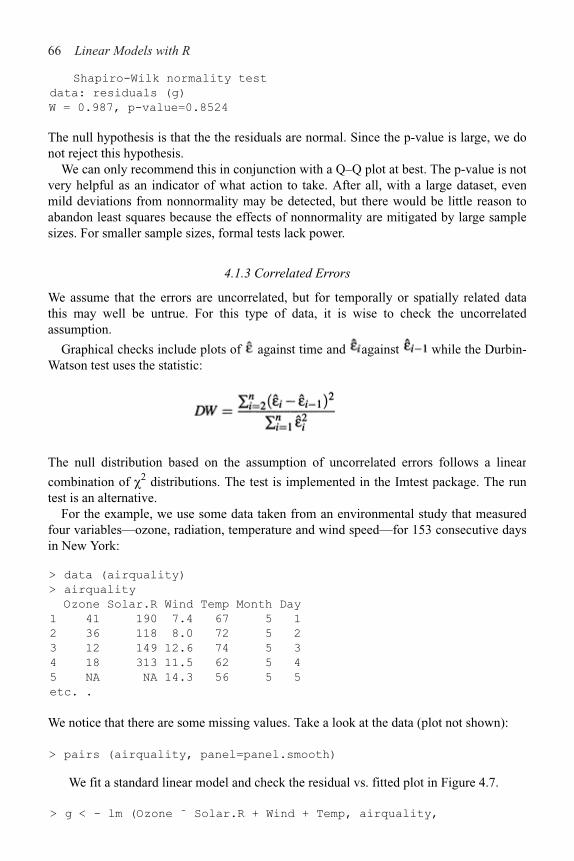
66 Linear Models with R
Shapiro-Wilk normality test
data: residuals (g)
W = 0.987, p-value=0.8524
The null hypothesis is that the the residuals are normal. Since the p-value is large, we donot reject this hypothesis.
We can only recommend this in conjunction with a Q–Q plot at best. The p-value is notvery helpful as an indicator of what action to take. After all, with a large dataset, evenmild deviations from nonnormality may be detected, but there would be little reason toabandon least squares because the effects of nonnormality are mitigated by large samplesizes. For smaller sample sizes, formal tests lack power.
4.1.3 Correlated Errors
We assume that the errors are uncorrelated, but for temporally or spatially related datathis may well be untrue. For this type of data, it is wise to check the uncorrelatedassumption.
Graphical checks include plots of against time and against while the Durbin-Watson test uses the statistic:
The null distribution based on the assumption of uncorrelated errors follows a linear
combination of ,2 distributions. The test is implemented in the Imtest package. The runtest is an alternative.
For the example, we use some data taken from an environmental study that measuredfour variables—ozone, radiation, temperature and wind speed—for 153 consecutive daysin New York:
> data (airquality)
> airquality
Ozone Solar.R Wind Temp Month Day
1 41 190 7.4 67 5 1
2 36 118 8.0 72 5 2
3 12 149 12.6 74 5 3
4 18 313 11.5 62 5 4
5 NA NA 14.3 56 5 5
etc. .
We notice that there are some missing values. Take a look at the data (plot not shown):
> pairs (airquality, panel=panel.smooth)
We fit a standard linear model and check the residual vs. fitted plot in Figure 4.7.
> g < - lm (Ozone ˜ Solar.R + Wind + Temp, airquality,
Diagnostics 67
na.action = na.exclude)
> summary (g)
Coefficients:
Estimate Std. Error t value Pr(>|t|)
(Intercept) !64.3421 23.0547 !2.79 0.0062
Solar.R 0.0598 0.0232 2.58 0.0112
Wind !3.3336 0.6544 !5.09 1.5e–06
Temp 1.6521 0.2535 6.52 2.4e–09
Residual standard error: 21.2 on 107 degrees of freedom
Multiple R-Squared: 0.606, Adjusted R-squared: 0.595
F-statistic: 54.8 on 3 and 107 DF, p-value: < 2e–16
> plot (fitted (g), residuals (g), xlab="Fitted", ylab="Residuals")
Notice how there are only 107 degrees corresponding to the 111 complete observations. The default behavior in R when performing a regression with missing values is to omit any case that contains a missing value. The option na.action= na. exclude does not use cases with missing values in the computation, but does keep track of which cases are missing in the residuals, fitted values and other quantities. We see some nonconstant variance and nonlinearity and so we try transforming the response:
> gl < - lm (log (Ozone) ˜ Solar.R + Wind + Temp,
airquality,na.action=na.exclude)
> plot (fitted (gl), residuals (gl), xlab="Fitted",
ylab="Residuals")
The improvement can be seen in the second panel of Figure 4.7.
Figure 4.7 Residuals vs. fitted for the air quality data. Untransformed response on the left; logged response on the right.
Now we check the residuals for correlation. First, make an index plot of the residuals—see the first plot of Figure 4.8:

68 Linear Models with R
> plot (residuals (gl), ylab="Residuals")
> abline (h=0)
If there was serial correlation, we would see either longer runs of residuals above orbelow the line for positive correlation or greater than normal fluctuation for negativecorrelations. Unless these effects are strong, they can be difficult to spot. Nothing isobviously wrong here. It is often better to plot successive residuals:
> plot (residuals (gl) [–153] , residuals (gl) [–1] , xlab=
expression (hat (epsilon) [i]) , ylab=expression (hat
(epsilon) [i + 1]) )
There is no obvious problem with correlation here. We can see a single outlier (whichgets plotted twice in this case). Let’s check using a regression of successiveresiduals—the intercept is omitted because residuals have mean zero:
> summary(lm(residuals(gl)[–1] ˜ Z–1+residuals (gl) [–153]))
Coefficients:
Figure 4.8 Diagnostic plots for correlated errors in the air quality data.
Estimate Std. Error t value Pr(>|t|)
residuals (gl)[!153] 0.110 0.105 1.05 0.3
Residual standard error: 0.508 on 91 degrees of freedom
Multiple R-Squared: 0.0119, Adjusted R-squared: 0.00107
F-statistic: 1.1 on 1 and 91 DF, p-value: 0.297
We omitted the intercept term because the residuals have mean zero. We see that there isno significant correlation. You can plot more than just successive pairs if you suspect amore complex dependence.
We can compute the Durbin-Watson statistic:

Diagnostics 69
> library(lmtest)
> dwtest (Ozone ˜ Solar.R + Wind + Temp, data=na.omit
(airquality))
Durbin-Watson test
data: Ozone ˜ Solar.R + Wind + Temp
DW=1.9355, p-value=0.3347
alternative hypothesis: true autocorrelation is greater
than 0
where the p-value indicates no evidence of correlation. However, the result should be viewed with skepticism because of our omission of the missing values.
If you do have correlated errors, you can use generalized least squares—see Chapter 6. For data where there is no apparent link between observations, as there is in serial data, it is almost impossible to check for correlation between errors. Fortunately, there is no reason to suspect it either.
4.2 Finding Unusual Observations
Some observations do not fit the model well—these are called outliers. Other observations change the fit of the model in a substantive manner—these are called influential observations. A point can be none, one or both of these. A leverage point is unusual in the predictor space—it has the potential to influence the fit.
4.2.1 Leverage
hi=H
ii are called leverages and are useful diagnostics. Since , a large
leverage, hi, will make small. The fit will be “forced” close to y
i. Sinc -
ih
i=p, an
average value for hi is p/n. A “rule of thumb” is that leverages of more than 2p/n should
be looked at more closely. Large values of hi are due to extreme values in X. h
i
corresponds to a (squared) Mahalanobis distance defined by X which is where
is the estimated covariance of X. The value of hidepends only on X
and not y so leverages contain only partial information about a point.
We will use the savings dataset as an example here:
> g < - 1m (sr ˜ pop15 + pop75 + dpi + ddpi, savings) >
ginf < - influence (g)
> ginf$hat
[1] 0.067713 0.120384 0.087482 0.089471 0.069559 0.158402
….
> sum (ginf$hat)
[1] 5
We verify that the sum of the leverages is indeed five—the number of parameters in the model.

70 Linear Models with R
Without making assumptions about the distributions of the predictors that would oftenbe unreasonable, we cannot say how the leverages would be distributed. Nevertheless, wewould like to identify unusually large values of the leverage. The halfnormal plot is agood way to do this.
Half-normal plots are designed for the assessment of positive data. They could be usedfor , but are more typically useful for diagnostic quantities like the leverages. The idea is to plot the data against the positive normal quantiles.
The steps are:
1. Sort the data: x[1]"…x
[n].
2. Compute .
3. Plot x[i] against ui.
We are usually not looking for a straight line relationship since we do not necessarilyexpect a positive normal distribution for quantities like the leverages. We are looking foroutliers, which will be apparent as points that diverge substantially from the rest of thedata.
We demonstrate the half-normal plot on the leverages for the savings data:
> countries < - row.names (savings)
> halfnorm. inf luence (g) $hat, labs=countries,
ylab=“Leverages”)
The plot is the first shown in Figure 4.9—I have plotted the country name instead of justa dot for the largest two cases, respectively, to aid identification:
Figure 4.9 Half-normal plots for the leverages and a Q–Q plot for the studentized residuals.
As we have seen this suggests the use of:

Diagnostics 71
which are called (internally) studentized residuals. If the model assumptions are correct, var r
i=1 and corr(r
i, r
j) tends to be small. Studentized residuals are sometimes preferred
in residual plots, as they have been standardized to have equal variance. Studentization can only correct for the natural nonconstant variance in residuals when the errors have constant variance. If there is some underlying heteroscedasticity in the errors, studentization cannot correct for it.
We now get the studentized residuals for the savings data:
> gs < - summary (g)
> gs$sig
[1] 3.8027
> stud < - residuals(g)/(gs$sig*sqrt(1-ginf$hat))
> qqnorm (stud)
> abline (0, l)
We have displayed the Q–Q plot of the studentized residuals in the second plot of Figure4.9. Because these residuals have been standardized, we expect the points to approximately follow the y=x line if normality holds.
Some authors recommend using studentized rather than raw residuals in all diagnostic plots. However, in many cases, the studentized residuals are not effectively very different from the raw residuals. Only when there is unusually large leverage will the differences be noticeable.
4.2.2 Outliers
An outlier is a point that does not fit the current model. We need to be aware of such exceptions. An outlier test is useful because it enables us to distinguish between truly unusual observations and residuals that are large, but not exceptional.
Outliers may affect the fit. See Figure 4.10. The two additional marked points both have high leverage because they are far from the rest of the data. ▲ is not an outlier. ●does not have a large residual if it is included in the fit. Only when we compute the fit without that point do we get a large residual.
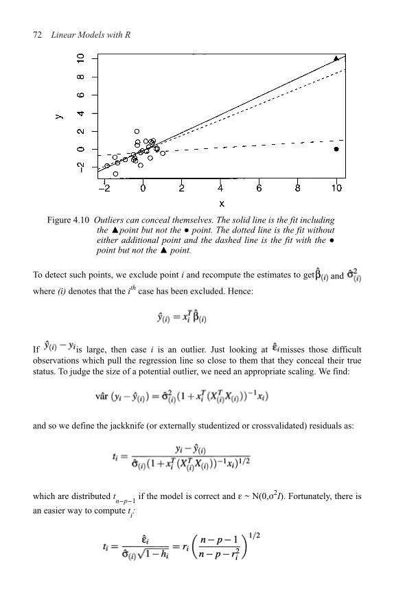
72 Linear Models with R
Figure 4.10 Outliers can conceal themselves. The solid line is the fit includingthe ▲point but not the ● point. The dotted line is the fit withouteither additional point and the dashed line is the fit with the ●point but not the ▲ point.
To detect such points, we exclude point i and recompute the estimates to get and
where (i) denotes that the ith case has been excluded. Hence:
If is large, then case i is an outlier. Just looking at misses those difficultobservations which pull the regression line so close to them that they conceal their truestatus. To judge the size of a potential outlier, we need an appropriate scaling. We find:
and so we define the jackknife (or externally studentized or crossvalidated) residuals as:
which are distributed tn!p!1
if the model is correct and " ~ N(0,#2I). Fortunately, there is
an easier way to compute ti:

Diagnostics 73
which avoids doing n regressions.Since t
i ~ t
n!p!1, we can calculate a p-value to test whether case i is an outlier. Even
though we might explicity test only one or two large tis, by identifying them as large, we are implicitly testing all cases. Some adjustment of the level of the test is necessary; otherwise we would identify around 5% of observations as outliers even when none exist.
Suppose we want a level % test. Now P (all tests accept)=1&P(at least one rejects) $1&-
iP (test i rejects)=1&n%. So this suggests that if an overall level a test is required, then
a level %/n should be used in each of the tests. This method is called the Bonferroni correction and is used in contexts other than outliers also. Its biggest drawback is that it is conservative—it finds fewer outliers than the nominal level of confidence would dictate. The larger that n is, the more conservative it gets.
Now get the jackknife residuals for the savings data:
> jack < - rstudent (g)
> jack [which.max (abs (jack))]
Zambia
2.8536
The largest residual of 2.85 is pretty big for a standard normal scale, but is it an outlier? Compute the Bonferroni critical value:
> qt (.05/(50*2), 44)
[1] !3.5258
Since 2.85 is less than 3.52, we conclude that Zambia is not an outlier. For simple regression, the minimum critical value occurs at n=23 taking the value 3.51. This indicates that it is not worth the trouble of computing the outlier test p-value unless the jackknife residual exceeds about 3.5 in absolute value.
Some points to consider about outliers:
1. Two or more outliers next to each other can hide each other.2. An outlier in one model may not be an outlier in another when the variables have been
changed or transformed. You will usually need to reinvestigate the question of outliers when you change the model.
3. The error distribution may not be normal and so larger residuals may be expected. For example, day-to-day changes in stock indices seem mostly normal, but large changes occur frequently.
4. Individual outliers are usually much less of a problem in larger datasets. A single point will not have the leverage to affect the fit very much. It is still worth identifying outliers if these types of observations are worth knowing about in the particular application. For large datasets, we need only to worry about clusters of outliers. Such clusters are less likely to occur by chance and more likely to represent actual structure. Finding these clusters is not always easy.
What should be done about outliers?1. Check for a data-entry error first. These are relatively common. Unfortunately, the
original source of the data may have been lost.

74 Linear Models with R
2. Examine the physical context—why did it happen? Sometimes, the discovery of anoutlier may be of singular interest. Some scientific discoveries spring from noticingunexpected aberrations. Another example of the importance of outliers is in the statisticalanalysis of credit card transactions. Outliers in this case may represent fraudulent use.
3. Exclude the point from the analysis but try reincluding it later if the model is changed. Theexclusion of one or more observations may make the difference between getting a statisti-cally significant result or having some unpublishable research. This can lead to a difficultdecision about what exclusions are reasonable. To avoid any suggestion of dishonesty,always report the existence of outliers even if you do not include them in your final model.
4. Suppose you find outliers that cannot reasonably be identified as mistakes or aber-rations, but are viewed as naturally occurring. Rather than exclude these points and then useleast squares, it is more efficient and reliable to use robust regression, as explained in Section 6.4. The preference for robust regression becomes stronger when there are multiple outliers.Outlier rejection in conjunction with least squares is not a good method of estimation.
5. It is dangerous to exclude outliers in an automatic manner. National Aeronautics andSpace Administation (NASA) launched the Nimbus 7 satellite to record atmosphericinformation. After several years of operation in 1985, the British Antarctic Surveyobserved a large decrease in atmospheric ozone over the Antarctic. On further exami-nation of the NASA data, it was found that the data processing program automaticallydiscarded observations that were extremely low and assumed to be mistakes. Thus thediscovery of the Antarctic ozone hole was delayed several years. Perhaps, if this had beenknown earlier, the chlorofluorocarbon (CFC) phaseout would have been agreed uponearlier and the damage could have been limited. See Stolarski et al. (1986) for more.
Here is an example of a dataset with multiple outliers. Data are available on the log ofthe surface temperature and the log of the light intensity of 47 stars in the star cluster CYG OB1,which is in the direction of Cygnus. These data appear in Rousseeuw and Leroy (1987).
Read in and plot the data:
> data(star)
> plot (star$temp, star$light, xlab="log(Temperature)",
ylab="log(Light Intensity)")
There appears to be a positive correlation between temperature and light intensity, butthere are four stars that do not fit the pattern. We fit a linear regression and add the fittedline to the plot:
> ga < - lm (light ˜ temp, star)
> abline (ga)
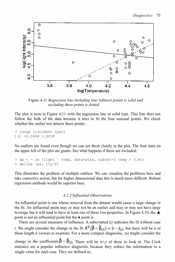
Diagnostics 75
Figure 4.11 Regression line including four leftmost points is solid and excluding these points is dotted.
The plot is seen in Figure 4.11 with the regression line in solid type. This line does not follow the bulk of the data because it tries to fit the four unusual points. We check whether the outlier test detects these points:
> range (rstudent (ga))
[1] !2.0494 1.9058
No outliers are found even though we can see them clearly in the plot. The four stars on the upper left of the plot are giants. See what happens if these are excluded:
> ga < - lm (light ˜ temp, data=star, subset=( temp > 3.6))
> abline (ga, lty=2)
This illustrates the problem of multiple outliers. We can visualize the problems here and take corrective action, but for higher dimensional data this is much more difficult. Robust regression methods would be superior here.
4.2.3 Influential Observations
An influential point is one whose removal from the dataset would cause a large change in the fit. An influential point may or may not be an outlier and may or may not have large leverage but it will tend to have at least one of these two properties. In Figure 4.10, the ▲point is not an influential point but the ● point is.
There are several measures of influence. A subscripted (i) indicates the fit without case
i. We might consider the change in the fit but there will be n of these length n vectors to examine. For a more compact diagnostic, we might consider the
change in the coefficients . There will be n"p of these to look at. The Cook statistics are a popular influence diagnostic because they reduce the information to asingle value for each case. They are defined as:

76 Linear Models with R
The first term, is the residual effect and the second is the leverage. The combination ofthe two leads to influence. A half-normal plot of D
i can be used to identify influential
observations.Continuing with our study of the savings data:
> cook < - cooks . distance (g)
> halfnorm (cook, 3, labs=countries, ylab="Cook's
distances")
The Cook statistics may be seen in the first plot of Figure 4.12. I have identified thelargest three values. We now exclude the largest one (Libya) and see how the fit changes:
Figure 4.12 Half-normal plot of the Cook statistics and ’s for pop15 for
the savings data.
> gl < - lm (sr popl5+pop75+dpi+ddpi,savings,
subset=(cook < max (cook)))
> summary (gl)
Coefficients:
Estimate Std. Error t value Pr(>|t|)
(Intercept) 24.524046 8.224026 2.98 0.0047

Diagnostics 77
pop15 !0.391440 0.157909 !2.48 0.0171
pop75 !1.280867 1.145182 !1.12 0.2694
dpi !0.000319 0.000929 !0.34 0.7331
ddpi 0.610279 0.268778 2.27 0.0281
Residual standard error: 3.79 on 44 degrees of freedom
Multiple R-Squared: 0.355, Adjusted R-squared: 0.297
F-statistic: 6.07 on 4 and 44 DF, p-value: 0.000562
Compared to the full data fit:
> summary (g)
Coefficients:
Estimate Std. Error t value Pr(>|t|)
(Intercept) 28.566087 7.354516 3.88 0.00033
pop15 !0.461193 0.144642 !3.19 0.00260
pop75 !1.691498 1.083599 !1.56 0.12553
dpi !0.000337 0.000931 !0.36 0.71917
ddpi 0.409695 0.196197 2.09 0.04247
Residual standard error: 3.8 on 45 degrees of freedom
Multiple R-Squared: 0.338, Adjusted R-squared: 0.28
F-statistic: 5.76 on 4 and 45 DF, p-value: 0.00079
Among other changes, we see that the coefficient for ddpi changed by about 50%. We do not like our estimates to be so sensitive to the presence of just one country. It would be rather tedious to leave out each country in turn, so we examine the leaveout-one differences in the coefficients:
> plot(ginf$coef [,2], ylab="Change in pop15 coef")
> identify (1:50, ginf$coef [, 2], countries)
We just plotted the change in the second parameter estimate, when a case is left out, as seen in the second panel of Figure 4.12. The identify function allows interactive identification of points by clicking the left mouse button on the plot and then using the middle mouse button to finish. This plot should be repeated for the other variables. Japan sticks out on this particular plot so examine the effect of removing it:
> gj < - 1m (sr ˜ pop15+pop75+dpi+ddpi,savings,
subset=(countries != "Japan"))
> summary (gj)
Coefficients:
Estimate Std. Error t value Pr(>|t|)
(Intercept) 23.940171 7.783997 3.08 0.0036
pop15 !0.367901 0.153630 !2.39 0.0210
pop75 !0.973674 1.155450 !0.84 0.4040
dpi !0.000471 0.000919 !0.51 0.6112
ddpi 0.334749 0.198446 1.69 0.0987
Residual standard error: 3.74 on 44 degrees of freedom
Multiple R-Squared: 0.277, Adjusted R-squared: 0.211
F-statistic: 4.21 on 4 and 44 DF, p-value: 0.00565

78 Linear Models with R
Comparing this to the full data fit, we observe several qualitative changes. Notice that the
ddpi term is no longer significant and that the R2 value has decreased a lot.
4.3 Checking the Structure of the Model
How do we check whether the systematic part (Ey=X!) of the model is correct? Lack offit tests can be used when there is replication, which does not happen too often; however,even if you do have it, the tests do not tell you how to improve the model.
We can look at plots of against % and xi to reveal problems or just simply look at
plots of y against each xi. The drawback to these plots is that the other predictors impact
the relationship. Partial regression or added variable plots can help isolate the effect of xi
on y. Suppose we regress y on all x except xi, and get residuals . These represent y with
the other X-effect taken out. Similarly, if we regress xi on all x except xi, and get residuals
, we have the effect of xi with the other X-effect taken out. The added variable plot
shows against . Look for nonlinearity and outliers and/or influential observations inthe plot.
The slope of a line fitted to the plot is . The partial regression plot provides someintuition about the meaning of regression coefficients. We are looking at the marginalrelationship between the response and the predictor after the effect of the other predictorshas been removed. Multiple regression is difficult because we cannot visualize the fullrelationship because of the high dimensionality. The partial regression plot allows us tofocus on the relationship between one predictor and the response, much as in simpleregression.
We illustrate using the savings dataset as an example again. We construct a partialregression (added variable) plot for pop15:
> d < - residuals (lm (sr ˜ pop75 + dpi + ddpi, savings) )
> m < - residuals(Im(popl5 ˜ pop75 + dpi + ddpi,savings))
> plot (m, d, xlab="pop15 residuals", ylab="Savings
residuals")
Compare the slope on the plot to the original regression and show the line on the plot(see Figure 4.13):
> coef (lm (d ˜ m))
(Intercept) m
5.4259e–17 !4.6119e–01
> coef (g)
(Intercept) pop15 pop75 dpi ddpi
28.5660865 !0.4611931 !1.6914977 !0.0003369 0.4096949
> abline (0, coef (g) ['pop15'] )
Notice how the slope in the plot and the slope for pop15 in the regression fit are the same.

Diagnostics 79
Partial residual plots are a competitor to added variable plots. These plot against x
i. To see the motivation, look at the response with the predicted effect of the
other X removed:
Again the slope on the plot will be and the interpretation is the same. Partial residual plots are reckoned to be better for nonlinearity detection while added variable plots are better for outlier/influential detection.
Figure 4.13 Partial regression (left) and partial residual (right) plots for the savings data.
A partial residual plot is easier to construct:
> plot (savings$pop15, residuals(g)+coef(g) ['poplS']*savings
$popl5, xlab="pop'n under 15", ylab="Savings(Adjusted)")
> abline (0, coef (g) ['pop15'])
Or more directly using a function from the faraway package:
> prplot(g,1)
We see the two groups in the plot. It suggests that there may be a different relationship in the two groups. We investigate this:
> gl < - lm (sr ˜ pop15+pop75+dpi+ddpi, savings, subset=
(pop15 > 35) )
> g2 < - 1m (sr ˜ pop15+pop75+dpi+ddpi, savings, subset=
(pop15 < 35) )
80 Linear Models with R
> summary
Coefficients:
Estimate Std. Error t value Pr(>|t|)
(Intercept) !2.433969 21.155028 !0.12 0.91
pop15 0.273854 0.439191 0.62 0.54
pop75 –3.548477 3.033281 !1.17 0.26
dpi 0.000421 0.005000 0.08 0.93
ddpi 0.395474 0.290101 1.36 0.19
Residual standard error: 4.45 on 18 degrees of freedom
Multiple R-Squared: 0.156, Adjusted R-squared: !0.0319
F-statistic: 0.83 on 4 and 18 DF, p-value: 0.523
> summary(g2)
Coefficients:
Estimate Std. Error t value Pr(>|t|)
(Intercept) 23.961795 8.083750 2.96 0.0072
pop15 !0.385898 0.195369 !1.98 0.0609
pop75 !1.327742 0.926063 !1.43 0.1657
dpi !0.000459 0.000724 !0.63 0.5326
ddpi 0.884394 0.295341 2.99 0.0067
Residual standard error: 2.77 on 22 degrees of freedom
Multiple R-Squared: 0.507, Adjusted R-squared: 0.418
F-statistic: 5.66 on 4 and 22 DF, p-value: 0.00273
In the first regression on the subset of underdeveloped countries, we find no relation be-tween the predictors and the response. The p-value is 0.523. We know from our previous examination of these data that this result is not attributable to outliers orunsuspected transformations. In contrast, there is a strong relationship in the developedcountries. The strongest predictor is growth with a suspicion of some relationship to pro-portion under 15. This latter effect has been reduced from prior analyses because we havereduced the range of this predictor by the subsetting operation. The graphical analysis hasshown a relationship in the data that a purely numerical analysis might easily have missed.
Higher dimensional plots can also be useful for detecting structure that cannot be seenin two dimensions. These are interactive in nature so you need to try them to see howthey work. We can make three-dimensional plots where color, point size and rotation areused to give the illusion of a third dimension. We can also link two or more plots so thatpoints which are brushed in one plot are highlighted in another.
These tools look good but it is not clear whether they actually are useful in practice.Certainly there are communication difficulties, as these plots cannot be easily printed. Ritself does not have such tools, but GGobi is a useful free tool for exploring higherdimensional data that can be called from R. See www.ggobi.org.
Nongraphical techniques for checking the structural form of the model usually involveproposing alternative transformations or recombinations of the variables. This approachis explored in the chapter on transformation.
Excercises
1. Using the sat dataset, fit a model with the total SAT score as the response and expend,salary, ratio and takers as predictors. Perform regression diagnostics on this model toanswer the following questions. Display any plots that are relevent. Do not provideany plots about which you have nothing to say.

Diagnostics 81
(a) Check the constant variance assumption for the errors.(b) Check the normality assumption.(c) Check for large leverage points.(d) Check for outliers.(e) Check for influential points.(f) Check the structure of the relationship between the predictors and the response.
2. Using the teengamb dataset, fit a model with gamble as the response and the other variables as predictors. Answer the questions posed in the previous question.
3. For the prostate data, fit a model with lpsa as the response and the other variables as predictors. Answer the questions posed in the first question.
4. For the swiss data, fit a model with Fertility as the response and the other variables as predictors. Answer the questions posed in the first question.
5. For the divusa data, fit a model with divorce as the response and the other variables, except year as predictors. Check for serial correlation.


CHAPTER 5Problems with the Predictors
5.1 Errors in the Predictors
The regression model Y=X!+" allows for Y being measured with error by having the " term, but what if the X is measured with error? In other words, what if the X we see is not the X used to generate Y? It is not unreasonable that there might be errors in measuring X. For example, consider the problem of determining the effects of being exposed to a potentially hazardous substance such as secondhand tobacco smoke. Such exposure would be a predictor in such a study, but clearly it is very hard to measure this exactly over a period of years.
One should not confuse the errors in predictors with treating X as a random variable. For observational data, X could be regarded as a random variable, but the regression inference proceeds conditional on a fixed value for X. We make the assumption that the Y is generated conditional on the fixed value of X. Contrast this with the errors in predictors case where the X we see is not the X that was used to generate the Y.
Suppose that what we observe is for i=1,…n which are related to the true
values
where the errors " and + are independent. The situation is depicted in Figure 5.1. The true underlying relationship is:
but we only see Putting it together, we get:
Suppose we use least squares to estimate !0 and !
1. Let’s assume E"
i=E&
i=0 and that
, Let:
84 Linear Models with R
experiment we can view it as just a numerical measure of the spread of the design. A
similar distinction should be made for cov(xA,+) although in many cases, it will bereasonable to assume that this is zero.
Figure 5.1 Measurement error: True vs. observed data.
Now and after some calculation we find that:
There are two main special cases of interest:
1. If there is no relation between XA and +, #x"
= 0, this simplifies to:
So will be biased towards zero, regardless of the sample size. If is small
relative to then the problem can be ignored. In other words, if the variability inthe errors of observation of X are small relative to the range of X, then we need notbe too concerned. For multiple predictors, the usual effect of measurement errors is
also to bias the in the direction of zero.
For observational data, is (almost) the sample variance of XA while for a controlled
Problems with the Predictors 85
2. In controlled experiments, we need to distinguish two ways in which error in x may
arise. In the first case, we measure x so although the true value is xA we observe x0. If
we were to repeat the measurement, we would have the same xA but a different x0. In
the second case, you fix x0—for example, you make up a chemical solution with a
specified concentration x0. The true concentration would be xA. Now if you were to
repeat this, you would get the same x0, but the xA would be different. In this latter case we have:
and then we would have So our estimate would be unbiased. This seems
paradoxical, until you notice that the second case effectively reverses the roles of xA
and x0 and if you get to observe the true X, then you will get an unbiased estimate of !
1. See Berkson (1950) for a discussion of this.
If the model is used for prediction purposes, we can make the same argument as in the second case above. In repeated “experiments,” the value of x at which the prediction is to be made will be fixed, even though these may represent different underlying “true” values of x.
In cases where the error in X can simply not be ignored, we should consider alternatives to the least squares estimation of !. The least squares regression equation can be written as:
so that . Note that if we reverse the roles of x and y, we do not get the same regression equation. Since we have errors in both x and y in our problem, we might argue that neither one, in particular, deserves the role of response or predictor and so the equation should be the same either way. One way to achieve this is to set
This is known as the geometric mean functional relationship. More on this can be found in Draper and Smith (1998). Another approach is to use the SIMEX method of Cook and Stefanski (1994), which we illustrate below.
Consider some data on the speed and stopping distances of cars in the 1920s. We plot the data, as seen in Figure 5.2, and fit a linear model:
> data (cars)
> plot (dist ˜ speed, cars, ylab="distance")
> g < - lm (dist ˜ speed, cars)
> summary (g)
Coefficients:
Estimate Std. Error t value Pr(>|t|)

86 Linear Models with R
(Intercept) !17.579 6.758 !2.60 0.012
speed 3.932 0.416 9.46 1.5e–12
Residual standard error: 15.4 on 48 degrees of freedom
Multiple R-Squared: 0.651, Adjusted R-squared: 0.644
F-statistic: 89.6 on 1 and 48 DF, p-value: 1.49e–12
> abline (g)
We could explore transformations and diagnostics for these data, but we will just focus onthe measurement error issue. Now we investigate the effect of adding measurement errorto the predictor. We plot the modified fits in Figure 5.2:
> gel < - lm (dist ˜ I (speed+rnorm (50)), cars)
> coef (ge1)
(Intercept) I (speed + rnorm(50))
!15.0619 3.7582
> abline (gel, lty=2)
> ge2 < - lm (dist ˜ I (speed+2*rnorm (50)), cars)
> coef (ge2)
(Intercept) I (speed + 2 * rnorm(50))
!5.3503 3.1676
> abline (ge2, lty=3)
Figure 5.2 Stopping distance and speeds of cars. The least squares fit isshown as a solid line. The fits with three progressively largeramounts of measurement error on the speed are shown as dot-ted lines, where the slope gets shallower as the error increases.
> ge5 < - lm (dist ˜ I (speed+5*rnorm(50)), cars)
> coef (ge5)
(Intercept) I (speed + 5 * rnorm(50))
15.1589 1.8696
> abline (ge5, lty=4)
We can see that the slope becomes shallower as the amount of noise increases.

Problems with the Predictors 87
Suppose we knew that the predictor, speed, in the original data had been measured with a known error variance, say 0.5. Given what we have seen in the simulated measurement error models, we might extrapolate back to suggest an estimate of the slope under no measurement error. This is the idea behind SIMEX.
Here we simulate the effects of adding normal random error with variances ranging from 0.1 to 0.5, replicating the experiment 1000 times for each setting:
> vv < - rep(1:5/10,each=1000)
> slopes < - numeric(5000)
> for (i in 1:5000) slopes [i] < - lm (dist ˜
I (speed+sqrt (vv [i] ) *rnorm(50) ) , cars) $coef [2]
Now plot the mean slopes for each variance. We are assuming that the data have variance0.5 so the extra variance is added to this:
> betas < - c(coef (g) [2], colMeans (matrix (slopes,
nrow=1000) ) )
> variances < - c (0,1:5/10)+0.5
> plot(variances, betas, xlim=c (0, 1), ylim=c (3.86, 4))
We fit a linear model and extrapolate to zero variance:
> gv < - lm (betas ˜ variances)
> coef (gv)
Figure 5.3 Simulation-Extrapolation estimation of the unbiased slope in the presence of measurement error in the predictors. We predict
at a variance of zero.
(Intercept) variances
3.99975 !0.13552
> points (0, gv$coef [1], pch=3)

88 Linear Models with R
The predicted value of at variance equal to zero, that is no measurement error, is 4.0.Better models for extrapolation are worth considering; see Cook and Stefanski (1994) for details.
5.2 Changes of Scale
Suppose we reexpress xi as (x
i+a)/b. We might want to do this because predictors of
similar magnitude result in of similar sizes. is easier to parse than and we can choose a and b to achieve this. Furthermore, a change of units
might aid interpretability. Finally, numerical stability in estimation is enhanced when all the predictors are on a similar scale.
Rescaling xi leaves the t- and F-tests and and R2 unchanged and
Rescaling y in the same way leaves the t- and F-tests and R2 unchanged, but and willrescaled by b.
To demonstrate this, we use the same old model:
> data(savings)
> g < - 1m (sr ˜ popl5+pop75+dpi+ddpi, savings)
> summary (g)
Coefficients:
Estimate Std. Error t value Pr(>|t|)
(Intercept) 28.566087 7.354516 3.88 0.00033
pop15 !0.461193 0.144642 !3.19 0.00260
pop75 !1.691498 1.083599 !1.56 0.12553
dpi !0.000337 0.000931 !0.36 0.71917
ddpi 0.409695 0.196197 2.09 0.04247
Residual standard error: 3.8 on 45 degrees of freedom
Multiple R-Squared: 0.338, Adjusted R-squared: 0.28
F-statistic: 5.76 on 4 and 45 DF, p-value: 0.00079
The coefficient for income is rather small—let’s measure income in thousands of dollars instead and refit:
> g < ˜ 1m (sr ˜ pop15+pop75+I(dpi/1000)+ddpi, savings)
> summary (g) Coefficients:
Estimate Std. Error t value Pr(>|t|)
(Intercept) 28.566 7.355 3.88 0.00033
pop15 !0.461 0.145 !3.19 0.00260
pop75 !1.691 1.084 !1.56 0.12553
I(dpi/1000) !0.337 0.931 !0.36 0.71917
ddpi 0.410 0.196 2.09 0.04247
Residual standard error: 3.8 on 45 degrees of freedom
Multiple R-Squared: 0.338, Adjusted R-squared: 0.28
F-statistic: 5.76 on 4 and 45 DF, p-value: 0.00079

Problems with the Predictors 89
What changed and what stayed the same?One rather thorough approach to scaling is to convert all the variables to standard units
(mean 0 and variance 1) using the scale ( ) command:
> scsav < - data.frame(scale(savings))
> g < - lm (sr , scsav)
> summary (g) Coefficients:
Estimate Std Error t value Pr(>|t|)
(Intercept) 4.0e–16 0.1200 3.3e–15 1.0000
pop15 !0.9420 0.2954 !3.19 0.0026
pop75 !0.4873 0.3122 !1.56 0.1255
dpi !0.0745 0.2059 !0.36 0.7192
ddpi 0.2624 0.1257 2.09 0.0425
Residual standard error: 0.849 on 45 degrees of freedom
Multiple R-Squared: 0.338, Adjusted R-squared: 0.28
F-statistic: 5.76 on 4 and 45 DF, p-value: 0.00079
As may be seen, the intercept is zero. This is because the regression plane always runs through the point of the averages, which because of the centering, is now at the origin. Such scaling has the advantage of putting all the predictors and the response on a comparable scale, which makes comparisons simpler. It also allows the coefficients to be viewed as a kind of partial correlation—the values will always be between minus one and one. It also avoids some numerical problems that can arise when variables are of very different scales. The downside of this scaling is that the regression coefficients now represent the effect of a one standard unit increase in the predictor on the response in standard units—this might not always be easy to interpret.
5.3 Collinearity
When some predictors are linear combinations of others, then XTX is singular, and we
have (exact) collinearity. There is no unique least squares estimate of ! If XTX is close to singular, we have collinearity (some call it multicollinearity). This causes serious problems with the estimation of ! and associated quantities, as well as the interpretation. Collinearity can be detected in several ways:
1. Examination of the correlation matrix of the predictors may reveal large pairwise collinearities.
2. A regression of xi on all other predictors gives . Repeat for all predictors. close
to one indicates a problem. The offending linear combination may be discovered by examining these regression coefficients.
3. Examine the eigenvalues of XTX, where $1 is the largest eigenvalue with the others in
decreasing order. Relatively small eigenvalues indicate a problem. The condition number is defined as:

90 Linear Models with R
where .$30 is considered large. . is called the condition number. Other condition
numbers, are also worth considering because they indicate whether more than just one independent linear combination is to blame. Alternative calculations involve standardizing the predictors and/or excluding the intercept term. Collinearity makes some of the parameters hard to estimate. Define:
then:
We can see that if xj does not vary much, then the variance of
j will be large. Another
consequence of this equation is that it tells us which designs will minimize the variance of the regression coefficients if we have the ability to place the X. Orthogonality means
that which minimizes the variance. Also we can maximize Sxjxj
by spreading X
as much as possible. The maximum is attained by placing half the points at the minimum practical value and half at the maximum. Unfortunately, this design assumes the linearity of the effect and would make it impossible to check for any curvature. So, in practice, most would put some design points in the middle of the range to allow checking of the fit.
If is close to one, then the variance inflation factor will be large.Collinearity leads to imprecise estimates of !. The signs of the coefficients can be the
opposite of what intuition about the effect of the predictor might suggest. The standard errors are inflated so that t-tests may fail to reveal significant factors. The fit becomes very sensitivite to measurement errors where small changes in y can lead to large change
in .Car drivers like to adjust the seat position for their own comfort. Car designers would
find it helpful to know where different drivers will position the seat depending on their size and age. Researchers at the HuMoSim laboratory at the University of Michigan collected data on 38 drivers. They measured age in years, weight in pounds, height with shoes and without shoes in cm, seated height arm length, thigh length, lower leg length and hipcenter the horizontal distance of the midpoint of the hips from a fixed location in the car in mm. We fit a model with all the predictors:
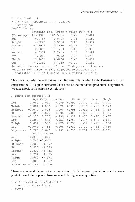
Problems with the Predictors 91
> data (seatpos)
> g < - lm (hipcenter ˜ . , seatpos)
> summary (g)
Coefficients:
Estimate Std. Error t value Pr(>|t|)
(Intercept) 436.4321 166.5716 2.62 0.014
Age 0.7757 0.5703 1.36 0.184
Weight 0.0263 0.3310 0.08 0.937
HtShoes !2.6924 9.7530 !0.28 0.784
Ht 0.6013 10.1299 0.06 0.953
Seated 0.5338 3.7619 0.14 0.888
Arm !1.3281 3.9002 !0.34 0.736
Thigh !1.1431 2.6600 !0.43 0.671
Leg !6.4390 4.7139 !1.37 0.182
Residual standard error: 37.7 on 29 degrees of freedom
Multiple R-Squared: 0.687, Adjusted R-squared: 0.6
F-statistic: 7.94 on 8 and 29 DF, p-value: 1.31e–05
This model already shows the signs of collinearity. The p-value for the F-statistics is very
small and the R2 is quite substantial, but none of the individual predictors is significant. We take a look at the pairwise correlations:
> round(cor(seatpos), 3)
Age Weight HtShoes Ht Seated Arm Thigh
Age 1.000 0.081 !0.079 !0.090 !0.170 0.360 0.091
Weight 0.081 1.000 0.828 0.829 0.776 0.698 0.573
HtShoes !0.079 0.828 1.000 0.998 0.930 0.752 0.725
Ht !0.090 0.829 0.998 1.000 0.928 0.752 0.735
Seated !0.170 0.776 0.930 0.928 1.000 0.625 0.607
Arm 0.360 0.698 0.752 0.752 0.625 1.000 0.671
Thigh 0.091 0.573 0.725 0.735 0.607 0.671 1.000
Leg !0.042 0.784 0.908 0.910 0.812 0.754 0.650
hipcenter 0.205 !0.640 !0.797 !0.799 !0.731 !0.585 !0.591
Leg hipcenter
Age !0.042 0.205
Weight 0.784 !0.640
HtShoes 0.908 !0.797
Ht 0.910 !0.799
Seated 0.812 !0.731
Arm 0.754 !0.585
Thigh 0.650 !0.591
Leg 1.000 !0.787
hipcenter !0.787 1.000
There are several large pairwise correlations both between predictors and between predictors and the response. Now we check the eigendecomposition:
> x < - model.matrix(g)[,!1] >
e < - eigen (t(x) %*% x)
> e$val

92 Linear Models with R
[1] 3.6537e + 06 2.14796+04 9.0432e+03 2.9895e + 02 1.48396+02
[6] 8.1174e+01 5.3362e + 01 7.2982e+00 >
sqrt(e$val[1]/e$val)
[1] 1.000 13.042 20.100 110.551 156.912 212.156 261.667
[8] 707.549
There is a wide range in the eigenvalues and several condition numbers are large. Thismeans that problems are being caused by more than just one linear combination.
Now check the variance inflation factors (VIFs). For the first variable this is:
> summary (lm (x [, 1] ˜ x[,!1]))$r.squared
[1] 0.49948
> 1/(1!0.49948)
[1] 1.9979
which is moderate in size—the VIF for orthogonal predictors is one. Now we compute allthe VIFs in one go, using a function from the f araway package:
> vif (x)
Age Weight HtShoes Ht Seated Arm Thigh
1.9979 3.6470 307.4294 333.1378 8.9511 4.4964 2.7629
Leg
6.6943
There is much variance inflation. For example, we can interpret astelling us that the standard error for height with shoes is 17.5 times larger than it wouldhave been without collinearity. We cannot apply this as a correction because we did notactually observe orthogonal data, but it does give us a sense of the size of the effect.
There is substantial instability in these estimates. Measuring the hipcenter is difficult todo accurately and we can expect some variation in these values. Suppose themeasurement error had a SD of 10 mm. Let’s see what happens when we add a randomperturbation of this size to the response:
> g < - lm (hipcenter+10*rnorm(38) ˜ . , seatpos)
> summary (g)
Coefficients:
Estimate Std. Error t value Pr (>|t|)
(Intercept) 501.295 164.752 3.04 0.0049
Age 0.632 0.564 1.12 0.2720
Weight 0.129 0.327 0.39 0.6967
HtShoes !2.329 9.647 !0.24 0.8109
Ht 0.705 10.019 0.07 0.9444
Seated !0.751 3.721 !0.20 0.8414
Arm !0.951 3.858 !0.25 0.8070
Thigh !1.879 2.631 !0.71 0.4808
Leg !7.087 4.662 !1.52 0.1393
Residual standard error: 37.3 on 29 degrees of freedom Multiple
R-Squared: 0.696, Adjusted R-squared: 0.612
F-statistic: 8.3 on 8 and 29 DF, p-value: 8.71e–06
Problems with the Predictors 93
Although the R2 and standard error are very similar to the previous fit, we see much larger changes in the coefficients indicating their sensitivity to the response values caused by the collinearity.
One cure for collinearity is amputation. We have too many variables that are trying to do the same job of explaining the response. When several variables, which are highly correlated, are each associated with the response, we have to take care that we do not conclude that the variables we drop have nothing to do with the response. Examine the full correlation matrix above. Consider just the correlations of the length variables:
> round (cor (x [ , 3:8] ), 2)
HtShoes Ht Seated Arm Thigh Leg
HtShoes 1.00 1.00 0.93 0.75 0.72 0.91
Ht 1.00 1.00 0.93 0.75 0.73 0.91
Seated 0.93 0.93 1.00 0.63 0.61 0.81
Arm 0.75 0.75 0.63 1.00 0.67 0.75
Thigh 0.72 0.73 0.61 0.67 1.00 0.65
Leg 0.91 0.91 0.81 0.75 0.65 1.00
These six variables are strongly correlated with each other—any one of them might do a good job of representing the other. We pick height as the simplest to measure. We are not claiming that the other predictors are not associated with the response, just that we do not need them all to predict the response:
> g2 < - lm (hipcenter ˜ Age + Weight + Ht, seatpos)
> summary (g2)
Coefficients:
Estimate Std. Error t value Pr (>|t|)
(Intercept) 528.29773 135.31295 3.90 0.00043
Age 0.51950 0.40804 1.27 0.21159
Weight 0.00427 0.31172 0.01 0.98915
Ht !4.21190 0.99906 !4.22 0.00017
Residual standard error: 36.5 on 34 degrees of freedom
Multiple R-Squared: 0.656, Adjusted R-squared: 0.626
F-statistic: 21.6 on 3 and 34 DF, p-value: 5.13e–08
Comparing this with the original fit, we see that the fit is very similar in terms of R2, butmuch fewer predictors are used. Further simplification is clearly possible.
If you must keep all your variables in the model, you should consider alternative methods of estimation such as ridge regression.
The effect of collinearity on prediction depends on where the prediction is to be made. The greater the distance is from the observed data, the more unstable the prediction. Distance needs to be considered in a Mahalanobis rather than a Euclidean sense.
Exercises
1. Using the faithful data, fit a regression of duration on waiting. Assuming that there was a measurement error in waiting of 30 seconds, use the SIMEX method to obtain a better estimate of the slope.

94 Linear Models with R
2. What would happen if the SIMEX method was applied to the response error variancerather than predictor measurement error variance?
(a) Fit a regression model with divorce as the response and unemployed, femlab, marriage,birth and military as predictors. Compute the condition numbers and interpret theirmeaning.
(b) For the same model, compute the VIFs. Is there evidence that collinearity causessome predictors not to be significant? Explain.
(c) Does the removal of insignificant predictors from the model reduce the collinearity?Investigate.
4. For the longley data, fit a model with Employed as the response and the other variables as predictors.
(a) Compute and comment on the condition numbers.(b) Compute and comment on the correlations between the predictors.(c) Compute the variance inflation factors.
5. For the prostate data, fit a model with lpsa as the response and the other variables as predictors.
(a) Compute and comment on the condition numbers.(b) Compute and comment on the correlations between the predictors.(c) Compute the variance inflation factors.
3. Using the divorce data:

CHAPTER 6Problems with the Error
The standard assumption about the error term " is that it is independent and identically
distributed (i.i.d.) from case to case. That is, var "=#2I. Furthermore, we also assume that the errors are normally distributed in order to carry out the usual statistical inference. We have seen that these assumptions can often be violated and we must then consider alternatives. When the errors are not i.i.d., we consider the use of generalized least squares (GLS). When the errors are independent, but not identically distributed, we can use weighted least squares (WLS), which is a special case of GLS. Sometimes, we have a good idea how large the error should be, but the residuals may be much larger than we expect. This is evidence of a lack of fit. When the errors are not normally distributed, we can use robust regression.
6.1 Generalized Least Squares
Until now we have assumed that var "=#2I, but sometimes the errors have nonconstant variance or are correlated. Suppose instead that var "=#2- where #2 is unknown but - is known—in other words, we know the correlation and relative variance between the errors, but we do not know the absolute scale. Right now, it might seem redundant to distinguish between # and -, but we will see how this will be useful later.
We can write -=SST, where S is a triangular matrix using the Choleski decomposition. Now we can transform the regression model as follows:
Now we find that:
So we can reduce GLS to ordinary least squares (OLS) by a regression of y!= S!ly on
S!1X which has error "! that is i.i.d. So we simply reduce the problem to one thatwe have
already solved. In this transformed model, the sum of squares is:

Problems with the Error 97
We find that:
Since "!=S!1", diagnostics should be applied to the residuals, . If we have the right-, then these should be approximately i.i.d.
The main problem in applying GLS in practice is that - may not be known and we may have to estimate it. To illustrate this we will use a built-in R dataset known as Longley’s regression data. Our response is the number people employed, yearly from 1947 to 1962 and the predictors are gross national product (GNP) and population 14 years of age and over. The data originally appeared in Longley (1967).
Fit a linear model:
> data (longley)
> g < - lm (Employed ˜ GNP + Population, longley)
> summary (g, cor=T)
Coefficients:
Estimate Std. Error t value Pr(>|t|)
(Intercept) 88.9388 13.7850 6.45 2.2e–05
GNP 0.0632 0.0106 5.93 5.0e–05
Population !0.4097 0.1521 !2.69 0.018
Residual standard error: 0.546 on 13 degrees of freedom
Multiple R-Squared: 0.979, Adjusted R-squared: 0.976
F-statistic: 304 on 2 and 13 DF, p-value: 1.22e–11
Correlation of Coefficients:
(Intercept) GNP
GNP 0.98
Population !1.00 !0.99
The correlation between the coefficients for GNP and Population is strongly negative while the correlation between the corresponding variables:
> cor (longley$GNP, longley$Pop)
[1] 0.99109
is strongly positive.
In data collected over time such as this, successive errors could be correlated. The simplest way to model this is the autoregressive form:
"i+l
=/i++
i
where +i ~ N(0, 02). We can estimate this correlation / by:
> cor (residuals (g) [!1], residuals (g) [!16])
[1] 0.31041
which is minimized by:

98 Linear Models with R
Under this assumption -ij=/i!j. For simplicity, let’s assume we know that /= 0.31041.
We now construct the - matrix and compute the GLS estimate of ! along with itsstandard errors. The calculation is for demonstration purposes only:
> x < - model.matrix (g)
> Sigma < - diag (16)
> Sigma < - 0 . 31041ˆ abs (row(Sigma) –col(Sigma))
> Sigi < - solve (Sigma)
> xtxi < - solve (t (x) %*% Sigi %*% x)
> (beta < - solve (t (x) %*% Sigi %*% x, t (x) %*%
Sigi %*% longley$Empl))
[,1]
(Intercept) 94.89889
GNP 0.06739
Population !0.47427
> res < - longley$Empl - x %*% beta
> (sig < - sqrt ( (t (res) %*% Sigi %*% res)/g$df))
[,1]
[1,] 0.5424432
> sqrt (diag (xtxi))*sig
[1] 13.94477260 0.01070339 0.15338547
Compare with the model output above where the errors are assumed to be uncorrelated.
Another way to get the same result is to regress S!1y on S!1x as we demonstrate here:
> sm < - chol (Sigma)
> smi < - solve (t (sm))
> sx < - smi %*% x
> sy < - smi %*% longley$Empl
> summary(1m(sy ˜ sx !1))
Coefficients:
Estimate Std. Error t value Pr(>|t|)
sx (Intercept) 94.8989 13.9448 6.81 1.3e–05
sxGNP 0.0674 0.0107 6.30 2.8e–05
sxPopulation !0.4743 0.1534 !3.09 0.0086
Residual standard error: 0.542 on 13 degrees of freedom
In practice, we would not know that the /=0.31 and we will need to estimate it from thedata. Our initial estimate is 0.31, but once we fit our GLS model we would need toreestimate it as:
> cor (res [ !1], res [!16])
[1] 0.35642
and then recompute the model again with /=0.35642 . This process would be iterateduntil convergence. This is cumbersome. A more convenient approach may be found inthe nlme package of Pinheiro and Bates (2000), which contains a GLS fitting function.We can use it to fit this model:
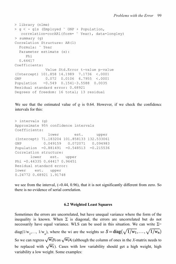
Problems with the Error 99
> library (nlme)
> g < - gls (Employed ˜ GNP + Population,
correlation=corARl(form= ˜ Year), data=longley)
> summary (g)
Correlation Structure: AR(1)
Formula: ˜ Year
Parameter estimate (s):
Phi
0.64417
Coefficients:
Value Std.Error t-value p-value
(Intercept) 101.858 14.1989 7.1736 <.0001
GNP 0.072 0.0106 6.7955 <.0001
Population !0.549 0.1541–3.5588 0.0035
Residual standard error: 0.68921
Degrees of freedom: 16 total; 13 residual
We see that the estimated value of / is 0.64. However, if we check the confidence intervals for this:
> intervals (g)
Approximate 95% confidence intervals
Coefficients:
lower est. upper
(Intercept) 71.183204 101.858133 132.533061
GNP 0.049159 0.072071 0.094983
Population !0.881491 !0.548513 !0.215536
Correlation structure:
lower est. upper
Phi !0.44335 0.64417 0.96451
Residual standard error:
lower est. upper
0.24772 0.68921 1.91748
we see from the interval, (&0.44, 0.96), that it is not significantly different from zero. So there is no evidence of serial correlation.
6.2 Weighted Least Squares
Sometimes the errors are uncorrelated, but have unequal variance where the form of the inequality is known. When - is diagonal, the errors are uncorrelated but do not necessarily have equal variance. WLS can be used in this situation. We can write -=
diag(1/w1,…, 1/w
n), where the wi are the weights so
So we can regress on (although the column of ones in the X-matrix needs to
be replaced with ). Cases with low variability should get a high weight, highvariability a low weight. Some examples:

100 Linear Models with R
1. Errors proportional to a predictor: suggests .
2. When the Yi are the averages of n
i observations, then var y
i=var "
i=#2/n
i, which
suggests wi=n
i. Responses that are averages arise quite commonly, but take care that
the variance in the response really is proportional to the group size. For example, consider the life expectancy for different countries. At first glance, one might considersetting the weights equal to the populations of the countries, but notice that there aremany other sources of variation in life expectancy that would dwarf the populationsize effect. Setting w
i=n
i is only likely to be sensible for small n
i.
When weights are used, the residuals must be modified. Use
> data (fpe)
> fpe
EI A B C D E F G H J K A2 B2
Ain 260 51 64 36 23 9 5 4 4 3 3 105 114
Alpes 75 14 17 9 9 3 1 2 1 1 1 32 31
…
A and B stand for Mitterand’s and Giscard’s votes in the first round, respectively, whileA2 and B2 represent their votes in the second round. C–K are the first round votes of theother candidates while EI is electeur inscrits or registered voters. All numbers are inthousands. The total number of voters in the second round was greater than the first—wecan compute the difference as N.
We will treat this group effectively as another first round candidate (we couldreasonably handle this differently). Now we can represent the transfer of votes as:
A2=!AA+!
BB+!
CC+!
DD+!
EE+!
FF+!
GG+!
HH+!
JJ+!
KK+!
NN
where !i represents the proportion of votes transferred from candidate i to Mitterand in
the second round. Now we would expect these transfer proportions to vary somewhat between departments, so if we treat the above as a regression equation, there will be someerror from department to department. The error will have a variance in proportion to thenumber of voters because it will be like a variance of a sum rather than a mean. Since theweights should be inversely proportional to the variance, this suggests that the weightsshould be set to 1/EI. Notice also that the equation has no intercept, hence the &1 in the
for diagnostics.
Elections for the French presidency proceed in two rounds. In 1981, there were10 candidates in the first round. The top two candidates then went on to the secondround, which was won by François Mitterand over Valéry Giscard-d’Estaing. Thelosers in the first round can gain political favors by urging their supporters to vote forone of the two finalists. Since voting is private, we cannot know how these voteswere transferred; we might hope to infer from the published vote totals how thismight have happened. Anderson and Loynes (1987) published data on these vote totals in every fourth department of France:
model formula. We fit the appropriate model:

Problems with the Error 101
> g < - lm (A2 ˜ A+B+C+D+E+F+G+H+J+K+N!l, fpe,
weights=l/EI)
> coef (g)
A B C D E F G
1.06713 !0.10505 0.24596 0.92619 0.24940 0.75511 1.97221
H J K N
!0.56622 0.61164 1.21066 0.52935
Note that the weights do matter—see what happens when we leave them out:
> lm (A2 ˜ A+B+C+D+E+F+G+H+J+K+N!l, fpe) $coef
A B C D E F G
1.07515 !0.12456 0.25745 0.90454 0.67068 0.78253 2.16566
H J K N
!0.85429 0.14442 0.51813 0.55827
which causes substantial changes for some of the lesser candidates. Furthermore, only the relative proportions of the weights matter—for example, suppose we multiply the weights by 53:
> lm (A2 ˜ A+B+C+D+E+F+G+H+J+K+N!l, fpe, weights=53/EI)$coef
A B C D E F G
1.06713 !0.10505 0.24596 0.92619 0.24940 0.75511 1.97221
H J K N
!0.56622 0.61164 1.21066 0.52935
This makes no difference.Now there is one remaining difficulty, unrelated to the weighting, in that proportions
are supposed to be between zero and one. We can impose an ad hoc fix by truncating the coefficients that violate this restriction either to zero or one as appropriate. This gives:
> lm (A2 ˜ offset(A+G+K)+C+D+E+F+N!1, fpe, weights=l/EI) $coef
C D E F N
0.22577 0.96998 0.39020 0.74424 0.60854
We see that voters for the Communist candidate D apparently almost all voted for the Socialist Mitterand in the second round. However, we see that around 20% of the voters for the Gaullist candidate C voted for Mitterand. This is surprising since these voters would normally favor the more right wing candidate, Giscard. This appears to be the decisive factor. We see that of the larger blocks of smaller candidates, the Ecology party voters, E, roughly split their votes as did the first round nonvoters. The other candidates had very few voters and so their behavior is less interesting.
This analysis is somewhat crude and more sophisticated approaches are discussed in Anderson and Loynes (1987).

102 Linear Models with R
using a small number of parameters. For example:
var "i=*
0+*
1x
1
might seem reasonable in a given situation. The iteratively reweighted least squares(IRWLS) fitting algorithm is:
1. Start with wi=1.
2. Use least squares to estimate !.
3. Use the residuals to estimate *, perhaps by regressing on x.4. Recompute the weights and go to 2.
Continue until convergence. There are some concerns about this because the estimationof the * has some uncertainty and consumes some degrees of freedom. This affects thesubsequent inference about !. An extensive investigation of this may be found in Carrolland Ruppert (1988).
Another approach is to model the variance and jointly estimate the regression andweighting parameters using a likelihood-based method. This can be implemented in Rusing the gls ( ) function in the nlme library.
6.3 Testing for Lack of Fit
How can we tell whether a model fits the data? If the model is correct, then should be
an unbiased estimate of #2. If we have a model that is not complex enough to fit the data
or simply takes the wrong form, then will overestimate #2. The situation is illustrated
in Figure 6.1. Alternatively, if our model is too complex and overfits the data, then will be an underestimate.
In cases where the form of the variance of " is not completely known, we may model -
Figure 6.1 True quadratic fit shown with the solid line and incorrect linearfit shown with the dotted line. Estimate of $2 will be unbiasedfor the quadratic model, but far too large for the linear model.
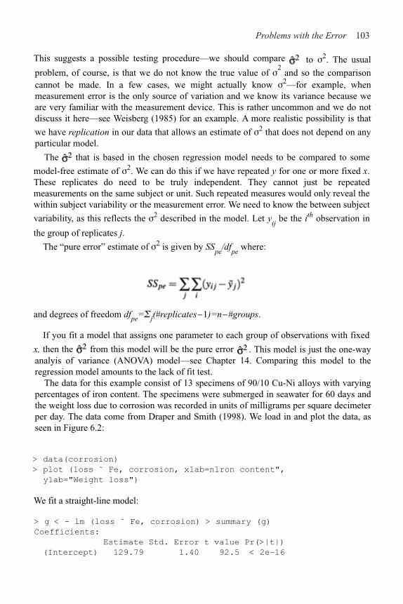
Problems with the Error 103
This suggests a possible testing procedure—we should compare to #2. The usual
problem, of course, is that we do not know the true value of #2 and so the comparison
cannot be made. In a few cases, we might actually know #2—for example, whenmeasurement error is the only source of variation and we know its variance because weare very familiar with the measurement device. This is rather uncommon and we do notdiscuss it here—see Weisberg (1985) for an example. A more realistic possibility is that
we have replication in our data that allows an estimate of #2 that does not depend on anyparticular model.
The that is based in the chosen regression model needs to be compared to some
model-free estimate of #2. We can do this if we have repeated y for one or more fixed x.These replicates do need to be truly independent. They cannot just be repeatedmeasurements on the same subject or unit. Such repeated measures would only reveal thewithin subject variability or the measurement error. We need to know the between subject
variability, as this reflects the #2 described in the model. Let yij be the ith observation in
the group of replicates j.
The “pure error” estimate of #2 is given by SSpe
/dfpe
where:
and degrees of freedom dfpe='j(#replicates#1)=n##groups.
If you fit a model that assigns one parameter to each group of observations with fixed
x, then the from this model will be the pure error . This model is just the one-wayanalyis of variance (ANOVA) model—see Chapter 14. Comparing this model to theregression model amounts to the lack of fit test.
The data for this example consist of 13 specimens of 90/10 Cu-Ni alloys with varyingpercentages of iron content. The specimens were submerged in seawater for 60 days andthe weight loss due to corrosion was recorded in units of milligrams per square decimeterper day. The data come from Draper and Smith (1998). We load in and plot the data, asseen in Figure 6.2:
> data(corrosion)
> plot (loss ˜ Fe, corrosion, xlab=nlron content",
ylab="Weight loss")
We fit a straight-line model:
> g < - lm (loss ˜ Fe, corrosion) > summary (g)
Coefficients:
Estimate Std. Error t value Pr(>|t|)
(Intercept) 129.79 1.40 92.5 < 2e–16

104 Linear Models with R
Fe !24.02 1.28 !18.8 1.1e–09 Residual
standard error: 3.06 on 11 degrees of freedom Multiple R-
Squared: 0.97, Adjusted R-squared: 0.967 F-statistic: 352
on 1 and 11 DF, p-value: 1.06e–09
Now show the regression line on the plot:
> abline (coef (g) )
Figure 6.2 Linear fit to the Cu-Ni corrosion data. Group means denotedby black diamonds.
We have an R2 of 97% and an apparently good fit to the data. We now fit a model that reserves a parameter for each group of data with the same value of x. This is accomplishedby declaring the predictor to be a factor. We will describe this in more detail in chapter 14:
> ga < - lm (loss ˜ factor (Fe), corrosion)
The fitted values are the means in each group—put these on the plot:
> points (corrosion$Fe, fitted (ga), pch=18)
We can now compare the two models in the usual way:
> anova (g, ga)
Analysis of Variance Table
Model 1: loss ˜ Fe
Model 2: loss ˜ factor (Fe)
Res.Df Res.Sum Sq Df Sum Sq F value Pr(>F)
1 11 102.9
2 6 11.8 5 91.1 9.28 0.0086
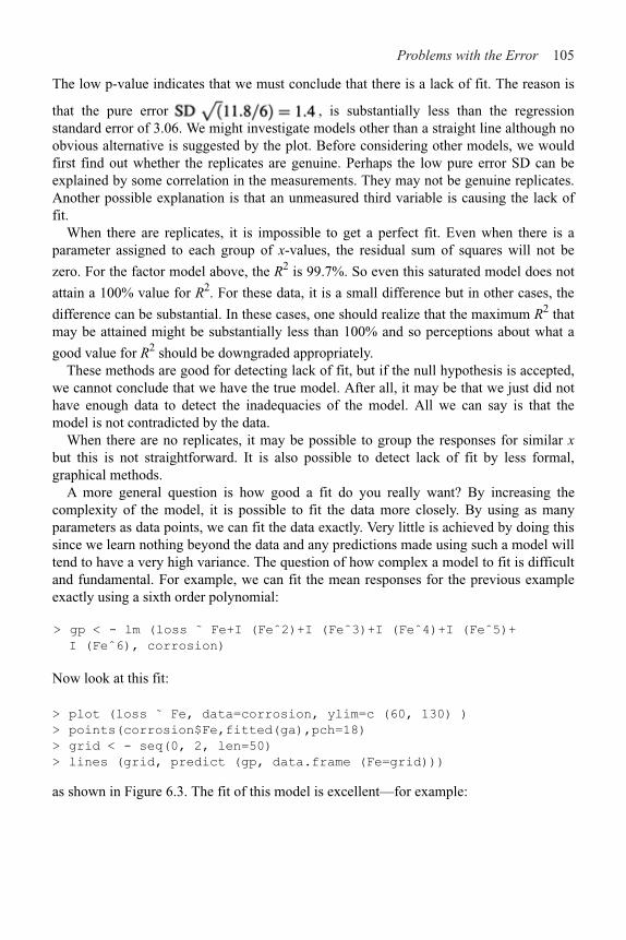
Problems with the Error 105
that the pure error , is substantially less than the regressionstandard error of 3.06. We might investigate models other than a straight line although noobvious alternative is suggested by the plot. Before considering other models, we wouldfirst find out whether the replicates are genuine. Perhaps the low pure error SD can beexplained by some correlation in the measurements. They may not be genuine replicates.Another possible explanation is that an unmeasured third variable is causing the lack offit.
When there are replicates, it is impossible to get a perfect fit. Even when there is aparameter assigned to each group of x-values, the residual sum of squares will not be
zero. For the factor model above, the R2 is 99.7%. So even this saturated model does not
attain a 100% value for R2. For these data, it is a small difference but in other cases, the
difference can be substantial. In these cases, one should realize that the maximum R2 thatmay be attained might be substantially less than 100% and so perceptions about what a
good value for R2 should be downgraded appropriately.These methods are good for detecting lack of fit, but if the null hypothesis is accepted,
we cannot conclude that we have the true model. After all, it may be that we just did nothave enough data to detect the inadequacies of the model. All we can say is that themodel is not contradicted by the data.
When there are no replicates, it may be possible to group the responses for similar xbut this is not straightforward. It is also possible to detect lack of fit by less formal,graphical methods.
A more general question is how good a fit do you really want? By increasing thecomplexity of the model, it is possible to fit the data more closely. By using as manyparameters as data points, we can fit the data exactly. Very little is achieved by doing thissince we learn nothing beyond the data and any predictions made using such a model willtend to have a very high variance. The question of how complex a model to fit is difficultand fundamental. For example, we can fit the mean responses for the previous exampleexactly using a sixth order polynomial:
> gp < - lm (loss ˜ Fe+I (Feˆ2)+I (Feˆ3)+I (Feˆ4)+I (Feˆ5)+
I (Feˆ6), corrosion)
Now look at this fit:
> plot (loss ˜ Fe, data=corrosion, ylim=c (60, 130) )
> points(corrosion$Fe,fitted(ga),pch=18)
> grid < - seq(0, 2, len=50)
> lines (grid, predict (gp, data.frame (Fe=grid)))
as shown in Figure 6.3. The fit of this model is excellent—for example:
The low p-value indicates that we must conclude that there is a lack of fit. The reason is

106 Linear Models with R
Figure 6.3 Polynomial fit to the corrosion data.
> summary (gp) $r.squared
[1] 0.99653
but it is clearly ridiculous. There is no plausible reason corrosion loss should suddenly drop at 1.7 and thereafter increase rapidly. This is a consequence of overfitting the data.
This illustrates the need not to become too focused on measures of fit like R2. The fitneeds to reflect knowledge of the subject matter and simplicity in modeling is a virtue.
6.4 Robust Regression
When the errors are normal, least squares regression is clearly best, but when the errorsare nonnormal, other methods may be considered. Of particular concern are long-tailederror distributions. One approach is to remove the largest residuals as outliers and still useleast squares, but this may not be effective when there are several large residuals becauseof the leave-out-one nature of the outlier tests. Furthermore, the outlier test is anaccept/reject procedure that is not smooth and may not be statistically efficient for theestimation of !. Robust regression provides an alternative. There are several methods, butwe will present just two popular methods.
6.4.1 M-Estimation
M-estimates choose ! to minimize:

Problems with the Error 107
Some possible choices for / are:
1. /(x)=x2 is just least squares.2. /(x)=x is called least absolute deviation (LAD) regression. This is also called L
1regression.
3.
is called Huber’s method and is a compromise between least squares and LADregression. c should be a robust estimate of #. A value proportional to the median of
is suitable.Robust regression is related to WLS. The normal equations tell us that:
With weights and in nonmatrix form this becomes:
Now differentiating the M-estimate criterion with respect to !j and setting to zero we get:
Now let to get:
so we can make the identification of w(u)=(!(u)/u. We find for our choices of / abovethat:
1. LS: w(u) is constant.2. LAD: w(u)=1/u—note the asymptote at 0—this makes a weighting approach
infeasible.3. Huber:

108 Linear Models with R
There are many other choices that have been used. Because the weights depend on theresiduals, an IRWLS approach to fitting must be used. We can get standard errors by
using a robust estimate of #2.
We demonstrate the methods on the Galápagos Islands data. Using least squares first:
> data (gala)
> gl < - lm (Species ˜ Area + Elevation + Nearest +
Scruz + Adjacent, gala)
> summary (gl)
Coefficients:
Estimate Std. Error t value Pr(>|t|)
(Intercept) 7.06822 19.15420 0.37 0.7154
Area !0.02394 0.02242 !1.07 0.2963
Elevation 0.31946 0.05366 5.95 3.8e–06
Nearest 0.00914 1.05414 0.01 0.9932
Scruz !0.24052 0.21540 !1.12 0.2752
Adjacent !0.07480 0.01770 !4.23 0.0003
Residual standard error: 61 on 24 degrees of freedom
Multiple R-Squared: 0.766, Adjusted R-squared: 0.717
F-statistic: 15.7 on 5 and 24 DF, p-value: 6.84e–07
Least squares works well when there are normal errors, but performs poorly forlong-tailed errors. The Huber method is the default choice of the rlm ( ) function, whichis part of the MASS package of Venables and Ripley (2002).
> library (MASS)
> gr < ˜ rlm (Species ˜ Area + Elevation + Nearest +
Scruz + Adjacent, gala)
> summary (gr)
Coefficients :
Value Std . Error t value
(Intercept) 6.36 1 12.390 0.513
Area !0.006 0.015 !0.421
Elevation 0.248 0.035 7.132
Nearest 0.359 0.682 0.527
Scruz !0.195 0.139 !1.401
Adjacent !0.055 0.011 !4.765
Residual standard error: 29.7 on 24 degrees of freedom
The R2 and F-statistics are not given because they cannot be calculated (at least not in thesame way). Similarly, p-values are not given although we can use the asymptoticnormality of the estimator to make approximate inferences using the t-values. Thenumerical values of the coefficients have changed a small amount, but the general signif-icance of the variables remains the same and our substantive conclusion would not be altered.

Problems with the Error 109
We can also do LAD regression using the quantreg package. The default option does LAD while other options allow for quantile regression:
> library (quantreg)
> attach (gala)
> gq < ˜ rq (Species
˜Area+Elevation+Nearest+Scruz+Adjacent)
> summary (gq)
Coefficients:
coefficients lower bd upper bd
(Intercept) 1.3144484 !19.877769 24.374115
Area !0.0030600 !0.031851 0.527999
Elevation 0.2321147 0.124526 0.501955
Nearest 0.1636558 !3.163385 2.988965
Scruz !0.1231408 !0.479867 0.134763
Adjacent !0.0518535 !0.104577 0.017394
Degrees of freedom: 30 total; 24 residual
> detach(gala)
Again, there is some change in the coefficients. The confidence intervals now suggest that adjacent is not significant.
For this example, we do not see any big qualitative difference in the coefficients and for want of evidence to the contrary, we might stick with least squares as the easiest to work with. Had we seen something different, we would need to find out the cause. Perhaps some group of observations were not being fit well and the robust regression excluded these points.
6.4.2 Least Trimmed Squares
Another popular method is least trimmed squares (LTS). Here one minimizeswhere q is some number less than n and (i) indicates sorting. This method has a high breakdown point because it can tolerate a large number of outliers depending on how q is chosen. The Huber and L
1 methods will still fail if some LTS is an example of a
resistant regression method. Resistant methods are good for dealing with data where we expect there to be a certain number of bad observations that we want to have no weight in the analysis:
> library (lqs)
> g < - Itsreg(Species ˜ Area+Elevation+Nearest+ Scruz+Adjacent,
gala)
> coef (g)
(Intercept) Area Elevation Nearest Scruz
7.410175 1.627483 0.011830 1.095214 !0.125413
Adjacent
!0.204292
> g < - Itsreg (Species ˜ Area+Elevation+Nearest+ Scruz + Adja-
cent, gala)

110 Linear Models with R
> coef (g)
(Intercept) Area Elevation Nearest Scruz
5.972165 1.578810 0.025237 0.948129 !0.108829
Adjacent
!0.201755
The default choice of q is [n/2]+[(p+ 1)/2] where [x] indicates the largest integer lessthan or equal to x. I repeated the command twice and you will notice that the results aresomewhat different. This is because the default genetic algorithm used to compute thecoefficients is nondeterministic. An exhaustive search method can be used:
> g < - Itsreg (Species ˜ Area + Elevation + Nearest + Scruz
+ Adjacent, gala, nsamp="exact")
> coef (g)
(Intercept) Area Elevation Nearest Scruz
9.381145 1.543658 0.024125 0.811109 !0.117732
Adjacent
!0.197923
This takes about 17 seconds on a 2.4 GHz Intel Pentium IV processor. For larger datasets,it will take much longer so this method might be impractical and the default methodmight be required.
This really does make substantial differences to the coefficients. For example, the Areacoefficient is now substantially larger while the Elevation coefficient is substantiallysmaller. However, we do not have the standard errors for the LTS regression coefficients.We now use a general method for inference that is especially useful when such theory islacking—the bootstrap.
To understand how this method works, think about how we might empiricallydetermine the distribution of an estimator. We could repeatedly generate artificial datafrom the true model, compute the estimate each time and gather the results to study thedistribution. This technique, called simulation, is not available to us for real data, becausewe do not know the true model. The bootstrap emulates the simulation procedure aboveexcept instead of sampling from the true model, it samples from the observed data.Remarkably, this technique is often effective. It sidesteps the need for theoreticalcalculations that may be extremely difficult or even impossible. See Efron and Tibshirani(1993) for an introductory text. To see how the bootstrap method compares withsimulation, we spell out the steps involved. In both cases, we consider X fixed.
SimulationThe idea is to sample from the known distribution and compute the estimate, repeatingmany times to find as good an estimate of the sampling distribution of the estimator as weneed. For the regression case, it is easiest to start with a sample from the error distributionsince these are assumed to be independent and identically distributed:
1. Generate " from the known error distribution.2. Form y=X!+" from the known ! and fixed X.
3. Compute .

Problems with the Error 111
We repeat these three steps many times. We can estimate the sampling distribution of
using the empirical distribution of the generated , which we can estimate as accurately
as we please by simply running the simulation for long enough. This technique is useful for a theoretical investigation of the properties of a proposed new estimator. We can see how its performance compares to other estimators. However, it is of no value for the actual data since we do not know the true error distribution and we do not know the true !
BootstrapThe bootstrap method mirrors the simulation method, but uses quantities we do know. Instead of sampling from the population distribution, which we do not know in practice, we resample from the data:
1. Generate "* by sampling with replacement from
2.
3. Compute from (X, y*).
This time, we use only quantities that we know. For very small n, it is possible to
compute for every possible sample from , but usually we can only take as many samples as we have computing power available. This number of bootstrap samples can be as small as 50 if all we want is an estimate of the variance of our estimates but needs to be larger if confidence intervals are wanted.
To implement this, we need to be able to take a sample of residuals with replacement. sample ( ) is good for generating random samples of indices:
> sample(10, rep=T)
[1] 7 9 9 2 5 7 4 1 8 9
and hence a random sample (with replacement) of LTS residuals is:
> residuals(g) [sample (30, rep=TRUE)]
Onslow Seymour Onslow Rabida Daphne.Major
!5.252656 33.841670 !5.252656 156.797891 0.040351
(rest deleted)We now execute the bootstrap. We extract the fixed X and then make a matrix to save
the results in. We repeat the bootstrap process 1000 times:
> x < - model.matrix ( ˜ Area+Elevation+Nearest+Scruz+
Adj acent, gala) [,!1]
> bcoef < - matrix (0, 1000, 6)
> for (i in 1:1000){
+ newy < - predict (g) + residuals(g)[sample(30,rep=T)]
+ brg < - ltsreg (x, newy, nsamp="best")
+ bcoef [i,] < - brg$coef
+ }
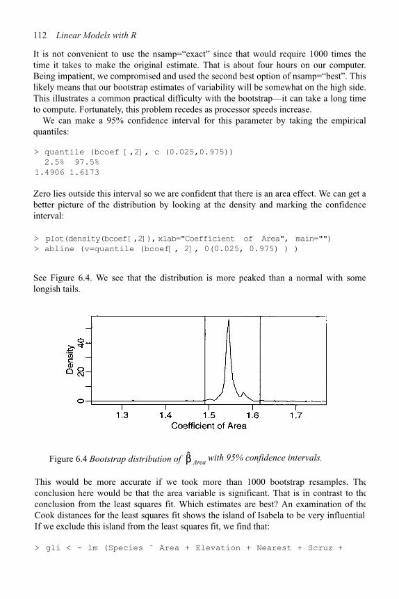
112 Linear Models with R
It is not convenient to use the nsamp=“exact” since that would require 1000 times thetime it takes to make the original estimate. That is about four hours on our computer.Being impatient, we compromised and used the second best option of nsamp=“best”. Thislikely means that our bootstrap estimates of variability will be somewhat on the high side.This illustrates a common practical difficulty with the bootstrap—it can take a long timeto compute. Fortunately, this problem recedes as processor speeds increase.
We can make a 95% confidence interval for this parameter by taking the empiricalquantiles:
> quantile (bcoef [,2], c (0.025,0.975))
2.5% 97.5%
1.4906 1.6173
Zero lies outside this interval so we are confident that there is an area effect. We can get abetter picture of the distribution by looking at the density and marking the confidenceinterval:
> plot(density(bcoef [,2]), xlab="Coefficient of Area", main="")
> abline (v=quantile (bcoef[, 2], 0(0.025, 0.975) ) )
See Figure 6.4. We see that the distribution is more peaked than a normal with somelongish tails.
Figure 6.4 Bootstrap distribution of Area with 95% confidence intervals.
This would be more accurate if we took more than 1000 bootstrap resamples. Theconclusion here would be that the area variable is significant. That is in contrast to theconclusion from the least squares fit. Which estimates are best? An examination of theCook distances for the least squares fit shows the island of Isabela to be very influential.If we exclude this island from the least squares fit, we find that:
> gli < - lm (Species ˜ Area + Elevation + Nearest + Scruz +

Problems with the Error 113
> data(star)
> plot (light ˜ temp, star)
> gsl < - lm (light ˜ temp, star)
> abline (coef (gs1) )
> gs2 < - rlm (light ˜ temp, star)
> abline (coef (gs2), lty=2)
> gs3 < - ltsreg (light ˜ temp, star, nsamp="exact")
> abline (coef (gs3), lty=5)
Adjacent, gala, subset= (row.names (gala) ! = "Isabela"))
> summary (gli)
Coefficients:
Estimate Std. Error t value Pr(>|t|) (Intercept)
22.5861 13.4019 1.69 0.1055
Area 0.2957 0.0619 4.78 8.0e–05
Elevation 0.1404 0.0497 2.82 0.0096
Nearest !0.2552 0.7217 !0.35 0.7269
Scruz !0.0901 0.1498 !0.60 0.5534
Adjacent !0.0650 0.0122 !5.32 2.1e–05
Residual standard error: 41.6 on 23 degrees of freedom
Multiple R-Squared: 0.871, Adjusted R-squared: 0.843
F-statistic: 31.2 on 5 and 23 DF, p-value: 1.62e–09
This fit is much closer to the LTS fit in that Area and Adjacent are very significant predictors. Thus, there are two routes to the same goal. We can use regression diagnostics in conjunction with least squares to identify bad or unusual points or we can use robust methods. The former approach is more flexible and allows for the discovery of a wider class of problems, but it is time consuming and does require human intervention. When data need to be quickly analyzed, perhaps without expert assistance or when large numbers of datasets need to be fitted, robust methods give some protection against aberrant data.
Another interesting point is that the M-estimate failed to identify the unusual island, Isabela, and gave similar results to the full data least squares fit. We can show similar behavior on another dataset—consider the Star data presented in Section 4.2.2. We compute the least squares, Huber and LTS fits and display them in Figure 6.5:
Figure 6.5 Regression fits compared. Least squares is the solid line, Huber is the dotted line and LTS is the dashed line. Only LTS finds the fit in the bulk of the data.

114 Linear Models with R
Only LTS managed to capture the trend in the main group of points. The Huber estimate is almost the same as the least squares estimate.
Summary
1. Robust estimators provide protection against long-tailed errors, but they cannot overcome problems with the choice of model and its variance structure.
2. Robust estimates just give you and possibly standard errors without the associated inferential methods. Software and methodology for this inference is not easy to come by. The bootstrap is a general-purpose inferential method which is useful in these situations.
3. Robust methods can be used in addition to least squares as a confirmatory method. You have cause to worry if the two estimates are far apart. The source of the difference should be investigated.
4. Robust estimates are useful when data need to be fit automatically without the intervention of a skilled analyst.
Exercises
1. Researchers at National Institutes of Standards and Technology (NIST) collected pipeline ine data on ultrasonic measurements of the depths of defects in the Alaska pipeline in the field. The depth of the defects were then remeasured in the laboratory. These measurements were performed in six different batches. It turns out that this batch effect is not significant and so can be ignored in the analysis that follows. The laboratory measurements are more accurate than the in-field measurements, but more time consuming and expensive. We want to develop an regression equation for correcting the in-field measurements.
(a) Fit a regression model Lab ˜ Field. Check for nonconstant variance.(b) We wish to use weights to account for the nonconstant variance. Here we split the
range of Field into 12 groups of size nine (except for the last group which has only eight values). Within each group, we compute the variance of Lab as varlab and the mean of Field as meanf ield. Supposing pipeline is the name of your data frame, the following R code will make the needed computations:
> i < - order(pipeline$Field)
> npipe < - pipeline [i,]
> ff < - gl (12, 9) [!108]
> meanfield < - unlist (lapply (split (npipe$Field, ff),
mean))
> varlab < - unlist (lapply (split (npipe$Lab, ff), var))
Suppose we guess that the the variance in the response is linked to the predictor in the following way:
Problems with the Error 115
Regress log (varlab) on log (meanf ield) to estimate a
0 and a
1. (You might choose
to remove the last point.) Use this to determine appropriate weights in a WLS fit of Lab on Field. Show the regression summary.
(c) An alternative to weighting is transformation. Find transformations on Lab and/or Field so that in the transformed scale the relationship is approximately linear with constant variance. You may restrict your choice of transformation to square root, log and inverse.
2. Using the divorce data, fit a regression model with divorce as the response and unemployed, femlab, marriage, birth and militaryaspredictors.
(a) Make two graphical checks for correlated errors. What do you conclude?(b) Allow for serial correlation with an AR(1) model for the errors. (Hint: Use
maximum likelihood to estimate the parameters in the GLS fit by gls (…, method=“ML”,…)). What is the estimated correlation and is it significant? Does the GLS model change which variables are found to be significant?
(c) Speculate why there might be correlation in the errors.
3. For the salmonella dataset, fit a linear model with colonies as the response and log (dose+1) as the predictor. Check for lack of fit.
4. For the cars dataset, fit a linear model with distance as the response and speed as the predictor. Check for lack of fit.
5. Using the stackloss data, fit a model with stack. loss as the response and the other three variables as predictors using the following methods:
(a) Least squares(b) Least absolute deviations(c) Huber method(d) Least trimmed squares
Compare the results. Now use diagnostic methods to detect any outliers or influential points. Remove these points and then use least squares. Compare the results.

CHAPTER 7 Transformation
Transformations of the response and predictors can improve the fit and correct violations of model assumptions such as nonconstant error variance. We may also consider adding additional predictors that are functions of the existing predictors like quadratic or cross-product terms. This means we have more choice in choosing the transformations on the predictors than on the response.
7.1 Transforming the Response
We start with some general considerations about transforming the response. Suppose that you are contemplating a logged response in a simple regression situation:
log y=!0+!
1x+"
In the original scale of the response, this model becomes:
y=exp(!0+!
1x).exp(")
In this model, the errors enter multiplicatively and not additively as they usually do. So the use of standard regression methods for the logged response model requires that we believe the errors enter multiplicatively in the original scale. Notice that if we believe the true model for y to be:
y=exp(!0+!
1x)+"
then we cannot linearize this model and nonlinear regression methods would need to be applied.
As a practical matter, we usually do not know how the errors enter the model, additively, multiplicatively or otherwise. The typical approach is to try different transforms and then check the residuals to see whether they satisfy the conditions required for linear regression. Unless you have good information that the error enters in some particular way, this is the simplest and most appropriate approach.
Although you may transform the response, you will probably need to express predictions in the original scale. This is simply a matter of back transforming. For example, in the logged model above, your prediction would be exp (10). If your prediction confidence interval in the logged scale was [l, u], then you would use [exp l, exp u]. This interval will not be symmetric, but this may be desirable. For example, the untransformed prediction intervals for the Galapágos data went below zero in Section 3.5. Transformation of the response avoids this problem.
Regression coefficients will need to be interpreted with respect to the transformedscale. There is no straightforward way of back transforming them to values that can be

118 Linear Models with R
interpreted in the original scale. You cannot directly compare regression coefficients for models where the response transformation is different. Difficulties of this type may dissuade one from transforming the response even if this requires the use of another type of model, such as a generalized linear model.
When you use a log transformation on the response, the regression coefficients have a particular interpretation:
Thus when a log scale is used, the regression coefficients can be interpreted in a multiplicative rather than an additive manner.
The Box-Cox method is a popular way to determine a transformation on the response. It is designed for strictly positive responses and chooses the transformation to find the best fit to the data. The method transforms the response y�g
# (y) where the family of
transformations indexed by $ is:
For fixed y>0, g$(y) is continuous in $. Choose $ using maximum likelihood. The profile
log-likelihood assuming normality of the errors is:
where RSS$ is the residual sum of squares when g
$(y) is the response. You can compute
numerically to maximize this. If the purpose of the regression model is just prediction,
then use y$ as the response (no need to use , as the rescaling is just for
convenience in maximizing the likelihood). If explaining the model is important, you
should round $ to the nearest interpretable value. For example, if it would be
hard to explain what this new response means, but might be easier.Transforming the response can make the model harder to interpret so we do not want to
do it unless it is really necessary. One way to check this is to form a confidence interval for $. A 100(1–%)% confidence interval for $ is:
An increase of one in x1 would multiply the predicted response (in the original scale) by

Transformation 119
This interval can be derived by inverting the likelihood ratio test of the hypothesis that
H0: $=$
0 which uses the statistic having approximate null distribution
The confidence interval also tells you how much it is reasonable to round $ for the sake of interpretability.
We check whether the response in the savings data need transformations. We will need the boxcox function from the MASS package:
> library (MASS)
Try it out on the savings dataset and plot the results:
> data(savings)
> g < - 1m (sr ˜ popl5+pop75+dpi+ddpi,savings)
> boxcox(g,plotit=T)
> boxcox (g, plotit=T, lambda=seq (0.5, 1.5, by=0.1))
Figure 7.1 Log-likelihoodplots for the Box-Cox transformation of the savings data.
The first plot shown in Figure 7.1 is too broad. I narrowed the range of $ in the second plot so that we can read off the confidence interval more easily.
The confidence interval for $ runs from about 0.6 to about 1.4. We can see that there is no good reason to transform.
Now consider the Galápagos Islands dataset analyzed earlier:
> data (gala)
> g < - lm (Species ˜ Area + Elevation + Nearest + Scruz +
Adjacent, gala)
> boxcox (g, plotit=T)
> boxcox (g, lambda=seq (0.0, 1.0, by=0.05), plotit=T)

120 Linear Models with R
be best here. A square root is also a possibility, as this falls just within the confidence intervals. Certainly there is a strong need to transform.
Some general considerations concerning the Box–Cox method are:
1. The Box-Cox method gets upset by outliers—if you find =5, then this is probably the reason—there can be little justification for actually making such an extreme transformation.
2. If some yi<0, we can add a constant to all the y. This can work provided the constant is
small, but this is an inelegant solution.3. If max
iy
i/min
iy
i is small, then the Box-Cox will not have much real effect because
power transforms are well approximated by linear transformations over short intervals far from the origin.
Figure 7.2 Log-likelihood plots for the Box-Cox transformation of the Galápagos data.
4. There is some doubt whether the estimation of $, counts as an extra parameter to be considered in the degrees of freedom. This is a difficult question since $ is not a linear parameter and its estimation is not part of the least squares fit.
The Box-Cox method is not the only way of transforming the predictors. For responses that are proportions (or percentages), the logit transformation, log (y/(1–y)), is often used, while for responses that are correlations, Fisher’s z transform, y=0.51og ((1+y)/(1–y))
, is
worth considering.
7.2 Transforming the Predictors
You can take a Box-Cox style approach for each of the predictors, choosing the transformation to minimize the RSS. However, this takes time. You can also use graphical methods such as partial residual plots to select transforming the predictors. These methods are designed to replace x in the model with f (x) for some chosen f. The
The plots are shown in Figure 7.2. We see that perhaps a cube root transformation might
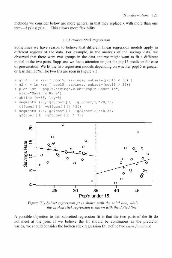
Transformation 121
methods we consider below are more general in that they replace x with more than one term—f (x)+g (x)+…. This allows more flexibility.
7.2.1 Broken Stick Regression
Sometimes we have reason to believe that different linear regression models apply in different regions of the data. For example, in the analysis of the savings data, we observed that there were two groups in the data and we might want to fit a different model to the two parts. Supp1ose we focus attention on just the pop15 predictor for ease of presentation. We fit the two regression models depending on whether pop15 is greater or less than 35%. The two fits are seen in Figure 7.3:
> g1 < - lm (sr ˜ pop15, savings, subset=(pop15 < 35) )
> g2 < - lm (sr ˜ pop15, savings, subset=(pop15 > 35))
> plot (sr ˜ popl5,savings,xlab="Pop'n under 15",
ylab="Savings Rate")
> abline (v=35, lty=5)
> segments (20, gl$coef [1] +gl$coef[2]*20,35,
gl$coef [1] +g1$coef [2] *35)
> segments (48, g2$coef [1] +g2$coef[2]*48,35,
g2$coef [1] +g2$coef [2] * 35)
Figure 7.3 Subset regression fit is shown with the solid line, while the broken stick regression is shown with the dotted line.
A possible objection to this subsetted regression fit is that the two parts of the fit do not meet at the join. If we believe the fit should be continuous as the predictor varies, we should consider the broken stick regression fit. Define two basis functions:

122 Linear Models with R
and:
where c marks the division between the two groups. Bl and B
r form a first-order spline
basis with a knotpoint at c. Sometimes Bl and B
r are called hockey-stick functions
because of their shape. We can now fit a model of the form:
y=!0+!
1B
l(x)+!
2B
r(x)+"
using standard regression methods. The two linear parts are guaranteed to meet at c.Notice that this model uses only three parameters in contrast to the four total parametersused in the subsetted regression illustrated before. A parameter has been saved byinsisting on the continuity of the fit at c.
We define the two hockey-stick functions, compute and display the fit:
> Ihs < - function (x) ifelse(x < 35, 35!x, 0)
> rhs < - function (x) ifelse(x < 35, 0, x!35)
> gb < - 1m (sr ˜ Ihs (pop15) + rhs(pop15), savings)
> x < - seq(20, 48, by=l)
> py < - gb$coef[1]+gb$coef[2]*lhs(x)+gb$coef[3]*rhs(x)
> lines (x, py, lty=2)
The two (dotted) lines now meet at 35, as shown in Figure 7.3. The intercept of thismodel is the value of the response at the join.
We might question which fit is preferable in this particular instance. For the highpop15 countries, we see that the imposition of continuity causes a change in sign for theslope of the fit. We might argue that because the two groups of countries are so differentand there are so few countries in the middle region, we might not want to imposecontinuity at all.
We can have more than one knotpoint simply by defining more basis functions withdifferent knotpoints. Broken stick regression is sometimes called segmented regression.Allowing the knotpoints to be parameters is worth considering, but this will result in anonlinear model.
7.2.2 Polynomials
Another way of generalizing the X! part of the model is to add polynomial terms. In theone-predictor case, we have:

Transformation 123
y=!0+!
1x+…+!
dxd+"
which allows for a more flexible relationship, although we usually do not believe it exactly represents any underlying reality.
There are two ways to choose d. We can keep adding terms until the added term is not statistically significant. Alternatively, we can start with a large d and eliminate nonstatistically significant terms starting with the highest order term.
Do not eliminate lower order terms from the model even if they are not statistically significant. An additive change in scale would change the t-statistic of all but the highest order term. We would not want the conclusions of our study to be so brittle to such changes in the scale which ought to be inconsequential.
Let’s see if we can use polynomial regression on the ddpi variable in the savings data. First, fit a linear model:
> summary (1m (sr ˜ ddpi, savings) )
Coefficients:
Estimate Std. Error t value Pr(>|t|)
(Intercept) 7.883 1.011 7.80 4.5e–10
ddpi 0.476 0.215 2.22 0.031
The p-value of ddpi is significant so move on to a quadratic term:
> summary (lm (sr ˜ ddpi+I (ddpiˆ2),savings))
Coefficients:
Estimate Std. Error t value Pr(>|t|)
(Intercept) 5.1304 1.4347 3.58 0.00082
ddpi 1.7575 0.5377 3.27 0.00203
I(ddpiˆ2) !0.0930 0.0361 !2.57 0.01326
Again the p-value of ddpi2 is significant so move on to a cubic term:
> summary (lm (sr ˜ ddpi+I (ddpiˆ2)+I (ddpiˆ3), savings))
Coefficients:
Estimate Std. Error t value Pr(>|t|)
(Intercept) 5.145360 2.198606 2.34 0.024
ddpi 1.746017 1.380455 1.26 0.212
I (ddpiˆ2) !0.090967 0.225598 !0.40 0.689
I (ddpiˆ3) !0.000085 0.009374 !0.01 0.993
The p-value of ddpi3 is not significant so stick with the quadratic. Notice how the other p-values are not significant in contrast with earlier results. Note that starting from a large model (including the fourth power) and working downwards gives the same result.
To illustrate the point about the significance of lower order terms, suppose we transform ddpi by subtracting 10 and refit the quadratic model:
> savings < - data.frame (savings, mddpi=savings$ddpi-10) >
summary (lm (sr ˜ mddpi+I (mddpiˆ2), savings))
Coefficients:

124 Linear Models with R
Estimate Std. Error t value Pr(>|t|)
(Intercept) 13.4070 1.4240 9.41 2.2e–12
mddpi !0.1022 0.3027 !0.34 0.737
I(mddpiˆ2) !0.0930 0.0361 !2.57 0.013
We see that the quadratic term remains unchanged, but the linear term is nowinsignificant. Since there is often no necessary importance to zero on a scale ofmeasurement, there is no good reason to remove the linear term in this model but not inthe previous version. No advantage would be gained.
You have to refit the model each time a term is removed and for large d there can be aproblem with numerical stability. Orthogonal polynomials get around this problem bydefining:
z1=a
1+b
1x
z2=a
2+b
2x+c
2x2
z3=a
3+b
3x+c
3x3+d
3x3
etc. where the coefficients a, b, c,…are chosen so that when . The z arecalled orthogonal polynomials. The value of orthogonal polynomials has declined withadvances in computing speeds although they are still worth knowing about because oftheir numerical stability and ease of use. The poly ( ) function constructs orthogonalpolynomials:
> g < - 1m (sr ˜ poly(ddpi,4),savings)
> summary (g)
Coefficients:
Estimate Std. Error t value Pr(>|t|)
(Intercept) 9.6710 0.5846 16.54 <2e–16
poly(ddpi,4)1 9.5590 4.1338 2.31 0.025
poly(ddpi,4)2 !10.4999 4.1338 !2.54 0.015
poly(ddpi,4)3 !0.0374 4.1338 !0.01 0.993
poly(ddpi,4)4 3.6120 4.1338 0.87 0.387
Residual standard error: 4.13 on 45 degrees of freedom
Multiple R-Squared: 0.218, Adjusted R-squared: 0.149
F-statistic: 3.14 on 4 and 45 DF, p-value: 0.0232
We can come to the same conclusion as above, that the quadratic model is best, with justthis summary.
You can also define polynomials in more than one variable. These are sometimescalled response surface models. A second degree model would be:
an example of which could be fit as:

Transformation 125
> g < - lm (sr ˜ polym(popl5, ddpi, degree=2), savings)
7.2.3 Regression Splines
Polynomials have the advantage of smoothness, but the disadvantage that each data pointaffects the fit globally. This is because the power functions used for the polynomials takenonzero values across the whole range of the predictor. In contrast, the broken stickregression method localizes the influence of each data point to its particular segmentwhich is good, but we do not have the same smoothness as with the polynomials. There isa way we can combine the beneficial aspects of both these methods—smoothness andlocal influence—by using B-spline basis functions.
We may define a cubic B-spline basis on the interval [a, b] by the followingrequirements on the interior basis functions with knotpoints at t
1,…, t
k:
1. A given basis function is nonzero on an interval defined by four successive knots andzero elsewhere. This property ensures the local influence property.
2. The basis function is a cubic polynomial for each subinterval between successiveknots.
3. The basis function is continuous and is also continuous in its first and secondderivatives at each knotpoint. This property ensures the smoothness of the fit.
4. The basis function integrates to one over its support.
The basis functions at the ends of the interval are defined a little differently to ensurecontinuity in derivatives at the edge of the interval. A full definition of B-splines andmore details about their properties may be found in de Boor (2002). The broken stickregression is an example of the use of linear splines.
Let’s see how the competing methods do on a constructed example. Suppose we knowthe true model is:
The advantage of using simulated data is that we can see how close our methods come tothe truth. We generate the data and display them in the first plot of Figure 7.4.
> funky < - function (x) sin (2*pi*xˆ3) ˆ3
> x < - seq (0, l, by=0.01)
> y < - funky (x) + 0.1*rnorm (101)
> matplot (x, cbind (y, funky (x)), type="pl", ylab="y",
pch=18, lty=l)

126 Linear Models with R
Figure 7.4 Data and true function shown on the left. Orthogonal polynomialof order 4 (dashed) and order 12 (solid) shown on the right.
We see how orthogonal polynomial bases of orders 4 and 12 do in fitting these data:
> g4 < - lm (y ˜ poly(x,4))
> g12 < - lm (y ~ poly(x,12))
> matplot (x, cbind(y, g4$f it, g12$f it) , type="pll,
ylab="y", pch=18,lty=c (1,2))
The two fits are shown in the second panel of Figure 7.4. We see that order 4 is a clearunderfit; order 12 is much better although the fit is too wiggly in the first section andmisses the point of inflection around x=0.8.
We now create the B-spline basis. You need to have three additional knots at the startand end to get the right basis. I have chosen to the knot locations to put more in theregions of greater curvature. I have used 12 basis functions for comparability to theorthogonal polynomial fit:
> library (splines)
> knots < - c (0, 0, 0, 0, 0.2, 0.4, 0.5, 0.6, 0.7, 0.8,
0.85, 0.9, 1, 1, 1, 1)
> bx < - splineDesign (knots, x)
> gs < - 1m (y ˜ bx)
> matplot (x, bx, type="1")
> matplot (x, cbind (y, gs$fit),type="pl", ylab="y",
pch=18, lty=l)
The basis functions themselves are seen in the first panel of Figure 7.5 while the fit itselfappears in the second panel. We see that the fit comes very close to the truth.
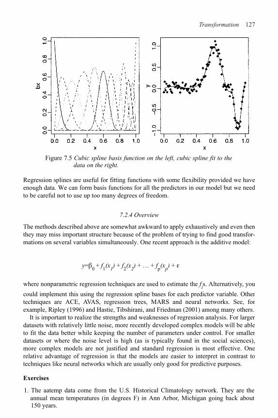
Transformation 127
Figure 7.5 Cubic spline basis function on the left, cubic spline fit to the data on the right.
Regression splines are useful for fitting functions with some flexibility provided we have enough data. We can form basis functions for all the predictors in our model but we need to be careful not to use up too many degrees of freedom.
7.2.4 Overview
The methods described above are somewhat awkward to apply exhaustively and even then they may miss important structure because of the problem of trying to find good transfor-mations on several variables simultaneously. One recent approach is the additive model:
y=!0
+ f1(x
1) + f
2(x
2) + … + f
p(x
p) + "
where nonparametric regression techniques are used to estimate the fis. Alternatively, you
could implement this using the regression spline bases for each predictor variable. Other techniques are ACE, AVAS, regression trees, MARS and neural networks. See, for example, Ripley (1996) and Hastie, Tibshirani, and Friedman (2001) among many others.
It is important to realize the strengths and weaknesses of regression analysis. For larger datasets with relatively little noise, more recently developed complex models will be able to fit the data better while keeping the number of parameters under control. For smaller datasets or where the noise level is high (as is typically found in the social sciences), more complex models are not justified and standard regression is most effective. One relative advantage of regression is that the models are easier to interpret in contrast to techniques like neural networks which are usually only good for predictive purposes.
Exercises
1. The aatemp data come from the U.S. Historical Climatology network. They are the annual mean temperatures (in degrees F) in Ann Arbor, Michigan going back about150 years.

128 Linear Models with R
(a) Is there a linear trend?(b) Observations in successive years may be correlated. Fit a model that estimates this
correlation. Does this change your opinion about the trend?(c) Fit a polynomial model with degree 10 and use backward elimination to reduce the
degree of the model. Plot your fitted model on top of the data. Use this model topredict the temperature in 2020.
(d) Suppose someone claims that the temperature was constant until 1930 and thenbegan a linear trend. Fit a model corresponding to this claim. What does the fittedmodel say about this claim?
(e) Make a cubic spline fit with six basis functions evenly spaced on the range. Plot thefit in comparison to the previous fits. Does this model fit better than the straight-linemodel?
2. The cornnit data on the relationship between corn yield (bushels per acre) and nitrogen(pounds per acre) fertilizer application were studied in Wisconsin in 1994. Usetransformations to find a good model for predicting yield from nitrogen. Use agoodness of fit test to check your model.
3. Using the ozone data, fit a model with O3 as the response and temp, humidity and ibhas predictors. Use the Box–Cox method to determine the best transformation on theresponse.
4. Using the pressure data, fit a model with pressure as the response and temperature asthe predictor using transformations to obtain a good fit.
5. Use transformations to find a good model for volume in terms of girth and heightusing the trees data.


CHAPTER 8Variable Selection
Variable selection is intended to select the “best” subset of predictors. Several reasons for wanting to do this follow:
1. We want to explain the data in the simplest way. Redundant predictors should be removed. The principle of Occam’s Razor states that among several plausible explanations for a phenomenon, the simplest is best. Applied to regression analysis, this implies that the smallest model that fits the data is best.
2. Unnecessary predictors will add noise to the estimation of other quantities that interested us. Degrees of freedom will be wasted. More precise estimates and predictions might be achieved with a smaller model.
3. Collinearity is caused by having too many variables trying to do the same job. Removing excess predictors will aid interpretation.
4. If the model is to be used for prediction, we can save time and/or money by not measuring redundant predictors.
Variable selection is a process that should not be separated from the rest of the analysis. Other parts of the data analysis can have an impact. For example, outliers and influential points can do more than just change the current model—they can change the model we select. It is important to identify such points. Also transformations of the variables can have an impact on the model selected. Some iteration and experimentation is often necessary to find better models.
There are two main types of variable selection. The stepwise testing approach compares successive models while the criterion approach attempts to find the model that optimizes some measure of goodness.
8.1 Hierarchical Models
Some models have a natural hierarchy. For example, in polynomial models, x2 is a higher order term than x. When selecting variables, it is important to respect the hierarchy. Lower order terms should not be removed from the model before higher order terms in the same variable. There are two common situations where this can arise:
Consider the polynomial model:
y = !0
+ !1x + !
2x2 + "
Suppose we fit this model and find that the regression summary shows that the term in x
is not significant but the term in x2 is. If we then remove the x term, our reduced model would become:

Variable Selection 131
y=!0+!
2x2+"
However, suppose we make a scale change x→ x+a; then the model would become:
y=!0+!
2a2+2!
2ax+!
2x2+"
The first order x term has now reappeared. Scale changes should not make any important change to the model, but in this case an additional term has been added. This is not desirable. This illustrates why we should not remove lower order terms in the presence of higher order terms. We would not want interpretation to depend on the choice of scale. Removal of the first-order term here corresponds to the hypothesis that the predicted response is symmetric about and has an optimum at x=0. Usually this hypothesis is not meaningful and should not be considered. Only when this hypothesis makes sense in the context of the particular problem could we justify the removal of the lower order term.
For models with interactions, consider the example of a second order response surface model:
We would not normally consider removing the x1x
2 interaction term without
simultaneously considering the removal of the and terms. A joint removal would correspond to the clearly meaningful comparison of a quadratic surface and a linear one. Just removing the x1x2 term would correspond to a surface that is aligned with the coor-dinate axes. This is hard to interpret and should not be considered unless some particular meaning can be attached. Any rotation of the predictor space would reintroduce the interaction term and, as with the polynomials, we would not ordinarily want our model interpretation to depend on the particular basis for the predictors.
8.2 Testing-Based Procedures
8.2.1 Backward Elimination
This is the simplest of all variable selection procedures and can be easily implemented without special software. In situations where there is a complex hierarchy, backward elimination can be run manually while taking account of what variables are eligible for removal.
We start with all the predictors in the model and then remove the predictor with highest p-value greater than %
crit. Next refit the model and remove the remaining least significant
predictor provided its p-value is greater than %crit. Sooner or later, all “nonsignificant” predictors will be removed and the selection process will be complete.

132 Linear Models with R
prediction performance is the goal, then a 15 to 20% cutoff may work best, althoughmethods designed more directly for optimal prediction should be preferred.
8.2.2 Forward Selection
This just reverses the backward method. We start with no variables in the model and thenfor all predictors not in the model, we check their p-value if they are added to the model.We choose the one with lowest p-value less than %
crit. We continue until no new
predictors can be added.
8.2.3 Stepwise Regression
This is a combination of backward elimination and forward selection. This addresses thesituation where variables are added or removed early in the process and we want tochange our mind about them later. At each stage a variable may be added or removed andthere are several variations on exactly how this is done.
8.2.4 Verdict on Testing-Based Methods
Testing-based procedures are relatively cheap computationally, but they do have some ofthe following drawbacks:
1. Because of the “one-at-a-time” nature of adding/dropping variables, it is possible tomiss the "optimal" model.
2. The p-values used should not be treated too literally. There is so much multiple testingoccurring that the validity is dubious. The removal of less significant predictors tendsto increase the significance of the remaining predictors. This effect leads one tooverstate the importance of the remaining predictors.
3. The procedures are not directly linked to final objectives of prediction or explanationand so may not really help solve the problem of interest. With any variable selectionmethod, it is important to keep in mind that model selection cannot be divorced fromthe underlying purpose of the investigation. Variable selection tends to amplify thestatistical significance of the variables that stay in the model. Variables that aredropped can still be correlated with the response. It would be wrong to say that thesevariables are unrelated to the response; it is just that they provide no additionalexplanatory effect beyond those variables already included in the model.
4. Stepwise variable selection tends to pick models that are smaller than desirable forprediction purposes. To give a simple example, consider the simple regression withjust one predictor variable. Suppose that the slope for this predictor is not quitestatistically significant. We might not have enough evidence to say that it is related toy but it still might be better to use it for predictive purposes.
We illustrate the variable selection methods on some data on the 50 states from the 1970s.The data were collected from U.S. Bureau of the Census. We will take life expectancy asthe response and the remaining variables as predictors:
> data(state)
The %crit
is sometimes called the “p-to-remove” and does not have to be 5%. If

Variable Selection 133
> statedata < - data.frame (state.x77, row.names=state.abb) > g <
- lm (Life.Exp ˜ . , data=statedata)
> summary (g)
Coefficients:
Estimate Std. Error t value Pr(>|t|)
(Intercept) 7.09e+01 1.75e+00 40.59 < 2e–16
Population 5.18e–05 2.92e–05 1.77 0.083
Income !2.18e–05 2.446!04 !0.09 0.929
Illiteracy 3.38e–02 3.666!01 0.09 0.927
Murder !3.016!01 4.666!02 !6.46 8.7e–08
HS.Grad 4.896!02 2.33e–02 2.10 0.042
Frost !5.74e!03 3.14e!03 !1.82 0.075
Area !7.38e–08 1.67e–06 !0.04 0.965
Residual standard error: 0.745 on 42 degrees of freedom
Multiple R-Squared: 0.736, Adjusted R-squared: 0.692
F-statistic: 16.7 on 7 and 42 DF, p-value: 2.53e–10
The signs of some of the coefficients match plausible expectations concerning how the predictors might affect the response. Higher murders rate decrease life expectancy as one might expect. Even so, some variables such as income, are not significant, contrary to what one might expect.
We illustrate the backward method—at each stage we remove the predictor with the largest p-value over 0.05:
> g < - update (g, . ˜ . - Area)
> summary (g)
Coefficients:
Estimate Std. Error t value Pr(>|t|)
(Intercept) 7.10e+01 1.39e+00 51.17 < 2e–16
Population 5.19e–05 2.88e–05 1.80 0.079
Income –2.44e–05 2.34e–04 !0.10 0.917
Illiteracy 2.85e–02 3.42e–01 0.08 0.934
Murder –3.02e–01 4.33e–02 !6.96 1.5e–08
HS.Grad 4.85e–02 2.07e–02 2.35 0.024
Frost –5.78e–03 2.97e–03 !1.94 0.058
> g < - update (g, . ~ . - Illiteracy)
> summary (g)
Coefficients:
Estimate Std. Error t value Pr(>|t|)
(Intercept) 7.11e+01 1.03e+00 69.07 < 2e–16
Population 5.11e–05 2.71e–05 1.89 0.066
Income !2.48e–05 2.32e–04 !0.11 0.915
Murder !3.00e–01 3.70e–02 !8.10 2.9e–10
HS.Grad 4.78e–02 1.866!02 2.57 0.014
Frost !5.916–03 2.47e–03 !2.39 0.021
> g < - update (g, . ~ . - Income)
> summary (g
Coefficients:
Estimate Std. Error t value Pr(>|t|)
(Intercept) 7.10e+01 9.53e–01 74.54 < 2e–16
Population 5.01e–05 2.51e–05 2.00 0.0520

134 Linear Models with R
Murder !3.00e–01 3.66e–02 !8.20 1.86–10
HS.Grad 4.666!02 1.486!02 3.14 0.0030
Frost !5.94e–03 2.42e–03 !2.46 0.0180
> g < - update (g, . ˜ .– Population)
> summary (g)
Coefficients:
Estimate Std. Error t value Pr(>|t)
(Intercept) 71.03638 0.98326 72.25 <2e!16
Murder !0.28307 0.03673 !7.71 8e–10
HS.Grad 0.04995 0.01520 3.29 0.0020
Frost !0.00691 0.00245 !2.82 0.0070
Residual standard error: 0.743 on 46 degrees of freedom
Multiple R-Squared: 0.713, Adjusted R-squared: 0.694
F-statistic: 38 on 3 and 46 DF, p-value: 1.63e–12
The final removal of the Population variable is a close call. We may want to considerincluding this variable if interpretation is made easier. Notice that the R2 for the fullmodel of 0.736 is reduced only slightly to 0.713 in the final model. Thus the removal offour predictors causes only a minor reduction in fit.
It is important to understand that the variables omitted from the model may still berelated to the response. For example:
> summary(1m(Life.Exp ˜ Illiteracy+Murder+Frost, statedata))
Coefficients:
Estimate Std. Error t value Pr(>|t|)
(Intercept) 74.55672 0 8425 1 27.61 < 2e!1
Illiteracy !0.60176 0 9893 ! 2.01 0 .05C
Murder !0.28005 0 4339 ! 6.45 6 e–0
Frost !0.00869 0 0296 ! 2.94 0 .005
Residual standard error: 0.791 on 46 degrees of freedom
Multiple R-Squared: 0.674, Adjusted R-squared: 0.653
F-statistic: 31.7 on 3 and 46 DF, p-value: 2.91e–11
we see that Illiteracy does have some association with Life Expectancy. It is true thatreplacing Illiteracy with High School graduation rate gives us a somewhat better fittingmodel, but it would be insufficient to conclude that Illiteracy is not a variable of interest.
8.3 Criterion-Based Procedures
If we have some idea about the purpose for which a model is intended, we might proposesome measure of how well a given model meets that purpose. We could choose thatmodel among those possible that optimizes that criterion. If there are q potential
predictors, then there are 2q possible models. We could fit all these models and choosethe best one according to some criterion. For larger q, this might be too time consuming and we may need to economize by limiting the search. Some possible criteria are theAkaike Information Criterion (AIC), defined as &2 max loglikelihood+2p. Also used is

Variable Selection 135
the Bayes Information Criterion (BIC) which is &2 max log-likelihood +plog n. For linear regression models, the &2 max loglikelihood is nlog(RSS/n)+a constant. Since the constant is the same for a given data set and assumed error distribution, it can be ignored for regression model comparisons on the same data. Additional care is necessary for other types of comparisons.
We want to minimize AIC or BIC. Larger models will fit better and so have smaller residual sum of squares (RSS), but use more parameters. Thus the best model choice will balance fit with model size. BIC penalizes larger models more heavily and so will tend to prefer smaller models in comparison to AIC. AIC and BIC are often used as selection criteria for other types of models too.
We can apply the AIC (and optionally the BIC) to the state data. The function does not evaluate the AIC for all possible models but uses a search method that compares models sequentially. Thus it bears some comparison to the stepwise method described above, but only in the method of search—there is no hypothesis testing.
> g < - lm (Life.Exp ˜ ., data=statedata)
> step (g)
Start: AIC= !22.18
Life. Exp ˜ Population + Income + Illiteracy + Murder
+ HS.Grad + Frost + Area
Df Sum of Sq RSS AIC
! Area 1 0.0011 23.3 !24.2
! Income 1 0.0044 23.3 !24.2
! Illiteracy 1 0.0047 23.3 !24.2
<none> 23.3 !22.2
! Population 1 1.7 25.0 !20.6
! Frost 1 1.8 25.1 !20.4
! HS.Grad 1 2.4 25.7 !19.2
! Murder 1 23.1 46.4 10.3
Step: AIC= !24.18
Life. Exp ˜ Population + Income + Illiteracy + Murder +
HS.Grad + Frost
.. intermediate steps omitted ..
Step: AIC= !28.16
Life. Exp ˜ Population + Murder + HS.Grad + Frost
Df Sum of Sq RSS AIC
<none> 23.3 !28.2
! Population 1 2.1 25.4 !25.9
! Frost 1 3.1 26.4 !23.9
! HS.Grad 1 5.1 28.4 !20.2
! Murder 1 34.8 58.1 15.5
Coefficients:
(Intercept) Population Murder HS.Grad Frost
7.10e+01 5.01e–05 !3.00e–01 4.66e–02–5.94e–03
The sequence of variable removal is the same as with backward elimination. The only difference is that the population variable is retained.
Another commonly used criterion is adjusted R2, written Recall that R2=1&RSS/TSS. Adding a variable to a model can only decrease the RSS and so only increase
136 Linear Models with R
the R2. Hence R2 by itself is not a good criterion, because it would always choose the largest possible model:
Adding a predictor will only increase R2 if it has some predictive value. There is a
connection to . Minimizing the standard error for prediction means minimizing
which in term means maximizing R2.Our final criterion is Mallow’s C
p statistic. A good model should predict well, so the
average mean square error of prediction might be a good criterion:
which can be estimated by the Cp statistic:
where is from the model with all predictors and RSSp indicates the RSS from a model
with p parameters. For the full model Cp=p exactly. If a p predictor model fits, then E
(RSSp)=(n#p))2 and then E(Cp) % p. A model with a bad fit will have C
p much bigger
than p. It is usual to plot Cp against p. We desire models with small p and C
p around or
less than p.C
p, and AIC all trade-off fit in terms of RSS against complexity (p).
Now we try the Cp and methods for the selection of variables in the state dataset.
For a model of a given size, all the methods above (with the possible exception of PRESS) will select the model with the smallest residual sum of squares. We first discover the best models for each size:
> library(leaps)
> b< - regsubsets(Life.Exp˜.,data=statedata)
> (rs < - summary (b))
1 subsets of each size up to 7
Selection Algorithm: exhaustive
Population Income Illiteracy Murder HS.Grad Frost Area
1 (1) " " " " " " " *" " " " " " "
2 (1) " " " " " " " *" " *" " " " "

Variable Selection 137
3 (1) " " " " " " "*" "*" "*" " "
4 (1) "*" " " " " "*" "*" "*" " "
5 (1) "*" "*" " " "*" "*" "*" " "
6 (1) "*" "*" "*" "*" "*" "*" " "
7 (1) "*" "*" "*" "*" "*" "*" "*"
In some cases, we might consider more than one model per size. Here we see that the best one predictor model uses Murder and so on. The C
p plot can be constructed as:
> plot (2:8, rs$cp, xlab="No. of Parameters", ylab="Cp Statistic")
> abline (0, l)
as seen in the first panel of Figure 8.1.
Figure 8.1 The Cp plot for the state data on the left; adjusted R2 on the right.
The competition is between the four-parameter, three-predictor, model including Frost, HS graduation and Murder and the model also including Population. Both models are on or below the C
p=p line, indicating good fits. The choice is between the smaller model and
the larger model, which fits a little better. Some even larger models fit in the sense that they are on or below the C
p=p line, but we would not opt for these in the presence of
smaller models that fit.
Now let’s which model the adjusted R2 criterion selects using the plot shown in the second panel of Figure 8.1:
> plot (2:8, rs$adjr2, xlab="No. of Parameters",
ylab="Adjusted R-square")
We see that the Population, Frost, HS graduation and Murder model has the largest

138 Linear Models with R
for high leverage points:
> h < - 1m.influence (g) $hat
> names (h) < - state.abb
> rev (sort (h))
AK CA HI NV NM TX NY
0.809522 0.408857 0.378762 0.365246 0.324722 0.284164 0.256950
We can see that Alaska has high leverage. Let’s try excluding it:
> b< - regsubsets (Life.Exp˜., data=statedata,
subset=(state.abb! ="AK"))
> rs < - summary (b)
> rs$which [which.max (rs$adjr),]
(Intercept) Population Income Illiteracy Murder
TRUE TRUE FALSE FALSE TRUE
HS.Grad Frost Area
TRUE TRUE TRUE
We see that Area now makes it into the model. Transforming the predictors can also havean effect. Take a look at the variables:
> stripchart (data.frame (scale (statedata)), vertical=TRUE,
method="jitter")
Jittering adds a small amount of noise (in the horizontal direction in this example). It isuseful for moving apart points that would otherwise overprint each other.
Figure 8.2 Strip charts of the state data; all variables have been standardized.
In Figure 8.2, we see that Population and Area are skewed—we try transforming them:
> b< - regsubsets (Life.Exp˜ log(Population)+Income+Illiteracy+
Murder+HS.Grad+Frost+log(Area), statedata)
Variable selection methods are sensitive to outliers and influential points. Let’s check

Variable Selection 139
> rs < - summary (b)
>rs$which [which.max (rs$adjr), ]
(Intercept) log(Population) Income Illiteracy
TRUE TRUE FALSE FALSE
Murder HS.Grad Frost log (Area)
TRUE TRUE TRUE FALSE
This changes the “best” model again to log (Population), Frost, HS graduation and
Murder. The adjusted R2 of 71.7% is the highest among models we have seen so far.
8.4 Summary
Variable selection is a means to an end and not an end itself. The aim is to construct a model that predicts well or explains the relationships in the data. Automatic variable selections are not guaranteed to be consistent with these goals. Use these methods as a guide only.
Stepwise methods use a restricted search through the space of potential models and use a dubious hypothesis testing-based method for choosing between models. Criterion-based methods typically involve a wider search and compare models in a preferable manner. For this reason, I recommend that you use a criterion-based method.
Accept the possibility that several models may be suggested which fit about as well as each other. If this happens, consider:
1. Do the models have similar qualitative consequences?2. Do they make similar predictions?3. What is the cost of measuring the predictors?4. Which has the best diagnostics?
If you find models that seem roughly equally as good, but lead to quite different conclusions, then it is clear that the data cannot answer the question of interest unambiguously. Be alert to the possibility that a model contradictory to the tentative conclusions might be out there.
Exercises
1. Use the prostate data with lpsa as the response and the other variables as predictors. Implement the following variable selection methods to determine the "best" model:
(a) Backward Elimination(b) AIC
(c) Adjusted R2
(d) Mallows Cp
2. Using the teengamb dataset with gamble as the response and the other variables as predictors, repeat the work of the first question.
3. Using the divusa dataset with divorce as the response and the other variables aspredictors, repeat the work of the first question.

140 Linear Models with R
4. Using the trees data, fit a model with log (Volume) as the response and a second-orderpolynomial (including the interaction term) in Girth and Height. Determine whetherthe model may be reasonably simplified.
5. Fit a linear model to the stackloss data with stack. loss as the predictor and the othervariables as predictors. Simplify the model if possible. Check the model for outliersand influential points. Now return to the full model, determine whether there are any outliersor influential points, eliminate them and then repeat the variable selection procedures.


CHAPTER 9Shrinkage Methods
9.1 Principal Components
Recall that if the X-matrix is orthogonal then testing and interpretation are greatly simplified. One motivation for principal components (PCs) is to rotate the X to orthogonality. For example, consider the case with two predictors depicted in Figure 9.1.
Figure 9.1 Original predictors are x1 and x2; principal components are Z1 and
Z2.
The original predictors, x1 and x
2, are clearly correlated and so the X-matrix will not be
orthogonal. This will complicate the interpretation of the effects of x1 and x
2 on the
response. Suppose we rotate the coordinate axes so that in the new system, the predictors are orthogonal. Furthermore, suppose we make the rotation so that the first axis lies in the direction of the greatest variation in the data, the second in the second greatest direction of variation in those dimensions remaining and so on. These rotated directions, z
1 and z
2in our two predictor example, are simply linear combinations of the original predictors. This is the geometrical description of PCs. We now indicate how these directions may be calculated.

Shrinkage Methods 143
$1$$
2$…$$
p0. Zero eigenvalues indicate nonidentifiability. Since:
ZTZ=XTXTXU
the eigenvalues of XTX are $1,…, $
p and the eigenvectors of XTX are the columns of U.
The columns of Z are called the PCs and these are orthogonal to each other. $i is the
variance of Zi.
Another way of looking at it is to try to find the linear combinations of X that have the
maximum variation. We find the u1
such that var is maximized subject to
. Now find u2 such that var is maximized subject to and
. We keep finding directions of greatest variation orthogonal to those directions we have already found. A simpler version of this is illustrated in Figure 9.1.
There are some variations on this theme:
1. We can use an X that includes the intercept as a column of ones or we can center each variable by its mean in which case we dispense with the intercept since the centered variables are orthogonal to it. The latter choice is more common since it means the PCs will just be linear combinations of predictors without a constant, which is easier to interpret.
2. As well as centering each variable, we could also divide by its standard deviation, thus standardizing each variable. This is equivalent to doing principal components analysis (PCA) on the correlation matrix of the predictors. This option makes the most sense when the predictors are measured on different scales, say millimeters and grams. If no scaling is done, the PCs will be dominated by the numerically largest predictors, but this may not make sense. When all the predictors are on the same scale, say distances between locations on the face, we might choose to center only.
PCA is a general technique for reducing the dimension of data. PCA is not specifically designed for regression and most applications lie in other fields. See Johnson and Wichern (2002) for an introduction. Typically, only a few eigenvalues will be large so that almost all the variation in X will be representable by the first few PCs. Various methods are used to determine how many components should be used. In application to regression, we replace the regression y ˜ X with y ˜ Z where we use only a few columns of Z. This is known as principal components regression or PCR. The technique is used in two distinct ways.Explanation When the goal of the regression is to find simple, well-fitting and
understandable models for the response, PCR may help. The PCs are linear combinations of the predictors. If we use these directly, then little is gained, but perhaps a close approximation may have a good interpretation. For example, suppose:
Z1
= 0.71X1+0.02X
2&0.06X
3&0.69X
4
We wish to find a rotation p!p matrix U such that Z=XU and ZTZ=diag ($1,…, $
p) and
144 Linear Models with R
and X4 was the distance between his or her hands when outstretched to the side, this
would represent a measure of the shape of the person. However, if X4 was the person’s
weight, then X1#X
4 would be harder to interpret. If this interpretation process works well, a
large number of X is reduced to a much smaller number of (approximate) Z that can be understood and used to model the response. However, for this to work, we typically need the predictors to measure quantities for which linear combinations are interpretable—usually the predictors would need the same units. Furthermore, we would need someluck to get interpretable PCs and we would need to make some creative approxima-tions. These requirements severely restrict the utility of PCR for explanatory purposes.
Prediction It may be that we can make better predictions with a small number of Z thana much larger number of X. We shall see this in the example that follows. Success requiresthat we make a good choice of the number of components. PCA does not use y so it ispossible (although less likely) that some lesser PC is actually very important in predicting theresponse.A Tecator Infratec Food and Feed Analyzer working in the wavelength range of 850 to
1050 nm by the near infrared transmission (NIT) principle was used to collect data onsamples of finely chopped pure meat. 215 samples were measured. For each sample, thefat content was measured along with a 100 channel spectrum of absorbances. Sincedetermining the fat content via analytical chemistry is time consuming, we would like tobuild a model to predict the fat content of new samples using the 100 absorbances whichcan be measured more easily. See Thodberg (1993).
The true performance of any model is hard to determine based on just the fit to theavailable data. We need to see how well the model does on new data not used in theconstruction of the model. For this reason, we will partition the data into two parts—atraining sample consisting of the first 172 observations that will be used to build themodels and a testing sample of the remaining 43 observations.
Let’s start with the least squares fit:
> data (meatspec)
> model 1 < - lm (fat ˜ ., meatspec[1:172,])
> summary (modell) $r.squared
[1] 0.99702
We see that the fit of this model is already very good in terms of R2. How well does thismodel do in predicting the observations in the test sample? We need a measure ofperformance—we use root mean square error (RMSE):
where n=43 in this instance. We find for the training sample that:
> rmse < - function (x, y) sqrt (mean ( (x-y)ˆ2) )
> rmse (modell$fit, meatspec$fat [1:172])
[1] 0.69032
Now Z1 is approximately proportional to X
1#X
4. So, suppose X
1 was a person’s height

Shrinkage Methods 145
while for the test sample:
> rmse (predict (modell, meatspec [173:215,]), meatspec$fat
[173:215] )
[1] 3.814
We see that the performance is much worse for the test sample. This is not unusual, as the fit to the data we have almost always gives an overoptimistic sense of how well the model will do with future data. In this case, the actual error is about five times greater than the model itself suggests.
Now, it is quite likely that not all 100 predictors are necessary to make a good prediction. In fact, some of them might just be adding noise to the prediction and we could improve matters by eliminating some of them. We use the default stepwise model selection:
> mode12 < - step (model1)
> rmse(mode12$fit, meatspec$fat [1:172] )
[1] 0.7095
> rmse (predict (mode12, meatspec [173:215,]),
meatspec$fat[173:215] ]
[1] 3.5902
The model selection step removed 28 variables. Of course, the nominal fit got a little worse as it always will when predictors are removed, but the actual performance improved somewhat from 3.81 to 3.59.
Now let’s compute the PCA on the training sample predictors:
> library (mva)
> meatpca < - prcomp(meatspec[1:172, !101])
We can examine the square roots of the eigenvalues:
> round (meatpca$sdev, 3)
[1] 5.055 0.511 0.282 0.168 0.038 0.025 0.014 0.011 0.005
etc
[97] 0.000 0.000 0.000 0.000
It is better to examine the square roots because the eigenvalues themselves are the variances of the PCs, but standard deviations are a better scale for comparison. We see that the first PC accounts for about ten times more variation than the second. The contribution drops off sharply. This suggests that most of the variation in the predictors can be explained with just a few dimensions.
The eigenvalues can be found in the object meatpca$rotat ion. We plot these vectors against the predictor number (which represents a range of frequencies in this case) in Figure 9.2 using:
> matplot (l:100, meatpca$rot [,1:3] , type="l",
xlab="Frequency", ylab="")

146 Linear Models with R
These vectors are the linear combinations of the predictors that generate the PCs. We seethat the first PC comes from an almost constant combination of the frequencies. Itmeasures whether the predictors are generally large or small. The second PC represents acontrast between the higher and lower frequencies. The third is more difficult to interpret.It is sometimes possible, as in this example, to give some meaning to the PCs. This istypically a matter of intuitive interpretation. In some other cases, no interpretation can befound—this is almost always the case when the predictors measure variables on differentscales (like a person’s height and age).
We can get the PCs themselves from the columns of the object meatpca$x. Let’s usethe first four PCs to predict the response:
> mode13 < - lm (fat ˜ meatpca$x [,1:4], meatspec [1:172,])
> rmse(mode13$fit, meatspec$fat [1:172])
[1] 4.0647
Figure 9.2 Eigenvectors for the PCA of the meat spectrometer data. The solidline corresponds to the first PC, the dotted is for the second PC and the dashed is for the third PC.
We do not expect as good a fit using only four variables instead of the 100. Even so,considering that, the fit is not much worse than the much bigger models.
PCR is an example of shrinkage estimation. Let’s see where the name comes from.We plot the 100 slope coefficients for the full least squares fit:
> plot(modell$coef[!1], ylab="Coefficient")
which is shown in the left panel of Figure 9.3. We see that the coefficients range is in thethousands and that the adjacent coefficients can be very different. This is perhapssurprising because one might expect that adjacent frequencies might have a very similareffect on the response. Because the PCs represent a linear combination of the 100predictors, we can compute the contribution of each in the PCR of just the four PCs andplot it. The PCR model is y=Z*+" which is y=XU*+" We compute U* and plot it in thepanel on the left of Figure 9.3.
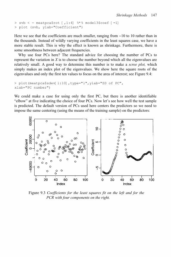
Shrinkage Methods 147
> svb < - meatpca$rot [,1:4] %*% mode13$coef [!1]
> plot (svb, ylab="Coefficient")
Here we see that the coefficients are much smaller, ranging from &10 to 10 rather than in the thousands. Instead of wildly varying coefficients in the least squares case, we have a more stable result. This is why the effect is known as shrinkage. Furthermore, there is some smoothness between adjacent frequencies.
Why use four PCs here? The standard advice for choosing the number of PCs to represent the variation in X is to choose the number beyond which all the eigenvalues are relatively small. A good way to determine this number is to make a scree plot, which simply makes an index plot of the eigenvalues. We show here the square roots of the eigenvalues and only the first ten values to focus on the area of interest; see Figure 9.4:
> plot(meatpca$sdev[l:10],type="l",ylab="SD of PC",
xlab="PC number")
We could make a case for using only the first PC, but there is another identifiable“elbow” at five indicating the choice of four PCs. Now let’s see how well the test sample is predicted. The default version of PCs used here centers the predictors so we need to impose the same centering (using the means of the training sample) on the predictors:
Figure 9.3 Coefficients for the least squares fit on the left and for the PCR with four components on the right.

148 Linear Models with R
Figure 9.4 Scree plot of the standard deviations of the first ten principalcomponents.
> mm < - apply (meatspec[1:172, !101], 2, mean)
> tx < - as.matrix (sweep (meatspec [173:215, !101], 2, mm))
We now form the four linear combinations determined by the first four eigenvectors andcompute the predicted values:
> nx < - tx %*% meatpca$rot[,1:4]
> pv < - cbind (l, nx) %*% mode13$coef
We find the RMSE to be:
> rmse (pv, meatspec$fat [173:215])
[1] 4.534
which is not at all impressive. It turns out that we can do better by using more PCs—wefigure out how many would give the best result on the test sample:
> rmsmeat < - numeric(50)
> for (i in 1:50) {
+ nx < - tx %*% meatpca$rot[,1:i]
+ mode13 < - lm (fat ˜ meatpca$x[,1:i] , meatspec[1:172,])
+ pv < - cbind (l, nx) %*% mode13$coef
+ rmsmeat [i] < - rmse(pv, meatspec$fat[173:215] )
+ } }
> plot (rmsmeat, ylab="Test RMS")
> which.min (rmsmeat)

Shrinkage Methods 149
[1] 27
> min (rmsmeat)
[1] 1.8549
The plot of the RMSE is seen in Figure 9.5. The best result occurs for 27 PCs for which the RMSE is far better than anything achieved thus far. Of course, in practice we would not have access to the test sample in advance and so we would not know to use 27 components. We could, of course, reserve part of our original dataset for testing. This is sometimes called a validation sample. This is a reasonable strategy, but the downside is that we lose this sample from our estimation which degrades its quality. Furthermore, there is the question of which and how many observations should go into the validation sample. We can avoid this dilemma with the use of crossvalidation (CV). We divide the data into m parts, equal (or close to) in size. For each part, we use the rest of the data as the training set and that part as the test set. We evaluate the criterion of interest, RMSE in this case. We repeat for each part and average the result.
The pls.pcr package can compute this CV. We center the training set X and divide the data into ten parts for the CV:
> library (pls.pcr)
> trainx < - as.matrix (sweep (meatspec [1:172,!101] , 2, mm))
> pcrg < – pcr(trainx,meatspec$fat[1:172] ,1:50,
validation="CV", grpsize=10)
> plot (pcrg$validat$RMS, ylab="CV RMS", xlab="No. of components")
Figure 9.5 RMS for the test sample on the left and RMS estimated using CV forvarying numbers of PCs on the right.
The crossvalidated estimates of the RMSE are shown in the right panel of Figure 9.5. The minimum occurs at 21 components. This gives an RMSE on the test sample, 2.21, that is close to the optimum.
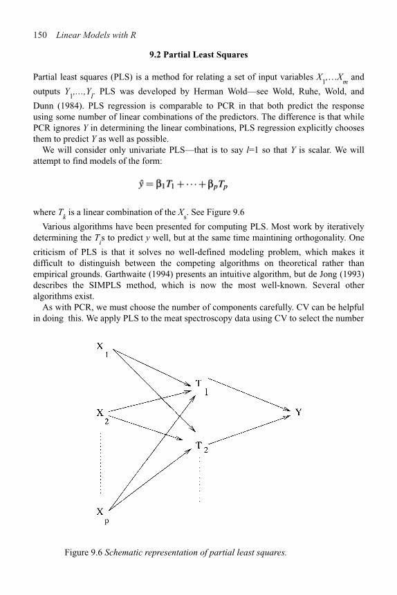
150 Linear Models with R
9.2 Partial Least Squares
Partial least squares (PLS) is a method for relating a set of input variables X1,…X
m and
outputs Y1,…,Y
l. PLS was developed by Herman Wold—see Wold, Ruhe, Wold, and
Dunn (1984). PLS regression is comparable to PCR in that both predict the response using some number of linear combinations of the predictors. The difference is that whilePCR ignores Y in determining the linear combinations, PLS regression explicitly choosesthem to predict Y as well as possible.
We will consider only univariate PLS—that is to say l=1 so that Y is scalar. We willattempt to find models of the form:
where Tk is a linear combination of the X
s. See Figure 9.6
Various algorithms have been presented for computing PLS. Most work by iterativelydetermining the T
is to predict y well, but at the same time maintining orthogonality. One
criticism of PLS is that it solves no well-defined modeling problem, which makes it difficult to distinguish between the competing algorithms on theoretical rather thanempirical grounds. Garthwaite (1994) presents an intuitive algorithm, but de Jong (1993)describes the SIMPLS method, which is now the most well-known. Several otheralgorithms exist.
As with PCR, we must choose the number of components carefully. CV can be helpfulin doing this. We apply PLS to the meat spectroscopy data using CV to select the number
Figure 9.6 Schematic representation of partial least squares.

Shrinkage Methods 151
of components. We center the predictors first and compute the PLS on all models up to size 50. We plot the linear combination used for a four-component model in the left panel of Figure 9.7. The crossvalidated estimates of the RMSE are shown in the right panel.
> trainx < - as.matrix (sweep (meatspec [1:172, –101], 2, mm))
> plsg < - pls(trainx,meatspec$fat[1:172] ,1:50,
validation="CV",grpsize=10)
> plot (plsg$training$B[ , , 4], ylab="Coefficient"
> plot (plsg$validat$RMS, ylab="CV RMS", xlab="No. of
components")
We see that the effective linear combination of the predictors in the four-component model is similar to the PCR indicating the shrinkage effect. As before, four components do not appear to be enough—we need around 14 components as suggested by the crossvalidated estimate of the RMSE. We need only half the number of components as PCR, which is expected since we are using information about the response. Note that the CV randomly divides the data into ten groups so if you repeat this calculation, you will not get exactly the same result.
Now we determine the performance on the training set for the 14–component model:
> ypred < - plsg$training$Ypred [,,14]
> rmse (ypred,meatspec$fat [1:172])
[1] 1.9528
which is similar to PCR, but now see how we do on the test set. Because the response is centered by PLS we need to add the mean response for the training set back in. We also need to center the test set:
Figure 9.7 Coefficients of X for a four-component PLS model are shown on the left. Estimated CV error is shown on the right.

152 Linear Models with R
> testx < - as.matrix (sweep (meatspec [173:215,!101], 2, mm))
> plsbeta < - plsg$training$B[,,14]
> ytpred < - testx %*% plsbeta + mean(meatspec$fat[1:172])
> rmse (ytpred,meatspec$f at [173:215] )
[1] 2.0112
which is slightly better than the 2.21 achieved by PCR.We have not checked any diagnostics in this analysis. PLS and PCR are just as
sensitive to assumptions as OLS so these are still mandatory in any full analysis.
PCR and PLS comparedPCR and PLS have the biggest advantage over OLS when there are large numbers ofvariables relative to the number of cases. They do not even require that n$p. PCRattempts to find linear combinations of the predictors that explain most of the variation inthese predictors using just a few components. The purpose is dimension reduction.Because the PCs can be linear combinations of all the predictors, the number of variablesused is not always reduced. Because the PCs are selected using only the X-matrix and notthe response, there is no definite guarantee that the PCR will predict the responseparticularly well, although it turns out that way. If it happens that we can interpret thePCs in a meaningful way, we may achieve a much simpler explanation of the response.Thus PCR is geared more towards explanation than prediction.
In contrast, PLS finds linear combinations of the predictors that best explain theresponse. It is most effective when there are large numbers of variables to be considered.If successful, the variability of prediction is substantially reduced. On the other hand,PLS is virtually useless for explanation purposes.
9.3 Ridge Regression
Ridge regression makes the assumption that the regression coefficients (afternormalization) are not likely to be very large. The idea of shrinkage is thereforeembedded in the method. It is appropriate for use when the design matrix is collinear andthe usual least squares estimates of ! appear to be unstable.
Suppose that the predictors have been centered by their means and scaled by theirstandard deviations and that the response has been centered. The ridge regressionestimates of !s are then given by:
The use of ridge regression can be motivated in two ways. Suppose we take a Bayesianpoint of view and put a prior (multivariate normal) distribution on ! that expresses thebelief that smaller values of ! are more likely than larger ones. Large values of $correspond to a belief that the ! are really quite small whereas smaller values of $correspond to a more relaxed belief about !. This is illustrated in Figure 9.8.

Shrinkage Methods 153
Figure 9.8 Ridge regression illustrated. The least squares estimate is at the center of the ellipse while the ridge regression is the point on the ellipse closest to the origin. The ellipse is a contour of equal density of the posterior probability, which in this case will be comparable to a confidence ellipse. % controls the size of the ellipse—the larger % is, the larger the ellipse will be.
Another way of looking at it is to suppose we place some upper bound on !T! and then compute the least squares estimate of ! subject to this restriction. Use of Lagrange multipliers leads to ridge regression. The choice of $ corresponds to the choice of an upper bound in this formulation.
$ may be chosen by automatic methods, but it is also safer to plot the values of as afunction of $. You should pick the smallest value of $ that produces stable estimates of !
We demonstrate the method on the meat spectroscopy data; $=0 corresponds to least
squares while we find that as
> library (MASS)
> yc < - meatspec$fat[1:172]-mean(meatspec$fat[1:172])
> gridge < - lm.ridge (yc ˜ trainx, lambda =
seq(0,5e!8,le–9))
> matplot (gridge$lambda, t(gridge$coef), type="l",lty=1,
xlab=expression (lambda), ylab=expression (hat (beta)))
Some experimentation was necessary to determine the appropriate range of $. The ridge trace plot is shown in Figure 9.9.

154 Linear Models with R
Figure 9.9 Ridge trace plot for the meat spectroscopy data. The gener-alized crossvalidation choice of % is shown as a vertical line.
Various automatic selections for $ are available:
> select (gridge)
modified HKB estimator is 1.0583e–08
modified L–W estimator is 0.70969
smallest value of GCV at 1.8e–08
> abline (v=l.8e–8)
We will use the generalized crossvalidation (GCV) estimate of 1.8e–8. First, we computethe training sample performance. This ridge regression both centers and scales thepredictors, so we need to do the same in computing the fit. Furthermore, we need to addback in the mean of the response because of the centering:
> which.min (gridge$GCV)
1.8e–08
19
> ypredg < - scale (trainx, center=FALSE,
scale=gridge$scales)
%*% gridge$coef [, 19] + mean(meatspec$fat[1:172])
> rmse(ypredg,meatspec$fat[1:172])
[1] 0.80454
which is comparable to the above, but for the test sample we find:
> ytpredg < - scale (testx, center=FALSE, scale=gridge$scales)
%*% gridge$coef [, 19] + mean(meatspec$fat[1:172])
> rmse (ytpredg, meatspec$fat[173:215])
[1] 4.0966

Shrinkage Methods 155
which is dismayingly poor. However, a closer examination of the predictions reveals that just one of the ridge predictions is bad:
> c (ytpredg [13], ytpred [13], meatspec$fat [172+13] )
185 185
11.188 35.690 34.800
The PLS prediction (second) is close to the truth (third), but the ridge prediction is bad. If we remove this case:
> rmse (ytpredg[!13], meatspec$fat[173:215] [!13])
[1] 1.9765
we get a good result.Ridge regression estimates of coefficients are biased. Bias is undesirable, but it is not
the only consideration. The mean-squared error (MSE) can be decomposed in the following way:
Thus the MSE of an estimate can be represented as the square of the bias plus the variance. Sometimes a large reduction in the variance may be obtained at the price of an increase in the bias. If the MSE is reduced as a consequence, then we may be willing to accept some bias. This is the trade-off that ridge regression makes—a reduction in variance at the price of an increase in bias. This is a common dilemma.
Frank and Friedman (1993) compared PCR, PLS and ridge regression and found the best results for ridge regression. Of course, for any given dataset any of the methods may prove to be the best, so picking a winner is difficult.
Exercises
1. Using the seatpos data, perform a PCR analysis with hipcenter as the response and HtShoes, Ht, Seated, Arm, Thigh and Leg as predictors. Select an appropriate number of components and give an interpretation to those you choose. Add Age and Weight as predictors and repeat the analysis. Use both models to predict the response for predictors taking these values:
Age Weight HtShoes Ht Seated
64.800 263.700 181.080 178.560 91.440
Arm Thigh Leg
35.640 40.950 38.790
2. Fit a PLS model to the seatpos data with hipcenter as the response and all other variables as predictors. Take care to select an appropriate number of components. Use the model to predict the response at the values of the predictors specified in the first question.

156 Linear Models with R
3. Fit a ridge regression model to the seatpos data with hipcenter as the response and allother variables as predictors. Take care to select an appropriate amount of shrinkage.Use the model to predict the response at the values of the predictors specified in thefirst question.
4. Take the bodyfat at data, and use the percentage of body fat as the response and theother variables as potential predictors. Remove every tenth observation from the datafor use as a test sample. Use the remaining data as a training sample building thefollowing models:
(a) Linear regression with all predictors(b) Linear regression with variables selected using AIC(c) Principal component regression(d) Partial least squares(e) Ridge regression
Use the models you find to predict the response in the test sample. Make a report onthe performance of the models.

CHAPTER 10Statistical Strategy and Model Uncertainty
10.1 Strategy
Thus far we have learned various tactics:
1. Diagnostics: Checking of assumptions—constant variance, linearity, normality,outliers, influential points, serial correlation and collinearity
2. Transformation: Transforming the response—Box-Cox, transforming the predictors—splines and polynomial regression
3. Variable selection: Testing- and criterion-based methods
In what order should these be done? Should procedures be repeated at later stages? Whenshould we stop? There are no definite answers to these questions. If the reader insists, Iwould recommend Diagnostics → Transformation → Variable Selection → Diagnostics asa rudimentary strategy. However, regression analysis is a search for structure in data andthere are no hard-and-fast rules about how it should be done. Regression analysis requiressome skill. You must be alert to unexpected structure in the data. Thus far, no one hasimplemented a computer program for conducting a complete analysis. Because of thedifficulties in automating the assessment of regression graphics in an intelligent manner, Ido not expect that this will be accomplished soon. The human analyst has the ability toassess plots in light of contextual information about the data.
There is a danger of doing too much analysis. The more transformations andpermutations of leaving out influential points you do, the better fitting model you willfind. Torture the data long enough, and sooner or later it will confess. Remember thatfitting the data well is no guarantee of good predictive performance or that the model is agood representation of the underlying population. So:
1. Avoid complex models for small datasets.2. Try to obtain new data to validate your proposed model. Some people set aside some
of their existing data for this purpose.3. Use past experience with similar data to guide the choice of model.
Data analysis is not an automatic process. Analysts have personal preferences in theirchoices of methodology, use software with varying capabilities and will interpret thesame graphical display differently. In comparing the competing analyses of twostatisticians, it may sometimes be possible to determine that one analysis is clearlysuperior. However, in most cases, particularly when the analysts are experienced, auniversally acceptable judgment of superiority will not be possible.
The same data may support different models. Conclusions drawn from the models maydiffer quantitatively and qualitatively. However, except for those well-known datasetsthat circulate endlessly through textbooks and research articles, most data are onlyanalyzed once. The analyst may be unaware that a second independent look at the datamay result in quite different conclusions. We call this problem model multiplicity. In thenext section, we describe an experiment illustrating the depth of this problem.

158 Linear Models with R
10.2 An Experiment in Model Building
In 1996, I taught a semester length masters level course in applied regression analysis to28 students. Towards the end of the semester, I decided to set an assignment to test thestudents’ ability in building a regression model for the purposes of prediction. I generatedregression data with a response y and five uncorrelated predictors and n=50 from a modelknown only to me, which was:
where x1
~ U (0, 1), x
2 ~ N (0, 1), 1/x
3 ~ U (0, 1), x
4 ~ N (1, 1), x
5 ~ U (1, 3) and " ~ N (0, 1).
I asked students to predict the mean response at ten values of the predictors that Ispecified. I also asked them to provide a standard error for each of their predictions. Thestudents understood and were reminded of the distinction between the standard error forthe mean response and for a future observed value. The students were told that their scoreon the assignment would depend only on the closeness of their predicted values and thetrue values and on how closely their standard errors reflected the difference betweenthese two quantities. Students were told to work independently.
For a given student’s input, let pi be his or her prediction, t
i be the true value and s
i be
the standard error where i=1,…, 10. To assess his or her prediction accuracy, I used:
whereas to measure the “honesty” of their standard errors, I used:
We would expect the predicted value to differ from the true value by typically about onestandard error if the latter has been correctly estimated. Therefore, the measure ofstandard error honesty should be around one:
1.12 1.20 1.46 1.46 1.54 1.62 1.69
1.69 1.79 3.14 4.03 4.61 5.04 5.06
5.13 5.60 5.76 5.76 5.94 6.25 6.53
6.53 6.69 10.20 34.45 65.53 674.98 37285.95
Table 10.1 Measures of prediction accuracy for 28 students in ascending order of magnitude.

Statistical Strategy and Model Uncertainty 159
The prediction accuracy scores for the 28 students are shown in Table 10.1. We see that one student did very poorly. An examination of his or her model and some conversation revealed that this student neglected to back transform predictions to the original scale when using a model with a transform on the response. Three pairs of scores are identical in the table, but an examination of the models used and more significant digits revealed that only one pair was due to the students using the same model. This pair of students were known associates. Thus 27 different models were found by 28 students.
The scores for honesty of standard errors are shown in Table 10.2. The order in which scores are shown correspond to that given in Table 10.1:
0.75 7.87 6.71 0.59 4.77 8.20 11.74
10.70 1.04 17.10 3.23 14.10 84.86 15.52
80.63 17.61 14.02 14.02 13.35 16.77 12.15
12.15 12.03 68.89 101.36 18.12 2.24 40.08
Table 10.2 Honesty of standard errors—order of scores corresponds to that in Table 10.1.
We see that the students’ standard errors were typically around an order of magnitude smaller than they should have been.
10.3 Discussion
Why was there so much model multiplicity? The students were all in the same class and used the same software, but almost everyone chose a different model. The course covered many of the commonly understood techniques for variable selection, transformation and diagnostics including outlier and influential point detection. The students were confronted with the problem of selecting the order in which to apply these methods and choosing from several competing methods for a given purpose.
The reason the models were so different was that students applied the various methods in different orders. Some did variable selection before transformation and others, the reverse. Some repeated a method after the model was changed and others did not. I went over the strategies that several of the students used and could not find anything clearly wrong with what they had done. One student made a mistake in computing his or her predicted values, but there was nothing obviously wrong in the remainder. The performance on this assignment did not show any relationship with that in the exams.
The implications for statistical practice are serious. Often a dataset is analyzed by a single analyst who comes up with a single model. Predictions and inferences are based on this single model. The analyst may be unaware that the data support quite different models which may lead to very different conclusions. Clearly one will not always have a stable of 28 independent analysts to search for alternatives, but it does point to the value of a second or third independent analysis. It may also be possible to automate the components of the analysis to some extent as in Faraway (1994) to see whether changes in the order of analysis might result in a different model.

160 Linear Models with R
Another issue is raised by the standard error results. Often we use the data to help determinethe model. Once a model is built or selected, inferences and predictions may be made. Usuallyinferences are based on the assumption that the selected model was fixed in advance andso only reflect uncertainty concerning the parameters of that model. Students took that approachhere. Because the uncertainty concerning the model itself is not allowed for, these infer-ences tend to be overly optimistic leading to unrealistically small standard errors. Meth-ods for realistic inference when the data are used to select the model have come under theheading of Model Uncertainty—see Chatfield (1995) for a review. The effects of modeluncertainty often overshadow the parametric uncertainty and the standard errors need to beinflated to reflect this. Faraway (1992) developed a bootstrap approach to compute thesestandard errors while Draper (1995) is an example of a Bayesian approach. These meth-ods are a step in the right direction in that they reflect the uncertainty in model selection.Nevertheless, they do not address the problem of model multiplicity since they proscribe aparticular method of analysis that does not allow for differences between human analysts.
Sometimes the data speak with a clear and unanimous voice—the conclusions are in-contestable. Other times, differing conclusions may be drawn depending on the model chosen.We should acknowledge the possibility of alternative conflicting models and seek them.

CHAPTER 11Insurance Redlining—A Complete Example
In this chapter, we present a relatively complete data analysis. The example is interesting because it illustrates several of the ambiguities and difficulties encountered in statistical practice.
Insurance redlining refers to the practice of refusing to issue insurance to certain types of people or within some geographic area. The name comes from the act of drawing a red line around an area on a map. Now few would quibble with an insurance company refusing to sell auto insurance to a frequent drunk driver, but other forms of discrimination would be unacceptable.
In the late 1970s, the U.S. Commission on Civil Rights examined charges by several Chicago community organizations that insurance companies were redlining their neighborhoods. Because comprehensive information about individuals being refused homeowners insurance was not available, the number of FAIR plan policies written and renewed in Chicago by zip code for the months of December 1977 through May 1978 was recorded. The FAIR plan was offered by the city of Chicago as a default policy to homeowners who had been rejected by the voluntary market. Information on other variables that might affect insurance writing such as fire and theft rates were also collected at the zip code level. The variables are: race racial composition in percentage of minority fire fires per 100 housing units theft theft per 1000 population age percentage of housing units built before 1939 involact new FAIR plan policies and renewals per 100 housing units income median family income in thousands of dollars side North or South Side of Chicago
The data come from Andrews and Herzberg (1985) where more details of the variables and the background are provided.
11.1 Ecological Correlation
Notice that we do not know the race of those denied insurance. We only know the racial composition in the corresponding zip code. This is an important difficulty that needs to be considered before starting the analysis.
When data are collected at the group level, we may observe a correlation between two variables. The ecological fallacy is concluding that the same correlation holds at the indi-vidual level. For example, in countries with higher fat intakes in the diet, higher rates of breast cancer have been observed. Does this imply that individuals with high fat intakes are at a higher risk of breast cancer? Not necessarily. Relationships seen in observational data are subject to confounding, but even if this is allowed for, bias is caused by aggregating data. We consider an example taken from U.S. demographic data:
> data (eco)

162 Linear Models with R
> plot (income ˜ usborn, data=eco, xlab="Proportion US born",
ylab="Mean Annual Income")
In the first panel of Figure 11.1, we see the relationship between 1998 per capita income dollarsfrom all sources and the proportion of legal state residents born in the United States in 1990for each of the 50 states plus the District of Columbia (D.C.). We can see a clear negativecorrelation.
Figure 11.1 1998 annual per capita income and proportion U.S. born for 50 states plus D. C. The plot on the right shows the same dataas on the left, but with an extended scale and the least squares fitshown.
We can fit a regression line and show the fitted line on an extended range:
> g < - lm (income ˜ usborn, eco) >
summary (g)
Coefficients:
Estimate Std.Error t value Pr(>|t|)
(Intercept) 68642 8739 7.85 3.2e–10
usborn !46019 9279 !4.96 8.9e–06
Residual standard error: 3490 on 49 degrees of freedom
Multiple R-Squared: 0.334, Adjusted R-squared: 0.321 F-
statistic: 24.6 on 1 and 49 DF, p-value: 8.891e–06
> plot (income ˜ usborn, data=eco, xlab="Proportion US born",
ylab="Mean Annual Income", xlim=c (0, 1), ylim=c(15000,
70000), xaxs="i")
> abline (coef (g) )
We see that there is a clear statistically significant relationship between the per capitaannual income and the proportion who are U.S. born. What does this say about the

Insurance Redlining—A Complete Example 163
average annual income of people who are U.S. born and those who are naturalized citizens? If we substitute usborn=l into the regression equation, we get 68642&460190=$22,623, while if we put usborn=0, we get $68,642. This suggests that on average, naturalized citizens earn three times more than U.S. born citizens. In truth, information from the U.S. Bureau of the Census indicates that U.S. born citizens have an average income just slightly larger than naturalized citizens. What went wrong with our analysis?
The ecological inference from the aggregate data to the individuals requires an assumption of constancy. Explicitly, the assumption would be that the incomes of the native born do not depend on the proportion of native born within the state (and similarly for naturalized citizens). This assumption is unreasonable for these data because immigrants are naturally attracted to wealthier states.
This assumption is also relevant to the analysis of the Chicago Insurance data since we have only aggregate data. We must keep in mind that the results for the aggregated data may not hold true at the individual level.
11.2 Initial Data Analysis
Start by reading the data in and examining it:
> data (chredlin)
> chredlin
race fire theft age involact income side
60626 10.0 6.2 29 60.4 0.0 11.744 n
60640 22.2 9.5 44 76.5 0.1 9.323 n
…etc…
60645 3.1 4.9 27 46.6 0.0 3.731 n
Summarize:
> summary (chredlin)
race fire theft age
Min. : 1.00 Min. : 2.00 Min. : 3.0 Min. : 2.0
1st Qu.: 3.75 1st Qu.: 5.65 1st Qu.: 22.0 1st Qu.:48.6
Median :24.50 Median :10.40 Median : 29.0 Median :65.0
Mean :34.99 Mean :12.28 Mean : 32.0 Mean :60.3
3rd Qu.:57.65 3rd Qu.:16.05 3rd Qu.: 38.0 3rd Qu.:77.3
Max. :99.70 Max. :39.70 Max. :147.0 Max. :90.1
involact incoome side
Min. :0.000 Min. : 5.58 n:25
1st Qu.:0.000 1st Qu.: 8.45 s:22
Median :0.400 Median : 10.69
Mean : 0.615 Mean :10.70
3rd Qu.: 0.900 3rd Qu.:11.99
Max. : 2.200 Max. :21.48
We see that there is a wide range in the race variable, with some zip codes almost entirely minority or nonminority. This is good for our analysis since it will reduce the variation in

164 Linear Models with R
the regression coefficient for race, allowing us to assess this effect more accurately. If allthe zip codes were homogeneous, we would never be able to discover an effect fromthese aggregated data. We also note some skewness in the theft and income variables.The response involact has a large number of zeros. This is not good for the assumptionsof the linear model but we have little choice but to proceed. We will not use theinformation about North vs. South Side until later. Now make some graphical summaries:
> par(mfrow=c (2, 3))
> for (i in 1:6) stripchart (chredlin [, i], main=names
(chredlin) [i] vertical=TRUE,method="jitter")
> par(mfrow=c (1, 1))
> pairs (chredlin)
The strip plots are seen in Figure 11.2. Jittering has been added to avoid overplotting ofsymbols. Now look at the relationship between involact and race:
Figure 11.2 Strip plots of the Chicago Insurance data.
> summary (1m (involact race, chredlin)
Coefficients:
Estimate Std. Error t value Pr(>|t|)
(Intercept) 0.12922 0.09661 1.34 0.19
race 0.01388 0.00203 6.84 1.8e–08
Residual standard error: 0.449 on 45 degrees of freedom
Multiple R-Squared: 0.509, Adjusted R-squared: 0.499
F-statistic: 46.7 on 1 and 45 DF, p-value: 1.78e–08
We can clearly see that homeowners in zip codes with a high percentage of minorities aretaking the default FAIR plan insurance at a higher rate than other zip codes. That is not in

Insurance Redlining—A Complete Example 165
doubt. However, can the insurance companies claim that the discrepancy is due to greater risks in some zip codes? The insurance companies could claim that they were denying insurance in neighborhoods where they had sustained large fire-related losses and any discriminatory effect was a by-product of legitimate business practice. We plot some of the variables involved by this question in Figure 11.3:
> plot (involact ˜ race, chredlin)
> abline (1m (involact ˜ race, chredlin))
> plot (fire ˜ race, chredlin)
> abline (1m (fire ˜ race, chredlin))
Figure 11.3 Relationship between fire, race and involact in the Chicago data.
The question of which variables should also be included in the regression so that their effect may be adjusted for is difficult. Statistically, we can do it, but the important question is whether it should be done at all. For example, it is known that the incomes of women in the United States and other countries are generally lower than those of men. However, if one adjusts for various factors such as type of job and length of service, this gender difference is reduced or can even disappear. The controversy is not statistical but political—should these factors be used to make the adjustment?
For the present data, suppose that the effect of adjusting for income differences was to remove the race effect. This would pose an interesting, but nonstatistical question. I have chosen to include the income variable in the analysis just to see what happens.
I have decided to use log (income) partly because of skewness in this variable, but also because income is better considered on a multiplicative rather than additive scale. In other words, $1,000 is worth a lot more to a poor person than a millionaire because $1,000 is a much greater fraction of the poor person’s wealth.
11.3 Initial Model and Diagnostics
We start with the full model:
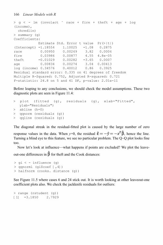
166 Linear Models with R
> g < - lm (involact ˜ race + fire + theft + age + log
(income),
chredlin)
> summary (g)
Coefficients:
Estimate Std. Error t value Pr(>|t|)
(Intercept) !1.18554 1.10025 !1.08 0.2875
race 0.00950 0.00249 3.82 0.0004
fire 0.03986 0.00877 4.55 4.8e–05
theft !0.01029 0.00282 !3.65 0.0007
age 0.00834 0.00274 3.04 0.00413
log (income) 0.34576 0.40012 0.86 0.3925
Residual standard error: 0.335 on 41 degrees of freedom
Multiple R-Squared: 0.752, Adjusted R-squared: 0.721
F-statistic: 24.8 on 5 and 41 DF, p-value: 2.01e-11
Before leaping to any conclusions, we should check the model assumptions. These twodiagnostic plots are seen in Figure 11.4:
> plot (fitted (g), residuals (g), xlab="Fitted",
ylab="Residuals")
> abline (h=0)
> qqnorm (residuals (g))
> qqline (residuals (g))
The diagonal streak in the residual-fitted plot is caused by the large number of zero
response values in the data. When y=0, the residual , hence the line.Turning a blind eye to this feature, we see no particular problem. The Q–Q plot looks finetoo.
Now let’s look at influence—what happens if points are excluded? We plot the leave-
out-one differences in for theft and the Cook distances:
> gi < - influence (g)
> qqnorml (gi$coef [,4])
> halfnorm (cooks. distance (g))
See Figure 11.5 where cases 6 and 24 stick out. It is worth looking at other leaveout-onecoefficient plots also. We check the jackknife residuals for outliers:
> range (rstudent (g))
[1] !3.1850 2.7929

Insurance Redlining—A Complete Example 167
Figure 11.4 Diagnostic plots of the initial model for the Chicago Insurance data.
Figure 11.5 A Q–Q plot of the leave-out-one coefficient differences for the theft variable is shown on the left. A half-normal plot of the Cook distances is shown on the right.
There is nothing extreme enough to call an outlier. Let’s take a look at the two cases:
> chredlin [c (6, 24), ]
race fire theft age involact income side
60610 54.0 34.1 68 52.6 0.3 8.231 n
60607 50.2 39.7 147 83.0 0.9 7.459 n
These are high theft and fire zip codes. See what happens when we exclude these points:
> g < - lm (involact ˜ race + fire + theft + age + log
(income), chredlin, subset=!c(6, 24))

168 Linear Models with R
> summary (g)
Coefficients:
Estimate Std. Error t value Pr(>|t|)
(Intercept) !0.57674 1.08005 !0.53 0.59
race 0.00705 0.00270 2.62 0.03
fire 0.04965 0.00857 5.79 1e–06
theft !0.00643 0.00435 !1.48 0.14
age 0.00517 0.00289 1.79 0.08
log(income) 0.11570 0.40111 0.29 0.77
Residual standard error: 0.303 on 39 degrees of freedom
Multiple R-Squared: 0.804, Adjusted R-squared: 0.779
F-statistic: 32 on 5 and 39 DF, p-value: 8.2e–13
theft and age are no longer significant at the 5% level.
11.4 Transformation and Variable Selection
We now look for transformations. We try some partial residual plots as seen in Figure11.6:
> prplot (g, 1)
> prplot (g, 2)
These plots indicate no need to transform. It would have been inconvenient to transformthe race variable since that would have made interpretation more difficult. Fortunately,we do not need to worry about this. We examined the other partial residual plots andexperimented with polynomials for the predictors. No transformation of the predictorsappears to be worthwhile.
We choose to avoid even considering a transformation of the response. The zeros in theresponse would have restricted the possibilities and furthermore would have madeinterpretation more difficult.
We now move on to variable selection. We are not so much interested in picking onemodel here because we are mostly interested in the dependency of involact on the race
variable. So is the estimate we want to focus on. The problem is that collinearity with
the other variables may cause to vary substantially depending on what other variablesare in the model. We address this question here. We leave out the two influential points andforce race to be included in every model. We do this because race is the primary predictorof interest in this model and we want to measure its effect. We are not prejudging whether it issignificant or not—we will check that later:
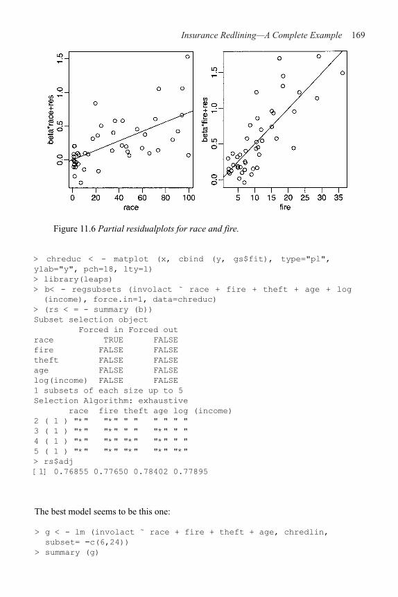
Insurance Redlining—A Complete Example 169
Figure 11.6 Partial residualplots for race and fire.
> chreduc < - matplot (x, cbind (y, gs$fit), type="pl",
ylab="y", pch=18, lty=l)
> library(leaps)
> b< - regsubsets (involact ˜ race + fire + theft + age + log
(income), force.in=1, data=chreduc)
> (rs < = - summary (b))
Subset selection object
Forced in Forced out
race TRUE FALSE
fire FALSE FALSE
theft FALSE FALSE
age FALSE FALSE
log(income) FALSE FALSE
1 subsets of each size up to 5
Selection Algorithm: exhaustive
race fire theft age log (income)
2 ( 1 ) "*" "*" " " " " " "
3 ( 1 ) "*" "*" " " "*" " "
4 ( 1 ) "*" "*" "*" "*" " "
5 ( 1 ) "*" "*" "*" "*" "*"
> rs$adj
[1] 0.76855 0.77650 0.78402 0.77895
The best model seems to be this one:
> g < - lm (involact ˜ race + fire + theft + age, chredlin,
subset= !c(6,24))
> summary (g)

170 Linear Models with R
Coefficients:
Estimate Std. Error t value Pr(>|t|)
(Intercept) !0.26787 0.13967 !1.92 0.0623
race 0.00649 0.00184 3.53 0.0011
fire 0.04906 0.00823 5.96 5.3e–07
theft !0.00581 0.00373 !1.56 0.1271
age 0.00469 0.00233 2.01 0.0514
Residual standard error: 0.3 on 40 degrees of freedom
Multiple R-Squared: 0.804, Adjusted R-squared: 0.784
F-statistic: 40.9 on 4 and 40 DF, p-value: 1.24e–13
The fire rate is significant and actually has higher t-statistics; but nevertheless, we have verifiedthat there is a positive relationship between involact and race while controlling for a selectionof the other variables. Even so we must consider the reliability of this conclusion. For ex-ample, would other analysts have come to the same conclusion? One alternative model is:
> galt < - lm (involact ˜ race+fire+log (income), chredlin,
subset= - c(6, 24))
> summary (galt) Coefficients:
Estimate Std. Error t value Pr(>|t|)
(Intercept) 0.75326 0.83588 0.90 0.373
race 0.00421 0.00228 1.85 0.072
fire 0.05102 0.00845 6.04 3.8e–07
log(income) !0.36238 0.31916 !1.14 0.263
Residual standard error: 0.309 on 41 degrees of freedom
Multiple R-Squared: 0.786, Adjusted R-squared: 0.77
F-statistic: 50.1 on 3 and 41 DF, p-value: 8.87e–14
In this model, we see that race is not statistically significant. The previous model did fitslightly better, but it is important that there exists a reasonable model in which race is notsignificant since, although the evidence seems fairly strong in favor of a race effect, it isnot entirely conclusive. Interestingly enough, if log (income) is now dropped:
> galt < - lm (involact ˜ race+fire, chredlin, subset= !c (6, 24))
> summary (galt)
Coefficients:
Estimate Std. Error t value Pr(>|t|)
(Intercept) !0.19132 0.08152 !2.35 0.0237
race 0.00571 0.00186 3.08 0.0037
fire 0.05466 0.00784 6.97 1.6e–08
Residual standard error: 0.31 on 42 degrees of freedom
Multiple R-Squared: 0.779, Adjusted R-squared: 0.769
F-statistic: 74.1 on 2 and 42 DF, p-value: 1.70e–14
we find race again becomes significant, which raises again the question of whetherincome should be adjusted for since it makes all the difference here.
We now return to the two left-out cases. Observe the difference in the fit when the twoare reincluded on the best model. The quantities may change but the qualitative message
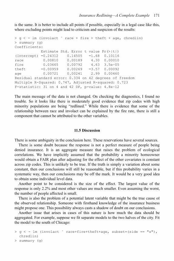
Insurance Redlining—A Complete Example 171
is the same. It is better to include all points if possible, especially in a legal case like this, where excluding points might lead to criticism and suspicion of the results:
> g < - lm (involact ˜ race + fire + theft + age, chredlin)
> summary (g)
Coefficients:
Estimate Std. Error t value Pr(>|t|)
(Intercept) !0.24312 0.14505 !1.68 0.10116
race 0.00810 0.00189 4.30 0.00010
fire 0.03665 0.00792 4.63 3.5e–05
theft !0.00959 0.00269 !3.57 0.00092
age 0.00721 0.00241 2.99 0.00460
Residual standard error: 0.334 on 42 degrees of freedom
Multiple R-Squared: 0.747, Adjusted R-squared: 0.723
F-statistic: 31 on 4 and 42 DF, p-value: 4.8e–12
The main message of the data is not changed. On checking the diagnostics, I found no trouble. So it looks like there is moderately good evidence that zip codes with high minority populations are being “redlined.” While there is evidence that some of the relationship between race and involact can be explained by the fire rate, there is still a component that cannot be attributed to the other variables.
11.5 Discussion
There is some ambiguity in the conclusion here. These reservations have several sources.There is some doubt because the response is not a perfect measure of people being
denied insurance. It is an aggregate measure that raises the problem of ecological correlations. We have implicitly assumed that the probability a minority homeowner would obtain a FAIR plan after adjusting for the effect of the other covariates is constant across zip codes. This is unlikely to be true. If the truth is simply a variation about some constant, then our conclusions will still be reasonable, but if this probability varies in a systematic way, then our conclusions may be off the mark. It would be a very good idea to obtain some individual level data.
Another point to be considered is the size of the effect. The largest value of the response is only 2.2% and most other values are much smaller. Even assuming the worst, the number of people affected is small.
There is also the problem of a potential latent variable that might be the true cause of the observed relationship. Someone with firsthand knowledge of the insurance business might propose one. This possibility always casts a shadow of doubt on our conclusions.
Another issue that arises in cases of this nature is how much the data should be aggregated. For example, suppose we fit separate models to the two halves of the city. Fit the model to the south of Chicago:
> g < - lm (involact ˜ race+fire+theft+age, subset=(side == "s"),
chredlin)
> summary (g)

172 Linear Models with R
Coefficients:
Estimate Std. Error t value Pr(>|t|)
(Intercept) !0.23441 0.23774 !0.99 0.338
race 0.00595 0.00328 1.81 0.087
fire 0.04839 0.01689 2.87 0.011
theft !0.00664 0.00844 !0.79 0.442
age 0.00501 0.00505 0.99 0.335
Residual standard error: 0.351 on 17 degrees of freedom
Multiple R-Squared: 0.743, Adjusted R-squared: 0.683
F-statistic: 12.3 on 4 and 17 DF, p-value: 6.97e–05
and now to the north:
> g < - lm (involact ˜ race+fire+theft+age, subset=(side == "n"),
chredlin)
> summary (g)
Coefficients:
Estimate Std. Error t value Pr(>|t|)
(Intercept) !0.31857 0.22702 !1.40 0.176
race 0.01256 0.00448 2.81 0.011
fire 0.02313 0.01398 1.65 0.114
theft !0.00758 0.00366 !2.07 0.052
age 0.00820 0.00346 2.37 0.028
Residual standard error: 0.343 on 20 degrees of freedom
Multiple R-Squared: 0.756, Adjusted R-squared: 0.707
F-statistic: 15.5 on 4 and 20 DF, p-value: 6.52e-06
We see that race is significant in the north, but not in the south. By dividing the data intosmaller and smaller subsets it is possible to dilute the significance of any predictor. Onthe other hand, it is important not to aggregate all data without regard to whether it isreasonable. Clearly a judgment has to be made and this can be a point of contention inlegal cases.
There are some special difficulties in presenting this during a court case. Withscientific inquiries, there is always room for uncertainty and subtlety in presenting theresults, particularly if the subject matter is not contentious. In an adversarial proceeding,it is difficult to present statistical evidence when the outcome is not clearcut, as in thisexample. There are particular difficulties in explaining such evidence tononmathematically trained people.
After all this analysis, the reader may be feeling somewhat dissatisfied. It seems we areunable to come to any truly definite conclusions and everything we say has been hedgedwith “ifs” and “buts.” Winston Churchill once said:
Indeed, it has been said that democracy is the worst form of Government exceptall those other forms that have been tried from time to time.
We might say the same about statistics with respect to how it helps us reason in the faceof uncertainty. It is not entirely satisfying but the alternatives are worse.

CHAPTER 12 Missing Data
Missing data occur when some values of some cases are missing. This is not uncommon. Dealing with missing data is time consuming. Fixing up problems caused by missing data sometimes takes longer than the analysis.
What can be done? Obviously, finding the missing values is the best option, but this is not always possible. Next, ask why the data are missing. If the reason an observation is missing is noninformative, then a fix is easier. For example, if a data point is missed because it was large in value, then this could cause some bias and a simple fix is not possible. Patients may drop out of a drug study, because they believe their treatment is not working—this would cause bias.
Here are several fix-up methods to use when data are missing for noninformative reasons:
1. Delete the case with missing observations. This is OK if this only causes the loss of a relatively small number of cases. This is the simplest solution.
2. Fill in or impute the missing values. Use the rest of the data to predict the missing values. Simply replacing the missing value of a predictor with the average value of that predictor is one easy method. Using regression on the other predictors is another possibility. It is not clear how much the diagnostics and inference on the filled-in dataset are affected. Some additional uncertainty is caused by the imputation, which needs to be taken into account. Multiple imputation can capture some of this uncertainty.
3. Consider just (xi, y
i) pairs with some observations missing. The means and SDs of x
and y can be used in the estimate even when a member of a pair is missing. An analogous method is available for regression problems. This is called the missing value correlation method.
4. Maximum likelihood methods can be used assuming the multivariate normality of the data. The EM algorithm is often used here. We will not explain the details, but the idea is essentially to treat missing values as nuisance parameters.
Suppose some of the values in the Chicago Insurance dataset were missing. I randomly declared some of the observations missing in this modified dataset. Read it in and take a look:
> data (chmiss)
> chmiss
race fire theft age involact income
60626 10.0 6.2 29 60.4 NA 11.744
60640 22.2 9.5 44 76.5 0.1 9.323
60613 19.6 10.5 36 NA 1.2 9.948
60657 17.3 7.7 37 NA 0.5 10.656
…etc…
60645 3.1 4.9 27 NA 0.0 13.731

174 Linear Models with R
There are 20 missing observations denoted by NA here. It is important to know what themissing value code is for the data and/or software you are using. See what happens if wetry to fit the model:
> g < - lm (involact ˜ .,chmiss)
> summary (g)
Coefficients:
Estimate Std. Error t value Pr(>|t|)
(Intercept) !1.11648 0.60576 !1.84 0.07947
race 0.01049 0.00313 3.35 0.00302
fire 0.04388 0.01032 4.25 0.00036
theft !0.01722 0.00590 !2.92 0.00822
age 0.00938 0.00349 2.68 0.01390
income 0.06870 0.04216 1.63 0.11808
Residual standard error: 0.338 on 21 degrees of freedom
Multiple R-Squared: 0.791, Adjusted R-squared: 0.741
F-statistic: 15.91 on 5 and 21 DF, p-value: 1.594e–06
Any case with at least one missing value is omitted from the regression. Differentstatistical packages have different ways of handling missing observations. For example,the default behavior in S-plus would refuse to fit the model at all. You can see there arenow only 21 degrees of freedom—almost half the data is lost. We can fill in the missingvalues by their variable means as in:
> cmeans < - apply (chmiss, 2, mean, na.rm=T)
> cmeans
race fire theft age involact income
35.60930 11.42444 32.65116 59.96905 0.64773 10.73587
> mchm < - chmiss
> for (i in c (1, 2, 3, 4, 6) ) mchm [is.na(chmiss[,i]),i]
< - cmeans [i]
We do not fill in missing values in the response because this is the variable we are tryingto model. Now refit:
> g < - lm (involact ˜ ., mchm)
> summary (g)
Coefficients:
Value Std . Error t value Pr(>|t|)
(Intercept) 0.0707 0.5094 0.1387 0.8904
race 0.0071 0.0027 2.6307 0.0122
fire 0.0287 0.0094 3.0623 0.0040
theft !0.0031 0.0027 !1.1139 0.2723
age 0.0061 0.0032 1.8954 0.0657
income !0.0271 0.0317 !0.8550 0.3979
Residual standard error: 0.3841 on 38 degrees of freedom
Multiple R-Squared: 0.6819, Adjusted R-squared: 0.6401
F-statistic: 16.3 on 5 and 38 DF, p-value: 1.409e–08
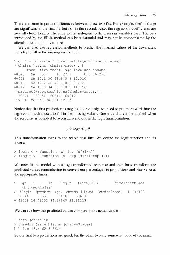
Missing Data 175
are significant in the first fit, but not in the second. Also, the regression coefficients are now all closer to zero. The situation is analogous to the errors in variables case. The bias introduced by the fill-in method can be substantial and may not be compensated by the attendant reduction in variance.
We can also use regression methods to predict the missing values of the covariates. Let’s try to fill in the missing race values:
> gr < - lm (race ˜ fire+theft+age+income, chmiss)
> chmiss [is.na (chmiss$race) , ]
race fire theft age involact income
60646 NA 5.7 11 27.9 0.0 16.250
60651 NA 15.1 30 89.8 0.8 10.510
60616 NA 12.2 46 48.0 0.6 8.212
60617 NA 10.8 34 58.0 0.9 11.156
> predict(gr,chmiss[is.na(chmiss$race),])
60646 60651 60616 60617
–17.847 26.360 70.394 32.620
Notice that the first prediction is negative. Obviously, we need to put more work into the regression models used to fill in the missing values. One trick that can be applied when the response is bounded between zero and one is the logit transformation:
y → log(y/(l-y))
This transformation maps to the whole real line. We define the logit function and its inverse:
> logit < - function (x) log (x/(l-x))
> ilogit < - function (x) exp (x)/(1+exp (x))
We now fit the model with a logit-transformed response and then back transform the predicted values remembering to convert our percentages to proportions and vice versa at the appropriate times:
> gr < - lm (logit (race/100) ˜ fire+theft+age
+income,chmiss)
> ilogit (predict (gr, chmiss [is.na (chmiss$race), ] ))*100
60646 60651 60616 60617
0.41909 14.73202 84.26540 21.31213
We can see how our predicted values compare to the actual values:
> data (chredlin)
> chredlin$race [is.na (chmiss$race)]
[1] 1.0 13.4 62.3 36.4
So our first two predictions are good, but the other two are somewhat wide of the mark.
There are some important differences between these two fits. For example, theft and age

176 Linear Models with R
Like the mean fill-in method, the regression fill-in method will also introduce a bias towards zero in the coefficients while tending to reduce the variance. The success ofthe regression method depends somewhat on the collinearity of the predictors—the filled-in values will be more accurate the more collinear the predictors are.
For situations where there is a substantial proportion of missing data, I recommend thatyou investigate more sophisticated methods, likely using the EM algorithm or multipleimputation. The fill-in methods described in this chapter will be fine when only a fewcases need to be filled, but will become less reliable as the proportion of missing casesincreases. See Little and Rubin (2002) and Schafer (1997) for more.

CHAPTER 13Analysis of Covariance
Predictors that are qualitative in nature, for example, eye color, are sometimes described as categorical or called factors. We wish to incorporate these predictors into the regression analysis. Analysis of covariance (ANCOVA) refers to regression problems where there is a mixture of quantitative and qualitative predictors.
Suppose we are interested in the effect of a medication on cholesterol level. We might have two groups; one receives the medication and the other, the default treatment. We could not treat this as a simple two-sample problem if we knew that the two groups differed with respect to age, as this would affect the cholesterol level. See Figure 13.1 for a simulated example. For the patients who received the medication, the mean reduction in cholesterol level was 0% while for those who did not, the mean reduction was 10%. So superficially it would seem that it would be better not to be treated. However, the treated group ranged in age from 50 to 70 while those who were not treated ranged in age between 30 and 50. We can see that once age is taken into account, the difference between treatment and control is again 10%, but this time in favor of the treatment.
Figure 13.1 Simulated example showing the confounding effect of a covariate.The patients who took the medication are marked with a solid dot while those who did not are marked with an empty dot.
ANCOVA adjusts the groups for the age difference and then presents the effect of the medica-tion. It can also be used when there are more than two groups and more than one covariate.
Our strategy is to incorporate the qualitative predictors within the y=X!+" framework. We can then use the estimation, inferential and diagnostic techniques that we have already learned. This avoids having to learn a different set of formulae for each new type of qualitative predictor configuration. To put qualitative predictors into the y=X!+" form

178 Linear Models with R
we need to code the qualitative predictors. We consider a specific example where 3; is thechange in cholesterol level, x is the age and:
d is called a dummy variable. A variety of linear models may be considered here:
1. The same regression line for both groups: y=!0+!
1x+" or is written in R as y ˜ x.
2. Separate regression lines for each group with the same slope: y=!0+!
1x+!
2d + " or is
written in R as y ˜ x + d. In this case !2=represents the vertical distance between the
regression lines (i.e., the effect of the drug).
0 1
!2d+!
3x.d+" or is written in R as y ˜ x + d d: x or y ˜ x*d. To form the slope
interaction term d: x in the X-matrix, multiply x by d elementwise. Any interpretation of the effect of the drug will now also depend on age.
Estimation and testing work just as they did before. Interpretation is much easierif we can eliminate the slope interaction term.
Other codings of d are possible, for instance:
is used by some. This coding enables !2 and !
3 to be viewed as differences from a
response averaged over the two groups. Any other coding that assigned a different number to the two groups would also work, but interpretation of the estimated parameterswould be more difficult.
13.1 A Two-Level Example
The data for this example come from a study of the effects of childhood sexual abuse onadult females reported in Rodriguez et al. (1997):45 women treated at a clinic, whoreported childhood sexual abuse (csa), were measured for post-traumatic stress disorder(ptsd) and childhood physical abuse (cpa) both on standardized scales. 31 women treatedat the same clinic, who did not report childhood sexual abuse, were also measured. Thefull study was more complex than reported here and so readers interested in the subjectmatter should refer to the original article.
We take a look at the data and produce a summary subsetted by csa:
> data (sexab)
> sexab
cpa ptsd csa
1 2.04786 9.71365 Abused
3. Separate regression lines for each group with the different slopes: y=! +! +

Analysis of Covariance 179
2 0.83895 6.16933 Abused
…..
75 2.85253 6.84304 NotAbused
76 0.81138 7.12918 NotAbused
> by (sexab,sexab$csa,summary)
sexab$csa: Abused
Cpa ptsd csa
Min. : !1.11 Min. : 5.98 Abused :45
1st Qu.: 1.41 1st Qu.: 9.37 NotAbused: 0
Median : 2.63 Median : 11.31
Mean : 3.08 Mean : 11.94
3rd Qu.: 4.32 3rd Qu.: 14.90
Max. : 8.65 Max. : 18.99
sexab$csa: NotAbused
Cpa ptsd csa
Min. : !3.12 Min. : !3.35 Abused : 0
1st Qu.: !0.23 1st Qu.: 3.54 NotAbused:31
Median : 1.32 Median : 5.79
Mean : 1.31 Mean : 4.70
3rd Qu.: 2.83 3rd Qu.: 6.84
Max. : 5.05 Max. : 10.91
Now plot the data—see Figure 13.2:
> plot (ptsd ˜ csa, sexab)
> plot (ptsd ˜ cpa, pch=as.character (csa), sexab)
We see that those in the abused group have higher levels of PTSD than those in the nonabused in the left panel of Figure 13.2. We can test this difference:
> t.test(sexab$ptsd[l:45],sexab$ptsd[46:76])
Welch Two Sample t-test
data: sexab$ptsd[1:45] and sexab$ptsd[46:76]
t = 8.9006, df = 63.675, p-value = 8.803e-13
alt. hypothesis: true difference in means is not equal to 0
95 percent confidence interval:
5.6189 8.8716
sample estimates:
mean of x mean of y
11.9411 4.6959
and find that it is clearly significant. However, in the right panel of Figure 13.2 we see that there is positive correlation between PTSD and childhood physical abuse and in the numerical summary we see that those in the abused group suffered higher levels (3.08 vs.1.31) of cpa than those in the nonabused group. This suggests physical abuse as an alternative explanation of higher PTSD in the sexually abused group.

180 Linear Models with R
Figure 13.2 PTSD comparison of abused and nonabused subjects onthe left. A=Abused and N=NotAbused on the right.
ANCOVA allows us to disentangle these two competing explanations. We fit the separateregression lines model. ptsd ˜ cpa*csa is an equivalent model formula:
> g < - lm (ptsd cpa+csa+cpa:csa, sexab)
> summary (g)
Coefficients:
Estimate Std. Error t value Pr(>|t|)
(Intercept) 10.557 0.806 13.09 < 2e–16
cpa 0.450 0.208 2.16 0.034
csaNotAbused !6.861 1.075 !6.38 1.5e–08
cpa:csaNotAbused 0.314 0.368 0.85 0.397
Residual standard error: 3.28 on 72 degrees of freedom
Multiple R-Squared: 0.583, Adjusted R-squared: 0.565
F-statistic: 33.5 on 3 and 72 DF, p-value: 1.13e–13
Because csa is nonnumeric, R automatically treats it as a qualitative variable and sets up acoding. We can discover the coding by examining the X-matrix:
> model.matrix (g)
(Intercept) cpa csaNotAbused cpa: csaNotAbused
1 1 2.04786 0 0.00000
2 1 0.83895 0 0.00000
……
75 1 2.85253 1 2.85253
76 1 0.81138 1 0.81138
We see that “Abused” is coded as zero and “NotAbused” is coded as one. The defaultchoice is made alphabetically. This means that “Abused” is the reference level here andthat the parameters represent the difference between “NotAbused” and this referencelevel. In this case, it would be slightly more convenient if the coding was reversed. Theinteraction term cpa: csaNotAbused is represented in the fourth column of the matrix as
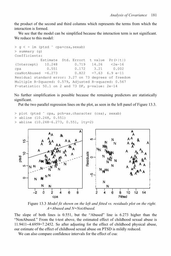
Analysis of Covariance 181
the product of the second and third columns which represents the terms from which the interaction is formed.
We see that the model can be simplified because the interaction term is not significant. We reduce to this model:
> g < - lm (ptsd ˜ cpa+csa,sexab)
> summary (g)
Coefficients:
Estimate Std. Errort t value Pr(>|t|)
(Intercept) 10.248 0.719 14.26 <2e–16
cpa 0.551 0.172 3.21 0.002
csaNotAbused !6.273 0.822 !7.63 6.9 e–11
Residual standard error: 3.27 on 73 degrees of freedom
Multiple R-Squared: 0.579, Adjusted R-squared: 0.567
F-statistic: 50.1 on 2 and 73 DF, p-value: 2e–14
No further simplification is possible because the remaining predictors are statistically significant.
Put the two parallel regression lines on the plot, as seen in the left panel of Figure 13.3.
> plot (ptsd ˜ cpa, pch=as.character (csa), sexab)
> abline (10.248, 0.551)
> abline (10.248–6.273, 0.551, lty=2)
Figure 13.3 Model fit shown on the left and fitted vs. residuals plot on the right.A=Abused and N=NotAbused.
The slope of both lines is 0.551, but the “Abused” line is 6.273 higher than the “NonAbused.” From the t-test above, the estimated effect of childhood sexual abuse is11.9411&4.6959=7.2452. So after adjusting for the effect of childhood physical abuse, our estimate of the effect of childhood sexual abuse on PTSD is mildly reduced.
We can also compare confidence intervals for the effect of csa:

182 Linear Models with R
> confint (g) [3,]
2.5 % 97.5 %
!7.9108 !4.6347
compared to the (5.6189, 8.8716) found for the unadjusted difference. In this particularcase, the confidence intervals are about the same width. In other cases, particularlydesigned experiments, adjusting for a covariate can increase the precision of the estimateof an effect.
The usual diagnostics should be checked. It is worth checking whether there is somedifference related to the categorical variable as we do here:
> plot (fitted (g), residuals (g), pch=as.character
(sexab$csa), xlab="Fitted", ylab="Residuals")
We see in the right panel of Figure 13.3 that there are no signs of heteroscedasticity.Furthermore, because the two groups happen to separate, we can also see that thevariation in the two groups is about the same. If this were not so, we would need to makesome adjustments to the analysis, possibly using weights.
For convenience, you can change the reference level:
> sexab$csa < - relevel (sexab$csa, ref="NotAbused")
> g < - lm (ptsd ˜ cpa+csa,sexab)
> summary (g)
Coefficients:
Estimate Std. Error t value Pr(>|t|)
(Intercept) 3.975 0.629 6.32 1.9e–08
cpa 0.551 0.172 3.21 0.002
csaAbused 6.273 0.822 7.63 6.9e–11
Residual standard error: 3.27 on 73 degrees of freedom
Multiple R-Squared: 0.579, Adjusted R-squared: 0.567
F-statistic: 50.1 on 2 and 73 DF, p-value: 2e–14
Although some of the coefficients have different numerical values, this coding leads tothe same conclusion as before.
Finally, we should point out that childhood physical abuse might not be the only factorthat is relevent to assessing the effects of childhood sexual abuse. It is quite possible thatthe two groups differ according to other variables such as socioeconomic status and age.Issues such as these were addressed in Rodriguez et al. (1997).
13.2 Coding Qualitative Predictors
A more extensive use of dummy variables is needed for factors with more than twolevels. Let B be an n!k dummy variable matrix where Bij=1 if case i falls in class j and is zero otherwise. We might use B to form part of the model matrix. However, the row sumsof B are all one. Since an intercept term would also be represented by a column of ones,all the parameters would not be identifiable.

Analysis of Covariance 183
Removing the intercept term is one solution, but this will not work well if there is more than one factor. A more general solution is to reduce the rank of the dummy variable matrix. Simply deleting one column would do, but any solution that avoids collinear dummy variables will work. The choice should be based on convenience of interpretation and numerical stability.
The coding is determined by a contrast matrix C which has dimension k"(k#l). Some examples of C are given below. The contribution to the model matrix is then given by BC. Other columns of the model matrix might include a column of ones for the intercept and perhaps other predictors.
Treatment codingConsider a four-level factor that will be coded using three dummy variables. This contrast matrix describes the coding, where the columns represent the dummy variables and the rows represent the levels:
> contr.treatment (4)
2 3 4
1 0 0 0
2 1 0 0
3 0 1 0
4 0 0 1
This treats level one as the standard level to which all other levels are compared so a control group, if one exists, would be appropriate for this level. The parameter for the dummy variable then represents the difference between the given level and the first level. R assigns levels to a factor in alphabetical order by default. Treatment coding is the default choice for R.
Helmert coding
The coding here is:
> contr.helmert (4)
[,1] [,2] [,3]
1 !1 !1 !1
2 1 !1 !1
3 0 2 !1
4 0 0 3
If there are equal numbers of observations in each level (a balanced design) then the dummy variables will be orthogonal to each other and to the intercept. This coding is not as nice for interpretation except in some special cases. It is the default choice in S-plus.
There are other choices of coding—anything that spans the k–1 dimensional space will
work. The choice of coding does not affect the R2, and overall F-statistic. It does affect
the and you do need to know what the coding is before making conclusions about .When there is an interaction between two terms represented by model matrix
components X1 and X
2, we compute the element-wise product of every column of X
1 with
every column of X2 to get the representation of the interaction in the model matrix.

184 Linear Models with R
13.3 A Multilevel Factor Example
The data for this example come from a study on the sexual activity and the life span ofmale fruitflies by Partridge and Farquhar (1981):125 fruitflies were divided randomlyinto five groups of 25 each. The response was the longevity of the fruitfly in days. Onegroup was kept solitary, while another was kept individually with a virgin female eachday. Another group was given eight virgin females per day. As an additional control, thefourth and fifth groups were kept with one or eight pregnant females per day. Pregnantfruitflies will not mate. The thorax length of each male was measured as this was knownto affect longevity. The five groups are labeled many, isolated, one, low and highrespectively. The purpose of the analysis is to determine the difference between the fivegroups if any. We start with a plot of the data, as seen in Figure 13.4.
> data (fruitfly)
> plot (longevity ̃ thorax, fruitfly, pch=unclass (activity))
> legend (0.63, 100, levels (fruitfly$activity), pch=1:5)
Figure 13.4 Plot of longevity in days and thorax length in mm of fruitflies divided into five treatment groups. Longevity for the high sexual activity group appears to be lower.
We fit and summarize the most general linear model:
> g < - Im (longevity ˜ thorax*activity, fruitfly)
> summary (g)
Coefficients:
Estimate Std. Error t value Pr(>|t|)
(Intercept) !50.242 21.801 !2.30 0.023
thorax 136.127 25.952 5.25 7.3e–07
activityisolated 6.517 33.871 0.19 0.848
activityone !7.750 33.969 !0.23 0.820
activitylow !1.139 32.530 !0.04 0.972

Analysis of Covariance 185
activityhigh !11.038 31.287 !0.35 0.725
thorax:activityisolated !4.677 40.652 !0.12 0.909
thorax:activityone 0.874 40.425 0.02 0.983
thorax:activitylow 6.548 39.360 0.17 0.868
thorax:activityhigh !11.127 38.120 !0.29 0.771
Residual standard error: 10.7 on 114 degrees of freedom
Multiple R-Squared: 0.653, Adjusted R-squared: 0.626
F-statistic: 23.9 on 9 and 114 DF, p-value: < 2e–16
Since “many” is the reference level, the fitted regression line within this group is longevity=&50.2+136.1*thorax. For “isolated,” it is longevity=(&50.2+ 6.5) + (136.1–4.7)* t thorax. Similar calculations can be made for the other groups. Examine:
> model.matrix (g)
to see how the coding is done. Some diagnostics should be examined by:
> plot (g)
There is perhaps some mild heteroscedasticity, but we will let this be until later for ease of presentation. Now see whether the model can be simplified:
> anova (g)
Analysis of Variance Table Response: longevity
Df Sum Sq Mean Sq F value Pr(>F)
thorax 1 15003 15003 130.73 < 2e–16
activity 4 9635 2409 20.99 5.5e–13
thorax:activity 4 24 6 0.05 1
Residuals 114 13083 115
This is a sequential analysis of variance (ANOVA) table. Starting from a null model, terms are added and sequentially tested. The models representing the null and alternatives are listed in Table 13.1. In ANCOVA, we wish to successively simplify the full model
Null Alternative
y ˜ l y ˜ thorax
y ˜ thorax y ˜ thorax+activity
y ˜ thorax+activity y ˜ thorax+activity+thorax:activity
Table 13.1 Models compared in the sequential ANOVA.
and then interpret the result. The interaction term thorax: act ivity is not significant indicat-ing that we can fit the same slope within each group. No further simplification is possible.
We notice that the F-statistic for the test of the interaction term is very small and so the p-value is not exactly one (due to the rounding), but is very close:

186 Linear Models with R
> 1–pf (0.05, 4, 114)
[1] 0.99525
For these data, the fitted regression lines to the five groups happen to be very close toparallel. This can, of course, just happen by chance. In some other cases, unusually largep-values have been used as evidence that data have been tampered with or “cleaned” toimprove the fit. Most famously, Ronald Fisher suspected Gregor Mendel of fixing thedata in some genetics experiments because the data seemed too good to be true. SeeFisher (1936).
We now refit without the interaction term:
> gb < - lm (longevity ˜ thorax+activity, fruitfly)
Do we need both thorax and activity? We could use the output above which suggests bothterms are significant. However, thorax is tested by itself and then activity is tested oncethorax is entered into the model. We might prefer to check whether each predictor issignificant once the other has been taken into account. We can do this using:
> dropl (gb, test="F")
Single term deletions
Model:
longevity ˜ thorax + activity
Df Sum of Sq RSS AIC F value Pr (F)
<none> 13107 590
thorax 1 12368 25476 670 111.3 < 2e–16
activity 4 9635 22742 650 21.7 2.0e–13
The drop1 ( ) command tests each term relative to the full model. This shows that bothterms are significant even after allowing for the effect of the other. Now examine themodel coefficients:
> summary (gb)
Coefficients:
Estimate Std. Error t value Pr(>t|)
(Intercept) !48.75 10.85 !4.49 1.6e–05
thorax 134.34 12.73 10.55 < 2e–16
activityisolated 2.64 2.98 0.88 0.379
activityone !7.01 2.98 !2.35 0.020
activitylow 4.14 3.03 1.37 0.174
activityhigh !20.00 3.02 !6.63 1.0e–09
Residual standard error: 10.5 on 118 degrees of freedom
Multiple R-Squared: 0.653, Adjusted R-squared: 0.638
F-statistic: 44.4 on 5 and 118 DF, p-value: < 2e–16
“Many” is the reference level. We see that the intercepts of “isolated” and “low” are notsignificantly different from many. We also see that the low sexual activity group, “one,”survives about seven days less. The p-value is 0.02 and is enough for statisticalsignificance if only one comparison is made. However, we are making more than onecomparison, and so, as with outliers, a Bonferroni-type adjustment might be considered.This would erase the statistical significance of the difference.

Analysis of Covariance 187
However, the high sexual activity group, "many," has a life span 20 days less than the reference group and this is strongly significant.
Returning to the diagnostics:
> plot (residuals (gb) ˜ fitted (gb),
pch=unclass (fruitfly$activity))
is seen in the first panel of Figure 13.5. We have some nonconstant variance although it does not appear to be related to the five groups. A log transformation can remove the heteroscedasticity:
> gt < - lm (log (longevity) ˜ thorax+activity, fruitfly)
> plot (residuals (gt) ˜ fitted (gt),
pch=unclass (fruitfly$activity))
as seen in the second panel of Figure 13.5. One disadvantage of transformation is
Figure 13.5 Diagnostic plots for the fruitfly data before and after log transformation of the response.
that it can make interpretation of the model more difficult. Let’s examine the model fit:
> summary (gt)
Coefficients:
Estimate Std. Error t value Pr(>|t|)
(Intercept) 1.8442 0.1988 9.28 1.0e–1
thorax 2.7215 0.2333 11.67 < 2e–1
activityisolated 0.0517 0.0547 0.95 0.34
activityone !0.1239 0.0546 !2.27 0.02
activitylow 0.0879 0.0555 1.59 0.116

188 Linear Models with R
activityhigh !0.4193 0.0553 !7.59 8.4e–1
Residual standard error: 0.193 on 118 degrees of freedom
Multiple R-Squared: 0.702, Adjusted R-squared: 0.69
F-statistic: 55.7 on 5 and 118 DF, p-value: < 2e–16
Notice that the R2 is higher for this model, but the p-values are similar. Because of the logtransformation, we can interpret the coefficients as having a multiplicative effect:
> exp (coef (gt) [3:6])
activityisolated activityone activitylow activityhigh
1.05311 0.88350 1.09189 0.65754
Compared to the reference level, we see that the high sexual activity group has 0.66 timesthe life span (i.e, 34% less).
Why did we include thorax in the model? Its effect on longevity was known, butbecause of the random assignment of the flies to the groups, this variable will not bias theestimates of the effects of the activities. We can verify that thorax is unrelated to theactivities:
> gh < - lm (thorax ˜ activity, fruitfly)
> anova (gh)
Analysis of Variance Table
Response: thorax
Df Sum Sq Mean Sq F value Pr(>F)
activity 4 0.026 0.006 1.11 0.36
Residuals 119 0.685 0.006
However, look what happens if we omit thorax from the model for longevity:
> gu < - lm (log (longevity) ˜ activity, fruitfly)
> summary (gu)
Coefficients:
Estimate Std. Error t value Pr(>|t|)
(Intercept) 4.1193 0.0564 72.99 < 2e–16
activityisolated 0.0234 0.0798 0.29 0.77
activityone !0.1195 0.0798 !1.50 0.14
activitylow 0.0240 0.0806 0.30 0.77
activityhigh !0.5172 0.0798 !6.48 2.2e–09
Residual standard error: 0.282 on 119 degrees of freedom
Multiple R-Squared: 0.359, Adjusted R-squared: 0.338
F-statistic: 16.7 on 4 and 119 DF, p-value: 6.96e–11
The magnitude of the effects do not change that much but the standard errors aresubstantially larger. The value of including thorax in this model is to increase theprecision of the estimates.
Exercises
1. Using the teengamb data, model gamble as the response and the other variables aspredictors. Take care to investigate the possibility of interactions between sex andthe other predictors. Interpret your final model.

Analysis of Covariance 189
2. Using the inf mort data, find a simple model for the infant mortality in terms of the other variables. Be alert for transformations and unusual points. Interpret your model by explaining what the regression parameter estimates mean.
3. Plot the ToothGrowth data with len as the response. Fit a linear model to the data and check for possible simplification. Display the fitted regression lines on top of the data.
4. Investigate whether the side variable can be used in a model for all the chredlin data rather than as a subsetting variable as in the analysis in the text.
5. Find a good model for the uswages data with wages as the response and all the other variables as predictors.

CHAPTER 14One-Way Analysis of Variance
In an analysis of variance (ANOVA), the idea is to partition the overall variance in the response into that due to each of the factors and the error. The traditional approach is to directly estimate these components. However, we take a regression-based approach by putting the model into the y=X!+" and then using the inferential methods we have learned earlier in this book.
The terminology used in ANOVA-type problems is sometimes different. Predictors are now all qualitative and are now typically called factors, which have some number of levels. The regression parameters are now often called effects. We shall consider only models where the parameters are considered fixed, but unknown—called fixed-effects models. Random-effects models are used where parameters are taken to be random variables and are not covered in this text.
14.1 The Model
Suppose we have a factor % occurring at i=1,…, I levels, with j=1,…, Ji observations per
level. We use the model:
yij=!+%
i+"
ij
Not all the parameters are identifiable. For example, we could add some constant to ! and subtract the same constant from each %
i and the model would be unchanged. Some
restriction is necessary. Here are some possibilities:
1. Set !=0 and then use I different dummy variables to estimate %i for i=1,…, I.
2. Set %1 = 0, then ! represents the expected mean response for the first level and %
i for
i&1 represents the difference between level i and level one. Level one is then called the reference level or baseline level. This corresponds to the use of treatment contrasts as discussed in the previous chapter.
3. Set 'i%i=0, now ! represents the mean response over all levels and %i, the difference
from that mean. Because we do not need to estimate %1 directly
because it can be determined from the other estimates. This approach requires the use of sum contrasts.
Some preliminary graphical analysis is appropriate before fitting. A side-by-side boxplot is often recommended, although strip plots are better for smaller datasets. Look for equality of variance, the need for transformation of the response and outliers. It is not worth considering diagnostics for influence, as the leverages depend explicitly on J
i. If
there is only one observation for a given level, that is Ji=1, then the estimate of the effect
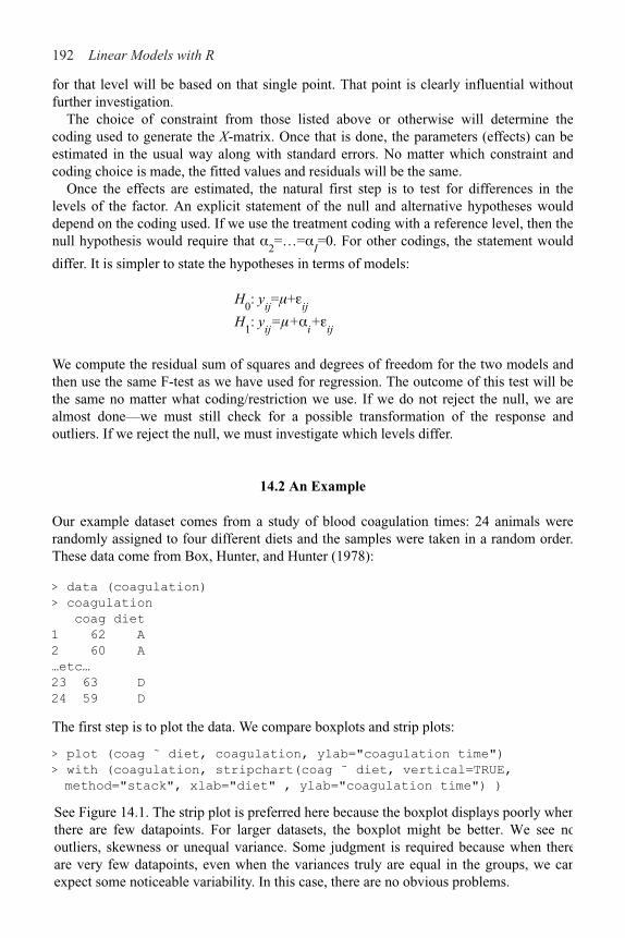
192 Linear Models with R
for that level will be based on that single point. That point is clearly influential withoutfurther investigation.
The choice of constraint from those listed above or otherwise will determine thecoding used to generate the X-matrix. Once that is done, the parameters (effects) can beestimated in the usual way along with standard errors. No matter which constraint andcoding choice is made, the fitted values and residuals will be the same.
Once the effects are estimated, the natural first step is to test for differences in thelevels of the factor. An explicit statement of the null and alternative hypotheses woulddepend on the coding used. If we use the treatment coding with a reference level, then thenull hypothesis would require that %
2=…=%
I=0. For other codings, the statement would
differ. It is simpler to state the hypotheses in terms of models:
H0: y
ij=!+"
ij
H1: y
ij=!+%
i+"
ij
We compute the residual sum of squares and degrees of freedom for the two models andthen use the same F-test as we have used for regression. The outcome of this test will bethe same no matter what coding/restriction we use. If we do not reject the null, we arealmost done—we must still check for a possible transformation of the response andoutliers. If we reject the null, we must investigate which levels differ.
14.2 An Example
Our example dataset comes from a study of blood coagulation times: 24 animals wererandomly assigned to four different diets and the samples were taken in a random order.These data come from Box, Hunter, and Hunter (1978):
> data (coagulation)
> coagulation
coag diet
1 62 A
2 60 A
…etc…
23 63 D
24 59 D
The first step is to plot the data. We compare boxplots and strip plots:
> plot (coag ˜ diet, coagulation, ylab="coagulation time")
> with (coagulation, stripchart(coag ˜ diet, vertical=TRUE,
method="stack", xlab="diet" , ylab="coagulation time") )
See Figure 14.1. The strip plot is preferred here because the boxplot displays poorly whenthere are few datapoints. For larger datasets, the boxplot might be better. We see nooutliers, skewness or unequal variance. Some judgment is required because when thereare very few datapoints, even when the variances truly are equal in the groups, we canexpect some noticeable variability. In this case, there are no obvious problems.

One-Way Analysis of Variance 193
Now let’s fit the model using the default treatment coding:
> g < - lm (coag ˜ diet, coagulation)
Figure 14.1 A boxplot and a strip plot of blood coagulation data.
> summary (g)
Coefficients :
Estimate Std. Error t value Pr(>|t|)
(Intercept) 6.10e+01 1.18e+00 51.55 < 2e–16
dietB 5.00e+00 1.53e+00 3.27 0.00380
dietC 7.00e+00 1.53e+00 4.58 0.00018
dietD 1.07e–14 1.45e+00 !7.4e–15 1.00000
Residual standard error: 2.37 on 20 degrees of freedom
Multiple R-Squared: 0.671, Adjusted R-squared: 0.621
F-statistic: 13.6 on 3 and 20 DF, p-value: 4.66e–05
We conclude from the small p-value for the F-statistic that there is some difference between the groups. Group A is the reference level and has a mean of 61, groups B, C and D are 5, 7 and 0 seconds larger, respectively, on average. Examine the design matrix to understand the coding:
> model.matrix (g)
We can fit the model without an intercept term as in:
> gi < - lm (coag diet !1, coagulation) >
summary (gi)
Coefficients:
Estimate Std. Error t value Pr(>|t|)
dietA 61.000 1.183 51.5 < 2e–16
dietB 66.000 0.966 68.3 < 2e–16
dietC 68.000 0.966 70.4 < 2e–16

194 Linear Models with R
dietD 61.000 0.837 72.9 < 2e–16
Residual standard error: 2.37 on 20 degrees of freedom
Multiple R-Squared: 0.999, Adjusted R-squared: 0.999
F-statistic: 4.4e + 03 on 4 and 20 DF, p-value: 0
We can directly read the level means. The R2 is not correctly calculated because of the ab-sence of an intercept. The F-test corresponds to a null hypothesis that the expected meanresponse is zero. This is not an interesting test. To generate the usual test that the meansof the levels are equal, we would need to fit the null model and compare using an F-test:
> gnull < - lm (coag 015˜ 1, coagulation)
> anova (gnull, gi)
Analysis of Variance Table
Model 1: coag ˜ 1
Model 2: coag ˜ diet !1
Res.Df RSS Df Sum of Sq F Pr(>F)
1 23 340
2 20 112 3 228 13.6 4.7e–05
We get the same F-statistic and p-value as in the first coding. We can also use a sum coding:
> options(contrasts=c("contr.sum","contr.poly"))
> gs < - lm (coag ˜ diet , coagulation)
> summary (gs)
Coefficients:
Estimate Std. Error t value Pr(>|t|)
(Intercept) 64.000 0.498 128.54 < 2e–16
diet1 !3.000 0.974 !3.08 0.00589
diet2 2.000 0.845 2.37 0.02819
diet3 4.000 0.845 4.73 0.00013
Residual standard error: 2.37 on 20 degrees of freedom
Multiple R-Squared: 0.671, Adjusted R-squared: 0.621
F-statistic: 13.6 on 3 and 20 DF, p-value: 4.66e–05
So the estimated overall mean response is 64 while the estimated mean response for A isthree less than the overall mean, that is 61. Similarly, the mean for C and D are 66 and 68,respectively. Since we are using the sum constraint, we compute
so the mean for D is 64&3=61. Notice that and theF-statistic are the same as before.
So we can use any of these three methods and obtain essentially the same results. Theconstraint !=0 is least convenient since an extra step is needed to generate the F-test.Furthermore, the approach would not extend well to experiments with more than onefactor, as additional constraints would be needed. The other two methods can be usedaccording to taste. The treatment coding is most appropriate when the reference level isset to a possible control group. I will use the treatment coding for the rest of this book.

One-Way Analysis of Variance 195
14.3 Diagnostics
There are fewer diagnostics to do for ANOVA models, but it is still important to plot the residuals and fitted values and to make the Q–Q plot of the residuals. It makes no sense to transform the predictor, but it is reasonable to consider transforming the response. Diagnostics are shown in Figure 14.2:
> qqnorm (residuals (g))
> plot (jitter (fitted(g)), residuals (g),
xlab="Fitted", ylab="Residuals")
Figure 14.2 Diagnostics for the blood coagulation model.
Because the data are integers and the fitted values turn out to be integers also, some discreteness is obvious in the Q–Q plot. Of course, discrete data cannot be normally distributed. However, here it is approximately normal and so we can go ahead with the inference without much concern. The discreteness in the residuals and fitted values shows up in the residual-fitted plot. We have jittered the points so that they can seen separately.
The assumption of homogeneity of the error variance can be examined using Levene’s test. It computes the absolute values of the residuals and uses these as the response in a new one-way ANOVA. To reduce the possible influence of outliers, group medians rather than means should be used. A significant difference would indicate nonconstant variance.
There are other tests, but this one is quite insensitive to nonnormality and is simple to execute. Most tests and confidence intervals (CIs) are relatively insensitive to nonconstant variance so there is no need to take action unless the Levene test is significant at the 1% level. Applying this to the diet data, we find:
> med < - with (coagulation, tapply (coag, diet, median))
> ar < - with (coagulation, abs (coag –med [diet] ) )
> anova (lm(ar ˜ diet, coagulation))
Analysis of Variance Table
Response: ar
Df Sum Sq Mean Sq F value Pr(>F)

196 Linear Models with R
diet 3 4.3 1.4 0.65 0.59
Residuals 20 44.5 2.2
Since the p-value is large, we conclude that there is no evidence of a nonconstantvariance.
14.4 Pairwise Comparisons
After detecting some difference in the levels of the factor, interest centers on which levelsor combinations of levels are different. It does not make sense to ask whether a particularlevel is significant since this begs the question of “significantly different from what?”Any meaningful test must involve a comparison of some kind.
A pairwise comparison of level i and j can be made using a CI for %i–%
j using:
where and df=n—I in this case. A test for %i=%
j
amounts to seeing whether zero lies in this interval or not. For example, a 95% CI for theB–A difference above is:
> qt(0.975,20)
[1] 2.0860
> c (5!2. 086*1.53, 5+2. 086*1.53)
[1] 1.8084 8.1916
Since zero is not in the interval, the difference is significant. This is fine for just one test,but we are likely to be interested in more than one comparison. Suppose we do allpossible pairwise tests when %=5% and the null hypothesis is in fact true. In the bloodcoagulation data, there are four levels and so six possible pairwise comparisons. Even ifthere was no difference between the four levels, there is still about a 20% chance that atleast one significant difference will be found.
For experiments with more levels, the true type I error gets even higher. Using thet-based CIs for multiple comparisons is called the least significant difference (LSD)method, but it can hardly be recommended. Now one might be tempted to argue that wecould choose which comparisons are interesting and so reduce the amount of testing andthus the magnitude of the problem. If we only did a few tests, then the Bonferroniadjustment (see Section 4.2.2) could be used to make a simple correction. However, thedetermination of which comparisons are “interesting” is usually made after seeing thefitted model. This means that all other comparisons are implicitly made even if they arenot explicitly computed. On the other hand, if it can be argued that the comparisons weredecided before seeing the fit, then we could make the case for the simple adjustment.However, this is rarely the case and furthermore it might be difficult to convince othersthat this really was your intention. We must usually find a way to adjust for all pairwisecomparisons.
One-Way Analysis of Variance 197
There are many ways to make the adjustment, but Tukey’s honest significant difference (HSD) is the easiest to understand. It depends on the studentized range distribution which
arises as follows. Let X1,…, X
n be i.i.d. N (!, #2) and let R=max
iX
i– min
iX
i be the range.
Then has the studentized range distribution qn,v
where v is the number of degrees of
When the sample sizes Ji are very unequal, Tukey’s HSD test may become too
conservative. We compute the Tukey HSD bands for the diet data. First, we need the critical value from the studentized range distribution:
> qtukey(0.95, 4, 20)/sqrt(2)
[1] 2.7989
and then the interval for the B–A difference is:
> c (5–2. 8*1. 53, 5+2. 8*1.53)
[1] 0.716 9.284
A convenient way to obtain all the intervals is:
> TukeyHSD (aov (coag ˜ diet, coagulation))
Tukey multiple comparisons of means
95% family-wise confidence level
$diet
diff lwr upr
A–B !5.0000e+00 !9.2754 !0.72455
C–B 2.0000e+00 !1.8241 5.82407
D–B !5.0000e+00 !8.5771 !1.42291
C–A 7.0000e+00 2.7246 11.27545
D–A !1.42116-14 !4.0560 4.05604
D–C !7.0000e+00 !10.5771 !3.42291
We find that only the A–D and B–C differences are not significant as the corresponding intervals contain zero. The Bonferroni-based bands would have been just slightly wider:
> qt (1!.05/12,20)
[1] 2.9271
We divide by 12 here because there are six possible pairwise differences and we want a two-sided CI.
The Tukey method assumes the worst by focusing on the largest difference. There are other competitors like the Newman-Keuls, Duncan’s multiple range and the Waller-Duncan procedure, which are less pessimistic or do not consider all possible pairwise comparisons. For a detailed description of the many available alternatives see Hsu (1996). Some other pairwise comparison tests may be found in the R package multcomp.
freedom used in estimating #.
The Tukey CIs are:

198 Linear Models with R
A contrast among the effects %1,…, %
I is a linear combination '
ic
i%
i where the c
i are
known and 'ic
i=0. For example:
1. %1&%
2 is a contrast with c
1=1, c
2= –1 and the other c
i=0. All pairwise differences are
contrasts.2. %
1&(%
2+(%
3++
4)/3 with c
1=1 and c
2=c
3=c
4= &1/3 and the other c
i=0. This contrast
might be interesting if level one were the control and two, three and four were alternative treatments.
The need for contrasts arises much less often than pairwise comparisons and the Scheffémethod must be used.
Exercises
1. Using the pulp data, determine whether there are any differences between theoperators. What is the nature of these differences?
2. Determine whether there are differences in the weights of chickens according to theirfeed in the chickwts data. Perform all necessary model diagnostics.
3. Using the PlantGrowth data, determine whether there are any differences between thegroups. What is the nature of these differences? Test for a difference between theaverage of the two treatments and the control.
4. Using the inf mort data, perform a one-way ANOVA with income as the response andregion as the predictor. Which pairs of regions are different? Now check for a goodtransformation on the response and repeat the comparison.

CHAPTER 15 Factorial Designs
A factorial design has some number of factors occurring at some number of levels. In a full factorial design, all possible combinations of the levels of the factors occur at least once. We start with experiments involving two factors and then look at designs with more than two factors.
15.1 Two-Way ANOVA
Suppose we have two factors, % at I levels and ! at J levels. Let nij be the number of
observations at level i of % and level j of ! and let those observations be yij1
, yij2
,…etc. A
complete layout has nij $ 1 for all i, j. A balanced layout requires that n
ij=n.
The most general model that may be considered is:
As in the one-way layout, not all the parameters are identifiable. The interaction effect
is interpreted as that part of the mean response not attributable to the additive effect of %
i and !
j. For example, you may enjoy strawberries and cream individually, but
the combination is far superior. In contrast, you may like fish and ice cream, but not together.
If the main effects % and ! generate design matrices X% and X&, then the design matrix for the interaction is given by collecting the element-wise products of all columns of X% with all columns of X
& to form a matrix with (I–1)(J–1) columns.
A significant interaction makes the model hard to interpret, as cannot be studied
independent of . A comparison of the levels of % will depend on the level of !. Consider
the following two layouts of in a 2!2 example:
Male Female Male Female
Drug1 3 5 2 1
Drug 2 1 2 1 2
The response is a measure of performance. In the case on the left, we can say that drug 1 is better than drug 2 although the interaction means that its superiority over drug 2 depends on the gender. In the case on the right, which drug is best depends on the gender. We plot this in Figure 15.1. We see that in both cases the lines are not parallel, indicating interaction. The superiority of drug 1 is clear in the first plot and an ambiguous

200 Linear Models with R
conclusion is seen in the second. Make plots like this when you want to understand aninteraction effect.
When the interaction is significant, the main effects cannot be defined in an obviousand universal way. For example, we could define the gender effect as the effect for females,
Figure 15.1 Two 2!2 tables with the response plotted by the factors, sex on thehorizontal axis and drug 1 as the solid line and drug 2 as the dotted line.
the effect for males, the effect for the average of males and females or something else. Ifthere was no interaction effect, the gender effect could be defined unambiguously.
When you have a significant interaction, an interaction plot of the fitted values can makeit easier to describe the nature and impact of the effect. Alternatively, you can fit a model:
yijk
=!ijk
+"ijk
and then treat the data as a one-way ANOVA with IJ levels. Obviously this makes formore complex comparisons, but this is unavoidable when interactions exist.
15.2 Two-Way ANOVA with One Observation per Cell
Mazumdar and Hoa (1995) report an experiment to test the strength of a thermoplasticcomposite depending on the power of a laser and the speed of a tape:
> data(composite)
> summary(composite)
strength laser tape
Min. :20.6 40W:3 slow :3
1st Qu.:28.0 50W:3 medium:3
Median :29.8 60W:3 fast :3
Mean :31.0

Factorial Designs 201
3rd Qu.:35.7
Max. :39.6
We can fit a model with just the main effects as:
> g < - lm (strength ˜ laser + tape, composite)
However, if we tried to add an interaction term, we would have as many observations as parameters. The parameters could be estimated, but no further inference would be possible. Nevertheless, the possibility of an important interaction exists. There are two ways we can check for this.
The interaction can be checked graphically using an interaction plot. We plot the cell means on the vertical axis and the factor % on the horizontal. We join the points with same level of !. The role of % and ! can be reversed. Parallel lines on the plot are a sign of a lack of interaction as seen in the plots in Figure 15.2:
> with (composite, interaction.plot (laser, tape, strength, legend=F))
> with (composite, interaction.plot (tape, laser, strength, legend=F))
Figure 15.2 Interaction plots for the composite data.
Because of random variation, we cannot expect the lines to be exactly parallel. Allowing for a certain amount of noise, these lines are approximately parallel, so we conclude there is no substantial interaction between the factors.
Tukey’s nonadditivity test provides another way of investigating an interaction. The model:
202 Linear Models with R
the product of parameters, Furthermore, it makes the assumption that theinteraction effect is multiplicative in form. We have no particular reason to believe ittakes this form and so the alternative hypothesis may not be appropriate. We execute thetest:
> coef (g)
(Intercept) laser50W laser60W tapemedium tapefast
23.9178 6.5733 12.2133 4.0367 !1.4800
> lasercoefs < - rep(c(0,6.5733, 12.2133),3)
> tapecoefs < - rep(c(0,4.0367,!1.4800), each=3)
> h < - update (g, . ˜ . + I (lasercoefs*tapecoefs)
> anova (h)
Analysis of Variance Table
Response: strength
Df Sum Sq Mean Sq F value Pr(>F)
laser 2 224.2 112.1 36.82 0.0077
tape 2 48.9 24.5 8.03 0.0624
I (lasercoefs * tapecoefs) 1 1.4 1.4 0.45 0.5503
Residuals 3 9.1 3.0
The p-value of 0.55 indicates a nonsignificant interaction. So for these data, we can
reasonably assume . We can now test the main effects:
> anova (g)
Analysis of Variance Table
Response: strength
Df Sum Sq Mean Sq F value Pr( >F)
laser 2 224.2 112.1 42.69 0.002
tape 2 48.9 24.5 9.32 0.031
Residuals 4 10.5 2.6
We see that both factors are significant. Examining the coefficients above, we see that thestrength increases with the laser power but the strength is largest for medium tape speedbut less for slow or fast tape speeds.
The treatment coding does not take advantage of the ordered nature of both factors. Wecan declare both to be ordered factors and refit:
> coraposite$laser < - as.ordered(composite$laser)
> composite$tape < - as.ordered(composite$tape)
> g < - lm (strength ˜ laser + tape, composite)
> summary (g)
Coefficients:
Estimate Std. Error t value Pr(>|t|)
(Intercept) 31.032 0.540 57.45 5.5e–07
laser.L 8.636 0.936 9.23 0.00077
laser.Q !0.381 0.936 !0.41 0.70466
tape.L !1.047 0.936 !1.12 0.32594
tape.Q !3.900 0.936 !4.17 0.01404
Residual standard error: 1.62 on 4 degrees of freedom
is fit to the data and then we test if . This is a nonlinear model because it involves
Factorial Designs 203
Multiple R-Squared: 0.963, Adjusted R-squared: 0.926
F-statistic: 26 on 4 and 4 DF, p-value: 0.00401
Instead of a coding with respect to a reference level, we have linear and quadratic terms for each factor. The coding is:
> contr.poly (3)
.L .Q
[1,] !7.0711e–01 0.40825
[2,] !9.0733e–17 !0.81650
[3,] 7.0711e–01 0.40825
We see the linear term is proportional to (&1, 0, 1) representing a linear trend across the levels while the quadratic term is proportional to (1, &2, 1) representing a quadratic trend.
We see that the quadratic term for laser power is not significant while there is a quadratic effect for tape speed. One of the drawbacks of a model with factors is the difficulty of extrapolating to new conditions. The information gained from the ordered factors suggests a model with numerical predictors corresponding to the level values:
> composite$Ntape < - rep (c (6.42,13,27), each=3)
> composite$Nlaser < - rep (c(40, 50, 60), 3)
> gl < - lm (strength ˜ Nlaser + poly(log(Ntape),2), composite)
> summary (gl)
Coefficients:
Estimate Std. Error t value Pr(>|t|)
(Intercept) 0.4989 3.0592 0.16 0.87684
Nlaser 0.6107 0.0604 10.11 0.00016
polydog (Ntape),2)1 !1.8814 1.4791 !1.27 0.25933
polydog (Ntape),2)2 !6.7364 1.4791 !4.55 0.00609
Residual standard error: 1.48 on 5 degrees of freedom
Multiple R-Squared: 0.961, Adjusted R-squared: 0.938
F-statistic: 41.5 on 3 and 5 DF, p-value: 0.000587
We use the log of tape speed, as this results in roughly evenly spaced levels. This model fits about as well as the two-factor model but has the advantage that we make predictions for values of tape speed and laser power that were not used in the experiment. The earlier analysis with just factors helped us discover this model, which we may not otherwise have found.
15.3 Two-Way ANOVA with More than One Observation per Cell
Consider the case when the number of observations per cell is the same and greater than one, so that n
ij=n > 1 for all i, j. Such a design is orthogonal. Orthogonality can also occur
if the row/column cell numbers are proportional.With more than one observation per cell, we are now free to fit and test the model:
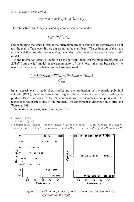
204 Linear Models with R
The interaction effect may be tested by comparison to the model:
yijk
=!+%i+!
j+"
ijk
and computing the usual F-test. If the interaction effect is found to be significant, do nottest the main effects even if they appear not to be significant. The estimation of the maineffects and their significance is coding dependent when interactions are included in themodel.
If the interaction effect is found to be insignificant, then test the main effects, but useRSS/df from the full model in the denominator of the F-tests—this has been shown tomaintain the type I error better. So the F-statistic used is:
In an experiment to study factors affecting the production of the plastic polyvinylchloride (PVC), three operators used eight different devices called resin railcars toproduce PVC. For each of the 24 combinations, two samples were produced. Theresponse is the particle size of the product. The experiment is described in Morris andWatson (1998).
We make some plots, as seen in Figure 15.3:
> data (pvc)
> attach (pvc)
> stripchart (psize ̃ resin, xlab="Particle size", ylab="Resin railcar")
> stripchart (psize ̃ operator,
xlab="Particle size", ylab="0perator")
Figure 15.3 PVC data plotted by resin railcars on the left and byoperators on the right.

Factorial Designs 205
Is there an interaction between operators and resin railcars? We first look at this graphically with interaction plots, as seen in Figure 15.4:
> interaction.plot (operator, resin, psize)
> interaction.plot (resin, operator, psize)
These are approximately parallel. The trouble with interaction plots is that we always expect there to be some random variation so it is sometimes difficult to distinguish true interaction from just noise. Fortunately, in this case, we have replication so we can directly test for an interaction effect.
Now fit the full model and see the significance of the factors:
g < - lm (psize operator*resin)
anova (g)
Figure 15.4 Interaction plots for the PVC data.
Analysis of Variance Table
Response: psize
Df Sum Sq Mean Sq F value Pr(>F)
operator 2 20.7 10.4 7.01 0.004
resin 7 283.9 40.6 27.44 5.7e–10
operator:resin 14 14.3 1.0 0.69 0.760
Residuals 24 35.5 1.5
We see that the interaction effect is not significant, but the main effects are. If you re-move the interaction and then retest the main effects, you get a somewhat different result. As discussed earlier, the former test is preferred (although in this particular example, it does not affect the conclusion):

206 Linear Models with R
> qqnorm (residuals (g))
> qqline (residuals (g))
> plot (fitted (g), residuals (g), xlab="FittedII,
ylab="Residuals")
We see some evidence of outliers. The symmetry in the residuals vs. fitted plot isbecause, for each combination of the factors, the mean of the two replicates is the fittedvalue. The two residuals for that cell will be mirror images. If we exclude the two largest
Figure 15.5 Diagnostics plots for the full model for the PVC data.
outliers, then the interaction is still insignificant. An examination of the main effectsmodel reveals that case 45 is the outlier, which we now exclude:
> g < - lm (psize ˜ operator+resin,subset=!45)
> summary (g)
Coefficients:
Estimate Std. Error t value Pr(>|t|)
(Intercept) 36.337 0.430 84.60 < 2e–16
operator2 –0.263 0.332 –0.79 0.435
operator3 –1.797 0.339 –5.30 5.5e–06
resin2 –1.033 0.543 –1.90 0.065
resin3 –5.800 0.543 –10.69 7.2e–13
resin4 –6.183 0.543 –11.40 1.2e–13
resin.5 –4.800 0.543 –8.85 1.2e–10
> anova(lm(psize ˜ operator + resin, pvc))
Analysis of Variance Table
Response: psize
Df Sum Sq Mean Sq F value Pr(>F)
operator 2 20.7 10.4 7.9 0.0014
resin 7 283.9 40.6 30.9 8.1e–14
Residuals 38 49.8 1.3
We check the diagnostics, as seen in Figure 15.5:

Factorial Designs 207
resin6 –5.450 0.543 –10.04 4.1e–12
resin7 –3.692 0.570 –6.47 1.4e–07
resin8 –0.183 0.543 –0.34 0.737
Residual standard error: 0.94 on 37 degrees of freedom
Multiple R-Squared: 0.905, Adjusted R-squared: 0.882
F-statistic: 39.2 on 9 and 37 DF, p-value: 3.00e–16
The diagnostics for this model are satisfactory. We see that operator 1 and resin car 1 produce the largest particle size while operator 3 and resin car 4 produce the smallest.
We can construct pairwise confidence intervals for the treatment factor using the Tukey method:
> Tukey HSD (aov (psize ˜ operator+resin,subset=!45))
Tukey multiple comparisons of means
95% family-wise confidence level
$operator
diff lwr upr
2–1 !0.2625 !1.0737 0.54872
3–1 !1.7771 !2.6017 !0.95246
3–2 !1.5146 !2.3392 !0.68996
$resin
diff lwr upr
2–1 !1.03333 !2.775204 0.70854
3–1 !5.80000 !7.541871 !4.05813
etc
We see that operators 1 and 2 are not significantly different but operator 3 is different from both. There are more differences in the resin cars.
The analysis above is appropriate for the investigation of specific operators and resin cars. These factors are being treated as fixed effects. If the operators and resin cars were randomly selected from larger populations of those available, they should be analyzed as random effects. This would require a somewhat different analysis not covered here. However, we can at least see from the analysis above that the variation between resin cars is greater than that between operators.
It is important that the observations taken in each cell are genuine replications. If this is not true, then the observations will be correlated and the analysis will need to be adjusted. It is a common scientific practice to repeat measurements and take the average to reduce measurement errors. These repeat measurements are not independent observations. Data where the replicates are correlated can be handled with repeated measures models. For example, in this experiment we would need to take some care to separate the two measurements for each operator and resin car. Some knowledge of the engineering might be necessary to achieve this.
15.4 Larger Factorial Experiments
Suppose we have factors %, !, *,…at levels l%, l&, l',…. A full factorial experiment has at
least one run for each combination of the levels. The number of combinations is l%l&l'…,
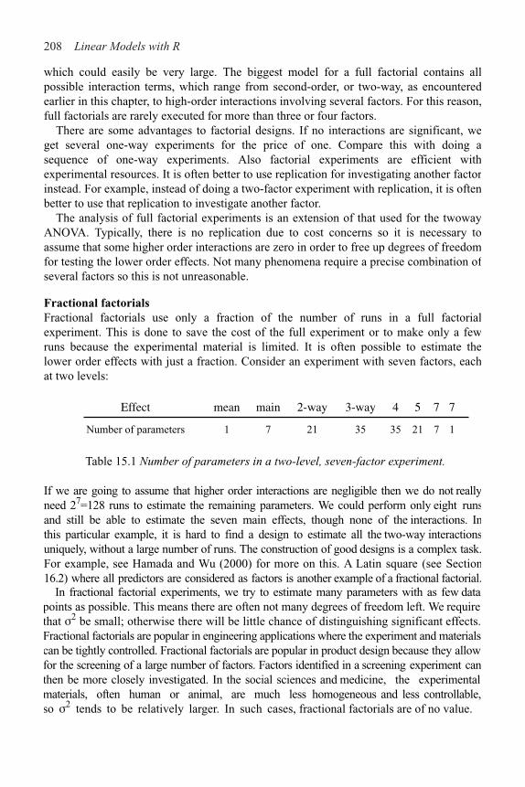
208 Linear Models with R
which could easily be very large. The biggest model for a full factorial contains allpossible interaction terms, which range from second-order, or two-way, as encounteredearlier in this chapter, to high-order interactions involving several factors. For this reason,full factorials are rarely executed for more than three or four factors.
There are some advantages to factorial designs. If no interactions are significant, weget several one-way experiments for the price of one. Compare this with doing asequence of one-way experiments. Also factorial experiments are efficient withexperimental resources. It is often better to use replication for investigating another factorinstead. For example, instead of doing a two-factor experiment with replication, it is oftenbetter to use that replication to investigate another factor.
The analysis of full factorial experiments is an extension of that used for the twowayANOVA. Typically, there is no replication due to cost concerns so it is necessary toassume that some higher order interactions are zero in order to free up degrees of freedomfor testing the lower order effects. Not many phenomena require a precise combination ofseveral factors so this is not unreasonable.
Fractional factorialsFractional factorials use only a fraction of the number of runs in a full factorialexperiment. This is done to save the cost of the full experiment or to make only a fewruns because the experimental material is limited. It is often possible to estimate thelower order effects with just a fraction. Consider an experiment with seven factors, eachat two levels:
Effect mean main 2-way 3-way 4 5 7 7
Number of parameters 1 7 21 35 35 21 7 1
Table 15.1 Number of parameters in a two-level, seven-factor experiment.
If we are going to assume that higher order interactions are negligible then we do not reallyneed 27=128 runs to estimate the remaining parameters. We could perform only eight runsand still be able to estimate the seven main effects, though none of the interactions. Inthis particular example, it is hard to find a design to estimate all the two-way interactionsuniquely, without a large number of runs. The construction of good designs is a complex task.For example, see Hamada and Wu (2000) for more on this. A Latin square (see Section 16.2) where all predictors are considered as factors is another example of a fractional factorial.
In fractional factorial experiments, we try to estimate many parameters with as few data points as possible. This means there are often not many degrees of freedom left. We requirethat #2 be small; otherwise there will be little chance of distinguishing significant effects.Fractional factorials are popular in engineering applications where the experiment and materialscan be tightly controlled. Fractional factorials are popular in product design because they allowfor the screening of a large number of factors. Factors identified in a screening experiment canthen be more closely investigated. In the social sciences and medicine, the experimental materials, often human or animal, are much less homogeneous and less controllable,so #2 tends to be relatively larger. In such cases, fractional factorials are of no value.
Factorial Designs 209
Let’s look at an example. Speedometer cables can be noisy because of shrinkage in the plastic casing material. An experiment was conducted to find out what caused shrinkage by screening a large number of factors. The engineers started with 15 different factors: liner outside diameter, liner die, liner material, liner line speed, wire braid type, braiding tension, wire diameter, liner tension, liner temperature, coating material, coating die type, melt temperature, screen pack, cooling method and line speed, labeled a through o. Response is percentage of shrinkage per specimen. There were two levels of each factor. The “+” indicates the high level of a factor and the “–” indicates the low level.
A full factorial would take 215 runs, which is highly impractical, thus a design with only 16 runs was used where the particular runs have been chosen specially so as to estimate the mean and the 15 main effects. We assume that there is no interaction effect of any kind. The data come from Box, Bisgaard, and Fung (1988).
Read in and check the data:
> data (speedo)
> speedo
h d l b j f n a i e m c k g o y
1 ! ! + ! + + ! ! + + ! + ! ! + 0.4850
2 + ! ! ! ! + + ! ! + + + + ! ! 0.5750
……
16 + + + + + + + + + + + + + + + 0.5825
Fit and examine a main effects only model:
> g < - lm (y ˜ ., speedo)
> summary (g)
Residuals:
ALL 16 residuals are 0: no residual degrees of freedom!
Coefficients:
Estimate Std. Error t value Pr(>|t|)
(Intercept) 0.5825000 NA NA NA
h– !0.0621875 NA NA NA
d– !0.0609375 NA NA NA
1– !0.0271875 NA NA NA
b– 0.0559375 NA NA NA
j– 0.0009375 NA NA NA
f– !0.0740625 NA NA NA
n– !0.0065625 NA NA NA
a– !0.0678125 NA NA NA
i– !0.0428125 NA NA NA
e– !0.2453125 NA NA NA
m– !0.0278125 NA NA NA
c– !0.0896875 NA NA NA
k– !0.0684375 NA NA NA
g– 0.1403125 NA NA NA
o– !0.0059375 NA NA NA
Residual standard error: NaN on 0 degrees of freedom
Multiple R-Squared: 1, Adjusted R-squared: NaN
F-statistic: NaN on 15 and 0 DF, p-value: NA

210 Linear Models with R
There are no degrees of freedom, because there are as many parameters as cases. We cannot doany of the usual tests. It is important to understand the coding here, so look at the X-matrix:
> model.matrix (g)
(Intercept) h d l b j f n a i e m c k g o
1 1 1 1 0 1 0 0 1 1 0 0 1 0 1 1 0
…etc…
We see that “+” is coded as zero and “&” is coded as one. This unnatural ordering isbecause of the order of “+” and “&” in the ASCII alphabet.
We do not have any degrees of freedom so we can not make the usual F-tests. We needa different method to determine significance. Suppose there were no significant effectsand the errors were normally distributed. The estimated effects would then just be linearcombinations of the errors and hence normal. We now make a normal quantile plot of themain effects with the idea that outliers represent significant effects:
> qqnorm (coef (g) [!1] , pch=names (coef (g) [!1] ) )
Figure 15.6 Q–Q plots of effects for speedometer cable analysis.
See Figure 15.6. Notice that “e” and possibly “g” are extreme. Since the “e” effect isnegative, the “+” level of “e” increases the response. Since shrinkage is a bad thing,increasing the response is not good so we would prefer whatever “wire braid” typecorresponds to the “&” level of “e”. The same reasoning for “g” leads us to expect that alarger (assuming that is “+”) would decrease shrinkage.
A half-normal plot is better for detecting extreme points:
> halfnorm (coef (g) [!1] ,labs=names(coef(g) [!1] ) )
We might now conduct another experiment focusing on the effect of “e” and “g.”

Factorial Designs 211
Exercises
1. Analyze warpbreaks data as a two-way ANOVA. Which factors are significant? Nowcheck for a good transformation on the response and see whether the model may besimplified. Now form a six-level factor from all combinations of the wool and tensionfactors. Which combinations are significantly different?
2. The barley data may be found in the lattice package. Perform a three-way ANOVAwith yield as the response. Check the diagnostics—you will find that two points stickout, which correspond to the same variety and site, but for different years. There isreason to suspect that the response values for these cases have been transposed.Investigate the effect of transposing these cases on the analysis.
3. Determine the important factors in the sono dataset where the Intensityis the responseand the other variables are predictors.
4. Using the rats data, model the survival time in terms of the poison and treatment. Usethe Box-Cox method to determine an appropriate transformation on the response.Which treatments and which poisons are significantly different?
5. The peanut data come from a fractional factorial experiment to investigate factors thataffect an industrial process using carbon dioxide to extract oil from peanuts.Determine which factors are important remembering to consider twoway interactions.


CHAPTER 16 Block Designs
In a completely randomized design (CRD), the treatments are assigned to the experimental units at random. This is appropriate when the units are homogeneous, as has been assumed in the designs leading to the one- and two-way analysis of variances (ANOVAs). Sometimes, we may suspect that the units are heterogeneous, but we can not describe the form the difference takes—for example, we may know that a group of patients are not identical, but we may have no further information about them. In this case, it is still appropriate to use a CRD. Of course, the randomization will tend to spread the heterogeneity around to reduce bias, but the real justification lies in the randomization test discussed in Section 3.3. Under the null hypothesis, there is no link between a factor and the response. In other words, the responses have been assigned to the units in a way that is unlinked to the factor. This corresponds to the randomization used in assigning the levels of the factor to the units. This is why the randomization is crucial because it allows us to make this argument. Now if the difference in the response between levels of the factor seems too unlikely to have occurred by chance, we can reject the null hypothesis. The normal-based inference is approximately equivalent to the permutation-based test. Since the normal-based inference is much quicker, we might prefer to use that.
When the experimental units are heterogeneous in a known way and can be arranged into blocks where the within block variation is ideally small, but the between block variation is large, a block design can be more efficient than a CRD. We prefer to have a block size equal to the number of treatments. If this cannot be done, an incomplete block design must be used.
Sometimes the blocks are determined by the experimenter. For example, suppose we want to compare four treatments and have 20 patients available. We might divide the patients into five blocks of four patients each where the patients in each block have some relevant similarity. We might decide this subjectively in the absence of specific information. In other cases, the blocks are predetermined by the nature of the experiment. For example, suppose we want to test three crop varieties on five fields. Restrictions on planting, harvesting and irrigation equipment might allow us only to divide the fields into three strips.
In a randomized block design, the treatment levels are assigned randomly within a block. This means the randomization is restricted relative to the full randomization used in the CRD. This has consequences for the inference. There are fewer possible permutations for the random assignment of the treatments, therefore, the computation of the significance of a statistic based on the permutation test would need to be modified. Similarly, a block effect must be included in the model used for inference about the treatments, even if the block effect is not significant.
16.1 Randomized Block Design
We have one treatment factor, 0 at t levels and one blocking factor, ! at r levels. Themodel is:

214 Linear Models with R
yij=!+0
i+!
j+"
ij
where 0i is the treatment effect and /
j is the blocking effect. There is one observation on
each treatment in each block. This is called a randomized complete block design (RCBD). The analysis is then very similar to the two-way ANOVA with one observationper cell. We can check for an interaction and check for a treatment effect. We can alsocheck the block effect, but this is only useful for future reference. Blocking is a feature ofthe experimental units and restricts the randomized assignment of the treatments. Thismeans that we cannot regain the degrees of freedom devoted to blocking even if theblocking effect is not significant. The randomization test-based argument means that wemust judge the magnitude of the treatment effect within the context of the restrictedrandomization that has been used.
We illustrate this with an experiment to compare eight varieties of oats. The growingarea was heterogeneous and so was grouped into five blocks. Each variety was sown oncewithin each block and the yield in grams per 16-ft row was recorded. The data come fromAnderson and Bancroft (1952).
We start with a look at the data:
> data (oatvar)
> attach (oatvar)
> xtabs (yield ˜ variety + block)
block
variety I II III IV V
1 296 357 340 331 348
2 402 390 431 340 320
3 437 334 426 320 296
4 303 319 310 260 242
5 469 405 442 487 394
6 345 342 358 300 308
7 324 339 357 352 220
8 488 374 401 338 320
> stripchart (yield ˜ variety, xlab="yield", ylab="variety")
> stripchart (yield ˜ block, xlab="yield", ylab="block")
See Figure 16.1. There is no indication of outliers, skewness or nonconstant variance.Now check for interactions, as seen in Figure 16.2:
> interaction.plot (variety, block, yield)
> interaction.plot (block, variety, yield)
There is no clear evidence of interaction:
> g < - lm (yield ˜ block+variety) >
anova (g)
Analysis of Variance Table

Block Designs 215
Response: yield
Df Sum Sq Mean Sq F value Pr ( >F)
Figure 16.1 Strip plots of oat variety data.
Figure 16.2 Interaction plots for oat variety data.
block 4 33396 8349 6.24 0.001
variety 7 77524 11075 8.28 1.8e–05
Residuals 28 37433 1337
Both effects are significant. The ANOVA table corresponds to a sequential testing ofmodels, here corresponding to the sequence:
y ˜ 1
y ˜ block
y ˜ block+variety

216 Linear Models with R
So here the p-value 0.001 corresponds to a comparison of the first two models in this list,while the p-value of 1.8e–05 corresponds to the test comparing the second two. Thedenominator in both F-tests is the mean square from the full model, here 1337. Thismeans that a test of the block effect that leaves out the variety effect is not the same:
> anova (lm (yield ˜ block))
Analysis of Variance Table
Response: yield
Df Sum Sq Mean Sq F value Pr(>F)
block 4 33396 8349 2.54 0.057
Residuals 35 114957 3284
There is a difference in significance in this case. This latter test is incorrect for testing theblocking effect.
Notice that if we change the order of the terms in the ANOVA, it makes no differencebecause of the orthogonal design:
> anova (lm (yield ˜ variety+block))
Analysis of Variance Table
Response: yield
Df Sum Sq Mean Sq F value Pr(>F)
variety 7 77524 11075 8.28 1.8e–05
block 4 33396 8349 6.24 0.001
Residuals 28 37433 1337
By way of comparison, see what happens if we omit the first observation in thedataset—this might happen in practice if this run is lost:
> anova (1m(yield ˜ block+variety,subset=!l))
Analysis of Variance Table
Response: yield
Df Sum Sq Mean Sq F value Pr(>F)
block 4 38581 9645 8.41 0.00015
variety 7 75339 10763 9.38 7.3e–06
Residuals 27 30968 1147
> anova(lm(yield ˜ variety+block, subset=!l))
Analysis of Variance Table
Response: yield
Df Sum Sq Mean Sq F value Pr(>F)
variety 7 75902 10843 9.45 6.8e–06
block 4 38018 9504 8.29 0.00017
Residuals 27 30968 1147
As there is one missing observation, the design is no longer orthogonal and the order doesmatter, although it would not change the general conclusions. If we want to test for atreatment effect, we would prefer the first of these two tables since in that version theblocking factor is already included when we test the treatment factor. Since the blockingfactor is an unalterable feature of the chosen design, this is as it should be. A convenientway to test all terms relative to the full model is:

Block Designs 217
> drop1 (lm (yield ˜ variety+block, subset=!l), test="F")
Single term deletions
Model:
yield ˜ variety + block
Df Sum of Sq RSS AIC F value Pr(F)
<none> 30968 284
variety 7 75339 106307 319 9.38 7.3e–06
block 4 38018 68986 308 8.29 0.00017
Check the diagnostics, as seen in Figure 16.3:
> plot (fitted (g), residuals (g), xlab="Fitted", ylab="Residuals"]
> abline (h=0)
> qqnorm (residuals (g))
> qqline (residuals (g))
Figure 16.3 Diagnostic plots for the oat variety data.
An examination of which varieties give the highest yields and which are significantlybetter than others can now follow.
We did assume that the interactions were not significant. We looked at the interactionplots, but we can also execute the Tukey nonadditivity test:
> varcoefs < - c (0, coef (g) [6:12])
> blockcoefs < - c (0, coef (g) [2:5])
> ab < - rep (varcoefs,each=5)*rep(blockcoefs,8)
> h < - update (g, .˜.+ab)
> anova (h)
Analysis of Variance Table
Response : yield
Df Sum Sq Mean Sq F value Pr(>F)
block 4 33396 8349 6.06 0.0013
variety 7 77524 11075 8.03 2.8e–05

218 Linear Models with R
ab 1 213 213 0.15 0.6974
Residuals 27 37220 1379
Because the p-value of the treatment times block effect is 0.6974, we accept the nullhypothesis of no interaction. Of course, the interaction may be of a nonmultiplicativeform, but there is little we can do about that.
Relative advantage of RCBD over CRDWe can measure precision by considering or equivalently . We should compare
the for designs with the same sample size. We define relative efficiency as
where the quantities can be computed by fitting models with and withoutthe blocking effect. For the example above:
> gcrd < - lm (yield ˜ variety)
> summary (gcrd) $sig
[1] 47.047
> summary (g) $sig
[1] 33.867
> (47.047/33.867)ˆ2
[1] 1.9298
So a CRD would require 93% more observations to obtain the same level of precision asan RCBD.
The efficiency is not guaranteed to be greater than one. Only use blocking where thereis some heterogeneity in the experimental units. The decision to block is a matter ofjudgment prior to the experiment. There is no guarantee that it will increase precision.
16.2 Latin Squares
Latin squares are useful when there are two blocking variables. For example, in a fieldused for agricultural experiments, the level of moisture may vary across the field in onedirection and the fertility, in another. In an industrial experiment, suppose we wish tocompare four production methods (the treatments)—A, B, C and D. We have availablefour machines 1, 2, 3 and 4, and four operators, I, II, III and IV. A Latin square design isshown in Table 16.1.
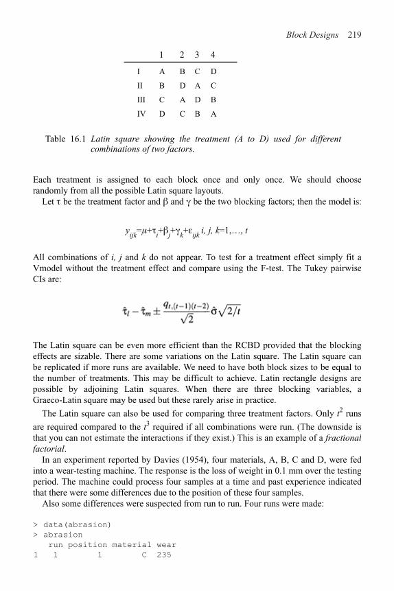
Block Designs 219
1 2 3 4
I A B C D
II B D A C
III C A D B
IV D C B A
Table 16.1 Latin square showing the treatment (A to D) used for differentcombinations of two factors.
Each treatment is assigned to each block once and only once. We should chooserandomly from all the possible Latin square layouts.
Let 0 be the treatment factor and ! and * be the two blocking factors; then the model is:
yijk
=!+0i+!
j+*
k+"
ijk i, j, k=1,…, t
All combinations of i, j and k do not appear. To test for a treatment effect simply fit aVmodel without the treatment effect and compare using the F-test. The Tukey pairwiseCIs are:
The Latin square can be even more efficient than the RCBD provided that the blockingeffects are sizable. There are some variations on the Latin square. The Latin square canbe replicated if more runs are available. We need to have both block sizes to be equal tothe number of treatments. This may be difficult to achieve. Latin rectangle designs arepossible by adjoining Latin squares. When there are three blocking variables, aGraeco-Latin square may be used but these rarely arise in practice.
The Latin square can also be used for comparing three treatment factors. Only t2 runs
are required compared to the t3 required if all combinations were run. (The downside isthat you can not estimate the interactions if they exist.) This is an example of a fractionalfactorial.
In an experiment reported by Davies (1954), four materials, A, B, C and D, were fedinto a wear-testing machine. The response is the loss of weight in 0.1 mm over the testingperiod. The machine could process four samples at a time and past experience indicatedthat there were some differences due to the position of these four samples.
Also some differences were suspected from run to run. Four runs were made:
> data(abrasion)
> abrasion
run position material wear
1 1 1 C 235

220 Linear Models with R
2 1 2 D 236
..etc..
1 4 4 D 225
We can check the Latin square structure:
> matrix(abrasion$material, 4, 4)
[,1] [,2] [,3] [,4]
[1,] "C" "A" "D" "B"
[2,] "D" "B" "C" "A"
[3,] "B" "D" "A" "C"
[4,] "A" "C" "B" "D"
Plot the data:
> with (abrasion, stripchart (wear material,
xlab="Material",vert=T))
> with (abrasion, stripchart (wear run, xlab="Run",vert=T))
> with (abrasion, stripchart (wear position,
xlab="Position", vert=T))
Figure 16.4 Amount of wear depending on material, run and position.
Examine the plots in Figure 16.4. There appear to be differences in all variables. Nooutliers, skewness or unequal variance is apparent.
Now fit the Latin square model and test each variable relative to the full model:
> g < - lm (wear ~ material+run+position, abrasion)
> drop1 (g, test="F")
Single term deletions
Model: wear ˜ material + run + position
Df Sum of Sq RSS AIC F value Pr(F)
<none> 368 70
material 3 4621 4989 106 25.15 0.00085
run 3 986 1354 85 5.37 0.03901
position 3 1468 1836 90 7.99 0.01617
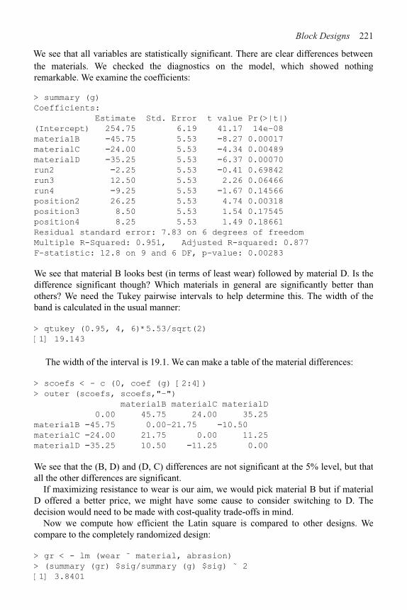
Block Designs 221
the materials. We checked the diagnostics on the model, which showed nothing remarkable. We examine the coefficients:
> summary (g)
Coefficients:
Estimate Std. Error t value Pr(>|t|)
(Intercept) 254.75 6.19 41.17 14e–08
materia1B !45.75 5.53 !8.27 0.00017
materialC !24.00 5.53 !4.34 0.00489
materialD !35.25 5.53 !6.37 0.00070
run2 !2.25 5.53 !0.41 0.69842
run3 12.50 5.53 2.26 0.06466
run4 !9.25 5.53 !1.67 0.14566
position2 26.25 5.53 4.74 0.00318
position3 8.50 5.53 1.54 0.17545
position4 8.25 5.53 1.49 0.18661
Residual standard error: 7.83 on 6 degrees of freedom
Multiple R-Squared: 0.951, Adjusted R-squared: 0.877
F-statistic: 12.8 on 9 and 6 DF, p-value: 0.00283
We see that material B looks best (in terms of least wear) followed by material D. Is thedifference significant though? Which materials in general are significantly better thanothers? We need the Tukey pairwise intervals to help determine this. The width of theband is calculated in the usual manner:
> qtukey (0.95, 4, 6)*5.53/sqrt(2)
[1] 19.143
The width of the interval is 19.1. We can make a table of the material differences:
> scoefs < - c (0, coef (g) [2:4])
> outer (scoefs, scoefs,"–")
materia1B materialC materialD
0.00 45.75 24.00 35.25
materia1B !45.75 0.00–21.75 !10.50
materialC !24.00 21.75 0.00 11.25
materialD !35.25 10.50 !11.25 0.00
We see that the (B, D) and (D, C) differences are not significant at the 5% level, but that all the other differences are significant.
If maximizing resistance to wear is our aim, we would pick material B but if material D offered a better price, we might have some cause to consider switching to D. The decision would need to be made with cost-quality trade-offs in mind.
Now we compute how efficient the Latin square is compared to other designs. We compare to the completely randomized design:
> gr < - lm (wear ˜ material, abrasion)
> (summary (gr) $sig/summary (g) $sig) ˜ 2
[1] 3.8401
We see that all variables are statistically significant. There are clear differences between

222 Linear Models with R
We see that the Latin square is 3.84 times more efficient than the CRD. This is asubstantial gain in efficiency. The Latin square may also be combined to designs wherewe block on only one of the variables. The efficiency relative to these designs is lessimpressive, but still worthwhile.
16.3 Balanced Incomplete Block Design
In a complete block design, the block size is equal to the number of treatments. When theblock size is less than the number of treatments, an incomplete block design must beused. For example, in the oat example, suppose six oat varieties were to be compared, buteach field had space for only four plots.
In an incomplete block design, the treatments and blocks are not orthogonal. Sometreatment contrasts will not be identifiable from certain block contrasts. This is anexample of confounding. This means that those treatment contrasts effectively cannot beexamined. In a balanced incomplete block (BIB) design, all the pairwise differences areidentifiable and have the same standard error. Pairwise differences are more likely to beinteresting than other contrasts, so the design is constructed to facilitate this.
Suppose, we have four treatments (t=4) A, B, C, D and the block size, k=3 and thereare b=4 blocks. Therefore, each treatment appears r=3 times in the design. One possibleBIB design is:
Block 1 A B C
Block 2 A B D
Block 3 A C D
Block 4 B C D
Table 16.2 BIB design for four treatments with four blocks of size three.
Each pair of treatments appears in the same block $=2 times—this feature means simplerpairwise comparison is possible. For a BIB design, we require:
b # t > k rt = bk = n$(t–1) = r(k–1)
This last relation holds because the number of pairs in a block is k (k#1)/2 so the totalnumber of pairs must be bk (k&1)/2. On the other hand, the number of treatment pairs is t(t&1 )/2. The ratio of these two quantities must be $.
Since $ has to be an integer, a BIB design is not always possible even when the firsttwo conditions are satisfied. For example, consider r=4, t=3, b=6, k=2 and then $=2which is OK, but if r=4, t=4, b=8, k=2, then $=4/3 so no BIB is possible. (Somethingcalled a partially balanced incomplete block design can then be used.) BIBs are alsouseful for competitions where not all contestants can fit in the same race.

Block Designs 223
The model we fit is the same as for the RCBD:
yij=!+0
i+!
j+"
ij
In our example, a nutritionist studied the effects of six diets, “a” through “f,” on weight gain of domestic rabbits. From past experience with sizes of litters, it was felt that only three uniform rabbits could be selected from each available litter. There were ten litters available forming blocks of size three. The data come from Lentner and Bishop (1986). Examine the data:
> data(rabbit)
> xtabs (gain ˜ treat+block, rabbit)
block
treat b1 b10 b2 b3 b4 b5 b6 b7 b8 b9
a 0.0 37.3 40.1 0.0 44.9 0.0 45.2 44.0 0.0
b 32.6 0.0 38.1 0.0 0.0 0.0 37.3 40.6 0.0 30.6
c 35.2 0.0 40.9 34.6 43.9 40.9 0.0 0.0 0.0 0.0
d 0.0 42.3 0.0 37.5 0.0 37.3 0.0 37.9 0.0 27.5
e 0.0 0.0 0.0 0.0 40.8 32.0 40.5 0.0 38.5 20.6
f 42.2 41.7 0.0 34.3 0.0 0.0 42.8 0.0 51.9 0.0
The zero values correspond to no observation. The BIB structure is apparent—each pair of diets appear in the same block exactly twice. Now plot the data, as seen in Figure 16.5:
> attach(rabbit)
> stripchart (gain ˜ block, xlab="weight gain",ylab="block")
> stripchart (gain ˜ treat, xlab="weight gain", ylab="treat")
Figure 16.5 Strip plots of rabbit diet data.
We fit the model taking care to put the blocking factor first:

224 Linear Models with R
> g < - lm (gain ˜ block+treat,rabbit) >
anova (g)
Analysis of Variance Table
Response: gain
Df Sum Sq Mean Sq F value Pr( >F)
block 9 730 81 8.07 0.00025
treat 5 159 32 3.16 0.03817
Residuals 15 151 10
Changing the order of treatment and block:
Analysis of Variance Table
> anova (lm(gain ˜ treat+block, rabbit))
Response: gain
Df Sum Sq Mean Sq F value Pr(>F)
treat 5 293 59 5.84 0.00345
block 9 596 66 6.59 0.00076
Residuals 15 151 10
does make a difference because the design is not orthogonal because of theincompleteness. We prefer the first table, because we want to test for a treatment effectafter the blocking effect has been considered.
Now check the diagnostics:
> plot (fitted (g), residuals (g), xlab="Fittedn, ylab="Residuals")
> abline (h=0)
> qqnorm (residuals (g), main="")
> qqline (residuals (g))
The plots are not shown, as they show nothing of interest.Now we check which treatments differ. The Tukey pairwise CIs need to be directly
constructed because this is not a complete layout. We extract the information about hetreatment effects and the standard error:
> coef (summary (g))
Estimate Std. Error t value Pr(>|t|)
treatb !1.741667 2.2418 !0.776898 0.449298
treatc 0.400000 2.2418 0.178426 0.860776
treatd 0.066667 2.2418 0.029738 0.976668
treate !5.225000 2.2418 !2.330695 0.034134
treatf 3.300000 2.2418 1.472018 0.161686
We see that the standard error for the pairwise comparison is 2.24. Notice that all thetreatment standard errors are equal because of the BIB. Now compute the Tukey criticalvalue:

Block Designs 225
> qtukey(0.95, 6, 15)
[1] 4.5947
So the intervals have width:
> 4.59*2.24/sqrt (2)
[1] 7.2702
We check which pairs are significantly different:
> tcoefs < - c (0, coef (g) [11:15])
> abs (outer (tcoefs, tcoefs,"–")) > 7.27
treatb treatc treatd treate treatf
FALSE FALSE FALSE FALSE FALSE FALSE
treatb FALSE FALSE FALSE FALSE FALSE FALSE
treatc FALSE FALSE FALSE FALSE FALSE FALSE
treatd FALSE FALSE FALSE FALSE FALSE FALSE
treate FALSE FALSE FALSE FALSE FALSE TRUE
treatf FALSE FALSE FALSE FALSE TRUE FALSE
Only the e–f difference is significant.Now let’s see how much better this blocked design is than the CRD. We compute the
relative efficiency:
> gr < - lm (gain ˜ treat,rabbit)
> (summary (gr) $sig/summary (g) $sig)ˆ2
[1] 3.0945
Blocking was well worthwhile here.
Exercises
1. The alf alf a data arise from a Latin square design where the treatment factor is inocu-lum and the blocking factors are shade and irrigation. Test the significance of the ef-fects and determine which levels of the treatment factor are significantly different.
2. The eggprod comes from a randomized block experiment to determine factors affecting egg production. Is there a difference in the treatments? What is the nature of the difference? What efficiency was gained by the blocked design?
3. The morley data can be viewed as a randomized block experiment with Run as the treatment factor and Expt as the blocking factor. Is there a difference between runs and what efficiency is gained by blocking?
4. The OrchardSprays data arise from a Latin square design. Which factors show a difference? What pairs of treatments are different? Can the treatment factor be replaced with a linear term? What efficiency is gained by this design?
5. The resceram data arise from an experiment to test the effects of resistor shape on current noise. The resistors are mounted on plates and only three resistors will fit on a plate although there are four different shapes to be tested. Identify the design and analyze. Which shapes are different?


APPENDIX AR Installation, Functions and Data
R may be obtained from the R project Web site at www.r-project.org.This book uses some functions and data that are not part of base R. You may wish to
download these extras from the R Web site. The additional packages used are:
MASS, nlme, splines, leaps, quantreg, Imtest, pls.pcr,
ellipse, faraway
MASS, splines and nlme are part of the “recommended” R installation; you will have these already unless you choose a nonstandard installation. Use the command:
> library( )
within R to see what packages you have. Under Windows, to install the additional packages, choose the “Install packages from CRAN” menu option. You must have a network connection for this to work—if you are working offline, you may use the “Install packages from local zip file” menu option provided you have already obtained the necessary packages. Under other operating systems, such as Macintosh or Linux, the installation procedure differs. Consult the R Web site for details.
I have packaged the data and functions that I have used in this book as an R package called f araway that you may obtain from CRAN or the book Web site at www.stat.lsa.umich.edu/˜faraway/LMR. The functions defined are:
hal fnorm Half normal plot
qqnorml Case-labeled Q–Q plot
vif Variance Inflation factors
prplot Partial residual plot
In addition the following datasets are used as examples in the text:
abrasion Wear test experiment with Latin square design
chredlin Chicago insurance redlining
chmiss Chicago data with some missing values
coagulation Blood coagulation times by diet
composite factors
corrosion Corrosion loss in Cu-Ni alloys
eco Ecological regression example
fpe 1981 French presidential election
fruitfly Longevity of fruitflies depending on sexual activity
gala Species diversity on the Galapagos Islands
Strength of a thermoplastic composite depending on two

228 Appendix A: R Installation, Functions and Data
meatspec Meat spectrometry to determine fat content
oatvar Yields of oat varieties grown in blocks
odor Odor of chemical by production settings
pima Diabetes survey on Pima Indians
pvc Production of PVC by operator and resin railcar
rabbit Rabbit weight gain by diet and litter
savings Savings rates in 50 countries
seatpos Car seat position depending driver size
sexab Post traumatic stress disorder in abused women
speedo Speedometer cable shrinkage
star Star light intensities and temperatures
stat500 Scores for students in Stat500 class
Some additional datasets are provided for the exercises.Where add-on packages are needed in the text, you will find the appropriate library ( )
command. However, I have assumed that the faraway library is always loaded. You can add a line reading library (faraway) to your Rprofile file if you expect to use this package in every session. Otherwise, you will need to remember to type it each time.
I set the following options to achieve the output seen in this book:
> options (digits=5, show.signif.stars=FALSE)
The digits=5 reduces the number of digits shown when printing numbers from the default of seven. Note that this does not reduce the precision with which these numbers are internally stored. One might take this further—anything more than two or three significant digits in a displayed table is usually unnecessary and more importantly, distracting. I have also edited the output in the text to remove extraneous output or to improve the formatting.
The code and output shown in this book were generated under R version 1.9.0. R is regularly updated and improved so more recent versions may show some differences in the output.

APPENDIX B Quick Introduction to R
This is just a brief introduction to R. See the preface for recommendations about how to learn more about R.
B.1 Reading the Data In
The first step is to read the data in. You can use the read. table ( ) or scan ( ) functions to read data in from outside R. You can also use the data ( ) function to access data already available within R:
> data (stackloss)
> stackloss
Air.Flow Water.Temp Acid.Conc. stack.loss
1 80 27 89 42
2 80 27 88 37
…stuff deleted…
21 70 20 91 15
Type:
> help (stackloss)
to see more information about the data. We can check the dimension of the data:
> dim (stackloss)
[1] 21 4
There are 21 rows and four columns.
B.2 Numerical Summaries
One easy way to get the basic numerical summaries is:
> summary (stackloss)
Air.Flow Water.Temp Acid.Conc. stack.loss
Min. :50.0 Min. :17.0 Min. :72.0 Min. : 7.0
1st Qu.:56.0 1st Qu.:18.0 1st Qu.:82.0 1st Qu.:11.0
Median :58.0 Median :20.0 Median :87.0 Median :15.0
Mean :60.4 Mean :21.1 Mean :86.3 Mean :17.5
3rd Qu.:62.0 3rd Qu.:24.0 3rd Qu.:89.0 3rd Qu.:19.0
Max. :80.0 Max. :27.0 Max. :93.0 Max. :42.0

230 Appendix B: Quick Introduction to R
> stackloss$Air.Flow
[1] 80 80 75 62 62 62 62 62 58 58 58 58 58 58 50 50 50 50 50 56
[21] 70
> mean (stackloss$Ai)
[1] 60.429
> median(stackloss$Ai)
[1] 58
> range (stackloss$Ai)
[1] 50 80
> quantile (stackloss$Ai)
0% 25% 50% 75% 100%
50 56 58 62 80
We can get the variance and standard deviation:
> var (stackloss$Ai)
[1] 84.057
> sd (stackloss$Ai)
[1] 9.1683
We might also want the correlations:
> cor (stackloss)
Air.Flow Water.Temp Acid.Conc. stack.loss
Air.Flow 1.00000 0.78185 0.50014 0.91966
Water.Temp 0.78185 1.00000 0.39094 0.87550
Acid.Conc. 0.50014 0.39094 1.00000 0.39983
stack.loss 0.91966 0.87550 0.39983 1.00000
B.3 Graphical Summaries
We can make histograms and boxplots and specify the labels:
> hist (stackloss$Ai)
> hist (stackloss$Ai, main="Histogram of Air Flow",
xlab="Flow of cooling air")
> boxplot (stackloss$Ai)
Scatterplots are also easily constructed:
> plot (stackloss$Ai, stackloss$W)
> plot (Water.Temp ˜ Air.Flow, stackloss, xlab="Air Flow"
ylab="Water Temperature")
We can make a scatterplot matrix:
> plot (stackloss)
We can also compute these numbers separately:

Appendix B: Quick Introduction to R 231
We can put several plots in one display:
> par(mfrow=c (2, 2))
> boxplot (stackloss$Ai)
> boxplot (stackloss$Wa)
> boxplot(stackloss$Ac)
> boxplot (stackloss$s)
> par(mfrow=c(1, 1))
where the final command causes a return to one plot per display.
B.4 Selecting Subsets of the Data
The second row:
> stackloss [2,]
Air.Flow Water.Temp Acid.Conc. stack.loss
2 80 27 88 37
The third column:
> stackloss [,3]
[1] 89 88 90 87 87 87 93 93 87 80 89 88 82 93 89 86 72 79 80 82
[21] 91
The (2, 3) element:
> stackloss [2, 3]
[1] 88
c ( ) is a function for making vectors—for example:
> c (1, 2, 4)
[1] 124
Select the first, second and fourth rows:
> stackloss [0 (1, 2, 4),]
Air.Flow Water.Temp Acid.Conc. stack.loss
1 80 27 89 42
2 80 27 88 37
4 62 24 87 28

232 Appendix B: Quick Introduction to R
> 3:11
[1] 3 4 5 6 7 8 9 10 11
We can select the third through sixth rows:
> stackloss [3:6,]
Air.Flow Water.Temp Acid.Conc. stack.loss
3 75 25 90 37
4 62 24 87 28
5 62 22 87 18
6 62 23 87 18
We can use “&” to indicate “everything but”—that is all the data except the first two columns:
> stackloss[,–c (1, 2)]
Acid.Conc. stack.loss
1 89 42
2 88 37
…
21 91 15
We may also want to select the subsets on the basis of some criterion—for example, those cases which have an air flow greater than 72:
> stackloss[stackloss$Ai > 72,]
Air.Flow Water.Temp Acid.Conc. stack.loss
1 80 27 89 42
2 80 27 88 37
3 75 25 90 37
B.5 Learning More about R
While running R you can get help about a particular command, for example, if you want help about the boxplot ( ) command, just type help (boxplot). If you do not know what the name of the command is that you want to use, then type:
help.start ( )
and then browse. You will be able to pick up the language from the examples in the text and from the help pages.
The: operator is good for making sequences—for example:

Bibliography
Anderson, C. and R.Loynes (1987). The Teaching of Practical Statistics. New York:Wiley.
Anderson, R. and T.Bancroft (1952). Statistical Theory in Research. New York: McGrawHill.
Andrews, D. and A.Herzberg (1985). Data: A Collection of Problems from Many Fieldsfor the Student and Research Worker. New York: Springer-Verlag.
Becker, R., J.Chambers, and A.Wilks (1998). The New S Language: A ProgramingEnvironment for Data Analysis and Graphics (revised ed.). Boca Raton, FL: CRCPress.
Belsley, D., E.Kuh, and R.Welsch (1980). Regression Diagnostics: Identifying InfluentialData and Sources of Collinearity. New York: Wiley.
Berkson, J. (1950). Are there two regressions? Journal of the American StatisticalAssociation 45, 165–180.
Box, G., S.Bisgaard, and C.Fung (1988). An explanation and critique of Taguchi’scontributions to quality engineering. Quality and Reliability Engineering International4, 123–131.
Box, G., W.Hunter, and J.Hunter (1978). Statistics for Experimenters. New York: Wiley.Carroll, R. and D.Ruppert (1988). Transformation and Weighting in Regression. London:
Chapman & Hall.Chambers, J. and T.Hastie (1991). Statistical Models in S. London: Chapman & Hall.Chatfield, C. (1995). Model uncertainty, data mining and statistical inference. JRSS-A
158, 419–466.Cook, J. and L.Stefanski (1994). Simulation-extrapolation estimation in parametric
measurement error models. Journal of the American Statistical Association 89,1314–1328.
Dahl, G. and E.Moretti (2003). The demand for sons: Evidence from divorce, fertility andshotgun marriage. Working paper.
Dalgaard, P. (2002). Introductory Statistics with R. New York: Springer.Davies, O. (1954). The Design and Analysis of Industrial Experiments. New York: Wiley.de Boor, C. (2002). A Practical Guide to Splines. New York: Springer.de Jong, S. (1993). Simpls: An alternative approach to partial least squares regression.
Chemometrics and Intelligent Laboratory Systems 18, 251–263.Draper, D. (1995). Assessment and propagation of model uncertainty. JRSS-B 57, 45–97.Draper, N. and H.Smith (1998). Applied Regression Analysis (3rd ed.). New York: Wiley.Efron, B. and R.Tibshirani (1993). An Introduction to the Bootstrap. London: Chapman
& Hall.Faraway, J. (1992). On the cost of data analysis. Journal of Computational and Graphical
Statistics 1, 215–231.Faraway, J. (1994). Order of actions in regression analysis. In P.Cheeseman and
W.Oldford (Eds.), Selecting Models from Data: Artificial Intelligence and Statistics IV,pp. 403–411. New York: Springer-Verlag.
Fisher, R. (1936). Has Mendel’s work been rediscovered? Annals of Science 1, 115–137.

234 Bibliography
Fox, J. (2002). An R and S-Plus Companion to Applied Regression. Thousand Oaks, CA: Sage Publications.
Frank, I. and J.Friedman (1993). A statistical view of some chemometrics tools. Technometrics 35, 109–135.
Freedman, D. and D.Lane (1983). A nonstochastic interpretation of reported significance levels. Journal of Business and Economic Statistics 1(4), 292–298.
Garthwaite, P. (1994). An interpretation of partial least squares. Journal of the American Statistical Association 89, 122–127.
Hamada, M. and J.Wu (2000). Experiments: Planning, Analysis, and Parameter Design Optimization. New York: Wiley.
Hastie, T., R.Tibshirani, and J.Friedman (2001). The Elements of Statistical Learning: Data Mining, Inference, and Prediction. New York: Springer.
Hsu, J. (1996). Multiple Comparisons Procedures: Theory and Methods. London: Chapman & Hall.
Ihaka, R. and R.Gentleman (1996). R: A language for data analysis and graphics. Journal of Computational and Graphical Statistics 5(3), 299–314.
John, P. (1971). Statistical Design and Analysis of Experiments. New York: Macmillan. Johnson, M. and P.Raven (1973). Species number and endemism: the Galápagos
Archipelago revisited. Science 179, 893–895.Johnson, R. and D.Wichern (2002). Applied Multivariate Statistical Analysis (5th ed.).
New Jersey: Prentice Hall.Lentner, M. and T.Bishop (1986). Experimental Design and Analysis. Blacksburg, VA:
Valley Book Company.Little, R. and D.Rubin (2002). Statistical Analysis with Missing Data (2nd ed.). New
York: Wiley.Longley, J. (1967). An appraisal of least-squares programs from the point of view of the
user. Journal of the American Statistical Association 62, 819–841.Maindonald, J. and J.Braun (2003). Data Analysis and Graphics Using R. Cambridge:
Cambridge University Press.Mazumdar, S. and S.Hoa (1995). Application of a Taguchi method for process
enhancement of an online consolidation technique. Composites 26, 669–673.Morris, R. and E.Watson (1998). A comparison of the techniques used to evaluate the
measurement process. Quality Engineering 11, 213–219.Partridge, L. and M.Farquhar (1981). Sexual activity and the lifespan of male fruitflies.
Nature 294, 580–581.Pinheiro, J. and D.Bates (2000). Mixed-Effects Models in S and S-PLUS. New York:
Springer.R Development Core Team (2003). R: A language and environment for statistical
computing. Vienna, Austria: R Foundation for Statistical Computing. http://www.R-project.org.
Ripley, B. (1996). Pattern Recognition and Neural Networks. Cambridge: Cambridge University Press.
Ripley, B. and W.Venables (2000). S Programming. New York: Springer-Verlag. Rodriguez, N., S.Ryan, H.V.Kemp, and D.Foy (1997). Post-traumatic stress disorder in
adult female survivors of childhood sexual abuse: A comparison study. Journal ofConsulting and Clinical Pyschology 65, 53–59.

Bibliography 235
Rousseeuw, P. and A.Leroy (1987). Robust Regression and Outlier Detection. New York: Wiley.
Schafer, J. (1997). Analysis of Incomplete Multivariate Data. London: Chapman & Hall. Sen, A. and M.Srivastava (1990). Regression Analysis: Theory, Methods and
Applications. New York: Springer-Verlag.Simonoff, J. (1996). Smoothing Methods in Statistics. New York: Springer.Stigler, S. (1986). The History of Statistics. Cambridge, MA: Belknap Press.Stolarski, R., A.Krueger, M.Schoeberl, R.McPeters, P.Newman, and J.Alpert (1986). Nimbus
7 satellite measurements of the springtime antarctic ozone decrease. Nature (322), 808-811.Thisted, R. (1988). Elements of Statistical Computing. New York: Chapman & Hall. Thodberg, H.H. (1993). Ace of Bayes: Application of neural networks with pruning.
Technical Report 1132E, Maglegaard vej 2, DK-4000 Roskilde, Danmark.Venables, W. and B.Ripley (2002). Modern Applied Statistics with S-PLUS (4th ed.).
New York: Springer.Weisberg, S. (1985). Applied Linear Regression (2nd ed.). New York: Wiley.Wold, S., A.Ruhe, H.Wold, and W.Dunn (1984). The collinearity problem in linear re-
gression: The partial least squares (pls) approach to generalized inverses. SIAM Journal on Scientific and Statistical Computing 5, 735–743.


Index
added variable plot, 72
adjusted R2, 127AIC, see Akaike Information Criterion Akaike Information Criterion, 126 analysis of covariance, 7, 167 analysis of variance, 7, 181 ANCOVA, see analysis of covariance ANOVA, see analysis of variance
B-splines, 116 back transformation, 109 backward elimination, 122 balanced incomplete block design, 212 bias, 78 BIC, 126 blocking, 203 BLUE, 15 Bonferroni correction, 67, 176, 187 bootstrap, 102 Box-Cox method, 110 boxplot, 182 breakdown point, 101 broken stick regression, 112
Cauchy distribution, 59 causation, 46 centering, 82 central composite design, 41 Choleski decomposition, 89 coefficient of determination, 17 collinearity, 83–87 completely randomized design, 203 condition number, 83 confidence interval, 36 confidence intervals, 34 confidence region, 34 contrast matrix, 173 contrasts, 188 Cook statistics, 69, 156 correlated errors, 61–63 C
p, 127
crossvalidation, 139

238 Index
abrasion, 209 airquality, 61 cars, 79 chmiss, 163 chredlin, 153 coagulation, 182 composite, 190 corrosion, 96 eco, 152 f pe, 93 f ruitfly, 174 gala, 18, 57, 100, 111 longley, 90 meatspec, 135 oatvar, 204 odor, 40 pima, 2 pvc, 194 rabbit, 213 savings, 28, 54, 81, 110 seatpos, 84 sexab, 168 speedo, 199 stackloss, 219 star, 68, 105 stat500, 7 state, 123
degrees of freedom, 14 dependent, 6 designed experiment, 39–43, 78 diagnostics, 53–75 dummy variable, 168 Durbin-Watson test, 61
ecological correlation, 151 eigenvalues, 83, 134 Einstein, 1, 47 ellipse, 34–35 EM algorithm, 163 estimable function, 15 explanatory, 6 extrapolation, 38, 48
F-test, 26 factor, 167 factorial, 197 fitted values, 14 fixed effects, 181 forward selection, 123 fractional factorial, 198
datasets
future observation, 37

Index 239
Gauss-Markov theorem, 15–16 generalized least squares, 63, 89 genetic algorithm, 101
half-normal plot, 64, 70 hat-matrix, 14, 53, 64 Helmert coding, 173 heteroscedasticity, 53 hierarchical models, 121 histogram, 58 history, 7–9 hockey-stick function, 113 Huber esti-mate, 99 hypothesis testing, 26
identifiability, 21–23 imputation, 163 incomplete blocks, 203 indicator variable, see dummy variable influence, 69–71 initial data analysis, 2-6, 153 input, 6 interaction, 122, 168, 173, 189 interac-tion plot, 191, 204 intercept, 11 iteratively reweighted least squares, 94
jackknife residuals, 66 jittering, 185
knotpoint, 113
lack of fittest, 94Latin square, 198, 208 leaps and bounds, 127 least absolute deviation, 99 least squares, 13–14 least trimmed squares, 101 level, 181 Levene’s test, 185 leverage, 64 likelihood ratio test, 25, 110 linear dependence, 21 lin-ear model, 11 logistic regression, 7 logit, 165 lognormal distribution, 59lurking variable, 43

240 Index
M-estimates, 99Mahalanobis distance, 64, 87 Mallow’s C
p, see C
p mean square error, 127 measurement error, 77 missing values, 4, 61, 163 model multiplicity, 148 model uncertainty, 147 multicollinearity, see collinearity multiple regression, 6 multiplicative errors, 109
neural networks, 118 nonconstant variance, 54 nonrandom sample, 48 normal equation, 13
observational data, 43–47 Occam’s Razor, 121 offset, 31 ordered factor, 192 orthog-onal polynomials, 115 orthogonal projection, 13 orthogonality, 40, 133 outlier, 59, 66-69, 156 output, 6 overfitting, 97
p-value, 27, 34, 50 pairwise comparisons, 186 parameters, 11 partial correlation, 82 partial least squares, 140 partial regression, 72 partial residual plot, 72 permu-tation test, 32–33, 48 piecewise linear regression, 112 PLS, seepartial least squares Poisson distribution, 38 polynomial regression, 114, 121 predicted values, 14 prediction, 36, 47 predictor, 6 principal components, 133 projection, 14 publication bias, 49 pure error, 95

Index 241
Q#Q plot, 58quadratic model, 95, 114
random effects, 181, 197randomization, 42randomized block design, 204rank, 15, 27reference level, 170regression splines, 116relative efficiency, 208, 211replication, 95representative sample, 48resampling, 103residual sum of squares, 14residuals, 13, 14response, 6response surface, 116ridge regression, 87, 143robust regression, 59, 98-106rounding error, 21
R2, 16
sample of convenience, 48sampling, 48saturated model, 21scalechange, 81scree plot, 137segmented regression, 114serial correlation, 62, 107Shapiro-Wilk test, 60shrinkage, 137SIMEX, 79simple regression, 6simulation, 102singular, 21, 83splines, 116statistical significance, 50stepwise regression, 123strip plot, 182studentized residuals, 65subspace, 30
t-statistic, 29t-test, 29, 169testing sample, 135training sample, 135transformation, 56, 109-119, 158treatment coding, 173

242 Index
Tukey HSD, 187, 196Tukey’s nonadditivity test, 191, 208
uniform distribution, 59
validation sample, 139variable selection, 121–130, 158variance stabilization, 57variance inflation factor, 83
weighted least squares, 92, 99weights, 92, 172