cartographic visualization
DESCRIPTION
Cartographic Visualization. April Webster November 21, 2008. Outline. Background Cartography & Cartoviz/Geoviz Recent work in Cartoviz/Geoviz An introduction to Geoviz methods Animation for spatiotemporal data exploration Conditioned choropleth maps Cartograms Summary - PowerPoint PPT PresentationTRANSCRIPT
Cartographic Visualization
April WebsterNovember 21, 2008
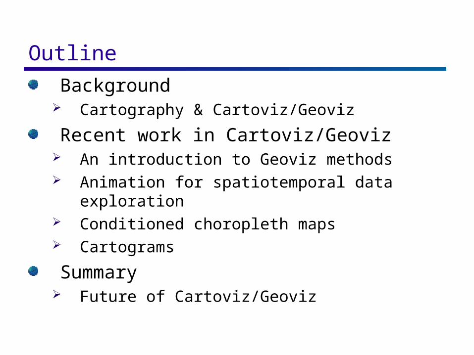
Outline
Background Cartography & Cartoviz/Geoviz
Recent work in Cartoviz/Geoviz An introduction to Geoviz methods Animation for spatiotemporal data exploration Conditioned choropleth maps Cartograms
Summary Future of Cartoviz/Geoviz
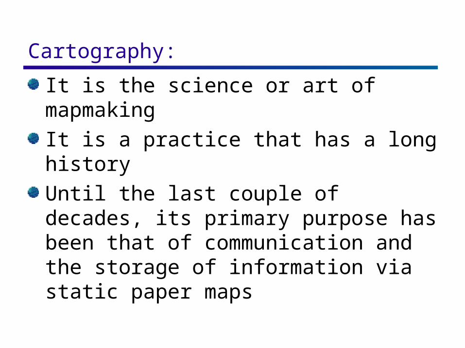
Cartography: It is the science or art of mapmaking
It is a practice that has a long history
Until the last couple of decades, its primary purpose has been that of communication and the storage of information via static paper maps
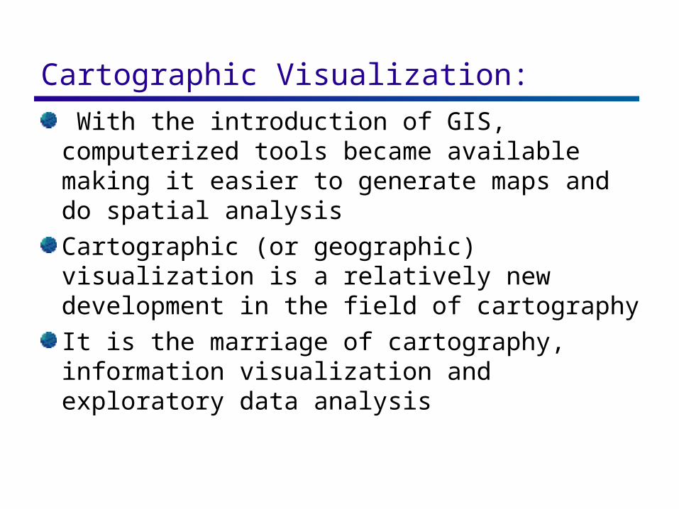
Cartographic Visualization: With the introduction of GIS, computerized tools became available making it easier to generate maps and do spatial analysis
Cartographic (or geographic) visualization is a relatively new development in the field of cartography
It is the marriage of cartography, information visualization and exploratory data analysis
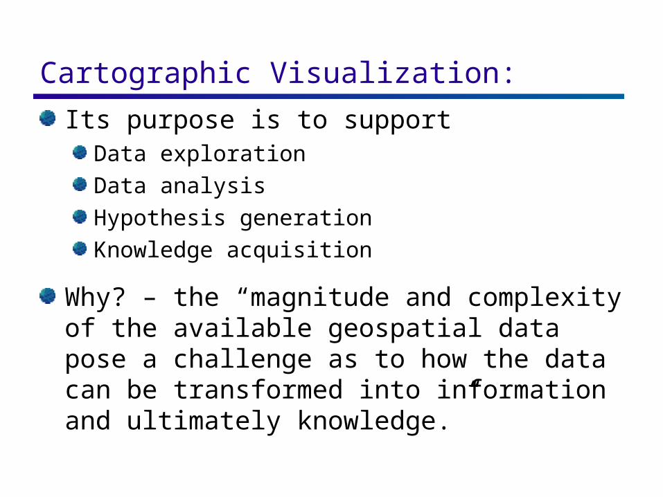
Cartographic Visualization: Its purpose is to support
Data exploration
Data analysis
Hypothesis generation
Knowledge acquisition
Why? – the “magnitude and complexity of the available geospatial data pose a challenge as to how the data can be transformed into information and ultimately knowledge.”
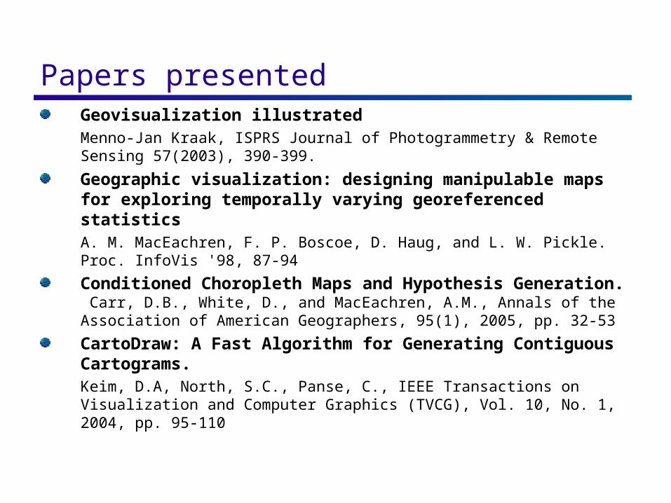
Papers presentedGeovisualization illustratedMenno-Jan Kraak, ISPRS Journal of Photogrammetry & Remote Sensing 57(2003), 390-399.
Geographic visualization: designing manipulable maps for exploring temporally varying georeferenced statisticsA. M. MacEachren, F. P. Boscoe, D. Haug, and L. W. Pickle. Proc. InfoVis '98, 87-94
Conditioned Choropleth Maps and Hypothesis Generation. Carr, D.B., White, D., and MacEachren, A.M., Annals of the Association of American Geographers, 95(1), 2005, pp. 32-53
CartoDraw: A Fast Algorithm for Generating Contiguous Cartograms. Keim, D.A, North, S.C., Panse, C., IEEE Transactions on Visualization and Computer Graphics (TVCG), Vol. 10, No. 1, 2004, pp. 95-110
Geovisualization Illustrated
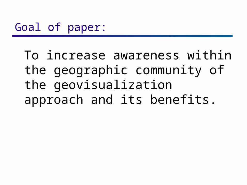
Goal of paper:
To increase awareness within the geographic community of the geovisualization approach and its benefits.
Author’s approach : Show how alternative graphic representations can stimulate & support visual thinking about spatial patterns, relationships, & trends
Applies the geoviz approach to one of the most well-known maps in the history of cartography
“Napoleon’s March on Moscow” (Minard)
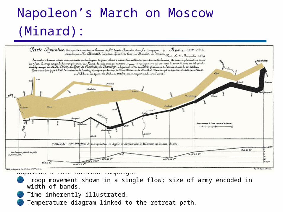
Napoleon’s March on Moscow (Minard):
Napoleon’s 1812 Russian campaign:Troop movement shown in a single flow; size of army encoded in width of bands.Time inherently illustrated.Temperature diagram linked to the retreat path.
Minard’s Map: How can we take an alternative look at this map and its data to improve our understanding about this event?
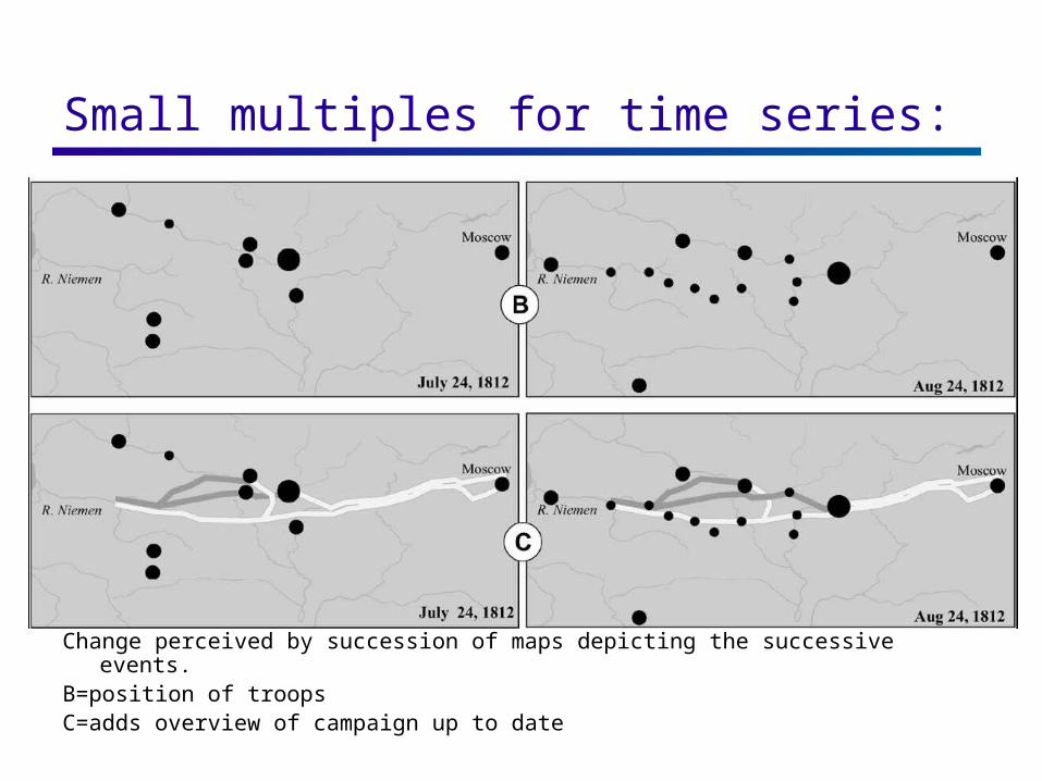
Small multiples for time series:
Change perceived by succession of maps depicting the successive events.B=position of troopsC=adds overview of campaign up to date
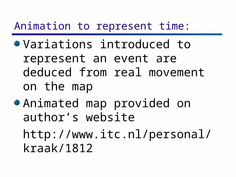
Animation to represent time: Variations introduced to represent an event are deduced from real movement on the map
Animated map provided on author’s website
http://www.itc.nl/personal/kraak/1812
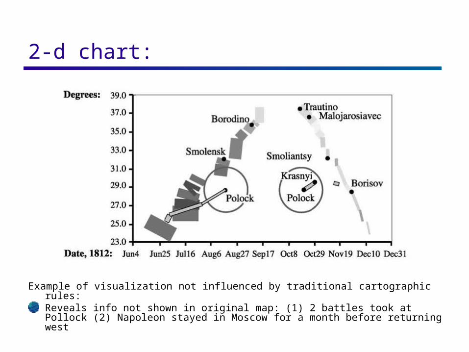
2-d chart:
Example of visualization not influenced by traditional cartographic rules:Reveals info not shown in original map: (1) 2 battles took at Pollock (2) Napoleon stayed in Moscow for a month before returning west
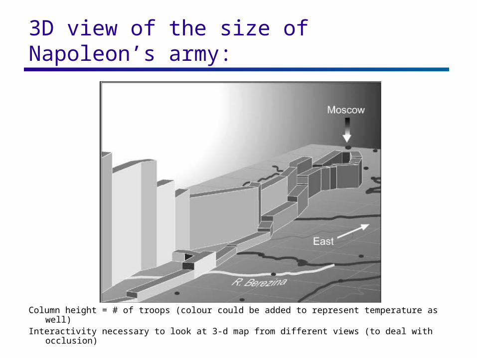
3D view of the size of Napoleon’s army:
Column height = # of troops (colour could be added to represent temperature as well)Interactivity necessary to look at 3-d map from different views (to deal with occlusion)
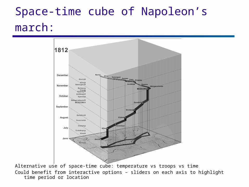
Space-time cube of Napoleon’s march:
Alternative use of space-time cube: temperature vs troops vs timeCould benefit from interactive options – sliders on each axis to highlight time period or location
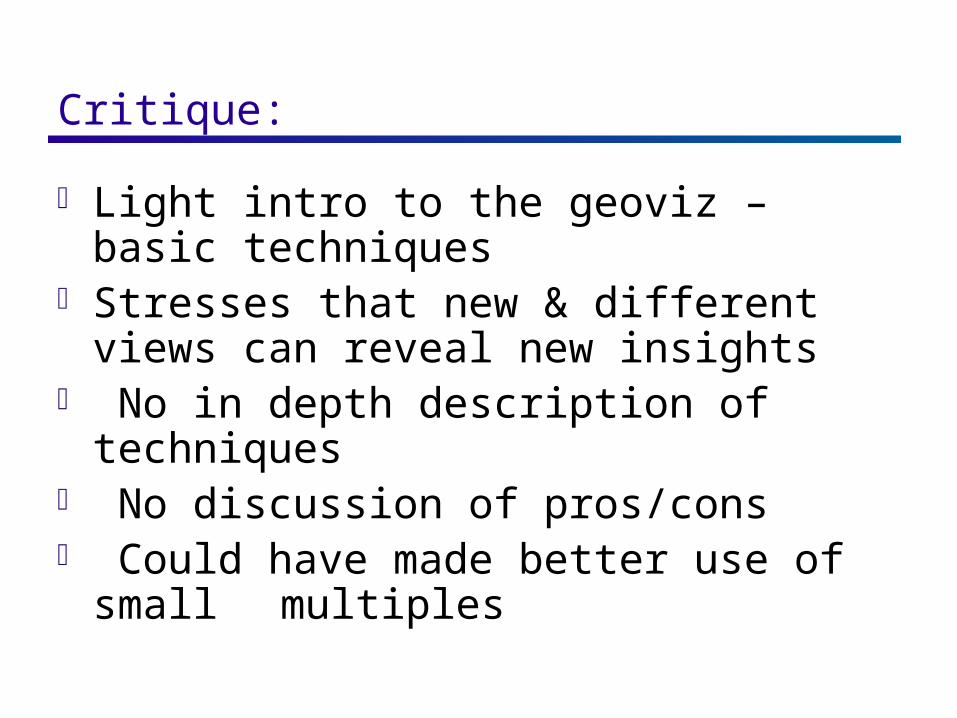
Critique:
Light intro to the geoviz – basic techniques Stresses that new & different views can
reveal new insights No in depth description of techniques No discussion of pros/cons Could have made better use of small
multiples
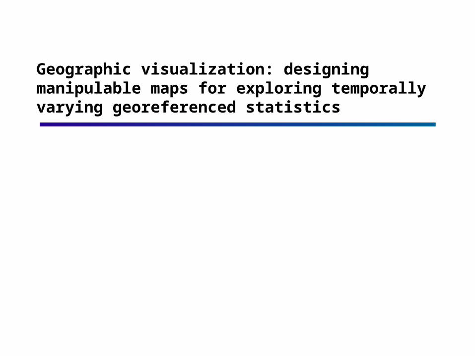
Geographic visualization: designing manipulable maps for exploring temporally varying georeferenced statistics

The Project: Presents the 2nd part of a 2-part project
Overall project goal: to understand the cognitive aspects of map use & to develop appropriate geoviz tools with an emphasis on data exploration.
Project:Part 1: spatial pattern analysis
Part 2: spatiotemporal analysis
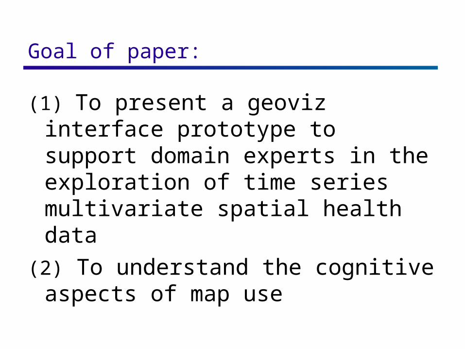
Goal of paper:
(1) To present a geoviz interface prototype to support domain experts in the exploration of time series multivariate spatial health data
(2) To understand the cognitive aspects of map use
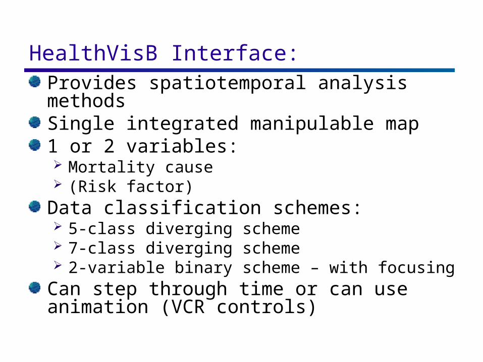
HealthVisB Interface: Provides spatiotemporal analysis methodsSingle integrated manipulable map1 or 2 variables: Mortality cause (Risk factor)
Data classification schemes: 5-class diverging scheme 7-class diverging scheme 2-variable binary scheme – with focusing
Can step through time or can use animation (VCR controls)
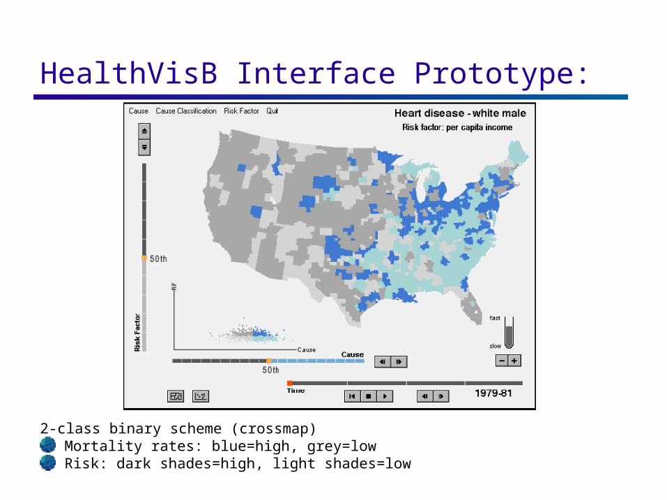
HealthVisB Interface Prototype:
2-class binary scheme (crossmap)Mortality rates: blue=high, grey=lowRisk: dark shades=high, light shades=low
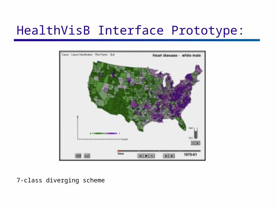
HealthVisB Interface Prototype:
7-class diverging scheme
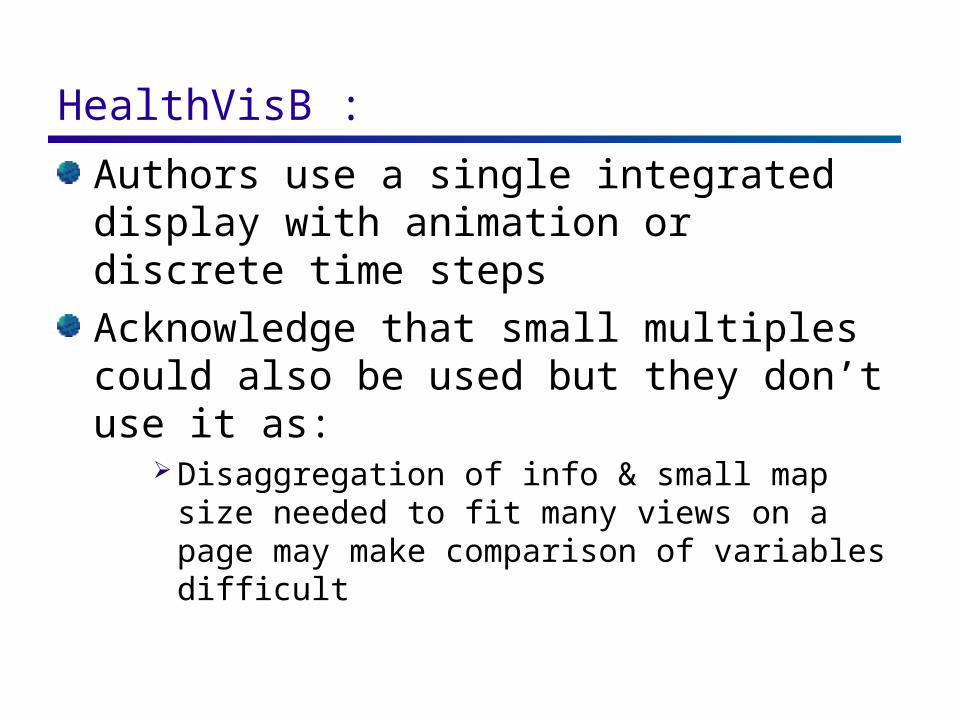
HealthVisB : Authors use a single integrated display with animation or discrete time steps
Acknowledge that small multiples could also be used but they don’t use it as:
Disaggregation of info & small map size needed to fit many views on a page may make comparison of variables difficult
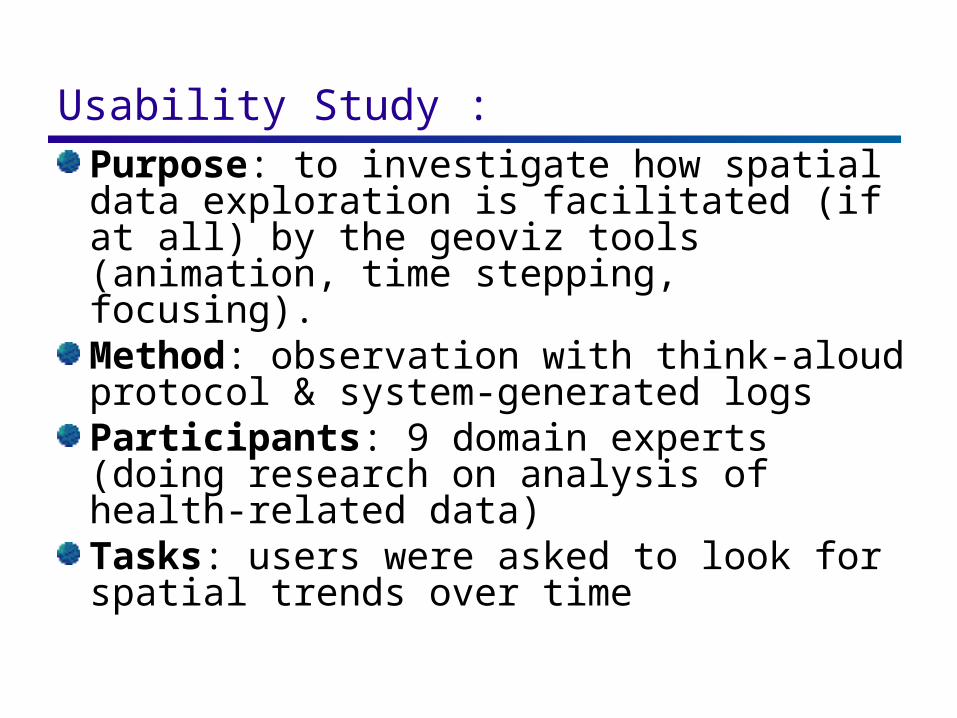
Usability Study : Purpose: to investigate how spatial data exploration is facilitated (if at all) by the geoviz tools (animation, time stepping, focusing).Method: observation with think-aloud protocol & system-generated logsParticipants: 9 domain experts (doing research on analysis of health-related data)Tasks: users were asked to look for spatial trends over time
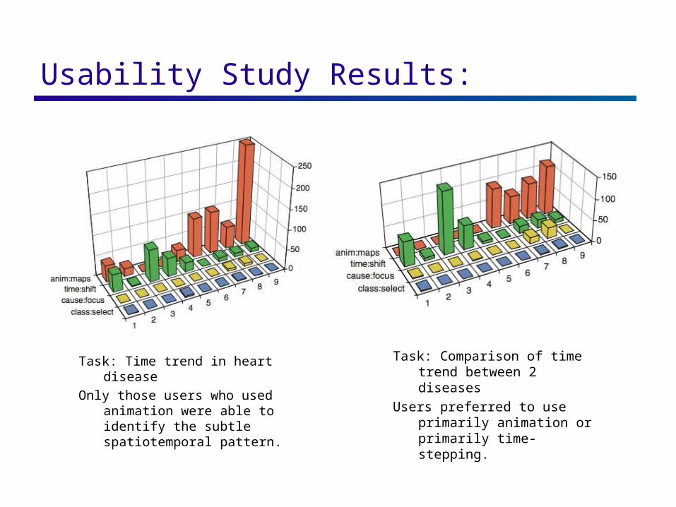
Usability Study Results:
Task: Time trend in heart disease
Only those users who used animation were able to identify the subtle spatiotemporal pattern.
Task: Comparison of time trend between 2 diseases
Users preferred to use primarily animation or primarily time-stepping.
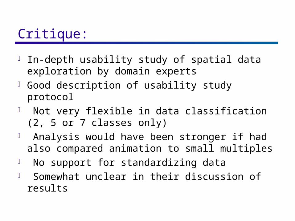
Critique:
In-depth usability study of spatial data exploration by domain experts
Good description of usability study protocol Not very flexible in data classification (2, 5 or 7
classes only) Analysis would have been stronger if had also
compared animation to small multiples No support for standardizing data Somewhat unclear in their discussion of results
Conditioned Choropleth Maps
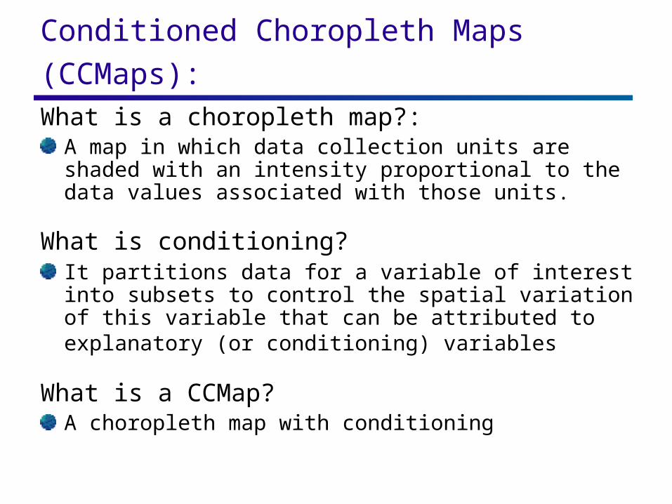
Conditioned Choropleth Maps (CCMaps): What is a choropleth map?:
A map in which data collection units are shaded with an intensity proportional to the data values associated with those units.
What is conditioning?It partitions data for a variable of interest into subsets to control the spatial variation of this variable that can be attributed to explanatory (or conditioning) variables
What is a CCMap?A choropleth map with conditioning
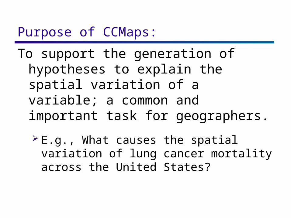
Purpose of CCMaps: To support the generation of hypotheses to
explain the spatial variation of a variable; a common and important task for geographers.
E.g., What causes the spatial variation of lung cancer mortality across the United States?
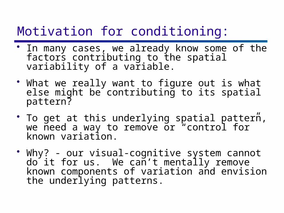
Motivation for conditioning: In many cases, we already know some of the
factors contributing to the spatial variability of a variable.
What we really want to figure out is what else might be contributing to its spatial pattern?
To get at this underlying spatial pattern, we need a way to remove or “control for” known variation.
Why? - our visual-cognitive system cannot do it for us. We can’t mentally remove known components of variation and envision the underlying patterns.
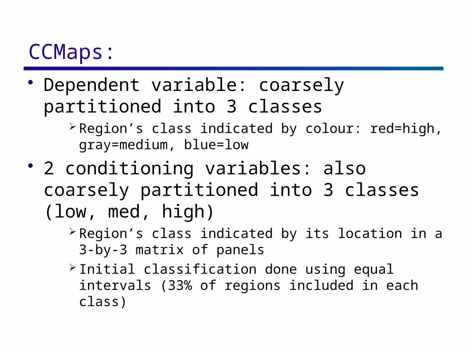
CCMaps: Dependent variable: coarsely partitioned
into 3 classes Region’s class indicated by colour: red=high,
gray=medium, blue=low
2 conditioning variables: also coarsely partitioned into 3 classes (low, med, high)
Region’s class indicated by its location in a 3-by-3 matrix of panels
Initial classification done using equal intervals (33% of regions included in each class)
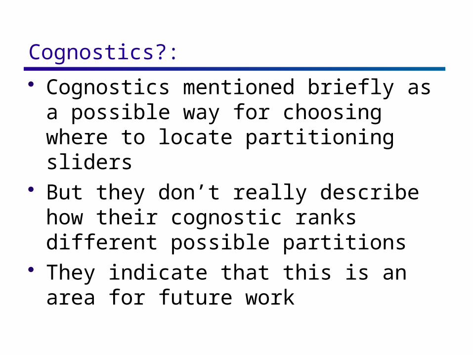
Cognostics?: Cognostics mentioned briefly as a possible
way for choosing where to locate partitioning sliders
But they don’t really describe how their cognostic ranks different possible partitions
They indicate that this is an area for future work
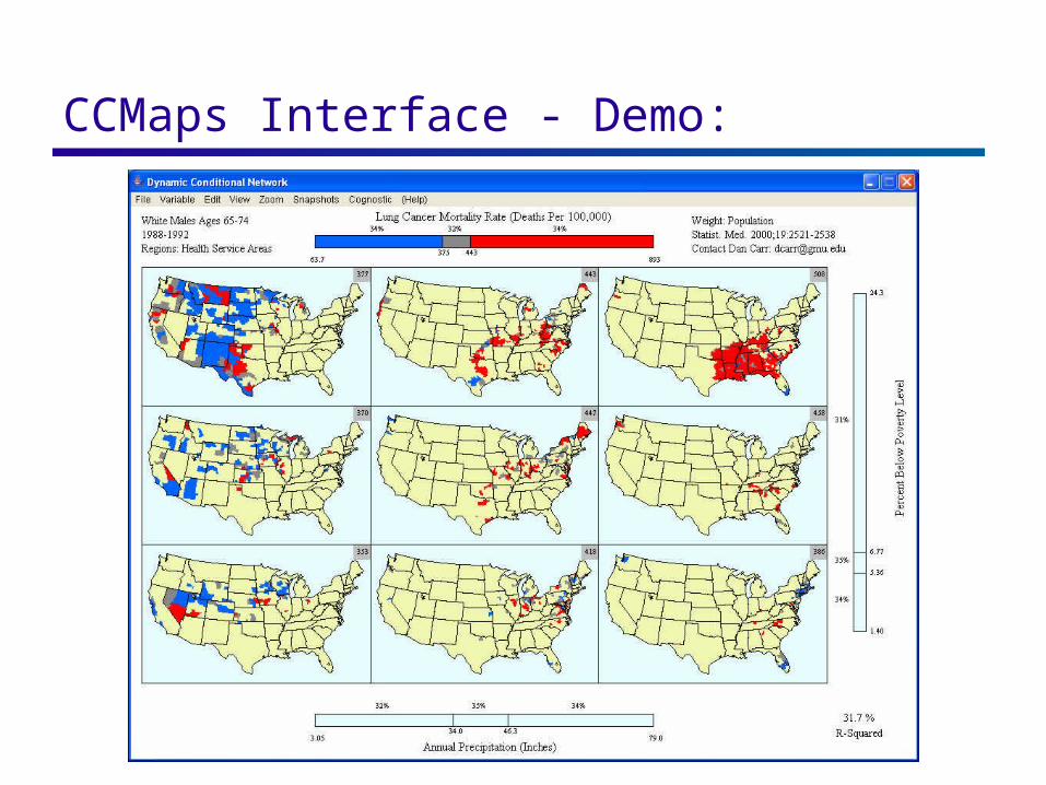
CCMaps Interface - Demo:
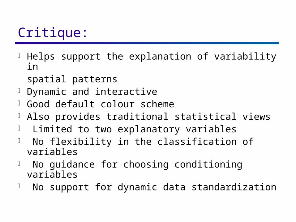
Critique: Helps support the explanation of variability in spatial patterns Dynamic and interactive Good default colour scheme Also provides traditional statistical views Limited to two explanatory variables No flexibility in the classification of variables No guidance for choosing conditioning variables No support for dynamic data standardization
CartoDraw
What is a cartogram?: Conventional maps only show data in relation to land area, not population or some other variable of interest.
By intentionally distorting individual map regions so that their areas are proportional to some other input parameter this alternative information can be communicated more effectively.
Maps transformed in this way are called CARTOGRAMS.
Typical applications: social, political, & epidemiological.
Key property of a cartogram:
To be effective, a cartogram must be recognizable. That is, a viewer must be able to quickly determine the geographic area that is being presented!
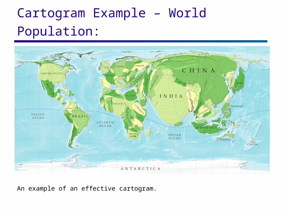
Cartogram Example – World Population:
An example of an effective cartogram.
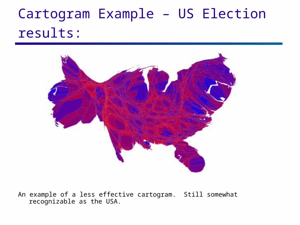
Cartogram Example – US Election results:
An example of a less effective cartogram. Still somewhat recognizable as the USA.
Motivation behind CartoDraw: Drawing cartograms by hand is a laborious task
Previous computer-aided techniques: Are prohibitively slow
E.g., Kocmoud & House report a time of 18 hours for a medium-sized map (744 vertices)
Produce significant deformation of global shape
General technique for “trading off shape and area adjustments” – wider applicability than just geoviz.
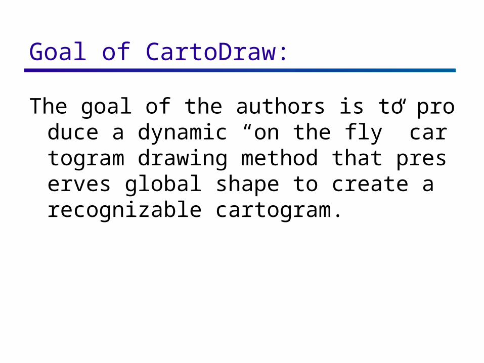
Goal of CartoDraw:
The goal of the authors is to produce a dynamic “on the fly” cartogram drawing method that preserves global shape to create a recognizable cartogram.
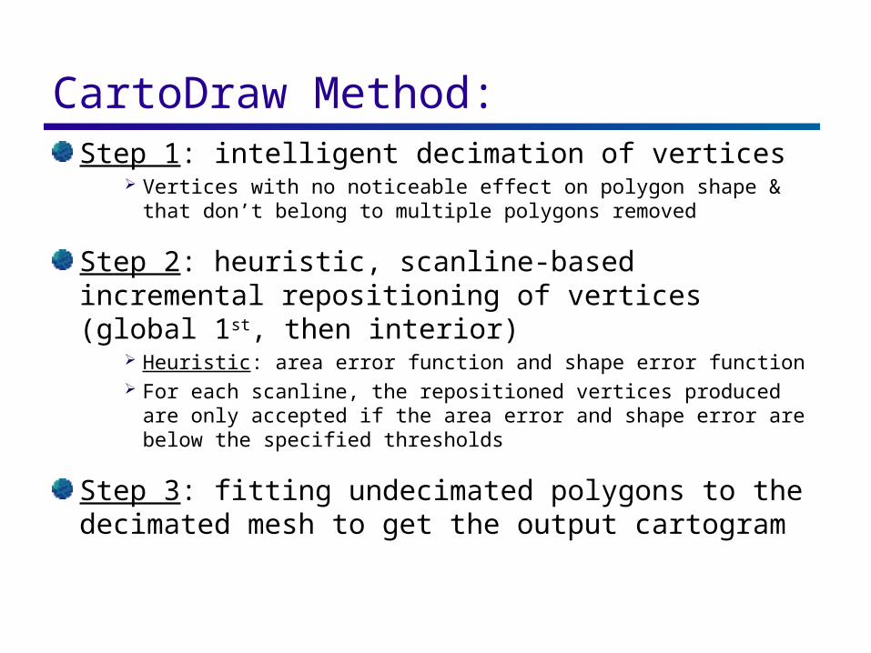
CartoDraw Method: Step 1: intelligent decimation of vertices
Vertices with no noticeable effect on polygon shape & that don’t belong to multiple polygons removed
Step 2: heuristic, scanline-based incremental repositioning of vertices (global 1st, then interior)
Heuristic: area error function and shape error function For each scanline, the repositioned vertices produced are
only accepted if the area error and shape error are below the specified thresholds
Step 3: fitting undecimated polygons to the decimated mesh to get the output cartogram
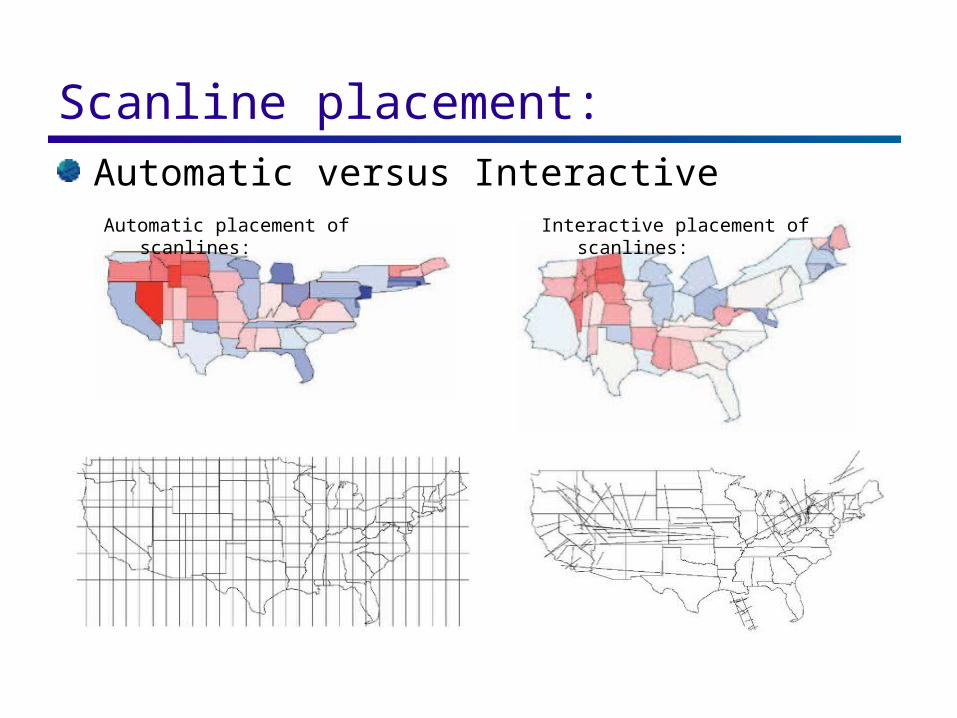
Scanline placement: Automatic versus Interactive
Automatic placement of scanlines: Interactive placement of scanlines:
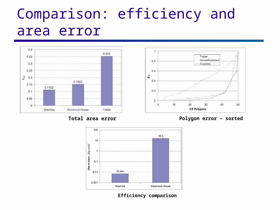
Comparison: efficiency and area error
Polygon error – sorted Total area error
Efficiency comparison
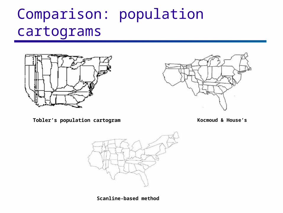
Comparison: population cartograms
Kocmoud & House’sTobler’s population cartogram
Scanline-based method
Critique:
Dynamic generation of cartogram 2 seconds for US population data 19 sec for 90,000 polygons
Minimizes error in global shape to promote recognition
Highly sensitive to scanline placement – user defined scanlines better
Not much guidance provided to the user for placing scanlines appropriately
Future of Geovisualization: The demand for geovisualization techniques will continue to increase as the sheer volume of geospatial data continues to grow exponentially and the popularity of spatial information increases due to tools such as Google Maps.