cafnr branding project identity standards guide · cafnr branding project identity. standards...
TRANSCRIPT
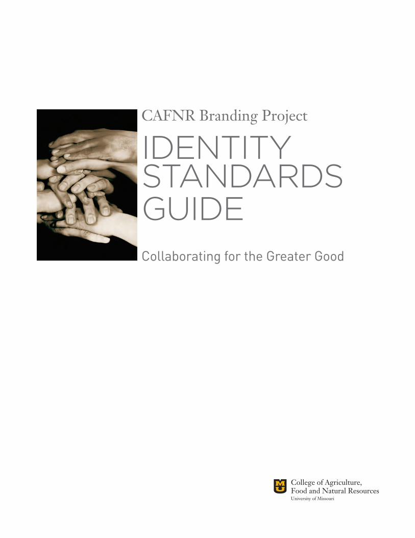
CAFNR Branding Project
IDENTITYSTANDARDSGUIDECollaborating for the Greater Good
CAFNR Branding Project2
ALLOW US TO INTRODUCE OURSELVESstrategy/positioning statements and keywords
IDENTITY STANDARDS GUIDE 3
Keywordsvisionarycreativeopen-mindedinspirationalboldprogressiveglobal
Supporting Messagespersonal connectionsevidence of excellenceinnovative thinkinginspirational impact
CAFNR Leadership PositioningAlways looking forward and drawing from the strengths of its diverse disciplines, the College of Agriculture, Food and Natural Resources is at the center of ensuring sustainability for future generations by infusing world-class research and the most advanced science-based technology with confidence, creative thinking, conscience, and commitment to excellence.
CAFNR Elevator SpeechCAFNR is changing the core components of society that impact what we eat, where we live and how we’ll face tomorrow. As the University of Missouri’s College of Agriculture, Food and Natural Resources, we are at the forefront of research and education working toward global sustainability.
CAFNR Branding Project4
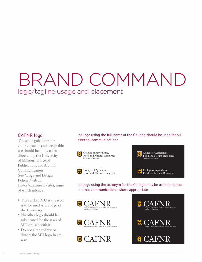
BRAND COMMANDlogo/tagline usage and placement
CAFNR logoThe same guidelines for colors, spacing and acceptable use should be followed as directed by the University of Missouri Office of Publications and Alumni Communication(see “Logo and Design Policies” tab at publications.missouri.edu), some of which inlcude:
•The stacked MU is the icon is to be used as the logo of the University.
•No other logo should be substituted for the stacked MU or used with it.
•Do not alter, redraw or distort the MU logo in any way.
the logo using the acronym for the College may be used for some internal communications where appropriate
the logo using the full name of the College should be used for all external communications
IDENTITY STANDARDS GUIDE 5
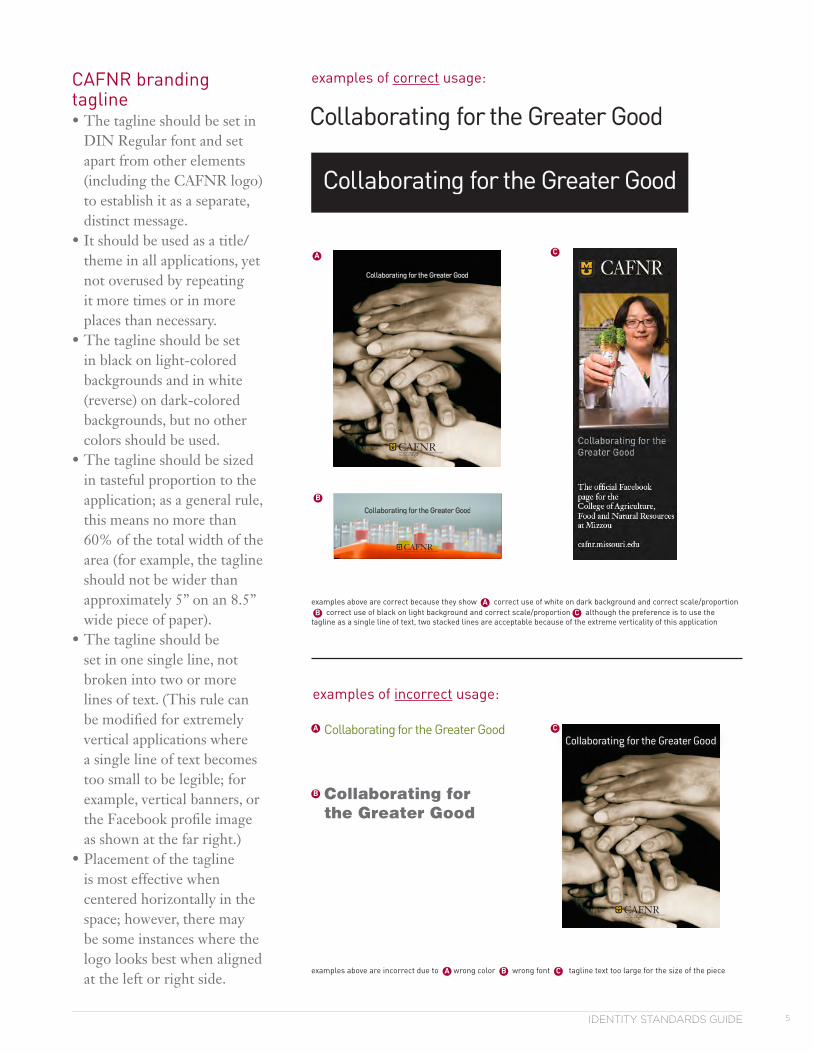
Collaborating for the Greater Good
CAFNR branding tagline•The tagline should be set in
DIN Regular font and set apart from other elements (including the CAFNR logo) to establish it as a separate, distinct message.
•It should be used as a title/theme in all applications, yet not overused by repeating it more times or in more places than necessary.
•The tagline should be set in black on light-colored backgrounds and in white (reverse) on dark-colored backgrounds, but no other colors should be used.
•The tagline should be sized in tasteful proportion to the application; as a general rule, this means no more than 60% of the total width of the area (for example, the tagline should not be wider than approximately 5” on an 8.5” wide piece of paper).
•The tagline should be set in one single line, not broken into two or more lines of text. (This rule can be modified for extremely vertical applications where a single line of text becomes too small to be legible; for example, vertical banners, or the Facebook profile image as shown at the far right.)
•Placement of the tagline is most effective when centered horizontally in the space; however, there may be some instances where the logo looks best when aligned at the left or right side.
examples of correct usage:
examples of incorrect usage:
Collaborating for the Greater Good
A
B
C
examples above are incorrect due to A wrong color B wrong font C tagline text too large for the size of the piece
examples above are correct because they show A correct use of white on dark background and correct scale/proportion B correct use of black on light background and correct scale/proportion C although the preference is to use thetagline as a single line of text, two stacked lines are acceptable because of the extreme verticality of this application
A
B
C
CAFNR Branding Project6
HUE WE AREcolor palettes/formulas and production specifications
IDENTITY STANDARDS GUIDE 7
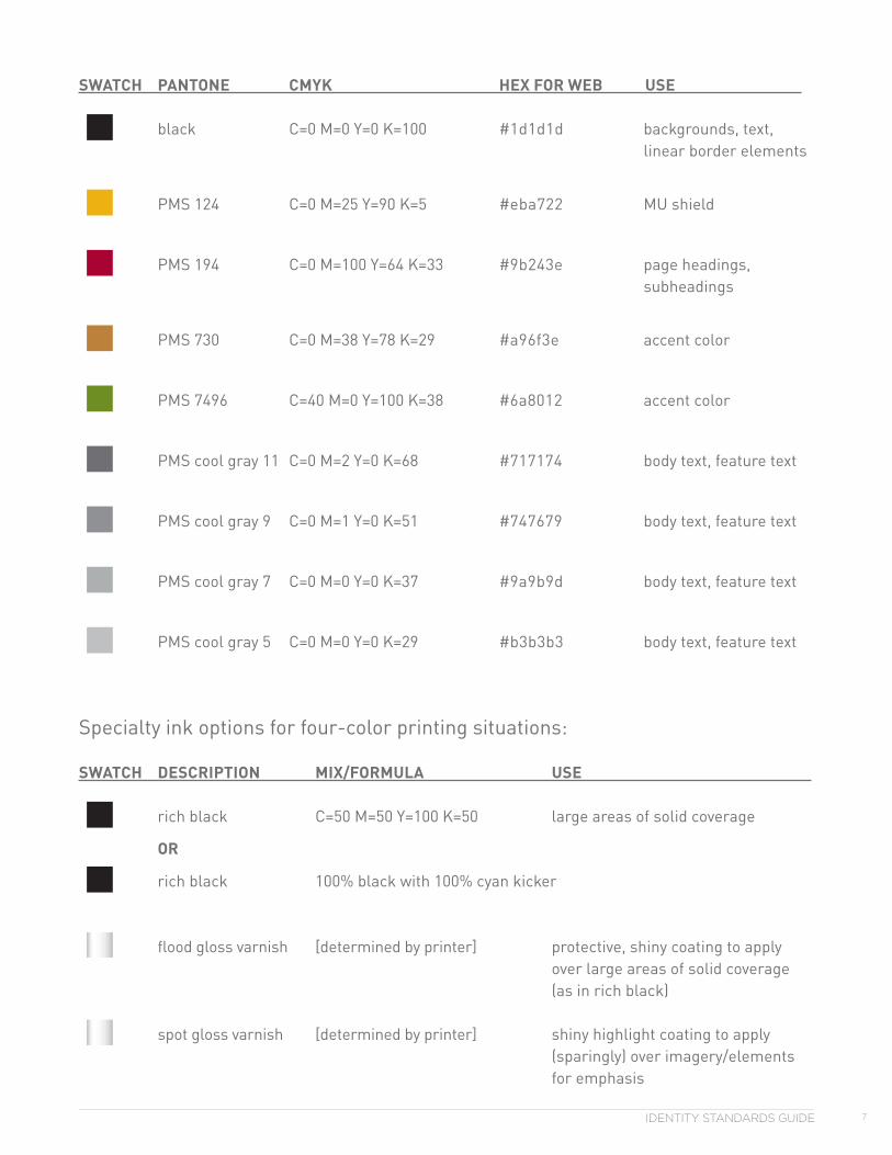
SWATCH PANTONE CMYK HEX FOR WEB USE
black C=0 M=0 Y=0 K=100 #1d1d1d backgrounds, text, linear border elements
PMS 124 C=0 M=25 Y=90 K=5 #eba722 MU shield
PMS 194 C=0 M=100 Y=64 K=33 #9b243e page headings, subheadings
PMS 730 C=0 M=38 Y=78 K=29 #a96f3e accent color
PMS 7496 C=40 M=0 Y=100 K=38 #6a8012 accent color
PMS cool gray 11 C=0 M=2 Y=0 K=68 #717174 body text, feature text
PMS cool gray 9 C=0 M=1 Y=0 K=51 #747679 body text, feature text
PMS cool gray 7 C=0 M=0 Y=0 K=37 #9a9b9d body text, feature text
PMS cool gray 5 C=0 M=0 Y=0 K=29 #b3b3b3 body text, feature text
Specialty ink options for four-color printing situations:
SWATCH DESCRIPTION MIX/FORMULA USE
rich black C=50 M=50 Y=100 K=50 large areas of solid coverage
OR
rich black 100% black with 100% cyan kicker
flood gloss varnish [determined by printer] protective, shiny coating to apply over large areas of solid coverage (as in rich black)
spot gloss varnish [determined by printer] shiny highlight coating to apply (sparingly) over imagery/elements for emphasis
CAFNR Branding Project8
SPELLING IT OUTfonts and font families
IDENTITY STANDARDS GUIDE 9
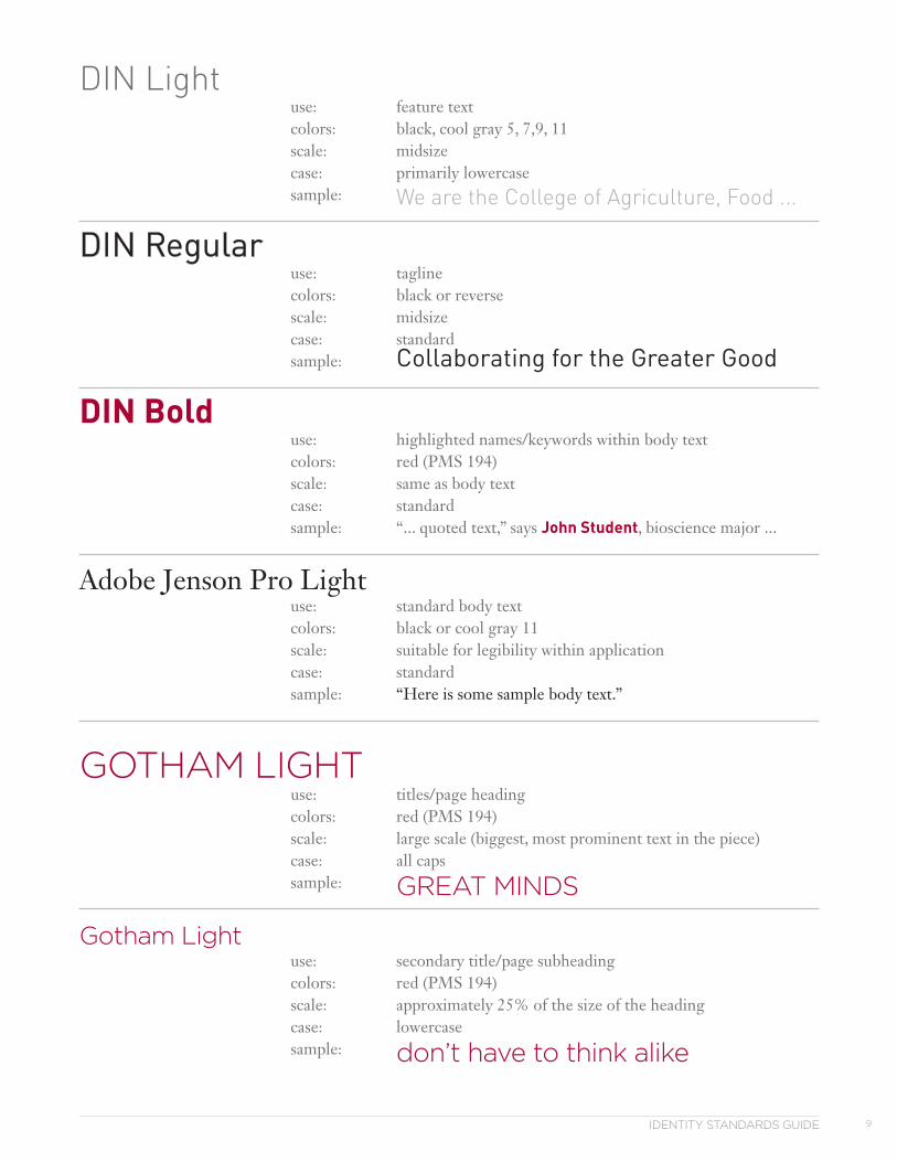
DIN Light use: feature text colors: black, cool gray 5, 7,9, 11 scale: midsize case: primarily lowercase sample: We are the College of Agriculture, Food ...
DIN Regular use: tagline colors: black or reverse scale: midsize case: standard sample: Collaborating for the Greater Good
DIN Bold use: highlighted names/keywords within body text colors: red (PMS 194) scale: same as body text case: standard sample: “... quoted text,” says John Student, bioscience major ...
Adobe Jenson Pro Light use: standard body text colors: black or cool gray 11 scale: suitable for legibility within application case: standard sample: “Here is some sample body text.”
GOTHAM LIGHT use: titles/page heading colors: red (PMS 194) scale: large scale (biggest, most prominent text in the piece) case: all caps sample: GREAT MINDS
Gotham Light use: secondary title/page subheading colors: red (PMS 194) scale: approximately 25% of the size of the heading case: lowercase sample: don’t have to think alike

CAFNR Branding Project10
IMAGE IS EVERYTHINGimage style, content, personality
IDENTITY STANDARDS GUIDE 11
SummaryThe effectiveness and distinctiveness of the CAFNR branding efforts will rely heavily on photography. Style and content of images should interestingly, compellingly represent traits for which the College is known — visionary, creative, open-minded, inspirational, bold, progressive and global. Traditional, conservative, academic, “typical” images have had their place and purpose in the past, but going forward the evocation should be unexpected.
Examples of some desired characteristics for the CAFNR image collection•unusual angles/points of view•extremely close-range interspered with “normal” ranges•unconventional composition, suitable for creative cropping when appropriate•unexpected, unique content•a good mix of full-color along with warm grayscale
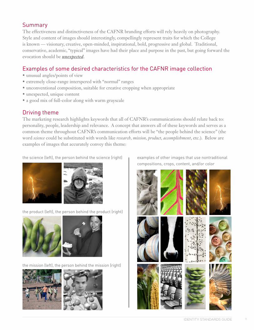
Driving themeThe marketing research highlights keywords that all of CAFNR’s communications should relate back to: personality, people, leadership and relevance. A concept that answers all of these keywords and serves as a common theme throughout CAFNR’s communication efforts will be “the people behind the science” (the word science could be substituted with words like research, mission, product, accomplishment, etc.). Below are examples of images that accurately convey this theme:
the product (left), the person behind the product (right)
the science (left), the person behind the science (right)
the mission (left), the person behind the mission (right)
examples of other images that use nontraditional compositions, crops, content, and/or color
CAFNR Branding Project12
IT’S ELEMENTALelements to enhance the communications
IDENTITY STANDARDS GUIDE 13
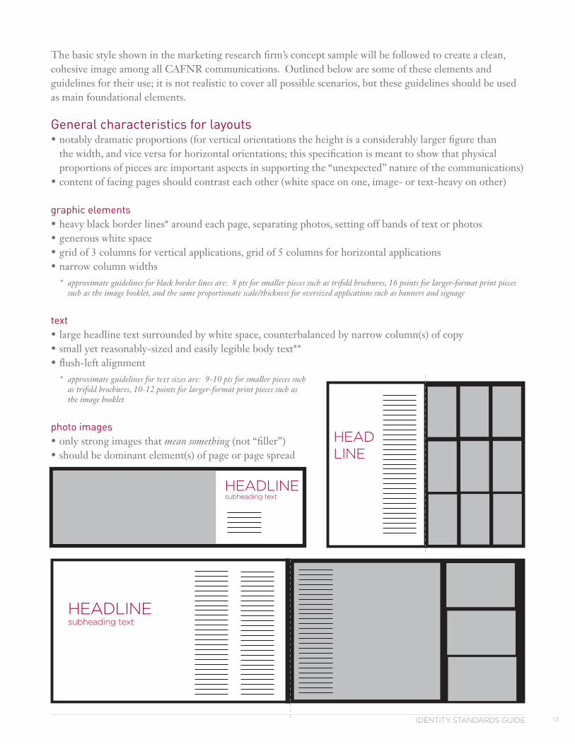
The basic style shown in the marketing research firm’s concept sample will be followed to create a clean, cohesive image among all CAFNR communications. Outlined below are some of these elements and guidelines for their use; it is not realistic to cover all possible scenarios, but these guidelines should be used as main foundational elements.
General characteristics for layouts•notably dramatic proportions (for vertical orientations the height is a considerably larger figure than
the width, and vice versa for horizontal orientations; this specification is meant to show that physical proportions of pieces are important aspects in supporting the “unexpected” nature of the communications)
•content of facing pages should contrast each other (white space on one, image- or text-heavy on other)
graphic elements•heavy black border lines* around each page, separating photos, setting off bands of text or photos•generous white space•grid of 3 columns for vertical applications, grid of 5 columns for horizontal applications•narrow column widths
* approximate guidelines for black border lines are: 8 pts for smaller pieces such as trifold brochures, 16 points for larger-format print pieces such as the image booklet, and the same proportionate scale/thickness for oversized applications such as banners and signage
text•large headline text surrounded by white space, counterbalanced by narrow column(s) of copy•small yet reasonably-sized and easily legible body text**•flush-left alignment
* approximate guidelines for text sizes are: 9-10 pts for smaller pieces such as trifold brochures, 10-12 points for larger-format print pieces such as the image booklet
photo images•only strong images that mean something (not “filler”) •should be dominant element(s) of page or page spread
HEADLINE
HEADLINEsubheading text
HEADLINEsubheading text
CAFNR Branding Project14
A PLACE FOR EVERYTHINGplacement of logo and/or tagline on environmental pieces, ad specialty items, wearables, etc.
IDENTITY STANDARDS GUIDE 15
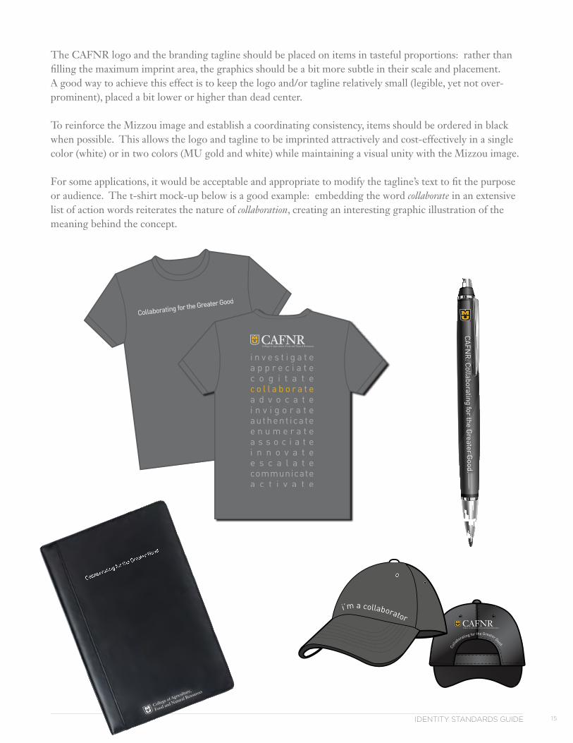
The CAFNR logo and the branding tagline should be placed on items in tasteful proportions: rather than filling the maximum imprint area, the graphics should be a bit more subtle in their scale and placement. A good way to achieve this effect is to keep the logo and/or tagline relatively small (legible, yet not over-prominent), placed a bit lower or higher than dead center.
To reinforce the Mizzou image and establish a coordinating consistency, items should be ordered in black when possible. This allows the logo and tagline to be imprinted attractively and cost-effectively in a single color (white) or in two colors (MU gold and white) while maintaining a visual unity with the Mizzou image.
For some applications, it would be acceptable and appropriate to modify the tagline’s text to fit the purpose or audience. The t-shirt mock-up below is a good example: embedding the word collaborate in an extensive list of action words reiterates the nature of collaboration, creating an interesting graphic illustration of the meaning behind the concept.
C
ollaborating for the Greater Good.
CAFNR
: Collaborating for the G
reater Good.
i’m a collaborator
front of shirt
size: across width of chest
color: print in WHITE INK on darl-colored shirt
back of shirt
size: print design to fill maximum imprint area on back
colors: logo at top is printed in WHITE and PMS 124 GOLD (thespacebetweeenthegoldMUandwhiteoutlinewillbetheshirtcolorcom-ingthru)
text below the logo is printed in PMS COOL GRAY 7, except the word “collaborate” which is PMS 124 GOLD
CAFNR Branding Project16
IF YOU BUILD IT, THEY WILL COMEguidelines for construction and assembly of printed communications
IDENTITY STANDARDS GUIDE 17
The basic format/style shown in the marketing research firm’s concept sample will be used as a foundation for creation of all CAFNR communications. Outlined below are some production guidelines for reference. These are simply basic guidelines; the actual specifications would be determined/driven by the piece’s intended use, audience, distribution channel, quantity, budget, etc.
Stock•clean, crisp, bright white (blue-white), matte-coated paper•weight of stock to be determined by purpose of piece•in some cases where a high-end “specialty” piece is called for, vellum sheets may be inserted to alternate
within the text pages
Inks•four-color process on most all printed communications•when spot color is required, it is acceptable to use a combination of Pantone inks as outlined on page 7
Size•varies with each individual piece (see “General characteristics” on page 13 for guidelines about proportion)
Folding•dependent on piece
Binding•dependent on piece
CAFNR Branding Project18
SIGNING OFFwho’s involved in CAFNR communications
IDENTITY STANDARDS GUIDE 19
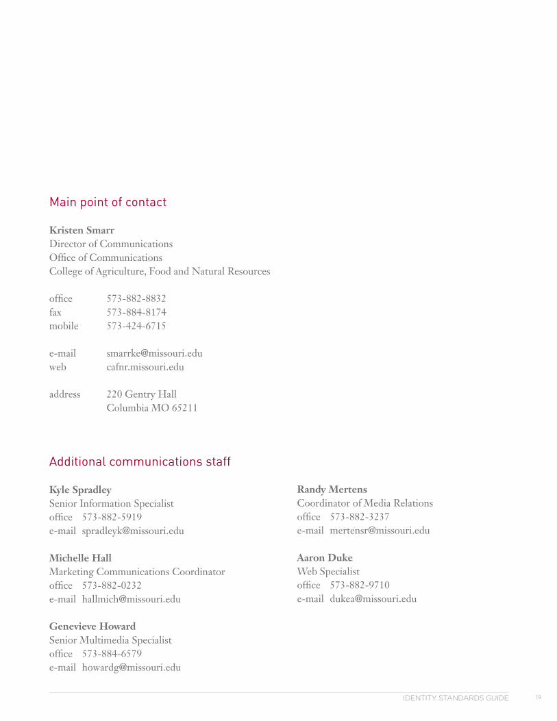
Main point of contact
Kristen SmarrDirector of CommunicationsOffice of CommunicationsCollege of Agriculture, Food and Natural Resources
office 573-882-8832fax 573-884-8174mobile 573-424-6715 e-mail [email protected] cafnr.missouri.edu
address 220 Gentry Hall Columbia MO 65211
Additional communications staff
Kyle SpradleySenior Information Specialistoffice 573-882-5919e-mail [email protected]
Michelle HallMarketing Communications Coordinatoroffice 573-882-0232e-mail [email protected]
Genevieve HowardSenior Multimedia Specialistoffice 573-884-6579e-mail [email protected]
Randy MertensCoordinator of Media Relationsoffice 573-882-3237e-mail [email protected]
Aaron DukeWeb Specialistoffice 573-882-9710e-mail [email protected]
Office of Advancement & Communicationscafnr.missouri.edu
CAFNR Brading ProjectIDENTITY STANDARDS GUIDEpublished August 2011; revised November 2013