by design email marketing design basics - … design plays a big role in the effectiveness of your...
TRANSCRIPT

www.iContact.com
BY DESIGN
Email Marketing Design Basics
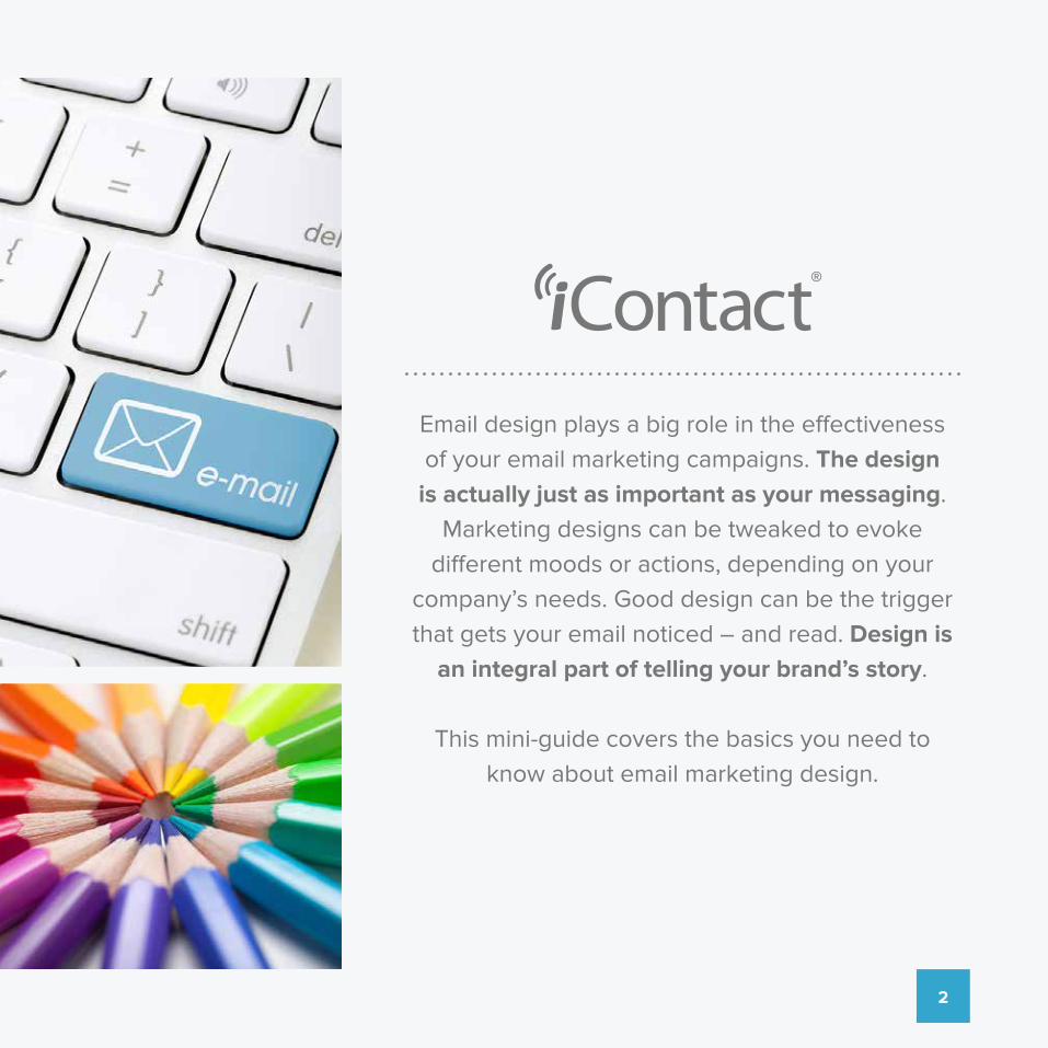
Email design plays a big role in the effectiveness of your email marketing campaigns. The design
is actually just as important as your messaging. Marketing designs can be tweaked to evoke
different moods or actions, depending on your company’s needs. Good design can be the trigger that gets your email noticed – and read. Design is
an integral part of telling your brand’s story.
This mini-guide covers the basics you need to know about email marketing design.
2

BREAKING DOWNEMAIL DESIGN
3

Preheader TextUse preheader text to grab the attention of your audience.
1
Navigation BarDetermine if you really need a Nav bar. Try not to use one.
2
Call to ActionMake it count. This is the action you want your viewsers to take
3
ImagesSay it with an image. Use 60/40 text-to-image ratio. Always include alt text.
4
ColumnsMinimize the number of columns. Columns can be difficult to read.
5
WidthTry to keep the main contnet information within 550-600 pixels
6LEARN MORE
TRAVEL NOW >>
LEARN MORE
1
5
2
3
4
6
Let’s begin by getting a broad overview of the essentials of a well-crafted email:
4

Now, let’s talk about some specific must do’s when crafting your email:
Carefully Craft Your Subject Line and Preheader TextYour subject line is what people see before opening your email. You might not think of it as part of the design, but it is. You need to carefully craft the subject line so that the wording is compelling and noticeable. Don’t be afraid to experiment with eye-catching text or characters.
Most email providers also display 75-100 words in the inbox area immediately after the subject line. Spend the time to write what is known as a preheader, because that is what will be shown in the email snippet after the subject line. It is merely a sentence of text at the very top of your email and is typically treated as a second subject line — and a way to grab attention.
Choose a Professional TemplateEmail design is a lot easier now than in the past. You no longer have to spend hours writing HTML code. Instead, templates are available that let you customize how your emails look.
Spend time choosing a professional template that reflects the tone you want. This will make designing the rest of your email easy. And make it your own! Don’t make the mistake of thinking that using a template has to mean that your design will look just like everyone else’s. A predesigned template will result in a unique look when you add your brand logo, colors, images, and personalized messages.
Find the Perfect Balance of ColorsColor is a great way to bring interest to the content of your emails, but it’s easy to get carried away. If you use too much color, your email could look disorganized and be distracting to the recipient. It’s best to limit yourself to three or four colors.
Use different colors for headings, links, and even your background. Just remember that it’s best to keep the background light — reading white text on a dark background is hard on the eyes. Emails are the perfect place to use your brand’s colors.
5

Use Negative SpaceStudies show that people get overwhelmed when they see too much text without much white space. That’s why subheads help so much — they break up your content.
You should also look for other ways to incorporate negative space in your email design. One idea is to leave the bulk of your content in one column and then have white space on the right with a picture every few inches. Pay special attention to negative space because it can also direct your readers’ eyes where to go.
Make Your Call to Action Stand OutAll emails should have a call to action (CTA). Use your email design to make it stand out. For instance, you could use a white background for the bulk of your email and then have a colored box for your CTA. The contrasting color is where the email recipients’ eyes will naturally go. Also, use text that conveys a sense of urgency to get your subscribers to act.
START FREE TRIAL
6

Include Pictures and VideosYou can’t guarantee that people will read the content of your emails, but they will likely take a look at eye-catching images. That’s one of the reasons infographics are becoming so popular. If you’ve never tried it, create an infographic and use it as the body of your email. You’ll be surprised at how many more people respond to this type of email design. (We’ll discuss the use of imagery in more detail a little further on.)
When possible, also include video links. Many people would rather watch something than read something. Lots of viral videos start out in email marketing campaigns. One caveat: we advise clients against trying to embed an actual video in an email. While it may be technically possible, it takes a lot of coding work. More to the point, most email clients can’t display embedded video content and will simply strip the code from your email. Instead, use a thumbnail sketch and link to the video’s URL.
Carefully Choose Your FontIt’s okay to use more than one font; however, as with the colors, you should keep your font styles to a minimum. Sans-serif fonts are still the most preferable because they are easy to read. It’s perfectly fine to play with font size; headings naturally look better in larger sizes.
If you’re not sure what font to use, go with something common, like Arial or Times New Roman. These are the fonts that people easily recognize and are email-safe. (Meaning, that they will actually render, unlike specialty fonts that might not be installed on many computers. Unfortunately, web fonts and specialty fonts should not be used in emails since they either won’t render or will be wildly unpredictable.)
Break Your Content Into SubheadingsThe content of your email should be concise. Nobody wants to spend all day reading their mail. And the goal of email marketing is not to keep a reader stuck in the email, but to send him or her to your website, landing page, or the useful content you are sharing.
If you’re trying to share an article or blog post from your website, it’s better to include only a short snapshot of what the article is about and then link to it from your email. If you do have a lot of content you want to include in an email, make sure that it is broken up by subheadings that are easy to scan. People rarely read your entire email. Instead, they typically scan your email, looking for the most important parts.
We like to tell our clients that we want their subscribers to act on their email, not just read it, so make it easy to understand and digest the content.
BACK TO SCHOOL!
Shop the latest & greatestmust haves items!
Buy Now!
7

Link to Relevant Social Media SitesIf you only have a soft CTA, it’s appropriate to link to your relevant social media sites. For instance, if you’re emailing a segment of people who purchased a specific item, you could link to a post on your website that describes how to use that item best, or a fan page on Facebook or other social media site.
Make sure to test all the links in your email before sending it. It’s an inconvenience to your subscribers when they click on a link and it goes to an unexpected site or takes them to an error page. It’s also a good idea to have the links open in a new window, so readers don’t have to scramble to find their way back to your email or newsletter.
Include an Email Opt-Out AreaThe CAN-SPAM Act of 2003 requires that all businesses include an “unsubscribe” button in all email marketing correspondence. Most marketers choose to display the button at the bottom of their emails. By law, the button must be easy to recognize, read, and understand. However, from a design standpoint, you don’t want to draw any more attention to it than necessary. Also, it’s best to have a menu that allows people to opt out of certain types of messages instead of all emails.
If you follow these tips on email design, you’ll be surprised at how much more effective your email marketing becomes. Just remember that email marketing trends are always changing, and you should be ready to adjust your strategy. The most successful businesses are willing to adapt and give their customers exactly what they need, when they need it.
Great subject lines SCREAM benefits. They give you a real reason to open a campaign and engage with it. A subject line shouldn’t be intriguing, it should be obvious and leave your subscriber in absolutely no doubt what your email contains.PROTIPS
8

BUILDING AN IMAGE LIBRARY TO TELL YOUR
BRAND’S STORY
9

A well-cultivated image library is one of the keys to creating a successful newsletter or email campaign. They say a picture is worth a thousand words, and it is no less true when talking about email design. But what if you are just starting out and you hit a roadblock when you realize:
“My image library is empty! What do I do?!”
Don’t panic. Let’s take first things first.
Why not start with a few assets that you have lying around? Download your logo from your website, if you don’t have it saved on your computer anywhere. Then upload it to the iContact image library. Take an inventory of hero images, banners, and stock photos you might already have on hand, and take the time to upload them into your image library for future use. You’ll save yourself a lot of potential frustration later on if you don’t have to stop and hunt around for these assets when you are in the middle of building your newsletter or email campaign.
Check to see if you have images from any previous ESP you may have used. Generally, those images are pretty easy to re-download and upload into iContact, but you’d need to contact your previous ESP to get them, and we know that you may not want to do that. So what can you do to repopulate your image library after you migrate to your new, easy-to-use ESP, iContact?
10
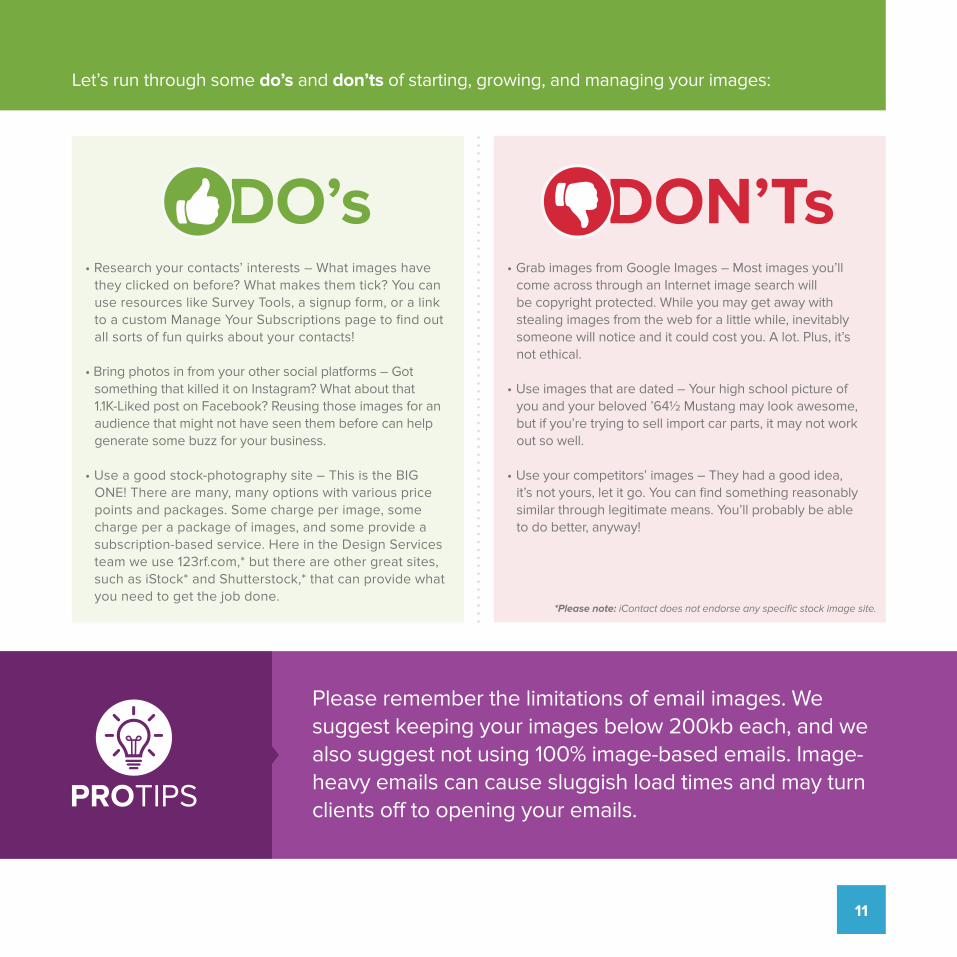
Please remember the limitations of email images. We suggest keeping your images below 200kb each, and we also suggest not using 100% image-based emails. Image-heavy emails can cause sluggish load times and may turn clients off to opening your emails.PROTIPS
*Please note: iContact does not endorse any specific stock image site.
• Grab images from Google Images – Most images you’ll come across through an Internet image search will be copyright protected. While you may get away with stealing images from the web for a little while, inevitably someone will notice and it could cost you. A lot. Plus, it’s not ethical.
• Use images that are dated – Your high school picture of you and your beloved ’64½ Mustang may look awesome, but if you’re trying to sell import car parts, it may not work out so well.
• Use your competitors’ images – They had a good idea, it’s not yours, let it go. You can find something reasonably similar through legitimate means. You’ll probably be able to do better, anyway!
• Research your contacts’ interests – What images have they clicked on before? What makes them tick? You can use resources like Survey Tools, a signup form, or a link to a custom Manage Your Subscriptions page to find out all sorts of fun quirks about your contacts!
• Bring photos in from your other social platforms – Got something that killed it on Instagram? What about that 1.1K-Liked post on Facebook? Reusing those images for an audience that might not have seen them before can help generate some buzz for your business.
• Use a good stock-photography site – This is the BIG ONE! There are many, many options with various price points and packages. Some charge per image, some charge per a package of images, and some provide a subscription-based service. Here in the Design Services team we use 123rf.com,* but there are other great sites, such as iStock* and Shutterstock,* that can provide what you need to get the job done.
Let’s run through some do’s and don’ts of starting, growing, and managing your images:
DO’s DON’Ts
11

BRANDING: UNIFYING THE LOOK OF WEBSITES
AND EMAILS
12

Why Your Branding Needs ConsistencyCustomers interact with your brand in countless ways, from visiting your company’s website, to subscribing to an email newsletter, to following your brand on social media.
If you have taken the time to develop a brand for your business, you already understand the need to have a unique look that customers can easily identify with your company. With a mix of visual and textual components, your business can convey everything from company values to products and services. Your brand also gives your company a distinct personality, differentiates it from competitors, and provides an avenue to make an emotional connection with your customer base.
No matter your industry, your business depends on much more than just a well-designed logo to communicate your brand. In fact, branding includes a long list of components, from graphics to color schemes to fonts. When you consider how many details branding incorporates, it’s easy to see why consistency across channels is so important.
Now that you understand why unifying your look is so critical, and follow these tips to keep your branding consistently on target.
13

Understand Your BrandThe first step in keeping your branding consistent is to agree on a concept and a look that accurately represent your business. You can do this by outlining some basics, such as your company’s vision, your organization’s mission, and your business’s products and services. As you’re brainstorming, be sure that you’re going beyond just the design elements that appeal to you on a personal level.
Instead, choose branding aspects that truly convey your company and its many facets. When you adopt an entire strategy that does much more than look great, keeping it consistent on your website and email marketing efforts will quickly become second nature.
Don’t Forget the LogoYour company’s logo is one of the most visible markers of your brand, so featuring it prominently on your website and in all email communication is a great way to help customers recognize your brand right away. For most businesses, however, it’s not enough just to use the logo.
Rather, make sure that you feature this visual element the same way in every instance. Whether your company’s website shows the logo in a centered position across the top of each page or at the top of a sidebar, do the same in your email marketing efforts. When your customers can quickly recognize your company’s logo, they’ll know exactly what to expect from both your website and your marketing messages.
Use the Right FontsLike logos and colors, fonts are a vital visual component of your brand identity. Using one set of icons, fonts, or color schemes on your website and another in your email newsletter dilutes your brand identity and introduces confusion.
Similar to the color scheme, you’ll want to stick to a short list of just one or two fonts throughout your branding. Carry over the same header and body text fonts from your website to your email templates in order to transfer branding from one platform to another, giving your audience another way to identify with your business.
14

Customize Your Color SchemeIf you think a consistent color palette isn’t necessary, think again. After the logo, your brand’s color scheme is the most prominent visual element and allows your audience to become completely immersed in what your brand has to offer.
Most brands rely on two or three primary colors and a short list of secondary colors. This select group of tones keeps the look vibrant without appearing too busy or disordered. Keep in mind that your brand’s colors should be visible throughout your marketing materials, in everything from logos to headers to buttons.
After you’ve found the right color scheme to evoke the ideal set of emotions in your audience, be sure to record the exact color details, such as hexadecimal values and Pantone codes. Using colors that are approximately the same from one platform to another ends up looking careless and slapdash, so keep them consistent from your website to your email marketing.
Feature Recognizable ImagesIf you’re considering creating entirely different sets of images for your website and your newsletter, stop right there. Not only does featuring similar images on both platforms save you time in the long run, but it also helps your audience identify with your content. Newsletter readers who click through to your website will feel confident that they’ve reached the intended content if the images and other branding elements carry over.
Take care not to let images completely dominate your email marketing campaigns, though. Not only can too many images overwhelm readers, but they can also be difficult to download. In fact, some email clients won’t download them by default, which means readers may not see them at all. Use only as many images as necessary in order to connect with your audience without compromising your campaign.
Orange#e8a952
Purple#994699
Blue#35a7cf
15

Speak With a Reliable VoiceIn addition to visual components, express your brand identity through the message itself. First and foremost, speak with the same reliable voice on each platform, since a consistent tone helps your audience develop a deeper connection with your brand. If your website provides news-based content or serves as an authority on a topic, give your voice an appropriate amount of weight and keep your tone appropriate to your message. If your brand focuses on fun and entertainment, however, a more informal tone on the website and in email correspondence may be more appropriate.
Include Branded LinksMost customers subscribe to your company’s newsletter after visiting your website, but they may not feel compelled to return to your website unless you give them a good reason to do so. Any email marketing campaign that you design should include several strategically placed internal links and calls to action to do just that. As one of the final pieces of the puzzle, branded links encourage your audience to take action and connect with your company beyond just the email.
When you take the right steps toward creating consistent branding, you’ll be well-positioned to reap benefits like increased customer loyalty and stronger client connections. Use these tips as a starting point to grow your brand with a unique look that extends across all channels.
16

GO MOBILE: USE RESPONSIVE DESIGN
17

Increasingly, people are using their smartphones for checking email and conducting other online activities.
The Mobile-Friendly MythOne of the keys to responsive design is that it takes mobile-friendly formats to the next level. Many companies believe their emails are appearing correctly on customers’ screens because they are using a so-called mobile-friendly template; however, the term “mobile-friendly” actually means that the email system automatically resizes the entire message to fit the screen upon which that message is viewed.
Even with mobile-friendly emails, your customers may find themselves caught in an endless loop of pinching, zooming, and scrolling to get access to all your content. This frustrating layout may cause some to skip reading the email altogether. Meanwhile, emails with responsive design appear seamlessly on every screen, so the content is easier to digest.
Making Emails Readable for Every CustomerAs a marketer, you don’t want your email marketing campaigns to annoy customers. So how can you make sure that your recipients aren’t stuck with the dilemmas described above? The answer is simple: responsive design.
This type of design approach will automatically resize a display to fit every screen by adjusting both the format and layout. Every image and word will appear clearly to customers no matter what device they are using, whether a desktop, laptop, smartphone, or tablet. Best of all, your content will look more attractive since your customers are seeing your presentation in an ideal layout that requires zero zooming.
If you’re one of these people, you’re probably all too familiar with the hassle of double-tapping and pinching your screen to view and read emails on your phone. These messages feature a static format that shows up the same way on screens of all sizes. While the display may look great on a desktop or laptop, the text and images look tiny when shrunk to smartphone size, making emails much more frustrating to read and more difficult to understand.
18

Seeing the DifferenceIn addition to reaching customers on the go, mobile also has given us great insights into how people respond to various types of marketing and website styles. With properly implemented responsive design, the results can be incredibly powerful for reaching consumers.
The data have shown that customer experience is vitally important to making sales online. Google’s Think Insights on Mobile found that when customers arrive at a mobile website that they find frustrating or that doesn’t display the content they’re looking for right away, there is a 61 percent chance that they will make their exit and use a different site to get what they want. In fact, 48 percent of users said that when a site doesn’t function well on their mobile device, they feel that the company doesn’t care about their business.
Meanwhile, those consumers with a positive experience on a mobile website were found to be 67 percent more likely to make a purchase or use a service. A better user experience is one of the most effective ways to increase your profits, making responsive design a must for any business owner who wants a thriving online presence.
These results apply as readily to emails as they do to websites. Making the effort to make sure that customers enjoy a positive, seamless experience with every email you send is essential to capturing their attention. In addition, the effort shows customers that you value their time and appreciate their business, which is important for marketers who are trying to stand out among the crowd.
And if you are not yet convinced the stakes are high: According to IBM, mobile commerce is now 30 percent of all US Commerce. You’ll be losing out on a huge market segment if your email marketing is not mobile responsive.
61%
67%
30%
19

The following tips will help you maximize your results when you consider responsive design email:
• Go for a minimal look. This approach makes your content easier to comprehend while also facilitating faster download times.
• Use images and fonts that are easy to see on smaller screens. Avoid images with an excess of small details and fonts with unnecessary embellishments.
• Besides making sure your email marketing content transfers well to mobile devices, don’t forget to take accessibility measures into account. It’s useful to build features into your email content so all people can change the text size or even the background color of the email if desired to improve visibility and contrast. if people can’t read the emails you send out, they’ll probably get so frustrated that they click away from the content too soon, possibly never to return.
• Keep the copy clean and concise. Big chunks of text take up a lot of space on smartphone screens, so choose your words carefully and keep word counts relatively low.
• Before you hit send, test your emails on various browsers, screen types, and devices to make sure your messages show up correctly.
• Responsive design sounds like all the work is done for you, but you still need to focus on creating the right content. Great design can’t take the place of useful, relevant content.
Maximizing Your ResultsWe hope we have convinced you about the importance of responsive design. Based on the results other marketers have seen, you’re likely to see profits from mobile conversions in the future.
20

Now that you know more about responsive design, it’s time to integrate this approach into your email marketing campaigns and website to make sure every email and website landing page looks incredible for your customers. Use the tips and information provided above so that you can maximize your customer engagement online and on the go with responsive design.
Beginning in April 2015, Google started taking mobile-friendliness into account in its search results. The websites that were best optimized for mobile platforms were getting priority in the search rankings. So in addition to using the tips in the previous section, you can also refer to Google’s mobile-friendly test to make sure your website stacks up.
PROTIPS
Go Beyond EmailsWhile emails are a great starting point for introducing responsive design, you should also make sure your website landing pages look just as great on every screen. Use the following tips to take advantage of the benefits of responsive design on your website:
• Keep links to a minimum.
• Clarify your message with a clear call to action (CTA).
• Don’t place your lead call to action “below the fold.”
• Choose colors that look good on small screens while also staying on brand.
DesktopLAYOUT Tablet
LAYOUT MobileLAYOUT
21

THE DO’S AND DON’TS OF CREATING GREAT
LANDING PAGES
22

With a new world of audience customization opened up, you will quickly discover that what you thought was the final action of a marketing campaign — i.e., sending an email — is actually just the beginning. An email is simply the gateway for where you really want to engage with your contacts: landing pages.
One of the great benefits of choosing a marketing automation platform like iContact Pro is the Landing Page editor that comes in its toolbox.
Getting Started with Landing PagesA great landing page experience begins with that email push (or social banner ad, etc.) that drives traffic to your landing page. Without that, even the most beautifully designed landing page will just sit there like that proverbial tree that fell in a forest when no one was around to hear it.
So don’t blindly blast out messages; to really amplify conversions with landing pages, first, segment your lists. That way, you’ll intuitively know which landing page URLs to include as CTAs on each of your email groupings.
For instance, not only can subscribers living in the North view a different-looking page than your contacts located in the Deep South, but your offers can be different and targeted for each group. That thick, warm sweater designed to combat an Arctic chill may not be so appealing to customers who may still be using their air conditioners, but those customers might be interested in lightweight jackets for cool-evening wear. Literally any information you have on your contacts can be used to help you create a more tailored customer experience.
Now that you’re excited about landing pages, you’re ready for a few tricks of the trade on how to make people click. After many years of designing communications for iContact customers, we’ve collected a few DO’S and DON’TS for creating great landing pages.
• Let’s start with a common mistake: including too many links on one landing page. DON’T do this. Contrary to what you might think, surrounding your visitor with buttons and text links from all sides does not increase the chance of conversion, it creates click paralysis. DO keep links to a minimum with a primary call to action, and perhaps use a secondary Ghost Button (basically, transparent boxes bordered by a thin line with plain text inside) to help drive traffic.
• Colors can have an impact on a person’s mood and click behavior. DO give the color of your landing page design and buttons some thought. Remember it’s not about your favorite colors as much as it’s about what your audience will respond to. Red might work with impulsive shoppers in an online store, whereas blue reflects a sense of serenity and trust. Vibrant color works well, but if your brand palette incorporates pastels, DON’T veer too far off from your branding. Achieving a consistent look across all your communication vehicles, even landing pages and email templates, is always a good goal.
23

• Make good use of your space. Because you have to keep your file size small when you’re designing HTML emails, you don’t have the same creative freedom as you do when designing landing pages. So DO have fun; incorporate a picture or even a video! But DON’T place your lead capture form and/or call to action on the very bottom of the page, where it’s “below the fold.” The more work a reader has to do to find and fill out the form, the less likely you are to get new leads from your landing page.
• Keep your call to action clear by incorporating three or four little words on the button to tell the viewer exactly what he or she needs to do to get the deal.
• And while having fun, remember that less is more when it comes to landing pages. Even though your landing page editor makes it easy to create a ton of cool effects with shaded buttons, background colors, and swirly fonts – that doesn’t mean you should use all those elements at the same time on the same page. When everything is calling out to a reader it feels like entering a room full of screaming people. It’s too overwhelming, and the reader just wants to back out. Instead, let one aspect of the page direct the user to the next aspect in a calm and visually polite manner. Keep everything on point so there is not confusion about what button to click or what form to fill out.
• Lastly, as you’re testing your new landing page, even if your editing tool says it’s mobile responsive, be sure to view it from your mobile phone before pushing people to it. That photo may look great on the desktop version of the page but terrible when viewing on a small smartphone screen. DON’T be afraid to create slightly different versions for different devices and browsers.
DO remember to keep it simple, and DON’T overdesign.
PROTIPS
With the right landing page, your new leads will be encouraged to stay on your site and complete the conversion. Higher conversion rates = higher acquisition rates and, better yet, improved revenues for your business.
24

When You Need a Design ProIf you need professional help to improve the design of your email marketing campaigns, iContact’s Design Services team is here to help. Design services can provide your business with a wide range of expertise that includes creating custom email templates, converting files (Word, PDF, or image) to HTML, repairing HTML code, creating custom signup forms, and so much more.
Design services is a great resource to take advantage of if you don’t have the time or the technical capability to create the quality of emails desired to accomplish a successful email marketing campaign.
Please feel free to reach out to the Design Services team by emailing [email protected] or, if you are an iContact Premier Customer, contact your Strategic Advisor.
www.iContact.com
25