business information visualization - …sauterv/dss/tegarden.pdfcommunications of ais volume 1,...
TRANSCRIPT

Communications of AIS Volume 1, Article 4Business Information Visualization by David P. Tegarden 1
Volume 1, Paper 4January, 1999
BUSINESS INFORMATION VISUALIZATION
David P. TegardenDepartment of Accounting and Information Systems
Pamplin College of BusinessVirginia Tech
Blacksburg, VA [email protected]
Note to Readers: This paper requires approximately 1.0 Mb in Word 97. Because it includes colorgraphics, a color display and printer should be used to understand its contents fully.
TUTORIAL

Communications of AIS Volume 1, Article 4Business Information Visualization by David P. Tegarden 2
BUSINESS INFORMATION VISUALIZATION
David P. TegardenDepartment of Accounting and Information Systems
Pamplin College of BusinessVirginia Tech
Blacksburg, VA 24061
ABSTRACT
With the flood of data produced by today’s information systems,
something must be done to allow business decision-makers to extract the
information the data contains. The recent advances in visualization technologies
provide the capability to begin to use human visual/spatial abilities to solve the
abstract problems found in business. If business problems can be visualized with
an appropriate representation, then it may be possible to use innate spatial/visual
abilities to allow the business decision-maker to separate the “wheat from the
chaff.” This tutorial surveys the issues related to applying visualization
technologies to business problem solving.
KEYWORDS: artificial reality, data visualization, decision support systems,
information visualization, scientific visualization, virtual environment, virtual reality

Communications of AIS Volume 1, Article 4Business Information Visualization by David P. Tegarden 3
I. INTRODUCTION
Information, once rare and cherished like caviar,
is now plentiful and taken for granted like potatoes.
The First Law of Data Smog, David Shenk, 1997
With the flood of data produced by today’s information systems,
something must be done to allow business decision-makers to extract the
information it contains. For example, “In the first four months of 1995, the New
York Stock Exchange processed, on average, 333 million transactions per day”
[Schroeder, et. al, 1996]. Considering this volume of data, today’s business
decision-maker faces the task of sorting through the jungle of data created by
information systems. Visualization technologies allow the business decision-
maker to separate the “wheat from the chaff.”
Recent advances in visualization technologies provide the capability to
begin to use human visual/spatial abilities to solve the abstract problems found in
business. Furthermore, cognitive fit theory shows that decision making is
improved when the information representation matches the problem-solving task
[Vessey, 1991]. Representing data suitably in a visual manner, improves the
efficiency and effectiveness of the decision-maker, and thus, allows them to
separate the information from the “chaff.”
The objectives of this tutorial are to introduce visualization technology and
to describe its potential for use in business problem solving tasks. To achieve
this goal, we define visualization, identify the purpose of visualization, and
describe:
• why visualization technology may be appropriate for business problem
solving,
• issues related to visualization design, and
• some applications of visualization technology.
A secondary purpose of this tutorial is to raise interest in research in
addressing the use of visualization technologies in business. Virtual reality and
Communications of AIS Volume 1, Article 4Business Information Visualization by David P. Tegarden 4
visualization technologies already have been deployed in finance [Chorafas &
Steinmann, 1995; Schroeder, et. al, 1996; Thierauf, 1995], litigation [Brown, et.
al, 1995], marketing [Thierauf, 1995], manufacturing [Chorafas and Steinmann,
1995; Thierauf, 1995], training [Thierauf, 1995], and organizational modeling
[Markham, 1998; Wexelblat, 1993]. Yet, does visualization technology improve
the effectiveness of business decision making? Are visualization technologies
cost effective? Or, are they simply another technology looking for a problem to
solve? Obviously, the answer is never a simple yes or no. Studies need to be
conducted to guide business decision-makers in determining what business
problem solving tasks should be supported by the different types of visualization
technologies.
II. VISUALIZATION HISTORY
Visualization is not new. For example, cave drawings found in France are
over 20,000 years old. The Chinese created the first known maps in the 12th
century. However, the first multi-dimensional representations did not begin
appearing until the 19th century. Dr. John Snow and Charles Joseph Minard
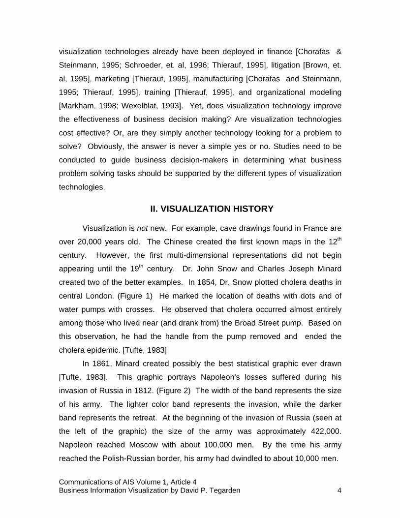
created two of the better examples. In 1854, Dr. Snow plotted cholera deaths in
central London. (Figure 1) He marked the location of deaths with dots and of
water pumps with crosses. He observed that cholera occurred almost entirely
among those who lived near (and drank from) the Broad Street pump. Based on
this observation, he had the handle from the pump removed and ended the
cholera epidemic. [Tufte, 1983]
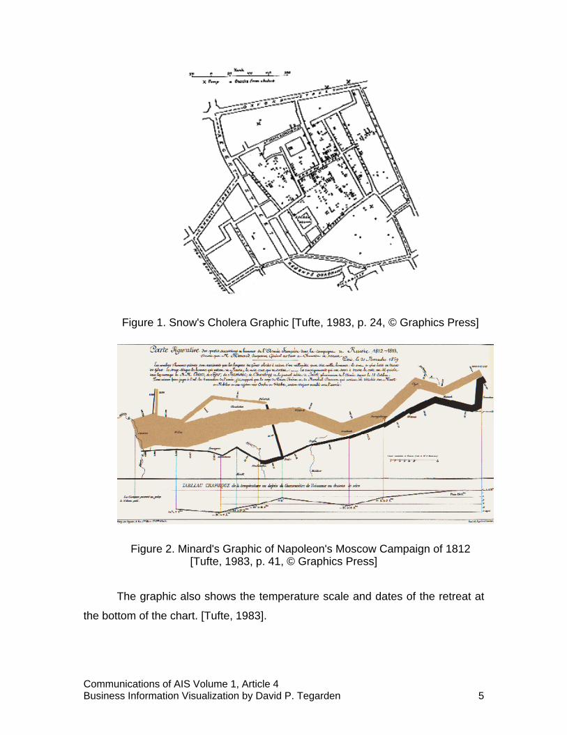
In 1861, Minard created possibly the best statistical graphic ever drawn
[Tufte, 1983]. This graphic portrays Napoleon's losses suffered during his
invasion of Russia in 1812. (Figure 2) The width of the band represents the size
of his army. The lighter color band represents the invasion, while the darker
band represents the retreat. At the beginning of the invasion of Russia (seen at
the left of the graphic) the size of the army was approximately 422,000.
Napoleon reached Moscow with about 100,000 men. By the time his army
reached the Polish-Russian border, his army had dwindled to about 10,000 men.
Communications of AIS Volume 1, Article 4Business Information Visualization by David P. Tegarden 5
Figure 1. Snow's Cholera Graphic [Tufte, 1983, p. 24, © Graphics Press]
Figure 2. Minard's Graphic of Napoleon's Moscow Campaign of 1812[Tufte, 1983, p. 41, © Graphics Press]
The graphic also shows the temperature scale and dates of the retreat at
the bottom of the chart. [Tufte, 1983].
Communications of AIS Volume 1, Article 4Business Information Visualization by David P. Tegarden 6
III. WHAT IS VISUALIZATION?
What exactly is meant by visualization? The New Lexicon Webster's
Dictionary of the English Language [1989, p. 1100], defines visualization as "a
visualizing or being visualized; a mental picture." What is meant by "being
visualized?" According to The Random House Dictionary of the English
Language [1987, p. 2127] to visualize is "to recall or form mental images or
pictures; to make visual or visible; to form a mental image of; to make perceptible
to the mind or imagination." These definitions imply that a visualization is a
picture of some phenomena. A more appropriate definition is found in The
Dictionary of Computer Graphics and Virtual Reality: visualization is “the process
of representing data as a visual image." [Latham, 1995, p. 148] The underlying
data could represent concrete objects, such as rooms or cars, or the data could
represent abstract objects, such as profit, sales, or cost. If the data is abstract,
then a visual analog must be created. A typical visual analog is a pie chart or
line graph.
The purpose of visualization is not to replace good solid quantitative
analysis, but instead to allow the quantitative analysis to be focussed [Grinstein
and Ward, 1997]. Visualization allows:
• Exploiting the human visual system to extract information from data,
• Provides an overview of complex data sets,
• Identifies structure, patterns, trends, anomalies, and relationships in data,
and
• Assists in identifying the areas of “interest”
In other words, visualization allows decision-makers to use their natural
spatial/visual abilities to determine where further exploration should be done.
This implies that visualization, when used appropriately, can allow the decision-
maker to find the information in the data.
Visualization technologies fall into three general classes: scientific
visualization, data/information visualization, and virtual reality.
Communications of AIS Volume 1, Article 4Business Information Visualization by David P. Tegarden 7
• Scientific visualization, as the name implies, deals with the transformation
of data produced through scientific or engineering calculations or
experiments into images, e.g., airflow over a wing. [Schroeder, Martin, and
Lorensen, 1998]
• Data/information visualization addresses the transformation of non-spatial
or behavioral data into visual images that represents an analogy or
metaphor of the problem space, e.g., investment portfolio analysis. [VDI,
1997]
• In the context of business information visualization, virtual reality (VR) is
simply a 3D, computer-generated, simulated environment that is rendered
in real time according to the behavior of the user. [Loeffler and Anderson,
1994] VR has also been referred to as artificial reality, cyberspace, and
virtual environments.
The three different classes of VR systems are non-immersive, immersive,
and CAVETM based systems.
• Non-immersive VR uses technology such as stereographic shutter glasses
to fool the user into believing that the object they see on a two-
dimensional surface is in fact 3D.
• Immersive VR actually takes the user the next step. It puts the user into
the visualization. The Dictionary of Computer Graphics and Virtual Reality
[Latham, 1995, p. 71] defines it as:
“an electronic simulation in which perspective images are
generated in real time from a stored database corresponding to
the position and orientation of the head of a user...”
When one thinks of VR, it is normally immersive VR that comes to
mind. The CAVETM is possibly the ultimate immersive VR environment.
• What is a CAVETM? [Cruz-Niera, et al., 1992] The best image that comes
to mind to describe a CAVETM as a first generation "holodeck."
Technically speaking this is not correct. However, it does produce the
correct "visualization" of the CAVETM. In a nutshell, a CAVETM is a multi-
person, room-sized, high-resolution, 3D video and audio environment. It

Communications of AIS Volume 1, Article 4Business Information Visualization by David P. Tegarden 8
allows a viewer (the “driver” who wears a location sensor) to move within
its display boundaries. The correct perspective and stereo projections of
the environment are updated and the image moves with and surrounds
the viewer. Currently, there is only one driver. The other viewers in the
CAVETM simply go along for the ride. Also, the CAVETM provides a
sonification capability through the use of computer-controlled speakers.
[Kriz, 1997]
Based on the above definitions, business information visualization is
simply the use of visualization technologies to visualize business data or
information. Of course, business information has been visualized in the form of
tables, outlines, pie charts, line graphs, and bar charts for a very long time.
However, today business information visualization means the use of
multidimensional graphics to represent business-related data or information.
Business information is different than other types of data. Business
information is typically abstract, discrete, and multi-dimensional. In addition,
business information can be historical or can be generated in real-time. These
characteristics make business information visualization difficult.
IV. WHY VISUALIZATION TECHNOLOGY?
Today's business decision-maker suffers from information overload while
at the same time underutilizing large amounts of relevant information. The
primary reasons for this are [VDI, 1997]:
• Key information is difficult to find or recognize
• Time-sensitive responsiveness is required
• Current DSS tools actually constrain productivity
Since a majority of the brain’s activity that deals with processing of
sensory data, deals with analyzing visual images, visualization technologies can
help resolve this dilemma. [Chorafas and Steinman, 1995] By tapping this innate
ability, we may be capable of aiding today's business decision-maker. In this
section, we describe why visualization technologies may be appropriate for
Communications of AIS Volume 1, Article 4Business Information Visualization by David P. Tegarden 9
business problem solving by overviewing visual cognition, cognitive fit theory,
and the types of tasks for which visualization can be used.
VISUAL COGNITION
Much of the research on human cognition shows that visualizations
enlarge problem solving capabilities. Visualization applications can enhance the
capability to process information that is either unidimensional or
multidimensional. Miller's classic paper [1956], "The Magical Number Seven,
Plus or Minus Two: Some Limits on Our Capacity for Processing Information,"
describes various experimental results that shed some light on the ability to make
absolute judgements in terms of unidimensional and multidimensional stimuli. In
relation to visualization, he reports on a set of results that imply that a human’s
input channel capacity is greater when visual abilities are used. For example,
humans are able to distinguish between ten and fifteen levels in determining the
location of a marker on a line, seven and ten levels of direction, six and eight
levels of line length, five and seven different levels of size, and about nine
different levels of color. For unidimensional data, the visual input channel shows
much promise for exploitation.
Using multidimensional stimuli, the experimental results were even better.
However, the results did not improve as much as was expected. The results
relevant to visualization were [Miller 1956]:
• when combining hue and saturation, humans can distinguish twelve
different levels,
• when combining size, brightness, and hue, the number of different levels
increases to seventeen, and
• when subjects were asked to identify the location of a dot in a square, they
were capable of differentiating about 24 different levels.
These findings suggest different parameters in the visual channel that can
be exploited to increase substantially the amount of data that decision-makers
process without overload.

Communications of AIS Volume 1, Article 4Business Information Visualization by David P. Tegarden 10
A more recent area of research is in the area of visual imagery [Kosslyn,
1980; Shepard and Cooper, 1982]. Visual recall seems to be better than verbal
recall, i.e., a picture really is worth a 1000 words. Furthermore, image
processing apparently is done in 3D. However, imagery is dependent on
perception, i.e., how the objects were learned (visual images on visual
perception; auditory images on auditory perceptions, etc.). Attempt to perform
the following tasks:
• Imagine your kitchen sink - describe how to turn on the hot water
• Imagine your home - count how many windows are in your home
• Name the major cities on the east coast of the United States
• Describe your "waking-up" routine
In each of these tasks, the underlying model could be based on an image.
Did you "see" your kitchen sink before recalling how to turn on the hot water?
Did you "walk through" your home to count the windows? Did you "use" a map to
identify the major cities? Did you "see" yourself waking up to identify the tasks
that you perform each morning? From a practical point of view, it really doesn't
matter how images are stored and recalled. What matters is that humans seem
to have a natural ability in using images that can be exploited to improve
business decision making.
Imagery based research also found that the mental models used in
simulating things related to vision or sound tend to draw upon real-world
analogies. When this occurs, images must behave according to “time-space” or
physics laws. Furthermore, concrete or "natural" images (those that have a real-
world counterpart) are faster to retrieve than abstract images. This result of
course has a bearing on business information visualization. What is a "natural"
image of business information? Visualize income, return-on-investment, wealth,
sales, or almost any information of interest to business decision-makers. We
revisit this issue below when we describe visualization representations.

Communications of AIS Volume 1, Article 4Business Information Visualization by David P. Tegarden 11
COGNITIVE FIT THEORY AND VISUALIZATION PROBLEM-SOLVING TASKS
Larkin and Simon [1987] found that diagrams can be superior
representations to written representations. They give three reasons why this
seems to be true:
• Diagrams can group all related information together
• Diagrams can use location to aid in information search
• Diagrams can aid in many perceptual inferences.
Their explanation for this phenomenon is that, from a cognitive processing
perspective, diagrams support efficient computational processes. However, the
user of the diagrams must be capable of executing these processes.
Cognitive Fit Theory [Vessey, 1991] has been used to explain why graphs
are sometimes better than tables for supporting decision making. In its basic form
(Figure 3), Cognitive Fit Theory states that a solution to a problem is "an outcome
of the relationship between the problem representation and problem solving
tasks." [Vessey, 1991, p. 220]. The better the "fit" is between these two
constructs, the more effective and efficient the problem solving process.
Therefore, when developing information visualizations, the developer must pay
attention to the tasks performed by the decision-maker if the visualization is to be
successful.
Figure 3. Cognitive Fit Model
The problem solving tasks that visualization technology can address are:
exploratory, confirmatory, and production [Grinstein and Ward, 1997].
Communications of AIS Volume 1, Article 4Business Information Visualization by David P. Tegarden 12
§ Exploratory tasks tend to be dynamic. Users normally search for structure
or trends that can be gleaned from the visualization or they are attempting
to create or test hypotheses about the underlying information.
§ Confirmatory tasks tend to be fairly stable and predictable. In this case,
the users normally attempt to confirm or refute hypotheses.
§ Production-based tasks are reporting systems. The users already have a
validated hypothesis and are using a visualization-based report.
V. VISUALIZATION DESIGN
To design effective visualizations, the designer must first understand the
data that will be used as the basis of the visualization. The designer must identify
the sources of the data, the level of completeness of the data, and the type of the
data. Is the data discrete or continuous? Is it located in a historical database or
is it coming in on a real-time data feed? What is the dimensionality of the data -
1D, 2D, 3D, etc? What is the scale of the data (Nominal, Ordinal, Interval, Ratio,
or Absolute)? How reliable is the data? All of these questions need to be
answered to understand the data well enough to design useful business
information visualizations. Data modeling approaches [Teorey, 1990] can be
used to address these questions.
In many ways, the design of a visualization is very similar to the design of
a user interface. Accordingly, paying attention to user interface guidelines is
essential. Shneiderman [1998] identifies three basic principles. First, the
designer should be aware of the diversity of the potential users and the tasks that
the user interface is to support. One of the primary mantras of user interface
design is "Know thy user." From Shneiderman's perspective, "Successful
designers are aware that other people learn, think, and solve problems in
different ways." (p. 67). Consequently, the designer must understand the
diversity of the users and their tasks. This can be accomplished using task
analysis [Bailey, 1996], observation techniques [Spradley, 1980], interviews
[Spradley, 1979], or scenario-based design techniques [Carroll, 1995].

Communications of AIS Volume 1, Article 4Business Information Visualization by David P. Tegarden 13
The second principle suggests eight heuristics that any user interface
designer should follow. First, the user interface should be consistent. This can
be difficult depending on the context. From a visualization perspective, the
interactions between the decision-maker and the system should be the same
across different systems. Also, similar types of data should be visually
represented similarly across systems. Second, the user interface designer should
encourage the use of shortcut key sequences for frequently performed actions,
e.g., control+s for saving a file. Third, every action taken by a user should have
an explicit response from the system, i.e., the system should provide meaningful
feedback. Fourth, dialogs should provide closure. Dialogs should inform the user
as to the amount of progress the user has made in performing their task. This
heuristic relates to the previous heuristic. Fifth, the designer should design for
user errors. By doing this, the designer builds into the system an error handling
capability. Sixth, the system should provide an easy way for the user to undo
their actions. This allows the user to correct their errors by backing them out.
Seventh, be sure that the user has the sense of being in charge. Many systems
in the past have put the computer in charge instead of the user. From a
visualization perspective, the user should be the initiator of all actions and the
computer should simply be the respondent. Eighth, be aware of short term
memory constraints (Miller's seven - plus or minus two chunks).
The third and final principle is systems should prevent errors. He
suggests three error prevention techniques. First, it is possible that commands
come in pairs, e.g, many HTML tags have both a beginning and an ending tag.
In these cases, the system could automatically insert or correct the matching
pair. Second, there may be a set of commands typically used in sequence. The
designer could create an "aggregate" command that groups the sequence of
commands. This would prevent the user from having to remember the entire
sequence. Third, the system could support automatic completion of a command
or provide a user with a set of relevant commands from which to choose.
Kosslyn [1994], an imagery researcher, states three maxims to guide
graphic display design:

Communications of AIS Volume 1, Article 4Business Information Visualization by David P. Tegarden 14
1. The Mind Is Not a Camera
2. The Mind Judges a Book by Its Cover
3. The Spirit Is Willing, But the Mind Is Weak
Many people assume that the mind sees things much like a camera does.
However, the mind is not a passive observer. It actively organizes data to make
sense of them. Kosslyn points out that our visual system seems to have a
number of separate "input channels" in which to gather visual information. The
different channels are sensitive to different types of changes. From a visual
design perspective, we should utilize these distinct channels, otherwise, we may
"overload" the decision-maker.
The second maxim dictates designing a visual representation that is
"natural." By natural, we mean that the visualization is capable of being
associated with the "real-world" entity at an intuitive level. In this manner, the
decision-maker can use a recognition-based approach instead of one that
requires recall. (Recognition-based tasks are computationally less expensive.)
Kosslyn's final maxim addresses the same point that Miller did, i.e., we
have a limited amount of information that we can retain in short term memory at
one time. The only way to increase this amount is by "chunking" the information
being stored. Visualizations, through the use of multiple input channels, can aid
the decision-maker in the chunking of the relevant information. Of course, if the
visualization is poorly designed, (i.e., it does not take the above into
consideration) it can cause much confusion.
Tufte [1983, 1990] provides six objectives that any graphic should meet:
• First, he suggests that we should simply show the data. In many cases,
graphic designers tend to show various aggregations of the data instead
of the data itself. In most cases, allowing the user to perform the
aggregations visually provides greater insight into the underlying structure
of the data.
• Second, he suggests that we insure that the user is thinking about the
substance of the graphic and not the graphic itself. From a business
information perspective, many of the standard techniques (or variations of

Communications of AIS Volume 1, Article 4Business Information Visualization by David P. Tegarden 15
them) are more than sufficient. If the user has to think about the graphic
representation instead of the underlying data, the graphics representation
has failed.
• Third, avoid any unnecessary decorations. Adornments to a graphic
rarely provide additional information. Normally they do nothing but divert
the attention of the user. "Cute" or "clever" graphics will only distract the
user from their problem-solving task.
• Fourth, Tufte suggests compressing as much information into as small a
space as possible. This point relates back to the results reported by Miller
[1956], Kosslyn [1980], and Shepard and Cooper [1982]. Through properly
designed graphics, it is possible to support the user's "chunking" of
information. Obviously, the previously mentioned points of Shneiderman
[1998] and Kosslyn [1994] must be taken into consideration.
• Fifth, graphics should be designed to encourage the user to make
comparisons between different pieces of data. Users are capable of doing
comparisons with graphics much better than using them for absolute
judgements. [Grinstein and Ward, 1997]
• Tufte’s sixth and final objective is that graphics should provide views of the
data at many levels of detail. This principle relates to the "Drilldown" and
"Level-Of-Detail" capabilities of visualizations. With these capabilities, the
designer can allow a broad overview of the data to be given and, at the
same time, allow the user to have access to the detailed data that
underlies the overview.
Based on Tufte’s guidelines, visualization designers can choose an
appropriate visual representation (Section VI). The user should find the metaphor
chosen easy to understand. In multidimensional visualization, normalization of
the underlying data is required. Otherwise, scale issues and skewness issues
could produce bad visualizations. Furthermore, the designers should map the
data/information to the components of the visualization. The primary components
of a visualization are based on size (height, length, width) and location (x-axis, y-
axis, z-axis). Secondary components could be animation (based on time) and

Communications of AIS Volume 1, Article 4Business Information Visualization by David P. Tegarden 16
color. However, visualization components such as transparency and texture are
not as easily interpretable.
VI. VISUALIZATION REPRESENTATIONS (METAPHORS)
Possibly, the most difficult aspect of designing information visualizations is
the choice of representation (or metaphor). The reason that this choice is so
difficult is that deciding what is a "natural" representation for business data is not
straightforward. However, information visualization designers have created
representations that can be used as a beginning point in creating new
information visualizations. Beyond the above guidelines and sample
representations, there are really no aids for the designer in choosing the correct
metaphor. It is possible that good information visualizations are not only task
dependent, but they also may be domain dependent. What is needed is a good
taxonomy of domains, tasks, and visualizations.
A good starting point is to look at business charting techniques. Business
decision-makers are already familiar with these types of diagrams. Today, bar
charts, line graphs, pie charts, and other typical business diagrams may be as a
"natural" representation as is possible. In this case, "natural" is a misnomer.
These formats have simply been learned. The formats can be modified and
extended to deal with multidimensional data. A good deal of additional research
is required in this area.
In this section, we describe a sample of the visual representations created
by information visualization designers. For a more complete set of examples see
Bertin [1983], Harris [1996], Keller and Keller [1993], Nielson et al. [1997], and
OLIVE [1997]).
KIVIAT DIAGRAMS
Kiviat diagrams (Fig. 4) have been used for many years in computer
performance evaluation [Kolence and Kiviat, 1973]. A Kiviat diagram allows the
depiction of relationships among multivariate data. Each value of each measure

Communications of AIS Volume 1, Article 4Business Information Visualization by David P. Tegarden 17
is shown on its own individual axis. For example, if we have five separate
measures, the Kiviat diagram would have five distinct axis (radii). The value for
each measure for the entity of interest is plotted on the appropriate axis. The
points are then connected. The pattern that is formed is the information
visualization. To compare one entity to another, one compares the patterns of
the separate entities. These diagrams are also known as radar charts, star
graphs, spider graphs, and star glyphs.
Figure 4. Kiviat Diagram
PARALLEL COORDINATES
Parallel Coordinates (Figure 5) is another multivariate technique that has
been used for a long time. Recently, this approach has been used in the area of
visual data mining [Inselberg, 1997]. As shown in Figure 5, like a Kiviat diagram,
each measure is plotted on its own individual axis for each entity. In this case,
the pattern is a line instead of a polygon, which makes looking for similar patterns
across multiple entities straightforward. For example, looking at the last two
variables in Figure 5 demonstrates two separate groupings of entities - one in red
and one in blue.

Communications of AIS Volume 1, Article 4Business Information Visualization by David P. Tegarden 18
Figure 5. Parallel Coordinates
3D SCATTERGRAM
A 3D scattergram (Figure 6) is an extension to the typical 2D scatterplot
that one finds in most statistics packages. In this case, one can represent up to
four separate measures on each entity: one for each axis (x, y, and z) and color.
However, one major problem with this approach is that it tends to be difficult to
determine precisely the location of each specific value. In many cases it is
necessary to add reference data, e.g., lines from each value to their respective
axis values and the addition of a color map. Otherwise, the interpretability of the
scattergram may be problematic.

Communications of AIS Volume 1, Article 4Business Information Visualization by David P. Tegarden 19
Figure 6. 3D Scattergram
3D LINE GRAPH
A 3D line graph (Figure 7) is an extension to the typical 2D line graph.
This graph allows the representation of up to four separate measures for the
entity of interest. In this case, the line spirals through the three dimensions (x, y,
and z). As the fourth measure changes, the color of the line changes. In this
case, since only one entity is graphed at a time, the results are easier to interpret
than the 3D scattergram. However, like the 3D scattergram, this representation
really needs the addition of reference data and a color map to be usable.
Figure 7. 3D Line Graph [Dull and Tegarden, 1998]

Communications of AIS Volume 1, Article 4Business Information Visualization by David P. Tegarden 20
VOLUME RENDERING
Volume rendering (Figure 8) requires a 3D data set. This approach has
been used as a scientific visualization technique. However, Becker [1997] of
Silicon Graphics has recently used it to represent data stored in a relational
database. In this work, he plots aggregated data (education level, occupation,
and hours worked) into the 3D space and assigns color to the dependent variable
(income). Opacity of the visualization is based on the number of observations
contained in that location. He also assigns an additional variable (age) to an
external slider to use as the basis for a visual query. Based on this work, volume
rendering may now turn out to be a reasonable alternative to other multivariate
representations.
Figure 8. Volume Rendering [Becker, 1997, p. 124, © IEEE]

Communications of AIS Volume 1, Article 4Business Information Visualization by David P. Tegarden 21
FLOORS AND WALLS
The floors and walls representation (Figure 9) is a form of a room
metaphor. In this representation, information is assigned to various business
graphics and is displayed on a wall of the room or on the floor of the room. This
representation allows a great deal of information to be placed in a relatively small
space, i.e., it supports one of Tufte's guidelines. Also, it supports the decision-
maker with graphics that the decision-maker is familiar, e.g., pie charts, bar
charts, line graphs, and other typical business charting approaches. This
representation supports both exploratory and confirmatory decision making
tasks. In these types of tasks, the decision-maker would navigate through the
landscape to find the information to create new or test held hypotheses.
Figure 9. Floor and Walls (courtesy Visible Decisions, Inc.)
MAPS
Maps (Figure 10) are a potential "natural" representation for entities that
can be analyzed geographically. For example, if a regional (state) manager
would like to see how their region (state) is performing in comparison to other
Communications of AIS Volume 1, Article 4Business Information Visualization by David P. Tegarden 22
regions (states) in terms of retail sales, the manager could look at a map-based
"bar" chart type of visualization. One drawback of this particular visualization is
that only one measure can be visualized at a time. However, this representation
could be combined with a floor and wall type of representation to allow a "drill
down" process. In this manner, a map-based representation can become a true
multivariate representation.
Figure 10. Maps (courtesy Visible Decisions, Inc.)
SURFACES
Surface representations (Figure 11), like volumes, have been used
primarily in the area of scientific visualization. However, the idea of traversing
the peaks and valleys of a business information landscape is appealing. We can
imagine a decision-maker scanning the surface to find "interesting" patterns.
However, since surface representations are continuous in nature, not discrete,
they should only be used when representing a continuous variable. As such,
their usefulness for most typical business information may be limited. More
research to determine the usefulness of this type of representation appears to be
necessary.

Communications of AIS Volume 1, Article 4Business Information Visualization by David P. Tegarden 23
Figure 11. Surfaces (courtesy Visible Decisions, Inc.)
VII. VISUALIZATION APPLICATIONS
This section describes several applications of information visualization
technologies. Table 1 lists typical problems that have been solved using this
technology.
Table 1. Typical Business Application Domains
Financial Risk Management Industrial Process Control
Operations Planning Capital Markets Management
Military Strategic Planning Network Monitoring
Marketing Analysis Derivatives Trading
Fraud/Surveillance Analysis Portfolio Management
Actuarial Modeling Customer/Product Analysis
Budget Planning Operations Management
Economic Analysis Fleet/Shipping Admin
Communications of AIS Volume 1, Article 4Business Information Visualization by David P. Tegarden 24
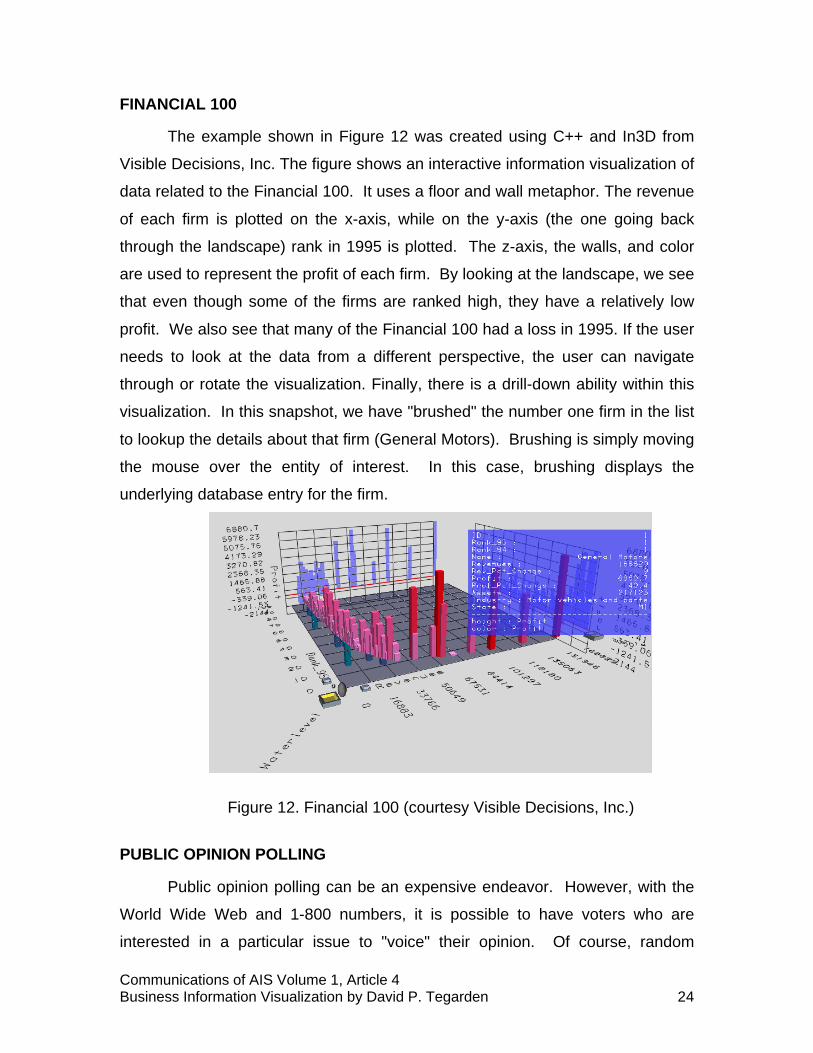
FINANCIAL 100
The example shown in Figure 12 was created using C++ and In3D from
Visible Decisions, Inc. The figure shows an interactive information visualization of
data related to the Financial 100. It uses a floor and wall metaphor. The revenue
of each firm is plotted on the x-axis, while on the y-axis (the one going back
through the landscape) rank in 1995 is plotted. The z-axis, the walls, and color
are used to represent the profit of each firm. By looking at the landscape, we see
that even though some of the firms are ranked high, they have a relatively low
profit. We also see that many of the Financial 100 had a loss in 1995. If the user
needs to look at the data from a different perspective, the user can navigate
through or rotate the visualization. Finally, there is a drill-down ability within this
visualization. In this snapshot, we have "brushed" the number one firm in the list
to lookup the details about that firm (General Motors). Brushing is simply moving
the mouse over the entity of interest. In this case, brushing displays the
underlying database entry for the firm.
Figure 12. Financial 100 (courtesy Visible Decisions, Inc.)
PUBLIC OPINION POLLING
Public opinion polling can be an expensive endeavor. However, with the
World Wide Web and 1-800 numbers, it is possible to have voters who are
interested in a particular issue to "voice" their opinion. Of course, random
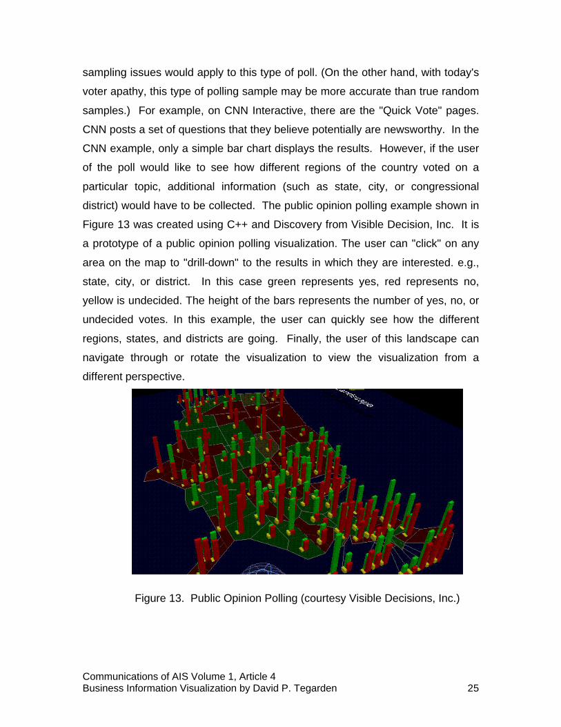
Communications of AIS Volume 1, Article 4Business Information Visualization by David P. Tegarden 25
sampling issues would apply to this type of poll. (On the other hand, with today's
voter apathy, this type of polling sample may be more accurate than true random
samples.) For example, on CNN Interactive, there are the "Quick Vote" pages.
CNN posts a set of questions that they believe potentially are newsworthy. In the
CNN example, only a simple bar chart displays the results. However, if the user
of the poll would like to see how different regions of the country voted on a
particular topic, additional information (such as state, city, or congressional
district) would have to be collected. The public opinion polling example shown in
Figure 13 was created using C++ and Discovery from Visible Decision, Inc. It is
a prototype of a public opinion polling visualization. The user can "click" on any
area on the map to "drill-down" to the results in which they are interested. e.g.,
state, city, or district. In this case green represents yes, red represents no,
yellow is undecided. The height of the bars represents the number of yes, no, or
undecided votes. In this example, the user can quickly see how the different
regions, states, and districts are going. Finally, the user of this landscape can
navigate through or rotate the visualization to view the visualization from a
different perspective.
Figure 13. Public Opinion Polling (courtesy Visible Decisions, Inc.)

Communications of AIS Volume 1, Article 4Business Information Visualization by David P. Tegarden 26
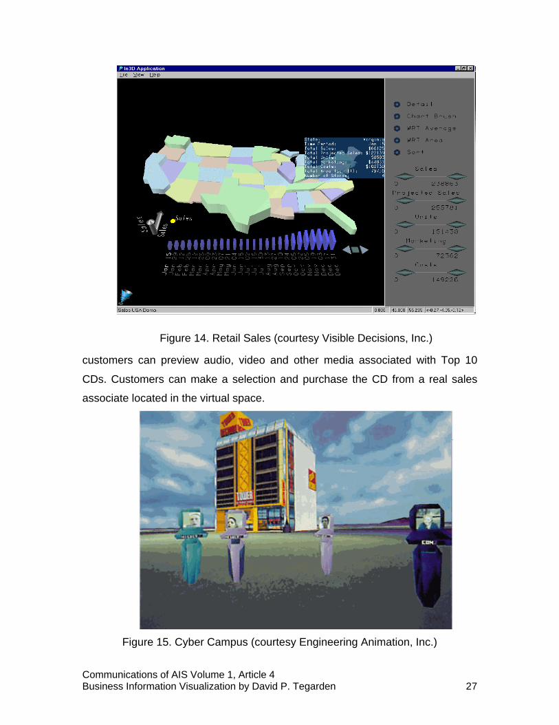
RETAIL SALES
The information landscape shown in Figure 14 was created using C++ and
In3D from Visible Decisions, Inc. It enables a manager of a retail chain to
observe sales patterns over an entire year within a geographical context. In this
example, there are many interactive controls. Within the landscape, it is possible
to change the variable being graphed (see x-y-z axis indicator on left side of
landscape). Currently, sales are the only measure being plotted. However, it is
possible to display more than one variable at a time. Also, there is a set of
"VCR" controls at the lower right portion of the landscape. These controls allow
the user to animate the visualization by having the sales plotted for each date
(see the time line at the bottom of the visualization) contained in the database. If
the user wants to "drill down" to find out more information about a particular
state, the user can either "brush" the state (see blue box data on Virginia) or the
user can use an external control located at the far right side of the application to
choose a detailed view (one that is similar to the polling example). External
range sliders allow the user to determine what underlying data values are to be
displayed in the landscape. Finally, this landscape also can be navigated and
rotated.
CYBERCAMPUS
The VR application shown in Figure 15 was created by NTT Human
Interface Laboratories using C++ and WorldToolkit from Engineering Animation,
Inc. This example provides a common virtual space in which each user can
move about freely and interact with other participants and the environment. Video
and audio capabilities actually project the face and voice of each user onto the
avatar representation of the user in the virtual world. This approach allows
realistic multi-user telecommunication. NTT and its partners hope to evaluate the
technical, social, commercial, and psychological aspects of this type of service.
Eventually, NTT plans to provide a shopping mall of commercial applications,
including educational, entertainment, business and retail options. The
demonstration in Figure 15 is a virtual music store (Tower Records) where
Communications of AIS Volume 1, Article 4Business Information Visualization by David P. Tegarden 27
Figure 14. Retail Sales (courtesy Visible Decisions, Inc.)
customers can preview audio, video and other media associated with Top 10
CDs. Customers can make a selection and purchase the CD from a real sales
associate located in the virtual space.
Figure 15. Cyber Campus (courtesy Engineering Animation, Inc.)

Communications of AIS Volume 1, Article 4Business Information Visualization by David P. Tegarden 28
VIRTUAL CAMPUS
For the past two years, David Monarchi has been heading up the
Integrated Immersive Learning Environment (IILE) project in the College of
Business at the University of Colorado at Boulder. The IILE uses multimedia,
world wide web, virtual reality, and collaborative groupware technologies to
support student learning. The different technologies used allow different
students to use different approaches to learn the same material. Thus, the IILE
supports different learning styles. Currently, the IILE has been used to create a
virtual campus that supports a set of classes at the University of Colorado (see
Figure 16). For example, in BCOR 100 - Business Computing Skills, the student
may "attend" the class at the student's convenience. The student can walk
through and interact with a virtual computer or virtual computer network. The
student can go to office hours that are supported using email or a threaded
discussion forum, for asynchronous office hours, and chat rooms or Microsoft's
NetMeeting software for synchronous office hours. However, the centerpiece of
the IILE is the Active Worlds browser created by Circle of Fire, Inc. The Active
Worlds browser more fully supports the immersion of the student into the learning
environment.
Figure 16. University of Colorado's Virtual Campus (courtesy David Monarchi)

Communications of AIS Volume 1, Article 4Business Information Visualization by David P. Tegarden 29
CATERPILLAR CAVE-BASED SOFT PROTOTYPE
This application (shown in Figure 17) was built by Caterpillar, the world's
leading manufacturer of earth moving and mining equipment, and the National
Center for Supercomputing Applications (NCSA) using C++ and WorldToolKit
from Engineering Animation, Inc. In this case, a CAVETM simulation was built.
The simulation allows Caterpillar to build and test soft prototypes of future
vehicles. Caterpillar found that making changes to physical prototypes tended to
require throwing away the current prototype and building a new one from scratch.
This new approach is a sophisticated use of VR in industry. Operators sit on a
platform that is equipped with controls like those found in a real cab. The controls
are hooked into the CAVETM. When the prototype needs to be modified, the C++
code is simply changed. This approach allows the new machine to be assessed
from within the virtual machine.
Figure 17. Caterpillar CAVETM Prototype (courtesy Engineering Animation, Inc.)
VIII. CONCLUSIONS
Information visualization technology provides the information systems
developer with a new set of tools in which to support the business decision-
maker. In this tutorial, we introduced visualization technology by putting
Communications of AIS Volume 1, Article 4Business Information Visualization by David P. Tegarden 30
visualization into a historical context, defined visualization, described the
purposes of visualization, and provided some justification as to why visualization
technology should be investigated. We also provided guidelines to designing
information visualizations and choosing visualization representations. Finally, we
described a set of typical visualizations that have been created to aid decision-
makers. However, there is very little evidence available that suggests which type
of business problems should be addressed with visualization technologies.
Visualization technologies have been used in many areas of business,
e.g., finance, marketing, and training, and they have been used to support many
different types of tasks, e.g. exploratory and confirmatory tasks. However, it is
still unclear where this technology may be most effective. As Cognitive Fit
Theory suggests, we need to match the problem representation (visualization
technique) to the problem solving task. To help address this state of affairs, a
taxonomy of business problem domains, problem solving tasks, and visualization
techniques would be useful.
With visualization technology, new approaches to solving business
problems arise. Decision-makers can fly over or swim through their data. Or,
would a decision-maker prefer to climb a mountain or go spelunking? Or, are the
more traditional business charting techniques, or their 3D extensions, sufficient?
Or, are there new visualizations that need to be created that would be more
"natural?" Only time will tell how these technologies impact business problem
solving. However, in the meantime, there are many opportunities to conduct
research to address these questions. The results of the research can be used to
guide the business decision-maker and information systems developer through
the visualization landscape. These studies can range from surveys to
experiments to systems development efforts.
ACKNOWLEDGEMENTS
The author gratefully acknowledges the discussions dealing with
information visualizations and virtual reality with Richard Dull, Traci Hess, Ron
Kriz, Steve Markham, and David Monarchi. The author also acknowledges the

Communications of AIS Volume 1, Article 4Business Information Visualization by David P. Tegarden 31
Aspires Program (Research and Graduate Studies at Virginia Tech) and the ATT
Center for the Scientific Visualization of Organizations (Virginia Tech) for
financial support of this research program. Finally, the author acknowledges
David Monarchi, Engineering Animation, Inc., and Visible Decisions, Inc. for
providing material presented in this tutorial.
This paper was accepted by Paul Gray on October 16, 1998. It was received onSeptember 2, 1998 and was with the author for approximately one month. The paper wasoriginally given as a Tutorial at AIS Americas ’98, Baltimore, MD, in August 1998. The paper waspublished on January 4, 1999 as one of the inaugural papers for CAIS.
REFERENCES
EDITOR’S NOTE: The following reference list contains hyperlinks to World Wide Webpages. Readers who have the ability to access the Web directly from their word processor or arereading the paper on the Web, can gain direct access to these linked references. Readers arewarned, however, that
1. these links existed as of the date of publication but are not guaranteed to be workingthereafter.
2. the contents of Web pages may change over time. Where version information isprovided in the References, different versions may not contain the information or the conclusionsreferenced.
3. the authors of the Web pages, not CAIS, are responsible for the accuracy of theircontent.
4. the author(s) of this article, not CAIS, is (are) responsible for the accuracy of the URLand version information.
Bailey, R W. Human Performance Engineering: Using Human
Factors/Ergonomics to Achieve Computer Usability, 3rd Ed., Prentice-Hall,
Englewood Cliffs, NJ, 1996.
Becker, B. "Research Report: Volume Rendering for Relational Data," in
Proceedings Information Visualization 1997, John Dill and Nahum Gershonn
(eds.), IEEE-CS Press, Los Alimitos, CA, 1997, pp. 87-90,124.
Bertin, J. Semiology of Graphics. The University of Wisconsin Press,
Madison, WI, 1983.

Communications of AIS Volume 1, Article 4Business Information Visualization by David P. Tegarden 32
Carroll, J.M. (ed.) Scenario-Based Design: Envisioning Work and
Technology in System Development, John Wiley and Sons, New York, NY, 1995.
Chorafas, D.N. and Steinmann, H., Virtual Reality: Practical Applications
in Business and Industry, Prentice Hall, Englewood Cliffs, 1995.
Cruz-Neira, C., Sandin, D.J., DeFanti, T.A., Kenyon, R.V., and Hart, J.C.,
“The Cave: Audio Visual Experience Automatic Virtual Environment." CACM
(35:6) June 1992, pp. 64-72.
Dull, R.B. and Tegarden, D.P., "Visualization of Complex Multi-
Dimensional Accounting Information." in Proceedings of the Fourth Americas
Conference on Information Systems, Ellen D. Hoadley and Izak Benbasat (eds.),
AIS, 1998, pp. 6-8.
Engineering Animation, Inc., Sense8 Product Line, http://www.
sense8.com.
Grinstein, G. and Ward M., "Introduction to Data Visualization." IEEE
Visualization Tutorial. 1997.
Harris, R.L., Information Graphics: A Comprehensive Illustrated
Reference. Management Graphics, Atlanta, GA, 1996.
Huff, D., How to Lie with Statistics. W.W. Norton, New York, NY, 1954.
Inselberg, A., "Multidimensional Detective." Proceedings Information
Visualization 1997, John Dill and Nahum Gershon (eds.), IEEE-CS Press, Los
Alimitos, CA, 1997, pp. 100-107.
Communications of AIS Volume 1, Article 4Business Information Visualization by David P. Tegarden 33
Keller, P.R. and Keller, M.M., Visual Cues: Practical Data Visualization.
IEEE-CS Press, Loa Alimitos, CA, 1993.
Kolence, K. and Kiviat, P., "Software Unit Profiles and Kiviat Figures."
Performance Evaluation Review (2:3) September 1973, pp. 2-12.
Kosslyn,S.M.,Images and Mind. Harvard University Press, Cambridge,
MA, 1980.
Kosslyn,S.M.,Elements of Graph Design. W.H. Freeman and Co., New
York, NY, 1994.
Kriz, R., "What is a Cave." http://www.sv.vt.edu/future/vt-cave/whatis/,
1997.
Larkin, J.H. and Simon, H.A., "Why a Diagram is (Sometimes) Worth Ten
Thousand Words." Cognitive Science (11) 1987, pp. 65-99.
Latham, R., The Dictionary of Computer Graphics and Virtual Reality, 2nd
Ed. Springer-Verlag, New York, NY, 1995.
Loeffler, C.E. and Anderson, T., (eds). The Virtual Reality Casebook. Van
Nostrand Reinhold, New York, NY, 1994.
Markham, S.E., "The Scientific Visualization of Organizations: A Rationale
for a New Approach to Organizational Modeling." Decision Sciences (29:1)
Winter 1998, pp. 1-23.
Miller, G.A., "The Magical Number Seven, Plus or Minus Two: Some
Limits on Our Capacity for Processing Information." Psychological Review (63)
1956, pp. 81-97.
Communications of AIS Volume 1, Article 4Business Information Visualization by David P. Tegarden 34
The New Lexicon Webster's Dictionary of the English Language. Lexicon
Publications, New York, NY, 1989.
Nielson, G.M., Hagen, H., and Muller, H. (eds.), Scientific Visualization:
Overviews, Methodologies, Techniques. IEEE Computer Society Press, Los
Alamitos, CA, 1997.
OLIVE: On-line Library of Information visualization Environments.
http://otal.umd.edu/Olive/, 1997.
The Random House Dictionary of the English Language, 2nd Ed.
Unabridged. Random House, New York, NY, 1987.
Schroeder, W., Martin, K., Lorensen, B., The Visualization Toolkit: An
Object-Oriented Approach to 3D Graphics. Prentice Hall, Upper Saddle River,
NJ, 1996.
Shenk, D.. Data Smog: Surviving the Information Glut, Revised and
Updated Ed. HarperCollins, San Francisco, CA, 1997.
Shepard, R.N. and Cooper, L.A., Mental Images and Their
Transformations. The MIT Press, Cambridge, MA, 1982.
Shneiderman, B., Designing the User Interface: Strategies for Effective
Human-Computer Interaction, 3rd Ed. Addison-Wesley, Reading, Mass, 1998.
Spradley, J.P.,The Ethnographic Interview. Holt, Rinehart, and Winston,
New York, NY, 1979.

Communications of AIS Volume 1, Article 4Business Information Visualization by David P. Tegarden 35
Spradley, J.P., Participant Observation. Holt, Rinehart, and Winston, New
York, NY, 1980.
Teorey, T.J. Database Modeling and Design: The Entity-Relationship
Approach. Morgan Kaufmann, San Mateo, CA, 1990.
Thierauf, R.J., Virtual Reality Systems for Business. Quorum Books,
Wesport, CT, 1995.
Tufte, E.R., The Visual Display of Quantitative Information. Graphics
Press, Chesire, Conn., 1983.
Tufte, E.R., Envisioning Information. Graphics Press, Chesire, Conn.,
1990.
VDI. Visualization Design. Visible Decisions, Inc., Toronto, CA, 1997.
Vessey, I., “Cognitive Fit: A Theory-Based Analysis of the Graphs Versus
Tables Literature.” Decision Sciences (22: 2) Spring 1991, pp. 219-241.
Visible Decision, Inc. http://www.vdi.com.
Wexelblat, A., Virtual Reality: Applications and Explorations. Academic
Press, Boston, MA, 1993.
BIBLIOGRAPHY
This bibliography contains references that are useful to readers interested
in pursuing the subject of visualization in depth.

Communications of AIS Volume 1, Article 4Business Information Visualization by David P. Tegarden 36
Brown, J.R., Earnshaw, R., Jern, M., and Vince, J., Visualization: Using
Computer Graphics to Explore Data and Present Information, John Wiley and
Sons, New York, NY, 1995.
Card, S., Eick, S., and Gershon, N. (eds.), Proceedings Information
Visualization 1996. IEEE-CS Press, Los Alamitos, CA, 1996.
Cleveland, W.S. Visualizing Data, Hobart Press, Summit, NJ, 1993.
Cleveland, W.S. The Elements of Graphing Data, Revised Ed. Hobart
Press, Summit, NJ, 1994.
Dill, J. and Gershon, N. (eds.), Proceedings Information Visualization
1997. IEEE-CS Press, Los Alimitos, CA, 1997.
Fortner, B., The Data Handbook: A Guide to Understanding the
Organization and Visualization of Technical Data, 2nd Ed. Springer-Verlag, New
York, NY, 1995.
Fortner, B. and Meyers, T.E., Number by Colors: A Guide to Using Color
To Understand Technical Data. Springer-Verlag, New York, NY, 1997.
Gershon, N. and Eick, S. (eds.), Proceedings Information Visualization
1995. IEEE-CS Press, Los Alimitos, CA, 1995.
Jones, C.V., Visualization and Optimization, Kluwer Academic Publishers,
Boston, MA, 1996.
Rosenblum, L., Earnshaw, R.A., Encarnacao, J., Hagen,H., Kaufman, A.,
Klimenko, S., Nielson, G., Post, F., and Thalmann, D., Scientific Visualization:
Advances and Challenges, Academic Press, London, UK, 1994.

Communications of AIS Volume 1, Article 4Business Information Visualization by David P. Tegarden 37
Tufte, E.R., Visual Explanations. Graphics Press, Chesire, Conn., 1997.
Vince, J., Virtual Reality Systems. ACM Press, Reading, Mass, 1995.
ABOUT THE AUTHOR
David Tegarden is Assistant Professor of Information Systems in the
Department of Accounting and Information Systems and a Fellow in the Center
for Human-Computer Interaction at Virginia Tech. He received the BBA in
Information Systems from Middle Tennessee State University in 1980; the MS in
Accounting/Information Systems from Middle Tennessee State University in
1981; and the PhD in Information Systems from the University of Colorado in
1991.
Dr. Tegarden’s current research emphases are in the areas of object-
oriented software engineering, the development of cognitively-based software
complexity measurements, group support systems, cognitive mapping, and the
application of information visualization technologies in business. He has
published articles Journal of Management Information Systems, The International
Journal of Decision Support Systems, Software Quality Journal, and Object-
Oriented Systems. He is a member of Association of Computing Machinery
(ACM), Association for Information Systems (AIS), Computer Professionals for
Social Responsibility (CPSR), The Institute of Electrical and Electronic Engineers
- Computer Society (IEEE-CS), and The Institute for Operations Research and
Management Science (INFORMS).
Copyright © 1999, by the Association for Information Systems. Permission to make digitalor hard copies of all or part of this work for personal or classroom use is granted without feeprovided that copies are not made or distributed for profit or commercial advantage and thatcopies bear this notice and full citation on the first page. Copyright for components of this workowned by others than the Association for Information Systems must be honored. Abstracting withcredit is permitted. To copy otherwise, to republish, to post on servers, or to redistribute to listsrequires prior specific permission and/or fee. Request permission to publish from: AISAdministrative Office, P.O. Box 2712 Atlanta, GA, 30301-2712 Attn: Reprints or via e-mail [email protected].

Communications of AIS Volume 1, Article 4Business Information Visualization by David P. Tegarden 38
EDITOR Paul Gray
Claremont Graduate University
AIS SENIOR EDITORIAL BOARDHenry C. Lucas, Jr.Editor-in-ChiefNew York University
Paul GrayEditor, CAISClaremont Graduate University
Phillip Ein-DorEditor, JAISTel-Aviv University
Edward A. StohrEditor-at-LargeNew York University
Blake IvesEditor, Electronic PublicationsLouisiana State University
Reagan RamsowerEditor, ISWorld NetBaylor University
CAIS ADVISORY BOARDGordon DavisUniversity of Minnesota
Richard MasonSouthern Methodist University
Jay NunamakerUniversity of Arizona
Henk SolDelft University
Ralph SpragueUniversity of Hawaii
CAIS EDITORIAL BOARDSteve AlterUniversity of SanFrancisco
Barbara BasheinCalifornia StateUniversity
Tung BuiUniversity of Hawaii
Christer CarlssonAbo Academy, Finland
H. Michael ChungCalifornia StateUniversity
Omar El SawyUniversity ofSouthern California
Jane FedorowiczBentley College
Brent GallupeQueens University,Canada
Sy GoodmanUniversity of Arizona
Chris HollandManchester BusinessSchool, UK
Jaak JurisonFordham University
George KasperVirginia CommonwealthUniversity
Jerry LuftmanStevens Institute ofTechnology
Munir MandviwallaTemple University
M.Lynne MarkusClaremont GraduateUniversity
Don McCubbreyUniversity of Denver
Michael MyersUniversity of Auckland,New Zealand
Seev NeumannTel Aviv University,Israel
Hung Kook ParkSangmyungUniversity, Korea
Dan PowerUniversity of NorthernIowa
Maung SeinAgder College, Norway
Margaret TanNational University ofSingapore, Singapore
Doug VogelCity University of HongKong, China
Hugh WatsonUniversity of Georgia
Dick WelkeGeorgia StateUniversity
Rolf WigandSyracuse University
Phil YettonUniversity of NewSouth Wales, Australia
ADMINISTRATIVE PERSONNELEph McLeanAIS, Executive DirectorGeorgia State University
Colleen BauderSubscriptions ManagerGeorgia State University
Reagan RamsowerPublisher, CAISBaylor University