bridging the gap between tools for learning and for doing statistics...
TRANSCRIPT

University of California
Los Angeles
Bridging the Gap Between Tools for Learning
and for Doing Statistics
A dissertation submitted in partial satisfaction
of the requirements for the degree
Doctor of Philosophy in Statistics
by
Amelia Ahlers McNamara
2015

c© Copyright by
Amelia Ahlers McNamara
2015

Abstract of the Dissertation
Bridging the Gap Between Tools for Learning
and for Doing Statistics
by
Amelia Ahlers McNamara
Doctor of Philosophy in Statistics
University of California, Los Angeles, 2015
Professor Robert L Gould, Co-chair
Professor Fredrick R Paik Schoenberg, Co-chair
Computers have changed the way we think about data and data analysis. While
statistical programming tools have attempted to keep pace with these develop-
ments, there is room for improvement in interactivity, randomization methods,
and reproducible research.
In addition, as in many disciplines, statistical novices tend to have a reduced
experience of the true practice. This dissertation discusses the gap between tools
for teaching statistics (like TinkerPlots, Fathom, and web applets) and tools for
doing statistics (like SAS, SPSS, or R). We posit this gap should not exist, and
provide some suggestions for bridging it. Methods for this bridge can be curricular
or technological, although this work focuses primarily on the technological.
We provide a list of attributes for a modern data analysis tool to support
novices through the entire learning-to-doing trajectory. These attributes include
easy entry for novice users, data as a first-order persistent object, support for a
cycle of exploratory and confirmatory analysis, flexible plot creation, support for
randomization throughout, interactivity at every level, inherent visual documenta-
tion, simple support for narrative, publishing, and reproducibility, and flexibility
ii

to build extensions.
While this ideal data analysis tool is still a few years in the future, we describe
several projects attempting to close the gap between tools for learning and tools for
doing statistics. One is curricular, a high school level Introduction to Data Science
curriculum. Others are technological, like the experimental LivelyR interface for
interactive analysis, the MobilizeSimple R package, and Shiny microworlds.
Much of this work was inspired by Biehler (1997), which describes the at-
tributes necessary for a software package for learning statistics. Biehler’s vision
has largely come to light, but advancements in computing and ‘data science’ have
moved the goalposts, and there is more to learning statistics than before. This
work envisions a tool not only encompassing these advancements, but providing
an extensible system capable of growing with the times.
iii

The dissertation of Amelia Ahlers McNamara is approved.
Alan Curtis Kay
Mark Stephen Handcock
Todd D Millstein
Fredrick R Paik Schoenberg, Committee Co-chair
Robert L Gould, Committee Co-chair
University of California, Los Angeles
2015
iv

Table of Contents
1 Introduction . . . . . . . . . . . . . . . . . . . . . . . . . . . . . . . . 1
1.1 State of statistics knowledge . . . . . . . . . . . . . . . . . . . . . 3
1.2 Relevancy at a variety of experience levels . . . . . . . . . . . . . 4
1.3 Technology as a component in the educational ecosystem . . . . . 5
1.4 What is a tool? . . . . . . . . . . . . . . . . . . . . . . . . . . . . 7
1.5 The difference between users and creators . . . . . . . . . . . . . 7
1.6 Overview of the rest of the dissertation . . . . . . . . . . . . . . . 8
2 The gap between tools for learning and for doing statistics . . 10
2.1 History of tools for doing statistics . . . . . . . . . . . . . . . . . 10
2.2 History of tools for learning statistics . . . . . . . . . . . . . . . . 11
2.3 The gap between tools for learning and doing . . . . . . . . . . . 13
2.4 Removing the gap . . . . . . . . . . . . . . . . . . . . . . . . . . . 19
3 The current landscape of statistical tools . . . . . . . . . . . . . . 21
3.1 Spreadsheets . . . . . . . . . . . . . . . . . . . . . . . . . . . . . . 22
3.2 Interactive data visualizations . . . . . . . . . . . . . . . . . . . . 25
3.3 iPython notebook/Project Jupyter . . . . . . . . . . . . . . . . . 29
3.4 TinkerPlots and Fathom . . . . . . . . . . . . . . . . . . . . . . . 30
3.5 Applets . . . . . . . . . . . . . . . . . . . . . . . . . . . . . . . . 36
3.6 StatCrunch . . . . . . . . . . . . . . . . . . . . . . . . . . . . . . 38
3.7 DataDesk . . . . . . . . . . . . . . . . . . . . . . . . . . . . . . . 39
3.8 R . . . . . . . . . . . . . . . . . . . . . . . . . . . . . . . . . . . . 41
v

3.8.1 R syntaxes . . . . . . . . . . . . . . . . . . . . . . . . . . . 46
3.8.2 R packages . . . . . . . . . . . . . . . . . . . . . . . . . . 50
3.8.3 knitr/RMarkdown . . . . . . . . . . . . . . . . . . . . . . 53
3.8.4 Tools for learning R . . . . . . . . . . . . . . . . . . . . . 57
3.8.5 GUIs and IDEs for R . . . . . . . . . . . . . . . . . . . . . 61
3.9 Stata, SAS, and SPSS . . . . . . . . . . . . . . . . . . . . . . . . 72
3.10 Bespoke tools . . . . . . . . . . . . . . . . . . . . . . . . . . . . . 77
3.11 Summary of currently available tools . . . . . . . . . . . . . . . . 82
4 Attributes . . . . . . . . . . . . . . . . . . . . . . . . . . . . . . . . . 84
4.1 Easy entry for novice users . . . . . . . . . . . . . . . . . . . . . . 86
4.2 Data as a first-order persistent object . . . . . . . . . . . . . . . . 87
4.3 Support for a cycle of exploratory and confirmatory analysis . . . 92
4.4 Flexible plot creation . . . . . . . . . . . . . . . . . . . . . . . . . 96
4.5 Support for randomization throughout . . . . . . . . . . . . . . . 101
4.6 Interactivity at every level . . . . . . . . . . . . . . . . . . . . . . 104
4.7 Inherent visual documentation . . . . . . . . . . . . . . . . . . . . 107
4.8 Simple support for narrative, publishing, and reproducibility . . . 108
4.8.1 Narrative . . . . . . . . . . . . . . . . . . . . . . . . . . . 109
4.8.2 Publishing . . . . . . . . . . . . . . . . . . . . . . . . . . . 110
4.8.3 Reproducibility . . . . . . . . . . . . . . . . . . . . . . . . 110
4.9 Flexibility to build extensions . . . . . . . . . . . . . . . . . . . . 113
4.10 Summary of attributes . . . . . . . . . . . . . . . . . . . . . . . . 114
5 First forays . . . . . . . . . . . . . . . . . . . . . . . . . . . . . . . . 116
vi

5.1 Mobilize . . . . . . . . . . . . . . . . . . . . . . . . . . . . . . . . 116
5.1.1 Participatory sensing . . . . . . . . . . . . . . . . . . . . . 118
5.1.2 Computational and statistical thinking . . . . . . . . . . . 124
5.1.3 Curriculum . . . . . . . . . . . . . . . . . . . . . . . . . . 125
5.1.4 Technology . . . . . . . . . . . . . . . . . . . . . . . . . . 130
5.2 LivelyR . . . . . . . . . . . . . . . . . . . . . . . . . . . . . . . . 139
5.2.1 Histogram cloud . . . . . . . . . . . . . . . . . . . . . . . 141
5.2.2 Regression guess line . . . . . . . . . . . . . . . . . . . . . 145
5.2.3 Small multiple callout plots . . . . . . . . . . . . . . . . . 147
5.2.4 Documentation of interaction history . . . . . . . . . . . . 148
5.3 Additional Shiny experiments . . . . . . . . . . . . . . . . . . . . 149
5.3.1 Conditional visualizations . . . . . . . . . . . . . . . . . . 150
5.3.2 Interaction plot with manipulable data cut point . . . . . 152
5.4 Discussion of first forays . . . . . . . . . . . . . . . . . . . . . . . 153
6 Conclusions, recommendations, and future work . . . . . . . . . 155
6.1 Current best practices . . . . . . . . . . . . . . . . . . . . . . . . 157
6.2 Future work . . . . . . . . . . . . . . . . . . . . . . . . . . . . . . 158
6.3 Final words . . . . . . . . . . . . . . . . . . . . . . . . . . . . . . 159
vii

List of Figures
2.1 The spectrum of learning to doing . . . . . . . . . . . . . . . . . . 14
3.1 Microsoft Excel for Mac 2011 . . . . . . . . . . . . . . . . . . . . 23
3.2 “Is it better to rent or buy?” from The Upshot . . . . . . . . . . 26
3.3 IEEE Spectrum ranking of programming languages . . . . . . . . 28
3.4 iPython notebook . . . . . . . . . . . . . . . . . . . . . . . . . . . 29
3.5 Fathom version 2.13 . . . . . . . . . . . . . . . . . . . . . . . . . 32
3.6 TinkerPlots version 2.0 . . . . . . . . . . . . . . . . . . . . . . . . 33
3.7 A Rossman Chance applet demonstrating randomization . . . . . 37
3.8 StatKey applet demonstrating a bootstrap confidence interval . . 38
3.9 StatCrunch instructions for creating a bar plot . . . . . . . . . . . 39
3.10 DataDesk version 7 . . . . . . . . . . . . . . . . . . . . . . . . . . 40
3.11 R at the command line . . . . . . . . . . . . . . . . . . . . . . . . 43
3.12 Regular R graphical user interface . . . . . . . . . . . . . . . . . . 44
3.13 Plot using dollar sign syntax . . . . . . . . . . . . . . . . . . . . . 48
3.14 Plot using formula syntax . . . . . . . . . . . . . . . . . . . . . . 49
3.15 Code and associated output from RMarkdown . . . . . . . . . . . 54
3.16 New RMarkdown document with template . . . . . . . . . . . . . 56
3.17 swirl introducing R . . . . . . . . . . . . . . . . . . . . . . . . . . 58
3.18 DataCamp introducing R . . . . . . . . . . . . . . . . . . . . . . . 60
3.19 R Commander GUI . . . . . . . . . . . . . . . . . . . . . . . . . . 63
3.20 The initial Deducer screen . . . . . . . . . . . . . . . . . . . . . . 65
3.21 Deducer data preview . . . . . . . . . . . . . . . . . . . . . . . . . 66
viii

3.22 Panes in RStudio . . . . . . . . . . . . . . . . . . . . . . . . . . . 68
3.23 Preview pane, showing data and files . . . . . . . . . . . . . . . . 69
3.24 Second pane in RStudio: environment and history . . . . . . . . . 69
3.25 Third pane in RStudio: file viewing, plots, packages, and help . . 71
3.26 Tab completion in RStudio . . . . . . . . . . . . . . . . . . . . . . 71
3.27 Stata interface . . . . . . . . . . . . . . . . . . . . . . . . . . . . . 73
3.28 SAS 9.4 interface . . . . . . . . . . . . . . . . . . . . . . . . . . . 74
3.29 JMP . . . . . . . . . . . . . . . . . . . . . . . . . . . . . . . . . . 76
3.30 SPSS Standard Edition . . . . . . . . . . . . . . . . . . . . . . . . 77
3.31 Data Wrangler . . . . . . . . . . . . . . . . . . . . . . . . . . . . 78
3.32 Open Refine . . . . . . . . . . . . . . . . . . . . . . . . . . . . . . 79
3.33 Tableau . . . . . . . . . . . . . . . . . . . . . . . . . . . . . . . . 80
3.34 Lyra . . . . . . . . . . . . . . . . . . . . . . . . . . . . . . . . . . 82
4.1 Rectangular data . . . . . . . . . . . . . . . . . . . . . . . . . . . 90
4.2 Hierarchical data . . . . . . . . . . . . . . . . . . . . . . . . . . . 90
4.3 ‘CSV Fingerprint’ dataset visualization by Victor Powell . . . . . 91
5.1 IDS lab in Viewer pane of RStudio . . . . . . . . . . . . . . . . . 130
5.2 ohmage in-browser data visualization engine . . . . . . . . . . . . 134
5.3 Standalone data visualization tool . . . . . . . . . . . . . . . . . . 135
5.4 Output from tm code . . . . . . . . . . . . . . . . . . . . . . . . . 138
5.5 LivelyR interface showing a histogram cloud of miles per gallon . 143
5.6 Regression guess functionality in LivelyR . . . . . . . . . . . . . . 147
5.7 Small multiples in LivelyR . . . . . . . . . . . . . . . . . . . . . . 148
ix

5.8 History transcript in LivelyR . . . . . . . . . . . . . . . . . . . . . 149
5.9 Conditional percentages . . . . . . . . . . . . . . . . . . . . . . . 151
5.10 Shiny app demonstrating fragility of interaction based on cutpoint 153
x

List of Tables
4.1 Typical default plots for common data types . . . . . . . . . . . . 97
4.2 Levels of abstraction in standard statistical plots . . . . . . . . . . 100
xi

Acknowledgments
This work owes a debt of gratitude to Rolf Biehler. I have been wrestling with
these issues for several years, and after coming across Biehler’s 1997 paper “Soft-
ware for Learning and for Doing Statistics,” things started to click into place.
I need to acknowledge all the people who have helped and supported me
throughout this process. First, none of this would have been possible without
the incomparable Glenda Jones, whose salary should be at least doubled.
Of course, my committee helped me frame and work through my dissertation.
In particular, Mark Hansen, Rob Gould, and Alan Kay discussed this work with
me repeatedly over the course of years.
Also instrumental was my family, Kathy Ahlers, Curt McNamara, Alena
McNamara, and Mitch Halverson. They taught me math, encouraged me to
change paths to follow my heart, offered countless words of advice, and cooked
me dinner when I really needed it.
I wouldn’t have made it through without my friends and colleagues at UCLA,
particularly Terri Johnson, LeeAnn Trusela, James Molyneux, and Josh EmBree.
And, from the Macalester math department, my friend and mentor Chad
Higdon-Topaz. Chad was with me through college, during my graduate school
applications and decision making, and has continued to be available to me at the
drop of a hat. He has given me his opinion on everything from the direction my
research might go to the appropriate outfit to wear to an interview.
It takes a village to get through graduate school. I am very grateful to my
village.
xii
Some of the material in Chapter 5 is based on work presented or published
elsewhere:
Gould, R., Johnson, T., McNamara, A., Molyneux, J., and Moncada-Machado,S. (2015). Introduction to Data Science. Mobilize: Mobilizing for InnovativeComputer Science Teaching and Learning
Lunzer, A. and McNamara, A. (2014). It ain’t necessarily so: Checking charts forrobustness. In IEEE Vis 2014
Lunzer, A., McNamara, A., and Krahn, R. (2014). LivelyR: Making R chartslivelier. In useR! Conference
McNamara, A. (2013a). Mobilize wiki: RStudio. http://wiki.mobilizingcs.org/rstudio
McNamara, A. and Hansen, M. (2014). Teaching data science to teenagers. InICOTS-9
McNamara, A. and Molyneux, J. (2014). Teaching R to high school students. InuseR! Conference
This material is also based upon work supported by the National Science
Foundation Grant No. DRL-0962919.
The LivelyR work was done jointly with Aran Lunzer, who deserves most of
the credit. Both Lunzer and I are associated with the Communications Design
Group.
The bibliography is formatted in APA-like format, and programming languages
and R packages are denoted using the styles prescribed by the Journal of Statistical
Software.
xiii

Vita
2010 B.A. Mathematics and English, Macalester College
2013-2015 Teaching Assistant/Teaching Fellow, Statistics Department,
University of California, Los Angeles
2011-2014 Graduate Student Researcher, Mobilize Project
2013-2015 Graduate Intern, Communications Design Group
xiv

The sexy job in the next 10 years will be statisticians.
Hal Varian, 2009
CHAPTER 1
Introduction
We live in a world where the term “Big Data” is splashed across every media
outlet. From the Large Hadron Collider to Twitter and Google Maps, we and
our built world are creating data constantly. This data deluge has expanded
society’s view of data. No longer are we limited to spreadsheets filled with num-
bers, now almost anything can become data in statistical applications. Photos,
maps, the text of books – the field is limitless. While there is no accepted def-
inition of Big Data, it is often spoken of in terms of volume, velocity, and vari-
ety (Dumbill, 2012). That is, big data isn’t just big in terms of storage space.
It can also be big because it is streaming in at high velocity (as Twitter data
does), or because of the extreme variety of data types (as in the use of photos
and text as data). All of these features require new computational methods to
address, and they can lead to new ethical issues as well (Crawford et al., 2013).
Because of the volume and variety of data now available, it is even easier
to mash up or de-anonymize data. The vast majority of personal data can be
uniquely identified using just zip code, gender, and date of birth, which has
prompted work on new methods to keep data truly private (Sweeney, 2002).
Having the power to merge data across many sources can expose facts about the
world, create targeted advertisements, or provide arguments for new legislation.
1

‘Power’ is a crucial word here. For those with access to the data and tools to
analyze it (corporations, newspapers, policy makers, scientists), data are power.
Data and data products, such as statistics, models, and visualization, are
used to convey information, to argue, and to tell stories. Hal Varian thinks
that being a statistician is a sexy job because Google has built their company
on data – optimizing search results, doing machine translation, developing self-
driving cars. Gone are the days where statisticians were only employed as aca-
demics or insurance agents. Today, every major corporation keeps data scien-
tists on staff.
Outside of the corporate world, every scientific domain has recognized the
value of data, and the humanities are not far behind. Whether it is a compu-
tational biologist sequencing genes or an English professor doing ‘far reading’
analysis on a corpus of text, practitioners have begun incorporating data every-
where. For the informed consumer of data, statistics and statistical graphics are
as susceptible to biases and inaccuracies as journalistic accounts. But, without
at least some statistical knowledge, citizens are highly unlikely to critique what
they read and thus accept it as fact. So the ability to unpack data analysis and
statistics is crucial to the informed citizen today.
This explosion of data and data analysis was wrought by computers. The
volume, velocity, and variety of data are all made possible by computerized sen-
sors, massive server space, the internet, and digital technologies of all kinds.
Statistical methods to deal with these data have lagged behind, but data sci-
entists are learning to compute on the data explosion and are gleaning insights
that allow them to predict behavior, recommend movies, tailor advertisements,
and uncover corruption in government.
Yet the average citizen does not have the opportunity to experience this
type of data analysis. The current conception of statistics still echoes that of
the 1970s – performing computations like mean and standard deviation on small,
2

lifeless data sets presented in a textbook. However, with access to statistical
software packages, computing summary statistics can become a small part of a
much deeper analysis.
The word ‘access’ is crucial. Given the current state of computing, the prac-
tical reality is most citizens do not have access to statistical computing tools.
They are either prohibitively expensive or prohibitively difficult to learn, and
those tools that might be considered accessible to a large audience have not
been kept up to date with the methods necessary for modern data analysis.
These and other issues will be discussed in more detail in this dissertation, which
identifies and begins to develop the most important aspects of software to pro-
mote statistical analysis and ‘data science’ as broadly as possible.
While the explosion of data and its accompanying challenges may sound like
young problems, they are not. Much of the inspiration for this project has come
from decades ago. John Tukey argued for more flexible tools for statistical pro-
gramming in 1965, Jacques Bertin was developing matrix manipulation tech-
niques by hand in 1967, and Seymour Papert was creating computer tools to
better support users and learners in 1967. In other words, most of these ideas
are almost 50 years old, and we are still struggling to see them implemented.
1.1 State of statistics knowledge
While statisticians have a vested interest in improving the statistical under-
standing of our society (Wild et al., 2011) and it is clear data skills are becom-
ing more necessary and relevant, many people still find statistics boring, hard,
or downright impossible (Gal et al., 1997).
Even teachers of statistics often have major misconceptions about statisti-
cal concepts or are unable to explain the reasoning behind them (Thompson
et al., 2007; Hammerman and Rubin, 2004; Kennedy, 2001). So it is no surprise
3

students often struggle to understand proportional groups (Rubin and Ham-
merman, 2006), use aggregates (Hancock et al., 1992), or find information from
graphs (Vellom and Pape, 2000).
While some argue that attempting to incorporate computational methods
into introductory statistics courses will only make this worse, research suggests
the opposite. For example, teachers in professional development (even with a
low baseline of knowledge) have more success when the training incorporates
innovative practices and technology (Hall, 2008). Research shows similar find-
ings among students, as active learning and exploratory analysis helps users
integrate their knowledge (Garfield and Ben-Zvi, 2007). This suggests courses
integrating computer technology into data analysis topics – even outside the
statistics classroom – could be more successful in both engaging students and in
teaching the material.
However, there is an important distinction to be made between statistical
computation and computational statistics (Horton et al., 2014b). Statistical
computation is using a computer to remove the need for pencil-and-paper cal-
culations, while computational statistics takes the computer into the practice.
This work discusses the development of computational statistics.
1.2 Relevancy at a variety of experience levels
Much of the research cited here refers specifically to high school education, but
the problems discussed are more general. Introducing novices to new computer
tools is a general problem in many disciplines (Deek and McHugh, 1998; Muller
and Kidd, 2014), and when the tool requires broader contextual knowledge, the
challenge can be even more complex. While secondary school students conform
to standard ideas about what a novice looks like, there are novices at many ages
and education levels. For example, masters students in data journalism are typ-
4
ically novices when it comes to statistical analysis and programming. Given the
current state of statistics education at the secondary school level, most adults
who have not specialized in statistics are also novices. Ideally, the statistical
programming tools of the future will be useful to a broad variety of novices, re-
gardless of age.
However, this work does not try to consider students below secondary school.
At the primary school level, the necessity of a computational tool is less obvi-
ous, and students’ reasoning is typically not to the level of abstract thinking
required to grasp concepts like variation at a deep level. The Guidelines for
Assessment and Instruction in Statistics Education (GAISE) outline three lev-
els of statistical reasoning, A, B, and C, which build on one another (Franklin
et al., 2005). The authors of the guidelines suggest pre-secondary school stu-
dents should be exposed to levels A and B so they are prepared for level C (in-
cluding randomization, comparing groups using measures of variability, and con-
sidering model fitting, including variability in model fitting) when they arrive
in high school. The final reason for excluding younger students from this work
is existing tools for teaching statistics seem to work well at this level (Biehler
et al., 2013).
Going forward, the term ‘novice’ is used to refer to someone at the secondary
school level or above, who does not have statistical or programming skills.
1.3 Technology as a component in the educational ecosystem
The problems and opportunities in statistics and statistics education are wide
reaching. Certainly, access to statistics and data analysis will continue to broaden
as material trickles down from innovations in academia and industry. However,
for novices to learn statistics, there is a need for much more than technology. As
has been the case in the evolution of all technology (e.g., moving pictures, radio,
5

television, computers, and now hand-held devices like smartphones and tablets),
just having the technology does not improve education.
The most crucial educational need is for good instructors. At the secondary
school level, this appears to be particularly hard (the politics of education in
the United States still have not resolved to a state where teachers are paid like
other professionals) but even at the post-secondary level practitioners are valued
more highly than educators.
However, simply having qualified teachers is still not enough. Teachers need
training and curriculum in order to scaffold the material they are teaching.
While modern statistical methods have begun to permeate courses at the college
level, there has been limited trickledown to the high school level. The Introduc-
tion to Data Science course discussed in Section 5.1.3.3 is the only curriculum
we are aware of focusing on computational statistics and data analysis at the
high school level.
It is possible new methods of educational publishing will help remedy some
of these problems. For example, Massive Open Online Courses (MOOCs) have
been gaining traction, and Johns Hopkins University has developed a data sci-
ence sequence on the Coursera platform, which introduces students to exploratory
data analysis, R, reproducible research, statistical inference, and modeling, from
simple linear modeling to machine learning (Caffo et al., 2015). Perhaps the
availability of good computational statistics instruction on the web will reduce
the need for teachers in other contexts, but it is likely to be an incremental shift
rather than a large one.
The problems of good teachers, curriculum, and teacher training are all diffi-
cult. This work only touches on these problems briefly, although I acknowledge
they are equally if not more important than the technological tool used. How-
ever, in the context of statistics and data analysis, a computational tool is nec-
essary. There is simply no way to do data analysis without a computer, and the
6

current tools leave a lot to be desired.
1.4 What is a tool?
One question I am often asked when discussing this work is why I use the term
‘tool’ to mean computer software or a programming language. Essentially, I am
looking forward to a future where computers do more than just amplify human
abilities – they enhance them (Pea, 1985). In the same way things we tradition-
ally think of as tools (like hammers, levers, and sewing machines) allow us to do
much more than we can do on our own, I believe computers are going to give us
superpowers. Particularly in the context of data, where so much of it is high-
dimensional, humans need some assistance ‘seeing’ the existing patterns.
1.5 The difference between users and creators
Throughout this work, I often reference the difference between being a ‘user’ of
a tool and being a ‘creator’ of statistics. My use of these terms comes from the
literature on equity in computer science education.
In her 2001 book “Unlocking the Clubhouse,” Jane Margolis describes the
difference between being a user of technology, which might include learning
word processing software and typing skills, and being a creator of technology
(Margolis and Fisher, 2001). In her book, she found women were less likely to
be creators of technology than their male counterparts. Margolis followed this
book by another, called “Stuck in the Shallow End,” which presented similar
results for minority students – minorities were less likely to have access to high
school courses focused on creation (e.g., AP Computer Science) and more likely
to take classes labeled as computer science but focused on using software (Mar-
golis et al., 2008).
7
This distinction has continued to be forefronted in discussions of computer
science education. In a 2014 article in Mother Jones, a National Science Foun-
dation representative was quoted lamenting, “We teach our kids how to be con-
sumers of technology, not creators of technology” (Raja, 2014).
In the realm of statistics education, there has been less explicit discussion of
the difference between using statistics and statistical tools, and being a creator
of statistical products. However, this distinction is crucial. Students are often
taught statistics as a static set of formulas to be applied in particular situations.
They may have a formal definition of a standard deviation memorized, and be
able to apply a hypothesis test to some data, but they do not have deeper con-
ceptual knowledge. With the recent focus on p-hacking (Head et al., 2015) and
at least one journal banning the use of p-values (Trafimow and Marks, 2015), it
is clear that even within the ‘client disciplines’ there is need for richer statistical
understanding.
Being a ‘creator’ of statistics and statistical products requires a person to
think creatively with data and to move through a cycle of exploration and con-
firmation with their data. In the context of a statistical tool, a creator of statis-
tics should be able to build new methods and data visualizations based on exist-
ing functionality within the system.
1.6 Overview of the rest of the dissertation
This dissertation is a mash-up of case study, opinion piece, and provocative
technology experiment.
Chapter 2 outlines the history of statistical programming, both for practi-
tioners of statistics as well as for learners of statistics. Then it calls attention to
the gap between tools for doing statistics and tools for learning statistics. The
chapter ends with a call to action to close this gap by developing tools that can
8

support a learning-to-doing trajectory.
Chapter 3 discusses existing tools and their success at spanning the gap, in-
cluding Excel, R, TinkerPlots and Fathom, SAS, SPSS and STATA, as well as a
number of bespoke data visualization tools.
Chapter 4 outlines requirements for future statistical programming tools,
including the need for easy entry for novice users, interactivity at every level,
and simple support for narrative, reproducibility, and publishing.
Chapter 5 discusses work I have done to close the gap between tools for
teaching and learning statistics, and those for doing statistics. This chapter in-
cludes my work on the Mobilize project (the initial inspiration for this work),
my joint work with Aran Lunzer of the Communications Design Group, called
LivelyR, and two illustrative Shiny widgets I created to augment my teaching.
Chapter 6 brings these thoughts together, and outlines my vision for the fu-
ture of this work. However, understanding this vision will take years to come
to fruition, I also provide recommendations for best practices using currently-
available tools.
9

We will be remiss in our duty to our students if we do not see that they learn
to use the computer more easily, flexibly, and thoroughly than we ever have;
we will be remiss in our duties to ourselves if we do not try to improve and
broaden our own uses.
John Tukey, 1965
CHAPTER 2
The gap between tools for learning and for
doing statistics
This chapter sets up the gap between tools for learning and tools for doing statis-
tics. The current qualities of both types of tools were highly influenced by the
time of their development and the specific goals the developers were consider-
ing. We begin by considering the history of tools for doing statistics, and follow
with the history of tools for learning statistics. Looking at the diverging history
makes it clear there is a gap between the two types of tools, so we consider the
reasons (both educational and political) for the gap. Finally, I argue the gap
should be eliminated in future tools.
2.1 History of tools for doing statistics
Many tools have been used for statistical computing over the years. It is not
within the scope of this work to capture every one of them, but some of the
largest stepping stones can be noted.
According to Jan De Leeuw, the history of statistical software packages be-
gan at UCLA in 1957 with the development of BMDP (De Leeuw, 2009). BDMP
was part of the first generation of statistical software packages, the others being
10

SPSS and SAS, both introduced in 1968. The second generation includes Data
Desk, JMP and STATA, all of which were developed in the 1980s (De Leeuw,
2009).
The next generation were the Lisp-inspired languages, S, LISP-STAT, and
R (De Leeuw, 2009). Both S and LISP-STAT could be extended using Lisp, and
R was based on Scheme, a dialect of Lisp. S was written by John Chambers
in the 1970s when he grew frustrated with Fortran and developed S to provide
more statistical power and flexibility (Becker, 1994).
The versions of S are often spoken of in terms of ‘books’ – the ‘brown book’
‘blue book’ and ‘white book’ correspond with versions of S. The goal of S was
initially to create an interactive functional programming language with a strong
sense of data format (Becker, 1994). Initially, S was free to academics, but it
was eventually sold to the Insightful corporation (De Leeuw, 2009) and now ex-
ists in the form of S-PLUS, sold by TIBCO Software, Inc.
However, R has essentially captured the former market of S and XLISP-
STAT, at least in academia (De Leeuw, 2004). R was developed by Ross Ihaka
and Robert Gentleman at the University of Auckland to provide an open-source
alternative to S, incorporating features from both S and Scheme (De Leeuw,
2009; Ihaka and Gentleman, 1996). R is discussed in more detail in Section 3.8.
2.2 History of tools for learning statistics
Running parallel to the history of statistical programming tools is a trajectory
of tools for making statistics easier for novices to understand. The history of
tools for learning statistics is shorter than that of tools for doing statistics, in
part because learning tools require more developed computer graphics, and also
because there has been a long debate about whether computer tools are neces-
sary for statistics education at all.
11

In 1997, Rolf Biehler described what he saw as the difference between tools
for doing statistics and those for learning statistics (Biehler, 1997). Biehler dis-
tinguishes between tools (used for real statistical analysis), microworlds (inter-
active systems encouraging play), resources (including data and data documen-
tation) and tutorial shells (he mentions Hypercard being used to create tutorial
shells to interface with other software) (Biehler, 1997).
In the late 1990s, Minitab and Splus could provide functionality for creating
microworlds, and were therefore commonly used in teaching. The other inter-
faces Bielher mentions are tutorial shells, including SUCROS, StatView, and
Data Desk (Biehler, 1997). Interestingly, Data Desk is the one tool covered by
both De Leeuw as a tool for statistical computing and by Biehler as a tool for
teaching and learning statistics. It was developed in 1985, and has been main-
tained by its software publisher to this day (currently, the software is on version
7). The functionality is very inspiring in the context of the bridging I am con-
sidering, but the user interface looks antiquated compared to current tools.
In the context of the tools that existed in 1997, Biehler was arguing for a
new type of software. He wanted a tool which would solve three problems: the
complexity of tools for doing statistics, the challenge of closed microworlds, and
the necessity of using many tools in order to cover a particular curricular trajec-
tory (Biehler, 1997).
Biehler’s paper expanded on the capabilities he believed were necessary for
such a system, and his guidelines were used to develop TinkerPlots and Fathom
in the early 2000s (Konold and Miller, 2005; Finzer, 2002a). Both tools are still
in use today, and are discussed at more length in Section 3.4.
Since their development, TinkerPlots and Fathom have become extremely
popular for teaching statistics in the K-12 context (Lehrer, 2007; Garfield and
Ben-Zvi, 2008; Konold and Kazak, 2008; Watson and Fitzallen, 2010; Biehler
et al., 2013; Finzer, 2013; Fitzallen, 2013; Mathews et al., 2013), at the intro-
12

ductory college level (Ben-Zvi, 2000; Garfield et al., 2002; Everson et al., 2008)
and in training for teachers (Rubin, 2002; Biehler, 2003; Gould and Peck, 2004;
Hammerman and Rubin, 2004; Rubin et al., 2006; Hall, 2008; Pfannkuch and
Ben-Zvi, 2011).
The main alternatives to TinkerPlots and Fathom are browser applets (what
Biehler might call microwords) like those by the five Locks (Morgan et al., 2014)
or by Rossman and Chance (Chance and Rossman, 2006). Applets are described
more fully in Section 3.5. In general, tools for learning statistics have not moved
forward since the early 2000s, and have not kept up with modern statistical
practice.
2.3 The gap between tools for learning and doing
Even the distinctions in the histories given by De Leeuw and Biehler suggest
a dichotomy between tools for teaching and learning statistics, and those for
legitimately doing statistics. De Leeuw explicitly states he is not concerned
with “software for statistics”(De Leeuw, 2009) while Biehler is only interested in
novices’ ability to grasp a tool with minimal instruction (Biehler, 1997). What-
ever your perspective, it is clear there is gap between these two types of tools.
There are two main approaches taken with regard to the gap – either basing
techniques for learning statistics on techniques for doing professional statis-
tics, or using technology simply to illustrate statistical concepts (Biehler et al.,
2013).
In fact, there are such distinct perspectives on this issue it is useful to have
a visualization of their relationship, as seen in Figure 2.1. This figure shows
the spectrum of opinions on the use of computers in education, from learning
without a computer to learning with a tool specifically designed for students, to
learning on a professional tool used by practitioners.
13

No computer Tool for learning Professional tool
Figure 2.1: The spectrum of learning to doing
Interestingly, this spectrum is paralleled almost completely in the computer
science education community, which has been studying novices’ use of comput-
ers much longer than statisticians have. The question in computer science has
been whether it is better for learners to begin on a simpler programming lan-
guage or to start directly in a language used by experts.
In statistics, there are some educators who believe the mathematical un-
derpinnings of statistics are sufficient to provide novices with an intuitive un-
derstanding of the discipline. Because of this, they do not find it imperative
statistics education be accompanied by computation. In this paradigm, stu-
dents learn basic concepts about sampling, distributions, and variability, and
work through formulas by hand. At most, they use the computer to assist with
their arithmetic calculations (statistical computation). This argument has two
roots: one is some statisticians do not believe computers are necessary to do
statistics, and the other is that even if doing real statistics requires a computer,
students do not need to use one when they are first starting out. However, this
is an unfortunate line of reasoning, because it prevents students from seeing real
applications of statistics (i.e., the interesting stuff) until they have progressed to
a second or third course.
One example to consider is the Advanced Placement Statistics course and
associated exam. The AP Statistics teacher guide states “students are expected
to use technological tools throughout the course,” but goes on to say techno-
logical tools in this context are primarily graphing calculators (Legacy, 2008).
Instead of building in computer work, the guide suggests exposing students to
computer output so they can learn to interpret it.
Paralleling this argument in computer science, some experts believe stu-
14

dents should begin learning about programming without a computer. For ex-
ample, the website “CS Unplugged,” promises “computer science ... without
a computer!” (Bell et al., 2010). It provides lessons to get students working
with physical materials to understand concepts of data representations, algo-
rithms (e.g., sorting, ranking), and other basic topics. Even at more advanced
levels there is argument for beginning programming projects outside the com-
puter (Rongas et al., 2004). Computing great Edsger Dijkstra argues we should
not teach students how to program in the current language de jour. Instead, we
should require novices to write formal proofs of their programs so they under-
stand the logic underpinning the computation (Dijkstra, 1989).
On the other side of the spectrum, much of the research on computer science
education (particularly in the context of language acquisition) has been done on
Java (Fincher and Utting, 2010; Kolling, 2010; Utting et al., 2010; Storey et al.,
2003; Hsia et al., 2005). This is due to Java being the language of choice in AP
Computer Science since 2003. The use of Java on the AP CS exam follows Pas-
cal and C++, which were used previously. The choice to move from C++ to
Java for the AP exam was based on the popularity of object-oriented languages
(which both C++ and Java are) and the fact that Java is simpler to learn than
C++.
All three of the languages that have been used for the AP exam are com-
piled, which means programmers write code and pass it through a ‘compiler’ to
get a packaged piece of code that can be run by the computer. In contrast, ‘in-
terpreted’ or ‘scripting’ languages allow dynamic work, typing code and running
it piece-by-piece to see smaller results. These two paradigms (compiled and in-
terpreted) can be used to describe nearly any programming language, and they
are different in approach.
While both compiled and interpreted languages are ‘real’ programming lan-
guages, and the use of any real programming language in introductory computer
15

science classes can be seen as an argument for the right end of the spectrum,
compiled languages are generally considered to be tougher. So, it is interesting
Java is used in AP Computer Science, while AP Statistics shies away from using
a computer tool at all.
Additionally, recent efforts to increase diversity in computer science have
found interpreted languages can be more accessible because they allow novices
to get results more quickly (Alvarado et al., 2012). Almost all languages used
for statistical computing are interpreted, which suggests they may be more ac-
cessible for learners than the alternative, but also makes it hard to apply the
body of computer science education research (generally on compiled languages)
to the problem.
The argument for teaching students a real programming language is that
they will have a skill they can apply in the workforce or in college. This echoes
the argument that students should learn to use statistical programming tools
used by professionals.
Over time, there has been a movement toward students as true ‘creators’ of
computational statistical work. Deb Nolan and Duncan Temple Lang argue well
for this in their paper, “Computing in the statistics curriculum,” where they
suggest students should “compute with data in the practice of statistics” (Nolan
and Temple Lang, 2010). They are promoting R, which is discussed in more de-
tail in Section 3.8. Many universities and colleges are modifying their statistics
courses to fall in line with Nolan and Temple Lang’s recommendations, but to
date, modifications have happened primarily at the graduate level and are still
trickling down to the undergraduate level or below.
However, both in statistics and computer science, there is a middling per-
spective on the spectrum. This perspective holds students should be using com-
puters to learn, but specialized tools should be developed specifically for learn-
ers.
16

In computer science, there is a field of programming languages developed
particularly for novices. One of the earliest and most famous examples is Sey-
mour Papert’s LOGO language (Papert, 1979). Papert was a student of Piaget,
the psychologist responsible for most current theories of childhood develop-
ment. Using his knowledge of how children learn, Papert developed LOGO in
the 1970s. It used ‘turtle graphics,’ so called because an icon of a turtle served
as the cursor on the screen, and some implementations used a robotic turtle on
the classroom floor. This was to allow students to ‘see’ themselves in the cur-
sor, and all the directionality was in relation to the turtle (meaning ‘up’ wasn’t
necessarily the top of the screen, rather in the direction the turtle was pointed).
This and many other features were carefully constructed based on child psychol-
ogy.
More accessible and modern, Scratch has often been used as a first foray into
programming (Resnick et al., 2009). It was implemented in Squeak, which is a
dialect of Smalltalk. It is a blocks programming environment where students
drag and drop elements together to create games, animations, or simple draw-
ings. In the Exploring Computer Science curriculum (Section 5.1.3), Scratch is
the most ‘programming-like’ element remaining.
After working with the language for a period of time, students will often
find tasks they want to do that are not possible in Scratch. This realization
can prompt them to dig further into the implementation in Squeak to modify
things about the Scratch interface. However, this is not a natural transition,
and something like the gap between tools for doing and teaching statistics can
be seen here. The Scratch team is not interested in raising the ceiling of the
tool. Instead, they are focused on lowering the threshold (making it easier to
get started) and “widening the walls,” providing more broad applications within
the same simple framework (Resnick et al., 2009).
Another middling approach from computer science is the concept of lan-
17

guage levels. In this paradigm, experts identify pieces of a programming lan-
guage most crucial for beginners to understand, and fence off just those parts of
the language. One version of this is called DrJava, and includes three levels (El-
ementary, Intermediate, Advanced) mimicking the Dreyfus and Dreyfus hierar-
chy of programming ability (novice, advanced beginner, competence, proficiency,
expert) (Hsia et al., 2005). Students can move from one level to the next, learn-
ing additional features and concepts of the language. Usually, these levels are
nested, meaning all the features learned in level one are also available in level
two, and so on.
In the context of tools for learning statistics, a distinction is made between
route-type and landscape-type tools (Bakker, 2002). Route-type tools drive
the trajectory of learning, determining the tools available to students and the
skills they should be using. Most applets are route-type tools, because they only
allow for one concept to be explored. Landscape-type tools are less directive,
and allow users to explore the field of possibilities themselves. TinkerPlots and
Fathom are both landscape-type tools.
The route/landscape dichotomy is not paralleled well in computer science, as
most programming tools are, by nature, landscape-type tools. However, while
programming languages can be used to accomplish many tasks, they tend to
obscure the range of tasks possible. Instead, users only consider the functions to
which they have been exposed. Fathom and TinkerPlots make the landscape of
possibilities more visible by arranging them in a palette of tools. While route-
type tools for learning feel more restrictive, they can be appealing to teachers
because they make it clear what students should be doing at any time, and limit
the prior knowledge the teacher must bring to the classroom.
Novices who begin with a tool designed for learning – whether it is an applet
or a full software package – encounter a lower barrier to entry, but there is still
a cognitive task associated with learning how to use the interface. When they
18

move on to additional statistical tasks, either in higher-level coursework or in
the corporate world, they need more complex tools, and are forced to learn yet
another interface. Unfortunately, because researchers have not studied this tran-
sition, at least in the context of statistics, there is little scaffolding to make the
transition easier.
Instead, users are essentially returned to the novice state. Their experience
with the learning tool presumably does not transfer well to their use of the tool
for truly doing statistics. So in a sense, the effort to learn that initial tool is
wasted. Alternatively, novices could be started immediately with a tool for do-
ing statistics, which would allow them to skip the ‘wasted’ effort of learning to
use an introductory tool, but would still incur the high startup costs of learning
the tool. Whether beginning with a professional tool immediately or transition-
ing to it after a learning tool, the threshold for entry can be so high as to make
users believe they are not capable of learning it.
There are many approaches that could be used to close this gap. For exam-
ple, explicit curricular resources making reference to the prior tool and couching
tasks in terminology from the previous system might make the transition eas-
ier. Likewise, providing some sort of ‘ramping up’ as users reach the end of the
abilities of the learning tool and ‘ramping down’ at the beginning of the tool for
doing could make the gap feel less abrupt.
2.4 Removing the gap
My argument is the gap between learning and doing statistics should be re-
moved entirely by creating a new type of tool, bridging from a supportive tool
for learning to an expressive tool for doing.
The belief there should be no gap between tools for learning and tools for
doing statistics is not shared by everyone. In particular, Biehler’s 1997 paper
19

urges statisticians to take responsibility for developing appropriate tools for use
in education, and Cliff Konold argues for the need for separate tools for these
two cognitive tasks (Biehler, 1997; Konold, 2007). These arguments are summa-
rized and expanded on by Susan Friel, who also believes students should not be
using industry-standard tools (Friel, 2008). Instead, all three authors contend
separate computer tools should be created with the specific goal of teaching stu-
dents statistics.
I take issue with the idea of separate tools for teaching, as it removes novices
from the experience of being true ‘creators’ of statistical products. As we will
see in the more detailed analysis of tools, products like Fathom and Tinker-
Plots only allow users to work with data up to a certain size, and do not pro-
vide methods for sharing the results of analysis.
There are some aspects of the philosophies espoused by Biehler, Konold, and
Friel I agree with. In particular, Konold says tools for learning statistics should
not be stripped down versions of professional tools for doing statistics. Instead,
they should be developed with a bottom-up perspective, thinking about what
features novices need to build their understandings (Konold, 2007). In consid-
ering how to close the gap, it is important to keep in mind how tools can build
novices’ understanding from the ground up. Konold also emphasizes the impor-
tance of creating software that can grow beyond its initial static state (Konold,
2007). A tool that grows with users as they move from learning to doing is a
large proposition, but I believe this goal can (and should) be met with a tool
spanning the entire trajectory of experiences.
The rest of this work is concerned with methods for closing the gap. Next,
we consider the existing tools on the market and how well they succeed at sup-
porting the learning-to-doing trajectory.
20

Professional statistical systems are very complex and call for high cognitive
entry cost. They are often not adequate for novices who need a tool that is
designed from their bottom-up perspective of statistical novices and can
develop in various ways into a full professional tool (not vice versa).
Rolf Biehler, 1997
CHAPTER 3
The current landscape of statistical tools
This chapter describes the landscape of currently-available statistical tools, from
the prosaic (Excel) to the bespoke (Wrangler, Lyra). Keeping in mind the gap
between tools for learning and tools for doing statistics, we consider the features
of each tool most relevant to closing the gap. Many positive examples are shown
(the bespoke tools provide particular inspiration) but negative examples are also
examined.
The tools currently available for learning and doing statistics generally break
along that particular divide: those good for an introductory learner are gener-
ally not good for actually performing data analysis, and vice versa. However,
since any user of software for doing statistics must necessarily begin as a novice,
it is logical there should be a coherent trajectory for learners to take.
My interest in the gap between tools for learning statistics and those for do-
ing statistics grew out of my experience with the Mobilize project (Section 5.1)
where we have iterated through a variety of tools over the years. The experience
of trying many statistical programming tools with learners led me to research
21

others that were available, in search of the ideal tool.
While there is rarely an ideal tool for anything, through examining the avail-
able software, programming languages, and packages, I began to see ways in
which the gap could be filled.
3.1 Spreadsheets
Spreadsheet tools like Excel are probably the most commonly used to do data
analysis by people across a broad swath of use-cases (see Figure 3.1 for a screen-
shot of Microsoft Excel for Mac 2011). Because of their common use, and the
free availability of spreadsheet tools like Google Spreadsheets and the Open Of-
fice analogue of Excel, Sheets, they can be considered an accessible and equi-
table tool.
However, spreadsheets lack the functionality to be a true tool for statisti-
cal programming. They typically allow for only limited scripting, which means
their capabilities are limited to those built in by the development company.
The locked-in nature of the functionality means they are only able to provide
a limited number of analysis and visualization methods, and cannot be flexible
enough to allow for true creativity. The toolbar in Figure 3.1 shows the possible
visualization methods available in this version of Excel. The categories can be
counted on one hand, although each category does have further modifications
that can be expanded using the disclosure widget located on the button.
Beyond this, several high profile cases of scientific paper retraction have
been based on internal errors within Excel. Because the underlying code is closed-
source, Excel does not allow users to view how methods are implemented, which
means it is very difficult for an individual to assess the validity of the internal
code. Some dedicated researchers have tested Excel’s statistical validity over ev-
ery software version Microsoft has released. Not only is every version flawed,
22

Figure 3.1: Microsoft Excel for Mac 2011
23
but even with specific attention shed on the problem, Microsoft often either
fails to repair the problem, or makes a change to another flawed version (Mc-
Cullough and Heiser, 2008).
Additionally, spreadsheets tend not to privilege data as a complete object.
Once a data file is open, modification or deletion of data values is just a click
away. In this paradigm, the sanctity of data is not preserved and original data
can be lost forever. In contrast, most statistical tools discourage direct manip-
ulation of original data. In tools used by practitioners to do statistical analysis
(e.g., R, SAS), data is an almost sacred object, and users are only given a copy
of the data to work with.
Data does not have structural integrity in a spreadsheet. Data values sit
next to blocks of text and plots produced by data cover up data cells. Every-
thing is included on one canvas. These pieces may be linked together, but there
is no explicit visual connection. In a true statistical tool, results from the anal-
ysis are clearly separated from the data from which they were derived, and any
data cleaning tasks performed in these tools can be easily documented.
This leads to the largest challenge with spreadsheets: their results are not
reproducible. Data journalists have historically done analysis using tools like
Excel (Plaue and Cook, 2015). Journalists must be careful about the analysis
they publish, as it it must to be as verified as any other ‘source’ they might
interview. Spreadsheets do not offer any inherent documentation. As a result,
journalists developed their own reproducibility documentation, typically in the
form of a document written in parallel with the analysis describing all the steps
taken. This supplementary document is done separately, either by hand or in
word processing software like Microsoft Word.
Because each stage of analysis in a spreadsheet is done by clicking and drag-
ging, there is no way to fully record all the actions taken. Reproducibility is
discussed more fully in Section 4.8, but one of its central tenets is it should be
24

possible to perform the same analysis on slightly different data (e.g., from a dif-
ferent year). Spreadsheets do not make this possible, so they are not effective
tools for data analysis.
However, the spreadsheet paradigm is not inherently troublesome. In fact,
Alan Kay believes computer operating systems should essentially be spread-
sheets, all the way down (Kay, 1984). The distinction is when Kay references
spreadsheets, he is thinking of a reactive programming environment that can
be built up into responsive tools to perform a wide variety of tasks. In this
paradigm, objects can be linked together in a dependent structure, and when-
ever an input is changed, all the downstream elements are updated accordingly.
Of course, the reactive possibilities in spreadsheets can also lead to unin-
tended consequences. In a study of spreadsheets used by Enron, researchers
found 24% of spreadsheets with a formula included an error (Hermans and Murphy-
Hill, 2015). This is likely because while spreadsheets allow for reactive linking
of cells, they do not visualize the reactive connections, and it can be easy to
double a formula or include unintended cells. The reactive programming en-
vironment Shiny (Section 3.8.2.3) showcases some of the capabilities of this
paradigm in a more reproducible data analysis environment.
3.2 Interactive data visualizations
If the average person has interacted with interesting data sets, it was likely in
the context of an interactive data visualization. The New York Times produces
some especially salient examples. The Times makes a point to create visualiza-
tions for the web that are much more than electronic versions of print graphics.
Instead of static graphics, their visualizations allow readers to manipulate rep-
resentations of data themselves. For example, the Times has produced graphics
allowing readers to balance the federal budget, predict which way states will
25

vote in the presidential election, or assess whether they would save more money
by buying or renting their housing (Carter et al., 2010; New York Times, 2012;
Bostock et al., 2014). The graphic companion to the article on buying versus
renting, Figure 3.2, allows users to drag sliders on a variety of graphs to deter-
mine whether it is better for them to rent or buy, given the particular set of pa-
rameters.
Figure 3.2: “Is it better to rent or buy?” from The Upshot
The paradigm of interactive data visualizations on the web is beginning to
approach the concept of the “active essay” (Yamamiya et al., 2009). Like ac-
tive essays, interactive articles on the web can be updated dynamically depend-
ing on parameter manipulations, and some news outlets have begun including
26

contextual information in their articles. Rather than hyperlinks taking the user
away from the page they were reading, New York Magazine includes ephemeral
popovers, and Medium has instituted in-context comments linked to a particu-
lar paragraph or sentence.
Interactive data visualizations of the type done by the Times are helping us
move toward broader statistical literacy, but they are lacking on a number of
levels. First, many people do not have the quantitative skills to interpret statis-
tical graphics, despite this literacy becoming more crucial (Meirelles, 2011).
Then, even if a reader is able to interpret the graphics, visualizations tend
to be highly scripted. This scripted quality is actually valued in data visualiza-
tion, because visualizations should provide some context and storytelling for the
data, rather than simply leaving users to explore (Cairo, 2013). But the script
can also be limiting. If a reader is looking at a graphic about renting and buy-
ing in the United States, she cannot easily compare the data in other countries.
She also cannot access the demographic data to determine how many people
fell into her particular demographic category. And there is no way to explicitly
validate the authors’ analysis, other than completely reproducing it. In short, a
reader is limited to exploring the story the journalists have provided. For true
democratic data access, citizens need to be able to analyze raw data sources.
Some interactive data visualizations have been opening the hood on the
analysis process, allowing readers to critique the creation process or algorith-
mic decisions. One notable example is the 2014 IEEE Spectrum rating of pro-
gramming languages, shown in Figure 3.3. The article provides a default rank-
ing (shown in Figure 3.3a), but it allows readers to create a custom ranking by
adjusting the weights of all the data inputs (Figure 3.3b) (Cass et al., 2014).
It is possible to imagine a future where all journalistic products based on data
are accompanied by this type of auditable representation of the process used to
create them.
27

(a) Default ranking
(b) Ranking editor
Figure 3.3: IEEE Spectrum ranking of programming languages
28

3.3 iPython notebook/Project Jupyter
The iPython notebook is a movement toward both more reproducible research
and interactive analysis output. The iPython notebook environment (Figure
3.4) allows a user to combine text and Python code, and to immediately see the
output from the code chunks (Perez and Granger, 2007).
Figure 3.4: iPython notebook
When authoring an iPython notebook, it is possible to execute each of the
code chunks separately, allowing the author to perform interactive manipulation
during the creation process. The system also provides the capability to create
29

interactive graphics, so if the author has decided to include them readers can
interact with selected graphics.
However, once the notebook is published or shared, the ability to execute
code is removed, and the only interactive elements are those programmed in
by the author. Instead, all code and output is presented as a static file, which
prevents readers from manipulating it. If a reader wants to modify the code,
they must download the source code, edit it, and then re-share the results.
The iPython notebook project is currently under transition to become part
of Project Jupyter, a larger umbrella project focused on scientific computation
more generally. Just recently, GitHub1 announced that Jupyter notebooks will
render directly on their site. This frees notebook authors from the necessity of
hosting their notebooks elsewhere in order to share them.
The iPython notebook and Project Jupyter represent some movement to-
ward the goals of interactive and reproducible analysis (like the scenarios dis-
cussed in Sections 3.2 and 4.8), but will require more work toward fully interac-
tive notebooks that can be manipulated by readers.
3.4 TinkerPlots and Fathom
Specifically designed for learning statistics, TinkerPlots and Fathom are essen-
tially sibling software packages. The two have similar functionality and slightly
different intended users. TinkerPlots is described as being appropriate for stu-
dents from 4th grade up to university, and Fathom is directed at secondary
school and introductory college levels.
Both TinkerPlots and Fathom are excellent tools for novices to use when
learning statistics. They comply with nearly all the specifications outlined by
1A code sharing website supporting collaborative coding projects and the version controlsoftware git.
30

Biehler (1997), allowing for flexible plotting, providing a low threshold, and en-
couraging play and re-randomization. They allow students to jump right in, to
perform exploratory data analysis and to move through a data analytic cycle
(e.g., asking questions, trying to answer them, re-forming questions), and have
been shown to enhance student understanding (Watson and Donne, 2009).
TinkerPlots and Fathom are both standalone software, which means they
must be installed directly on a user’s computer. They both offer versions for
Macintosh and Windows computers. Clicking on the application icon will launch
a blank canvas, with buttons and menus to support loading data, plotting, re-
sampling, and more.
Fathom (Figure 3.5) was developed by William Finzer as tool for learning
statistics (Finzer, 2002a). It was based on principles from Biehler (1997), and
intended to allow students play with statistical concepts in a more creative way.
Like Seymour Papert and his LOGO language, discussed in Section 2.3, the au-
thors of Fathom and TinkerPlots wanted to design tools relevant to the way
students think. Because Fathom is intended for slightly older users, it includes
more features than TinkerPlots does.
Finzer was working from the perspective of a designer of education software
rather than an education researcher. Therefore, he was solving a design problem
rather than a research problem (Finzer, 2002b). He notes the development pro-
cess could have benefited from more input from education researchers, but the
resulting software has been reasonably useful regardless (Finzer, 2002b). He also
mentions one of the largest challenges with developing education software (or
software in general)– how to know if it ‘works’ (Finzer, 2002b).
The design specs upon which Fathom is based include a focus on resampling,
a belief there should be no modal dialog boxes, the location of controls outside
the document proper, and animations to illustrate what is happening (Finzer,
2002b). Many of these ideas are also brought forward in Chapter 4.
31

Figure 3.5: Fathom version 2.13
32

The TinkerPlots graphical user interface (Figure 3.6) was designed by a
team led by Clifford Konold, a psychologist focused on statistics education (Konold
and Miller, 2005). TinkerPlots was built on Fathom’s infrastructure, but de-
signed for younger students. TinkerPlots was developed the same year as the
GAISE guidelines (Franklin et al., 2005), and the connection between the cog-
nitive tasks TinkerPlots makes possible and the A and B levels of the guidelines
is clear. TinkerPlots includes probability modeling, but no standard statisti-
cal models (e.g. linear regression). It supports students through the develop-
ment of more abstract representations of data (discussed further in Section 4.4).
Users can develop their own simulations and link components together to see
how changing elements in one area will impact the outcome somewhere else.
Figure 3.6: TinkerPlots version 2.0
As mentioned in Section 2.2, TinkerPlots and Fathom have a large market
33

share when it comes to teaching introductory statistics, both at the K-12 and
university levels (Lehrer, 2007; Garfield and Ben-Zvi, 2008; Konold and Kazak,
2008; Watson and Fitzallen, 2010; Biehler et al., 2013; Finzer, 2013; Fitzallen,
2013; Mathews et al., 2013; Ben-Zvi, 2000; Garfield et al., 2002; Everson et al.,
2008). Past their design principles, both tools were popular for their reasonable
pricing strategy, which made it possible for schools to afford licenses. However,
while they are commonly used by forward-thinking educators, their market sat-
uration cannot begin to compare with the TI calculators, which are familiar to
every high school student, particularly those taking the AP Statistics exam.
For educators who want to teach concepts like randomization and data-
driven inference, the primary competitors at this level are applets. TinkerPlots
and Fathom have a number of advantages over applets. Most importantly, Tin-
kerPlots and Fathom allow students to use whatever data they want, rather
than demonstrating data on one locked-in data set. The systems come with pre-
loaded data sets, but it is easy to open other data and use it in the same way.
However, even with the popularity of TinkerPlots and Fathom in the statis-
tics education community, their future was not always certain. McGraw Hill
Education, the publishing company which owned and distributed TinkerPlots
and Fathom, decided in 2013 to discontinue carrying the software products. Af-
ter discontinuing their corporate support, McGraw Hill returned the licensing
to the tools’ original creators, Konold and Finzer. Konold and Finzer provided
temporary versions free of charge, and as of 2015 have found new publishers.
TinkerPlots will be distributed by Learn Troop, and Fathom by the Concord
Consortium (the research group with which Finzer is associated).
While both TinkerPlots and Fathom provide good support for novices, there
are drawbacks to using them, even in an educational context. All the arguments
discussed in Section 2.3 about the gap between tools for learning and tools for
doing apply. In particular, even though using these tools requires the use of a
34

computer, they do not necessarily require students to be producers of statistics.
Instead, users can become focused on learning the interface to the software and
the language surrounding the various buttons. Users may learn statistical con-
cepts, but they are not developing any “computational thinking” or program-
ming proficiency.
Fathom was developed in 2002, and TinkerPlots in 2005. In the 10 years
since their respective releases, statistical programming has moved forward in
ways these software have not. For example, while few would expect novices to
be working with ‘big data’ in the truest sense of the term, TinkerPlots can only
deal with data up to a certain size. A trial using a dataset with 12,000 observa-
tions and 20 variables caused considerable slowing, while larger datasets caused
the program to hang indefinitely. Fathom dealt with the same data much more
easily, but still had a noticeable delay loading and manipulating the data.
While both software packages allow for the inclusion of text in the workspace,
there is no way to develop a data analysis narrative. The more free-form
workspace can feel creative, but it makes it nearly impossible to reproduce anal-
ysis, even using an existing file. There is no easy way to publish results from
these programs. The proprietary file types (.tp for TinkerPlots and .ftm for
Fathom) need the associated software in order to be run interactively, and the
only way to produce something viewable without the application is to ‘print’ the
screen.
Again, because the software is closed-source, neither TinkerPlots nor Fathom
are extendable in any way. What you see is what you get. This becomes par-
ticularly problematic when it comes to modern modeling techniques. For exam-
ple, in the Introduction to Data Science class developed for high school students
through the Mobilize grant (discussed in Section 5.1), students use classification
and regression trees, and perform k-means classification. Those methods are not
available in either software package, and cannot be added. In fact, TinkerPlots
35

has no standard statistical models, which means it cannot be used for real data
analysis tasks. It is truly only a tool for learning. Fathom, which is designed for
slightly older students, does provide limited modeling functionality in the form
of simple linear regression and multiple regression.
In the context of Clifford Konold’s argument that tools for learning should
be completely separate from tools for doing (Konold, 2007), it makes sense there
are limits to these tools. They were consciously designed to be separate. How-
ever, given the capabilities of modern computing, it should be possible to pro-
vide this ground-up entry while still supporting more extensibility. Through the
attributes listed in Chapter 4, we will explore how this balance could be met.
3.5 Applets
Applets pose the most direct competition to TinkerPlots and Fathom in intro-
ductory statistics courses. Statistics applets will illustrate one concept through
the use of a specialized interactive web tool. They are highly accessible because
they are hosted online, and they are free to use.
Some of the best applets were designed by statistics educators Alan Ross-
man and Beth Chance (Chance and Rossman, 2006). One of their applets (Fig-
ure 3.7) allows students to discover randomization by working through a sce-
nario about randomly assigning babies at the hospital. The applet asks the
question, if we randomly assign four babies to four homes, how often do they
end up in the home to which they belong? The user can watch the randomiza-
tion happen once, as a stork flies across the screen to deliver the babies to their
color-coded homes, and then accelerate the illustration to see what the distribu-
tion would look like if one tried the same experiment many times. Students can
use checkboxes to turn the animation on or off, or to see the theoretical proba-
bilities. They can also try again with a different number of babies or a different
36

number of trials.
Figure 3.7: A Rossman Chance applet demonstrating randomization
Another popular applet set was developed by the Lock5 group. This set of
applets is called StatKey and accompanies the textbook the Locks have au-
thored (Lock et al., 2012; Morgan et al., 2014).
In Figure 3.8, a StatKey applet for a bootstrap confidence interval for a
mean is shown. This example does not include an animation like the stork fea-
tured in the Rossman Chance example, but users can still specify how many
samples they want to take, stepping through one sample at a time, or accelerat-
ing the process by clicking the “generate 1000 samples” button.
Applets can be useful for students to learn distinct concepts like randomiza-
tion, but they can also be frustrating when students want to do things just out-
side the scope of the applet. The Rossman and Chance applets include
many concepts, but very few of them let users import their own data. The
37
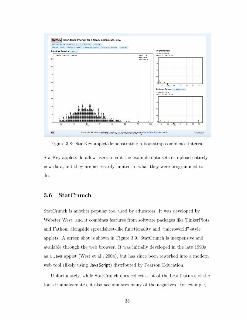
Figure 3.8: StatKey applet demonstrating a bootstrap confidence interval
StatKey applets do allow users to edit the example data sets or upload entirely
new data, but they are necessarily limited to what they were programmed to
do.
3.6 StatCrunch
StatCrunch is another popular tool used by educators. It was developed by
Webster West, and it combines features from software packages like TinkerPlots
and Fathom alongside spreadsheet-like functionality and “microworld”-style
applets. A screen shot is shown in Figure 3.9. StatCrunch is inexpensive and
available through the web browser. It was initially developed in the late 1990s
as a Java applet (West et al., 2004), but has since been reworked into a modern
web tool (likely using JavaScript) distributed by Pearson Education.
Unfortunately, while StatCrunch does collect a lot of the best features of the
tools it amalgamates, it also accumulates many of the negatives. For example,
38

Figure 3.9: StatCrunch instructions for creating a bar plot
the lack of data sanctity mentioned in the spreadsheets section is certainly true
here, as is the messy canvas associated with both spreadsheets and software like
TinkerPlots and Fathom.
3.7 DataDesk
As mentioned in the introduction, Data Desk is the one tool that was consid-
ered by DeLeeuw to be a statistical programming tool (De Leeuw, 2009) and by
Biehler to be software for learning statistics (Biehler, 1997). Data Desk (Fig-
ure 3.10) was introduced in 1985 and a current version exists to this day (Velle-
man, 1989). The program was developed to facilitate John Tukey’s exploratory
data analysis, and represents one of the first uses of linked visualization (Wills,
2008).
The interface was clearly the inspiration for TinkerPlots and Fathom, and
features a palette of tools as well as menu bars. However, Data Desk provides
much richer functionality than either TinkerPlots or Fathom, including linear
39

Figure 3.10: DataDesk version 7
40

and nonlinear models, cluster analysis, and principal component analysis.
The drawbacks of Data Desk are slight, and similar to those of TinkerPlots
and Fathom. The interface looks outdated, only static versions of analysis can
be shared, and it does not promote the inclusion of text supporting the data
‘story.’ However, all these drawbacks notwithstanding, it is very inspirational.
3.8 R
R is a programming language for statistical computing (R Core Team, 2014). It
is the tool of choice of academic statisticians, and has a growing market outside
academia (Vance, 2009). Analysts at companies like Google routinely use R to
perform exploratory data analysis and make models.
R has a number of benefits over the other tools we have discussed. First,
it is free. When members of the open source community use the word “free”
they often distinguish between “free as in speech” and “free as in beer.” These
phrases indicate the difference between software that costs no money (e.g., most
Google products) and software that is completely unrestricted and available for
anyone to modify and edit. R is free in both ways.
R is an interpreted language, as are all the other languages commonly used
for statistical computing. The interpreted paradigm means a user can type a
piece of code, say mean(height) and see the results immediately. A program in
an interpreted language gets executed in the same way as a single line of code.
That is, the computer looks directly at the code, not a compiled version of it.
So, while the education research on the acquisition of Java can be useful as in-
spiration, it cannot be used directly in a statistical computing context, due to
the differences between compiled and interpreted languages.
R can be a very slow language to work with, as it reads all data into the
computer’s working memory. Because of its lack of speed and a few other lan-
41

guage features (the result of R being developed by statistical practitioners rather
than computer scientists) it is often criticized by programming language ex-
perts. Even the author of R admits that there are drawbacks to R and suggests
that a better language could be created if they started over (Ihaka, 2010).
But, R provides such a flexible framework for statistical computing it has
virtually taken over statistical computing in academia and is making inroads in
the corporate world (Vance, 2009). And even programming language researchers
admit it has interesting and unique language features (Morandat et al., 2012).
In particular, its lazy evaluation and lexical scoping are often pointed to.
Lazy evaluation describes the fact that code is not evaluated until its results
are asked for, either by another function or by the user. Since R is a functional
language, there are often chained functional statements equivalent to a set of
nested functions, f(g(h(x,y))), and functions g() and h() will not be evalu-
ated until the result of f() is asked for.
Lexical scoping is a quality either lauded or critiqued in R. In general, the
term means variables are only available in particular environments, but in R,
lexical scoping means the language looks within local environments first (for ex-
ample, within the function being used) but if it cannot find a particular variable
it will continue to look outside to the next highest environment (the next high-
est function) until it reaches the global scope. Again, this type of scoping can
be good or bad. It means R is less restrictive than some other languages, but it
can also lead to unintended side effects.
R work typically takes place at a command-line interface (CLI). In fact, R
can be used directly at the command line, as seen in Figure 3.11. A slightly
friendlier interface is the regular R graphical user interface (GUI) that comes
with the language when it is downloaded (Figure 3.12). GUIs are discussed in
more depth in Section 3.8.5, but essentially the GUI allows a user to move some
tasks from command line typing tasks to more menu-oriented tasks. The regular
42

R GUI provides a file menu, a red stop button for when code gets out of hand,
and not much else. Section 3.8.5 examines more advanced GUIs for R as well
as the integrated development environment RStudio. All these approaches add
support for users, but still require syntactic knowledge.
Figure 3.11: R at the command line
Like many programming languages, R has both a language base and addi-
tional libraries, allowing users to extend its functionality. The additional li-
braries are called ‘packages’ and most are hosted on a centralized server called
the Comprehensive R Archive Network (CRAN) (R Core Team, 2015). Having
CRAN makes it simple for users to install new packages, as they do not have
to go hunting for where a particular package is hosted. Additionally, R provides
great library management support. By using the command install.packages(),
a particular package can be pulled from CRAN, unpacked, and installed in pre-
cisely the right location. This simplifies the installation process and makes it
43

Figure 3.12: Regular R graphical user interface
44

much more straightforward than library management in Python, for example.
Because R has the statistical community invested in it, and because it is
open-source and easy to modify, there are many additional packages for R. As
of this writing, CRAN hosts over 6,500 packages. However, there has been a
recent movement away from hosting packages on CRAN toward hosting them
on GitHub. Using Hadley Wickham’s devtools package, package installation
from GitHub is as seamless as from CRAN, although there are fewer checks on
packages prior to their installation. The reduced checks could allow unscrupu-
lous package writers to distribute packages with nefarious aims (a worst case
scenario would be some type of trojan horse virus). However, because of the
high bar packages must pass to be included on CRAN, the relaxed checking also
promotes more creative packages and allows users to try out packages still in
development. The flexibility of being able to install packages from GitHub has
outweighed the risks for many users.
One good affordance of R is it makes it very difficult to modify original data.
Instead, R loads a copy of the data into the work session and the user works
with the copy. Once it is loaded, it is possible to ‘clean’ the data, i.e., standard-
ize some of the fields so labels are consistent, convert 0s to NAs, etc. None of
these actions are taken on the data itself. Instead, they take place on the copy
of the data you have loaded. Because R is a language, it is possible to follow the
trail of actions taking the original data file to the cleaned version. Code can be
saved and verified by another party if there are questions of reproducibility. Of
course, it is still possible to save the modified data file over the original, but the
process of making changes to a local copy makes it much less likely.
There are many other affordances of data analysis systems that shape the
way users think about and work with data. For example, while many languages
rely on constructs like ‘for’ loops and ‘while’ statements (often called control
statements), other languages, like R, support vectorized operations. Instead
45

of having to explicitly state an operation should be done for every entry in a
list, R allows for the operation to be applied to the list itself, and the program’s
inherent paradigm will know to do it in vectorized format. R includes control
statements like ‘for’ loops, but they are used less often than in other similar lan-
guages.
As with any tool, R has its shortcomings as well. The main drawback of R
is its status as a programming language. Many of the other tools discussed here
are much more toward graphical user interfaces, while R is a language, meaning
users need to provide the correct function calls with appropriate syntax and ar-
guments. Adding to this is R’s inconsistent syntax, which makes it hard to learn
for novices and programming experts alike. This is discussed below in Section
3.8.1.
There have been efforts to simplify the coding aspects of R over the years.
Some of these efforts are curricular, reducing the number of commands to which
novices are exposed, or providing more consistent syntax (Verzani, 2005; Ka-
plan and Shoop, 2013). Other efforts are Graphical User Interfaces (GUIs) like
Deducer (Fellows, 2012) and RCommander (Fox, 2004), discussed further in Sec-
tion 3.8.5. However, none of these efforts have truly solved the problem.
3.8.1 R syntaxes
One complex aspect of R is the multitude of syntaxes it supports. Where most
programming languages would have one standard syntax, R has many.
The two main syntaxes most users encounter are the dollar sign syntax and
the formula syntax. The dollar sign syntax uses the $ operator to denote when
an object is within another object. For example mtcars$wt indicates the wt
variable within the mtcars dataset. The formula syntax is so named because it
is most commonly found in functions performing modeling, which use a formula
46

specification. This syntax uses a ~ operator, but the entire syntax is different.
Instead of referring to variables within datasets, the user refers to the variables
directly and then notes the dataset later.
For a more thorough example, see below. In this example, a set of three
plots are made to compare the weight (wt) and miles per gallon (mpg) of cars
with different numbers of cylinders (cyl).
First, the dollar sign syntax:
par(mfrow=c(1,3))
plot(mtcars$wt[mtcars$cyl == 4], mtcars$mpg[mtcars$cyl == 4])
plot(mtcars$wt[mtcars$cyl == 6], mtcars$mpg[mtcars$cyl == 6])
plot(mtcars$wt[mtcars$cyl == 8], mtcars$mpg[mtcars$cyl == 8])
Then, the formula syntax:
xyplot(mpg~wt | as.factor(cyl), data=mtcars)
The plot from the dollar sign example is seen in Figure 3.13 and the plot
from the formula example is seen in Figure 3.14. Perhaps the most obvious ob-
servation of these two plots is they do not appear to be ‘the same.’ This is be-
cause the formula syntax example standardizes the axes automatically, while the
dollar sign syntax example generates the best axes for each plot.
47

1.5 2.0 2.5 3.0
2224
2628
3032
34
mtcars$wt[mtcars$cyl == 4]
mtc
ars$
mpg
[mtc
ars$
cyl =
= 4
]
2.6 2.8 3.0 3.2 3.4
18.0
18.5
19.0
19.5
20.0
20.5
21.0
21.5
mtcars$wt[mtcars$cyl == 6]
mtc
ars$
mpg
[mtc
ars$
cyl =
= 6
]
3.5 4.0 4.5 5.0 5.5
1214
1618
mtcars$wt[mtcars$cyl == 8]
mtc
ars$
mpg
[mtc
ars$
cyl =
= 8
]
Figure 3.13: Plot using dollar sign syntax
48

wt
mpg
10
15
20
25
30
35
2 3 4 5
4
2 3 4 5
6
2 3 4 5
8
Figure 3.14: Plot using formula syntax
49

The plotting example makes the formula syntax appear far superior, but
there are tasks that are much easier in the dollar sign syntax as well. For ex-
ample, creating a new variable in the formula syntax requires something like
mtcars = mutate(mtcars, avgWT = mean(wt))
rather than
mtcars$avgWT = mean(mtcars$wt)
in the dollar sign syntax.
One method for simplifying R for novices is to expose them to only one syn-
tax. In projects limiting exposure to only one syntax (Project MOSAIC and
Mobilize), the choice has been made to use the formula syntax (Pruim et al.,
2015a; Gould et al., 2015), although either choice would have been effective.
In order to focus on the formula syntax, graphics are made using the lattice
package (Sarkar, 2008), summary statistics are computed with the mosaic pack-
age (Pruim et al., 2015b), and modeling can continue to be done in base R.
3.8.2 R packages
Again, one of the strengths of R is the large quantity of additional packages
available to extend its functionality.
3.8.2.1 mosaic
Project MOSAIC and its associated R package, mosaic, have advanced the state
of R for education (Pruim et al., 2015a,b). By making summary statistics avail-
able in the formula-based R syntax, the mosaic package allows for a standard-
ization within the introductory curricula. By using the mosaic package, along
50

with lattice graphics (Sarkar, 2008), students can stay firmly within the formula-
based syntax for an entire introductory statistics course.
In addition, the project has been improving RMarkdown templates (dis-
cussed further in Section 3.8.3), and creating interactive widgets – what Bieher
might call microworlds – to allow users to interact with R more dynamically
(Biehler, 1997). However, even with these advantages, students still need to
type syntactically correct code and cannot easily create their own interactive
graphics.
3.8.2.2 The Hadleyverse
In recent years, simpler and more flexible R packages have become more plen-
tiful. A main driver of this trend is Hadley Wickham, the Chief Scientist at
RStudio (RStudio is discussed more in Section 3.8.5.3). Wickham developed the
flexible graphics package ggplot2 as his doctoral dissertation (Wickham, 2009).
ggplot2 is an implementation of The Grammar of Graphics (Wilkinson, 2005),
which means it supports the creation of novel plot types within a structured
syntax.
Wickham has also developed packages to help users deal with data manipu-
lation, such as plyr, reshape2 and dplyr (Wickham, 2011, 2007; Wickham and
Francois, 2015). Wickham has said he wants to build tools that allow users to
easily express 90% of what they want to be able to do, while only losing 10%
of the flexibility. He acknowledges there will always be edge cases falling out-
side the capabilities of his packages. But, he is not trying to create a complete
language, simply domain-specific languages for data analysis tasks.
3.8.2.3 Shiny and manipulate
Shiny is an R package developed by the RStudio team enabling R programmers
51

to create interactive visualizations for the web (Chang et al., 2015).
In order to develop a Shiny app, an author must create two R files, one called
ui.R and one called server.R. These two files must be developed in parallel,
taking particular care to match variable names between the processes happening
on the back end (in the server file) and those visible in the app (in the UI file).
In the server file, authors can define reactive expressions. The reactive expres-
sions can be used to build a system that responds to user input, updating only
those values that depend on the modifications made by the user.
Shiny supports interface features like sliders, radio buttons, check boxes,
even text input. Typically, though, the resulting visualizations are themselves
static. The user cannot zoom into them naturally in the way they would with
a d3 web graphic. Instead, the designer would have to incorporate sliders for
the x- and y-ranges, and the user would manipulate those to impact the zoom.
Shiny also supports simple publishing, as local Shiny apps can be ported to
RStudio’s shinyapps.io hosting site with one button click.
However, authoring Shiny apps is not a task for novices. In order to create
an interactive graphic, the user first needs to understand R syntax and which
parameters she wants to manipulate. The user must also have a basic under-
standing of reactive programming, and must be able to match up variable names
and outputs in the paired server/UI paradigm Shiny uses. Much more useful
would be a tool where users could create interactive graphics using direct ma-
nipulation of objects on the screen, without needing to know R syntax.
Its challenges notwithstanding, Shiny is a very powerful tool, and it has been
enabling R programmers to build interactive tools that have gained viral suc-
cess, such as the dialect map (Katz and Andrews, 2013) published on the New
York Times that eventually received more views than any article in the history
of the paper (Leonhardt, D. (@DLeonhardt), 2014).
52

As it stands, Shiny can be useful as what Biehler calls a “meta-tool,” en-
abling teachers to “adapt and modify material and software for their students”
(Biehler, 1997). There are many nice examples of these types of tools, including
the gallery being curated by Mine Cetinkaya-Rundel (Cetinkaya Rundel, 2014)
and tools for exploring database joins (Ribeiro, 2014). Two Shiny apps I devel-
oped are discussed in Section ??.
A simpler package with a similar idea is the manipulate package, which was
also developed at RStudio (Allaire, 2014). manipulate is easier for novices to
use, although it still requires some knowledge of R. However, instead of requir-
ing the server/UI paradigm Shiny requires (which is useful for publishable web
documents), manipulate works directly at the command-line to produce interac-
tion that cannot be published but can be used for educational purposes.
3.8.3 knitr/RMarkdown
While not specifically for doing statistical analysis, several projects by Yihui Xie
are extending the capabilities for reproducible research, both with R and more
generally.
During his doctoral dissertation, Xie wrote the knitr package, which ex-
panded the capabilities of previous functionality called Sweave from base R
(Xie, 2013). knitr makes it possible to combine text, code, and the results from
the code. This is much like the iPython notebooks discussed in Section 3.3, but
is more flexible in terms of languages and output formats. The most canonical
examples are including R code in LATEX or Markdown text, but the package is
much more flexible (Xie, 2013). In fact, knitr allows users to combine any type
of code (Python, C++, etc) with any textual format.
Users write text and code (delimited as such by particular syntax depending
on the textual format they are using), then ‘knit’ the source document to create
53

(a) Code (b) Output
Figure 3.15: Code and associated output from RMarkdown
a fully formatted HTML or PDF document. The output document has nicely
formatted text, code with syntax highlighting, and all the results from the code,
including numeric summaries and plots. If the user changes something in the
source document, they have only to re-knit the document to see the updated
results in their output document. For an example of the RMarkdown code and
corresponding HTML output, see Figure 3.15.
This paradigm supports reproducible research. It makes it very simple to
share analysis results in such a way that the reader can easily audit them, and
the same analysis can be easily run on new data, changing only one line in the
source code and re-knitting the report to see the results.
knitr functionality is available through any R session, but the most embed-
ded support is through RStudio, where the file menu of gives users the choice
of RMarkdown document and R Sweave (LATEX), among others. Users can also
choose the output format they would like from their RMarkdown code. For a
document, the choices are HTML, PDF, or Word.
Once a document type has been chosen, RStudio provides a new document,
54

as shown in Figure 3.16. However, rather than presenting the user with a blank
page (as might be seen in word processing software, for example), there is some
minimal code already there. This template demonstrates the most important
features of the syntax, and it provides a working example using sample datasets
that should run on any system.
Providing a minimal working example has been shown to support novices,
particularly through research on the acquisition of Java. Michael Kolling calls
this the “recipe” format (Kolling, 2010), and suggests a student should never
start with a blank page. Instead, they should always be presented with some-
thing that ‘works’ (meaning it either either runs or compiles, depending on the
type of language) that they can modify. In Java, sometimes these recipes are in
the form of the layout for a function, and other times more like a documenta-
tion scheme.
In the realm of statistical computing, RStudio provides document templates
for all of their document types. Starting with a recipe provides two supports for
learners. First, it is always easier to edit than it is to write (the “just put some-
thing down” philosophy), and second, when given a working example, students
can verify their system is set up correctly. If the minimal example does not run,
they know they need to get more help from their instructor in terms of installa-
tion.
Because of all the support they provides for reproducible research, RMark-
down and knitr are clearly moving toward the future of statistical programming.
However, the re-knitting step that must take place between every change and
its appearance in the compiled document is a stumbling block. And because of
its connection to textual languages, it is not clear how knitr could extend in a
visual setting.
55

Figure 3.16: New RMarkdown document with template
56

3.8.4 Tools for learning R
There have been efforts to provide tools specifically to guide students through
the process of learning R. Two of the most promising are swirl and DataCamp.
3.8.4.1 swirl
swirl is an R package intended to teach R at the command line (Carchedi et al.,
2015). It was developed by Nick Carchedi, a graduate student at Johns Hopkins
University.
swirl has a number of advantages, the biggest being that students do not
need to leave their R environment to see the curricular materials to which they
are referring. Compared to other approaches for learning R, which might include
looking at a book next to a computer and then trying exercises on the screen, or
switching back and forth between a browser window with some documentation
and an R session, swirl does have the advantage. By combining everything into
one window, it makes the experience of learning R more focused and less likely
to be sidelined by other issues (e.g., the book falling closed, losing the browser
window).
Another advantage of swirl is its status as an open-source R package. The
code is hosted on GitHub, and any instructor can develop their own swirl ‘mod-
ule’ to cover a particular lesson or set of lessons. These modules are available
on GitHub and can be easily loaded in through the swirl interface, so students
can pull in modules on whichever topic they want to learn. Currently, there are
very few modules, which makes it hard to assess the usefulness of the platform.
However, as more R experts port their material to swirl modules it will become
easier to assess.
The authors of swirl suggest using it within RStudio, which means users can
see their plots in the plot pane and the items they add to their workspace in
57

the environment pane. These features are discussed more extensively in Section
3.8.5.3. However, beyond encouraging students to use RStudio, the authors have
not taken full advantage of the features available in RStudio (e.g., presentations,
markdown documents, etc).
Figure 3.17: swirl introducing R
A view of a swirl session is shown in Figure 3.17. Much like the Mobilize
labs discussed in Section 5.1.3.3, swirl will prompt the user to try running a
piece of code to see what it does. Once the task is completed, swirl will give
more information and then ask another question. Because the system is set up
to wait for a correct response, it is a very directed form of learning. Unlike the
inquiry-based model upon which Mobilize was based, swirl is a linear trajectory
of learning. Of course, this form of learning was determined by the format the
authors chose to use for swirl. Because it uses a command-line tool and does
58
not have any fancy machine learning behind it, support of very fluid learning
trajectories could not be expected.
In the first version of swirl, the questions were quite vague and the required
answers were very specific. The authors had not built in an escape function, so
if a user got stuck, their only recourse was to close their R session. Additionally,
if a user wanted to play around with a function to see what it did, they had to
endure endless error messages from the system. There was no capability to go
back, which made it feel limiting. The user could only enter code in one partic-
ular instance, and once they did it right the system would move on completely.
However, the second version has corrected for all these problems and more.
The questions have been simplified and it is much easier to escape. For exam-
ple, if a user is in a code prompt and types info(), they will be shown a list of
other commands they can use for utility functions, like skip() to skip the ques-
tion, play() to try things out without swirl interpreting the code as an answer
to a question, or bye() to end the swirl session.
The info() command helps ease frustration, but still requires the cognitive
load of remembering the command. A quick reference of some sort would be
very useful – taking advantage of RStudio’s support of presentations open in the
viewer pane throughout an entire session, or providing custom documentation
files to be loaded in the help pane. Again, the authors have not taken advantage
of all the capabilities of RStudio yet.
One particularly ill-advised design choice is the use of red font for all in-
structions. As we found when implementing Deducer (Section 3.8.5.2) with
teenage users in the Mobilize project, users associate red with errors, so red
text can be very anxiety-producing (McNamara and Hansen, 2014; Ellior et al.,
2007).
Overall, swirl’s main drawback is its rigidity. Even with the improvements in
59

version two, the material feels linear and the question and answer format does
not seem structured to provide for long-lasting learning.
3.8.4.2 DataCamp
A competitor to swirl is the website DataCamp (Figure 3.18) (Cornelissen et al.,
2014). DataCamp uses the format seen on popular sites such as CodeAcademy
and applies it to R. Each element of learning R is defined as a module, and as a
user moves through the modules they earn points. The interface asks questions
that the user must supply an answer to in order to move on, although it will
also provide hints.
Figure 3.18: DataCamp introducing R
DataCamp sidesteps some of the issues from swirl by situating the learning
on the web. Users do not have to install R, RStudio, or any supporting packages
on their computer. Instead, everything takes place in the browser. However,
60

working in the browser is a somewhat artificial experience, as real R work will
take place in another interface. The other disadvantage to Data Camp is that it
is not free. The site allows users access to some introductory material without a
subscription, but to see all the modules in their entirety, users must pay $25 per
month or $50 per year.
3.8.5 GUIs and IDEs for R
In contrast to the Command Line Interface (CLI) that characterizes much of
programming, Graphical User Interfaces (GUIs) and Integrated Development
Environments (IDEs) are used by programmers to reduce cognitive load in a
variety of languages. IDEs are support tools for textual coding, which often pro-
vide a source code editor with debugging support, code completion, and some-
times automated code refactoring. A common example is Eclipse, which is used
by Java programmers. There have been efforts to simplify Eclipse for novices,
like the Gild project (Storey et al., 2003).
The term GUI can be used more broadly. In computer science, the term was
initially used to suggest a graphical system allowing a user to interact with a
(typically text-only) programming language without having to understand the
underlying syntax. However, as personal computers have become more graph-
ical, the term GUI has begun to be used more broadly to mean any computer
interface using menus and buttons for interaction. Under this definition, Word,
Skype, and Google Chrome are all GUIs.
Both GUIs and IDEs are attempts at simplifying the use of computers, and
there have been efforts to use them to simplify and improve R. As with the his-
tory of statistical programming languages, there are too many to exhaustively
mention, so we will consider a small selection.
61

3.8.5.1 R Commander
R Commander (Figure 3.19) is a GUI for R. It was developed by John Fox as a
way to use R in introductory statistics classes without students having to learn
syntax (Fox, 2004). Much like the tools for learning discussed in Section 3.4,
R Commander provides a limited set of possible tasks and provides a graphical
user interface. While the interface is much more route-type than the landscape-
type TinkerPlots and Fathom (Bakker, 2002), R Commander also makes it pos-
sible to do summary statistics, graphics, and simple models.
R Commander is a button- and menu-driven GUI for R, and any action
taken in the GUI results in the corresponding R code appearing in the Script
Window (top pane) and output appearing in the Output Window (bottom pane).
Any messages appear at the bottom of the GUI.
While this method allows students to use the tool for introductory statistics
courses, it does not facilitate play (as Fathom does) or develop computational
thinking (as learning R does). The connection between actions taken with the
menus and the resulting code is implicit rather than explicit, and there is little
reason for users to manipulate the code.
R Commander offers one of the same benefits as Fathom and TinkerPlots
(namely, the user does not need to know how to code in order to use it) but
does not take the rest of them (flexible and creative exploration). It is not clear
R Commander would help bridge the gap better than other tools for learning, so
there is little incentive to use it.
62

Figure 3.19: R Commander GUI
63

3.8.5.2 Deducer
Deducer is another GUI for R which, much like R Commander, provides access
to some of R’s functionality through menus and wizards2.
Deducer also preserves command-line access to R’s full potential and dis-
plays source code as the result of each action in the GUI. It allows novices to
perform basic data analyses and produce exploratory plots, maps, and word
clouds.
Deducer was developed by a graduate student named Ian Fellows, who saw
a disconnect between the way psychologists at UCSD worked with data and the
possibilities available in R (Ohri, 2013; Fellows, 2012). Fellows continued work
on Deducer at the Center for Embedded Network Sensing (CENS) at UCLA,
specifically considering the Mobilize project (Section 5.1) as a use-case. De-
ducer’s primary advantage is that it is free, which makes it possible to use in
educational settings where funding is tight. It was used in a live educational set-
ting during the second year of the Mobilize project. While Deducer was slightly
easier for teachers to learn than R, the disadvantages of the system easily out-
weighed this slight advantage. See Section 5.1.4 for more on Deducer in the Mo-
bilize project.
Deducer suffers from one of the same problems as the standard R GUI: there
are many free-floating windows, and it is easy to lose one.
Another detail is the automatically-created R code, which should be non-
threatening if we want users to make the association between the actions they
take in wizards (for example, the plot-creation wizard) and the resulting code,
is bright red. In many users’ minds, red signifies ‘error,’ (Ellior et al., 2007) so
many users initially believed they had done something wrong.
2The term wizard refers to pop-up windows guiding the user through particular tasks. Onecommonly-encountered wizard is the letter writing wizard in Microsoft Word, which guidesusers through the salutation and closing of a formal letter. In Deducer, the wizards were fortasks like graph creation or modeling.
64

Figure 3.20: The initial Deducer screen
65

Figure 3.21: Deducer data preview
Additionally, the plot menus produce beautiful ggplot2 graphics (Wickham,
2009), which is ideal for users because they are inclined to feel pride for having
created something appealing. Unfortunately, the resulting ggplot2 code printed
into the console is much too difficult for users to parse. It is the difficulty dis-
cussed with R Commander taken to the extreme. It is highly unlikely a novice
will make the implicit connection between their actions and the code. Much like
R Commander, the simplicity of the system is not coupled with any inherent
playfulness, and it does not seem to actually teach R.
3.8.5.3 RStudio
On the other hand, RStudio is an Integrated Development Environments (IDE)
for R (RStudio Team, 2014). It was initially developed by J.J. Allaire, who is
now supported by a team of expert R programmers, including several who have
66

been mentioned previously in this document (Yihui Xie and Hadley Wickham in
particular).
RStudio offers many useful features, such as code completion, file manage-
ment, and comprehensive code history. For introductory college users, many
professors have found the support RStudio provides makes it much easier to
pick up R (Baumer et al., 2014; Muller and Kidd, 2014; Pruim et al., 2014; Hor-
ton et al., 2014a). It is also easier for high school teachers and students, as dis-
covered during the Mobilize project and in McNamara and Hansen (2014).
RStudio can be run as a desktop application for Mac, Windows, or Linux,
but it is also available as a server install. By using a server version, instruc-
tors can manage package installations from a central location and provide quick
bug fixes to all students at once. Users go to a particular web address, log in,
and find their R session just how they left it. All files can be hosted on a cen-
tral server, which means students can do their work from any computer without
having to worry about moving data from place to place.
Because of how simple it makes access, many colleges use RStudio servers for
their students. In particular, Smith College, Mount Holyoke College, Duke Uni-
versity, and Macalester College all use this arrangement. For Mobilize, a server
version was used for our high school teachers and students (discussed further in
Section 5.1).
When a user opens RStudio, whether in the desktop version of the applica-
tion or through a server, the initial screen will look much like what is seen in
Figure 3.22. In fact, in the book “Start Teaching with R,” the authors warn the
server version and desktop version “look so similar that if you run them both,
you will have to pay attention to make sure you are working in the one you in-
tend to be working in.” (Pruim et al., 2014).
The RStudio screen has four panes, which are shown in their default ar-
67
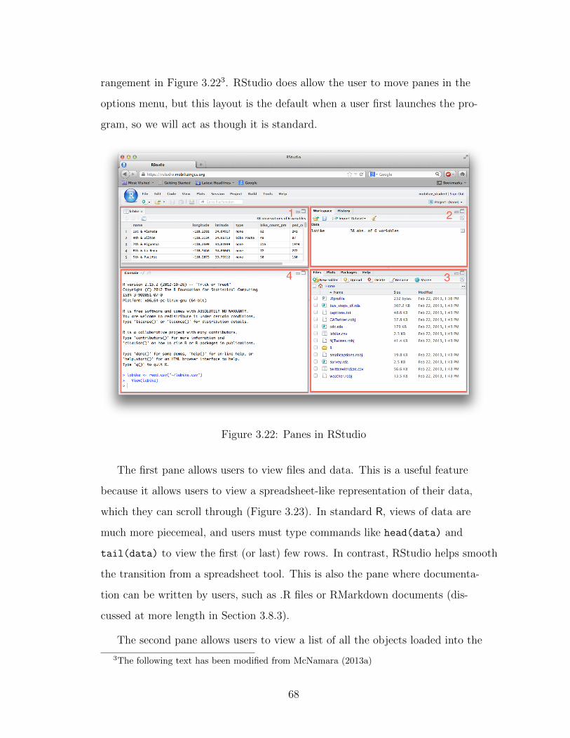
rangement in Figure 3.223. RStudio does allow the user to move panes in the
options menu, but this layout is the default when a user first launches the pro-
gram, so we will act as though it is standard.
Figure 3.22: Panes in RStudio
The first pane allows users to view files and data. This is a useful feature
because it allows users to view a spreadsheet-like representation of their data,
which they can scroll through (Figure 3.23). In standard R, views of data are
much more piecemeal, and users must type commands like head(data) and
tail(data) to view the first (or last) few rows. In contrast, RStudio helps smooth
the transition from a spreadsheet tool. This is also the pane where documenta-
tion can be written by users, such as .R files or RMarkdown documents (dis-
cussed at more length in Section 3.8.3).
The second pane allows users to view a list of all the objects loaded into the
3The following text has been modified from McNamara (2013a)
68

Figure 3.23: Preview pane, showing data and files
working environment, as in Figure 3.24a. For example, all datasets loaded will
appear here, along with any other objects that have been created (special text
or spatial formats, vectors, etc). Again, this helps make using R more concrete.
Every time a user creates a new variable, they see its name appear in the envi-
ronment tab, and can click on its name to inspect it more closely. The other tab
in the second pane is a code history, which includes the complete history of all
code typed, over all R sessions, as in Figure 3.24b. The history is searchable, so
the user can use the search box at the upper right of the pane to search through
their code history.
(a) Environment (b) History
Figure 3.24: Second pane in RStudio: environment and history
The third pane provides integrated views of files, plots, packages and help.
When a user runs code in the Console creating a plot, the Plots tab will be au-
69

tomatically selected, as in Figure 3.25b. The automatic plot tab selection makes
it very simple for users to know when the code they have run created a plot. In
contrast with the standard R GUI, which has a floating window for plots that
can easily get ‘lost,’ this integrated tab keeps everything cohesively together.
The packages tab (Figure 3.25c) gives a visual summary of all the packages
the user has installed and which are loaded into the current working session.
Again, the ability to visually keep track of packages supports users. In the stan-
dard R GUI, users have to type installed.packages() to see the list of pack-
ages they have installed, and this command is often not taught. By making it
simple to see the list of packages, RStudio is encouraging users, even novices,
to view their installed packages. Similar to the plots tab, the help tab will be
automatically selected whenever the user runs help code in the Console, like
help(plot) or ?plot.
The fourth pane is the console, and provides the command line for users to
enter R code. The console pane is where the majority of work takes place – the
other panes provide support for the user, but no code interpretation. The con-
sole looks similar to the standard R GUI, but it also provides support for users.
For example, if a user begins to type a function and then hits the ‘tab’ key on
their keyboard, RStudio will do code completion and provide a hovering hint of
the documentation of the function (Figure 3.26).
RStudio provides many support features, in particular a unified interface
where windows cannot get ‘lost.’ It also provides visual cues; to objects in the
working environment, to installed packages, and to files in the working direc-
tory. The data preview functionality helps ease the transition from spreadsheet
programs. And even in the most programming-oriented area, the Console, RStu-
dio provides coding support features like tab completion and code hints. RStu-
dio has been used successfully in many introductory college statistics classes
(Baumer et al., 2014; Muller and Kidd, 2014; Pruim et al., 2014; Horton et al.,
70
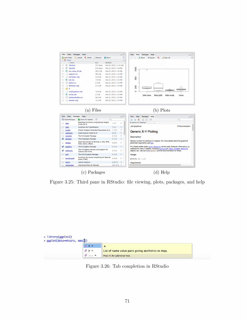
(a) Files (b) Plots
(c) Packages (d) Help
Figure 3.25: Third pane in RStudio: file viewing, plots, packages, and help
Figure 3.26: Tab completion in RStudio
71

2014a) and with high school teachers and students through the Mobilize Project
(Section 5.1). However, even though it lowers the barrier to entry for R, RStu-
dio still requires users to code, so there is a startup cost associated with using
it.
3.9 Stata, SAS, and SPSS
Other commonly used tools for doing statistical analysis are Stata, SAS, and
SPSS. All three tools are stand-alone software, and all combine elements of
graphical user interfaces with command-line tools. They are used in a variety
of disciplinary contexts, so the argument for teaching them is ‘students will
need to use this in the future.’ They are often popular in industry, because they
come with guarantees of validity and technical support.
Stata (Figure 3.27) is often the tool of choice for introductory statistics courses
taught in an economics department, as it is used routinely by economists. Stata
does support users writing their own routines, so it is extensible. It also includes
a command-line language, so it can be used to create reproducible research, in
the sense that analyses can be re-run to get the same results.
However, Stata does not integrate with tools like the iPython notebook or
knitr, so there is no easy way to produce reproducible reports (Rising, 2014).
Another major drawback to Stata is its price. As of 2015, educational pricing
was $445 for an annual license or $895 for a perpetual license. A single business
license costs $845 per year or $1,695 for a perpetual license. The company does
offer group discounts, but these are also expensive (for example, a 10-user lab
costs $1,850 plus $160 each, unless purchasing the “small” version which only
deals with data up to 1,200 observations).
SAS has similar benefits and drawbacks to Stata. It is often used in phar-
maceutical and business applications because it comes with a guarantee of ac-
72

Figure 3.27: Stata interface
73

curacy. SAS is also hugely expensive for corporate use, in part because of the
guarantee of accuracy and included support. For an individual it costs $9,000,
and enterprise and government licenses require users to submit a request for a
quote.
However, the company makes the software free for educational use, both as
desktop software and via the cloud, so students can access it via a web browser,
much like RStudio. This is a shrewd business decision, because it grooms stu-
dents to become experts at their software. A screenshot of SAS is shown in Fig-
ure 3.28.
Figure 3.28: SAS 9.4 interface
The other product from SAS often used in an educational setting is JMP.
JMP is a drag-and-drop, menu-driven graphical user interface. Some features
of JMP are shown in Figure 3.29. The backbone of JMP is SAS, but JMP pro-
74

vides a simple visual interface. Again, JMP is expensive ($1,540 for an individ-
ual) but they offer academic discounts: $50 for a yearly license for undergradu-
ate and graduate students.
JMP provides many features useful for novices, like interactive brushing and
linking, generalizable data cleaning, and visual model support.
Like TinkerPlots and Fathom, while JMP does produce interactive graphics
within an individual session, these interactive results cannot be exported. In-
stead, a work session can be printed or pasted into a document. The student
version of JMP does not support exporting graphics, but individual licenses do.
SPSS (Figure 3.30) is typically used by social scientists and is focused on a
menu-driven interface, although it does have a proprietary command-line syn-
tax allowing for reproducibility. However, the syntax is hard to understand and
code is generally only created by copying and pasting, versus users generat-
ing code themselves (Academic Technology Services, 2013). SPSS is also very
expensive– $5,760 for a 12-month individual license, or $95.75 for a one-year
student license.
Although Stata, SAS, and SPSS are commonly used in industry, none of
them seem to be supportive of learners. They all provide specific types of graph-
ics, and most work is done using menus and wizards, so they do not make clear
what the tool is actually doing. Using these tools creates ‘users’ not ‘creators’
of statistics (see Section 1.5 for more on the distinction). All three tools ob-
scure the underlying computational processes and reduce statistical procedures
to button clicks. Although they all provide some capability of extending the
software with scripting, none of them have the community of statisticians shar-
ing work that R has. Further, they all suffer from a lack of transparency about
how internal routines were coded, they do not produce reproducible reports, and
their pricing is prohibitive for the secondary school use-case.
75

(a) JMP dynamic querying
(b) JMP modeling
(c) JMP model diagnostics
(d) JMP graphing
Figure 3.29: JMP
76

Figure 3.30: SPSS Standard Edition
The most inspirational is JMP (Figure 3.29), which makes data analysis
visual and interactive, providing many of the features of software for learning
statistics with the power of a tool for really doing statistics.
3.10 Bespoke tools
In addition to the tools discussed above, there are a number of ‘bespoke’ tools
for doing particular things with data. The most salient examples are Data Wran-
gler, Open Refine, Tableau, and Lyra.
Data Wrangler (Figure 3.31) began as a project from the Stanford Visu-
alization Group in 2011 (Kandel et al., 2011b). Their goal was to provide a
visual representation of data transforms, as well as a reproducible history of
those transforms. For example, a user could select an empty row and indicate it
should be deleted, at which point the Wrangler interface would suggest a variety
of generalizable transformations that could be built from that one ‘rule’ (e.g.,
77

delete all empty rows, or always delete the 7th row). Once the user specifies a
transform, it is applied to the data and added to the interaction history. The in-
teraction history can be exported as a data transformation script in a variety of
languages.
Figure 3.31: Data Wrangler
Wrangler can also perform simple database manipulations, in the same way
dplyr manipulates data in R. The tools Wrangler provided were so useful the
authors were able to convert their academic research project into a corporate
venture, which is now known as Trifacta.
Very similar to Data Wrangler is Open Refine (Verborgh and Wilde, 2013).
The project was initially called Google Refine, but has since been turned into
an open source package. Like Wrangler, Open Refine can help clean data and
document the data cleaning process. It can also be used for data exploration
and data matching, including geooding. Open Refine is shown in Figure 3.32.
Again, the results of the refining process are available as a re-useable script.
Both Data Wrangler and Open Refine provide great alternatives to the
78

Figure 3.32: Open Refine
spreadsheet paradigm. They privilege data as a complete object, and document
all modifications. By suggesting methods of generalizing data transformations,
they remove much of the grunge work of spreadsheet analysis. The other benefit
of generalized data transformations is they encourage the user to think compu-
tationally. Instead of just doing ‘whatever works,’ there is user incentive to find
a way to describe the data cleaning rule in a way that works generally.
Tableau (Figure 3.334) is a bespoke system for data visualization. As such,
it does not provide much support for data cleaning. Tableau makes it simple
for users to create interactive graphics that can be easily published on the web.
Tableau will suggest the ‘best’ plot for particular data, which is both a bless-
ing and a curse (Mackinlay et al., 2007). It can lead to much more appropriate
uses of standard plots, but it also does not support novices’ learning trajectory.
A user can make a plot without having any idea of what it means. Similarly,
4 Screenshot from Lin (2012).
79
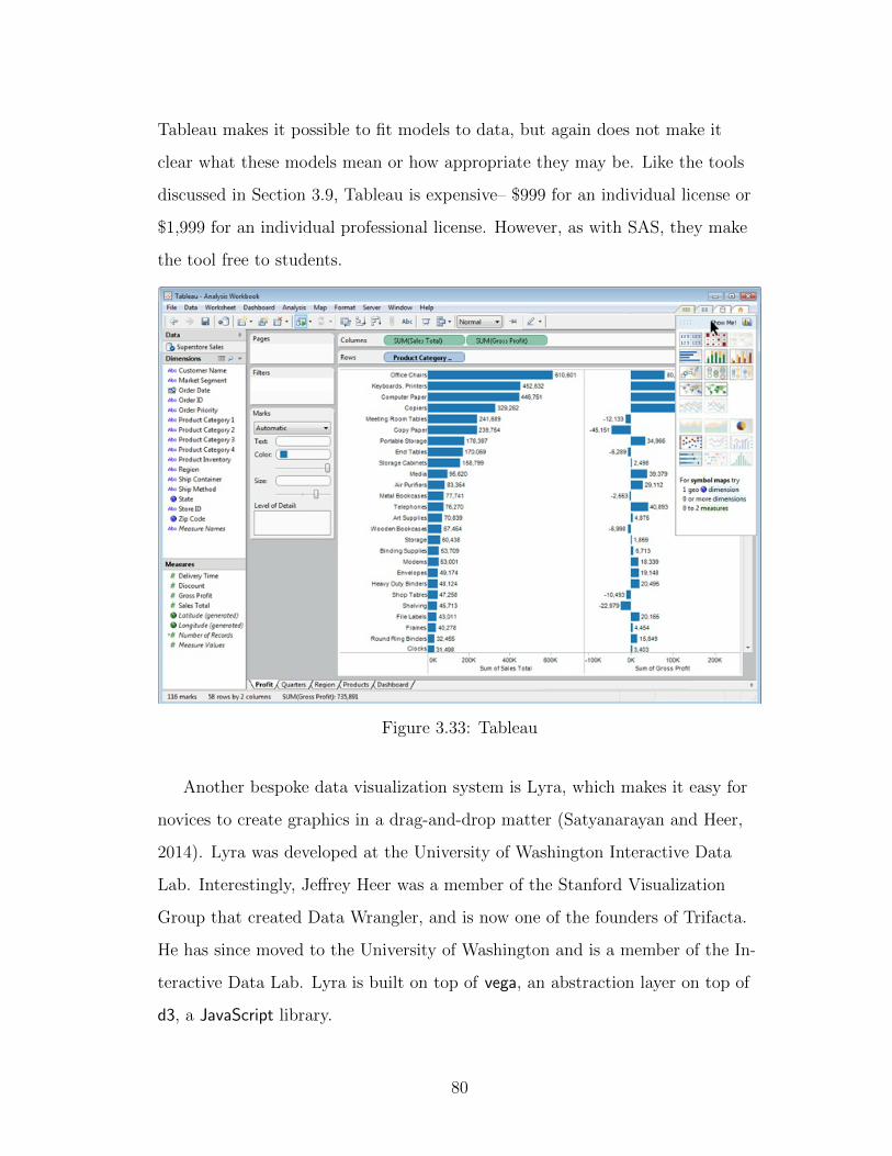
Tableau makes it possible to fit models to data, but again does not make it
clear what these models mean or how appropriate they may be. Like the tools
discussed in Section 3.9, Tableau is expensive– $999 for an individual license or
$1,999 for an individual professional license. However, as with SAS, they make
the tool free to students.
Figure 3.33: Tableau
Another bespoke data visualization system is Lyra, which makes it easy for
novices to create graphics in a drag-and-drop matter (Satyanarayan and Heer,
2014). Lyra was developed at the University of Washington Interactive Data
Lab. Interestingly, Jeffrey Heer was a member of the Stanford Visualization
Group that created Data Wrangler, and is now one of the founders of Trifacta.
He has since moved to the University of Washington and is a member of the In-
teractive Data Lab. Lyra is built on top of vega, an abstraction layer on top of
d3, a JavaScript library.
80
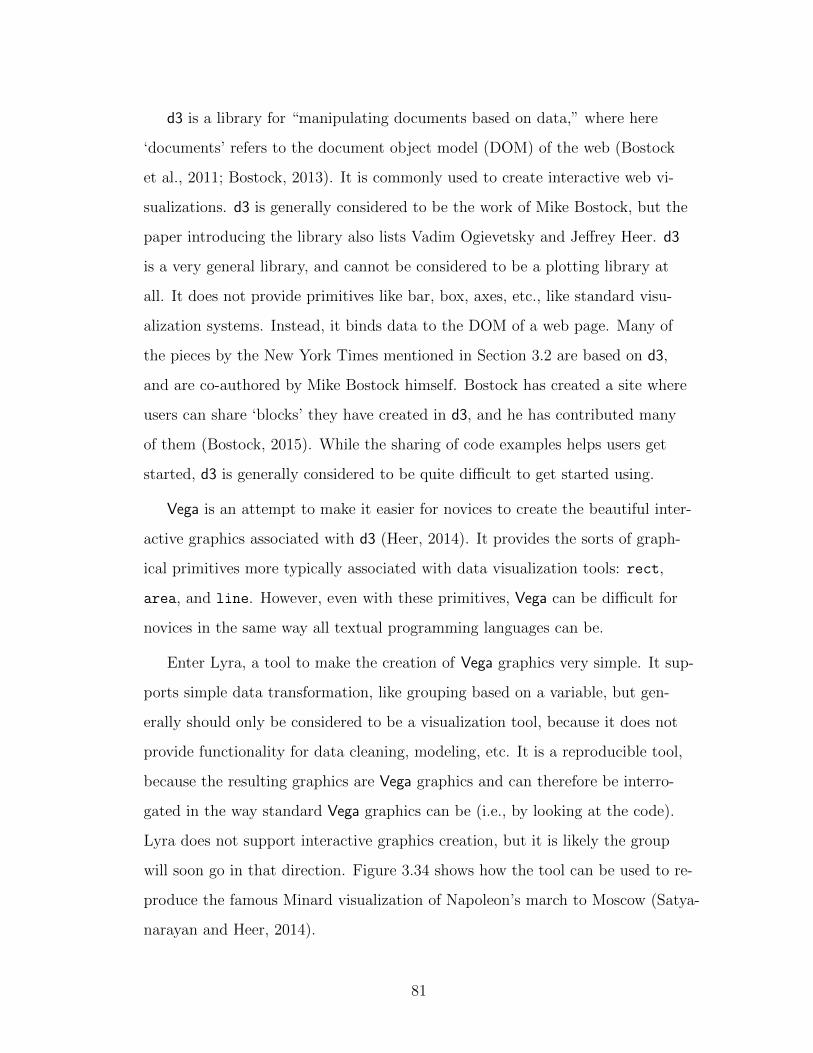
d3 is a library for “manipulating documents based on data,” where here
‘documents’ refers to the document object model (DOM) of the web (Bostock
et al., 2011; Bostock, 2013). It is commonly used to create interactive web vi-
sualizations. d3 is generally considered to be the work of Mike Bostock, but the
paper introducing the library also lists Vadim Ogievetsky and Jeffrey Heer. d3
is a very general library, and cannot be considered to be a plotting library at
all. It does not provide primitives like bar, box, axes, etc., like standard visu-
alization systems. Instead, it binds data to the DOM of a web page. Many of
the pieces by the New York Times mentioned in Section 3.2 are based on d3,
and are co-authored by Mike Bostock himself. Bostock has created a site where
users can share ‘blocks’ they have created in d3, and he has contributed many
of them (Bostock, 2015). While the sharing of code examples helps users get
started, d3 is generally considered to be quite difficult to get started using.
Vega is an attempt to make it easier for novices to create the beautiful inter-
active graphics associated with d3 (Heer, 2014). It provides the sorts of graph-
ical primitives more typically associated with data visualization tools: rect,
area, and line. However, even with these primitives, Vega can be difficult for
novices in the same way all textual programming languages can be.
Enter Lyra, a tool to make the creation of Vega graphics very simple. It sup-
ports simple data transformation, like grouping based on a variable, but gen-
erally should only be considered to be a visualization tool, because it does not
provide functionality for data cleaning, modeling, etc. It is a reproducible tool,
because the resulting graphics are Vega graphics and can therefore be interro-
gated in the way standard Vega graphics can be (i.e., by looking at the code).
Lyra does not support interactive graphics creation, but it is likely the group
will soon go in that direction. Figure 3.34 shows how the tool can be used to re-
produce the famous Minard visualization of Napoleon’s march to Moscow (Satya-
narayan and Heer, 2014).
81

Figure 3.34: Lyra
Bespoke data tools like these are great sources for inspiration about new
ways to visualize and improve data cleaning, modeling, and visualization. Many
of these projects are open-source, so while they do not cover the entire analysis
trajectory, they show promise as tools for particular data needs.
3.11 Summary of currently available tools
As is probably clear, my preference for doing statistical analysis is R, for its sta-
tus as a free and open source project, as well as its flexibility, extensibility, and
community of users. However, I acknowledge that R is a very difficult tool to
begin learning. There have been attempts to ease the transition to R at a vari-
ety of levels. The attempts including GUIs and IDEs for R, pedagogical frame-
works like swirl and Data Desk, and fencing attempts including mosaic and the
MobilizeSimple package discussed further in Section 5.1.4.2. However, none of
these attempts have been able to fully remove the barrier to entry for R. On the
82

learning end of the spectrum, tools like TinkerPlots and Fathom provide flexible
and creative ways to explore data. They offer little barrier to entry, but do not
support reproducible analysis or the sharing of results.
Many of the tools we have examined are inspirational. TinkerPlots and Fathom
in particular, but also the bespoke tools Data Wrangler, Open Refine, Tableau,
and Lyra. All of these tools forefront methods to increase the visual represen-
tation of analysis and to simplify it for novices. However, none of the tools we
have seen are ideal. In the next chapter, we look to the future of statistical pro-
gramming.
83

This idea—that programming will provide exercise for the highest mentalfaculties, and that the cognitive development thus assured for programmingwill generalize or transfer to other content areas in the child’s life—is a greathope. Many elegant analyses offer reasons for this hope, although there is animportant sense in which the arguments ring like the overzealousprescriptions for studying Latin in Victorian times.
Roy Pea, 1983
CHAPTER 4
Attributes
Given the capabilities of current tools, it is possible to imagine a new system
which combines the strengths of existing tools with some of the abilities not yet
possible. Considering these strengths and weaknesses, we can develop a list of
requirements for the statistical programming tools of the future. The remainder
of this chapter describes these requirements.
One major inspiration for the qualities that follow is a paper in which Repen-
ning et al outlined what they saw as the requirements for a “computational
thinking tool” (Repenning et al., 2010). They posit a computational thinking
tool must fulfill all the following conditions:
• “Has low threshold.” The tool does not take much time to get up to speedwith the software, and students can easily jump into really ‘doing’ what-ever it is the tool helps them do (in this case, statistics).
• “Has high ceiling.” The tool allows students to learn as much as theywant and have access to the industry-standard methods.
• “Scaffolds flow.” As related to the curriculum accompanying the tool, itallows for pieces to build on one another.
• “Enables transfer.” The tool teaches skills useful in other contexts (gener-ally, computer science contexts).
84

• “Supports equity.”The tool should be easy to access for all types of stu-dents.
• “Systemic and sustainable.” The tool can be used to teach students at avariety of levels, and aligns with standards.
Also inspiring was John Tukey’s 1965 paper about the “technical tools of
statistics,” (Tukey, 1965), in which he describes his vision for the future of sta-
tistical programming tools. He argues statisticians should be looking for,
“(1) More of the essential erector-set character of data-analysis techniques, inwhich a kit of pieces are available for assembly into any of a multitude ofanalytical schemes,
(2) an increasing swing toward greater emphasis on graphicality and informal-ity of inference,
(3) a greater and greater role for graphical techniques as aids to explorationand incisiveness
(4) steadily increasing emphasis on flexibility and on fluidity,,
(5) wider and deeper use of empirical inquiry, of actual trials on potentiallyinteresting data, as a way to discover new analytic techniques
(6) greater emphasis on parsimony of representation and inquiry, on the fo-cusing, in each individual analysis, of most of our attention on relativelyspecific questions, usually in combination with a broader spreading of theremainder of our attention to the exploration of more diverse possibili-ties.” (Tukey, 1965)
Given these requirements for a computational thinking tool and the various
positive qualities existing in current tools for doing and teaching statistics, we
hold that a statistical thinking tool bridging the gap between learning and doing
statistics must provide the following:
1 Easy entry for novice users. . . . . . . . . . . . . . . . . . . . . . . . 86
2 Data as a first-order persistent object. . . . . . . . . . . . . . . . . . 87
3 Support for a cycle of exploratory and confirmatory analysis. . . . . . 92
4 Flexible plot creation. . . . . . . . . . . . . . . . . . . . . . . . . . . 96
5 Support for randomization throughout. . . . . . . . . . . . . . . . . . 101
85
6 Interactivity at every level. . . . . . . . . . . . . . . . . . . . . . . . . 104
7 Inherent visual documentation. . . . . . . . . . . . . . . . . . . . . . 107
8 Simple support for narrative, publishing, and reproducibility. . . . . . 108
9 Flexibility to build extensions. . . . . . . . . . . . . . . . . . . . . . . 113
All these requirements will be discussed in more detail in their respective sec-
tions.
4.1 Easy entry for novice users
Requirement 1 Easy entry for novice users.
This theory comes directly from Reppenning’s work on tools for computational
thinking (Repenning et al., 2010). Tools to be used by novices – and really, all
tools – should make it easy to get started (Repenning et al., 2010). It should be
clear what the tool does, how to use it, and what the most salient components
are. The tools should provide immediate gratification, rather than a period of
frustration eventually leading to success assuming the user perseveres.
Some systems that are supposedly easy to get started using have startup
times around a week – in this context, we want novices to be examining data
in a rich way within the first 10 or 15 minutes. With tools like TinkerPlots and
Fathom, this is possible within the first minute, so 10-15 minutes should not be
unreasonable. In fact, depending on the curricular structure, novices can begin
making plots within their first hour of R, but typically the first lesson is unnec-
essarily hung up on installation issues.
In the context of statistical programming tools, users should be able to jump
directly into ‘doing’ data analysis without having to think about the minutiae of
86

a particular data import function or the name of a plot type. As Biehler says,
“In secondary education, but also in introductory statistics in higher educa-
tion, using a command language system is problematical. We are convinced
that a host system with a graphical user interface offers a more adequate ba-
sis” (Biehler, 1997). Thus, by Biehler’s definition, a system that provides easy
entry for novices will likely have a visual component, either initially or through-
out.
4.2 Data as a first-order persistent object
Requirement 2 Data as a first-order persistent object.
Perhaps the most important component of any data analysis platform is how
it deals with data, or, more specifically, the way data are formatted and rep-
resented within the system. The issue of data representation is important at a
number of levels1.
First, the system must find a balance between the sanctity of data and its
fallibility. When novices begin engaging with data, they often perceive data as
infallible (Hancock et al., 1992). In a pedagogical setting, it is important for
students to move toward an awareness of data’s subjectivity and to learn how
to critique data and data products. However, the realization of the subjectiv-
ity of data can send students into a state of extreme skepticism, making argu-
ments like “you can say anything with statistics!” In this nihilistic state, it can
be hard to see the difference between the inherently subjective nature of data
and the effects of intentional manipulation. However, it is vitally important to
1In this context, we are thinking most specifically of how the data appear to the user, nothow they are stored within the computer’s memory system
87

the scientific process that data are not modified in this way. We need to treat
data sets as complete objects without room for modification, while also identify-
ing the weaknesses and biases that may be present within them.
As discussed in Sections 3.1 and 3.8, data are given particular affordances
in each analysis system. Excel does not privilege data as a complete object, be-
cause once a user has a spreadsheet of data open, modification is just a click
away, and the original value is lost forever. In contrast, R, which uses data as
its primary object, makes it very difficult to modify the original data file. This
paradigm helps provide implicit valuing of maintaining original data.
A system privileging initial data should also have a commitment to pro-
viding data as the result of all actions. In systems like SAS and SPSS, results
are often just text outputs that cannot be saved or incorporated into additional
stages of the analysis. However, in R, almost every result is itself data that can
be used again. This is a design decision on the part of the language authors,
and could be implemented in other systems. The main exception to this rule in
R are base plots, which are ephemeral. They cannot be saved, other than ex-
porting them as image files. However, ggplot2 plots remedy this. They can be
saved into objects, which is in fact the suggested use case. In the tool of the fu-
ture, all results should be re-useable data, even plots.
Another important consideration is how the data are represented. One of
the most common data representations is a flat file or rectangular data set. This
representation is composed of rows and columns – observations and variables –
and can generally be visualized as a spreadsheet. The data most naturally used
in R are rectangular, particularly those data that come stored as comma sepa-
rated values (.csv files). Hadley Wickham wrote a paper on ‘tidy’ data which
describes the way a rectangular or flat data file should be structured (Wickham,
2014b). It specifies that for a flat file, every row should represent one case (e.g.,
a person, gene expression, or experiment), and every column should be a vari-
88

able (i.e., something measured or recorded about the case). Wickham’s tidy re-
quirements necessarily exclude hierarchical structures, but do lead to neat rect-
angular datasets that avoid many error sources.
However, novices who have not encountered data before often default to
a list-based or hierarchical format for their data (Lehrer and Schauble, 2007;
Finzer, 2014, 2013). This suggests that rectangular data may not be the most
natural representation. Adults, particularly those who have taken a statistics
class, will default to the format they were taught, typically a flat spreadsheet-
like file, although they also tend to find the format challenging. So it is clear
the affordances of a data analysis system have far-reaching implications for the
people who learn on that system.
There are popular hierarchical and list-based formats, such as JSON and
XML, but they are typically not introduced to novices. A more modern data
analysis system might include these data types, and should attempt to find
ways to represent them naturally.
One reason rectangular formatting has been popular with statisticians is it
allows us to think of many operations on data as matrix manipulations (e.g.,
take the inverse, do a multiplication, decompose the whole thing and take some
pieces out, find eigenvalues, etc.). Hierarchical data will likely require new
metaphors or operations to clarify how the pieces fit together.
In one data collection exercise from Mobilize, students collect data on their
snacking habits, and data are aggregated by class on a centralized server. When
they download the aggregated data, it is represented in a rectangular format
(Figure 4.1). However, it could also be represented in a more hierarchical for-
mat, as shown in Figure 4.2. Considering the current curricular tasks we expect
students to complete, some tasks seem difficult using this representation. For
example, subsetting is less straightforward. Subsetting the data to select only
the snacks where the reason given was “hungry” would be difficult, and would
89

require removal of the matching pieces and creation of an entirely new data
structure with the time of day attached.
Figure 4.1: Rectangular data
Figure 4.2: Hierarchical data
Another common initial assumption is data should always be visualized in
such a way that all of the values can immediately be read. In conversations with
data journalists, they often cite reading data values in a spreadsheet as their
first line of inquiry, so this practice may be useful. However, there are other
possibilities for the highest level view of data. For example, Victor Powell’s
CSV Fingerprint project provides an extremely high-level view of data, and uses
colors to indicate data types and missing data (Powell, 2014). See Figure 4.3 for
an example of this visualization.
90

Figure 4.3: ‘CSV Fingerprint’ dataset visualization by Victor Powell
Because so much of the interesting data on the web are made available through
application programming interfaces (APIs)2, it is crucial to provide smooth in-
tegration with them. An API connection helps users quickly engage with inter-
esting topics requiring little prior contextual knowledge (Gould, 2010). Several
of the existing tools for statistical analysis provide API connections, Fathom be-
ing most notable on the statistical education side (Finzer, 2002a). However, the
interfaces are often clunky.
Another open area of research focuses on how data could be surrounded by
more inherent documentation. When using API data, a user will typically per-
form a direct call to the API, store the data locally during their work session,
and save results. However, they often do not cache the API data. The next time
the user runs the analysis, they make another API call and get the most current
data. This workflow means the analysis must be very reproducible, as the data
cleaning steps need to work for slight variations in the supplied data.
However, because APIs rely on internet services, there is the possibility the
data provider could ‘go dark’ and stop providing data. To protect against this,
2In this context, APIs specifically refer to data access APIs. The term API is more gen-eral, and can be used to refer to any programming language specification, but statisticians donot use it this way.
91

there is a growing desire to provide functionality for caching API data calls
so the most recent data can continue to be used in these cases (Ogden et al.,
2015).
There is also a need for better metadata about API data, and about data in
general. Ideally, API data would be accompanied with information about how it
was retrieved and when, and perhaps more context about how it was collected
initially. Fuller data documentation fits in with the idea of documentation as
part of the process (discussed in Section 4.8), because the data would come with
more of a story from the start.
4.3 Support for a cycle of exploratory and confirmatory
analysis
Requirement 3 Support for a cycle of exploratory and confirmatory analysis.
Statistical thinking tools should always promote exploratory analysis. Exploratory
Data Analysis (EDA) was proposed by John Tukey in his 1977 book of the same
name. Although it has its own acronym, EDA is not very complicated; it is sim-
ply the idea that we can glean important information about data by exploring
it. Instead of starting with high-powered statistical models, Tukey proposes do-
ing simple descriptive statistics and making many simple graphs – of one vari-
able or several – in order to look for trends. Indeed, humans looking at graphs
are often better than computers at identifying trends in data (Kandel et al.,
2011a).
EDA is an engaging and empowering way to introduce novices to statistics,
but introductory courses do not always include it, perhaps because it requires
92

computational skills to achieve, or because it can seem to teachers as too ‘soft’ a
skill to be truly useful. In particular, the math teachers we have trained as part
of the Mobilize grant (Section 5.1) are often wary of situations where there is
more than one possible answer.
Although EDA can appear as a ‘soft’ or subjective practice, there are sit-
uations where it is the best and richest method for analysis. For example, to
make inference using formal statistical tests, data must be randomly collected.
But in many situations (including the participatory sensing context discussed in
Section 5.1.1) data are either non-random, or comprise a census. In these situa-
tions, EDA is the best method for finding patterns in the data and performing
informal inference.
When Tukey wrote his book, computers were not in everyday use, so his text
suggests using pencil and paper to produce descriptive statistics and simple
plots. Today, the tasks listed in the book are even easier because of the many
computer tools facilitating them, and the results are analogous to those made
by hand (Curry, 1995; Friel, 2008). However, simply being able to implement
the things Tukey did by hand in the 1970s is not enough; computers should be
enabling even more powerful types of exploration (Pea, 1985).
Many tools for teaching statistics do support rapid exploration and proto-
typing. In fact, this is one area where tools for doing statistics fall short. In R,
creating multiple graphs takes effort, as does playing with parameter values.
A sense of play is important to data analysis, which is never a linear process
from beginning to end. Instead, data scientists repeatedly cycle back through
questioning, exploration, and confirmation or inference.
There are many opinions as to what the cycle entails. In the Mobilize Intro-
duction to Data Science course we use a cycle of statistical questions, collecting
data, analyzing data, and interpretation, based on the GAISE guidelines dis-
93

cussed in Section 1.2 (Franklin et al., 2005). Because this is a cycle, interpreting
leads back to questioning. Ben Fry suggests data analysis takes the shape of a
cycle comprising the steps of acquiring, parsing, filtering, mining, representing,
refining, and interacting (Fry, 2004). These cycles can be thought of as either
exploratory or confirmatory, and the two complement each other. If users find
something interesting in a cycle of exploratory analysis, they need to follow with
confirmatory analysis.
The complementary exploratory and confirmatory cycles were suggested
by Tukey, and have been re-emphasized by current educators (Biehler et al.,
2013). There are several ways to bring the two cycles together. One method
uses graphics to perform inference, discussed in Section 4.5, and thus brings ex-
ploratory and confirmatory analysis together. Andrew Gelman thinks modelers
should be using simulation-based methods to check their models, and people
doing exploratory data analysis should be fitting models and making graphs to
show the patterns left behind (Gelman, 2004).
The difference between exploratory and confirmatory analysis (or informal
and formal inference) is like the difference between sketching or taking notes
and the act of writing an essay. One is more creative and expansive, and the
other tries to pin down the particular information to be highlighted in the final
product. A system supporting exploration and confirmation should provide a
workflow connecting these two types of activities. Users need ‘scratch paper,’ or
a place to play with things without them being set in stone. While data analy-
sis needs to leave a clear trail of what was done so someone else can reproduce
it, a scratch paper environment might allow a user to do things not ‘allowed’ in
the final product, like moving data points around. This connects to Biehler’s
goal of easily modifiable draft results (Biehler, 1997).
Many current systems for teaching statistics provide simple sketching-like
functionality (allowing users to manipulate data or play with graphic represen-
94

tations), but the transition to an essay-like format is more complex. An essay
requires a solid line of reasoning strung through. The question then becomes,
how do readers interact with it? We also want the user to be able to see the
multiplicity of possibilities (the ‘what-ifs’), while maintaining the ability to reset
to reality.
If the system kept a transcript of all the actions taken in the sketching area,
the resulting analysis possibilities would be analogous to a set of sketches an
artist or designer does in the first stages of a project (a ‘charrette’). The goal
is produce and document many ideas, ideally all very different from one an-
other. The charrette process is useful in art because it allows an artist to pro-
vide provocations instead of prototypes (Bardzell et al., 2012). Provocations
drive thinking forward, while prototypes tend to lock in a particular direction.
In order to support this, the system could provide a way to save many analyses
and look through the collection.
In the context of art, once the charrette is complete, one sketch is converted
into a finished product. In statistics, we want to support this same type of tra-
jectory. Artists take one sketch and look back and forth between it and their in-
progress painting as they complete it. With data, the user needs to make sure
the trajectory of analysis is solid, so the relationship between a less-detailed
sketch and a finished product is less clear.
The book “Infographic Designers’ Sketchbooks” provides a glimpse into how
designers of infographics and data visualizations work. Designers of infographics
typically start with pen-and-paper sketches, and they use digital tools as digital
paint (occasionally, they will speak about sketching in Photoshop or Illustrator).
In contrast, designers of visualizations grounded in data (Mike Bostock, Tony
Chu, Cooper Smith, Moritz Stefaer) begin by ‘sketching’ using code. They use
a variety of computer tools to do this (e.g., Bostock’s sketches look to be done
in R, Smith sketches in Processing), but they are not explicitly mapping color to
95

paper the way the infographic designers are (Heller and Landers, 2014).
While it is not precisely clear how these different styles of creation could
be incorporated into one tool, the LivelyR work discussed in Section 5.2 shows
some methods for allowing both in the same interface.
4.4 Flexible plot creation
Requirement 4 Flexible plot creation.
To fully support exploratory data analysis, a tool needs to emphasize plotting.
Computers make it possible to visually explore large datasets in a way not pos-
sible before. For example, Jacques Bertin developed a method for reordering
matrices of unordered data in the 1960s. At the time, Bertin’s method involved
cutting up paper representations of matrices or creating custom physical repre-
sentations, then reordering the rows and columns by hand (Bertin, 1983). Much
like the graphical methods John Tukey developed by hand in the ‘60s, Bertin’s
methods are now easily accessible on the computer.
Providing easy plotting functionality is a goal of almost any tool, both for
learning and doing statistics. However, there are two perspectives on plotting.
One is to provide appropriate default plots based on data types, and the other
is a system allowing for the flexible creation of any plot a user can think of.
The use of appropriate defaults is the perspective driving the base R graph-
ics, which use similar defaults in the generic plot() function, producing differ-
ent graph types depending on the data passed to it.
There are also efforts to provide default visualizations representing all vari-
ables in a particular data set, such as the generalized pairs plot, which can be
96

Variable(s) Default plotone numeric histogramone categorical bar charttwo numeric scatterplottwo categorical mosaic plotone numeric and one categorical pair of box plots
Table 4.1: Typical default plots for common data types
used to automatically visualize all two-variable relationships (Emerson et al.,
2013). There are also many bespoke data visualization systems (discussed fur-
ther in Section 3.10) that automatically offer the ‘best’ plots for each variable
in the data (Miller, 2014; Mackinlay et al., 2007). Some of the most common
defaults are enumerated in Table 4.1.
The matching of plots to data is in line with most educational standards.
When mathematical educational standards reference statistical graphics, they
tend to do so in a rote way, suggesting students should learn how to pick the
most appropriate standard plots for their data. Educators of this mindset will
often critique students’ visualization choices, and emphasize students should be
able to choose appropriate plots for their data or otherwise make, read, and in-
terpret standard plots (e.g., scatterplots, bar charts, histograms) (National Gov-
ernors Association Center for Best Practices and Council of Chief State School
Officers, 2010). In other words, students should serve as the plot-choosing algo-
rithm, and learn to make the mappings outlined in Table 4.1.
This is also the paradigm spreadsheet tools like Excel, or route-type tools
(Bakker, 2002) implicitly expect, because they only offer standard visualization
types. However, there is a growing body of research suggesting learning by rote,
both in general and particularly with respect to statistical graphics, is not an
effective way to embed knowledge. Instead, researchers suggest students should
learn to develop their own representations of data.
The development of new data representations falls on the other end of the
97

spectrum. In Leland Wilkinson’s Grammar of Graphics, Hadley Wickham’s gg-
plot2, TinkerPlots, and Fathom, users can build up novel plots from any type of
data encoding they find appropriate (Wilkinson, 2005; Wickham, 2008; Konold
and Miller, 2005; Finzer, 2002a). While the Grammar of Graphics and ggplot2
are intended for use by advanced data analysts, the inclusion of this type of
flexible plotting in the learning tools TinkerPlots and Fathom points to the cog-
nition research about visual encodings.
Learners tend to move through a standard sequence of levels of understand-
ing as they begin to map data to visual representations. Typically, their first
representations are idiosyncratic (Watson and Fitzallen, 2010). That is, they
have some relation to the data at hand, but typically do not explicitly represent
it. For example, when students are asked to represent a set of random draws
from a collection, an idiosyncratic representation might be a drawing of a per-
son taking a slip out of a bowl.
Students move on to a case-value plot. In case-value plots, every data value
is explicitly shown on the plot. In other words, there is no abstraction away
from the raw data, simply a visual encoding. Visualizations like dot plots and
scatterplots are barely abstractions. They allow a reader to easily retrieve the
exact values of the data. Studies show students start with case-value plots and
gradually move toward more abstract representations (Kader and Mamer, 2008).
Students will often initially think a graph representing speed is actually repre-
senting location, or a graph of growth is a graph of height. They have difficulty
with the abstractions. Instead, they think the graph is representing the most
‘real’ thing possible (Shah and Hoeffner, 2002).
The next level of abstraction is classifying (e.g., stacking similar cases to-
gether and then abstracting them as a bar, as in bar charts and histograms)
(Konold et al., 2014). These visualizations add a count abstraction. The origi-
nal data are still retrievable, but the reader must understand the height of the
98

bar has encoded how many times a particular value has been seen. Even more
abstract is the histogram. A reader could generate data that would produce the
histogram (randomly choosing n values between a and a + x for all y bins in the
histogram, where n is the height of the bar in the histogram, and (a, a + x] is
the range of the bin), but the resulting data would not necessarily be the same
as the original. It would preserve some qualities of the data, but not necessarily
even the true summary statistics of center and spread.
The final level of abstraction is where data are fully abstracted to summary
values, as in a box plot (Konold et al., 2014). In these plots, there is no way to
map back to the original data. The reader could generate data to would pro-
duce the same boxplot, but the data might have almost no correspondence to
the original data. Modifications to the boxplot such as the violin and vase plots
reduce the abstraction level slightly, but still often leave the size of the dataset
abstract (Wickham and Stryjewski, 2011). Some examples of common data rep-
resentations and their abstraction level are shown in Table 4.2.
By providing a tool that grows as a user learns, we can support learners on
their path toward more abstraction. Rolf Biehler emphasized the importance
of “co-evolution” of user and tool (Biehler, 1997). TinkerPlots intentionally
supports the natural trajectory to build from less abstract plots, as its default
plot of a single variable is just a set of dots set randomly displayed in the plot
window. However, while TinkerPlots supports the natural sequence of build-
ing graph understandings, it is characterized as a landscape-type tool (Bakker,
2002), because it does not prescribe this particular trajectory. If a student had
a different natural inclination, she could build representations that felt natural
to her. However, even with a landscape-type tool, the affordances of a tool such
as TinkerPlots impact the sorts of plots and reasoning users develop (Hammer-
man and Rubin, 2004).
Again, the standard (named) plot types mentioned in Table 4.2 do not rep-
99
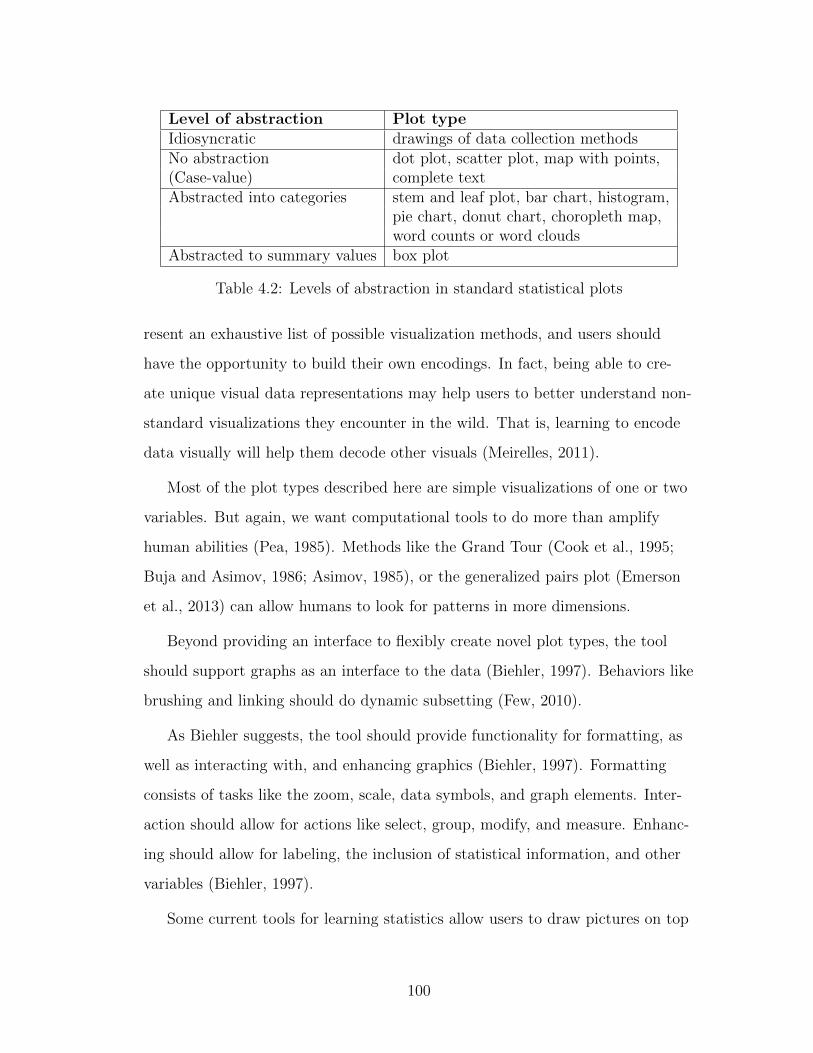
Level of abstraction Plot typeIdiosyncratic drawings of data collection methodsNo abstraction dot plot, scatter plot, map with points,(Case-value) complete textAbstracted into categories stem and leaf plot, bar chart, histogram,
pie chart, donut chart, choropleth map,word counts or word clouds
Abstracted to summary values box plot
Table 4.2: Levels of abstraction in standard statistical plots
resent an exhaustive list of possible visualization methods, and users should
have the opportunity to build their own encodings. In fact, being able to cre-
ate unique visual data representations may help users to better understand non-
standard visualizations they encounter in the wild. That is, learning to encode
data visually will help them decode other visuals (Meirelles, 2011).
Most of the plot types described here are simple visualizations of one or two
variables. But again, we want computational tools to do more than amplify
human abilities (Pea, 1985). Methods like the Grand Tour (Cook et al., 1995;
Buja and Asimov, 1986; Asimov, 1985), or the generalized pairs plot (Emerson
et al., 2013) can allow humans to look for patterns in more dimensions.
Beyond providing an interface to flexibly create novel plot types, the tool
should support graphs as an interface to the data (Biehler, 1997). Behaviors like
brushing and linking should do dynamic subsetting (Few, 2010).
As Biehler suggests, the tool should provide functionality for formatting, as
well as interacting with, and enhancing graphics (Biehler, 1997). Formatting
consists of tasks like the zoom, scale, data symbols, and graph elements. Inter-
action should allow for actions like select, group, modify, and measure. Enhanc-
ing should allow for labeling, the inclusion of statistical information, and other
variables (Biehler, 1997).
Some current tools for learning statistics allow users to draw pictures on top
100

of their data, circling interesting features and providing annotations. Draw-
ing functionality could be enhanced to become another method for interacting
with the system. Researchers in the Communications Design Group are think-
ing about the ways in which drawing could become another level of vocabulary
for humans to use as they interact with the computer. Ken Perlin has developed
a tool he calls Chalktalk, which allows him to draw from a vocabulary of sim-
ple drawings to create the impression of interaction in his presentations (Perlin,
2015). For example, he might draw a crude pendulum and set it swinging. The
behavior of these gestures has been coded behind the scenes, but they allow him
to quickly and fluidly show examples almost like sketches. There is also work
being done to add ‘smart’ drawing features to Lively Web (Section 5.2). This
work is so new there is not yet a good pointer to it, but Calmez et al. (2013)
describe the initial work making it possible.
The system should also make it possible to see multiple coordinated views
of everything in the user’s environment. Rolf Biehler suggests a multiple win-
dow environment to allow for easy comparisons (Biehler, 1997). The impor-
tance of a coordinated view is supported by researchers who suggest allowing
for multiple views of the same data may help students gain a more intuitive un-
derstanding (Shah and Hoeffner, 2002; Bakker, 2002). In many systems, this is
supported by brushing and linking (Wilkinson, 2005).
4.5 Support for randomization throughout
Requirement 5 Support for randomization throughout.
Computers have made it possible to use randomization and bootstrap methods
where approximating formulas would once have been the only recourse. These
101

methods are not only more flexible than traditional statistical tests, but can
also be more intuitive for novices to understand (Pfannkuch et al., 2014; Tintle
et al., 2012).
Randomization and bootstrap methods can help make inferences from data,
even if those data are from small sample sizes or non-random collection meth-
ods (Efron and Tibshirani, 1986; Lunneborg, 1999; Ernst, 2004). While these
methods are not new, they have recently been extended into a field of visual in-
ference. Statisticians at Iowa State University have been working on methods to
use randomized or null data to provide graphical inference protocols (Wickham
et al., 2010; Majumder et al., 2013; Buja et al., 2009).
Humans are very adept at finding visual patterns, whether the patterns are
real or artifacts. Graphical inference helps people train their eyes to more ac-
curately judge whether a pattern is real or not. In these protocols, one plot
created with the original data is displayed in a matrix of n decoy plots. If the
user sets n = 19, the chance of randomly picking the true plot at random is
120
= 0.05, which is the traditional boundary for statistical significance (Wick-
ham et al., 2010).
The method for generating the null plots can vary. Sometimes it is as simple
as randomizing one of the variables to break any linear relationship that might
have existed between the two. However, this does not work on data where the
relationship is more complex, e.g., a quadratic relationship. In those cases, data
are generated from the null model and compared to the true data.
Using the null data, plots analogous to the one filled with real data are gen-
erated. If the user creates a matrix of decoy plots with the true plot randomly
placed within the matrix, identifying the true plot means it is somehow differ-
ent from randomness. These methods have been extended for use in validating
models (Majumder et al., 2013; Buja et al., 2009; Gelman, 2004).
102

Of course, protocols must be followed so as not to introduce bias. For ex-
ample, if the user has been working with the data or doing exploratory data
analysis, familiarity will make it easier to recognize the true plot in the matrix.
However, even with prior knowledge, picking the real data out of a lineup of
plots it is a very compelling exercise. I have introduced the idea to groups of
high school teachers and students, and the ‘game’ of picking the right plot has
proven to be very engaging. In fact, showing randomized plots can be a great
extension to the ‘making the call’ activity of trying to determine the difference
between groups – in this case, between real and randomized versions (Pfannkuch,
2006; Wild et al., 2011).
The application of randomization and the bootstrap is another place where
tools for teaching statistics shine. All the popular applet collections provide
functionality for simply randomizing or bootstrapping data (Chance and Ross-
man, 2006; Morgan et al., 2014). TinkerPlots and Fathom also provide inter-
faces for this (Finzer, 2002a; Konold and Miller, 2005). However, the tools for
doing statistics have lagged behind. R provides the most complete functional-
ity, but it has not been simple to use. Tim Hesterberg has prepared a document
explaining how bootstrap methods could be integrated into the undergraduate
curriculum (Hesterberg, 2014), as well as an R package called resample provid-
ing a simpler syntax.
Because of their intuitive nature and generalizability, randomization and
bootstrap methods are ideal for novices. They can be used in a variety of con-
texts, including graphical inference methods bridging the gap between exploratory
and confirmatory analysis.
103

4.6 Interactivity at every level
Requirement 6 Interactivity at every level.
Interactivity is becoming the standard for the web, and data analysis should
be no different. It should be possible for users to interactively develop an anal-
ysis, e.g., building up a plot by using drag-and-drop elements. The results of
this analysis in the session should themselves be interactive. All graphs should
be zoomable, it should be easy to change the data cleaning methods and see
how that change is reflected in the analysis afterward, and parameters should
be easily manipulable. This type of simple parameter manipulation will further
support exploratory data analysis.
Finally, the product from the tool should also be interactive. Interactivity in
published analysis would be of particular use for data journalism and academic
publishing. As reproducibility becomes more valued in the academic community,
data products are more often accompanied with fully reproducible code, and if
the code were interactive, the audience – even if they do not know much about
statistics – could play with the parameters and convince themselves the data
were not doctored.
With a tool that made it simple to publish fully interactive results of data
analysis, it would be easy to imagine data-driven newspaper articles accompa-
nied by the reproducible code that produced them, allowing readers to audit the
story. As noted in Chapter 3, bespoke projects such as the IEEE programming
language ratings (Cass et al., 2014) provide readers access to the process used to
create an analysis.
The draw of interactivity was also clear to Rolf Biehler, who inspirationally
wrote,
104

The concept of slider pushes the tool a step in the direction of a
method construction tool where one can operate with general pa-
rameters. [...] It may be considered a weakness of systems like Data
Desk that the linkage structure is not explicitly documented as it is
the case with explicit programming or if we had written the list of
commands in an editor. An improvement would be if a list of com-
mands or another representation of the linkage structure would be
generated automatically. (Biehler, 1997)
The implementation of this vision may require something akin to the Shiny
reactive environment to allow the system to keep track of all the downstream
elements depending on the one above.
The power and usefulness of this type of functionality is easy to imagine,
and likely the possibilities are even greater than can be imagined at present.
For example, if a user had used a cut point to create a categorical variable from
a continuous variable, and then fed that categorical variable into a regression
model, the system would allow them to manipulate the cut point to see the ef-
fect on regression parameters, interaction effects, etc. This example is examined
further in Section 5.3.2.
Many other possibilities would be available in the world opened up by this
type of functionality. All plots would be resizable, zoomable, and pan-able.
Clicking on an element in a plot would highlight the associated element in the
data representation, while clicking on a non-data element (e.g., an axis, tick line
or model line) would offer information about the element, and that information
would be manipulable as well.
For a histogram, the bin size and width would be draggable, providing an af-
fordance for the user to manipulate these parameters, rather than encouraging
them to keep the default, as R does. Similarly, spatial binning would be manip-
105

ulable, again providing the user the capability of exploring and gaining intuition
about the ‘true’ underlying spatial distribution. Essentially, every level of ab-
straction could be manipulated. A histogram is generalizing into bins, so the
generalization (binning) can be manipulated. A box plot has a lot of abstrac-
tion, so the user could manipulate the various parameters there, by changing
the mapping of center from median to mean, for example, or by redefining how
outliers are determined.
Interaction is one of the weakest elements in R. The R programming paradigm
means if a user wants to manipulate a parameter value they must modify the
code and re-run it, making the comparison between states in their head. Com-
paring two states in this way may be possible, but comparing more than two is
very difficult. Additionally, because of the static way code is saved, there is no
user incentive to return to the beginning of the analysis to see how a code modi-
fication would trickle down.
The development of RMarkdown has improved this somewhat, as users can
change elements in their code and re-knit the report to see the full scope of ef-
fects from the change. However, the edit/compile cycle is still quite clunky. As
Biehler suggests, we want to encourage direct manipulation over modifying a
script (Biehler, 1997). This concept has been given a lot of attention. One of
the main tenants of Michael Kolling’s Greenfoot (the integrated development
environment designed for novices to learn Java) was shortening the feedback
loop (Kolling, 2010). Bret Victor has made the shortening of the loop one of
his driving design principles, to provide users with the ability to see the direct
results of their actions without waiting for something to compile (Victor, 2012).
Deborah Nolan and Duncan Temple-Lang make the distinction between dy-
namic documents (those that are compiled and then automatically include the
results of embedded code), and interactive documents (those that let a reader
interact with components like graphics) (Nolan and Temple Lang, 2007). Given
106

the goals of interactivity all the way down, and the importance of publishing,
the system we are imagining should provide dynamic-interactive graphics. Users
could interact with any component of the document and have the results re-run
in real time.
R programmers have been wrestling with the issue of making interactive
graphics from within R (Nolan and Temple Lang, 2012). Several efforts have
been made, the most successful being the R packages Shiny and ggvis. However,
these packages are not accessible for novices. While they allow expert users to
create dynamic graphics, they are too complicated for a beginner. For that use
case, manipulate is the closest to the functionality we are imagining.
Currently existing tools like the iPython notebook and RMarkdown provide
some of this dynamic-interactive functionality. They can be used to create inter-
active documents that respond to user input, but the process is not dynamic for
the author, Users must modify code and then re-run it in order to see results,
so direct manipulation is not being achieved, and readers only have access to
dynamic behavior programmed in by the author.
TinkerPlots and Fathom are dynamic and interactive, but they break down
on this requirement when it comes to publishing interactive documents. Tinker-
Plots makes it easy to interactively develop analysis and play with it, but there
is no way to share an interactive result.
4.7 Inherent visual documentation
Requirement 7 Inherent visual documentation.
107

Each component of the system should show the user what it is going to do,
versus simply telling them. Another version of this goal would be ‘help that
is helpful,’ because most documentation in systems like R is unintelligible to
novices. However, the idea of a self-articulating system goes one step further.
The system should show the user what it is going to do, not just use textual
labels. For example, if it is going to perform k-means clustering, instead of a
box with the words “k-means” on it, the user should see a visual representation
of the algorithm, and as it is applied to the data interim steps should be visu-
alized (Muhlbacher et al., 2014). There also needs to be a nice model object
and likely an associated visualization (not residual plots, etc.) to give the user a
sense of the model in order to increase intuition.
This is similar to the idea of scented widgets, which are embedded visualiza-
tions providing hints to users about what all elements are capable of (Willett
et al., 2007). Scented widgets are really a specific platform for implementing
this idea, but the concept is generalizable.
4.8 Simple support for narrative, publishing, and repro-
ducibility
Requirement 8 Simple support for narrative, publishing, and reproducibility.
The products of the system should be as easy to understand as the process of
creating them, and they should be simple to share with others.
108

4.8.1 Narrative
Many programming systems tend toward a paradigm of writing code in one doc-
ument and narrative in another, such as performing analysis in Excel and writ-
ing about the results in Word. Code comments notwithstanding, narrative and
analysis are usually kept separate. However, in order to create compelling re-
ports, it must to be easier to combine the two. This means the system should
encourage documentation alongside or mixed in with the code in order to facili-
tate the integration of storytelling with words and statistical products.
Data science is so much about storytelling that it should be built into the
analysis process. Andrew Gelman and Thomas Basboll have written about how
stories can be a way to develop hypotheses (Gelman and Basboll, 2013), which
is one of the powers of data journalism. Where statisticians usually think of
data as a pre-existing object, journalists are more likely to ‘interview’ their data
source and research the contextual story surrounding it. This process should be
integrated into the documentation and analysis.
In this sense, documentation does not refer to the indecipherable comments
I am guilty of inserting into my code (e.g., “#Don’t know what this does”), but
rather a supporting narrative that surrounds the analysis when it is complete.
Instead of encouraging a process where analysts create their data product first,
then go back and try to interpret it, a good statistical programming tool should
create major incentive to do the hard work of thinking as you go.
Students can learn how to write about their data analysis early on. While
not ideal, RMarkdown and knitr are beginning to make it possible to integrate
this into introductory courses (Baumer et al., 2014).
109

4.8.2 Publishing
Similarly, data analysis products should be easy to publish. Rather than having
to translate the document to another format, it should be as simple as a button
click to make the finished product available to an audience.
It should be easy for a journalist to create a data-driven website, or a citizen
scientist to share the cool thing they found in the data they helped create. On
top of this philosophy, the publishing format should allow for exploration. In
fact, the ideal case would be a system that would look nearly identical to the
person accessing the ‘publication’ as it did to the person producing it. In this
way, users could continue to explore the data, modify the analysis, and perhaps
move sliders to see the effects of changes in the analysis and visualizations.
Integrated documentation and one-click publishing will necessarily encour-
age reproducibility. Anyone who reads the published product will not only be
able to see the code, but it will be easy to understand, given the integrated doc-
umentation.
Again, RStudio is working toward making this possible. Their RPubs web-
site makes it possible, particularly for students, to write RMarkdown documents
and then publish them to be viewable to their class or on the web at large.
4.8.3 Reproducibility
Most important in this requirement is the focus on reproducibility. While it has
been a goal of research for some time, reproducibility is being more explicitly
valued in the scientific publishing community (Buckheit and Donoho, 1995; Ince
et al., 2012). Jan DeLeeuw ends his summary of statistical programming tools
by making it clear reproducibility is the next frontier (De Leeuw, 2009).
People agree modern data analysis should be reproducible. However, there
is some debate about what reproducibility really means. There are two main
110

perspectives on this issue.
The first is the perspective that posits reproducibility means someone other
than the author of the analysis should be able to take the data and code used
by the author and get exactly the same result. The goal of reproducing an anal-
ysis using the same data and code seems like it should be simple to achieve, but
there are many factors that can make it difficult. Namely, software versions can
change, package dependencies can get broken, and most disruptive to the pro-
cess, authors often do not manage to document their entire process. There may
have been data cleaning steps that took place outside the main software package
(e.g., the bulk of the analysis takes place in R but the author does some data
cleaning in Excel before the analysis), or analysis steps run elsewhere and not
added to the code. The provided code might not be the current version, or it
might have bugs that need to be addressed before the code will run (and often,
code is poorly documented, so it is hard to debug someone else’s code). The
R package packrat is attempting to fix some of these problems (Ushey et al.,
2015).
The second view of reproducibility is an independent researcher should be
able to replicate the results, either with new data and code, or at least with
new code. In this framework, another researcher would replicate the study that
produced the data or go about procuring it in the same way as the original re-
searcher (e.g., making API calls to a service, or using FOIA requests to access
government data). They would then attempt to perform the same analysis,
writing the code from scratch or using a different analysis platform, to see if the
results were the same.
As we are attempting to expose students to an authentic experience of data
science, it is crucial they experience reproducibility. This aim has implications
both pedagogically and technologically. Pedagogically, the aim of reproducibility
needs to be written into the curriculum, and teachers need to be trained in or-
111

der to understand the aim. Technologically, the tool students are using needs to
support reproducibility. Supporting reproducibility means, first and foremost,
the process that created a data product needs to be savable. Some teaching
tools, like applets, are more for interaction than anything else, and the creation
process can not be saved. Other tools, like TinkerPlots and Fathom, allow the
user to save the environment that produced the product, but do not document
the steps taken within the environment. An ‘independent researcher’ (in this
context, another student) could potentially use this environment and manage to
reproduce the steps required to produce the analysis product, but it would be
much harder to do so.
The current tools for learning statistics fall quite short in this regard. In
most systems, there is no encouragement of documentation, and analysis is not
reproducible because it was all produced interactively. This tension is addressed
in Section 5.2, where we attempt a method of tracking interactions. Tools like
Excel also fail to meet this criteria, because they do not make it clear what
modifications have been made on the data, not do they provide a method for
reproducing the analysis with different data.
Even in courses where introductory college students are using R, they of-
ten document their data process in Microsoft Word, copying and pasting results
into their final document. This can be a very frustrating experience, because if
a student realizes they made a mistake early in their analysis they must replace
all the dependent pieces of the analysis in their Word document. In introduc-
tory college statistics courses there is a movement toward students using tools
like RMarkdown from the beginning in order to get them in the habit of repro-
ducible research (Baumer et al., 2014). While RMarkdown takes some cognitive
effort to learn, the payoffs are typically great enough students see the useful-
ness.
Much of the work of data analysis is gaining access to data and getting it
112

into a format a tool can work with, which can take up to 80% of the time in
data projects (Kandel et al., 2011a). This ties into reproducibility, as well. If,
once a user has cleaned some data and neatened it into a ‘tidy’ format (Wick-
ham, 2014b), they are given a new version of the data set, are they able to per-
form those same actions on these new data? Thus, another benchmark is to be
able to reproduce wrangling steps and share them with others (Kandel et al.,
2011a).
Once data have been wrangled, it should be clear what steps have been taken,
and how to re-do them on another data set. ‘Consumers’ of the product should
be able to look at the process and assess whether it was done in good faith.
Again, this is a shortcoming of tools designed for learning statistics, as they
make it difficult to share and reproduce research. Several products are working
to address this problem, most notably Data Wrangler and Open Refine.
4.9 Flexibility to build extensions
Requirement 9 Flexibility to build extensions.
Again, this requirement comes from the paper on computational thinking tools
referenced in the introduction to this chapter. In the words of Repenning et al,
the system should have a “high ceiling” (Repenning et al., 2010). This means
users should not ‘age out or ‘experience out of the system. Instead, it should
be possible to build almost anything from the components the system provides.
As discussed in Section 4.4, it should be possible to develop new visualization
types, building from a series of primitives. Similarly, it should be possible to
build new data processes from other modular pieces.
Many of the tools currently used for teaching statistics are guilty of not pro-
113

viding a high enough ceiling. For example, TinkerPlots does not even provide
simple statistical modeling functionality.
Most tools for doing statistics provide the ceiling, but not the low threshold.
For example, in R it is easy to create new components of the system using old
components, and then share them through a centralized repository where other
users can easily find and import others’ work.
Again, Konold argues a high ceiling is not necessary for a statistical tool for
students (Konold, 2007), but in order to close the gap between tools for learn-
ing and tools for doing statistics, extensibility is a requirement. Even Biehler
argues that “adaptability (including extensibility) is a central requirement for
data analysis systems to cope with the variety of needs and users” (Biehler,
1997).
Making sure a system can be used to extend itself is crucial, because a sys-
tem author can never think of all the features a priori.
4.10 Summary of attributes
Again, the overall structure of a tool complying with these requirements could
take a variety of forms. Currently, I imagine a multi-layered system, with a
visual drag-and-drop blocks programming environment providing easy entry
for novices. Visual representations can help novices understand the underly-
ing workings of a data system (Shneiderman, 1994), which suggests this is the
appropriate direction. Once users have reached a certain point, they will likely
want to extend their capabilities, and could move on to the next ‘layer’ down, a
domain-specific programming language (DSL). The DSL would provide simple
primitives, allowing users to develop their own elements to extend their analysis,
and create their own visual blocks to add to the layer above. If users reached
the limits of that layer, they could move down again, to the standard statistical
114

programming tool (e.g., R) in which the DSL was implemented. The underlying
domain-specific language could be implemented in any target language (e.g., R,
Python or Julia), but because the community of statisticians is currently using R
that is what I am currently imagining.
This falls in line with Biehler’s belief that “a co-evolution of tool and user
should be facilitated” (Biehler, 1997). In other words, as users top out in the
capabilities of one aspect of the system, they can move on to a more complex
version allowing for more functionality and flexibility. A solution Biehler pro-
poses is “embedded microwords” (Biehler, 1997). In an embedded microworld, a
larger system is used to make a microworld, which can then be extended in the
larger system. However, Biehler warns embedding sometimes brings language
artifacts from whatever the microworld is embedded in.
As Clifford Konold urges, the system should be built from the bottom up
(Konold, 2007), so the first step is to consider the tasks a novice would need to
accomplish and work from there. Some examples of tasks are discussed in the
next chapter.
115
The best way to predict the future is to invent it.
Alan Kay, 1971
CHAPTER 5
First forays
Given the current state of tools for doing and teaching statistics (Chapter 3),
and my vision of future statistical programming tools (Chapter 4), it is clear
there is work to be done. Since 2011, I have produced a variety of initial at-
tempts toward this vision of the future. Most of my work can be categorized
either under the umbrella of Mobilize (described in Section 5.1) or the Com-
munications Design Group (Section 5.2), although I also describe several Shiny
widgets I created as microworlds for courses I taught (Section 5.3).
5.1 Mobilize
Mobilize is a six year, $12.5 million National Science Foundation grant focused
on integrating data science and computational thinking into a multiplicity of
STEM (science, technology, engineering and math) disciplines. The grant has
eight “principal investigators” (PIs) and six institutional partners, the most
important of which is the Los Angeles Unified School District (LAUSD). The
LAUSD is the second-largest school district in the United States, after the City
School District of the City of New York. For three years, I was a graduate stu-
dent researcher on the grant, and the experience inspired and motivated my
116

work on statistical programming tools for novices.
The Mobilize team has developed curriculum and supporting technology to
allow high school teachers to integrate data science into their classes. In addi-
tion, we hold regular professional development1 sessions for in-service teachers2,
and our research and evaluation teams study what makes elements of the cur-
riculum work (or not work).
Currently, our data-centric curriculum exists as insertable units in computer
science, math, and science, and as a stand-alone, year-long data science class,
called Introduction to Data Science (IDS). IDS was piloted in the 2015-2016
school year in the LAUSD. For more detail about these courses, see Section
5.1.3.
All the curricula are based on the idea of engaging students with data through
the process of participatory sensing, whereby they learn to collect data about
themselves and their communities, often using mobile technology. By ground-
ing the analysis in data with a direct contextual relationship with the students,
we hope to make our lessons more compelling. Once data have been collected,
students begin a process of Exploratory Data Analysis (EDA).
The Mobilize curricula all attempt to follow current best practices in statis-
tics education. In particular, students participate in almost all the activities
suggested by Biehler et al. (2013):
“1. Students can practise graphical and numerical data analysis by developingan exploratory working style.
2. Students can construct models for random experiments and use computersimulation to study them.
3. Students can participate in ‘research in statistics,’ that is to say they par-ticipate in constructing, analyzing and comparing statistical methods.
4. Students can use, modify and create ‘embedded’ microworlds in the soft-ware for exploring statistical concepts.” (Biehler et al., 2013)
1Professional development is additional training for teachers2In-service teachers are those currently certified as teachers and actively teaching
117

All of these activities are woven throughout the Mobilize curricula, with the
possible exception of 4. Students do not construct microworlds, but they do ask
and answer questions using data. In IDS in particular, students learn to code in
R within RStudio.
5.1.1 Participatory sensing
Participatory sensing is a data collection method in which people participate in
data collection using sensors. The term was developed by researchers at UCLA’s
Center for Embedded Networked Sensing, an institutional partner and source of
many PIs for both the Exploring Computer Science and Mobilize grants (Burke
et al., 2006).
The term participatory sensing tends to defy definition, so it is most easily
explained in terms of negative examples, or by its component parts, breaking it
into its component words (‘participatory’ and ‘sensing’) for easier understand-
ing.
‘Sensing’ means using sensors, and sensors could be anything from ther-
mometers, scales, and pressure gauges to electronic sensors like the GPS and
accelerometer in a modern smartphone. Often when we think of sensor data,
we imagine it coming from electronic sensors programmed to collect data in a
particular way (Kanhere, 2011), such as a water clarity sensor programmed to
move along a trajectory in a pond, taking readings every 3 feet and storing the
results. In the context of participatory sensing, sensors are not as autonomous,
although there may be automatic data collection modes accompanying the hu-
man elements.
‘Participatory’ means humans participate in the data collection process. So,
the water clarity sensor from above is not an example of participatory sensing.
It is certainly sensing, and, like all data collection methods, does involve hu-
118

mans in some way, but does not directly involve participants in the act of data
collection. The Audubon bird count, which has been taking place since 1900, is
a participatory data collection exercise without sensors. Each year, thousands of
participants across the country report the breeds of birds they have seen in their
area (Silvertown, 2009).
Starting in 2002, the Audubon Society has supplemented their traditional
Christmas Bird Count with a program called eBird, which “engages a vast net-
work of human observers (citizen-scientists) to report bird observations using
standardized protocols” (Sullivan et al., 2009). More than 500,000 users have
visited the site and have gathered 21 million bird records (Sullivan et al., 2009).
This activity is more closely approximating participatory sensing because it uses
electronic data recording to standardize records, but it is still light on the sens-
ing component.
For an example of both participatory as well as sensing, consider the Mo-
bilize snack campaign. For this data collection exercise, students use a smart-
phone app to record information about every snack they eat. It is participatory
because students are doing the data collection and are also the trigger for when
data collection occurs. Unlike the sensor in the pond, programmed to record
data every 3 feet, students are ‘programmed’ to record data every time they eat
a snack. It is sensing because they are using smartphones to collect the data.
Although they are entering reasonably qualitative survey data, the phone is
recording precise GPS coordinates and time stamps.
Another element characteristic of participatory sensing is the idea data need
to be collected regularly over space and time to get an idea of how the phenom-
ena varies. So, for example, measuring the heights of students in a class does
not count as participatory sensing, because although students are participating
in the data collection, and the ruler/yardstick could count as a sensor, there is
no variation over space or time. It would not make sense to continue taking re-
119

peated measurements of the students’ heights throughout the week. If there was
variation in the measurements, it would be due to random error rather than to
some true variation.
Participatory sensing is an inherently democratic process. It involves people
collecting data about themselves, for themselves. The data do not get sent to
some higher authority and disappear. Instead, the participants should be able
to see and participate in the data analysis process, or at the very least, receive
information from the final analysis. It is an effort to give back access to data to
those who create it, and balance the scales of information power, if only slightly.
5.1.1.1 Teenagers and participatory sensing
In 1993, George Cobb exhorted instructors to expose students to real-world
data and involve them in collecting data. If both could be achieved at once, he
called it a “best of two worlds” situation (Cobb, 1993). Statistics courses have
gradually moved toward using more relevant data to engage students (Friel,
2008; Hall, 2011). Particularly since the explosion of data on the internet, data
are being collected about students constantly, whether they know it or not
(Meirelles, 2011). Whether they are tracking runs with Nike+ or simply giving
off their location by posting on Instagram with location services enabled, stu-
dents – and people in general – are producing digital data streams constantly.
Many statistics courses attempt to focus on data relevant to students’ lives
(particularly those which they may be aware of producing already), such as so-
cial media data from Facebook or Twitter, data about music, or physical ac-
tivity data (Gould, 2010; Lee and DuMont, 2010). With the rise of the “data
natives” (young people who have grown up in the big data era where services
are continuously predicting what an individual will do next), there will only be
more data to use (Rogati, 2014)
120

Involving students in participatory sensing is one more step along this tra-
jectory. Teenagers are especially likely to be involved in participatory cultures
(Jenkins et al., 2009). They are drawn to cultures with “relatively low barri-
ers to artistic expression and civic engagement, strong support for creating and
sharing one’s creations, and some type of informal mentorship whereby what
is known by the most experienced is passed along to novices.” (Jenkins et al.,
2009). Some examples of such cultures include blogs and Facebook. Obviously,
there are access issues if participatory cultures are dependent on computer or
internet access, and young adults often have trouble seeing the way media shape
our culture. But, urban youth are actually more likely to be online content cre-
ators (Jenkins et al., 2009). Recognizing young adults as entrenched in partici-
patory cultures suggests introducing data analysis within the context of partici-
patory sensing may be highly appropriate.
In this context, the use of participatory sensing data in Mobilize is a natu-
ral next step. It is a “best of two worlds” situation, where students are handed
back the power over their own data. The Mobilize technical team has devel-
oped an app making it easy for students to deploy ‘campaigns’ on issues they
care about, and collect data directly on their phones (Tangmunarunkit et al.,
2013). Each piece of Mobilize curriculum uses at least one participatory sensing
campaign to ground the rest of the unit. So far, our campaigns have been less
science-focused and more sociological (e.g., sleep patterns, advertising in neigh-
borhoods, snacking habits).
5.1.1.2 User rewards for participatory sensing
The eBird project has produced research suggesting data collection participants
submitted more data to the project when the program instituted more user-
rewards (Sullivan et al., 2009). For example, users have profiles on the site and
there is a competitive component where prolific contributors are featured on
121

a leaderboard. Users are also rewarded with data visualizations including the
data they helped collect (Sullivan et al., 2009). Showing the results of the data
collection process is an important piece of citizen science (Bonney et al., 2009).
However, not all citizen science initiatives include this type of user incentive.
On the Mobilize project, we have done our best to provide satisfactory user
rewards. In fact, being able to analyze their own data is one of the main payoffs
students receive for participating in the collection exercise. The dashboards pro-
duced by the technical team (discussed in Section 5.1.4.1) help with this. But
again, the tools we are using are falling short, as they encourage students to be-
come users of a dashboard tool and not true producers of statistics. It is also
clear other participatory projects could benefit from an easy-to-use data analy-
sis platform as well.
5.1.1.3 Analyzing participatory sensing data
While participatory sensing data has many benefits, in particular giving power
back to data creators, it is always messy. It rarely represents a random sample,
either in terms of people collecting data or their collection methods.
For example, classes involved in the Mobilize project have collected data on
snacking habits every year since the grant began in 2010. If students are com-
pletely successful at collecting every snack they eat, the data represent a census
rather than a sample, and it is hard to say what statistics should be used to an-
alyze it. However, even the most conscientious of data collectors usually miss a
few observations. It is unknown if those observations are missing at random or
missing not at random, and even less clear what to do with the data.
Up to this point, the grant has side-stepped this issue by focusing on ex-
ploratory data analysis rather than formal inference. The IDS course has used
randomization to make limited conclusions from the data. However, it is often
122

unsatisfying for teachers, students, and even non-statistical PIs to learn we can-
not make formal inference from these data.
Many of the examples of participatory sensing and dealing with missing data
come from ornithology. The Cornell Laboratory of Ornithology has found data
mining methods can be used to help deal with missing data (Caruana et al.,
2006). Decision trees, bagging, and boosting can all be used to help fill in data
where it is missing not at random. For example, bird data tends to be biased
toward higher population areas, where more people exist to track bird sight-
ings (Hochachka et al., 2010). Another approach is to do data augmentation,
combining two datasets – one collected using a participatory method and one
more rigorously collected (perhaps by paid researchers). Using these two data
sets, data augmentation suggests researchers fit a model, one to each data set,
and compare the predictions (Munson et al., 2010).
In environmental contexts, where the variable of interest is assumed to be
smoothly distributed, researchers have used interpolation (Mendez et al., 2013).
If this results in a model with high variability in certain areas, researchers can
then try to incentivize data collectors to collect data in highly variable spatial
areas (Mendez and Labrador, 2012). There are also examples predicting election
outcomes using non-representative polls (Wang et al., 2014).
Finally, because many psychological researchers are using the Amazon Me-
chanical Turk3, there is a growing field of research for dealing with those data.
While Turkers do not represent a random sample of humanity, they do seem
to represent the demographics of the internet well, although they tend to skew
a bit young (Ipeirotis, 2010; Ross et al., 2010). One method for increasing the
quality of data from Turkers is to do repeated labeling (i.e., have several Turk-
ers answer the same question to see what the consensus is). But, too much re-
3The Amazon Mechanical Turk is an online forum to find humans to perform tasks diffi-cult for computers. It was first developed to create reference data sets for image recognitionresearch, as humans can easily identify a number shown in an image, for example.
123

peated labelling is costly. An alternative is to use the EM algorithm to con-
vert ‘hard’ labels to ‘soft’ (probabilistic) labels (Ipeirotis et al., 2010). A simpler
method is to determine some measure of trustworthiness for each data collector,
and use weightings to put emphasis on the more trusted data (Welinder et al.,
2010).
5.1.2 Computational and statistical thinking
“Computational thinking” is a term first described by Jeannette Wing, the head
of the computer science department at Carnegie Mellon (Wing, 2006). Wing is
concerned with access to computer science in the general population, and has
developed the concept of computational thinking to describe the skills she be-
lieves are foundational. Computational thinking encompasses much more than
the traditional view of computer science. Wing describes it as “a fundamental
skill for everyone” (Wing, 2006). It includes many facets of thinking like a com-
puter: problem solving, algorithmic thinking, recursive thinking, and abstrac-
tion. Computational thinking, therefore, is one of the crucial skills in today’s
economy. Not coincidentally, true statistical literacy requires many computa-
tional thinking skills.
‘Statistical thinking’ is a similarly general term, encompassing fundamental
skills of thinking related to statistical concepts. For example, statistical thinking
means considering the tendency of phenomena in a distribution or over time, as
well as the variation within data or with repeated sampling. While these topics
are included in introductory statistics curriculum, they are often presented as
skills to be applied within class, not generally in life. Students presented with
data visualizations often do not connect them to the context of the data from
which they came (Meirelles, 2011; Wickham, 2010).
Statistical thinking also includes what Darrell Huff called “talking back to
124

a statistic,” or checking for bias in reporting on statistical issues, and asking
if it makes sense when presented with a statistical argument (Huff, 1954). On
a broader level, it can be argued that people should develop a “data habit of
mind” and look for evidence to ground things in their life, even outside of a
statistics class (Finzer, 2013; Pfannkuch et al., 2014).
Computational and statistical thinking tie together because computers are
so necessary for statistics today. There is no ‘data science’ without compu-
tation, and statistics provides an excellent place to introduce computing be-
cause it is inherently contextualized. Traditional methods of motivating pro-
gramming in the classroom (e.g., building a game) are often not as appealing to
women (Kelleher and Pausch, 2005; Cooper and Cunningham, 2010). However,
by couching statistics in data in which students are interested (particularly data
in which they can see themselves, like participatory sensing data) makes the de-
sire for inference natural (Wild et al., 2011). Speaking about the difference be-
tween mathematics and statistics, Cobb and Moore note, “in mathematics, con-
text obscures structure. [...] In data analysis, context provides meaning” (Cobb
and Moore, 1997).
5.1.3 Curriculum
As previously note, Mobilize has created curricular units across content areas.
They are all grounded in participatory sensing, computational thinking, and
statistical thinking. While the grant has units to insert into computer science,
algebra, and biology courses, as well as a stand-alone, year-long Introduction to
Data Science curriculum, my primary contributions were on the ECS and IDS
material. The ECS and IDS curricula were also the two most computationally-
based courses.
125
5.1.3.1 Exploring Computer Science unit
The first Mobilize curriculum to be developed was a six-week-long unit on data
analysis, written to fit within a year-long curriculum called Exploring Com-
puter Science (ECS)4. ECS initially piloted in the LAUSD, but has now grown
to include schools in Chicago, Oregon, Utah, Washington, D.C. and New York.
Thousands of high school students are exposed to ECS annually. ECS includes
6-week-long units on human computer interaction, problem solving, HTML and
web design, Scratch programming (animation and game design), LEGO Mind-
storms robotics, and data analysis.
Members of the Mobilize team, including myself, helped developed the data
analysis unit for ECS. In the unit, students engage in exploratory data analysis,
creatively interacting with their own data.
The initial version of the curriculum involved students collecting data using
one of two ‘canonical’ surveys provided: one for collecting data about adver-
tising in the community, and one for collecting data about personal snacking
habits. In the example of the advertising survey, a student would take a photo
of an ad (e.g., a billboard), and then answer questions about the demographic
they believe the ad is targeting, what product it is selling, how much they want
the product, etc.
In keeping with participatory sensing, the survey is implemented on a smart-
phone, and the data are automatically uploaded to a server, along with informa-
tion gathered by the phone. The unit incorporated student-collected data along-
side previously-collected data from sources like the CDC to expose students to a
variety of data analysis topics.
The curriculum and its implementation struggled with many issues. A major
stumbling block for the teachers in professional development was learning the
4Mobilize is essentially a sibling grant to ECS, with many overlapping PIs.
126

data analysis tool. However, as we moved through the various technical tools
discussed in Section 5.1.4, we realized that not only was our professional devel-
opment too short to get the teachers up to speed, but the six-week unit really
was not enough time for students to truly engage with R. Additionally, as ECS
grew nationally, it became harder to support a particular data analysis tool.
The curriculum was later re-written to be tool agnostic, and the need for smart-
phones for data collection was minimized. In the most current version, students
decide what topic they want to study, collect data using pencil and paper, then
analyze it using a tool of their teacher’s choice.
This experience underscored the need for a longer data science curriculum,
which formed the inspiration for the Introduction to Data Science curriculum.
5.1.3.2 Math and science units
The Mobilize math and science curricula comprise shorter units, and were de-
signed to be inserted into existing courses: Algebra I and Biology, respectively.
In math, students collect participatory sensing data on their snacking habits,
and learn to connect linear modeling and predictions to the equation of the line,
y = mx + b. In science, the participatory sensing campaign is related to trash–
whether recyclables are being put into the incorrect container or not. This gets
related to environmental concerns biology teachers are comfortable discussing.
The math and science units were loosely based on the ECS curriculum I
helped develop. For more on the curricula, see (Board et al., 2015; Perez et al.,
2015).
Because these curricula were on much shorter time scales, and because the
teachers we trained were even less comfortable with statistics, neither the Alge-
bra I nor the Biology unit include true computational statistics. Instead, stu-
dents use bespoke dashboards to analyze their data. By using the dashboards,
127

they are able to ask and answer questions with data, but the questions are some-
what limited by the abilities of the tool.
5.1.3.3 Introduction to Data Science course
The most exciting curricular development in Mobilize is the year-long course,
Introduction to Data Science (IDS). This course piloted in 10 schools in the
2014-2015 school year, and will be expanded to 25 teachers in 34 schools in
2015-2016. Unlike the previous curricula mentioned, the IDS course is a full,
free standing course for high school students.
Historically, it has been difficult to schedule students into courses in statis-
tics and computer science because these courses do not typically fulfill grad-
uation requirements. The state of California adds an additional hitch, as all
high school courses must be approved by the University of California Office of
the President (UCOP) to be used for admission to college within the UC sys-
tem, the Cal States, or the California community colleges. One boon to the IDS
course is we were able to get it approved by the UCOP, so as of fall 2014, tak-
ing the IDS course counts for “C” credit.5
As a result of the UCOP approval, high school counselors are interested in
scheduling students into the course, and students are interested in taking it.
I was involved in the overall planning for the curriculum, the UCOP ap-
plication, and the detailed development of the first two units of the curricu-
lum. However, I was not involved in the detailed development of the second
two units. The rest of the IDS team includes Suyen Moncada-Machado, Robert
Gould, Terri Johnson, and James Molyneux.
The topics covered by the class include visualizing data in one and multi-
5California has “A-G” requirements, which require high school students to take two yearshistory, four years of English, three years of math, two years of science, two years of a for-eign language, one year of visual or performing arts, and one year of an elective. “C” creditindicates the IDS course satisfies one of the three years of college preparatory math.
128

ple dimensions, statistical questioning, randomization methods, linear modeling,
classification and regression trees, and k-means clustering. For the full curricu-
lum, see (Gould et al., 2015).
The entire curriculum is based on R within RStudio, with regular labs for
students to work through the techniques they are learning in class. There are
also numerous ‘hands-on’ activities allowing students to enact data analysis
physically, whether creating a human box plot as captured in (Menezes, 2015)
or doing randomization activities with notecards.
5.1.3.4 Labs
All of the IDS coursework is grounded in computational labs (Figure 5.1), which
take place in RStudio (Molyneux et al., 2014). The labs take advantage of the
features of RStudio, and provide an integrated method for viewing lab prompts
and accomplishing the associated tasks6.
For students enrolled in IDS, the labs appear to be a coherent piece of the
RStudio implementation. When students log in to the server version of RStudio,
they can call up whichever lab they are completing by using the load_labs()
function. Whichever lab they select is then displayed in the Viewer pane of
RStudio (as described in Section 3.8.5.3). Because of the embedded slide view-
ing functionality in RStudio, students can page through the lab at their own
speed and answer questions in their ‘journal,’ either on paper or in an RMark-
down document.
This essentially provides the type of functionality offered by swirl (Section
3.8.4.1), but without getting locked into answering questions. All the curricular
materials are in the same browser window, so students do not need to flip back
and forth between screens, but they are still free to play with code.
6To see the full text and installation instructions for all the labs, see https://github.
com/mobilizingcs/ids_labs.
129

Figure 5.1: IDS lab in Viewer pane of RStudio
5.1.4 Technology
Over the years I was involved with the Mobilize project, we iterated through a
variety of technological tools7. In the ‘pre-pilot’ stage of the grant, immediately
preceding my appointment, the platform of choice was R, using the base R GUI,
as described in Section 3.8. Although we were working with computer science
teachers, this proved to be very difficult for them, as they had little prep time
and struggled to pick up a new programming language on the fly.
Our next endeavor was Deducer, a graphical user interface (GUI) for R. For
more information about Deducer, see Section 3.8.5.2. We used Deducer in the
2011-2012 school year. Deducer was slightly easier for the teachers to learn, but
its status as a menu-driven standalone application presented a number of logis-
tical challenges.
7This work is adapted from McNamara and Hansen (2014).
130

Because Deducer is completely menu driven, it is very hard to document,
and thus difficult to use in an educational context, where supporting materials
are always needed. Rather than providing a reproducible code example, each
step of our documentation needed to be a screenshot of the particular configura-
tion of the system.
Teachers often wanted features not available in the current version, and even
though Deducer was a tool developed in conjunction with the grant, long devel-
opment times prohibited this from happening. The development time was the
result of Deducer being implemented in Java, which required the grant to hire
an expert developer and pass them design specifications before changes could be
made.
Finally, Deducer had to be installed on each computer individually. This
was problematic for two reasons. First, any bugs present in the installed version
are essentially set in stone until another version is available. Second, because
many teachers lacked the time and resources to do installations themselves, we
sent grant employees into the field to do installations. Sometimes this was very
complicated, as installation required administrator passwords to which teachers
did not have access, or which had been lost to time. As a result, some features
did not work properly.
Learning from the experience of Deducer, we chose to move back toward R
in the 2012-2013 school year. However, instead of using the standard R GUI
as discussed in Section 3.8, we chose to deploy using the server-side version of
RStudio. The use of the RStudio server version allowed us to sidestep the in-
stallation problems associated with Deducer. Because students could access
RStudio through the browser, they could access the tool from any computer
with internet access, and did not have to worry about user privileges. Files were
stored on the server, so they could not be lost to nightly hard drive wipes.
Simply making the switch to RStudio made a huge difference. One of the
131

challenges of the base R GUI and with Deducer is there are many disconnected
windows that float seemingly at random on the screen. Users often minimize
windows (e.g., the plot or help window), and then struggle the next time they
make a plot because they cannot find their results. One of the simple solutions
RStudio offers is it ‘sticks’ all windows together, so the plot window cannot be
lost, since it is stuck to the others.
Another improvement to getting started using R was the development of
an R package called MobilizeSimple. The aim of MobilizeSimple is to provide
simplifying functions to reduce the number of lines of code necessary to per-
form tasks such as making maps and word clouds. I was the original author of
MobilizeSimple, with subsequent revisions and iterations developed by James
Molyneux. This package is discussed in more depth in Section 5.1.4.2.
Finally, we provided as much documentation as possible to support teach-
ers as they began implementing the curriculum in their own classrooms. First,
package documentation for the MobilizeSimple package and all the other pack-
ages used by the project are accessible through the standard R help() function
and the Help tab in RStudio.
Teachers were also provided with a one-page summary, or ‘cheatsheet,’ of
all functions necessary for completion of the unit, including minimal working
examples, and a pdf document describing how to put together functions to ac-
complish tasks in the curriculum (e.g., text analysis and map creation).
The project’s Youtube page hosted videos showing the basics of logging in
to RStudio, the tabs and features of RStudio, and tasks like plotting, mapping,
and working with text. A wiki containing the the same material as the pdf doc-
ument and cheatsheet – updated on a daily basis as I received questions or com-
ments from teachers – was accessible on the web. Finally, I offered – and the
current team still offers – support via an email ticketing queue, answered within
24 hours (often, within 2-3 hours).
132

However, even with all these support materials, ECS teachers ran into snags.
Without access to the research and evaluation results from the grant team it
is impossible to make any formal statements. However, my anecdotal experi-
ence answering email and hearing from people who observed classroom behavior
suggests many teachers, perhaps insecure about their skill in R, relied heavily
on my videos and wiki as curricular materials. Although there is a full, day-by-
day curriculum guide for ECS, replete with classroom activities and questions
for the students to work through, teachers rarely used this. Instead, they had
students work through examples I had posted on the wiki, copying and pasting
commands into the console.
However, the modifications have helped R became usable enough that teach-
ers were able to deploy successfully in IDS, and the project settled on R within
RStudio for the remainder of the life of the grant.
Another interesting observation from the early years of Mobilize was that
no matter which tool the teachers were first exposed to, they disliked changing
away from it. Even if they acknowledged the new tool was objectively better,
they were opposed to the change. This is supported by research in other areas.
In a route-type software trajectory, Bakker observed participants were hesitant
to make the switch to the next minitool (Bakker, 2002).
Running in parallel to our search for the right tool for data science at the
high school level was a conversation about whether teachers and students needed
to truly learn to code. Because there was still such a high startup cost to learn-
ing R, it became clear we could not expect teachers to try to introduce it into
their class if students were only going to see it for a day or two. However, we
still wanted those students to have the experience of asking and answering ques-
tions with data, so the technology team on the grant developed a few tools to
allow students to view their data without having to code.
133

5.1.4.1 Dashboard tools
Jeroen Ooms developed several tools for simple visualization of the student-
collected data. The first is an embedded visualization tool (Figure 5.2) within
our data access platform, ohmage (Tangmunarunkit et al., 2013). It allows stu-
dents to select one or two variables to analyze, and then produces an appropri-
ate type of plot.
Figure 5.2: ohmage in-browser data visualization engine
Ooms has also produced a standalone data visualization tool (Figure 5.3)
that is currently custom-tailored to the data students are producing.
These tools have been invaluable for teachers and students participating in
the Mobilize project. They allow students to begin working with data with-
out first having to learn a lot of computational skills. For this reason, they’re
an excellent first step into the world of data analysis, particularly in short cur-
ricular excursions like the math and science units. However, much like the vi-
sualizations from the New York Times, they prescribe what a person can do
with them. There is limited support for subsetting, and the raw data cannot
134

Figure 5.3: Standalone data visualization tool
be worked upon, only be browsed.
5.1.4.2 R package
The Mobilize project limits what learners see of R, particularly during their first
semester of a course, to the formula syntax. In order to do this, we have used
the mosaic package, pkglattice graphics, and a few additional functions in the
MobilizeSimple package.
The motivation for the creation of MobilizeSimple was a one-day profes-
sional development session for ECS teachers in 2011, after which they were ex-
pected to be proficient enough with R to teach it to their students. California
does not have a certification for computer science teachers (Lang et al., 2013),
so most of the participating teachers has degrees in mathematics or business,
and were only nominally computer scientists. As a result, they were novice pro-
grammers and novice statisticians.
Using the Exploring Computer Science Mobilize unit discussed in Section
5.1.3.1, I enumerated the tasks teachers needed to be able to accomplish in R,
135

noting how many lines of code it would take to do them. My heuristic was if a
task could be done using one function call or one line of code, I would leave the
existing R functionality as it was. However, there were several tasks requiring
many lines of code, such as:
• Creating a map, using as base map pulled from Google Maps or Open-StreetMaps.
• Plotting points on top of the map and adjusting the sizes of points.
• Creating a map with the same base map, but with points scaled by someother variable in the data set.
• Initializing and processing textual data, including removing stop words,making all words lowercase, and stemming common words.
• Creating and modifying a word cloud based on absolute frequencies ofword appearance as well as by percentages (e.g., show only the top 1%).
• Creating and modify a bar chart showing the same types of frequenciesand percentages.
• Performing basic regular expressions, like pulling 4 out of a string thatsays “4 hours of sleep.”
For tasks requiring more than one line of code, I wrapped up the code into
a helper function. For a concrete example, let us examine text analysis. It is
possible to do text analysis in R using the package tm (Feinerer and Hornik,
2008). However, to get a basic word cloud (Figure 5.4) of some text data, the
following code is necessary:
MobilizeSimple
library(tm)
library(RColorBrewer)
library(wordcloud)
twitter = read.csv("twitterwithdate.csv")
textCorpus = Corpus(VectorSource(twitter$message))
processedText = tm_map(textCorpus, tolower)
processedText = tm_map(processedText, removePunctuation)
136

processedText = tm_map(processedText, removeNumbers)
processedText = tm_map(processedText, removeWords,
stopwords("english"))
tdm = TermDocumentMatrix(processedText)
m = as.matrix(tdm)
v = sort(rowSums(m), decreasing = T)
d = data.frame(word =names(v), freq = v, row.names = NULL)
pal = brewer.pal(9, "BuGn")
pal = pal[-(1:4)]
wordcloud(d$word, d$freq, random.color = T, min.freq = 2,
color = pal)
I did not want to completely hide the process when creating the wrapper
function for MobilizeSimple, but the goal was to reduce the number of lines to
code while maintaining the computational process. In MobilizeSimple, the same
task is wrapped into three functions:
text = InitializeText(twitter$message)
processedText = ProcessText(text, removestopwords = TRUE)
MakeWordCloud(processedText)
The plot is identical to the one seen in Figure 5.4. The simplified flow in
MobilizeSimple still captures the workflow of the text analysis process. A user
has to initialize the text to get it stored in the right format for R to consider
a textual corpus, process it to standardize capitalization, remove stop words,
and finally plot the word cloud. The package abstracts away the details stu-
dents do not need to know. Note the ProcessText function defaults to making
every word lowercase and removing numbers and punctuation, but if the user
wants the function to remove stop words they must pass that argument. It was
137

car
cold
ride
httptinyurlcomdcwpzdfamily
waitbroughtdiscount
mowing
hisshealthtonight
ganeshaquotspring
percentapril
gardentamils
amp
forsythia
day
woods
foodmakes
boston
tellcant
goldfinches
bloomhered
summers
chill song
water
feedtotally
pizza
brooklyn
nicefeels
httpbitlydenk
wow
healthy
fort
heat
holyhttptwitpiccomrupd
foliagebad
celebrate
signneighbors
plant
gone
explore
jackets
gardening
doesnt
deckbyhandme
sunny
north
hugs
degrees
red
cool
nancy
outdoor
amazing
cardinals
coffee
loveskies
press
yeahloving
wife
arrived
change
pair
centerville
heavy
lost
tweet
flower
life
httpappsfacebookcomdogbookprofile
walking
believemaple
fashion
news
blooming
giving
park
mean
rose
quick
gladyoull
httpappsfacebookcomdogbookprofileview
weekend
favorite
leaves
fall
httpappsfacebookcomdog
approachingpost
quotprimaveraquot
lookcute
help
baycourse
feel
easter
tomorrow
til
break
little
yardpurple
belleair
officiallypeople
logan
free
guess
valid
naked
shining
finally
smells
type
angus
temple
likes
lensbaby
tshirt
nearluckykids
heretoday
rainy
sparrows
azalea
budsweathergolf
glovesfreezing
flowe
ring
perfect
perennials
hereq
england
ornamentals waiting
movemac
business
ill
nikki
soon
tweetmeme
feeling
ims
offercouple
airportfalling
chilly
heading
thats
friday
thunder
grass
fly
bulbs
ahhhh
christmas
bbq
wedding
yah
tweets
beach
fun
pattern
neighbourhoodbackyard
hope
running
gorgeous
date
original
mallards
joe
magichappy
squirrels
temps
outside
trip
chase
yay
beautiful
taking
birds
blossom
wearing
gift
spring
curtains
till
yellow
lanchin
rains
chelsea
httptinyurlcomcnffbl
fresh
hairmiss
morning
sun
living
warm
home
getting
white
sprung
tecnu
drinking
rockets
warmer
blue
corner
stay
theres
pool
front
hereandplay
check
week
excited
enjoying
ollie
hot
trees
herebut
hate
watching
flowers
seedsfellow
silverdriving
worth
scout
winter
ready
buy
season
walks
blog
sortforward
heart
enjoy
vermont
httptweetphotocom
wellnow
days
starting
chicks
dinner
word
dont
snow
window
looks
beer
time
means
grackles
heard
start
summer
green
lots
rain
busy
Figure 5.4: Output from tm code
138

a conscious decision to make the simplest processes standard, but require extra
arguments to do other motivational tasks. For example, if a student is confused
or frustrated when they see “the” as the largest word in their word cloud, they
will hopefully be motivated to study the documentation to learn how to remove
words like this.
This workflow provides a simple algorithm to getting word clouds to work,
and requires users to pass arguments to functions. Thus, it is capturing some
components of computational thinking, but it does not require the burden of
many lines of code, like the tm package would, or totally remove the computa-
tional experience as GUIs so often do.
Critics of this package have cited its function naming and syntax, and as
the package authors we think these concerns are legitimate. Future versions of
MobilizeSimple will use more standard R naming conventions, such as using
lowercase function names (Wickham, 2014a). It will also be modified to use the
so-called ‘formula syntax’ discussed further in Section 3.8.1. While the Mobi-
lizeSimple package has not yet been added to CRAN, it can be installed from
Github using the devtools package (McNamara, 2013b).
The experience of developing and deploying the MobilizeSimple package un-
derscored my earlier understanding, which is that users need support as they
learn a language. Exactly how to support people is the salient question.
5.2 LivelyR
Through my work with the Communications Design Group, I was able to col-
laborate with Aran Lunzer to develop a tool we are calling LivelyR. The Com-
munications Design Group is an independent research lab headed by Alan Kay.
It draws together researchers from Kay’s non-profit, Viewpoints Research Insti-
tute, as well as employees from SAP.
139

The product of this work is an interface we are calling LivelyR8. The inter-
face is a bespoke system (see Section 3.10 for other examples of such systems).
An R server is running in the background, either locally on a user’s computer or
on a centralized server. Results are much quicker (and therefore, interaction is
smoother) when R is run locally, but of course that requires a local installation.
As discussed in Section 5.1.4, relying on a local installation is a barrier to acces-
sibility. However, because LivelyR is more provocation than prototype, we were
not as concerned with the realities of use cases.
R interacts with a JavaScript programming environment called Lively Web.
Lively is an open source tool making it easy to develop applications in the web
browser (Ingalls et al., 2013). Each component of a Lively page is ‘live,’ so a
user can give it behavior using code, modify the shape or size of it, move it,
delete it, and copy it. The results can be shared as completely ‘live’ products (In-
galls et al., 2013). When a user goes to a page produced by LivelyWeb – even
the project’s main web page – every element is fully moveable, transformable,
and programmable. In order to program the elements, the user does need to
know JavaScript, but edits can be made on the fly without having to download
source code and edit it ‘offline.’ This stands in direct contrast to projects like
RMarkdown and the iPython notebook, where the results may be interactive (if
the author made them that way), but in order to edit the user needs to move
away from the live implementation.
The Lively team also maintains a “parts bin” where users can share com-
ponents they have developed, either by dragging and dropping pieces together
or writing code (Lincke et al., 2012). There was no existing connection between
the Lively server and a server running R, but Robert Krahn created a web socket
8Lunzer is the primary author on this work, as he did the coding, but we worked throughthe conceptual ideas together. Our joint work has been supported by thoughtful input frommany of our colleagues, most notably Robert Krahn, Dan Ingalls, Alan Kay, Bret Victor, AlexWarth, and Ted Kaehler. The written descriptions included here are based on Lunzer andMcNamara (2014); Lunzer et al. (2014)
140

connection. Additionally, the interaction available off the shelf with Lively was
not sufficient for the types of behavior we wanted to implement, so Lunzer wrote
additional code hacking Shiny and ggvis to provide reactive behavior. In con-
trast to the standard ggvis functionality, LivelyR uses JavaScript to initiate and
control all behavior. This work is discussed in more depth in Lunzer and McNa-
mara (2014); Lunzer et al. (2014).
The behavior of LivelyR was based on my commitment to interactive sta-
tistical programming tools, and Lunzer’s longstanding work on subjunctive in-
terfaces (Lunzer and Hornbæk, 2008). For an overview of the functionality of
LivelyR as of May 2014, see Lunzer (2014)9.
5.2.1 Histogram cloud
One feature that has garnered a lot of attention when we have shown this work
is what I call the ‘histogram cloud.’ The data used in the example shown in
Figure 5.5 is from the R sample dataset mtcars.
In the screenshot, a scatterplot of weight (wt) versus miles per gallon (mpg)
is shown in the center of the plot window. At the top of the image, a few sim-
ple summary statistics are displayed: the number of data points currently in
use (which changes as subsets are applied), the mean and standard deviation of
both variables, and the Pearson correlation coefficient. Green arrows indicate
the range of the data included. The arrows can modified interactively to subset
the data, but the view shown is using the complete data set.
At the bottom of the screen is a rectangular display of the data set, with the
x- and y-variables noted, and ranges for each of the variables. The 0 and 100
indicate 100% of the data are included for each variable. Again, this could be
interactively modified to only include a particular percentile of the data.
9https://vimeo.com/93535802
141

For this version of LivelyR, we made it possible to plot several different
types of plot in the same plotting window. Therefore, the left vertical axis is
the wt axis, but the right vertical axis is the count for the histogram(s) of mpg.
Researchers have found this type of layering of multiple plots is difficult for
users to understand, so this functionality would ideally not be included in a pro-
duction tool (Isenberg et al., 2011; Few, 2008). However, providing histograms
along the margins of scatterplots (typically outside the plot region, rather than
inside as shown here) is a common visualization feature (Emerson et al., 2013).
Typically, statistical packages provide default bin widths and bin offsets, and
the affordances of the system provide a disincentive to modify the parameters.
For example, in base R, the hist() command uses a default bin width based
on the Sturges algorithm (Sturges, 1926). The geom_bar() command in the R
package ggplot2 uses range/30 and though it does provide a warning,
stat_bin: binwidth defaulted to range/30.
Use ‘binwidth = x’ to adjust this.
many people stick with what is given.
There are several other accepted algorithms for choosing optimal histogram
bin width (Wand, 1997), but generally the parameters should be tuned to a par-
ticular data set. Choosing appropriate bin widths is one of the pieces of data
science that ends up being more of an art.
Therefore, we sought to make it so easy to modify the defaults there would
be no reason not to. This is in line with Biehler’s idea of a “stretchy” histogram,
allowing users to pull the height of bars up or down (Biehler, 1997). In this in-
terface, the bars cannot be directly manipulated, but the parameters are easily
manipulable.
Outside the scope of the screenshot in Figure 5.5 but visible in Figure 5.7
are the slider controls for bin width and bin offset. Users can interactively ma-
142

Figure 5.5: LivelyR interface showing a histogram cloud of miles per gallon
143

nipulate these sliders independently, to see a series of static histograms with the
particular parameter value. However, Lunzer’s work often gives users the ability
to modify several parameters together, in order to see more ‘what if?’ possibil-
ities. In this case, it is possible to make a ‘sweep’ of one of the parameters. In
Figure 5.5 the sweep is of the bin offset parameter. Therefore, each histogram in
the cloud has the same bin width, but they all have slightly different bin offsets,
where the bin begins. Once this sweep is in place, the user can use the slider to
modify the bin width of the cloud, which will produce a new set of histograms
with the same (new) bin width, but a variety of bin offsets.
When people are presented with the histogram cloud for the first time, they
typically express a sense of wonder. Because the full range of possible histograms
for a particular data set has never been accessible to them, they find it fascinat-
ing how many variations are possible. The cloud also gives a sense of the ‘true’
shape of the distribution. Obviously, kernel density estimation can provide sim-
ilar information about the true distribution of the data, but understanding ker-
nel densities requires another layer of abstraction. Understanding histograms is
a complicated task for novices (Watson and Fitzallen, 2010; Friel, 2008), but the
histogram cloud only requires an additional small cognitive step in order to be
understood.
Inspired by the popularity of the histogram cloud when showing LivelyR, I
have begun to think about how the concept could be extended to a 2-D setting.
Mapmaking is often appealing to novices because it is very grounded in reality.
As Tom MacWright noted, “The problem with maps is that the world looks like
a map. We don’t have that problem with other visualizations.” One of the chal-
lenges with map-making, particularly of choropleth maps, is the areal units used
do not have much meaning in terms of the variable being mapped. For example,
mapping incidences of traffic accidents by zipcode or Census block is typically
not useful, because traffic accidents tend to happen along streets. Because data
144

are often measured in standard areal units, there is typically not much that can
be done.
In geography, this is called the Modifiable Areal Unit Problem (MAUP). Ge-
ographers and geostatisticians have developed some methods for dealing with
these data. The methods are usually spoken of in terms of ‘scaling.’ Upscaling
is the easiest task, and it involves making a map at a less detailed spatial res-
olution than the data collection method (e.g., taking a map aggregated at the
county level and turning it into one aggregated at the state level). Side-scaling
is somewhat more complex, as it involves taking two similarly-sized areal units
and translating between them (e.g., moving from zipcodes to Census tracts).
The most complex is down-scaling, which involves taking data at a less-detailed
level down to a more detailed level (Atkinson, 2013).
There are a variety of methods to deal with this problem, including data
fusion and area-to-point kriging. Also relevant are efforts using data augmen-
tation, much like what was discussed in Section 5.1.1, which will use auxiliary
information to help with disagreggation. For example, the Disser project helps
disaggregate Census data by bringing in information about zoning to determine
housing density (Martin-Anderson, 2014).
Again, because viewers found the ability to move bins in the histogram cloud
and see the resulting changes in distribution in 1-D, it seemed likely an analo-
gous action would be appealing in 2-D. However, this extension is still a work in
progress.
5.2.2 Regression guess line
Another feature built into LivelyR is the ability to create a ‘regression guess’
line. This is another feature suggested by Biehler, who suggests, “eye-fitted lines
with residual analysis should precede the method of least squares” (Biehler,
145

1997). As in the previous section, a video of the interaction is available to more
clearly display the functionality (Lunzer, 2014).
Similar to the histogram cloud discussed above, this feature allows users to
manipulate one or multiple parameters in order to find the best fit line. In this
case, the parameters are the start and end points of the line the user is guess-
ing. Choosing the best line can be done by eye by modifying first one end of
the line and then the other, then judging how well the line fits the scatterplot
of points. The interface provides additional information in the form of the resid-
ual sum of squares (RSS) value, which a user can also use as a guide, manually
attempting to optimize RSS.
Because LivelyR complies with Lunzer’s conception of a subjunctive inter-
face (Lunzer and Hornbæk, 2008), it also allows users to try a ‘sweep’ of param-
eter values. In this case, the user defines a sweep of point locations on one end
of the line, then moves the other end by hand. This allows the user to visually
compare a selection of lines with a more dynamic set of end points. Addition-
ally, the interface provides an ephemeral plot of the RSS value, which allows
the user to more directly attempt to optimize the value by aiming for the lo-
cal maximum on the plot. A screenshot of this functionality is shown in Figure
5.6. Again, this falls into the category of allowing learners to discover things by
themselves, as Biehler suggests.
Of course, even the LivelyR implementation does not do the most superb job
of supporting discoverability. The interface provides RSS as a measure to opti-
mize without ever explaining why one might want to optimize it, and there is
no visual support to suggest why the movement of the line is increasing or de-
creasing the RSS. A second generation of this type of tool should include a more
self-articulating version of this, where the residuals or the squares are visually
represented on the screen. More work should be done to study how novices con-
ceptualize the sum of squares, and to determine the most effective way of con-
146

veying the concept visually.
Figure 5.6: Regression guess functionality in LivelyR
5.2.3 Small multiple callout plots
In all the plot scenarios involving sweeps of parameters, LivelyR makes it possi-
ble to see each of the possible scenarios broken out into small multiple plots (Tufte,
2001). An example of this is shown in Figure 5.7, where each of the histograms
from the histogram cloud in section 5.2.1 is broken out into an individual plot.
Once again, this feature allows for exploration over multiple parameters. In
147

Figure 5.7: Small multiples in LivelyR
this case, although the small multiples each display one of the set of histograms
from the histogram cloud, the user can use a second input device (in Lunzer’s
experiments, an iPad configured for use as a lefthand input) to select a his-
togram they want to compare with all others. In Figure 5.7, there is a light
ghosted histogram shown in the background of all the small multiples. This is
the histogram being used for comparison. In this example, the histogram being
used for comparison is the beginning of the sweep (notice the small multiple in
the upper left does not have a ghost histogram), but the tool is more generic.
5.2.4 Documentation of interaction history
Many of the features discussed above are available in other software packages,
particularly those for learning statistics (see Section 2.2 for more on these tools).
However, LivelyR offers a feature we have not witnessed in any common inter-
active tools: a history. Each time a user performs an action in the LivelyR in-
terface, whether changing the subset of the data, modifying the histogram bin
width, or sweeping values for a regression line guess, a line is added to the his-
148

tory list. The history list is visible on the right side of the screenshot in Figure
5.7 and is shown in more detail in Figure 5.8.
Figure 5.8: History transcript in LivelyR
The history not only makes the interactive system reproducible (see Section
4.8 for more about this requirement), it allows users to move forward and back-
ward through their history. In Figure 5.8, the cursor is indicating a move ‘back
in time’ to the way the interface was when the bin width was set to 0.6. The in-
terface also allows the user to rewrite history and see what the situation in the
past would have looked like with a slight parameter tweak. There are obviously
open issues surrounding how to deal with those alternate histories, but other re-
searchers in the Communications Design Group are experimenting with novel
methods to address those problems (Warth et al., 2011).
5.3 Additional Shiny experiments
The goal of ‘interaction all the way down’ (Section 4.6) in a statistical program-
ming tool does not always immediately present itself as a useful feature. How-
ever, given my experience teaching high school students, professional develop-
ment for high school teachers, and undergraduates, I am able to see many pos-
149

sible use cases. Because of the effort it took to create LivelyR (again, mostly
on the part of Lunzer), it was clear we needed a simpler solution to mocking up
interface possibilities.
As a result, I have been creating a few experiments in Shiny to show some of
the features that could be available in a full system complying with the require-
ments listed in Chapter 4.
5.3.1 Conditional visualizations
A very simple Shiny app I developed for a data visualization course I taught is
shown in Figure 5.910. In the class, we were looking at a visualization about the
saving habits of men and women, made by Wells Fargo (Harris Poll, 2014). In
the original visualization, a donut chart is broken down into overall percentages
of the surveyed population who saved a particular percent of their savings. For
example, 18% of those surveyed saved more then 10% of their income. However,
in addition, conditional percentages were given by gender. For that same slice
of the donut, it said “men - 26%” and “women - 9%” Obviously, those num-
bers are for those groups individually, but upon first glance it seemed like the
graphic was suggesting that 26% of the 18% were men and 9% women.
In order to help my students understand the difference between the two
breakdowns, I created a series of graphics: one with the data broken first into
saving categories, and then gender (5.9b), and the other breaking on gender first
(5.9a). While this app will not win any awards for visualization style, it con-
veyed the point easily, and allowed my students to flip back and forth between
the versions.
10Interactive version available at https://ameliamn.shinyapps.io/ConditionalPercens
150
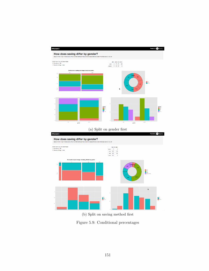
(a) Split on gender first
(b) Split on saving method first
Figure 5.9: Conditional percentages
151

5.3.2 Interaction plot with manipulable data cut point
Another example stuck out from a modeling course for which I was the teaching
assistant. In the course, students were asked to prepare a linear model to pre-
dict API scores11 from a number of other factors about schools. The assignment
asked students to discuss interaction effects in their final paper.
Because the data had many numeric variables and the students preferred
the clarity of studying interaction plots when both variables were categorical,
many groups chose to split a numeric variable into a categorical variable with
two classes. Of course, the choice of cut point was somewhat arbitrary. Some
groups chose the mean of their variable, others the median, while others chose
a cutoff that they believed to be significant given some contextual knowledge.
However, because they were programming in R and the choice of cut point was
so early in their analysis, many groups did not realize how sensitive their analy-
sis was to their earlier parameter choice.
Difficulty understanding the impact of cut points is not unique to my stu-
dents. Other researchers have observed similar behavior in students and teach-
ers (Hammerman and Rubin, 2004; Rubin and Hammerman, 2006).
In order to display how a completely interactive system could help even in-
termediate and advanced analysts, I created a Shiny app which allows a user
to pick a variable in the dataset to convert to a categorical variable, and then
allows them to manipulate the cut point. Because Shiny uses a reactive frame-
work, even time the cut point is manipulated the model output, interaction
plot, and coefficient interpretation change. A view of this Shiny app is shown
in Figure 5.1012.
The app makes it very simple to see where the choice of cutpoint makes the
11In this context, API means Academic Performance Index, not to be confused with Appli-cation Programming Interfaces.
12Interactive version available at https://ameliamn.shinyapps.io/InteractionPlot/
152

Figure 5.10: Shiny app demonstrating fragility of interaction based on cutpoint
interaction effect flip, and even provides a visual cue as to why that might be
happening– the vastly different sizes of data in the two groups. However, this
app had to be hand-coded by me, using the Shiny server/UI framework, so it is
not something an introductory student could develop on their own.
5.4 Discussion of first forays
The work discussed in this chapter has helped to ease some of the transition be-
tween learning and doing, particularly for high school students associated with
the Mobilize Project. However, the tools developed only hint at the richer inter-
faces that are possible. The experience of creating LivelyR prompted Lunzer
and myself to reconsider our choice of target technology, because the combi-
nation of R and Lively Web caused us to get locked in to particular interface
choices too early. Instead, we should be attempting to create as many distinct
153

possibilities as possible (as in a charrette) and using user studies to learn which
are most successful. These experiences motivate my future work.
154

CHAPTER 6
Conclusions, recommendations, and future work
Nearly 20 years after Rolf Biehler’s 1997 paper, “Software for learning and for
doing statistics,” much of Biehler’s vision has been realized through the devel-
opment of TinkerPlots and Fathom. These landscape-type tools for learning
statistics and data analysis allow novices to jump into ‘doing’ statistics and ex-
perience the playful nature of the cycle of exploratory analysis, moving from
questioning to analysis and back to questioning. However, new developments
in computation and data analysis are beginning to trickle down into introduc-
tory material, and need better support. In particular, the drive for reproducible
research has trickled down from science (Buckheit and Donoho, 1995) to intro-
ductory statistics (Baumer et al., 2014), and needs to be supported by tools for
learning.
However, the movement of best practices is not simply from professional
tools to tools for learning. In fact, tools like Fathom and TinkerPlots have
strengths professional tools are sorely lacking, like support for interactive graph-
ics, parameter manipulation, building new plot types, and integrated random-
ization. We can imagine a tool combining the strengths of both paradigms,
eliminating the gap between tools for learning and tools for doing statistics.
In Chapter 3 we considered the strengths and weaknesses of tools currently
on the market. While R has been gaining followers because of its strengths, like
its status as a free and open source programming language, the R programming
paradigm is very stilted and does not support exploratory analysis as well as it
155

could. Projects like Shiny, RMarkdown and the iPython notebook are making
it possible to combine textual programming languages with interactive and pub-
lishable results, but they typically provide either dynamic or interactive graph-
ics, never dynamic-interactive.
Conversely, TinkerPlots and Fathom make it simple for everyone, includ-
ing novices, to interact with their data. However, this interactivity comes with
tradeoffs, particularly in terms of sharing results (proprietary file formats make
it hard to share interactive results with others) and reproducibility (as there is
no linear documentation of the analysis process).
In Chapter 4, we discussed the attributes necessary for a modern statisti-
cal programming tool bridging the gap between being a tool for learning and a
tool for doing. These attributes include easy entry for novice users, data as a
first-order persistent object, support for a cycle of exploratory and confirmatory
analysis, flexible plot creation, full support for randomization, interactivity at
every level, inherent visual documentation, simple support for narrative, pub-
lishing, and reproducibility, and the flexibility to build extensions. While there
are efforts to move toward this ideal tool, no existing products satisfy all the
requirements.
Chapter 5 describes a set of experiments I have undertaken in the space of
closing the gap between tools for learning and tools for doing statistics. One
component of this is curricular: high school level material developed through
the NSF grant Mobilize, including data science units to be added to courses in
computer science, Algebra I and Biology, and a freestanding course called Intro-
duction to Data Science. As part of the Mobilize project I have also considered
appropriate computational tools (R, Deducer, and R within RStudio), and de-
veloped additional functionality in the MobilizeSimple package.
In joint work with Aran Lunzer, we considered ways in which interactive
tools would provide capabilities not possible using pen-and-paper, including an
156

interaction history to make using an interface more reproducible. Finally, I cre-
ated a few illustrative Shiny apps, to demonstrate the microworld capabilities of
the system.
6.1 Current best practices
Because there are currently no tools containing all the attributes discussed in
Chapter 4, it makes sense to consider the best practices using existing tech-
nology. As we have seen repeatedly throughout this work, there is a contrast
between tools for learning and tools for doing. On the tools for learning side,
Fathom appears to have the most features complying with the requirements. It
has a low threshold, provides plenty of interactivity for analysis authors, and
has a low price point. However, if Fathom is to be used in an introductory class,
efforts must be taken to scaffold its use toward the next tool. For example, the
end of the semester could include a basic exploratory data analysis project in R.
For those more interested in starting students on a professional tool, but
providing better ‘on-ramping’ to the tool, the use of R within RStudio is rec-
ommended. In addition, scoping decisions should be made to only introduce
students to a small set of R commands and one unified syntax. In the Mobilize
project, we have followed the lead of Project MOSAIC and have used the for-
mula syntax, using mosaic, lattice graphics, and the additional tools available
from the MobilizeSimple package. This package includes the integrated lab ex-
ercises described in Section 5.1.3.4, which allow students to move through struc-
tured activities without leaving the RStudio interface. This approach is simi-
lar to that taken by tools like swirl and DataCamp, but the Mobilize labs offer
more space for creativity and inquiry by not locking students into a particular
trajectory. R is a landscape-type tool, which does not specify any particular tra-
jectory. The Mobilize labs provide more of a route through the material, while
157

allowing for exploration around the edges.
As shown in Section 5.3, Shiny has potential as a tool for creating microworlds
or minitools, allowing novices to explore within an environment built in a target
language. However, while Shiny apps allow users to interact with data, they still
suffer from a hard gap between using the interactive tool and using the target
language (i.e., R).
6.2 Future work
None of the work presented in this dissertation is ‘the’ system, so my goal for
the future is to begin building larger experimental prototypes in order to ex-
plore the possibilities. At present, I imagine a blocks-programming environment
along the lines of Scratch, allowing novices to begin doing statistics and data
analysis. However, underlying this environment would be a textual program-
ming environment more like the target language (e.g., R).
The challenge is there should be a tight coupling between the visual repre-
sentation in the block and the language underneath it. And, it should be pos-
sible to build up additional visual blocks to add to the system, and share with
others. In other words, we want a bijection between visual blocks and textual
programming, rather than an injection. If the blocks programming system is
fixed and the only way to move forward is to write in the textual language, then
the language becomes injective.
There are several components to be developed in order for this sort of sys-
tem to work properly. The first is the domain-specific language to underly the
visual component. The challenge with developing these primitives is to make
them descriptive enough to capture all the basic tasks necessary, while still pro-
viding the possibility to create new functionality. The language should be ex-
pressive enough to be used in many circumstances, but limited enough it can be
158

captured by the (small) working memory of humans – either 7 ± 2 or 4, depend-
ing on who you consult (Miller, 1955; Cowan, 2000; Shah and Hoeffner, 2002).
The second is the visual system itself. The interfaces of tools like Tinker-
Plots, Fathom, Data Desk, and JMP provide some inspiration, but as they do
not capture a reproducible workflow or encourage integrated narrative, there are
changes to be made. My future work will focus on paper prototyping in order to
“get the design right and the right design” as Bill Buxton says (Buxton, 2007).
Once the design has been solidified, and the underlying language is clear,
there is a challenge of implementation. As reactive programming in R gets more
support through Shiny, I am hopeful implementation in R will be possible. How-
ever, it is likely additional computational components will need to be included
to support all the functionality. For example, research and anecdotal experience
suggest packages used through the browser are best for novices, because they re-
move many technical difficulties. However, in-browser support for data is very
limited, and running on a centralized server can lead to delays.
6.3 Final words
As noted in the introduction, there is much more to education than technology
tools. In order for novices to have an authentic experience of data, they need to
work with real data to answer questions, but that experience requires guidance.
It is not clear how to develop more instructors capable of guiding this experi-
ence. In the United States, the answer is often to develop a new teacher cer-
tification. Computer scientists are currently working toward a certification for
K-12 teachers to teach computer science in schools. However, the road to certi-
fication is long and fraught with politics. And, given the way statistics is often
taught even at the post-secondary level, not all certifications would be equal.
There is also an important consideration about the affordances of tools we
159

use. In 1995, Michael Curry wrote a piece about the implications associated
with the rise of Geographic Information Systems (GIS) (Curry, 1995). In it,
he talks about how difficult it is for a software user to take responsibility for
the actions of the software. Just like GIS products, statistical and data analy-
sis products are used to make decisions about real people. While scholars are
bringing attention to the algorithmic and data-driven processes governing our
everyday lives (Diakopoulos, 2014; boyd and Crawford, 2012), creators and
users of software need to bring more awareness to the process. While techno-
logical tools can appear neutral, they shape the way we think, and thus should
be created with care.
Finally, while the subject of this inquiry has been statistical programming
tools, there is a noticeable lack of rigorous research in the field. There is a need
for more and better data about just what interface features and design decisions
support thinking, and which promote misconceptions.
160

Bibliography
Academic Technology Services (2013). Comparing SAS, Stata, and SPSS. http:
//www.ats.ucla.edu/stat/mult_pkg/compare_packages.htm.
Allaire, J. J. (2014). manipulate: Interactive plots for RStudio. R package ver-
sion 1.0.1.
Alvarado, C., Dodds, Z., and Libeskind-Hadas, R. (2012). Increasing women’s
participation in computing at Harvy Mudd College. ACM Inroads, 3(4):55–
64.
Asimov, D. (1985). The grand tour: a tool for viewing multidimensional data.
SIAM Journal on Scientific and Statistical Computation.
Atkinson, P. M. (2013). Downscaling in remote sensing. International Journal
of Applied Earth Observation and Geoinformation, 22:106–114.
Bakker, A. (2002). Route-type and landscape-type software for learning sta-
tistical data analysis. In Proceedings of the 6th International Conference on
Teaching Statistics.
Bardzell, S., Bardzell, J., Forlizzi, J., Zimmerman, J., and Antanitis, J. (2012).
Critical design and critical theory: The challenge of designing for provocation.
In DIS 2012: In the wild.
Baumer, B., Cetinkaya Rundel, M., Bray, A., Loi, L., and Horton, N. (2014). R
markdown: Integrating a reproducible analysis tool into introductory statis-
tics. Technology Innovations in Statistics Education, 8(1).
Becker, R. A. (1994). A brief history of S. Technical report, AT&T Bell Labora-
tories.
161

Bell, T., Witten, I. H., and Fellows, M. (2010). Computer science unplugged.
http://www.csunplugged.org.
Ben-Zvi, D. (2000). Toward understanding the role of technological tools in
statistical learning. Mathematical thinking and learning, 2(1&2):127–155.
Bertin, J. (1983). Semiology of Graphics. University of Wisconsin Press.
Biehler, R. (1997). Software for learning and for doing statistics. International
Statistical Review, 65(2):167–189.
Biehler, R. (2003). Interrelated learning and working environments for sup-
porting the use of computer tools in introductory classes. In IASE satellite
conference on statistics education and the internet. International Statistical
Institute.
Biehler, R., Ben-Zvi, D., Bakker, A., and Makar, K. (2013). Third International
Handbook of Mathematics Education, chapter Technology for Enhancing Sta-
tistical Reasoning at the School Level. Springer Science + Business Media.
Board, O., Gould, R., Amaya, P., and Estevez, H. (2015). Mobilize 2014-2015
Mathematics Curriculum. Office of Curriculum, Instruction, and School Sup-
port.
Bonney, R., Cooper, C. B., Dickinson, J., Kelling, S., Phillips, T., Rosenberg,
K. V., and Shirk, J. (2009). Citizen science: A developing tool for expanding
science knowledge and scientific literacy. BioScience, 59(11):977–984.
Bostock, M. (2013). D3.js: Data-driven documents. http://d3js.org/.
Bostock, M. (2015). mbostock’s blocks. http://bl.ocks.org/mbostock.
Bostock, M., Carter, S., and Tse, A. (2014). Is it better to rent or buy? The
New York Times.
162
Bostock, M., Ogievetsky, V., and Heer, J. (2011). D3: Data-driven documents.
IEEE Transactions on Visualization and Computer Graphics, 17(12).
boyd, d. and Crawford, K. (2012). Critical questions for big data. Information,
Communication & Society, 15(5):662–679.
Buckheit, J. B. and Donoho, D. L. (1995). Wavelab and reproducible research.
Wavelets and Statistics.
Buja, A. and Asimov, D. (1986). Grand tour methods: An outline. Computer
science and statistics, pages 63–67.
Buja, A., Cook, D., Hofmann, H., Lawrence, M., Lee, E.-K., Swayne, D. F.,
and Wickham, H. (2009). Statistical inference for exploratory data analysis
and model diagnostics. Philosophical Transactions of the Royal Society A,
367:4361–4383.
Burke, J., Estrin, D., Hansen, M., Parker, A., Ramanathan, N., Reddy, S., and
Srivastava, M. B. (2006). Participatory sensing. Center for Embedded Network
Sensing.
Buxton, B. (2007). Sketching user experiences: Getting the design right and the
right design. Morgan Kaufmann Publishers.
Caffo, B., Leek, J., and Peng, R. D. (2015). Johns hopkins university data
science coursera sequence. https://www.coursera.org/specialization/
jhudatascience/.
Cairo, A. (2013). The Functional Art: An introduction to information graphics
and visualization. New Riders.
Calmez, C., Hesse, H., Siegmund, B., Stamm, S., Thomschke, A., Hirshfeld, R.,
Ingalls, D., and Lincke, J. (2013). Explorative authoring of active web content
in a mobile environment, volume 72. Universitatsverlag Potsdam.
163

Carchedi, N., Bauer, B., Grdina, G., Kross, S., Schouwenaars, F., and Leonard,
A. (2015). swirlstats. http://swirlstats.com/.
Carter, S., Ericson, M., Leonhard, D., Marsh, B., and Quealy, K. (2010). Bud-
get puzzle: You fix the budget. The New York Times.
Caruana, R., Elhaway, M., Munson, A., Riedewald, M., Sorokina, D., Fink, D.,
Hochachka, W. M., and Kelling, S. (2006). Mining citizen science data to pre-
dict prevalence of wild bird species. In Proceedings of the 12th ACM SIGKDD
International Conference on Knowledge Discovery and Data Mining, pages
909–915.
Cass, S., Diakopoulos, N., and Romero, J. J. (2014). Interactive: The top pro-
gramming languages: IEEE Spectrum’s 2014 rating. IEEE Spectrum.
Cetinkaya Rundel, M. (2014). ShinyEd. https://stat.duke.edu/~mc301/
shinyed/.
Chance, B. and Rossman, A. (2006). Using simulation to teach and learn statis-
tics. In ICOTS-7.
Chang, W., Cheng, J., Allaire, J. J., Xie, Y., and McPherson, J. (2015). Shiny:
Web application framework for R. R package version 0.12.0.
Cobb, G. (1993). Reconsidering statistics education: A National Science Foun-
dation conference. Journal of Statistics Education, 1(1).
Cobb, G. and Moore, D. S. (1997). Mathematics, statistics, and teaching. The
American Mathematical Monthly, 104(9):801–823.
Cook, D., Buja, A., Cabrera, J., and Hurley, C. (1995). Grand tour and projec-
tion pursuit. Journal of Computational and Graphical Statistics, 4(3):155–172.
Cooper, S. and Cunningham, S. (2010). Teaching computer science in context.
ACM Inroads, 1(1):5–8.
164

Cornelissen, J., Theuwissen, M., De Mesmaeker, D., and Schouwenaars, F.
(2014). Datacamp. www.datacamp.com.
Cowan, N. (2000). The magical number 4 in short-term memory: A reconsidera-
tion of mental storage capacity. Behavioral and Brain Sciences, 24:87–185.
Crawford, K., Faleiros, G., Luers, A., Meier, P., Perlich, C., and Thorp, J.
(2013). Big data, communities and ethical resilience: A framework for action.
White paper, Bellagio/PopTech Fellows.
Curry, M. R. (1995). Rethinking rights and responsibilities in geographic infor-
mation systems: Beyond the power of the image. Cartography and Geographic
Information Systems, 22(1):58–69.
De Leeuw, J. (2004). On abandoning Xlisp-Stat. Technical report, University of
California, Los Angeles.
De Leeuw, J. (2009). Statistical software - overview. Technical report, Depart-
ment of Statistics, University of California, Los Angeles.
Deek, F. P. and McHugh, J. A. (1998). A survey and critical analysis of tools
for learning programming. Computer Science Education, 8(2):130–178.
Diakopoulos, N. (2014). Algorithmic accountability reporting: On the investiga-
tion of black boxes. Technical report, Tow Center for Digital Journalism.
Dijkstra, E. W. (1989). On the cruelty of really teaching computing science.
Communications of the ACM, 32:1398–1404.
Dumbill, E. (2012). What is big data? an introduction to the big data land-
scape. O’Reilly.
Efron, B. and Tibshirani, R. (1986). Bootstrap methods for standard errors,
confidence intervals, and other measures of statistical accuracy. Statistical
Science, 1(1):54–77.
165

Ellior, A. J., Maier, M. A., Moller, A. C., Friedman, R., and Meinhardt, J.
(2007). Color and psychological functioning: The effect of red on performance
attainment. Journal of Experimental Psychology, 136(1):154–168.
Emerson, J. W., Green, W. A., Schloerke, B., Crowley, J., Cook, D., Hofmann,
H., and Wickham, H. (2013). The generalized pairs plot. Journal of Compu-
tational and Graphical Statistics.
Ernst, M. D. (2004). Permutation methods: a basis for exact inference. Statisti-
cal Science, 19(4).
Everson, M., Zieffler, A., and Garfield, J. (2008). Implementing new reform
guidelines in teaching introductory college statistics courses. Teaching
Statistcs, 30(3).
Feinerer, I. and Hornik, K. (2008). Text mining infrastructure in R. Journal of
Statistical Software, 25(5):1–54.
Fellows, I. (2012). Deducer: A data analysis GUI for R. Journal of Statistical
Software, 49(8).
Few, S. (2008). Dual-scaled axes in graphs: Are they ever the best solution?
Technical report, Perceptual Edge.
Few, S. (2010). Coordinated highlighting in context: Bringing multidimensional
connections to light. Technical report, perceptual edge.
Fincher, S. and Utting, I. (2010). Machines for thinking. ACM Transactions on
Computing Education, 10(4).
Finzer, W. (2002a). Fathom: Dynamic data software (version 2.1). Computer
software. Emeryville, CA: Key Curriculum Press.
Finzer, W. (2002b). The Fathom experience: Is research-based development of a
commercial statistics learning environment possible? In ICOTS-6.
166

Finzer, W. (2013). The data science education dilemma. Technology Innovations
in Statistics Education, 7(2).
Finzer, W. (2014). Hierarchical data visualization as a tool for developing stu-
dent understanding of variation of data generated in simulations. In ICOTS9.
Fitzallen, N. (2013). Characterizing students’ interaction with TinkerPlots.
Technology Innovations in Statistics Education, 7(1).
Fox, J. (2004). Getting started with the R commander: A basic-statistics graph-
ical user interface to R. In useR! Conference.
Franklin, C., Kader, G., Mewborn, D., Moreno, J., Peck, R., Perry, M., and
Schaeffer, R. (2005). Guidelines for assessment and instruction in statistics
education report. American Statistical Association.
Friel, S. N. (2008). The research frontier: Where technology interacts with the
teaching and learning of data analysis and statistics. In Heid, M. K. and
Blume, G. W., editors, Research on technology and the teaching and learning
of mathematics, volume 2. National Council of Teachers of Mathematics.
Fry, B. (2004). Computational Information Design. PhD thesis, Massachusetts
Institute of Technology.
Gal, I., Ginsburg, L., and Schau, C. (1997). The Assessment Challenge in
Statistics Education, chapter Monitoring Attitudes and Beliefs in Statistics
Education. IOS Press.
Garfield, J. and Ben-Zvi, D. (2007). How students learn statistics revisited: a
current review of research on teaching and learning statistics. International
Statistical Review, 75(3):372–396.
Garfield, J. and Ben-Zvi, D. (2008). Preparing school teachers to develop stu-
dents’ statistical reasoning. In Joint ICMI/IASE Study: Teaching Statis-
167

tics in School Mathematics. Challenges for Teaching and Teacher Education.
Proceedings of the ICMI Study 18 and 2008 IASE Round Table Conference.
ICMI/IASE.
Garfield, J., Chance, B., and Snell, J. L. (2002). The Teaching and Learning of
Mathematics at the University Level, chapter Technology in college statistics
courses. Springer.
Gelman, A. (2004). Exploratory data analysis for complex models. Journal of
Computational and Graphical Statistics, 13(4):755–779.
Gelman, A. and Basboll, T. (2013). When do stories work? Evidence and il-
lustration in the social sciences. http://www.stat.columbia.edu/~gelman/
research/unpublished/Storytelling_as_Ideology_11.pdf.
Gould, R. (2010). Statistics and the modern student. International Statistical
Review, 78(2):297–315.
Gould, R., Johnson, T., McNamara, A., Molyneux, J., and Moncada-Machado,
S. (2015). Introduction to Data Science. Mobilize: Mobilizing for Innovative
Computer Science Teaching and Learning.
Gould, R. and Peck, R. (2004). Preparing secondary mathematics educators to
teach statistics. Curricular development of statistics education, pages 244–255.
Hall, J. (2008). Using Census at School and Tinkerplots to support Ontario
elementary teachers’ statistics teaching and learning. In Joint ICMI/IASE
Study: Teaching Statistics in School Mathematics. Challenges for Teaching
and Teacher Education. Proceedings of the ICMI Study 18 and 2008 IASE
Round Table Conference. ICMI/IASE.
Hall, J. (2011). Teaching Statistics in School Mathematics- Challenges for
168

Teaching and Teacher Education, chapter Engaging Teachers and Students
with Real Data: Benefits and Challenges. Springer Science + Business Media.
Hammerman, J. K. and Rubin, A. (2004). Strategies for managing statistical
complexity with new software tools. Statistics Education Research Journal,
3(2):12–41.
Hancock, C., Kaput, J. J., and Goldsmith, L. T. (1992). Authentic inquiry with
data: Critical barriers to classroom implementation. Educational Psychologist,
27(3):337–364.
Harris Poll (2014). 2014 Wells Fargo millennial study. Technical report, Wells
Fargo.
Head, M. L., Holman, L., Lancer, R., Kahn, A. T., and Jennions, M. D. (2015).
The extent and consequences of p-hacking in science. PLoS Biology, 13(3).
Heer, J. (2014). Vega. https://github.com/trifacta/vega.
Heller, S. and Landers, R. (2014). Infographic Designers’ Sketchbooks. Princeton
Architectural Press.
Hermans, F. and Murphy-Hill, E. (2015). Enron’s spreadsheets and related
emails: A dataset and analysis. In ICSE.
Hesterberg, T. (2014). What teachers should know about the bootstrap: Resam-
pling in the undergraduate statistics curriculum. Technical report, Google.
Hochachka, W. M., Fink, D., and Kelling, S. (2010). Checklist programs as a
source of data for bird monitoring: designing analyses and model validations
to account for unequal spatial and temporal sampling effort. In Proceedings of
the 18th Conference of the European Bird Census Council, volume 23, pages
9–20. European Bird Census Council.
169

Horton, N., Baumer, B., and Wickham, H. (2014a). Teaching precursors to data
science in introductory and second courses in statistics. In ICOTS-9.
Horton, N., Pruim, R., and Kaplan, D. (2014b). A compendium of commands to
teach statistics with R. Project MOSAIC.
Hsia, J. I., Simpson, E., Smith, D., and Cartwright, R. (2005). Taming Java for
the classroom. In SIGCSE’05.
Huff, D. (1954). How to lie with statistics. W W Norton & Company.
Ihaka, R. (2010). Simply start over and build something bet-
ter. https://xianblog.wordpress.com/2010/09/13/
simply-start-over-and-build-something-better/.
Ihaka, R. and Gentleman, R. (1996). R: A language for data analysis and
graphics. Journal of Computational and Graphical Statistics, 5(3):299–314.
Ince, D. C., Hatton, L., and Graham-Cumming, J. (2012). The case for open
computer programs. Nature, 482:485–488.
Ingalls, D., Krahn, R., et al. (2013). Lively Web. http://lively-web.org/.
Ipeirotis, P. G. (2010). Analyzing the Amazon Mechanical Turk marketplace.
XRDS: Crossroads, The ACM Magazine for Students, 17(2):16–21.
Ipeirotis, P. G., Provost, F., and Wang, J. (2010). Quality management on
Amazon Mechanical Turk. In Proceedings of the ACM SIGKDD Workshop
on Human Computation.
Isenberg, P., Bezerianos, A., Dragicevic, P., and Fekete, J.-D. (2011). A study
on dual-scale data charts. IEEE Transactions on Visualization and Computer
Graphics, 17(12).
170

Jenkins, H., Clinton, K., Purushotma, R., Robison, A. J., and Weigel, M.
(2009). Confronting the Challenges of Participatory Culture: Media Educa-
tion for the 21st Century. The MIT Press.
Kader, G. and Mamer, J. (2008). Statistics in the middle grades: Understanding
center and spread. Mathematics Teaching in the Middle School, 14(1):38–43.
Kandel, S. et al. (2011a). Research directions in data wrangling: Visualizations
and transformations for usable and credible data. Information Visualization,
10(4):271–288.
Kandel, S., Paepcke, A., Hellerstein, J., and Heer, J. (2011b). Wrangler: Inter-
active visual specification of data transformation scripts. In CHI 2011.
Kanhere, S. S. (2011). Participatory sensing: Crowdsourcing data from mobile
smartphones in urban spaces. In 2011 12th IEEE International Conference on
Mobile Data Management.
Kaplan, D. and Shoop, L. (2013). Data and computing fundamentals.
http://htmlpreview.github.io/?https://github.com/dtkaplan/
DataAndComputingFundamentals/blob/master/Spring2013/syllabus2013.
html.
Katz, J. and Andrews, W. (2013). How y’all, youse and you guys talk. The New
York Times.
Kay, A. (1984). Computer software. Scientific American.
Kelleher, C. and Pausch, R. (2005). Lowering the barriers to programming: A
taxonomy of programming environments and languages for novice program-
mers. ACM Computing Surveys, 37(2):83–137.
171

Kennedy, D. (2001). Mathematics and Democracy: The Case for Quantitative
Literacy, chapter The Emperor’s Vanishing Clothes, pages 55–60. National
Council on Education and the Disciplines.
Kolling, M. (2010). The Greenfoot programming environment. ACM Transac-
tions on Computing Education, 10(4).
Konold, C. (2007). Designing a data analysis tool for learners. In Lovett, M. C.
and Shah, P., editors, Thinking with Data. Lawrence Erlbaum Associates.
Konold, C., Higgins, T., Russell, S. J., and Khalil, K. (2014). Data seen through
different lenses. Educational Studies in Mathematics.
Konold, C. and Kazak, S. (2008). Reconnecting data and chance. Technology
Innovations in Statistics Education, 2(1).
Konold, C. and Miller, C. D. (2005). TinkerPlots: Dynamic data exploration.
Computer software Emeryville, CA: Key Curriculum Press.
Lang, K., Ganalos, R., Goode, J., Seehorn, D., Trees, F., Phillips, P., and
Stephenson, C. (2013). Bugs in the system: Computer science teacher certifi-
cation in the US. Technical report, Computer Science Teachers Association.
Lee, V. R. and DuMont, M. (2010). An exploration into how physical activity
data-recording devices could be used in computer-supported data investiga-
tions. International Journal of Computational Math Learning, 15:167–189.
Legacy, M. (2008). AP statistics teacher’s guide. Technical report, The College
Board.
Lehrer, R. (2007). Introducing students to data representation and statistics.
In Watson, J. and Beswick, K., editors, Proceedings of the 30th annual confer-
ence of the Mathematics Education Research Group of Australia.
172

Lehrer, R. and Schauble, L. (2007). Contrasting emerging conceptions of distri-
bution in contexts of error and natural variation. In Lovett, M. C. and Shah,
P., editors, Thinking with Data. Lawrence Erlbaum Associates.
Leonhardt, D. (@DLeonhardt) (2014). “The most visited page in NYT history
is the dialect quiz: http://nyti.ms/1bynb1z . @jshkatz made it. He’s joined
our team.”. 14 February 2014, 9:35 a.m. Tweet.
Lin, M. (2012). Comparing two data visualization tools:
Tableau public vs. infogr.am. http://www.mulinblog.com/
comparing-two-data-visualization-tools-tableau-public-vs-infogr-am/.
Lincke, J., Krahn, R., Ingalls, D., Roder, M., and Hirshfeld, R. (2012). The
lively partsbin: A cloud-based repository for collaborative development of ac-
tive web content. In Proceedings of Collaboration Systems and Technology
Track at the Hawaii International Conference on System Sciences (HICSS).
Lock, R. H., Lock, P. F., Morgan, K. L., Lock, E. F., and Lock, D. F. (2012).
Overview of statistics: UnLlocking the power of data. Technical report, John
Wiley and Sons.
Lohr, S. (2009). For today’s graduate, just one word: Statistics. New York
Times.
Lunneborg, C. E. (1999). Data Analysis by Resampling. Cengage Learning.
Lunzer, A. (2014). Livelyr introductory demo. https://vimeo.com/93535802.
Lunzer, A. and Hornbæk, K. (2008). Subjunctive interfaces: Extending appli-
cations to support parallel setup, viewing and control of alternative scenarios.
ACM Transactions on Computer-Human Interaction, 14(4).
Lunzer, A. and McNamara, A. (2014). It ain’t necessarily so: Checking charts
for robustness. In IEEE Vis 2014.
173

Lunzer, A., McNamara, A., and Krahn, R. (2014). LivelyR: Making R charts
livelier. In useR! Conference.
Mackinlay, J. D., Hanrahan, P., and Stolte, C. (2007). Show me: Automatic
presentation for visual analysis. IEEE Transactions on Visualization and
Computer Graphics, 13(6):1137–1144.
Majumder, M., Hofmann, H., and Cook, D. (2013). Validation of visual statis-
tical inference, applied to linear models. Journal of the American Statistical
Association, 108(503):942–956.
Margolis, J., Estrella, R., Goode, J., Holme, J. J., and Nao, K. (2008). Stuck in
the Shallow End: Education, Race and Computing. MIT Press.
Margolis, J. and Fisher, A. (2001). Unlocking the clubhouse: women in comput-
ing. The MIT Press.
Martin-Anderson, B. (2014). Building precise maps with disser. http:
//conveyal.com/blog/2014/04/08/aggregate-disser/.
Mathews, S. M., Reed, M., and Angel, N. (2013). Getting students excited
about data analysis. Ohio Journal of School Mathematics.
McCullough, B. D. and Heiser, D. A. (2008). On the accuracy of statistical pro-
cedures in Microsoft Excel 2007. Computational Statistics & Data Analysis,
52:4570–4578.
McNamara, A. (2013a). Mobilize wiki: RStudio. http://wiki.mobilizingcs.
org/rstudio.
McNamara, A. (2013b). MobilizeSimple. Github repository, https://github.
com/mobilizingcs/MobilizeSimple.
McNamara, A. and Hansen, M. (2014). Teaching data science to teenagers. In
ICOTS-9.
174

McNamara, A. and Molyneux, J. (2014). Teaching R to high school students. In
useR! Conference.
Meirelles, I. (2011). Visualizing data: new pedagogical challenges. In Spinillo,
F. and Padovani, editors, Selected Readings of the 4th Information Design
International Conference.
Mendez, D., Labrador, M., and Ramachandran, K. (2013). Data interpolation
for participatory sensing systems. Pervasive and Mobile Computing, 9:123–
148.
Mendez, D. and Labrador, M. A. (2012). Density maps: Determining where to
sample in participatory sensing systems. In 2012 Third FTRA International
Conference on Mobile, Ubiquitous, and Intelligent Computing. IEEE.
Menezes, R. (2015). Data science class offers L.A. Unified students a new handle
on math. Los Angeles Times.
Miller, E. (2014). Wizard: Data analysis for the non-statistician. Computer
software, http://www.wizardmac.com/.
Miller, G. A. (1955). The magical number seven, plus or minus two: Some limits
on our capacity for processing information. Psychological review, 101(2):343–
352.
Molyneux, J., Johnson, T., and McNamara, A. (2014). Introduction to data
science labs. https://github.com/mobilizingcs/ids_labs.
Morandat, F., Hill, B., Osvald, L., and Vitek, J. (2012). Evaluating the design
of the R language: Objects and functions for data analysis. In ECOOP’12
Proceedings of the 26th European conference on Object-Oriented Program-
ming.
175

Morgan, K. L., Lock, R. H., Lock, P. F., Lock, E. F., and Lock, D. F. (2014).
StatKey: Online tools for bootstrap intervals and randomization tests. In
ICOTS-9.
Muhlbacher, T., Piringer, H., Gratzl, S., Sedlmair, M., and Streit, M. (2014).
Opening the black box: Strategies for increased user involvement in existing
algorithm implementations. IEEE Transactions on Visualization and Com-
puter Graphics, 20(12):1643 – 1652.
Muller, C. L. and Kidd, C. (2014). Debugging geographers: Teaching program-
ming to non-computer scientists. Journal of Geography in Higher Education,
38(2):175–192.
Munson, M. A. et al. (2010). A method for measuring the relative information
content of data from different monitoring protocols. Methods in Ecology and
Evolution, 1:263–273.
National Governors Association Center for Best Practices and Council of Chief
State School Officers (2010). Common Core State Standards for Mathematics.
National Governors Association Center for Best Practices, Council of Chief
State School Officers.
New York Times (2012). The electoral map: Building a path to victory. The
New York Times.
Nolan, D. and Temple Lang, D. (2007). Dynamic, interactive documents for
teaching statistical practice. International Statistical Review, 75(3):295–321.
Nolan, D. and Temple Lang, D. (2010). Computing in the statistics curricula.
The American Statistician, 64(2):97–107.
Nolan, D. and Temple Lang, D. (2012). Interactive and animated scalable vector
graphics and R data displays. Journal of Statistical Software, 46(1).
176

Ogden, M., Buus, M., and McKelvey, K. (2015). dat. http://dat-data.com/
index.html.
Ohri, A. (2013). Interview dr. ian fellows fellstat.com #rstats
deducer. http://decisionstats.com/2013/04/03/
interview-dr-ian-fellows-fellstat-com-rstats-deducer/.
Papert, S. (1979). Final report of the Brookline LOGO Project. Massachusetts
Institute of Technology, Artificial Intelligence Laboratory.
Pea, R. D. (1985). Beyond amplification: Using the computer to reorganize
mental functioning. Educational Psychologist, 20(4):167–182.
Perez, F. and Granger, B. E. (2007). iPython: a system for interactive scientific
computing. Computing in Science & Engineering, 9(3):21–29.
Perez, L., John, L. K., and Gould, R. (2015). Mobilize 2014-2015 Science Cur-
riculum. Office of Curriculum, Instruction, and School Support.
Perlin, K. (2015). Zen and the art of interactive diagrams. http://blog.
kenperlin.com/?p=15699.
Pfannkuch, M. (2006). Comparing box plot distributions: A teachers’ reasoning.
Statistics Education Research Journal, 5(2):27–45.
Pfannkuch, M. and Ben-Zvi, D. (2011). Teaching Statistics in School
Mathematics- Challenges for Teaching and Teacher Education, chapter De-
veloping Teachers’ Statistical Thinking. Springer Science + Business Media.
Pfannkuch, M., Wild, C., and Regan, M. (2014). Using Tools for Learn-
ing Mathematics and Statistics, chapter Students’ difficulties in practicing
computer-supported data analysis: Some hypothetical generalizations from
results of two exploratory studies. Springer.
177

Plaue, C. and Cook, L. R. (2015). Data journalism: Lessons learned while de-
signing an interdisciplinary service course. In SIGCSE’15.
Powell, V. (2014). CSV fingerprints. http://setosa.io/blog/2014/08/03/
csv-fingerprints/.
Pruim, R., Horton, N., and Kaplan, D. (2014). Start teaching with R. Project
MOSAIC.
Pruim, R., Kaplan, D., and Horton, N. (2015a). mosaic: Project MOSAIC
(mosaic-web.org) statistics and mathematics teaching utilities. R package ver-
sion 0.9.2-2.
Pruim, R., Kaplan, D., and Horton, N. (2015b). mosaic: Project MOSAIC
Statistics and Mathematics Teaching Utilities. R package version 0.10.0.
R Core Team (2014). R: A language and environment for statistical computing.
R Foundation for Statistical Computing, Vienna, Austria.
R Core Team (2015). Comprehensive R archive network. http://cran.
r-project.org/.
Raja, T. (2014). We can code it! why computer literacy is key to winning the
21st century. Mother Jones.
Repenning, A., Webb, D., and Ioannidou, A. (2010). Scalable game design and
the development of a checklist for getting computational thinking into public
schools. In SIGCSE’10.
Resnick, M., Maloney, J., Monroy-Hernandez, A., Rusk, N., Eastmond, E.,
Brennan, K., Millner, A., Rosenbaum, E., Silver, J., Silverman, B., and Kafai,
Y. (2009). Scratch: Programming for all. Communications of the ACM,
52(11).
178

Ribeiro, B. B. (2014). Visualizing data manipulation operations. http:
//rstudio.calvin.edu:3838/rpruim/dataOps/.
Rising, B. (2014). Reproducible research in Stata. In 12th German Stata Users
Group Meeting.
Rogati, M. (2014). The rise of the data natives. ¡re/code¿.
Rongas, T., Kaarna, A., and Kalviainen, H. (2004). Classification of computer-
ized learning tools for introductory programming courses: Learning approach.
In Proceedings on the IEEE International Conference on Advanced Learning
Technologies.
Ross, J., Irani, L., Silberman, M. S., Zaldivar, A., and Tomlinson, B. (2010).
Who are the crowdworkers? Shifting demographics in Mechanical Turk. In
CHI’10 extended abstracts on Human factors in computing systems. ACM.
RStudio Team (2014). RStudio: Integrated development for R. http://www.
rstudio.com/products/rstudio/.
Rubin, A. (2002). Interactive visualizations of statistical relationships: what do
we gain? In Research papers from ICOTS 6.
Rubin, A. and Hammerman, J. K. (2006). Thinking and Reasoning with Data
and Chance, chapter Understanding Data through New Software Representa-
tions. National Council of Teachers of Mathematics.
Rubin, A., Hammerman, J. K., and Konold, C. (2006). Exploring informal infer-
ence with interactive visualization software. In Research papers from ICOTS
7.
Sarkar, D. (2008). Lattice: Multivariate data visualization with R. Springer.
179

Satyanarayan, A. and Heer, J. (2014). Lyra: An interactive visualization design
environment. In Eurographics Conference on Visualization (EuroVis) 2014,
volume 33, page 3.
Shah, P. and Hoeffner, J. (2002). Review of graph comprehension research: Im-
plications for instruction. Educational Psychology Revieq, 14(1).
Shneiderman, B. (1994). Dynamic queries for visual information seeking. IEEE
Software.
Silvertown, J. (2009). A new dawn for citizen science. Trends in Ecology &
Evolution, 24(9):467–471.
Storey, M., Michaud, J., Mindel, M., Sanseverino, M., Damian, D., Myers, D.,
German, D., and Hargreaves, E. (2003). Improving the usability of Eclipse
for novice programmers. In Proceedings of the 2003 OOPSLA Workshop on
Eclipse Technology.
Sturges, H. A. (1926). The choice of a class interval. Journal of the American
Statistical Association, 21(153):65–66.
Sullivan, B., Wood, C., Iliff, M., Bonney, R., Fink, D., and Kelling, S. (2009).
ebird: A citizen-based bird observation network in the biological sciences. Bi-
ological Conservation.
Sweeney, L. (2002). k-anonymity: A model for protecting privacy. International
Journal of Uncertainty, Fuzziness and Knowledge-Based Systems, 10(5):557–
570.
Tangmunarunkit, H., Hsieh, C. K., Jenkins, J., Ketcham, C., Selsky, J., Alquad-
doomi, F., Kang, J., Khalapyan, Z., Longstaff, B., Nolen, S., Ooms, J., Ra-
manathan, N., and Estrin, D. (2013). Ohmage: A general and extensible
180

end-to-end participatory sensing platform. ACM Transactions on Intelligent
Systems and Technology.
Thompson, P. W., Liu, Y., and Saldanha, L. A. (2007). Intricacies of statistical
inference and teachers’ understandings of them. In Lovett, M. C. and Shah,
P., editors, Thinking with Data. Lawrence Erlbaum Associates.
Tintle, N., Topliff, K., Vanderstoep, J., Holmes, V.-L., and Swanson, T. (2012).
Retention of statistical concepts in a preliminary randomization-based intro-
ductory statistics curriculum. Statistics Education Research Journal, 11(1).
Trafimow, D. and Marks, M. (2015). Editorial. Basic and Applied Social Psy-
chology, 37(1):1–2.
Tufte, E. (2001). The Visual Display of Quantitative Information. Graphics Pr.
Tukey, J. W. (1965). The technical tools of statistics. The American Statisti-
cian, 19(2):23–28.
Tukey, J. W. (1977). Exploratory Data Analysis. Addison-Wesley Publishing
Company.
Ushey, K., McPherson, J., Cheng, J., and Allaire, J. J. (2015). packrat: A de-
pendency management system for projects and their R package dependencies.
R package version 0.4.3.
Utting, I., Cooper, S., Kolling, M., Maloney, J., and Resnick, M. (2010). Al-
ice, Greenfoot, and Scratch – a discussion. ACM Transactions on Computing
Education, 10(4).
Vance, A. (2009). Data analysts captivated by R’s power. New York Times.
Velleman, P. F. (1989). Data Desk: Handbook, Volume 1. Data Description, Inc.
181

Vellom, R. P. and Pape, S. J. (2000). Earthvision 2000: Examining students’
representations of complex data sets. School Science and Mathematics,
100(8):426–439.
Verborgh, R. and Wilde, M. D. (2013). Using OpenRefine. Packt Publishing.
Verzani, J. (2005). simpleR- using R for introductory statistics. Chapman &
Hall/CRC.
Victor, B. (2012). Inventing on principle. In CUSEC 2012.
Wand, M. P. (1997). Data-based choice of histogram bin width. The American
Statistician, 51(1):59–64.
Wang, W., Rothschild, D., Goel, S., and Gelman, A. (2014). Forecasting elec-
tions with non-representative polls. International Journal of Forecasting.
Warth, A., Ohshima, Y., Kaehler, T., and Kay, A. (2011). Worlds: Controlling
the scope of side effects. Technical report, Viewpoints Research Institute,
1209 Grand Central Avenue, Glendale CA 91201.
Watson, J. and Donne, J. (2009). TinkerPlots as a research tool to explore stu-
dent understanding. Technology Innovations in Statistics Education, 3(1).
Watson, J. and Fitzallen, N. (2010). The development of graph understanding
in the mathematics curriculum. Technical report, New South Wales Depart-
ment of Education and Training.
Welinder, P., Branson, S., Belongie, S., and Perona, P. (2010). The multidi-
mensional wisdom of crowds. In Advances in Neural Information Processing
Systems.
West, W., Wu, Y., and Heydt, D. (2004). An introduction to StatCrunch 3.0.
Journal of Statistical Software, 9(5).
182

Wickham, H. (2007). Reshaping data with the reshape package. Journal of
Statistical Software, 21(12):1–20.
Wickham, H. (2008). Practical tools for exploring data and models. PhD thesis,
Iowa State University.
Wickham, H. (2009). ggplot2: Elegant graphics for data analysis. Springer New
York.
Wickham, H. (2010). Using visualization to teaching data analysis and program-
ming. In ICOTS8. International Association of Statistical Education.
Wickham, H. (2011). The split-apply-combine strategy for data analysis. Jour-
nal of Statistical Software, 40(1):1–29.
Wickham, H. (2014a). Advanced R. Chapman & Hall/CRC The R Series.
Wickham, H. (2014b). Tidy data. Journal of Statistical Software, 59(10).
Wickham, H., Cook, D., Hofmann, H., and Buja, A. (2010). Graphical infer-
ence for infovis. IEEE Transactions on Visualization and Computer Graphics,
16(6).
Wickham, H. and Francois, R. (2015). dplyr: A grammar of data manipulation.
R package version 0.4.1, http://CRAN.R-project.org/package=dplyr.
Wickham, H. and Stryjewski, L. (2011). 40 years of boxplots. http://vita.
had.co.nz/papers/boxplots.html.
Wild, C. J., Pfannkuch, M., Regan, M., and Horton, N. J. (2011). Towards
more accessible conceptions of statistical inference. Journal of the Royal Sta-
tistical Society, 174(2):247–295.
Wilkinson, L. (2005). The Grammar of Graphics. Statistics and computing.
Springer Science + Business Media.
183
Willett, W., Heer, J., and Agrawala, M. (2007). Scented widgets: Improving
navigation cues with embedded visualizations. IEEE Information Visualiza-
tion.
Wills, G. (2008). Handbook of Data Visualization, chapter Linked Data Views.
Springer Handbooks.
Wing, J. M. (2006). Computational thinking. Communications of the ACM,
49(3):33–35.
Xie, Y. (2013). Dynamic Documents with R and knitr. Chapman & Hall/CRC
The R Series.
Yamamiya, T., Warth, A., and Kaehler, T. (2009). Active essays on the web.
Technical report, Viewpoints Research Institute.
184