brendina ebook
DESCRIPTION
Final eBook presentation.TRANSCRIPT

UNDERSTANDING DESIGN 14Fuck Content, Michael Rock
The Persistence of Posters, Andrew BlauveltVentures In E-Publishing, Andrea Marks
2x4: Essay, Michael RockGraphic Authorship, Michael Rock
Half a Dozen Regrettable Choices That Mark
A Self Published Book “Amateur”, Stephen Tiano
THE ART OF TYPOGRAPHY 40Magazine Culture, Jeremy Leslie
The Making of Typographic Man, Ellen Lupton The Art of Title Sequence, Ian AlbinsonPairing Typefaces In Books, David Airey
Émigré No. 7, the Look Back Issue, James Puckett The Library of the Gutenberg Museum, Dan Reynolds
Art and Text, James Puckett
COPY & CONTENT 2Reading and Writing, Ellen Lupton
21 Writing Prompts For Design Students, David BarringerCommunication — The Connection Between
Graphic Design and Writing, Steven Bradley Writing 101: Visual Or Verbal, Ellen Lupton
Writing is Design Too, Steven HellerA Manifesto On Writing For Design, David Airey

READING AND WRITING
3
Ellen Lupton
COPY & CONTENT

4
COPY & CONTENT

5
21 Writing Prompts for Design Students
Several design instructors have confessed to me, in casual conversation, their struggles to inspire students to write. Students complain about writing: always have, always will. Design students are no exception. Writing is boring. Writing is all about rules. Writing has nothing to do with me. Writing doesn’t matter. But students don’t find all writing boring or irrelevant or burdened by rules. They complain mainly about the nature of their school writing assignments. So how can design teachers make writing more interesting for their students? It’s a great problem. I came up with 21 prompts that are dramatic, provocative, fun, urgent and personal. Assignments that require research tempt students to copy entries from Wikipedia or other online sources. Designed to defeat that urge, these prompts depend on personal information or perspec-tive. Some involve parodies, which promote awareness of language by demanding that the student bring one kind of language into a new and jarring context (like, say, writing about a rifle through language typically used to advertise a new baby stroller). To combat charges of irrelevant subject matter, I geared many prompts to involve popular culture, technology, and current trends and debates, but most impor-tantly they demand the student to write persuasively—that is, engage in argument in order to persuade a specific person of some specific thing. My intent is to get writers thinking about the uses of lan-guage, about audience and authorial intention, about jargon and slang and context and how language works or doesn’t work in different ways on different people at different times.
David Barringer
COPY & CONTENT

6
Design and WritingA couple of weeks ago I came across a short post by Jordan Koschei for The Industry. The post is titled Design Writing and the Self-Aware Industry and it comments on how there are many designers who also write about design. Jordan brings up an interesting point that this is both positive to help the community learn and potentially negative in that the industry tends to iterate off each other instead of truly innovating. It’s a great point, however it’s not the reason I’m citing the article. I mention it for these two quotes from the start of the post.
• We designers are natural observers• That same trait makes one a natural author
The reason why being a designer, specifically a graphic designer makes one a natural author is because both are fundamentally the same thing. Both are at the core about communication.
• Graphic designers communicate to an audience through visual elements• Authors communicate to an audience through the written word
Both make use of language. The difference is each uses a different language with which to communi-cate. Getting better at one involves becoming a better communicator, which can then be applied to the other. Designers write, because writing helps make them better designers.
Multiple Disciplines Contributing to a Single SkillLet’s dig a little deeper into how writing helps make you a better designer. As a designer a large part of your job is to communicate to an audience. To do that you have to learn the language of design. You learn how to work with things like
• Space• Color• Lines• Shapes
You learn how to combine these things to create a design that’s balanced and leads the eye through it. You learn how to create focal points and develop a hierarchy of visual elements. When you write you learn to work with a different set of elements. You learn how to use words and how to combine words into sentences and paragraphs according to rules of grammar. You learn to work with the language to create:
• Pace• Tone• Story• Perspective
What you learn from writing can be indirectly applied to design. Pace, tone, story, and perspective can all be communicated visually. Learn to control pace through the rhythm of word structures and you’ll have a greater understanding how to control pace through the rhythm of graphic elements and space. Design and writing use different tools, but at their core both are fundamentally the same.
Communication — The Connection Between Graphic Design and WritingDavid Barringer
COPY & CONTENT

7
COPY & CONTENT

COPY & CONTENT
8
Writing 101: Visual or Verbal
Liz Losh is an English teacher. But put aside your image of a frumpy schoolmarm with faded gravy stains on her blazer. This hip, forty-something ex-punk rocker teaches at the University of California Irvine, where she oversees an intro-ductory writing course that enrolls over 1,100 students. She also teaches advanced seminars on digital rhetoric, where projects include editing a blog, producing a YouTube video and crafting a virtual persona on Second Life.
Likewise, Cheryl E. Ball, assistant professor of new media at Illinois State University, teaches “multimodal” writing courses, in which students assemble images and texts using video, photography, web design and page layout. Ball says, “We are looking at the idea of ‘composition’ in the broadest sense, going way beyond the old model of grammar-based freshman comp courses.” A spate of new writing textbooks suggests that a visual revolution is underway in college writing curricula. The sleek, sophisticated Seeing & Writing series, designed by 2x4 and launched in 1999, shook up the field of English composition by inviting students to analyze visual artifacts, from works of photojournalism to contemporary art installations. A bigger
Ellen Lupton
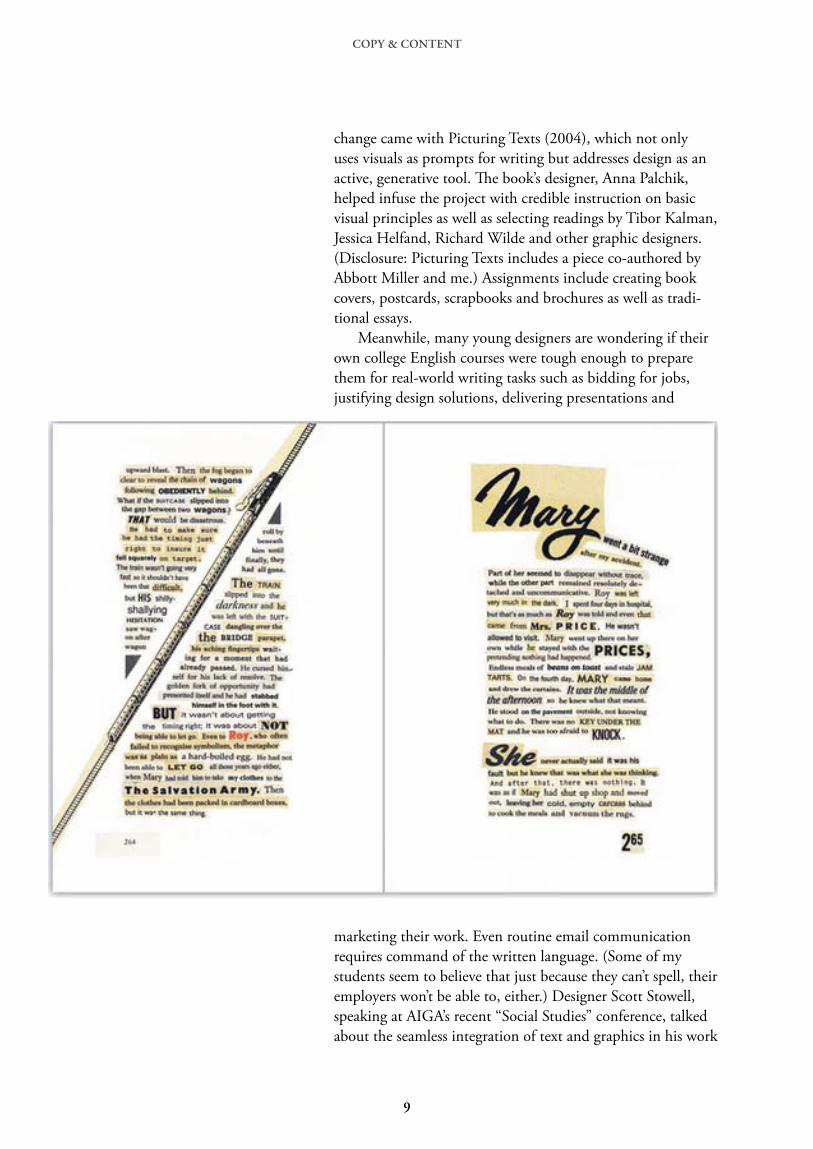
change came with Picturing Texts (2004), which not only uses visuals as prompts for writing but addresses design as an active, generative tool. The book’s designer, Anna Palchik, helped infuse the project with credible instruction on basic visual principles as well as selecting readings by Tibor Kalman, Jessica Helfand, Richard Wilde and other graphic designers. (Disclosure: Picturing Texts includes a piece co-authored by Abbott Miller and me.) Assignments include creating book covers, postcards, scrapbooks and brochures as well as tradi-tional essays. Meanwhile, many young designers are wondering if their own college English courses were tough enough to prepare them for real-world writing tasks such as bidding for jobs, justifying design solutions, delivering presentations and
marketing their work. Even routine email communication requires command of the written language. (Some of my students seem to believe that just because they can’t spell, their employers won’t be able to, either.) Designer Scott Stowell, speaking at AIGA’s recent “Social Studies” conference, talked about the seamless integration of text and graphics in his work
9
COPY & CONTENT
Liz Losh is an English teacher. But put aside your image of a frumpy schoolmarm with faded gravy stains on her blazer. This hip, forty-something ex-punk rocker teaches at the University of California Irvine, where she oversees an intro-ductory writing course that enrolls over 1,100 students. She also teaches advanced seminars on digital rhetoric, where projects include editing a blog, producing a YouTube video and crafting a virtual persona on Second Life. Likewise, Cheryl E. Ball, assistant professor of new media at Illinois State University, teaches “multimodal” writing courses, in which students assemble images and texts using video, photography, web design and page layout. Ball says, “We are looking at the idea of ‘composition’ in the broadest sense, going way beyond the old model of grammar-based freshman comp courses.” A spate of new writing textbooks suggests that a visual revolution is underway in college writing curricula. The sleek, sophisticated Seeing & Writing series, designed by 2x4 and launched in 1999, shook up the field of English composition by inviting students to analyze visual artifacts, from works of photojournalism to contemporary art installations. A bigger change came with Picturing Texts (2004), which not only uses visuals as prompts for writing but addresses design as an active, generative tool. The book’s designer, Anna Palchik, helped infuse the project with credible instruction on basic visual principles as well as selecting readings by Tibor Kalman, Jessica Helfand, Richard Wilde and other graphic designers. Assignments include creating book covers, post-cards, scrapbooks and brochures as well as traditional essays. Meanwhile, many young designers are wondering if their own college English courses were tough enough to prepare them for real-world writing tasks such as bidding for jobs, justifying design solutions, delivering presentations and marketing their work. Even routine email communication requires command of the written language. Designer Scott Stowell, speaking at AIGA’s recent “Social Studies” confer-ence, talked about the seamless integration of text and graph-ics in his work for GOOD magazine and other clients. “I can’t imagine being a designer who can’t write,” said Stowell. And it’s not just about business. The glorious, sloppy, over-populated blogosphere beckons everyone to participate, but you can only play if you have something to say and you know how to say it. How are graphic designers learning to write? Since the late 1970s, a movement known as Writing Across the Curriculum (WAC) has argued that writing should be taught
10
COPY & CONTENT
in every course on campus, not just in specialized composition courses. Because each discipline—from art to engineering—has its own standards and conventions, faculty in each field should be teaching its own practitioners how to write. Yet few design educators have the time or confidence to load this duty on to their studio courses. Some are giving it a try. Andrea Marks has authored a new e-book on writing for visual thinkers, which emphasizes brainstorming techniques rather than grammar and composi-tion. As for me, I’m teaching a stand-alone writing course for graphic design MFA students at MICA this spring. I won’t be using any of the sexy new composition textbooks, however.
Instead, I’m focusing on basic style, starting with how to craft a seaworthy sentence and how to pare down over-upholstered prose. Our textbook? Strunk and White’s classic Elements of Style (Maira Kalman’s illustrated edition, of course). Even Liz Losh agrees that most young writers still need to work on the basics, especially on college campuses like hers, where over half the students speak a home language other than English. As foot soldiers in the visual revolution, students have more to learn, and faculty have more to teach. Introducing the principles of web design and typography shouldn’t replace teaching writing as a precise, rule-based medium of communication. In the digital age, people are writing more, not less. The alphabet isn’t dead; it just has a lot more company.
11
COPY & CONTENT

COPY & CONTENT
A talk with Alice Twemlow, co-founder of the MFA Design Criticism program at the School of Visual Arts.
You don’t go to art school to learn to write, right? Wrong. These days, art departments are as interested in writing as any liberal-arts institution. Certainly, designers must communicate to an audience, and most audiences receive messages through words and pictures—or type and image. So it should come as no surprise that design departments in art schools are ramping up on verbal and written literacy. The School of Visual Arts in New York is one such institution. That’s where I co-chair the MFA Designer as Author and Entrepreneur program, but also where four years ago I co-founded the MFA Design Criticism (also known as D-Crit) program, devoted to teaching writing, research and critical thinking to help students develop their respec-tive voices. The program chair and other co-founder, Alice Twemlow, is a Ph.D candidate at the Royal College of Art and Design, London, researching the history of design criti-cism. She believes that writing design criticism has broad im-plications for a 24-hour information cycle culture. I recently spent time talking with her about the benefits that come from learning to write critically about design.Decades ago, few people wrote critically about food outside of restaurant reviewers and cookbook authors. Now there are dozens of food memoirs and analyses. Do you see design writing moving in that direction?
“HOW DOES A WRITER LIKE ALICE MUNRO CAPTIVATE THE READER IN SUCH A SHORT SPAN OF PAGES? THE SAME TECHNIQUES OF ENGAGEMENT APPLY TO NON-FICTION.”
The more people cotton to how interesting design is and the extent to which it affects their lives, the more they will write about it. That’s exciting. And while I’m all for gen-erating new design fans and new design writers, it can be wince-inducing to read some of the unsophisticated, “Hey, isn’t design cool?” responses to design on blogs (probably the closest things we have to actual design memoirs thus far). I advocate for more and better writing by experts in the field, which may include D-Crit graduates, that is both richly researched and speaks in a personal and engaging voice. This is what we should be blazing the trail with.
5
Writing is Design TooSteven Heller
I’m delighted to have been asked to be foreman of D&AD’s Writing for Design jury this year. On 16 April, I’ll be getting together with friends and fellow copywriters Nick Asbury, Lisa Desforges and Fiona Thompson, as well as John Weich of Lemon Scented Tea and Interbrand Sydney’s Christopher Doyle, to look over likely contenders.
It struck me that I should get my thoughts together and set down a marker ahead of the judging. Not only what I’ll be looking for on the day, but what I believe it takes to be suc-cessful in the writing for design world. So I’ve put together a 12-point ‘manifesto’ based on my personal observations and experience. Some points are pretty obvious, others maybe less so, but I hope they add fuel to the debate around this particu-lar form of writing. Feel free to agree or disagree.
A writer’s half dozen Jim Davies’ 6-point manifesto on writing for design
1— REMEMBER, ALL DESIGNERS ARE DIFFERENTThere are some designers out there who really can write. There are others who appreciate good writing when they see it. And then there are those who can’t and don’t. The level of dyslexia among designers is astonishingly high — that’s prob-ably why they’re designers and not writers. So the way your writing is perceived and received depends on not only how good it is, but who you’re dealing with. Maybe your words will transport the reader with unfettered delight, but on the other hand, be prepared to explain yourself or fight your corner. Just bear in mind that different designers (and clients) have different expectations and perspectives.
2— KNOW YOUR PLACEA lot of writers moan about words not being given the respect they deserve. But they are missing the point. Good words deserve respect, bad words don’t. Besides, you can’t expect to be the star of the show in every performance — different design projects involve major or minor roles for the writer. You need to establish the part you’re expected to play from the outset. If you’re Hamlet, grab the opportunity with both hands. But if you’re Rozencrantz, make sure it’s a Rozencrantz to remember. And certainly, don’t let Guildenstern get a look.
3— SEE YOUR WORDSIf a woman in a boilersuit and a man in a tutu utter exactly the same words, the effect is completely different. So before
COPY & CONTENT
12
A Manifesto On Writing for DesignDavid Airey

13
you start writing, it’s important to visualise what your words will look like when the reader sees them. How will the text and images relate to each other? What typeface will they be set in? What’s the format and medium? Too often, words and visuals inhabit the same world but look in totally different directions. Whereas they should be embracing like childhood friends.
4— BE YOURSELF…Of course you should be able to modify your tone and adopt different voices. One of the joys of writing for differ-ent brands is slipping into a variety of personas and being someone else for the day. But it’s also worth remembering that you’ve been asked to contribute for a reason — because the client wants a piece of you. Something about your per-sonality or writing style has made an impression, otherwise they’d have asked someone else to do the job. Be a chame-leon, by all means, but don’t be invisible.
5— …BUT DON’T TAKE IT PERSONALLYNo matter who you are, your drafts will be rejected and your best lines will be cut. You’ll be asked to write the same sen-tence over and over before the client decides he likes the first one best after all. Days will be long, repetitious and frustrat-ing. You’ll have occasion to feel ignored, bullied and belittled. But most of the time, this will have absolutely nothing to do with you or the quality of your work. So you just need to keep smiling and do what you do until the sun comes out again.
6— KEEP A LID ON ITToo many punch lines can leave the reader punch drunk. Just like a good joke, writing for design is all about rhythm and timing, keeping it natural, not trying too hard. No one likes a show off, so try to curb your instinctive lexical dexter-ity. Of course, the odd clever analogy or deft turn of phrase doesn’t go amiss, but context is all. Think of a Paul Smith suit — impeccably tailored, but with a perfectly judged twist. Be disciplined, but know the precise moment to let go.
COPY & CONTENT

UNDERSTANDING DESIGN
UNDERSTANDING DESIGN
FUCK CONTENTMichael Rock
15
UNDERSTANDING DESIGN
16

UNDERSTANDING DESIGN
17

The Persistence of PostersMichael Rock
UNDERSTANDING DESIGN
18

UNDERSTANDING DESIGN
19
A chance meeting with an acquisitions editor at the 2005 AIGA Design Conference, in Boston, propelled me into my first book publishing experience. Since 2000, my colleagues and I at Oregon State University have emphasized writing in our graphic design curricula, and I wanted to apply some of these ideas to a book—not to reiterate traditional skills and methodologies of basic writing courses, but to approach writing from a different perspective: a visual one. My infor-mal “pitch” for a book on the subject of writing and design came back with an enthusiastic reply from the publisher. “Yes, we are very interested—but we want it to be an e-book.” Wait, did you say an e-book? When I saw that word staring back from the screen, I felt my elation quickly fade. In my mind, I had just been handed the publishing world’s consola-tion prize. As excited as I am about new technology and all it has to offer, I had a hard time mustering enthusiasm for an electronic book. Perhaps my reticence had to do with the clunky e-books I had seen to date, some nothing more than a scanned print book, with little or no interactivity. And call me old fashioned, but I really love the sensation of flipping through the pages of a printed book. An afternoon spent at Powell’s Books (a great independent bookstore in Portland) is one of my favorite pastimes. “Flipping” through an e-book equated to tapping arrow keys on the computer. My first reaction was disappointment, but then I started to rethink the possibilities. What else could the “e” in e-book stand for besides electronic?
• An expandable book–with the addition of links and other media.• An educational book–encouraging learning through interactivity.• An economical book–costing nothing to print and publish.• An environmental book–no paper, no waste.• An ear-friendly book–one that could be heard by the vision im paired, thanks to Read Out Loud software capabilities.• An exciting book–not only fun to create, but enjoyable to read.
And the more I thought about engaging the 18-24 target audience I was writing for, the clearer it became that an e-book was the perfect medium to talk about writing. The result is Writing for Visual Thinkers: A Guide for Artists and Designers, exploring the potential of writing as a way to better understand the process of visual communication. Since there are already excellent books that focus on traditional writing and grammar conventions, I used the format to begin a dialogue, in particular with undergraduate art and design students.
Ventures In E-Book PublishingAndrea Marks
UNDERSTANDING DESIGN
20

What does it mean to call a graphic designer an author?
Authorship, in one form or another, has been a popular term in graphic design circles, especially those at the edge of the profession, the design academies and the murky territories that exist between design and art. The word authorship has a ring of importance: it connotes seductive ideas of origina-tion and agency. But the question of how designers become authors is a difficult one, and exactly who the designer/authors are and what authored design looks like depends en-tirely on how you define the term and the criteria you choose to grant entrance into the pantheon. Authorship may suggest new approaches to understand-ing design process in a profession traditionally associated more with the communication than the origination of mes-sages. But theories of authorship may also serve as legitimiz-ing strategies, and authorial aspirations may actually end up reinforcing certain conservative notions of design production and subjectivity — ideas that run counter to recent critical attempts to overthrow the perception of design based on indi-vidual brilliance. The implications deserve careful evaluation. What does it really mean to call for a graphic designer to be an author?
What is an author?
That question has been an area of intense scrutiny over the last forty years. The meaning of the word itself has shifted significantly over time. The earliest definitions are not associated with writing; in fact the most inclusive is a “person who originates or gives clearly index authoritarian — even patriarchal — connotations: “father of all life,” “any inventor, constructor or founder,” “one who begets,” and a “director, commander, or ruler.” All literary theory, from Aristotle on, has in some form or another been theory of authorship. Since this is not a history of the author but a consideration of the author as metaphor, I’ll start with recent history. Wimsatt and Beardsley’s, seminal text, “The Intentional Fallacy” (1946), drove an early wedge between the author and the text, dispelling the notion that a reader could ever really know an author through his writing. The so-called death of the author, proposed most succinctly by Roland Barthes in 1968 in an essay of that title, is closely
Designer As AuthorMichael Rock
UNDERSTANDING DESIGN

linked to the birth of critical theory, especially theory based in reader response and interpretation rather than intentional-ity. Michel Foucault used the rhetorical question “What is an author?” as the title of his influential essay of 1969 which, in response to Barthes, outlines the basic taxonomy and func-tions of the author and the problems associated with conven-tional ideas of authorship and origination. Foucauldian theory holds that the connection between author and text has transformed and that there exist a number of author-functions that shape the way readers approach a text. These stubbornly persistent functions are historically determined and culturally specific categories. Foucault posits that the earliest sacred texts were au-thorless, their origins lost in ancient history (the Vedas, the Gospels, etc.). The very anonymity of the text served as a certain kind of authentication. The author’s name was sym-bolic, rarely attributable to an individual. (The Gospel of Luke, for instance, is a diversity of texts gathered under the rubric of Luke, someone who may indeed have lived and written parts, but not the totality, of what we now think of as the complete work.) Scientific texts, at least through the Renaissance, demand-ed an author’s name as validation. Far from objective truth, science was based in subjective invention and the authority of the scientist. This changed with the rise of the scientific method. Scientific discoveries and mathematical proofs were no longer in need of authors because they were perceived as discovered truths rather than authored ideas. The scientist revealed extant phenomena, facts anyone faced with the same conditions would discover. The scientist and the mathemati-cian could claim to have been first to discover a paradigm, and lend their name to the phenomenon, but could never claim authorship over it. (The astronomer who discovers a new star may name it but does not conjure it.) Facts were universal and thus eternally preexisiting. By the 18th century, Foucault suggests, the situation had reversed: literature was authored and science became the product of anonymous objectivity. When authors came to be punished for their writing — i.e. when a text could be transgressive — the link between author and text was firmly established. The codification of ownership over a text is often dated to the adoption of the Statute of Anne (1709) by the British Parliament, generally considered the first real copyright act. The first line of the law is revealing: “Whereas Printers, Booksellers, and other Persons, have of late frequently taken
UNDERSTANDING DESIGN
21
the Liberty of Printing... Books, and other Writings, without the Consent of the Authors... to their very great Detriment, and too often to the Ruin of them and their Families...” The statute secures the right to benefit financially from a work and for the author to preserve its textual integrity. That authorial right was deemed irrevocable. Text came to be seen as a form of private property. A romantic criticism arose that reinforced that relationship, searching for critical keys in the life and intention of the writer. By laying a legal ground for ownership, the Statute of Anne defines who is, and isn’t, an author. It was a thoroughly modern problem. No one had owned the sacred texts. The very fact that the origins of sacred texts were lost in history, their authors either composites or anonymous, gave them their authority. The gospels in their purest form were public domain. Any work to be done, and any arguments to have, were interpretive. The authors referred to in the Statute were living, breathing — and apparently highly litigious — beings. The law granted them authority over the meaning and use of their own words.
Ownership of the text, and the authority granted to authors at the expense of the creative reader, fueled much of the 20th century’s obsession with authorship. Post-structuralist reading of authorship tends to critique the prestige attributed to the figure of the author and to suggest or speculate about a time after his fall from grace. Postmodernity turns on what Fredric Jameson identi-fied as a “fragmented and schizophrenic decentering and dispersion” of the subject. Decentered text — a text that is skewed from the direct line of communication from sender
UNDERSTANDING DESIGN
22
to receiver, severed from the authority of its origin, a free — floating element in a field of possible significations — figures heavily in constructions of a design based in reading and readers. But Katherine McCoy’s prescient image of designers moving beyond problem solving and by “authoring additional content and a self-conscious critique of the message, adopt-ing roles associated with art and literature,” is often miscon-strued. Rather than working to incorporate theory into their methods of production, many selfproclaimed deconstructivist designers literally illustrated Barthes’ image of a reader-based text — a “tissue of quotations drawn from innumerable centers of culture” — by scattering fragments of quotations across the surface of their “authored” posters and book covers. (This technique went something like: “Theory is complicated, so my design is complicated.”) The rather dark implications of Barthes’ theory, note Ellen Lupton and J. Abbott Miller, were refashioned into a “romantic theory of self-expression.” After years in the somewhat thankless position of the faceless facilitator, many designers were ready to speak out. Some designers may be eager to discard the internal affairs of formalism — to borrow Paul de Man’s metaphor — and branch out to the foreign affairs of external politics and content. By the ‘70s, design began to discard some of the sci-entistic approach that held sway for several decades. (As early as the ‘20s, Trotsky was labeling formalist artists the “chemists of art.”) That approach was evident in the design ideology that preached strict adherence to an eternal grid and a kind of rational approach to design. (Keep in mind that although this example is a staple of critiques of modernism, in actuality the objectivists represented a small fragment of the design popu-lation at the time.) Müller-Brockmann’s evocation of the “aesthetic quality of mathematical thinking” is certainly the clearest and most cited example of this approach. Müller-Brockmann and a slew of fellow researchers like Kepes, Dondis and Arnheim worked to uncover preexisting order and form in the manner a scientist reveals a natural “truth.” But what is most peculiar and revealing in Müller-Brockmann’s writing is his reliance on tropes of submission: the designer submits to the will of the system, forgoes personality and withholds interpretation. In his introduction to Compendium for Literates, which attempts a highly formal dissection of writing, Karl Gerstner claims about the organization of his book that “all the com-ponents are atomic, i.e. in principle they are irreducible. In other words, they establish a principle.” The reaction to that drive for an irreducible theory of
UNDERSTANDING DESIGN
23

design is well documented. On the surface at least, contem-porary designers were moving from authorless, scientific text — in which inviolable visual principles were carefully revealed through extensive visual research — toward a more textual position in which the designer could claim some level of own-ership over the message. (This at the time literary theory was trying to move away from that very position.) But some of the basic, institutional features of design practice have a way of getting tangled up in zealous attempts at self-expression. The idea of a decentered message does not necessarily sit well in a professional relationship in which the client is paying a designer to convey specific information or emotions. In addition, most design is done in some kind of collaborative setting, either within a client relationship or in the context of a design studio that utilizes the talents of nu-merous creative people. Thus the origin of any particular idea is clouded. And the ever-present pressure of technology and electronic com-munication only further muddies the water.
Is there an auteur in the house?
It is not surprising to find that Barthes’ essay, “Death of the Author,” was written in Paris in 1968, the year students joined workers on the barricades in the general strikes and the year the Western world flirted with social revolution. To call for the overthrow of authority — in the form of the author — in favor of the reader — read: the masses — had real resonance in 1968. But to lose power you must have already worn the mantle, and so designers had a bit of a dilemma overthrowing a power they may never have possessed. On the other hand, the figure of the author implies a total control over creative activity and seemed an essential
UNDERSTANDING DESIGN
24
ingredient of high art. If the relative level of genius was the ultimate measure of artistic achievement, activities that lacked a clear central authority figure were necessarily devalued. The development of film theory in the 1950s serves as an interest-ing example. Almost ten years before Barthes made his famous proc-lamation, film critic and budding director François Truffaut proposed “La politique des auteurs,” a polemical strategy to reconfigure a critical theory of the cinema. The problem facing the auteur theorists was how to create a theory that imagined the film, necessarily a work of broad collabora-tion, as a work of a single artist and thus a singular work of art. The solution was to develop a set of criteria that allowed a critic to decree certain directors auteurs. In order to estab-lish the film as a work of art, auteur theory required that the director — heretofore merely a third of the creative troika of director, writer and cinematographer — had the ultimate control of the entire project. Auteur theory — especially as espoused by American critic Andrew Sarris — held that directors must meet three essential criteria in order to pass into the sacred hall of the auteur. Sarris proposed that the director must demonstrate technical expertise, have a stylistic signature that is demon-strated over the course of several films and, most important, through choice of projects and cinematic treatment, dem-onstrate a consistent vision and evoke a palpable interior meaning through his work. Since the film director often had little control over the choice of the material — especially in the Hollywood studio system that assigned directors to proj-ects — the signature way he treated a varying range of scripts and subjects was especially important in establishing a direc-tor’s auteur credentials. As Roger Ebert summed up the idea: “A film is not what it is about, it’s how it is about it.” The interesting thing about the auteur theory was that, unlike literary critics, film theorists, like designers, had to construct the notion of the author. It was a legitimizing strat-egy, a method to raise what was considered low entertainment to the plateau of fine art. By crowning the director the author of the film, critics could elevate certain subjects to the status of high art. That elevation, in turn, would grant the director new freedoms in future projects. (Tantrums could be thrown in the name of artistic vision. “I’m an artist, dammit, not a butcher!” Expensive wines could be figured into overhead to satisfy rarefied palates.) The parallel to design practice is useful. Like the film di-rector, the art director or designer is often assigned his or her
UNDERSTANDING DESIGN
25

material and often works collaboratively in a role directing the activity of a number of other creative people. In addition, the designer works on a number of diverse projects over the course of a career, many of which have widely varying levels of creative potential; any inner meaning must come through the aesthetic treatment as much as from the content. If we apply the auteur criteria to graphic designers we find a body of work that may be elevated to auteur status. Technical proficiency could be fulfilled by any number of practitioners, but couple technical proficiency with a sig-nature style and the field narrows. The list of names that meet those two criteria would be familiar, as that work is often published, awarded and praised. (And, of course, that selec-tive republishing of certain work to the exclusion of other work constructs a unified and sty-listically consis-tent oeuvre.) But great technique and style alone do not an auteur make. If we add the third require-ment of interior meaning, how does that list fare? Are there graphic designers who, by special treatment and choice of projects, approach the realm of deeper meaning the way a Bergman, Hitchcock or Welles does? In these cases the graphic auteur must both seek projects that fit his or her vision and then tackle a project from a spe-cific, recognizable critical perspective. For example, Jan van Toorn might be expected to approach a brief for a corporate annual report from a critical socioeconomic position. But how do you compare a film poster with the film itself? The very scale of a cinematic project allows for a sweep of vision not possible in graphic design. Therefore, as the design of a single project lacks weight, graphic auteurs, almost by definition, have long, established bodies of work in which
UNDERSTANDING DESIGN
26
discernable patterns emerge. The auteur uses very specific client vehicles to attain a consistency of meaning. (Renoir observed that a director spends his whole career making varia-tions on the same film.) Think of the almost fetishistic way a photographer like Helmut Newton returns to a particular vision of class and sexuality — no matter what he is assigned to shoot. Conversely, many great stylists don’t seem to make the cut, as it is difficult to discern a larger message in their work — a message that transcends stylistic elegance. (You have to ask yourself, “What’s the work about?”) Perhaps it’s an absence or presence of an overriding philosophy or individual spirit that diminishes some designed works and elevates others. We may have been applying a modified graphic auteur theory for years without really paying attention. What has design history been, if not a series of critical elevations and demotions as our attitudes about style and inner meaning evolve? In trying to describe interior meaning, Sarris finally resorts to the “intangible difference between one personal-ity and another.” That retreat to intangibility — “I can’t say what it is but I know it when I see it” — is the Achilles heel of the auteur theory, which has long since fallen into disfavor in film — criticism circles. It never dealt adequately with the collaborative nature of the cinema and the messy problems of movie-making. But while the theory is passé, its effect is still with us: to this day, when we think of film structure, the director is squarely in the middle. The application of auteur theory may be too limited an engine for our current image of design authorship but there are a variety of other ways to frame the issue, a number of paradigms on which we could base our practice: the artist book, concrete poetry, political activism, publishing, illustra-tion. The general authorship rhetoric seems to include any work by a designer that is self-motivated, from artist books to political activism. But artist books easily fall within the realm and descriptive power of art criticism. Activist work may be neatly explicated using allusions to propaganda, graphic design, public relations and advertising. Perhaps the graphic author is actually one who writes and publishes material about design. This category would include Josef Müller-Brockmann and Rudy VanderLans, Paul Rand and Eric Spiekermann, William Morris and Neville Brody, Robin Kinross and Ellen Lupton — rather strange bedfel-lows. The entrepreneurial arm of authorship affords the pos-
UNDERSTANDING DESIGN
27
sibility of personal voice and wide distribution. The challenge is that most in this category split the activities into three recognizable and discrete actions: editing, writing and de-signing. Design remains the vehicle for their written thought even when they are acting as their own clients. (Kinross, for example, works as a historian and then changes hats and becomes a typographer.) Rudy VanderLans is perhaps the purest of the entrepreneurial authors. Emigre is a project in which the content is the form — i.e. the formal exploration is as much the content of the magazine as the articles. The three actions blur into one contiguous whole. VanderLans expresses his message through the selection of material (as an editor), the content of the writing (as a writer), and the form of the pages and typography (as a form-giver). Ellen Lupton and her partner J. Abbott Miller are an interesting variation on this model. “The Bathroom, the Kitchen and the Aesthetics of Waste,” an exhibition at MIT and a book, seems to approach a kind of graphic authorship. The message is explicated equally through graphic/visual devices as well as text panels and descriptions. The design of the exhibition and the book evoke design issues that are also the content:it is clearly self-reflexive. Lupton and Miller’s work is primarily critical. It forms and represents a reading of exterior social or historical phe-nomena and explicates that message for a specific audience. But there is a subset of work often overlooked by the design community, the illustrated book, that is almost entirely concerned with the generation of creative narrative. Books for children have been one of the most successful venues for the author/artist, and bookshops are packed with the fruits of their labors. Many illustrators have used the book in wholly inventive ways and produced serious work. Illustrator/authors include Sue Coe, Art Spiegelman, Charles Burns, David Macaulay, Chris Van Allsburg, Edward Gorey, Maurice Sendak, and many others. In addition, the comic book and the graphic novel have generated a renewed interest both in artistic and critical circles. Spiegelman’s Maus and Coe’s X and Porkopolis suggest expanded possibilities.
Power Ploys
If the ways a designer can be an author are myriad, complex and often confusing, the way designers have used the term and the value attributed to it are equally so. Any number of recent statements claim authorship as the panacea to the woes of the browbeaten designer. In an article in Emigre,
UNDERSTANDING DESIGN
28

author Anne Burdick proposed that “designers must consider themselves authors, not facilitators. This shift in perspective implies responsibility, voice, action... With voice comes a more personal connection and opportunity to explore indi-vidual options.” A recent call-for-entries for a design exhibi-tion titled “Designer as Author: Voices and Visions” sought to identify “graphic designers who are engaged in work that transcends the traditional service-oriented commercial pro-duction, and who pursue projects that are personal, social or investigative in nature.” In the rejection of the role of the fa-cilitator and in the call for transcendence lies the implication that authored design holds some higher, purer purpose. The amplification of the personal voice compels designers to take possession of their texts and legitimizes design as an equal of the more traditionally privileged forms of authorship. But if, as a chorus of contem-porary theorists have convinced us, the proclivity of the contem-porary designer is toward open reading and free textual interpreta-tion, that desire is thwarted by oppositional theories of authorship. The cult of the author narrows interpretation and places the author at the center of the work. Foucault noted that the figure of the author is not a particularly liberating one. By transferring the authority of the text back to the author, by focusing on voice, presence becomes a limiting factor, containing and categoriz-ing the work. The author as origin and ultimate owner of the text guards against the free will of the reader. The figure of the author reconfirms the traditional idea of the genius creator, and the esteem or status of the man frames the work and imbues it with some mythical value. While some claims for authorship may be as simple as a renewed sense of responsibility, at times they seem to be ploys
UNDERSTANDING DESIGN
29
for property rights, attempts to finally exercise some kind of agency where traditionally there has been none. The author = authority. The longing for graphic authorship may be the longing for a kind of legitimacy, or a kind of power that has so long eluded the obedient designer. But do we get any-where by celebrating the designer as some central character? Isn’t that what fueled the last fifty years of design history? If we really want to move beyond the designer-ashero model of history, we may have to imagine a time when we can ask, “What difference does it make who designed it?” Perhaps, in the end, authorship is not a very convincing metaphor for the activity we understand as design. There are a few examples of work that is clearly the product of design authors and not designer/authors, and these tend to be excep-tions to the rule. Rather than glorify the act and sanctify the practice, I propose three alternative models for design that attempt to describe the activity as it exists and as it could evolve: designer as translator, designer as performer, and designer as director.
Designer As Translator
This is based on the assumption that the act of design is, in essence, the clarification of material or the remodeling of content from one form to another. The ultimate goal is the expression of a given content rendered in a form that reaches a new audience. I am drawn to this metaphor by Ezra Pound’s translations of Chinese character poetry. Pound translated not only the meaning of the characters but the visual component of the poem as well. Thus the original is rendered as a raw material reshaped into the conventions of Western poetry. The translation becomes a second art. Translation is neither scientific nor ahistorical. Every translation reflects both the character of the original and the spirit of the contemporary as well as the individuality of the translator: An 1850s transla-tion of the Odyssey will be radically different from a 1950s translation. In certain works, the designer remolds the raw material of given content, rendering it legible to a new audience. Like the poetic translator, the designer transforms not only the literal meaning of the elements but the spirit, too. For example, Bruce Mau’s design of a book version of Chris Marker’s 1962 film, “La Jetée,” attempts to translate the original material from one form to another. Mau is certainly not the author of the work but the translator of form and spirit. The designer is the intermediary.
UNDERSTANDING DESIGN
30

Designer As Performer
The performer metaphor is based on theater and music. The actor is not the author of the script, the musician is not the composer of the score, but without actor or musician, the art cannot be realized. The actor is the physical expression of the work; every work has an infinite number of physical expres-sions. Every performance re-contextualizes the original work. (Imagine the range of interpretations of Shakespeare’s plays.) Each performer brings a certain reading to the work. No two actors play the same role in the same way
In this model, the designer transforms and expresses content through graphic devices. The score or script is enhanced and made whole by the performance. And so the designer like-wise becomes the physical manifestation of the content, not author but performer, the one who gives life to, who speaks the content, contextualizing it and bringing it into the frame of the present. Examples abound, from early Dada, Situationist, and Fluxus experiments to more recent typographic scores like Warren Lehrer’s performance typography or experimental typography from Edward Fella or David Carson. The most notable example is perhaps Quentin Fiore’s performance of McLuhan. It was Fiore’s graphic treatment as much as McLuhan’s words that made The Medium is the Massage a worldwide phenomena. (Other examples include any number of “graphic interpretations,” such as Allen Hori’s reinvention of Beatrice Warde’s Crystal Goblet essay, or P. Scott Makela’s improvisation on Tucker Viemeister’s lecture, both originally printed in Michael Bierut’s Rethinking Design.)
Designer As Director
This model is a function of bigness. Meaning is manufactured by the arrangement of elements, so there must be many ele-ments at play. Only in large-scale installations, advertising campaigns, mass-distribution magazines and very large books do we see evidence of this paradigm. In such large projects, the designer orchestrates masses of materials to shape meaning, working like a film director, overseeing a script, a series of performances, photographers, artists, and production crews. The meaning of the work results from the entire production. Large-scale, mass-distribu-tion campaigns like those for Nike or Coca-Cola are examples of this approach. Curatorial projects such as Sean Perkins’
UNDERSTANDING DESIGN
31
UNDERSTANDING DESIGN
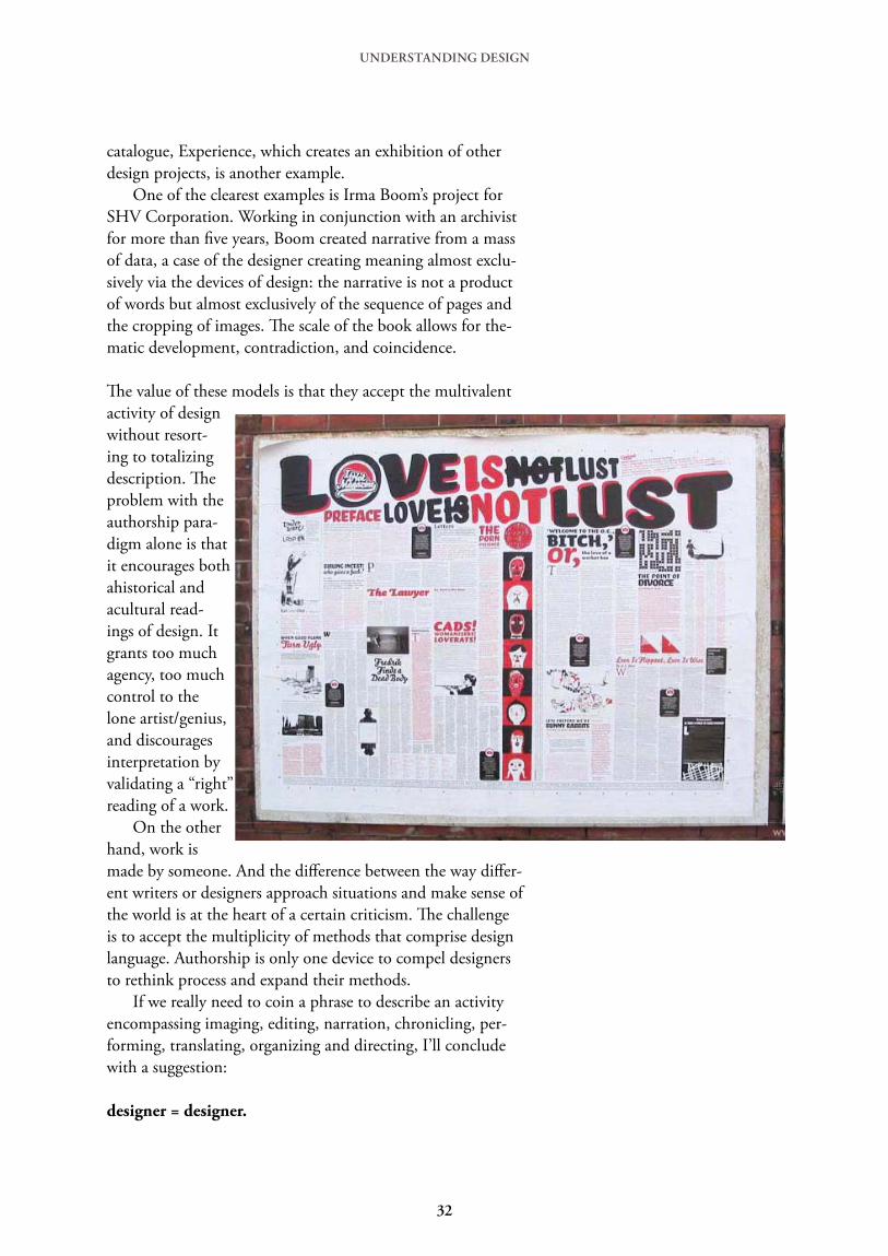
catalogue, Experience, which creates an exhibition of other design projects, is another example. One of the clearest examples is Irma Boom’s project for SHV Corporation. Working in conjunction with an archivist for more than five years, Boom created narrative from a mass of data, a case of the designer creating meaning almost exclu-sively via the devices of design: the narrative is not a product of words but almost exclusively of the sequence of pages and the cropping of images. The scale of the book allows for the-matic development, contradiction, and coincidence.
The value of these models is that they accept the multivalent activity of design without resort-ing to totalizing description. The problem with the authorship para-digm alone is that it encourages both ahistorical and acultural read-ings of design. It grants too much agency, too much control to the lone artist/genius, and discourages interpretation by validating a “right” reading of a work. On the other hand, work is made by someone. And the difference between the way differ-ent writers or designers approach situations and make sense of the world is at the heart of a certain criticism. The challenge is to accept the multiplicity of methods that comprise design language. Authorship is only one device to compel designers to rethink process and expand their methods. If we really need to coin a phrase to describe an activity encompassing imaging, editing, narration, chronicling, per-forming, translating, organizing and directing, I’ll conclude with a suggestion:
designer = designer.
32

UNDERSTANDING DESIGN
An examination from 1996 of the history and concept of the designer as author, starting in the first decades of the 20th century.
What does it mean to call for a graphic designer to be an author? Authorship, in one form or another has been a popular term in graphic design circles, especially those circles that revolve around the edge of the profession, the design academies, and the murky territory that exists between design and art. The word has an important ring to it, and it connotes seductive ideas of origination and agency. But the question of how designers become authors is a difficult one and exactly who are the designer/authors and what authored design looks like depends entirely on how you end up defining the term and criterion you chose to determine entrance into the pantheon. In order to subject the problem of design authorship to close examination, it is necessary to first dispense with some definitions before moving on to more specific design examples and suggestions for possible theories of graphic authorship. It may also be useful to reexamine the preconceived qualities we attribute to this powerful figure, the author, and wonder how those attributes apply to a profession traditionally associated more with the communication than the origination of messages. Finally it is interesting to speculate about how theories of authorship can serve to legitimize mar-ginalized activities like design and how authorial aspirations may actually end up reinforcing certain conservative notions of design production; notions that might actually contradict the stated goals of the budding designer/author. What is an author? The issue of the author has been an area of intense scrutiny over the last forty years. The meaning of the word itself has shifted significantly over history. The earliest definitions are not associated with writing per se, in fact the most inclusive is ‘the person who originates or gives existence to anything.’ But other usage clearly index the authoritarian — even patriarchal — conno-tations: the ‘father of all life,’ ‘any inventor, constructor or founder,’ ‘one who begets,’ and ‘a director, commander, or ruler.’ Wimsatt and Beardsley’s seminal text, The Intentional Fallacy (1946), drove one of the first wedges between the author and the text, dispelling the notion a reader could ever really ‘know’ an author through his writing. The so-called death of the author, proposed most suc-cinctly by Roland Barthes in 19681, is closely linked to the birth of critical theory, especially theory based in reader response and interpretation rather than intentionality. Michel Foucault used the rhe-torical question, ‘What is an author?’ as the title of his influential essay of 1969 which, in response to Barthes, outlines the basic taxonomy and functions of the author and the problems associated with conventional ideas of authorship and origination.2 Foucault demonstrated that historically the connection between the author and the text has changed. The earliest sacred texts were authorless, their origins lost in ancient history. In fact, the ancient, anonymous origin of the text served as a certain kind of authentication. On the other hand scientific texts, at least through the renaissance, demanded an author’s name as validation. By the eighteenth century, Foucault asserts, the situation had reversed; literature was authored and science became the product of anonymous objectivity. When authors came to be punished for their writing — i.e. when a text could be transgressive — the link between author and text was firmly established. Text came to be seen as a kind of private property, owned by the author, and a romantic criticism rose up that reinforced that relationship, searching for critical keys in the life and intention of the writer. With the rise of scientific method, on the other hand, scientific texts and mathematical proofs were no longer authored texts but were seen as discovered truths. The scientist revealed an extant
Graphic Authorship Michael Rock
33

phenomena, a fact anyone faced with the same conditions would discover. Therefore the scientist and the mathematician could claim to have been first to discover a paradigm, and lend their name to the phenomena, but never claim authorship over it. Post-structuralist reading of authorship tends to critique the prestige attributed to the figure of the author and suggest or speculate about a time after his fall from grace. The focus shifts from the author’s intention to the internal workings of the writing itself; not what it means but how it means. Barthes ends his essay supposing ‘the birth of the reader comes at the cost of the death of the author.”3 Foucault imagines a time when we might question: ‘What difference does it make who is speaking?”4 All attempt to overthrow the notion that a text is a line of words that releases a single, theological meaning, the central message of an author/god. Postmodernity began to turn on a ‘fragmented and schizophrenic decentering and dispersion’ of the subject, noted Fredric Jameson. That sense of a decentered text - i.e. a text which is skewed from the direct line of communication from sender to receiver, severed from the authority of its origin, and existing as a free floating element in a field of possible significations - figured heavily in recent constructions of a design based in reading and readers. But Katherine McCoy’s prescient image of designers moving beyond problem solving and by ‘...authoring additional content and a self-con-scious critique of the message ...adopting roles associated with art and literature”5 was as often as not misconstrued. Rather than working to incorporate theory into their methods of production, many self-proclaimed deconstructivist designers literally illustrated Barthes’ image of a reader-based text - ‘a tissue of quotations drawn from innumerable centers of culture”6 - by scattering fragments of quota-tions across the surface of their ‘authored’ posters and book covers. The rather dark implications of Barthes theory, note Ellen Lupton and Abbott Miller, were fashioned into ‘...a romantic theory of self-expression.”7 Perhaps after years in the somewhat thankless position of the faceless facilitator many design-ers were ready to start speaking out. Some designers may be eager to discard the internal affairs of formalism - to borrow Paul de Man’s metaphor - and branch out to the foreign affairs of external politics and content.8 In that way, by the seventies, design began to discard the kind of some of the scientific approach that held sway for several decades. (Even as early as the twenties Trotsky was labeling formalist artists the ‘chemists of art.”9) That approach is evident in the rationalist design ideology that preached strict adherence to an eternal grid and a kind of rational approach to design. (Keep in mind that although this example is a staple of critiques of modernism, in actuality the rationalism represented a small fragment of the design population at the time.) Müller-Brockmann’s evocation of the ‘aesthetic quality of mathematical thinking”10 is certainly the clearest, and most cited example of this approach. Brockmann and a slew of fellow researchers like Kepes, Dondis, Arnheim, worked to uncover preexisting order and form in the manner a scientist reveals a natural ‘truth.’ But what is most interesting in Brockmann’s writing is his reliance on tropes of submission; the designer submits to the will of the system, forgoes personality, withholds interpretation. On the surface at least it would seem that contemporary designers were moving from authorless, scientific text - in which inviolable visual principals were carefully revealed through extensive visual research - toward a more textual position in which the designer could claim some level of ownership over the message. (This at the time that literary theory was trying to move away from that very posi-tion.) But some of the basic, institutional features of design practice have a way of getting tangled up in zealous attempts at self-expression. The idea of a decentered message does not necessarily sit well in a professional relationship in which the client is paying a designer to convey specific information or emotions. In addition, most design is done in some kind of collaborative setting, either within a client relationship or in the context of a design studio that utilizes the talents of numerous creative
UNDERSTANDING DESIGN
34

people, thus the origin of any particular idea is increasingly clouded. And the ever-present pressure of technology and electronic communication only further muddies the water. Is there an auteur in the house? It is not surprising to find that Barthes Death of the Author was written in Paris in 1968, the year students joined workers on the barricades in the general strikes and the year the western world flirted with real social revolution. To call for the overthrow of authority in the form of the author in favor of the reader - read that masses - had real resonance in 1968. But to lose power you must have already worn the mantle, thus designers had a bit of a dilemma overthrow-ing a power they may have never possessed. Almost ten earlier, Andre Bazin and his protégé François Truffaut had collaborated on La poli-tique des auteurs, a polemical strategy developed to re-configure a critical theory of the cinema.11 The problem facing the auteur critics was how to create a theory that imagined the film, necessarily the work of broad collaboration, as a work of a single artist, thus a work of art. The solution was to develop a set of criteria that allowed a critic to decree certain directors as auteurs. In order to estab-lish the film as a work of art, auteur theory held that the director — heretofore merely a third of the creative troika of director, writer and cinematographer - had the ultimate control of the entire project. Auteur theory - especially as espoused by American critic Andrew Sarris12 - speculated directors must meet three essential criteria in order to pass into the sacred hall of the auteur. Sarris proposed that the director must demonstrate technical expertise, have a stylistic signature that is demonstrated over the course of several films, and most importantly, through choice of projects and cinematic treatment, demonstrate a consistency of vision and evoke a palpable interior meaning through his work. Since the film director often had little control of the material - especially in the Hollywood Studio system that assigned director to projects - the signature way he treated a varying range of scripts and subjects was especially important in establishing auteur credentials. The interesting thing about the auteur theory was that unlike literature, film theorists, like de-signers, had to construct the notion of the author as a legitimizing strategy, as a method to raise what was considered low entertainment to the plateau of fine art. By labeling the director as the author of the film, the critics could elevate certain subjects to the status of high art. The parallel to design prac-tice is quite striking. Like the film director, the art director or designer is often distanced from his or her material and often works collaboratively in a role which directs the activity of a number of other creative people. In addition, the designer works on a number of diverse projects over the course of a career, many of which have widely varying levels of creative potential, and any inner meaning must come through the aesthetic treatment as much as it does from the content. If we apply the auteur criteria to graphic designers we yield a body of work that may be elevated to auteur status. For instance technical proficiency could be fulfilled by any number of practitioners, but couple technical proficiency with a signature style the field narrows. The list of names that could fill those two criteria would be familiar to any EYE reader, as that work is often published, awarded and praised. (And of course that selective republishing of certain work, and exclusion of other, constructs a unified and stylistically consistent oeuvre.) That list would probably include Fabien Baron, Tibor Kalman, David Carson, Neville Brody, Ed Fella, Anton Beeke, Pierre Bonnard, Gert Dumbar, Vaughan Oliver, Rick Valicenti, April Grieman, Jan van Toorn, Wolfgang Weingart, and many others. But great technique and style alone do not an auteur make. If we add the third require-ment of interior meaning, how does that list fare? Are there graphic designers who by special treat-ment and choice of projects approach the issue of deeper meaning the way a Bergman, Hitchcock or Welles does?
UNDERSTANDING DESIGN
35

Of course, how do you compare a film poster with the film itself? The very scale of a cinematic project allows for a sweep of vision not possible in graphic design. Therefore, as the design single project lacks weight, graphic auteurs, almost by definition, have long, established bodies of work in which discernible patterns emerge. Who are the graphic auteurs? Perhaps Pierre Bernard, Jan van Toorn, maybe, Oliver, Beecke, and Fella. There is a sense of getting at a bigger idea, a deeper quality to their work; a sense aided considerably in the case of Bernard and van Toorn by their political af-filiation, and in Oliver by long association with a record company that produces a consistent genre of music that allows for a range of experimentation. The auteur uses very specific client vehicles to attain a consistency of meaning. (Think of the almost fetishistic way that a photographer like Helmut Newton returns to a particular vision of class and sexuality no matter what he is assigned to shoot.) So Bernard, for instance, evokes an image of class struggle, capitalism brutality and social dysfunction; and Oliver examines dark issues of religion, decay and the human body. Renoir ob-served that an artistic director spends his whole career remaking variations on the same film. Conversely, great stylists like Carson and Baron don’t seem to make the cut as it is difficult to discern a larger message in their work, i.e. a message that transcends the stylistic elegance of the typography in Baron’s case or the clever use of the computer in Carson’s. (You have to ask yourself, ‘What’s their work about?”) Valicenti and Brody seem to try to inject inner meaning into their work - for example Valicenti’s self-published AIDS advertising and Brody’s attachment to post-linguistic alphabet systems - but their work seems to remain impervious to any such intrusion. Perhaps its an absence or presence of an overriding philosophy or individual spirit that diminishes some designed work and elevates other. We may have been applying a modified graphic auteur theory for many years without really paying attention. What has design history been if not a series of critical elevations and demotions as our attitudes about style and inner meaning evolve. In trying to describe interior meaning, Sarris finally resorts to ‘the intangible difference between one personality and another.”13 That retreat to intangibility - the ‘I can’t say what it is but I know it when I see it’ aspect - is the Achilles’ tendon of the auteur theory which has long since fallen into disfavor in film criticism circles. It never dealt adequately with the collaborative nature of the cinema and the messy problems of movie making. But while the theory is passé, the effect of theory is still with us; the director is to this day squarely in the middle our perception of film structure.
Here the author outlines other approaches to graphic authors.
The application of auteur theory may be too limited an engine for our current image of design au-thorship but there are a variety of other ways to frame the issue. There exists a number of paradigms on which we could base on practice; the artist book, concrete poetry, political activism, publishing, illustration, and others. Could a theory of poetics be a functional model? Use is one of the major sticking points in trying to view designed work as poetic; traditionally the poem or artwork is a self-contained artifact while design refers to some exterior function or overt intention. ‘Judging a poem is like judging a pudding or a machine...’ Wimsatt and Beardsley remarked, ‘...Poetry succeeds because all or most of what is said or implied is relevant; what is irrelevant has been excluded like lumps from pudding and ‘bugs’ from machinery. In this respect poetry differs from practical messages which are successful if an only if we correctly infer the intention.’ 14 That poetic/practical opposition proposes two examples; the artist book on one hand and activist design on the other. The artist book offers a form of design authorship in which function has been
UNDERSTANDING DESIGN
36
fully exorcised. The artist book, in general, is concrete, self-referential and allows for a range a visual experiments that include text and image without the burden of mundane commercial tasks. The artist book has a long tradition that through the historical avant garde, the situationists, Fluxus and experimental publishing in the sixties and seventies. The list of artists that have experimented with the book form covers an eclectic mix of designers and authors (Dieter Rot, Janet Zweig, Tom Philips, Kevin Osborne, Warren Lehrer, Tom Ockerse, Johanna Drucker) as well as visual artists (Robert Morris, Renee Green, Barbara Kruger, Mary Kelly, Jenny Holzer, Hans Haacke, Ron Jones). Dieter Rot has produced a monumental and consistent body of books which explores, in a self-reflexive way, the nature of books. Lehrer has focused on production processes, like printing and binding, and aspects of dialogue and narrative. He has recently produced a new group of graphic portraits, distributed in the form of trade paperback, that are perhaps the most ambitious attempt at wide distribution. Artist book work uses word, image, structure and material to tell a story or to invoke an emotion and may be the purest form of graphic authorship. But the odd thing about the genre is that many of the most skilled designers have avoided it, and much of the work produced under the rubric is of substandard graphic quality (not in production value which is often necessarily low, but in simple terms of typography or composition.) The singularity of the artist book, the low technical quality, and the whole issue of uselessness may alienate the professional graphic designer from the book artist. If the difference between poetry and practical messages is that in the latter is successful ‘if an only if we correctly infer the intention’ activist design would be labeled as absolutely practical. But activist work is also self-motivated and self-authored under a clear political agenda. Proactive work has a voice and a message but in its overt intentionality lacks the self referential quality of the artist book. Authored activism would include the output of Gran Fury, Bureau, Women’s Action Coalition, General Idea, Act Up, Class Action, Guerrilla Girls, and many others. But several prob-lems cloud the situation, not the least being the issue of collaboration. Whose voice is speaking? Not an individual but some kind of unified community. Is this work open for interpretation or is the point the brutal transmission of a specific message? The rise of activist authorship has complicated the whole idea of authorship as some kind of free self-expression. Perhaps the graphic author is actually one who writes and publishes material about design. This category would include Josef Müller-Brockmann and Rudy Vanderlans, Paul Rand and Eric Spiekermann, William Morris and Neville Brody, Robin Kinross and Ellen Lupton; rather strange bedfellows. The entrepreneurial arm of authorship affords the possibility of personal voice and wide distribution. The challenge is that most split the activities into three recognizable and dis-creet actions; editing, writing and designing. Even as their own clients, the design remains the vehicle for the written thought. (Kinross, for example, works as a historian then changes hats and becomes a typographer.) Rudy Vanderlans is the purest of the entrepreneurial authors. Emigre is a project in which the content is deeply embedded in the form - i.e. the formal exploration is as much the content of the magazine as the articles - the three actions blur into one contiguous whole. Vanderlans expresses his message through the selection of material (as an editor), the content of the writing (as a writer) and the form of the pages and typography (as form giver). Ellen Lupton and partner Abbott Miller are an interesting variation on this model. The partners almost single-handedly constructed the new critical approach to graphic design coupled with an ex-ploratory design practice. A project like The Bathroom, the Kitchen and the Aesthetics of Waste, an exhibition at the MIT List Gallery, seems to approach a kind of graphic authorship almost unheard of before them. The message of the exhibit is explicated equally through graphic/visual devices as well as text panels and descriptions. The design of the show evokes the design issues that are the
UNDERSTANDING DESIGN
37
content; it is clearly self reflexive. (The exhibition catalogue, on the other hand, does not reflect that same level of graphic authorship. Lupton and Miller seem to slip back into the more familiar and distinct roles of author and designer producing a richly illustrated manuscript.) But much of their other work demands to be reckoned with on both the visual and the verbal plane. Lupton and Miller construct their ideas using all their high skill as writer/designers. Lupton and Miller’s work is primarily critical, it forms and represents a reading of exterior social or historical phenomena and explicates that message for a specific audience. But there is a subset of work which is often overlooked by the hard-core design community, the illustrated book, which is almost entirely concerned with the generation of creative narrative. Books for children have been one of the most successful venues for the author/artist and book shops are packed with the fruits of their labors. But many illustrators have used the book in wholly inventive ways and produced serious work. Illustrator/authors include Sue Coe, Art Spiegalman, Charles Burns, David McCaulley, Chris van Allesberg, Edward Gorey, Maurice Sendak, and many others. In addition, the comic book and the graphic novel have generated a renewed interest both in artistic and critical circles. Works like Speigelman’s Maus and Coe’s X and Porkopolis expand the form into new areas and suggest expand-ed possibilities.
Other models that may indicate a level of graphic authorship include projects of such a scale that the designer is called upon, as a major collaborator, to make sense out of a sea of various materials and to construct narrative. Bruce Mau’s work with Rem Koolhaas on the gigantic S,M,L,XL and Irma Boom’s five year commission from a powerful Dutch corporation to create an unspecified commem-orative work of unspecified form, scale or content are two examples. In such unwieldy projects, the designer - working like a film director on the unfolding cinematic structure of the work - assumes a primary position in the shaping of the material. Bigness itself has a particular theology. The charac-ter of the project is a function of the organization and the interior structure of the work. Once the project gets big enough, it takes on a life of its own; like the biggest buildings, the biggest books say, in Koolhaas’ words, ‘fuck context.”15 The final category includes designers who choose to use the medium and devices of profes-sional graphic design to create functionless or self referential statements and compositions. Examples include April Grieman’s special issue of Design Quarterly, a single full scale image of her own pixilat-ed body with personal text full of dreams, visions, aphorisms and ironic mundanities; Dan Friedman and Jeffrey Deitch’s books Post Human and Artificial Nature in which image choice and juxtaposi-tion expound on the meaning of image choice and juxtaposition; and any number of intricate and enigmatic projects from the likes of Tom Bonnaro and Alan Hori, (e.g. Hori’s graphic interpretation of a Beatrice Ward essay in a recent Mohawk paper sample book.) This work eschew the parameters of a client relationship while retaining the forms dictated by the needs of commerce; books, posters, exhibits, etc. This work operates in a space between a service oriented mode and some level of free expression. In the case of Hori’s paper sample project, the client pays for a graphic work to embellish a corporate project. The designer lends his avant garde credentials to the corporation. Power ploys If the ways a designer could be an author are complex and confused, the way design-ers have used the term and the value attributed to it are equally so. Any number of recent statements claim authorship as the panacea to the woes of the brow beaten designer. In an article in Emigre magazine, author Anne Burdick proposed that ‘...designers must consider themselves authors, not facilitators. This shift in perspective implies responsibility, voice, action... With voice comes a more personal connection and opportunity to explore individual options.”16 A recent call-for-entries for a design exhibition entitled designer as author: voices and visions sought to identify ‘graphic design-
UNDERSTANDING DESIGN
38

ers who are engaged in work that transcends the traditional service-oriented commercial production, and who pursue projects that are personal, social or investigative in nature.”17 In the rejection of the role of the facilitator and in the call for transcendence, there is the implication that authored design holds some higher, purer purpose. The amplification of the personal voice compels designers to take possession of their texts and legitimizes design as an equal of the more traditionally privileged forms of authorship. But if the proclivity of the contemporary designer is to open reading and free textual interpreta-tion - as a litany of contemporary theorists have convinced us — that desire is thwarted by opposi-tional theories of authorship. The cult of the author narrows interpretation and replaces the author at center of the work. Foucault noted that the figure of the author is not a particularly liberating one. By transferring the authority of the text back to the author, by focusing on voice, presence becomes a limiting factor, containing and categorizing the work. The author as origin, authority and ultimate owner of the text guards against the free will of the reader. The figure of the author reconfirms the traditional idea of the genius creator, and the esteem or status of the man always frames the work and imbues it with some mythical value. While some claims for authorship may be as simple as a renewed sense of responsibility, at times they seem to be ploys for property rights, attempts to finally exercise some kind of agency where there has traditionally been none. Ultimately the author = authority. The longing for graphic author-ship may be the longing for a kind of legitimacy, or a kind of power, that has so long eluded the obe-dient designer. But do we get anywhere by celebrating the designer as some central character? Isn’t that what fueled the last fifty years of design history? If we really want to move beyond the designer-as-hero model of history, we may have to imagine a time when we can ask ‘What difference does it make who designed it?” On the other hand, work is made by someone. And the difference between the way different subjects approach situations, the way different writers make sense of their worlds, is at the heart of a certain kind of criticism. (All those calls for the death of the author are, after all, written by famous authors.) It may be that the real challenge is to accept the multiplicity of methods that comprise design language. Perhaps we have to expand the modes of practice and elaborate our historical frame to include all forms of graphic discourse. We must move beyond the limiting questions of what is and isn’t design, when is the movement design becomes art, when modern ends and post- begins. In the end authorship is a device to rethink process and expand design methods. While theories of graphic authorship may change the way work is made, critics must still question what it does and how it does it, not where it comes from.
UNDERSTANDING DESIGN
38

Half a Dozen Regrettable Choices That Mark A Self Published Book “Amateur” Stephen Tiano
UNDERSTANDING DESIGN
Using one of the typefaces that come resident on most every computer – like Times New Roman. It’s intellec-tually lazy to not explore what typefaces are out there for best taking an author’s words to his or her readers.
Using type at a size that’s more conducive to squeezing more words on the printed page than making for comfortable reading.
Margins and/or leading that is stingy, leading to less than optimal white space and too many characters per line, something that can tax readers’ eyes and their abil-ity to stay focused on what they are reading.
Tables of Contents for novel whose chapters do not have titles, only numbers. The word “Chapter,” a num-ber, and then a page number are unnecessary and rather silly looking. Present such a table of contents in a two-column format (when everything else in the book, aside, perhaps for an Index, which a novel wouldn’t have, is single-column) and we have a book that, right at the start, looks ridiculous. The Table of Contents appears to be squeezed in to use the least amount of space. If it’s necessary, it deserves the proper amount of room.
Opening paragraphs of a chapter that have the first line indented. They should be flush left and, while we’re at it, a conservative initial drop cap (or even a raised initial cap) often presents very nicely.
Sending art embedded in Microsoft Word – or worse PowerPoint – files. And for the best chance at success-ful placing of photos, they should be in TIFF format, a lossless filetype (unlike JPEG, which is lossy).
Bonus Choice: Not checking spelling. You don’t have to be a design or editorial pro to get this right. And one that always stands out and drives me crazy is “loose” when an author means “lose.” If I spot one of those in a book when I’m considering it, I will set it down in a New York second.
Note: Although it is tempting to say that readers are responsible for whether they remain focused on what they are reading, those of us involved in making books – publishing companies, self-publishing authors, and book designers alike – should do all we can to help readers stay involved with the books they read.
1.
2.
3.
4.
5.
6.
39
UNDERSTANDING DESIGN
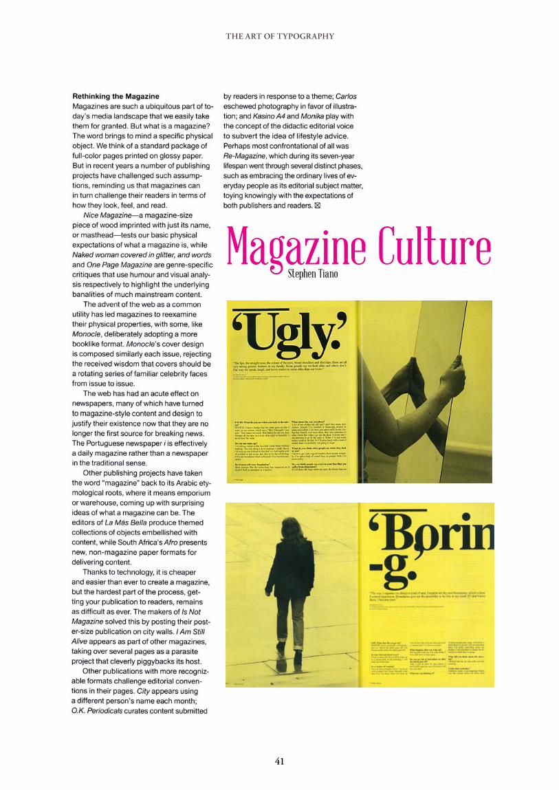
THE ART OF TYPOGRAPHY
Magazine CultureStephen Tiano
41

THE ART OF TYPOGRAPHY
42
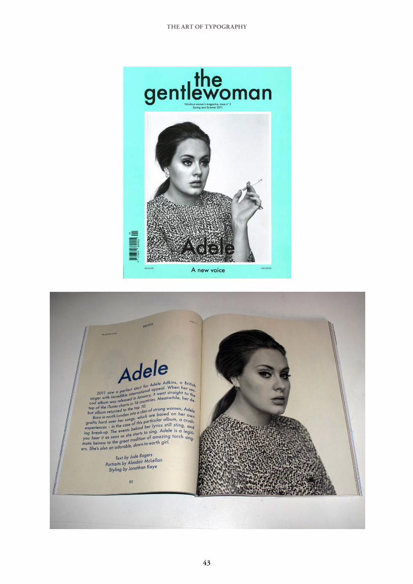
THE ART OF TYPOGRAPHY
43

THE ART OF TYPOGRAPHY
44

THE ART OF TYPOGRAPHYTHE ART OF TYPOGRAPHY
The Making of A Typographic ManEllen Lupton
45
THE ART OF TYPOGRAPHY
46

THE ART OF TYPOGRAPHY
47

THE ART OF TYPOGRAPHY
48

THE ART OF TYPOGRAPHY
The Art of the Title SequenceIan Albinson
49

THE ART OF TYPOGRAPHY
50
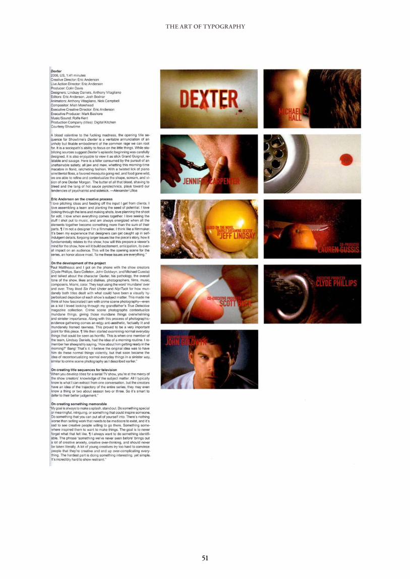
THE ART OF TYPOGRAPHY
51

THE ART OF TYPOGRAPHY
52
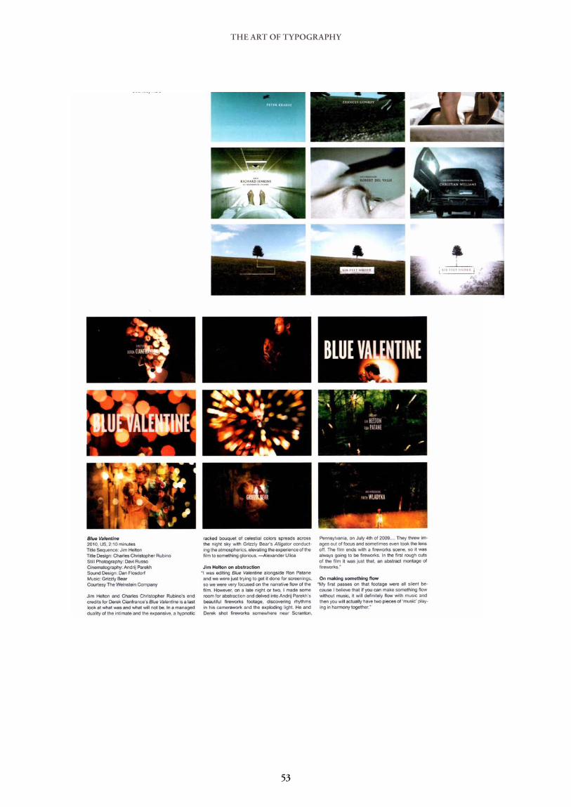
THE ART OF TYPOGRAPHY
53
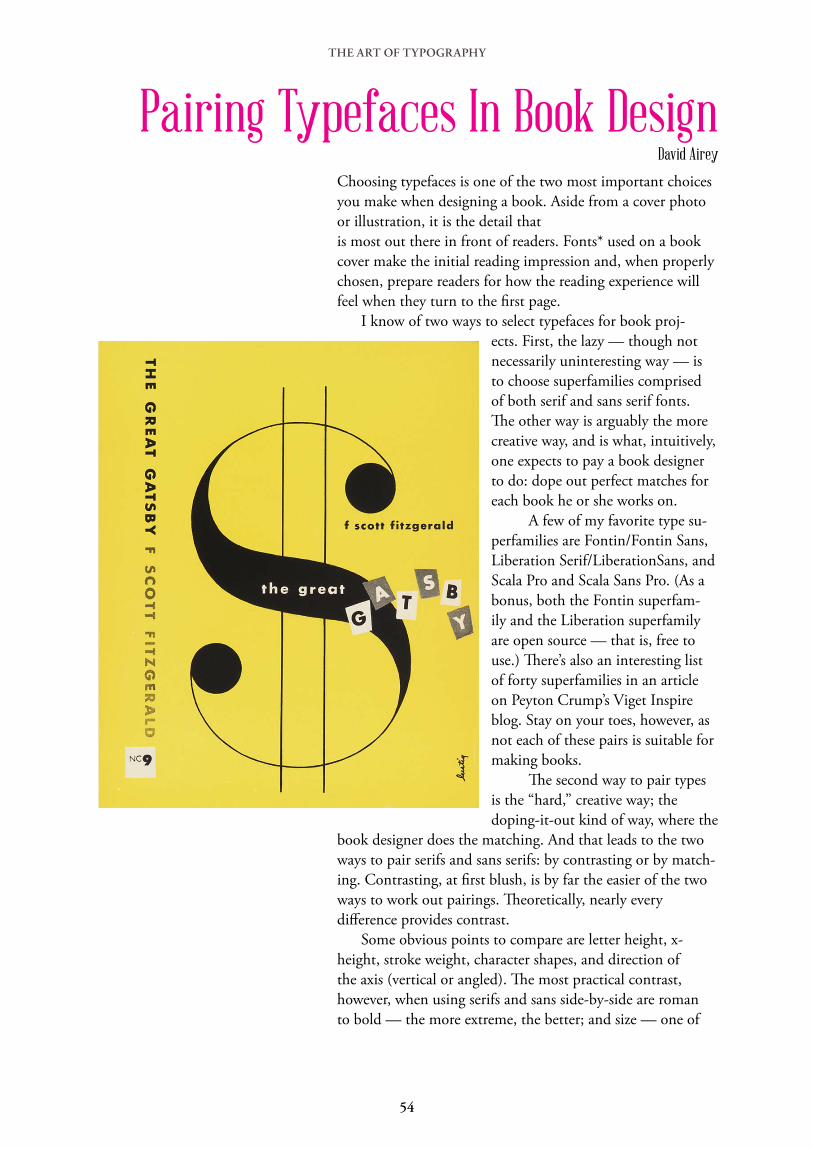
THE ART OF TYPOGRAPHY
Pairing Typefaces In Book DesignDavid Airey
Choosing typefaces is one of the two most important choices you make when designing a book. Aside from a cover photo or illustration, it is the detail that is most out there in front of readers. Fonts* used on a book cover make the initial reading impression and, when properly chosen, prepare readers for how the reading experience will feel when they turn to the first page. I know of two ways to select typefaces for book proj-
ects. First, the lazy — though not necessarily uninteresting way — is to choose superfamilies comprised of both serif and sans serif fonts. The other way is arguably the more creative way, and is what, intuitively, one expects to pay a book designer to do: dope out perfect matches for each book he or she works on. A few of my favorite type su-perfamilies are Fontin/Fontin Sans, Liberation Serif/LiberationSans, and Scala Pro and Scala Sans Pro. (As a bonus, both the Fontin superfam-ily and the Liberation superfamily are open source — that is, free to use.) There’s also an interesting list of forty superfamilies in an article on Peyton Crump’s Viget Inspire blog. Stay on your toes, however, as not each of these pairs is suitable for making books. The second way to pair types is the “hard,” creative way; the doping-it-out kind of way, where the
book designer does the matching. And that leads to the two ways to pair serifs and sans serifs: by contrasting or by match-ing. Contrasting, at first blush, is by far the easier of the two ways to work out pairings. Theoretically, nearly every difference provides contrast. Some obvious points to compare are letter height, x-height, stroke weight, character shapes, and direction of the axis (vertical or angled). The most practical contrast, however, when using serifs and sans side-by-side are roman to bold — the more extreme, the better; and size — one of
54

THE ART OF TYPOGRAPHY
the fonts should be at least a few points larger than the other. When matching types, there are certain combinations that work naturally, because of the weights, shapes, and proportions of the characters. Oldstyle Serif types, with their angled stress and mild difference between thin and thickness of stroke, pair nicely with Humanist Sans Serifs — Minion and Frutiger, for instance. Other Oldstyle Serifs such as Jenson, Bembo, Caslon, Garamond, Palatino, and Sabon, combine well with other Humanist Sans Serifs such as Eras, Gill Sans, and Lucida Grande. Transitional faces have a vertical stress and the contrast of thin and thickness of a character’s stroke is more obvious than with Oldstyle faces. Some examples of Transitional Serifs are Bell, Bookman, Bulmer, Caledonia, Joanna, Mrs. Eaves, New York, Perpetua, and Times Roman typefaces. Transitionals are paired well with Geometric Sans Serifs such as Avant Garde, Avenir, Bernhard Gothic, Century Gothic, Eurostile, Futura, Kabel, and Univers. Modern typefaces have much more pronounced contrast between the thin
and thick of their stroke than the Transitionals, and larger x-heights. Examples of Moderns are Bernhard Modern Roman, Bodoni, Didot, Fenice, New Century Schoolbook, and Walbaum. Geometric Sans Serifs, as with Transitionals, make nice pairings with Modern Serifs. For book design, I stop here, except for my desire to sometime set a book in Optima, a Near-Serif Sans.
*A word on the two separate and distinct terms, typeface and font. A typeface is the name under which all the characters (letters, numbers, punctuation marks), in all styles (roman, italic, bold, etc.) and sizes, of a particular design are unified. A font is a typeface in a single size and a single style. So Bembo is a typeface, but 10 point Bembo Italic is a font.
55
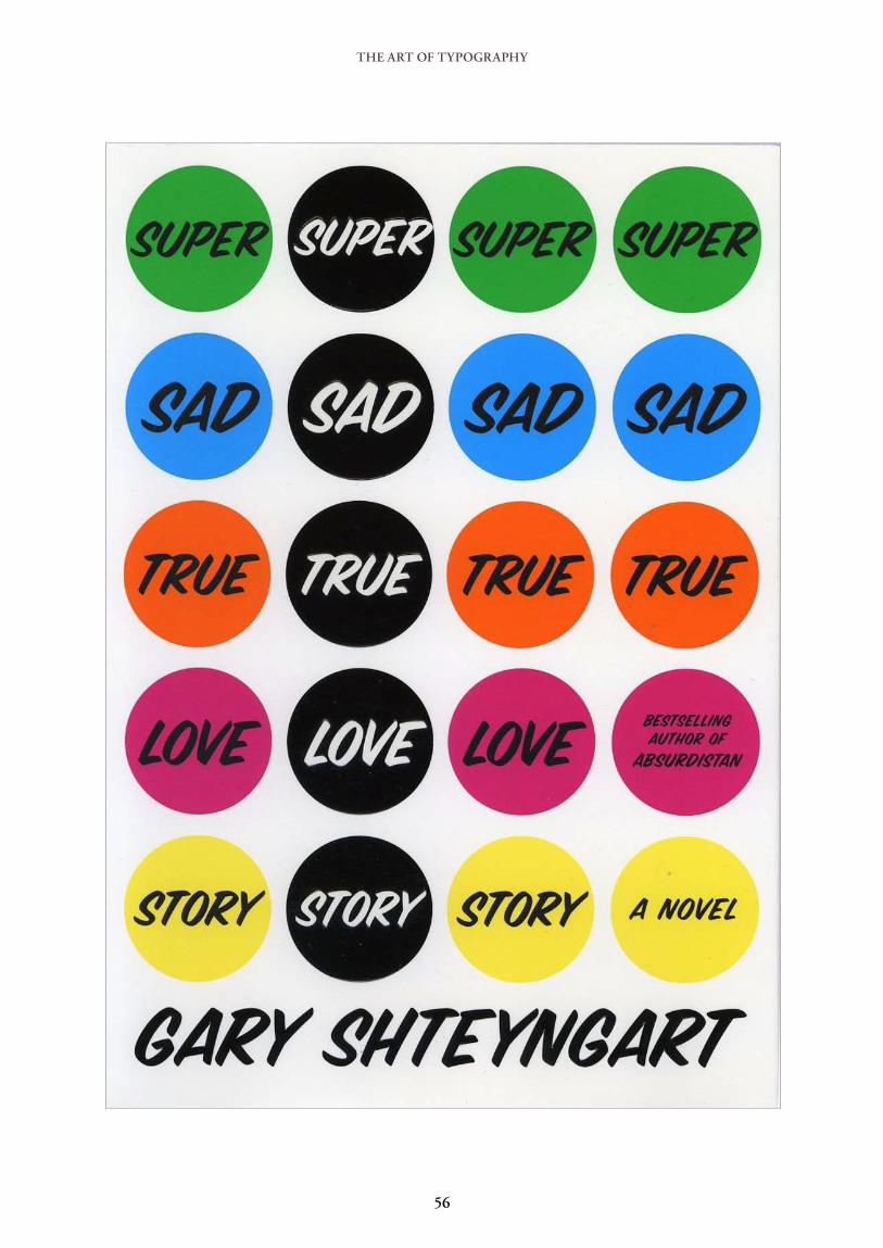
THE ART OF TYPOGRAPHY
56
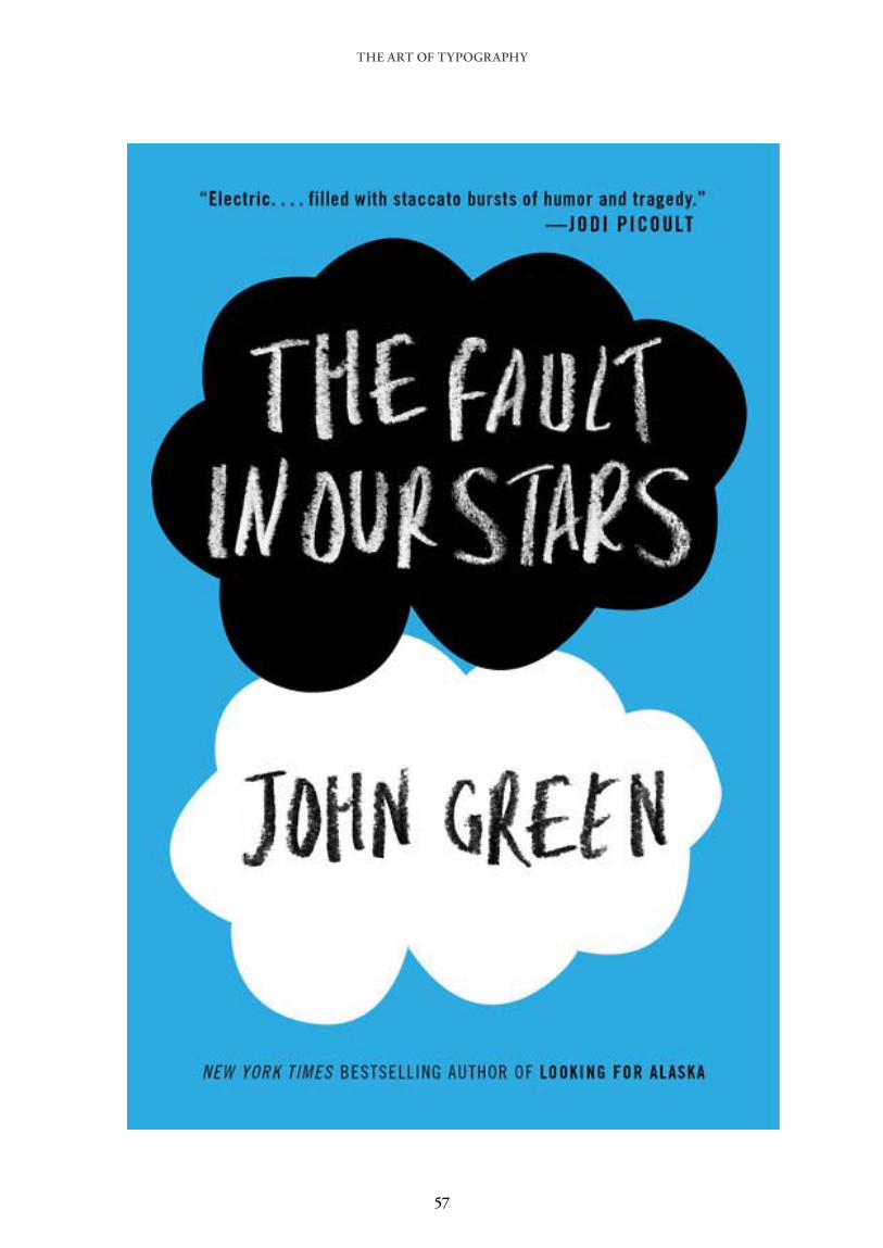
THE ART OF TYPOGRAPHY
57

THE ART OF TYPOGRAPHY
58

THE ART OF TYPOGRAPHY
In 1983 Rudy VanderLans, Zuzana Licko, Marc Susan, and Menno Meyjes began Emigre, a magazine about “…the global artist who juggles cultures, travels between them, and who is fluent in the cultural symbols of the world. An émigré.”[1] Early issues meandered through essays, inter-views, fiction and poetry. VanderLans directed wild layouts that ignored the so-called rules instilled by modernist design pedagogues. After four issues Susan and Meyjes had left the magazine, allowing VanderLans and Licko to steer Emigre toward being a design magazine that explored experimental and usually computer-driven work like their own. In the early days of desktop publishing the selection of digital fonts available to designers was very limited. Licko started designing bitmap fonts on the Macintosh and VanderLans used them in Emigre. To support the magazine they sold these fonts, establishing Emigre Fonts as one of the first digital type foundries. Emigre now followed in the footsteps of The Monotype Recorder, func-tioning as both design journal and type specimen. In those experimental years VanderLans and Licko did not see themselves as radicals. Their work was not intended to chal-lenge established notions about design so much as to explore new possibilities. But Emigre was noticed by designers and eventu-ally made its way into the hands of the modernist old guard in New York who saw barbarians at the gate. Steven Heller went on the attack in his infamous 1993 essay about post-modern design, “Cult of the Ugly”, in which he dismissed VanderLans:
Rudy VanderLans, whose clarion call of the ‘new typography’ Emigre has been vituperatively criticised by Massimo Vignelli, has not returned the fire, but rather countered that he admires Vignelli’s work despite his own interest in exploring alternatives made possible by new technologies. It could be argued that the language invented by Rand’s ‘Bauhaus boys’ challenged contem-porary aesthetics in much the same way as VanderLans is doing in Emigre today. Indeed VanderLans, and those designers whom Emigre celebrates for their inventions…are promoting new ways
ÉMIGRÉ No. 7, the
Look Back Issue
James Puckett
59

THE ART OF TYPOGRAPHY
of making and seeing typography. The difference is that Rand’s method was based strictly on ideas of balance and harmony which hold up under close scrutiny even today. The new young turks, by contrast, reject such verities in favour of imposed discor-dance and disharmony, which might be rationalised as personal expression, but not as viable visual communication, and so in the end will be a blip (or tangent) in the continuum of graphic design history.
Heller had just fired a massive salvo in what would later be dubbed the Legibility Wars. Licko and Vanderlans never sought conflict, but were dragged in anyway. Design magazines lit up with fiery essays on both sides, including Emigre‘s publication of Jeffrey Keedy’s “Zombie Modernism”, a denounce-ment of ideologues who, seemingly having one foot in the grave, refus-ing to go down without a fight. For the twenty-fifth anniversary of Emigre, VanderLans compiled writing and photos of pages from the sixty-nine issue run into Emigre No. 70, The Look Back Issue. It could have been easy to make Emigre No. 70. VanderLans and Licko could have picked only the best, providing readers with a narrative about post-modern graphic design similar to Rick Poynor’s No More Rules: Graphic Design and Postmodernism. VanderLans and Licko chose another path.Emigre No. 70 is an eclectic mix that makes no attempt to impress. Those who read Emigre the first time around will find nothing new here. Those on limited budgets will be annoyed at the amount of content in this book available in cheaper books or online; but to students of history or designers who want to think about design theory from varied angles Emigre No. 70 will be invaluable.
60
THE ART OF TYPOGRAPHY
The Library of the Gutenberg Museum
II. MAINZFor hundreds of years, this small German city along the Rhine has been known for Johannes Gutenberg and his invention — printing with movable metal type. Almost any graphic designer who has passed through Mainz has stopped at the Gutenberg Museum. Next to the city’s landmark Romanesque cathedral, the Gutenberg Museum presents the history of Western (and some Eastern) printing. Several in-cunabula books are on display — including three Gutenberg Bibles — as well as printing presses and bits of city parapher-nalia. Lesser known is the museum’s small library, which is open to the public. Aside from trade and academic titles on print-ing and typographic history, the library has a large collection of type specimens from the 17th through 20th centuries. These were largely collected by Gustav Mori (1872–1950) during the first half of the 20th century, especially the large, one-sheet specimen from German type foundries.
III. TYPE SPECIMENMori may be most known for his work collecting type speci-men from Frankfurt am Main. Just 40 kilometers east of Mainz, Frankfurt has played an important role in the book trade for almost 500 years. Over several decades, Mori was an employee at the D. Stempel AG type foundry, one of several large type foundries in Frankfurt at the time. Frankfurt’s University Library also includes a Mori collection of type specimen. [1] Mori published several works during his life-time, but one of his most significant volumes was published posthumously in 1955: a folio book reproducing his collec-tion of type specimen from Frankfurt-based founders from the 16th through 18th centuries. Today, type foundries tend to design and produce folded or bound catalogs to show off their typefaces. Increasingly, they post their designs online thus minimizing print advertis-ing costs. Centuries earlier, many type specimens tended to take another form: large, over-sized single sheets, on which a type founder would display paragraph settings of each of his types at their various sizes — almost like a poster. The Gutenberg Museum library’s oldest specimens all take this form. The Gutenberg Museum library’s specimen collection is broad, drawing on holdings from all over Europe. Traditional serif typefaces (called Antiqua type in German) are to be found in abundance, as are Greek, Hebrew, Arabic, Syriac,
Dan Reynolds
61
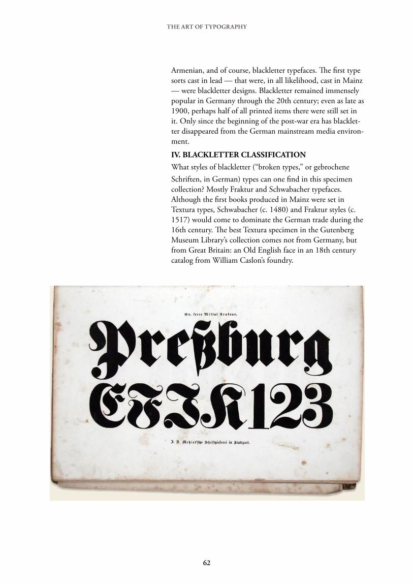
Armenian, and of course, blackletter typefaces. The first type sorts cast in lead — that were, in all likelihood, cast in Mainz — were blackletter designs. Blackletter remained immensely popular in Germany through the 20th century; even as late as 1900, perhaps half of all printed items there were still set in it. Only since the beginning of the post-war era has blacklet-ter disappeared from the German mainstream media environ-ment.
IV. BLACKLETTER CLASSIFICATIONWhat styles of blackletter (“broken types,” or gebrochene Schriften, in German) types can one find in this specimen collection? Mostly Fraktur and Schwabacher typefaces. Although the first books produced in Mainz were set in Textura types, Schwabacher (c. 1480) and Fraktur styles (c. 1517) would come to dominate the German trade during the 16th century. The best Textura specimen in the Gutenberg Museum Library’s collection comes not from Germany, but from Great Britain: an Old English face in an 18th century catalog from William Caslon’s foundry.
THE ART OF TYPOGRAPHY
62

THE ART OF TYPOGRAPHY
Artist Joseph Kosuth’s 1965 work One and Three Chairs pre-sented a static composition that represents an idea three ways. It was heady stuff, addressing what conceptual artists saw as a crisis of reconciling the realization of concepts with the concepts. One of the three material representations in One and Three Chairs was an enlarged photostat of the dictionary definition of the word chair, making text both a literal and metaphorical focus in a work of art. It was not the first time text had been used in art, but it was a key moment in the conceptual art movement of the time, followed by decades of conceptual artists using text to convey their ideas. Art and Text is about this conceptual art. It covers works that include some text, are made up of text, or are text. The subject of these works is often the intersection of art, philoso-phy, and linguistics. While a few older works are shown, the focus of the book is 1960–2008 with most of the work from the latter decades. Most of Art and Text is dedicated to images of the subject matter, but it does offer some writing. A foreword and three essays chart the development of language in conceptual art from Dada to the field today. These essays are interesting but can be uninviting. Each overuses the lingo of high art and little effort is made to explain the terminology. Because the terminology is so esoteric it will be hard for readers not already steeped in conceptual art to follow; if one can under-stand all of thee essays I suspect that one need not read them anyway. A glossary would have made them much more acces-sible. Art and Text is broken into four chapters. Each has a short introduction followed by images with occasional cap-tions to guide the reader. The captions are insightful and much easier to read than the essays. “Text” explores the range of text as a material, media, and subject. “Context” covers text art as reaction to social forces. “Art in Semiotext” is the most philosophical, questioning and manipulating language to question its limits, deficiencies, and possibili-ties. “Textuality” showcases works that examine the area where supposedly clear textual communication breaks down as meaning falls apart, is lost, or is shown to not exist. Thoughtful pacing of the chapters keeps the content from becoming boring, even when the art presented is only com-prehensible with afterthought and reflection. For a designer Art and Text can provide plenty of food for thought and inspiration. Some of the featured works overlap with recent design trends—albeit with dramatically differ-ent subjects. The almost total absence of graphic designers
Art and Text
James Puckett James Puckett
63

from the book was a little surprising. For example, it seems like Stefan Sagmeister overlaps the worlds of art and design as Barbara Krueger does, but he was left out; she was not. In the design classroom Art and Text would be a useful text for students exploring experimental typography. Like its subject matter, Art and Text raises questions. If all of these artists are asking questions, does anyone care to answer them, or even hear them? Is conceptual art relevant to anyone other than conceptual artists and their critics? Is this the avant-garde ahead of its time or pretentious doggerel? These questions lead one to wonder just how much any art can really be understood in its era. Few people really understood Duchamp when he was working but now most art school freshmen can figure him out. Is conceptual art being made for a world in which the ideas that spawned it are finally widespread? It is these questions that make Art and Text a success. Really explaining these works would take many more books. Attacking or defending concep-tual art would be boring and redundant. But for 279 pages that are mostly photo-graphs to inspire so much thought is an artful thing.
64

Gray318Kyle CooperRodrigo CoralGareth EdwardsLindsey DanielsKuntzel + DeygasÉmigréSarah ForssHouse IndustriesDigital KitchenDaniel KleinmanAlvin LustigCarlos MagazineThe Gentlewoman MagazineLittle White Lies MagazineRe-MagazinePenny ModraFalke PisanoBrendina RamdatGraham RowleCharles Christopher RubinoJames VictoreAnthony VitaglianoAndy WarholSharon Werner
Designers featured in this E-Book: